#grade: b-
Explore tagged Tumblr posts
Visit Tumblr Blog
Explore Tumblr blogs with no restrictions, modern design and the best experience.
Last Seen Tumblr Blogs


Fun Fact
In 2020, 44% of users from Denmark used Tumblr daily.
Note
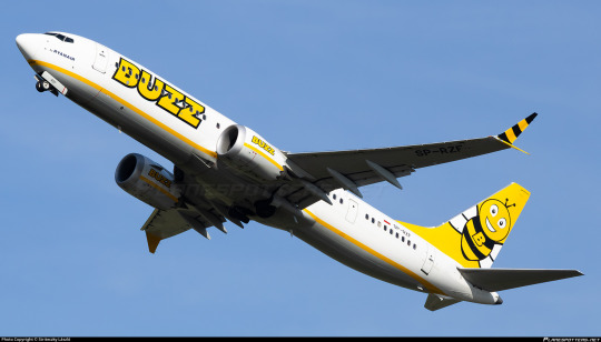
Have you ever seen the livery of Buzz? I'm haunted by those eyes... what have they seen.. what do they know
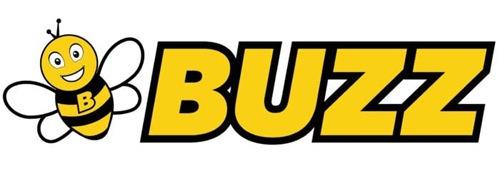
Yeah, it's a little frightening. They definitely went a bit too hard on the cartoon factor here, almost like they were trying to overcompensate for some sort of horror.
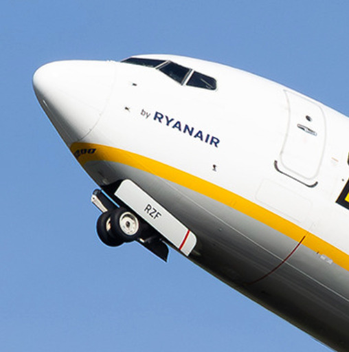
Now, take a look at that livery. Ignore the bee, the wordmark, the colors, the (admittedly cute touch of) the stripes on the inner winglets. Sure, it's flattened, but does that bit of Deltalike underline look familiar?
Yeah, I have a guess as to what the horrors are.
I mean, ultimately, Bee- for Buzz.
Points off for being haunting in the same way a bad composite sketch of a murder victim is, but definitely exactly what I'd expect when I hear there's an airline called 'Buzz'. It does the job, though the job's ugly work.
It makes sense they'd lean as far away from being visibly a Ryanair subsidiary as possible, but that's what they are. Their callsign, 'MAGIC SUN', and their IATA and ICAO identifiers, RR/RYS, are vestigial from their prior identity as Ryanair Sun. So as if the words 'Polish ultra-low-cost airline' weren't already bad enough...yeah, it's Polish Ryanair.
Although I'm not sure what they tried to cover it up with is any better.
#transmissions#tarmac fashion week#era: 2010s#era: 2020s#grade: b-#buzz#ryanair group#region: europe#region: poland#ulccs#deltalike
39 notes
·
View notes
Note
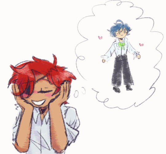
Judging from that drawing, Nyoka actually be a snake whisperer of sorts?
(Prev) they have too many distinct dialects for him :(
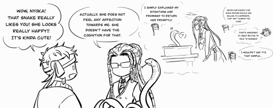
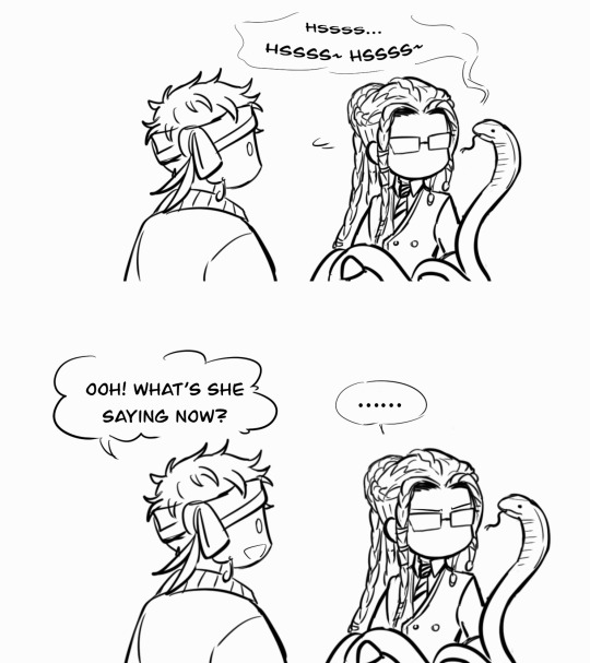

He only knows enough to get by, not enough to be an effective communicator 😔 it’s all luck based regarding an individual cobras temperament at this point (assuming they listen). He can’t be rude by messing up. One wrong tongue placement and it’s over :(
rip kalim, not all beastmen can perfectly talk to animals…
#cozy ask#my art#nyoka wadjet#his animal linguistics aren’t the best.#HIGHEST GRADES WITHIN HIS DORM. not so much entire the school.#But its like the equivalent of getting all As then there’s just one B- in there.#HE’S NAJA HAJE NOT NAJA OXIANA#OVERLAP BUT he cant understand anymore once common stops being used.#(which was what he was using at first.)#stressed nyoka is funny.
367 notes
·
View notes
Text

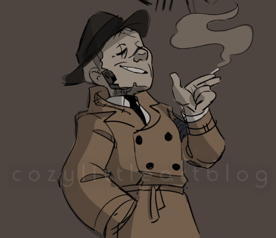
i found these old nick doodles from 2021 and still like them :) so here
#fallout 4#nick valentine#fo4#art#doodles#kinda rough and i left the sketch layer on but i think that adds to it yknow#sweet ol man. sweet peepaw. love him#save me nick valentine#its almost his day again#my nick charms got sniped off etsy btw so if you want them they're in my B and C grade charm listings#the stickers are still up. just the charms got hit. idk why that is
391 notes
·
View notes
Text
Sometimes you buy someone a chili dog and it is a totally normal and fine experience . and other times you buy someone a chili dog and realize you are Down Bad
#jaytim#jason todd#tim drake#dc#droring#they are the definition of ‘person A fell first (has been low grade pining for years) but person B fell harder (i.e. like a ton of bricks)’#to me.
3K notes
·
View notes
Note
My MC is dramatic enough to have a crash out over one B grade, all because they made their entire success quota revolve around the fact that they've always gotten straight As in every tests. College is gonna be such a rude awakening for them 😭
How would M react to an MC who is spiralling because of one average grade?
the dorm bathroom’s yellow light sounded like a dying insect, casting a sickly pallor over your reflection. you leaned against the sink, fingers gripping the porcelain until the skin covering your knuckles stretched as far as it could.
the mirror showed a stranger—sunken cheeks carved by sleepless nights, shadows pooling like ink beneath your eyes, lips trembling as if trying to outrun the sob lodged in your throat. your skin had a yellow undertone to it, thanks to the bathroom light, and it made you look like you had jaundice. honestly, you’d have preferred that to the situation you were in right now.
B. the letter glared in your mind, bold and mocking.
B. a splinter under your fingernail. a pebble in your shoe. a stain on a white shirt.
you’d handed in that exam with hands steady as a surgeon’s, heart singing ‘this was easy, per usual.’ but the grade had come back like a verdict: you were wrong. you’re just like everyone else. you’re not special anymore.
you’d spent years folding yourself into the shape of excellence—midnight oil burned to ash, highlighters drained dry, every social invitation declined with a polite, “i have to study, sorry.”
you thought about your wasted potential, the way you had spent your life striving, pushing, grinding yourself down to bone and nerve and exhaustion just to be the best, and now—what did you have to show for it?
your worth was an equation: As = brilliance, respect, worthy. without it, you were unspooled. a equation with no solution.
back in your room, you tore through the silence like a wild thing. the bottle of cheap vodka—pilfered from a party that D invited you to months ago, “for emergencies”—glinted on your desk. your hands shook as you unscrewed the cap, the smell sharp and chemical.
this is what failure tastes like, you thought, the first swallow burning a trail to your gut. the second was smoother. the third didn’t burn at all.
the room tilted, walls breathing in and out. you slumped into your desk chair, macbook screen still open to the grade portal.
B. you wanted to claw it out of the digital ether, scream at it until it rearranged itself into the letter above it. instead, you drank. and drank. the bottle became a companion, its weight in your hand a perverse comfort.
what’s the point? the thought slithered, oily and familiar. you’re a goddamn fraud. all those late nights spent studying, all that praise—for what? to plateau? to be ordinary?
your vision blurred. you imagined your classmates’ faces, their tight smiles. “oh well, they were supposed to burn out at some point.” your professors’ voices, syrupy with pity. “you’ll bounce back.” as if resilience were a trampoline to you, not a bruise.
the door creaked open. you didn’t turn. footsteps—light, familiar—paused at the threshold.
“hey,” M said softly, their deep, posh voice immediately recognisable.
you had half the mind to admonish them for entering your room without knocking, but you didn’t. you couldn’t. not when your tongue was feeling swollen, your throat lined with sand.
they stepped closer, their presence a warmth at your back. “you didn’t answer your texts. i… got worried.”
again, you maintained your silence. M furrowed their brows, walking closer to you. their hand hovered near your shoulder, then withdrew. they then crouched beside your chair, eyes level with yours. their umber brown gaze—flecked with gold, like sunlight through maple syrup—held no judgment. only quiet concern. “talk to me, love.”
you wanted to snap. to lash out. but their voice, steady as a heartbeat, disarmed you.
“i got a B, M,” you whispered, the letter a curse. “a B. do you know how many hours i—?”
“yes.”
the word stopped you. M rarely ever interrupted you in the middle of a sentence.
“i know,” they repeated, softer. “i’ve watched you. every library all-nighter. every time you skipped lunch to review notes. every moment you treated yourself like a machine.” their hand finally settled on your arm, a warm anchor. “i just wish i could convince you that your grades do not diminish the amount of work you’ve put into it, love.”
you shook your head, eyes now burning with unshed tears. “you don’t get it. i’m supposed to be brilliant. if i’m not the best, who the fuck even am i?”
M’s thumb brushed your wrist, a gentle stroke. “do you remember that one elective you took for astrophysics? the one with dr. conway?”
you blinked. of course you did. you’d transcribed almost every lecture to M, whether they wanted to hear it or not. they were never really inclined towards anything STEM related, but they still listened to you regardless.
“stars,” M said, “don’t measure their worth by how brightly they burn. they just… are. and even when they collapse? they scatter stardust. new planets. new life.” their voice thickened. “you’re not a grade. you’re a star. you think i don’t see it? the way you dissect a poem like it’s alive. how you remember every footnote, every theory of your ridiculously complicated classes.”
“that B?” M plucked the bottle from your grip, setting it aside. “it’ll never stain your potential. it’s a miniscule particle in the brilliance of your cosmos. nothing more.”
a sob tore loose. M pulled you into their arms, your face buried in their sweater—smelling of jasmine and the faintest trace of incense. they didn’t shush you. didn’t offer platitudes. just held you as you let your emotions pour out, their fingers carding through your tangled hair.
when the storm passed, they guided you to bed, your legs wobbling.
“sleep,” they murmured, tucking the comforter around you. “we’ll talk about this more when you wake up, if you still wish to.”
“okay,” you slurred, eyelids leaden. “good night.”
M smiled, a sad, sweet curve. “good night, meri jaan.”
as darkness crept in, you felt it—the ghost of lips against your forehead, featherlight. a breath, or a dream. but in that liminal space between waking and oblivion, you let yourself believe it was real.
#even academic weapons need love bro ):#also B isn’t even a bad grade 😭#M is so much better than me cause wdym you’re having a breakdown because you didn’t get an A#if: the ballad of the young gods#interactive fiction#interactive novel#interactive story#twine wip#ro: m whitlock singh
152 notes
·
View notes
Note
What would Eggman role be in your All for you au ?
Dr. Eggman's role is that one professor for a class you HAVE to take. There is no avoiding him. He specifically teaches robotics engineering.
Dr Eggman is a very strict professor. He has strict rules for his class, like even if you are seconds late, he would lock that door the second class is supposed to start. And he counts attendance as part of your grade so it's either you're on time or ya fail. Unless you have a very, VERY good reason you don't show up—but even then his classes are like 4 hours long so if ya miss anything ur pretty screwed.
He also has very strict due dates, no extensions unless you, again, have a very good reason.
He is the type of professor to correct you if you were to say "Professor Eggman" instead of "Dr. Eggman."
His class can be fun if you are an engineering major, but even those students say that class is pretty hardcore.
Dr. Eggman likes to flaunt his awards around, especially his award winning inventions. Like Metal (who looks strangely like Sonic but only he notices that). Who is a very impressive Artificial intelligence robot he created way back when. Dr. Eggman likes to bring him to campus as a demonstration to his students—and because he can. Metal doesn't wonder far from the Dr. Unless he's ordered to.
Also, yes. He does have it out for Sonic. He is very much a jerk.
"Dr. Eggman, Why did I receive this grade?"
"You didn't use the right size font."
"...but I did?"
"You used size 12.01 font. it's supposed to be 12."
"And that deserved a whole letter drop?"
#all for you au#Eggman is a butt face tails words not mine#but this is where shadow comes in#cough cough#dr. eggman#sonic the hedgehog#sth#sonic au#fred answers#sonic was supposed to get a B+ but eggman gave him a C#he did get the grade in the end after a whole nonviolent argument later#sorry for the late answer i was going to draw him#but got busy and couldn't#so hope this descriptive of his character/role#metal sonic#mention
150 notes
·
View notes
Text


Got some weird new beasts up on the ol’ Etsy if anyone’s interested!
#Etsy#merch#just shillin’#people have been snapping up the ‘b grade stickers listing’ absolutely destroying my stores of spare cheap fucked up stickers so#get those while there’s time
224 notes
·
View notes
Text
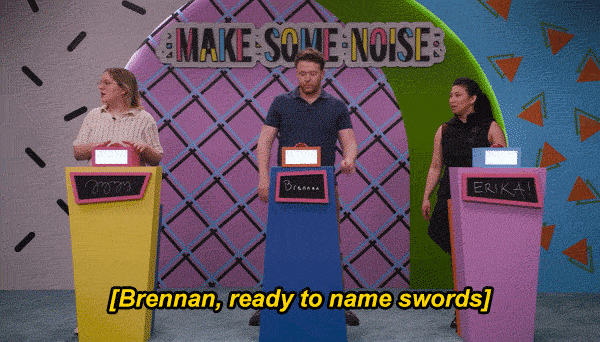
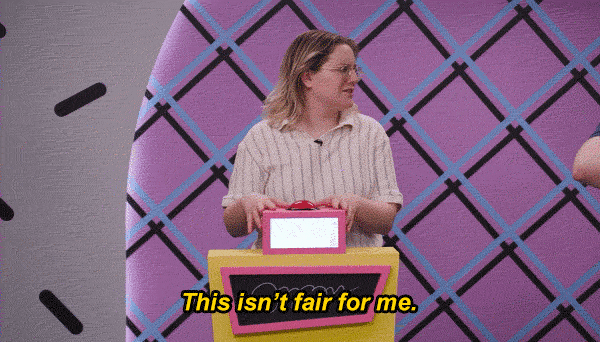

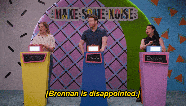
one of my favorite moments from this episode.
make some noise, season 2, “the wicked switch of the west.”
#k talks#dimension 20#d20#dropout tv#brennan lee mulligan#izzy roland#sam reich#erika ishii#make some noise#game changer#collegehumor#look! i learned how to use stroke! i'm going to get a good grade in gifs#something that is b--#did i break tumblr THIS time? i guess we'll find out.#brennan forgot what show he was on for a second 😔
2K notes
·
View notes
Text


card games on motorcycles
#dont ask............im living out 6th grade me's dreams#cannot express how obsessed i was with kiryu#yusei fudo#kiryu kyosuke#yugioh 5ds#yugioh#fanart#drawings#sketch dump#color brain tired rn so we doing b&w doodles
468 notes
·
View notes
Text

groupchat enacting torturous punishments against me
236 notes
·
View notes
Text
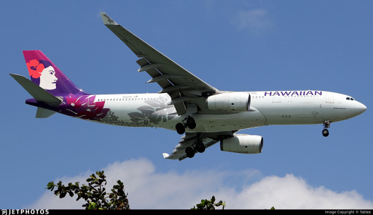
No. 53 - Hawaiian Airlines
I've spent basically a week and a half posting exclusively about Alaska Airlines, and I don't regret a second of that, but it's time to move on to something a little bit different. It's time to shift our focus south, from the icy coasts of Alaska to the sunny shores of the other non-contiguous United State. Thank you to @sirigorn for the request!
I'd had in mind for a while that I would cover Alaska and Hawai'i's home carriers right after one another. Despite the vast difference in climate their airlines have a startling amount in common. They are two of the five remaining US legacy carriers, standing proud with Delta, American, and United amidst the carnage of countless mergers and bankruptcies. They are both very well regarded - Hawaiian has a reputation for punctuality and professionalism, and is the only legacy carrier to have never had a fatality or hull loss despite being the thirteenth-oldest airline in the world still operating. But none of that is why I paired them up.
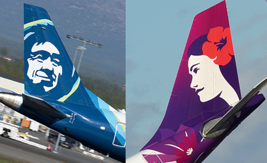
I paired them up because they both have faces. There is no reason to suspect that this was coordinated, but I think that Oliver and Pualani - the face on Hawaiian Airlines' tailfins - should be friends. If you take nothing else away from this post, let it be that. But I do have more to say, so let's look past the tail at the rest of the plane it's attached to.
(I have to say this upfront before I get into the review: no matter how pretty their airline's planes are, please choose somewhere other than Hawai'i for your next vacation. The islands were already strained by tourism and that's even before Maui was lit on fire. Now, when the people of Hawai'i are trying to rebuild, is not the time to divert their resources to anything other than supporting those affected by the deadliest wildfires in the past century. If you are able, however, I recommend donating to funds like Maui Nui Strong.)
Hawaiian Airlines has endeared themselves to me by creating a webpage discussing their brand refresh, which I always appreciate. I'm going to be discussing their modern livery today, which was introduced, with this webpage, in 2017, but it's worth noting that their 2001-2017 livery is very easy to mistake for the modern one. It's quite similar, so I'm going to quickly explain how they differ. For what it's worth, they're similar enough that I sort of consider the modern look a revision rather than an outright replacement.
This is the 2001-2017 livery. As you can see it has large flowers in varied shades of vivid purple which bloom out from around Pualani, who is on a solid red backdrop. They wrap around the tail of the plane, creating that sort of curved shape classic SASlikes try to have, and the same purple blooms are present on the winglets. I love this livery, personally - the colors and the shapes of the petals are both fantastic - I just wish there were more of them on more of the plane, instead of it just being boring and rear-heavy like everything else out there.
The 2017 revision is similar, but nonetheless visibly different. The color balance in general has shifted and Pualani has been slightly updated, but it's the flowers around her which have changed the most, and I'm going to be honest - I prefer the old one.
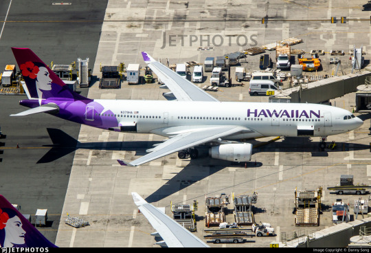
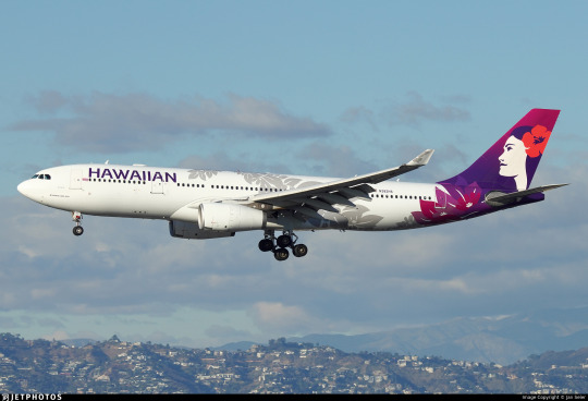
A large portion of Hawaiian's fleet is composed of Airbus A330s. (Each of them is named for a Polynesian constellation, historically a huge part of navigation for traditionally seafaring peoples!) The A330 is a very common plane but a very tricky one to work with. The Airbus roundness doesn't just stop at the nose, and A330s probably are the most vulnerable to this, the ratio of length to fuselage making them look a bit puffy in the front, while the taper of the tail remains about as sharp as with any other model of plane. The wings are located quite forward, and the tail is not especially large or visually interesting, which means that it ends up feeling almost small. None of this is to say that the A330 is an ugly plane; it is not. There is no such thing as an ugly plane (well, there is, but they're still cute and the A330 isn't one), but there are features of different airframes which can make them susceptible to certain visual effects. The A330, due to its specific shape, can easily struggle with an issue very opposite to many other planes - it is very easy to make it look forward-heavy, with the tail coming off sparse.
Unfortunately, this is what happens with the new flower pattern. And yet, somehow, once it's in flight it feels tail-heavy again, because all the color is concentrated there. This weighting of detail and color manages to solve no problems at all, while somehow making two seemingly paradoxical problems worse. And Hawaiian is by far not the worst offender in either camp, but it's my job to be nitpicky and harsh, so nitpick I will - the A330 is a big puffy white tube and you need more fuselage coverage, on both ends, to make it not look like a poorly weighted puffy white tube tumbling its way through the air dealing with just the strangest aerodynamic loads imaginable.
I think if I had never seen the old design I would still notice it, but knowing that they had fixed this very problem and then created it again makes it sting a bit more. I don't mind the flowers as they are now, to be clear - I just wish that there were more of them. They take up so little space that they're easy to miss if you aren't looking closely, and that's a shame, seeing as they've added so much detail!

Looking at the two tailfin designs directly next to each other, I think I actually prefer the old one. And that's not because I think the new one is bad or anything - to the contrary, I love the extra detail in the foliage, and I'll touch on another thing I like later, but there are just a few details that make me sad here, like the way the wordmark got a bit smaller and the removal of the color from the winglets.
The color in general, I think, is a step back. Some things I love, like the vivid, saturated flower they've given Pualani. In general, though, I miss the high contrast between the warm red and cool lavender of the old livery. The website says this regarding the changes to the tailfins:
Pualani, with her welcoming smile and proud gaze, embodies our culture even more clearly. Known as the “flower of the sky,” Pualani is now framed by the rising sun, watching over our guests and crew along their journey. To celebrate her regal status, we are featuring purple more prominently in our color palette, complemented by an updated graphical style that reflects our reputation as a premium, global brand.
So, I might be insane, but I actually think the new livery is less purple and more red, right? Am I insane for thinking this? And that's not bad - the color palette of a shelf of homemade jams is absolutely an appealing one - but I loved the contrast between dark, warm, rich tones and light, crisp, clear ones with the old purple, which had really been a new direction for Hawaiian's primarily-red historical branding. Like I said, I don't hate the new livery at all, but it feels like it's missing a bit compared to the old one. There's a part of me that feels like the ideal Hawaiian Airlines livery would have the tailfin of the 2017 livery with the 2001 livery's flower unfolding beneath it, fully wrapping up the tail the way it used to and providing that blueish lavender pop to really clearly contrast itself from the rest of the plane. That could be stunning, I think, and while it would be a lot of detail that's generally something you want with florals - you either go minimal, like the Vietnam Airlines lotus, or you take advantage of the potential depth of color and shape which layering can give you.
Seriously, though...it's less purple. I haven't totally lost it, right? Please tell me I haven't totally lost it. I like purple. I want purple! This feels less purple!
Having insulted the new livery a bit, I'm now going to tell you all what I really like about it.
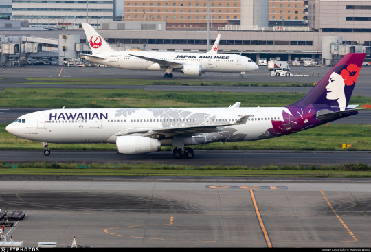
A maile lei—one we use for important occasions—wraps around the body of the aircraft to symbolize the warm welcome we extend to our guests, and the ways that our traditions bind us together as an ‘ohana (family).
I don't think I need to explain why I love this idea, but I will anyway, because that's what you follow this blog for.
This is a lovely idea that, in addition to portraying Hawai'ian culture, is a great way to keep interest going throughout the fuselage. I love the way it's placed, with that natural-feeling flow to it which feels like it continues on from the placement of the colored flowers before assuming a flowing pattern like that of a lei held up into the wind.
It works well with the shape of the A330, curling elegantly around the ventral fairing and over the wing. It takes advantage of the large canvas provided by the giant tube of a fuselage to present an elegant pattern of twists which keeps the fall of the lei feeling natural and means that you get a different view of it from every angle. I like this a lot.
I also like the fact that they stuck with a shape that's more-or-less the Lufthansa-SAS-line archetype, but then added something else to the fuselage, less because of how it works for this specific livery and more because it proves that you don't have to reinvent the wheel when it comes to colorblocking...you just need to add something else. There is nothing wrong with the basic shapes, but everything wrong with the fact that they stop there.
...but I have to keep on nitpicking.
First: why is it grey? Why not a light purple? Grey is difficult to see on the white fuselage, and just feels at odds with the rest of the color scheme. It would feel so much more integrated, be more visible, do a lot to fix the rear-weighted color balance, and just look better if it were a light lavender or pink. I mean, fuchsia flowers lead directly into...grey ones? What kind of decision is that?
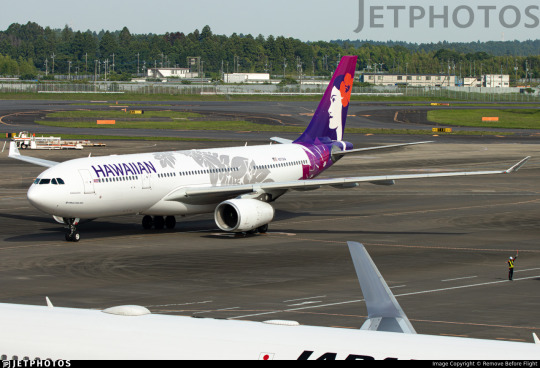
Second: why does it stop where it does? Surely with this sort of anfractuous winding pattern you could avoid covering the wordmark, or you could integrate it into the wordmark if you so wanted - I just don't understand why it cuts off behind it! This feels...
Oh no. Oh no, it's giving condor. Not literally as ugly, of course. It's not ugly at all. And it wasn't beginning with a never-before-done dynamite concept, it was iterating on something they already had that was nice but had room to grow. But it has potential dense enough that a spoonful weighs the same as an A330 and they've diluted it until most of the fuselage is just white. I don't get it. I just don't get it. They've been put one foot before the finish line of a footrace and immediately begun running in elaborate spirals. Like, you got there, but this was just a bad way to do what could have been so guaranteed.
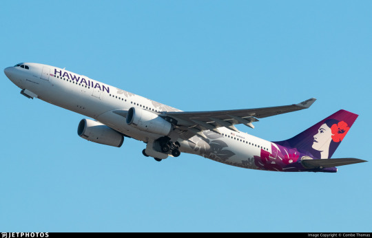
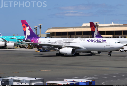
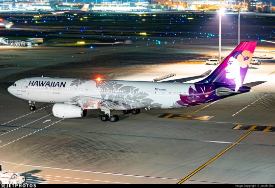
Well, that's just one part of it. I've been talking about A330s this whole time. Hawaiian doesn't have an all-A330 fleet. I'm sure some airline out there does, but it's not them. (I had actually thought Aircalin did but I'm glad I checked to make sure because they have an A321 and a Twin Otter.) The reason I've been talking on and on about A330s is that I judge liveries which are consistent across models by their weakest points, and the A330 is easily the weakest for Hawaiian. On the reverse is the backbone of their inter-island fleet: a flock of Boeing 717s which are all named after indigenous birds, and apparently come with little plaques inside to dispense bird facts!
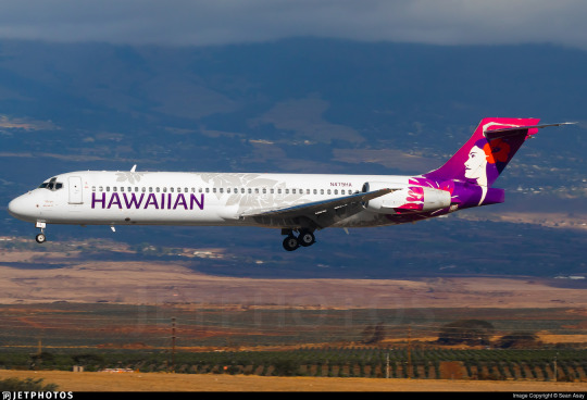
This livery actually looks phenomenal on the 717. This isn't a surprise to me. 717s are just fancy DC-9s, and DC-9s are one of the hardest planes to make a livery look bad on. I think the ceiling for a really great DC-9 livery is probably not the highest, but the floor for a bad DC-9 livery is in contrast quite high. Some planes are just hard to design liveries for - like A330s. Other planes are forthcoming with visual interest of their own in a way that accommodates liveries that look painfully minimal on larger, more conventionally laid-out planes.
The 717 has a very short (vertically) fuselage, limiting the blank space, and it seems like something about how they transferred the lei pattern unchanged onto it meant that it ended up reaching nearly to the nose. The small amount of overall real estate on planes like this means that detailed liveries shine their brightest, with every little bit fully blown up where on a larger, whiter canvas they could be lost in the dense shuffle and surrounding howling expanse. The rear part of the engines look a bit funky (which could be remedied somewhat if the flowers extended farther, like they did with the old livery) but this is otherwise just fantastic and would be exalted in my eyes if they just had made the lei an actual color.
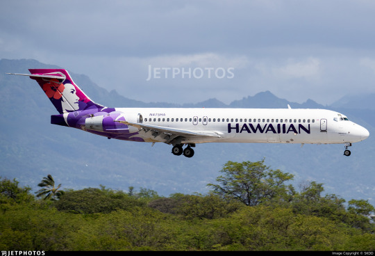
Look, see how much better the shape of the old livery worked with the engines! It's so frustrated when airlines keep making half of a really great livery but never really merging them together into the absolute stunner of a livery that they could have - it reminds me of JAL, sort of, though again, Hawaiian just has nicer-looking planes at base by quite a margin.
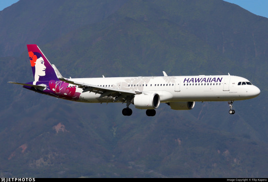
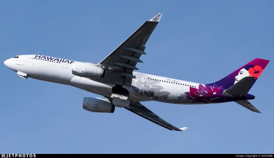
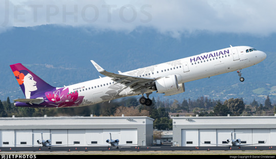
The last type of plane they fly is the A321neo (each of which is named after local plants and forests). The relative stature, shape, and layout of this handsome girl are a compromise between the 717 and the A330, and accordingly I think this livery looks totally solid on her. The issues with the grey that I mentioned earlier remain, fuselage coverage is better than the A330 but not perfect, it's pretty but I can nitpick about it. Still, when I see this plane the nitpicks aren't the first thing that come to mind - they come after. The impression upfront is of a very pretty floral design in a lovely palette of homemade jams with a bit going on in the fuselage and Pualani's striking silhouette. There is a lot to like here and it's the details that just aren't keeping pace with the general design.
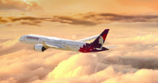
image: Hawaiian Airlines
Worth mentioning, though, is that this is the last type of plane they operate for now. Beginning in January of 2024 they will be taking delivery of 12 Boeing 787s, a plane which I love so much that it's one of the airframe features I've actually gotten around to doing. (I've been meaning to do more, but my life is hectic and posts kept getting long.) I only have this one picture to go off of, but I'm worried about the fact that the lei seems to stop even earlier on the airframe. The 787 is a beautiful plane, but it's a long plane, and this makes me worry that the rear-heaviness is going to be exacerbated on it. Maybe from a different angle the heavy wing sweep and the location of the engines could counteract this somewhat, but for now all I have to say is that I hope this very pretty livery and this very pretty plane can unite to create something very pretty, and I hope that it looks better when we get more pictures of it. (I do not yet know what their 787s will be named for.)
As I wind down my picking-apart of this livery, I keep stumbling on the glaring absence of winglet and nacelle detail. This is one of the simplest things you can do to avoid the rear-heavy look, and basically every livery benefits from it. The floral motif would be easy to translate, and the old livery even had some colored detail on the winglets, so I really don't get it. This doesn't just feel like a misstep, this feels like walking an hour to work every day and then learning on your very last day at that job that the whole time there was a bus you could have been taking.
And that's just...overall how I feel about Hawaiian Airlines. Beautiful graphics, fantastic idea, but it's like if a designer has ordered the building of a beautiful sculpture and the head of the company has ordered his employees to comply, but each one of them hates the designer and is doing all they can to sabotage him while never technically going counter to his instructions and vision. It's...it's really strange. It's hard to classify. I've kind of figured out how I give verdicts for things I think are really great executions of fundamentally insufficient concepts, but the reverse - 'great idea, generally pretty, so many bad choices' - is harder to nail down.
B-, I think.
Is this provisional or permanent? I couldn't tell you. But my reasoning is thus: this livery is one that I like, but which I think is poorly executed. A like-minus, if you will.
These grades ultimately really are something that can only mean something within the context of its own post - comparing one airline to another along their lines is going to be futile and this is not a tier list. I had intended it to function like that, but it just probably doesn't. Sorry, grading scales are difficult. I get so neurotic about grading scales. That's why I never used a numeric scale.
I mean, even these posts can be a bit misleading. This has been mostly critical despite the fact that I generally like this livery. It's the granular nature of my problems which makes up the bulk of the length. 'It's pretty' is maybe one paragraph at best. 'The details are mind-bogglingly suboptimal' is a full essay.
Their liveries are pretty. Their liveries have lovely colors and a fantastic logo in Pualani, reference their heritage, and incorporate features I've specifically pointed to before as being the sort of thing that can save liveries, but they managed to stumble so elaborately when sticking the landing that you wonder how they managed to do it - just landing on your feet would have been so much easier than doing that many ungainly tap-dancing maneuvers on your way down. None of it ruins what is still a very pretty livery, but all of it makes me look off at the horizon and faintly wonder 'why...' under my breath. I hope that in the future they wake up, take a deep breath, and realize they've built the perfect livery piecemeal all along and now all they have to do is put it together from their two most recent attempts, both of which were beautiful but far from perfect. I would even say that, with the inclusion of the lei, they have grown objectively - but they have so much further to grow.
And, to finish, I'm going to address what I know some people are probably wondering - no, I am not doing a deep dive into Pualani's identity, because Hawaiian Airlines is very upfront about what and who she is. Pualani is not exactly a real person, per se - she is a mascot, the 'flower of the sky' - but her image is based on a real person, and that real person unfortunately died mere weeks ago, as I was preparing to research this.
It was startling receiving this news as I was searching for information on the history of the Pualani logo - seeing 'is' turn to 'was' in real time. It was strange having to go back and edit my own writing to say 'was'. But maybe my timing isn't as bad as it could have been. One more tribute amid tributes - nothing special - but another voice among those celebrating the iconic face on the purple tailfins.
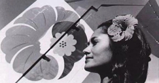
image: Miss Hawaii Organization
Leina’ala Ann Teruya Drummond, an indigenous Hawai'ian, was 1964's Miss Hawai'i and a top ten placer in 1965's Miss America competition. She had also worked for Hawaiian Airlines as a cabin crew member when she was younger, and was later chosen to be the model for the airline's new Pualani logo, which debuted in 1973. Coincidentally right after Oliver, but I do think it's just that - a coincidence - especially since the 1973 livery, including Pualani, was designed by Landor Associates, an incredibly prolific firm. She's evolved a lot since then, but she started out as Leina’ala Drummond and this has been public knowledge since the start.
Unfortunately, on 18th September 2023 Drummond succumbed to cancer, aged 77. She lived a full and exciting life, and I can't think of any better way to put it than the Miss Hawaii Organization did - her “iconic smile, elegance and grace will always be remembered”. Some of that elegance still lives on through the image on every Hawaiian Airlines plane's tailfin, which has evolved over the years but never changed at its core. May her memory be blessed, and my condolences to her loved ones.

image: Hawaiian Airlines
Even as she changes you can still see Drummond in Pualani's calm, graceful dignity. Hawaiian Airlines' branding would be a husk of itself without her, and I hope her image will grace their planes for decades to come.
#tarmac fashion week#era: 2010s#era: 2020s#grade: b-#region: north america#region: united states#hawaiian airlines#legacy carriers#landor portfolio
32 notes
·
View notes
Text


LEFTOVER SAAALES ARE OPEN!!!
last call for the Sleeping Silver artbook! I will not be doing any reprints of this, so get it while u can 🫶 there are still a few charms in stock as well, and all freebies will be included with every order until i run out! :D
🔗 suntails.bigcartel.com
#thank u all as always for the support. could NOT have done this project without u guys <3 <3 a labor of LOVE from the silver community#that sparkly eye silver is my pride and joy btw. he wants to be adopted soooo bad#for transparency's sake the stock left is as follows: 6 A grades w/charms. 4 A grades alone. 13 B grades. 2 C grades#for descriptions of what each grade means i've described it and included example photos in the shop! A is best C is lowest#twst#twisted wonderland#twst silver#yes im using his tag. i think its fair
134 notes
·
View notes
Text

THE SEMESTER IS FINALLY OVER I’M FREEEE
No more complaining about school and stress from school and art block from school!! Not for awhile anyway since I’m probably gonna take a gap year because life is crazy-
#I survived#AND WITH GOOD GRADES#I was worried I was gonna flunk my classes#BUT ALL MY GRADES ARE EITHER A OR B#Fox rambles#iterator oc#rw omop#my art
102 notes
·
View notes
Text
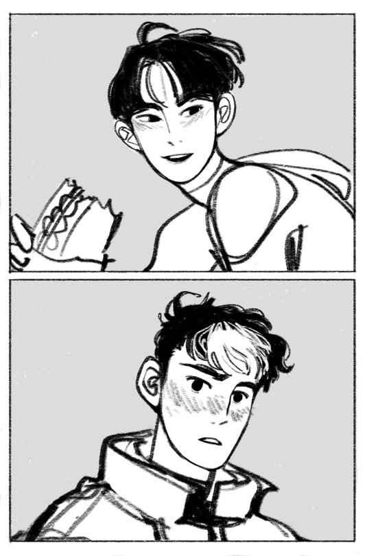
expectation...
and.... reality.

by the way, the full version, if anyone needs it

#danganronpa despair time#drdt#no obscenities#david just likes to piss xander off#david chiem#xander matthews#uhm kinda crossover with “7th Time Loop: The Villainess Enjoys a Carefree Life Married to Her Worst Enemy!”#but you really dont need to watch b-grade anime for that#i just like everything that contains time loops#and if david is somehow involved in this it becomes twice as good#THIS BRUSH FROM MAGMA.IO IS STILL SO YAMMYYY THO#xanvid
71 notes
·
View notes
Text
i made them art majors so that they can suffer too 😁

#the caption is semi-joking....i got tired of working on my projects so i drew them instead lol#kakyoin's B is actually an A++ in rohan grading scale so he can keep his honor student claims dw#dawnsies art#jjba#jojos bizarre adventure#jean pierre polnareff#noriaki kakyoin#stardust crusaders
68 notes
·
View notes
Text
Sure it's wild that Marry My Husband and Perfect Marriage Revenge have almost the exact same set up, but the vibes are waaaaaay different.
#marry my husband#perfect marriage revenge#kdrama#ones a makjang#and the other is a tropey office rom com#the villains are super different too#perfect marriage revenge had serious evil villains#Marry my husband ones are like grade b meddlers#i was obsessed with perfect marriage revenge until ep 8 and then just kinda lost interest#so i wonder how this one will go#ep 4
431 notes
·
View notes