#exhibition review
Explore tagged Tumblr posts
Visit Tumblr Blog
Explore Tumblr blogs with no restrictions, modern design and the best experience.
Last Seen Tumblr Blogs


Fun Fact
28.6 is the average number of monthly visits per US mobile user.
Text
Exhibition Review: Women in Revolt! Art and Activism in the UK 1970-1990

Anything feminist puts me instantly on guard. Feminism sells. Sure. But can't female artists be recognised for anything other than having a vagina? Female artists in Britain did not occupy the spaces of museums and galleries, their work has been safeguarded under individual mattresses and home archives. So I approached Tate Britain's exhibition with a certain scepticism, wondering if the show would be a tokenistic gesture of promoting ‘inclusivity’.
From the get-go, there is one thing obvious. There are no Guerrilla Girls. There are no Mona Lisas. Each piece, interdependent, brings dimension to all the contradictions and experiences of women at a time of significant sociopolitical change. As a result, the exhibition is messy and fatiguing; it almost tries too much at once. However, this is no sign of failure, there is a feminist, non-capitalist politics which informs the curation of the exhibition. Women in Revolt! Art and Activism in the UK 1970-1990 showcases the works of over 100 female artists who used their work to campaign for women’s rights and whose contribution to British culture has been incredibly uncredited.
Arranged chronologically, the exhibition begins with photographs taken by then-20-year-old Chandon Fraser of the First Women’s Liberation Conference that took place in Oxford. Unlike images of any male gathering, these images are intimate, women are smiling and some carrying their infants with them. These women are wives, mothers, activists and artists all carrying the burden of being a woman in each role. Maureen Scott's painting Mother and Child at Breaking Point supplies an honest reflection on being a devoted mother and at the same time, losing the sense of ‘I’. Or, Susan Hiller's "10 Months," where she documents her growing pregnant belly through photographs, along with text from her journal where she writes about being a woman artist. At the time, being a female artist and a mother were considered incompatible. These works demonstrate that while society accepts that there are good, bad, and they-went-to-buy-milk-they-said fathers, mothers are held to different standards.
The works are witty and thought provoking, for instance, Monica SJOOS referencing phallic culture with a painting of a big penis overcasting a city or Rose Finn-Kelcey's 'The Divided Self' a self-portrait of her sitting on a bench at Hyde Park, bookended, appearing on opposite sides of the bench in conversation with her 'other' self. The photograph examines the dichotomy between the person we are in private and the person we are in public.
The exhibition also recognises the influence of subcultures in their role of pushing the boundaries behind the theatrics of womanhood. In the 1980s, against London's depressive political backdrop, a bunch of working-class teenagers were determined to build their own swinging London and escape into an electric new counterculture. These kids would gather around cubs like Blitz's which made the ultimate test bed for new romantics, punks, fashion and lesbian squatters. The photographs by Jill Posner of lesbian couples inhabiting new places were a way to challenge traditional female beauty canons aimed at male arousal and defy sexual orientation attitudes. While others such as Jill Westwood’s photographs of her wearing a latex outfit or Liz Rideal’s self-portraits of her face in a photo booth as she reaches orgasm would use hyper-sexualisation as a means of declaring control over their bodies and acknowledging their sexual self.
It becomes evident that women produced work on the fringes of the art industry, creating their magazines, putting shows at alternative venues and sustaining their work through collaboration. The postal art project supported by Monica Ross and Su Richardson is an example of the networks women built to disseminate their work. These works included in the exhibition are small-scale pieces of artwork using DIY techniques that women would produce on kitchen counters with random items found in the house. These collectibles were mailed between women creating documentation of their experiences. Forms of low-status art became a significant medium of feminist art, which is a direct reflection of women's precarious material conditions at the time.
The exhibition does not focus on a universal experience of women, each room has the function to provide a new layer to the narrative of feminism activism in Britain. Marlene Smiths' “My mother opens the door at 7 am. She is not bulletproof” a portrait of Dorothy Cherry Grace who was shot at her home in Brixton documents the BLK Art Group's contribution to feminist activism and racism in Britain.
Turning our view back to the present, what does it all mean? Perhaps this is the most important. One cannot stop themselves from making connections between women’s rights then and now. Abortion is being criminalised in my countries disowning women from their bodies, women are still inflicted between becoming a mother and pursuing their careers, walking alone at night is still dangerous, and social media algorithms have taken a role in exposing young minds to figures such as Andrew Tate and their “toxic masculinity” content. But at the same time, I wouldn’t want to live anywhere else in time but now.
I’ve confessed to myself that I am not a feminist of my time, as a young woman I’ve become weary of the term. Women In Revolt has put into question why I refuse to recognise this history of my gender when it means everything I take for granted now. Despite my initial judgements, this exhibition is a revelation.
#feminism#art#art exhibition#tate britain#archive of women artists#female artists#british art#exhibition review
3 notes
·
View notes
Text
ReMark Exhibition Review
I feel a lot of rage about the obvious class divide in art. It is, as a medium, one of the most expensive hobbies to peruse, and most interestingly, is often condemned as ‘not a real career, pick something more stable’ by lower-class parents. They are not wrong, an arts career comes with its risks as well as its rewards (though mostly risks), and it is a struggle to get into. Public transport costs, fuel costs, and the costs of eating and merchandise for a trip to gallery all add up, and not everyone can afford them. Then, of course, there is also the issue of children. The inaccessibility of art fuels most of my rage, which is why when I come across an exhibition placed in a shopping centre, such as Chester’s Grosvenor Shopping Centre, I smile, because people are going to be there anyway.

The ReMark exhibit is an exhibition that centres ‘four acclaimed artists from the north-west’, Terry Duffy, Julie Saul, Julie Mayer, and Anne Byrne. It is good to see an exhibition in the north-west focusing on artists from the north-west instead of proving many fears of art being unstable by utilising the (very talented) artists from the south. It promotes, the north-western children who go and see it, that a career in the arts is possible. It is a refreshing reminder that people can be successful as an artist, and not have to move themselves to London (or one of the many numerous places down south) to be so. It is nice to see that, at a time when, for the past several years, the future of the arts has been hotly debated and funding decreased, the curators are reaching out to people who are artists from the same area as the people traveling to view the exhibit are. It helps foster a sense of community, one that has been severally lacking since the pandemic.
The paintings and pieces of art themselves are displayed in ‘The Large White Cube’, the standard setting for art displays which helps the viewer become disconnected from the outside world, though this falls slightly flat here. The old shopping unit that the exhibit is in does not have any doors, so it is rather difficult for The Large White Cube to take effect, and you are instead left with, on one side, a piece of art, and on the other, a screaming child in Costa. Is this to say that the exhibit as a whole is bad? No, not at all. It can be apricated for its efforts of bringing together a community at a time when such bonds are found lacking, but you are left, when faced with Duffy’s MONUMENTS-Revisted and their almost geode-like appearance, if this is the best the curators can think to do with this space? It would be different if, perhaps, the unit had doors on it, even if they were glass, or there was some kind of music playing to drown out the rest of the noise of the shopping centre.


Though the exhibit is not all paintings on a wall. Rather cleverly, knowing that this exhibit would be taking place in a shopping centre where lots of children would be, they provide the chance to make your own mark. Two massive sheets of canvas hang in the corner along with several buckets of coloured chalk (chunky, so they are easy for children to hold), child-size tables and chairs, and several blank notebooks. This gives the patrons (children or not) a chance to make art by themselves, and it is the most beautiful piece in the exhibit. The pieces of art made by the many footsteps display many languages, drawings, names, references and jokes that are understood only to a few people, as they are then covered by the next round of languages, drawings, names, references and jokes, and they are then covered by the next round, and so on and so forth. Flipping b through the books you will find numerous amounts of drawings of many abilities, and words of a similar nature. Many children who have just learnt to write their names will have scrawled them messily in the books with their favourite coloured chalk, messages of hope and unity, and several very worthy art pieces.


ReMark is open until the 7th of March at Chester Grosvener Shopping Centre.
Words: 730
#art review#exhibition review#the large white cube as a concept is interesting but it is not utilised correctly often in this essay i will-
1 note
·
View note
Text
Rising Star Amy Bravo Sold Out Her New Solo Show. What’s Behind Her ‘Grandma’s House’ Art Installation? https://news.artnet.com/art-world/amy-bravo-swivel-gallery-2541243
#Amy Bravo.New York.#article#exhibition review#solo show#artnet#swivel gallery#unstretched canvas#installation#'Grandma's House
0 notes
Text
Gallery Visit - AGNSW
‘‘TEN THOUSAND SUN’’


Cultural multiplicities
First Nations understandings
Celebrates carnival
Rallying against oppression and dehumanisation


This is one of my favorite work among this whole exhibition!
Combination of video and installation
Expanded field
History & heritage
Body
Tangled past
Colonial, aboriginal history
1 note
·
View note
Text
EVA EXHIBITION REVIEW !!!
soft 5/10
Let me preface by mentioning that we went on a Tuesday. That brought the score down a lot. About five venues were open (One of them contained a single poster). But I'm going to focus mainly on the Limerick City Gallery of Art.
It was a slight disappointment, frankly. There was amazing art on display within, some really striking stuff, and kudos to each artist whose work was chosen for display, but it seemed like it was set up a day before opening, and didn't exactly strike me as an international-level event.
Photos were tacked up like posters in a teenage bedroom. Shadows seeped out from underneath, distracting any viewer from the immersive experience that could have been achieved. It's Lala Meredith-Vula's Haystacks series that I'm mainly referring to. I was enamoured by the work, it reminded me of the haystacks I would see driving through the Romanian countryside on my holidays, it had enough imagery to allow a viewer to add narrative, and question the events within. And yet, all I could see were the jarring buckled shadows underneath the asymmetrically displayed images.
Seóidín O'Sullivan's ongoing research project, Crex crex, crex crex, crex..., really bewildered me and a few others I was with. Beautiful old coins embossed with the corncrake showed her inspiration on a wall whereby a viewer would have their back to the large main piece, rendering everything quite disjointed and unconnected, and harder to picture interacting. Her research images seemed haphazardly tacked onto MDF board screwed into the walls. I left quite confused and underwhelmed by the unfinished nature of the display.
Her beautiful textile work, illustrated with deep blue corncrake postage stamps, draped over a hay-bale whose scent would transport any viewer out to the Irish springtime countryside, was labelled and described, but across the room. I went over to the work and examined it, only to have to pace back and see what it was actually called. This was a repeated issue. The gallery had its artwork labels in weird places that weren't conducive to someone's movement through the space. I would walk in to a room, have to turn back, read a label around the corner, look back at the art, and figure out if I was reading the right thing. It gets really annoying when all you want to do is understand an artist's idea and concept and be submerged in the work. It felt as though the technicians didn't know much about gallery operations at all.
Orla Barry's video installation was in the middle of the first main atrium of the gallery. I don't know anyone who would actively enjoy standing in everyone's way with a pair of headphones, staring at words scrolling across a screen. I tried to watch the video, but couldn't focus for the discomfort of standing in the middle of a gallery pathway.
Rosalind Fowler's video was more intimately set up, more comfortable to sit and watch in private, but the sound was neglected. A tiny speaker accompanied the projector showing the work. It was almost like the piece was afraid to intrude on the gallery environment and adjoining café. This could have been intentional, but I didn't find it very effective. One of my favourite things at the Venice Biennale was the booming, unapologetic noise that you would here from whatever room awaited you, and the excitement of discovering where it was coming from. Not the case here. In fact, I almost missed the video completely. I was just curious enough to look around the inconspicuous curtain and find a quiet video rolling therein.
Unfortunately, I did not have time to go out to UL, where the work might have had a more thought-out display, but for such a small biennial, I don't understand why the work would be spread out around the town. It's not the Venice Biennale and I think it's wrong for it to try to be, at least physically. It felt like each individual venue provided nothing much at all, other than Rachel Fallon and Alice Maher's monumental tapestry (whose display I quite enjoyed), whereas having the works in fewer, larger spaces would have had a much more immersive, lasting impact.
It's just such a shame because I know it could have been wonderful. The art itself was fantastic - again, from what I could see of the few open venues - but the execution of the exhibitions was less than impressive, and brought my experience down significantly.
0 notes
Text


👽🤡☠️💀
#halloween#horror#terror#art exhibition#artists on tumblr#cine#movie#movies#october#movie review#moviegifs#michael myers#jason voorhees#the tingler#80s#90s#retro#vintage#fondo de pantalla#classic rock#hard rock#rock#the texas chainsaw massacre#junji ito#payaso#the shining#70s#tbt#niñez
2K notes
·
View notes
Text


CLAMP Exhibition Official Art Book COLOR KURO
Watch the video below for the flipthrough review. If you like the artbook, please support the artist by buying a copy ^_^
youtube
#artbookie#artbook review#illustration#pixiv#japanese artbook#artists on pixiv#gugeli#manga#illustration book#flip through#source: pixiv#mai yoneyama#acky bright#oh great#ogure ito#yoh yoshinari#artbook#art books#illustration 2024#old xian#19 days#manhua#yaoi#clamp illustrations#clamp#CLAMP EXHIBITION#Youtube
204 notes
·
View notes
Text
leo “perchance” valdez and frank “you can’t just say perchance” zhang have a very underrated dynamic in my humble opinion
#leo would genuinely write ‘mario exhibits experience by crushing turts all day’ in his essay and force frank to peer review it#phil jamesson a leo variant fr#riordanverse#incorrect riordanverse#rick riordan#hoo#heroes of olympus#leo valdez#frank zhang#rewriting
806 notes
·
View notes
Text

Piet Zwart: Typotekt, Designed by Wim Crouwel and Otto Treumann, Stedelijk Museum Amsterdam, 1961 [Design Reviewed, Bradford. Flat & Bound, Integral Lars Müller GmbH, Zürich]

Exhibition: January 20 – February 20, 1961
#graphic design#typography#art#exhibition#catalogue#catalog#cover#piet zwart#wim crouwel#otto treumann#stedelijk museum amsterdam#design reviewed#flat & bound#1960s
47 notes
·
View notes
Text
I dropped in on the de Young's fashion exhibition a few weeks ago, and finally wrote up my thoughts. Tl;dr: mixed feelings.
#would I be nicer if they'd interviewed me for the assistant fashion curator position?#maybe!#fashion history#historical fashion#museum#exhibition#review
115 notes
·
View notes
Text
sorry to be a bit of a hater but i do wish youtubers weren't so scared of making their videos just like, "reviews", whys everything gotta be a "video essay" all the time. every day my recommendations are filled with 40 minute videos titled "_____: An Underrated Masterpiece" where the first like five minutes are reading the wikipedia definition of "masterpiece" in a somber voice with dramatic themed text on screen. please just tell me how good or bad you think something is and use the rest of the runtime to explain why. you dont need to put on all these airs
#i know the ahem. channel. of some awe....... that whole situation kind of scared people off from using the word review#but like we live in the future now. you can make a review. i believe in you#AND LIKE i like a good video essay!! but im picky. because i read academic shit for fun#when i see a capital E essay im expecting theses. im expecting sub headers. im expecting multiple examples AND footnotes with asides#(and i know this is a controversial topic but i do expect them to be long. because if you read aloud a 4 page journal article its gonna)#(take a bit of time LOL maybe i just read too much academia shit. but i dunno man. theres not a lot you can say about like a big huge)#(topic with multiple angles if you only have like 10 minutes. maybe i just talk too slow. i need to breath <3 )#theres other formats too. surveys. retrospectives. informative essays. persuasive essays. etc#and like i also read lots of reviews not just of like movies and books but of like gallery exhibitions and shit!! they can be extremely#interesting a lot of work and some really beautiful writing!! nothing wrong with a review!!! theyre important#but i do get annoyed with like. the odd air of pretention i see in a lot of video essays. especially cause its usually not backed up by#the content. i dont care for those airs in academia either. nor do i like it in documentaries#just talk naturally. you'll find your voice. there might be pretention in it in the end but it'll be yours#if im making sense. i hear a lot of people talking in a pretention that is not their own. something they put on because thats what they#think they should do. you need to find your own pretention. be pretentious in a way that feels natural to youuuuuu#hell im being pretentious. about this LOL but like its my own. it is a pretentiousness ive built over the past half decade#play around. write a blog. i dunno. find your voice dear youtubers. find your voice
141 notes
·
View notes
Text


A review of the Southern Photography exhibit at the Figge Art Museum.
#own post#Filofax#review pages#commonplace book#commonplace journal#art museum#photography exhibition#inserts by kas
53 notes
·
View notes
Text
Gallery visit
(The work cannot be recorded, but it can be taken as non-commercial used photos)
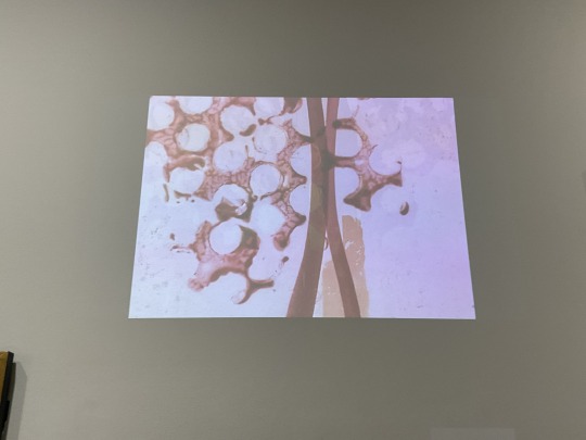
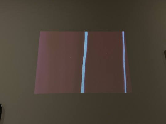
I went to AGNSW to see part of the Biennale of Sydney exhibition and I accidentally found Len Lye's work, but I found that it was not as good as the effect I saw on Youtube.
I think this is the influence of the exhibition medium, which made me decide that I will not put the work too small but to show a more macro world.
But the sound design is absolutely beautiful…
0 notes
Text

Danny Brown- Atrocity Exhibition


hello phannie PHUCKING nation! everyone’s favourite series is BACK BABY!
its time for another kate rates dans favourite albums! Today we are listening to Atrocity Exhibition by Danny Brown
Initial thoughts?
This is a funnnnn and exciting one! Danny Brown has been someone I've been wanting to get into more, I'm not totally clued up on danny brown but he feels like someone I will really enjoy bc this seems soooo up my street. Ive defo heard some songs before but this is not my area of expertise!
Is this a first time full album listen through?
NO ITS FUCKING NOT. I listened and reviewed this album last year when i was originally doing this series. I wrote a full (really good) review, scheduled it to post and tumblr just fucking DELETED IT 😭😭😭😭!!! SO. we are going a re listen :) anyway. lets get listening bitches
Listen through:
•downward spiral is a perfect introduction to the album. the soundscape is haunting and literally makes you feel like you are falling into that downward spiral. song-omatepia? (also nine inch nails reference!)
• it’s weird to me that i haven’t actually listened to much of danny brown, it feels like it would be sooo up my alley
• obsessed with the instrumentals in the second track tell me what i don’t know danny brown is a master at conveying emotions through the mixture of sounds
• danny browns voice reminds me SO much of andre 3000 (specifically like stankonia era outkast andre)
•sexy basslines make me horny and there is an abundance throughout this album
• really doe is defo the highlight of the album so far. kendrick feature always make every song 10x better and EARLLLLL!!
• this is a veryyyyy sexy album :3
• ain’t it funny is fucking FANTASTIC!!!! what a bouncy brilliant track. the beat is absolutely next level
• omg how have i literally JUST realised that ‘atrocity exhibition’ is a joy division reference!
• this album STILL feels fresh, even though it came out nearly 10 years ago. so funky!
• REALLy like really enjoying the instrumentals on these tracks. such an interesting mixture of jazzy, punky and hip hop influences. i’m such a slut for rap that doesn’t just use the same shite reused trap beat and has an interesting and unique perspective sound wise. danny brown is a fucking master at this.
• white lines sounds like ur brain on cocaine lol - the album feels and sounds like that descent into drug fueled madness, chasing that high and running from a comedown
•the ominous piano and erratic electronica of pneumonia make listening an EXPERIENCE, it’s wild but fun as fuck (feels slightly death gripsy to me!!) “lick the clit and she did the macarena” is a fucking insane bar im crying
• love the complete switch up to dance in the water!! this album keeps you on your toes and requires an immersive listening experience
• from the ground with kelela feels soupy and sludgey and sexy and sensual! what a voice she has!!
•this is absolutely my favourite type of hip hop. fun, experimental and insane
•mate the production on this album is just fantastic - it feels SO post punk inspired 🤩🤩🤩
•need to hear when it rain mixed into a sexy techno set literally as soon as possible
Favourite song(s)?
really doe, ain’t it funny, pneumonia
Least favourite song?
probably ‘today’ it’s not bad AT all. just everything else is so banging
Would i listen again?
fuck YES! i don’t remember enjoying it this much on the first listen i did a few months ago. such a fun, engaging album that truly takes you on a journey, the PRODUCTION is fabulous!!!!!
Do i recommend?
✅✅✅✅ yes! can’t wait to listen to more
What would I rank it out of 10?
9/10
guysssss ive missed doing these! i hope you've missed them too because they are coming back FULL FORCE! see u tomorrow for another one!
read my 2015 reviews here
read the rest of the my 2016 reviews here
listen to the playlist of highlights from dans favourite albums here
#dan album review: 2016#dan album review#kate zinphandels dan howell album of the year review and rating#atrocity exhibition#danny brown#dan and phil#phan#dnp#dan howell#phil lester#amazing phil
21 notes
·
View notes
Text
La nostalgia va a acabar conmigo
Arte oficial de Kishou Arima🩷


[ ᴛᴏᴅᴀs ʟᴀs ɪʟᴜsᴛʀᴀᴄɪᴏɴᴇs sᴏɴ ᴅᴇ sᴜɪ ɪsʜɪᴅᴀ]
#arima kishou#ken kaneki#tokyo ghoul re#tokyo ghoul fanart#sui ishida#art exhibition#artedigital#artwork#manga review#nostalgic#anime edit#anime manga#icon boys#anime#anime art#girls icons#rize kamishiro#touka kirishima
24 notes
·
View notes
Text


CLAMP Exhibition Official Art Book COLOR SHIRO Watch the video below for the flipthrough review. If you like the artbook, please support the artist by buying a copy ^_^
youtube
#artbookie#artbook review#illustration#pixiv#japanese artbook#artists on pixiv#gugeli#manga#illustration book#flip through#source: pixiv#mai yoneyama#acky bright#oh great#ogure ito#yoh yoshinari#artbook#art books#illustration 2024#old xian#19 days#manhua#yaoi#clamp illustrations#clamp#CLAMP EXHIBITION#Youtube
179 notes
·
View notes