#emblems manufacturer
Explore tagged Tumblr posts
Visit Tumblr Blog
Explore Tumblr blogs with no restrictions, modern design and the best experience.
Last Seen Tumblr Blogs


Fun Fact
Tumblr was the first site to host the blog for President Barack Obama in 2011.
Text
Top-Quality Emblems Manufacturer in India
Metalic Impressions is a leading manufacturer of top-quality emblems manufacturer in India, known for precision craftsmanship and durability. Whether for automobiles, machinery, or custom projects, we deliver emblems that stand out and last. Looking for high-quality designs that make an impact? Get in touch with Metalic Impressions today and elevate your brand with superior emblems!

0 notes
Text
Reeve spreading misinfo and building a little cat on company time
They simply dont make video game men like this anymore
#ok sometimes they do i just wanted him to feel special#they manufacture these Some Guys in the Fire Emblem Assembly Line all the time actually come to think of it
14 notes
·
View notes
Text
The Ashok Stambh: Symbol of Power, Peace, and Pride

India, a land of rich cultural heritage and timeless history, holds many treasures that reflect the values and principles of its civilization. Among these treasures, the Ashok Stambh stands tall, a symbol of power, peace, and pride that resonates deeply with the spirit of the nation. This iconic structure not only represents the glorious era of Emperor Ashoka but also serves as an enduring reminder of India’s ideals of non-violence, justice, and unity.
The Historical Origins of Ashok Stambh
The Ashok Stambh, often referred to as the Lion Capital of Ashoka, is one of the most celebrated symbols of ancient Indian architecture and governance. This magnificent pillar was erected during the reign of Emperor Ashoka, one of India’s greatest rulers, who ruled from 268 to 232 BCE. Ashoka, after embracing Buddhism following the gruesome Kalinga War, dedicated his life to spreading the message of peace and dharma (righteousness).
The Ashok Stambh is a testament to this transformation. Carved out of a single block of polished sandstone, these pillars were inscribed with edicts that conveyed messages of moral conduct, religious tolerance, and social welfare. The most famous among these is the pillar found in Sarnath, Uttar Pradesh, which features four majestic lions standing back-to-back on a circular abacus adorned with intricate carvings of animals and a lotus.
The Symbolism of the Ashok Stambh
The Ashok Stambh is more than just an architectural marvel; it is a symbol steeped in profound meaning. The four lions atop the pillar represent courage, confidence, and strength, while the circular abacus signifies eternal truth and harmony. The carvings of animals such as the elephant, horse, bull, and lion are believed to symbolize different stages of Buddha’s life and convey messages of enlightenment, energy, and perseverance.
The lotus, upon which the lions rest, represents purity and the rise of spirituality amidst life’s adversities. Together, these elements encapsulate India’s ethos and its commitment to upholding values that transcend time and geography.
The Ashok Stambh and Its National Significance
In 1950, when India adopted its Constitution, the Ashok Stambh was chosen as the national emblem, a decision that underscored its significance as a unifying symbol for the newly independent nation. The emblem features the four lions, with only three visible in a two-dimensional view, and the base is inscribed with the words “Satyameva Jayate” (“Truth Alone Triumphs”) in Devanagari script. This powerful phrase, derived from the ancient Indian scripture Mundaka Upanishad, inspires Indians to uphold truth and justice in all aspects of life.
The emblem is prominently displayed on official documents, currency, and the Indian passport, serving as a constant reminder of the principles upon which the nation was built. The Ashok Stambh’s adoption as the national emblem was a declaration of India’s commitment to values of tolerance, equality, and peaceful coexistence.
Ashok Stambh in Modern Times
In contemporary India, the Ashok Stambh remains a source of inspiration and pride. Its presence in government institutions and on the Indian flag underscores its enduring relevance. While the Ashok Stambh symbolizes power and authority, it also emphasizes the importance of governance rooted in compassion and morality.

For many, the Ashok Stambh represents the essence of India’s journey from ancient glory to modern democracy. It reminds every Indian citizen of the responsibility to uphold the principles of truth, justice, and unity that have been integral to the nation’s identity.
Lessons from the Ashok Stambh
The Ashok Stambh’s message is timeless, offering valuable lessons for individuals and leaders alike:
Non-Violence and Compassion: Ashoka’s transformation from a conqueror to a messenger of peace serves as a profound lesson in the power of compassion. The Ashok Stambh inspires us to resolve conflicts through dialogue and understanding rather than aggression.
Unity in Diversity: The intricate carvings on the Ashok Stambh reflect India’s cultural and spiritual diversity. They remind us of the importance of respecting different perspectives and fostering unity amidst diversity.
Moral Leadership: The inscriptions on the Ashok Stambh highlight the importance of governance based on ethics and accountability. In today’s world, where leadership is often tested, the pillar’s teachings are more relevant than ever.
Manufacturing Patriotism
The Ashok Stambh’s influence extends beyond its symbolic meaning. It has inspired artisans, architects, and even manufacturers who incorporate its design into various products that celebrate India’s heritage. Among these, the production of items like miniature Ashok Stambh replicas and other patriotic memorabilia has gained popularity, especially for use in offices, schools, and public spaces.
Moreover, industries like the Indian flag manufacturer sector draw inspiration from symbols like the Ashok Stambh to create products that evoke national pride. These symbols serve as a unifying force, reminding citizens of their shared heritage and aspirations.
Celebrating the Ashok Stambh
From schools to government offices, the Ashok Stambh is celebrated as a representation of India’s core values. Educational institutions often include lessons on its history and significance in their curricula, ensuring that younger generations understand and appreciate their cultural heritage.
The pillar’s imagery is also frequently used during national celebrations like Republic Day and Independence Day. It adorns parade floats, decorations, and even postage stamps, reinforcing its importance as a symbol of India’s identity and aspirations.
Conclusion
The Ashok Stambh stands as a timeless beacon of India’s values, bridging the past and the present. It represents the strength and resilience of a nation that has weathered countless challenges and emerged stronger, guided by principles of peace, justice, and unity. For every Indian, the Ashok Stambh is more than just a historical artifact; it is a source of inspiration and a reminder of the responsibilities that come with being part of this great nation.
As we continue to celebrate the Ashok Stambh, let us carry forward its message of harmony, courage, and truth. In a world often divided by differences, the Ashok Stambh reminds us of the power of unity and the importance of striving for a better, more inclusive future for all. Let it inspire us to build a nation that truly embodies the ideals of power, peace, and pride.
#ashok stambh#indian flag manufacturer#wooden ashok stambh#ashok stambh pen stand#emblem ashok stambh
1 note
·
View note
Text
Sample acrylic keychain of Byleth~
It's a full bleed acrylic keychain. Byleth looks like he popped out from the screen hehe. The size is almost 4 inches, a bit bigger than what I expected but that's on me😂


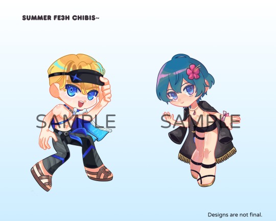
Drew summer chibi Dimitri and Byleth some time go and just finished them last month~ I already ordered sample acrylic keychains and standees and they're coming soon. I'll share when I can.
Planning to make more summer 3H chibis when I can hehe.
#he's a free keychain that I ordered from a manufacturer hehe#for personal keeping#unless we get an official summer alt. for beleto/mbyleth next year i will redesign him#byleth eisner#mbyleth#m!byleth#fire emblem three houses#fe3h
29 notes
·
View notes
Text
Sea Cryptic! Danny AU- Pt.4
[Pt.1] [Pt.2] [Pt.3] [Pt.5] [Pt.6] [Pt.7] [Pt.8] [Pt.9] [Pt.10]
Danny was sitting in the back, his backpack obnoxiously taking up the seat next to him, when the door to the lecture hall creaked open near silently.
“What are you in here for?” Danny asked the guy who crept into class. He sympathetically took his backpack off the Seat of Shame and allowed the guy to sit down. Funnily enough, they had the same hair and eye color.
“Gen Ed. Undecided. You?” The guy grunted quietly back.
“Environmental studies. I’m Danny.”
“Tim.”
With the implicit understanding of two people in a required class they could not give less than two fucks about, Tim and Danny tuned back into the lecture. When the class was assigned group work, Danny looked over to see Tim softly snoring, head slammed down on the table.
“Tim. Wake up, dude.” Danny poked his shoulder.
“Huh? Class over?”
“Nah, we got group work. Discussion board.”
“Oh shit, thanks for waking me up. Wanna team up?”
Danny shrugged. “Sure. We should aim to post it in the middle so the professor doesn’t read our answers to the class.”
“Yeah, sounds like a good idea. Any idea what we’re talking about?”
“Kind of?”
“Good enough for me.”
——
Tim Drake kept seeing Danny Fenton around on campus.
“Danny! Dude, what are you doing?”
Danny turned, gloved hands full of crumpled trash. “Picking up after the student population, apparently.”
“Didn’t think environmental studies was that serious.”
“Global warming is very serious, you jerk,” Danny smirked at him, crossing the grass to put the trash into the trash can. “Reduce, reuse, oil shouldn’t be spilled in water and all that.”
“Basic stuff,” Tim grinned. Nice, he basically had a friend past Bernard now!
They were friends, right?
“And yet humanity fails to comprehend it. Incredible. Incredibly stupid that is.”
“They get it. Major corporations just don’t care.”
Danny sighed. “True that. You on your way to your next class?” He took off his biodegradable gloves off (nitrile and nylon, baby!) and chucked them into the trash.
“I’ve got free time, actually. Prof cancelled for his daughter’s surgery.”
“Oh, shit, that’s rough! You wanna go downtown and join the strike?”
“A strike? What for?” Even as he asked, Tim hiked his bag higher onto his shoulder, ready to go. They fell into step as the two left campus.
“Apparently, Quillan Pharma was doing some shady shit at their manufacturing plants. I think it’s like killing kids, and pouring toxins into the ground.”
“Oh, shit.”
“Yeah. Oh! Poison Ivy’s gonna be there!”
Tim blinked. He casted a sideways look at Danny. Sure he’s been here long enough to know… but it couldn’t hurt to check. “You know she’s an eco-terrorist, right?”
“Okay, but like… people suck sometimes. And all she’s asking for is like don’t kill the planet. And she doesn’t do that whole mind control thing too much anymore! The Sirens are so cool. Plus, one of my best friends at home might actually kill me if I don’t try to get her autograph. Poison Ivy is like, Sam’s personal hero.”
Tim snickered. “Yeah, okay. Mind if one of my friends join? His name’s Bernard.”
“The more the merrier,” Danny nodded. “Ooo! Hot chocolate. Want some?”
Danny bought three drinks as Tim trailed behind, texting Bernard.
“He said yes.”
“Cool! We should meet up somewhere before the drinks get cold.”
Well, Danny got the autograph. Tim got a new friend, and Bernard got a drink from his crush.
——
“Oh, you’re the glowing dude that Batman always talks about!”
Danny blinked, eyes scanning the wing-like cape and the yellow emblem on the hero’s suit. Danny was indeed glowing, stars and nebulas freckling across neon green skin, and glowing hair the color of a white dwarf star, tinged with the blue from his ice core.
“I… have absolutely no idea who you are,” Danny lied, like a liar. He’s found a surprising niche of entertainment in messing with the local vigilantes and he’ll be damned if he missed this opportunity.
He heard a snicker from the comm lines as Red Robin visibly brushes it off.
“I’m Red Robin. Why are you picking up trash?”
“Picking up after you humans, apparently.”
The both of them blink, feeling a weird sense of déjà vu. A moment of awkward silence passed before they both shook it off.
“Are you here to help? No offense, but the track record for you people is terrible.” Danny strode over and grabbed a bag. He opened it, and shook it at Red Robin’s face. “See? Batarangs, these odd bird looking ones, the R’s. Seriously, pick up after yourselves!”
“Oh, woah, can we have these back?”
Danny yanked the bag back before Red Robin could get close. “Pay me. These were incredibly tedious to pick up. Especially the batarangs. I mean, I even found a whole bunch of old rusted ones in the middle of the bay. What did you do, dump an entire bag in there from the air?”
Red Robin sighed and took out a wad of cash, with tracking fluid all over it. Danny grimaced, smelling the odd scent on the money. “That’s not real cash. It smells off. Are you trying to give me counterfeits because you’re broke?”
Red Robin gaped, oddly offended. “No! They’re real!”
“Doesn’t smell like it. It’s stinkier than the trash. Go get the one with the money, the litterer. Tell him I’ll be back the next full moon. I don’t want to talk to you anymore.” Danny grumbled, disappearing on the spot to watch Red Robin flounder with the stack of cash and the piles of dead bodies on the shore.
“What the fuck even is my life these days?” Red Robin wondered out loud, stuffing the cash back into his pocket. He looked over the plastic wrapped bodies and slumped, sighing.
Oddly enough, Danny felt a sense of sympathy. Well, he’s not getting paid for sympathy. He’s not getting paid at all tonight, actually. Danny flew off, plunging once more into the depths of the significantly cleaner waters, and used his ice to scoop out oil stains.
Danny glanced around and sighed. He had a lot of work to do.
——
“So you’re saying he’s like a werewolf mermaid fae child immortal god thing, right?”
Bruce grunted.
“B, what the hell are you smoking these days? You know drugs are bad, right? Do we need Superman to give you that PSA?” Jason snickered.
Tim, massaging his arms from having to haul an ungodly amount of dead bodies, grunted. He’s so similar to Bruce that it gave the people currently in the cave hives.
“He said full moon. I don’t think we can track him with regular stuff. The bugs kept shorting out.”
“Oh boy,” Dick sighed. “Don’t fall off the spiral cliff, Tim. You’ve got midterms to think about so no stalking the guy.”
“Yet,” Tim shot back, changing out of his suit.
Bruce grunted, setting aside a huge stack of cash.
#let Tim Drake go to college you cowards#he got his GED in this one boys#let Tim fucking age#danny phantom#batman#tim drake#dc x dp#dcxdp#dpxdc#danny the tired college student#bamf danny phantom#siren au???#sea cryptic Danny#bro I had war flashbacks to discussion board group work#terrible why do I do this to myself#the batarangs in the middle of the bay was from when Bruce tried to kill the joker and himself#Danny: people just can’t clean up after themselves these days#sea cryptic! danny au
4K notes
·
View notes
Text

1972 Hurst/Olds
How about some interesting facts about 1972 Oldsmobile Hurst:
Indy Pace Car: The 1972 Hurst/Olds was the official pace car for the Indianapolis 500. Hurst Performance stepped in to sponsor the pace car after major auto manufacturers were reluctant to provide one due to a tragic accident involving the 1971 Dodge Challenger.
Performance: It featured a 455 cubic inch (7.5-liter) V8 engine producing around 300 horsepower. The engine was paired with a 3-speed Turbo-Hydramatic 400 transmission and Hurst Dual-Gate shifter.
Exterior Design: The car had a unique Firefrost gold on white paint scheme, black pinstripes, and chrome accents. It also featured a functional hood scoop and rear spoiler for improved performance.
Interior: The interior was luxuriously appointed with black leather upholstery, wood trim, and special H/O emblems. The car also had power windows and climate control for added comfort.
Limited Production: Only 3,508 units of the 1972 Hurst/Olds were produced, making it a rare and sought-after model among collectors.
#Hurst/Olds#hurst#oldsmobile#Olds#car#cars#muscle car#american muscle#Indy Pace Car#indianapolis 500
180 notes
·
View notes
Text
Downtimes, module editor, water temple
Happy summer! There's smoke in Portland but it's not too bad. Bless firefighters. Work on Lancer Tactics continues apace.
This month has been mostly focused on the largest heretofore-untouched section of the game: downtimes and the module editor for designing the sequences between combats. We're not planning on doing anything particularly innovative or new in its design — if you've played Banner Saga, Fire Emblem (gameboy versions), or Rogue Squadron you'll recognize what's going on here.

Repair, level up, have visual-novel-style conversations with companions, do some light choose-your-own-adventuring, and pick & launch the next combat. All pretty standard downtime fare — games have pretty thoroughly explored these patterns as vehicles for narrative at this point.

The unique thing that Lancer Tactics is offering on this front is an editor to make your own entire campaigns. Classic games like Warcraft or Age of Empires had incredible scenario editors, but making anything more than a one-mission map was solely the domain of modders. Over the last few weeks, we've gotten a full basically-visual-novel-editor working ingame where you can orchestrate NPC story arcs, clocks ticking, branching paths, and triggered events for all the stuff that happens between combats.


All of the campaigns we ship with the game are going to be made with these same editors, which'll force us to really make sure that they're solid tools. I think it'd be very funny to someday see someone like completely ignore all the mech stuff and just make a visual novel in this engine.
There's no new preview game build this month because adding this big section of the game means too many things are under construction. I'm happy with how fast we've been able to get this going, but making ingame editors is a lot of unglamorous UI piping and data refactoring work. Fingers crossed that it'll come together enough that we'll be able to get the first version of this editor in your hands in time for the next update
Other Changelogs
Carpenter has started re-making the tutorial level from the demo in this new engine, which is pushing us to add a bunch of stuff to the combat editor. I added triggers for playing arbitrary effects on the map, moving the camera, storing arbitrary data to the battle/module states, enabling/disabling/triggering other triggers, AND/OR conditions, and putting execution limits on triggers.

Triggers can highlight UI or actions (so it can be like "use the boost to get through!" and the boost button becomes all shiny)

New "camera start" zone type
Added a "hotspot" zone type that has a little floating title, and plastered the names of other zones on the map (visual style stolen from some Foundry VTT modules)

Added water, whose level can be set via the editor or triggers.


Added unmounted pilots who can mount up into Shut Down mechs. We continue to plan to not have pilot combat be a part of the core game, but it'll be useful for scenario or scripted sequences.

Added activation pips and template icons to the mini healthbar on units.

A bunch more portrait editor assets from Martina, including facial hair. Here's a check Carpenter did where he tried to recreate some official Lancer art ingame. ✨

Schedule update
Taking a look at our original date for the "bones" of the game ("finishing the battle engine, basic character creation, 2 mechs per manufacturer, and an a 'instant action' mode"), we estimated being able to get it done by the end of November. The emotional milestone for me on this front is getting the game to a complete enough state that I feel OK about swapping it in on the itch.io page.
I've been saying that the 3D cataclysm has pushed us back back about 3 months, and I think that's still holding true. Carpenter and I haven't officially made the call yet, but I think it's likely we'll need that time to port more mech content; here's a graph they made that shows about where we're sitting on the PC and NPC mechs for the "bones" target in terms of mechanics and action icon/sprite.

(This data is pulled from a big table they made that includes ALL talents/gear/traits where we've been marking things off as we've implemented them. Very handy for tracking where we are.)

That's all for now. Tata!
80 notes
·
View notes
Note
Cyrvo sneaks around the big lot full of trucks as it downpours and spots a big one with a cool paint job. "Now that's a hell of a ride..." She mumbles to herself, pulling her hood to better cover her face as she reaches to test the locks, opening the door and climbing right on in. From the outside it could easily look like a lost kid just trying to get out of the rain. Once she's in the truck she inspects the dashboard, grinning to herself. "Well ain't I lucky... It's all modern." She pulls an old woven glove off her right hand, odd markings that look like servos and circuits on a motherboard glow blue, and she starts to reach for the dashboard
“Now, what do you think you’re doing?” A man’s deep voice coming from the gps asked. Suddenly the truck’s engine turned over and on the steering wheel, instead of a manufacturer’s logo, there was a strange emblem.
313 notes
·
View notes
Text
WING EMBLEM Ita Bag Collection Update Thread! 🧵

I've been getting a lot of questions about when exactly the bags and their complementary accessories, the SPECIAL STAGE wallets, and the SPEED HEROES wrist lanyards, are coming, or if there are any updates, so I'm gonna write about it below. This will also be posted on my other socials and also in a newsletter I'll send out today.
---
I know I haven't updated my Tumblr as much as my other platforms, so this may be new info to some of you. On October 5, I posted this video of the WING EMBLEM ita bags sent to me by my manufacturer to my Twitter and Bluesky. This was when they were preparing to ship. Only 2 days ago on October 21 did I get a tracking number for the ita bags and wallets that I ordered.
I also have a video for the wallets, also sent to me by my manufacturer, which I posted on Twitter and Bluesky but I didn't post them here. You can see that here.
I did say they'd be coming in about a month when I made that post on October 5, but I assumed that when I sent that video, that they were ready to ship right then and there, so I apologize to anyone wondering "well she did say in a month, and it's almost the end of October, what gives?" 🙏🏾
Also, the SPEED HEROES wrist lanyards arrived at the end of August about 4 months ago. This is a photo of them unopened, if anyone was wondering! The bags and wallets are just much bigger items, so the lanyards have been waiting patiently to accompany the other items in the collection.

As for why bag/wallet shipping is taking so long: I ordered 300 bags & 150 wallets; together this is 26 individual boxes worth of merch which are coming by sea, so it's a lot to load on the ship. Last time I only ordered 100 and that was 9 boxes, so it wasn't as long of a wait.
At this time I don't have any updates on the tracking number, but I imagine I will see them in the next week or so. But now my estimate for their arrival is mid November to beginning of December. I did get expedited shipping so I'm crossing my fingers for mid-November. 🤞🏾
I definitely plan to make another post or posts when they actually arrive, and then I'm gonna need some time to inspect the items and then send invoices, but I'll try to send out as many packages at a time when that's all been sorted.

In addition, a gentle reminder that some orders may not arrive in time for the holidays, especially if you live outside of the US. I'll try to get as many out at a time as I can though! I am just one person doing all of this so I'm respectfully asking for your patience 💙
If you have any further questions, feel free to reply to this post or shoot me a DM! If this is your first time seeing these merch items of mine, or if you need a refresher, you can visit this page for more detailed information.
If you need a change of address, you can email me with that information at [email protected]. You will also be able to input any updated address info on your invoice when you receive it. Thanks!
#sonic#sonic the hedgehog#sth#sonic merch#sonic merchandise#fan merch#ita bag#sonic x shadow generations#fearless year of shadow#shadow the hedgehog#miles tails prower#tails the fox#classic sonic#knuckles the echidna#dynamo merch#dynamodeepblue#if you see this and you like sonic please share! tyty
18 notes
·
View notes
Note
Dumb question, but why does heracles use a club, a rather primitive weapon, when other heroes use swords and spears? I know he's ridiculously strong but even the gods use more manufactured weapons.
Not sure why, but I guess it's just part of his identity as this man of extremes and contradictions, especially since his other notable weapon is the bow. As D. C. Feeney puts it in The Gods in Epic: Poets and Critics of the Classical Tradition: "He is at home in the shared feast, sometimes as a glutton, and he is also famous for violating the holy laws of hospitality. He is the ultimate expression of Greek virility, and spends a year as the slave of a woman, the Asiatic Omphale. He is physical strength incarnate, and also a philosopher’s paradigm of intellectual resource and self-control. He is the great civilizer, clearing the world of monsters to make it safe for humans, who wears the untanned skin of an animal. One of his stock weapons, the club, is the very emblem of pre-technological aggressive brutishness, while the other, the bow, is the embodiment of craft in war. His very name is a paradox: the glory of Hera, the glory of the goddess who persecuted him all his life."
17 notes
·
View notes
Text
Explore Leading Emblem Manufacturings Company in India!
Metalic Impressions is a leading emblem manufacturing company in India, offering high-quality, durable emblems for all your branding needs. With expert craftsmanship and attention to detail, Metalic Impressions ensures your brand stands out with stylish, customized emblems. Trust their innovative solutions to elevate your brand's identity in today's competitive market.

0 notes
Text


Sword (jian) and scabbard, probably made in the court workshops of the Yongle Ming Emperor. Chinese, Ming Dynasty, early 15th century.
The hilt is of gilt iron. The grip is of gibbous rectangular section, punched with small circles to imitate ray skin. Down the centre of the front is a raised spine bordered by tiny flames at either side.
The pommel is of trilobed form, bordered at the front and rear by bands of golden scrolls. The front panel of the pommel is chiselled and fretted with a dragon surrounded by interlacing flames, with triple claws on each paw. At the rear of the pommel, the central panel is decorated with a monster mask (kirtimukha), surmounted by a silvered crescent and golden disc, and with human hands, also surrounded by flames. At either side of the pommel are the Eight Buddhist Emblems of Good Augury (ba jixiang): the wheel of law (dharma), the standard, the treasure jar, the pair of fish, the endless knot, the lotus, the parasol and the conch shell of victory.
The guard is embossed in the form of a monster mask, surmounted by a silvered crescent and golden disc. The face is punched with circles, the canine teeth silvered, the eyebrows and whiskers chiselled and gilt. The horns are in the form of crab claws. At either side of the mouth is a paw in the form of a human hand. The head is surrounded by scrolling curls of mane. The rear of the guard is rendered as the underside of the jaw, with a set of silvered teeth, and a narrow beard running into a throat of alternate silvered and gilt bands.
The blade is associated but is probably a later replacement of Tibetan manufacture. It is formed of pattern-welded steel, of diamond section, straight and double edged. The pattern welding produces a mirrored pattern of addorsed crescents at either side of the medial ridge. The tang is of rectangular section, tapering towards the pommel, with a large expanded peg-hole towards the end. The edges have been ground and sharpened.
The scabbard is of wood covered in green stained leather and bound with gilt iron. At the throat is a V-shaped cut out at the front for seating the blade, and a scalloped cut-out in the leather to accommodate the guard. The throat retains traces of the scarlet silk with which it was lined. The iron binding comprises a long, facetted strip running all the way round either edge.
There are eight transverse bands at the rear, the uppermost and fourth of which are wider than the others, and extend round the front of the scabbard forming suspension loops. The edging strip has four main facets, with an additional narow facet at either side. It is decorated with scrollwork in gold running down each facet, and matching that on the pommel. At either end is a set of three golden lotus leaves.
The front panel is divided stylistically into upper and lower sections. The upper section is decorated quite plainly; a series of five beaded transverse bands divide it into six sections, and there are three vertical bands of fretted four-petalled rosettes in each section.
At the throat is a cusped section with a beaded border, below which is a band of flames. The ornate lower section has six smaller segments, divided vertically and horizontally by fretted 'vajras', each with a 'yinyang' symbol in the central knop. The half-'vajras' at either side emanate from the heads of lions, and the vertical bands of decoration at either side are formed by rows of flames.
Above and in the middle of these divisions are two square panels, each containing a cusped lozenge shaped central medallion, the corners decorated with interlacing flames. The uppermost of these two panels contains two dragons intertwined amid flames, with the heads at top right and bottom left; the lower has two similar dragons, with thicker bodies, and with their heads confronted at the left and right.
The chape section is decorated with a large panel of interlacing flames, within a beaded border. At the rear of the scabbard, the upper band is decorated with alternating gold and silver scrollwork, and terminates in a rosette at the front. The next two narrow bands are decorated with silver scrollwork only. The fourth is decorated at the rear like the top one, but is extended accross the front in a broad band; it is chiselled with four medallions decorated with gilt characters on silver grounds, and surrounded by interlacing gilt flames. The three lower bands are decorated in gold scrollwork.
The rear chape panel has a small, flat piece of rather coarse, scrolling interlace at the bottom, and narrow bands of petalled rosettes at either side.
A four character Tibetan inscription on the lower suspension loop reads 'khi'u ga ral gri' (honourific sharp sword).
China, 15th century (About 1420),
Leather, Ferrous, Gold, Silver, Semi-precious stone, Silk, Wood,
Dimensions:
Blade Length: 30 inches
Overall (sword) Length: 35 inches
Courtesy: Royal Armouries Museum, Leeds, United Kingdom
Sword (jian) and scabbard, probably made in the court workshops of the Yongle Ming Emperor. Chinese, Ming Dynasty, early 15th century.
#art#history#design#style#sculpture#silver#gold#semi precious stones#royal armouries#leeds#silk#wood#sword#jian#scabbard#ming#15th century#yongle#imperial
62 notes
·
View notes
Text
I was listening to Dynamite plant- Sonic fights ost and somebody in the comments says "funfact Bean owns the factory" so i looked it up and on this reddit post someone says
"The number of bombs he can produce appears to be unlimited. His signature stage in Sonic the Fighters is Dynamite Plant, an industrial factory that manufactures the kind of bombs Bean uses. A sign at the plant says it is under construction with an emblem resembling Beans face which may indicate that Bean himself owns the factory and where he makes and/or is supplied with his bombs."

but you know what else about the Dynamite Plant?
on it's wiki it says
"The level seems to have been inspired by both Chemical Plant and Oil Ocean Zone from the 16-bit version of Sonic the Hedgehog 2. You can see various gimmicks from both of the Mega Drive levels in this arena since the background appears to be various bits of art from the Oil Ocean level with a Chemical Plant styled building. You can also see Cogs in a building which look similar to the ones in Metropolis Zone, also from Sonic 2."
this makes me believe Bean owns it because it's in a stupid location, who would put a bomb factory next to an oil ocean?

he would do something like that
12 notes
·
View notes
Text

An obvious reading of the Crest of Soleanna (due to both items being symbolic of Solaris) is that it is an eagle with wings outstretched beneath the sun, its feathers expanding outwards to act as the sun's beams.
A less obvious interpretation is that the crest is a direct attempt to parse Solaris' form.


The core of Solaris (a large, sun-like orb) is what contains his consciousness and will, and Solaris forms a body resembling an eagle around this core to protect himself.


The emblem may depict the form of Solaris standing guard and protecting the core, thus the outstretched wings and defensive or perhaps hostile stance. As seen in the final battle, this form is entirely manufactured and the only true way to damage Solaris is to attack beyond the form and directly hit the consciousness; Eggman surmises that the only way to truly defeat a super-dimensional lifeform is to destroy its will, leaving the body empty.

Of course, this masquerade of a powerful form protecting the weak core may further be representative of the fact the true Solaris is a simple flame, capable of being extinguished easily.
Perhaps Solaris himself manipulated the emblem the be a facet of worship in the Soleannan religion, as this would not be the first instance where such manipulation is implied.
9 notes
·
View notes
Text
Longwinded over-explanation as to why I DON'T think these Wanderful PreCure leaks are real or at the very least not be taken as 100% accurate if they are real.
POTENTIAL SPOILER FOR WANDERFUL PRECURE AHEAD!

As someone who's been into PreCure for almost a decade, and has been studying art in an informal setting (self taught artist go brrr) I've noticed some issues with these leaks.
First is obviously the names. Never in the entire history of PreCure have we had a cure whose name lines up with the title. No Cure Smile in Smile, no Cure Suite in Suite, no Cure Fresh in Fresh- you get my point. Cure Wonderful is a highly suspect name, however could still be real as PreCure is always experimenting. Cure Friendy on the other hand is WAY more egregious. Friendy isn't a word, and PreCure isn't known for making mistakes that bad. But it could have either slipped through the cracks OR as these photos look like prototypes that were meant to be destroyed, it's possible Friendy is a typo and she's meant to be Cure Friend, Cure Friendly, or an idea my phone gave me via autocorrect Cure Trendy. Any of which could fit my theorized theme of dog styling or the latter to with a blanket theme of dogs. But they could also be placeholder names. Fake names used to differentiate the characters before they're ready to start publishing their real names.
Secondly is the design. Although I'm not classically trained (see above for self taught artist go brrr) I have a good grasp on art fundamentals via independent study. I was wondering why the designs looked so off to me, and outside of it looking like it was traced off of Aikatsu, I realized that these silhouettes SUCK. Having a strong silhouette is an important aspect of making an identifiable cartoon character. Case and point, a few previous seasons compared with these leaks:
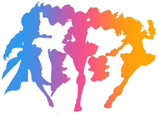
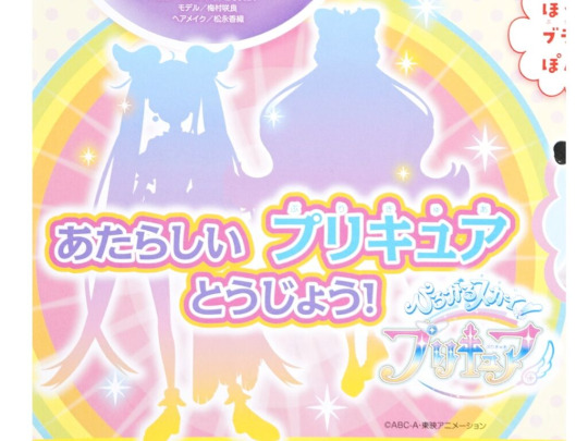


(Pardon the rough nature of the silhouettes, I had to make my own on my phone) without the details, I have no idea what I'm looking at with these designs. With previous seasons, the silhouettes themselves gave us an idea of the vibes or even themes for the upcoming season. Here though? I mean my crappy silhouette of Cure Wonderful made her pigtails look like a cat sitting on her head when I asked my boyfriend for input. These silhouettes are incredibly weak with their long hair basically ruining their design by hiding their dresses. Fun fact! These are the same issues I had with Colgate-chan- oh sorry Alear from Fire Emblem Engage that made me think those were fake too. The minor details were the only thing that separated them from other characters since their silhouette was awful.
Now weak silhouettes aren't always a crime against art, however for a piece of media that is meant to sell toys, is in animation, and for children? Yeah no you need a strong silhouette for the audience to easily identify. The only reason such a weak silhouette would work in PreCure is because no other Cure has one this bland. You can tell which PreCure is Cure Wonderful because "oh that's the least fun looking one". Since her charm comes from the details you can't see when it's just her silhouette, that means that although they're all still cute, they could have been MUCH cuter, which Toei is typically really good at.
So in conclusion, are these definitely fake? I'm not sure. Given these products were probably taken home without permission from the manufacturer, it's possible these leaks are one of three things.
1. An INCREDIBLY well done fake leak, potentially by Toei themselves since they do that sometimes.
2. Real prototypes made with VERY early drafts of the characters and placeholder names that were intended to be destroyed once the designs/names got updated.
3. This is the real deal and this is going to be a fairly weak season in terms of aesthetic.
I'm personally leaning towards 1 or 2 since PreCure usually has higher standards of production. But hey, this is just my theory regarding these leaks. I know one of my girlfriends loves Cure Friendy, and I'm always here for more green rep in PreCure. I'm still excited for this season even if the aesthetic might be a bit weak. If there's anything I've learnt from PreCure, it's that even the most casual of seasons can get real dark real quick and somehow still work. Didn't Cure Grace literally leave someone to die... idk I haven't been able to watch a full PreCure season since like Go! Princess first came out 😭 fuck I'm getting old-
#wonderful precure leaks#wonderful precure theory#wonderful precure spoiler#wonderful precure#precure 2024#theory#hyperfixation#over analyzing#art analysis#design analysis#wanderful precure#wanderful precure 2024
44 notes
·
View notes
Text

Portrait of Eleonora of Toledo with her Son Giovanni
Artist: Agnolo Bronzino (Florence 1503-1572)
Date: circa 1545
Medium: Oil on Panel
Collection: Uffizi Gallery , Florence
Eleanor de Toledo
Eleanor of Toledo was a Spanish noblewoman who became Grand Duchess of Florence as the first wife of Cosimo I de' Medici. A keen businesswoman, she financed many of her husband's political campaigns and important buildings like the Pitti Palace
Description
The spectacular portrait of Eleonora of Toledo together with her second son Giovanni is one of Bronzino's greatest masterpieces, and it is the work that helped to deliver to the collective imagination the splendor of the bride of Cosimo I de' Medici. Eleonora, with her white skin, her rich jewels and her majestic dress, stands out against a magnetic blue background that gives her an aura of sacredness and gives her portrait the value of an apparition. The immense expanse of blue was executed with the most expensive pigment available, lapis lazuli blue, traditionally reserved in Italian art for the Virgin's cloak, therefore a sign of devotion identifying Mary. One of the tasks of this portrait is certainly to exalt the dynastic role of the Duchess, guarantor of the succession of the House of Medici, strengthened by the birth in 1543 of Giovanni who stands beside her, the second son candidate for an ecclesiastical career like the famous ancestor whose name he bore, the second son of the Magnificent Lorenzo, who became Pope in 1513. Another significant element is certainly the dress woven in a 'curly brocade', a very expensive fabric, a specialty of Florentine manufacture, often reserved for the making of liturgical vestments. The motifs repeated in the fabric, the pomegranate and the pine cone, are Christian symbols of resurrection and regeneration, suitable to indicate the fertility of the Duchess. But the painting certainly does not want to convey exclusively the image of a good Christian wife and mother. Eleonora was a stateswoman, a skilled administrator, the Duke's right-hand woman. In the summer of 1545, when Bronzino was painting her portrait, Eleonora had already held the role of head of state three times during Cosimo's absences. The very cut of the painting, in portraying her up to her knees (repeating the innovative solution that Raphael adopted for the portrait of Leo X), gives grandeur and authority to this woman whose face is the emblem of a firm and noble spirit. Bronzino managed to capture all the traits of Eleonora's personality and communicate them in an extraordinary portrait that represents a wife and mother, but also a powerful and independent woman.
#portrait#woman#young boy#oil on panel#16th century painting#agnolo bronzino#necklace#jewelry#florentine#duchess#spanish nobility#house of medici#italian nobility#european
8 notes
·
View notes