#easy shadow painting for beginners
Explore tagged Tumblr posts
Text
eaudera's detailed tutorial for skin rendering
okay loves i've put together a tutorial in text form detailing my step by step process of shading darker skin + the brushes and techniques I use and why I use them. you will be following along as we shade a piece together, you can find the lineart to the piece here. *turn off your true tone and night shift displays for the most objective viewing.
i wrote a lot on the preview pictures, if you find spelling errors (which you def will) or are unable to read my handwriting, you'll find the typed out version of the writing in the alt text feature.
disclaimer: i'm not an art professor nor am i academically/classically trained in art. a lot of the verbiage and techniques i'm using to teach you all here are from my current self taught and observed understanding of art, light, and anatomy
support me: kofi / ig / twt / commissions
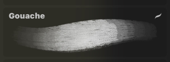
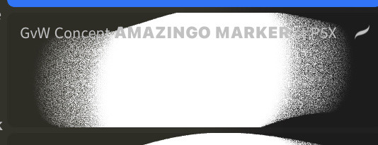
firstly, here are my two staple brushes. you can find the second brush here, i modified it by making it larger.
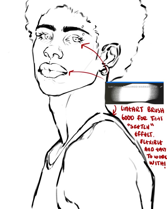
the lineart brush is very good for easy sketching and simultaneously cleaning up that sketch to produce the final lineart you'll be using in your piece. the diffusion from the erased parts/the diffusion created by lowering the pressure of your pen creates a light graphite effect which i enjoy! give it a shot.
you'll notice quickly that there are lighter strokes throughout this lineart, these are simply acting as rendering guides for me in order to remember certain placements. i erase/draw over these lines a lot.
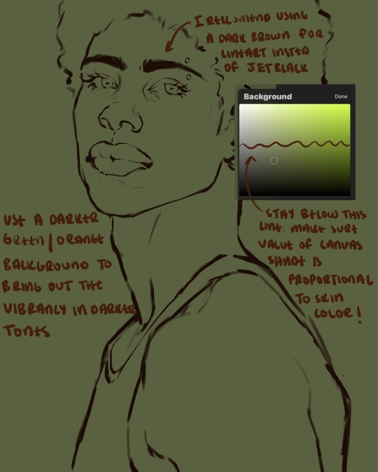
i initially learned to shade skin on a completely grey background with very slight orange undertones, and for a while this was very helpful in providing the most objective view of the base colors you're using (objective as in free of being effected by colors of different values). as you might know, using a white background for dark skin will seemingly darken the value and dim the vibrancy of your base colors, and using a black background will do the opposite. if you're using a darker skin tone, you want your canvas shade to be of a value that is proportional to your skin tone to avoid the same problems created by colors with too light or dark of a value. now if you're using a screened device to draw, you have the extra burden of screen reflections/wavering color output on different screens, so you're never really sure if the exact color you're using will be consistent across the board. priming your canvas with neutral colors will help with that. whereas priming with more vibrant colors will slightly change the undertone of your skintone (especially if you're using a low opacity brush), but it makes for a funner canvas and more creativity with your color palette imo. if you're a beginner i recommend you stay below the wavy line to avoid too light of a canvas shade.
for these same reasons i avoid keeping my lineart jet black. when you lay down the base colors under a black lineart it can look very unfavorable.
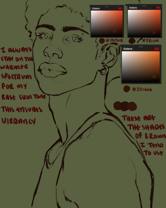
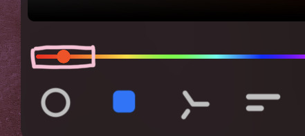
here are some skin tone variants that i tend to use the most, peep how i never wander off too far to the left of the spectrum where the reds are. i definitely favor red-oranges as compared to green-oranges for my skin tones, however, because i stay primarily on the left side of the color spectrum for my rendering, red can quickly become too much too fast. so i make sure to use a skin tone that can work very well with green-orange shadows. for this specific piece i will use the third shade (#2d1606).
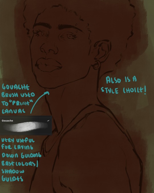
heres where the gouache brush comes in handy. i use it very loosely to "prime" the canvas almost. if you've ever done oil painting you'll realize very few artists draw directly onto a completely white canvas, though i've already primed my canvas essentially by changing the background color, i loosely shade over it with the skin tone color using the gouache brush. i find this gives me a better grasp on the composition of the piece due to increased harmony between the canvas and the skin color. it also looks really cool to me and resembles a real canvas almost.
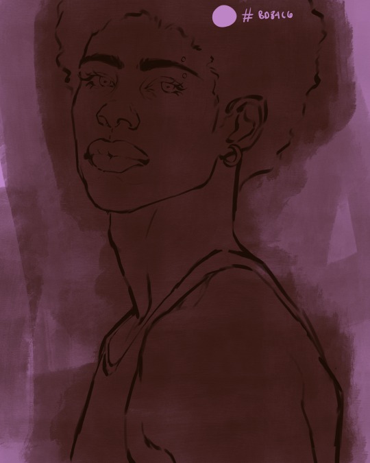
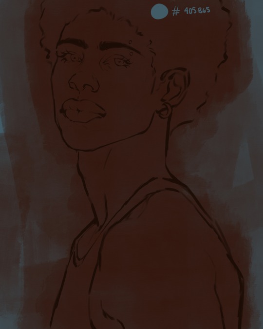
as stated before, priming your canvas with neutral colors (grey) can help give you a more consistent view of your base colors, when you get the hang of understanding the colors you most often use (i.e, how they interact with other colors), you can start using more vibrant and fun colors to color your canvas with! the gouache brush changes opacity depending on the pressure exerted by the pen, if you zoom in you'll notice patchy areas where the canvas color bleeds through the layer more prominently than it does in other areas. for some people this might throw off the consistency of the shadows, but you should be fine as long as you're using a consistently opaque brush (which we will be doing)
i know i recommended beginners use a grey canvas like i did, but since this tutorial is using my techniques i figured i'd also teach you guys how to use variantly opaque brushes to your advantage. we will be drawing on the pink canvas from here on out.
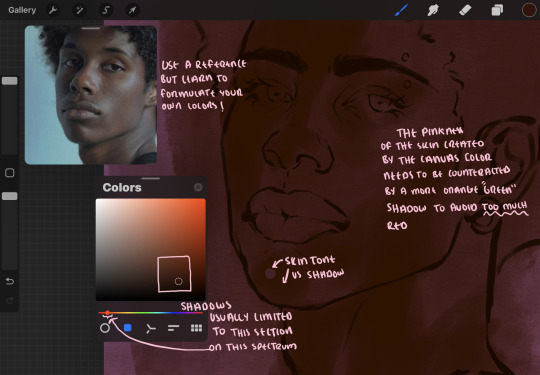
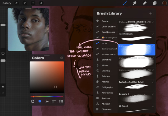
a reference is so helpful, i still rely on references to guide my shadows/lights. i'm past the point of relying on references for exact coordinates for rendering or lineart, but they are still incredibly helpful. in most references of darker skintones you come across, color dropping directly from the picture will give you very grey colors! we want to prioritize vibrancy in this case, so attempt to formulate your own colors or colordrop and increase the vibrancy :)! keep in mind i'm now using the lineart brush to shade. the diffuse/soft corners of this brush allows fewer pixels to be scattered wherever you lessen the pressure, this is perfect for color dropping medium colors to blend two colors together. you'll see how i blend colors later on.
as mentioned previously, red can become too much too fast- so i avoid monochrome rendering as much as possible by using shadows of different undertones. my most frequent combination is using a red-orange skin tone and then using a green-orange shadow.
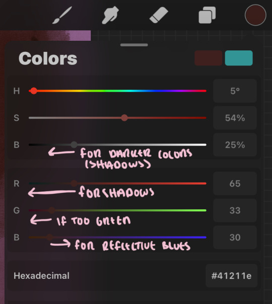
the value spectrum will be your best friend in mixing values and undertones, i use it all the time to formulate the best less saturated darker shadow that is proportional (not too dark, not too grey) to my skintone value. if the shadow is too green simply increase the magenta, if you're looking for a "reflective" shadow, increase the blue.
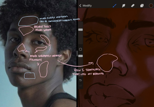
when i begin shading, i always slide the curser to a truer orange color on the spectrum and increase the saturation (slide towards the right) while i decrease the brightness (slide down). heres how it looks when i'm jumping between shadows and highlights while trying to keep my colors proportional (but not identical) to whats happening in the reference ^. i most often times will rely on the value tool, however.
you will notice that a lot of darker skin tones have patches of orange vibrancy, these areas are most common on the nose and cheeks. this is only a detail to pay attention to if you're going for more of a realism rendering style :)
now onto how i prefer to bridge/blend colors together by utilizing the blend tool.
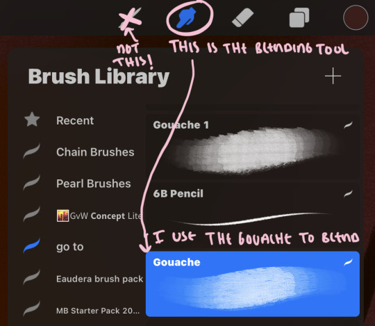
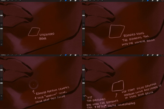
i do not like simply blurring colors in order to blend colors together, it can lead to overblending which can make your portrait look heavily gaussian blurred (think 2010 deviantart art... yea that). the brilliant thing about procreate is you can utilize brushes really efficiently, which include changing the brushes you use for blending. so in reality, artists who use the blending tool on its own can still have portraits that don't look it! there also exists plenty of brushes that have properties allowing it to blend into its surrounding colors are you draw. but in my case, the above photo is 99% of the times how i will bridge two colors together. doing this allows me to keep pretty consistent brushstrokes across the whole portrait, which i enjoy. it also gives me better control of the shapes i use in my rendering, an aspect that is pretty easy to lose when you're using the blending tool directly and solely.
in case the blending process is a bit hard too see, heres that same process recreated with different more visible colors:
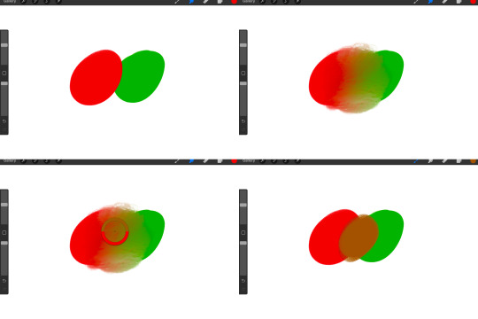
now once you've placed your shadows where they generally tend to be (according to the reference photo), let's make those shapes a bit more specific and pick up on smaller details to make your rendering look more complete.
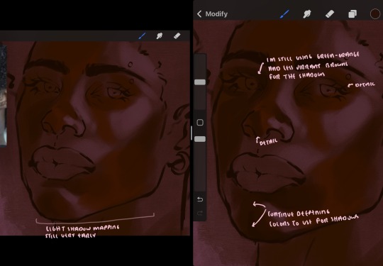
your base colors will never be as dark or as light as you need them to be when you begin rendering, making sure you have a decent contrast between your lightsource highlights and the shadows is key to capturing the essence of a light being cast on your character. it's much easier to keep building upon your shadows before rendering the highlights, i laid down the highlights only to create a guide/help me map my shadows better. do not darken the entirety of the areas affected by shadow, you'll find that shadows are rarely ever the same value, it's a gradual process affected by things like position, height, etc. so make sure the darkest of your shadow colors are preserved only in areas where the shadows are the or should be the darkest.
you'll notice i labeled some areas as "detail", adding very specific shadow placements is a detail. in the reference, the model has a pretty prominent brow bone, creating a shadow over where his eyelid creases just above his lash line, paying attention to feature details like this help enhance the rendering and its realism.
now that i've mapped my shadows i'm going to move onto to rendering my highlights and the region of the face where the lightsource is most prominent.
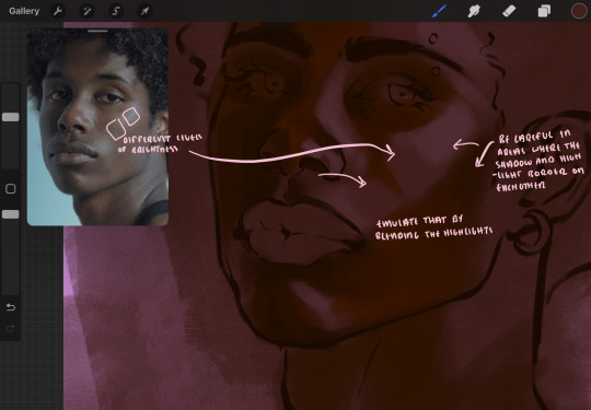
i described shadows as a gradual process earlier, this is because of the lightsource. light tends to spread when its further from the affected surface, creating a larger area affected by the light. of course, this varies depending on how intense and how close/far the light source is. in this case, the light is being casted above him further to the other side of his face, but again, remember that the face is not 2d and more prominent areas are affected more by light. it's due to this that there still exists a, albeit very minimal, shadow beneath his cheekbone. i exaggerate the shadow here for stylistic purposes, but it also helps in keeping me uphold that contrast between the highlight and shadow once again. so i refrain from blending the light into this area like i did in other areas.
midtones are the areas most unaffected by the light source, they're neither shadows nor highlights. and because light spreads, it is brighter in certain areas and darker in others. it is most easiest to blend the darker ends of the highights into the midtones of your portrait. you can emulate this by once again using your blend tool. blend the outer areas of the light and colordrop this color and use it as the darker light more proportional to the midtones. note that before i add even lighter shades to the areas where light is most concentrated, i blend what highlight placements i currently have there.
we're going to switch gears now and focus on the reflective shadow occurring on the darker half of his face.
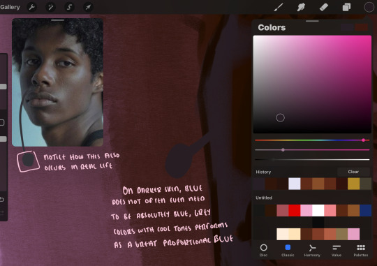
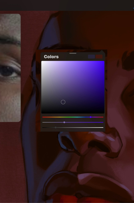
this shadow is a reflection from the lighter background the model is up against, the light being casted above him is allowing for some bounce back from his surroundings, leading to very faint light visible in areas primarily affected by shadows. hence why i'm referring to these colors as "reflective shadows".
in this case, the reflective shadows are blue, or appear to our eyes as blue. on darker skin, "true" blues (blue-purple) are not often times present. what is present rather, is a very grey tone with cool undertones/a grey tone on the blue side of the spectrum, which creates a blue that is much more proportional to the value of the skintone than a true blue. in this case i used a deeper grey on the pink color spectrum, which is more purple. this was intentional, and was done in order to create some sort of color harmony between the contrasted deep oranges im using for the bordering shadows and the blue-grey i'm attempting to emulate.
while i utilize this blue-grey, out've a purely stylistic choice, i still introduce true blues to my rendering. in fact i love using blue/purple reflective shadows in my art, it creates a stunning and colorful render. in this case, i used the blue-grey as a stepping stool to introduce that trueer blue more naturally. you'll see this happening in the second picture above, where i used a slightly more vibrant and slightly more brighter blue, and used it on areas where this reflection was more prominent (and therefore brighter).
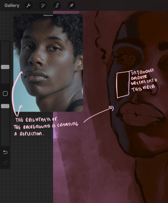
you'll notice how the shadows that border on these reflective colors are less saturated and darker than the shadows on his chin. introduce a darker and less saturated (more green) shadow to that area on his cheek and the darkest shadow of this photo, the sunken area near his nose bridge and inner eye corner. i emphasize this line in the lineart so you can follow this shadow more accurately:
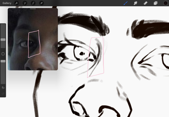
this is also a detail in my opinion and can make your portrait more realistic if you include.
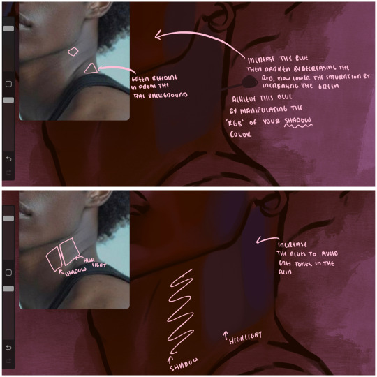
we're going to pivot to his neck area before continuing. you'll find the area of his neck with the most light is also the least vibrant, i laid down a grey base color to emphasize this detail in the portrait. afterwards i added key details. i wanted to stay at least somewhat true to the color dynamics occurring in the reference hence why i used the grey, but i'm not a very big fan of using blatant grey directly on the skin, so i made it more blue.
moving forward, the outer eye and the nose can be some of the most "detail focused" areas of the face when it comes to rendering. due to their more "bulbous" anatomy, light tends to curve around them in more complex ways than the flatter parameters of the face.
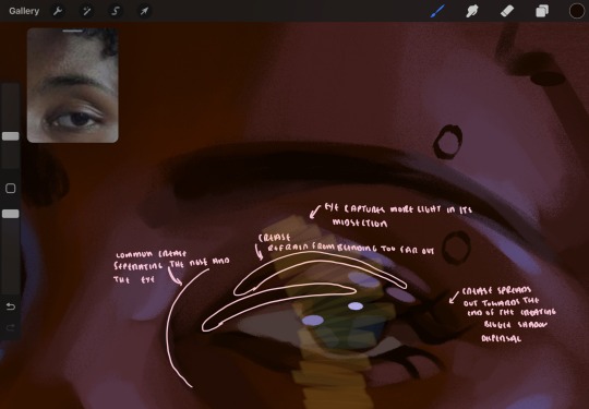
when it comes to the many creases that surround the eye, the skin folding over itself creates a very thin shadow from between the folds. the key to rendering this crease is to concentrate the blending to a very small scale, do not overblend the area because the hill created by the crease very easily captures light, creating an area where the shadow and highlight meet in very close proximity. slight blending is needed for this area, you can deepen the shadows in both horizontal corners of the eye for more accuracy. the midsection of the total eye area (eyeball and socket) tends to capture the most light, remember this is due to how bulbous rounder shapes tend to capture light from whichever direction its coming from.
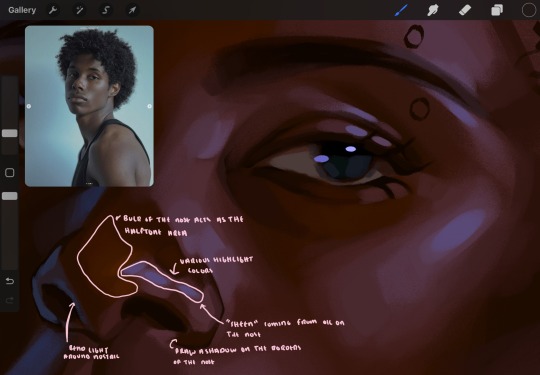
this is of course the case for the nose as well. highlights are typically placed as a dot on the outermost part of the nose by artists, but highlights also spread on either side of the tip of the nose. the nose tends to collect a lot of oil, creating a sort of sheen on the upper parts of the nostril. when rendering a portrait where the position of the head is more cast to the side, the highlight of the nose changes from the bulb of the nose, to the upper nostril. in this case, the highlight spreads, causing a "half tone", or the remnants of the light on the bulb of the nose. this is the easiest place to blend highlights and shadows together. now for the shadow detailing on the nose, i'm actually drawing on top of the lineart on a separate layer. which i'll go into detail about in the next part. you want to focus the shadow on where your lineart is, the outermost part of the nose.
now were going to really detail your portrait by introducing a new layer, the detail layer! this isn't technically apart of the skin rendering, so i'm gonna keep it very brief. this is the layer you're going to render the lips, eyeballs, and eyebrows. more specifically, the purpose of this layer is to reduce the reliance on lineart. in terms of order, it goes above the lineart layer. we're going to soften and even erase the lineart in certain aspects. i use bolder/thicker lines when creating my lineart, but this can become a nuisance/hinderance when rendering.
starting out with the lips:
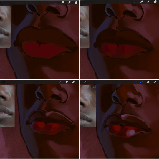
people w brown skin tend to have two toned lips, with the top lip resembling the same skin tone as the face and the bottom lip being redder/pinker and lighter than the upper lip. in my case, i prefer a more vibrant red for the bottom lip. once i lay down these base colors, i begin shading on the second layer.
i personally enjoy the look of a poutier lip shape, this includes emphasizing the middles of the lips as opposed to the ends. i've highlighted the shapes that this lip shape often entails. the small circles on the corner of the lip line are just pockets that occur when the mouth is closed and become emphasized by the fat around the mouth. the parameters of the lip lines do not often meet these round corners, theres often times a "double lip line", that exists around these areas. i love including that in the art, its very easy to emphasize by simply drawing a highlight from the corner of the lips along the curvature of the bottom lip towards the middle.
shadow mapping on the lips tend to go: highlight, shadow, highlight, shadow. the top lip going inward creates a highlight on the most outward part: the top of the lip. and the bottom lip curving outward thus creates a shadow on the bottom of the lip.
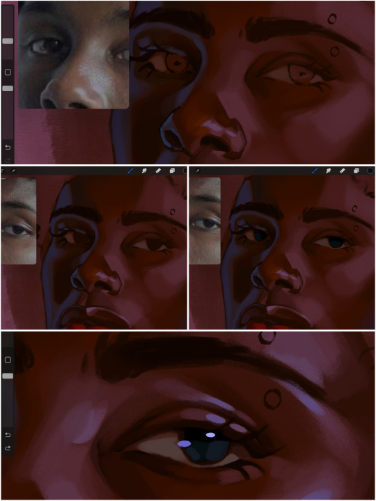
when it comes to the eyeball, i don't draw the white parts as solid white, nor do i make them too bright most of the time. they're most often times an orange grey, i also dont spread this color out if you can notice the uncolored white part of the eye. i do this intentionally to keep some of the shadows that are naturally present on the eye. very specifically right where the upper eyelid sits on the eyeball, it tends to create a small shadow that follows the curvature of the eye. this shadow is crucial, if you can see the first and second picture do not have this shadow, making the iris look more exposed and the eye appears to be held wider.
when it comes to the iris, i do very little. if i'm drawing a dark colored eye i will cover the entire iris brown, before darkening it with an almost black color. i leave the brown sides of the iris exposed to aid in bridging the values between the whiter parts of the eye and the very dark iris. this blended ring also appears on all eyes in real life. lastly, dark eyes tend to show light reflections much easier than lighter eyes. these reflections can be any color in art, in this case i kept it blue-green. i bend these reflections around where the pupil would most likely be depending on the drawing.
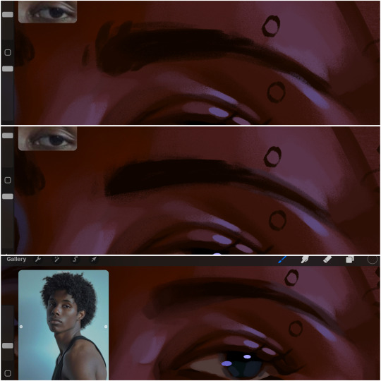
next, the eyebrow. i find it tedious to draw individual eyebrow strands when it comes to rendering, i actually prefer to blend the parameters of the eyebrows to create cohesiveness. sparse and fine eyebrow hairs are penetrated by light and shadows more than what you'd find on the scalp. it's harder to see light on someones scalp due to the bulk of hair crowding the scalp, whereas as its easier to see such light on the eyebrow. to introduce this concept to my art, i will initially draw the entire shape of the brow. then when rendering, i erase the parameters, leaving the darkest part of the brow. then i blend. the lower brow bone will be blended the least, whereas the area of the eyebrow connected to the T zone will be the most blended thanks to the shadow following the nose bridge. the far end of the brow by the hairline tends to be the lightest given the light source.
and lastly, i loosely draw a white border around the portrait for stylistic purposes. then i combine the layers (group together your layers, then duplicate and compress the duplicate group so that you still retain your individual layers) to edit. i typically add noise and play with the curve setting. and heres the finished image:
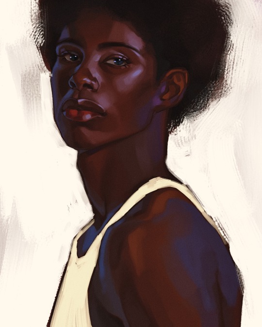
i hope you enjoyed!!
#i didnt proofread this if u find spelling errors pls lmk#black artists on tumblr#digital art#illustration#painting#black art#commissions#tutorial#art tutorial#how to shade#rendering tutorial#brushes
278 notes
·
View notes
Note
Hii me again. I'm not sure if I sent the ask I'm talking about on anon, so maybe that's why you didn't see it? It partially got answered with a recent ask you got anyway so no worries. I was just wondering if you use 3d in your process and if so, how? I've seen other illustrators use it to varying degrees and it seems like a really helpful tool to push your work.
Oh that's so weird! No I periodically go through my asks in chunks and I didn't see anything like that. I've had a few people in the past few months send me asks that looked like the second half of something else with no context, so maybe it's Tumblr fuckery. Sorry!!
I recommend learning Blender so you can help sculpt shapes and render lighting onto them in order to get the weirder/more complex shadows right. You can also apply colors onto the things you sculpt in order to see how the colors act in different lighting. It's pretty much an invaluable tool to me as it keeps me from having to problem-solve too much. I did a lot of digging around in my house to build references to photograph but it was just impractical to achieve the things I want to a lot of the time. I still do that, and you would not believe how many goofy photos I have of my husband in the poses you've seen me paint Astarion in lmao...
I do think that it needs to be used in moderation if you are a more beginner artist- I think that using 3D is DANGEROUSLY close to becoming a massive crutch for a newer artist and improper usage or over reliance on it can lead to stiffness or artificial looking colors. You need to be able to train your eye to create compelling compositions by bashing things together, and train your hand to replicate/add/subtract as needed from your references with an organic feel.
I will say this as a total committer of this crime myself in the past, it's VERY easy to tell when an artist relies too much on, for example, Clip Studio Paint posed models as bases for pieces without a good enough grasp on their fundamentals. And I also used to prickle when I saw more advanced artists warn of this, so I do think maybe it just has to run its course sometimes, because I know that using 3D for reference seems like an easy-button.
I've taken a lot of in-person classes for live figure drawing and painting, as well as just totally done drills, basically, on sketching and painting from life before relying too much on static imagery/3D/etc.
I often fret over every piece I do looking too stiff even still.
You have to do a LOT of the boring hard stuff the old fashioned way. And I regularly go back to it over and over when needed.
For example, I recently did a stupid amount of rose petal/flower studies deconstructing and painting ugly little paintings/doodles over and over because I know that I've been horribly weak at painting flowers for years (actively avoiding them). And I've been doing a lot of floral stuff lately due to that.
Whenever I start a new piece in new territory, I know it's going to mean several 3AM nighters where I have two other tabs open on Photoshop where I test out different textures or do a couple of studies. I'm working on a piece of my OC right now that has a lot of gore/medical instruments and I've been working on testing out different methods for shiny metal painting and some anatomical studies. I'll come to a snag in a painting and go "here we go" and work through it one piece at a time.
My Halsin piece, "Secret Spot" in the hot spring, was a massive undertaking with a lot of these moments. The Karlach x Dammon piece took 3 times longer than it should have due to me just having to go back and fix things knowing I could do better after doing some studies.
Ultimately I personally find art tutorials to be quite useless overall once you get to a certain point, unless they are teaching the use of a tool/software because you HAVE to figure out what works for you. And even then I use Blender like a monkey with a keyboard, I suspect, because I've just bruteforced through it, so I could probably use a tuneup from a good teacher on that haha. I hope this helps some, and sorry if I overstepped if I sound preachy.
24 notes
·
View notes
Text
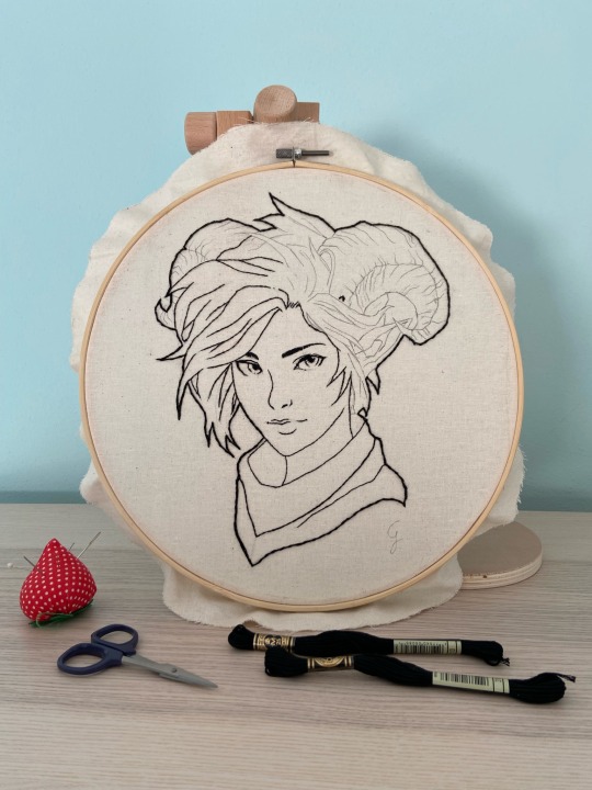
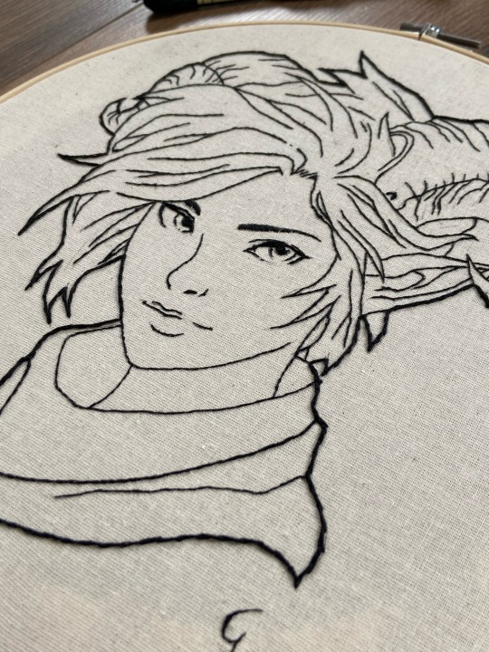
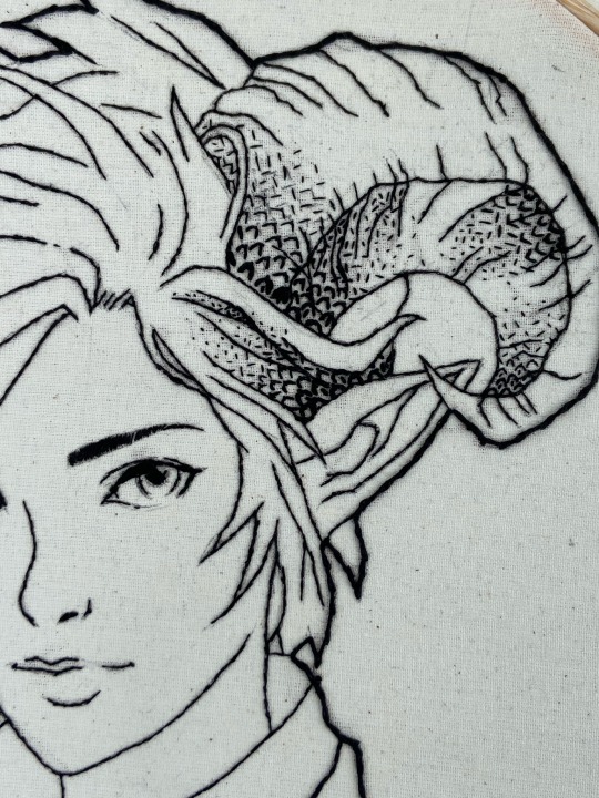
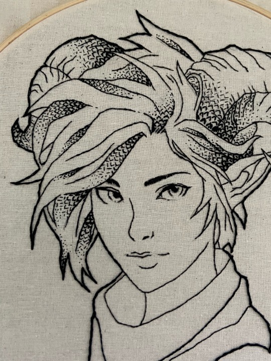
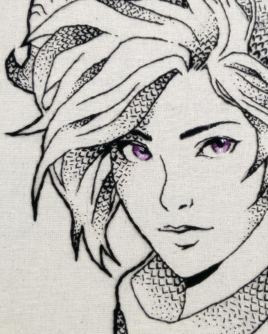
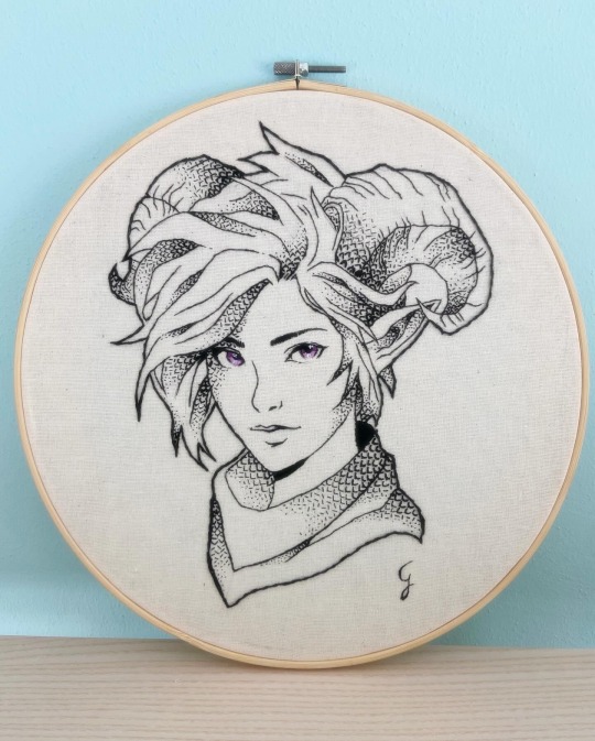
An interesting Challenge: freestyle Blackwork Lady Faun 🌿
Blackwork embroidery, with its elegant and bold outlines, has a rich history dating back to Tudor England. Today, I'm taking you on the journey of creating a freestyle blackwork embroidery featuring a lovely Lady Faun I designed myself!
From Sketch to Stitch
My design process began in Procreate, a well-known app for illustrators and designers. On Procreate I sketched my Fantasy character and drew lineart but I also simulated my stitches to better plan out the ideal blackwork pattern and study light and shadow areas (watch the video below!)
Since I wasn't yet comfortable with counted thread techniques, I opted for freestyle blackwork. This technique gave me the freedom I needed, especially because I planned to use thread painting for the eyes (which required a cotton/linen fabric).
Scales & Shadows: Building Texture
To bring a touch of Fantasy to the design, I chose a simple fly stitch to create a pattern resembling dragon scales. To create shadow effects, I got creative! I used two methods simultaneously:
Varying thread thickness: thickening the lines from 4 strands for the darkest areas to 1 strand for the highlights.
Seed Stitch accents: adding texture and depth with tiny seed stitches in bright areas.
Embroidering, finally 😅
The actual stitching process involved several stages: the initial outer lineart (4 strands), followed by progressively finer inner lines,and finally, the definition of shaded areas with my alternated fly/seed stitch pattern. Ah! Of course I used black thread, n° 310 DMC cotton mouliné ✌🏻
Challenges & Triumphs
This project wasn't without its hurdles! Maintaining precision with freestyle blackwork, especially on a larger format, was a test. Constantly changing thread thickness also added a layer of complexity. However, the end result was a successful experiment with great visual impact! The fly/seed stitch pattern proved to be easy to execute with freestyle and offered a beautiful textural element. Absolutely love the ink/pen sketching effect (with a touch of colour 😛).
In the end, my freestyle blackwork with alternated fly/seed stitches is a fun and versatile technique for beginners and experienced stitchers alike 😉
What do you think about this piece?🖤
#embroidery#blackwork#crafts#handmade#handcrafted#ricamo#thread painting#my art#textilart#portrait#fantasy art#fantasy#original character#character design#procreate art#hand stitching#stitching
9 notes
·
View notes
Text
Working In Nature
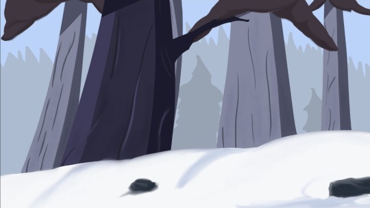
Winter In Nature
This is a new, friendly beginner style that I like to use when I want to sketch my ideas with painting, rather than meticulously planning everything out with a pencil. Sometimes, I find it enjoyable to capture my surroundings using colors and shapes while trying to create a story. Although I often practice this exercise, this particular painting is inspired by an original piece I found on Pinterest that I want to try recreating as an idea.
I also found it more easy to use between three to five different layers and fork separate on layers with shadowing and light effects, after giving some basic colors nailed down
This painting illustrates a creative process. I hope you enjoyed it and have a wonderful day. Remember to keep being creative and don’t forget to smile!
#artist#art dump#art style#digital sketch#art practice#procreate#small artist#beginner artist#sketch#digital illustration#content creator#onlyfans creator#inspiration#illustrators on tumblr#illustration#learning#lifestyle#life#artists on tumblr#boy blogger#blogging#blog#digital artist#digital painting#digital art#digital drawing#comission#commission
4 notes
·
View notes
Note
hiii!! your artstyle is SO COOL to me- as in sometimes i'll just stare at some of your pieces because theyre all so great. i was wondering if you were comfortable sharing your process when it comes to art?? i'd love to see how you do things!
Hi!! I'm sorry this took so long to answer, I hope you still find it useful. It means a ton to me that you enjoy my art so much! <3 It's easy to feel discouraged by the Invisible Hand of Internet Engagement, so I really appreciate your ask.
General thoughts (NOT rules, just things I consider or do a lot):
Things that appear one solid color irl can be broken down into multiple colors through artistic interpretation. I see a lot of beginner artists paint trees as solid green, when there's a lot of yellows, blues, and browns in there! A FANTASTIC example of this is jadenvargen, whose color use is masterful and I can only aspire to emulate one day.
Base colors are not saturated; saturation is reserved for pops of color and details
Shadows are purples, blues, and greens
Reference is your best friend!!!
So the nitty gritty for those who want to see: with digital art there's two main avenues I take. The first one is lineart, and the second is painterly. All IDs are in alt text.
My process for lineart pieces:
I always start off with a sketch; for this example I'm using one of my pieces from @/mylittlefusions (that isn't actually posted yet but will be later today) - a Grogar and Trixie MLP G4 fusion. I like to fiddle with brush selections until I get the effect I want, and then go slow on the lineart to make sure it's how I want it, so this can be time consuming!
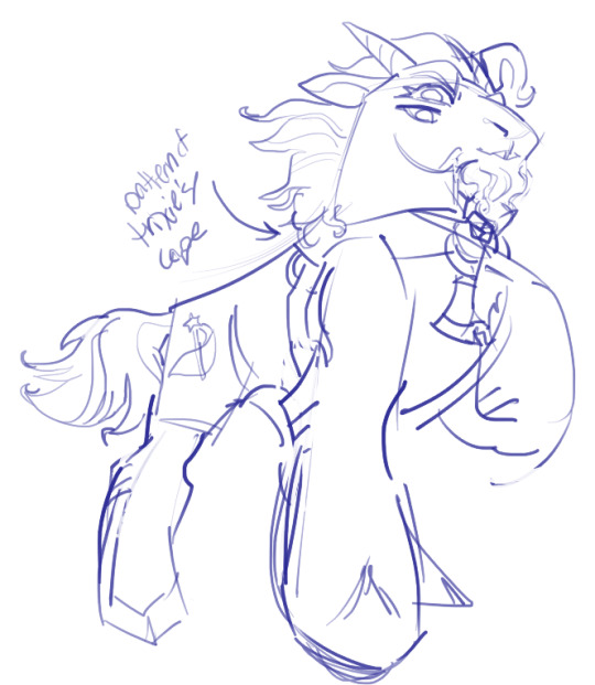
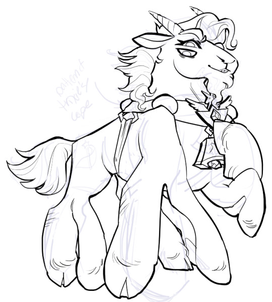
I've been trying for distinct shapes; I hate when my art gets muddled, I feel like the end piece is less impactful when I don't put in the right amount of contrast and distinctive silhouettes. Just something I've been thinking about and trying to improve.
Then I add base colors, going for slightly desaturated colors. I like to use saturated/bright tones to contrast or draw attention to something. I put the base-base colors down in one layer and then add details as a mask layer:
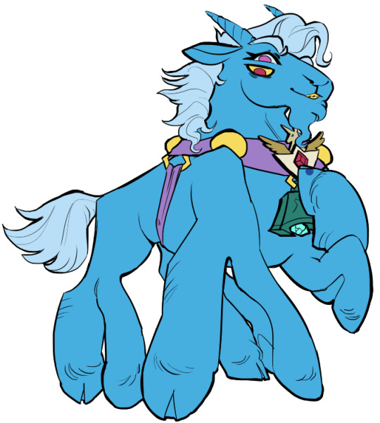
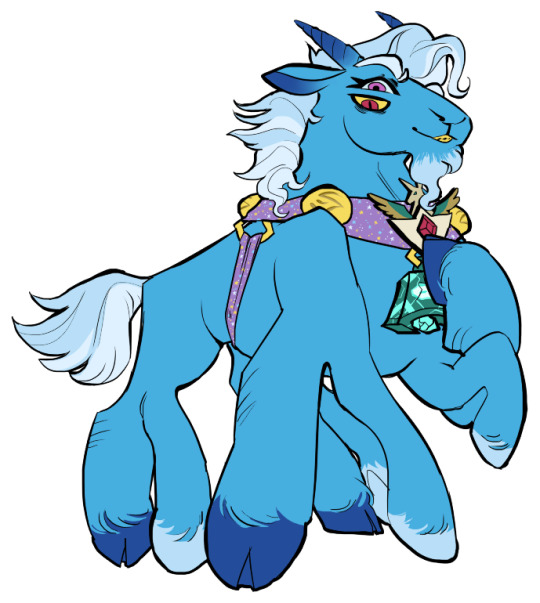
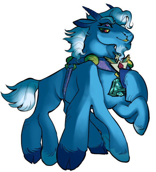
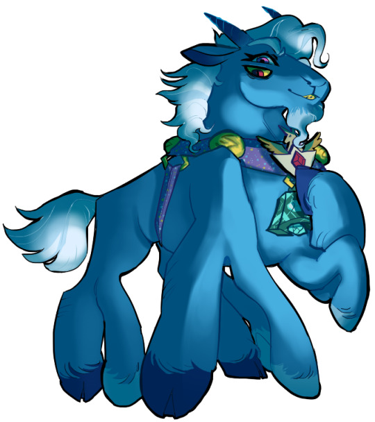
Then comes shading!! I'm a big fan of a multiply layer set to cool tones like blue, so I usually start there. If I think it needs to be different I can change it later. In this instance, I filled the whole canvas in the shading color as a mask over the base colors, and then erased where needed. Now that the shading is done, I often go back and color the lineart :)
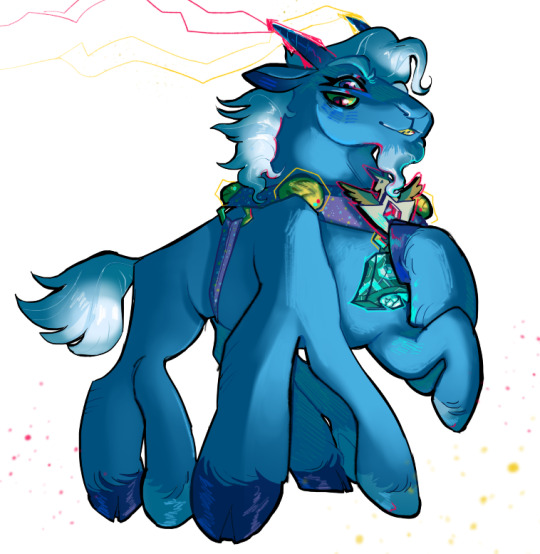
Last but not least is my favorite part, painting on top! The extent to which I do this depends on what I think is needed, but I usually at least paint on top of the multiply shading to add some nuance, i.e. the greener bits on the background limbs. Here I added bright magic outlines to pop from the more desaturated character.
My more painterly style is a different story though! I use the same thoughts about color and shading, but I usually forgo multiply layers entirely and just do colors by eye. I still do a sketch, usually. Here is an example using my Lae'zel / Shadowheart piece.
The sketch is a disaster zone lol - but I painted below it using base tones, again desaturated. Once I feel I don't need the sketch anymore, I keep painting, making a new layer when I feel like being cautious about a change I'm making.

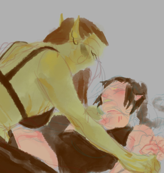
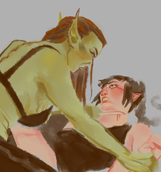
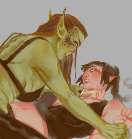
After I feel that I've got base colors down, it's time to get more contrast in using darker and/or more saturated colors! Then, like with my lineart process, I paint more details on top of everything else - reflections, jewelry, body hair, etc. I try to communicate shadow and distance with purples and blues, but I'm still working on it.

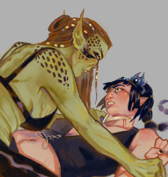
Another example real quick, where i did my typical lineart process base work and then painted on top of the shadow layer and the entire piece as a whole:
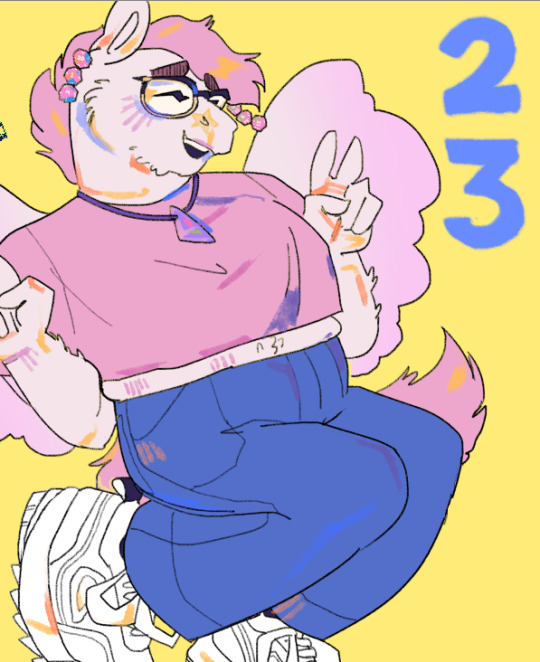
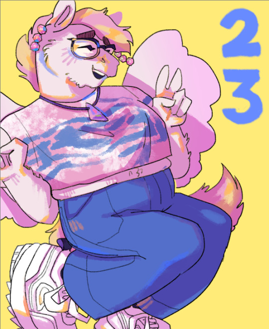
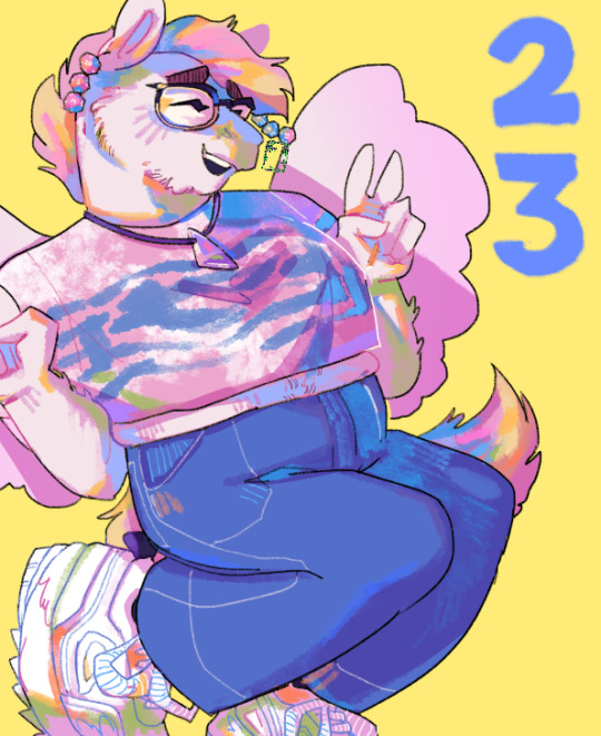
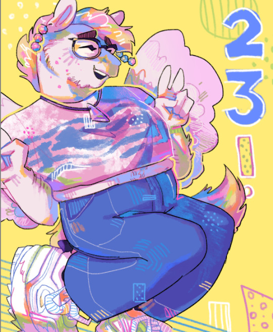
Thanks for reading if you stuck around, and thank you for the ask, friend! ^^
6 notes
·
View notes
Text
Bring Animals to Life on Canvas: Tips & Techniques for Animal Art Contest
Since time immemorial, animals have been showcased through art. Whether you are painting a racing cheetah, a playful kitten, or an exotic bird, you will need a certain amount of skill, patience, and a deep understanding of the anatomy and movement of animals while bringing them to life on canvas. If you are fond of paintings of animals or sculpting animal figures, get your art a spotlight while participating in an animal art contest by some reputed organizations like TERAVARNA. No matter if it’s a photography art contest, or you are preparing for an animal drawing competition, mastering the techniques of this art can set your work apart. In this blog, we will explore the best ways and some essential tips to help you create stunning dog portrait painting or an incredible elephant artwork and a lot more! So, stay tuned!

Your Knowledge of Animal Anatomy and Structure Matters!
Before you start with your art materials and dive into creating stunning animal art, understanding their anatomy and skeletal structure is crucial. It is always helpful to notice how animals move, and how light plays an important role in the composition, as the light and shadow of their body will help you create more realistic depictions.
Pro Tips:
Better to study real life animals and reference images to create convincing portrayals.
Start from the basic shapes like, ovals, circles, and rectangles to outline the animal you are creating and go on adding details.
While you sketch, it’s advisable to break down the complex structures into simpler forms.
What is the Best Medium for Painting of Animals: Know Here!
Are you comfortable with watercolors, or oil paintings or acrylic? The choice of medium can greatly impact your paintings for animals and how you turn them into master creations. Every medium has its own pros and cons:
Watercolors: For fur and feathers, make soft and flowing effects perfect with watercolors.
Acrylics: The medium of acrylic is best suited for beginners, as the colors dry quickly, allowing space for layering.
Oil Painting: Requires a certain amount of experience to bring out the rich textures and blending, but the colors take longer time to dry.
Pencils and Pastels: Intrigued to sketch animals? This is best for adding intricate details and texture to your portraits of fauna.
Choose the Right Colors & Blending Techniques
If you wish to get your colorful animal painting a kudo from the contest jurors, you have to plan your color palette accordingly. Choosing the right color schemes and blending techniques matter for a great portrayal. To add more realistic touches to these living and breathing creatures, paint them in shades of grey, not only black, brown, or white; paint their fur, feathers, and scales with subtle color variations to bring them to life.
Techniques:
Complementary colors help enhance the vibrancy of the animal portraits.
While doing the fur or feathers, use the technique of layering with different hues to bring more realism in art.
Sometimes, working with your fingers to blend colors works wonders! Try soft blending techniques with dry brushes to create smooth transitions.
How to Create Realistic Fur, Feathers, and Textures
Wish to paint like a pro? You have to focus more on the textures of an animal’s skin, fur, or feathers – that will make the paintings lifelike. You can achieve the results following these easy tips:
Feathers:
While painting feathers, start from the base colors, and then move with the details with thin, controlled strokes.
You can create a three-dimensional effect while highlighting individual feathers.
Scales & Skin:
While painting reptiles and amphibians, use color dabbing techniques.
For the scales and skin, add more depth and dimension with highlighting areas and shadows.
Fur:
Use small, quick strokes to create the illusion of hair.
To be realistic, follow the natural direction of fur growth.
To add depth, use layers of light and dark shades.
Storytelling through Expression and Personality: Really Matters for Animal Art Contest
Portraying animals is not an easy job and it requires the act of storytelling through the emotions of the ones you are presenting. That is why paintings of animals require capturing their unique expressions through different body parts and sense organs.
The Important Areas to Tap the Expressions:
Eyes: Eyes are the windows to our souls – that’s exactly for animals. Use highlights to make them appear glossy.
Muzzle and Nose: These are the areas to add subtle shading for creating depth.
Personality through Posture and Movement: You have to study the animals thoroughly before you can come up with credible portrayals of their personality.
Create Diverse Backgrounds and Animal Habitats
Creating dynamic and well-thought-out backgrounds for an animal art contest can make a huge impact on your portrayals.
Natural Settings: Choose expanse of grasslands, shadiness of forests, or oceans to add context.
Abstract Backgrounds: Sometimes bold and abstract textures as backgrounds can make your animal stand out.
Minimalist Approach: Even you can try a minimalist background with a simple gradient or light wash to keep the focus on the animal.
Rules to Participate in an Animal Art Contest or Animal Drawing Competition
While you think of entering an animal art contest or an animal drawing competition organized by a prestigious gallery like TERAVARNA, take these events as a stepping stone for success and exposure to a broader viewer base, receive genuine feedback, and even win lucrative cash prizes!
How to Go about the Shows:
Adhere to the contest rules carefully and follow the submission guidelines.
Select your animal muse that resonates with the theme of the competition.
Always use high-quality materials for a professional finish.
Judges will always look for detailed work, as they often seek precision and creativity.
How to Improve Your Skills in this Art:
Mastering the art is not a child’s play. Like any form of art, mastering the techniques takes time and practice. Here are some of the proven ways to scale up your skills:
Practice makes perfect: Drawing and sketching regularly from different angles can help.
Paintings of animals from real life: You can visit zoos or farms to observe real animals.
Art Community Networking: Connect with fellow artists for inspiration and feedback.
Taking Online Classes: There are online and offline tutorials to help refine your skills.
Take Your Animal Art to the Next Level
You know how satisfying it feels to bring animals to life on canvas or captured through lens as an artist! By mastering anatomy, choosing the right materials, experimenting with colors, and paying attention to detail, you can create stunning colorful animal paintings or animal photographs, sculptures, or digital arts that will captivate viewers. If you have already experienced working with an esteemed online gallery like TERAVARNA, you know how rewarding an animal art contest can be. It will always fuel your ego to get your art hung on the gallery wall! So, get on with these easy tips and take your art to the next level.
Paint your passion now!
0 notes
Text
Create Unique, High-Quality AI Artwork with PicLumen’s Simple Tool
What if you could transform your thoughts and creativity into stunning, intricate works of art without having artistic skills? Now, with PicLumen's AI Art Tool, this is possible! Even if you are a seasoned artist or a beginner with a paintbrush, it's easy to create your own unique pieces of art in just a few clicks.
This powerful tool uses simple text descriptions to create vibrant, customizable art within seconds. Just describe what you want: your serene landscape, futuristic city, or anime character, and let the AI do the rest. With a creative spirit, it's fast, easy, and free — anyone can use it.
Let's get started with AI art. We will explore how PicLumen's tool can help you make stunning masterpieces with no experience required!
The Magic of AI Art: How PicLumen Works
The advanced technology that's used in PicLumen's AI Art Tool is what makes it so outstanding because it enables anyone to create the best, professional-looking art in such a simple way. Here's how it works:
1. Text-to-Art Magic: From Words to Visuals
The core of PicLumen is an advanced AI image generator that only needs a text prompt to generate spectacular visuals. All you need to do is to give a description of what the image should be — an abstract scene, sci-fi landscape or a hyperrealistic portrait. Each word is analyzed in detail by the AI and transformed into a portrayal by the use of complex algorithms — the AI understands the details and translates them into an image.
For instance, if you put "sunset over the ocean with dolphins," the AI will create a picture like that one and show dolphins swimming (in the bright sunshine). Your prompt should be as specific and as descriptive as possible, which will help give you precise and personal artwork.
2. Personalization with Image References
PicLumen is the best AI art generator that has an image-to-image feature, so you can fine-tune the results if you want. Upload your reference image (whether it is a photo, drawing, or any other visual content), and guide the AI to help enhance or change those elements from your reference. This further personalizes the process so you can keep those things you love and tweak them so you can grow where needed.
3. Speed and Simplicity
The speed at which PicLumen's AI Art Generator works is one of its biggest advantages. Unlike traditional art-making processes, this tool results in artwork in mere seconds instead of hours or days.
4. Style Flexibility
What makes PicLumen not only about basic art but the ability to make art in different styles. Regardless of the style you like (whether it is photorealistic, cartoonish, anime-esque, or abstract), the AI can adjust to your chosen style. With some style prompts, you can steer the AI and get your art to meet your vision, hitting your creative canons.
Endless Art Styles: From Fantasy to Realism

What makes the AI Picture generator Tool stand out is the myriad art styles it can produce. Whether you are into whimsical fantasy or photorealistic portraits, this tool can help you see anything in the blink of an eye.
1. Fantasy Worlds: Unleash Your Imagination
Make dragons, castles, and mythical creatures, and make magical worlds! Whether bringing a fantasy landscape to life or turning your imagination into an epic scene, PicLumen's AI excels at recreating that reality. An Enchanted Realm can be anything when it is created.
2. Realism: Stunning Details
PicLumen can produce more lifelike scenes as realistic portraits. The artwork created by the AI is detailed and realistic regardless of the subject: from a simple portrait to gorgeous scenery, the AI renders in everyday texture, shadow, and light source.
3. Stylized Art: Express Your Vision
For more artistic options, PicLumen allows the use of different stylized art forms. AI is able to create images out of anything: from anime and cartoons to cyberpunk, even oil painting gives it endless expressive possibilities.
4. Freedom to Experiment
You have the freedom to explore and the endless style options to create. PicLumen's AI adapts to whichever creative direction you decide to take, mix and match styles, or dive into new artistic territories with ease.
Features That Make PicLumen Stand Out
When it comes to AI art generators, PicLumen's AI art generator is not another tool; rather, it is filled with features that make it exceptional and improve your creative workflow. No matter if you are a seasoned artist or a beginner, these standout features are going to make it that much easier to generate high-quality art.
1. Image Generation, Lightning Fast!
One of PicLumen's strongest features is its speed. Art creation from traditional takes hours or days, and PicLumen creates gorgeous artwork in mere seconds. This allows you to experiment very quickly and make as many pieces as you want, making it ideal for rapid prototyping or a bit of brainstorming.
2. User-Friendly Interface
Simple and yet intuitive, PicLumen is built to be used by anyone, no matter what your artistic experience. You do not need to understand digital art tools or complicated techniques; simply type your prompt and select a style, then let the AI do the work.
3. References with Image Personalization
PicLumen provides the image-to-image feature to give you more control over what you create. Upload a reference image, and the AI will take it and customize it to your liking, making sure the end result is what you pictured.
4. Flexible Style Options
PicLumen supports art ranging from realistic to anime, surreal to more. It allows you to make artwork in any style or mix styles so you can make something all your own.
5. Advanced Editing Tools
Once your art is created, PicLumen's suite of editing tools allows you to refine it. AI Inpainting can be used to modify a certain area, remove a background to clean up your image, or enhance resolution by image upscaling. With these tools, you have complete control over the final result.
6. No Registration Required
Unlike other tools, PicLumen doesn't require any signups or logins to get art started. It is quick and hassle-free; just visit the site and create and download your images instantly.
Ready to Unleash Your Creativity?
PicLumen makes it easy to create stunning AI-generated art. You don't need complex tools or artistic skills; just type in a prompt, pick a style, and watch the AI bring your ideas to life quickly. With PicLumen, you can create real people, fantasy worlds, or anything else you can think of; there is so much you can create with PicLumen.
What's even better? It's free to use, so you can begin building right away without registering or using any annoying processes. Discover the realm of AI art and create beautiful visuals of your creative ideas with just a few clicks. Start out creating beautiful artwork like never before with PicLumen today.
0 notes
Text
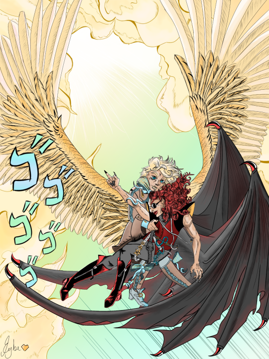
Wacky races - fairly odd parents - powerpuff girls - scooby doo - adventure time - Cowardly dog
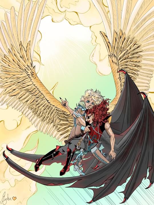
(Kanji-less version, timelapse and ramblings under the cut)
ALSO OPEN THE IMAGE TUMBLR KILLED THE QUALITY AS USUAL
I wasn't sure sure which version was better, so here is the one without the ~~menacing~~ kanji! (And sorry. I'm sure the Kanji I did is horrible but I swear I tried my best)
So. Before Good Omens consuming my every awaken thought, the media that lived in my head was JoJo's Bizarre Adventure. Because of a certain thing I am working on, my mind end up connecting the two and I HAD to do something about it or else I'd go crazy.
(Cues 3 min time lapse bc i spent -checks app- ALMOST 46 HOURS on this thing. Fuck)
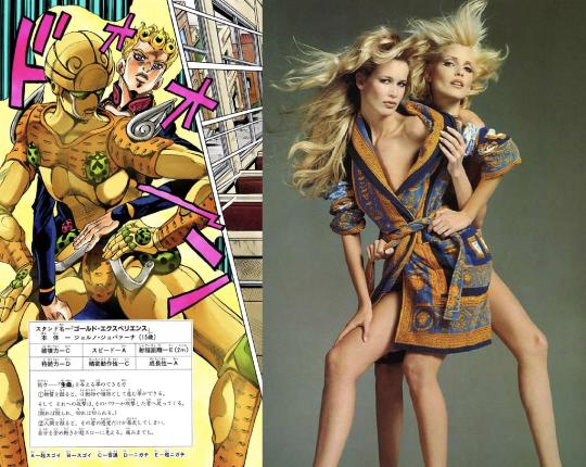
Since JJBA is one of my fixations, at some point I end up watching every single interview with Araki (the author) I could get my hands into, and lo and behold he actually shared about his process quite a bit over the years. We even have access to some timelapses of him working on illustrations!!! I tried to follow a bit of his process, and one VERY interesting characteristic of his work is the JoJo pose – very dramatic covers/panels that showcase the character. He often uses fashion shoots as a references (Araki is very inspired by fashion, architecture and music and there is a million references in his work it's very very interesting and fun) like this:
So there I go on Pinterest looking for a fashion photo that inspires me (Google was shit. What is happening to that search engine?) AND I FOUND IT
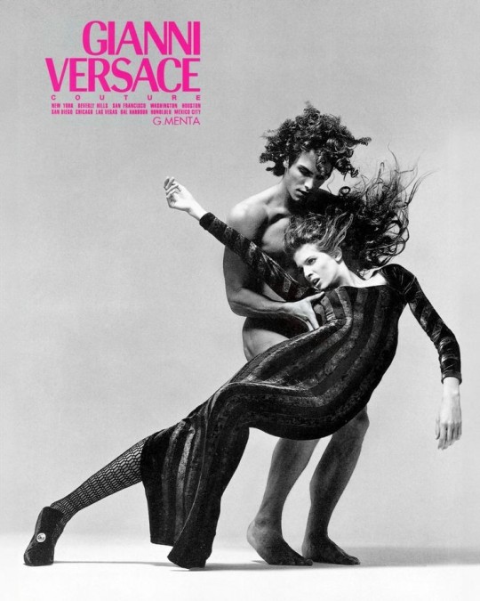
YALL. IT WAS LIKE A SHOT RIGHT THROUGH MY BRAIN. I COULD SEE IT SO CLEARLY. Aziraphale and Crowley falling out of heaven together after the second coming. Azi holding him. Crowley giving the middle finger to all those fuckers bc HE GOT HIS ANGEL BACK.
But the thing is... the things is. I'm no artist. I have almost no experience drawing. And this is not exactly an easy pose, and is something pretty ambitious for a beginner like me (I can literally count on my hands the amount of digital drawings I have done. It's all on my blog even lol) so like.... the chances of this going well were very slim. But I am very happy with how it turned out!!
I have to thank @elenthyaolyenths and @gribouli LOTS for that. Elen teached me how wings worked, a bit of anatomy with that, a bit of how she makes those beautiful fluid pieces, Li taught me a bit about colors and light/Shadow. Their support was amazing and they're so so nice to me 🥹
I had so much trouble drawing this bc I'm still learning how digital painting works and how Ibis Paint works. Idk what half of the stuff there does LMAO yk the line work? All in one layer. Don't do that folks. I resized the canvas half way through and had to redo a bit of the line art bc I had to scale it a bit to make the proportions better. Half way in I figured out how to make masks (again, elenthya is an angel for telling me that exists) so I had to learn as I went how that thing works (I still don't know how to use it fully). Ibis Paint froze like 4 times bc my phone can't handle it well LMAO my precision is shit bc I mostly draw with my fingers so I had to gave up control and use the stabiliser on maximum... and so on.
I'm having so much trouble with everything in digital painting BUT IT'S SO MUCH FUN. THERE'S SO MANY POSSIBILITIES. I'm excited to keep going and learn more.
Back to the Jojo style. I LOVE IT SO MUCH. I love harsh lines and shadows, the dramatic effects, the detail, the crazy perspectives, the colors... THE WAY ARAKI DRAWS SMOKE AND CLOUDS.
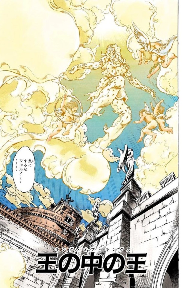
This was my ref for the background, and to represent the heaven Crowley is flipping off and that they're falling from. (fuck this scene in the anime broke me. BUCCIARATI MY BELOVED)
AND THE CLOTHEEEEESSSSS I HAD SO MUCH FUN IMAGINING WHAT THEY'D WEAR IN ARAKI'S STYLE. Obviously Aziraphale is once again sporting something inspired by the crepes look bc omg that was so OVER THE TOP. I'm sure araki would come up with something crazier and more interesting than what I did, but I still think this is a fair shot.
As much as I love JoJo's style I have to say it isn't really an art style made to depict softness. Like. I don't think Araki ever drew something that looks soft. All the characters are slim or super strong, and the few ones that are fat he didn't really... Well. I'm gonna say it. Araki doesn't draw fat people, and when he does I don't think they're a good depiction. As I said he doesn't do softeness lol nothing looks soft in his style, not even fabric I think. It's all sharp lines, dark shadows (again, I love it but yeah) and thin (or extremely big in the first parts) people. This fits really well with Crowley but not so much with Aziraphale. If this was a pose that showed more of him I'd probably not do a great job at it. I think I'd need to go heavy on trying to make his clothes look soft and big to try to make it better.
Now WwwwwiiiIIIIIIINNNNNGGGGGZZZZZZZ!!!! Elen is such a magician at drawing wings. I can't believe she actually offered to help me with this one. I learned so much. I was taking inspiration from her work, I wanted to make them BIG and GLORIOUS as she does and I think I succeeded a bit at it (they're not as fluid and perfect as hers, obviously, but I think they still look nice.)
As she was explaining to me how the anatomy works and all we ended up talking about how they're like arms and the digits in bats and I decided to give Crowley that type of wings. I also discovered that Elenthya used to draw DRAGONS. DRAGONS YALL. SHE GAVE ME A DOODLE OF ONE AND IT'S SO AMAIZNG. So together with the bat wings I tried to give him some drangon-esque feel. And she also gave me the idea to make Crowley's wings more damaged, to give more weight to the drawing - Aziraphale helping him not to fall again, holding him in the descend.
Anyway. I talked too much already and no one has the patience for this lol I just like to register the process of me learning things. It's fun.
#fanart i guess#good omens#jojo no kimyou na bouken#jojo's bizarre adventure#good omens fanart#fanart#crowley x aziraphale#aziracrow#ineffable husbands#cartoon!omens#DON'T ARGUE WITH ME I KNOW “ANIME” ISNT SEEN AS A “CARTOON” BUT IDC#it's a 2d animation as much as the others and that's what matters
157 notes
·
View notes
Text
Get Creative with Lime Green Eyeliner – Tips from Glowing Generation
The world of beauty, as far as using eyeliner can make for self-expression, has no place for any color at present like lime green. This eye-catching shade of lime green eyeliner introduces a fresh pop to your look and, when carried out carefully, can convert an easy makeup routine into something almost stunning and statement-making. If you are a newcomer to colorful eyeliners or feel like a shake-up, then here are some creative steps on how you can pull off lime green eyeliner with confidence
Start with a Clean Base
Achieving a full pop of lime green requires starting with a completely clean, even surface under the peepers. To give your liner something to grab onto for excellent hold, apply an eye primer or a little concealer underneath your eyeshadow. Applying eye primer also prepares your eyelids, giving you an even surface that makes it easier for eyeliner to slide on evenly and retain its vibrancy over time.
Use Lime Green as magic in Your Waterline
If you want to use lime green eyeliner in a not-too-complicated way, use this look by applying it on your waterline, just above the lower lashes. This will add the funny shadow of a color that is subtle but impactful. This way, you can pair it with neutral shades on your lids, say a light brown or champagne color, and save the lime green to be the star. This is also a great technique for beginners because it lets you play with different colors without overwhelming the look.
Try the dramatic graphic wingline
For a more dramatic look, you could always go for the classic winged liner in lime green. Start by drawing a really thin line from the inner corner of your eyelid out. You'll then thicken this as you get towards the outer corner of your eye. Finish with an upward flick to give it that signature wing effect. Lime green is a color that already draws people's attention but do you want your eyes to stand out more? This is a great look for when you want to go out in the evening, to a concert, or maybe just a time you want your eyes to be highlighted with a little twist of the winged eyeliner.
Double It Up With Black Eyeliner
If you like the lime green, but you want to keep things a little more toned down, try pairing it with classic black eyeliner. Sketch a lime green color directly above the lash line, but with a black liner first painted close to the lash line. It is a two-toned look that would make a strong contrast both stylish and classy. This makes eyeliner an anchor that places the lime green color base and will just pop even further-this is the addition of depth that just does not compromise boldness for the lime green shade.
Pair with Earthy Tones for Balance
Lime green eyeliner is great when paired with earthy tones for a more balanced look. Apply warm browns or bronzes on your eyelids to complement the lime green and create a harmoniously warm look with earthy tones. The earth tone warms up your face, and the lime green adds this surprising pop of color. This is perfect for daytime events as it is bright but still approachable.
Add Lime Green to the Inner Corners
Another very subtle way to add lime green is on your inner corners. It just brightens up your eyes and makes your eyes look even bigger with this playful highlight. Use a liner or small brush to tap on some lime green in the inner corners, and finish with a nude or soft pink lip for a look that keeps eyes at center stage. This is a great look for casual settings where you still want some color without going too crazy.
Finishing Touches
With lime green eyeliner, the other makeup needs to balance out. A light blush color and a natural lip color are perfect; this is where all attention goes directly to the eyeliner. As with any makeup look, if you don't feel confident, it's going to show. Own your look, and do not be afraid to try something new never know what may become a new favorite style.
Glowing Generation cosmetics for good.
Inspired by both modern beauty and a little shot of cultural heritage, this founding moment brings a very special lost moment of innocence she shared with her grandmother. Culturally-inspired, clean cosmetics for empowering teens, Glowing Generation ignites a product that adores individuality, again and again. As the company expands, it hopes to stand out globally as a symbol of inclusivity and empowerment. So if you want your freedom of self-expression with makeup holding beauty and traditions, Glowing Generation is here to inspire your path.
1 note
·
View note
Text
A Guide to Creative Editing and Digital Art
features that can elevate any project. Whether you’re a beginner or an experienced designer, learning to “play” with Photoshop opens up endless possibilities for digital creativity. In this article, we’ll explore some essential Photoshop techniques, creative ideas, and tips for making the most out of this versatile software.
1. Getting Started with Photoshop: The Basics
For newcomers, Photoshop can seem overwhelming, given the array of tools and features available. However, starting with the basics can make the learning process enjoyable. Key tools to begin with include:
Layers: Layers are the foundation of any Photoshop project. They allow you to stack different elements and make adjustments without affecting the entire image. Each layer can be edited independently, making it easy to add, remove, or modify content without impacting other parts of the design.
Selection Tools: Mastering selection tools like the Lasso, Magic Wand, and Quick Selection Tool allows you to isolate and edit specific parts of an image. This is particularly useful for complex compositions or when making color adjustments to a specific area.
Brushes and Textures: Photoshop offers a wide variety of brush tools, from basic round brushes to complex textures. Brushes are invaluable for painting, adding texture, or creating digital effects, and you can even create custom brushes for unique designs.
2. Photo Manipulation Techniques
Photo manipulation is where Photoshop shines. By using various tools and effects, you can dramatically change the look and feel of an image. Some popular manipulation techniques include:
Color Grading and Adjustments: Using tools like Curves, Levels, and Hue/Saturation, you can change the mood of a photo entirely by adjusting color tones. Color grading is widely used in photography and film to create a specific atmosphere or aesthetic.
Retouching and Enhancing Portraits: For portrait photographers, Photoshop offers tools to enhance and retouch photos while maintaining a natural look. Techniques like skin smoothing, blemish removal, and dodge-and-burn are essential for achieving polished, professional portraits.
Removing Objects: Photoshop makes it easy to remove unwanted objects or distractions from an image. Using tools like the Clone Stamp, Content-Aware Fill, and Healing Brush, you can seamlessly eliminate elements that detract from the focal point.
3. Creative Compositing and Digital Collages
Compositing is the art of combining multiple images to create a single, cohesive piece. With Photoshop, you can blend different elements to produce surreal or imaginative scenes. Here’s how to start:
Layer Masks: Layer masks are essential for smooth blending in compositing. They allow you to hide or reveal parts of an image without permanent changes, making it easy to create complex compositions with seamless transitions.
Blending Modes: Blending modes change how layers interact with each other, allowing you to achieve different effects. For example, using Overlay or Soft Light can enhance colors, while Multiply can create shadow effects.
Adding Textures and Elements: By incorporating textures, like grunge or abstract overlays, and additional elements, such as light flares or particles, you can add depth and interest to your composite images. Experimenting with textures can bring a new level of creativity to your work.
4. Using Photoshop for Digital Art and Illustration
Photoshop is a fantastic tool for creating digital illustrations. With an array of brushes, textures, and effects, artists can draw, paint, and illustrate directly in Photoshop. Here are some techniques to try:
Custom Brushes and Patterns: Create custom brushes to add unique touches to your artwork. For example, you can design brushes to mimic natural media, like watercolor or charcoal, for a traditional look.
Blending Colors and Layers: Blending colors effectively is a key skill for digital painting. Using different blending modes, opacity adjustments, and the Smudge Tool can help you achieve smooth transitions in your artwork.
Using Layer Styles and Filters: Photoshop’s Layer Styles (such as Drop Shadow, Stroke, and Outer Glow) and Filters (like Gaussian Blur and Noise) add polish to digital art. These tools help artists create effects that make their work look more dynamic and visually appealing.
5. Experimenting with Typography and Graphic Design
For graphic designers, Photoshop is an ideal platform for working with typography and creating visually engaging designs. From logos to social media graphics, Photoshop allows for full customization and creativity. Techniques to explore include:
Text Effects: Adding effects like shadows, glows, and gradients to text can make typography stand out. Layer Styles are particularly useful for customizing text and giving it a three-dimensional look.
Combining Text and Images: Graphic designers often blend text with images, a skill that’s especially useful in branding and advertising. By using clipping masks and transparency, you can create striking designs that balance visuals and text.
Shapes and Vector Art: Photoshop includes basic shape tools and the Pen Tool, enabling you to create simple vector graphics. While Adobe Illustrator is better suited for complex vector work, Photoshop can handle basic vector elements in your design.
6. Exploring Advanced Photoshop Techniques
Once you’re comfortable with the basics, diving into advanced techniques can take your projects to the next level. Some popular advanced techniques include:
Frequency Separation: This technique is essential for high-end photo retouching, allowing you to separate texture and color for greater control over skin tones and details.
HDR Imaging: High Dynamic Range (HDR) imaging creates vivid, high-contrast photos by blending multiple exposures. Photoshop makes it easy to create HDR images that capture a full range of light and shadow.
Creating 3D Effects: Photoshop’s 3D tools are ideal for adding dimension to your work. Experimenting with 3D layers can add depth to text and graphics, especially for projects that need a futuristic or industrial feel.
Conclusion: Endless Possibilities with Photoshop
Playing with Photoshop is about exploring, experimenting, and discovering new ways to express your creativity. Whether you’re editing photos, creating digital art, or designing graphics, Photoshop offers tools to bring any vision to life. For beginners, mastering the basics will provide a strong foundation, while experienced users can dive into advanced features to push their work further. The key to mastering Photoshop is practice, so keep experimenting and let your creativity lead the way!
Whether you’re a budding designer or even the Best Wedding Photographer in India, Photoshop provides a toolkit to refine images, create captivating visuals, and elevate your projects to new creative heights.
1 note
·
View note
Text
Discover the Beauty of Acrylic Mountain Painting: Tips, Techniques, and Inspiration
The rugged peaks and tranquil beauty of mountains make them a popular subject for artists, and acrylic mountain painting has become a favorite choice for both beginners and seasoned painters. Acrylic paints offer unique advantages—quick drying times, vibrant colors, and the ability to create various textures—that make them ideal for capturing the majestic essence of mountain landscapes. In this blog, we’ll explore what makes acrylic painting so captivating, discuss essential techniques, and provide tips for creating your own acrylic mountain masterpiece.
Why Acrylic Paints Are Perfect for Mountain Landscapes
Acrylic paints are versatile, fast-drying, and easy to work with, making them ideal for landscape painting. The medium allows you to layer colors, build textures, and adjust your composition as you work. Acrylic mountain paintings can range from realistic depictions to abstract interpretations, and the paint’s adaptability means artists can experiment with different styles, blending techniques, and textures to create mountains that evoke a sense of peace and grandeur.
Essential Techniques for Acrylic Mountain Painting
Layering and Gradients Mountains often have subtle color shifts and depth, which can be effectively captured with layered painting. Start by blocking in large shapes and colors, then gradually layer in details like shadows and highlights. This layering approach creates a sense of depth and realism in your mountain scene. Gradients, or smooth transitions between colors, can be used to capture the lighting conditions at different times of day.
Texture with Brush Strokes and Palette Knives Adding texture to an acrylic mountain painting brings life to the rocky cliffs, grassy fields, and snowy peaks. Use a palette knife to apply thick layers of paint for rough textures, while brushes with varied bristle thicknesses can create softer effects. Experimenting with these tools allows you to replicate the natural textures of a mountain landscape, from rough rocks to soft snowdrifts.
Blending Techniques for Sky and Clouds The sky is an integral part of any landscape painting, setting the mood for the entire scene. For mountain paintings, blend colors for the sky to create the illusion of atmosphere and distance. Acrylics dry quickly, so consider using a slow-drying medium if you need more time to blend. Soft brushes are excellent for blending cloud shapes and creating smooth transitions between sky and mountain.
Light and Shadow Capturing light and shadow is crucial for adding dimension to mountain landscapes. Study how sunlight hits different parts of a mountain, casting shadows and highlighting peaks. Use darker shades on the shadowed side of mountains and lighter tones for highlights. This contrast gives a sense of realism and helps convey the time of day, be it a golden sunset or a crisp morning.
Choosing a Color Palette for Your Acrylic Mountain Painting
Color choice can dramatically impact the mood and style of your painting. Here are a few popular palettes for mountain landscapes:
Warm Tones: For sunrise or sunset scenes, incorporate warm oranges, reds, and purples. These hues bring a sense of warmth and evoke the feeling of dawn or dusk.
Cool Tones: For misty morning or winter scenes, shades of blue, gray, and white can capture the chill and stillness of snow-covered mountains.
Natural Tones: Using greens, browns, and earth tones gives your painting a grounded and natural feel, perfect for spring or summer scenes.
Experiment with different color combinations to find the palette that resonates with the mood you want to convey.
Finding Inspiration for Your Mountain Paintings
Acrylic mountain painting is an art form that allows for endless creativity and personal expression. Here are some tips for finding inspiration:
Photography and Real-Life Exploration Use photos of mountain ranges, either taken yourself or sourced online, as references. Visiting local parks, mountains, or nature reserves can also inspire your color choices, light effects, and composition.
Study Other Artists Looking at other artists' work is an excellent way to learn new techniques and gain inspiration. Art galleries, online platforms, and websites like Artrekha showcase many different styles of mountain paintings, from abstract to realistic.
Experiment with Styles Don’t feel restricted to realism. Many artists use acrylic paints to create abstract representations of mountains, focusing on color and form rather than precise detail. Abstract mountain paintings are a great way to explore new ideas and techniques.
Displaying Your Acrylic Mountain Painting
Once you’ve completed your acrylic mountain painting, think about the best way to showcase your artwork. Whether framed in a gallery style or displayed on a modern, minimalist canvas, a mountain landscape can become the focal point of any room. Consider using Artrekha’s collection as inspiration, where you can see various ways artists bring mountain art into interior spaces, creating a calming and inspiring environment.
Conclusion
Acrylic mountain painting offers a fantastic opportunity to capture the beauty of nature in all its rugged glory. From layering and blending to mastering light and shadow, the possibilities with acrylic paints are nearly endless. By experimenting with color palettes, techniques, and textures, you can create a piece that reflects your unique vision and brings the tranquility of mountain landscapes into your home.
Visit Artrekha to explore more acrylic mountain paintings and find inspiration to start your own journey in this captivating art form. Whether you're an aspiring artist or an art enthusiast, acrylic mountain painting is a rewarding way to connect with nature and express creativity on canvas.
0 notes
Text
Discover the Best Free Image Editor Online

In the age of digital media, the want for effective and human-friendly image editing tools is greater obvious than ever. Whether you are a professional photographer, a style photographer, or a hobbyist, having a flexible shadow editor can make a huge distinction within the subtlety of your pics. While there are numerous paid options to be had, not absolutely everyone can locate the cash for pricey software program. Fortunately, there are several outstanding unfastened photo editors on line that offer strong capabilities without breaking the financial institution. In this newsletter, we'll explore some of the satisfactory free photograph editor on line options, their particular capabilities, and how they are able to advantage you.
Top Picks for the Best Free Image Editor Online
Photopea
Photopea is a browser-primarily based picture editor that carefully resembles Adobe Photoshop in each appearance and functionality. It helps PSD documents, making it an outstanding choice for the ones familiar with Photoshop. Photopea gives a extensive range of equipment, including layers, mask, filters, and vector pics. Its versatility and effective features make it a pinnacle contender for the quality free image editor on line.
Adobe
While Adobe gives many paid alternatives like Photoshop, it also presents a unfastened, person-pleasant photo editor referred to as Adobe Spark that may be accessed on-line. Adobe Spark is an high-quality preference for the ones looking for the best free picture editor online, providing a variety of layout gear and templates for developing stunning visuals.
Canva
Canva is a famous graphic layout tool that also gives robust image editing skills. While it's miles mainly used for growing social media pix, presentations, and other layout initiatives, Canva's photo editor is strong enough for maximum picture modifying needs. It gives a drag-and-drop interface, a sizeable library of templates and elements, and diverse enhancing equipment like cropping, resizing, and applying filters.
Fotor
Fotor is an easy-to-use on line picture editor with a variety of features for basic and advanced modifying. It includes equipment for retouching pics, including consequences, and growing collages. Fotor's person-pleasant interface makes it on hand for beginners, while its advanced features, like batch processing and HDR, cater to greater skilled customers. Fotor is a sturdy choice for all people seeking the best unfastened photograph editor online.
BeFunky
BeFunky gives a easy but powerful online photo editor this is best for brief edits and innovative tasks. It presents a variety of gear for boosting pix, creating collages, and designing pix. BeFunky also consists of a number of filters, effects, and customizable templates. Its truthful interface makes it an outstanding preference for users of all ability stages.
Sumopaint
Sumopaint is a versatile on line photo editor that offers quite a number capabilities much like those observed in traditional laptop software program. It includes gear for drawing, painting, and image modifying, as well as layers and filters. Sumopaint's browser-based platform guarantees that you could get entry to your tasks from everywhere, making it a convenient choice for the first-rate unfastened photo editor online.
Conclusion
Finding the first-rate unfastened image editor online can extensively decorate your virtual projects with out the need for expensive software. Whether you need simple modifying gear or advanced functions, there may be a loose option available to suit your wishes.
Read full article here: https://www.techybullion.com/2024/05/discover-best-free-image-editor-online.html
0 notes
Text
Discover Nainital’s Best Treks: Essential Trails for Every Explorer

Nainital, a picturesque hill station nestled in the Kumaon region of Uttarakhand, is a haven for nature lovers and adventure seekers alike. Known for its serene lakes, verdant hills, and breathtaking landscapes, Nainital also boasts an array of trekking trails that offer something for everyone, from casual walkers to seasoned hikers. These treks not only provide stunning views but also an opportunity to immerse yourself in the natural beauty and tranquility of the region. Here are eight of the best treks in Nainital that you should explore with amazing travel tips for Nainital.
1. Naini Peak (China Peak)
Naini Peak, also known as China Peak, is the highest point in Nainital, standing tall at approximately 2,615 meters. This trek is among the most popular in the area, offering panoramic views of Nainital town, its surrounding lakes, and the majestic Himalayan range in the distance.
The trek to Naini Peak is moderately easy, making it suitable for both beginners and experienced trekkers. The trail winds through dense forests filled with rhododendrons, deodars, and cypresses, providing ample shade and a refreshing environment. As you ascend, the air becomes cooler and crisper, and you might spot some of the local wildlife, including various bird species and small mammals.
Upon reaching the summit, you are rewarded with a 360-degree view of the landscape. On clear days, the snow-clad peaks of the Himalayas, including Nanda Devi, the second-highest mountain in India, are visible. Many trekkers prefer to start early to catch the sunrise from the peak, which paints the mountains and valleys in golden hues—a sight worth the early morning effort.

2. Snow View Point
Snow View Point is another gem in Nainital’s trekking repertoire. This trek is easier compared to Naini Peak, making it perfect for families and casual walkers. The trail is well-maintained and meanders through lush forests, offering beautiful views along the way.
At Snow View Point, you are greeted with a mesmerizing view of the Himalayan range, including peaks like Nanda Devi, Trishul, and Nanda Kot. The viewing platform at the top is equipped with binoculars for a closer look at these snow-capped giants. Small tea stalls nearby provide a warm beverage to enjoy while soaking in the scenery.
This trek is relatively gentle, allowing you to enjoy the natural beauty without too much physical exertion. The forest along the trail is alive with the sounds of birds, adding a melodious backdrop to your hike.
Length: Approximately 3 km one way Time Taken: 2-3 hours round trip Difficulty Level: Easy
3. Tiffin Top (Dorothy’s Seat)
Tiffin Top, also known as Dorothy’s Seat, is a favorite among trekkers for its splendid views of the surrounding hills and valleys. Named in memory of Dorothy Kellet, an English artist, this spot offers a peaceful retreat from the bustle of Nainital town.
The trek to Tiffin Top is moderately easy, suitable for most people, including families and beginners. The path winds through forests of oak, deodar, and pine trees, providing a cool and serene environment. Along the way, you can spot various bird species and enjoy the vibrant colors of the local flora.
At the summit, Tiffin Top offers a 360-degree view of Nainital and the surrounding areas. The large open space at the top is perfect for picnics, which is why it’s called Tiffin Top. The play of light and shadows across the landscape during sunrise or sunset adds to the beauty of the trek.

4. Land’s End
For those seeking a shorter, more adventurous trek, Land’s End is an excellent choice. This trek is moderately challenging due to its steep path but is short enough to be completed by most trekkers.
The trail to Land’s End starts on the outskirts of Nainital and ascends through dense forests, eventually leading to a dramatic cliff that offers a breathtaking view of Khurpatal Lake. The lake, nestled deep in the valley and surrounded by thick forests and hills, is a sight to behold.
The forest along the trail is rich in biodiversity, and you might encounter various birds, small animals, and even deer. The trek is particularly beautiful in the spring when the trees are in full bloom.
Length: Approximately 2-3 km one way Time Taken: 1-2 hours round trip Difficulty Level: Moderate
5. Pangot and Kilbury Trek
The Pangot and Kilbury trek is a paradise for bird watchers and nature enthusiasts. This trek takes you through dense forests of oak, pine, and rhododendron trees, home to over 580 bird species, including the Himalayan griffon, blue-winged minla, and rufous-bellied woodpecker.
Starting from Nainital, the trail leads to the quaint village of Pangot, offering numerous opportunities to spot exotic birds along the way. The trek then continues to Kilbury, known for its bird sanctuary, making it a must-visit for bird lovers.
The peaceful environment, coupled with the symphony of bird songs, makes this trek a delightful experience. The trail is moderately easy, making it accessible to both beginners and seasoned trekkers.

6. Guano Hills
Guano Hills is a lesser-known trek in the Pangot region, but it is equally beautiful and rewarding. The trail takes you through thick forests of oak, bamboo, and deodar trees, offering a peaceful retreat from the more crowded trails around Nainital.
This easy trek is perfect for families and casual trekkers. The forest is teeming with wildlife, including various bird species and small mammals, making it a great spot for nature lovers. The trek culminates at a clearing that offers stunning views of the surrounding hills and valleys.
The Guano Hills trek is ideal for those looking to enjoy a quiet, nature-filled walk without too much physical exertion. The return journey along the same path offers different perspectives of the landscape.
Length: Approximately 5-6 km round trip Time Taken: 2-3 hours Difficulty Level: Easy
7. Cave Garden Trek
The Cave Garden Trek is unique among the treks in Nainital, offering a blend of nature and adventure. This short and easy trek takes you to the Eco Cave Gardens, a popular attraction featuring a network of natural caves.
The trek starts from the center of Nainital and winds through a forested area, making it a pleasant walk. The Eco Cave Gardens themselves consist of six interconnected caves, each representing a different animal. Exploring these caves is fun, especially for children.
After visiting the caves, you can continue to a nearby viewpoint that offers a beautiful view of Nainital and its surrounding hills. The Cave Garden Trek is perfect for a short, family-friendly adventure.
Length: Approximately 2 km round trip Time Taken: 1-2 hours Difficulty Level: Easy
8. Kunjkharak Trek
For experienced trekkers looking for a challenge, the Kunjkharak trek is a perfect choice. This trek takes you through dense forests, along ridges, and up to Kunjkharak Peak, offering stunning views of the mountains and valleys.
The trail is steep in places and demands good physical fitness, but the effort is well worth it. The dense forests along the trail are home to a variety of wildlife, and the cool, crisp air adds to the experience. At the summit, you are rewarded with breathtaking views of the snow-capped peaks and deep valleys below.
The Kunjkharak trek is a two-day adventure that allows you to immerse yourself in the natural beauty of the region. Camping overnight under the stars adds to the thrill of this challenging trek.

Conclusion
Nainital offers an array of trekking options, each with its unique charm and appeal. Whether you’re a casual walker or an experienced trekker, these trails provide a perfect escape into nature, with breathtaking views, rich biodiversity, and a peaceful environment. So, pack your bags, lace up your hiking boots, and embark on one of these best treks in Nainital for an unforgettable adventure.
0 notes
Text
Editing Faces with Photoshop: A Complete Guide for Beginners
Editing faces with Photoshop can feel dispiriting at first, but with the right ways and tools, you can achieve emotional results. Whether you are looking to touch up a portrayal, produce cultural goods, or indeed perform advanced face barters, Photoshop offers a wealth of possibilities.
In this companion, we'll walk you through the basics of editing faces with Photoshop in veritably easy English, while also exploring how tools like Facewix and free face exchange apps compare.
Understanding Photoshop for Face Editing
Adobe Photoshop is an important software known for its expansive editing capabilities, including manipulating faces in prints.
Tools Photoshop provides tools like the Clone Stamp, Healing Brush, and Liquify sludge for precise adaptations.
Layers and Masks use layers and masks tonon-destructively edit facial features and overall composition.
Pollutants and goods Apply pollutants and goods to enhance facial details or produce cultural metamorphoses.
Why Consider Photoshop for Face Editing?
Photoshop remains a favored choice among professionals and suckers for several reasons:
Versatility From introductory touch- ups to complex metamorphoses, Photoshop can handle colorful editing tasks.
High- Quality Results Produces high- resolution labors suitable for both digital and print media.
Integration Seamlessly integrates with other Adobe products like Lightroom for a streamlined workflow.
Step by- Step companion to Editing Faces with Photoshop
Step 1 Open Your print in Photoshop
Launch Photoshop Open Adobe Photoshop on your computer.
Cargo Your print Go to train> Open and select the print you want to edit.
Step 2 Basic Touch- Ups
Spot Healing Brush Use the Spot Healing Brush tool( J) to remove mars or defects on the face.
Clone Stamp Tool Use the Clone Stamp tool( S) to indistinguishable corridors of the image to cover unwanted areas.
Step 3 Acclimate Facial Features
Liquify Filter Go to Filter> Liquify to reshape facial features like eyes, nose, or mouth. Use the tools handed to acclimate size and shape.
transfigure Tools Use Edit> transfigure to resize or rotate facial features as demanded.
Step 4 Enhance Skin and Tone
Adjustment Layers Use Adjustment Layers(e.g., situations, Angles) to acclimate skin tone, brilliance, and discrepancy.
Blur and Edge Pollutants Apply Blur or Edge pollutants to enhance skin texture or overall sharpness.
Step 5 Add Creative goods( Optional)
Pollutants and goods Explore cultural pollutants(e.g., Oil Paint, Sketch) to produce unique goods on the face.
Subcaste Styles Apply Subcaste Styles(e.g., Drop Shadow, external gleam) to add depth and dimension to facial rudiments.
Step 6 Perform Face barters( Optional)
select and Mask Use the Select and Mask workspace for precise selections around faces.
Face exchange ways trial with homemade face barters using selection tools and subcaste masks for blending.
Step 7 Finalize and Export
Review Your Edits Zoom in to check for any defects or areas demanding refinement.
Save Your Work Go to train> Save As to save your edited print in the asked format.
Using Facewix and Free Face exchange Apps for Comparison
While Photoshop offers robust editing capabilities, tools like Facewix and free face exchange apps give indispensable styles for face editing.
Facewix A free online tool specializing in AI- driven face barters with a stoner-friendly interface.
Free Face exchange Apps Offer real- time face switching directly on mobile bias, making them ideal for quick edits and sharing.
Tips for Effective Face Editing in Photoshop
Practice Non-Destructive Editing Use layers and masks to save the original print and make reversible edits.
Use Reference Images Keep reference images handy to guide facial point adaptations for literalism.
Trial with Pollutants Explore different pollutants and goods to achieve asked facial advancements or creative metamorphoses.
Editing faces with Photoshop allows you to unleash your creativity and enhance prints in innumerous ways. Whether you are a freshman learning the basics or a sucker exploring advanced ways, Photoshop provides the tools and inflexibility to achieve professional- quality results.
Consider integrating tools like Facewix and free face exchange apps into your workflow for fresh editing options and effectiveness. Start rehearsing, and discover the endless possibilities of editing faces with Photoshop!
1 note
·
View note
Text
Quick Fixes: Simple Photo Retouching Hacks Everyone Should Know
Introduction
Photo retouching doesn't have to be a time-consuming process reserved for professionals. With the right hacks and tools, you can quickly enhance your photos to make them look polished and professional. This blog post will share simple photo retouching hacks that everyone should know, enabling you to improve your images with minimal effort.
Basic Retouching Tools
1. Healing Brush and Spot Removal
Healing Brush: Use the Healing Brush tool in Photoshop or similar software to remove blemishes and small imperfections. This tool samples surrounding pixels to blend the retouched area seamlessly.
Spot Removal: In Lightroom, the Spot Removal tool works similarly to the Healing Brush, making it easy to eliminate unwanted spots.
2. Clone Stamp Tool
Clone Stamp: The Clone Stamp tool allows you to copy pixels from one area of the photo to another. This is useful for duplicating textures or covering larger imperfections.
Quick Retouching Hacks
1. Brighten Eyes
Brightening the eyes can make a portrait more engaging and lively.
Dodge Tool: Use the Dodge tool in Photoshop to lighten the whites of the eyes. Set the tool to a low exposure (10-15%) and carefully paint over the eye whites.
Iris Enhancement: Increase the clarity and exposure on the irises using the Adjustment Brush in Lightroom to make them pop.
2. Soften Skin
Smooth, even skin can dramatically improve a portrait.
Frequency Separation: In Photoshop, use frequency separation to separate texture from color. Smooth the color layer while preserving texture for natural-looking skin.
Skin Smoothing Presets: Use skin smoothing presets in Lightroom to quickly even out skin tones.
3. Enhance Hair
Shiny, well-defined hair can elevate a portrait.
Dodge and Burn: Use the Dodge and Burn tools to add highlights and shadows to the hair, enhancing its volume and texture.
Clarity Adjustment: Increase clarity and contrast on the hair using the Adjustment Brush in Lightroom for added definition.
Tools for Quick Fixes
1. Adobe Photoshop
Content-Aware Fill: Use Content-Aware Fill to remove larger objects seamlessly.
Actions and Presets: Download or create actions and presets to automate repetitive retouching tasks.
2. Adobe Lightroom
Quick Develop: Use the Quick Develop panel for batch adjustments to exposure, contrast, and white balance.
Presets: Apply presets for consistent and speedy edits.
Additional Tips
1. Work Non-Destructively
Adjustment Layers: Use adjustment layers in Photoshop for non-destructive edits that can be easily modified or removed.
Virtual Copies: In Lightroom, create virtual copies of your photos to experiment with different edits without altering the original file.
2. Utilize Keyboard Shortcuts
Photoshop Shortcuts: Familiarize yourself with Photoshop shortcuts to speed up your workflow. For example, pressing “J” selects the Healing Brush tool.
Lightroom Shortcuts: Use Lightroom shortcuts, such as pressing “Q” for the Spot Removal tool, to work more efficiently.
Conclusion
With these simple photo retouching hacks, you can quickly enhance your photos and achieve professional-looking results. By utilizing tools like the Healing Brush, Clone Stamp, Dodge and Burn, and adjustment layers, you can make significant improvements to your images in no time. Whether you're a beginner or an experienced photographer, these tips will help you streamline your retouching process and produce stunning photos with ease.
0 notes
Text
Master the Art of Rain Clouds Easy Nail Art
Are you looking to add a playful touch to your nails? Look no further than this easy nail art tutorial on creating adorable rain clouds. This design is perfect for beginners and can be a fun way to brighten up a rainy day with just a few simple steps and common nail art tools. Materials Needed: Light blue nail polish White nail polish Gray nail polish A fine detailing brush A dotting tool or a toothpick Top coat polish Step-by-Step Guide: Prepare Your Nails: Start by cleaning your nails, trimming them to your desired length, and applying a clear base coat. This not only protects your nails but also helps the nail art last longer. Apply the Base Color: Apply two coats of light blue nail polish on all your nails. This serves as the sky background for your rain clouds. Allow it to dry completely before proceeding to the next step. Paint the Clouds: Dip your fine brush into white nail polish. On each nail, paint one or two fluffy clouds near the top of your nail. You don’t have to be perfect—uneven, fluffy shapes contribute to the natural look of clouds. Allow the white polish to dry. Add Shades to the Clouds: Using a small amount of gray polish, add slight shadows to parts of the clouds to give them a more dynamic and realistic appearance. Use a very light touch, and don’t cover too much of the white. Create Raindrops: With your dotting tool or toothpick, dip into the gray polish and add small raindrops falling from each cloud. Space them unevenly to mimic natural rainfall. This tiny detail will bring your nail art to life! Apply Top Coat: Once your miniature masterpiece is dry, seal it with a clear top coat. This step is crucial as it helps prevent chipping and provides a glossy finish that makes your rain clouds pop. And there you have it—a charming rain cloud design that's perfect for any weather. This nail art is not only cute and stylish but also a great conversation starter. Whether you're a beginner or an experienced nail artist, this easy tutorial is sure to bring a little joy and creativity into your nail care routine. Happy painting!
0 notes