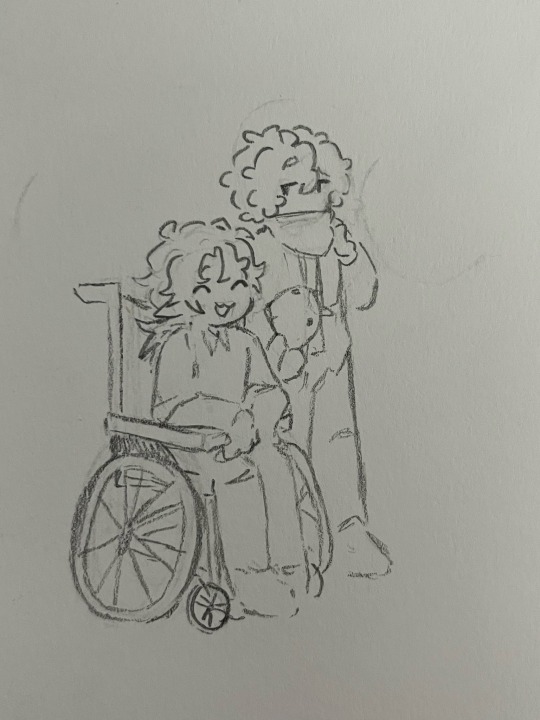
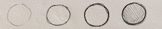
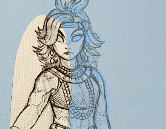
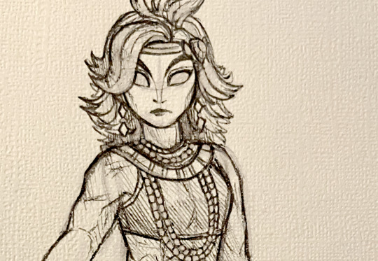
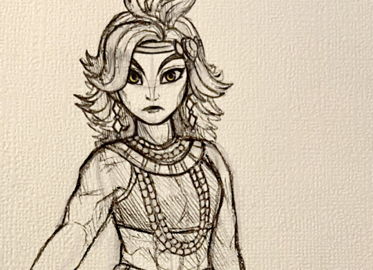
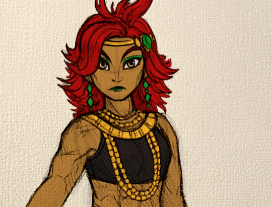
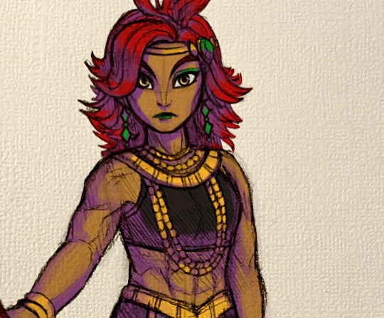
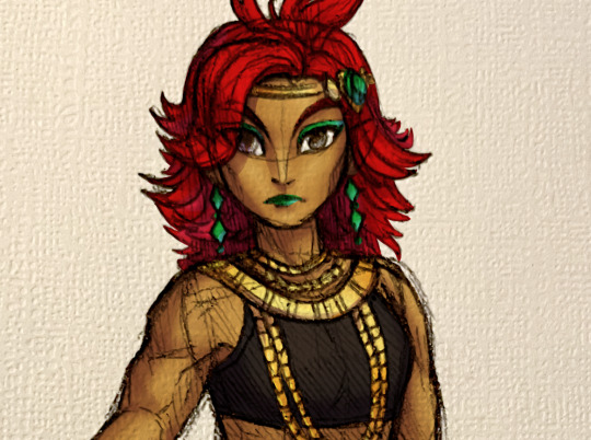
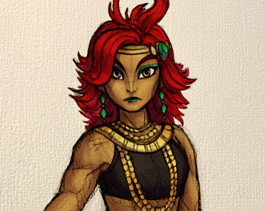
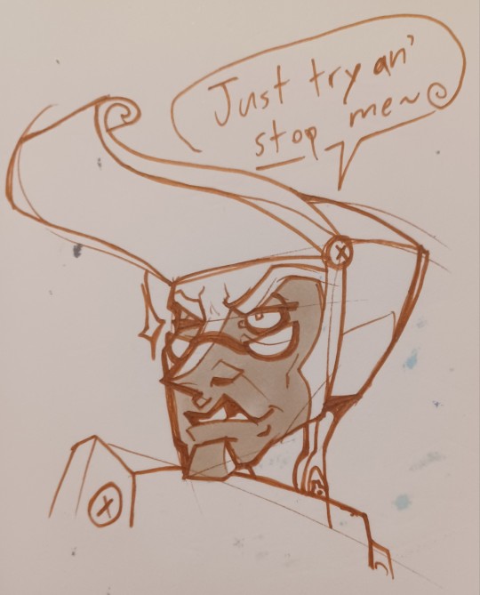
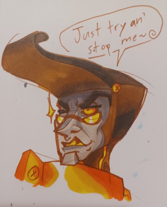
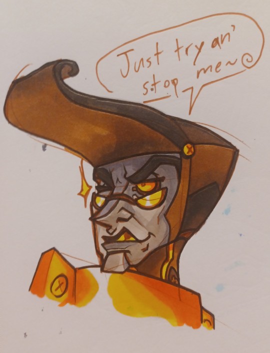
#did the lines for these on paper with a brush pen and then colored them digitally
Explore tagged Tumblr posts
Visit Tumblr Blog
Explore Tumblr blogs with no restrictions, modern design and the best experience.
Last Seen Tumblr Blogs


Fun Fact
There were a total of 171.5 billion posts on Tumblr in 2019.
Note
Hi! I saw your ddvau watercolor drawings and the look so pretty <3<3<3<3
I was wondering if you could share your art process when it can to those pieces? (Like what order you did stuff in, what materials, ect.)
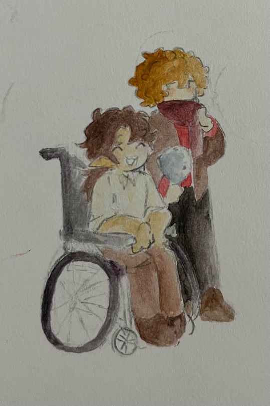
Hihi!! First off TYSMM and Im more than glad to show the process (≧∇≦)!! Sorry if it's a bit long or if im over explaining, I struggle with this, but oh well.. (ㆀ˘・з・˘)
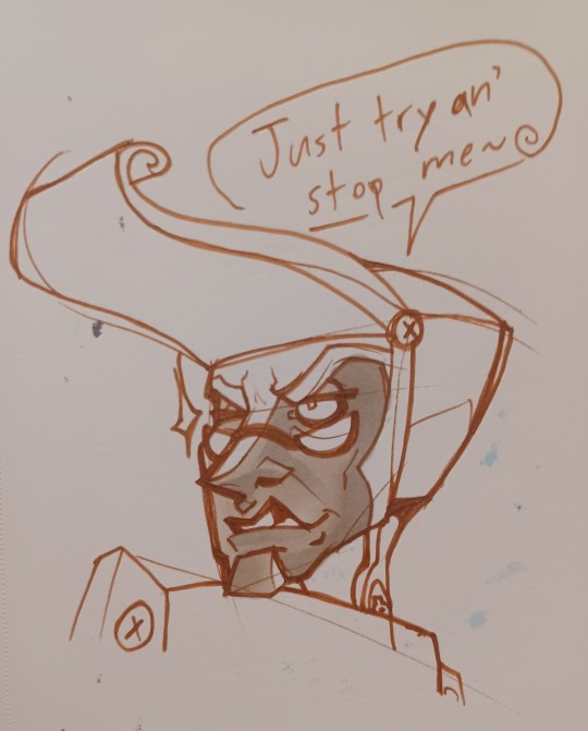
1~ have your sketch on a separate piece of paper, I don't use watercolor paper-purely drawing paper and sometimes mixed media. I then clean up the sketch, make sure any parts you don't plan on going over are lightly erased(??) especially parts that are lighter (like skin or white clothes!)
(Btw, I recommend using lighter lead like 2H/4H)
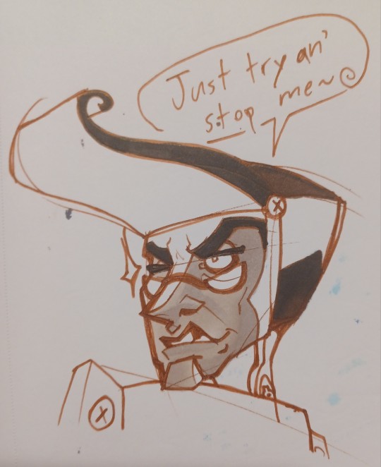
2~I use the 36 pack of "twistable bear crayons" (if you search it up they're the first thing that show up!) and on another piece of paper (I usually just use any scrap paper) make a little blotch with the crayon and go over it with your brush (I use a random round point brush..)
I love these crayons especially for the fact they dry so fast, they're so easy to blend and use as water color (*´∀`*)
No idea how to explain the way I color, but I start from the lighter color to darker ones. I don't think it makes any difference from the other way around! I also mix the colors a lot, like with grian I mix this yellow brown with a more reddish brown and for Scar I add green undertones to his skin!
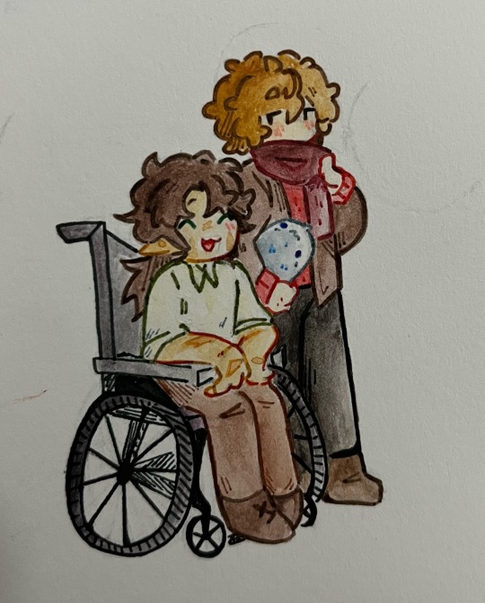
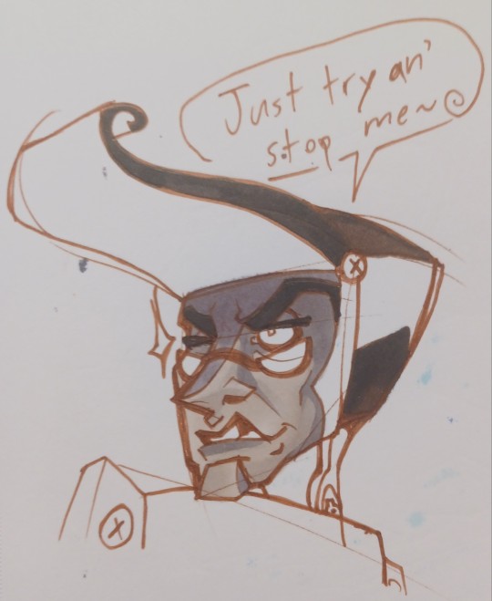
3~After the colors are layed down, I line it with ZSCM dual brush pens. Althoughhh I plan on finding a new brand since there's not the biggest variety of colors-at least not with the pack I have..
I add little bits of hatching purely for texture, and I go over the outside lines multiple times so they're bolder (just a style preference ( ̄∇ ̄))
Also! If you do use these markers make sure not to go over them with water, and make sure your paper isn't wet as it will runoff 。゚(゚´ω`゚)゚。 I've also noticed that while all the other colors don't smudge, black does if you don't let it sit before touching up!
4-Cut it out! I like to leave a little white boarder since it's hard to cut around such tiny lines, and obviously after that I just glue it in :3
I like to add later to the drawings, adding other little bits, like for example the jellyfish tank in the background ^^
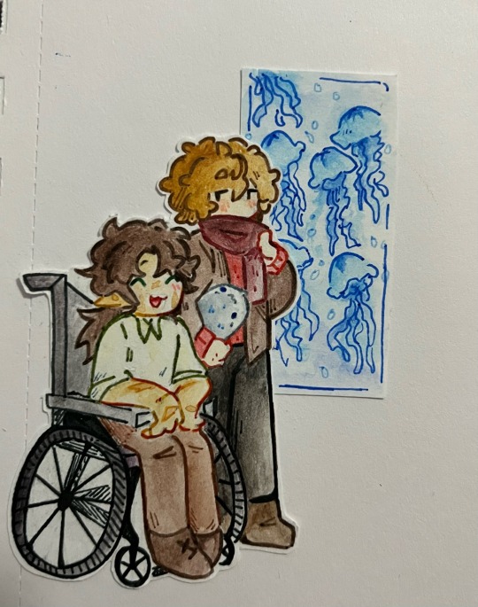
That's it though, I hope this helps!! Sorry if I didn't answer any questions ITS SO HARD TO EXPLAIN WAAH
635 notes
·
View notes
Text
code of ethics
iii. “possessive”


read on AO3 🤎
parts: previous / next
plot: things become a bit easier between you and your professor (now mentor)—but something isn't adding up.
pairing: professor!bruce wayne x student!reader
cw: 18+
word count: 3k
a/n: listened to 'bad decisions' and 'hands on me' by ariana grande on loop while writing this—if this were my main fic, i would've written like fifty bajillion scenes of lusting and personal time, but this is a miniseries, so, we move right along! trying new things <3

A one-on-one mentorship didn’t require a classroom, so you found yourself sitting across from Professor Wayne in his minuscule office. Evidently, billionaire or not, every faculty member got the same 100-square foot space that left barely enough room for one student in addition to a desk, filing cabinet, and two chairs. Deep brown tones filled his office, making it appear stuffy.
You felt awful watching him squeeze into his tiny seat across from you; had he opted for the smaller seat so you could have room? Surely the higher-ups could accommodate him. Like you’d spoken aloud, he apologized while hunting through his desk.
“Emailed the admin about booking a conference room, but they’ve yet to get back to me. Hopefully,” he pulled out a bottom drawer, a small, satisfied sound slipping past his lips that made you sit straighter. “They’ll respond soon, and we can get somewhere more comfortable.”
Comfortable. You’d repeated that word like a mantra in the mirror as you picked your outfit for the first day. Against your better judgment, you’d gone with sweats and a tee; unprofessional, you’d chastised, but wearing anything else felt promiscuous. Hyperaware of how tightly the jeans hugged your waist and ass—and oh, god, you avoided your skirts like your life depended on it—you’d landed on a perfectly comfortable pair of thick, cozy sweatpants. You tugged at a loose thread as your focus landed on his hands.
Blue was the color he’d chosen for his pen. Not black, not red, but a cool, even blue. How sweet. You pulled at the thread harder.
“Do you have topic ideas?”
“Yes.” Dutifully, you slid a folder out of the backpack you’d obsessively cleaned the night prior. Smooth manila protected your typed list, ranging from strict academia to looser creative pursuits. You pushed the paper to him, heart pounding.
He stared, his head cocked slightly. He looked to you, the paper, then slid it back. “Which are you passionate about?”
“I thought we’d look over them and decide together,”
He shook his head, lips pressed in a thin line. You felt what he wasn’t saying. “I won’t be the one writing it. It should be about what you want.”
Your professor held out his pen, and your fingers brushed as you took it. It was weighty in your hand, and you very well could’ve imagined it, but the cushion where his fingers had been held warmth. His big, long, warm hands… they were what you wanted. Manicured nails caught your attention, and you bit back an audible ‘of course’. His hygiene was impeccable. What else did you expect from a man like him? Was he manicured elsewhere?
“Circle the topics you’re most interested in. If you still need my help,” yes, I do, “then we’ll talk.”
You knew it would be bad after the break you had, but not this bad. You were achingly aware, in fact, following out of the corner of your eye while you pretended to deliberate topics, that he’d switched his usual sweater for a button-up. With the top two buttons undone.
Focus.
You snuck another look, and he caught your eye with a curious squint.
FOCUS!
In truth, none of the topics genuinely interested you. Scouring his faculty page online, you’d gone down his research and found topics he was engaged with, and went from there. Sitting only a few inches from him now, your play felt embarrassingly obvious. It could’ve been minutes or could’ve been hours, but nothing was circled, or underlined, and the pressure in the room shifted.
“I don’t like any of these,” you admitted, once again feeling like a child owning up to a Big Mistake. What would the slap on the wrist be? Sending you home early? Emphasizing that you really needed to take this class seriously, only making you feel worse?
Instead, he bridged the space between you. The depth of his blue eyes this close had you genuinely worried you’d drown. “If you had to write the paper right now, and no one would read it, what would you write about?”
You hoped he couldn’t feel the heat emanating off your cheeks, and fought to keep your voice steady. “But you will read it.”
“I’m here to support, not punish.” He lingered a moment, holding your gaze so firmly that a small gasp escaped when he sat back against his chair. “The process will be more enjoyable if it’s a subject you want to dig into, and your writing will be better for it.”
It’d been hard enough getting grades back throughout undergrad knowing someone had read what you wrote, perceived you, judged you. It was an entirely new thing when the single most attractive, naturally charismatic man you’d ever seen was judging it in real time, intimately. If you didn’t know him, and had seen him on the opposite end of the same coffee shop, you would’ve hightailed it out of there, holding your breath—never would you have even thought it an option to approach him.
Yet here you were, mandated to share a teensy room with the object of such desire.
“This isn’t like last term. This course is about development and revision, pass no pass.”
“Alright.” It didn’t settle the rhapsody that threatened to overwhelm you, but nothing would in his presence. He appeared to attune to your continued hesitance at once.
“What makes you afraid of me reading it?”
That you’ll think less of me. “You’ll think it’s elementary.”
“Pick whichever topic without regard for how I might receive it.” He waved his hand over the carefully crafted options. “Or pick from the assembly of my research credits you collected there.”
Crap. Of course he could tell.
It took you the rest of the class, but you finally selected your paper topic. When you shared it, Professor Wayne’s eyes flashed, and after your internal recoil, you noticed him grin. “It’ll certainly make for an interesting essay.”
You shifted in the chair, the space between you and the shared desk seeming too tight. “Bad or good?”
“Neutral.”
He’d been too thoughtful when he said it. Pause… ‘neutral’. “A professional way to say ‘bad’ without hurting my feelings?” An hour spent with him and your filter was slowly removing itself. A smidgen of bravery gathered within you, though you couldn’t imagine how with the adrenaline-spiked overwhelm at how fucking perfect he was.
“Seems to be your Achilles heel, Y/n.” He stood, somehow managing to pull on his coat in the meager space. His perfect hair fell perfectly around his ears, swishing slightly as the jacket’s collar grazed it. “A harsh inner critic will only get you so far.”
“Mm.” Your throat went dry as he towered over you. It was as if he’d plucked last night’s fantasies from your bedroom. Now, just press his hands onto the desk… lean closer… tell me he wants to…
“I mean it.”
You bit your lip, blinking at warp speed. “Yeah?” Too pitchy, shit.
He nodded, oh, even just a nod… and it was only the first day! “Almost dropped out of my doctoral program twice.”
“No way.”
He grabbed his mug, and your eyes trained on the movement. Does Professor Wayne know all I can think about is his hands on me? “Overthought my dissertation from the day of admission. Didn’t think I could measure up.”
Him having anything outside of strict confidence was so shocking it pulled you out of your lust. “And?”
“Now I get this spacious office all to myself.”
Your cheeks hurt from the slope of your grin, digging into the apples of your cheeks. The man was endearing; certainly more than he’d been a term prior. Was it pitying? Did he see you as fragile? Because good god, you wanted him to break you.
“My point being: I had to write it despite my concerns. Follow where my mind went. Learn to trust it.”
“How did you?” If you could mimic a single crumb of how he moved so effortlessly through the world—billionaire near-miss-A-list-celebrity notwithstanding—you’d take it. Managing a string of conversation that didn’t make your core tighten would be helpful, too.
“Trusted my supervisors. That if I were truly out of line, someone would’ve told me.” He walked around the desk toward the door, but stopped between you and it. The noise got harder to ignore, but you managed.
“Like you did last term.”
“A bit kinder than that, I’ll admit.” He gestured for you to lead the way out of his office, and you shakily got up from your chair to follow orders. You stalled in the slim, empty hallway, lit mostly by passing headlights through the window at its end.
He clicked the lock and strode just ahead. “You have a strong voice. It’s a shame you’re not trusting it.”
His smooth speech was beginning to genuinely unravel you. If he’d been speaking to you like this in his office, when you had to stare into his face instead of at his broad, flowing shoulders…
“I just can’t believe you ever felt that way. You seem like you knew all this stuff from birth.”
He tossed a look back at you, the whisper of a smirk wearing his mouth. “That’s the trick, isn’t it?”
Mmm…
Professor Wayne held the door open for you into the building’s main hallway, and you hugged the folder tight to your chest as you skirted past. “Come with an outline for next week’s session.”
“Will-do.” Your voice was too deep, thrown, almost ragged.
“Hopefully we’ll have a more accommodating room by then.”

You did not have a bigger room for the rest of the term.
“Wonderful.”
He handed your essay back without comment, which was too confusing to internalize his praise. “No edits?”
“Stellar paper.”
“Like, I’d get 100 if I turned it in for a grade?”
“I’d invite you to TA on the back of the rubric.”
“Shit.”
If you had to pinpoint the moment you and Professor Wayne’s communication had become less rigid, it might’ve been at the reveal of his dissertation insecurity. Or two weeks later when he made an offhand joke about being an orphan, and his cheeks turned the slightest shade of pink when it didn’t land.
Either way, things had become easy. For the last day, you’d brought him a coffee. With sessions being in the evening, you usually showed up with water or the occasional herbal tea; however, as your roommate made customary for the end of a term, you were headed straight for the club after. A latte for you, black coffee for him.
And a pastry, as a parting gift.
“What now? Since I’m apparently perfect?” You tapped your fingers against your exposed thighs, the minidress you’d thrown on only covered from the waist-up by a baggy sweater. Things were pleasant between you two, sure, but that didn’t mean you didn’t ache watching his lips curve around the edge of his cup, or linger when he rolled the cuffs of his sleeve.
He checked the clock, and you attuned to the movement of his waist when he shifted. You’d miss this. His tiny office that made you both sweat, his dry one-liners, the perfume of citrus and musk that followed you on your walks home.
“Guess you get out half an hour early.” A bit curt of a nod, you noted, but it could’ve been in your head.
What wasn’t in your head, however, was how he didn’t rise to follow you out the door. You withheld a pout as you tucked your folder into your bag and stood. It was your favorite time of the week getting guided down the hall with him. It felt delightfully possessive; he was your mentor, you were his student.
“Not coming?” One hand on the doorknob, watching as he glanced halfway up at you, then quickly back to his desk.
His voice went quieter. “Have finals to grade.”
“That’s why my paper has no errors?” You teased. “Antsy to finish?”
“Have a good night.”
No joking, no awkwardly-delivered story about some niche aspect of his personal life: nothing.
With a level of awkwardness that hadn’t existed since the first meeting in ethics, you caught his hint for you to leave, and left. The hallway felt massive without him guiding you, the walls colder. What the fuck?
The walk home was quick, his TA comment stuck like glue. The first order of business when you slumped into bed involved pulling out your laptop to peruse the class listings. After such a lackluster goodbye, you figured you could make up for it through another term. A jarring crack in your chest festered when you considered the possibility of that being your last ever interaction.
Ethics 511: Ethics Matters, An Explanation of Moral Qualities (TA)
Time: Wednesdays 4-6:40pm
Faculty: Bruce Wayne
Seats: 0/1 [OPEN]
You slammed it shut and paced the room, drawing an invisible pros and cons list, a frustrating experience that ended with you flipping it back open, wildly moving your cursor to the REGISTER button, and clicking SUBMIT with your eyes closed.
The computer made a bad sound.
Registration Locked: Requires Instructor Approval.
“Hey, Professor Wayne.”
He glanced at the yellow office slip in your hand and sighed. “The assistant position is no longer open.”
“Oh!” Your spine tingled at his flat affect, disappointment disorienting you. With one term left, this had been your single opportunity to work with him again. “Damn. It wouldn’t let me sign up online.” Had it gotten sniped in the two days it took the office to get back to you with the override form?
He didn’t look over, opting to concentrate on whatever lay within his notebook. Right off the bat, it was apparent you were a nuisance. Your stomach twisted into a knot.
You parted your lips to speak, but nothing came of it. Fuck. Say anything.
“Get a conference room yet for your new mentee—”
“Sorry to cut you short, but I have a deadline to meet.”
He didn’t sound sorry. He wouldn’t even look at you, and practically cut off the last syllable of your sentence.
You swallowed back bile and a thousand other questions. It was a knife to the heart that you weren’t worth looking at for two fucking seconds now that he wasn’t obligated to teach you. At least you’d go out politely. Kindly. Maybe that could be enough. You faked a cheery grin. “Good luck!”
“Have a good evening.”
Invisible bruises peppered your skin moving down the hallway from his classroom. Reduced to tears once again, like the past three months hadn’t even happened. Prideful, you leaned against the wall before the exit and searched the schedule to double-check.
Ethics. 511. Ethics Matters. An Explanation of Moral Qualities. (TA). Wednesdays. 4-6:40. Faculty: Bruce Wayne.
Seats: 0/1 [OPEN]
You stomped back to his classroom, pausing for a beat at the door to catch your breath and reign in tears. Clenched fists at your sides. Biting your cheek. It didn’t make sense. He always made sense.
Peeking through the window panel, Professor Wayne looked beaten; his posture hunched over the desk unlike he ever sat. He ran a stiff hand through his hair, and the huff of his exhale ruffled the papers below him. He adjusted uncomfortably.
He seemed… flustered. Strung-out. You pressed the pushbar.
“Did I do something wrong?”
He startled like a gun had been shot, but his recovery was smooth. You thought an additional button had been loosened on his shirt. “I’m immersed in my work.”
“Did you just pass me and say all that because I cried at the midterm?”
His shoulders dropped in disillusionment, and you tensed. He squeezed the words past his teeth. “You did good work. Now let me get back to mine.”
Vulnerability spilled out of you, your voice cracking. “I just—”
“Y/n.” His voice was firm, an edge creeping in.
“You acted like I would be the perfect candidate. Classes start next week.”
“I no longer need an assistant.”
“I just checked, and it still says ‘open’ online.”
“I’ll get it changed.”
“This doesn’t seem—”
“Let it go.” He glared at you while he said it, as fiery and brutal as swallowing hot coal.
“So it is something.” Whatever window he’d opened for you was bolted shut, and it felt like it snapped off a finger as he slammed it. He faced his desk, an absent stare at the empty monitor. His silence was the final brick, and you chewed on your cheek as hot, angry tears wet your lashes. He didn’t respect you enough to even tell you why.
He repeated himself, weaker this time. “I no longer need an assistant.”
You stepped closer, and his shoulders drew inward. What the hell was his problem?
“Hi,” another student maneuvered around you to set up at the desk in front of his. Precisely where you’d chosen the first day of ethics. You could’ve fallen to your knees as she took your seat. “I hope I’m not interrupting, I wanted to go over expectations for the mentorship next term when you’re available.”
“We were just finishing, Isabel.”
So much for his deadline.
The ease of the last term sat differently in your chest. Had it been so relaxed because he hadn’t actually cared? You stopped yourself before scowling at the woman—it wasn’t her fault she was his next mentee, but god, jealousy nipped at the tips of your fingers as she rose from her seat and walked toward what used to be yours. His attention, his consideration, his time; his eyes, his scent, the way your name sounded in his mouth…
“Appreciate the transparency, Professor.” You spun on your heel and left without looking back. Fuck him.

taglist: @noisylime, @serynstorylover, @crayzmarvelfan800, @dreamer7black, @sad-ghouls, @smellingbats
#bruce wayne x reader#professor Bruce Wayne#alternate universe#bruce Wayne#eventual smut#bruce Wayne smut#bruce wayne x you#bruce wayne fic#bruce wayne imagine#batman x reader#batman x you#battinson#dc bruce wayne#brucie wayne#fanfic#cross posted on ao3#fic writer#forbidden relationship#forbidden romance#teacher crush#teacher x student#professor kink#professor x reader#the Batman#slow burn#slow burn fanfic#fic writing#writers of tumblr#fanfic writing#miniseries
146 notes
·
View notes
Text
Reach out
Staying in Holmes Harbor on Whidbey Island for a few days. Quiet, peaceful, beautiful. Like most places around here really. As long as I can control my amount of city exposure I’m good. Had family over for the weekend. Sharing it all with loved ones is priceless. Reminds me how much I miss it.
And on that note, we so often have a disagreement or just bad past with someone we care about and just sit for years waiting for that person to reach out. Don’t let your pride or stubbornness get in the way. Be the one that reaches out first, just do it. A theme of my life now is do it now because you never know when the lights are gonna go out, and then it’s too late. You may not get back the relationship with that person you had, but at least you have one. Everyone relaxes and it can grow again.
Wishing you fair winds and following seas, Jeff
Please like or subscribe on Facebook or “Montana in the Salish Sea“. Thanks.


Source: Reach out
0 notes
Note
Hey, I was wondering if you had any starter tips for digital art? I'm a traditional artist and have been for years, but I was recently given a tablet and clip studio. I am having SUCH a hard time getting anything to look right: shaky lines, flat/too soft pieces, just an absolute childish mess every single time. I see all these gorgeous digital pieces and have NO IDEA how to get there.
Heya!
So, it's been a very very long time since I transitioned from traditional to digital art, but I DID do proper traditional for a few years; we're talking ink pens, color pencils, markers, watercolor, fancy papers, the works. I did some acrylic painting too but only monochrome (and before anyone asks, these works no longer exist so I can't share them) all that to say that I do have some experience with the former and definitely felt the learning curve when I changed to a tablet.
To get the unhelpful advice out of the way first: It's a different and unfamiliar medium, and there is probably nothing significant that you're "missing" about it except time and exploration. There are pillars to digital art just like there are in traditional art, but when it comes to personal process everyone has their quirks and habits - you gotta mess around and find what works for you. I suggest looking up tutorials and speedpaints on youtube even if you know all the basics or if the style you see doesn't appeal to you; just watching how others do their thing might help you figuring out how you would like to do yours!
Now, for the more practical advice:
-I don't know what kind of tablet you got, but assuming it's a non display, that's an extra hurdle you have to get over in developing the eye-hand coordination necessary to use it. This feels very alien at first but it shouldn't take longer than a few weeks to feel completely natural.
-On that note, if there is a significant size discrepancy between the tablet and the screen you are looking at, that might mess you up. Try adjusting the size of the CSP window so it fits the size of the actual drawing surface you are using more closely.
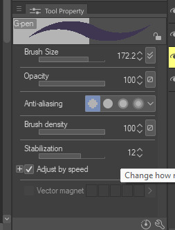
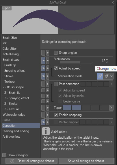
-Every drawing tablet's pen has pressure settings that can be tweaked to your liking, I for one always make it a little softer than the default.
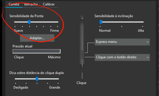
-BRUSH STABILIZATION! That's a setting every individual brush (and almost every tool, I believe) on CSP has. It does as advertised: stabilizes your brush strokes. A lot of people like this set between 8-20 depending on the brush, and it can make a huge difference to the way you draw.
It is usually always visible in the tool properties, but if not, you can toggle it on through the "sub tool details" menu by clicking the little wrench symbol on the bottom right.
Hopefully this has been helpful at all. Good luck!
211 notes
·
View notes
Note
Hi ;-)
If your request are open may i request something Fluff Felix from stray kids x platonic child reader whos shy and needs time to warm up with new faces and Felix gets on babysitting duty?
summary: Felix is yn's new babysitter, but she needs a little time to get used to him
genre: fluff, (platonic) babysitter au,
words: 1k
Carefully, very carefully, the little girl peeked around the corner. She had been engrossed in her game when she heard voices from the hallway. She had tucked her bear cuddly toy under her arm and, curious as she was, had gone to see who was talking to her mother. The man was just a little taller, like mom, and had long blond hair. They were talking about a salary or a contract, which she didn't understand.
But then her mother's eyes wandered to yn's safe hiding place. She had been found out.
"Yn darling, why don't you come here? I want to introduce you to someone." Her voice changed immediately, from her normal voice to a higher octave. However, her "baby voice" did not make yn any less afraid of the stranger. She had been more than satisfied with her role as observer.
Nevertheless, she now had to shuffle out of her cover and over to her mother. She hugged her teddy bear to her like a protective shield. When she reached the two adults, she pressed herself against her mother's leg. Where had her curiosity led her again? What if the stranger was a spy? Or wanted to steal her teddy?
"This is Felix. Your new babysitter. He'll look after you when I'm not here. He can play and paint with you... whatever you want." Her mommy smiled as if it were a gift.
"Hey, little one!" Said this Felix, kneeling down to be at her eye level.
"Your teddy bear is so cute. Shall we play something together?" Felix beamed at her, the adoration in his eyes was clear to see and he had to pull himself together not to get cuteness aggrestion as the little girl hid behind a curtain of her own hair. She was obviously a shy child, but Felix was determinated to win her heart. Yn looked helplessly at her mom, who nodded encouragingly. With her teddy bear and Felix in tow, she marched ahead to her room, where there were countless opportunities to play.
"What do you want to play?"
"Can we paint?" she asked cautiously, brushing the loose strands of hair behind her ear. Felix laughed and yn noticed the funny dots scattered across his face. Her mom once told her that these were called freakles.
Felix carefully reached into a small box on her bedside table and took out a colorful hair clip. He used it to fix her hair behind her ear.
"There, now you can see something too." He grinned at her, even though one of her hiding places was now gone. Yn dug the box of pens out of one of her desks and put a sheet of paper down for both Felix and herself. She immediately grabbed the red pencil and drew some spidery lines. Felix also took one of the blue markers and began to draw little stars on the sheet. There was silence for a while while the two of them diligently completed their works of art.
"Done!" Felix announced proudly and showed yn his paper. It showed a drawing of yn's teddy bear, which she still had sitting on her lap. Stars and clouds were floating around the little bear. Yn was amazed. The picture wasn't completely realistic, but in her eyes it was absolutely perfect.
"What's your bear's name? Then I'll write his name on the picture."
"Muffin" she mumbled. Felix used the same blue marker to write the name on the picture and then handed it to her. She smiled cautiously at him and he smiled back.
~☆~
The ringing of the front doorbell lured the curious yn out of her room again.
"Hello Felix, it's nice that it's worked out so spontaneously."
"No problem at all," Felix smiled at yn's mom.
"I'm looking forward to seeing the little one!" This time her mother smiled.
"Yes, she really is an angel. Just a bit shy. "
"Don't worry, I understand. Strangers can be scary, especially as a child." She was caught in her hiding place again when Felix's gaze fell on her.
"Hey, I've got something for you." Her mother let Felix into the apartment. She said a quick goodbye to her daughter and then she was gone. Felix came up to her and handed the girl a packet of sweets.
"Your mom said these are your favorites." She smiled shyly at him and reached for the bag with her small hands. She tugged at his sleeve to get his attention.
"Do you want to play with me...?" Felix smiled at her, how could a little girl be so sweet?
"What do you want to play?"
"Can we sing? Pleaseeee?" Yn looked at him with wide eyes. Felix grinned.
"I love singing!" He proclaimed and Yn beamed.
"Me too!" Together they plugged in the karaoke machine and sang several children's songs. As time went on, yn relaxed more and more, laughing and joking with Felix. By the time her mother came back through the door, they were both engrossed in their songs, which they sang at the top of their voices. Smiling, her mother leaned in the doorway and watched them.
~☆~
"Mamiiiii?" yn jumped up at her mother and tugged at her sleeve.
"When is Lix finally coming?"
"Honey, you have to be patient. Felix will be here soon." When the doorbell rang, the little girl dashed to the door and pulled it open. Felix greeted her with a beaming face, which Yn immediately returned.
Yn grabbed his big hand in hers with her small one and hurriedly pulled him into her room. This time she wanted to try out different hairstyles on him and couldn't wait any longer.
It had taken Yn a while to get used to him, but by now they were inseparable. Her mother smiled, even though Yn had forgotten to say goodbye in her haste.
#kpop#stray kids#stray kids imagine#skz#skz x reader#skz imagines#skz scenarios#felix x y/n#felix#lee felix#skz felix#stray kids felix#felix x reader#felix x you#lee yongbok#felix lee
121 notes
·
View notes
Text
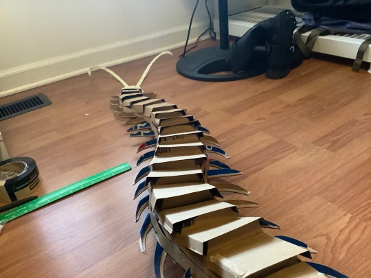
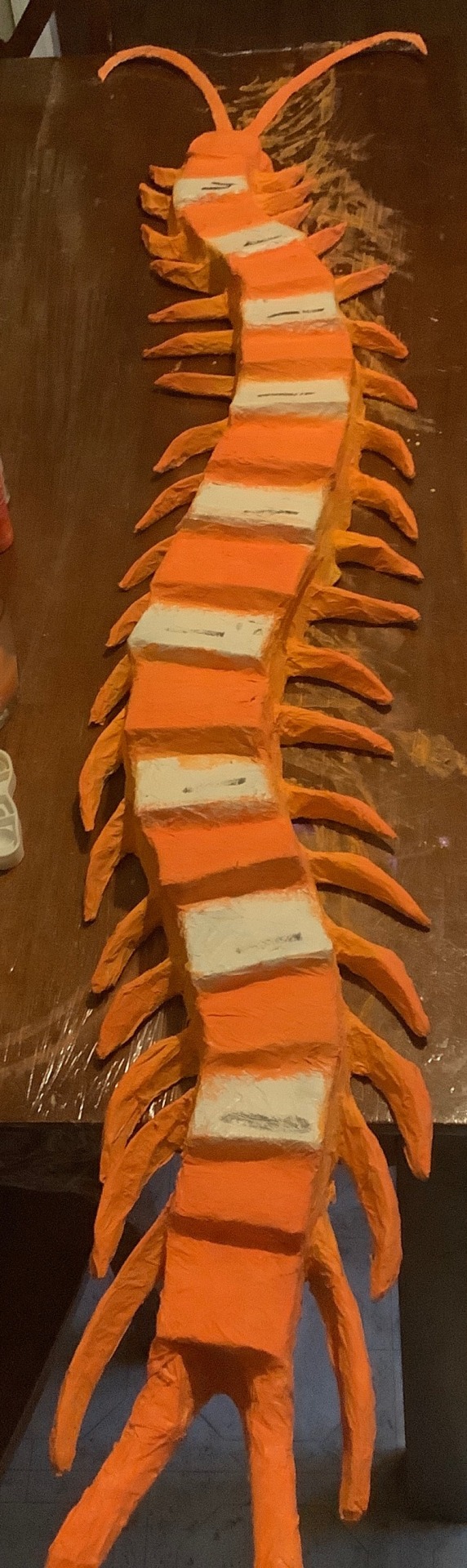
Guess what time it is…….
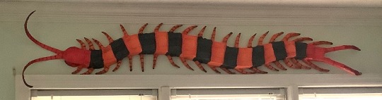
CENTIPEDE TIME !!! she’s finally real,,,,,,,, based off Scolopendra hardwickei or the Indian tiger centipede
Before I go about the process I just want to say you guys have been soooo incredible and I love reading your reblogs and I love the idea knowing I’ve inspired a lot of people,,, the project, although it was a lot of work and I’m feeling not so great as of posting this, still motivates me to want to make another.
(Art process below)
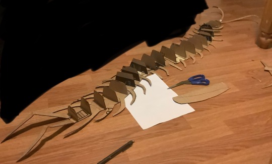
This was entirely freehanded! I have a lot of experience working in 3D art settings that this part came easy to me but I started with a flat base shaped in the pose I’d like the creature in. I used one whole piece cut from a shipping box and filled in the gaps with tape; you don’t need a single piece for the base but for structural integrity it helps a lot. As you can see here I also cut the legs separate and glued them on using hot glue. The vertical cross sections are to give an early support for the structure of the creature, think about the frames of aircraft or boats. During this part I used a pen to mark the width and height of the previous section to get a gradual flow of shapes.
This next part I wish I got more documentation on but after the vertical cross sections I used soda boxes for the thinner and flexible cardboard to add contour lines along the length of the creature, gluing them on the cross sections. I did about 2 strips of this on either side to fill in the space and then I continued to use soda boxes to fold and shape the top of the creature, gluing onto the strips rather than the cross sections (this part was a mistake but I quickly adapted, no issues happened but it did make it slightly less secure). I also gave the legs vertical cross sections as well to shape them for the masking tape.
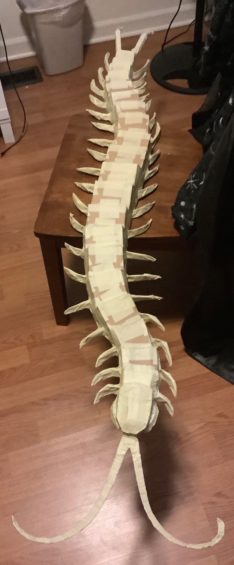
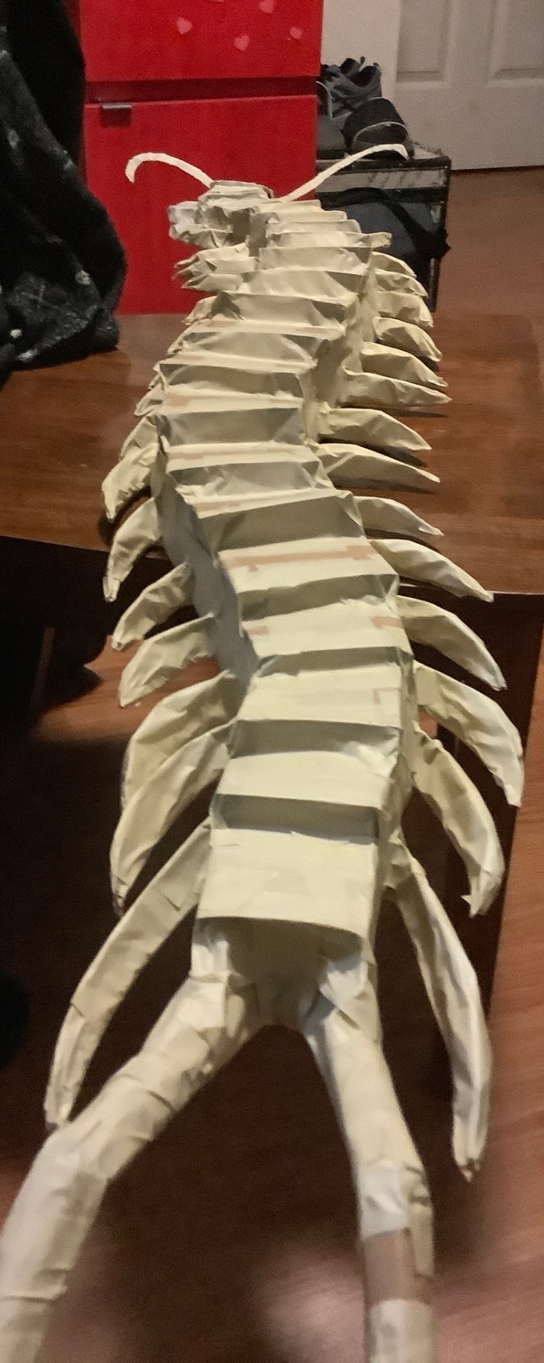
The worst part, taping everything. I used tape to further shape it how I wanted but that meant going over parts several times. I used 2 different widths of tape for this for efficiency but it doesn’t matter. The legs were very loosely taped and if squeezed then they’d lose their shape; I didn’t bother filling them in because I don’t have materials for that and I let the paper mache help support them instead. Tape was also used to fill any holes and gaps left by the cardboard skeleton.
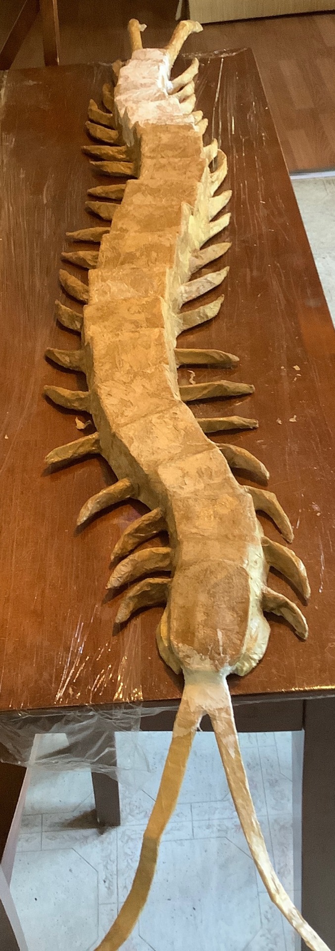
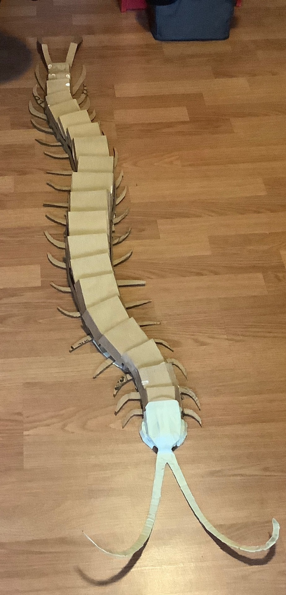
The next phase is paper mache of which I haven’t done since 5th grade… I was not confident in this step. I used mod podge and a brush to smooth down the paper. Because I lacked materials I used fast food napkins instead of newspaper which worked totally fine, it just tended to tear a bit easier. Some areas required me to get hands on and I don’t really like the texture during this stage so that was fun (lie). I didn’t do too many layers, one for the body and 3 for the back and legs but some projects might demand more. I used half of a 16oz bottle of mod podge btw so please get more than you think you need.
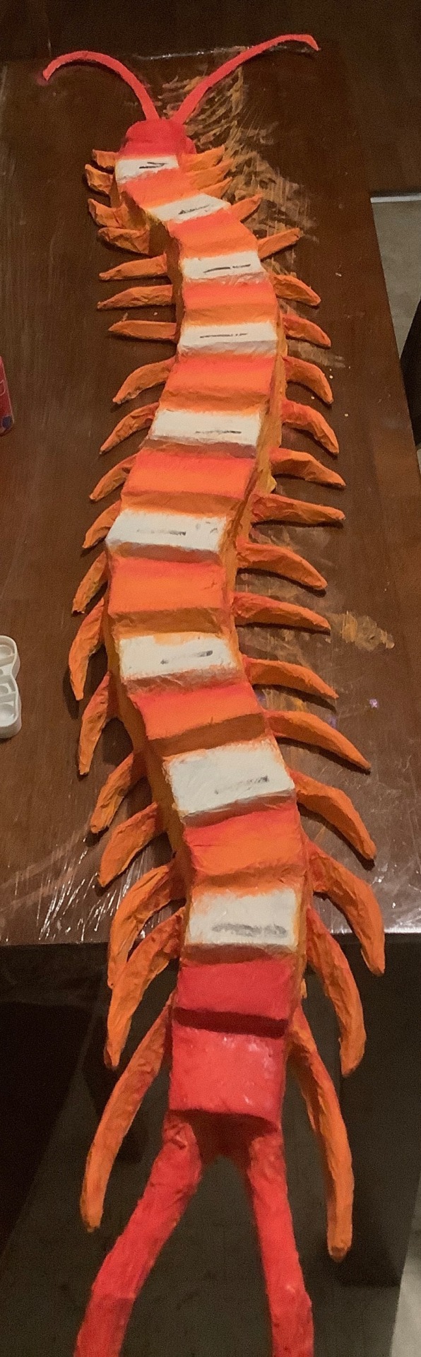
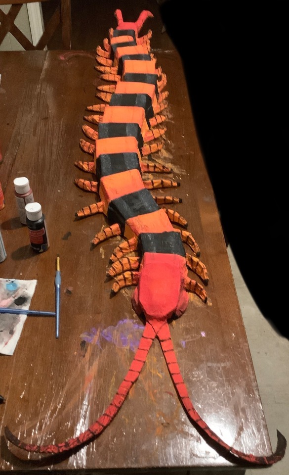
Finally, texture hell!!! I did a base coat of white spray paint and painted everything else with acrylic. Start with your lighter colors first before doing darker ones! I originally mixed some yellow and orange for the body and realized it was too bright and so covered it with orange instead. It also wasn’t until later I realized I could’ve been smarter with my paint so I skipped over the segments that were going to be fully black, saving the orange for the rest of the body. I wanted my centipede to stand out and not look 2D color-wise so I also used the red for the head and tail to give gradients and edges to the orange segments and legs, later going back with burgundy to further darken them but not too much. For the black segments I also used a very watered down layer of sky blue to give a fake shine and show the intended structure of the segments. Do not be afraid to use your hands! I used mine to smudge my detail paints like the black fade on the legs and the back shading. To top it all off I sprayed a clear coat and punched two holes in the underside to hang it up, using thumbtacks angled upwards.
622 notes
·
View notes
Text
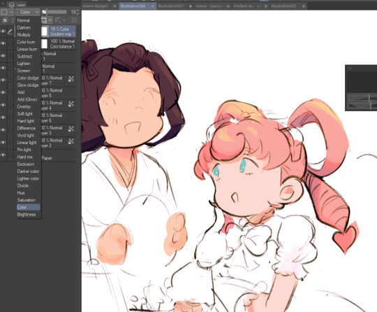
hi everyone!! my wrist is too sore to draw today, so instead i thought i'd share some of my favorite csp assets + how i like to use them! i also linked some procreate brushes at the end of the post!!
lineart brushes:
SU-Cream Pencil: i swear by this brush and i use it very often!! if you lower the pen density and use a gradient map over it when coloring your drawing, it has a nice effect. that's what i did in this drawing here! i also use this brush like i would draw on paper, so as a sketching tool. recently i've been enjoying blending it for shading. the pics below are drawn on one layer; left is more manga style while the one on the right is from a WIP of my singer sargent study, so it can be used for more realistic styles pretty well!


Found Pencil: another pencil brush that feels really nice to use, created by @/pigpenandpaper.
PS style brushes: a recreation of photoshop's (i believe) default brush. very versatile and also blends well!
analog wind variant pen: a nice pen that i like to use for lineart that is intended to have a bit of a sketch look.
zakutoro real g-pen: i used it for the lineart of this piece. although, it was drawn before i started using 600dpi in my works, so the lower resolution might make it look a bit unclear.
sets of rough pens: great for manga lineart with a rougher vibe; some of them have varying line weight.
coloring brushes:
zaku brushes: very nice and painterly mixing! i definitely recommend it for those who like to leave their colors a bit unblended.
softie marker: as the name implies, it's very soft! i like to use it for blush in chibi illustrations.
analog watercolor brushes: realistic-looking watercolor brushes. i recommend using it with csp's default paper textures, or those i linked below!
993 coloring pen: it's very soft and watery, though it can be made more solid by adjusting the paint density. i actually think it works very nicely for lineart too.
rock dog pen: another soft marker brush i like, that i once again also use for lineart and doodles.
thick coating brush set: recommended for paintings that show brush strokes.
cartoon cloud: don't let the name narrow your vision!! this has to be one of the BEST brushes for painting in my opinion, and of course it's great for clouds and explosions but so so much more!! and it's FREE try it try it!!
decoration/miscellaneous brushes:
neon pen
paper textures
symmetry move brush
close and fill without gaps
rope brush
sphere fisheye guide
flash balloon
speech bubble set: a lifesaving collection for comic artists!! dimensions and line weight can be adjusted by using the operation tool.
gradient map to use in color mode at 15% and another gradient map to use at 20%: the percentage refers to the opacity of the gradient map layer, but they are just the creator's recommendation and i tend to actually increase it. to use gradient map efficiently, i recommend putting all your colors (and lineart if you want) in a folder. then, right-click the folder, select "new correction layer" and then "gradient map". this allows you to modify the gradient map without worrying about affecting the original colors in case you decide not to use it in the end. to import a gradient map from your downloaded csp assets, click the wrench icon next to the name of the gradient set that's currently in use, then select "add gradient set".


you'll also notice that the creator recommends to use their gradients in "color mode". of course, this is also only a recommendation and i suggest trying as many layer modes as you like! to change a layer's mode, simply highlight the layer and click on "normal" (the default mode) and csp will display the available modes.

fruit ninja gradient map: fun to use if you want really drastic/vibrant colors! the names of the gradients are cute too, as you can see in the above screenshot!
BONUS: jeremy fenske's free photoshop brush pack: these aren't csp brushes per se, but they can be imported into the program! excellent for environments, i recommend watching fenske's video on how he uses the brushes to get a clearer picture since there are so many in this pack!!
BONUS 2: my good friend clem has a few brush packs for procreate that are ideal for painting,decorating drawings, and y2k-inspired illustrations, i definitely recommending checking out her shop!
in conclusion i hope this post can be helpful to you!! i tried to explain how to use the brushes as best as i could, but feel free to let me know if anything is unclear!! i hope you will enjoy using them! :D
#clip studio paint#clip studio paint brushes#csp#csp brushes#procreate#procreate brushes#brushes#tutorial#art tutorial#sort of hehe
190 notes
·
View notes
Note
As far as I remember, or like years ago, you’ve used sai right? Sai or sai2(man the brush engines better and Binary brushes feel smoother..) but I also saw you used procreate at some point for that one Jessie draw- which digital programs have you used that you enjoy the most for different things, or which kind of traditional medium for example also, is interesting and/or satisfying? Have been doing lots of ref and tutorial searching and looking at art inspiration for the direction I wanna take my stuff and I was curious about your preferred setup; I just like to hear people’s workflow and what they use to create what they do. I think it’s neat. Also if this is too long sorry 😅
I use sai 2. I switched to sai once oekaki became more and more inoperable. The binary style aspect ended up sticking. Oekaki has limited layer capabilities and this rewarded a simpler pixel style that was more easily edited. I still miss the ease of using pixelated screen tones in oekaki. There are other programs that can make them, but not how oekaki did. But I prefer sai 2 most now.
I use clip studio for larger scale images like print pages for its more versatile and expensive selection of brushes. It has unique settings that still allow me to turn these brushes into pixelated work without anti-aliasing artifacts. There is a setting for level of anti-aliasing, but this is often not enough for more complex brushes using spraying patterns. Using the "replace alpha" blending mode forces many brushes into a binary color mode because drawn on top of a solid color the brush's color can only be 100% opaque. The binary layer color mode also allows you to do this. Both of the latter options often only let you do this with black and white. I usually do this to be able to transfer it back to sai 2 where it's more comfortable to work in. I also use it for its ability to produce text in multiple sizes without anti-aliasing. Sai 2's text tool is fairly primitive.
I use Aseprite for animating. It is mostly for pixel art. It reminds me of an animation program I used to use a long time ago called easytoon due to its simplicity though...
For traditional I prefer paint pens (I mostly use poscas). Gel pens are okay but very small and cheaply made. I really wish someone would make paint pen versions of gel pens. I also had a big black and white plain ink and hatching phase a long time ago. Generally I gravitate towards opaque materials that make the process feel straightforward. The ability to "erase" or white out mistakes for correction is one of the most important qualities in a medium to me.
Less opaque, more time-consuming layered media yield more textured and nuanced results, but I hate few things as much as ruining a piece of art irrecoverably over a relatively small mistake be that accidentally pilling the paper or drawing a line wrong or splashing watercolor the wrong way. Mixed media was fun, but I just prefer having more purpose to what I'm doing. When I'm too preoccupied with the aesthetics I waste a ton of time on useless tweaking or experimenting that never goes anywhere.
27 notes
·
View notes
Text
Notes on Comic Art #2: To Hatch or Not to Hatch, also some coloring stuff
One of the most influential things I've ever read on the subject of comic art is a piece Jesse Hamm wrote on Alex Toth where he talks about flatpacking.
[I discovered while writing this that Jesse Hamm passed away in 2021. He was a brilliant educator, one of the best in the history of the comics medium, and will be sorely missed.]
In the piece Hamm basically discusses how over-rendering objects usually makes them function worse as comic art. Many other people have discussed how using thicker lines for objects closer to the "camera" is good practice, how colors can seperate shapes and create depth, etc.
The question is, where does cross hatching fit into all of this? Or rather, various methods of adding more detailed rendering to artwork? I'm trying to figure this stuff out as I'm doing layouts for my comic, because I want to know the answers before I start inking the final artwork.
I try/want to have an uncluttered, clean, easily readable art style. I occasionally add hatching to my drawings, because hatching is fun, but I often feel like I've slightly ruined my artwork when I'm finished.
I've decided to look at some of the art that I feel like my own work is trying the hardest to emulate, at least philosophically, to see how other artists "weigh in" on this debate. It's important to remember that inkers embellish artwork [hence the alternate title "embellisher"], and so I'm going to try and find inkers most representative of a given penciller's intentions when applicable.
As I was working on this piece, I read Hamm Tips vol 1.1, and I discovered this diagram, which seems to relate with what I'm going to discuss later:

I think it's accurate to say that my desired approach is Uninflected/Deliberate; I think most people going for a clean and cartoonish look fall into that quadrant. Some people might describe Toth's work as being "clean", and so I should clarify that I'm talking about clean in the spirit of "lines meet neatly".
Some of the artists I'll discuss have lines that fall somewhere between being Inflected and Uninflected, and I think a lot of this comes down to inker approach. I feel like, in spirit, all of these pencillers are Uninflected, but some of the inkers use brushes, which creates a sort of middle ground. Brushes add different weights to a line, whereas crow quill nibs and pens have a uniform width. [The technical term for unweighted inked lines is "dumb line"; I believe this was coined by David Mazzucchelli.]
Let's first look at Adam Warren's work in the Dirty Pair volume Fatal But Not Serious. I'm a huge fan of how this comic looks; the flat, cel animation-style colors are very clean and easy to read. It's a very pleasant look, and I'm surprised more comics don't do this.

There is some hatching here, but it's not "serious" hatching. Just a few lines on cheeks, hands, etc. 98% of the artwork is shapes delinated entirely by a clean line and color. The convention floor panel is able to have a ton of detail without really changing the visual "rules" of the comic. An artist who does things in a more highly rendered way may've, for instance, reduced the crowd to a series of heavily shadowed figures, or colored in a single expressionistic wash to paper over things, etc.
Warren's Magical Drama Queen Roxy used a very similar approach to Fatal But Not Serious:

Let's now look at Rick Mays. I'm not a huge fan of Rick Mays, I've only actual read a single issue of a comic by him, but as I was reading Gen 13 he immediately stood out as being the best artist on that series, aside from Adam Warren himself [speaking only about issues Warren wrote]. It feels very telling that Rick Mays later did the final art for a graphic novel Warren laid out called Livewires.
These are from Gen 13 vol 2 #70:
The biggest difference between this piece has nothing to do with Warren or Mays, and everything to do with the coloring approach. I don't think the coloring here is bad, but the gradient-y colors do create a vastly different visual effect than the cel look I highlighted earlier.
The inking approach feels quite similar between the two artists; while Mays's art takes one or two steps towards realism relative to the Fatal But Not Serious stuff, texture is largely used to the same degree [with the grass and tornado being understandable exceptions]. What's interesting is that this issue has three different credited inkers; Karl Story, Rick Mays, and Jason Martin. I'm assuming this happened for deadline reasons.
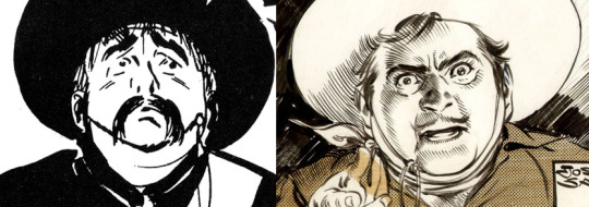
I feel like I'm maybe starting to sound a little repetitive, and so I feel like I should share an issue of Gen 13 that I disliked, and then we can move to things that aren't Adam Warren-adjacent. These are from #43 and #44, with pencils by Lee Bermejo and inks by John Nyberg:
I'm not a big fan of this. The borderline chiaroscuro inking makes everything look heavily referenced, labored, and weird, and the "acting" in the comic suffers because of the over-rendered faces. It's a real shame the artwork is like this, because this two-part story is actually quite solid and would be a minor classic with better artwork.
I notice that many newer comic artists [which is to say, people who began their careers during the 90s onwards] put a lot of heavy shadows on figures in a way that feels too slavishly devoted to a certain kind of realism. I say a "certain kind" because the high contrast look of black spots being put onto a figure make the shadows way darker than they'd actually look in real life, so it almost makes the figures look dirty.
Look at comic art from the olden days and figures are largely defined by outlines/color. If a figure in an old comic has a lot of shadow on them, it's for reasons that are obvious and motivated; noir-y venetian blinds stuff, a mysterious villain being obscured, someone being underlit, or having half their face obscured, etc. There's a clear reason shadows are being used in these cases, rather than it being done to add usually unnecessary detail.
Anyways, let's look at Amanda Conner's work. Image on the left is from a Vampirella story called Fantasy Feast, and the image on the right is from Power Girl #12. Texture is used, like on the walls of the bathroom, but sparingly.
Looking at Conner's work in this context makes me realize, I don't think I've ever seen Amanda Conner's stuff colored flat [at least after she fully matured as an artist]. I don't think the more three-dimensional rendering used in any of these panels is bad, but I'm not going to be doing that kind of coloring in my book, and so it's not quite as instructive to me.
That being said, I really love Conner's style. I've noticed that Marvel and DC are increasingly using artists with styles that are broadly similar to Conner's; I've included an example below. Maybe it's because the artist below is too lazy to draw a proper background, but their work feels so much more flavorless than Conner's in comparison. I think it's because the "acting" is not as impressive, and Conner brings a fun-factor that feels completely absent in the page below.
I realize "fun" isn't always the order of the day, but this page doesn't really reflect . . . anything. It's completely bland.
Here's Kirby, who couldn't be bland if he tried. The left image is from the Young Romance collection Fantagraphics put out, and the right is from OMAC. The former is from the 40s, latter is from the 70s. [By the way, the Young Romance image is photographed from my own collection; there's no warping visible because Fantagraphics knows how to design a book].

Looking at these pieces side-by-side really challenges a lot of my assumptions about Kirby's artwork, because in some ways his artwork changed less than I previously thought it did without direct comparisons. There are some things that are more abstract about the OMAC page, like the wiggly shadows. Someone unfamiliar with Kirby might assume these were drawn by two different people, but only because 30-odd years of growth seperate these two pages.
Kirby's style, in my mind, is highly geometric and defined more so by abstract shorthand squiggles than hatching or other forms of rendering, but there actually is a fair amount of hatching on the OMAC page.
However, that OMAC page I believe was inked by Mike Royer, or at least someone using a brush. I noticed that, by sheer coincidence, almost all of the Kirby art from my first post in this series was inked by D. Bruce Barry, who didn't use a brush and also followed Kirby's pencils perhaps more literally than any other inker he ever had. In those images, it's clear that most of the hatching in Kirby's work was added by his inkers.
When Kirby did ink himself [using a brush], his style was oddly clean. He did add in hatching, but it was never particularly dense.
Anyways, I want to close this by including some Jesse Hamm quotes from his instructional PDFs:
-Simplicity is great, but often you need extra texture to seel weirdness.
-Another sign of experience is texture. The pro-level artist has learned to give different textures to grass, hair, tree bark, bushes, etc. Meanwhile, the amateur uses the same one or two shading techniques on EVERYTHING, giving it all a samey feel.
-Open spaces of black or white may be "activated" with a bit of texture. A few pebbles/ripples/etc will spur the mind to fill what's missing.
-We talk often about spotting blacks, but spotting greys (i.e., details/texture) is also crucial to clear compositions.
The lesson in the bit of Hamm writing I most often revisited, the flatpacking post, was that too much texture and rendering can make a comic exhausting to read. But reading more of his work, it turns out he had a more nuanced, texture-inclusive view of things.
What's the lesson here? Discretion.
56 notes
·
View notes
Text
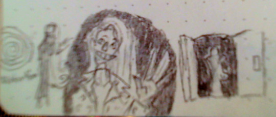
Distortion Fanart (michael centered)
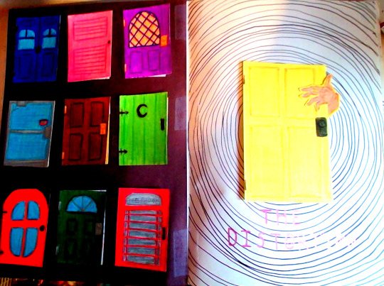
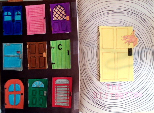
(saturated version on the left, og on right)
This is long, so a break before closeups start!
Closeups:
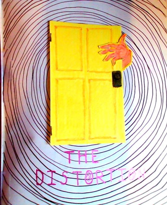
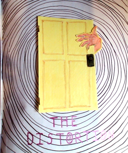
Text reads "The Distortion" (the o has a spiral inside of it)
More closeups but the doors on the left page are open, left to right, top to bottom:
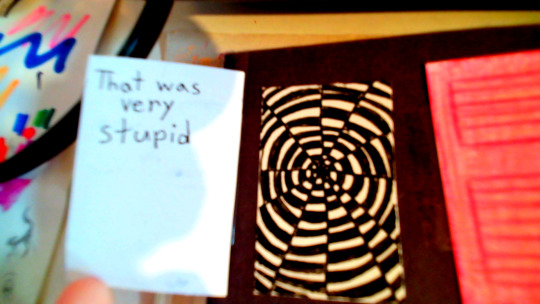
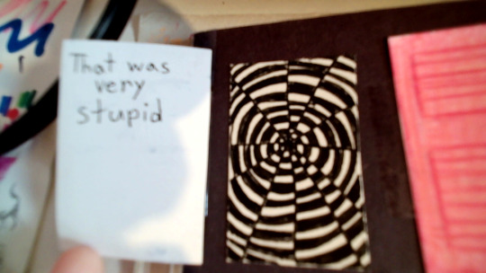
Text reads: That was very stupid
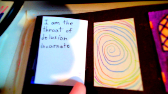
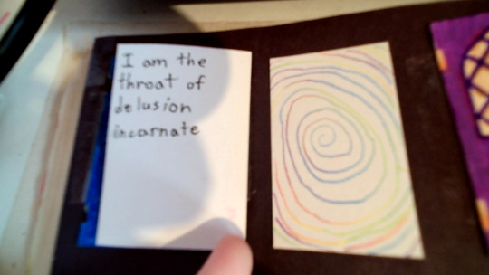
Text reads: I am the throat of delusion incarnate
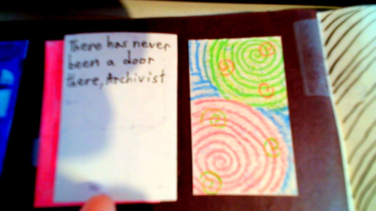
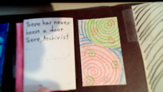
Text reads: There has never been a door there, Archivist
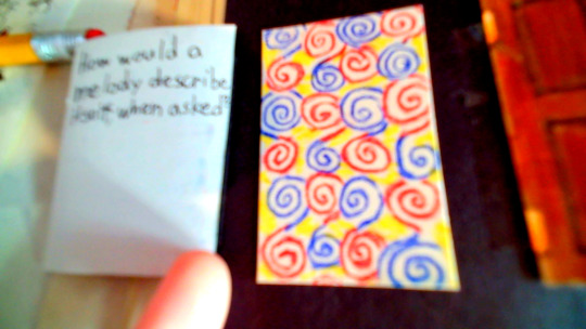
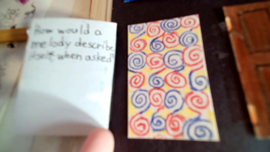
Text reads: How would a melody describe itself, when asked?
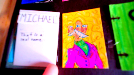
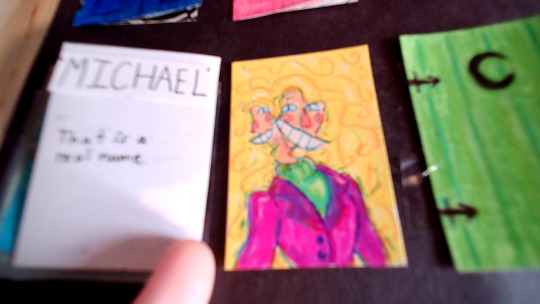
Text reads: "MICHAEL" That is a real name
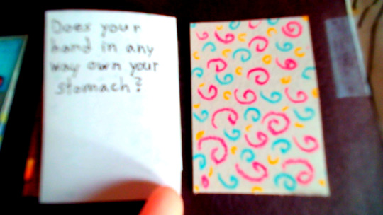
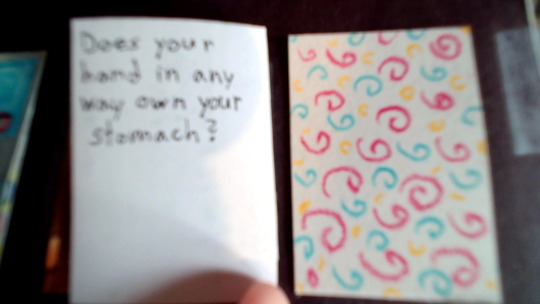
Text reads: Does your hand in any way own your stomach?
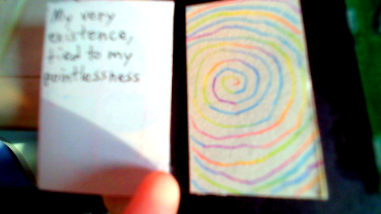
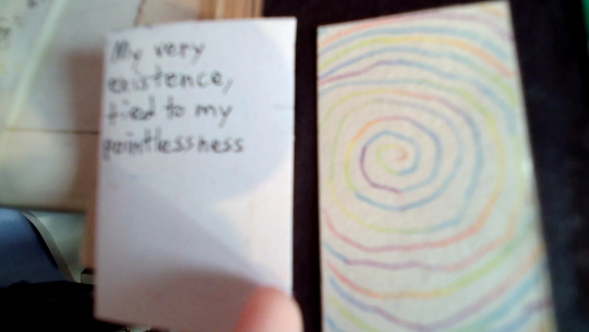
Text reads: My very existence, tied to my pointlessness
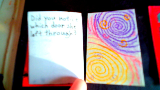
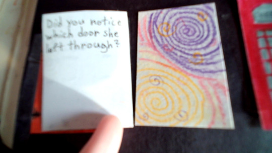
Text reads: Did you notice which door she left through?
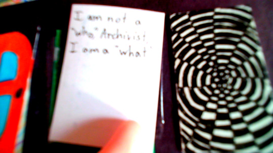
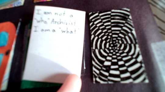
Text reads: I am not a "who," Archivist. I am a "what"
And that's the end of the closeups :D
All the text inside the doors are quotes from Michael Distortion btw. The only exception being "MICHAEL" bc Jon says that, but Michael does respond by saying "That is a real name" so I think it counts as a Michael quote. At least enough to be included.
I'd also like to thank a couple members of the "michael enjoyers" community for helping me come up with enough quotes. I do not remember your names, but thank you :D
The decision to make this spread was fairly impulsive. It started by me doodling spirals on a scrap piece of paper while trying to design a birthday card for a family member. While doing so, I thought, "why not fill a full page in my sketchbook with spirals?" And that turned into "I could make it into a Distortion spread."
And so, we have ended up here with a full Michael Distortion spread.
It was lots of fun to do, and has possibly gotten me out of artblock. Although, trying to come up with 9 unique doors that weren't yellow was quite the pain. Alongside the 9 different spiral patterns inside said doors. (although a couple of the spirals are copies of another)
And now a couple fun facts.
I am currently listening to "More Doors For Me" by elybeatmaker. I thought the song would be fitting.
I have only watched the first 14 episodes of TMA, and none of the TMAGP episodes. Everything I know about TMA is from my sister and Tumblr. For this reason I did only Michael, bc I know him far better than Helen. (she appears less in fanworks)
This spread took me five days. This is because I was either busy, or didn't have the motivation to work on it. The doors took the longest.
There is so much tape. The black background on the left page is black construction paper taped in, the spiral patterns underneath the doors were taped in, the doors themselves were taped on, the yellow door was also taped in, along with the hand and the wrist, both separately taped. It's a good thing I want a thick sketchbook.
My sketchbook's paper is a bit thin, so you can see the spiral behind the yellow door on the back of the next page. (I have since drawn over it, so I don't have a pic)
Each door has a separate color chosen to be the main color of said door. The colors include: Pink, Red, Orange, Yellow, Lime, Green, Light Blue, Blue, Purple, and Brown. The only one that is a normal door color (brown) has Michael inside it.
If you look closely at the right page, you can see where the lines start to get uneven in the background spiral.
I really like the idea of showing someone this spread and have them randomly open the doors, just to see a surprise Michael. :)
Materials used: generic pencil (for the initial sketch) 05 Micron pen random Prismacolors a cool multicolored lead pencil I don't know the brand of kingart twin-tipped brush pens Sipa fineliner pens scotch tape X-acto knife kid scissors black construction paper yellow cardstock A5 Fabriano sketchbook that I hate with a burning passion
Since you read this far, have some bonus Michael doodles!
^This one was variations of a scene from a dream.
^This one is from a doodle page I have laying on my desk, hence the scribbles nearby. I did not color in the lines (yes, that is nendou from TDLOSK to his left) This was also the first time I ever drew him.
I love giving him spiral cheeks :)
#art#drawing#artwork#my art#drawings#tma fanart#tma art#tma#tma podcast#michael distortion#the distortion#tma micheal distortion#tma distortion#the spiral#spiral#door#michael shelley#the twisting deceit#traditional art#art dump#my artwork#sketch art#sketches#doodle#sketchbook#sketch#traditional drawing#colored pencil#markers#sketchbook spread
38 notes
·
View notes
Note
I love your watercolor style! Any tips?
Hm… Let’s see. Watercolor is a good medium for blending and layering color—it’s usually best to start lighter and add pigment in layers, since it’s hard to remove paint, and watercolor is transparent, so once the color’s been added it’s there to stay. Add your hi-lights first, and then your shadows. As an example of what can happen if you do the opposite, Well….

Yeah…. Probably should have cut my losses sooner with that one. It’s also a good idea to be flexible if you use watercolors, because unless you go really slowly, something’s going to end up in the picture that you didn’t originally plan for. Mistakes don’t always have to ruin your piece—sometimes they can enhance it:
In this case, the black paint smeared on the Cellist, and the piece was due the next day, so instead of starting over, I decided to make more sharp smears in the other parts of the painting and make it a part of the picture. I feel like it adds drama and makes the painting as a whole more interesting. Since this happened, it’s become a part of my art style to add background splashes and streaks of mismatched color, because I know I won’t be able to paint in the lines. Speaking of lines, let’s talk about line-art and watercolor. If you’re using ink of any kind for your pictures, either add it last or make sure it’s water resistant, because a lot of liners smear when they make contact with water. My favorite brand is Micron Pens, since they line cleanly, they’re fast drying, and you can paint right over them and they don’t smear at all!

If you want to, though, you can do line work with watercolors paints, you just need a detail brush, a high amount of pigment in proportion to water, and a whole lot of patience. Here’s an example of a piece I did where I used this technique:

This method tends to look more natural when you do it, so I tend to reserve it for my more ambitious art pieces. It takes a lot of time though, so I wouldn’t recommend it if you’re trying to paint fast. You can also just do Pencil underneath, without any darker lines. I did this a lot when I was younger because I preferred the way it looked back then:

Whatever look you want to achieve.
As to blending colors: Opposites tend to make brown, but you’ll get different kinds of brown depending on what shades you use. For example, if I mix the green and the red the Mad hatter is waring in the image above, I end up with a sort of foresty black color. If I mix an oreangy yellow with purple, I usually end up with a warmer almost honey brown color. One of the best ways to learn how to color blend is to pull out a piece of paper and just try different color combinations—paying attention to trends and noting which colors mix the best. It’s really fun, like science. (Technically it is actually science.) It’s something you’ll naturally get better at the longer you paint, so don’t worry if you can’t get the colors to look the way you want. I still can’t seem to make my green show up on my Black Cat designs, no matter what I mix. :(

See? You can barely tell his eyes are green. What’s up with that? Anyway….
For cheap Watercolor brands, Go with Crayola or Masters touch, and steer clear of any Crazy Art or anything that looks more like a Tums than paint. Dry watercolors are best if you want convenience or maximum possible control over the consistency of the paint1-they’re generally easier to use and easier to store. However, liquid watercolors (the kind you get in tubes that look a bit like acrylics when you squeeze them out) are usually better for higher pigment quality and tend to give you more options. They also have the added bonus of being long term use, even after they’ve dried out, so keep them on your pallet until they’re used up! Once they’re dried, they act basically the same as the ones that come dry, but still have the better pigment quality, so if you have the patience for that, they’re generally the better option. If you do use them wet, though, you can achieve some pretty interesting results:

They almost act as a sort of hybrid between acrylics and Watercolors, so that can be a lot of fun. :)
Anyway, hopefully some of that was useful. If I confused you, I apologize. There are a lot of really good tutorials on YouTube for this stuff, btw, so if you want more instruction, that’s a great place to look for it. Anyway, that’s it for me. Hope that was a good use of your time. :)
#ask#art#art tutorial#watercore#watercolourpainting#How to watercolor#Watercolor tutorial#Paint tutorial#Art advice#Using paint#color painting#Lineart#Feel free to tease me about zombie Kyle. I won’t feel sad.
18 notes
·
View notes
Text
Reach out
Staying in Holmes Harbor on Whidbey Island for a few days. Quiet, peaceful, beautiful. Like most places around here really. As long as I can control my amount of city exposure I’m good. Had family over for the weekend. Sharing it all with loved ones is priceless. Reminds me how much I miss it.
And on that note, we so often have a disagreement or just bad past with someone we care about and just sit for years waiting for that person to reach out. Don’t let your pride or stubbornness get in the way. Be the one that reaches out first, just do it. A theme of my life now is do it now because you never know when the lights are gonna go out, and then it’s too late. You may not get back the relationship with that person you had, but at least you have one. Everyone relaxes and it can grow again.
Wishing you fair winds and following seas, Jeff
Please like or subscribe on Facebook or “Montana in the Salish Sea“. Thanks.
Source: Reach out
0 notes
Note
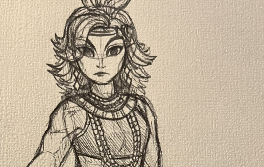
can you explain the process of the digital colored sketches you did? especially Seera, cos HOT DAMN she looks good
I sure can! Talking about the artistic process is fun :) I've learned a lot from other artists, so it feels nice to pass it on!
Have pen and paper. Textured is more fun, though you can add a texture to it digitally afterward. I used a dollar store sketchbook and a ballpoint pen.
2. Draw. Start by sketching the anatomy really lightly, then add features and build up the lines slowly. Only use pressure when you're confident these are the lines you want! (This took a lot of practice, but once I got it, it felt magical) For the hatching lines, do it lightly, and use crosshatching sparingly. I think it looks cool to change the direction of hatching for different parts of the drawing, so I shaded the hair vertically and clothing diagonally.
3. Scan it or take a photo. I ended up drawing her head too big, so I took the photo at an angle to lessen that a bit. Make sure you don't cast a shadow on the paper (unless you want to).
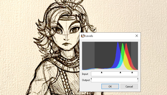
4. Import into an art program. I used FireAlpaca, which is free! Mess around with levels to increase the contrast, and lower the saturation a smidge to ease the yellow tint.
5. On a new layer, with a opacity-sensitive brush, cover up any lines/details you don't want. I decided to redo the pupils, so filled them in completely. But since I didn't want it to be too neat, I didn't bother to cover up every line perfectly.
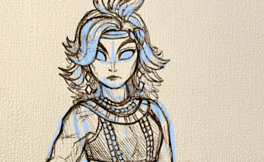
6. Select a random patch of empty paper and copy it. Paste this sample around the place, clipped to your edits layer, until everything is covered. Matching the texture looks a lot cleaner than just matching the colour.
7. Add a bit of new linework. It's a good idea to darken the eyelashes and brows. Put your sketch layer in a Group with all your edits, then set that Group to Multiply. This allows you to easily add colours on the layers below it.
8. Shading! Put all your flats into another Group, and then clip a layer to it. My colour of choice is violet. It looks pretty cool as is, but I then set the shading to Multiply and adjusted the opacity. Use a blurring brush as wanted, but don't go too hard with it.
9. Add highlights. For skin, I generally use white or a very soft yellow, set to Soft Light or Overlay. I also added a bit of cyan to her green makeup and accessories.
10. I added a shadow behind her because I could. Just copy the Group with all the flat colours, merge it together, make it one colour and position it. And that's about it.
Here's with and without the lineart edits for comparison:
(Here's original post with the full work)
7 notes
·
View notes
Note
Your art is amazing! I keep finding myself just going back to stare at your work. Like how did you do that with the colors? Or when do you stop adding bold lines and do more implied ones etc.
Do you have any go-to references or tips you always go back to or would recommend?
THANKYOU!! OHHHH ART QUESTION!!!! *cracks knuckles* i havent ever really explained how i do things before, so dont be shy to ask any follow up Qs if i dont make sense!
——————
Colors??? Ohhh man, aeh, thats a fun but hard one. I started off my art years ago with just pencil on paper, black n white style! So ive gone on my own little self taught journey over the years when it comes to using actual color in art and ohh boyyyy was it a challenge.
Theres definitely some tutorials out there that explain color theory waaayyyyyy better and are more helpful than me, but ill still explain it my way for anyone whos curious about the way i use colors instead <3
At first i was pretty bad, SO for example IF I WAS PAST ME..... and i drew a purple dragon, the lighting and background id add would be purple too. Thats bad. It looked good, yes...... But it wasnt the smartest choice of lighting/background to make it so similar to the purple character id drawn.
I couldnt really see what i was drawing because everything was the same color, same saturation. It makes present me cry a little inside that i used to do that xD and i had to figure out that overtime... i didnt want whatever i was drawing to blend in to the canvas, disappear, and be really hard to see because it was all the same shade/color.
SO, i experimented >:) i have a vague goal in mind when it comes to colors. I want things to be clear to see, colors to contrast and pop and flow! If your focal point/character is blue? I try to make the background the complete opposite color, or something that compliments blue like pink or orange.
BUT!!!! BUUUUUUT!! Its not as simple as that... it can look terrible if you pick an opposite color and itll clash in the worst way possible >.> THAT, im admittedly still figuring out as i go! But ive learned that when the colors are too bright and clashing, i can reduce the saturation/make them less bright. Perhaps if i used pastel colors instead? Or something closer to grey? Maybe if i darkened this one and lightened that one theyll still stand out but also flow a bit better.
I rely heavily on my gut feelings with colors too, ill test different options all the time and mess with filters to see if i get any cool results until i land on something that makes me go "woahhhh this feels awesome". It can take actual hours just trying to find the right combination of colors...
——————
This ones a great example of a good color combo!! I tend to lean towards warmer/softer colors in my work unless im doing a nighttime scene or something with cold/fresh vibes. The dragon here is a pretty light shade, and i went with a matching light background. I did that to give it a soft/calm look <3

When i look back at my art and any of my bigger/finished works, i notice i have a running theme of finding a nice balance between pastel/light colors and bright/saturated colors.
The saturated/brighter colors are usually used for the focal point, and the desaturated/lighter ones are for the background! I can also reverse that with a saturated/bright background and a light/desaturated focal point depending on the situation!
Heres some examples of what im talking about:

——————
MMMMMMM LINES! Lineart, i love it. My artstyle when it comes to that kinda flip flops around a little. But i often use a thinner brush and the pen i draw with has pressure sensitivity!! So lineweight kind of just revolves around how i literally move my hand against the screen.
But when it comes to purposefully making the lines thicker or thinner though, i use bolder lines for the focal points or areas with sharp details, so they catch the eye.
Thinner or less opaque lines for outlining markings or representing fur, scales, feathers, things like that :D
——————
Tips, refs and recommendations??? OHhhhh, everything i use is specialized for helping myself reach the style/quality of art i aim to make so it wouldnt entirely help others the same way.
But i can say that for refs and tips, i save EVERY little thing that sparks inspiration or looks like it could help me draw something i find difficult later on. I have files organized for that stuff! Things for ref sheets, anatomy, tmnt-related, a file just titled "inspiration" full of anything that makes my eyes happy when i look at it, and one for kingfishers (theyre a fav of mine when it comes to finding the inspiration to design a dragon).
Ironically, i dont often use typical art tutorials so i dont have any recommendations to share because i wing-it like the menace to myself that i am xD I probably should use tutorials though, im constantly trying to improve and those would actually help. Im just, too lazy 💀
Its a great habit to save stuff that helps/inspires you for when your stuck! And just go out there and follow all the artists who inspire you, even the smaller ones. Ive seen so many unknown/underrated artists who are able to draw a certain way that id love too, just gotta hunt them down and follow them so i can keep seeing their art <3
10 notes
·
View notes
Note
Your art is so cool! I keep seeing the art trades you’re doing and I love how every character comes out so nicely and clear
Do you think you could talk about your process a little? Especially how you can get such nice pieces out so quickly! I’m working on my own artstyle right now, understanding it and getting better, so I’m asking some of my favorite artists how they learned and practiced theirs! Lots of practice, but what kind, what things have you learned from that really helped create your vision?
Thank you so much!!!! ::D ✨ That means a lot to me!!!
I decided to record the most recent art trade I did of Gossan to accompany my process! ::D
Explained process is below the cut ⬇️
⚠️ Beware of flashing lights ⚠️
Important things first! Practice practice practice! On everything! Do not be afraid to experiment with colors, brushes, textures, perspectives, ect, because: you might just come up with a process that works for you/produces the results you want. Study color theory, study anatomy, study the way fabric folds, study the way light hits objects and casts shadows (I’m still working on that one myself, lol)
That’s the other thing, you’ll be constantly learning, improving with new knowledge. Keep learning and experimenting and trying new things with your work, it’ll only help you. Even if it doesn’t come out the way you expect: you can always try again with a different process and see what happens!
TAKE BREAKS. I cannot stress this enough. Listen to your body, if something hurts, or if you’re tired, you need to stop. Don’t try to “push through it”. That is the biggest regret of mine. (I’d still end up with osteoarthritis no matter what, but I could’ve prevented some of the specific damage done had I listened and treated my body better years ago.)
Process Explained 🎨✨
Okay, specifically for these art trades, I’m using poses from The Pose Archives, so that certainly helps on time, but I only use poses like this for studies. (I feel its important for me to note that for any commercial/commissioned work of mine, I take my own reference photos, but since these are just studies purely for practice/gifts, I’ll use The Pose Archives.)
I’m currently using Procreate on my iPad, using a gen 1 Apple Pencil.
With a pose down, I use the Narinder Pencil brush to sketch over the pose, and figure out how clothes/fabric would drape over and around the body.
Once I’m satisfied with my sketch, I lower the opacity on the sketch, and create a new layer.
Then I use the Technical Pen brush to “ink” over the sketch. (Whenever I ink things, I try to have a good variety of line weights. It helps keep the drawing from looking flat.)
Now with the ink layer finished, I duplicate the layer. On this duplicated layer, I use the paint bucket tool to fill the colors in, and hand paint in places that are too small to use the tool.
With the flats done, I paint in the colors that���ll be blended, like on their ears and their throat. I’ll use the smudge tool (using the Flat Brush) to blend those colors together.
Then I’ll put down a background color, and then on a new layer, I’ll experiment different colors on a low opacity to get a feel for which color would look best for the shadows. (Complimentary colors usually work, but again, don’t be afraid to experiment!!)
I then paint down the shadows, and blend them using the method I mentioned above. I’ll then use Gaussian Blur filter over it at like 2% or so, just to smooth it out a little.
This piece didn’t have highlights in it, but I use the same above method for those as well. 👍
Once everything looks how I want it, I save the image (sometimes with or without the background depending on the effect I’m going for.) so everything is now flat (I do this to keep my layers where they’re at, cause once they merge, they’re merged!)
Then I’ll import that saved image onto a new topmost layer.
I’ll then add a Noise filter to the saved image at anywhere from 1-3%, just to give it some texture. (In the past I’ve used paper textures, but haven’t gotten around to experimenting with that on Procreate just yet!)
Then I slap my signature and my @ on it, and Tadah!!! It’s done!! ::D
Thank you for reading and I hope this knowledge is of use to you!!
#text post ish#long post#asks#replies#pose is from the pose archives#art study#my art#outer wilds fanart#outer wilds Gossan#art timelapse#Thanks for reading!!! ::D
14 notes
·
View notes
Note
Do you have any advice for coloring with markers?
Sure thing!
So I use Ohuhu brush and chisel tip alcohol based markers (I mainly use the brush tip end). And my main tip really if you wanna do shading especially is to get used to how fast your markers dry on the paper. Alcohol markers especially dry really fast. And you can do different things with the colors whether they're laying wet or dry on the paper. If they're still wet, you can blend them much easier. If the ink on the page is already dry, they won't really blend much if at all when you add a new layer.
Here's my sketch.
First, I take swatches of the colors and make myself a mini palette I'm using off to the side. I like to plan out loosely what colors I want to use before I start coloring. You can always dig back in your marker bag if you wanna grab another color. But I like to have a starting point palette to use so most of the markers I am going to use are already set on the table. You wouldn't believe how many times I rifled around my marker bag to pick a color to blend with only to put it on the drawing and realize the layer I wanted to blend it with dried already XD
Then I start to lay down my lightest colors, usually starting with the face if there is one in the illustration. The thing with alcohol markers is you can always go darker with the colors (until you reach pitch black or start ripping your paper), but you can't really make them lighter again. So generally speaking: start light, work dark. Although sometimes if I know something is going to be the darkest color in the palette without much variation, I will lay that down pretty early too.
I laid down the lightest gray first, and then the slightly darker gray to make a softer gradient on the face to subtly show where the light is hitting. I'll add a harsher shadow later.
While I waited on the face to dry, I did lay down the darkest browns I was using. First I put the darkest one down and blended it with a slightly lighter dark brown to add some subtle lighting even to the darkest areas.
Then I returned to the face once the first gradient layer dried completely. As you can see the darker gray isn't blending with the lighter grays because they're already dry. It just stops abruptly to create a harsher shadow.
I rinse and repeat making gradients, letting them dry and layering either a flat shadow or another gradient on top until I'm satisfied with it. Or until I'm sick of it lol.
Then I add my lines in a darker pen, hiding any slight bleeding of the marker outside of the sketch lines and also just to make the lines darker and bolder because I like that look. Do a couple extra color touch ups when the pen dries too.

And I wanted to wrap this piece up with a couple background details. Bam!
That's sort of a peek at my process with markers. It's a lot of timing. Making gradients and layering and getting to know your markers so you get a sense of how fast they dry. Hope these tips help you!
51 notes
·
View notes
Text
Reach out
Staying in Holmes Harbor on Whidbey Island for a few days. Quiet, peaceful, beautiful. Like most places around here really. As long as I can control my amount of city exposure I’m good. Had family over for the weekend. Sharing it all with loved ones is priceless. Reminds me how much I miss it.
And on that note, we so often have a disagreement or just bad past with someone we care about and just sit for years waiting for that person to reach out. Don’t let your pride or stubbornness get in the way. Be the one that reaches out first, just do it. A theme of my life now is do it now because you never know when the lights are gonna go out, and then it’s too late. You may not get back the relationship with that person you had, but at least you have one. Everyone relaxes and it can grow again.
Wishing you fair winds and following seas, Jeff
Please like or subscribe on Facebook or “Montana in the Salish Sea“. Thanks.
Source: Reach out
0 notes
Text

February sketchbook dump
Starting off, some fairies inspired by illustrations in The Great Encyclopedia Of Faeries. I loved doing the sketch. I have mixed feelings on the painting. I only did a so so job coloring in the lines. And I didn’t pay attention to where my light was coming from, so I missed a chance to add meaningful highlights and shadows that would have added a lot.

Literally to keep myself amused while the fairies were drying, I painted this based off an illustration in the same book. Opposite techniques. Fairies were a pen sketch I colored. This was a color I threw on the page and drew over.

More penguins because I bought new round brushes and I wanted to test them
Random attempts at flowers, I think where you paint with water and then add color
An attempt to play with opposite of color wheel shading ala Mallery Jane — not my best
More random doddles — that house is my fav this month. The cakes would have had more going on but my baby woke up. The purple flowered were a drop of concentrated paint per petal, the brushed out with water only.

this started off with the Andrea Nelson Tulip tutorial to help understand background colors and then suddenly there were circles and bees. Cute.

Child art hearts (literally a toilet paper roll bent like a heart and covered with black acrylic) with wet in wet colors inside for blends fun
Did the Lacey color palette challenge. My favorite is the mountains.

Lacey’s dragonfly exercise for paint mixing and brush control
Andrea Nelson’s mountain range tutorial
Andrea Nelson’s blueberry tutorial — this turned out cuter than it had any right to considering how much I messed up! Too much water.


Ink monsters
Random pencil sketch — I should probably be doing more sketching to up the drawing skills but 🤷♀️

Last and honestly probably least - I tried a Zukka sketch in marker for Valentine’s Day and it just had too much wrong with it for a standalone post. The coloring of the faces is just.. Ugg. And half the hearts aren’t colored in the lines. Oh well! I did like doing the sketch at least.
It was definitely a quieter month for art. But that’s largely because it was an excellent month for writing so I’ll take it!
7 notes
·
View notes
Text
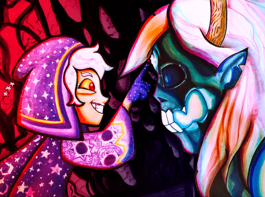
Did a screenshot redraw of that moment Belos knew he fucked up. With markers!
WIPs/links to higher quality under the cut 😌
So what I did to create this image was hold my paper up to my screen and trace over the screenshot's lineart, then worked out the rest of the details on paper. The straight lines on the top and bottom are where the original screenshot cuts off.
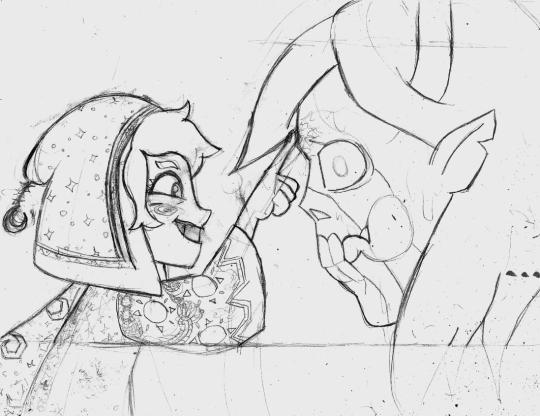
Once I decided the sketch was finished I put my blending card (special paper for the markers) over the sketch on a lightboard and traced over it with my pens.
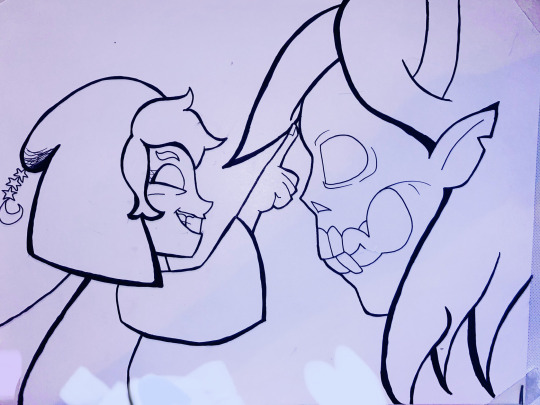
If I made mistakes I would sometimes use my white paint pen to draw over them.
Then, on a piece of scrap paper, I would test out my markers to see what blending combinations looked good.
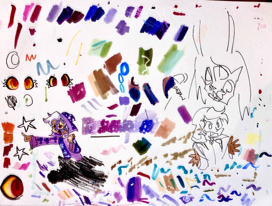
Tangent: I use alcohol markers, specifically COPICs, though I also have some Prismacolors too. Alcohol markers are built for blending and I recommend looking them up if you are interested. I use copics because they have a brush nib and while they're expensive, you can easily get refills and replacement parts so you'll never throw them away. You can buy 30 year old markers that are still good.
First I colored (most of) the characters (that took a lot of time, especially since I was cautious about how to color in things like the eye and would test on scrap paper first)
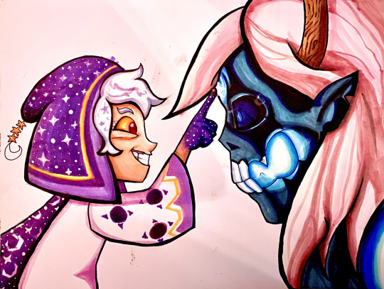
Then I tried making a background but I really didn't like it
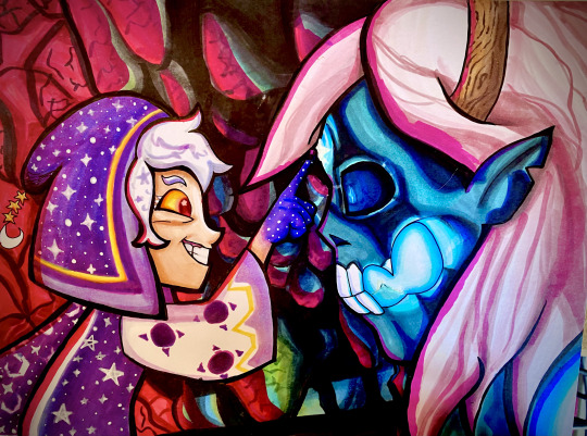
So in digital art I cut out the characters from the background to see how to fix it and came up with the idea of darkening it significantly.
Digital experiment on the left, experiment onto paper on the right.
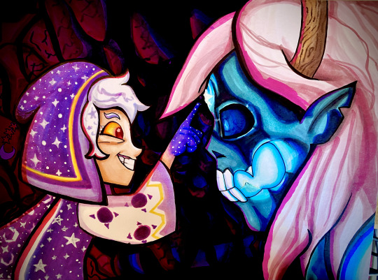
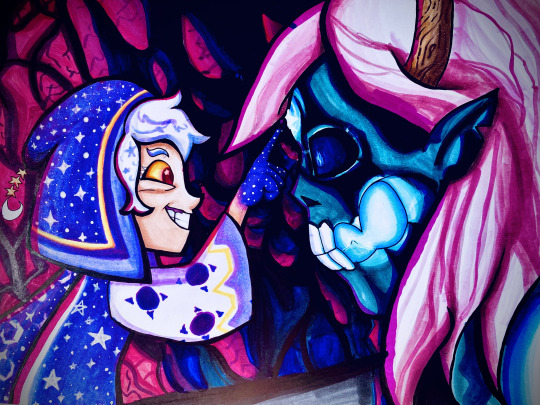
A lot of these WIPs look very different because of me taking pictures of the photo with a phone camera and doing different filters every time. I have a scanner but I've never liked how it comes out.
If you want to see a higher quality version of the final image, here's links to where I uploaded it on Deviantart and Newgrounds.
Also a Youtube upload of that video I made!
Note: There's an animation error in the original ToH clip I used where the Collector's clothes are miscolored, and the reason they're not here is because I fixed it.
#The Owl House#the collector#emperor belos#screenshot redraw#traditional art#quo's art#quo's colors#quo's traditional
74 notes
·
View notes