#design evolution
Explore tagged Tumblr posts
Text

I adore the wavy design elements in this modern architectural stunner.
#wavy#design elements#design evolution#design education#design engineering#modern design#modern house#modern home#modern architecture#architecture#may#spring#toya's tales#style#toyastales#toyas tales#exterior#home design#luxury home#luxury#home improvement#home & lifestyle#home#concrete#wood#fence#box#planters
263 notes
·
View notes
Text
The Evolution of the Ninja Turtles' Designs

As I'm sure many of you know by now, this year marks the 40th anniversary of the Teenage Mutant Ninja Turtles.
What initially started off as an intended one-off parody of the dark and gritty comics of the early to the mid 1980s (particularly the works of Frank Miller like Ronin and especially Daredevil) would grow to become one of the most successful media franchises in history.
The one-off quickly became a full-on series, running for a total of 30 years from 1984 to 2014.
It also led to the creators of the Turtles, Kevin Eastman and Peter Laird, to start their own comic publishing company, Mirage.
And apart from that, this franchise has seen multiple of other comic runs from the likes of Image, Archie and IDW.
Four animated series (with a fifth one coming out this summer).
Ten feature-length films (7 being released in theaters, while 3 were released direct-to-DVD).
A live-action TV show that nobody likes to talk about....
And a boatload of video games, toys, food products, and just about any other kind of merchandising you can think of!
And it's honestly impressive just how consistently popular the TMNT brand has reminded over the four decades they've existed in pop culture.
Even more so is how much of a spotless track record they've had when it comes to the quality of their products.

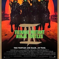
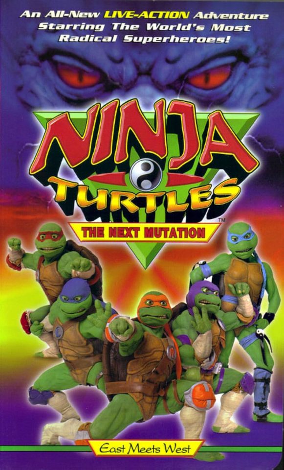
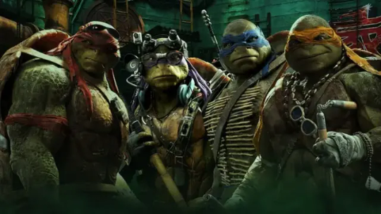
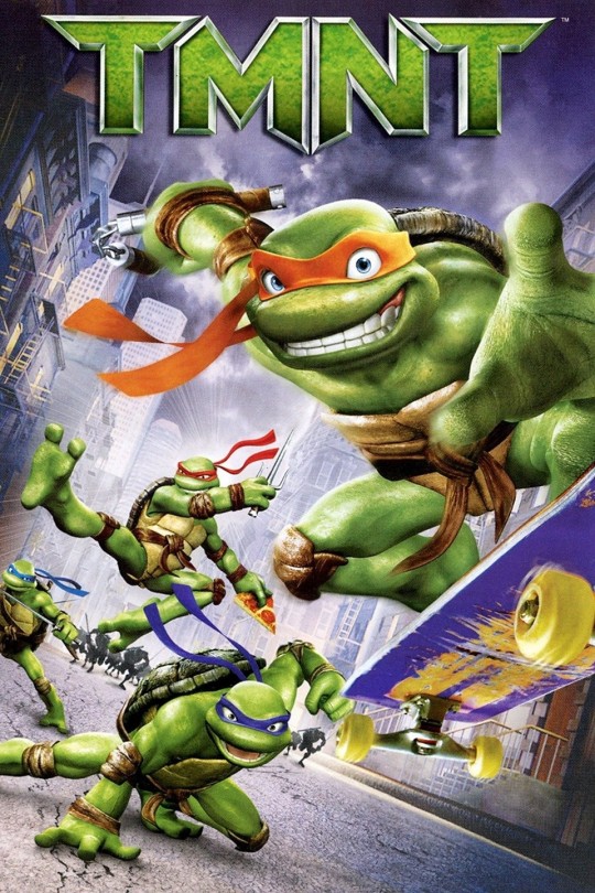
Okay a mostly spotless track record....
But today I'm here to talk about one of the coolest things to notice when looking at this franchise. And that's the visual evolution of the Turtles.
I'm gonna be looking at the designs of the Turtles from the original Mirage comics and the animated outputs of the franchise to see just how much the Turtles have visually changed.
Starting this off we have the Turtles from the Mirage comics, the 1987 cartoon, the 2003 cartoon and the 2007 film.
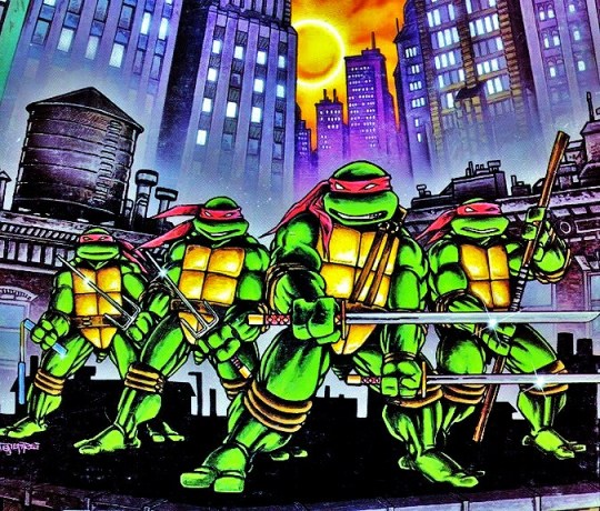
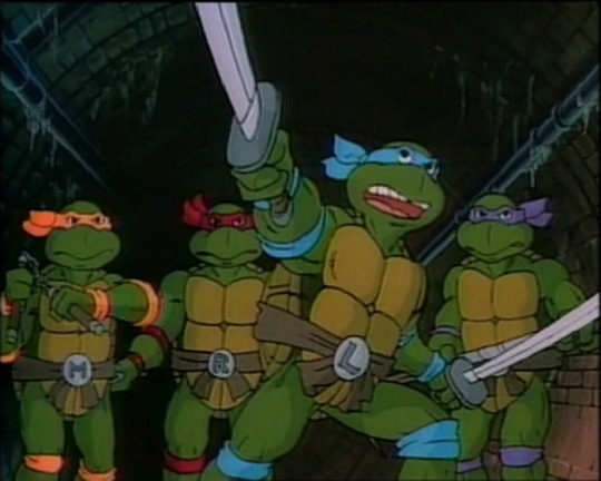
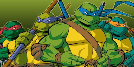

The reason I decided to lump these four iterations together is because they all share something in common....
What that's you may ask?
Well, a while back, I watched a video by YouTuber Just Stop called "Death by Nicktoon", where he looked at the many Nicktoons that were unfairly snubbed and sent to the Nicktoons channel to die a slow and painful death.
And one of those Nicktoons was one of the next TMNT series I'll be talking about pretty shortly.
When talking about that series, Just Stop mentioned the Silhouette Test.
As I'm sure many of know by now, the Silhouette Test is major component when it comes to character designing.
Essentially the saying goes that you know a character has a good design if their silhouette is easily recognizable.
And Turtles do pass this test.....but only as a group.
Because individually, these versions would all fail that in an instant.
And that's the thing they all have in common.
Within the pieces of media each of these groups come from, all they look exactly the same.
Out of all of them, the Mirage Turtles have this issue the worst.
During the early years of the comics, the Turtles basically acted damn-near identical to each other.
And if you were trying to find another way to differentiate them from each other, I don't know what to tell you.
As I mentioned earlier, these Turtles look exactly the same and the fact that they were in black and white for a good chunk of the comics didn't help matters either.
But when they were in color, the Turtles were all depicted wearing red masks.
Really, the only way you could actually tell which Turtles is which is by their respective weapons.
Leonardo wields the dual katanas.
Raphael wields the twin sais.
Donatello wields the bō staff.
And Michelangelo wields the dual nunchucks.
But when the 87 cartoon rolled around, the crew behind that show knew the Turtles needed some retooling in order for a wider audience to get into the brand.
Thus, they did two things that have become staples in the Turtles franchise since then.
They gave each of the Turtles their own distant personalities. Leonardo was the calm, brave and strategic leader, Donatello was the tinkering, inventing genius, Raphael was the cynical and wisecracking smartass with a slightly bad attitude, and Michelangelo was the fun-loving, Cowbunga-shouting goofball.
They gave each of the Turtles different colored masks. With the expectation of Raphael (who was still rocking the red look), Leonardo got a blue mask, Donatello got a purple mask, and Michelangelo got a orange mask.
And although their visually more distinct when compared to the Mirage Turtles, they still suffer from the same problem where physically, they look exactly the same.
Plus the fact that a lot of promotion and merchandising for this show often depict the Turtles as having the same expressions didn’t help either.
However, there was another visual element added to the Turtles' designs.
They gave each of the turtles belts with buckles that had the initials of their respective names.
But if you had put these Turtles in black and white and took away their weapons and belts, you most likely wouldn't be able to tell who was who.
The same can be applied to the 2007 Turtles as well....minus the belts since they don't have those.
But in the case of the 2003 Turtles, this is where things get interesting....
These Turtles do share the same issues as the three other iterations listed above, being that they look exactly the same to each other, minus the colored bandanas and trademark weapons (which I'm still surprised they carried over from the 1987 cartoon given that Turtles co-creator Peter Laird, who was heavily involved in the 2003 cartoon, is kind of infamous for having a bit of a hate-boner towards that series).
However, there is another visual element to these Turtles that would help differentiate them from each other.
This would mark the very first time in the franchise's history where the Turtles were given different skin colors....or more appropriately, shades, as each of Turtles' skins were a different shade of green.
Leonardo was forest green.
Michelangelo was blue green.
Donatello was olive green.
And Raphael was emerald green.
But with that being said, if you put these Turtles in black and white just like the others iterations above and took away their respective weapons, it would be the same output as before.....
Or maybe not....
You see, for the last two seasons of the show: Fast Forward and Back to the Sewers, the entire cast received major redesigns, and this led to two notable changes with the Turtles.

Their eyes. In the first five seasons, the Turtles' eyes were depicted as being fully white when they had their masks on. And when they were off, their eyes were just simple black. But in these last two seasons, the Turtles' eyes were now colored and were made visible through the masks. The Turtles all had green eyes....except for Donatello, whose eyes were brown for some reason.
Their heights. In the first five seasons, the Turtles all stood at about the same height, that being 5'2. But in the last two seasons, they were each given different heights. Michelangelo was the shortest at 5'4, Leonardo was the second shortest at 5'5, Donatello was the second tallest at 5'6, and Raphael was the tallest at 5'7.
Next we come to the Turtles from the 2012 series, and this is where everything changed....
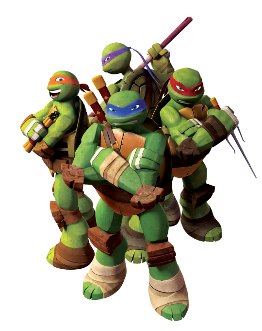
For the very first time in the franchise's history, the Turtles were each given unique and distinct looks from each other.
No longer did they look like the same character copy-pasted three times, each of Turtles actually looked different!
If you saw these guys in black and white and took away their weapons, you could definitely tell who was who!
Some of the visual elements of the previous cartoons were carried over such as the colored masks (which have becomes staples of the franchise since the 1987 cartoon), having their skin colors being a different shade of green, having colored eyes and standing at different heights.
But what really sets these versions apart from the others is the fact that each Turtle has a different physical build!
Leonardo is the most well-rounded when it comes to physical builds, he has fern green skin, cobalt blue eyes, and is the second tallest of the Turtles at 5'1.
Raphael is slightly more bulkier and has more defined muscles than the rest of his brothers, has dark green skin, emerald green eyes, a crack on the right side of his shell, and is the second shortest of the Turtles at 5'0.
Donatello has a lean and gangly-like build, brownish green skin, reddish brown eyes, has a gap in the middle of his teeth, and is the tallest of the Turtles at 5'6.
And Michaelangelo has a more stout and pudgy build, light green skin, baby blue eyes, freckles on his face, and is the shortest of the Turtles at 4'10.
Now come to the Turtles from Rise of the Teenage Mutant Ninja Turtles....
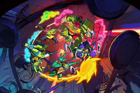
Out of all the iterations of the Turtles before and since, these guys are by far the most visually distinct of them all!
It honestly feels like the crew looked at the designs of the 2012 Turtles and said, "Hey! Let's do what they did.....but even better!"
Marking yet another first for this franchise, this would mark the first time the Turtles were all different specific species of Turtles rather than being the same unspecified species for the umpteenth time.
And them being different species are greatly reflected in their designs.
Also, according to several artists on the show, each of the Turtles were designed around a shape, and the use of the shapes also reflected their respective personalities.
Raphael is an alligator snapping turtle, which is why is he's an absolute unit in this series, with a hulking and muscular build to match! This Raphael is the second biggest and tallest he's been in this franchise, standing at a whooping 6'0! And since he's an alligator snapping turtle, Raphael also has jagged and fractured points on his elbow, knees and shell. His choice of species reflect three major aspects of his character.....
His status as the brawler/muscle of the team.
In this iteration, HE'S the leader of the team.
He's the oldest of the Turtles. Oh yeah, marking yet another first for this franchise, this would mark the first time that the Turtles were all made different ages rather than being quadruplets like every other iteration. As previously mentioned, Raphael is eldest of his brothers at 15.
Raphael was designed around squares, to reflect his offensive and defensive fighting style.
His mask, in contrast to half of his brothers, is depicted as more of a bandana (or a possibly a durag). Plus it has the longest tails out of the group, reflecting his status as the oldest brother.
He also wears red bands on his elbows and his thighs, a red belt with his Turtle Emblem off to the right side, and his bandages on a few parts of his body and specifically around his ankles and hands, reflecting his prowess as a fighter and that he's the Turtle most dedicated to training.
Raphael also has bright green skin and a sharp tooth sticking out of the right side of his mouth.
Leonardo is a red-eared slider, which is why he has those markings all over his body and shell and the red markings over his eyes. His choice of species would also reflect his future status as the leader of the Turtles, since red-eared sliders are the most well-known species of turtles. He also has a lean and athletic build, reflecting his status as the team's resident speed fighter.
Leonardo was designed around triangles, to reflect his witty and sharp nature.
The marks on his body are also triangular as well.
Leonardo also has lime green skin and wears blueish grey fingerless gloves and toeless footwear, a blue belt with a strap that overs his right shoulder, a set of pouches, and he has his Turtle Emblem on the left, and is the second tallest turtle at 5'5 (the same height as his 2003 iteration).
Donatello is a Asian softshell, which plays a big part in his personality. Out of all the iterations of Donatello, this one is far more aggressive than most of his prior iterations, even the Mirage version! I mean bro, this Donatello is practically a psychopathic scientist. This is because Asian softshells are known for being incredibly aggressive and one of the few species of turtles that are carnivorous.
As for his physical build, it's quite similar to Leonardo, which is possibly because of the fact they're twins, both being 14 years old.
Though Donatello's is even more leaner and thinner than Leonardo's, giving him a build akin to a swimmer. That's because Asian softshells are known for being some of the couple of turtles that live on land that are semi-aquatic.
Another similarity Leonardo and Donatello share are their mask tail lengths.....well, sort of....
The length of Leonardo's mask tails is squarely in the middle, reflecting his status as the middle child.
Donatello's however are little harder to tell.....
At first glance they appear to be quite short. However, when looking closely, you can see that the tails look folded. So there's a strong chance that his mask tails are both as long as Leonardo's, since they're twins.
(Also, it's fashioned in a similar way to Raphael.)
Donatello was designed around rectangles, to reflect his more practical and blunt nature and his technological prowess.
He also has purple, rectangular markings on his body as well.
Donatello wears purple fingerless gloves and toeless footwear, a silver tech-gauntlet on his left wrist with a blue touchscreen, purple knee and elbow pads, a purple belt with matching pouches, and the Turtle emblem placed on the center. He also has jade green skin and stands at 5'3.
But the most notable aspect of Donatello's design is his mechanical shell.
This not only reflects his technological prowess, but also reflects an aspect of his species and his character.
Asian softshells are known for their shells being on the weaker side when compared to other turtles species. It's in the name. So Donatello wears one for obvious reasons.
It reflects his inferiority complex. Throughout this series, it's shown that he heavily relies on technology due to him feeling inferior to his brothers. That was sort of already from the beginning given that he majorly lacks the same natural protection they do, but thanks to them getting mystical powers, that was made even worse.
Michelangelo is a ornate box turtle, which is why he's the smallest and shortest of the Turtles, standing at 4'7 (being the shortest any of the Turtle iterations have ever been). Him being a box turtle also reflects a major part of his personality, that being his friendly and kind personality, as box turtles are known for being one of the friendliest and gentle species of turtles.
Michelangelo was designed around circles, to reflect his bouncy and kinetic nature.
He also has orange spots on his body and orange markings on his shell, which also serve as an another nod to his species.
Michelangelo also has blue green skin and wears orange wristbands and toeless footwear, and orange knee pads with red faces on them (a dead face on the right and a smiley face on the left), and a dark orange chest harness over his left shoulder with the Turtle emblem placed over his heart.
He also wears a pair of magenta and cyan stickers on his plastron (a triangle and a lightning bolt), to reflect his artistic nature.
Michelangelo also has the shortest mask tails of his brothers, to reflect his status as the youngest.
Finally we come to latest incarnation of the Turtles, Teenage Mutant Ninja Turtles: Mutant Mayhem....
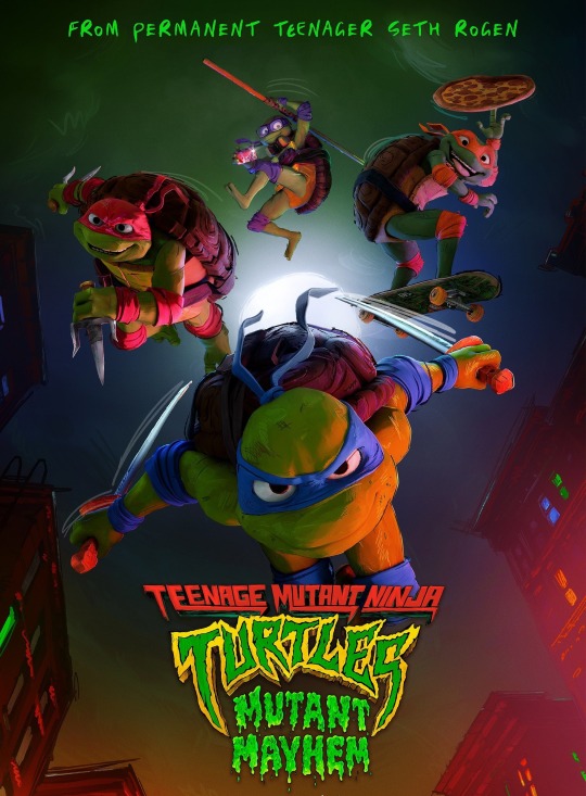
Although they're not nearly as visually unique as their previous iteration, they still do a good job at making each of the other visual distinct from each other.
One thing to note is that the just like the 1987 Turtles, they all have initialed buckles again.
Leonardo has a well-rounded build like his 2012 iteration with French lime green skin, has shurikens on his belt, and is the second tallest of his brothers at 5'5
Donatello has a leaner build similar to his 2012 iteration with bitter lime green skin, wears glasses, headphones, and a fanny pack, carries a phone on his belt, and is the second shortest at 5'4.
Raphael is the biggest and bulkiest of his brothers with bright green skin, has his mask fashioned in a bandana-like style akin to Rise Raphael, has a pouch on his belt, and is the tallest at 5'7.
Michelangelo is the skinniest with sea green skin, wears braces and is the shortest at 5'1.
Well that's all for now folks!
The reason I wanted to do this (apart from wanting to do something for the Heroes in a Half-Shell's Big 40), was because although I've seen people talk about the looks of the various iterations of the Turtles before, but only in the sense of that specific iteration.
So I thought I would be interesting to instead do a timeline of their visual appearances to show just how much they've changed over the decades.
Anyway, I'm gonna go to bed.....
Peace.
#teenage mutant ninja turtles#tmnt mirage#tmnt 1987#tmnt 2003#tmnt 2007#tmnt 2012#rise of the teenage mutant ninja turtles#tmnt mutant mayhem#character design#design evolution#though in all honesty rise is peak character design for this franchise
58 notes
·
View notes
Text
I’m no stranger to JoJo character’s designs evolving, and I’ve spotted something. Just realized Usagi’s first appearance already looks odd compared to how he’s currently drawn chapters later.
What do you think of his design evolution so far?


#jjba#jojo#the jojolands#jojolands#jojo’s bizarre adventure#jojo’s bizzare adventure#jojo no kimyo na boken kin#jojo no kimyou na bouken#jojo no kimyō na bōken#jojo part 9#usagi#usagi alohaoe#jojo usagi#design evolution#jojo design#usagi design
70 notes
·
View notes
Text
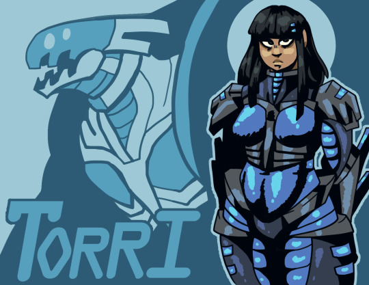
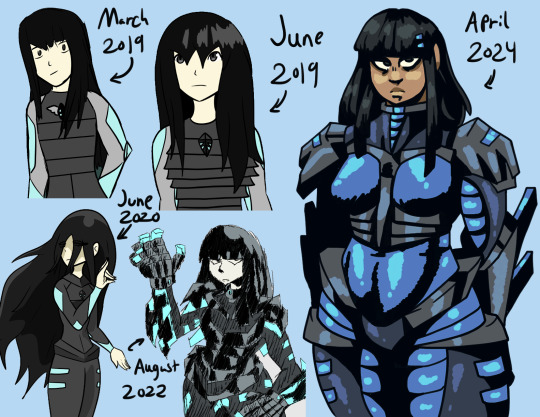
Torri, my mech pilot oc. She's very old, so here's her design evolution
#mech pilot#mecha art#robot#mechposting#mechs#oc#original character#design evolution#redesign#character redesign#kaneidae art
39 notes
·
View notes
Text
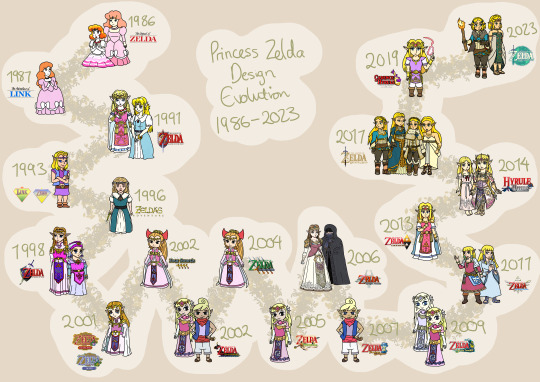
Made in 2023
If you’ve seen this anywhere else, I posted it back on my deviantArt when it was made.
From my large project of drawing every Zelda design, I’ve now taken to colouring them! And here's the compilation of all of the game Zeldas!
#princess zelda#zelda#evolution#design evolution#legend of zelda#the legend of zelda#the adventure of link#a link to the past#triforce of the gods#the wand of gamelon#the faces of evil#zelda's adventure#zelda cdi#ocarina of time#child zelda#adult zelda#oracle of seasons#oracle of ages#four swords#the wind waker#wind waker#tetra#toon zelda#four swords adventures#the minish cap#minish cap#twilight princess#phantom hourglass#spirit tracks#skyward sword
59 notes
·
View notes
Text
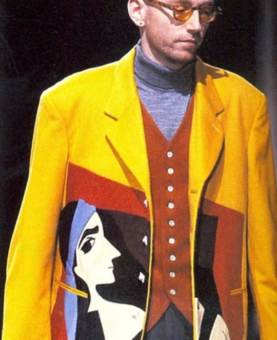
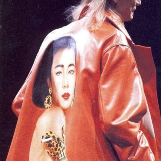
Yohji Yamamoto A/W 1991
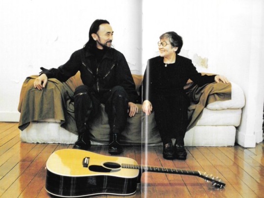
Yohji Yamamoto Memories (scan)
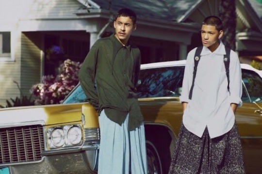
Yohji Yamamoto SS 12 in Arena Homme Magazine
#yohji yamamoto#yohji Yamamoto memories#visual archive#yohji Yamamoto archive#design evolution#runway#vintage#90s#book scans
19 notes
·
View notes
Text
Rory - Design Evolution
Originally, Rory was just an asgoriel fankid, and not part of the larger AU. Though when designing them, I decided right off the batt that they would be nonbinary, as from what I'd seen, there was a surprising lack of nonbinary characters within the fandom. I decided to also go a different route than most other nonbinary designs, as most are very neutral or more feminine. I wanted them to be more masculine, however I gave them more feminine long hair for a contrasting feature, as well as due to seeing most nonbinary characters having shorter hair.
Their name came from how Asgore and Toriel both had nicknames that ended in "or-ee" (Tori and Gory), and I thought that a similar sounding name would fit. I eventually settled on the name Rory.

This reference sheet was the first time I drew Rory. I had them in my head for a long time before this, but had never drawn them, as I tend to like to get all of the details figured out before I put a character down on paper.
I knew that I wanted them to take more after Asgore, with them having yellow hair and blue eyes. However I originally gave them Toriel's short horns and a long tail like I used in my Toriel design.

I went through a phase for a while where I was really into shading my drawings, as well as starting to try to draw more dynamic poses. This is when I drew Rory next.
At this point, I had added them to my AU where the fallen humans came back as goat monsters. I had decided to draw all of the kids using their magic in combat, however, I only ended up finishing a few.
I gave them Justice magic, as I thought it would fit their personality pretty well. I also imagined them as having a preference for more physical combat than just purely magical, so I drew them using their magic sort of like brass knuckles.
This drawing is what inspired the current lore that they prefer defense rather than offense, as I felt that this drawing looked like they were more on the defensive.
I had changed their outfit to a tank top and tight-fitting shorts, as I felt that those would be better suited for this pose and action than the original t-shirt and long pants.
I did make a few errors of design in this drawing, however it was mainly due to me having limited color-choice at the time. I had used too dark of a blue for their eyes and shirt, as I didn't have a lighter color. I also didn't make Rory as masculine as I would have liked, as I wasn't familiar with drawing different body types, and mainly drew one main base type for all of my drawings.

The third time I drew Rory was for a personal hight comparison reference sheet that I did to make my drawings of my characters more consistent. I had used an online height comparison chart for the base and had drawn over it, so the proportions are a bit weird compared to my other art. Though ironically, I was pretty happy with how Rory looked here.
I kept the darker shirt color from the previous drawing, however I stayed with their original t-shirt and long pants as their main outfit.

The fourth time I drew Rory was when I was fleshing out the AU and doing a pose/body language study.
I couldn't figure out how to draw their hair where it looked right in this pose, so I settled for drawing it up in a braid. However, I ended up really liking how it looked, and it ended up as part of their main design.
I had slightly changed how I drew Toriel and Asgore, and changed Rory's design to reflect that. I also further pushed their appearance more towards Asgore rather than having them be a fairly even mix of the two; I gave them longer horns and longer fur.
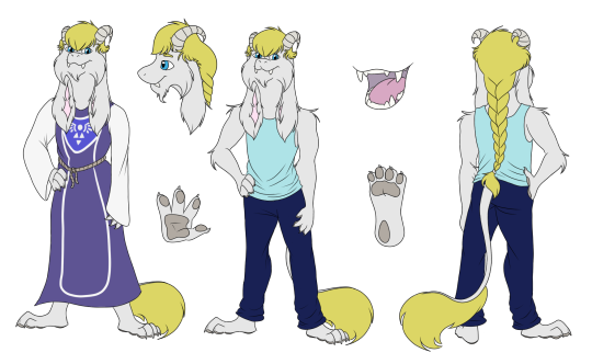
Rory's final design really didn't have much more changed, however I changed the shape of the fluff at the end of their tail to have a more consistent style that was close to how I did Toriel's tail. I also gave them a small beard, as I had decided at this point that I wanted them to very strongly resemble a younger Asgore.
#undertale au#shattered soul au#au designs#design evolution#undertale oc#undertale#utdr#undertale ocs#undertale fankid#asgoriel fankid#asgoriel
8 notes
·
View notes
Text
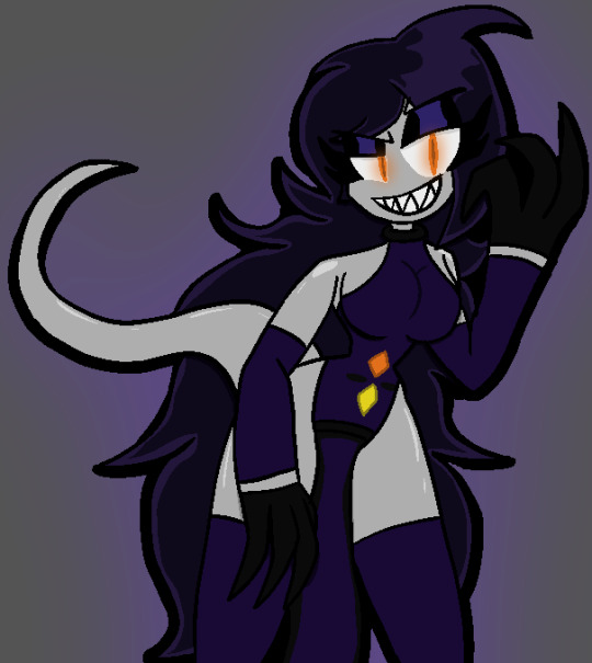
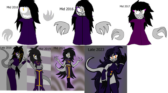
Ziana. She's an evil Queen. Plus a design evolution for her.
10 notes
·
View notes
Text

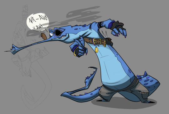

my Lizardfolk Warlock Shanks love their development in design, very fun
#artists on tumblr#clip studio paint#not a bot#dnd5e#dungeon and dragons 5e#lizardfolk#warlock#design evolution#character design#plwease don steal.... me to tired to add my watermork
6 notes
·
View notes
Text

Rando Loops: Optimized Experience & Animations Update
#Rando Loops#UI Design#UX Design#Motion UI#Interface Animation#Smooth Interactions#App Update#Design Evolution#Playful UI#Mobile UI#Game Design#Dribbble#Creative Process#UX UI#App Experience#Interaction Design#Digital Product#Visual Design#Microinteractions#Mockup#Case Study Coming Soon
0 notes
Text
I love you speculative biology. I love you worldbuilding projects. I love you creature design. I love you fantasy biology. I love you speculative evolution. I love you science fiction.
#speculative biology#speculative evolution#creature design#scifi#rosie rambles#all tomorrows#the birrin#subnautica#humanity lost#the epic of serina
14K notes
·
View notes
Text
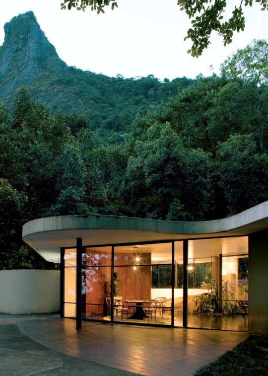
This home is neatly tucked away into nature.
#nature#greenery#mountains#curvy#trees#modern design#modern home#modern house#exterior#modern architecture#architecture#may#spring#home design#design engineering#design elements#design evolution#design education#toya's tales#style#toyastales#toyas tales#floor to ceiling windows#luxury home#home improvement#home & lifestyle#home#concrete hardscape#concrete house#concrete
168 notes
·
View notes
Text
Generative AI is totally changing the game for UI/UX design! Say goodbye to endless brainstorming and hello to smart, adaptive designs that learn and grow with user needs.
Now, creating user experiences feels more like collaboration with AI as your creative partner!
Ready for the future of design?
#generative ai#future of design#uiux#ai design#tech trends#innovation#design evolution#next gen design
1 note
·
View note
Text
I dont have any art of this design whatsoever, but I would like to say that my original design for Spottedleaf when i was younger was gray and white, speckled all over with no real pattern like an old warriors wiki sprite. This wasnt due to anything i had heard or found anywhere, but due to my misinterpreted idea of what "tortoiseshell with white" meant.
What is a tortoise? Kinda like a turtle.
What color is a turtle. Green.
Cats cant be green, thats stupid. Whats the closest color to green a cat can be? Grey.
If its "tortoiseshell" i suppose that means multiple different shades right? And theres white in there too. Okay sure why not. Add green eyes in there too just to drive the idea in further that this is just a turtle we disguised as a cat.
Then i proceeded to make literally zero art of this design ever except for a crappy minecraft skin, and never attempted to draw her again until a few weeks ago when i settled on this:

Im pretty proud of it, to say the least. Much better than the muddy grey atrocity that came before.
Hi reblog this with your old and recent designs/art of a wc character for comparison. Also feel free to ramble about them, like what you changed/improved or if it's for an au, etc
#warrior cats art#warriors#warrior cats#spottedleaf#thunderclan#design evolution#sapphanimates#sapph talks#warriors fanart
602 notes
·
View notes
Text
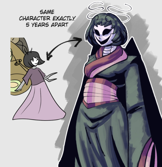
#monster girl#monstergirl#moth girl#bug girl#insect girl#geisha#kimono#doll character#antennae#design evolution#art evolution#kaneurysm art
9 notes
·
View notes
Text
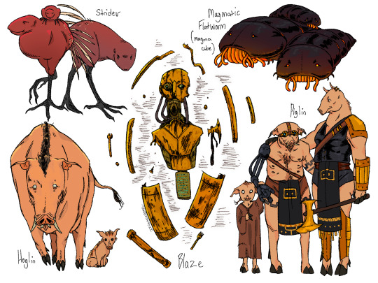
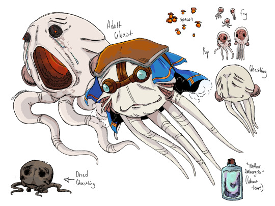
In the land of fire and metal
(Redraw of an older piece)
#minecraft#mineblr#minecraft art#my art#minecraft fanart#minecraft headcanons#minecraft abiogenesis#minecraft lore#minecraft mob#minecraft ghast#minecraft piglin#minecraft nether#speculative evolution#creature design#fantasy#dark fantasy#minecraft blaze#minecraft strider
4K notes
·
View notes