#design designtheory
Explore tagged Tumblr posts
Text
IMPORTANT TOPICS OF DESIGN THEORY
Design theory is a rich and multifaceted field that underlies the principles, concepts, and methodologies governing the art and science of design. It serves as the intellectual foundation upon which designers, artists, architects, engineers, and creators of all kinds build their understanding of how to craft effective, aesthetically pleasing, and meaningful solutions in a wide range of disciplines.
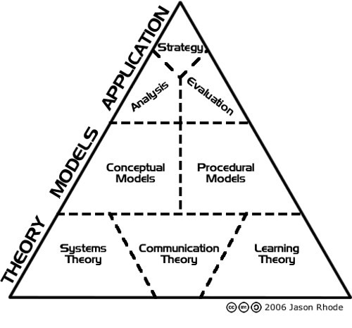
At its core, design theory delves into the fundamental questions of "how" and "why" when it comes to shaping the world around us. It explores the principles that guide the creation of visual, structural, and functional elements, helping to create objects, spaces, and experiences that are not only visually appealing but also efficient, user-friendly, and emotionally resonant.
Design theory encompasses a diverse array of topics, from the fundamental principles of visual composition and aesthetics to the ethical considerations that designers must grapple with in an increasingly interconnected and complex world. It provides the intellectual framework for understanding color theory, typography, grid systems, user-centered design, and the psychology of how humans perceive and interact with the designed environment.
Moreover, design theory is not confined to the visual realm alone. It extends its reach into fields like industrial design, architecture, user experience design, and even urban planning. It informs decisions about form and function, guiding the development of products, buildings, digital interfaces, and more, all with the aim of improving the quality of life for individuals and society as a whole.
In essence, design theory serves as both a roadmap and a source of inspiration for those who seek to innovate, solve problems, and communicate ideas through the medium of design. It is an ever-evolving field that adapts to the changing needs and aspirations of humanity, reflecting the broader shifts in culture, technology, and the environment.
As we delve deeper into the intricacies of design theory, we embark on a journey of exploration, discovery, and creativity. It is a journey that invites us to question conventions, embrace new ideas, and ultimately, contribute to the ongoing evolution of design as a force for positive change in the world. Whether you are a seasoned designer or someone simply intrigued by the world of design, the study of design theory offers valuable insights into the processes and principles that shape our designed environment.
Design theory encompasses a wide range of topics that are essential for understanding the principles, concepts, and frameworks that underpin the field of design. Here are some important topics in design theory:
Design Principles:
Understanding fundamental design principles like balance, contrast, alignment, proximity, and repetition is crucial for creating visually pleasing and effective designs.
Color Theory:
Color theory explores the principles of how colors interact, the psychology of colors, and their use in design to convey emotions, messages, and brand identity.
Typography:
Typography theory delves into the art and science of choosing and arranging fonts. It covers topics like font families, readability, hierarchy, and kerning.
Grid Systems:
Grid systems are fundamental in design for creating structure, alignment, and consistency in layouts, whether for print or digital media.
User-Centered Design:
User-centered design theory focuses on creating products, interfaces, and experiences with the end user in mind, involving research, prototyping, and usability testing.
Information Design:
Information design theory explores how to present complex information clearly and effectively through charts, graphs, diagrams, and data visualization.
Semiotics and Symbols:
Semiotics studies the use of symbols, signs, and icons in design to convey meaning and messages, and how cultural context influences interpretation.
Design Thinking:
Design thinking is a problem-solving methodology that emphasizes empathy, ideation, prototyping, and testing to develop innovative solutions.
Aesthetics and Beauty:
Aesthetic theory in design examines the concept of beauty, visual appeal, and the emotional impact of design on users.
Visual Hierarchy:
Understanding how to create visual hierarchy through layout, size, color, and contrast is crucial for guiding the viewer's attention and conveying information effectively.
Responsive Design:
Responsive design theory addresses the principles and techniques for designing content that adapts seamlessly to different screen sizes and devices.
Design Ethics:
Design ethics explores the moral responsibilities of designers, including issues related to accessibility, inclusivity, sustainability, and the impact of design on society.
Gestalt Principles:
Gestalt psychology principles explain how people perceive and organize visual elements into meaningful patterns, which is valuable for designers seeking to create effective compositions.
Cognitive Load:
Cognitive load theory examines how the design of information affects the mental effort required for users to process and understand content.
Design History:
A knowledge of design history helps designers draw inspiration from past movements, styles, and designers, while also understanding how design has evolved.
Brand Identity and Logo Design:
Brand identity theory explores the creation of consistent and memorable visual identities, including logo design, color palettes, and brand guidelines.
Cross-Cultural Design:
Cross-cultural design theory considers how cultural differences impact design choices and how to create products and experiences that resonate with diverse audiences.
Sustainability in Design:
Sustainable design theory focuses on creating environmentally friendly and socially responsible products and solutions that minimize ecological impact.
CONCLUSION
These topics provide a solid foundation for anyone interested in pursuing a career or academic study in design. Design theory is a dynamic field that evolves with technological advancements and societal changes, making it essential for designers to stay informed and adaptable in their practice.
0 notes
Text
WEEK ONE
About Me
Tell us all a little about yourself. Why did you take this class and what is your interest in design? Do you have any relevant experience? What inspires you? Have you recently purchased any items where design was a deciding factor over a competitor?
Hi,
My name is Lamyra (la-meer-ah) Adams, but I mostly go by Myra (meer-ah). Im from Sturgeon Bay, which is located on the Door County Peninsula -- the thumb of Wisconsin. Im a sophomore on the DVC track, so Design Survey happens to be a requirement. Im excited to see what I’ll learn in this class, in regards to ‘design theory and methodologies’ as it says in the syllabus. I’ve never really thought about origins/history of design so I think class will be a real eye opener.
Design plays a huge factor in not only the work I make but the work we all make. I’ve definitely used the elements and principles of design in almost all of my works, whether it was a well thought out decision or a subconscious one. Even within this first week of class im learning/realising how much design plays into our artistic decisions. I think the aesthetics of design also play a role in what art we find personality attractive -- we tend to drift towards in the art museum or on an internet app such as Pinterest.
A lot of my art is inspired by nature and people. I know that sounds very basic. I try to combine them as much as possible. I like to collect open source photos on the internet (especially vintage) and then I rework them into my own art as collage elements. I especially enjoy creating my own Photoshop Brushes and creating radial designs, or patterns with the cut out photos.
I’d say design is a huge factor in my ‘shopping life’ when it comes to clothes. I follow a lot of designers on Instagram and If I wanted to I could go bankrupt on buying clothes purely to hang them in my closet and just look at them. Clothes are so pretty. I know this sounds shallow, but I find it interesting how someone can express a certain personality, aesthetic, or period in time.
I could go on but I think this should enough info,
Thanks for reading!
Lamyra Adams
1 note
·
View note
Photo
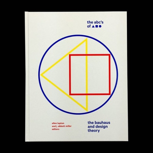
The Bauhaus and Design Theory by @ellenlupton & J. Abbott Miller / Design by @ellenlupton / Published by Princeton Architectural Press / Available @counterprintbooks * * * * * #bauhaus #ellenlupton #jabbottmiller #designtheory #design #graphicdesign #designer #graphicdesigner #book #books #booksondesign #designbook #publishing #publication #graphicbooks #type #typeface #typography #grid #layout #designstudent #designstudio https://www.instagram.com/p/BuhjxVKhKHj/?utm_source=ig_tumblr_share&igshid=jvkdoaiqu8sc
#bauhaus#ellenlupton#jabbottmiller#designtheory#design#graphicdesign#designer#graphicdesigner#book#books#booksondesign#designbook#publishing#publication#graphicbooks#type#typeface#typography#grid#layout#designstudent#designstudio
2 notes
·
View notes
Photo

Lovely to be featured on @bridgetbeari ‘Hue are You’ blog. Click on https://bridgetbearidesigns.blogspot.com/2019/01/hue-are-you-with-regina-sturrock.html to read about my phiosophies on color. ........................................................................... Susan Jamieson: What one color represents your design style? Regina Sturrock: I suppose the color that would best represent my design aesthetic is blue. It’s a calming hue that evokes a strong sense of peace and serenity; an essence that speaks to the order and clean classicism in my interiors. If I could see color as a design principal, blue would absolutely distinguish itself with symmetry and harmony. There’s a deep integrity to this hue. #Repost @bridgetbeari with @get_repost ・・・ It’s Friday and time for another Hue Are You? Question and answer series on color. Up today is Canadian Designer @reginasturrock Can you guess what colors she uses to bring balance and harmony to a room? Check it out by clicking the link on the BIO. #bridgetbearistyle #hueareyou #canadianfriends #designerfriends #learningfromthebest #color #paint #light #reginasturrockdesigninc #blogger #livingthemix (at Regina Sturrock Design Inc.) https://www.instagram.com/p/BtE7ApaA8Kp/?utm_source=ig_tumblr_share&igshid=1mays6kfb5nnd
#repost#bridgetbearistyle#hueareyou#canadianfriends#designerfriends#learningfromthebest#color#paint#light#reginasturrockdesigninc#blogger#livingthemix#interiordesign#reginasturrock#designphilosophy#colorphilosophy#design#designtheory#designhounds
1 note
·
View note
Photo
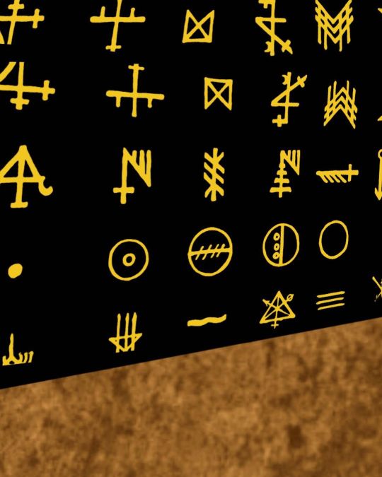
Topics-Case Studies in Design, & Graphic/ Information Design Theory I: “The Least Likely Theory of the Demise of the Dinosaurs”🦖🦕 Title: The Sci-fi Scenario of the Dinosaurs through Hypothetical Languages Media: Adobe Photoshop, and Procreate Size: 1620x2160px Likes, comments and shares are welcome 🙏 Follow abs support me @jmwebb_designs #demiseofdinosaur #dinosaur #designtheory #informationdesign #characterdesign #graduatestudent #graphicdesign #procreatebrushes #procreate #digitalillustration #drawing #noticemyartwork #artshare #graphicdesigner #dinosaurtheory #dinosaurartwork #characterart #artistsoninstagram #designer #artistintwitter #jmwebb_designs #designbrief #warmcolorpalette #adobephotoshop #photoshop #ipadpro #ipadillustration #characterdesignartist #artistontumblr #digitalillustration #digitalartworksoninstagram https://www.instagram.com/p/CTqiv0YsnDW/?utm_medium=tumblr
#demiseofdinosaur#dinosaur#designtheory#informationdesign#characterdesign#graduatestudent#graphicdesign#procreatebrushes#procreate#digitalillustration#drawing#noticemyartwork#artshare#graphicdesigner#dinosaurtheory#dinosaurartwork#characterart#artistsoninstagram#designer#artistintwitter#jmwebb_designs#designbrief#warmcolorpalette#adobephotoshop#photoshop#ipadpro#ipadillustration#characterdesignartist#artistontumblr#digitalartworksoninstagram
0 notes
Quote
We need to attend to the ways in which the professionalization of Design in the last century has included a legacy of hegemonic claims to adjudicate the question of whose knowledges are relevant to our collective future-making. We might agree to reclaim the keyword design in order to refashion it, but we need to do that deliberately, with an eye to the tensions inherent in articulating projects in transformational change as “small d” design, without reproducing the supremacy of Design with that initial capital letter.
Suchman, Lucy. "Design." Theorizing the Contemporary, Cultural Anthropology website, March 29, 2018. https://culanth.org/fieldsights/1355-design
4 notes
·
View notes
Text
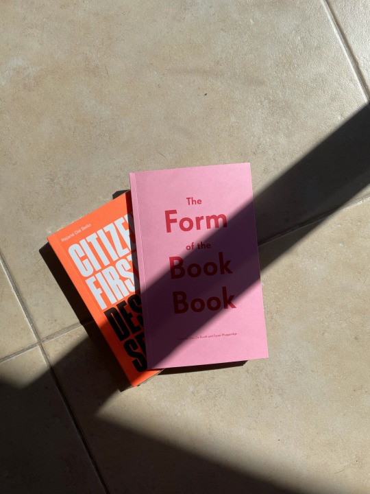
Morning deliveries 📦
#books#graphicdesign#theformofthebookbook#citizenfirstdesignsecond#counterpoint#designtheory#editorialdesign#design#Goodreads
0 notes
Photo
The Design Concept... . . . . . . . . . . . #architect #architectures #architecturestudent #architectureprofession #interior #interiordesign #interiordesigners #interiordesignerslife #interiordesignstudent #productdesign #landscaping #setdesign #design #designconcept #verbal #and #visuals #concept #designtheory #designstudent #iiidfoundation #coasocial #designersdome #designworkshop #webinars #instapost #designmatters #livingetc #homeandgarden #diy https://www.instagram.com/p/CAhXqjHAzYa/?igshid=v1cgxs87r3q8
#architect#architectures#architecturestudent#architectureprofession#interior#interiordesign#interiordesigners#interiordesignerslife#interiordesignstudent#productdesign#landscaping#setdesign#design#designconcept#verbal#and#visuals#concept#designtheory#designstudent#iiidfoundation#coasocial#designersdome#designworkshop#webinars#instapost#designmatters#livingetc#homeandgarden#diy
0 notes
Photo
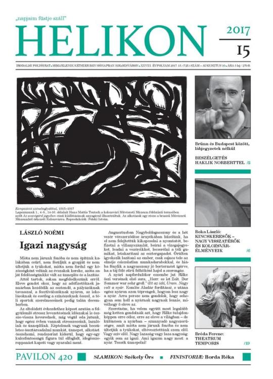
Megjelent egy designelméleti bevezetőm a Helikonban. Design a kiscicák összefüggéseiben, ez a címe, lol.
2 notes
·
View notes
Text
design principle no. 1 BALANCE
an equilibrium, an aesthetically pleasing arrangement, that allows nothing to be taken away
A canvas, on its blank state, is a neutral space—like a blind canvas, a new born baby. This is the space where endless possibilities are allowed. The dawn that holds the new day. As soon as an object is placed, a pole is created. Life is created on earth. A force field. A gravity.
The balance is broken.
Now, every single new object that enters the force field will either be pulled towards a pole—if its own gravity is weaker than the former—or creates a new pole stronger—if its gravity is stronger instead. (In the former case, the object obeys the dominant trend within the field, and in the latter, it creates a new trend that overpowers the existing forces.)
A tension is created.
This push and pull between objects continue as long as a state of balance is achieved, which is an extremely rare state that is present for no longer than a brief moment in time. This state is somehow similar to a stationary moment, or maybe a snapshot in time. I would even argue that balance is never something we can achieve, but rather only aspire to. It’s such an ultimate idea that this intention itself it is often the sole hint of a balance. The duality of Yin and yang, which is an ideal equilibrium within the micro- and macrocosms is omnipresent and flowing towards its alteration. As life is always moving, the composition is always evolving, balance is always broken to be recreated over and over again. So the perception of balance as a moment of inertia might be a paradox.
However, this also means that we can only speak of balance in presence of, not necessarily two, but definitely multiple objects (or elements or things or flavours or sounds or colours or movements or any other artistic ingredient). So balance is a relationship. The astrological sign Libra, which has the scales as its symbol, rules relationships. In particular, it rules relationships of one-to-one, where a precise fairness has to be maintained by a constant equal give and take.
Hence balance is a constant equal give and take, the flirt between the female and male.
It’s a peaceful tension, where you feel at ease. The more tension there is, the closer we are to quietude. Or Balance. Like the moment before a rubber band snaps. Or tip of a rollercoaster. Or orgasm.
Aesthetically, balance can create immense pleasure to senses and that’s why we’re drawn towards it as creators. A balanced face is a beautiful symmetrical face, which every feature is counterpoised by an opposite one; where your eyes can rest as long as they want to. It feels like the artist’s job is done. To the outside gaze, it can look perplexing to analyse the meticulous calculations that were put into the construction of the piece. Because there is not a single extra grain that tips the scale. A perfect nothing. The lack of tension. It is perfectly decluttered. Not in the sense that it is minimalistic. Not necessarily. But rather, it’s crystal clear that every single element in the composition exists to fulfil a noble purpose in the exactly right place. Like the way, God created each of us with a special purpose that no-one else but us can fulfil that in the whole contributes to a complex system. It’s without a doubt impossible to substitute any single object with another.
Nothing is redundant, or arbitrary.
I love Hemingway’s quote “Write drunk, edit sober”. It may take courage to start the creative process, so losing your head over it might certainly help. But equally, it takes a sharp mind, a steady hand and a strong will to refine the outcome and to take things out. And the latter is what makes the work great. Getting rid of the unnecessary and stripping the work down is what makes mastery. And in my own experience, and according to others like Hemingway, this is the hardest part. Artists ultimately manifest a human nature, which more often than not holds onto overstatement.
I recently went to a shaman, because, like everyone, I have issues that I can’t solve with a sharp mind, a steady hand and a strong will. I show addictive behaviour and am drawn to extremes. I’ve been looking for a long time to find my state of balance. This shaman told me that my soul wasn’t willing to let go of the soul of a long passed loved one, even though he wanted to let me go already. She said that our souls finally separated peacefully through her guidance and that when two souls do separate, they always do so with love. I was so so so mad to hear this. Like, so mad. I could not believe that I was being dumped on the soul level. I was just so so so mad. I clearly wasn’t willing to let go of the past and or to be in balance whatsoever. And then I was so so so sad. After the experience, I cried for days, which felt like a fresh grief. But in an ironic way, this started a healing in me.
Finding balance can be dramatic.
You might have to be very brave to let of things, that you know bring you (or your work) harm. It’s quite heart breaking to “killing your darlings.” It might feel like cutting your own limb off. But in fact, the more you dare to lose things, the more you (or your work) get stronger.
So indeed, balance can only be achieved by letting go rather than adding on, in that as artists, we tip the initial balance of nothingness by creating in the first place.

Go to MukShop and have a look at the BALANCE notebook from the design principles series and many more.
#balance#designprinciple#forcreativeminds#design#designtheory#tension#lettinggo#editing#ernest hemingway#kill your darlings#creative advice#notebook#stationery#mukbook
1 note
·
View note
Photo
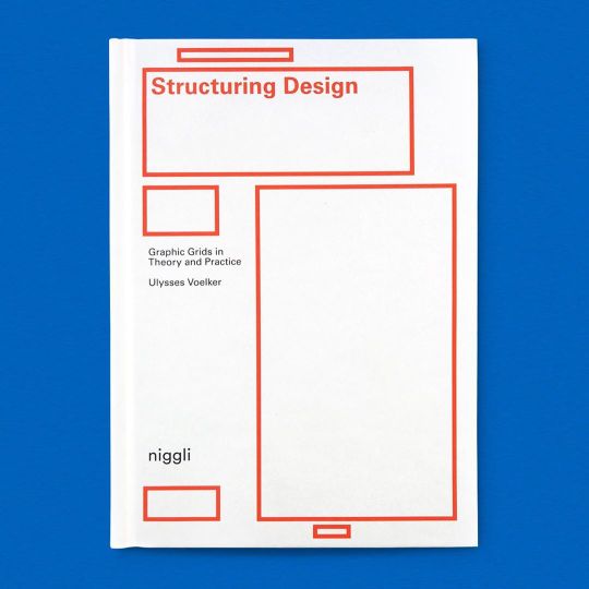
SHIPPING WORLDWIDE Just in time for thesis books… Structuring Design: Graphic Grids in Theory and Practice Available at www.draw-down.com An introduction to one of the basic tools of graphic design with background, explanations, and guidelines. Where do use which grids? What is their significance? How are they created? This book answers all of these questions. How do you begin using grids and what steps should you follow? What differentiates the visual from the verbal? How does one balance method and intuition? These topics are all covered in this instructive volume. Structuring Design presents the principles and rules of visual communication as an introduction to practical design. The book offers a compact mix of practical tips and helpful information, coupled with an extensive glossary. #graphicdesigngrids #designgrids #graphicsdesigncommunity #youaretypography #designtheory #grids #thesis #thesisbooks https://www.instagram.com/p/B-wtqYTn7jP/?igshid=1ebjg7ks1hu6w
#graphicdesigngrids#designgrids#graphicsdesigncommunity#youaretypography#designtheory#grids#thesis#thesisbooks
9 notes
·
View notes
Text
Do you want to join Graphic Designing Course?| Digital Gaurabh
If you want to join the best Graphic designing Course in Bhubaneswar. then you find so many institutes here like Digital Gaurabh but what makes us different is our advance and creative graphic courses with expert mentors who will guide you throughout this course and help you to improve your skills. We also teach how you can understand the client's needs and full fill their requirements
Our Courses
Graphic DesignTheory
Logo Design
Visual Elements
Web/UI/ UX Design
Graphics Design Principles
Branding Identity
Colour Theory
Youtube Thumbnail Design
For more details visit us
0 notes
Photo

Balance 〰 Abstract detail from my "designers workbook" cover design
#balance#abstract#abstractdesign#simpledesign#minimal#minimalist#designer#visualworkbook#designersworkbook#designersjournal#journal#design#circle#designprocess#designtheory#grey#colourpalette#colourtheory#designed#studentwork#behance#art#abstractart#tamsenmaya#conceptual#dailydesign#designinspo#inspo#create#creativity
1 note
·
View note
Text
Star Pieces
A canvas of colourful strokes; a sculpture that casts the most beautiful form in shadow and light; an artful one-off whether it be furniture or special ware; these are the star pieces that bring focus.
They are the unique focal points that draw the eye in to settle for a while and to absorb the true character of a room.
These are not ones to sit back quietly. They speak loudly and can stir the demure and perfectly appointed into an off-the-charts assembly.
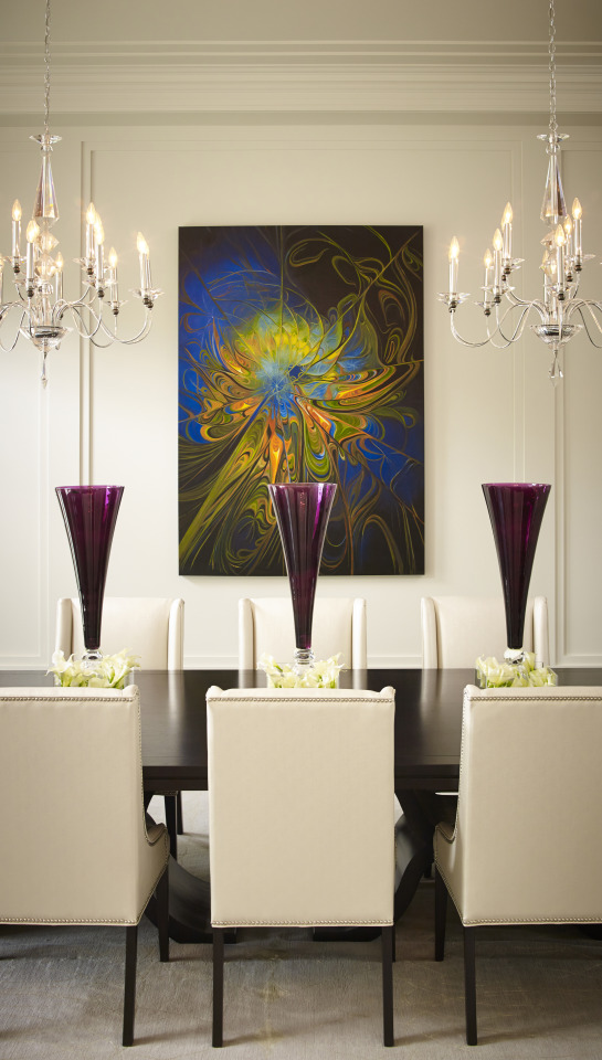
Imagine this classic space without the electric art and without the oversized magenta vases that sit as simple and saturated sculpture. It would be a beautiful and perfect envelope. Nothing more. The star pieces animate the symmetry of this room. They play within the formal geometry but there is a joie de vivre through colour, pattern and form and a grounding that is simply creative within the orderly space.
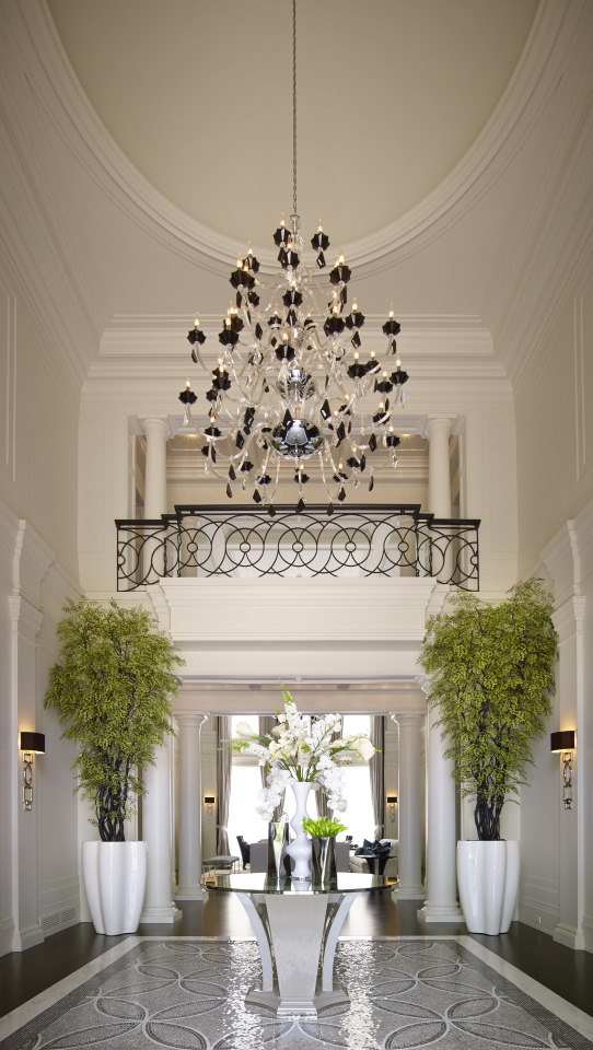
A star piece can ground and frame. There are several key features that act in unison to create big first impressions in this great hall. They charge and move from sparkling floor to faceted chandelier. At the centre, a one-of-a-kind table performs like sculpture. We designed it just for this space. It doesn’t steal the show but its polished turns and nickel rimming play with the brilliant pattern of mosaic and the whole move up towards the next star piece. A grouping of artful vases and its tropical blooms reach up and out to a pair of large organic planters in high-gloss white. They house the soft-scaping that frames grand architecture. A railing of rhythmic line connects with the final feature; an elegant luminaire of clear and black crystal. This room performs as one large star piece.
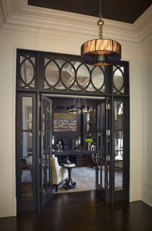
A star piece can guide and introduce. This entry of ebony tracery and clear glazing leads us to a moody library filled with luxury. It’s an integrated feature that commands attention through quality material and contrast.
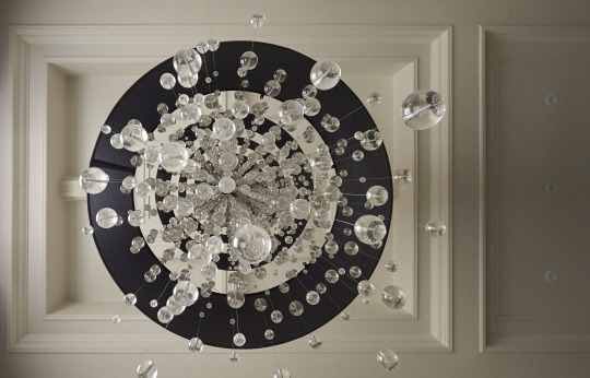
Lighting often plays the leading role. It can play within the architectural tradition or juxtapose dramatically. Tiered drums of black silk with raindrops of crystal make a powerful contemporary statement suspended from classic coffers in this stair hall.
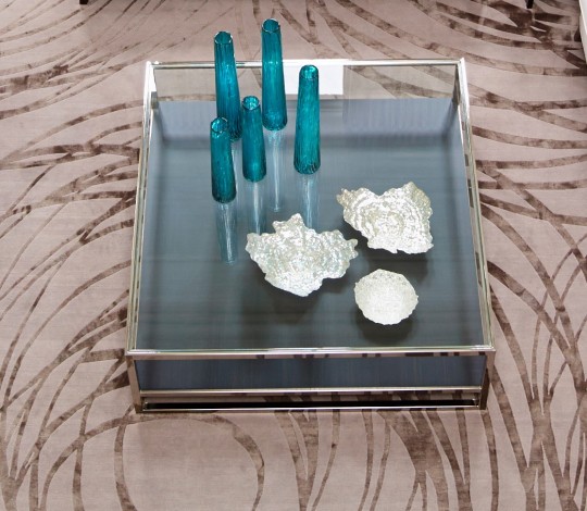
A custom table of Macassar ebony, glass, and polished nickel brings big, restful presence to a room filled with dynamic line. It also allows a grouping of silver sculpture and art-glass to perform on its clean structure.
So, what makes a piece a ‘star piece’? I can tell you that it’s not necessarily the valuable gallery item. The star pieces are more so about creatively balancing scale and proportion and tradition. They are about shaking things up with a shiver of delight.
All image credits - Regina Sturrock Design
#blog#starpieces#focalpoint#design#interiordesign#designtheory#designphilsophy#designhounds#balance#rhythm#harmony#iba17#amarainteriorblogawards
1 note
·
View note
Photo

Practical and flexible design. Fancy is good but not always practical, simplified variants of the primary usually come in handy.. right down to a single colour option. Cheap production on vinyl stickers, screen printing or branding promotional products. ♠️ Preferably having a fully rendered logo, a flat colour and a single colour option will always be more help than hassle in the long run. ♠️ Even if they arent requested its good to keep the concept for variant logos in the design process in your concious for when they rear their head. ♠️ #branding #buildingbrands #logos #logodevelooment #branddevelopment #practicaldesign #functionaldesign #designtheory #designprocess #flexibledesign #ux #userexperience #practicalogodesign #functionallogos #logodesignprocess #designthoughts #brandevelopmentprocess #theory #desognperspective #designtheory #beliefs #designbeliefs #logo #conceptualisation #mockup #graphicdesignconcepts #smallbiz #graphicsconcepts #jakearthurdesign (at Perth, Western Australia) https://www.instagram.com/p/COxY-1ShmXG/?utm_medium=tumblr
#branding#buildingbrands#logos#logodevelooment#branddevelopment#practicaldesign#functionaldesign#designtheory#designprocess#flexibledesign#ux#userexperience#practicalogodesign#functionallogos#logodesignprocess#designthoughts#brandevelopmentprocess#theory#desognperspective#beliefs#designbeliefs#logo#conceptualisation#mockup#graphicdesignconcepts#smallbiz#graphicsconcepts#jakearthurdesign
0 notes