#informationdesign
Explore tagged Tumblr posts
Visit Tumblr Blog
Explore Tumblr blogs with no restrictions, modern design and the best experience.
Last Seen Tumblr Blogs


Fun Fact
Forty percent of Tumblr users are between the ages of 18 to 25.
Text
Hey students, if you have a choice of presenting your information in tables or graphs, choose the graph. Want to know why: 🔽
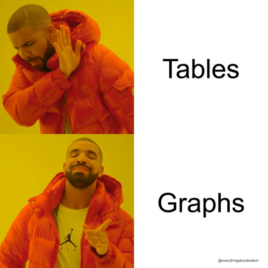
Graphs showcase trends, relationships, and key takeaways in a format the mind grasps faster than rows and columns. When you need to drive home critical data or demonstrate complex connections, graphs speak volumes.
Focus the spotlight on what matters most. Eliminate distractions with clean axes, labels, and legends tailored to the story you want to tell. Guide the viewer's eyes towards revelations, not footnotes.
But don't abandon tables altogether. Sometimes specifics and precise figures need the clarity tables allow. Use graphs to pull out patterns and messages, then turn to tables when the raw numbers themselves hold meaning.
With intentional design, graphs grab attention and spark "Aha!" moments. Tables serve as vital references to ground insights in accuracy. Together, they become a powerful communication duo.
The right balance drives home your data-driven point quickly, clearly and credibly. Let purpose guide your mix of visuals. Whether tables or graphs, let the numbers speak.
👉Do you agree with me? Let me know in the comments.
#scicomm#science communication#science#Infographic#DataViz#GraphicRecording#Sketchnotes#VisualCommunication#VisualThinking#DrawingExplanation#InformationDesign#DataStorytelling#VisualLiteracy#VisualNotes#GraphsRock#VisualizeThis
12 notes
·
View notes
Text
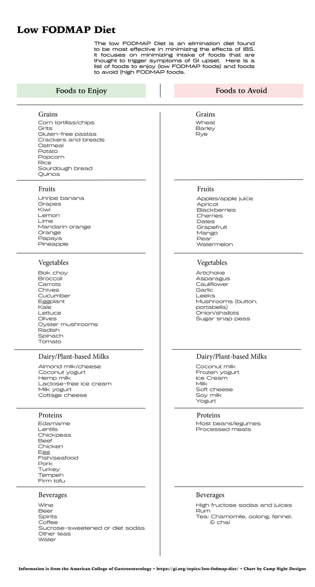
Redesigned low FODMAP diet chart. The low FODMAP diet is recommended for people with IBS to minimize symptoms of GI upset. I wanted to make something informative and thorough, but clean and easy to read.
8 notes
·
View notes
Text
A motivation letter for volunteering is a detailed description of your motivation to perform social work or contribute to a particular cause or organization. It ideally highlights your passion and eligibility for the volunteering program.
#Infographic#DataVisualization#Statistics#InformationDesign#VisualCommunication#DataAnalysis#FactsAndFigures#Research#KnowledgeSharing#Education#Explainer#SOPConsultants#sop samples#sop examples
2 notes
·
View notes
Text
The Importance of Legends in Line Graphs: Enhancing Clarity in Data Representation
Data Visualization: Key Questions Explained
1.Which chart is best for analysis?
The best chart for analysis depends on the data and the insights you want to convey. Bar charts are effective for comparing categories, line charts are great for trends over time, pie charts can show proportions, and scatter plots are useful for relationship analysis. Choose the chart type that best represents your data and highlights key points.
2. What is the limitation of line charts?
A limitation of line charts is that they can be misleading when displaying data with significant fluctuations or irregular intervals. They may oversimplify complex data trends, leading to misinterpretation. Additionally, line charts are not effective for comparing multiple datasets at once if they overlap, making it difficult to discern individual trends clearly.
3. What is the application of line graph?
Line graphs are used to display data points over time, showing trends and changes. They effectively illustrate relationships between variables, making it easier to compare information and identify patterns. Common applications include tracking sales performance, monitoring temperature changes, and visualizing stock market trends. Overall, line graphs aid in understanding data dynamics and making informed decisions.
4. What are the characteristics of a line graph?
A line graph displays data points connected by straight lines, showing trends over time or continuous data. Key characteristics include an x-axis (horizontal) and y-axis (vertical), which represent different variables, the use of scales to quantify data, and the ability to easily visualize changes, patterns, and relationships within the data. It often includes markers for data points.
5. What is a legend in a line chart?
A legend in a line chart is a key that explains what each line represents. It typically includes labels or colors corresponding to different data series, helping viewers understand the chart's information briefly. The legend is essential for interpreting the data accurately, especially when multiple lines are displayed.
Visit: VS Website See: VS Portfolio
#DataVisualization#LineChart#ChartAnalysis#GraphCharacteristics#StatisticalAnalysis#LegendInCharts#DataPresentation#InformationDesign
0 notes
Text
Increase your data visualization using Iconadda’s free graphic assets
An important aspect of modern design is data visualization, and the right graphic elements bring everything together. We offer a series of free graphic assets to help display data in an attractive way in IconAdda . Our SVG graphics provide a simple solution for your design requirements, whether you design dashboard, infographic or business presentation.
Why choose our free graphic resource? Completely free: The graph elements in Iconadda are all independent, making them ideal for both individual and professional applications. Superior SVG format: Regardless of the size of the screen, our SVG property remains clear and scalable. Various collections: Our free illustrations, free icons and free stickers meet all your data visualization requirements, from pie charts and bar charts to line maps and infographic. Easy to customize: Change styles, colors and sizes that fit your design requirements.
Popular graphic assets Bar graph icons are ideal for presentations and reports. Pie chart are great for dashboards and infographics. Line map stickers are good for modern user interface design. Infographic elements: Increase your visual story.
How to download free SVG Graph features? Downloading free SVG graphics, icons and stickers is easier than IconAdda: Go to our site IconAdda . Go through the Graph asset category. You can immediately download the desired feature by clicking on it.
Increase your photos with IconAdda Iconadda is your Go-Context for high quality SVG graphics because of our growing library with free graph elements. See it and use our free illustrations , stickers and icons to increase data visualization!
Get it now to make facts beautiful!
#GraphDesign#DataVisualization#GraphIcons#ChartIllustration#AnalyticsDesign#InfographicAssets#DataDrivenDesign#GraphVectors#BusinessAnalytics#FinancialCharts#DataIcons#StatisticalGraphics#InformationDesign#VisualData#GraphIllustration#EconomyGraphics#LineChart#PieChart#BarGraph#CreativeData
0 notes
Text
Observe the dippler patterns playing out on screen with respect to my double tap wooden box contraption beats :p
#physicsatwork #percussion #datascience #datapatterns #waves #waveimages
0 notes
Text
Data Visualization
The process of representing data using popular images, like charts, plots, infographics, and even animations, is known as data visualization. These informational visual displays make difficult data linkages and data-driven insights understandable. YrEdge Consulting can provide you with optimum data visualization solutions, contact us today.

#DataVisualization#VisualizeData#DataViz#DataInsights#VisualData#Analytics#DataDriven#Infographics#ChartsAndGraphs#DataStorytelling#DataArt#DataAnalysis#DataPresentation#InformationDesign#GraphicalData#DataIllustration
0 notes
Text
🌟 How to make your business presentations for partners stand out using graphic content? 📊📈🖼️

Visual elements like charts, graphs, and illustrations can transform your information into something clear and memorable. Puzzlax is here to guide you on using these elements effectively, ensuring your presentation leaves a lasting impression.
✨ Key Tips for Success: ✨
1️⃣ Respect the guidelines in the brand book and use the logo without any modifications. Consistency is key.
2️⃣ Crafting impressive designs doesn't require specialized skills. With simple elements like shapes, points, and lines, you can create stunning slides quickly and effortlessly.
3️⃣ Illustrations play a crucial role in reinforcing your message. They can be more than just pictures or infographics. Quotes, statistical references, and personal stories all contribute to an impactful presentation.
4️⃣ Additional visual representations not only enhance clarity but also make the information more memorable for your audience.
Ready to unlock more business secrets and elevate your presentation skills? Join Puzzlax and discover a world of knowledge. https://presentation.puzzlax.com/
#graphiccontent#businesspresentations#visualcommunication#informationdesign#designskills#branding#illustrations#infographics#presentationtips#Puzzlax#partnerships#visualappeal#datavisualization#memorablepresentations#effectivecommunication#creativepresentations#presentationskills#businesssecrets#slidesdesign#presentationresources
0 notes
Text
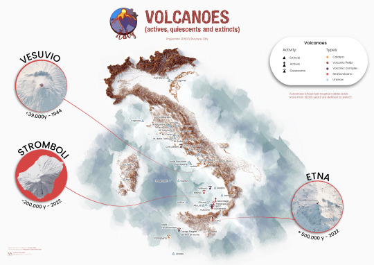
Let's take a jump into a world of impressive natural resources and present our second infographic on Italy's natural wonders!
As the title suggests, we attempt to investigate the quantity and type of volcanoes that make up the Italian soil.🌋
This is a first version and we are upset and a little disappointed at the lack of information available on the subject.
Let us know your suggestions for enriching it!
See a bigger size of the project on Behance
If you like our work, want to see our daily updates (or want to say hello to our studio), consider to follow our Instagram or Twitter account. Otherwise if are interested in our prints or have a custom request check our shop.
#datascience#datavisualization#dataviz#datavizsociety#informationdesign#infografía#infographic#adobeillustrator#datart#volcanoes#volcanoesnationalpark#stromboli#stromboli🌋#etna#etnavolcano#vesuvio#vesuvius#naplesitaly#italygram#naturalresources#vizart
0 notes
Text

Struggling with your MSIT402 Information Design and Content Management assignment? 🤔 Don’t worry, we’ve got you covered! 📚💻 Let’s break it down together and ace that task! DM for tips, resources, and personalized help. 💡
We have more specialization in Master of Information & Communications Technology course:-
MSIT401 System Development Methodologies
MSIT403 Project and Change Management in ICT
MSIT405 ICT Project - Capstone
MSIT402 Information Design and Content Management
MSIT404 Cyber Security
#MSIT402 #InformationDesign #ContentManagement #AssignmentHelp #StudyTips #MSIT401 #MSIT403 #MSIT405 #MSIT402 #MSIT404 #TechSupport #MBIS402 #MBIS403 #MBIS401 #MBIS404
0 notes
Video
youtube
Infographic design, piktochart, design info graphics, design an infograp...
https://youtu.be/JvVWnjKgfio
Infographic design, piktochart, design info graphics, design a infographic, good infographic
Welcome to our creative haven of design inspiration! 🎨 Dive into the fascinating world of Infographic design with our latest YouTube video! 📊 Unleash your creativity as we explore the art of crafting visually stunning Infographics using the powerful tool, Piktochart. 🚀 Whether you're a seasoned designer or just starting out, join us on a journey to demystify the secrets of designing captivating Infographics that effectively communicate complex information. Discover the key elements of a good Infographic, and learn how to seamlessly blend aesthetics with information to make your visuals not only informative but also visually appealing. ���� Ready to elevate your design game? Hit that like button, subscribe to our channel, and share this video with fellow enthusiasts who are passionate about the intersection of art and data. 🌐 Let's embark on this design adventure together – like, subscribe, and let the creative vibes flow! So with a commitment to excellence and a passion for creativity, our team of professionals is ready to collaborate with you to achieve your goals and we invite 🤝 you, to our world 🏡 where innovation, precision, and imagination converge. We, welcome 🤝 you to our services hub, where your vision becomes reality.
👮For Your 🖋️Inquiries Reach Us At:
🏡 SOLUTION LAB
📝 Email ID’s:- [email protected], [email protected]
🔗 Web: - www.solutionlab.online
✍️ Blog ID: - https://solutionlabonline.blogspot.com/ 📚 🌿
📚 🌿printing infographics, infographic design company, infogram examples, business plan infographic, infographic dashboard, data infographic, business infographic, hubspot infographic, infographic marketing, infographic design online, easy infographic, create your own infographics, interactive infographic examples, best infographic websites, infographic flyer, interactive infographic, animated infographic, infographic designers, piktochart infographic, make your own infographic, infographic online, infographic presentation, make infographics online, websites to make infographics, info graphic designer, digital infographic, infographic layout, real estate infographics, infographic companies, infographic data visualization, infographic service, infographics and data visualization, 🎉 #infographicdesign #piktochart #designinspiration #dataviz #visualstorytelling #designinspiration #informationdesign #graphicdesign #CreativeInfographics #datavisualization #InfographicTips #infographictutorial #visualcommunication #designthinking #infodesign #InfographicArt #beautifuldesign #digitaldesign #InfoGraphics101 #designprocess #infographiccreation #visualdesign #effectivecommunication #illustrationdesign #InfographicElements #visualdata #designskills #InfographicInspiration #visualcontent #CreateWithPiktochart #GoodInfographicDesign #likeandshare #likeandshareandcomment #likeandsharemarketing #likeandshareplz #likeandsubscribe #likeandsubscribemychannel #likeandsubscribes #likeandsubscribeplease #likeandsubscribebutton #likeandsubscriber #likeandsubscribepls #likeandsubscribeplz #likesharefollow #subcribe #subcribeme #subcriber #subcribers #subscribeandshare #subscribenow #subcribemyyoutube #subcribemychannel #subcribetothechanell #subscribenowmychannal #subcribe_to_our_channel #subscribenowmorevideos #likeshare #likesharesubscribe #likeshareandsubscribe #likesharecomment #subscribeandlearn #subscribeforsupport #subscribefortips #canada #usa #unitedstates #unitedstatesofamerica #mexico #mexicocity #brazil #argentina #chile #peru #uk #unitedkingdom #britain #poland #portugal #finland #germany #france #italy #turkey #switzerland #spain #austria #norway #hungary #bulgaria #southafrica #russia #uae #unitedarabemirates #dubai #saudiarabia #oman #qatar #bahrain #kuwait #singapore #southkorea #japan #australia #newzealand #usacollege #usanews #usanewsonline #usatoday #usatodaynews #usatodaysports #uaekhabartoday #uaenews #uaenewsofficial #uaelife #uaelifestyle #uaejobs #dubailife #dubaijobs #dubainews #dubainewstoday #dubailifestyle #dubailifestylevlog #dubailifestyleblogger #canadalife #canadalifestyle #canadian #canadianuniversity #canadanews #canadanewstoday #saudiarabialatestnews #saudiarabianews #saudiarabianewslive #saudiarabiajobs #saudinews #saudi #saudi_news #saudi_news_update #saudinewsofficial #omannews #omannewsdaily #omanchannel #omannewslive #omanjobs #omanjob #omanjobnewstoday #qatarlife #qatarlifestyle #qatarnews #qatarjobs #qatarevents #qatarliving #kuwaitnews #kuwait_kuwait #kuwaitlivenews #kuwaitcity #kuwaitlatestupdate #kuwaitlatestupdates #kuwaitnewshighlights #kuwaitnewsheadlines #newzealandbusiness #newzealandlife #britainnews #greatbritain #british #britishenglish #bahrainbloggers #bahrainevents #bahrainnews #bahraintv #português #singaporevlog #singaporevideos #germanynews #german #francese #italya #italian #italia #italianteacher #italiancourse #italianclass #swiss #swissview #swissviews #austriatravel #hungarylife #bulgariantechchannel #russian #russianews #japanese #japanlife #japanlifestyle #japanvlog #japanvlogger #qatarjobinformation #saudiarabiainternational #canadalifevlog #canadavlogs #spaintravel #spainish #unitedstatesofamerican #unitedstatesofamericaplease #unitedkingdomlife #britishenglishpronunciation #britishenglishclass #russianlanguage #russianlanguageteacher #russianlanguagelessons #japaneselanguage #japaneselanguageschool #australiainternationalstudents #likeshareandsubscribemychannel #likesharesubscribecommentnow #subscribenowmoreinterestingvideos
0 notes
Photo

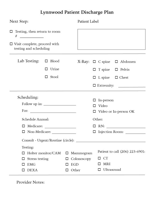
Working on a discharge sheet for a medical clinic. Portrait and landscape formats were created. The trick was trying to focus on hierarchy and making a lot of information and choices not seem overwhelming.
0 notes
Text

A motivation letter for MBA admission is one among several documents demanded by an admission panel of a university. As the competition for courses like business administration increases every academic year, the admission committee follows stringent procedures. In that regard, they demand several essays including a letter of motivation.
It conveys the purpose, interest, and aspirations of the candidate. In a motivation letter for the MBA program, one needs to explain why they choose that particular college or course, reasons why they are the right candidate and their short and long-term goals in that field. It aids the panel to decide whether the applicant is an ideal candidate for that particular course at their university.
#Infographic#DataVisualization#Statistics#InformationDesign#VisualCommunication#DataAnalysis#FactsAndFigures#Research#KnowledgeSharing#Education#Explainer#VisualStorytelling#GraphicDesign#DigitalMarketing#BusinessInsights#TrendingTopics#IndustryInsights#Innovation#ProductivityTips#Motivation letter sample#motivation letter template#motivation letter example
1 note
·
View note
Text
Choosing the Right Visualization Techniques for Quantitative and Categorical Data
1.What is the key purpose of data types?
The key purpose of data types is to define the nature of data that can be stored and manipulated in a programming language or database. They establish the kind of operations that can be performed on the data, determine memory allocation, and ensure type safety. By categorizing data into types like integers, strings, data types help in optimizing performance, reducing errors, and enhancing code readability and maintainability. They enable programmers to express their intentions clearly, ensuring that data is used appropriately throughout the application.
2. What are the benefits of data storytelling?
Data storytelling combines data analysis with narrative to communicate insights effectively. Its benefits include enhanced understanding, as stories make complex data more relatable and memorable. It fosters engagement, capturing the audience's attention and encouraging interaction. By providing context, it helps stakeholders grasp the significance of data, facilitating informed decision-making. Additionally, data storytelling can drive action by highlighting key findings and recommendations in a compelling way. Overall, it transforms raw data into a powerful tool for persuasion and clarity, making it essential for effective communication in business and research.
3. What are the three categories of data visualization?
The three categories of data visualization are:
1. **Exploratory Visualization**: Used for analyzing data sets to identify patterns, trends, and insights. It helps users interactively explore data.
2. **Explanatory Visualization**: Aimed at communicating specific findings or narratives clearly, often using static visuals to present data-driven conclusions.
3. **Operational Visualization**: Focuses on real-time data monitoring and operational metrics, enabling users to track performance and make quick decisions based on live data feeds.
4. What is the purpose of a data visualization?
The purpose of data visualization is to present complex data in a visual format, making it easier to understand, interpret, and analyze. By using charts, graphs, and maps, data visualization helps identify patterns, trends, and insights that may not be apparent in raw data. It enhances communication, enabling stakeholders to make informed decisions quickly and effectively. Ultimately, data visualization transforms data into a compelling narrative, facilitating better comprehension and engagement with the information presented.
5. How to visualize data with many categories?
To visualize data with many categories, consider using techniques such as bar charts for clear comparisons, stacked bar charts to show subcategories, or tree maps for hierarchical data. Heatmaps can effectively display relationships between variables, while bubble charts can represent three dimensions simultaneously. If the data is time-based, line charts with multiple series can help. For a more compact view, consider using parallel coordinates or radar charts. Ensure to use color coding and legends for clarity, and keep visualizations simple to avoid overwhelming the audience. Always tailor your choice based on the audience and the specific data context.
Visit: VS Website See: VS Portfolio
0 notes
Photo

This tale serves as an uplifting reminder that no matter the obstacle, anything can be achieved ! - Article featured @medium 🔗Read here: https://lnkd.in/dYp4EJGy . . . . #inspiration #motivation #dreambig #dontgiveup #positivevibes #believeinyourself #goals #hope #spreadjoy #happiness #realitycheck #uplift #encouragement #perseverance #successstory #positiveoutlook #determination #overcome #nevergiveup #empowerment #selfbelief #mindset #optimism #bettertomorrow #striveforgreatness #keepgoing #empowered #informationdesigner #blogging https://www.instagram.com/p/Cpg3R7hOXLf/?igshid=NGJjMDIxMWI=
#inspiration#motivation#dreambig#dontgiveup#positivevibes#believeinyourself#goals#hope#spreadjoy#happiness#realitycheck#uplift#encouragement#perseverance#successstory#positiveoutlook#determination#overcome#nevergiveup#empowerment#selfbelief#mindset#optimism#bettertomorrow#striveforgreatness#keepgoing#empowered#informationdesigner#blogging
0 notes
Photo
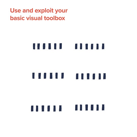
Use and exploit your basic visual toolbox
Data visualization is all about converting data into meaningful and effective visual representations. In order to do so, you need to become familiar with your toolbox of visual assets like size, color, direction, etc. Don’t use all at once but choose and experiment to find the most effective for the task.
Subscribe to the notebook
#ferdio#informationdesignersnotebook#informationdesign#infographics#datavisualization#data visualization#datavisualisation#data visualisation#gif#animation#motiondesign#infographic#graphic design#visual communication
8 notes
·
View notes