#VisualizationTechniques
Explore tagged Tumblr posts
Visit Tumblr Blog
Explore Tumblr blogs with no restrictions, modern design and the best experience.
Last Seen Tumblr Blogs


Fun Fact
Tumblr is used by 21% of adults online aged 18-29 years.
Text
Dream to Reality
Manifest Your Desires with a Checkbook Manifestation Journal
#ManifestationJournal#LawOfAttraction#CheckbookManifestation#DreamsToReality#WealthManifestation#ManifestAbundance#VisualizationTechniques#ManifestingGoals#FinancialFreedom#AffirmationsForSuccess#ManifestingMoney#AbundanceMindset#SpiritualGrowth#GoalSettingJournal#ManifestYourDreams#universe#manifesting#journal
4 notes
·
View notes
Video
youtube
Once you VISUALIZE like THIS, REALITY SHIFTS instantly (How To Visualize)
#youtube#manifestation#visualizationtechniques#realityshift#manifestyourdreams#positivethinking#law of attraction#instant manifestation#change your life#spiritualawakening#spiritual#spirituality
3 notes
·
View notes
Text

#3dcutsectionrendering#architecturalvisualization#productdesign#mechanicalengineering#constructionplanning#urbanplanning#3dmodeling#visualizationtechniques#sustainabledesign#innovativeengineering
2 notes
·
View notes
Text
Visualizing Relationships: A Step-by-Step Guide to XY Scatter Charts in Excel
Data Visualization: Key Queries Explained
1.How do you create a XY scatter chart?
To create an XY scatter chart, first, select your data points (two numerical variables). In Excel, go to the "Insert" tab, click on "Scatter" in the Charts group, and choose the desired scatter chart style. Adjust the chart title, axis labels, and other formatting options as needed. Save your work to keep the chart.
2. How to change bubble size in scatter plot excel?
To change bubble size in a scatter plot in Excel, right-click on a bubble, select "Format Data Series," then go to the "Size & Properties" section. Adjust the "Bubble Size" settings by changing the scale or entering a specific value. You can also change the data series values that determine bubble sizes in your data table.
3. Is a line chart a scatter chart?
A line chart is not the same as a scatter chart, though they are related. A line chart connects individual data points with lines to show trends over time, while a scatter chart displays individual data points without connecting lines, highlighting relationships between two variables. Both visualize data but serve different purposes in analysis.
4. How to add labels in a bubble chart?
To add labels in a bubble chart, use charting software like Excel or Google Sheets. After creating the chart, click on the bubbles to select them, then choose the option to add data labels. You can customize the labels to display values, categories, or other information as needed. Adjust the label position for clarity if necessary.
5. What is the difference between a bubble chart and a scatter plot?
A scatter plot displays points representing two variables, showing their relationship. A bubble chart is similar but adds a third variable, represented by the size of the bubbles. This allows bubble charts to convey more information visually, as the size indicates another dimension of data alongside the x and y coordinates.

Visit: VS Website See: VS Portfolio
0 notes
Text
#ManifestWithVisualization#TurnDreamsIntoReality#VisualizationForManifestation#ManifestYourDreams#CreateYourReality#ManifestationPower#LawOfAttraction#DreamBigManifestBigger#VisualizeAndManifest#ManifestYourGoals#ManifestationJourney#MindsetForManifestation#VisualizeYourSuccess#BelieveAndAchieve#ManifestationMindset#ManifestingDreams#LawOfAttractionWorks#VisualizeYourFuture#ManifestYourVision#PositiveVibesOnly#PowerOfVisualization#CreateTheLifeYouWant#ManifestingAbundance#VisualizationTechniques#ManifestingMiracles#AlignWithYourDesires#VibrationalFrequency#ManifestYourDestiny#AbundanceMindset#DreamManifestation
0 notes
Video
Audition anxiety can be a major hurdle, but it doesn't have to be!👇
Discover how hypnotherapy can turn your fear into confidence by tapping into the power of your subconscious mind. In this video, I explore effective hypnotherapy techniques and share a simple yet powerful visualization exercise to help you boost your confidence before any audition. Don't let anxiety hold you back - transform your nerves into positive energy and shine on stage! 🌱 If you found this video helpful, please like and share it with others who might benefit from these tips. ✅ Click the link to book a 𝐅𝐑𝐄𝐄 𝐈𝐧𝐢𝐭𝐢𝐚𝐥 𝐂𝐡𝐚𝐭 with me to ask any questions and discuss how Solution Focused Hypnotherapy could help you 𝐠𝐞𝐭 𝐭𝐡𝐞 𝐫𝐞𝐬𝐮𝐥𝐭𝐬 𝐲𝐨𝐮 𝐰𝐢𝐬𝐡, before booking your first session 👉 https://bit.ly/Free-Initial-Chat
#auditionanxiety#hypnotherapy#confidenceboost#visualizationtechniques#overcomingfears#performanceanxiety#auditiontips#mentalhealth#stagefright#joaoalmeidahypnosis
0 notes
Text
#powerofintention#manifestyourdreams#overcomelimits#believeinyourself#intentionalmindset#personalgrowth#inspiredaction#positivethinking#selfbelief#mindsetshift#goalsetting#visualizationtechniques
0 notes
Text
youtube
Success Activation with Scientific Visualization by Dr. Jitendra Adhia
Discover the cutting-edge techniques behind achieving your goals with "Success Activation with Scientific Visualization by Dr. Jitendra Adhia." In this enlightening video, Dr. Adhia, a renowned expert in mind science, shares powerful visualization strategies rooted in scientific principles.

Learn how to harness the full potential of your mind to activate success in all areas of your life. From practical exercises to real-life success stories, this video provides the tools you need to visualize and realize your dreams. Join us and explore the transformative power of scientific visualization with Dr. Jitendra Adhia.
#SuccessActivation#ScientificVisualization#DrJitendraAdhia#MindPower#VisualizationTechniques#PersonalGrowth#ProfessionalDevelopment#AchieveYourGoals#MindsetTransformation#UnlockYourPotential#guniguru#Youtube
0 notes
Text
Unlocking Your Financial Potential with the Wealth Brain Code

Imagine a world where abundance and prosperity are not just distant dreams, but achievable realities. This is the premise behind the innovative approach known as the Wealth Brain Code. It seeks to tap into the potential within our minds, aiming to transform our relationship with money.
#WealthBrainCode#FinancialWellness#AbundanceMindset#Prosperity#Neuroscience#Psychology#WealthBuilding#CognitiveRestructuring#MindsetMastery#FinancialFreedom#LimitingBeliefs#Empowerment#SelfDiscovery#VisualizationTechniques#Affirmations#GameChanger#HolisticApproach#LastingSuccess#Fulfillment#Alignment#MindsetShift#FinancialAbundance#TransformativeJourney#PurposefulLiving#JoyfulAbundance
0 notes
Text
Learn Graphic Design Course In Rewa
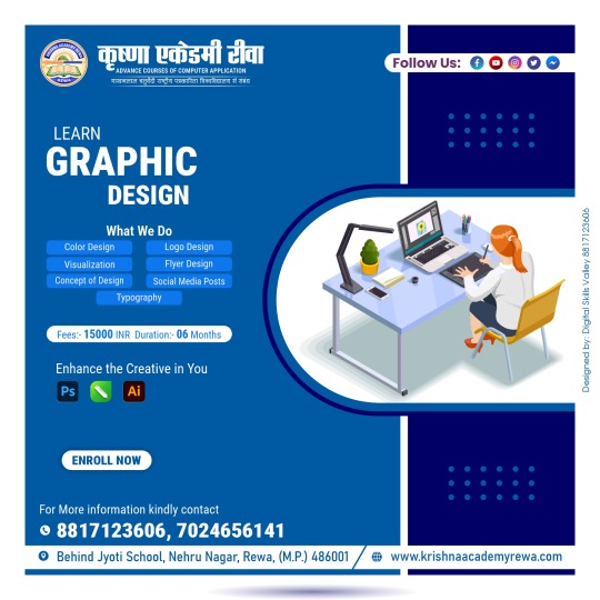
Learn Graphic Design encompasses a diverse array of skills and techniques vital for effective visual communication. From mastering color theory to crafting captivating logos, we delve into the intricacies of design principles.
Visualization techniques bring concepts to life, while flyer design and social media posts engage audiences. Typography adds depth and personality to every project. Through comprehensive learning, you'll gain the expertise to create impactful designs across various mediums, leaving a lasting impression in the digital landscape. What We Do
Color Design.
Logo Design.
Visualization.
Flyer Design.
Concept Of Design.
Social Media Posts.
Typography.
Fees:- INR 15000
Duration:- 06 Months
Enroll Now!
For more information, kindly contact us at:-
Phone:- 8817123606, 7024656141
Website: -www.krishnaacademyrewa.com
Address: -Behind Jyoti School, Nehru Nagar, Rewa, (M.P.) 486001
#colordesignhairtribe#colordesignhair#ᴄᴏʟᴏʀᴅᴇsɪɢɴᴇʀ#COLORDESIGNER#logodesigninspiration#logodesigners#typographyposter#typographyporn#typographyart#typographyinspiration#socialmediapostsdesign#socialmediapostsforinstagram#socialmediapostsdesigner#socialmediapostsevidence#socialmediapostservice#socialmediaposts#conceptdesignsketch#conceptdesigner#conceptdesigne#conceptdesignacademy#flyerdesigner#flyerdesigns#flyerdesigners#flyerdesignrepost#architecturevisualization#visualizationtechniques#VisualizationMastery#visualizationjourney#architecturalvisualization#logodesignershub
0 notes
Text
O is for....
Overcoming Adversity: Techniques for Helping Athletes Rise Above Challenges Sports is a realm where adversity is an inevitable part of every athlete’s journey. Whether it’s facing a tough opponent, dealing with injuries, or experiencing personal setbacks, the ability to overcome adversity is critical for success. As a coach, it is our role to guide and support athletes in their quest to rise…

View On WordPress
#AdaptabilityInSports#AthleteDevelopment#AthleteResilience#BuildingMentalToughness#GoalSettingStrategies#GrowthMindsetInSports#NavigatingAdversity#OvercomingAdversity#RiseAboveChallenges#SelfReflectionInSports#SportsCoachingTips#SportsPerformance#SportsPsychology#SupportingAthletes#VisualizationTechniques
0 notes
Text
7 Life-Changing Brain Hacks to Unlock Your Potential
Unlock your full potential with these 7 life-changing brain hacks! Check out the article now! #PersonalGrowth #Success"
It’s great to share some mind-blowing techniques that have transformed my life as both a successful business person and former athlete. Today, I want to introduce you to 7 life-changing brain hacks that can supercharge your performance and bring more fulfillment to your everyday existence. So, let’s dive right in! Embrace the Power of the Brain Before we get into the hacks, let me emphasize the…

View On WordPress
#Achievement#AthleteMindset#BrainHacks#Entrepreneurship#GoalSetting#MentalToughness#Mindfulness#Motivation#OvercomeObstacles#PersonalGrowth#PositiveAffirmations#ProductivityTips#Resilience#ResilienceTraining#SelfImprovement#StressFreeLiving#StressManagement#VisualizationSuccess#VisualizationTechniques
0 notes
Photo

Don’t discount your ability to do something just because the way most people do it doesn’t work for you. This goes for everything! I’ve had so many people tell me they can’t do something. Turns out it’s not that they can’t, it’s that they’re ignoring their way of doing it. #visualizationtechniques are super common. You don’t see pictures in your head so you think you can’t do it. Not true. I hear what I’m “picturing” like having a story read to me. For other people it’s a textural thing. They feel what it’s like to be in the visualization. How the ground feels as they walk on it. The warmth of sitting in the sun. Then there’s the people who just know the whole picture. That’s all visualization. https://www.instagram.com/p/Cpz7aNFOQNX/?igshid=NGJjMDIxMWI=
0 notes
Text
3D Cut Section Rendering: A Game-Changer in Design Communication

3D cut section rendering is a game-changer in design communication, playing a crucial role in fostering clarity among stakeholders. By providing detailed visual representations of internal structures, this technique minimizes misunderstandings and ensures everyone is aligned on project goals. It helps architects, engineers, and designers effectively convey complex ideas, leading to smoother collaboration and more successful project outcomes.
Click the link and read full article!
#3dcutsectionrendering#architecturalvisualization#productdesign#mechanicalengineering#constructionplanning#urbanplanning#3dmodeling#visualizationtechniques#sustainabledesign#innovativeengineering
2 notes
·
View notes
Text
Choosing the Right Visualization Techniques for Quantitative and Categorical Data
1.What is the key purpose of data types?
The key purpose of data types is to define the nature of data that can be stored and manipulated in a programming language or database. They establish the kind of operations that can be performed on the data, determine memory allocation, and ensure type safety. By categorizing data into types like integers, strings, data types help in optimizing performance, reducing errors, and enhancing code readability and maintainability. They enable programmers to express their intentions clearly, ensuring that data is used appropriately throughout the application.
2. What are the benefits of data storytelling?
Data storytelling combines data analysis with narrative to communicate insights effectively. Its benefits include enhanced understanding, as stories make complex data more relatable and memorable. It fosters engagement, capturing the audience's attention and encouraging interaction. By providing context, it helps stakeholders grasp the significance of data, facilitating informed decision-making. Additionally, data storytelling can drive action by highlighting key findings and recommendations in a compelling way. Overall, it transforms raw data into a powerful tool for persuasion and clarity, making it essential for effective communication in business and research.
3. What are the three categories of data visualization?
The three categories of data visualization are:
1. **Exploratory Visualization**: Used for analyzing data sets to identify patterns, trends, and insights. It helps users interactively explore data.
2. **Explanatory Visualization**: Aimed at communicating specific findings or narratives clearly, often using static visuals to present data-driven conclusions.
3. **Operational Visualization**: Focuses on real-time data monitoring and operational metrics, enabling users to track performance and make quick decisions based on live data feeds.
4. What is the purpose of a data visualization?
The purpose of data visualization is to present complex data in a visual format, making it easier to understand, interpret, and analyze. By using charts, graphs, and maps, data visualization helps identify patterns, trends, and insights that may not be apparent in raw data. It enhances communication, enabling stakeholders to make informed decisions quickly and effectively. Ultimately, data visualization transforms data into a compelling narrative, facilitating better comprehension and engagement with the information presented.
5. How to visualize data with many categories?
To visualize data with many categories, consider using techniques such as bar charts for clear comparisons, stacked bar charts to show subcategories, or tree maps for hierarchical data. Heatmaps can effectively display relationships between variables, while bubble charts can represent three dimensions simultaneously. If the data is time-based, line charts with multiple series can help. For a more compact view, consider using parallel coordinates or radar charts. Ensure to use color coding and legends for clarity, and keep visualizations simple to avoid overwhelming the audience. Always tailor your choice based on the audience and the specific data context.
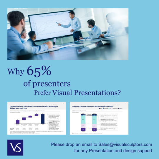
Visit: VS Website See: VS Portfolio
0 notes
Text
youtube
I Designed My Shop In My Brain First! Unlock your visualization power! Learn how to manifest your dreams using visualization and gratitude techniques. This video explores the power of mental imagery, showing how one artist designed their dream tattoo shop before it even existed. Perfect for those seeking self-improvement and manifestation techniques! #VisualizationTechniques #LawOfAttraction #Manifestation #Gratitude #DreamManifestation #MentalImagery #SelfImprovement #Visualization #PositiveThinking #SuccessMindset via Lyfe Choyces https://www.youtube.com/channel/UCOvTcHk7G7O_yl3GNxLU1qA February 26, 2025 at 07:58AM
#lyfechoyces#podcast#motivation#exploring#mentalhealth#transformation#confidencebuilding#wellnessjourney#Youtube
0 notes