#colourtheory
Explore tagged Tumblr posts
Text
Flower Study!
Continuing with the same theme as last week, more plant life! 🌷🌿
This digital painting I did early in my masters at uni, I was initially looking at how colour could draw the viewer's eye to certain points in a painting. So this was a bit of an experiment in that! 🎨

4 notes
·
View notes
Text

funny colours>>>>>>>>>
#fanart#digitalart#art#detectiveconan#aceattorney#phoenixwright#conanEdogawa#kudoshinichi#aceattorneyfanart#caseclosed#digitaldoodle#anime#animeandmanga#crossover#artstudy#colourtheory#moriartythepatriot#sherlockholmes#naruhodoryuichi#sherliam
45 notes
·
View notes
Text
Im angry. I hate it. Make it stop.
But what if it was all a dream
108K notes
·
View notes
Text


Beyond the Wheel: 3 Dynamic Colour Pairings for Your Space
Not all bold contrasts come from opposites! Blue & Yellow, Purple & Green, Pink & Blue are unexpected pairings that bring energy, elegance, and intrigue to any space. Which duo speaks to your style? Tell us in the comments below https://www.indiaartndesign.com/beyond-the-wheel-3-dynamic-colour-pairings-for-your-space/
#ColourTheory#InteriorInspo#BoldDesign#IndiaArtnDesign#colourwheel#complimentarycolours#contrastingcolours
0 notes
Text

⭐ Style File Requests always open btw!! , , happy to do a style file for a specific person or just one in general , can do it in a detailed format with descriptions or as a more visual piece also happy to do them brand specific too 🐰 also any fashion Q's always welcome 🧜♀️🎀💐🧚♀️ it's what I'm a big Nerd about 💘
#stylefiles#styling#fashion#stylediaries#womenswearstyling#menswearstyling#taking requests#fashionhistory#colourtheory#fashiongrad
0 notes
Text
Colour Theory Workshop
Week 6
I found it to be quite useful, I liked the part where we had to find the colours in a picture, it was fun to see how everyone else perceived colour. We had to then scan the colours in and then use them for an InDesign document design. However, my laptop didn't work when trying to put in the colours, and the image I needed, I couldn't find.


We then got briefed for our one week project - postcards of a place we feel at home, using colour to show this.
0 notes
Text

YAYYY CODY CODY DAY!!!!!!!
#commander cody#cc 2224#it’s his birthday today#and only today#his next birthday will be in 100 years#btw I don’t know colourtheory so idk if this looks good#star wars#my art
156 notes
·
View notes
Text


𝒮𝒸𝒽𝑜𝑜𝓁 𝒜𝓈𝓈𝒾𝑔𝓃𝓂𝑒𝓃𝓉
𝐼 𝒻𝑜𝓇𝑔𝑜𝓉 𝓉𝑜 𝓅𝑜𝓈𝓉 𝒽𝑒𝓇𝑒
૮꒰ྀི∩´ ᵕ `∩꒱ྀིა♡
🎀🍓
⠀⠀⠀⠀⠀⠀⡀⣀⣀⣠⡀⠀⠀⠀⠀⠀⠀⠀⣀⣀⣀⣀⠀⠀⠀
⠀⠀⠀⠀⠀⣾⠟⠉⠉⠉⠙⣦⡀⠀⠀⠀⢠⡾⠋⠉⠉⠙⣲⡀⠀
⠀⠀⠀⠀⠀⣿⠀⠀⠀⠀⠀⠸⣷⠀⠀⣰⠏⠀⠀⠀⠀⠀⣽⣷⠀
⠀⠀⠀⠀⠀⢿⠀⠀⢀⣤⠤⣄⣻⣄⣀⡏⠀⠀⠀⠀⠀⢀⣵⠃⠀
⠀⠀⠀⠀⡴⠛⠛⣳⣿⡤⠀⠈⣏⠉⠉⠁⠀⠀⠀⠀⢠⣼⠋⠀⠀
⠀⠀⠀⢸⡁⠀⠉⢹⢿⣀⣀⣰⠇⠀⠀⠀⠀⠀⠀⠀⠀⠙⢷⡀⠀
⠀⠀⠀⢠⡟⠲⠒⠋⣠⡬⠟⠛⠛⠛⠛⠛⠓⠦⣤⡀⠀⠀⠀⢿⡀
⠀⠀⠀⣾⠀⠀⠀⡾⠋⠀⠀⠀⠀⠀⠀⠀⠀⠀⠀⠙⣦⠀⠀⠈⣧
⠀⠀⠀⢿⠀⠀⣸⠁⠀⣴⣦⠀⠀⠀⠀⠀⣶⣦⠀⠀⢸⡆⠀⠀⡿
⠀⠀⠀⠈⢧⡀⠹⣄⣀⠙⡋⠀⠀⠁⠀⠀⢝⢁⠠⠀⣸⠃⠀⣰⠃
⢀⣄⣴⡄⠀⠙⠶⣽⣶⣤⣤⠖⠲⣄⡼⢛⡳⣆⣠⡴⢋⣠⡾⠃⠀
⠀⠙⠛⠁⠲⢤⡴⣏⡀⢠⡏⠀⠀⣼⡇⠐⠃⠘⣇⠀⠈⣹⠇⠀⠀
⠀⠀⠀⠀⠀⠀⠀⠈⡟⠛⠀⠀⠀⠈⠁⠀⠀⠀⠘⠞⣿⠁⠀⠀⠀
⠀⠀⠀⠀⠀⠀⠀⠀⣧⠀⠀⠀⠀⠀⠀⠀⠀⠀⠀⠀⣿⠀⠀⠀⠀
⠀⠀⠀⠀⠀⠀⠀⠀⢻⣄⣀⣀⣀⣰⣶⣂⣀⣀⣀⡼⠃⠀⠀⠀⠀
⠀⠀⠀⠀⠀⠀⠀⠀⠀⠈⠉⠉⠉⠉⠀⠉⠉⠉⠉⠀⠀⠀⠀⠀⠀
✦∘₊✧──────✧₊∘
🎀🍓
ꈍᴗꈍ𝙻𝚒𝚔𝚎 🩷
ꈍᴗꈍ𝙲𝚘𝚖𝚖𝚎𝚗𝚝 ♡
∘₊✧──────✧₊∘
❀🎀𝙰𝚙𝚙 𝚞𝚜𝚎𝚍/𝙸𝚋𝚒𝚜𝚙𝚊𝚒𝚗𝚝𝚇
✿🩰𝚃𝚒𝚖𝚎 𝚝𝚊𝚔𝚎𝚗/ 36 𝚑𝚘𝚞𝚛𝚜 55 𝚖𝚒𝚗𝚞𝚝𝚎𝚜
•.:°❀×═════════×❀°:.•
##artist #pink #anime #jellyart #speedpaint #colourtheory #mymelody #assignment
#jelly art#digital drawing#art on tumblr#digital artist#pink#pink aesthetic#my melody#colour theory#school assignment#Spotify
5 notes
·
View notes
Text

PAINTING AFTER THE COLOURTHEORY SEMINAR
Based on the colour theory seminar, I used bright watercolors to create an intense background.
I then painted railway signs that I see every day on my commute. The contrast between the colours really appeals to me.
2 notes
·
View notes
Text


From @incubate_printmaking (Instagram) 💜
Coming up is another workshop with Alfons! @alfonsbytautas
➡️ https://incubateprintmaking.com/shop ⬅️ (link in IP bio)
Colour Screen Print : Understanding Colour
Saturday 24th August
10am til 4pm
Tutor : Alfons
Address: 10-16 Boyd Street, Studio 4, Cobalt Studios, Newcaste Upon Tyne, NE2 1AP
Designed to help you grasp the basics of colour theory, this workshop provides practical guidance as to how to produce vibrant & exciting images in colour using screenprint.
No previous knowledge or experience is necessary – you will be introduced to the basic concepts of colour theory and how to apply these to the screenprint technique.
Towards an understanding of colour theory
The Colour Wheel & Colour Dimensions
Colour Relationships
Subtractive Colour Mixing - practical instruction on colour mixing
The workshop is also a practical introduction to screenprinting, a suitable technique for exploring colour combinations.
Mixing inks for screenprinting
Screenprinting basics
Making stencils – positive/negative
Printing
#printmaking #screenprint #screenprinting #colourtheory #colour #newcastleupontyne #ouseburn
0 notes
Photo

Amazing colour theory at the Bernat Klein exhibition @nationalmuseumsscotland so inspiring to see the interplay between colour and materials #textiles #colourtheory #colourbathing (at National Museum of Scotland) https://www.instagram.com/p/CosJysmoXSQ/?igshid=NGJjMDIxMWI=
8 notes
·
View notes
Text

he may be evil but at least he knows his colour theory
54 notes
·
View notes
Photo

Je commence mon tour d'horizon dominicale en vous présentant le travail d'un architecte d'intérieur installé à Paris depuis bien longtemps mais que j'ai découvert seulement début juillet sur Instagram : Elliot Barnes @elliottbarnesarchitect Cet Américain à Paris depuis 1987 doublement diplômé Cornell NY et Ensad Paris a été repéré par la Grande André Putman. Son agence Elliott Barnes Interiors date de 2004. In 1987, he joined the office of the renowned designer Andrée Putman, who in 1997 handed over the management of her firm to him; a position he occupied until 2003. In 2004 Elliott Barnes created his own design firm in Paris. Fauteuil Glynell : Hêtre teinté, nubuck ou cuir. Fauteuil historique. Collection Elliott Barnes pour Ecart International. Crédit photo @francisamiand #art #design #collectbledesign #LiveArtfully#ArtAndDesign #InteriorDesignInspiration #HousesOfLA #ArtInTheHome #ColourTheory #InsideCollectorHomes #CollectorCrib #FrenchApartment #DreamLivingRoom #ArtInFocus #LuxuryLiving #LuxuryInterior #bytyna #BlueChipArt #T+MStudio #JavierCalleja #MarioBellini #CiniBoeri #EttoreSottsass #chairdesign #chairdesigner #designerchair (at París, France) https://www.instagram.com/p/Chy6PvUsgJp/?igshid=NGJjMDIxMWI=
#art#design#collectbledesign#liveartfully#artanddesign#interiordesigninspiration#housesofla#artinthehome#colourtheory#insidecollectorhomes#collectorcrib#frenchapartment#dreamlivingroom#artinfocus#luxuryliving#luxuryinterior#bytyna#bluechipart#t#javiercalleja#mariobellini#ciniboeri#ettoresottsass#chairdesign#chairdesigner#designerchair
3 notes
·
View notes
Text
Pinhole photography!✨🌟
Recently, I also attempted to create pinhole photography- this uses one basic of the concepts of a camera, a camera without a lens but with a tiny aperture (a tiny slit/crevice), in a light proof-material or box). This is known as the camera obscura effect (which means obscured image/dark chambers), the earliest recorded mention of a pinhole camera was as early as the 5th century BC, by the philosopher Mozi. The Arabian scientist In al Haytham wrote about pinhole effects in the book of Optics. He discovered that by using a smaller pinhole, the image depicts a much sharper form, but dims the light of the composition. I gained this knowledge through the CCS lectures where one of the lectures focused on the variation in perspective, the various gazes depicted in media and how light works/the history of this discovery.
The physics behind pinhole photograph: The pinhole acts like a lens and defracts light as it passes through. We can see the light as it passes through. We can see the image because light reflects everything. Only a small amount of reflected light can go through the crack which is what us viewers/photographers can see on the screen of the camera.
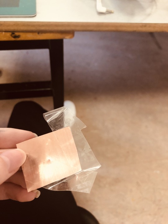
My process: In the mono printing studio, the lecturer showed me how to use the pinhole camera technique, firstly, she explained what materials were needed (a needle to bore a hole/gap, a piece of metal material and a phone/camera).
Furthermore, I pierced the metal with the needle and made a small crevice/hole, then I placed my camera lens on top of the hole (this let light flow through the metal)! I then took a photograph with this pinhole effect.





Monday seminar/ tutorials:
I was immensely inspired by the tutorial surrounding colour and also the lecture focusing on composition. Learning the elements of what creates an art piece opened my eyes to all the various techniques and planning that I need to include in my artworks and photography, and the endless options that surround these elements is inspiring. Planning my work in relation to line, shape, texture,space, colour and pattern has improved the standard of quality in my artworks and also enabled me to explore various styles and genres.
#art college#ireland#artist on tumblr#pinhole photography#learning#Fun#special effects#Phone#light#colourtheory#colour#prism#cows#cute cows#fluffy cows#strawberrycows
10 notes
·
View notes
Text


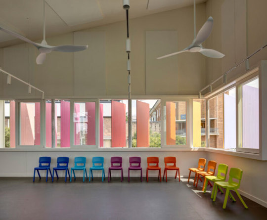
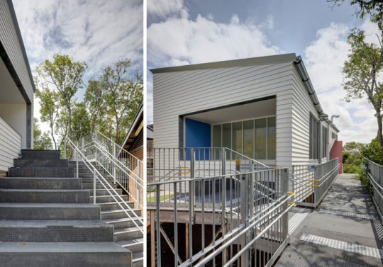

Exploring Colour Psychology in Education
Carter Williamson Architects designs the performance space and STEM classroom at Burwood Girls High School making a bold, colourful statement through a detailed yet simple form. https://www.indiaartndesign.com/exploring-colour-psychology-in-education/
#education#colourtheory#colourandlearning#institutionalarchitecture#buildingdesign#façadedesign#colourfulfaçade#infrastructuredevelopment#indiaartndesign
0 notes
Text
Communicating in Colour
Week 6
I had a play around with my photos and how I could edit them and add in colour.


I looked through the filters in Photoshop to see if I liked any of them. I quite like the one below, it is similar to Becky Bettesworth style.

I then started to look at hue and saturation and how to make them more blue or pink.


I tested out loads of photos to have a range, and pick out my fabourites:
The first beach one, the huts, my dog on the beach, the sunsets
I do like the one with my family but it doesn't work as a postcard.
0 notes