#artanddesign
Explore tagged Tumblr posts
Text


#art#my art#digital art#cats#comic#nail art#comic art#arthur lester#artwork#art process#illustration#artists on tumblr#ArtTheClown#ArthurAsheStadium#Arthritis#Art#Article#ArthurAndSons#Arthur#ArtichokePizza#ArticlesOfConfederation#ArtificialIntelligence#ArtAndDesignHighSchool#ArtAndDesign#ArtAttack#ArtAi#ArtAndCommerce#ArtApps#ArtAndCraft#ArtAndAutonomy
87 notes
·
View notes
Text

YELLOW COLOR | IL COLORE GIALLO Milan, kitchen. March 2024 Milano, una cucina. Marzo 2024 _ An artist’s photograph of an abstract painting, where the artwork becomes part of the scene it inhabits. A subtle Droste effect blends art with reality, capturing the essence of yellow’s vibrant presence. fine art photography by Francesca Pozzi tells a story about a painting by Francesca Pozzi
#francesca pozzi#yellow#art#photography#still life photography#colors#lightscape#artists on tumblr#architecture#books#lemons#painting#paintings#YellowVibes#AbstractArt#ItalianArtist#MinimalismInArt#FineArtPhotography#ModernArt#InteriorInspo#ColorInspiration#ArtAndDesign
403 notes
·
View notes
Text
Ekua's Kwanzaa Stamp

We’re beyond thrilled to share some amazing news about our very own @ekuaholmes!
Ekua has created a stunning stamp celebrating Kwanzaa for the United States Postal Service®!
The stamp was unveiled yesterday and is now available nationwide! Her beautiful design, inspired by a live performance at OrigiNation Cultural Arts Center in Roxbury, features a drummer and two dancers, perfectly capturing the essence of Kwanzaa— family, history, values, community, and African American culture. Ekua is in Pittsburgh this week celebrating the stamp’s launch!

Congratulations, Ekua and thank you for the gift of this postal treasure!
33 notes
·
View notes
Text

Kimberly Balla
The Cure: Dill Weed
48 x 36 inches
Acrylic on canvas
2024
#plantlovers#abstractart#abstractpainting#whitepainting#modernart#contemporarypainting#artanddesign#interior design#contemporaryabstract
11 notes
·
View notes
Text
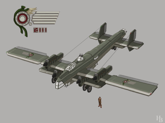
One of my oldest fully digital pieces, and one i want to do more of. It was a big step forward for me. A fixed wing bomber of the Cacean republic, in the world of Lakeweaver. An Industrialized nation, roughly reaching the 1920s-1930s in development, with their roots in central american styled empires and revolution nearly a century before. A Lack of readily available and reachable crude oil led to their early electrical adaptation taking off. Most tech in their states tend to lean heavily electric, utilizing battery power for longer range travel. Their air force can be considered average for the time. their early 4 engined bomber more a focus of pushing their limits of heavy aircraft then offensive use at the point of its development. Yet for all their technological developments. Their lands and the jungles that sprawl around the bases of their mountain ridges and deep lake valleys hold many secrets about their past.
#concept#illustration#digitalillutration#artwork#conceptart#aircraft#artanddesign#conceptualart#sketch#sketchbook#symbol#digitalsketch#dieselpunk#teslapunk
58 notes
·
View notes
Text
Uncovered: The Ninja Tales
3. Machinedrum - 3FOR82 (2024)
To complete our trilogy of ‘The Ninja Tales’, Part III takes a look at the hidden spot gloss ASCII artwork for Travis Steward's aka Machinedrum’s 11th studio album, 3FOR82 out on Ninja Tune on 24th May 2024. It is reported that Stewart crafted the album during a pilgrimage to Joshua Tree National Park, California, to seek clarity and inspiration, saying, “..I knew that I should, at some point in my life, go out there to work on something creatively.”

Fascinated by the outwardly simple artwork that, in reality has many hidden depths, we caught up with graphic designer and Machinedrum's Creative Director, Joseph Durnan and Ninja Tune’s Head of Production, Sean Preston to understand more about the process for creating the album’s hidden code artwork using The Demoscene. For us mere mortals unfamiliar with The Demoscene, it is an international computer art subculture made up of a worldwide network of creative minds, focused on producing demos: self-contained, sometimes extremely small, computer programs that produce audiovisual presentations.
Joseph told us, “One component we latched onto early was the Demoscene's challenge of keeping file sizes as low as possible while maximising the complexity of the demos. ASCII art, halftoning, and duotone degrading helped express that idea, with legendary demoscener TPOLM's art and Travis' (Machinedrum) personal artefacts from his teenage years acting as source material. The words flooding the sleeve and hidden code are nods to personal messages within Demoscene culture—references to in-jokes, cryptic sayings and messages to other demo makers. I liked how this type of content could either seem conceptual and esoteric to an outsider, or something between total gibberish and a confusing nerdy joke. Blending this with the 3FOR82 process involved using personal numbers related to birth dates, in-studio references among the album collaborators, and redundant information about the WAV files for the album tracks.”


Accompanying the record is a 16-page boutique zine. Joseph explains, “The accompanying zine goes deeper into the archival aspect, including rules from a quest-style video game imagined by Machinedrum as a child and a transcript from his first-ever interview. It also features nostalgic cyber-culture-style artwork contributions from Sensory Works and bitmapped photos from studio shoots with Tinashe and AK the Saviour.”
The limited edition translucent yellow glow vinyl edition, includes an alternative Dinked album art oversleeve and Joseph told us more about this, “For the limited edition Dinked art, TDR's Ian Anderson "3FOR82" font was degraded via an online ASCII art converter, overlaid with the T-26 font "Bias” for the MACHINEDRUM type. The font non-coincidentally looks good with Ian's logotype because a lot of the T26 foundry's typefaces made their way into his designs in the 90s and early 00s - which is widely held up as an era defining body of work within that world. Something definitive of the visual language of electronic music was how much of the artwork developed with technology, mirroring the way the Demoscene visuals have mutated over the past 30 years.”


Ninja Tune’s Head of Production, Sean Preston worked alongside Durnan on the album artwork and gave us his insight into the creative process.
He told us, “I think if anyone else other than Joe had come to me with the premise for the latest Machinedrum album I would’ve done all I could to put them off, but having suffered under the designer’s collaboration for several years, I was all too aware of his penchant for ASCII art, glitchy graphics, and secret gifts/traps buried deep within pixel data for me to find. Sometimes, where you land with the final packaging on a record, is more pleasing or rewarding because of the pitfalls laid before it, most of which in this instance we couldn’t have known ahead of the course.”
Sean explains, "Initially pencilled for manufacture in Ireland, we had to pivot to printing some of the sleeves there, stickers, zine booklet and o-card (for the Dinked edition) in three separate locations in the UK, and pressing the vinyl in France. The danger in working that way is that most printers have their own calibration settings for sleeves and o-card sizes. It also presents a risk to hitting colour consistency across the print parts. Getting printers to talk about these things with each other isn’t always a harmonious of fruitful pursuit, but with a good amount of physical proofing, some nervy stress tests, the record comes together really well.”


We asked more about the 16 page zine insert and Sean explained, “The zine booklet, complete with French folds, feels like a real artefact, centring the artwork’s ambition on an uncoated offset paper and card. The outer sleeve is 6-colour, utilising a bright Pantone Green and Pantone Orange against a CMYK composite, overlaid with a blind spot varnish. A blind varnish is a varnish that doesn’t necessarily correspond to the colour artwork it is printed on. Often when you see this, the blind varnish is vibrant, blind only in name, and usually employed as large block text, which requires a certain level of legibility. I visited the printer near Dublin specifically to get the right amount of subtlety to the overlaid varnish. Because of the miniscule, dotted areas occupied by the varnish, the traditional method of varnishing wasn’t going to give us the fine detail desired. The beauty of working with the sort of printer we did (AngloPrinters in Drogheda, around 45 mins north of Dublin) is that they are experienced and agile enough to recognise intention and move to solutions that benefit the artistic purpose. The finished sleeve now holds a finely detailed varnish that is present in light, but subtle enough to maintain the overall clandestine aesthetic that pervades the album’s artwork and music.”

youtube

3FOR82 by Machinedrum is released on Ninja Tune on 24th May 2024. Artwork by Joseph Durnan [124 World]. Typography by Ian Anderson (The Designers Republic). Record FlipFrames by Art Vinyl.
#art vinyl#album cover art#digital art#record cover#machinedrum#ninja tune#graphic design#ascii art#demoscene#artanddesign#uncovered
9 notes
·
View notes
Text
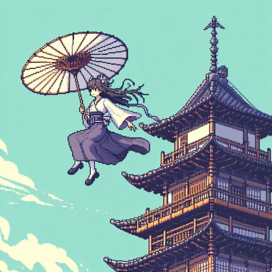
Floating Grace 🌸☁️
A serene scene of a graceful woman floating mid-air, holding a traditional Japanese umbrella, drifting gently past a beautiful pagoda. The gentle breeze and calm sky create a timeless, dreamlike moment. Inspired by classic Japanese art, now rendered in detailed pixel art.
#PixelArt#FloatingGrace#JapaneseArt#PixelArtStyle#Art#DigitalArt#PixelArtCommunity#JapaneseArchitecture#PixelArtWorld#FantasyArt#FloatingUmbrella#UmbrellaArt#TraditionalJapaneseArt#RetroArt#ArtLovers#ArtAndDesign#IndieArt
3 notes
·
View notes
Text
🎨 Welcome to the Institute of Design (I.O.D) – Where Creativity Meets Innovation!
Are you passionate about art and design? Do you dream of turning your creativity into a thriving career? Then welcome to the Institute of Design (I.O.D) – a leading international institution dedicated to shaping the future of design professionals since 1993.
At I.O.D, we believe that design has the power to transform the world, and we are committed to nurturing creative minds through world-class education, hands-on training, and global exposure. Whether you aspire to be a graphic designer, fashion innovator, interior expert, or digital artist, our industry-focused programs will equip you with the skills and knowledge needed to succeed in today’s fast-evolving creative landscape.
With a diverse student community from India, Maldives, Thailand, South Africa, Australia, the Middle East, Netherlands, and Korea, I.O.D is truly a global hub for design education. Our renowned faculty, state-of-the-art facilities, and dynamic learning environment make us the go-to destination for aspiring designers worldwide.
🌟 Explore. Create. Innovate. Join I.O.D today and take the first step toward your dream career in design! 🚀
#InstituteOfDesign#IOD#DesignEducation#CreativeLearning#ArtAndDesign#FutureOfDesign#DesignInspiration#GraphicDesign#FashionDesign#InteriorDesign#UXUIDesign#DigitalArt#CreativeCommunity#LearnDesign#DesignStudents#ArtisticInnovation#DesignTrends
2 notes
·
View notes
Text
Discover Your Creative Side with Adobe Photoshop 2021! 🌟
Whether you're a pro designer or just beginning to explore your creativity, Adobe Photoshop is your go-to tool for amazing photo edits, digital art, and so much more. Packed with powerful features like enhanced filters, AI-driven tools, and seamless integration with other Adobe apps, Photoshop 2021 unlocks a world of possibilities.
✨ Why You'll Love It:
Easy-to-use tools for both beginners and professionals
Amazing photo editing options like object removal and color enhancements
AI-powered smart filters to save you time
Access to hundreds of creative resources and tutorials
Regular updates to keep you at the cutting edge of design
👉 Get Adobe Photoshop 2021 Today!
2 notes
·
View notes
Text
🌟 Unlock the Secret to Stunning Design! 🌟
Ever wondered why some designs just feel right? The secret might be hidden in the Golden Ratio – nature’s perfect proportion! From iconic architecture to your favorite logos, this timeless principle creates balance, harmony, and beauty. In my latest blog, I break down: ✨ What the Golden Ratio is ✨ Why it works so well ✨ How you can use it in your designs 📐 Whether you’re designing a logo,…
2 notes
·
View notes
Text
✨ Transform your ideas into stunning visuals with our professional Graphic Design Services! From branding to digital design, we've got you covered. Let's make your brand shine! 🌟
📞 Call us at 8527471171 🌐 Visit: fluxitsolutions.in
#GraphicDesign#Branding#LogoDesign#WebDesign#PrintDesign#CreativeDesign#VisualIdentity#MarketingDesign#BusinessBranding#DesignServices#SocialMediaDesign#DesignInspiration#GraphicDesigner#DigitalMarketing#FluxITSolutions#DelhiBusinesses#BrandStrategy#CustomDesigns#PackagingDesign#Illustrations#BusinessGrowth#CreativeStudio#GraphicInspiration#SmallBusinessSupport#DesignMatters#ArtAndDesign
2 notes
·
View notes
Text


TIJON MIAMI X RAMSÉS MEJÍA
A rendez-vous between art and fragance.
Four illustrations inspired by iconic places in the city of Miami, created exclusively for the four signature perfumes of Tijon.
Perfume bottle replica designed by @onicemejia
Photography by @vcoproductions360
Tijon is a hand-crafted, luxury fragrance brand providing a curated retail experience along with award-winning fragrance labs providing custom perfume-making classes suited for small to large-scale groups and events.
Book this unique fragance making experience at:
🔗tijon.com/pages/class-sign-up-miami
1600 Ponce de León Bldv Suite A
Coral Gables, Miami, Florida. 33134
www.tijonmiami.com
#art#portfolio#illustration#design#artists on tumblr#contemporary art#modern art#abstract#drawing#visuals#artanddesign#designproject#design studio#art direction#creativedirection#interior design#shop design#Fragance#luxury#lujo#miami#coral gables#south Florida#florida
1 note
·
View note
Text

The Significance of Modern Art and Design in Interior Spaces
5 notes
·
View notes
Text
The Art of Imagination: How Verum Artifex Serves Your Creative Needs
In a world where creativity is often confined to the boundaries of practicality, Verum Artifex stands as a beacon of limitless imagination. We believe that art is not just a product of thought, but a magnificent manifestation of the human spirit. It is this belief that fuels our mission: to serve your creative needs in ways that transcend the ordinary.
At Verum Artifex, we understand that every individual is a unique blend of ideas and inspirations. Our goal is to provide a platform where these ideas can take flight, transforming into tangible pieces of art that not only reflect your identity but also resonate with your soul.
Unleashing the Power of Graphic Design
In the realm of graphic design, we strive to create visuals that speak volumes. Our designs are not just aesthetically pleasing, but they also carry a message, a story, a feeling. Whether it's a logo for your startup, a poster for your event, or a complete branding solution, we ensure that our designs capture the essence of your vision and communicate it effectively to your audience.

Art That Speaks to You
Art, in its purest form, is a reflection of the self. At Verum Artifex, we offer a wide range of art pieces that cater to diverse tastes and preferences. Each piece is a labor of love, crafted with utmost care and attention to detail. We hope that our art not only beautifies your space but also inspires you, evokes emotions, and sparks conversations.
Illustrating Your Ideas
Our illustration services are where your wildest ideas come to life. We believe that every story deserves to be told, and what better way to tell it than through captivating illustrations? From whimsical children's books to complex scientific concepts, our illustrations make your stories visually engaging and easy to understand.

Your Imagination, Our Canvas
At the heart of Verum Artifex is a commitment to serve your creative needs. We believe that every individual holds a universe within them, a universe brimming with ideas, stories, and dreams. Our job is to provide the canvas where your imagination can unfold, creating art that is as unique and extraordinary as you.

In the end, Verum Artifex is more than just a creative platform. It's a community of dreamers, creators, and art enthusiasts. It's a space where creativity is celebrated, ideas are nurtured, and imagination is limitless. So, step into the world of Verum Artifex, and let's embark on this creative journey together.

#illustration#digital illustration#anime fanart#aestheitcs#ArtistsOnTumblr#DesignInspiration#IllustrationArt#GraphicDesign#ArtCommunity#CreativeMinds#ArtisticExpression#VerumArtifex#ArtLovers#ArtAndDesign#CreativityUnleashed#ArtForEveryone#ArtInEverydayLife#ArtisticInnovation#ArtOfTheDay#art#manga#black art#tumblr merch#fan merch#Merch#Supportable
21 notes
·
View notes
Text

instagram
“I’m Queen Rhaenyra now. And you are all traitors to the realm.” — Rhaenyra Targaryen
Fan art by me. Feel free to follow me here: https://www.instagram.com/ymhuang_illos/
#illustration#art#collaboration#illustrator#houseofthedragon#HBO#artanddesign#artist#design#poster#emmadarcy#Rhaenyra#RhaenyraTargaryen#branding#advertising#ads#artprocessreel#Instagram
2 notes
·
View notes
Text
Uncovered: PJ Harvey - I Inside the Old Year Dying
We continue to delve into the detail of the creative process for some of The Best Art Vinyl 2023 shortlisted album artworks and today we take a look at this seemingly simple cover design for PJ Harvey’s tenth studio album that, in fact, couldn’t be less so. The final image is actually a result of months of preparation, awaiting perfect weather conditions and a combination of multiple photographs and techniques. We were lucky enough to get the whole story from artist Michelle Henning.
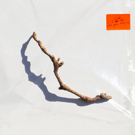
Henning’s background is in fine art, she started as a painter and installation artist. As well as being a Professor in Photography and Media in the School of the Arts at the University of Liverpool, Michelle works for PJ Harvey as art director/creative director, and as such is very much involved in decisions relating to many of the visual assets.
Michelle explained to us how the creative process starts and about her collaboration with PJ Harvey; “The way I approach the work is to listen to the music. Polly and I don’t discuss visual ideas at first, instead, she gives me everything to do with the album: recordings or demos, poems and lyrics, drawings and notes. I then immerse myself in it and try to get a feel for it and start working. I already had a way into it because I was familiar with her poetry book 'Orlam', which is connected to the album, and I had a strong sense of the world of the album. What matters most to me is trying to find a visual equivalent for the music, not to illustrate it or directly reference lyrics, but sense the atmosphere and convey that.”
Michelle elaborates, “In the case of ‘I Inside the Old Year Dying’, this album has a strange and interesting feel, on the one hand it’s about a twentieth century rural childhood, with references to Curly-Wurlys and Coca cola but also there are soldiers who appear from a much more ancient past, and there’s a strong presence of nature."
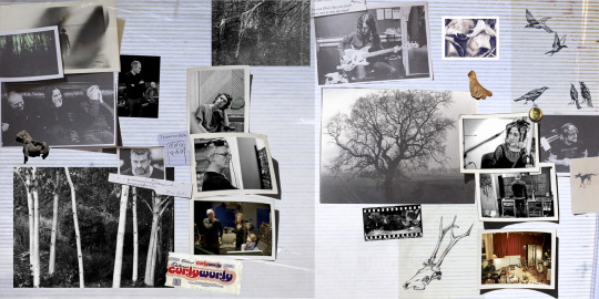
PJ Harvey, I Inside the Old Year Dying concept gatefold (Copyright © Michelle Henning, 2023) with photographs by Steve Gullick and drawings by Polly Harvey
"I started by thinking I would try to put wildlife cameras in a forest, not to capture animals but to get infra-red photos of trees. So I did that for a while but I wasn’t satisfied with the results. Then I started to paint forests, but that didn’t feel right either."
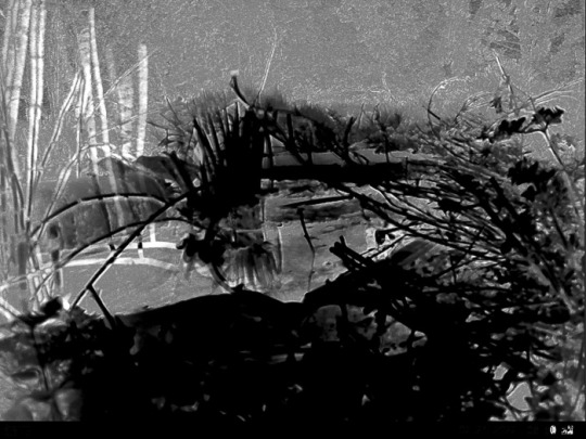
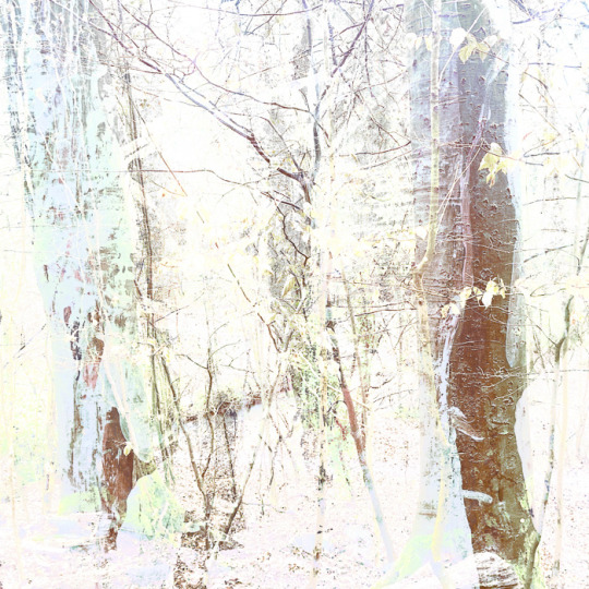
Early Forest concept ideas for PJ Harvey, I Inside the Old Year Dying (Copyright © Michelle Henning, 2023)
"I had a sudden realisation that I didn’t need a whole forest, I just needed one stick and such a simple single object would give it the feel of the classic album covers I admire. Now I realise an unconscious influence was Polly herself, because she had chosen to use drawings she had made of single twigs (“twiddicks”), to break up the sections in 'Orlam'."
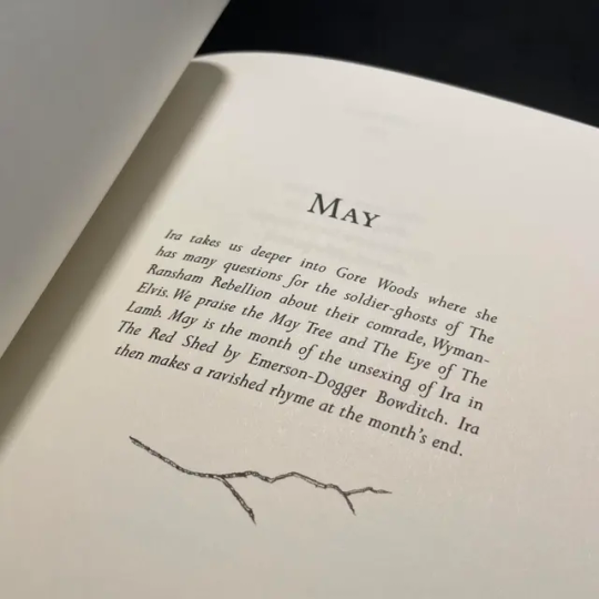
Orlam by PJ Harvey
"I think the idea of giving the stick a shadow emerged from the process of finding twigs on the ground and photographing them — the shadows seemed to bring them to life and make something very ordinary suddenly seem almost animate."

Concept ideas for PJ Harvey, I Inside the Old Year Dying (Copyright © Michelle Henning, 2023)
"The back cover is a photograph of Polly by Steve Gullick, onto which I superimposed a scan of a tissue and plastic envelope, so it has a slightly battered, used look. I chose this photo because I loved the way her legs echoed the shape of the twig, and also how it could be cropped so that it seemed as if she was almost kicking the edge of the album away."

Front and back cover artwork for PJ Harvey, I Inside the Old Year Dying (Copyright © Michelle Henning, 2023)
Michelle has produced three album covers and a number of singles for PJ Harvey as well as several for other artists, including for John Parish, Mazgani and Dot Allison. She works with a wide variety of techniques; photography, clay models, printmaking, drawing in ink and watercolour and moves between analogue and digital, with a lot of work in Adobe Photoshop, creating very complex layered files.

Michelle Henning: PJ Harvey, Let England Shake (Island Records, 2011)
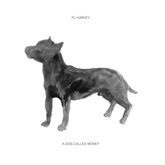
Michelle Henning: PJ Harvey, A Dog Called Money 7" Single

Centre label of Hope Six vinyl | PJ Harvey (Island Records 2016)
Expanding on her techniques for this current album cover artwork, Michelle tells us, “I photographed a lot of sticks in bright sunlight on different coloured and textured backgrounds. At a certain time in the afternoon the sun started to cast really interesting shadows. I remember Polly’s manager Sumit calling me and asking me when I would have something ready to show them, and I said I wouldn’t be ready until we had had more sunny weather. He was very patient with me but he must have wondered what on earth I was doing.”
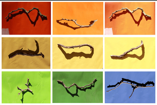
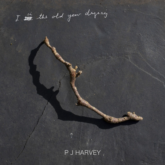
She continues, “The stick that worked best, that I felt had the most mysterious shadow, I then rephotographed under plastic. The final image is a composite of about three or maybe more photographs of this twig, both under the plastic and not. The orange sticker is based on the sticker stuck on this piece of plastic — which was a large transparent folder in which my film photographs were returned to me. I liked the way it brought a pop of colour to the cover.”
"In Photoshop, I changed the lighting on the plastic, added more layers of plastic lighting, superimposed Polly’s handwriting onto the sticker, and created the fake embossed text in the centre (which is a mixture of hand-painted ink drawing and a lot of digital editing)."
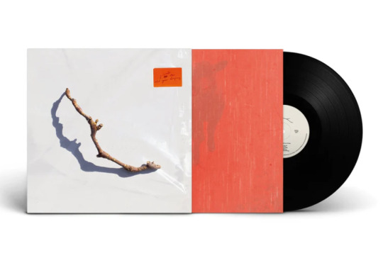
"The gatefold is a scan of a 1980s sticky photograph album complete with the blue lines of glue and the plastic layer, and the inner sleeve is based on photographs of red kitchen linoleum superimposed over photographs by Polly of a lamb and a forest. I did a rough layout for the body text and type, and then handed that over to Rob Crane of Rob Crane Design, who did a brilliant job of making the typography on the inside and back covers look elegant and balanced, and made all the files print-ready."
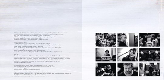
Inner gatefold for PJ Harvey, I Inside the Old Year Dying (Copyright © Michelle Henning, 2023) with typesetting by Rob Crane, and photographs by Steve Gullick gatefold pic
Michelle told us she looked at a lot of great album covers when creating this artwork and there are subtle references to some of them, both in the inner gatefold and the front cover. She says, "I love the idea that there are record cover geeks like myself who like to figure out the echoes of other designs, so I won’t say what they are!" (two iconic late 60s LP covers spring to our record cover geeky minds!)
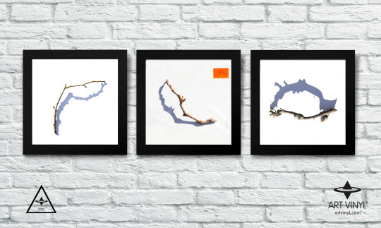
Michelle Henning: PJ Harvey, I Inside the Old Year Dying concept (Copyright © Michelle Henning, 2023)
I Inside the Old Year Dying by PJ Harvey on Partisan Records is shortlisted for the Best Art Vinyl 2023 Award. Art Director, Design and front cover photography by Michelle Henning. Additional design and typesetting by Rob Crane.
#art vinyl#record frames#play and display#best art vinyl#lp cover frame#bestartvinyl2023#contemporaryart#mixartandmusic#artanddesign#recordcoverart#albumcover#photography
8 notes
·
View notes