#decade: 1790s
Explore tagged Tumblr posts
Text

Woman's Evening Gown, October 1797.
#fashion plates#historical fashion#clothing#women's fashion#dress#year: 1797#decade: 1790s#century: 1700s#18th century#evening#gown#formal#evening gown#blue#era: georgian#white#brown#month: october#era: regency#regency (unofficial)#colour illustration
297 notes
·
View notes
Text

Like I just think that this is a completely bonkers insane thing to say about nearly any period of irish history. exposure to any genuine historical research would kill you instantly
#as though people living through things like the irish revolution or the entire decade of the 1790s saw any of it as clear-cut. deeply#unserious behaviour#jory.txt
16 notes
·
View notes
Text
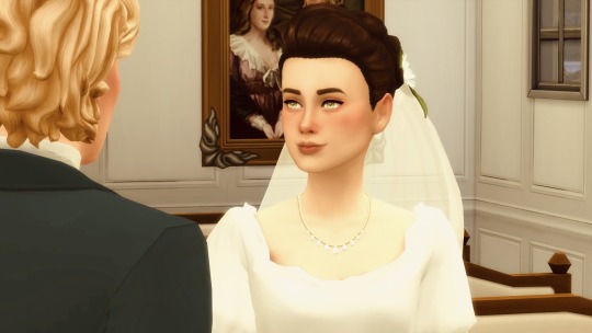

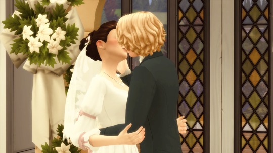
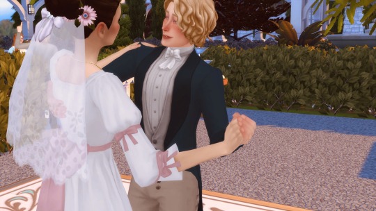


The wedding of Caroline Fletcher and Charles Davenport (in which I got way too invested)
39 notes
·
View notes
Note
so i am newly in a wheelchair which has been a Massive gain in my ability to go out and about. but i realized that i have aprox 0 clothes that look Good while seated. its a completely different silhouette and i am at a loss as to what to do for it. do you have any suggestions for what could look good seated? preferably no skirts or dresses.
Edit: Check the notes for more people's input, including actual wheelchair users who know much more about what works than I could!
Congrats on chair acquisition!!
Since you're sending this to me specifically I am working under the assumption that you mean to do some amount of sewing.
A high waisted silhouette definitely works best for sitting. I make all my pants with the waistband at my natural waist, and a bit of pleating or gathering at the back just like they did on 18th century breeches, and I've never noticed any particular discomfort from sitting in them. (I think high waisted pants are more comfortable in general, and that low rise jeans are evil.)

It's something I've never really thought about before, but sitting is a very legs-forward position, so perhaps a colourful or fancy stripe down the side would work well.

(I made this pair 10 years ago and they didn't fit well and are long gone, but I should do a better version someday...)
Or some other form of side seam decoration, like these fabulous button tabs.
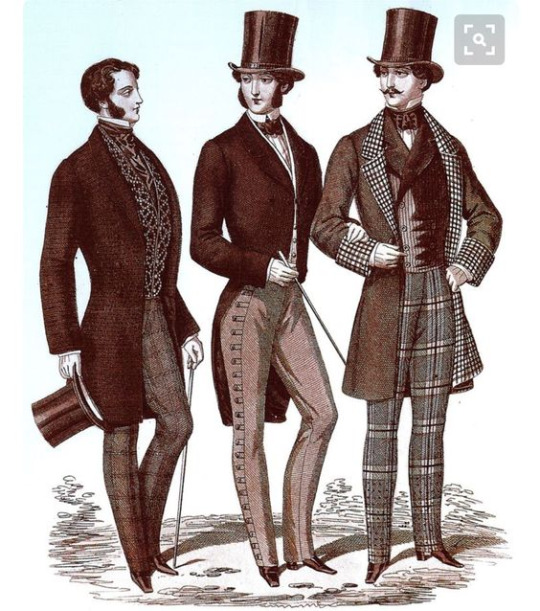
(I don't know what the source for this mid 19th century fashion plate is.)
Cropped jackets would also be good. The first thing that comes to mind for me is the Carmagnole, which was a style worn by French revolutionaries. It's got a pretty similar cut to a regular 1790's coat, just shorter.
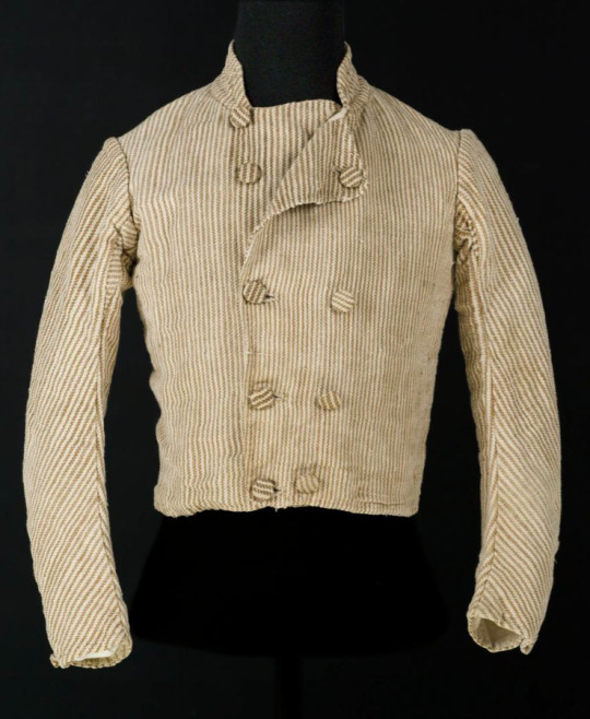
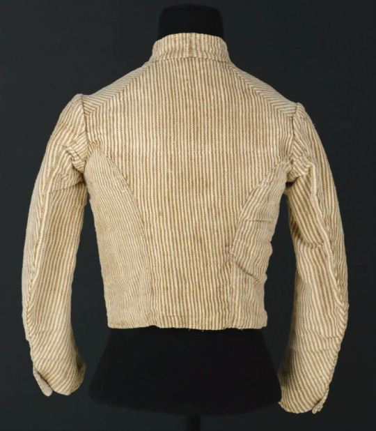
(Source)
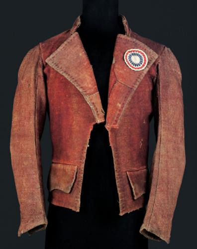
(Source)
And there are other styles of short jacket, like this one from a few decades later.
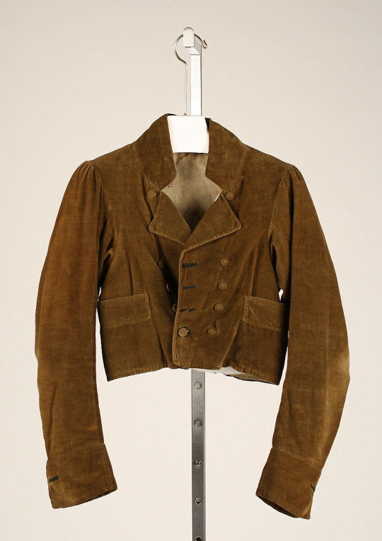
I think it might be possible to get a similar effect from cutting down a thrifted corduroy jacket, depending on the pocket placement? It's not something I've done myself though.
A fancy little bolero could be a lot of fun too! I quite like these ones made by Marlowe Lune. Super easy to sew, and could be patterned by cutting down a bigger pattern that fits the torso.


They'd be a good thing to try if you have a smallish piece of fancy fabric, or a small bit trim to use, or want to try a small amount of embroidery.
There are lots of historical styles with sleeves too, and all sorts of decorations.
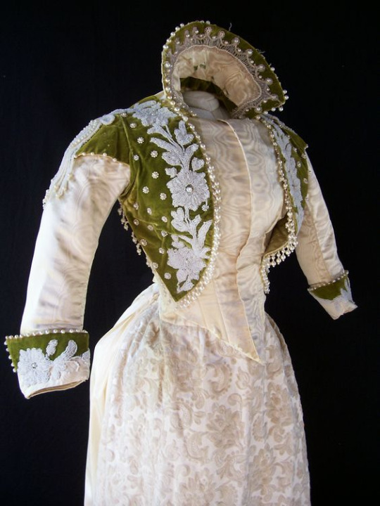
(Dunno the source for this one either, unfortunately, but the pin says 1880s reception dress. I think a little jacket like that would look good with a puffy shirt and pants.)
Short capes might be practical too, and the late 19th and early 20th century have tons of fancy capelets for inspiration, like this one.
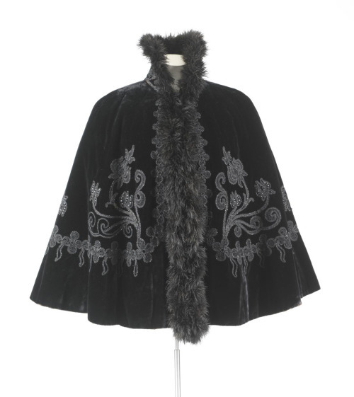
Or this one.
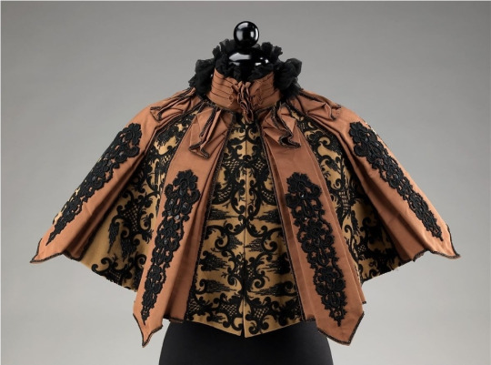
I hope this is somehow helpful! I don't know if you're looking to sew things from scratch or to buy and alter stuff or what, and I have no personal experience using a wheelchair, but these are the best things I can think of for a suitable silhouette. Dramatic sleeve/shoulder puffs would also be shown off to great effect, if that's something you'd like to wear.
1K notes
·
View notes
Text
I don't know if you're ready for this BUT American Duchess and the Bata Shoe Museum just launched a collab collection called In Bloom.
They made 3 styles in several colours using 3 styles from the the 18th, 19th and 20th centuries from their current exhibition "In Bloom: Flowers and Footwear", and are currently in pre-sale, with estimated deliveries between July and August 2023.
Let's take a look:
We start at the 18th century with the Primrose shoes, based on their Dunmore model, accurate for 1770s-1790s they are embroidered on satin and are $179 USD while in pre-sale and later will be $199. The original style is in black and pink silk satin, and OF COURSE that's my favourite variation, but the green ones are a close second.

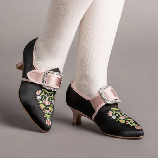
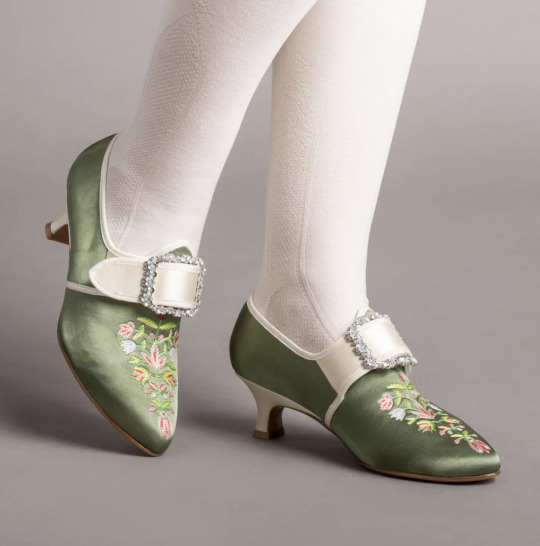
Images from top: 1780s shoes, Bata Shoe Museum / Primrose shoes, American Duchess.
From the 19th century we have this style called Flora, accurate for the late 19th century (1870s-1900), are $230 USD while in pre-sale and later will bee $250. This embroidered boots with satin ribbon laces are probably my favourite style from the collection. Of course my fave colour is black, which is also the colour of the original piece, but the lavender ones are just *chef kiss*:
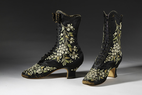

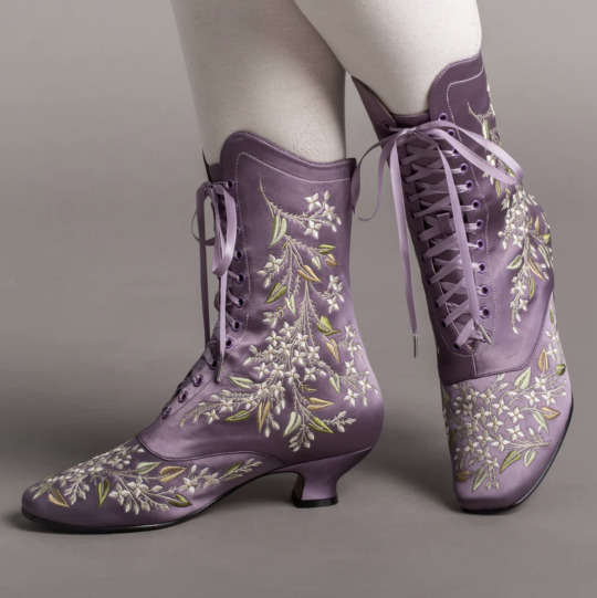
Images from top: the original French embroidered boots by Francois Pinet, late 1870s-early 1880s, Bata Shoe Museum. / Flora boots, American Duchess
Finally, the 20th century style is the Daisy, accurate for the 1920s-1940s. A vintage style full of flowers and colour, this T-strap style is perfect to pair with a simple dress from any decade and have a very decent 6.3cm heel, so you can dance all night in these art deco shoes.
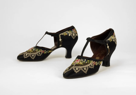
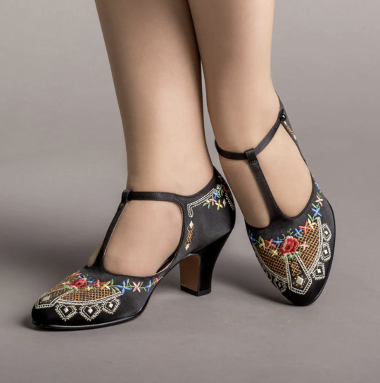
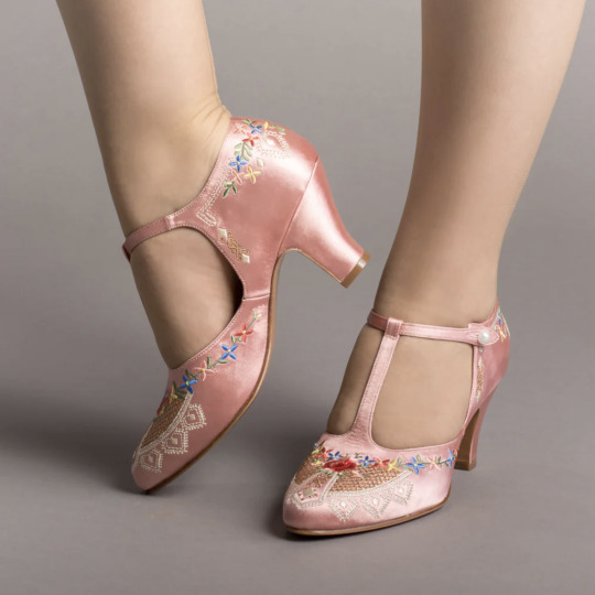
1920s shoes, Bata Shoe Museum / Daisy shoes, American Duchess.
The sales from the In Bloom collection will support The Bata Shoe Museum in their study, outreach, and conservation of historic footwear, and we're here for it.
More info:
"In Bloom: Flowers and Footwear"
Read more about the collaboration at the American Duchess Blog.
Buy the whole collection in pre-sale here.
Which style are you looking for the most?
#shoes#accessories#in bloom#florals#18th century#19th century#20th century#historical shoes#american duchess
8K notes
·
View notes
Text

For the past six years or so, this graph has been making its rounds on social media, always reappearing at conveniently timed moments…
The insinuation is loud and clear: parallels abound between 18th-century France and 21st-century USA. Cue the alarm bells—revolution is imminent! The 10% should panic, and ordinary folk should stock up on non-perishables and, of course, toilet paper, because it wouldn’t be a proper crisis without that particular frenzy. You know the drill.

Well, unfortunately, I have zero interest in commenting on the political implications or the parallels this graph is trying to make with today’s world. I have precisely zero interest in discussing modern-day politics here. And I also have zero interest in addressing the bottom graph.
This is not going to be one of those "the [insert random group of people] à la lanterne” (1) kind of posts. If you’re here for that, I’m afraid you’ll be disappointed.
What I am interested in is something much less click-worthy but far more useful: how historical data gets used and abused and why the illusion of historical parallels can be so seductive—and so misleading. It’s not glamorous, I’ll admit, but digging into this stuff teaches us a lot more than mindless rage.
So, let’s get into it. Step by step, we’ll examine the top graph, unpick its assumptions, and see whether its alarmist undertones hold any historical weight.
Step 1: Actually Look at the Picture and Use Your Brain
When I saw this graph, my first thought was, “That’s odd.” Not because it’s hard to believe the top 10% in 18th-century France controlled 60% of the wealth—that could very well be true. But because, in 15 years of studying the French Revolution, I’ve never encountered reliable data on wealth distribution from that period.
Why? Because to the best of my knowledge, no one was systematically tracking income or wealth across the population in the 18th century. There were no comprehensive records, no centralised statistics, and certainly no detailed breakdowns of who owned what across different classes. Graphs like this imply data, and data means either someone tracked it or someone made assumptions to reconstruct it. That’s not inherently bad, but it did get my spider senses tingling.
Then there’s the timeframe: 1760–1790. Thirty years is a long time— especially when discussing a period that included wars, failed financial policies, growing debt, and shifting social dynamics. Wealth distribution wouldn’t have stayed static during that time. Nobles who were at the top in 1760 could be destitute by 1790, while merchants starting out in 1760 could be climbing into the upper tiers by the end of the period. Economic mobility wasn’t common, but over three decades, it wasn’t unheard of either.
All of this raises questions about how this graph was created. Where’s the data coming from? How was it measured? And can we really trust it to represent such a complex period?
Step 2: Check the Fine Print
Since the graph seemed questionable, the obvious next step was to ask: Where does this thing come from? Luckily, the source is clearly cited at the bottom: “The Income Inequality of France in Historical Perspective” by Christian Morrisson and Wayne Snyder, published in the European Review of Economic History, Vol. 4, No. 1 (2000).

Great! A proper academic source. But, before diving into the article, there’s a crucial detail tucked into the fine print:
“Data for the bottom 40% in France is extrapolated given a single data point.”
What does that mean?
Extrapolation is a statistical method used to estimate unknown values by extending patterns or trends from a small sample of data. In this case, the graph’s creator used one single piece of data—one solitary data point—about the wealth of the bottom 40% of the French population. They then scaled or applied that one value to represent the entire group across the 30-year period (1760–1790).
Put simply, this means someone found one record—maybe a tax ledger, an income statement, or some financial data—pertaining to one specific year, region, or subset of the bottom 40%, and decided it was representative of the entire demographic for three decades.
Let’s be honest: you don’t need a degree in statistics to know that’s problematic. Using a single data point to make sweeping generalisations about a large, diverse population (let alone across an era of wars, famines, and economic shifts) is a massive leap. In fact, it’s about as reliable as guessing how the internet feels about a topic from a single tweet.
This immediately tells me that whatever numbers they claim for the bottom 40% of the population are, at best, speculative. At worst? Utterly meaningless.

It also raises another question: What kind of serious journal would let something like this slide? So, time to pull up the actual article and see what’s going on.
Step 3: Check the Sources
As I mentioned earlier, the source for this graph is conveniently listed at the bottom of the image. Three clicks later, I had downloaded the actual article: “The Income Inequality of France in Historical Perspective” by Morrisson and Snyder.
The first thing I noticed while skimming through the article? The graph itself is nowhere to be found in the publication.
This is important. It means the person who created the graph didn’t just lift it straight from the article—they derived it from the data in the publication. Now, that’s not necessarily a problem; secondary analysis of published data is common. But here’s the kicker: there’s no explanation in the screenshot of the graph about which dataset or calculations were used to make it. We’re left to guess.
So, to figure this out, I guess I’ll have to dive into the article itself, trying to identify where they might have pulled the numbers from. Translation: I signed myself up to read 20+ pages of economic history. Thrilling stuff.
But hey, someone has to do it. The things I endure to fight disinformation...
Step 4: Actually Assess the Sources Critically
It doesn’t take long, once you start reading the article, to realise that regardless of what the graph is based on, it’s bound to be somewhat unreliable. Right from the first paragraph, the authors of the paper point out the core issue with calculating income for 18th-century French households: THERE IS NO DATA.
The article is refreshingly honest about this. It states multiple times that there were no reliable income distribution estimates in France before World War II. To fill this gap, Morrisson and Snyder used a variety of proxy sources like the Capitation Tax Records (2), historical socio-professional tables, and Isnard’s income distribution estimates (3).
After reading the whole paper, I can say their methodology is intriguing and very reasonable. They’ve pieced together what they could by using available evidence, and their process is quite well thought-out. I won’t rehash their entire argument here, but if you’re curious, I’d genuinely recommend giving it a read.
Most importantly, the authors are painfully aware of the limitations of their approach. They make it very clear that their estimates are a form of educated guesswork—evidence-based, yes, but still guesswork. At no point do they overstate their findings or present their conclusions as definitive
As such, instead of concluding with a single, definitive version of the income distribution, they offer multiple possible scenarios.
It’s not as flashy as a bold, tidy graph, is it? But it’s far more honest—and far more reflective of the complexities involved in reconstructing historical economic data.
Step 5: Run the numbers
Now that we’ve established the authors of the paper don’t actually propose a definitive income distribution, the question remains: where did the creators of the graph get their data? More specifically, which of the proposed distributions did they use?
Unfortunately, I haven’t been able to locate the original article or post containing the graph. Admittedly, I haven’t tried very hard, but the first few pages of Google results just link back to Twitter, Reddit, Facebook, and Tumblr posts. In short, all I have to go on is this screenshot.
I’ll give the graph creators the benefit of the doubt and assume that, in the full article, they explain where they sourced their data. I really hope they do—because they absolutely should.
That being said, based on the information in Morrisson and Snyder’s paper, I’d make an educated guess that the data came from Table 6 or Table 10, as these are the sections where the authors attempt to provide income distribution estimates.

Now, which dataset does the graph use? Spoiler: None of them.
How can we tell? Since I don’t have access to the raw data or the article where this graph might have been originally posted, I resorted to a rather unscientific method: I used a graphical design program to divide each bar of the chart into 2.5% increments and measure the approximate percentage for each income group.
Here’s what I found:

Now, take a moment to spot the issue. Do you see it?
The problem is glaring: NONE of the datasets from the paper fit the graph. Granted, my measurements are just estimates, so there might be some rounding errors. But the discrepancies are impossible to ignore, particularly for the bottom 40% and the top 10%.
In Morrisson and Snyder’s paper, the lowest estimate for the bottom 40% (1st and 2nd quintiles) is 10%. Even if we use the most conservative proxy, the Capitation Tax estimate, it’s 9%. But the graph claims the bottom 40% held only 6%.
For the top 10% (10th decile), the highest estimate in the paper is 53%. Yet the graph inflates this to 60%.
Step 6: For fun, I made my own bar charts
Because I enjoy this sort of thing (yes, this is what I consider fun—I’m a very fun person), I decided to use the data from the paper to create my own bar charts. Here’s what came out:

What do you notice?
While the results don’t exactly scream “healthy economy,” they look much less dramatic than the graph we started with. The creators of the graph have clearly exaggerated the disparities, making inequality seem worse.
Step 7: Understand the context before drawing conclusions
Numbers, by themselves, mean nothing. Absolutely nothing.
I could tell you right now that 47% of people admit to arguing with inanimate objects when they don’t work, with printers being the most common offender, and you’d probably believe it. Why? Because it sounds plausible—printers are frustrating, I’ve used a percentage, and I’ve phrased it in a way that sounds “academic.”
You likely wouldn’t even pause to consider that I’m claiming 3.8 billion people argue with inanimate objects. And let’s be real: 3.8 billion is such an incomprehensibly large number that our brains tend to gloss over it.
If, instead, I said, “Half of your friends probably argue with their printers,” you might stop and think, “Wait, that seems a bit unlikely.” (For the record, I completely made that up—I have no clue how many people yell at their stoves or complain to their toasters.)
The point? Numbers mean nothing unless we put them into context.
The original paper does this well by contextualising its estimates, primarily through the calculation of the Gini coefficient (4).
The authors estimate France’s Gini coefficient in the late 18th century to be 0.59, indicating significant income inequality. However, they compare this figure to other regions and periods to provide a clearer picture:
Amsterdam (1742): Much higher inequality, with a Gini of 0.69.
Britain (1759): Lower inequality, with a Gini of 0.52, which rose to 0.59 by 1801.
Prussia (mid-19th century): Far less inequality, with a Gini of 0.34–0.36.
This comparison shows that income inequality wasn’t unique to France. Other regions experienced similar or even higher levels of inequality without spontaneously erupting into revolution.
Accounting for Variations
The authors also recalculated the Gini coefficient to account for potential variations. They assumed that the income of the top quintile (the wealthiest 20%) could vary by ±10%. Here’s what they found:
If the top quintile earned 10% more, the Gini coefficient rose to 0.66, placing France significantly above other European countries of the time.
If the top quintile earned 10% less, the Gini dropped to 0.55, bringing France closer to Britain’s level.
Ultimately, the authors admit there’s uncertainty about the exact level of inequality in France. Their best guess is that it was comparable to other countries or somewhat worse.
Step 8: Drawing Some Conclusions
Saying that most people in the 18th century were poor and miserable—perhaps the French more so than others—isn’t exactly a compelling statement if your goal is to gather clicks or make a dramatic political point.
It’s incredibly tempting to look at the past and find exactly what we want to see in it. History often acts as a mirror, reflecting our own expectations unless we challenge ourselves to think critically. Whether you call it wishful thinking or confirmation bias, it’s easy to project the future onto the past.
Looking at the initial graph, I understand why someone might fall into this trap. Simple, tidy narratives are appealing to everyone. But if you’ve studied history, you’ll know that such narratives are a myth. Human nature may not have changed in thousands of years, but the contexts we inhabit are so vastly different that direct parallels are meaningless.
So, is revolution imminent? Well, that’s up to you—not some random graph on the internet.
Notes
(1) A la lanterne was a revolutionary cry during the French Revolution, symbolising mob justice where individuals were sometimes hanged from lampposts as a form of public execution
(2) The capitation tax was a fixed head tax implemented in France during the Ancien Régime. It was levied on individuals, with the amount owed determined by their social and professional status. Unlike a proportional income tax, it was based on pre-assigned categories rather than actual earnings, meaning nobles, clergy, and commoners paid different rates regardless of their actual wealth or income.
(3) Jean-Baptiste Isnard was an 18th-century economist. These estimates attempted to describe the theoretical distribution of income among different social classes in pre-revolutionary France. Isnard’s work aimed to categorise income across groups like nobles, clergy, and commoners, providing a broad picture of economic disparity during the period.
(4) The Gini coefficient (or Gini index) is a widely used statistical measure of inequality within a population, specifically in terms of income or wealth distribution. It ranges from 0 to 1, where 0 indicates perfect equality (everyone has the same income or wealth), and 1 represents maximum inequality (one person or household holds all the wealth).
#frev#french revolution#history#disinformation#income inequality#critical thinking#amateurvoltaire's essay ramblings#don't believe everything you see online#even if you really really want to
239 notes
·
View notes
Text
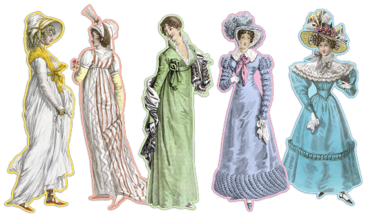
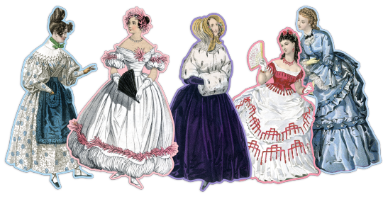
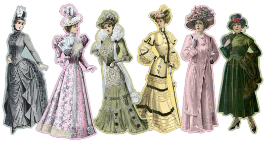
19th century fashion plates, designs, etc.
(with late 18th and early 20th century plates)
Tagged by decade:
1790s | 1800s | 1810s | 1820s | 1830s | 1840s | 1850s | 1860s | 1870s | 1880s | 1890s | 1900s | 1910s | 1920s | 1930s | 1940s
Check out today’s plates.
Or check out the art, design, and fashion posts I reblog.
#fashion#fashion plate#collage#1790s#18aughts#1810s#1820s#1830s#1840s#1850s#1860s#1870s#1880s#1890s#1900s#1910s#1920s#1930s#1940s
739 notes
·
View notes
Text
Nostalgia
by Billy Collins
Remember the 1340s? We were doing a dance called the Catapult.
You always wore brown, the color craze of the decade,
and I was draped in one of those capes that were popular,
the ones with unicorns and pomegranates in needlework.
Everyone would pause for beer and onions in the afternoon,
and at night we would play a game called "Find the Cow."
Everything was hand-lettered then, not like today.
Where has the summer of 1572 gone? Brocade and sonnet
marathons were the rage. We used to dress up in the flags
of rival baronies and conquer one another in cold rooms of stone.
Out on the dance floor we were all doing the Struggle
while your sister practiced the Daphne all alone in her room.
We borrowed the jargon of farriers for our slang.
These days language seems transparent, a badly broken code.
The 1790s will never come again. Childhood was big.
People would take walks to the very tops of hills
and write down what they saw in their journals without speaking.
Our collars were high and our hats were extremely soft.
We would surprise each other with alphabets made of twigs.
It was a wonderful time to be alive, or even dead.
I am very fond of the period between 1815 and 1821.
Europe trembled while we sat still for our portraits.
And I would love to return to 1901 if only for a moment,
time enough to wind up a music box and do a few dance steps,
or shoot me back to 1922 or 1941, or at least let me
recapture the serenity of last month when we picked
berries and glided through afternoons in a canoe.
Even this morning would be an improvement over the present.
I was in the garden then, surrounded by the hum of bees
and the Latin names of flowers, watching the early light
flash off the slanted windows of the greenhouse
and silver the limbs on the rows of dark hemlocks.
As usual, I was thinking about the moments of the past,
letting my memory rush over them like water
rushing over the stones on the bottom of a stream.
I was even thinking a little about the future, that place
where people are doing a dance we cannot imagine,
a dance whose name we can only guess.
84 notes
·
View notes
Text
CORRECTED & UPDATED! Clothes + Equivocation = Romance:
The Husbands in 1793
EDIT: I made a significant error when I wrote this. As @goodjomans kindly points out in the comments to Part 2 of this essay (massive shoutout for this, goodjomans! also I love your name!), Aziraphale is the one who dresses the executioner in clothing like Aziraphale's original ensemble, not Crowley. This changes my conclusions about the meaning we can take from this scene!
On the one hand, mea culpa, y'all. I shall get on with eating my crow. On the other hand, I had to go through this frame-by-frame to catch which of the ineffable spouses puts Jean-Claude in his new togs, and the answer only lasts three frames. Here it is:
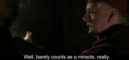
After Aziraphale changes his clothes, but before Crowley snaps his fingers and unfreezes time, there's a shot of the executioner over Crowley's shoulder, and he is now wearing a light coat with gold embroidery on the shoulders like Aziraphale's. Aziraphale arranges the executioner's death, not Crowley. So I feel like an idiot for missing it, but not a total idiot.
Let's discuss how this information changes what we can read from this scene! I'm going to leave my original text in place and edit with bold green. I can still stand by most of this essay, but this detail changes how I read the meaning of the husbands' communication at the end of this scene.
So we're all clear on the fact that the universe of Good Omens is an inescapable nightmare dystopia in which either of the husbands' merciless authoritarian regimes could be watching or listening to them at any time, yes? And that if either are caught 'fraternizing' with the other that means discorporation, torture, memory wipe, and/or death for either or both of them, yes?
Which means Crowley and Aziraphale can never speak or do anything openly to each other about their friendship or attraction or love. Everything they say and do has to have an innocuous meaning they can point to in case anybody ever sees or hears something Team Azcrow can't explain away. Walls (and ducks) have ears, and the price of slipping up--as we see in 1827--is heavy.
When a character says or does something that has two distinct meanings because they need to disguise what they really mean from one party but make their meaning plain to another, lit-nerds (and lit nerds🍃) call this equivocation. Equivocation is a kind of coded communication meant to pass hostile ears and eyes in plain sight but reach its intended recipient with its true meaning. The 1793 scene is jammed with it.
A lot of that coded messaging revolves around the clothes Crowley and Aziraphale choose in this scene, so--THESIS PARAGRAPH, BITCHES--we're going going to talk about how their clothes read to the people of this time period and location, what their clothes tell us about their characters, how their clothes help them equivocate, and what they're really saying with that equivocation. And Spoiler A-fucking-lert, it is ROMANTIC AF PRETTY GD ROMANTIC. Let's get nerdy!
We start with Aziraphale's beautiful champagne-gold and powder-pink ensemble.
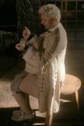

This outfit would tell people of this time period 3 things about Aziraphale:
That he's insanely wealthy--These clothes would be silk, hand-embroidered with thread made with actual gold. Each individual garment could cost years' or even decades' worth of working-class wages and take a team of skilled artisans dozens to hundreds of hours to make.
That he's a fop--i.e., a man who loves fine clothes and dressing up and looking fancy. By the 1790s in England, once-fashionable foppishness was giving way to the Neoclassical 'Corinthian' style, and was considered effete. (Fun note: During this time period, effete did not automatically indicate gay, and pink was considered a masculine color, so while Az. is queering it up to the audience here, his clothes would not have read as gay or overtly effeminate to the other characters around him.)
Even though he's insanely wealthy, Aziraphale wears clothes that are decades out of fashion.
According to the Victoria & Albert Museum, "As the [18th] century progressed, the male silhouette slowly changed.[...] Coat skirts gradually became less full and the front was cut in a curved line towards the back. Waistcoats became shorter. The upper leg began to show more and more[...]. Shoes became low-heeled with pointed toes and were fastened with a detachable buckle and straps or ribbon[.]
Source
That description is not what Aziraphale's wearing. Judging by his heel height and the length of his waistcoat, Aziraphale is wearing a style that's at least a decade older than this:
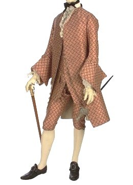
And this is from 1765. The great crepes caper happens in 1793, almost 30 years later.
My inference: Just as he has in the modern period, Aziraphale has settled into a style he really likes and refused to let go of it long after it's gone out of fashion.
We'll come back to this set of Aziraphale's clothes in a bit, but we need to talk about Crowley's first, because Crowley's clothes in this scene help render a line he says later about this outfit very flirtatious and darkly romantic.
First, some background: What was considered acceptable attire for wealthy people in France changed pretty much overnight during the French Revolution after the storming of the Bastille in 1789 and the fall of the French monarchy. Instead of advertising wealth, clothes now had to advertise political allegiance, and they had to do so loud and clear. And if you didn't want to be murdered by the French First Republic, that political allegiance had fucking better be to the Revolution.
People started wearing a looooooot of super patriotic shit. And I mean it was like little kids on the 4th of July; clothes were red, white, and blue in any hue and garish combination and print. The cockade, a fabric rosette in the colors of the French flag, was required by law to be worn by men, and despite that was just as popular among women. To show solidarity with the laboring classes, the fabrics the wealthy wore went from embroidered silk in light Rococo colors (what Aziraphale is wearing) to sober neutrals without decoration in wool, cotton, and linen.
Now, the script note for Crowley's clothing in this scene is this:

But clearly there were some changes made between script and filming, because Crowley does not appear standing behind Aziraphale; he appears lounging.
And he's not dressed as a French peasant.
Here's how French peasants dressed in 1790:
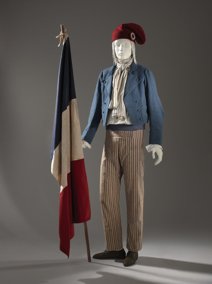
Peasants at this time wore styles that distinguished them from the styles of the upper classes not just in materials, colors, or patterns, but in shapes. Full trousers and cropped boxy jackets in French flag colors were the marks of the laboring-class Revolutionary, and both styles were huge changes from hundreds of years of French fashion up to that point.
And that's not what Crowley shows up wearing. Crowley is wearing the knee breeches, stockings, waistcoat, and frock coat of a wealthy man, and in fact his clothes reference a very specific type of wealthy man.
In the 1790s, if you were an aristocrat who wasn't happy about the Revolution and you were so sure of your privilege that you would risk your life showing it, you wore black in mourning for the monarchy and in protest of the violence of its deposition. If you were an aristocrat who wanted to protest and you didn't want to be immediately murdered by the French First Republic, you wore a style called half-mourning, which was black with a colored coat.
Here's a picture from a 1790 fashion magazine of an aristocrat in half-mourning:
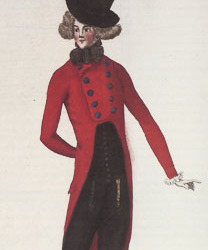
"The text accompanying the plate describes his ensemble as 'half-mourning,' referring to the aristocrats who lamented 'the diminished powers of the monarchy and [signaled] their willingness to die for the royal cause'" [emph. added]. [Source]
Notice: the shoes, stockings, breeches, waistcoat, and cravat are all black. You with me?
Because here's Crowley in 1793:
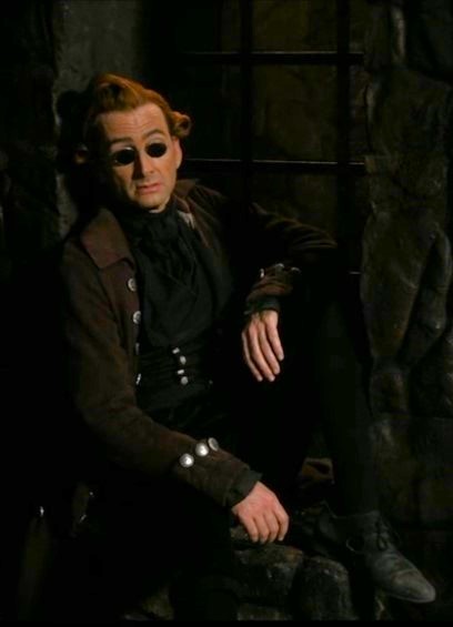
I've turned up the brightness and exposure in this image so he's more clearly visible against the stone, but I haven't warmed it up. He's wearing a coat that's a dark blackish red. Everything else, even his cravat, even his shirt, is black. (The black shirt is anachronistic, a lovely little nod to Crowley's refusal to wear angelic white.)
This is 179fuckin'3, y'all. Marie Antoinette is executed in 1793. It's 3 full years after that fashion plate up there in his bright red jacket, and that lil dude was already risking his neck way back in 1790. As we can see from the fact that the government are apparently now grabbing random wealthy-looking Englishmen off the street to murder without trial, the time for a man demon to be sauntering around Paris dressed in all black or even nearly all black is well past.
Crowley's also wearing a whole assload of huge silver buttons, which would have been flashy and tacky and frankly pretty weird in 1793 but very definitely an eccentric Rich Person Thing to do, bc regular buttons at this time were horn or wood and covered with the garment's fabric. The only man in France who could get away with this fancy aristo shit anymore was Robespierre himself, and only "devotion to the cause[...] excused Robespierre’s showy dress since he was perceived as a bridge between the politically empowered bourgeois deputies and the ardently antimonarchical unenfranchised classes." [Source]
So when Crowley teases Aziraphale--
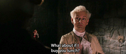

--both of them are perfectly well aware that Crowley's outfit would get him just as killed as Aziraphale's.
And that's why Aziraphale's expression is annoyed when he has abandon his "standards" and change his clothes. Because Aziraphale's the one who needs the favor, Crowley makes him take one for the team and wear the goofy hat.
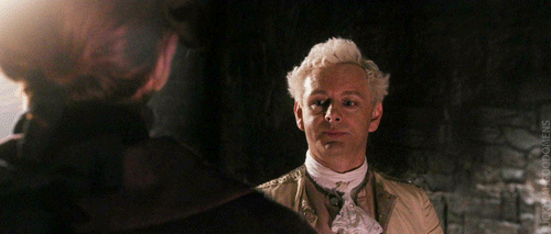
The clothes Az. changes into here still tell people that he's rich, but they also say he's a hardcore Revolutionary. The red jacket in a current cutaway style, the cockade and sash, and the bonnet phrygien (the red garden-gnome cap) all announce this guy is a huge supporter of the Revolution. His clothes are all still aristocratic in shape and materials (and he keeps his now-unfashionably frilly lace cravat), but he's no longer flaunting obscene wealth in a city filled with angry starving people, and the gnome cap says he's in solidarity with the working classes even if he isn't one of them.
Once he restarts time, Crowley is not leaving that prison cell safely without either changing his clothes or taking Aziraphale with him, because Crowley looks like a rich asshole protesting the fall of the monarchy--which is frankly exactly the kind of thing he'd show up wearing to the Bastille during the Reign of Terror (just like he wears athleisure in Heaven). But Aziraphale's new appearance covers for them both: if the rich-looking guy with no cockade and wearing all black under his almost-black coat is in with this other guy who's obviously a Revolution fanatic, then the rich guy's probably okay, right? He just forgot his sash at home or something. Bees.
Something else happens when Az. changes, too. Look at Aziraphale's new dress from a different angle:
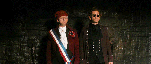
Half-mourning is a white shirt, but a black cravat, so this isn't half-mourning. He's wearing three different badges of the Revolution to make up for the fact that Crowley looks like a Satanic libertine (which tbf he is), but Aziraphale's new ensemble is black and dark red.
Y'all. Aziraphale changes into Crowley's colors.
Now, this is a more fashionable and higher quality version of what the executioner is wearing, so Aziraphale has very plausible deniability here; if anyone ever pulled him up on it, he could say he just copied our man Jean-Claude.
But let me show you what English fashion looks like right now:
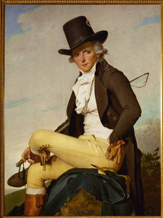
This is a French painting of a wealthy Frenchman, but he's wearing the English 'Corinthian' style. It was painted in 1795, so this would have been the very cutting edge of fashion in England in 1793, and the fabrics and colors look right at home in Revolutionary Paris. (He's wearing the cockade on his hat, btw.)
Look at all that angelic white! The buttery almond of the buckskin breeches, the golden kidskin gloves, the rich tan of the riding boots! The blue of the greatcoat! All colors we know Aziraphale prefers!
And yet this is what Aziraphale chooses:

We know from the entire rest of the show how very particular about his clothes Aziraphale is. And yet 150 years before he (accidentally) admits in words that he's Crowley's friend, Aziraphale wears Crowley's colors to take him to lunch to say thank you for a rescue.
When we decide whether a character's speech or action is equivocation, one of the things we check is whether equivocation (and deception generally) is something that character does elsewhere in the text, which, with Aziraphale, hahahahaha, DUH. He's already using equivocation in this scene.
The lunch date itself is equivocation on Aziraphale's part. Aziraphale tries to thank Crowley for the rescue, but Crowley says,

So Aziraphale says,

No more words like "thanks" or "rescue" used, but a couple hours of good food and drink and conversation, Aziraphale hopes, will express the gratitude toward Crowley it's not safe to speak aloud. With this, Crowley and Aziraphale explicitly establish that they are equivocating for each other's safety and using coded communication--immediately before Aziraphale changes into Crowley's colors.
So yes, Aziraphale may well copy the executioner's clothes. But consider: When a character who can't speak or act openly says or does something that has two or more possible meanings, this can be read as equivocation.
We don't get a face reaction from Crowley about Aziraphale's new 'fit, so we can't be sure how he feels about this. But this whole scene is, even on its surface, about 1) the meaning clothes transmit to a viewer ("Oh good Lord," says Aziraphale when he sees what Crowley's wearing) and 2) how to show gratitude and appreciation when you can't speak of them openly. And we know Crowley notices clothing and clothing colors, because look at what he wears, like, ever. So it's very reasonable to presume he notices Aziraphale wearing his colors, and it fits well with both the rest of Crowley's actions in this scene and with his being very hurt and angry when Aziraphale later characterizes their interactions as "fraternizing."
Right, so we've covered what's going on with the husbands' clothes, and we've looked at two examples of equivocation on Aziraphale's part, viz., lunch and his change of colors. (Here's an example of equivocation on Crowley's part as well.) Now let's look at that super interesting thing Crowley says about Aziraphale's first outfit.
Here's the line:
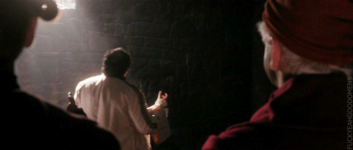

Crowley follows up here on earlier lines in which he teases Aziraphale for coming to Reign-of-Terror Paris for crepes: "Dressed like that?" meaning Aziraphale was guaranteed to get arrested dressed like an aristocrat. The top layer of equivocation is always an innocuous meaning: the plausible deniability meant for the hostile/unsafe listeners. That's Meaning 1.
But "Dressed like that, s/he's asking for trouble" means two other things, too. It's a veeerrrrry familiar phrase, isn't it? We've all heard that arrangement of words in that order before. It's used when people think someone (usually but not always a woman) is dressed to invite sexual attention.
How do we know we're supposed to take this modern meaning from this phrase? This is how:

We have learned in literally the previous sentence to this one that rain has not been invented yet. The only two humans in existence have just left the Garden. Balloons definitely do not exist yet, humans couldn't tell you what lead is, and yet this is a phrase Crowley uses and Aziraphale understands. This tells us, the audience, in the very first line of the very first scene with these characters, that their speech is anachronistic and modern, and that we are to understand their phrasing in its contemporary sense.
So. When Crowley says "Dressed like that, he was asking for trouble" in 1793, we should read that in the context of the scene and in the senses the phrase carries to us today.
And since Crowley is using a phrase that means the executioner is dressed to invite sexual attention, and the executioner is wearing clothes identical to Aziraphale's, then Crowley is necessarily telling Aziraphale that when Aziraphale was wearing those clothes--those frilly, effete, unfashionable-for-decades clothes that nobody else likes and the French now murder people for wearing--that was, in Crowley's view...provocatively sexy. Meaning 2.
"Dressed like that, s/he was asking for trouble" is also what people say to justify violence, especially sexual violence against women and queerphobic attacks against men perceived as gay or just 'insufficiently' 'masculine'. In fact justifying assault is likely the most common way this phrase is used today by a wide margin. Meaning 3.
Crowley's joke isn't even really a joke in this sense; it's a vicious barb. And, because it must, it sounds like it's at Aziraphale's expense: You wore the wrong clothes, you weren't careful enough to guard yourself against the men who want to do you harm, so you deserved the trouble you got. Meaning 1.
Except remember: Crowley is also dressed for trouble. And Aziraphale is aware of this. Crowley's 'fit would be almost as offensive to the Revolutionary French of 1793 as Aziraphale's Rococo pastels, and probably just as likely to get him arrested and murdered by the state if he weren't making letting Aziraphale keep him safe by wearing the cockade and the silly hat. Crowley's not saying anything about Aziraphale here that he's not also saying about himself; and as we know from Aziraphale's initial "Oh good Lord" when he turns around and sees Crowley's black and red half-mourning (with extra black and gobs of silver), Aziraphale knows it.
Then why the rapey joke, Crowley?
This is fucking why:
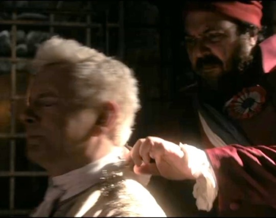
Crowley rocks up at the Bastille just in time to witness some grubby fucker assault his friend. Assault the person Crowley will greet 15 seconds after this as angel.
Crowley's first act after freeing Aziraphale is to send this dude to his death. Nope! Aziraphale is the one who arranges to have the executioner killed in the clothes he would have killed Aziraphale for wearing. He takes Jean-Claude's ability to speak (but not to make sounds, interestingly! Jean-Claude can still whimper, Jean-Claude can still cry!) so the executioner can't tell anyone about the 'mixup.' It's unclear which of them blocks the executioner's power of speech. The vicious joke about assault in Meaning 3 isn't at Aziraphale's expense at all. It's not You wore the wrong clothes, so you deserved the trouble you got. It's If this guy thinks you deserve trouble for wearing the wrong clothes, he can eat his own rules.
And that's the other piece of evidence that, along with Crowley's ensemble, shows us the audience and Aziraphale which meanings Crowley intends with his equivocation. Meaning 1 is cancelled out by Crowley's clothes. That leaves Meanings 2 and 3.
Crowley and Aziraphale share clothes as a common interest. They don't have the same style, but they're both aware of current fashions, and Heaven and Hell aren't. You can't tell me Hastur or Uriel would recognize the significance of Crowley saying "Dressed like that, he's asking for trouble" about someone else while wearing black stockings and cravat and waistcoat himself. And that means Anything the husbands communicate to each other through clothing choices goes undetected by their masters.
SO. With all this in mind, let's go through the 1793 scene again and look at what their clothes help them say without words.
Concluded in Part 2!
#good omens#good omens 2#good omens s2#good omens costumes#good omens fan theory#good omens meta#good omens analysis#aziracrow#azcrow#ineffable husbands#aziraphale x crowley#azicrow#good omens 1793#good omens 1984#good omens clothes and equivocation
576 notes
·
View notes
Text
Work acquaintance, ostensibly as a joke about me and my interests, asked if I had any educational reading recommendations about "Santa's sleigh"
So, to pass the time, I thought we'd have a dialogue about the history of urban vehicularization, pedestrian encounters with vehicles, and control of space and mobility, through the "vehicle" (pun intended) of a case study of carriages and sleighs in eighteenth-century Amsterdam.
---
And none of this is to be taken seriously, I'm just saying words recreationally.
But Amsterdam is important in the history of urban space. It was the site of early speed limit regulations for vehicles: In 1681, a bylaw limited vehicle speed to walking pace (stapvoets), and a 1696 deposition describes the servants of a sheriff stopping a driver for driving too fast. By the 1770s, the sleigh-man's guild had 285 sleigh-men active year-round, not counting unregistered personal sleighs, or those who used sleighs over snow in winter. The (colonialism-fueled) expansion of the city's infrastructure (in the context of maritime trade and East India Company profits) allowed sudden, dramatic architectural expansion, though there was uneven adoption of new transportation methods of wheeled vehicles in newly-built edges of the urban area (where textile factories were situated) while maintaining the architecture of the dense streets of the medieval city core, so that sleighs and carriages existed side-by-side in a way that was distinct from the streets of Paris and London.
In 1790, visiting German scientist Georg Forster described Amsterdam as such: "The whole day long, a continuous thunderous roaring dominates. The manifold carriages of mayors, councilors, state officials, directors of the East India Company, physicians and the lavishly rich, the unremitting transport of goods [...] obstruct the way of passage and cause a constant yelling and rumbling [...]."
But history scholar Bob Pierik (in an article that opens with Forster's lamentation) describes how Amsterdam was an early site of "vehicularization" and related street regulations, and he finds this notable and worth considering because it anticipated and predated the more famous and more widely discussed urban regulations and policing of properly-industrialized nineteenth-century London, which allows us to perhaps rethink the historiography and "teleological narrative" of modernity.
Since vehicles, pedestrians, and their attendant regulations were experimented with in the Dutch metropole decades before the mechanized transportation and "politics of paving" in Victorian Britain, there were what Pierik calls "multiple modernities" existing simultaneously in the streets of early modern Amsterdam (a "proper metropolis" at that time).
---
Evidently, "sleighs had been an important part of street life in Amsterdam long before coaches and chaises." Indeed, Pierik invokes the observation of English author Samuel Ireland from 1789, describing a visit to Amsterdam: "[C]arriages with wheels, except for the use of the nobility and gentry, were not suffered here for many years […]. A sleigh, as the Dutch term it (the French a traineau or pot de chambre) is now in use: it is the body of a coach, without wheels […]."
And guess what? They dragged those sleighs over pavement. No wheels, but only "an oily cloth (a smeerlap) was used to smoothen the passage."
A piece of rhyming graffiti, written on a wagon, and collected by Hieronymus Sweerts between 1683 and 1690, reads:
Who drives fast make a quick start
But easily loses their horse and cart
Careful and sen-
Sible is a good carriage man.
(For all excerpts and arguments here, by the way, see: Bob Pierik. "Coaches, Sleighs, and Speed in the Street: "Vehicularization" in Early Modern Amsterdam." Journal of Urban History, Volume 50, Issue 4. First published online 2 September 2022. All of this research was done by Pierik.)
Along with sleighs for transporting goods and products, there were sleighs for personal transport: a toeslee (closed sleigh) and koetsslee (coach sleigh).
---
And what of the pedestrian? Early on, at least in the Netherlands, vehicles were perceived as dangerous to pedestrians, and it could apparently be seen as arrogant to flaunt aristocratic wealth by gallavanting around in an expensive personal carriage in the city center, and so regulations and public opinion seem to indicate that pedestrian right-of-way was prioritized. An Amsterdam bylaw from 1528 indicated that drivers of sleighs could not sit upon their vehicle but had to walk beside it, because:
"[D]riving caused great disorder, often mixed with malice, as people, specifically women and children, are at great danger of being driven over."
An important city bylaw in 1634 banned the use of coaches within city walls. But the prohibition was gradually loosened, such that conflict between coach-drivers and pedestrians was frequently mentioned in depositions. But by the 1730s, something had changed. In Pierik's words:
[Quote.] Pedestrians now shared space with vehicles and had a new responsibility to protect themselves […]. [T]he language used in Bicker’s chronicle is very telling: In 1734, exactly a century after the vehicle ban, he wrote of a coachman who “had the misfortune of driving over a poor woman who died shortly thereafter.” Here, rather than the “women and children first” rhetoric that we have seen in the sixteenth-century regulations on the sleigh-men in the previous section, the coachman was also presented as a victim, and the right of the coach’s presence on the streets remained undisputed. Similarly, in 1746, Bicker Raije wrote of a nine- or ten-year-old boy who was “negligently watching around him” moments before he was killed by a sleigh horse. [End quote.]
The trend continued, and in the nineteenth century, British authorities would notoriously enact sweeping policies to control mobility in and access to urban space, in ways that prioritized "economic" activity while reinforcing class hierarchies. In fact, Pierik sees this vehicularization of the early modern city as "at once a civilizing and a colonizing project" in the same vein as what Koslofsky described as "nocturnalization," or the way in which, in London and Paris, "the elites of the court and the city colonized the urban night" with their affordance of transportation and a mobility not always shared with those lower in the hierarchies.
---
We are, of course, reminded of another aristocratic figure who, traveling through the night, engaged in this civilizing mission of nocturnalization and colonized public space with their vehicle. Someone who, like the early modern vehicle regulations of Amsterdam, is associated with Dutch tradition. Someone whose persona is closely connected to mobility, even hyper-mobility, drawn forth by their sleigh:
Santa Claus.
55 notes
·
View notes
Text
Pana Evening Dress
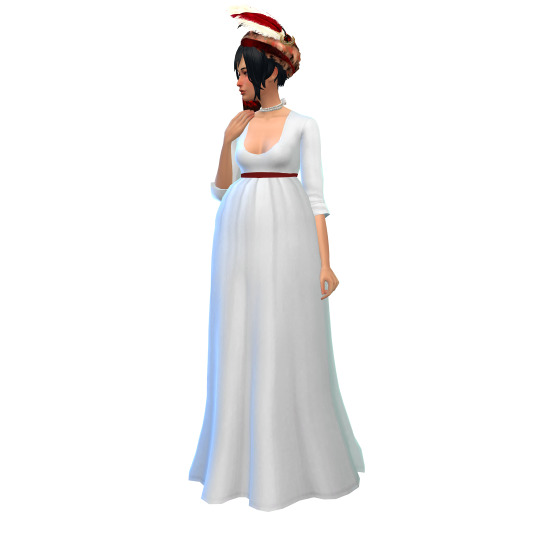
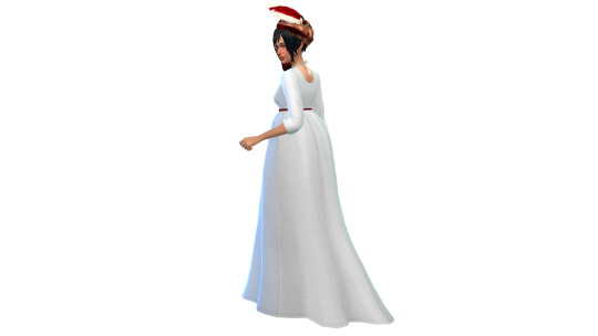
This simplistic evening dress, with its awkward, transitional silhouette and less-than-modest neckline, is perfect for any fashionable 1790s lady, or any less fashionable 1800s lady.
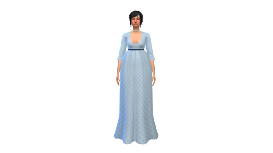
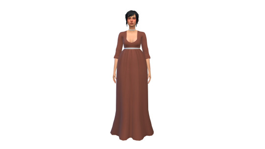
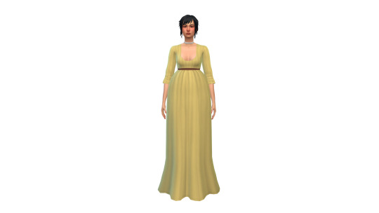
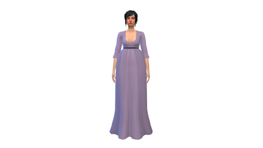
BGC
Custom thumbnail
39 swatches
Tagged as feminine
Found in the Long Dresses category
Casual, Formal, Party, Hot Weather
Polycount: 4658
All LODs
Normal map
Color tagged
Display index by decade
Disabled for random
Download (SFS)
Alt Download (Mediafire)
#my cc#ts4 historical#ts4 regency#ts4 1790s#ts4 1800s#18c#19c#sims 4 historical#sims 4 cc#ts4 cc#ts4cc#sims 4 custom content#historical cc#the sims 4#sims 4#ts4#af cc#fullbody#might make a more ~sleek~ 1800s version of this but also....i might not
168 notes
·
View notes
Text

Women's Green Round Gown, January 1793.
#historical fashion#fashion plates#women's fashion#gown#round gown#dress#clothing#year: 1793#decade: 1790s#century: 1700s#18th century#nationality: french#era: georgian#era: late georgian#era: french revolution#era: regency#regency (unofficial)#green#day wear#day dress#month: january#colour illustration
4 notes
·
View notes
Text
They didn't have twitter beef in the 1790s so instead northern irish men had to compensate by publishing 350 page books covering their thoughts on every single topic of conversation anyone in belfast had ever brought up for the past two decades and king billy too also apparently
90 notes
·
View notes
Text


I’m not crying, there’s something in both of my eyes
15 notes
·
View notes
Text
After African missionaries circulated initial reports about the slave labor behind sugar in the 1790s, some consumers desisted from sugar entirely -- "anti-saccharites", mostly fervent Christians such as Quakers. As the East India importers created a market in Britain, anti-slavery societies became their free marketing teams, widely distributing pamphlets such as "What Does Your Sugar Cost?" A Cottage Conversation on the Subject of British Negro Slavery. Meanwhile, in America, the free-produce movement was led by black women, who encouraged their segregated groceries to buy only slavery-free goods.
The bind that free Black Americans faced in sourcing their food and raw materials was especially harsh. They were forced to buy "ethical" expensive cotton from white farmers instead of black slaves, which frustrated those trying to support black businesses. They sought coffee from Liberia and Haiti, hoping that the majority black demographics of these countries would support black uplift and prevent slave labor, and these created natural (and, indeed, slavery-free) coffee industries in those countries which indeed persisted for some decades.
The most surprising part of this story comes in the 1840s. After abolishing slavery in 1836, Britain had placed tariffs on slave-produced sugar in order to ensure fairness for British sugar producers who paid their laborers. This inflated sugar prices generally. Without tariffs, "free-labour sugar" would cost three times as much as its competition, defeating the East Indian importers' argument that slavery was a corrupt process which artificially inflated prices. It soon became clear that the writing was on the wall. In 1845, the primary importer of "free-labour sugar" exited the sugar market, and the following year, Britain decided to remove all the tariffs, for the benefit of consumers. Free-labour sugar completely vanished as a category thereafter.
Meanwhile in the United States, abolitionists criticized the free-produce movement as ineffective; similar to "free-labour sugar", it only placed an extra economic burden on those struggling to live ethically. It was recognized on both sides of the Atlantic that making individual consumer choices was not enough, and that systemic change was necessary to permanently eliminate slavery. As a status symbol, though, "free cotton made by escaped slaves" continued to be worn in Britain and attracted comment in aristocratic salons into the 1860s. In this final stage of the movement, free labor was considered to be part of a civilizing project, a way to train ex-slaves in useful arts.
https://www.reddit.com/r/AskHistorians/comments/138i5at/comment/jj04qsx/?context=3
889 notes
·
View notes
Text
History grounds us.
History can help us find our footing. This is not because we can ever know what will happen next. It is rather because history can make familiar some consistent patterns of human life.
Such prompts for further thought are not analogies. When we think in terms of analogies, we get stuck on the differences, and those sticking points then becomes an excuse not to think historically at all. Of course what comes next in the 2020s won't be exactly like the 1790s or the 1860s or the 1930s or the 1990s — the reference points I am choosing here.
But in recalling these epochs (or others) we can start to see certain resemblances, certain patterns, and get ourselves thinking again.
In this spirit, I offer these four scenarios for Trumpomuskovia, the musko-trumpified America that is already upon us.
The 1790s. Rescuing Russia
One possible Trumpomuskovia rescues Russia: actively, passively, or just by collapsing. This scenario draws from the eighteenth century, the time of the partitions of Poland.
Empress Catherine’s Russian Empire, founded just decades before, was in trouble. It had no clear means of succession, and Catherine herself was the German wife of a murdered tsar (her husband). It saved itself by warfare in Ukraine, bringing under its control its fertile territories. Fortunately for Catherine the Great, its western neighbor, Poland, suffered from tremendous inequality of wealth, and was rent by struggles between clans of magnates -- or, as we would say today, oligarchs. One of her former lovers was made king. He did not always do what she wanted, but his Poland was not going to effectively resist. In this situation, Russia was able to intervene in Poland, brings about its partition, and claim Ukraine (beginning the relatively short historical period when Ukraine was ruled from Russia).
Today the Russian Federation, founded a few decades ago, is also in trouble. It has no clear means of succession, as its ruler has done away with democracy and established a personal dictatorship. He has a fantasy of Russian unity with Ukraine, based in some considerable measure on the exploits of the eighteenth-century empress, Catherine. Like Catherine, Putin counts on divisions within (and among) western powers. His campaign for Ukraine has been extremely bloody, and has brought the Russian economy to the point of collapse.
But like Catherine, Putin has favorites that are close to power: Musk and Trump. They will not always do exactly what he wants, but they probably generally will, and their will certainly bring a fractious oligarchy. Putin is counting on the Musk-Trump regime to rescue him by turning American power away from its allies and towards Russia. Quite a few of Trump's proposed appointments, and much of Musk's rhetoric, suggest that rescuing Russia will be the priority.
The 1860s. Secession
When Poland was partitioned at the end of the end of the eighteenth century, it was a shock. Could a major country simply disappear from the map? A second scenario is suggested by the 1860s, when the United States nearly did.
Some of Poland's rebels, such as Tadeusz Kościuszko and Kazimierz Pułaski, crossed the Atlantic to help America's fledgling republic, which they hoped would avoid the mistakes of their own. Kościuszko saw slavery as a curse that could weaken the United States, much as serfdom had weakened Poland. Unlike Poland, the young American republic faced no great neighbor, at least after the Louisiana Purchase of 1803 withdrawal of the British after the War of 1812. But the issue of slavery was almost enough to break the American republic anyway. In the aftermath of the Civil War, whites in southern states were able to exert disproportionate political power, by preventing African Americans from voting, and by dominating first the Democratic and then the Republican Party.
The United States in 2025 will be, in some sense, the victory of the old south. But is it a sustainable one? When people think of themselves as rebels they sometimes push too far when they actually have power. The social and cultural policies proposed by Trumpomuskovia are mainstream in much of the country, but not for most of the population. And the implementation of some of them, especially mass deportation, can reveal fault lines inside the federal government, between the federal government and the states, and among the states. An attempt to deport millions of people in 2025 could lead to clashes within and contests for control over the armed forces. Over the longer run, repressive social and cultural policies could lead to shifts of population, making the differences among the states still greater than they are. Trump has already been telling his people that the differences between them and the "enemy within" are greater than those between America and China or America and Russia.
Will Trumpomuskovia be stable? It is not a great leap for people to decide to move to California, on the logic that the state could make it alone, and already has a secession movement. Indeed, these moves are already happening.
From there it is a small step to start thinking of constellations of states that would be wealthier and more functional than the current United States. A west coast union would certainly be richer, and would have its own borders with Canada and Mexico.
It is sad to think about. But the next round of musing could easily follow: a west coast union plus Canada plus the New England, New York and Minnesota would have an economy about 2/3 the size of what was left of the United States, with a far higher GDP per capita, a better standard of living and longer life spans — just going by today’s numbers.
Such a hypothetical country would not have to worry about free trade with Canada, since it would be Canada; and it would not have to worry about free trade with Mexico, since it would have a border with Mexico. Unlike the residual United States, aka Trumpomuskovia, it would not be fighting a trade war with the European Union.
The 1930s: Electoral Fascism
This is the most familiar of the thought experiments and so probably requires the least elaboration. The resemblances are all familiar.
A politician who has attempted a coup d'état comes to power later anyway on the strength of elections, with a minority of the overall vote. He is supported by conservatives who want the Left to suffer and businesspeople who imagine that all he will do is suppress the trade unions. This politician speaks angrily of the media as "the enemy of the people" and condemns his political opponents as "the enemy within." He hopes for some kind of emergency in order to declare a state of permanent emergency -- for Hitler this was the Reichstag Fire of 1933, for Trump it could be something entirely imaginary. At that stage of fascism, an event in the real world could be made an element of a conspiracy; at the current stage, the event in the real world might not even be necessary.
Trump speaks, sensibly enough from his fascist perspective, of "Hitler's generals." What Trump has in mind is Hitler's personal control of the armed forces, which began in 1934 when soldiers and officers began to swear a personal oath to the Führer instead of an oath to the German constitution. It was indeed this event that made of Hitler the Führer, the Leader, rather than simply the chancellor or prime minister. Hitler's men opened their first concentration camp right after he came to power; if Trump's men are able to round up millions of non-citizens, they too will be in camps -- an institution, as we know, that can be turned to other purposes than its initial ones. The first major act of violence of Hitler's SS, aside from establishing those camps and running them, was a mass deportation of non-citizens.
From this scenario come the political lessons that I have tried to make familiar in other posts and in On Tyranny.
The 1990s: Reliving Russia
The fourth and final scenario is one that some of us will remember. Indeed, the 1990s in Russia might be seen not just as a point of reference, but as an origin story of Trumpomuskovia. In my book The Road to Unfreedom, I tried to argue that Russia, with its oligarchy, media monopolies, and fascism, revealed possible futures for the United States. This has never seemed a more reasonable place to begin an analysis than right now.
In the 1990s, after the collapse of the Soviet Union, men who became known as oligarchs struggled to control the parts of the economy that could return quick profits -- the minerals, the metals, the pipelines, the hydrocarbons. All of this took place against the background, especially in the West, of either intensely naive or intensely cynical free market ideology: what ever is happening in Russia must be for the best, since without the state the magical forces of capitalism will ensure growth, freedom, and democracies. Instead, the collapse of the state led to wealth inequality, a battle for final control at the top, the perfection of alternative realities and media disinformation, and now fascism and a war of atrocity against Ukraine.
In that struggle, a doddering elected president, Boris Yeltsin, was surrounded by a cluster of oligarchs. The successor they chose, Vladimir Putin, was eventually able to tame them all, and become the oligarch king, the boss of bosses. In doing so he did not clean up the system, but simply insured that all of the dirt was his own. This situation rather strongly resembles the America of today, with an elderly president, Donald Trump, surrounded by a cluster of oligarchs. The oligarchs have chosen his successor: JD Vance.
It is very hard to tell, right now, who is actually running the show, if anyone. All of the headlines are about shocking personalities who do not identify in any sense with the larger interests of the country. Elon Musk and his tame DOGE seem set to dismantle the parts of the American government that are profitable and seize them for himself. All of this recalls late Yeltsin, and thus the transition of Putin. A difference: ketamine and fentanyl for the White House, not vodka as in the Kremlin back then.
Here’s the twist: there is actually an overlap of personnel in the two scenarios, and so now we are perhaps dealing with one history, rather than the past as an inspiration for the present. When Putin was elected president of Russia in 2000, no one would really have imagined that he would not only survive the oligarchs but become their chief and still be ruling a quarter century later. So is the Putin in this scenario… Putin?
It is tempting to imagine that Putin, who has to be regarded now as one of the oligarchs around Trump, could also unexpectedly end up on top, as America relives the Russia of the 1990s. He certainly occupies quite a lot of Trump's mental space. He is working to bully Trump, to make him feel subordinate (for example by showing naked pictures of his wife on television). Nikolai Patrushev, a central figure in the Russian intelligence and security apparatus under Putin, reminds Trump that he has debts to pay. Putin clearly has like-minded allies around Trump, Musk most importantly. Some of the people at the top of Trump's preferred national security team (Gabbard, Hegseth) mix Putinism and anti-qualifications.
Or is the Putin in this scenario Vance? Putin is now 72, and Trump is now 78. Will either of them be around in four years? Putin’s mass murderer client Assad is on the run in Syria and the ruble is well under a penny. At some point, one can at least imagine, Putin’s charisma fades. It is not hard to imagine Trump or Putin or both expelled from oligarchs' island. Putin won after the 1990s as an outsider; who is the dark horse now? Vance is the closest thing to a Putin-like figure in this scenario: odd background, less money than the people around him, rich patrons, clear ideology, smarter than he seems. But might one of his oligarch patrons actually emerge on top?
Or could Trump himself, despite looking like Yeltsin, surprise us and end up being the Putin of the scenario, first getting close to the oligarchs, then using the government to freeze them out, and finally himself getting rich, as he has always wanted?
But if our Reliving Russia scenario is the helpful one, the crucial point of resemblance is the dismantling of government and the oligarchical claim on whatever is left. Who emerges on top is, in some sense, secondary.
Combinations
History helps, because everything that has happened was something that could have happened. And those things that could have happened, usually unexpected at the time, stretch our minds about what might happen.
In the near future, in coming months and years, these four scenarios can intersect and combine. A Trumpomuskovia that seeks to rescue Russia can also be one that relives Russia. A Trumpomuskovia that looks fascist is also one that risks secession.
History warns. It would be wonderful if these scenarios helped people in positions of responsibility to make good choices.
History surprises. Strikingly, we see in most of the scenarios presence of Ukraine: for the old Russian Empire, and for the present one, and for that matter for Hitler, whose chief war aim was the control of Ukraine. Ukraine is a useful shortcut as we try to evaluate Trumpomuskovites: what do they say about Ukraine? As a rule of thumb, those that wish for its fall also want the fall of the American republic. I would expect that the first actions regarding Ukraine will be a harbinger of what is to come for America if Ukraine is sold out, expect America to be sold for parts.
History enlivens. It gets us outside the box of the daily outrages and our emotional responses. As we think outside the box, we sometimes catch a glimpse of what is inside it. In all four of these past moments, we see the problem of inequality somewhere close to the origin of political collapse. Any future rescue operation for the American republic will have to begin there.
39 notes
·
View notes