#cutting edge stencils
Explore tagged Tumblr posts
Text

Making some new patches
#ive got a blazer someone gave me that im gonna diy#love the nina simone one#im gonna make a billie holiday one next#i might write something around ian#diy projects#patches#i use a paper stencil and cut out the shapes with a razor blade or exacto knife#the secret is to use a gluestick to stick the stencil to the paper cause it will hold down all the small corners and edges#it usually doesnt leave residue on the fabric but this time it did maybe cause im using velvet?#ian curtis#nina simone
1 note
·
View note
Text
new tutorial, this time for "fake" medals you can use to decorate your jacket or any stuff really.
give yourself a weird award you yourself came up with, coorperations do it all the time!

stuff you will need:
-scissors
-variation of pliers
-a stencil, the shape you want the fabric part of ur medal to be, make it a bit bigger so youll have room to sew
-piece of fabric two times the size of your stencil
-sewing needle
-sewing thread, i use dental floss
-safety pin
-paperclip, or just iron wire, around 1 mm Ø
-bottlecap
start with cutting out the two pieces of fabric for your medal using a stencil

pin em to eachother, with the sides you want to be on the outside, facing inwards.
sew along the side but keep the top open, so you can flip it inside out.
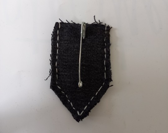
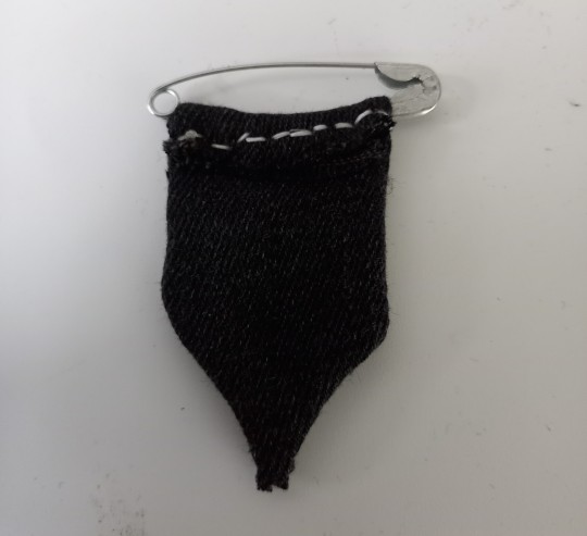
now you can flip in inside out, and fold the top around the safety pin, and sew it down
make sure the side of the pin that doesnt open is the one being sewn down. the opening part should be on top.
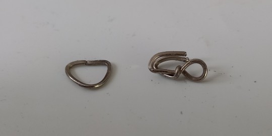
bend the paperclip into something resembling the shapes in the pic below using the pliers, doesnt need to look good, mine sure dont
bend the edges of the bottlecap to the inside, and pin the hook part of the right iron wire thing down under the edge
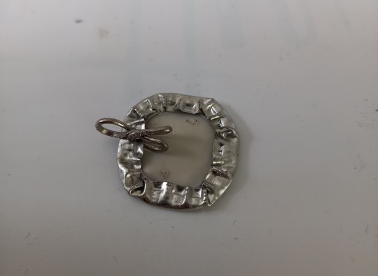
connect the iron wire hoop you made (left in picture) to the piece of iron wire on the bottlecap. fold the point of the fabric part of the metal around the hoop and sew it down.
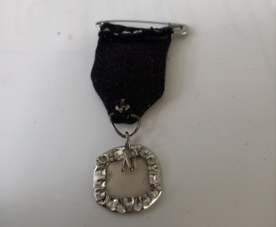
should look something like this.

now you can add decorations, you can paint the cap aswell as the fabric part, using patterned fabrics can also make ur medals look nicer.
ive seen people advise using modgepodge to seal the painted cap, instead of nailpolish, i dont have modpodge where i live but use that if youre able to get ur hands on it.
i hope this was clear, let me know if you want tutorials on any other stuff. i like doing them a lot.
3K notes
·
View notes
Photo
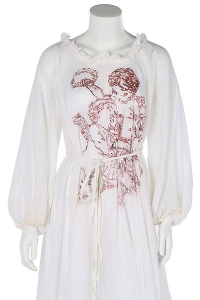

vivienne westwood 'sun-wheel' gown, from 'dressing up' collection, autumn 1991-92, “voluminous cut, the white muslin stencilled and printed in red and silver with cherubs, with ruffle to neck edge, full sleeves, tie belt” .
7K notes
·
View notes
Text
I made the galactic rib cage shirt graphic with a freezer paper stencil
I drew the bones on freezer paper, roughly tracing an existing rib cage shirt I had

Freezer paper has a plastic backing--the purpose is to make it waterproof, but someone discovered that it's just right to make a temporary iron-on adhesive, leading to the idea of freezer paper stencils. Draw or print (ink jet, do not put this stuff trough a laser printer) a line art image on the paper side (so no need to reverse it), cut out the parts of the image that you want to put on the fabric, then use a hot iron to tack the pieces in place. Since the freezer paper sticks completely down, the edges will stay crisp as you add paint. (In my admittedly limited experience, it doesn't stick as well to fabrics with a high synthetic content.)
Use a sponge/foam brush to dab the paint onto the exposed fabric. I use acrylic paint, and only recently finally got fabric medium, which allows the paint to stay more flexible when it dries. Even without fabric medium, the paint won't necessarily crack if you keep the application light enough, in my (again, limited) experience
When everything's dry, the freezer paper can easily be peeled off
For this shirt, I started by dabbing on splotchy white, followed by various pastel colors, then did a layer of spatters using an old toothbrush, hoping for a cosmic nebula look. I let everything dry thoroughly before removing the freezer paper.

I also pressed the painted areas through baking parchment paper, and also from the back, before finishing the shirt
242 notes
·
View notes
Note
Question...how do you make your patches? They seem so fuckin cool. I'm working on a vest and a jacket atm, and I'd like for them to be done by the time a pride fest rolls around next month.
Main technique I use for making patches nowadays is linocut. Its best suited for mass production of patches.
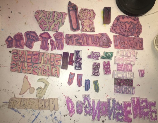
Make sure to remember your carving the mirror image so you have to flip all the text. Using tracing paper to flip the design is a good trick, as well as leaving graphite marks on side, then pressing that to the lino to leave the marks in the same spot. Another trick with pencil is to view what ur carving in negative space quickly, put a paper over your design and shade over it with pencil, darker marks will be where you haven't carved yet.
I use speedball fabric ink, it takes 1 week to set then will be fine to be washed. I have magenta, violet, turqouise, and white. They have a limited range of fabric colors at the store. I have seen gold and silver fabric paint for sale and I will investigate it one day.

I use a speedball roller, i find the smaller one to be better than the big one as I can be more precise and waste less ink.
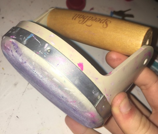
I got a fancy handle for $40 but the screws fallen out so its broken now so just get some heavy books. I used to use a mug. Whats important is pushing your whole body weight into it.
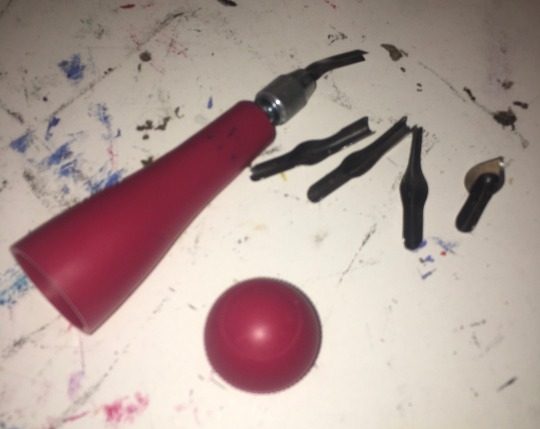
I got a speedball carving tool with different heads I can swap out so I can cut into the lino at different deepness and widths. The heads are stored inside the tool since its hollow and has a screwable removable bottom. I use linocut or dollar store erasers for my carvings. Make sure to wash the ink off your linocuts after your done using them.
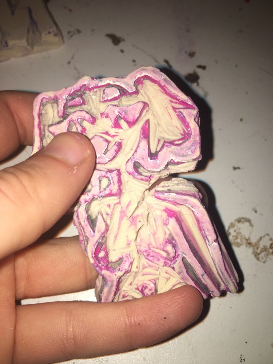
A thing to increase the lifespan of you're linocuts is to use wood glue, some cork or wood pieces, and glued the lino stamps onto them. I dont do that yet so my stamps fall appart from overuse sometime and because I cut way too deep into the lino since I hate chatter.
Chatter is the term for in linocutting when theres little messy lines and stuff. It makes the art more recognisably to be linocut. My work is very clean with no chatter which is why people don't notice its linocut usually. This is a stylistic choice, with diy styles having a lot of chatter can look really cool so experiment with leaving bits of extra uncarvered lino sticking out in ur stamp. I need to experiment and buy some more lino.
You can also use multiple linocut stamps together to make a patch. Some patches ive made have like 8 different stamps. Ive made a dog nonsense patch where each letter was their own eraser stamp. You can also use different colors between the different lino stamps on the same patch to add more color. An effect I like to do is first stamp it in color, then the next day I stamp it in white over the same spot but shifted to the right and down slightly. It makes the text have a cool border 3D effect I love doing.
If making a more detailed picture with colors, i reccomend hand painting patches. I use white fabric paint mixed with acrylics for color to get all the shades i need. Acrylic paint mixed with fabric softener works too.
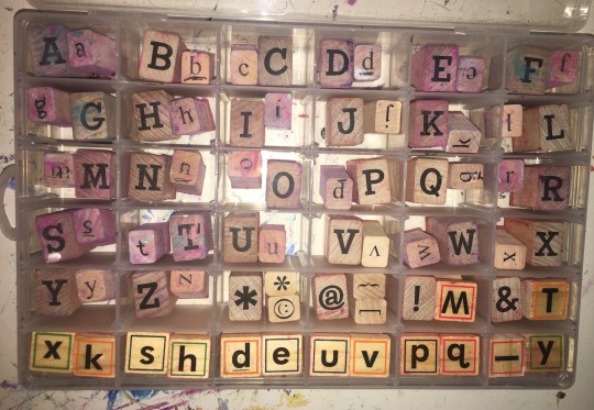
If doing words and you dont want a unique font reccomend using letter stamps. If you want a unique font for that i recommend hand paint for individual or linocut for mass produce.
The positive of letter stamps is the font is neat and can be done quickly. I know from lending them to my roommate that they are very helpful if you have dyslexia and have trouble getting letters right.
A visual effect of the letter stamps is that have a nice boxy edge effect, its an imperfection that adds a personally touch to it. I have both lower and upper case stamps that I got from michaels. You can use a hair band or elastic to hold a bunch of letter stamps together to make a word stamp.
You can use other stamps than letters that you find at craft stores for example my racoon print is a craftstore stamp.
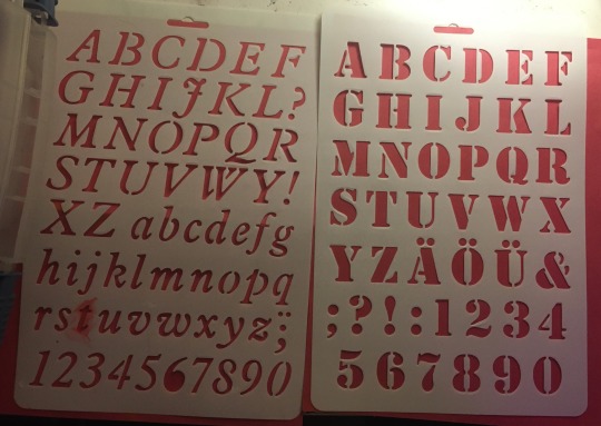
You can also find big plastic letter stencils at the dollar store that you can use to do lettering by filling in gaps with a sponge or or paintbrush. They make special paintbrushes just for using stencils.
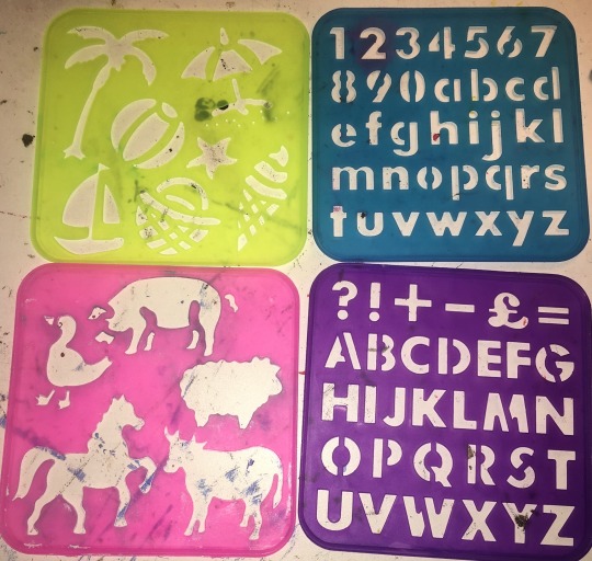
You can also get plastic stencils in the shapes of things, i got some for children and use a horse stencil for my horse smoking weed patch. Easier than drawing a horse myself.
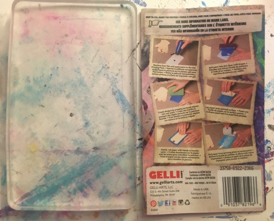
Another technique I use for more unique clean patches is gel plating. I haven't tried printing laserprint images with it as ive seen online a lot but I will try one day. What i personally do is use it to make imprints with chains and physical objects.
Another thing i use with gelplates are any stamps or linocuts that dont have words, or words ones that i fucked up with and forgot to mirror when carving. It flips mirror image twice with the gel plate so it goes back to being right again on the patch.
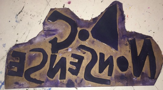
Another patch making technique is using foamboard cut into shapes glued onto cardboard. This is good for a quick test of a design and is very cheap to make. It will not hold under water so is more difficult to clean.
#punk#diy#patches#diy patches#patch pants#diy punk#crust punk#crust pants#battle vest#punk fashion#punk diy#punk patch#queer art#linocut patch#gel plate#linocut#stencil#my patches#patch tips#how to make patches#patch 101
563 notes
·
View notes
Text
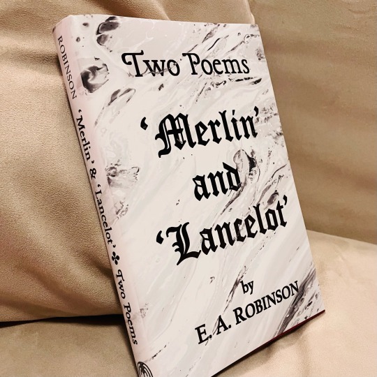
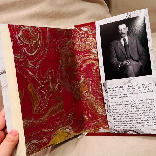
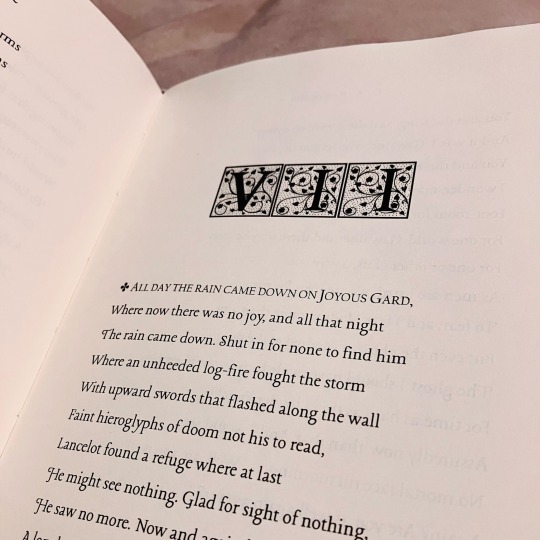
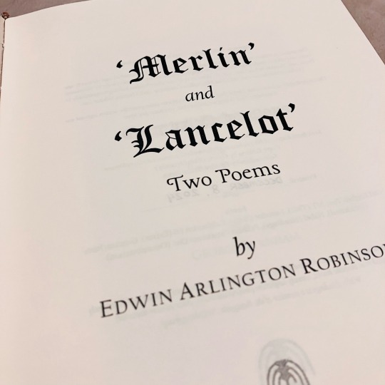
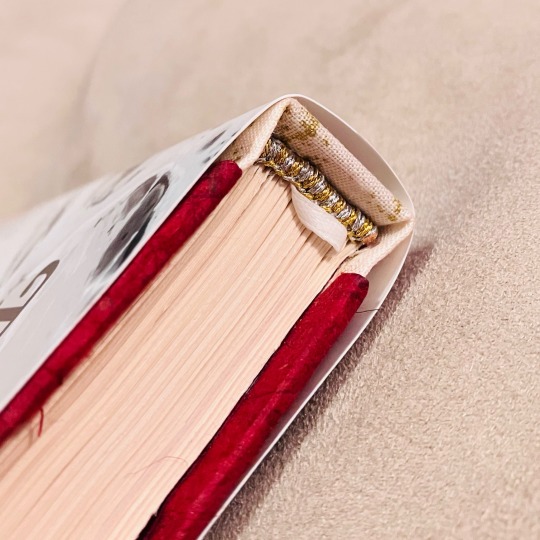
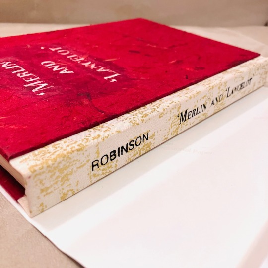
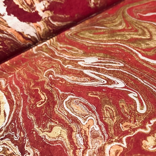
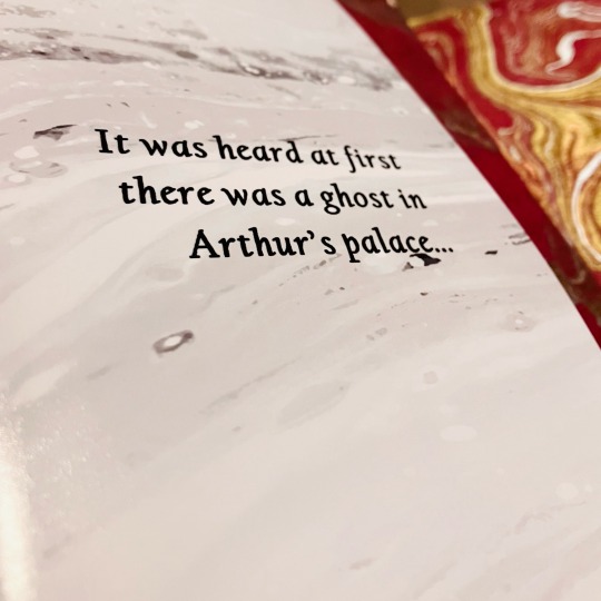
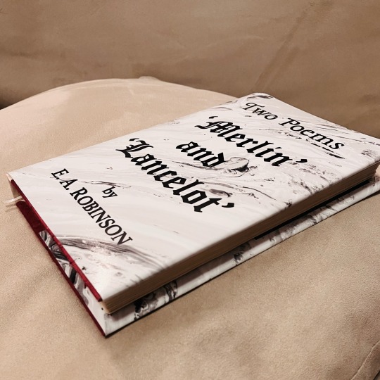
'Merlin' and 'Lancelot' by Edwin Arlington Robinson
This is the first full book I've typeset and bound that is not fanfiction—which means I finally have something to show off to the normies in my life LMAO!
'Twas a Christmas gift for my lovely Misery (@whoawhataconcept), who has dragged me right after her into a fascination with Arthuriana ❤️
✨ Details below the cut! ✨
🤍 NEW METHODS 🤍
Printing at home: In the past, I've sent my typeset PDFs off to a local print shop to be printed, but with access to a home printer for the first time, I battled the fucking thing to print it entirely at home. I had a lot of trouble getting my printer to do the whole thing (I think it was so long that the printer's memory started giving up), so I eventually ended up sending the PDF to print in smaller signature groups at a time. Due to misprinting, I ended up with many good glue sheets & pages to protect drying boards and such
Leather-core for endbands: I finally splurged and bought some leather jewellery cord to use as the core in my sewn endbands and it was FANTASTIC!
Ribbon bookmark: 🤍🤍🤍
Backed papers: I purchased two large sheets of artisan paper for the endpages and the cover material. Both were too flimsy for my comfort, so on the advice of some folks at @renegadeguild, I backed some cut-down sheets with regular printer paper using a mix of 50/50 PVA and rice paste. I pressed them flat between protective sheets and they came out perfect!
Paste mix: I enjoyed working with the PVA-paste mix so much that I used it for the rest of the project for pretty much all of my gluing :)
Using an actual book press: Not much to say here except that I finally have an actual press and it made everything 100% easier haha!
Cricut stencil: My sister donated her time and cricut to help me title my cover and spine (under the dust jacket). We cut out stencils with cricut's stencil material & with stick-on vinyl (when we ran out of stencil material LOL). The spine turned out lovely but with some bleed; the cover was a bit of a mess since the stencil material started peeling up the fibres of the cover paper (which I had somehow not thought to seal). But live and learn!
🤍 BOOK INTERIOR 🤍
Copy-editing: Done by they lifesaving and gracious @highlynerdy, who saved me from agonizing over if the raw text source I took from had typos or mistakes. Thank you again, Gracie 💛
Typeset: I was inspired by the original typesets from when these poems were first published, updated to my own aesthetic sensibilities (as much as I had patience for)! The main body-text font is 'Lancelot' which seemed the only appropriate font to use for this project <3
Art: (Not pictured) I included some art by Edward Burne-Jones, "The Beguiling of Merlin", and "The Failure of Sir Lancelot"
🤍 EXTERIOR DESIGN 🤍
Cover: I originally wanted to do this book in blue, but when I went to the paper store, I could not find any marbled blue paper that wasn't wildly over-budget, so I ended up doing another red book. I tried to stick to a colour scheme of white-heavy monochrome + red + metallics.
Dust jacket: Much to my dismay, I realized that I've been lucky in the past, with access to a small nonprofit print shop where their ordering process involves emailing them and describing what you need. To print a dust jacket, one needs access to a print service with "large format" printing, and as I've discovered, that usually means an industrial printing service. Sorely missing my usual nonprofit print shop, I ended up going with a custom photo printing service, requesting a large photo print on their thinnest paper. Due to my special instructions, the cover came back almost-perfect. The edges were jagged, and the paper was a bit too thick, but it is perfectly serviceable and I'm overall happy with how it came out.
#Withy Bindings#bookbinding#book binding#books#E. A. Robinson#Edwin Arlington Robinson#arthuriana#arthurian legend#arthurian literature
73 notes
·
View notes
Text


Had so much fun binding still need your teeth around my organs for the Renegade Tiny Book Bang this summer!
Typeset (and photos) by @just-a-pollicle.
This fic is gorgeous and set in a swamp, the main character has purple eyes, and the trio ship is called Bouquet, so I had so much to visually work with. I kept picking it up and going "what if I add just one more thing..."
Materials/techniques below the cut
Bookcloth Duo Lagoon. Edge and title paintJaquad Lumiere Halo Violet Gold. Cover paper by Southwest Pattern House.
Some of my earliest sewn endbands, and my first Oxford Hollow! Title was stenciled on, which I would not do again at this size on a rounded spine. Edges were power sanded to smoothness before being painted.
145 notes
·
View notes
Text


The Nightmare Club by Elle Gray
Summary: Hermione and Ron are going back to Hogwarts to do N.E.W.T.s, Ginny isn't. Harry hasn't decided, until he has, in front of the Wizengamot and now he's responsible for Malfoy as well. A tale of enemies who learn to get along, get it wrong and get it on. Everything is purple, some things are on fire and no-one is sleeping properly. But don't worry, there's tea!
I loved doing this bind so much. I tried out even more new (to me) techniques on this one! I did a three piece bradel for the first time, speckled edges, and a two layer stencil for the cover.
I knew for the typeset I wanted to do an overarching tea theme because in the fic there is a lot of tea drinking for The Nightmare Club, so the title page features a tea bag and the section separators are tea themed as well.

Overall I think it turned out great! There are a few things I look forward to improving upon like stiffening the pleather next time, it just slightly wrinkles at the top.

Supplies: * Marbled paper from a Renegade Member * Navy Dubletta bookcloth from Colophon * Stencils cut with my cricut * Vectors for the cover made by me * Typeset done by me
#drarry#bookbinding#renegade_fam#fanbinding#fanfic#ficbinding#grimmauldplacepublishing#harry potter#book binding
185 notes
·
View notes
Text
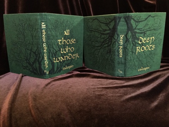


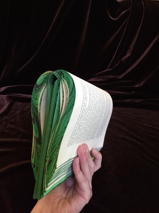
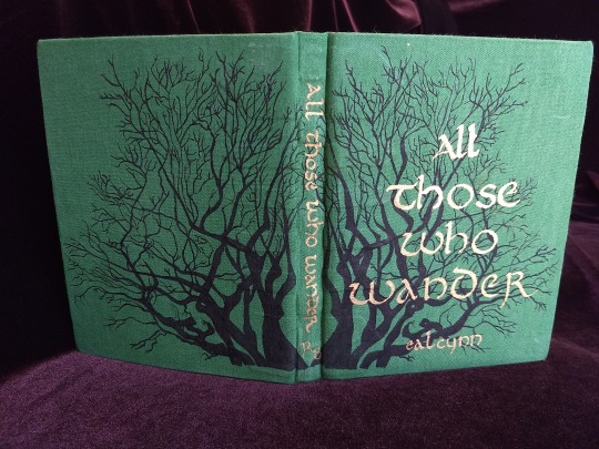
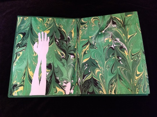
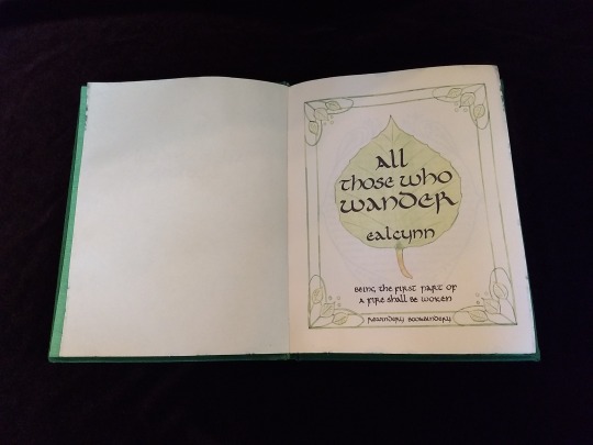
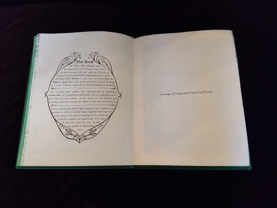

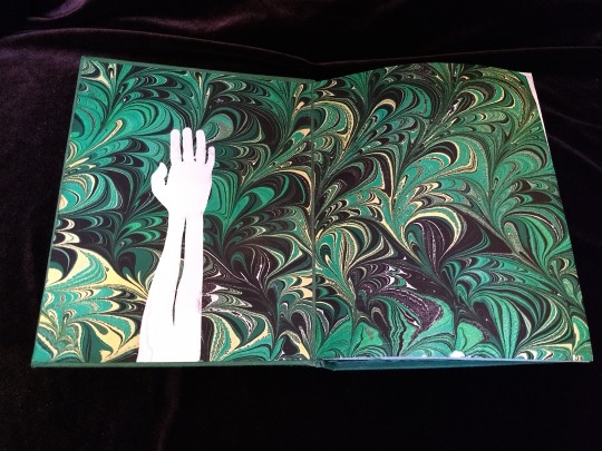
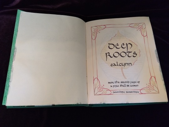
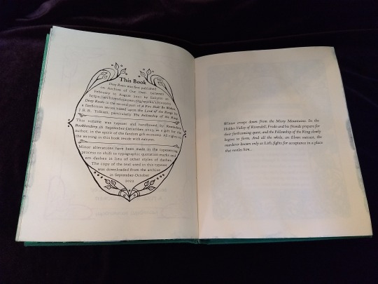
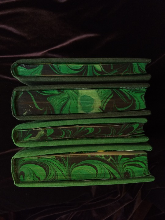


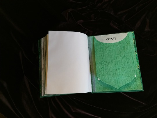

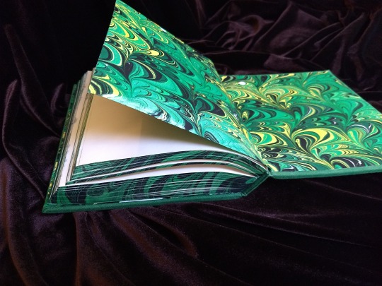

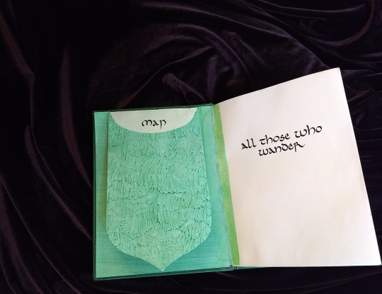

A Fire Shall Be Woken, by Ealcynn. A pair of bindings using the K118 structure, one as a gift for the author and one to keep.
Chapter page illustrations are by Alphonse Mucha, all other illustrations are hand-drawn.
I hope to make a long post later explaining the process in more depth & another to document all my mistakes, but here's the basics.
New techniques learned: Paper marbling, edge marbling, uncial calligraphy, making paste papers, drawing on bookcloth, making paste-filled cloth, fold-out maps
I began work on this project in early September and am completing the finishing touches this week.
Structures:
Binding: K118 tightback
Endpapers: Simple cloth-joined endpapers
Map fold: Turkish map fold
Materials:
Sewing supports: linen tapes
Thread: 30/3 linen thread
Spine lining: Medium weight kozo tissue bonded to linen fabric
Interior paper: Hammermill Ivory, 11x17, hand-cut to 8.5x11
Endpapers: Blick sulphite paper hand-marbled, with masked stenciled silhouettes created with freezer paper
Adhesives: Jade PVA, wheat starch paste, wheat flour paste
Covers: Davey board, laminated full thickness to half thickness
Cover fabric: Studio E shot cottons in Jungle and Emerald; filled with wheat starch paste
Cover decorations: Speedball india ink and Dr. Ph. Martin's calligraphy ink in Copperplate Gold
Inks for maps and illustrations: Speedball black india ink and a selection of watercolors thickened with gum arabic
Dip pens used for calligraphy: Combination of Brause calligraphy nibs and Leonardt tape nibs
Dip pens used for illustration: Nikko G pointed pen nib
Typesetting:
Typesetting program: Scribus 1.5.5
Body font: Coelacanth in 10 pt caption weight
Headings, titles, chapter titles, drop caps: Hand lettered uncial calligraphy, scanned
Illustrations and References:
Frames on colophon, copyright, author's notes and title page: Hand drawn, with inspiration taken from the vellucent bindings of Cedric Chivers
Frames that illustrate each chapter start: Alphonse Mucha from Cloches de Noël et de Pâques
Cover illustrations: Referenced from a photograph of an European beech tree found on iNaturalist.org
Maps of Imladris: Hand drafted with inspiration from the maps of Barbara Strachey, and Daniel Reeve
Map of Eriador: Traced from a map by Karen Wynn Fonstad, with edits made to coordinate with the geography of the fic
Frames on maps: Referenced from a drawing by Alphonse Mucha that @zhalfirin found for me
Special Thank Yous:
To the tightback council of problem-solvers in the Renegade server: Zhalfirin, Eka, @spockandawe who helped figure out many issues with the structure and technique
To the marbling experts in the Renegade server: Marissa, Aether, AGlance, Jenny, Catz, Badgertide, Rhi, and everyone else who helped me figure out beginnner marbling
To Spock for finding the K118 structure and introducing it to the server!
And to Bruce Levy, who discovered the method and shared his discoveries freely with the bookbinding and conservation world.
#bookbinding#Fanbinding#mine#bookbinding adventures#thank you to everyone i consider this a group effort#it has been 10000 years and I have loved every step#except for sanding. nasty nasty sanding. ew.#fic recs
242 notes
·
View notes
Text
My First Fanbind! A Black Sails Fic Anthology Series
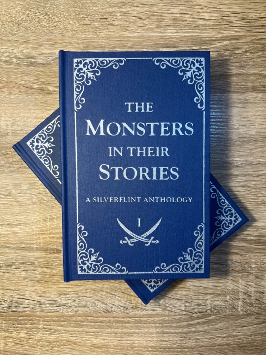
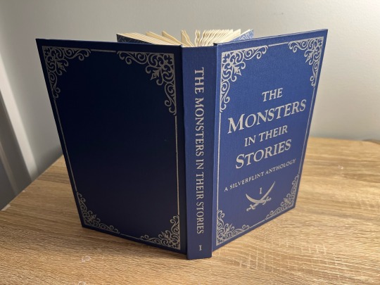
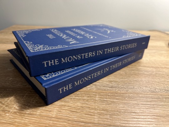
It took me a year (and a lot of anxious research) before I worked up the courage to bookbind fanfiction, and after months of on-again-off-again work, my first fanbind is finally done!
I knew that if I was going to bookbind fic, I had to bind something from the Black Sails fandom, aka the fandom and show that have had the biggest impact on my life. Y'all, I almost went into academia to study slavery in the 17th-18th century Caribbean because of this show - when folks say this show rewires your brain chemistry, they are NOT kidding. THEE show of all time. Happy 10th anniversary to Black Sails! This fandom is small but mighty. May we continue to get our hearts and souls blasted to smithereens by this show for many years to come.
Ao3 abounds with magnificent Black Sails oneshots, so I decided to put together an anthology of my favorite Silverflint fics under 20k, which I split into two volumes. Included are works by @justlikeeddie, @vowel-in-thug, @balloonstand, @annevbonny, @francisthegreat, @nysscientia, and more! Thank you, thank you all, you brilliant wonderful people, for gracing the Internet with such amazing writing. When I read the fics in these anthologies I want to fling myself into the sun.
More on the design and binding process below the cut!
Vol. 1 Page Count: 270 (12 fics) Vol. 2 Page Count: 248 (11 fics) Body Font: Sabon Next LT (10.5 pt) Title Font: Goudy Old Style Other Fonts: IM Fell English, pirates pw
The typeset (which I did in Word) took a while, mainly because I'd never done it before. Manually adjusting the hyphenation line-by-line was especially tedious. After making these books, I abandoned Word in favor of InDesign, in large part because InDesign gives you way finer control over your justification and hyphenation settings.
Regarding my actual design choices, I'm happy with how the ocean motif on the title page turned out (it's not the same pattern as my endpapers, but they're complimentary) and I'm very fond of my divider dingbats, which are little swords! Goudy Old Style was a fun title font to use, since it's the font that Black Sails uses as its logo. The stories in Vol. 1 are divided into parts based on what Silver WAS at that point in the show (cook, quartermaster, or king), and Vol. 2 is split up into comedies, histories (AUs set in the canon universe) and tragedies - befitting Black Sails' Shakespearean ~vibes~.
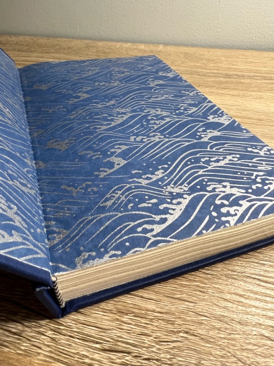
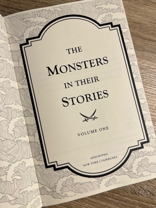
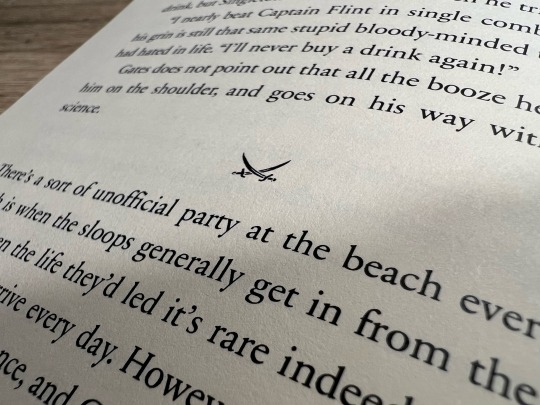
I stuck to a flatback binding, as I wasn't feeling quite ambitious enough to try rounding and/or backing. I've learned that I ~Anakin Skywalker voice~ hate sanding, enjoy folding/sewing, and don't LIKE edge trimming but enjoy the results enough to make it worth it.
The real adventure was decorating the cover, which remained bare for months. After agonizing over Illustrator and experimenting unsuccessfully with HTV and lokta paper embossing, I ultimately turned to using stencil vinyl to paint on the designs. There was a bit of seepage under some of the stencils, but I was able to scrape off the excess with my Cricut weeding tool without damaging the coated surface of the bookcloth (probably Arrestox Blue Ribbon from Hollander's). Even though it was very time-consuming, I'm so happy with the end result of the stenciled paint job and I intend to stick with stencils for my foreseeable future binds.
Are there things I would change? Sure. It was humid out when I printed, so the pages have got a wave. There’s an extra two pages in Vol 2. that I have no idea how I missed, and I got a line of glue in the middle of one of my Vol. 2 endpapers. I’m pretty sure I didn’t case in quite right, since my endpapers pull away from the case at the spine. I think the inner margins are a bit too big, and despite going line-by-line there’s still some wacky justification spacing in the typeset. But man, am I proud of these books! It is so satisfying to learn a new skill - MANY new skills, if we’re being honest - and to make something both beautiful and practical. If I’m still binding in two years or so, I can see myself redoing the typeset in InDesign, cutting out the existing text block, and reusing the cases. I’m also already planning for Vol. 3, which will be Silverflint Modern AUs.
Thanks for reading!
#bookbinding#fanbinding#ficbinding#my books#black sails#silverflint#fanfiction#bsanniversary#10yearsblacksails#10bsfest
295 notes
·
View notes
Text
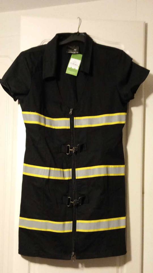
Cyber goth dress + my favourite way to make patches
I thrifted this dress a couple of weeks ago for £1. I believe it started life as some sort of costume, possibly a sexy firefighter, but the fabric is really good quality cotton, and I thought it had some cybergoth potential with the yellow and reflective bits. I also really like the metal fastenings.
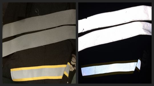
I already had a high-viz coat in my wardrobe from when I used to go bicycling more often, so I was able to steal more reflective bits from that. Not yet sure what I'll do with them, probably cut interesting shapes and glue or sew them on. Photos with and without flash.
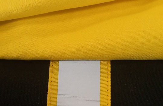
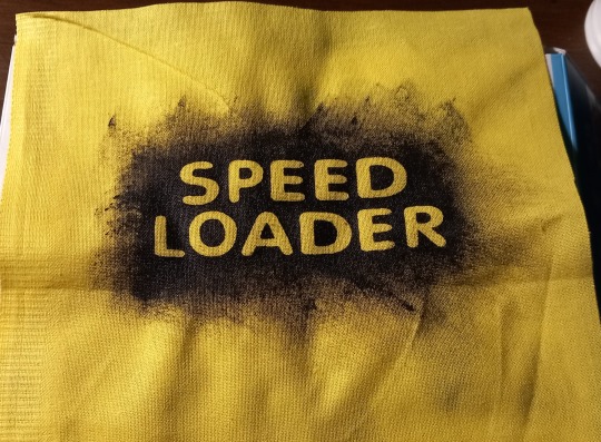
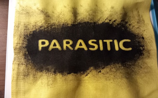
And then yesterday I got a half meter of cotton fabric for £1 which is an almost exact colour match, so I can make some stencilled patches.
I already had fabric paint at home, so this entire outfit has only cost me £2! Cybergoth clothing is usually super expensive.
There are lots of tutorials for making stencilled patches on YouTube, (@rattusrattus3 has some excellent ones) but I lack patience and don't like cutting out intricate pieces, especially for lettering, so I had the idea to use alphabet stickers. You can pick these up really cheap from your local pound shop or dollar store depending on where you're from. I think mine were 40p a packet.
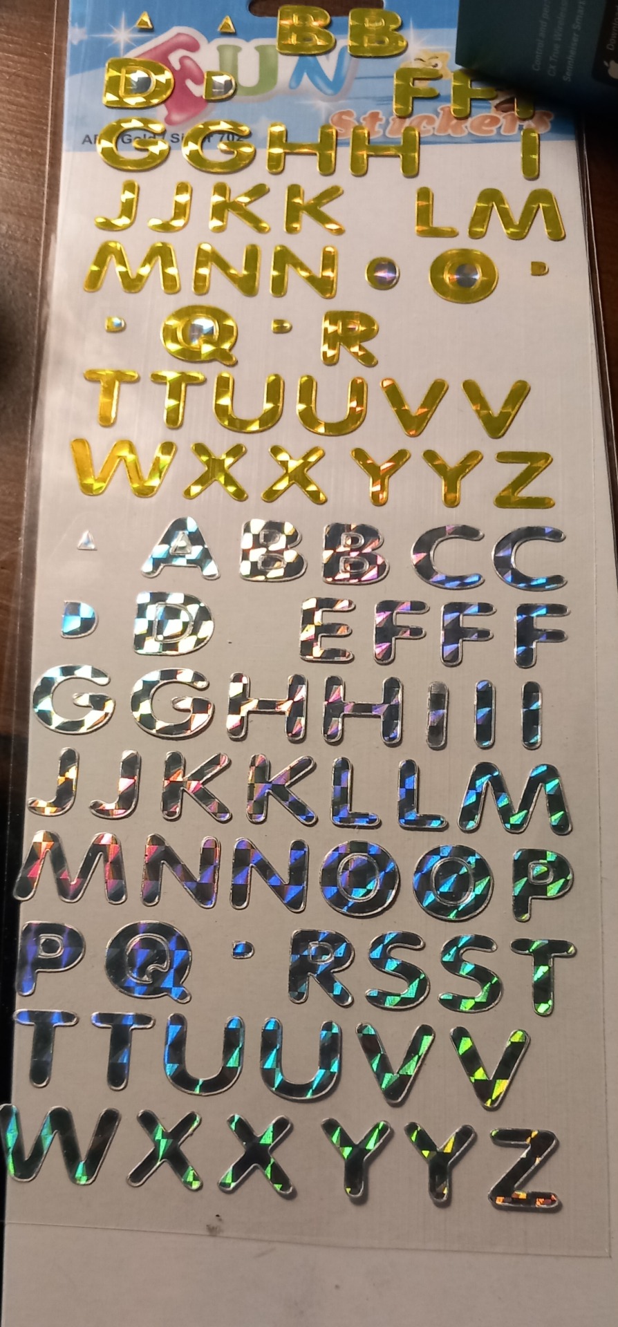
Stick them to your fabric, use fabric paint and a sponge, then when you peel the stickers off you'll have the words in relief. You can go thicker than I have here to make the surrounding area totally opaque, but I like the edges being messy and faded out. These are both song titles from cyber/industrial bands that I like.
Here are some other examples that I've done in the past. These were all done with pound shop spray paint which isn't ideal for fabric, but it's cheap! You'll also get more of the original fabric colour showing through with this kind of paint, which is nice.
If you're using black fabric, gold or silver paint will generally work better than white. These are all Devin Townsend song lyrics.
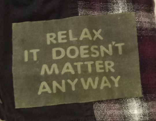
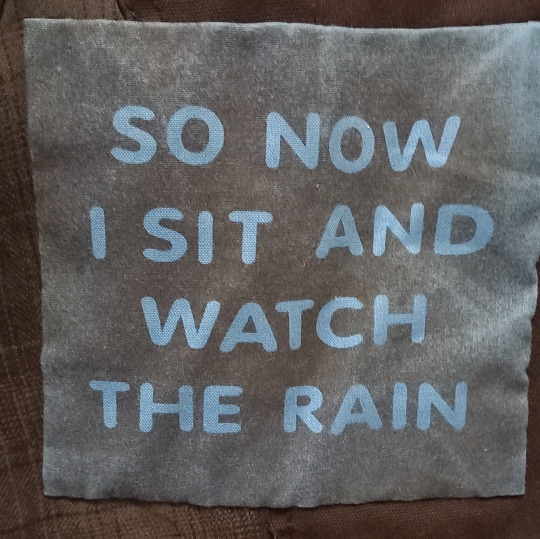
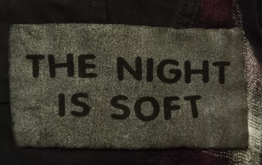
The only negative to this method for some people may be that the letters will be very uniform, but I like that. And if you want to you can space them irregularly to break things up a bit. Or you might be able to find more interestingly shaped alphabet stickers than I did!
#goth diy#cybergoth#goth sewing#goth upcycling#upcycle#upcycling#punk patches#stencil#goth#industrial#electronic music#alternative fashion#alternative#diy craft#diy sewing#diy projects#cyber goth#goth subculture#thrifting#thrifted#goth thrifting#goth charity shopping#charity shop finds
240 notes
·
View notes
Text

There's No Such Thing in the World (As An Undo Button) by Zulu
Before there was omegaverse, there was mpreg, a trope where a male character finds themselves pregnant through whatever means, often with some hand-wavey fanfic magic. This chonky little quarto fic is rarepair mpreg crackfic for the early 2000's medical drama House MD, with the pairing of House/Foreman.
Here we have the copy I made @zulufic, and the one I made for myself, fraternal copies due to limited materials in the same pattern. (I did not think I'd ever find a use for the bits of baby quilt patterned fabric in the fabric scraps I got from a coworker a few years ago, but lo and behold...)


So, this started out as a Christmas present for @zulufic. Come time for the exchange of gifts, I presented her with... a textblock! I had the pages printed and sewn, but not cased in. Eventually, it gained a hardcover case and became a finished book, but circumstances lined up just right such that I would be seeing her in August and able to put the book in her hands right within a few days of Fanfic Writers' Appreciation Day, and participate in @renegadeguild's annual initiative to gift an author with their book for the day.
The lettering on the case is acrylic paint, applied with a Cricut-cut stencil. Hand-sewn endbands, decorated edges just for fun. One book has gelli-plate printed endpapers from my wife's art stash, the other has some Japanese paper of unknown provenance out of my paper stash.


This is the fic that sat on my to-bind list labelled "I like them all, she says unhelpfully," due to a stealth conversation with Zulu's wife to attempt to find her favourite fic. (The answer: whatever fic she's currently working on.) So I picked one I remember fondly from when it was first posted. Things that never made it into the author's notes and only obliquely into the AO3 tags: Zulu says this is actually an AU of the move Knocked Up.


I'm pretty happy with how it turned out, and I'm glad I decided to do it as a half-sized quarto. A cute little chonk of a book for a cute (if delightfully cracktastic story! Happy Fanfic Writers' Appreciation Day, Zulu!
#renegade loves fic#ffwad 2024#fanfic writers appreciation day#house md fanfic#house/foreman#zulufic#sometimes you just need to gift your friend their rarepair mpreg crackfic from days gone by#fanbinding#ficbinding
79 notes
·
View notes
Text


Over the weekend, I went to my family’s Cottage in the Northwoods for the first time since I was a kid! 🌲 I had a fantastic time, and also brought Kaya, Samantha, and Nellie (my mother and stepfather were very patient with me packing three dolls, two doll horses, a teepee, and a bunch of photography equipment 📷 into their van along with my suitcase 😂). I’m going to post the pictures of Sam and Nellie separately later on, but I wanted to share my Kaya photos now.
I’m pretty proud of the teepee: I made it myself!... or, sort of. I bought the first version of Kaya’s Teepee NIB recently on FB Marketplace. When it arrived, it was very clearly unopened… but the faux animal-hide fabric was cracking horribly from sheer age, and I didn’t feel right returning it because of something the seller clearly didn’t know about after opening it when it was NIB; besides which, shipping cost a lot, and it would barely have been worth it to return after shipping it back, even if the seller did accept a return. So I bought some microsuede and faux leather cord and, using the original fabric as a stencil, I made my own. I did everything myself, from sealing the edges so they don’t fray, to dying the flaps at the top with some Rit fabric dye left over from a different project; then I attached it to the original plastic tent sticks. I also changed a few things while I was at it to make the doorway larger so you can actually see inside. It’s not perfect (I messed up and cut both pieces the same, rather than as mirror images, so part of it is actually wrong-side-out; and I burned one side in the dying process, as well as splashing some dye on it) and I plan to re-do it later, but honestly I’m a bit amazed it came out as well as it did!
Note: I am White. If you are indigenous and find anything in this post offensive, please let me know and I’ll edit it or take it down!
#american girl#american girl doll#kaya#kaya'aton'my#steps high#sparks flying#tatlo#nez perce#nimiipuu#indigenous#nature#doll photography#doll photoshoot#dollblr
100 notes
·
View notes
Text
How to Print Embroidery Stencils Directly onto Fabric
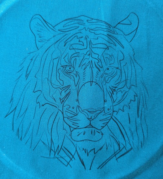
This was requested, and I'm often asked how I do this so here's a short how to! I do almost all my stencils this way, and avoid "stick and stitch" wash away stabilizers as much as possible. I work with a lot of detail, and I've found this is the best way to capture it all. I use a basic canon inkjet printer. Nothing fancy. I make all my stencils in procreate from reference photos.

Firstly you're going to need regular 8x11 sheets of label paper. Find the fabric you want to use and stick the whole sheet straight on. Smooth out your fabric as much as possible to ensure there's no folds or wrinkles so your pattern doesn't distort or your sheet doesn't jam your printer. Lint roll it too to get rid of any extra fuzz or hair.
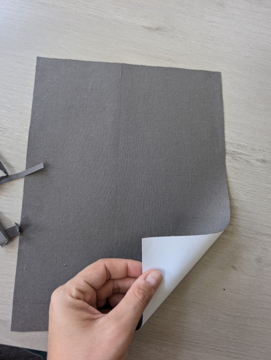
Cut off the edges of excess fabric to the exact size of your sheet. Make sure there are no threads hanging off. This fabric is going to stay on this sheet until you're done.


BEFORE I load the fabric into my printer, I have to format how I want the stencil to print. I want to adjust the margins to center the image, and then I play with the scale to figure out how big I want to work. I was going to be finishing this piece in a 6 inch hoop, so I had to ensure it would frame how I wanted it to. However, when I'm actually working, I work with a 7 inch hoop(it's easier on my hands). The one downside to this method is that I cannot go any larger than this(personally I don't usually work larger than 6 so it works). You need to make sure you have margins all around your working hoop so that you can tighten the fabric.
Once you've got your desired size and centered presets, load the fabric, still on the label paper, into the printer. For most printers this will be fabric side down. Then, print! Voila, you have your stencil directly on your fabric. Peel it off the sticker paper (this is the hardest part tbh), it's normal to end up with really frayed edges to the fabric sheet during this process. You won't see those on your finished piece.
There you have it. Stencils, printed right onto fabric. Happy stitching!

Side thoughts:
-i have never had this jam or screw up my printer. That's not to say it's impossible. I take the risk because so far it's worked great for me.
-i do not ever wash my pieces or get them wet. So I cannot say if the ink would or would not run on the fabric or thread. Keep that in mind.
-the fabric I use is either Kona cotton or a slightly thicker canvas material. I've never tried with anything else.
#hand embroidery#embroidery#fiber arts#tutorials#modern embroidery#needlework#handmade art#fiber art
88 notes
·
View notes
Text
Bookbinding Year in Review 2024
Another year, another reflection on all of the books I've bound this year! I didn't have as prolific a year as last year, but I still bound quite a bit.
Starting off with some overall stats:
Total books bound: 30 Total books gifted: 26 Total words bound: 1,116,840 Average words per book: 37,228
I bound quite a few blank books/journals this year, and I ended the year with a few very large binds, so there are some outliers skewing this average 😂 Additionally, despite binding about half as many books as last year, my total words bound is approximately the same (likely because so many of last year's books were short pamphlet binds).
This year, instead of doing pamphlet binds for Binderary (a bookbinding marathon event hosted by the Renegade discord server in February), I did 15 Malevolent-themed journals in conjunction with @shadow0haven and sold them at Invictuscon in March, with profits going to charity. Though I probably won't be doing it again (it took a lot out of me), it was a lot of fun!

[ID: Three journals laid side-by-side. The leftmost journal is yellow with a black spine and has artwork of Blob John on it. The middle journal has a black spine and painted-style artwork of John (depicted as a large monster with a large white pallid mask) and Arthur (depicted holding a lighter with his eyes covered) on it. The rightmost journal is black with a gold spine and a gold metallic painted Yellow Sign in the middle. All three journals have gold ribbons and black elastic closures. /End ID]
About half of my bound books this year were for Binderary. I also bound books for Fandom Trumps Hate, Renegade bookbinding exchanges, Big Bang events, and Fanfiction Writers Appreciation Day. One of my most experimental book designs from this year was from the Rusty Quill Big Bang, where I went all-out on a hockey-themed book.

[ID: A hand-bound book open and standing up with the spine facing the viewer. The highlight of the picture is the spine, which has a hockey lace threaded over it so that the spine looks like the front of a hockey skate. The spine beneath the lace is open so you can see the paper and stitching. /End ID]
I've been experimenting a lot with different book styles and binding techniques this year, trying to stretch myself, try new things, and use the skills I've acquired to think and work outside the box. I did that with the above book (combining coptic and sewn board binding styles). I also learned some new techniques, such as creating covers using cutting machines, doing different styles of endbands, trimming edges (easily the most frustrating part of the binding process 😒), and painting edges. One of my favorite aspects of this hobby is, as the Renegade server calls it, FAAFOing, or "fucking around and finding out," so even when something doesn't work out 100% perfectly or the way I envisioned it, it's just a learning experience for the future ✨
This year's fandom that I bound the most for (excluding "no fandom") was back to my roots with the Magnus Archives. I got to bind one of my own fanfictions as part of a Fandom Trumps Hate gift, which was a pleasure to do. It was my first exploration into the world of creating stenciled covers using my Silhouette, and I'm delighted at the cover designs available to me now.

[ID: A hand-bound book photographed from the front. The book has dark green bookcloth, a decorative red and gold ribbon along the left side, and a gold painted cherry blossom design. The title and author name are also in gold and read, “Ten Thousand Flowers in Spring” and “bluejayblueskies.” /End ID]
My favorite bind from this year is currently a secret (it's an exchange gift!), but my second-favorite is a Rusty Quill Gaming bind I did of knifemartin's fic Due North earlier this year. I tried marbling for the first time for it, which was a tricky yet rewarding process, and I'm thrilled with the aesthetics of this book. An honorable mention is Aftershocks, another RQG fic by knifemartin that allowed me to indulge in my love of wingfic.


[ID: Two images of two different hand-bound books. The leftmost image shows the front cover of a book bound in black cloth with the fic name "Due North" and author name "knifemartin" painted on with silver paint in a fancy sans serif font. There is also a rectangular cutout showing off blue and green marbled paper beneath. The rightmost image shows the front cover of a book bound in shiny gold cloth with the fic name “Aftershocks” and author name “knifemartin” painted on vertically on the righthand side with silver paint in a blocky sans serif font. On the lefthand side, there is a 3D white angel wing that has been constructed from individually cut-out paper feathers. /End ID]
I have some fun plans for the upcoming year, as well as a resolution to bind more for myself in 2025. I really enjoy doing events and gifts and exchanges, but it does have me putting a lot of projects I want to do off to the side, so I'm going to make more of an effort to focus on those in the upcoming year. Time to finally make a dent in my to-bind list! 💪
37 notes
·
View notes
Note
tips for a broke punk trying to make diy patches like your “Useless Patch” patch!
So the current Useless patch I have at cons is hand screenprinted by me, but screenprinting does have an initial cost and i think not the best option for a broke punk who is looking to just make a couple of patches. There are so many ways to make patches, but heres what I did when i first started. Get some good 'ol wax paper you can get at the grocery store. and some cheapo acrylic paint, any kind will do, those little bottles you can get anywhere, and one of those spongy brushes. if you are too broke for spongy brush, (they are cheaper at the hardware store than the craft store often time btw) you can use a regular dish sponge or even a folded napkin, you just wanna be able to dab the paint.


get a piece of paper and draw your design on it, you wanna be careful with letters that have enclose spaces like O's and R's, i actually suggest if youre using this method the easiest 'font' to use is the basic punk stencil, which is actually literally just a grade school stencil. you dont need to buy a set, you can look at a reference and draw it or print it out if you have access to a printer and paper (library might help if you dont!) these are the letter type im talking about. Sorry for all these shitty google images lmao. ANYWAY.

grab a razor or an xacto knife and cut the letters out of your wax paper, wax side down, be careful obviously, helps to put a flat piece of cardboard underneath and you can tape it down to keep it in place if you want. once you have your design all cut out you can place it on your piece of fabric. with the wax side down on the piece you plan to paint, run the iron over it. itll stick! neat! now you can grab your paint and use some method (i really like the dab with a sponge brush, dish sponge or papertowel method myself) and paint in your stenciled letters. dont let it dry between coats, layer it up till its a nice solid white or whatever color youre using, let it get slightly tacky but not dry and peel your wax paper off. the design should now be painted on your fabric! hurray! let it dry and the next day, press your iron over it to heat set it and voila! diy cheapo patch. its not going to be perfect, there will be bleeding in your edges, if that bothers you, you can fix it with black (or whatever color your fabric is) paint. either way doesnt matter, punk can be messy. I've made lots of patches this way, heres a pic of the recent ones, the Punks Respect Pronoun patch is the one ive done most with this method, it has the stencil letters i was talking about so it stays in one piece without me having to piece it together. for the record i am totally fine with people making Useless Patch, and if someone does, I'd love to see it! And obligatory shop shill, i will have my own versions of both these patches in my store soon when I get some time! I'm sorry I dont have pics for the process, next time I do it, ill take some and post them <3
Thanks for the Q!
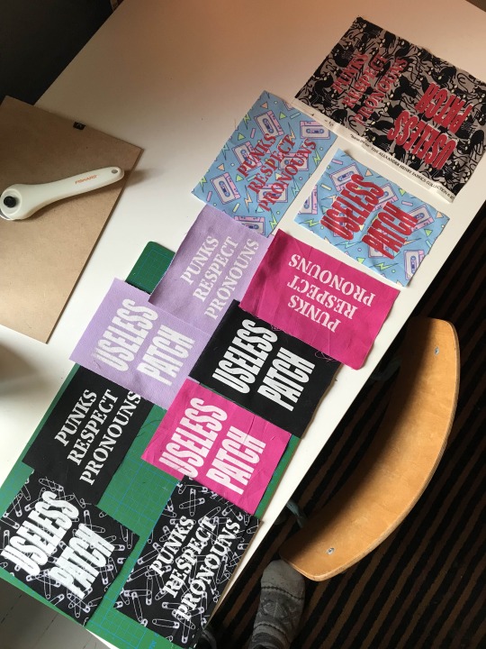
78 notes
·
View notes