#css flexbox examples
Explore tagged Tumblr posts
Visit Tumblr Blog
Explore Tumblr blogs with no restrictions, modern design and the best experience.
Last Seen Tumblr Blogs


Fun Fact
The Tumblr office adopted Tommy, an 11-year-old Pomeranian.
Text
Flexbox Landing Page
#css flexbox examples#flexbox css#flexbox tutorial#html css#css#frontenddevelopment#webdesign#html#css3#divinectorweb#flexbox#landing page website#website design#create a website
3 notes
·
View notes
Text
Essentials You Need to Become a Web Developer
HTML, CSS, and JavaScript Mastery
Text Editor/Integrated Development Environment (IDE): Popular choices include Visual Studio Code, Sublime Text.
Version Control/Git: Platforms like GitHub, GitLab, and Bitbucket allow you to track changes, collaborate with others, and contribute to open-source projects.
Responsive Web Design Skills: Learn CSS frameworks like Bootstrap or Flexbox and master media queries
Understanding of Web Browsers: Familiarize yourself with browser developer tools for debugging and testing your code.
Front-End Frameworks: for example : React, Angular, or Vue.js are powerful tools for building dynamic and interactive web applications.
Back-End Development Skills: Understanding server-side programming languages (e.g., Node.js, Python, Ruby , php) and databases (e.g., MySQL, MongoDB)
Web Hosting and Deployment Knowledge: Platforms like Heroku, Vercel , Netlify, or AWS can help simplify this process.
Basic DevOps and CI/CD Understanding
Soft Skills and Problem-Solving: Effective communication, teamwork, and problem-solving skills
Confidence in Yourself: Confidence is a powerful asset. Believe in your abilities, and don't be afraid to take on challenging projects. The more you trust yourself, the more you'll be able to tackle complex coding tasks and overcome obstacles with determination.
#code#codeblr#css#html#javascript#java development company#python#studyblr#progblr#programming#comp sci#web design#web developers#web development#website design#webdev#website#tech#html css#learn to code
2K notes
·
View notes
Text
YOU MUST MAKE A WEBSITE
Oh wow, look at that! YET ANOTHER post urging you to make a webbed site! What a completely new thing that people haven't made a thousand masterposts for already!!
• Making a website might look scary. It is Not.
At first, I too thought making a website was too much work. It really isn't! It turns out that all you need is
an HTML file,
a web hosting service and
w3schools tutorials,
and that's about it!
This post will point you towards these resources, and others I found useful while figuring out how to make a website.
• VERY QUICK EXPLANATIONS:
What's HTML and CSS?
HTML is the content of your webpage, the skeleton of it. What shows up in a webpage is what's written in the HTML file!
CSS is the way the HTML is styled; the colour of the background and the letters, the size of elements, the font, all that!
Do I absolutely NEED JavaScript for a website?
Not at all! You don't need to worry about learning it before getting started.
• What do I make a website for? What do I put in there?
ANYTHING AND ALMOST EVERYTHING. Here's some ideas for pages from a post of mine were I was very normal about websites:
You can make a page that's only pictures of your pets.
You can make an interactive adventure.
You can make your own academic blog full of your own essays or articles.
You can just post a ton of art or make a full music page.
You can make a blog and infodump eternally, give book reccs and reviews. You can host a thousand virtual pets and nothing else.
Upload entire books in a single html file. Make a wikipedia for your ocs. Make a fake site for a random fictional place (restaurant, hotel, whatever). You can make a thousand fanpages/shrines about your favorite media. You can upload your own webcomic and make it all like a fancy website and shit.
I could keep going but, for the sake of "brevity", I won't.
• WEBSITE EXAMPLES!
If I started listing the websites I know, this post would be bottomless. Here's only seven:
https://publictransit.neocities.org/ - A webbed site, for sure
https://ribo.zone/ - A personal site
https://leusyth.neocities.org/ - An art archive
https://solaria.neocities.org/ - Personal website with A Lot of stuff (it'll come up in a bit, because it offers web making resources)
https://hog.neocities.org/ - The Hogsite
https://thegardenofmadeline.neocities.org/ - Another personal site! It also has a web resources page and has made another masterpost like this one (but better)
https://spiders.neocities.org/ - My own website, which must be weird to see in mobile . sorry
• You've convinced me. I want a webbed site. Where do I start?
https://neocities.org/
FIRST OF ALL: Neocities. It is a free web hosting service, and it's the one I and the sites I linked use!
When I first started, my website was a black page with red letters and a drawing, and nothing else! It was like that for a month, till i started picking up on how to do things.
Here's what helped me get an idea of how to make things work:
https://sadgrl.online/learn/articles/beginners-guide-neocities
An absolute beginners guide to neocities -- while when you make an account there you get a tutorial page from the site, this one's extra support for that.
https://www.w3schools.com/
Learn HTML, CSS, JavaScript and MANY other coding things for free. All the tutorial/reference pages have live testing windows for you to mess with!! helped me a LOT while figuring this stuff out!
https://htmlcheatsheet.com/
https://htmlcheatsheet.com/css/
Cheatsheets for HTML and CSS, respectively. It includes a JavaScript one too!
https://sadgrl.online/webmastery/
Sadgrl's webmastery resources! Also includes the next resource listed here:
https://sadgrl.online/projects/layout-builder/
Sadgrl's layout builder; not a lot of customization at a first glance, but I've seen wildly different websites all using it as a base, plus it works using CSS Flexbox, so it generates a responsive layout!
(basically, a responsive layout is one that translates well in different sized screens)
https://www.tumblr.com/fysa/728086939730919424/wikitable-code?source=share
Tumblr user fysa made this layout imitating a wiki page!
https://brackets.io/
At some point, you might want to do things outside the Neocities code editor and get one outside the site. I recommend Brackets, because my old as fuck computer can run that and absolutely nothing else apparently, and it works wonderfully! Though I recommend either turning off the code autocomplete or using it after a good while of already using the Neocities code editor, so you get used to coding on your own.
http://www.unit-conversion.info/texttools/text-to-html/
Turn your text into HTML code! i use this kind of pages for my lengthy blog entries that I don't feel like formatting myself.
https://imagecompressor.com/
COMPRESS YOUR IMAGES.
The heavier an image is, the more your site weighs and the more time your page will spend loading. You don't want that, specially if your site is heavy on graphics. This might help!
https://solaria.neocities.org/guides
Some CSS, JavaScript and Accessibility guides! Worth checking out!
https://eloquentjavascript.net/
This is a free, interactive book for learning JavaScript! NOTE: It is very intuitive, but JavaScript is HARD!! I still haven't learned much of it, and my website does fine without so don't worry if you end up not doing much with it. It's still useful + the exercises are fun.
And now, accessories!
• Silly stuff for your page :]
https://gifypet.neocities.org/
Make a virtual pet, copy the code and paste it in your HTML file! You'll get a little guy in your webbed site :]
https://www.wikplayer.com/
Music player for your website!
http://www.mf2fm.com/rv/
JavaScript silly effects for your site :]
https://blinkies.neocities.org/geoblinkies
Blinkie search engine!
https://www.cbox.ws/
Add a chatbox to your site!!
https://momg.neocities.org/
Infinite gallery of gifs. i've spent hours in there looking at moving pictures and out of them all, the ONLY gif i actually ended up using on my site was a rotating tomato slice. it is still there. trapped.
https://wrender.neocities.org/tarotinstructions
A widget that gives you a random tarot card!
https://www.websudoku.com/widget.php
Sudoku widget!
That's about it for now! I don't know how to end this!!! Remember to have fun and google everything you don't know :]
519 notes
·
View notes
Note
how did you learn coding?
I am pretty much entirely self taught as far as front end goes!
I started messing around with HTML and CSS with tumblr themes back in 2016-ish.
For javascript I looked at https://developer.mozilla.org/en-US/ for a lot of documentation + examples. And also used codepen a lot to kinda reverse engineer existing snippets of code.
I also read a lot of https://css-tricks.com/
And for flexbox + css grid there's these:
After I got a good foundation of vanilla JS, I learned Vue for a little while and then moved on to React. The new react documentation is really good in my opinion so I definitely recommend reading that if you're interested in learning.
Most of my learning came from trial and error and working on projects that I was really excited about. I used to be so proud of findtags (the original version) which was in jquery...
The react version is miles ahead of it. And even then, the theme builder is also way ahead of findtags. I learned way more between those two projects than reading documentation alone!
186 notes
·
View notes
Text
Learn flexbox!
Although it is IMPOSSIBLE to ever get align-items vs justify-content right on the first try, getting familiar with how flexbox works will allow you to know at least one of them does what you want them to. If there's anything I've learned during my studies it's that development is much more about knowing you can do certain things and being able to google it when you don't know how, rather than having everything memorized. What you need to memorize you will memorize from practice, repetition and experience.
That being said: here are some (two) resources for learning flexbox!

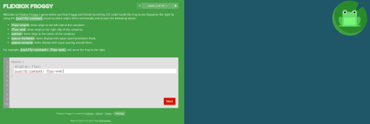
Play Flexbox Froggy
This was such a huuuuuge help for me when learning flexbox. I completed all of the exercises once, and then I would use this as a guide and reference when trying to figure stuff out on my own projects. It's a great interactive way of learning, and it really simplifies and makes flexbox digestible. I recommend just crunching through it once, and you will be exposed to all the different ways of using flex! Then you will have in the back of your head what is possible with flex, and you will be able to recall this and maybe use the next resource to implement it if you don't remember all the keywords yourself!

CSS tricks - a complete guide to flexbox
This was recommended to me by a developer waaay back when i started studying, and it has saved me countless times. It's so good for referencing the different properties, with clear visual examples and a super easy-to-follow structure of the page. I have this bookmarked because of how often I use it.
Good luck in your studies 💻🐸
#css#html#javascript#js#reactjs#react.js#next.js#vite#web development#web developer#frontend#frontend developer#frontend development#software development#coding#codeblr#studyblr#resources#learn how to code#study code#programming#progblr#tech#women in tech#stem#compsci#computer science
195 notes
·
View notes
Text

🌸 Sakura Page Theme 🌸
re-coded an unreleased page theme an anon asked me to release like 5 years ago (example of the original). realized i actually hated a lot of how it was originally handled and changed it up. now it is ready to be unfurled!
features:
mobile responsive (built with flexbox)
header designed for 4:3 ratio gifs/images
up to 2 side pixels (left & right) with optional captions
two javascript-powered pop-up modals
title font supports english & japanese
customizable fonts, images, and colors
CSS variable settings
tumblr controls removed (like the follow button)
...and more! just play around with it!
notes:
you must have javascript enabled for this page theme to work! see this post for instructions.
this theme is meant to be used with custom tumblr pages (select custom layout rather than standard layout and then copy + paste)
this can also be used on neocities or any other host that supports html/css/js.
🍃 code + live preview + more 🍃
90 notes
·
View notes
Text
Revisiting CSS Multi-Column Layout
New Post has been published on https://thedigitalinsider.com/revisiting-css-multi-column-layout/
Revisiting CSS Multi-Column Layout
Honestly, it’s difficult for me to come to terms with, but almost 20 years have passed since I wrote my first book, Transcending CSS. In it, I explained how and why to use what was the then-emerging Multi-Column Layout module.
Hint: I published an updated version, Transcending CSS Revisited, which is free to read online.
Perhaps because, before the web, I’d worked in print, I was over-excited at the prospect of dividing content into columns without needing extra markup purely there for presentation. I’ve used Multi-Column Layout regularly ever since. Yet, CSS Columns remains one of the most underused CSS layout tools. I wonder why that is?
Holes in the specification
For a long time, there were, and still are, plenty of holes in Multi-Column Layout. As Rachel Andrew — now a specification editor — noted in her article five years ago:
“The column boxes created when you use one of the column properties can’t be targeted. You can’t address them with JavaScript, nor can you style an individual box to give it a background colour or adjust the padding and margins. All of the column boxes will be the same size. The only thing you can do is add a rule between columns.”
She’s right. And that’s still true. You can’t style columns, for example, by alternating background colours using some sort of :nth-column() pseudo-class selector. You can add a column-rule between columns using border-style values like dashed, dotted, and solid, and who can forget those evergreen groove and ridge styles? But you can’t apply border-image values to a column-rule, which seems odd as they were introduced at roughly the same time. The Multi-Column Layout is imperfect, and there’s plenty I wish it could do in the future, but that doesn’t explain why most people ignore what it can do today.
Patchy browser implementation for a long time
Legacy browsers simply ignored the column properties they couldn’t process. But, when Multi-Column Layout was first launched, most designers and developers had yet to accept that websites needn’t look the same in every browser.
Early on, support for Multi-Column Layout was patchy. However, browsers caught up over time, and although there are still discrepancies — especially in controlling content breaks — Multi-Column Layout has now been implemented widely. Yet, for some reason, many designers and developers I speak to feel that CSS Columns remain broken. Yes, there’s plenty that browser makers should do to improve their implementations, but that shouldn’t prevent people from using the solid parts today.
Readability and usability with scrolling
Maybe the main reason designers and developers haven’t embraced Multi-Column Layout as they have CSS Grid and Flexbox isn’t in the specification or its implementation but in its usability. Rachel pointed this out in her article:
“One reason we don’t see multicol used much on the web is that it would be very easy to end up with a reading experience which made the reader scroll in the block dimension. That would mean scrolling up and down vertically for those of us using English or another vertical writing mode. This is not a good reading experience!”
That’s true. No one would enjoy repeatedly scrolling up and down to read a long passage of content set in columns. She went on:
“Neither of these things is ideal, and using multicol on the web is something we need to think about very carefully in terms of the amount of content we might be aiming to flow into our columns.”
But, let’s face it, thinking very carefully is what designers and developers should always be doing.
Sure, if you’re dumb enough to dump a large amount of content into columns without thinking about its design, you’ll end up serving readers a poor experience. But why would you do that when headlines, images, and quotes can span columns and reset the column flow, instantly improving readability? Add to that container queries and newer unit values for text sizing, and there really isn��t a reason to avoid using Multi-Column Layout any longer.
A brief refresher on properties and values
Let’s run through a refresher. There are two ways to flow content into multiple columns; first, by defining the number of columns you need using the column-count property:
Second, and often best, is specifying the column width, leaving a browser to decide how many columns will fit along the inline axis. For example, I’m using column-width to specify that my columns are over 18rem. A browser creates as many 18rem columns as possible to fit and then shares any remaining space between them.
Then, there is the gutter (or column-gap) between columns, which you can specify using any length unit. I prefer using rem units to maintain the gutters’ relationship to the text size, but if your gutters need to be 1em, you can leave this out, as that’s a browser’s default gap.
The final column property is that divider (or column-rule) to the gutters, which adds visual separation between columns. Again, you can set a thickness and use border-style values like dashed, dotted, and solid.
These examples will be seen whenever you encounter a Multi-Column Layout tutorial, including CSS-Tricks’ own Almanac. The Multi-Column Layout syntax is one of the simplest in the suite of CSS layout tools, which is another reason why there are few reasons not to use it.
Multi-Column Layout is even more relevant today
When I wrote Transcending CSS and first explained the emerging Multi-Column Layout, there were no rem or viewport units, no :has() or other advanced selectors, no container queries, and no routine use of media queries because responsive design hadn’t been invented.
We didn’t have calc() or clamp() for adjusting text sizes, and there was no CSS Grid or Flexible Box Layout for precise control over a layout. Now we do, and all these properties help to make Multi-Column Layout even more relevant today.
Now, you can use rem or viewport units combined with calc() and clamp() to adapt the text size inside CSS Columns. You can use :has() to specify when columns are created, depending on the type of content they contain. Or you might use container queries to implement several columns only when a container is large enough to display them. Of course, you can also combine a Multi-Column Layout with CSS Grid or Flexible Box Layout for even more imaginative layout designs.
Using Multi-Column Layout today
Patty Meltt is an up-and-coming country music sensation. She’s not real, but the challenges of designing and developing websites like hers are.
My challenge was to implement a flexible article layout without media queries which adapts not only to screen size but also whether or not a <figure> is present. To improve the readability of running text in what would potentially be too-long lines, it should be set in columns to narrow the measure. And, as a final touch, the text size should adapt to the width of the container, not the viewport.
Article with no <figure> element. What would potentially be too-long lines of text are set in columns to improve readability by narrowing the measure.
Article containing a <figure> element. No column text is needed for this narrower measure.
The HTML for this layout is rudimentary. One <section>, one <main>, and one <figure> (or not:)
<section> <main> <h1>About Patty</h1> <p>…</p> </main> <figure> <img> </figure> </section>
I started by adding Multi-Column Layout styles to the <main> element using the column-width property to set the width of each column to 40ch (characters). The max-width and automatic inline margins reduce the content width and center it in the viewport:
main margin-inline: auto; max-width: 100ch; column-width: 40ch; column-gap: 3rem; column-rule: .5px solid #98838F;
Next, I applied a flexible box layout to the <section> only if it :has() a direct descendant which is a <figure>:
section:has(> figure) display: flex; flex-wrap: wrap; gap: 0 3rem;
This next min-width: min(100%, 30rem) — applied to both the <main> and <figure> — is a combination of the min-width property and the min() CSS function. The min() function allows you to specify two or more values, and a browser will choose the smallest value from them. This is incredibly useful for responsive layouts where you want to control the size of an element based on different conditions:
section:has(> figure) main flex: 1; margin-inline: 0; min-width: min(100%, 30rem); section:has(> figure) figure flex: 4; min-width: min(100%, 30rem);
What’s efficient about this implementation is that Multi-Column Layout styles are applied throughout, with no need for media queries to switch them on or off.
Adjusting text size in relation to column width helps improve readability. This has only recently become easy to implement with the introduction of container queries, their associated values including cqi, cqw, cqmin, and cqmax. And the clamp() function. Fortunately, you don’t have to work out these text sizes manually as ClearLeft’s Utopia will do the job for you.
My headlines and paragraph sizes are clamped to their minimum and maximum rem sizes and between them text is fluid depending on their container’s inline size:
h1 font-size: clamp(5.6526rem, 5.4068rem + 1.2288cqi, 6.3592rem); h2 font-size: clamp(1.9994rem, 1.9125rem + 0.4347cqi, 2.2493rem); p font-size: clamp(1rem, 0.9565rem + 0.2174cqi, 1.125rem);
So, to specify the <main> as the container on which those text sizes are based, I applied a container query for its inline size:
main container-type: inline-size;
Open the final result in a desktop browser, when you’re in front of one. It’s a flexible article layout without media queries which adapts to screen size and the presence of a <figure>. Multi-Column Layout sets text in columns to narrow the measure and the text size adapts to the width of its container, not the viewport.
Modern CSS is solving many prior problems
Structure content with spanning elements which will restart the flow of columns and prevent people from scrolling long distances.
Prevent figures from dividing their images and captions between columns.
Almost every article I’ve ever read about Multi-Column Layout focuses on its flaws, especially usability. CSS-Tricks’ own Geoff Graham even mentioned the scrolling up and down issue when he asked, “When Do You Use CSS Columns?”
“But an entire long-form article split into columns? I love it in newspapers but am hesitant to scroll down a webpage to read one column, only to scroll back up to do it again.”
Fortunately, the column-span property — which enables headlines, images, and quotes to span columns, resets the column flow, and instantly improves readability — now has solid support in browsers:
h1, h2, blockquote column-span: all;
But the solution to the scrolling up and down issue isn’t purely technical. It also requires content design. This means that content creators and designers must think carefully about the frequency and type of spanning elements, dividing a Multi-Column Layout into shallower sections, reducing the need to scroll and improving someone’s reading experience.
Another prior problem was preventing headlines from becoming detached from their content and figures, dividing their images and captions between columns. Thankfully, the break-after property now also has widespread support, so orphaned images and captions are now a thing of the past:
figure break-after: column;
Open this final example in a desktop browser:
You should take a fresh look at Multi-Column Layout
Multi-Column Layout isn’t a shiny new tool. In fact, it remains one of the most underused layout tools in CSS. It’s had, and still has, plenty of problems, but they haven’t reduced its usefulness or its ability to add an extra level of refinement to a product or website’s design. Whether you haven’t used Multi-Column Layout in a while or maybe have never tried it, now’s the time to take a fresh look at Multi-Column Layout.
#:has#ADD#almanac#Article#Articles#back up#background#book#box#browser#challenge#clamp#colours#columns#container#content#course#creators#CSS#CSS Grid#css-tricks#Design#designers#desktop#developers#digitalocean#display#easy#English#Explained
2 notes
·
View notes
Text
/) /) (˶•-•˶) ♡ ; Complete reviews of CSS learning games by bunnydevs #001 (づ づ
CSS DINER:

↳ Link Here ༉‧₊ ↳ 7/10 ༉‧₊ ↳ super cute ༉‧₊ ↳ helps visualize what's going on ༉‧₊ ↳ a little difficult to understand sometimes & a better "help" section would be useful for when people get stuck! ༉‧₊
I completed up until level 15 before it started becoming confusing for me and I needed outside assistance. While I understood on a base level, I would have really enjoyed a few more examples that were in a similar setting. E.G. (selecting the top apple instead of the top orange) Specifically when becoming confused.
Did this game help me understand and use css? YES! absolutely.
FLEXBOX FROGGY:

↳ Link Here ༉‧₊ ↳ 9/10 ༉‧₊ ↳ instructions are very clear + the tools are wonderful ༉‧₊ ↳ visuals are amazing༉‧₊ ↳ easy but still makes you think༉‧₊
Finished all 24 levels! Helped a lot with visualizing what's going the hell on with flexbox and really made me think about my choices. While I didn't have to stare at the screen confused for 20 minutes, I did need to think about my choices. Bonus points for having the abilities of each thing there the whole time in case you forget!
What games should I review next? Send them into my inbox ! suggestions for all prog languages are welcome.
#filed under: bunnytalks#codeblr#filed under: bunny reviews#progblr#programming#coding#css#html#css resources#css games#css learning
23 notes
·
View notes
Text
good websites to practice CSS
Here are a few good websites to practice CSS:
CSS Diner (https://flukeout.github.io/) - Interactive game that teaches CSS selectors in a fun way.
CSS Grid Garden (https://cssgridgarden.com/) - Game for learning CSS grid layout.
Flexbox Froggy (https://flexboxfroggy.com/) - Game for learning flexbox.
CSS Battle (https://cssbattle.dev/) - Challenge to recreate small layouts using CSS.
CodePen (https://codepen.io/) - Frontend web dev playground where you can create pens and practice CSS.
FreeCodeCamp (https://www.freecodecamp.org/learn/) - Interactive coding challenges including CSS sections.
CSS Tricks (https://css-tricks.com/) - Blog with CSS tutorials and examples.
Scrimba (https://scrimba.com/) - Interactive screencasts for learning web development including CSS courses.
I'd recommend starting with CSS Diner, Grid Garden and Flexbox Froggy as they provide a very hands-on way to get familiar with CSS selectors and layout concepts. CodePen is also great for quickly testing out CSS ideas. FreeCodeCamp, CSS Tricks and Scrimba offer more in-depth learning content and challenges.
12 notes
·
View notes
Note
omg i saw ur neocities how did you make it look tht good what's ur secret
when on mobile, go into your address bar, and type "view-source:" without spaces in front of ANY url from my website. unsure if it works on desktop. let me know if it does.
this will allow you to take a closer look at my spaghetti html code, here's an example of a view-sourced link you can look at yourself:
view-source:https://kopawz.neocities.org/
my landing page for example, you will notice,
+ has many flex boxes JUST so i can center everything on the page. i like it that way. do i have to do it like this? no but i like it.
+ every green box i'm putting text in is the same base element from the css. they're all the exact same <aside> lol. they are all called asides because i was initially fiddling with a template, but it was very cluttered and noisy, so...
+ i decided to just use one base element, and use a rampant amount of in-line styling in the html to customize each aside box's size, shape, and other properties, instead of several different elements in the css. it just works better for me that way.
+ i didn't feel like learning how to make images/elements stack on top of eachother, so i set a flexbox to force images to wrap around once they hit the box's max width limit. it's fun to brute-force things!
+ there is no secret, just fuck around and find out what makes most sense to you when making it, so you can understand it for yourself. nobody but you sees the blueprint.
above all else, laugh and learn from your own mistakes- do not use them as weapons against yourself as "proof" that you shouldn't try. 👍
9 notes
·
View notes
Photo
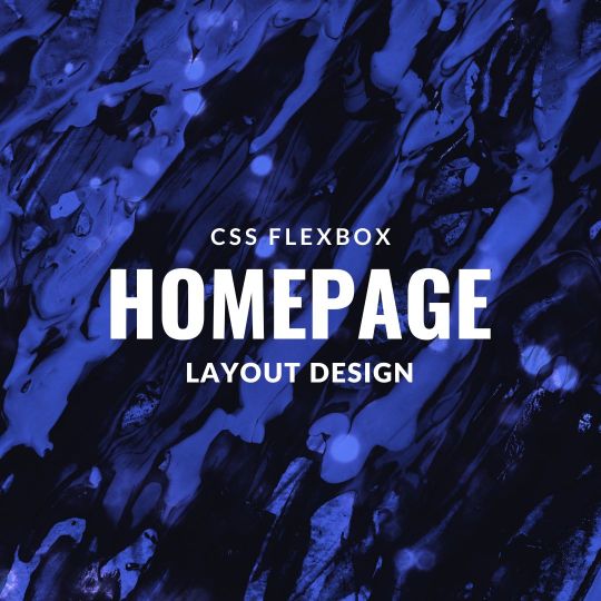
Responsive Flexbox Layout
#responsive flexbox layout#css flexbox layout#css flexbox examples#learn to code#code#Homepage design#homepage#flexbox homepage#css#html#css3#html5#divinectorweb
2 notes
·
View notes
Note
i like your website! it looks very nice
especially the gradient colored text!! you used a separate font to make it more legible
whenever i try to do something like that, it always becomes really hard to read... maybe i should learn some basic web design?
my website looks like this and it took two days of fiddling with css
Thank you! The biggest thing with making text legible is making sure there is enough contrast between the text color and the background or make the text big enough that it’s legible even if there isn’t that much contrast. The best guide on color contrast that I know of is the Mozilla docs! If you scroll down to the solution part there it has many tools to check text contrast.
Since your website has a warm bright canvas background darker colors and gradients would work better and end up being more legible.
If you’re looking to learn more about web development and especially CSS I strongly recommend Kevin Powell on YouTube! His videos on flexbox and grid are very helpful in understanding those new browser features and making responsive websites (websites that look great on any screen size). For example, I used grid for the nickname table and for my projects so that on desktop those elements would be wider and shorter while on mobile they’d get narrower and taller.
I love your site too, especially the canvas theme with the green branch/orange leaves and the clever span box to show your favorite color complete with a title tag featuring the hex code!
To be clear my site took me at least 20 hours of fiddling and development to make. Feel free to look at the site code (and my commit history) on GitHub!
6 notes
·
View notes
Link
0 notes
Text
What's new about HTML6 and CSS5?
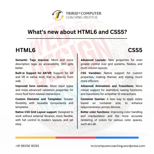
As technology continues to advance, so do the characteristics of how languages will shape a web in the future. HTML and CSS were also the constituent elements of web design. Although HTML5 and CSS3 have become standards in the industry, the web development community has anticipated HTML6 and CSS5 to come soon as they already breathe of new features and improvements that will revolutionize the way websites are constructed and experienced. Let's dive into what we can expect from these upcoming languages.
New Features of HTML6
Under development, HTML6 is expected to proffer any features exciting enough that it makes web development much more powerful and intuitive. Here is what is expected to come in:
Better Integration with JS Frameworks
HTML6 will come with a design that perfectly matches the working of modern JavaScript frameworks, for e.g., React, Angular, or Vue.js, enabling easy creation of dynamic and responsive web applications.
Reduced Complexity in Syntax
HTML6 should lessen complexity with new tags and attributes opening up ways to easier and simpler syntaxes. For example, semantic elements would be new to better content structuring, improving code readability.
Better Web Accessibility
Web accessibility is among the important developments of HTML6. New features would offer facilities to construct effective websites capable of usage by disabled people with improvements in screen reader usage and improved ARIA (Accessible Rich Internet Applications) integration.
Advanced Multimedia Support
HTML6 gives web developers greater control in the handling of multimedia elements, such as video and audio. Enhanced support of 3D content and interaction with more immersive user experience could be possible.
What Is Latest in CSS5?
Similar to the development of HTML6, CSS5 is being developed and is expected to give web designers an improved capability in designing. Here are some of the expected newer features of CSS5:
CSS Grid 2.0
CSS Grid has changed the face of layout design in CSS3, and CSS5 would go a step further by offering more positioning control of the elements to allow even more complex and fluid designs of grid layouts.
Advanced Typography Features
There will be improvements in typography with new properties that will allow for an even more impressive and lively text styling in CSS5. Better variable font support, animated text, and superior text alignment control can be expected.
Enhanced CSS Variables
CSS Variables are reusable styles incorporated in the development of a website that increase the ease with which developers could use styles. CSS5 will also reinvent custom properties, making them much easier to use in crafting flexible and scalable design systems.
New Pseudo-Classes and Pseudo-Elements
New pseudo-classes and pseudo-elements will be added to form CSS5. They will also provide new flexibility for selecting and styling elements on a page. Elements targeting dynamically, based on their state or position, will then be easier.
Flexible Improvements
Flexbox will be stable and strong as it is, and in addition to that, CSS5 is expected to give added powers. Here will come in new properties to enable better flexible-tenant layout construction, to make building responsive into it.
For What Purposes One Should Learn HTML6 and CSS5?
Well, whenever the new versions come into existence, it becomes important for web developers, designers, and students to keep pace with the changes. The TCCI Computer Coaching Institute makes up the best educational institutions for aspiring web developers to learn master HTML5, CSS3, and beyond.
Courses related to website designing and development will happen at TCCI, including practical learning sessions with HTML, CSS, JavaScript, and more. Whether a student is entering the doors of the web development world for the first time or wishes to learn new technologies to update their skill set, expert trainers are there for every step of the journey.
What HTML6 and CSS5 are going to do is a revolution in the way we build our websites. They are going to enhance the experience at the front end in terms of features, make the application more accessible, and increase compatibility with modern framework development. With these technologies, you are going to prepare yourself at the TCCI Computer Coaching Institute to be relevant in the changing tech world and develop the next generation of web experiences.
Call now on +91 9825618292
Get information from https://tccicomputercoaching.wordpress.com/
#Best Computer Training Institutes Bopal Ahmedabad#Computer Training Institutes near me in Ahmedabad India#TCCI - Tririd Computer Coaching Institute#Top Web Designing Institutes in Bopal Ahmedabad#web development courses in ahmedabad
0 notes
Text
Creating a Responsive Angular Application with CSS Grid and Flexbox
Introduction Creating a Responsive Angular Application with CSS Grid and Flexbox is a crucial skill for any web developer. In this tutorial, we will cover the technical aspects of building a responsive Angular application using CSS Grid and Flexbox. We will explore the core concepts, implementation guide, code examples, best practices, testing, and debugging. What Readers Will Learn How to…
0 notes
Text
Start Coding with CSS: A Beginner-Friendly Tutorial to Beautiful Web Design

If you are starting your journey in web development, understanding CSS (Cascading Style Sheets) is essential. In this CSS Tutorial for Beginners, we’ll explore how CSS helps you make your web pages look attractive and organized.
CSS works hand-in-hand with HTML. While HTML is used for creating the structure of a webpage, CSS is used for styling. With CSS, you can change the colors, fonts, spacing, and layout of your content. For example, you can make your headings bold, change the background color of your page, or center-align text.
There are three ways to add CSS to your website: inline, internal, and external. Inline CSS allows you to add styles directly to individual elements. Internal CSS involves adding styles within your HTML document but in a dedicated section. External CSS uses a separate file linked to your HTML, making it easier to manage styles across multiple pages.
Learning CSS helps you control the design of your site, from basic formatting to advanced layouts. As you grow more confident, you can explore features like Flexbox for arranging elements or Grid for complex designs. You can even add animations and transitions to make your website more interactive.
With consistent practice, you’ll be able to transform plain web pages into visually amazing sites. For a detailed step-by-step guide, visit CSS Tutorial for Beginners. Happy learning!
0 notes