#flexbox css
Explore tagged Tumblr posts
Visit Tumblr Blog
Explore Tumblr blogs with no restrictions, modern design and the best experience.
Last Seen Tumblr Blogs


Fun Fact
Mobile US users spent an average of 115.8 minutes on Tumblr app monthly.
Text
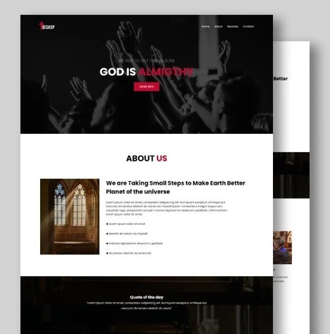
Flexbox Landing Page
#css flexbox examples#flexbox css#flexbox tutorial#html css#css#frontenddevelopment#webdesign#html#css3#divinectorweb#flexbox#landing page website#website design#create a website
2 notes
·
View notes
Text
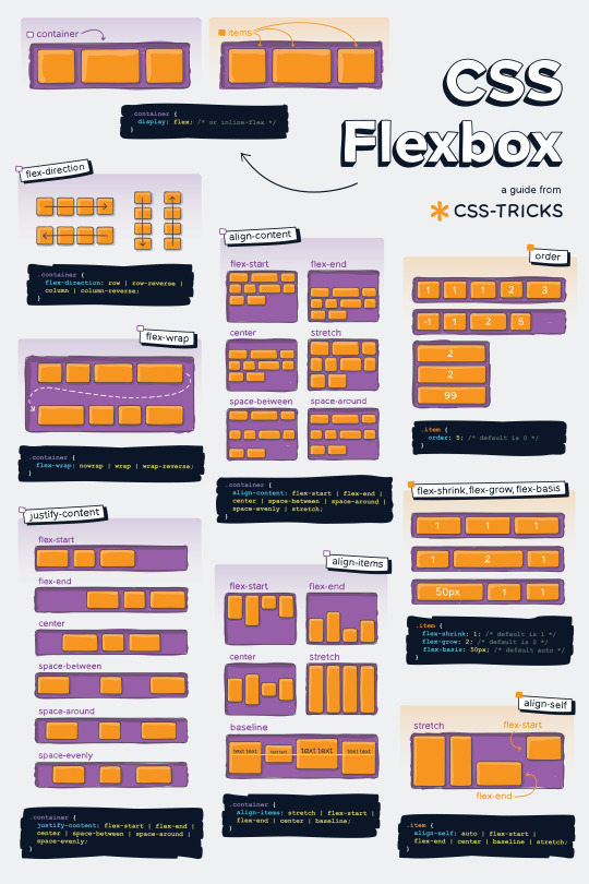
Helpful Poster Guide from CSS-Tricks for CSS Flexbox
#codeblr#coding#studyblr#studying#programmer#coder#programming#progblr#study#code blog#code#css#flexbox
311 notes
·
View notes
Text
she flex on my box till I overflow
23 notes
·
View notes
Text
CSS Positioning...
Today is the day I try my absolute best to focus on CSS flexbox.
Positioning in CSS is a complete guessing game to me currently, so today I'm going to specifically take the time to deep delve and try to fully understand what does what.
If you have any handy tips, I'd be grateful to hear them! Otherwise, I'll end up trying to make something that will hopefully make it easier to others too.
Wish me luck!
#css#flexbox#learning to code#web design#coding#codeblr#studybrl#study blog#learning#web development#programming#career change#career switch#motivated
15 notes
·
View notes
Text

Responsive Flexbox Image Gallery
#flexbox image gallery#responsive image gallery#image gallery html css#css#html#frontend#html css#codingflicks#webdesign#css3#frontenddevelopment#code#neduzone
7 notes
·
View notes
Text

Team Section UI Design
#team section design#team section flexbox#codenewbies#html css#html5 css3#webdesign#css flexbox layout#css flexbox#css#team section html css#html css tutorial
4 notes
·
View notes
Text
Curious about when to use display: flex or display: inline-flex?
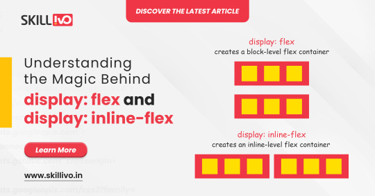
display: flex turns your element into a block-level flex container, giving you full control over its child elements' alignment and spacing. Perfect for structuring complex layouts! 🏗️
On the other hand, display: inline-flex gives you the same flex properties but maintains the container as an inline element. Ideal for inline-level layouts where you need the magic of flex without breaking the flow! 💫
Read Article- Click Here
Follow-
LinkedIn- Skillivo
#WebDevelopment#CSS#Flexbox#Coding#Frontend#WebDesign#Programming#CodeNewbie#LearnToCode#TechTips#Skillivo#ProgrammingTips#InlineFlex
3 notes
·
View notes
Text
3 notes
·
View notes
Text
not gonna lie now that I've mastered flexboxes I don't really get the point of tables anymore. they're just kind of annoying to use looool
#bellspeaks#jokes aside I am aware flexboxes came later along in html's life. which is why they coexist & are taught later then tables#but imo they should just be in the css basics of every html course. they're so fucking useful like oh my god
4 notes
·
View notes
Text
The Mistakes of CSS
New Post has been published on https://thedigitalinsider.com/the-mistakes-of-css/
The Mistakes of CSS
Surely you have seen a CSS property and thought “Why?” For example:
Why doesn’t z-index work on all elements, and why is it “-index” anyways?
Or:
Why do we need interpolate-size to animate to auto?
You are not alone. CSS was born in 1996 (it can legally order a beer, you know!) and was initially considered a way to style documents; I don’t think anyone imagined everything CSS would be expected to do nearly 30 years later. If we had a time machine, many things would be done differently to match conventions or to make more sense. Heck, even the CSS Working Group admits to wanting a time-traveling contraption… in the specifications!
NOTE: If we had a time machine, this property wouldn’t need to exist.
CSS Values and Units Module Level 5, Section 10.4
If by some stroke of opportunity, I was given free rein to rename some things in CSS, a couple of ideas come to mind, but if you want more, you can find an ongoing list of mistakes made in CSS… by the CSS Working Group! Take, for example, background-repeat:
Not quite a mistake, because it was a reasonable default for the 90s, but it would be more helpful since then if background-repeat defaulted to no-repeat.
Right now, people are questioning if CSS Flexbox and CSS Grid should share more syntax in light of the upcoming CSS Masonry layout specifications.
Why not fix them? Sadly, it isn’t as easy as fixing something. People already built their websites with these quirks in mind, and changing them would break those sites. Consider it technical debt.
This is why I think the CSS Working Group deserves an onslaught of praise. Designing new features that are immutable once shipped has to be a nerve-wracking experience that involves inexact science. It’s not that we haven’t seen the specifications change or evolve in the past — they most certainly have — but the value of getting things right the first time is a beast of burden.
Direct Link →
#background#Born#change#CSS#CSS Flexbox#CSS Grid#css-tricks#csswg#digitalocean#easy#Features#grid#Ideas#immutable#it#layout#Light#Link#links#list#masonry#mind#module#newsletter#Science#specifications#stroke#syntax#technical debt#time
0 notes
Text

Flexbox Website Design
#flexbox website design#responsive layout#responsive website design#css#html css#divinector#webdesign#html#css3#frontenddevelopment#css flexbox examples#flexbox tutorial#flexbox css#flexbox layout
0 notes
Text
flex-direction: row; & flex-direction: column;
Flexbox has a property called flex-direction and this determines the direction that the flex items are displayed.
flex-direction: row; - this is the default and aligns the items across the page, making the main axis, left to right and the cross axis, top to bottom.

When this property is applied with this value, and if you use the flex-basis property on the flex items within this container, it would affect the width of the items:

if we apply a flex-basis of 500px to the first child div, it would change the width of the div.
flex-direction: column; - this aligns the items down the page, making the main axis from top to bottom and the cross axis from left to right.

When this property is applied with this value, and if you use the flex-basis property on the flex items within this container, it would affect the height of the items:

if we apply a flex-basis of 300px to the first child div, it would change the height of the div.
The flex-basis property interacts with the main axis, and depending on the direction of the main axis, determines whether the flex-basis will change the items' width or height.
#codeblr#coding#studyblr#studying#programmer#coder#study#progblr#programming#random notes#css#flexbox
88 notes
·
View notes
Text
La propiedad display en CSS: Desde lo básico a los diseños más avanzados.
La propiedad display determina el tipo de caja que un elemento forma y cómo se comporta dentro del flujo del documento. En otras palabras, indica si un elemento se mostrará como un bloque, una línea o si se ocultará por completo. Valores de la propiedad display La propiedad display admite varios valores, cada uno con un comportamiento específico: Valores básicos: block: Crea un bloque que…
#block#caja#contenedor#CSS#CSS3#desarrollo web frontend#Diseño web#diseño web adaptable#diseño web moderno#elemento#elementos HTML#Flexbox#flujo del documento#Grid#inline#inline-block#layout#maquetación#posicionamiento de elementos#propiedad display#responsive design#tipos de display#valor display
0 notes
Text
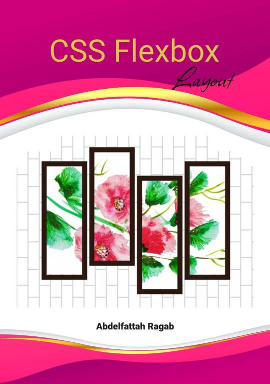
CSS Flexbox Layout by Abdelfattah Ragab
CSS Flexbox Layout by Abdelfattah Ragab
Welcome to "CSS Flexbox Layout". In this book I explain the flexbox layout model. I explain the properties of containers and elements and show you how to use Flexbox to create modern and responsive web designs. By the end of this book, you will know everything about Flexbox, use it to create responsive designs and handle all kinds of scenarios. Let’s get started.
Available on https://shop.tredition.com and https://www.amazon.com
0 notes
Text
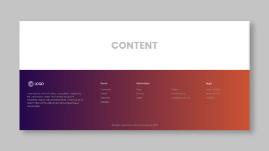
Responsive Footer Design
#flexbox footer design#responsive web design#frontend#html css#css#html#css3#frontenddevelopment#webdesign#neduzone#website footer#css footer#footer html css
9 notes
·
View notes
Text

Team Section UI Design
#team section html css#team section flexbox#codenewbies#html css#frontenddevelopment#html5 css3#css#webdesign#css flexbox layout#flexbox snippets
3 notes
·
View notes