#CSS Flexbox
Explore tagged Tumblr posts
Visit Tumblr Blog
Explore Tumblr blogs with no restrictions, modern design and the best experience.
Last Seen Tumblr Blogs


Fun Fact
Tumblr’s reach among the 26-to-35-year-olds in the US is 11%.
Text

Responsive Vertical Timeline using HTML CSS
#responsive vertical timeline#html css#css#frontenddevelopment#html#css3#divinectorweb#vertical timeline#responsive web design#timeline html css#css flexbox
4 notes
·
View notes
Text

Team Section UI Design
#team section design#team section flexbox#codenewbies#html css#html5 css3#webdesign#css flexbox layout#css flexbox#css#team section html css#html css tutorial
4 notes
·
View notes
Text
Display: Flexbox vs. Floats
Dominando la Maquetación Web con CSS ¡Hola, N’ticos! En el vasto universo del diseño web, la maquetación es la clave para crear interfaces atractivas y funcionales. Durante años, hemos recurrido a diferentes técnicas para organizar nuestros elementos en la pantalla. Hoy, vamos a desglosar dos de las más importantes: display: float y display: flex (Flexbox), explorando sus ventajas,…
#CSS Flexbox#CSS Floats#desarrollo web#Diseño web#display flex#display float#Flexbox#Floats#Formación#informática#maquetación web#N&039;tics#responsive design#Tutorial CSS
0 notes
Text
The Mistakes of CSS
New Post has been published on https://thedigitalinsider.com/the-mistakes-of-css/
The Mistakes of CSS
Surely you have seen a CSS property and thought “Why?” For example:
Why doesn’t z-index work on all elements, and why is it “-index” anyways?
Or:
Why do we need interpolate-size to animate to auto?
You are not alone. CSS was born in 1996 (it can legally order a beer, you know!) and was initially considered a way to style documents; I don’t think anyone imagined everything CSS would be expected to do nearly 30 years later. If we had a time machine, many things would be done differently to match conventions or to make more sense. Heck, even the CSS Working Group admits to wanting a time-traveling contraption… in the specifications!
NOTE: If we had a time machine, this property wouldn’t need to exist.
CSS Values and Units Module Level 5, Section 10.4
If by some stroke of opportunity, I was given free rein to rename some things in CSS, a couple of ideas come to mind, but if you want more, you can find an ongoing list of mistakes made in CSS… by the CSS Working Group! Take, for example, background-repeat:
Not quite a mistake, because it was a reasonable default for the 90s, but it would be more helpful since then if background-repeat defaulted to no-repeat.
Right now, people are questioning if CSS Flexbox and CSS Grid should share more syntax in light of the upcoming CSS Masonry layout specifications.
Why not fix them? Sadly, it isn’t as easy as fixing something. People already built their websites with these quirks in mind, and changing them would break those sites. Consider it technical debt.
This is why I think the CSS Working Group deserves an onslaught of praise. Designing new features that are immutable once shipped has to be a nerve-wracking experience that involves inexact science. It’s not that we haven’t seen the specifications change or evolve in the past — they most certainly have — but the value of getting things right the first time is a beast of burden.
Direct Link →
#background#Born#change#CSS#CSS Flexbox#CSS Grid#css-tricks#csswg#digitalocean#easy#Features#grid#Ideas#immutable#it#layout#Light#Link#links#list#masonry#mind#module#newsletter#Science#specifications#stroke#syntax#technical debt#time
0 notes
Text
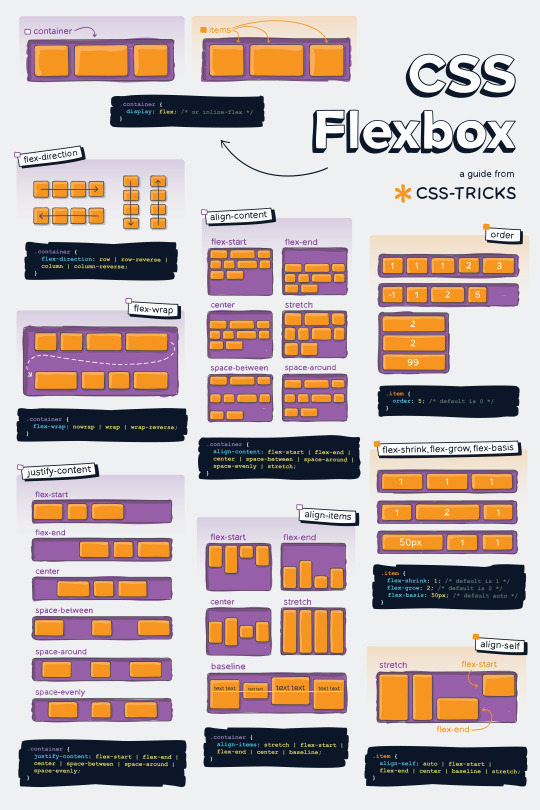
Helpful Poster Guide from CSS-Tricks for CSS Flexbox
#codeblr#coding#studyblr#studying#programmer#coder#programming#progblr#study#code blog#code#css#flexbox
312 notes
·
View notes
Text
she flex on my box till I overflow
23 notes
·
View notes
Text
CSS Positioning...
Today is the day I try my absolute best to focus on CSS flexbox.
Positioning in CSS is a complete guessing game to me currently, so today I'm going to specifically take the time to deep delve and try to fully understand what does what.
If you have any handy tips, I'd be grateful to hear them! Otherwise, I'll end up trying to make something that will hopefully make it easier to others too.
Wish me luck!
#css#flexbox#learning to code#web design#coding#codeblr#studybrl#study blog#learning#web development#programming#career change#career switch#motivated
17 notes
·
View notes
Text

Responsive Flexbox Image Gallery
#flexbox image gallery#responsive image gallery#image gallery html css#css#html#frontend#html css#codingflicks#webdesign#css3#frontenddevelopment#code#neduzone
7 notes
·
View notes
Text
every so often i rediscover css and rediscover why i hate it
#caique posts#i hate absolutely everything about css but if there's one thing i hate more than using css it's not using css#why is flexbox?#it's like a horse. powerful but fragile. most other parts of css are robust but flexbox will just die for no reason even though#you did your all to take care of it#grid layouts (like the one pictured here) are fun to make though
3 notes
·
View notes
Text
Curious about when to use display: flex or display: inline-flex?
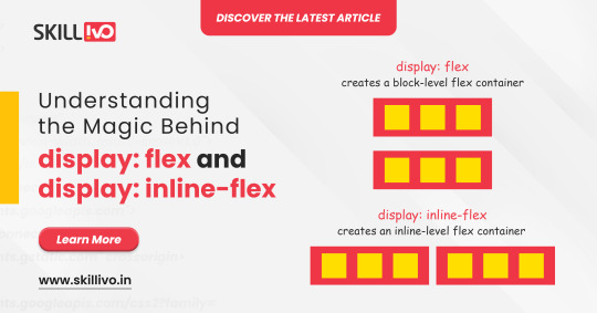
display: flex turns your element into a block-level flex container, giving you full control over its child elements' alignment and spacing. Perfect for structuring complex layouts! 🏗️
On the other hand, display: inline-flex gives you the same flex properties but maintains the container as an inline element. Ideal for inline-level layouts where you need the magic of flex without breaking the flow! 💫
Read Article- Click Here
Follow-
LinkedIn- Skillivo
#WebDevelopment#CSS#Flexbox#Coding#Frontend#WebDesign#Programming#CodeNewbie#LearnToCode#TechTips#Skillivo#ProgrammingTips#InlineFlex
3 notes
·
View notes
Text
3 notes
·
View notes
Text

Web Design with Flexbox
#web design with flexbox#responsive flexbox layout#flexbox tutorial#css flexbox examples#html css#divinector#css#frontenddevelopment#webdesign#html#css3#responsive web design#css flexbox
0 notes
Text

Team Section UI Design
#team section html css#team section flexbox#codenewbies#html css#frontenddevelopment#html5 css3#css#webdesign#css flexbox layout#flexbox snippets
3 notes
·
View notes
Text
not gonna lie now that I've mastered flexboxes I don't really get the point of tables anymore. they're just kind of annoying to use looool
#bellspeaks#jokes aside I am aware flexboxes came later along in html's life. which is why they coexist & are taught later then tables#but imo they should just be in the css basics of every html course. they're so fucking useful like oh my god
4 notes
·
View notes
Text
8 CSS Snippets for Creating Bento Grid Layouts
New Post has been published on https://thedigitalinsider.com/8-css-snippets-for-creating-bento-grid-layouts/
8 CSS Snippets for Creating Bento Grid Layouts
Another day, another design trend! Bento grid layouts are the subject this time around. They’re bold and beautiful. Plus, they satisfy those with a need for symmetry.
So, what exactly is a Bento layout? Think of it as a puzzle. Different-sized containers fit together to create a seamless look. Inspired by Japanese culture, it’s popping up all over the web.
There’s good reason for Bento’s growing popularity. You can use these layouts in a multitude of ways. Everything from listing blog posts to product features is possible. They’re also perfect for dashboard screens.
We should also mention the role that the evolution of CSS has played. Both CSS Grid and Flexbox make these layouts easier to build. No hacks or workarounds are necessary!
With that, here’s a look at 8 beautiful Bento grid layouts.
Complex Bento CSS Grid Layout
CSS Grid packs a lot of power into a tiny bit of code. For example, this complex grid layout requires only 43 lines of CSS. The layout is both efficient and naturally responsive. Therefore, you won’t have to play around with media queries.
See the Pen Complex Bento Layout
Bento-Style Responsive Dashboard
Here’s a gorgeous dashboard layout that benefits from Bento. The layout offers a great way to display relevant content. Everything is neatly organized and easy to follow. The use of photography and color makes this example stand out.
See the Pen Responsive Dashboard | Bento Style by Ecem Gokdogan
Bento Design Concept Layout
This page layout is a different take on the Bento aesthetic. There’s a sidebar featuring in-page navigation. Clicking a button expands it. Meanwhile, the content container maintains a consistent height.
See the Pen bento design concept by Abhishek Bhardwaj
Bento-Box-V1.0.1
Bento layouts also benefit from minimalism. This layout features fewer bells and whistles. Notice the use of white space and legible typography. The animated charts catch your eye without being overwhelming.
See the Pen Bento-Box-V1.0.1 by Gwenaël Guiraud
Sticky Bento on Scroll
This “sticky” presentation adds special effects to the mix. Watch how certain elements stick as you scroll. The idea is that you can go beyond static grids. Bento can be fun, too!
See the Pen Sticky Bento on Scroll ✨ by Jhey
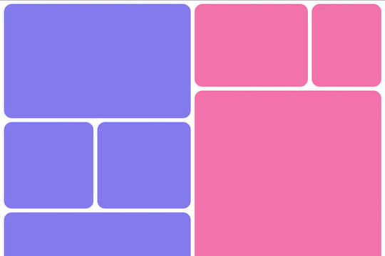
Bento Grid Using CSS Flexbox
Let’s check out another fun example using Flexbox. This grid has a neon look and includes cool hover effects. Bonus points here for maintaining legibility and responsiveness.
See the Pen bento grid – challenge (Chrome +111) by EaterUsr
Card-Based Layout with Gradient Borders
Here’s an example for those wanting to stand out from the crowd. This card-based layout features animated borders, “wipe” effects, and beautiful hover styling. The layout remains clean – even with all those goodies.
See the Pen Cards (gradient border) by Dan
CSS Grid & :has() Grid Layouts
We can achieve a lot with the CSS :has() pseudo-class. This example uses it to adjust the layout as boxes are added and subtracted. Watch as the layout maintains perfect symmetry throughout.
See the Pen Always great grid – CSS grid + :has() + view transitions by Adam Argyle
Use Bento Grids to Keep Your Layout Nice and Tidy
The idea of using Bento aesthetics in web design isn’t new. However, older CSS layout techniques made them difficult to build. That’s no longer the case.
Perhaps the best part is that modern CSS does all the dirty work. We don’t need to compute complex calculations. CSS Grid and Flexbox can do this for us.
That leaves us free to experiment. The examples above demonstrate what is possible. And you can get as creative as you like.
Want to see more Bento grid examples? Check out our CodePen collection!
Related Topics
Top
#amp#Blog#box#challenge#charts#chrome#code#Color#container#Containers#content#CSS#CSS Flexbox#CSS Grid#CSS Layout Snippets#CSS Layouts#CSS Snippets#dashboard#Design#display#easy#effects#Evolution#eye#Features#grid#grids#hover#how#it
1 note
·
View note
Text
flex-direction: row; & flex-direction: column;
Flexbox has a property called flex-direction and this determines the direction that the flex items are displayed.
flex-direction: row; - this is the default and aligns the items across the page, making the main axis, left to right and the cross axis, top to bottom.

When this property is applied with this value, and if you use the flex-basis property on the flex items within this container, it would affect the width of the items:

if we apply a flex-basis of 500px to the first child div, it would change the width of the div.
flex-direction: column; - this aligns the items down the page, making the main axis from top to bottom and the cross axis from left to right.

When this property is applied with this value, and if you use the flex-basis property on the flex items within this container, it would affect the height of the items:

if we apply a flex-basis of 300px to the first child div, it would change the height of the div.
The flex-basis property interacts with the main axis, and depending on the direction of the main axis, determines whether the flex-basis will change the items' width or height.
#codeblr#coding#studyblr#studying#programmer#coder#study#progblr#programming#random notes#css#flexbox
88 notes
·
View notes