#vertical timeline
Explore tagged Tumblr posts
Visit Tumblr Blog
Explore Tumblr blogs with no restrictions, modern design and the best experience.
Last Seen Tumblr Blogs


Fun Fact
The Tumblr office adopted Tommy, an 11-year-old Pomeranian.
Text

Responsive Vertical Timeline using HTML CSS
#responsive vertical timeline#html css#css#frontenddevelopment#html#css3#divinectorweb#vertical timeline#responsive web design#timeline html css#css flexbox
4 notes
·
View notes
Text


Candid photos never turn out well.
It's happening, everyone! We've made it to the end :D...kind of.
Legato's new outfit (+ annotations) under the cut ^-^


#you can tell that hytopia is a fashion capital because legato's outfit doesn't have pockets. truly the worst timeline 😔#the poor photographer...dude was just trying to get a cool shot of the heroes setting off on a new adventure#and then these little jerks saw the camera and called everyone over to pose for a photo#i tried to roughly frame it with the dimensions that the in-game photos use#just rotated vertically#fun little detail about tfh: each lobby is slightly different‚ so if you reference the wrong one you'll have to go back and fix it later#i spent longer than I care to admit deciding the hair colors for everyone#my art#lu doppelgänger au#lu wind#lu four#lu hyrule#lu legend#lu wild#lu twilight#lu time#lu warriors#lu sky
172 notes
·
View notes
Text
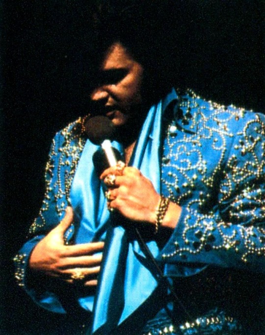
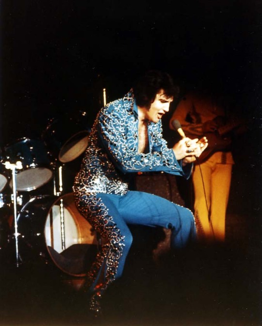
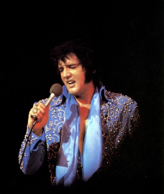
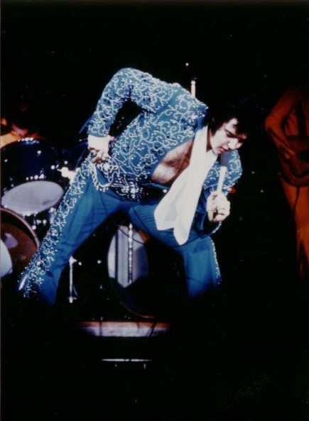
blue swirl lucky suit, you got me right where you want me.
#these photos represent a vertical timeline as my sanity declines#no but it looks so pretty when the lights turn it from navy to sky blue#i'm watching concert footage where he wore this and there's a jumpcut and his belt is gone 😭#baby what you doin#elvis presley
33 notes
·
View notes
Text
yayyy the shining! minotaur! labyrinth! house of leaves! running down impossible yellow-walled corridors! malevolent architecture!
#everything i love about this episode that’s only the surface of it#it’s got layers! isn’t it good to see an episode with layers#most importantly it’s vertically complex (dissects the meanings of the characters’ relationships to one another) rather than#horizontal complexity (moffatisms: an extremely convoluted plot that takes brainpower to untangle but doesn’t carry much substance beyond#ooh look just how twisty-turny i can make this timeline)#not to toot my own horn but these are useful terms and i’ll be using them in future posts not even just about this show#‘creepy or wet’ meme. you tell me this media’s complex. i ask if it’s horizontally or vertically. you tell me you don’t understand. i check#the media. it’s horizontal#dw#the god complex#jamie catches up#doctor who#jamie.txt
13 notes
·
View notes
Text
EXTREMELY low effort plug n play cover with very default settings mixing i did in like 20 min but im trying out voisona and holy shit tsudumi's 2.0 sounds SO so good
honeymoon un deux trois by dateken (original vocal rin), UST by purblexber
#voisona#vocal synth cover#suzuki tsudumi#needs a lot of work. mostly needs better placed breaths than the default and the legato situation is dire#she just ran a marathon into the studio and immediately started singing no breaks LOL#but man you can hear anju inami's tone clearer here and its great. i always wished she did more solo music#but shes like busy with stage work and whatever else so i understand. so this will do hjkfdhgjkfdgfd thank u anchan for this gift#i dont mind cevio ai's odd max-setting-autotuney sounding engine quirk but man#am i glad they let u have a free voisona license for vocals u bought on cevio because tsudumi specifically i prefer here#she has a warmer tone i think is how id describe it#voisona aint half bad! i do which the pause and play buttons were the same tho but thats a problem i have with cevio too#and i do need to alter the shortcuts because rn ctrl scroll is zoom vertically instead of horizontal which is...lol#but every audio program will have ui quirks so i dont mind. fl studio keeps killing me with the shift scroll not being scroll timeline#and instead being move audio over?? bizarre. oh and i guess voisona keeps glitching out the text in the top bar for some reason#i do like the vibrato editing settings tho. its not super precise it seems but its fast
3 notes
·
View notes
Text
i live for the visible progression of him becoming more traumatised, vs him starting to heal

Redrew the Jon hair timeline
#wolfy dearest#that is a squiggle#not a timeline#please i beg you rearrange it so it goes horizontally not vertically t-t
10K notes
·
View notes
Text
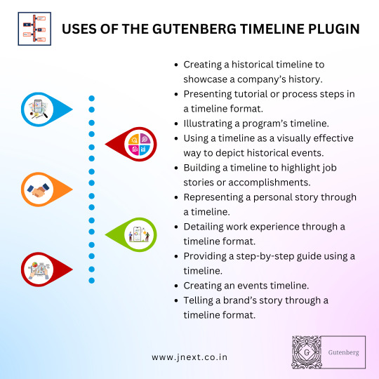
Transform your content presentation with the Gutenberg Timeline Plugin, featuring the all-new curve timeline feature! Effortlessly design stunning, curved timelines that captivate your audience and beautifully showcase your company's history, project milestones, or any chronological events. This easy-to-use plugin seamlessly integrates with Gutenberg, empowering you to craft dynamic timelines without any coding. Download now and elevate your WordPress website with captivating curve timelines!
#Gutenberg Timeline Plugin#JNext Timeline Plugin#JNext Services#Curve Timeline Plugin#Gutenberg Timeline Blocks#Timeline Block Plugin for Gutenberg#Vertical Timeline Plugin Wordpress#Wordpress Plugin History Timeline#JNext Timeline Block#History Timeline#Wp Timeline Plugin#Timeline Elementor#Wordpress Timeline#Gutenberg Timeline Block Plugin#WordPress Timeline Block Plugin
0 notes
Text
A Visual Journey with Gutenberg Timeline Plugin

Enhance your website with the dynamic and visually engaging JNext Timeline Block Plugin. This powerful tool allows you to effortlessly showcase chronological events, milestones, and achievements in a sleek and customizable timeline format. Captivate your audience with interactive timelines that seamlessly integrate into your site, offering a compelling storytelling experience. Whether you're a blogger, business professional, or educator, the JNext Timeline Block Plugin is the perfect solution to bring your content to life. With user-friendly customization options and responsive design, create a captivating narrative that leaves a lasting impression on your visitors. Elevate your website's storytelling potential with the JNext Timeline Block Plugin – where past, present, and future seamlessly converge in a visually stunning display.
#Timeline Blocks#WordPress Timeline Block#WordPress Timeline Plugin#Timeline Block Plugin for Gutenberg#JNext Timeline Blocks#JNext Timeline Block Plugin#JNext Timeline Plugin#WordPress Timeline Block Plugin#Curve Timeline Plugin#Timeline Block Plugin#Gutenberg Timeline Plugin#Wordpress Curve Timeline Plugin#Timeline WP Plugin#Elementor Timeline Widget#Divi Timeline Plugin#Vertical Timeline Plugin Wordpress#Wordpress Plugin History Timeline#JNext Timeline Block#History Timeline
0 notes
Text
FIVE HARGREEVES ; now you're gone, out of reach
summary ; you end up disappearing due to the kugelblitz and five gets drunk as hell at the wedding after finding out
warnings ; language, talk about death & loss, five being drunk
disclaimers ; five is reminded of reader with fruity things, scents, drinks etc
track ; cigarettes, david kushner
word count ; 1.3k
masterlist
You were just some un-powered love interest to Five Hargreeves, having traveled to the ends of the universe and back with him. You'd also been stuck in your pubescent body, due to some accidents at the Commission.
But they were gone now, for the most part.
You and Five never really made it official, so to say. Too much trying to save the world and restarting your lives over and over again for it.
But as you sat at the bar in the Hotel Obsidian, you old, retired skinbags who didn't seem to age had finally worked out your romantic problems. Apparently, the space time continuum wouldn't allow you two to be any further than five feet away from each other, fate dragging you out to Pennsylvania to join Klaus on a road trip.
You were far enough away from the first wave that snatched the lobsters, avoiding it by a few feet on that dark night. You'd avoided death like another character in Final Destination.
You stuck by him like your life depended on it, unknowing of your soon-to-come fate.
After nearly avoiding another wave of the Kugelblitz, which sucked up a shit ton of cows by the Amish where Klaus supposedly came from, you all knew something was up. Not because you'd been sucked away, but because cows don't just disappear. Neither do lobster, but no one ever takes you seriously. You needed a break, maybe you hallucinated it, right?
Like how Five apparently hallucinated ever knowing you, right?
Upon returning to the Hotel Obisidian, you run up to your room, hoping to retrieve a comfort item from your room, at least a blanket, to cope with the oncoming stress.
And then, you never returned.
Five assumed you probably fell asleep, and didn't bat an eye when his newfound lover never returned from their room that afternoon. The grandfather paradox was explained to the Hargreeves siblings, informing themselves of what they'd done to the timeline, fucking it up enough for it to want to destroy itself, creating a black hole of sorts to eat everything up.
It ate everything up within a million miles radius, other than the powered individuals and the hotel itself which had gone untouched, other than you, of course.

Upon realizing that he hadn't seen you in damn near days, and that the theories and excuses that you were asleep or out on an adventure couldn't be true, Five searches the Hotel Obsidian for you. He wished to see you again, wanting to drag you onto the dance floor and slow dance with you at his side, his brothers and their lovers feet away doing the same, staring into each other's eyes like there was no tomorrow, because there wasn't.
As he enters your room, a light, fruity smell burrows into his nose. A warm yellow, quilted blanket lays on your bed, vertically scrunched like you were holding it before disappearing into thin air.
The fear grasps onto Five like nothing had before. His chest tightens like his ribs were suffocating his lungs and heart, his mind racing a million miles an hour.
He forgot you weren't one of them. You were just... you. Normal.
He searches the room top to bottom, praying to God that this wasn't some sort of sick prank. But, with no trace, he accepts the truth, realizing you'd faded into the fabric of the universe.
Soft, salty tears pour down his cheeks.
His last day on Earth and he couldn't even spend it with you.
How many days had you been gone without him even batting an eye?
His ignorance caused your disappearance, not that you weren't protected by the locked safe known as the Hotel Obsisidian, which remained untouched for the most part by the Kugelblitz. You didn't have that special little barrier that came with the children born on October 1st 1989. You couldn't have been protected anywhere you went.
As the world crumbles around him, Five solemnly trails down the many flights of stairs back down to the bar, trying to keep his spirit lifted for his brother's wedding. He couldn't be weak now, not in a time for final celebration before his pain would be relieved, everything he had to internally die for to be lifted away.
A long, perilous journey waits for him among the stairs.
"Don't die, Mr. Five."
Christ, he could hear Pogo a million light years away warning him.
He sits at the bar alone, his mind drifting to another world as he absent mindedly drinks himself to death. Behind him dances Luther and Sloane, enjoying their first dance together.
Aftward, Diego and Lila join them on the dance floor. Accompanying them is Klaus, Ben, and Viktor.
Five maintains his seat at the bar, trying to fuck himself up as much as possible.
He looks over his shoulder, seeing Diego and Lila enthusiastically bouncing around, enjoying their last memories together.
That should've been you and him. He should've had you wrapped in his arms, spinning you around out there with colorful lights blanketed over your bodies. He wanted to feel you pressed against him, fingers intertwined as you danced in that ballroom for the first and last time. He wanted to remember every good and bad moment with you one more time before you both became another speck of dust for the stars.
Viktor, concerned, approaches Five, knowing of the events of your disappearance. Five was the only one who couldn't push past the loss at the moment, which was obvious. He sits down next to his brother, a glass of some sort of alcohol stored in a small shot glass in his hand.
"You alright?" He asks.
"Good as I'll ever be" Five slurs, resting his head on his left hand, his elbow perched on the bar counter.
"Miss Y/n, don't you?" Viktor frowns, rubbing Five's back in an attempt to comfort him.
Five nods, taking another chug from his vodka, the strong, sour taste on his tongue causing him to cringe. "Just wish I had more time. Like, the light that guided me through the dark is just gone. All lights turned off can't be turned on, I guess"
"That's oddly poetic" Viktor chuckles. "Your inner old man will always be stuck deep down inside of you, huh?"
"Says you." The physically younger man laughs, "You're what? Thirty-four? How long were you stuck in the sixties?"
"Dude, it was like a month"
"Whoops"
The two laugh loudly, drunk out of their minds to ease the hurt of imminent death rolling upon them. They look back at their family, dancing, smiling, enjoying their time together. They smile, knowing that even at the end of it all, they'd be happy together.
That's all it took.
Five mixes himself up a pineapple refresher to try and settle his liver, not trying to let organ failure take him before the Kugelblitz did. As he remembers, he's brought back to memories of you and him at a bar back in the sixties, sipping on some fruity margaritas in Dallas.
"Fuck it, I need something stronger"
"Something stronger and you'll end up jumping off the roof within the hour"
"Where's Klaus the alcoholic know-it-all when you need him?..."
As the hotel crumbles around them deep in the night, Five sleeps, blacked out, with your yellow blanket beside him. It reeked of a citrus scent, reminding him of you.
His tired, baggy eyes and messily hair speak volumes if his slurred speech before he knocked himself out didn't. He awaits to see you again in the fabric of the universe, awaiting to be scooped away as he slumbers one last night, this time, alone.
As he begins dissolving into stardust, he dreams of relaxing on a quiet beach with you, the smell of fruit stuck in his nose, colorful, patterned shirts covering your chests loosely.
At least he was able to find peace in your absence.
You were gone and out of reach, but even with that, he'd find a way to get to you, to reach you just one last time.
#lowkeyrobin#gn reader#gender neutral reader#they/them reader#five hargreeves x reader#five hargreeves x you#the umbrella academy x reader#umbrella academy x reader#the umbrella academy#gn! reader#five x reader
393 notes
·
View notes
Text
There's a beautiful model of time travel called hypertime, which so far as I know was invented by qntm. You can read about it here.
The general idea is that there's an infinite stack of universes, possibly with a "prime" universe, each temporally offset from each other by some small amount (or just being continuous). You can imagine all of time on a chart where a properly sloped diagonal defines a specific time (e.g. January 1st, 2001), every horizontal line defines a single universe from its past to present, and every vertical line defines multiple universes that are "initially" arranged so that they're equivalent to "down" being backward in time and "up" being forward in time.
My plan was to write a fanfic of the NBC show Timeless using this model, rather than the one they use in the show. I see now that this was hugely more ambitious than Timeless ever deserved.
The big thing that keeps drawing me to this idea like a moth to flame is that there are cool things you can do with it. Here's one of them: a person goes to what they think of as "back in time", which is actually "down" on the time sheet, and ends up in a past that's different from the one they remember. How cool is that??
You intend to go to the past to see what's on Nixon's missing 18 minutes, and instead find yourself in a universe where the Nazis won WWII. And if you're operating under the assumption your time machine works like the one in Back to the Future, you're suddenly extremely confused. So you go back in time again, heading to just before the outbreak of WWII, and ... it's completely normal, with no sign that anyone has been monkeying around.
This is my white whale of a scene: the revelation that it all actually does make sense, the unfolding implications, the machinations of all the major time traveling factions and their goals.
I'm not actually sure that such a scene can be written in such a way that the majority of the audience would get it. Hypertime is hellish. Diagrams would help, but I'm not sure how much, especially because one of the things that (this subset of) hypertime assumes is some level of determinism and the inability to talk about "when" things happen except using reference frames.
As an added bonus, hypertime makes it possible to have diverse scenarios such that you can be wrong about how time travel works multiple times. You start out thinking that it's a stable time loop, you eventually see that contradicted and realize that it must be branching timelines, you see that contradicted and decide that it's ripple effect, and you see that contradicted and end up realizing that you're in this stupidly complicated hypertime setup. It has the potential to be the most complicated time travel story of all time. It has the potential to have the greatest number of explanations of time travel in a story, many of them incorrect.
I am at the point where I have an almost intuitive understanding of hypertime, but it took me drawing a lot of diagrams to get there, and I'm not sure I possess the writerly ability to explain it properly, especially if there are misdirects built into it.
A man can dream though.
233 notes
·
View notes
Text

Responsive Vertical Timeline Flexbox
#css flexbox examples#vertical timeline#timeline design#html css#code#frontenddevelopment#css#html#css3#responsive timeline#responsive web design#frontend#divinector#learn to code#webdesign
1 note
·
View note
Text
Someone asked me how I created the fade transition in this gifset which I’ll try to explain in the most comprehensive way that I can. If you've never done something like this before, I suggest reading through the full tutorial before attempting it so you know what you'll need to plan for.
To follow, you should have:
basic knowledge of how to make gifs in photoshop
some familiarity with the concept of how keyframes work
patience
Difficulty level: Moderate/advanced
Prep + overview
First and foremost, make the two gifs you'll be using. Both will need to have about the same amount of frames.
For ref the gif in my example is 540x540.
I recommend around 60-70 frames max total for a big gif, which can be pushing it if both are in color, then I would aim for 50-60. My gif has a total of 74 frames which I finessed using lossy and this will be explained in Part 4.
⚠️ IMPORTANT: when overlaying two or more gifs and when using key frames, you MUST set your frame delay to 0.03 fps for each gif, which can be changed to 0.05 fps or anything else that you want after converting the combined canvas back into frames. But both gifs have to be set to 0.03 before you convert them to timeline to avoid duplicated frames that don't match up, resulting in an unpleasantly choppy finish.
Part 1: Getting Started
Drag one of your gifs onto the other so they're both on the same canvas.
The gif that your canvas is fading FROM (Gif 1) should be on top of the gif it is fading INTO (Gif 2).
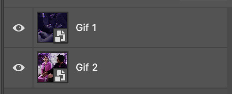
And here's a visual of the order in which your layers should appear by the end of this tutorial, so you know what you're working toward achieving:

Part 2: Creating the grid
Go to: View > Guides > New guide layout
I chose 5 columns and 5 rows to get the result of 25 squares.
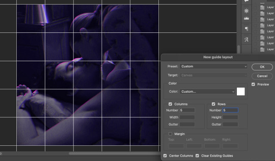
The more rows and columns you choose, the more work you'll have to do, and the faster your squares will have to fade out so keep that in mind. I wouldn't recommend any more than 25 squares for this type of transition.

To save time, duplicate the line you've created 3 more times, or as many times as needed (key shortcut: CMD +J) and move each one to align with the guides both horizontally and vertically. You won't need to recreate the lines on the edges of the canvas, only the ones that will show.
After you complete this step, you will no longer need the guides so you can go back in and clear them.

Follow the same duplicating process for the squares with the rectangle tool using the lines you've created.
Align the squares inside the grid lines. The squares should not overlap the lines but fit precisely inside them.
This might take a few tries for each because although to the eye, the squares look all exactly the same size, you'll notice that if you try to use the same duplicated square for every single one without alterations, many of them will be a few pixels off and you'll have to transform the paths to fit.
To do this go to edit > transform path and hold down the command key with the control key as you move one edge to fill the space.
Once you're done, put all the squares in their separate group, which needs to be sandwiched between Gif 1 and Gif 2.

Right click Gif 1 and choose "create clipping mask" from the drop down to mask it to the squares group. This step is super important.
After this point, I also took the opacity of the line groups down to about 40% so the lines wouldn't be so bold. Doing this revealed some squares that needed fixing so even if you aren't going dim the lines, I recommend clicking off the visibility of the lines for a moment to make sure everything is covered properly.

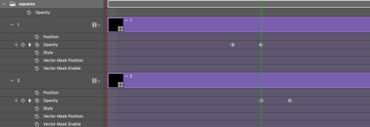
Part 3A: Prep For Key framing
I wanted my squares to fade out in a random-like fashion and if you want the same effect, you will have to decide which squares you want to fade out first, or reversely, which parts of Gif 2 you want to be revealed first.
In order to see what's going on underneath, I made Gif 1 invisible and turned down the opacity of the squares group.

If you want text underneath to be revealed when the squares fade away, I would add that now, and place the text group above Gif 2, but under the squares group.

Make a mental note that where your text is placed and the order in which it will be revealed is also something you will have to plan for.
With the move tool, click on the first square you want to fade out. Every time you click on a square, it will reveal itself in your layers.
I chose A3 to be the first square to fade and I'm gonna move this one to the very top of all the other square layers.
So if I click on D2 next, that layer would need to be moved under the A3 layer and so on. You'll go back and forth between doing this and adding key frames to each one. As you go along, it's crucial that you put them in order from top to bottom and highly suggested that you rename the layers (numerically for example) which will make it easier to see where you've left off as your dragging the layers into place.

Part 3B: Adding the Keyframes
This is where we enter the gates of hell things become tedious.
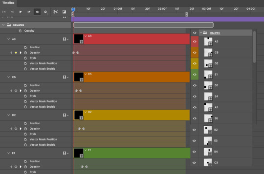
Open up the squares group in the timeline panel so you can see all the clips.
Here is my example of the general pattern that's followed and its corresponding layers of what you want to achieve when you're finished:
So let’s try it!
Expand the control time magnification all the way to the right so you can see every frame per second.

As shown in Part 3A, select your first chosen square.
Where you place the time-indicator on the panel will indicate the placement of the keyframe. Click on the clock next to opacity to place your first keyframe.

Move the time-indicator over 3 frames and place the next key frame.

Things to consider before moving forward:
Where you place your very first keyframe will be detrimental. If you're using a lot of squares like I did, you may have to start the transition sooner than preferred.
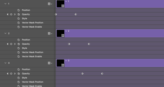
If you're doing 25 squares, the key frames will have to be more condensed which means more overlapping because more frames are required to finish the transition, verses if you're only using a 9-squared grid. See Part 4 for more detailed examples of this.
The opacity will remain at 100% for every initial key frame, and the second one will be at 0%.
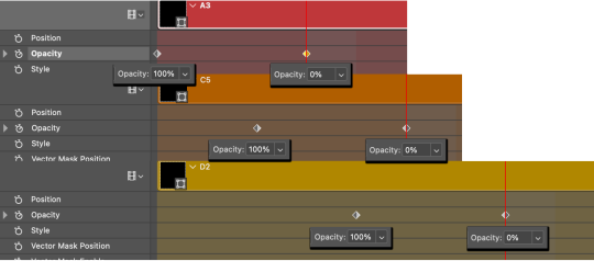
Instead of creating two keyframes like this and changing the opacities for every single clip, you can copy the keyframes and paste them onto the other clips by click-dragging your mouse over both of them and they'll both turn yellow. Then right click one of the keyframes and hit copy.
Now drop down to your next clip, move your time-indicator if necessary to the spot where the first keyframe will start and click the clock to create one. Then right click it and hit "paste".

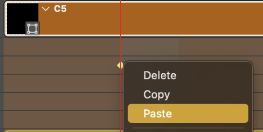
Tip: When you have both keyframes selected, you can also move them side to side by click-dragging one of them while both are highlighted.
Your full repetitive process in steps will go as follows:
click on square of choice on the canvas
drag that square layer to the top under the last renamed
in timeline panel: drop down to next clip, move time-indicator tick to your chosen spot for the next keyframe
create new keyframe
right click new keyframe & paste copied keyframes
repeat until you've done this with every square in the group
Now you can change the opacity of your squares layer group back to 100% and turn on the visibility of Gif 1. Then hit play to see the magic happen.
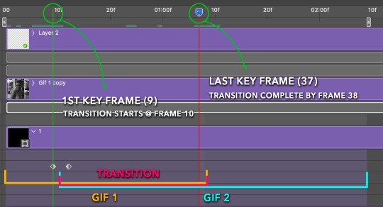
PART 4: Finished examples
Example 1
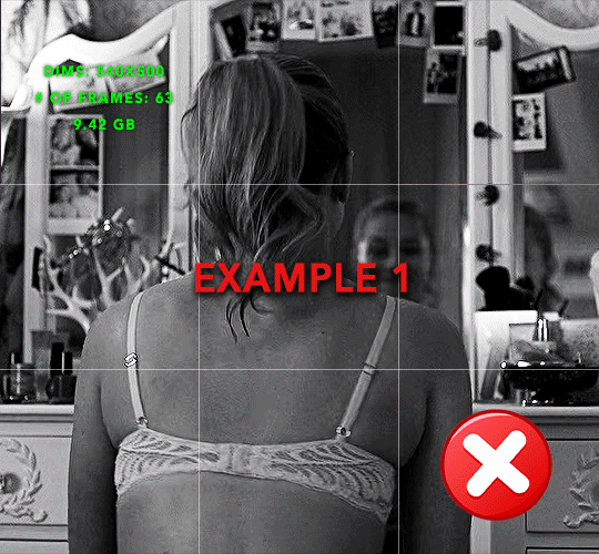
the transition starts too soon Cause: initial keyframe was placed at frame 0
the squares fade away too quickly Cause: overlapping keyframes, seen below. (this may be the ideal way to go with more squares, but for only 9, it's too fast)
Example 2
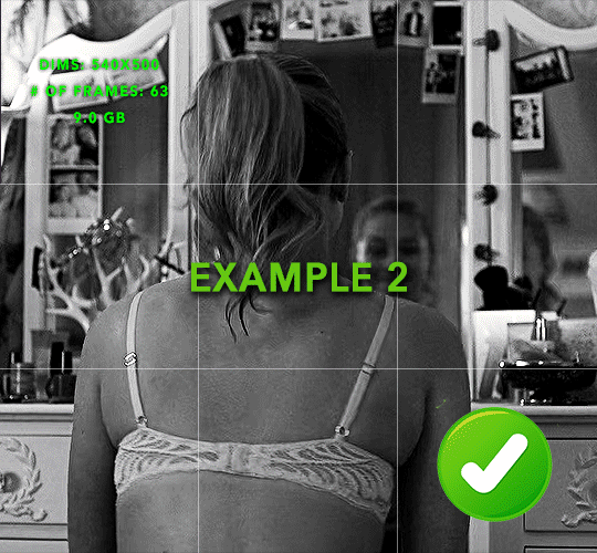
more frame time for first gif
transition wraps up at a good point Cause: in this instance, the first keyframe was placed 9 frames in, and the keyframes are not overlapping. The sequential pair starts where the last pair ended, creating a slower fade of each square.
Part 5: Final Tips and Saving
You can dl my save action here which will convert everything back into frames, change the frame rate to 0.05 and open the export window so you can see the size of the gif immediately.
If it's over 10gb, one way to finesse this is by use of lossy. By definition, lossy “compresses by removing background data” and therefore quality can be lost when pushed too far. But for most gifs, I have not noticed a deterioration in quality at all when saving with lossy until you start getting into 15-20 or higher, then it will start eating away at your gif so keep it minimal.

If you've done this and your gif is losing a noticeable amount of quality and you still haven’t gotten it below 10mb, you will have no choice but to start deleting frames.
When it comes to transitions like this one, sometimes you can't spare a single frame and if this is the case, you will have to return to the timeline state in your history and condense the key frames to fade out quicker so you can shorten the gif. You should always save a history point before converting so you have a bookmark to go back to in case this happens.
That's pretty much it, free to shoot me an ask on here or on @jugheadjones with any questions.
#gif tutorial#photoshop tutorial#transition tutorial#grid tutorial#usergif#ps help#tutorials#tutorials*#resources*#requested
395 notes
·
View notes
Note
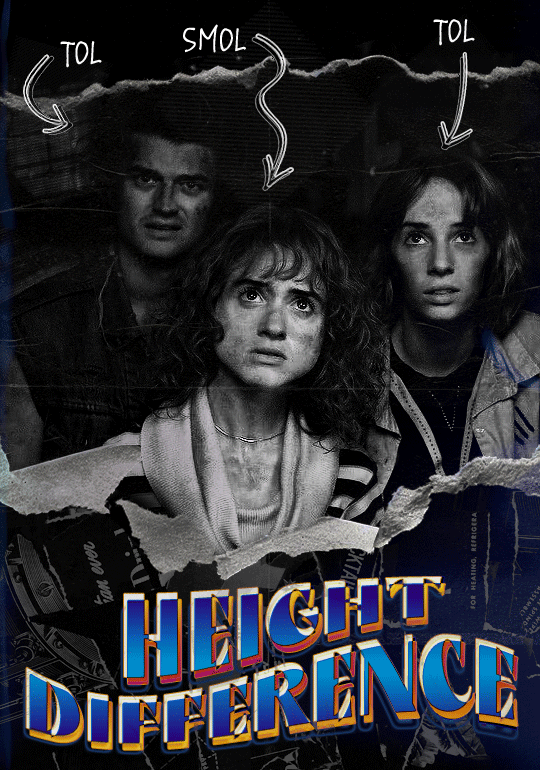
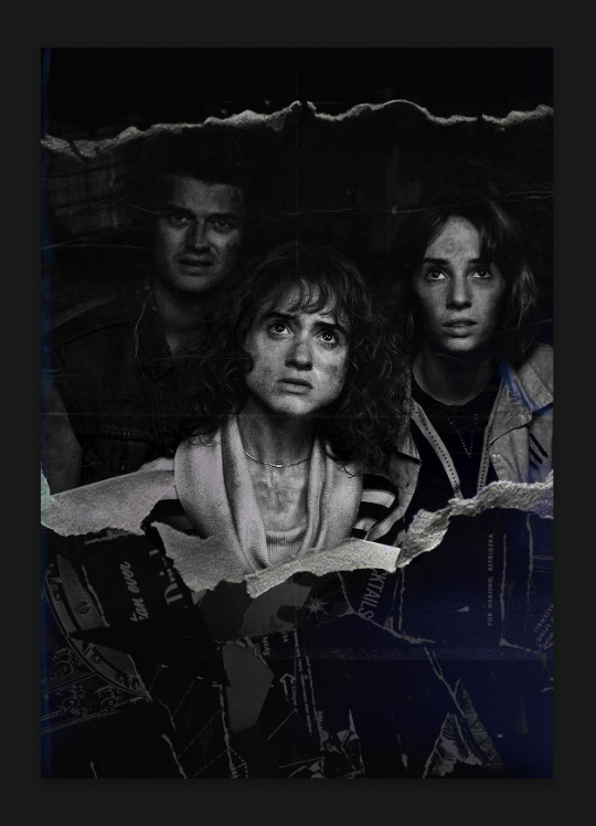
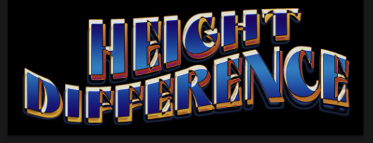
hello! I love your edits and I wanted to know, for the "Steve Robin and Nancy" Gif you posted.. How would I go about doing something like that? More specificly, the bottom two where it says "Height Difference" and where it labels them as "Princess, Jock and Loser"
Thank you! Sorry this took a while to answer. I finally had time to sit down and write this. Link to original post.

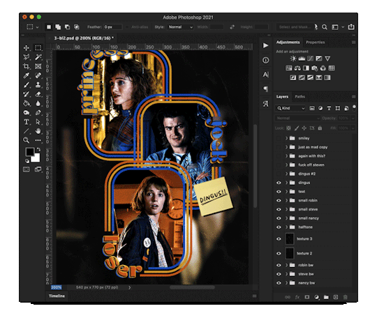
Quick notes: I'm using Photoshop 2021 on Mac and working in video timeline. Must have basic gifmaking skills and know how to use layer masks. This is primarily a gif layout and text tutorial.
Fonts used in first gif:
Pea Wolfe Tracks — link here
King & Queen — link here
Fonts used in second gif:
Kiera — link here
Post — link here
Ellianarelle's Path — link here
Heina's hurry — link here
I used a light leaks/film texture, ripped paper textures, folded paper textures, and transparent pngs (arrows + post-it notes + smiley face).
We'll start with this gif.
Make your gif! The gif here is 540x600px. I color and sharpen it to my liking. Go to image > canvas size > change height from 600 to 770px. I left the anchor in the middle, though it doesn't really matter.
I drag and drop my folded paper texture and change the layer order so it's under my gif. Then I change the blending mode on my gif to Screen so the texture shows through the gif, but I keep the texture at 100% Opacity and Fill.
Now I move my gif around and add my ripped paper textures. I wanted to give it a sort of poster-like feel to it, so I made more room on the bottom for my main text and ended up with something like this. Blending mode is set to Lighten for the ripped paper textures.
I then use layer masks to hide what I don't want shown and add my light leaks/film texture. Blending mode on light leaks/film texture set to Pin Light, Opacity: 50%, Fill: 70%.
I use Levels and Brightness/Contrast adjustment layers to darken the gif up a bit more, then I add a patterned paper texture. Blending mode for patterned paper texture set to Lighten, Opacity: 100%, Fill: 75%. Result:
Now on to the text!
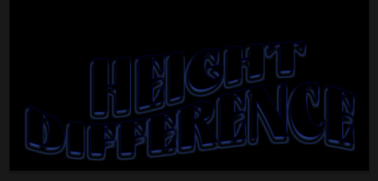
I'm going to be honest here, a lot of this was clicking around until I settled on something I liked. There's three layers to create this text effect. The font used here is King & Queen.
For the first text layer, the font color is set to black (#000000), font size: 87 pt, leading: 80 pt, tracking: 25.
Layer styles used here are stroke and drop shadow.
Text Layer 1
Stroke settings:
Size: 1px
Position: Outside
Blend Mode: Hard Light
Opacity: 40%
Overprint: unchecked
Fill Type: Color
Color: #5911ed
Drop Shadow settings:
Blend Mode: Difference
Color: #2d5ba8
Opacity: 85%
Angle: 70°
Use Global Light: checked
Distance: 7px
Spread: 0%
Size: 6px
Contour: Cone - Inverted
Anti-aliased: unchecked
Noise: 0%
Layer Knocks Out Drop Shadow: checked
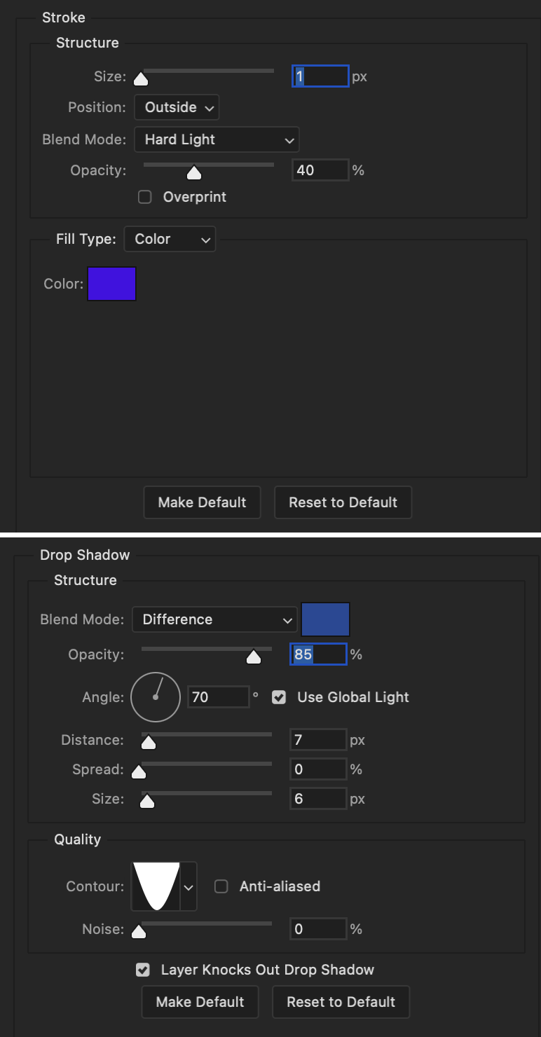
Blending mode for text layer set to Overlay, Opacity: 100%, Fill: 85%.
Warp text settings:
Style: Wave
Horizontal: checked
Bend: +60%
Horizontal Distortion: +10%
Vertical Distortion: 0%
With all those settings applied, the first text layer looks like this:
Duplicate the layer, clear all layer styles, and change the color for the second text layer to white (#ffffff). All other text settings (including warp settings) should stay the same. The only layer style then applied to this text layer is stroke.
Text Layer 2
Stroke settings:
Size: 1px
Position: Outside
Blend Mode: Difference
Opacity: 100%
Overprint: unchecked
Fill Type: Color
Color: #d48f16

Blending mode for the second text layer is set to Difference, Opacity: 90%, Fill: 100%. Nudge the second text layer a bit so the first text layer is a little more visible or move to your liking.
With both those layers active, it looks like this:
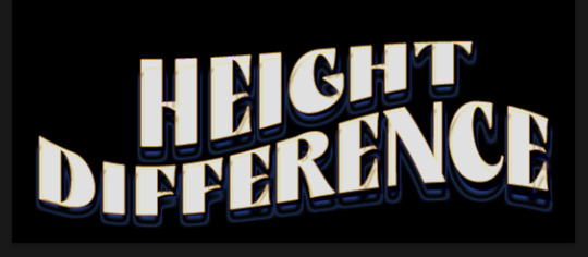
Duplicate the second text layer, clear layer styles, and change the color of this third text layer to a dark grey (#1a1919). Again, all other text (and warp) settings should stay the same.
Layer styles applied to this layer are stroke and gradient overlay.
Text Layer 3
Stroke settings:
Size: 1px
Position: Outside
Blend Mode: Difference
Opacity: 100%
Overprint: unchecked
Fill Type: Color
Color: #d48f16
Gradient Overlay settings:
Blend Mode: Difference
Dither: unchecked
Opacity: 100%
Gradient: #cd3f00 > #ffdb5d
Reverse: unchecked
Style: Reflected
Align with Layer: checked
Angle: 90°
Scale: 100%

Blending mode for the third text layer set to Exclusion, Opacity: 100%, Fill: 100%. I also moved the third text layer around, down and to the right a few pixels to give it that 3-D Word Art effect.
With all three text layers active:
Next are the arrows.
Take your transparent pngs and place them to your liking. Blending mode for these is set to Difference, Opacity: 100%, Fill: 100%.
Command + click on an arrow thumbnail to select all the pixels in that layer. This is why the image must be transparent!
With that selection made and on a new blank layer, right click the selection and click on stroke. Settings for that are width: 2px, color: white, location: center. Move that a couple of pixels over.
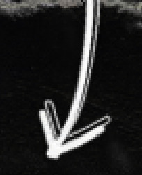
Do this for all arrows for a total of 6 layers for arrows. I group them together to keep my workspace clean, then I duplicate my arrows group with no further changes made to the second group to get what you see in the final gif.
Next is the smaller text. It's three separate text layers for each word, so I can move each of them around to my liking.
Font used is Pea Wolfe Tracks, font color: white (#ffffff), font size: 24 pt, leading: 6 pt, tracking: 25. Bold and italic options checked. I set the blending mode to Difference, Opacity: 100%, Fill: 100%.
And that's it! That concludes the tutorial for this gif!
Now on to this gif.
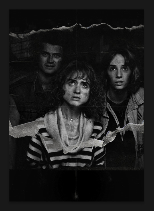
We'll start with the background gif. There are three separate gifs. You could make them one gif, but I wanted the option to order them differently if I needed to.
All gifs in the background are the size of the canvas: 540x770px. Color and sharpen to your liking, but keep them all black and white. To get the blurry effect go to filter > blur > guassian blur. Set radius to 7.0 pixels. Add this to all three gifs.
Then I add two folded paper textures. Blending mode for one set to Lighten, Opacity: 60%, Fill: 100%. The other set to Screen, Opacity: 70%, Fill: 90%.
I found this tutorial a while back for a halftone effect. They include links to the halftone pattern used here as well as textures and gradient maps not used here.
I'm only using the halftone pattern here.
Pattern fill settings:
Angle: 66°
Scale: 8%
Link with Layer: checked
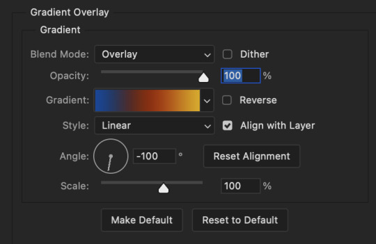
I also added a gradient overlay layer style to the halftone pattern which gives the gifs the color you see above.
Gradient Overlay settings:
Blend Mode: Overlay
Dither: unchecked
Opacity: 100%
Gradient: #0059ac > #a33600 > #e6b801
Reverse: unchecked
Style: Linear
Align with Layer: checked
Angle: -100°
Scale: 100%
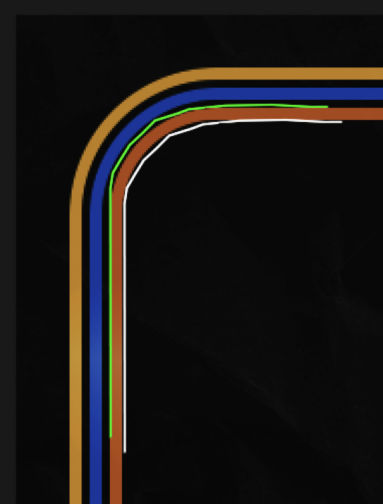
Now on to the square shapes with rounded corners. In the interest of keeping this tutorial short(er), I found this tutorial on youtube that explains how to make squares with rounded corners.
I set my stroke size to 6px, stroke color to white (#ffffff), and fill to no color. I don't use the stroke layer style to make the borders of the shape like in the video! I'm only linking the video to show how to curve corners with square shapes.
Note: Be sure you know how big or small you want these to be and how they're going to fit on your canvas in order to make all the shapes and edit them. It can be tedious to change the settings.
Duplicate and resize to your liking.
In this instance, I wanted to make three squares total, so I had to duplicate twice and resize until I had something I liked.
Settings for the shapes used here are:
Innermost shape: W: 200px, H: 280px, corners: 50px
Middle shape: W: 220px, H: 300px, corners: 60px
Outer shape: W: 240px, H: 320px, corners: 70px
Once I have the size I want for all three shapes, I group them together to make a set and duplicate that group twice, then adjust each set on the canvas for my layout.
What the sets look like all together:
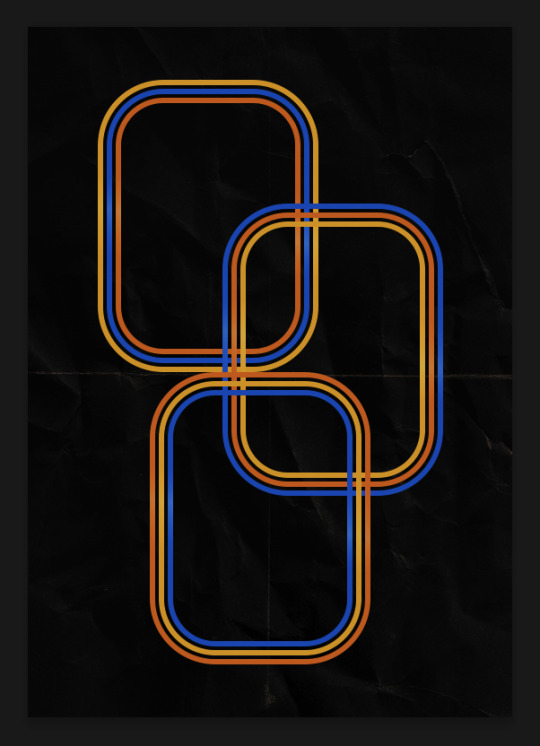
Colors used: orange #e47100, blue #0062d1, yellow #ecac00
To add color to the shapes, either change the color of the shape itself or use layer styles. I used layer styles.
Note: I didn't add the colors until the end after I knew what gifs went where and what color scheme I wanted, but I don't want to add more images than I need to here.
To keep this short, I found this tutorial on youtube that explains how to wrap text around a shape. However, I wanted the text to align on the outside where the white line is and not the green line (left image):
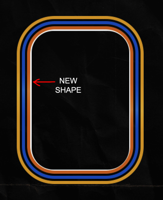
So I created another shape just inside the innermost square and used that as a path for my text (right image). Adjust the text to your liking until you have your text where you want it. Refer to the video tutorial if you need help moving the text along the path!
You don't need the shape path once you have your text where you want it, so use the layer visibility tool to hide it. You can hide your other shapes too so you can work with your text.
Do not delete your shape path!
I duplicate it once I start working with my "jock" text since all the sets are the same size. The "loser" text has to be worked a little differently, but we'll get to that later.
For the princess, jock, and loser text, there are two text layers to create the overall effect. For both layers, font used is Kiera, font color set to white (#ffffff), font size: 60 pt, blending mode set to Normal.
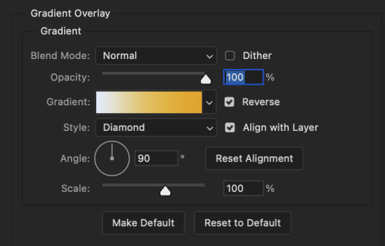
I added a gradient overlay layer style to the first text layer which I'll call the base layer. Opacity for this layer is 100%, Fill: 100%.
Base Layer
Gradient Overlay settings:
Blend Mode: Normal
Dither: unchecked
Opacity: 100%
Gradient: #f0b002 > #e7f0fd
Reverse: checked
Style: Diamond
Align with Layer: checked
Angle: 90°
Scale: 100%
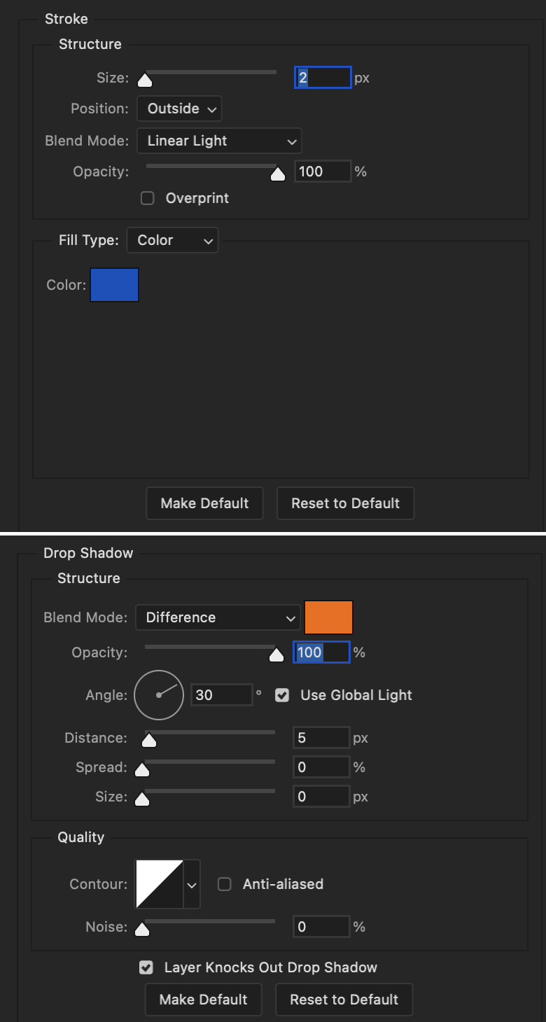
The second text layer is your stroke and drop shadow layer. For this layer, opacity is set to 100%, Fill: 0%.
Stroke and Drop Shadow Layer
Stroke settings:
Size: 2px
Position: Outside
Blend Mode: Linear Light
Opacity: 100%
Overprint: unchecked
Fill Type: Color
Color: #0064cb
Drop Shadow settings:
Blend Mode: Difference
Color: #fb7c00
Opacity: 100%
Angle: 30°
Use Global Light: checked
Distance: 5px
Spread: 0%
Size: 0px
Contour: Linear
Anti-aliased: unchecked
Noise: 0%
Layer Knocks Out Drop Shadow: checked
End result looks like this:

When I make my shapes visible again (minus the one I used as a path), I get this:
The shapes are clearly in the way of the text, whether they're above my shapes layer or under it. I use layer masks to hide what I want, so the text is legible. It looks cleaner this way and I wanted the text to be a part of the shape itself. I do that for each rounded square.
Now on to my smaller gifs. I like to crop, resize, sharpen, and color separately because my laptop and Photoshop would kill me if I tried to do it all on one canvas. I use the size of the middle shape for my gifs (220x300px), so I can have a little wiggle room when adjusting. I then use a layer mask to hide the parts of the gif that are outside of the shape.
A quick way to do this is to command + click on the thumbnail of the innermost square. With that selection made, I got to my gif layer and add a layer mask. Sometimes you need to invert it. Use command + i with the layer mask selected (not the gif) to invert the layer mask.
I repeat this process with my Steve and Robin gifs. I have to go back and forth with all the layer masks to hide parts of the gif/shapes I don't want for each set. It's kind of a long process, but not all that difficult. I label and group my layers together as I work to keep things clean and it helps me keep track of what I edited and what needs to be edited when it comes to things like this.
The picture below shows where I hid the bottom right corner of Nancy as well as the shapes that make up her set using layer masks. I also did this with the Steve and Robin sets, hiding the bottom left corner of Steve.

Similar text settings used for jock. The gradient overlay layer style for this base layer is different than that of princess because of the positioning of the text. Again, same as princess, two text layers are used here. Blending mode, opacity, and fill for both are the same as the princess text layers as mentioned before.
Base Layer
Gradient Overlay settings:
Blend Mode: Normal
Dither: unchecked
Opacity: 100%
Gradient: #007aec > move bottom middle dot to 80% > #e7f0fd
Reverse: checked
Style: Diamond
Align with Layer: checked
Angle: -140°
Scale: 100%
Stroke and Drop Shadow Layer
Stroke settings:
Size: 2px
Position: Outside
Blend Mode: Linear Light
Opacity: 100%
Overprint: unchecked
Fill Type: Color
Color: #a05700
Drop Shadow settings:
Blend Mode: Difference
Color: #ffba00
Opacity: 100%
Angle: 30°
Use Global Light: checked
Distance: 5px
Spread: 0%
Size: 0px
Contour: Linear
Anti-aliased: unchecked
Noise: 0%
Layer Knocks Out Drop Shadow: checked
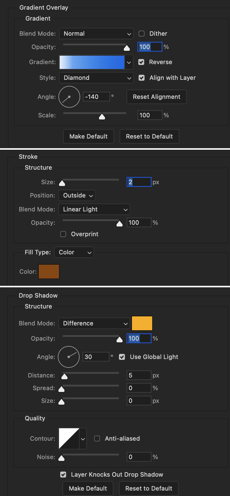
Image 1: We start with Robin.
Image 2: To make the loser text, I had to create a new path.
Image 3: I make it so the text is on the inside of the path instead of the outside. (Hint: Refer to video tutorial if you don't know how to do that.) I then adjusted the tracking between the letters in the word "loser" so they didn't look so squished together.
Image 4: Then I use layer masks to hide the parts of the shape I don't want shown.
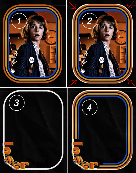
You can then hide the path or delete it. You only need it if you want to adjust the placement of the text. I keep it (hidden) just in case.
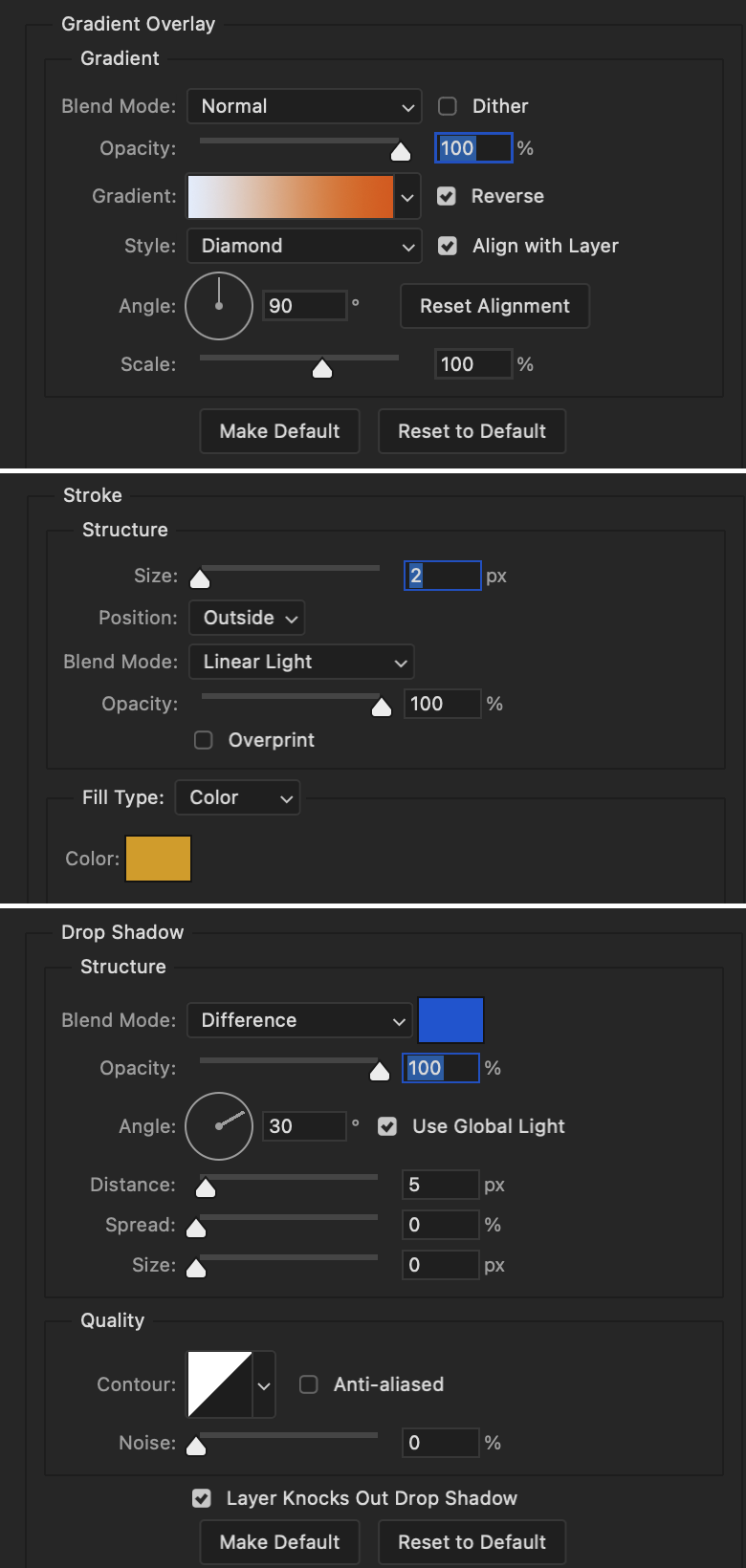
Text settings for loser are just like those for princess. Blending mode, opacity, and fill are also the same.
Base Layer
Gradient Overlay settings:
Blend Mode: Normal
Dither: unchecked
Opacity: 100%
Gradient: #eb6400 > #e7f0fd
Reverse: checked
Style: Diamond
Align with Layer: checked
Angle: 90°
Scale: 100%
Stroke and Drop Shadow Layer
Stroke settings:
Size: 2px
Position: Outside
Blend Mode: Linear Light
Opacity: 100%
Overprint: unchecked
Fill Type: Color
Color: #e1a900
Drop Shadow settings:
Blend Mode: Difference
Color: #0068de
Opacity: 100%
Angle: 30°
Use Global Light: checked
Distance: 5px
Spread: 0%
Size: 0px
Contour: Linear
Anti-aliased: unchecked
Noise: 0%
Layer Knocks Out Drop Shadow: checked
Next are the post-it notes! This is probably the easiest part of making this gif. You just have to repeat this process for however many post-it notes you're making.
Image 1: To start, place your transparent post-it note where you want it. You can also rotate it if you'd like.
Image 2: Then create a text layer and write what you want. Font used here is Post. I wanted this text underlined to give emphasis, so I click on the underline option. I also adjusted the leading because I wanted more space between the word and the line. Rotate the text so it looks like it's written on the post-it note. Note: It looks better if you choose a font that looks handwritten.
Image 3: I wanted another line to give emphasis to the "Dingus!!" text and make it seem more handwritten. I use the line tool to create another line.
Image 4: Then I adjust that line to my liking.

Fonts used for notes: Post, Ellianarelle's Path, and Heina's hurry
Repeat this process for all post-it notes!
That finishes the tutorial! (And I hit the 30 image limit lol.) I hope this helps. If you have any further questions, feel free to send an ask or IM and I'll try to answer to the best of my ability.
Happy photoshopping!
#ask#pcocana#photoshop#photoshop tutorial#tutorials#*tutorials#userchibi#userbunneis#uservivaldi#userriel#userabs#usertiny#useralien#useraljoscha#userfanni#userraffa#tusermona#userbess#userrobin#userroza#quicklings#janielook#usernaureen#userrlorelei#tsusermels#tusermimi#userelio#usertj#userbarrow#usernolan
263 notes
·
View notes
Text
I want to talk about V1 being developed for combat on the Earthmovers
The new lore that dropped really puts into perspective why V1 moves and fights like it does. On a normal battlefield V1’s agility would be useful but it would be far more effective to optimize things like the guttermen, machines with heavy armor and powerful weapons, as opposed to putting a whole lot of time and money into developing something that has more maneuverability but could go down from less damage. Maneuverability on the battlefield is essential for any machine to truly function as a war machine but the greater machines that had been developed before V1 have already demonstrated their ability to proficiently navigate a normal battlefield scenario so the factor of excess maneuverability wouldn’t exactly be something that dominates a battlefield filled with machines of greater defense and firepower.
However at the time V1 was being created normal battlefields no longer existed, the war was now being fought on the earthmovers and with the chaotic terrain that made up that area vertical maneuverability became much more important. Sure the greater machines can fight on an earthmover, but they are severely limited by the cramped spaces causing the ones with more explosive firepower to damage themselves and their allies, and the complex geography restricting where they could reach. And as seen with how most of the machines in layer 7 arrive by being dropped via a bomb casing, the only way for the greater machines to infiltrate the earthmovers would be to be dropped in from a plane (which poses it's own risks of being shot from the sky by the earthmovers weapons system).
This is where the V models come in. V1's advanced maneuverability allows it to effortlessly navigate and dominate the general terrain of the earthmover, the ability to cling to walls and jump as high as it does makes it one of the only machines that wouldn't be neutralized if it was forced off one of the earthmovers many edges and it's agility allows it to reach spaces that other enemies couldn't reliably damage them from. V1 has the ability to completely skip though entire areas that could be blocked off or heavily guarded against the standard war machines due to its ability to climb through the terrain, which additionally gives it the advantage of being able to infiltrate from below providing a much safer route (as it would be inefficient if the earthmover could use it's cannon to shoot out it's own legs).
V1 also has immense versatility in it weapons proficiency as opposed to most other greater machines. In the cramped narrow walkways along the edges it can make precise controlled shots that wont risk damage to itself, but in more open areas it can utilize larger explosions to contend with the more heavily armored machines. This combined with it's advance maneuverability allows V1 to fight on the earthmovers in a way that tougher enemies can't reliably counter.\
The lore of Ultrakill has always been very fascinating to me and I love how now we have a clearer timeline for the production of the machines and how V1 came to be. V1 being developed for battle on the earthmovers before the New Peace was established makes so much sense in retrospect given it's abilities.
515 notes
·
View notes
Text
Joel dealing with Preggo Wife drabble (?): Sundae Surprise
Notes: I've still got more adventures for these two, I'm just writing little scenes that may or may not be Canon and jumping around the timeline at this point idk just ENJOY THE IDEA OF IT:
- - - -
You're playing on the old Gameboy Joel dug up out of storage, legs propped up on the couch on this hot-ass-fuck Sunday afternoon. You had been given strict orders to take it easy and lounge these last few days before the baby arrives.
Easy.
Your thumbs are furiously clicking, eyebrowns furrowed as you try for the 23rd time to pass the level youre stuck on.
"Joel. Can you get me chocolate syrup and a can of cool whip."
"No. You've had too much sugar today. Need to keep your heart rate down, due any minute."
"Daddy..." you pout with a head tilt and innocent begging voice to entice him.
"Mmm," he mocks with a far cry minic of your high pitched tone, still not looking at you as he twiddles with his tools on the creaky bolts of the dining table. "Still no."
You roll your eyes, dropping the game box on the coffee table. You drumb your fingertips on your ever so quiet belly all scrunched up under your massive breasts.
You know for a fact this baby isnt coming any time soon since she's so silent today. Joel's been too overly anxious with the due date approaching literally this week. Keeps fixing shit around the house like it's going to make him ease his worry. He's already replaced the lightbulb in the bathroom that was perfectly fine, adjusted the creaky hinge of the front door, re-caulked the kitchen sink back splash, but damn the dining room table--which you have no idea had something wrong with it but Joel's been giving it hella attention while you sit around bored out of your mind.
Momma's instinct will tell you when this baby is ready to pop. But right now you NEED to guzzle chocolate syrup and whip cream down your throat like a frat party bukake or SOMEBODY (not to name any names--but its Joel) is sleeping on the couch tonight.
You think a little bit before it clicks.
You gasp excitedly--a little too over the top, "She's kicking!"
But Joel is so on edge he doesn't even question it, running straight for you and kneeling by the couch, his whiskers scratching the smooth expanse of your skin as he rests his ear flat on your belly.
"Hear that?" You encourage.
But it's quiet.
"No....no," but he wants to so badly, wants to believe his baby is gonna tell him something, and he thinks maybe ...? "wait, wait, yeah, she says 'daddy's here'--"
"No, she says bring me some fucking chocolate syrup and whip cream."
He pulls away and narrows his eyes at you before disappointingly getting on his feet and going to the fridge.
You eagerly tilt your head back, sticking your tongue out, hands clasped merrily as he presses the nozzle of the can and shhhhhh it into you mouth, getting revenge by intentionally over filling too much for you to be able to close your lips around it. Then he drizzles the chocolate syrup on top, making your mouth a vertical Sundae.
You try to swallow around the concoction, lips pursing to encase the top of the pile, but it's all too much and you choke a little bit, sending a miniaturized cannon of white cream and dark sauce splattering back on to Joel's nose.
With a gasping mouth full of ice cream toppings, you chortle over laughing and kicking your feet comically while clapping your hands, desperate to swallow the mess and breathe a lung full of air at the same time through your teary eyes.
Joel just puts his hands on his hips, letting you have your laugh at him.
Then you gasp out loud--the panicked, serious, bone chilling one where you stop laughing and kicking altogether, lips trembling and terrified as your hand drifts south to cup your lower belly, feeling a sudden rush of liquid staining your bum, and that dreaded big something has abruptly DROPPED inside you.
You slowly bring your wide eyes back at Joel, who's tight lipped gaze matches yours of tense panic despite the glob of Cool Whip hanging off his snout.
You gargle with the sugary fluffy dessert still in your mouth, "Mah wawa bwoke."
-
Series Masterlist
Permanent taglist
@harriedandharassed @lola8888673 @its-nebuleuse @zliteraturehoe @merz-8 @joeldjarin @pascalscoffin @pedroshotwifey @ghostslillady @innerpersonunknown @missladym1981 @mrs-oharaxx @survivingandenduring @milla-frenchy @cockykookiee @fairytale07 @daddy-din @pedropascalsbbg @spookyxsam @somehopeatlast @millercontracting @pedrostories @mishala005 @theoraekenslover
#pedro pascal smut#joel miller fan fiction#joel miller x reader#joel miller smut#joel miller fanfiction#joel miller x you#last of us fanfiction#the last of us fic#tlou fanfiction#joel dealing with preggo wife
334 notes
·
View notes
Text

Hi ^^
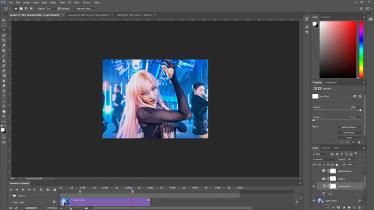
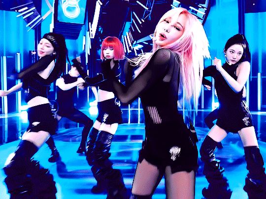
It’s me, the creator of some gifs you like and the creator of many gifs you could’ve probably lived without. A few people have asked me for a giffing tutorial recently so I have made one documenting my normal process! I’m going to gif this Aespa stage in this tutorial because I am still pretty bad at coloring stages. So come struggle along with me 🫶!
Step 1. Getting Sources & Vapoursynth
The worst enemy of the tumblr gifmaker is tumblr itself. You will spend your time making the clearest gif imagineable only for the blue site to reduce it to pixels. But alas, we must gif on. The best way to get good results is have a good source and to precompress your gif with vapoursynth.
As far as downloading from Youtube the best app to use is 4k Video Downloader. 4kVD let's you get download your file as a .mkv which is how youtube stores their 4k quality vids. Only limitation is on the free tier you get only 10 downloads. There are other more technically dubious methods to get 4kvids but I've literally never hit this limit.
10 out of 10 gifmakers agree if you want those good good crystal clear gifs you gotta stick with 4k or 1080p sources. Although if you are a complete sicko like me you can gif 720p and still get pretty good (not great) results.
So now you got your source video but you won't actually be able to open that bad boy up in PS yet. This is where the Vapoursynth step comes in. Vapoursynth will blast that footage into a nice denoised, sharpened and resized little baddie of a video clip for us.

To download VS and get a more in depth explanation of the exact steps on how to use it please reference this post. The basic steps of Vapooursynth are:
Drop your source video on the "vapourscript (drop a video file on me).bat" icon and type in the timestamps
Crop your gif to your liking (I do a lot of 540 x405 or 540x335 for horizontal gifs. 268x480 for vertical.)
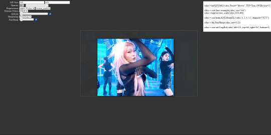
Apply the sharpness and denoise (these are the options I use):

copy the code from the white box and paste it into the script like below
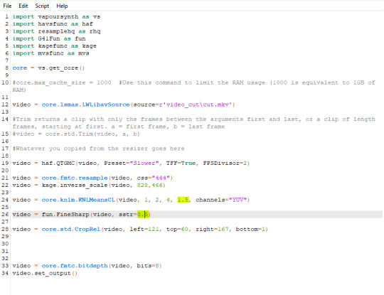
I set my denoiser to 1.5 and my sharpening to .5. (I stole this from @hyeongseo lol)
Go to Script > Encode Video. Make sure on this screen to name your file and set the header option to 'Y4M'. (Sometimes this is the step where it crashes and all your dreams are ruined because it can't convert it unfortunately. But 99% of videos are good lol)
You will find your Photoshop ready clip in gifs/output
Step 2. Photoshop
You are now good to open up your clip in Photoshop.

if we export our gif at this moment it will look like this:

Which isn't too bad. They just are pretty washed out and a lot of times at this step you'll see a lot of grain.
Sharpening (again lol) and Noise:
This might sound weird cause we just denoised lmao but stick with me.
We are going to convert our clip to a smart object. If you want to slow down or speed up your clip make sure to do so before converting.
(Often times if i have 60fps clip I put it at half speed, but if the action of the gif is really jerky or flashy at 30fps a lot of times I'll set it to 85% speed)
Convert your video to a smart object by right clicking it in the layers panel and selecting the "Convert to Smart Object" option
Create a copy of layer 1 and arrange it so it is aligned perfectly on top of the first video in the timeline. You have to drag it outside of the video group to do this. It should look like this once you are done:

On the bottom clip (layer 1), select filters -> sharpen -> smart sharpen. Apply the filter with these settings:

Then on the same clip (layer 1) apply the same smart sharpen filter with these settings

Setting up the Sharpness like this makes sure the finer details with stand out with crisp lines in the final product. (Look at how the mesh on her arms is in finer detail now)

Your video might look a little crispy at this point and that is ok cause we are going to soften that.
Now on our top video layer (layer 1 copy) select filters -> Blur -> Gaussian Blur. Use this setting:

Finally apply filters-> Noise -> Add Noise to layer 1 copy with these settings

"Vacancy what the hell? It looks like shit now."
Yeah... But now we'll put layer 1 copy at 25% opacity and it will look less like the shit that it does look like right now I prommy. Here is the current output:

The idea behind all this blurring and adding noise is that it will help create smoother transitions between the colors of the gif and reduce large blotchy bands of pixels that can sometimes show up
PLEASE!!! Save your current step as a PSD file. You can skip having to apply all those filters and just drag the filter groups on to the layers after the smart object conversion step.
Step 3. Coloring
Now to the fun part! There is a lot of trial and error in this step since we only have 256 colors to play with.
Typically my goals for this step are:
Raise the black point (Make Giselle's outfit in this gif black so more color can be used on her hair, skin and the background.)
Reduce the overall contrast of the gif. (Darken the lightest lights if possible)
Saturate the colors enough so they stand out but not so much that everything looks gross.
Depending on how we do these steps we may need to subtract frames from the gif. (Which I hope not cause there is exactly 69 frames in the current version lol)
Here is an example of what my coloring difference can look like:


In this case the colored gif is actually smaller because I elminated a lot of the dark greys in the background.
Vacancy's Dumbass Original Recipe thing
This is probably the only thing different that I do from most creators
My first adjustment layer is usually a gradient map. The green and red one to be more specific.

I then change the blend mode to luminosity and set the opacity somewhere between 12 and 20% (Usually 15%).
This step brings all our shades closer together so we have more freedom with coloring later. Also when idols are very white wash this seems to bring out the shadows and skin tone better in later steps as well. If you overdo it though the person in the gif can wind up looking very orange or yellow so less is sometimes more here.
There's also probably a better way to achieve this but you know... oh well
My Other adjusment layers usually consist of:
Levels: With the gradient map applied you can darken the blackpoint of your gif pretty significantly.
Selective Color: This is the most useful adjustment layer. Make sure to expirement with adding to the black slider on the blacks and neutrals color options. Often times kpop vids are over exposed and darkening this can bring out a lot of unseen color.
Hue/Saturation: I use this layer to darken the blues of the background with the lightness slider as well. You can adjust individual colors with this layer and with selective color and that is a very powerful tool for coloring.
Start:
Finish:
Because I darkened the gif so much I was able to add around 6 frames!
Though I’m not 100% satisfied with this gif, this would be my process from the start. You can put those adjustment layers all in a group and save it to the psd as well to skip all the steps to apply them. I used all the same adjustment layers for the header gif of this post as well which saved me a lot of time ^^!
Since every video is different you usually have to play around with the sliders a lot between clips.
Step 4. It Flops…
Jk jk but it does happen a lot tho on this site so don’t get discouraged ☺️
Parting Notes
If you want a really nicely colored fancam to practice on I would see if MIRAI on YouTube has a fancam of your fave idol. Their videos are really nicely color balanced from the start where stages like this tend to be very bright.
I’ll probably make a follow up post with more coloring tips and my thought processes while making gifs but this is the very basics to making hq gifs hope you learned a lot.
You can always hit my dms or inbox with questions if you have them ^^!
#hope this helps#tagging a few people#tuserflora#userdoyeons#forparker#useranusia#rhitag#usercherry#<- these are all creators I try to learn from#flashing tw#flashing cw#tutorials
86 notes
·
View notes