#could be a different dimention
Explore tagged Tumblr posts
Text
i know i deleted all my 4 am ranting about that 'therapy speak' article but i still feel it is extremely irresponsible journalism and the cherry picked soundbites circulating on that tumblr post are also very irresponsible and are borderline doing a 360 all the way back around to calling for the re-stigmatization of therapy.
I think the useful points that were discussed in the article, and those that quoted actual psychologists, were about conflict resolution and a much more responsible way to have written the article would have been to call it "How to Succeed in Conflict Resolution While Maintaining Healthy Boundaries". because that's the actual complaint right? that people dont have conflict resolution skills and are instead coopting therapy speak in order to opt out of the work of conflict resolution. But you could have written that whole article in a way that would actually be useful to people and NOT be calling for an end to the use of tools that are extremely necessary for so many people. like there was no reason, other than click bait, to center the article around the perceived need to re-stigmatize "therapy speak". that was so irresponsible and yall who keep spreading it around uncritically are also being irresponsible.
#there we go#thats the post im gonna stick with#that i shall not delete#also ironically the article itself did the one thing it was criticizing#which was presenting only one side of each of the example conflicts#and leaving the second person involved as a one dimentional characature of a 'therapy speak-er' who had no interior life and motivations#for all of those examples i could imagine another side to the story from what the interviewee was saying#and feel the need to remind that the people who are the loudest and quickest to complain about setting boundaries are usually abusers#GOD every time i see that post or any other reflecting the sentiment i feel so much rage#like im sorry but if you think your friends are using therapy speak for selfish reasons either you need different friends OR#the problem is actually you being the one who is refusing to listen and empathize with their situation
5 notes
·
View notes
Text
Another very random post for my account.
!SPOILERS FOR GRAVITY FALLS!
So since The Book of Bill released, I've been hyperfixated on Gravity Falls. I was watching the series with my partner and they brought up a really good point and I just had to share it since I haven't seen anything about this yet.
In Weirdmageddon, it's very obvious that Bill takes on more of a monarchy type reign. And back in the mideveal times (I'm not sure if the time period is correct, anyone is free to correct me!) there was a seat placement for thrones. The king always sits in the middle, the heir would usually sit on the right hand side of the king, while the Queen would sit left handed of the king.

While my partner and I were watching the Weirdmageddon episodes, they noticed a pattern. Close to, if not every time, Bill is shown on his throne with Ford, he is always on his right hand side.


Even when he's getting tortured or sometimes not even on the throne (the last photo), Ford is almost always on Bill's right hand side. But, if we take a look at it from a different perspective, Bill is always on Ford's left hand side. Which this could mean two totally different things. But knowing Hirsch, hell, who knows what one it could be.
Ford being on Bill's right hand side could mean that Bill considers Ford to be his heir to the throne. The one person he wants to rule over the dimention once he feels Ford is ready. Even that one scene where Bill is negotiating with Ford in the top of the pyramid supports this theory because it shows Ford ruling over a universe.
This one I feel is a bit of a stretch, but im gonna put it here anyways because it's kinda interesting. Bill being on Ford's left could imply that Bill feels like the queen, since technically speaking, Ford did start Weirdmageddon. He admits so himself. Bill feels as if Ford is his ruler or he is a lower power to Ford because of the fact if it wasn't for Ford making a deal with him, Bill would've never had his reign in the first place. Like a king marrying a queen would give the queen power. (This can be easily disproven, which is why I say it's a stretch)
This could 100% just be the animators putting Ford wherever the fuck and keeping him there and there really is no symbolism, but seeing how much lore The Book of Bill has given us, kinda makes me think otherwise. Let me know what yall think! Thank you for reading my insane yapping :3
102 notes
·
View notes
Text
"You ever wonder what it would be like to wake up outside your own body?"
Holy shit!? Holy fucking shit????? Very surprised that they're actually acknowledging the fact that Eclipse was apart of Moon- practically was Moon (or is Moon, he was at least a fragment of old Moon, are we counting fragments as equal to the person, or ai, themselves?), since he definitely sees himself as Moon, referring to Moon’s body as his 'own'. Eclipse was discarded part of Moon, an unfavourable aspect of Moon that, instead of accepting it as a part of himself, Moon tore and ripped Eclipse, his killcode, from his code and abandoned within Sun, quite literally dumping his main problem on him (in him?)
And like, old Moon had some serious issues and anxiety over losing his bodily autonomy, being trapped in Sun again (to the point that another dimentional version of him literally ends up killing Sun for his, perceived, freedom) , and I'd like to assume that this trait is shared with Eclipse, who was once promised his own freedom through Moon's, only to have it stripped away, only to find himself still stuck, fragmented and alone. Abandoned, disposed of. Betrayed at the very least.
How could Eclipse ever forgive the man who discarded him and left him to rot? Personally, with the way things are going now, I don't believe he could, not on his own, not without some serious intervention (through Earth or new Moon, or whoever really) or guidance. Old Moon is dead, replaced by a convincing replica, nothing that new Moon says or could say about old Moon's actions would really get to Eclipse, both because of his current general distrust of Moon, but also because new Moon is a completely different person to old Moon, he can't apologise and atone for the actions of another, not in anyway significant, its just not the same. Eclipse holds a grudge against a dead man and he'll never reach a satisfying end for himself. What can he do? (Even in a dimention where Eclipse does get the star, his previous main goal, he never seemed too happy) I think that Eclipse will have to accept what has happened to him and that he can't do anything about it before he is able to move on and grow around his past.
"...Horrifying."
I was already working on an Eclipse rant from like last week as well, what a coincidence, so I'll keep this short (will post at some point this week or month or year) (My wording was pretty bad in the last part but I do think that an Eclipse redemption could be possible, just that it would take a lot of work from multiple parties)
#Btw do people find the italics annoying?#Genuine question because I feel a little self conscious about it#I was gonna do a Ship of Theseus part but I can't be asked#tsams#the sun and moon show#eclipse sams#sams eclipse#sun and moon show eclipse#the sun and moon show eclipse#tsams eclipse#myposts#vecramble#VecText#tsams moon#tw swearing#eclipse tsams
174 notes
·
View notes
Text
Uprooted vs Grishaverse
I finally finished uprooted and I wanted to share my two cents on where Naomi Novik delivers while LB fails.
Warning: spoilers
Backgrounds:
1) Both the stories were written in first POV of the protagonist.
2) Both are dealing with an immortal, youthful looking male wizard(/grisha) and a reluctant, low self-esteemed, female protagonist.
3) Both are set up in a war torn country with an expanding evil element threatening to swallow the country whole.
However the similarities end there.
1) First POV:
Although Noami uses First POV for Agnieszka, it is not restrictive like Alina's. We can see the universe clearly through her eyes and how she views the magic system. We could also read the other characters and see their strengths and flaws through her eyes. This is completely lost in the Grishaverse. We only see Alina's low self-esteem rambles, her unhealthy attachment to Mal and her judgemental censure of others characters We don't understand the universe, or the true nature of the characters. This makes the Grishaverse restricted universe, although we know how vast it is.
2) Strong female lead:
Agnieszka is a village born, free thinker and an independent girl. She is passionate and compassionate. She cares for her family, her best friend, her village and its people. Although she did not expected to be picked she does not stagnate as the story unfolds. At first she is reluctant and useless in learning magic but once she understands why she needs the magic, she pulls the magic by its horns and masters it. Unlike Alina, she practices and fails and yet she does not give up. Nieshka is by no means a girlboss but she knows what she wants and is unafraid to seek it. She knows when to standup and seize her power and when to let go. Naomi handles her beautifully that we want to know more about what's going on in her mind. Nieshka's life is lived by her rules. When Sarkan flees from his tower she does not run after him. She lets him go. She understands his nature and she also understands hers. She chooses to stay behind and heal the forests around her. This, right here, is proper feminism. Not Alina's ballerina farm.
3) Strong characters:
Sarkan, Solya, Kasia, Alosha, Marek, Vladimir and many others. We see them all through Nieshka but Naomi has portrayed each one of them beautifully. They are not one dimensional. We see how Sarkan is withdrawn from the world with the weight of immortality, choosing to surround himself with books and magic instead. We can see Kasia's pain, her love for Nieshka, her jealousy and the hurt of her mother's betrayal. We can see Marek's boarish nature, his hot headedness and love for his mother which ultimately led to his downfall. Every character has a story arc and a journey to fullfil on their own and Naomi does it wonderfully. We see them through Nieshka's eyes but we see the whole person not just her characterization. LB fails in this aspect. After book 2&3, we see many characters simply as an extension of Alina. They all profess their fealty and choose to stay with her even when she does not show them the same respect. Alina is labelled as virtuous although we see no evidence of it. In other words, the characters in Grishaverse are mere mindless, plot devices that are supposed to love Alina because she is the protagonist. They seize to exist outside of Alina which cripples the story telling in Grishaverse.
4) Vastness of the universe
One of the key nature of a fantasy story is the vastness of the universe. The reader when journeying through the story must feel the endlessness of the universe. Eg. The Lord of the Rings. This offers the readers a real submersive experience. We see it lacking in the Grishaverse. Although there are different countries and people, we can feel the boxed nature of the universe. This when combined with Alina's restricred POV, one dimentional side characters(spanning across different countries) and blatant favouritism shown to some characters we feel suffocated inside the Grishaverse. Naomi's universe feels vast, unexplored and unending making it a true fantasy experience.
5) Sarkan
We can see plenty of similarities between the Darkling and the Dargon. A lonely wizard, fighting alone against evil(/corrupt government). The people and the Royal family don't like him but keep him around as a neccessay evil. However, we can see the stark contrast in how Naomi handles Sarkan. For one, she does not think a seventeen year girl knows better than an age old wizard. Sarkan and Nieshka's magic are different but Naomi finds a way to blend them and makes them work with each other. She lets Nieshka form her own judgement of Sarkan instead of force feeding it like LB did to Alina. She gives a chance to the Dragon to tell him his story which gives us an additional understanding. Naomi shows and tells while LB just tells.
There are so many other intricate details which made Uprooted more enchanting to read. Naomi as a writer made me want more. Her universe has potential and Naomi handles it very effectively. The same, however, could not be said about the Grishaverse. The Grishaverse had immense potential compared to Uprooted but due to LB's restrictive story telling, it leaves the readers with a huge disappointment and fails to live upto it's potential.
#uprooted#naomi novik#agnieszka#sarkan#the darkling#alina starkov#anti leigh bardugo#grishaverse#lost potential#pro the darkling#pro aleksander morozova
46 notes
·
View notes
Text
𓈒༷♪˚.✧ How to make a mockup like this for smaus, ocs, etc. (step-by-step tutorial ☆ no Photoshop, easy, free) (requested by @lovebittenbyevans) ✿
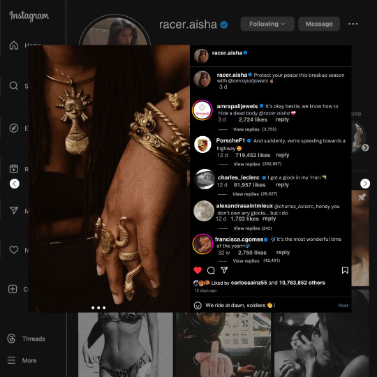
guys this took me two hours to make and you could probably get this done in like, 30 minutes :) I hope this is coherent <3 Please look back this image for comparisons, if my explanation is not well explained, etc.
first of all, if you dont already have one, make a free canva acount. once you're signed in, hit the purple "create design" button on the sidebar. A pop-up will appear with different design template options. For this design, we want the dimentions to be 1080 x 1080, so you can either make a custom size or choose the instagram post (square) template by either searching or scrolling through the list.

2. Now you have a blank page. Zoom in with the slider at the bottom of the page if you need to (Mine is currently zoomed in 41%). Click on the page and change the color to an off black (hex code #111111).
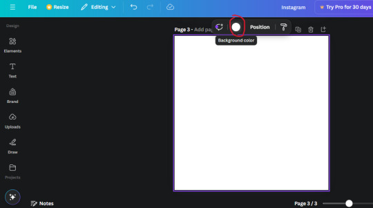
3. Now that the color is changed, click the "elements" tab and search "line". Click the shape and it will add it to the page automatically. These line are particularly hard to navigate and hard to get it at the right angle and length so this part might take a little longer than the rest.
4. stretch it from top to button and turn in a 90 angle so its straight on the left side of the page. Change the color of this as well to a grey tone (hex code #2F2F2F).
5. Now we'll add the Instagram logo. Click the "text" tab then click the purple "add text box" button. Write "Instagram" in the box and change the font to "apricots". This is the closest font I could find that resembled the logo font but if you find a better one, feel free to use that instead. Make the font size 19.3 (you can do this manually or do it in the text options). Change the color to grey color (hex code #707070). Add it to the upper left corner of the page like this:
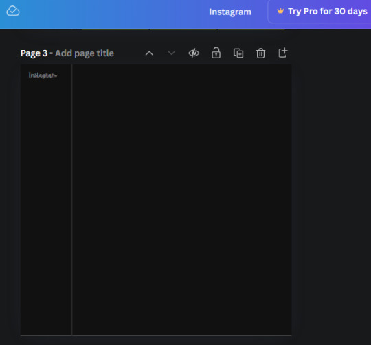
6. now we're adding icons and a menu inside the border we just made. Click the "elements" tab again and search for "instagram home icon" and add the element by sketchify to the page. Click the home icon, an options icon with pop-up above the page. Look for the "Position" button and click it. Scroll to find the advanced options and you can manually type in the width and height at 26.6 and 28.7.
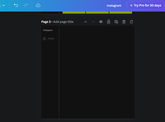
Move it inside the border, under the logo (photo below). Change the color again (the hex code is #707070).
7. Open the text tab and add a text box. Change the font to Canva Sans and write "Home" in the box. Change the font size to 18.1 and align with with the house icon. It will look something like this,
8. Go into the elements tab again and search "instagram search icon". Scroll until you find the one by sketchify and add it to the page.
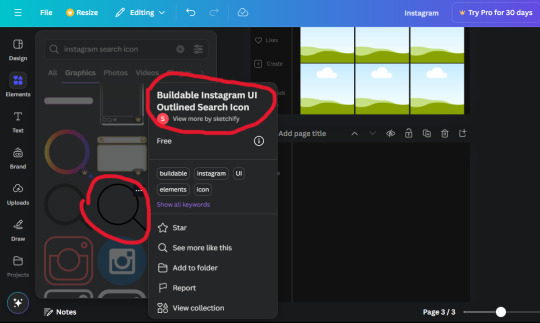
9. Shrink it so the W and H is at 36.6 and 31.3. Move it below the home icon until a purple "67" pop ups and aligns under it. Change it to the same color as the Home text and icon (#707070). Go ahead and Duplicate the the "Home" text box and clicking it and a pop-up will show up then edit the text so it says "Search" and align with the searcch icon we just added.
10. You know the drill. We are continuing to search up more icons in the "elements" tab. Search "instagram compass icon" and choose the one by sketchify (are u seeing the pattern?). Add it to the page and change the width and heigth to 33.1. align it under the search icon just like how we did before and change it to the say colors as the other icons.
11. Do the same as before and write "Explore" in a text box and align it with the icon. We're doing the same thing for all of these.
We'll be using the same search prompt for all of these icons so just change the type of icon you're looking for like we've done before hand. Next look for the Instagram reel icon and add the outlined one by sketchify and change the W and H to 31.2 x 30.9. Change the color to the ones we've used before, align it underneath the icons above and add your text ("Reels").
12. The next icon is an outlined, "sent" one. W and H is 31.1 x 27. The text will say "Send". Then an heart outline by sketchify; W and H is 34.2 x 29.1 and the text is "Likes". Next is the "create" outline icon by sketchify, W and H is 36.8.
(p.s if you are struggling to align the icons and text correctly, shoot me a message and I'll send you the X and Y positions ;D)
If you followed it through, it should look like this,
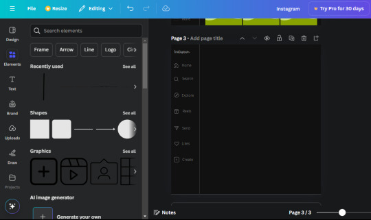
13. Now onto step 13, we'll be adding the Threads logo. You don't have to add this but to make it look more like the actual website, I will be adding it. Open the "text" tab and add a text box. Write an "@" symbol in the box and change the font to Nanum Sqaure and the size to 24.9. Add in the bottom corner below all the icons we just added to our page. We need another text box now (Color is still #707070), write "Threads" and align it to the "@" symbol.
14. We're adding another icon now. Search "Instagram menu icon" and find a wireframe menu icon by sketchify. the W and H are 42.5 x 24.6. Add a text box that says "More". It will look like this:
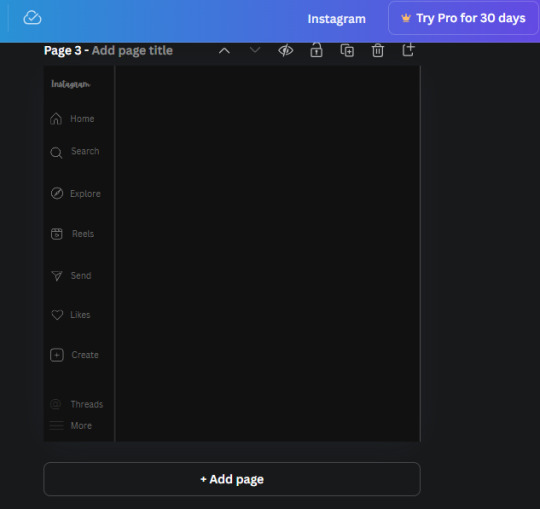
We are a quarter way done now :D
15. Search in the elements tab "circle frame" and look for the one with a little border around it.
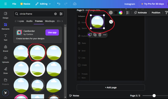
At first, the circle will be green and inside the circle will be white. Change the white to color of the background of the page (hex code #111111) then change the green to a grey color (#8D8986).
16. Add a new text box, change the font to Canva Sans and the size to 22.8 and the color is white. I just wrote "user.name" in the box. the W and H will be 153.3 x 35.7.
Enter the "elements" tab and search for a blue checkmark and find the icon by Victor Aguiar. The W and H is 28.1 by 28.
17. Search in the search box for a rectangular shape and add it to the page. Place it next to your username and checkmark icon and make the W and H to 149.6 x 38. Add another and place it next to the other rectangle shape. the W x H is 111.4 x 36.7.
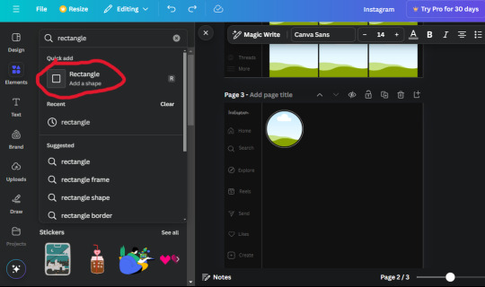
Change the color of both boxes to #2F2F2F. Add a text box and write "following" then change the W and H to 82.6 x 21.8 and fit it inside the first box. Add a second text box and write "message" in it then change the W and H to 77.8 x 21.8. Change both text colors to #7A7A7A

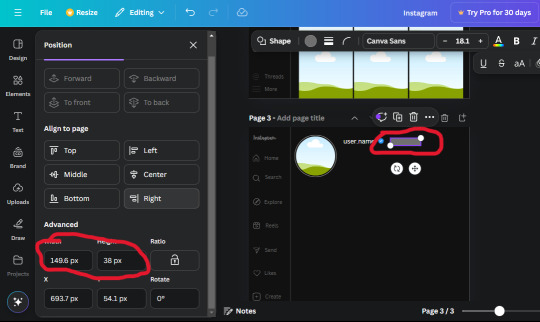
18. Add another text box. Write "<" and turn it upside down and place it beside the "following" text inside the rectangle. Adjust the size as you need to. I also like the round the corners to around 8 so its not so pointy and square.
19. Add 3 new text boxes. Write the amount of posts, the amount of accounts you're following and the amount of followers your have. Write "20 posts", "30 following" "40 followers". Bold the numbers and change the text W and H to 116.4 x 32.7. These are just place holders that I use.
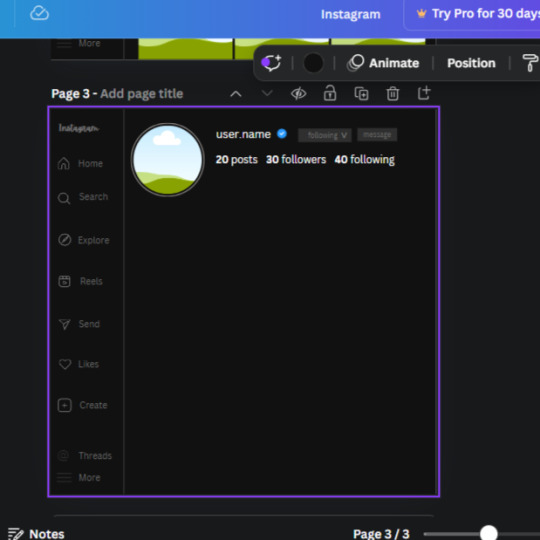
20. Open the "elements" tab again and search "frame". Choose the first one.
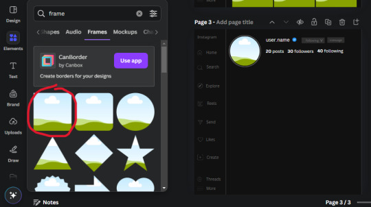
We want the height and width to be 268 x 252.4. Place it at the bottom of the page but we want some space between the frame and the page.
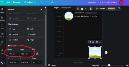
Now we'll duplicate the frame we just placed (the icon between the comment and trash can on the pop up above the frame). Place it next to the previous frame but we want to leave a bit of space between them like this:
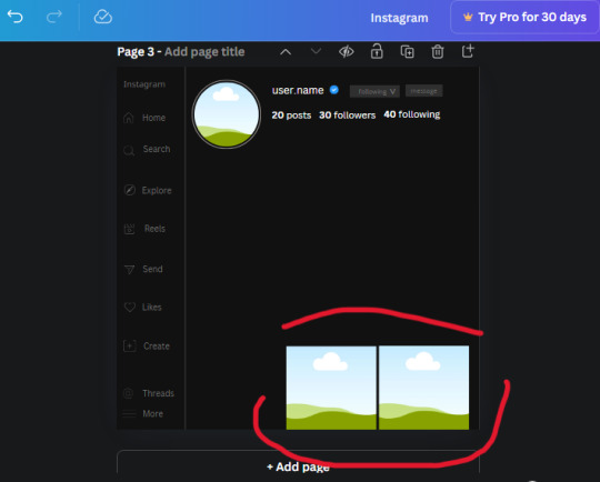
If its a little wonky, don't worry. You can always adjust it so it looks right.
Duplicate the frame again and place it next the second frame you just placed, same distance between. Make sure they're even. Now we have a row.
Select all three frames and duplicate them. Move them above our original frames but leave a little space between them.
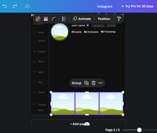
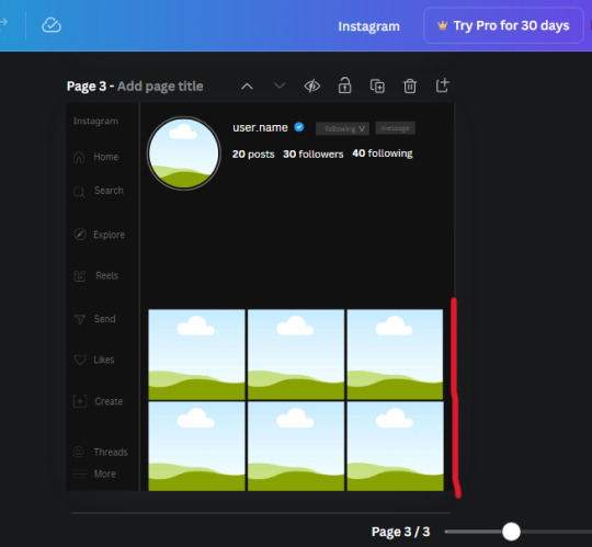
Again, if they're uneven, adjust them as you need to.
21. Select the line again from the elements tab. Stretch starting from the top frame to the last frame and make the color grey (#2F2F2F).
Because the line is stupid hard to navigate, use something like a text box to mark where you want it to end like this:


Delete the text box and the line with be where we want it.
22. On to the highlight reels. Seach for "add button" and find the one by Barudak Lier.
Change the heigh and width to 81.1 and move it above the border.
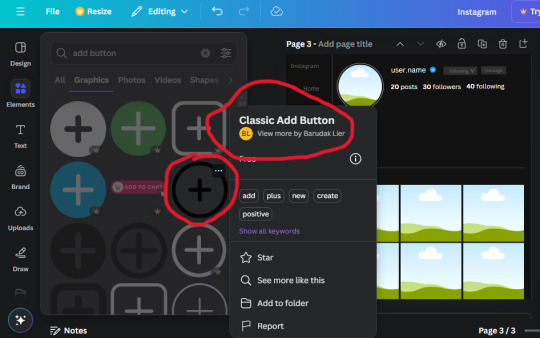
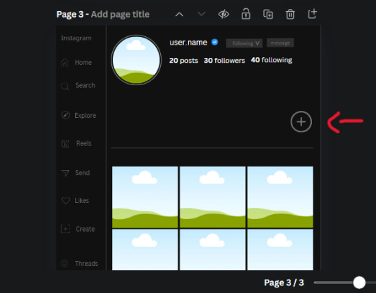
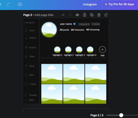
Search for circle frames now and add this one to the page (The same one we used for the pfp), change the width and height to 85.4 and move it next to the add button. Since this is a generic, blank template, I add about 4 of these highlight frames but you can do however many you want. You can change the border color to a gradient or leave it grey.
Add a text box now. The font will be Canva Sans, the size will be 18.1 and the color will be white. Change the text to "Add" and place it under our add button. Make more of these text boxes to place under the circle frames. Depending on which frame its under, write "Highlight 1", "Highlight 2", etc. etc. or you can give them different names and such.
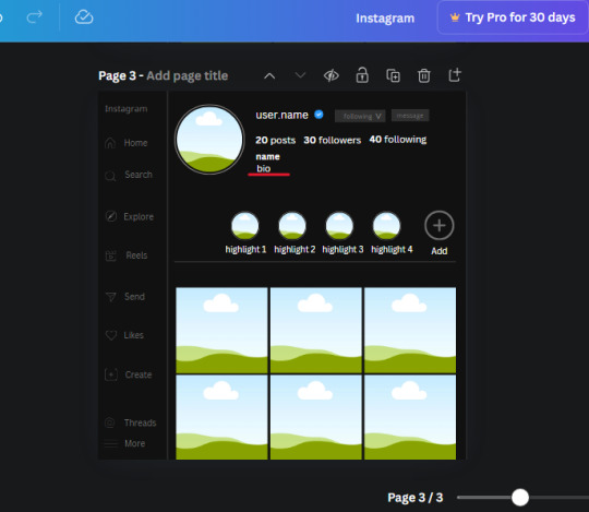
23. Add another text box, write "name" and bold it, change the size to 19.1 and the W and H to 69.2 x 28.8. The font will be Canva Sans and the color will be white. It will go under the amount of posts, followings and followers.
Add another box. The font is Canva Sans, font size to 20.1, the W and H is 40.8 x 31.3 and the color is white as well. This is our "bio". Place it under "name".
Yay!🎉🎉🎉 You're halfway done!
24. Search for a shape in the elements. Look for the rectangle again and add it. Change the width and height to 460 x 760.4 and the color to an off black/grey color (#191919), placing it like this:
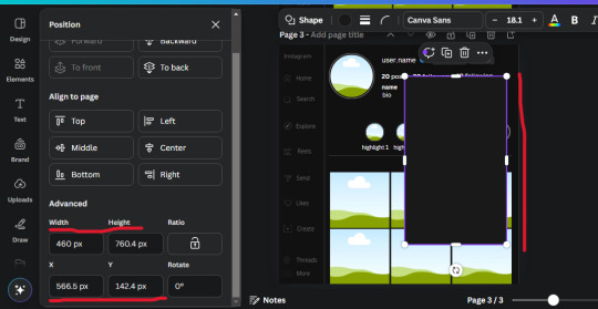
Get the same kind of square frame we used before to make the profile grid and make it the same size as the rectangle we just added. Place right up against the rectangle like it's its other half. Add another line like before and span across the upper half of the black rectangle as a border then add a circle frame inside the border.
Add a text box, "user.name" and align it with the frame. The text is white and the W and H is 111.5 x 25.9
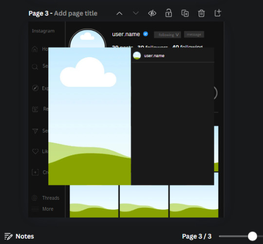
25. Add more circle frame along the inside of the rectangle to resemble the comment section. Make sure the W and H of the frames are 46.1.
Add more text boxes that align with the frames you just made and write "username" again and bold them. Add even more text boxes that align with the usernames and write "comment". These are place holders for when you decide to use this template.
Add another rectangle on the lower part of the rectangle and make the color black. and search for "instagram heart icon", "instagram comment icon" and "instagram send icon". Make sure the lines are thick. Find the heart icon by sketchify, and the the comment and send icon are by Mirazz Creations. Make the lines white and make sure the W and H are the following:
Heart icon: 38.7 x 32.9
Comment icon: 35.2 x 35. 8
Send icon: 35 x 32
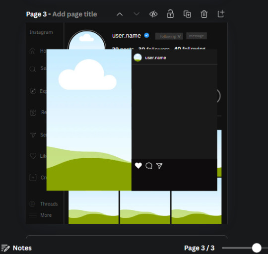
Next, look for "instagram bookmark icon" and find the one by Adricreative. Change the color to white and the W and H to 29.7 x 40.2. Move it to the other end of the rectangle.
26. Now add three circles frames and change the W and H to 37.2. Move them below the heart icon and have them overlap each other some. Then, add a text box and write "liked by username and 1000 others". Change the font size to 13.6 and change the font to Canva sans. the color will be white. Align this with the three overlapped frames.
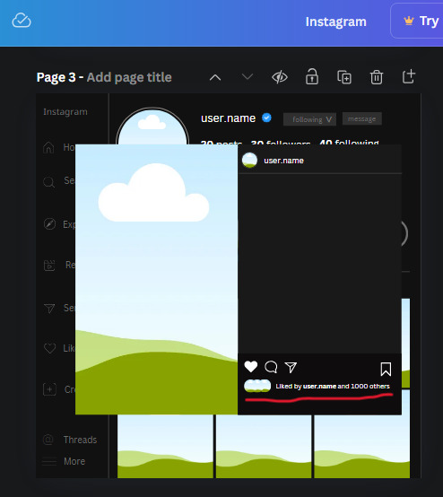
27. Look in the elements tab for an emoji icon and choose the one by Soni Soukell from Noun Project. The W and H will be 32.8 and the color is white.
Now add a another text box and write "Write a comment". The color will be white, the font size will be 14.2 and align with the emoji icon you just placed.
Search for "next arrow button" by Pixeden and make the W and H 42.8 then add it to both sides of the post.
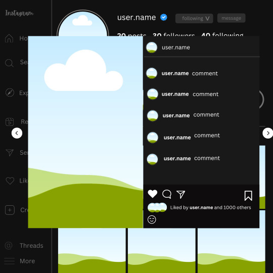
And you're all done with your template! All that is left to do is fill it but before doing that, duplicate the page so you always have an extra blank mockup if you want to use it again.
To fill the frames, upload an image (or use a Canva stock photo), drag and hover it over the frame and it will fill the frame.
Hope this was helpful and you you successfully made one :D <3
#requests#text#smau#template#mockup#moodboard#instagram#instagram moodboard#instagram mockup#graphic design#canva#psd#free tutorial#tutorial#instagram au#social media au#free psd#photoshop#resources#fanfiction resources#graphic design resources#graphic design tutorial#psd tutorial#photoshop tutorial#au#au ideas#mockups#digital design#digital design tutorial
38 notes
·
View notes
Text
So about this lil thing called The Magnus Archives. I finished it, 200 episodes spanning 5 seasons, and damn it got spicy. Love the world building, characters range from annoying to lovable but they're all written in depth so even being annoyed by say, Martin's passiveness or Jon's self loathing, is captivating. Because sure, character flaws that make me scream for them to just get over themselves already, but they actually feel human. And by the end of the series all the characters actually grew on me somewhat. I absolutely love what they ended up doing with the mythology pantheon of fears stuff, I love the detail to the mechanics, the little revelations, the hints towards the ending all through out the previous seasons. Though I would have loved to have some more Martin x Jon fluff for the season 5 beginning.
Go listen to it! Now, to the precise spoilers!
The ending was a trainwreck in one of the best ways. Very in character for Jon to go against the vote and pretty much just nearly off himself, very poetic and bury your gays for Martin and Jon to just disappear into some different dimention (or die, honestly the open endedness of that is cool!) Loved the anger in "This is for Sasha!" Melanie and Georgie (and Admiral) were a welcome breeze through out season 5 as well as the little interactions with Basira and Helen.
I first got the vibes of "this isn't our world but it feels like it could be"/the creepypasta "you listen to this and you will be doomed too" vibes all the way back with the worms in season 1. MAG 032, Hive. And they just got actualized in MAG200. I liked imagining I was there with them, suffering, running, thriving, even in the apocalypse. The nods to different faiths, the Christian symbolism, I really found it all interesting.
#tma#the magnus archives#good soup#jonathan sims#thank you very much#magnus archives#mag 200#i'm lowkey a hoe for this#martin blackwood#melanie king#georgie barker#minor tma spoilers#major tma spoilers#spoilers
27 notes
·
View notes
Text
The Umbrella Academy season 3 review post
I finally finished season 3 of tua even tho I've watched first two seasons first day they came out and oh boy do I have things to talk about-
To begin with, the things I like about new season:
- The way we finally dug into Allison's trauma and how she starts going psychotic is actually a good plot line especially the accent on how she just like any other Umbrella Academy people indulges in self-distructive behavior, she's really just like them
- Diego getting a kid as someone with the biggest daddy issues out there is a realistic plotline because having a kid (even if Stanley's not actually his) heals him in this regard tho he and Lila would get a kid anyway eventually but they really should've been more sad about Stanley thanosing out of the existence you know
- Five being the founder of The Temps Commission makes so much sense as he's the one with the power to travel time of course he's more powerful than it seemed
- Good music scenes. Music is what season 1 was incredible for and what I love about the show. In season 2 there weren't many scenes that caught my attention but in s3 it's definetely better. We got Klaus's death montage with "Crystallised" by The xx and celebration scene with "Another one bites the dust" by Queen + Luther on moon and "Friday I'm in Love" by The Cure these were really nice.
- The Oblivion Hotel is such a cool location and concept (a place for everyone) I like the change of place of action a lot, but the way it's a portal is kinda overused imo
- Lila and Five are still the best characters and carried the season
- Fei is such a cool chara with a distict character design (which most of Sparrow Academy lack tbh)
Now things I don't like:
- Ben being just a placeholder character is such a bummer because instead of getting angst and drama we got a mostly one-dimentional anti-hero who has a completely different personality from Ben. We got a tiny bit of his character when he admitted he just wants to be involved with everyone but it's really minimal.
I can't believe Klaus says "He's an asshole and he's dead to me" like WHAT DO YOU MEAN fuck no Klaus would not say that shit and he would not just give up on him. Yeah Luther says stuff like "I'm glad to see you even if you're different" or whatever but it's Klaus who've spent the most time with Ben.
The way literally any other actor could have played Sparrow Ben and nothing would change is lame af I hope in next season we will see more changes
- Same goes to my dear Grace who's just a placeholder for black hole worshipper like what do you mean we just got one phrase from Diego and that's it??? This whole bit with fake god and stuff really threw me off it didn't go anywhere
- The Sparrow Academy being one-dimentional characters in general like I get producers probably didn't have enough episodes to actually develop characters but holy shit are they boring.
Even if you want to make them just antagonists we had such cool villains in two previous seasons they were original and interesting (aka The powerless podcast-fan male manipulator Peabody and The Cunty Handler)
Also the way the fisrt Sparrows who died were the most annoying and cliche assholes makes them just filler charas
- How show tried to make us feel compassion to Reginald Hargreeves holy shit do I hate this guy- After Klaus realised his father was basically killing him over and over in his childhood instead of Klaus getting mad or upset and having a breakdown we got nothing.
He even came back to new timeline Reginald who's "nicer" for this asshole just to hurt him AGAIN
- Klaus mostly being a comic relief in this season is so fucked I love this character and in previous seasons we had a great look at his life and experiences but now he's just kinda there being high and that's it
"mm I guess he died a few times it's probably enough" - plot writers
no character development whatsoever is just upsetting.
And the amount of unnecessary traumatising aka Reginald training him was really not it, even if it's supposed to be a joke.
- Reginald being a two-faced ass like holy shit is this terrifying. Pogo was the one who gave Sparrows pills and now Klaus helped him to stop taking them and this asshole is taking advantage of naive and vulnerable Klaus.
It is in fact a good plot twist but bro I really did prefer Reginald being a cartoonish villian instead of actual pure evil like how does he have shitty motivation but still does just so much shit.
- The Umbrella Academy family having no improvement in their relationship. They still don't care Klaus relapsed, they still don't care about Viktor. All they care about is their own misery which is really in character but with three seasons out of the way and only one more left I would expect at least something you know.
- Viktor is still left out. Like bro the only compassion he had is only when he transitioned but this is it?? Bro's still waiting till someone comes and cares about him but not only this doesn't happen, he even gets rediculed by Sparrow Ben for that and called emo are you actually kidding me what's with all the hurt with no comfort???
It feels a lot like when you're mentally ill and your family kinda "walks on eggshells" to not trigger you but it's in quotes because they don't actually care. They act nice just because they think you're psycho and you would make less problems if they pretend. And this is very sad, Viktor is such a tragic character.
Okay that's it for now. If you have any thoughts please share in comments!
#the umbrella academy#tua#tua s3#tua s3 spoilers#klaus hargreeves#ben hargreeves#allison hargreeves#diego hargreeves#lila pitts#the sparrow academy#viktor hargreeves#reginald hargreeves
36 notes
·
View notes
Text
Hi guys, it's me again, here to give my 2 cents on a another fandom.
Now, I felt the need to do this because as I pleasantly scroll through some Jarley content, I see 'Shipping a toxic couple is gross' 'Jarley is weird' 'Their not even together anymore' (If I could find the original post, I would so tag whoever made it because TODAY I CHOOSE VIOLENCE'
This literally might be my first ever (Omg they're so cute together as a kid. THis is my childhood right here. Jarley. Now, I respect and love her and Ivy as much as the next, but as a child, I didn't see the toxicity and the violence of Jarley, all I saw was my favorite cartoon villians, and it's just carried along to who I am now.
The main flaw about this is that THIS. IS. FICTION. Not even like, Game of Thrones or King of the Hill fiction. THIS SHIT WAS ORIGINALLY MEANT FOR FUCKING KIDS! Mf an 8 year old don't gaf abt or know about no abuse and shit. (Unless they come from that type of household, in which cases I completely respect that) Like, it's no reason that people should be this pressed over CHARACTERS that you literally can write them to act different. The writers of DC comics decided that 'Hey, this is how we want Joker, and he's never gonna change or treat Harley right' They could just as easily wrote it another way, henceforth, fanfic writers writing it a different way.
It's not about them being toxic it's about them matching each others' freaks. Everyone acts like Harley isn't fucking insane either like be so fr. She was gonna break eventually either way. The freakyness is rooted deep down inside her fr fr.
I personally/secretly wish their relationship was more like Cleo and Deuce from Monster High (Yes, I'm comparing them to someone again, I can't think of anyone else rn) Where; Yes, the Joker is mainly still and evil shitty Batman-obsessive weirdo, but he was always nice to Harley, and Harley was just like "Radical dude" (Lmaoooo) But in all seriousness, a plot where they both mutual respect each other, make realistic mistakes and hurt each other, but work it out in the end would have been great.
But I love the fact that the writers touched on the topic of abuse. I feel like not enough comics/media or anybody really talks about things women go through, or they romanticize it. I don't think anyone who ships Jarley wants to take away from what she went through. You can love them together and still not like what The Joker did to her. These feelings don't have to be mutually exclusive.
Anyways, this is too long again. Love y'all open minded Jivey fans. To the rest of y'all though? Eat dick and ☠️
(Side note: I reblogged a post on my page that talked about fans making Poison Ivy a one-dimentional character by making her entire personallity about Harley so HA SUCK ON THAT)
#Jarley#harleen quinzel#harley quinn#the joker#dc joker#dc comics#dc universe#dcu#poison ivy#comics#Hot takes#harley and ivy#pamela isley#Poison ivy#harley and joker#harley quinn x joker#harley x ivy
14 notes
·
View notes
Note
Another, another! Very nice, yes! Could this lunar be from a different dimention?~ one where a someone is oh so P A T H E T I C ? Oh infinite wonders, infinite possibilities, yes! Careful, careful where you tread, things are very strange, careful what you watch and see, careful, careful...

That’s ominous as shit.
Agreed.
83 notes
·
View notes
Text
ummmmm
HAVE A SCIENCE INFO DUMP/ THEORY ABOUT SBG GO
okokok this is gonna be a real science and theory infodump so feel free to scroll
so from my understanding in order to jump dimension to dimension you need energy. like a shit ton of it. like almost black hole (well theoretically black hole amount bc there's a theory that black holes are wormholes but that's science for an other time)
this implies that something had to have made a crap tom of energy in sbg. now i understand that it may not be gulley scientifically accurate cuz i mean this kinda science is really theoretical and im no professional.
so as far as i can tell things started when ashlyn was born. which in turn connected ash to the phantom dimension (im assuming its a different dimension) so something must have created X amount of energy to connect the dimensions.
as we see a phantom temporarily crosses over to our dimension and cuts mike which means something brought it there, but what?
now we don't have too much info on the cranes past/ backstory BUT knowing that something had to have created enough energy to connect the dimensions.
my theory is that the cranes (in the past) were already researching alternate/ different dimentions around the time ash was born
now we don't know the exact location of ash's birth or the cranes facility (unless i missed something) so i think it is very possible that the night ash was born the cranes started as experiment and generated a bunch of energy to jump dimensions, but something went wrong and it pulled emma, mike, and ash into the dimension for a moment
this could have given ash and her parents a connection to the phantom dimension, but especially ash because she was still very little (literally out of the womb) and could have affected her differently
if this is the case you may be wondering 'then why didn't the cranes take ash and her family sooner?' to which i say they didn't know about her connection
i think they didn't realize about ash until she was a bit older and even then there was really no way to confirm that she had any connection at all
that is until they went to the sorrel house, (which i feel like plays a bigger role, we just haven't figured out how yet) where she had an active encounter with the phantom dimension
maybe the sorrel house had a bunch of energy from something and that's how the gang was able to temporarily cross over and how ash 'pulled them in'
#rey's chats#this started as science but it turned into a bunch on theory juice and lore#sbg#school bus graveyard#webtoon#ashlyn banner#taylor hernandez#tyler hernandez#logan fields#aiden clark#ben clark#sbg (webtoon)
13 notes
·
View notes
Text
Ghost. - part 17: Team work (How to not)
My suggestion for this chapter is Sharks by Imagine Dragons
Part 1 here - part 18 Here
PAIRING: TVA!LokixOC
TAG LIST: @kats72 ; @mischief2sarawr ; @m3ntally-unstable ; @star-maker-rain-dancer
SUMMARY: Loki meets sombody at the TVA he once knew. Unfortunately she doesn't seem to remember him.
"Let me see if I understand correctly," O.B. took a sheet of paper and began scribbling on it. "Yggdrasil supports the universes; it’s the only constant within the multiverse, and so far, that’s clear to everyone. This means that there is always an Yggdrasil, regardless of how you look at space or time, because it’s the only thing that allows multiple universes, spaces, or times to coexist."
"Exactly," Lydia nodded while taking off her jacket and getting comfortable.
"We have the new Yggdrasil, created because the universe was collapsing."
"Which is a form of Ragnarok."
"So, this means the previous Yggdrasil is... dead?"
"Destroyed, yes. At the same time that moment He Who Remains died."
"But the loom didn’t collapse because he died; it collapsed because we stopped pruning," B-15 interjected.
"Indeed, it has nothing to do with the death of He Who Remains; it’s what we could call a temporal coincidence," Mobius put his hands in his pockets.
"You have to think of it this way," Lydia took the pen from O.B.’s hand and began drawing ellipses that touched at various points. "Odin said that there has always been a Loki, at different moments, in different world, who sacrificed himself by transforming into the tree and died after a while, and at that point," Lydia pointed to a spot where one ellipse intersected with another, "a Loki from another timeline and world created a new tree."
"Th-that co-could make s-sense," Timely scratched his cheek with one hand.
"It’s as if the tree had its own specific timeline given cyclically by birth, stasis, and death. At each birth, there’s a Loki, a variant, who creates it in his world, and at each death, there’s a Ragnarok affecting worlds of that timeline. In our case, though, the tree is at the TVA and affects all worlds, dimentions and timelines; and by destroying it, we don’t have the certainty that any variant of Loki would survive to rebuild it," Lydia looked at the others, seeking a nod of agreement “Even if we were to remove Loki from the tree, we can’t be sure there would be another Loki somewhere who’s already creating a new Yggdrasill. We’d kill the tree and destroy the TVA.”
"So how do we solve this?" B-15 was getting impatient.
"The tree is powered by a core: after a period of stasis in there, Loki, who is a god but not immortal, wears out, leaving a pulsing core inside, a sort of heart, which energy is bond to end eventually. We want to do a transplant: go back in time, take the heart of a dying Yggdrasil and place it in ours, so the tree no longer needs him to survive."
"But won't that cause a Ragnarok?"
"T-technically, it’s a-already h-happened," Timely adjusted his glasses, "otherwise, Loki wouldn’t have needed to rebuild the tree. You have to think of that as two lines that only meet in a point of time in which a tree dies and the other is created”.
"Exactly," Lydia nodded. To be honest, she hadn’t thought about it; the idea of causing the destruction of an entire universe to get Loki back was fine with her. But it was even better if it wasn’t necessary.
"You’ll need to be precise with the timing, though. You should extract the heart of Yggdrasil from the first universe, for instance, at the exact moment a Loki creates the other Yggdrasil in the second universe," O.B. pointed to the spots on the paper.
"And there’s another problem," Mobius pointed out, "we don’t know exactly where the tree to extract the core is. We know that in 2017 Ragnarok was narrowly avoided due to a war generated in Asgard between Hela, Loki, and Thor. That could be the moment the old tree was destroyed and simultaneously, Loki, as a variant of himself, recreated it here at the TVA."
"It all sounds very hypothetical, chaotic, and incredibly risky," B-15 sighed.
"It could work," O.B. adjusted his glasses.
"But we don’t know what might happen if we’re wrong," B-15 shook her head. "Sure, if it works, we could get Loki back, and we’d all be very happy, but if it doesn’t, everyone’s lives in every universe would be in danger."
"It will work," Lydia clenched her jaw, looking at her.
"You’re not sure," B-15 crossed her arms "and I don’t agree with putting everyone’s lives at risk because you can’t get over a loss."
"How can you be so ungrateful?" Lydia raised her voice, "He saved us, and you don’t even want to try to find a solution."
"No, because this isn’t a solution. It’s the desperate move of someone who can’t accept reality."
Lydia could only glare at her, fuming with anger.
"So, you all agree with this?" B-15 turned to the rest of the group, who lowered their gaze.
Traitors, all of them.
"I’m not entirely convinced either," Casey, who had been silent until then, could have kept quiet, at least according to Lydia.
"Perhaps it would be better to gather some more scientific data on the possibility of this working" O.B. shrugged, giving Lydia a sad look.
Very well. If they didn’t want to help her, she would do it alone.
"As you wish," Lydia cleared her throat, "then we should all try to find some other solution if you really care about him."
She grabbed her jacket and left the room. She hadn’t even reached the end of the corridor leading to the elevator when she had already opened the TimePad and set the destination: Asgard, 2017.
LET'S JUST ALL PRETEND, AS A COMMUNITY, THAT THIS MAKES SENSE. I JUST HAD FEW IDEAS AND REALLY CONFUSED. BUT U KNOW WHAT, IF THE MARVEL STUDIOS CAN CREATE SUCH A CAOS MESSING WITH TIME-TRAVELLING AND SUCH, I FEEL ENTITLED TO DO MY SHIT AS USUAL THANK YOU TO ALL MY READERS <3
#fanfic#loki series#loki#loki laufeyson#loki x reader#loki x oc#loki season 2#loki x reader images#loki x you#loki x y/n#tva!loki#tva!lokixreader#tva!lokixoc#tom hiddleston#ghost
15 notes
·
View notes
Text
TUA S4 SPOILERS
I have so many thoughts after finishing it.
yet I feel so empty lmao.
I'm gonna put my disorganised rambles under a read more if anyone is interested and/or wants to scream with me about it
umbrella academy is one of, if not, my favourite show ever made for its storytelling and unique art direction yes, but mainly its characters and their dynamic, like everyone who loves this show.
i love the fluffy sibling relationships and how their trauma affects how they live and behave with one another. everything is built off of the characters!! it's never revolved around love interests unless it made sense and I really loved that. patch (mostly), dave, ray, lila and even Delores tied into the main cast's arcs and pushed the plot forward in a way that I thought was really satisfying and didn't take away too much from the family dynamics that the show focuses on.
so why did they choose these random romantic relationships this season to focus on? I thought the twist about Ben's death was actually great and unexpected personally, (and i loved seeing the kids go out on a mission; i always wanted more flashbacks to their childhood) but to boil it down to a virus that made him fall in love with someone he just met? that's so boring and so unlike anything they've done before imo!
also what happened to sloane lmao. I know basically nothing about behind the scenes stuff but what was the point of having her and Luther get together last season if they had no plans, I'm guessing they must have and the actress didn't come back?
and I feel like hargreeves' grand plan that caused everything in this show to happen feels so anticlimactic now. I mean I guess it literally meant nothing now. this feels like life is strange all over again but worse lol.
Klaus! thank god he exists in this series. what a breath of fresh air any time he was on screen. i never thought i'd be so relieved they threw him into another side quest lmao thank god he wasnt burdened by the main plot too much. I don't mean to say I'm completely happy with what they did with him, they started this arc of like, not letting his powers define him and finish his transformation that he's been continuously going through since s1, but because the show ends with everyone killing themselves it just kind of fizzles out? still love him and his careless whimsy, i thought the way he got his powers back and the scene following it was really good. as always wish they explored it moreeeeeee ughhhhh. Omg they never did anything more with the void or God either. I loved that stuff :(((((((((((
I cant even think about the five and lila stuff without getting mad so I'm just gonna say: fuck you for that. what the fuck were you thinking. why. why. why. in my head five is aroace and moves on with his life, maybe takes up golfing idk. who cares. anything else. HE LITERALLY SAID "I WANNA FUCKING KILL HIM" ABOUT DIEGO IN THE LAST EPISODE?!?!?!?!? and he hid the way home to her children from her for months???? I like the very end of the plotline where it explained founder five, very Loki, but that could have been accomplished without the 7 year romance...............
I think the 6 year time jump reallllyyyyy did not help this season at all. it just led to all the conflict with Allison being resolved instantly and her only story being the one klaus is living with. also wtf was going on with her powers why did they just give her telekinesis thats way more boring than her rumours! I like the tiny bits we got with klaus and allison but it was so short! with the time jump we missed so much development, most of them feel like completely different characters for no real reason. the only thing we know about luther is that he became a stripper, and viktor owns a bar in canada i guess??? these guys were most of the main plot in season 1 and they were so one dimentional this season. i feel like we barely got to get to know Claire or Diego and lilas kids which would be fine if the rest of the plot going on with the other characters was good and engaging, which i felt it wasn't. I don't even know the kids names apart from Grace, which is very cute ill give them that.
The show ended with the main cast doing a group suicide. ceasing to exist. none of them getting to heal.
I'm sorry I don't want to be a hater and I really do hope that some people loved this season but im just so sad lol. i liked the first couple eps and I really love these characters, judging by twitter I'm not alone in my disappointment though lmao. what was the potential s5 gonna look like?!?!?
I loved klaus and Allison a lot and we got little snippets of greatness, I want a spinoff of them now!!!!!!!
I'm excited to hear other people's opinions, maybe I'll see other perspectives and feel a little better haha.
klaus 4ever 🖤☂️🖤
#tua#tua s4#tua s4 spoilers#tua season 4 spoilers#tua season 4#i've been updating this post any time i think of more stuff i wanna get off my chest lol#🌑
10 notes
·
View notes
Text
Rewatching W is a different sort of pleasure - now I know where the story is going, it's really fun to notice all the themes.
There is so much about authors being devoured by their creations - the artist's insistence on killing Kang Chul makes me think of how Conan Doyle famously killed Sherlock Holmes because he was tired of him - here the metaphor becomes literal where mangaka feels as if he's being devoured by the story and hits back - but it's a take on being tied to a story that no longer brings you joy and wanting to change that.
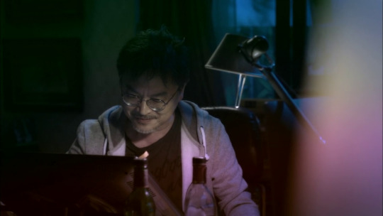
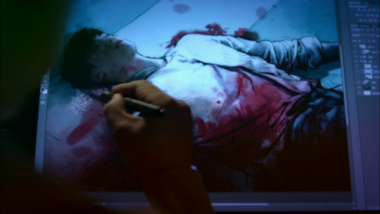
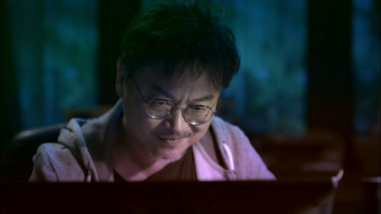
And I love Goya's famous painting of Saturn Devouring His Children coming into play:

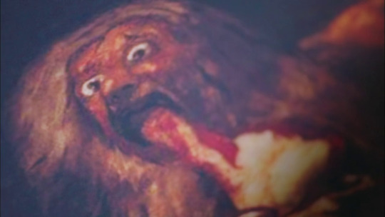

Being devoured by your creation becomes literal in a sense in this drama but once again, it's metaphor made flesh. And also an interesting take on relationships between parents and children. There is a reason the artist analogizes Kang Chul, his fictional creation, to a son - I mean the painting is Saturn devouring his SON. And of course the whole "relationship" starts falling apart because the artist is concerned that Kang Chul may acquire free will and not always do what the artist wants - it's very much like relationships between parents and children who are growing up and want independence and their own way, and some parents don't take it well because they seem them as extensions of themselves.
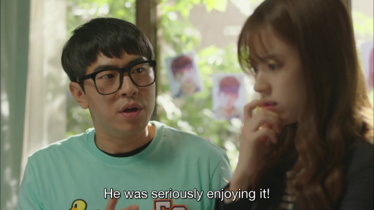

And of course Yeon Joo's whole character is a take on how we engage with fiction - this story is "death of the author" made flesh but also how fans shape narratives and who "owns" them - the whole story is very much a take a creator going "character X is dead" and fandom going "nope" and "saving" them in fanfics and other fan works, refusing to bow down to authorial will.
(There is also a take on how we interact with object of our fannish affections, be they fictional or real celebs or w/e. YJ is a self-proclaimed fangirl of the character of Kang Chul. But when she eventually meets him and gets to interact with him, one of the things she has to process is that he's fun to read about in fiction and cool and what not but in RL, someone with that type of background and personality will have damage that is not easy and fun to be around - the narrative has something to say about how object of fannish adorations cannot be two dimentional perfect specimens unless they are literally on 2d printed pages; they are real people and should be treated as such.)
God, I could write meta about this drama all day.
25 notes
·
View notes
Note
Sorry to unleash this in your askbox but I saw that someone wanted an explanation of the parallels of Gojo v Sukuna with Uraraka v Toga.
And I wanted to explain it too, tbh.
At least I made it bullet points so its faster.
So...
Gojo v Sukuna and Uraraka v Toga similarities:
Villain who uses slashing attacks (Toga's knives, Sukuna's Cleave and Dismantle Cursed Techniques)
Space related hero (Uraraka's whole theme and Quirk, Gojo's Limitless is, at it's core, a form of Space Manipulation)
Villain uses someone elses body to use a summoning technique (Toga tranforms into Twice to use his Quirk and Sad Man's Parade, Sukuna possesses Megumi to use the Cursed Technique: Ten Shadows Technique)
One side upgrades their power to get the final upper hand (Ironically switched: Sukuna develops Dimentional Dismantle [fan nickname: "Strong Cleave"] to pass Gojo's Limitless defense and Uraraka has a Quirk Awakening to stop Sad Man's Parade)
One side is primed to deliver the final blow but can't do it (Again switched: Toga stopping herself from killing Uraraka, Gojo being killed before he could clinch his victory)
One side acknowledging the other (Yet again switched: Uraraka's "Cutest in the World" comment, Sukuna calling Gojo "Magnificent" and vowing to remember him forever)
The fight ends with the villain standing over the dying body of the hero, and exchanging some solemn final words with them (Toga talking with Uraraka before giving her her blood, Sukuna's previously mentioned acknowledgement)
I'm gonna close saying that the main difference is that Uraraka managed to stop Toga's rampage, while Gojo just straight up died (though injuring Sukuna greatly)
This is fascinating!
25 notes
·
View notes
Text
I just watched a beutifull and and emotionall video by Patricia Taxxon on youtube and it reminded me of something I used to be very close to but have since stopped doing, and that is to just look at math and play! Math is inherently arbitrary! By definition math is art! It's a way to grasp at the world, yes, but it's also a vehicle into creating entierly new worlds! New dimentions! New, novel kinds of logic and causality! You can take any single operation, map it to an arbitrary unused symbol, and just! Use it! In different eqasions! In different contexts! You can stretch you conceptions of what is a number, a value, space itself, and it's all so fun and inventive, and you can draw fractals! So so so so many fractals!
And it can be hard to see it that way. Especially after going through public education, especially after being beaten into the ground with incomprehensible notation of lond dead professors, after being offered only the most optimised and abstracted of formulas with no basis on which to place them but! Math is a jurney! To discovery of not only reality but yourself! What compells you; what you see with ease and what just does not compute, what is the rjeason for all of that notation, what would happen if you just assumed something stupid! And that stupid thing can sometimes be revolutionary to your understanding of numbers! Math and notation is an art form and I'm heartbroken people aren't seeing it for that! Because it's too esoteric or intimidating or because they've been made to feel like they could never succseed at it! Becouse someone hurt you in an attempt to teach you how to fill out a standardised test.
My plea is, to give math a try, look for something that resonated with you, or just draw some triangles and sqares; make a fractal; define how it's built and try to see what comes of it, there's so many things to discover. Try to proove a simple formula. Visualise! Solve a simple problem! It's intimidating; but it doesn't have to be! It's impossible to fail at mathematics, you can only learn from your mistakes, I beg of you, try.
#this is a desprete plea to get people to consider maths#you do not have to enjoy it; and it may be simply too hard to get over your feelings about it#but there can be so much joy in it#not even in rigorous math proofs; but in simple casual play#I think I'll try to do some geometry now#me posting#math
9 notes
·
View notes
Note
so the two-dimentional beings in shapeland can be different colors, right? how do the colors factor into their scociety? race? another layer of gender? just not important? can we retrospectively apply significance to bill being green when he appears in the arcade machine in season 1
Wrote a post about it once.
Here's the tl;dr: it doesn't matter. I have no interest in slapping a hamfisted "your position in society is partially determined by the color of your skin" allegory onto the funny cartoon shapes, and there'd really be no way to avoid it if color was treated as something with social significance.
I made Bill's dad green specifically because Bill's original design concept and early cameo appearance had him green. So somewhere in him, Bill's got the green gene. So, you could reverse cause and effect and decide that Bill's dad is why Bill is portrayed on rare occasions as green.
25 notes
·
View notes