#contrasting art
Explore tagged Tumblr posts
Text
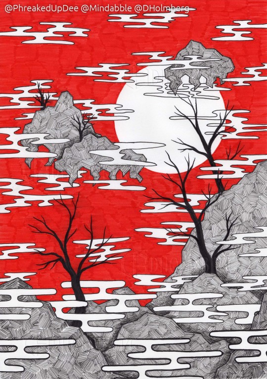
Back during HF (prerequisite school thing for Uni), during particularly difficult to focus on classes, I started making these red landscapes. It was about 2011-13. Recently, while having some downtime at work, I've come back to them.
This is from a few days ago (7/7-23) and made with fineliners and a cheap red marker on "layout paper".
More examples and experiments, the old drawings and musings about the process below the fold.
It started out as a productive way of slowly letting time pass. Doing something monotonous but creative, which would take a long time to finish. All I had was the note-paper and whatever was in my pencil case (Which to be fair, was well stocked).


These two are from back then, probably a couple of days apart, probably took a few days each. I don't remember. The left one, the one with the "waterfall" was my first attempt. The one on the right was the third, after a bit of experimenting on what worked and didn't. The second attempt of experiments are further down.
I've removed the holes from the paper digitally, just for transparency (lol)
Recently, I've had a lot of wait time at work. InDesign is bloated and slow, my computer is quite a bit lacking in RAM and the books we are working with atm is quite heavy. So, I've had some time while waiting for files to export, books to package and documents to open. This has resulted in some experimenting.
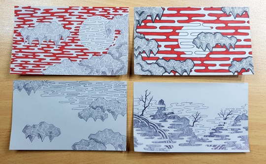
The top-left one was the second made after getting back into the flow of the process. The first one is not much different, so not included. I hadn't seen the originals for years, so there are some very obvious differences, but the elements are there. The top-right one was made more as an experiment: what if I make ruler-lines to space out the clouds. I like the effect. More geometric, but it does take away from the original, ominous feeling.
After the experiment (see also the bottom right drawing in the following picture.) I dug out the old drawings and referenced them, as you can see on the bottom right post-it (which is still WIP). The bottom left one is abandoned.
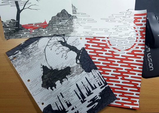
It's both a meditative and obsessive process. Most of the drawings (All those shown here) are made without a sketch. I prefer to just jump into it, slowly building up the layers of mist and rock formations.
The biggest problem is that I get absolutely swallowed up by the process. When I've started, I have a very hard time stopping again. It gets into my brain and continuing working on it becomes all I can think about.
I have to take breaks and I have to aggressively force myself to do so, as the tiny little lines in these does a number on my wrist and forearm. And I'd like to keep those for as long as possible. I have to physically remove myself from my desk, as I have proven myself able and willing to work through the pain.
So I'm taking a break between drawings so I can maybe focus on something else. Like making this post lol
Thank you for reading <3 I very much appreciate it.
3 notes
·
View notes
Text
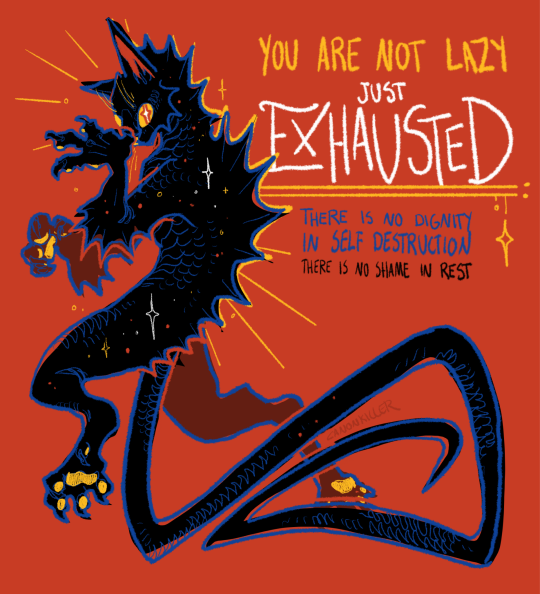
eat drink sleep play
#my art#tatzelwurm#no overarching significance to the creature choice this time i just like tatzelwurms#the blue and red were different contrast on my original screen so they look kind of meh on this one. ill sue
54K notes
·
View notes
Text

make what you love, do what you love :) filet crochet 50 x 37 cm prints available here dyke version here
#i still need to wetblock this but i do my projects in one go so uh have it like this#my art#crochet#filet crochet#f slur#contrast#traditional art#fiber art#queer art#people will unfollow over this i can already feel it but idc
12K notes
·
View notes
Text
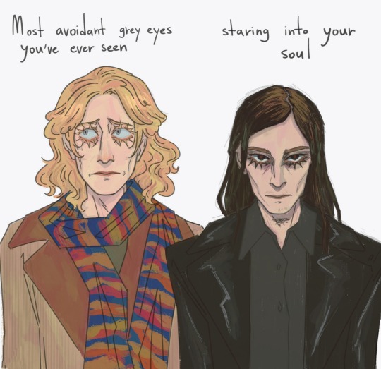
that one dynamic meme
#michael has the hugest most frightened eyes in existence deer in the headlights stare looking everywhere but not at you#i think I'm right#my art#the magnus archives#michael shelley#gerry keay#gerard keay#this is just a silly thing but the contrast in eye contact makes sense to me with gerry being heavily marked by the eye#and michael marked by the spiral since childhood#shifty gaze where you can't quite pinpoint his eye colour vs the far-too-knowledgeable stare you know
6K notes
·
View notes
Text


you’ve changed (for the better)
for @where-does-the-heart-lie ‘s fighting game au I love ur designs I love them dearly
#og art#one piece#roronoa zoro#tony tony chopper#hhehehehe the pookiesssss#this was originally going to just be the bottom image but then I got too comfortable with the colors and wanted to explore#the idea of Zoro aka norm .l guy™️ ever being best buddies with the little guy that not only has ears but wings sprouting from his head#is everything I could’ve ever wanted#zoro’s main heart being on his elbows gives such nice contrast to chopper basically wearing it like a casual shirt to the store#being with people u care about and making new connections that inspire change in you bring out the best of you. something something#whery thank you for the food it was a delicious meal#now that I have clarity putting more hearts on zoro! was v fun it’s been a while since I drew glasses
3K notes
·
View notes
Text
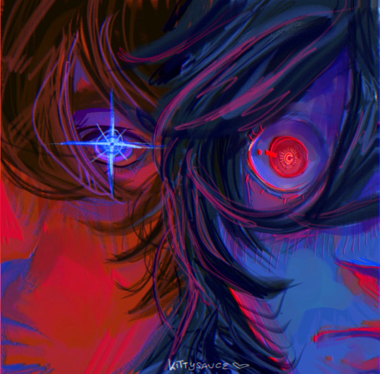
LOOK THROUGH HIS EYES , SEE WHAT HE SEES .
#fanart#art#artist#death note#light yagami#my art#l lawliet#lawlight#light yagami fanart#l lawliet fanart#lawlight fanart#death note fanart#contrast#contrast art#red blue#dn musical
12K notes
·
View notes
Text

#vampire hunter d#vhd#art#illustration#I think I like best how it's a recall of klimt's figures but in contrast D is alone - an emphasis of his solitude#The gold surrounding him a symbol of his status and how above it all he his - looking past us to something we can't even imagine#Don't forget to check out the VHD Zine ! P-O opened yesterday ( can't believe Saiko of all people is in it omg )#also yeah ~ I'll be making prints of it~#I have to get things into order but do keep an eye out if you're interested!#I think it'd be cool to look into gold foil too ooh ꒰´͈ 0 ॣ`͈⌗꒱💖#Hmm ~ but yes the motif I had going into this drawing was the “horseman of death”#makes me think about the brothers and which ones they would symbolize of the the remaining horsemen....#anyways have a wonderful day ! (❀ •̀ᴗ•́ )っ♡#and now onto the next D drawing🌚
3K notes
·
View notes
Text
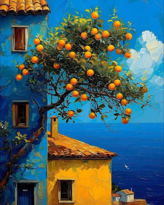
By Juan Brufal
#Sea#trees#blue#beautiful#scenery#painting#paint#orange#oranges#summer#art#Spring#Spring vibes#building#buildings#beach house#ocean#summer vibes#ai#ai art#bright colors#contrast#artwork#artist
11K notes
·
View notes
Text
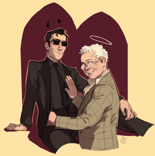
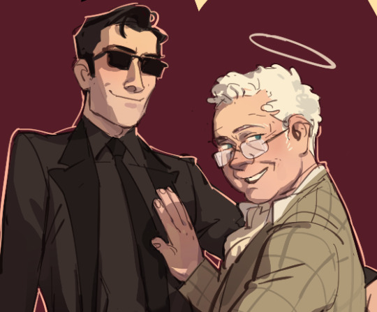
drew some book!husbands. they feel like they've taken more traits from each other than the show.
#decided book!az has hints of elton john. its the old queen energy#book!crowley is nice looking average white man who learns how to wear a suit but half the reason he's interesting is bc he's trailing aroun#an old bookseller who looks maybe 30 years his senior and giving him babygirl eyes#its the stark contrast in the looks between the “bland” (cr) and “interesting” (az) that im going for with these guys#god im trying to make them not look like butch lesbians purely from an art skill pov but i cant beat the allegations#good omens#ineffable husbands#crowley#aziraphale
20K notes
·
View notes
Text
[Toon x Mobster] Only he can make him laugh like that...
Jack Desmond is the silly guy. Gavriel Huffman is the scary guy. They come from different worlds that has contrasting genres, one more cartoonishly comedic and the other much dramatically darker.
It's kind of a running gag that Sir Huffman is unable to laugh without looking absolutely wicked. Both in the cartoon world and his own world.
That doesn't stop Jack from being completely smitten with him though, his voice is the most mind-melting thing he's ever had the pleasure to hear
[AUDIO USED:] Men I Trust - show me how
#Toon x Mobster#Jack Desmond#Gavriel Huffman#listen listen listen#I can't get enough of two CLEARLY different characters being in love with each other alright#and I meant different as in they literally come from different genres of stories#like their art styles contrast against each other and MMM it's so delicious#think of it like the movie of Who Framed Roger Rabbits#or Looney Toons: Back in Action#you'll get what I mean if you go to Youtube and watch a clip or two from those movies haha#anyway I just thought this was a fun idea. maybe I'll make more of them#original characters#original character#original character art#ocs#oc#oc artwork#oc art#artists on tumblr#original charater art#my drawing museum
3K notes
·
View notes
Text

#orv#orv fanart#kim dokja#han sooyoung#yoo joonghyuk#wanted to do a quick sketch ended up with this#red&blue contrast my beloved#my art
2K notes
·
View notes
Text
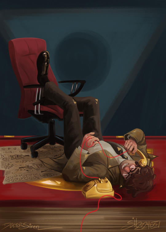
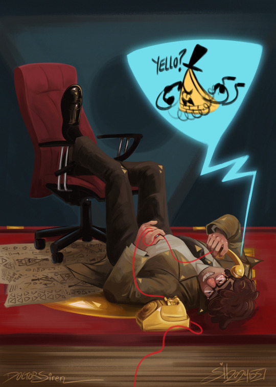
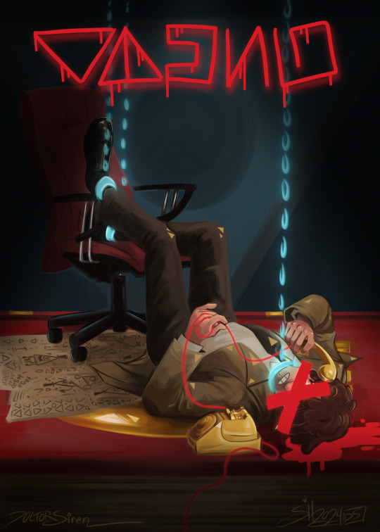
“It would eat you alive, Sixer”
(Available as a print on my Etsy shop)
#doctorsiren#gravity falls#the book of bill#billford#stanford pines#bill cipher#gravity falls fanart#tw blood#digital art#my art#procreate#digital painting#what started as a silly little thing of a babygirl pose#became one of my favourite pieces I think i’ve done in quite some time#…yeah I should turn this into a print asap HEHEHE#I’ll probably have one listing for it but it’ll have all 3 available maybe (so you can choose)#I kept bill as his sketch bc uhh I tried lining him and it looked dumb and I thought that the contrast#btwn the rendered painting and his silly little coloured sketch was funny
3K notes
·
View notes
Text


We’ve seen Gem, so here are the Scotts!
When it comes to Smajor, I wanted him to be Gaslight, Gatekeep, and Girlboss all in one… For Impulse I wanted him to be the friendliest guy you’ve ever seen 🥰
#scott smajor#impulsesv#trafficblr#wild life smp#smajor1995#smajor fanart#smajor#impulse fanart#impulsesv fanart#life series#floweroflaurelin art#mcyt#mcytblr#mcyt fanart#smajor kinda looks like a YA romance love interest and i dig it#i actually spent a while on Impulse to make his eyes warm and friendly to contrast Smajor’s cold ones
2K notes
·
View notes
Text

Dyke <33 (Fag version) Filet crochet, 27 x 44 cm prints available here !
#once again unblocked project but what can i say#i am lazy#my art#filet crochet#crochet#fiber art#d slur#f slur#queer art#contrast
9K notes
·
View notes
Text
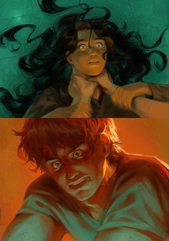
“you believe me like a god / i’ll destroy you like i am”
— i’m your man, Mitski
#thg#the hunger games#katniss everdeen#peeta mellark#thg fanart#hunger games#hunger games fanart#my art#fanart#cw choking#tw choking#everlark#everlark fanart#the contrast between this and my last thg fanart 😭😭 they have a happy ending after this I SWEARRR
5K notes
·
View notes
Text


🌙🪽✨✨
#nightwing#dick grayson#dc comics#snoozyfruit art#artists on tumblr#digital art#art#i wanna revisit this concept sometime when im not in a terrible headspace and once im better at rendering#like can u imagine this where nightwing is in night time lighting and then out-of-costume dickie is in like normal lighting#and so the ‘star’ doesn’t need the white line to differentiate between them it’s just naturally that contrast-y#also nightwing’s hair would totally be styled differently from dick’s normal hair but i got lazy#i HATE shading. but i need to practice shading in order to improve at shading. and yet……#edit: I FORGOT TO CAPTION THIS LMAO. emoji time
1K notes
·
View notes