#commercial cleaning examples
Explore tagged Tumblr posts
Visit Tumblr Blog
Explore Tumblr blogs with no restrictions, modern design and the best experience.
Last Seen Tumblr Blogs


Fun Fact
The KCSC sent more than 20K requests to delete posts related to prostitution and porn to Tumblr from January to June 2017.
Text
The Ultimate Guide to Commercial Cleaning
Commercial cleaning is a professional service that specializes in cleaning and maintaining commercial properties, such as offices, retail stores, and industrial facilities. Unlike residential cleaning, commercial cleaning involves a more extensive scope of work, often requiring specialized equipment, cleaning agents, and trained personnel. This guide will delve into the meaning, benefits, and various aspects of commercial cleaning, providing insights into its profitability, services, and how to start and run a successful commercial cleaning business.
#Commercial Cleaning#commercial cleaning services#commercial cleaning meaning#commercial cleaning contracts#commercial cleaning definition#commercial cleaning leads#commercial cleaning prices#commercial cleaning calculator#commercial cleaning examples
0 notes
Text
my creative writing prof also HATES fantasy. as in if she asks for an example of symbolism in a book, and you give something from a fantasy novel, she’ll ask for an example from a “non-commercial book” instead.
I dunno man, people can have preferences, but the second you discount the artistic merit of sci fi and fantasy I stop taking your opinion seriously. and there’s such a big culture in Canada of only valuing literary fiction, to the point where one of our biggest authors, Margaret Atwood, refused for a while to classify her books as sci fi or fantasy. she said they were “speculative fiction”, which is entirely separate and very highbrow (sarcasm).
and I could go on about how Octavia Butler and Ursula Le Guin wrote books every bit as intellectual (and honestly, even more so) than their literary counterparts, but I am also an enjoyer of schlock!! I think there’s artistic merit in animorphs, and in isekais where a japanese schoolgirl reincarnates into a magical spider who has to level up like it’s a video game! it’s like with everything, you can’t draw a clean line that separates ‘art’ from ‘non-art’ or even ‘lesser art’, and pretending you can do so just makes you look ignorant and goofy. in my opinion.
23K notes
·
View notes
Text
"In China, a landscape architect is reimagining cities across the vast country by working with nature to combat flooding through the ‘sponge city’ concept.
Through his architecture firm Turenscape, Yu has created hundreds of projects in dozens of cities using native plants, dirt, and clever planning to absorb excess rainwater and channel it away from densely populated areas.
Flooding, especially in the two Chinese heartlands of the commercial south and the agricultural north, is becoming increasingly common, but Yu says that concrete and pipe solutions can only go so far. They’re inflexible, expensive, and require constant maintenance. According to a 2021 World Bank report, 641 of China’s 654 largest cities face regular flooding.
“There’s a misconception that if we can build a flood wall higher and higher, or if we build the dams higher and stronger, we can protect a city from flooding,” Yu told CNN in a video call. “(We think) we can control the water… that is a mistake.”
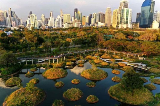
Pictured: The Benjakitti Forest Park in Bangkok
Yu has been called the “Chinese Olmstead” referring to Frederick Law Olmstead, the designer of NYC’s Central Park. He grew up in a little farming village of 500 people in Zhejiang Province, where 36 weirs channel the waters of a creek across terraced rice paddies.
Once a year, carp would migrate upstream and Yu always looked forward to seeing them leap over the weirs.
This synthesis of man and nature is something that Turenscape projects encapsulate. These include The Nanchang Fish Tail Park, in China’s Jiangxi province, Red Ribbon Park in Qinghuandao, Hebei province, the Sanya Mangrove Park in China’s island province of Hainan, and almost a thousand others. In all cases, Yu utilizes native plants that don’t need any care to develop extremely spongey ground that absorbs excess rainfall.
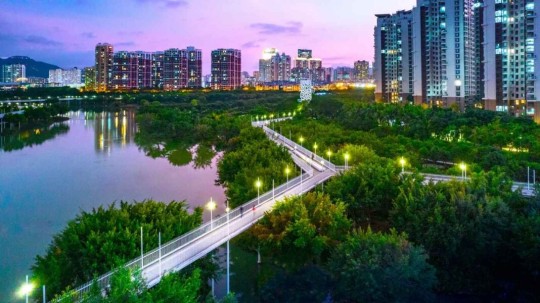
Pictured: The Dong’an Wetland Park, another Turescape project in Sanya.
He often builds sponge projects on top of polluted or abandoned areas, giving his work an aspect of reclamation. The Nanchang Fish Tail Park for example was built across a 124-acre polluted former fish farm and coal ash dump site. Small islands with dawn redwoods and two types of cypress attract local wildlife to the metropolis of 6 million people.
Sanya Mangrove Park was built over an old concrete sea wall, a barren fish farm, and a nearby brownfield site to create a ‘living’ sea wall.
One hectare (2.47 acres) of Turenscape sponge land can naturally clean 800 tons of polluted water to the point that it is safe enough to swim in, and as a result, many of the sponge projects have become extremely popular with locals.
One of the reasons Yu likes these ideas over grand infrastructure projects is that they are flexible and can be deployed as needed to specific areas, creating a web of rain sponges. If a large drainage, dam, seawall, or canal is built in the wrong place, it represents a huge waste of time and money.

Pictured: A walkway leads visitors through the Nanchang Fish Tail Park.
The sponge city projects in Wuhan created by Turenscape and others cost in total around half a billion dollars less than proposed concrete ideas. Now there are over 300 sponge projects in Wuhan, including urban gardens, parks, and green spaces, all of which divert water into artificial lakes and ponds or capture it in soil which is then released more slowly into the sewer system.
Last year, The Cultural Landscape Foundation awarded Yu the $100,000 Oberlander Prize for elevating the role of design in the process of creating nature-based solutions for the public’s enjoyment and benefit."
-via Good News Network, August 15, 2024
#china#wuhan#thailand#bangkok#landscape#wetlands#sponge city#landscape architecture#flooding#climate action#parks#public park#green architecture#sustainability#good news#hope
996 notes
·
View notes
Text
LADOOR - PLATİN (2)
The door surface is a critical element in the design and functionality of any door. It can significantly impact not only the aesthetic appeal but also the overall durability and maintenance of the door itself. Understanding the various types of door surfaces available can help you make an informed decision when choosing the right door for your needs.
One popular type of door surface is made from wood. Wooden doors often provide a classic, timeless look, and can be stained or painted to suit your decor. However, they require regular maintenance to prevent warping and decay, especially in moist environments.
Another common door surface option is fiberglass. These doors are known for their resilience and ability to imitate the look of wood without the drawbacks. Fiberglass doors resist cracking, splitting, and rotting, making them an excellent choice for homeowners looking for low maintenance.
Metal doors, often made from steel or aluminum, are another option to consider. They offer superior security and durability, making them an ideal choice for commercial applications. Additionally, metal door surfaces can be finished with various coatings to enhance their appearance and protection against rust.
It's also crucial to consider the texture and finish of the door surface. Smooth finishes are easier to clean but may show fingerprints and scuffs more easily, while textured surfaces can hide imperfections but might require more effort for cleaning.
In summary, the selection of a door surface is an essential aspect of door planning. Whether you opt for wood, fiberglass, metal, or a combination of materials, being aware of the features, maintenance needs, and aesthetic potential of each option can lead to a more satisfying purchase. Invest time in selecting the right door surface to ensure that it complements your design vision while providing the functionality you require.
Ladoor
The term Ladoor refers to a specific type of door that is not only functional but also enhances the aesthetic appeal of any space. These doors are designed with a combination of durability and style, making them a popular choice for both residential and commercial buildings.
Ladoor options are available in various materials, including wood, metal, and composite materials. Each material offers its own unique appearance and benefits. For example, wooden Ladoor can provide a warm, natural look and can be customized with different finishes. Metal Ladoor, on the other hand, offers strength and security, making them ideal for entry points that require additional protection.
Additionally, Ladoor can feature various styles, such as single doors, double doors, or sliding doors, enabling homeowners and architects to choose the design that best fits their space. Some Ladoor styles include traditional panel doors, modern flat doors, and elegant French doors, each offering its unique charm.
When choosing a Ladoor, it is essential to consider factors such as insulation, maintenance, and design coherence with the rest of the home. Proper installation is also crucial to ensure the door operates smoothly and efficiently, contributing to energy savings and overall longevity.
Incorporating a Ladoor into your space can significantly impact the functionality and design. Whether you are looking to upgrade your home or design a new one, exploring Ladoor options can lead to fulfilling architectural decisions that marry utility and aesthetics.
738 notes
·
View notes
Text
Become Your Best Version Before 2025 - Day 11
Taking Care of Your Body


Hi Goddesses! How are you feeling today after focusing on regulating your emotions? It’s a big step, right? Knowing that we can handle whatever comes our way gives us so much more power. But today, let’s shift gears a little and talk about our bodies, our physical well-being. After all, emotional regulation and physical health are like two sides of the same coin. They feed into each other.
I’m sure you’ve heard it a million times: “You need to take care of yourself.” But, let’s be real, it can be hard to know where to start. Sometimes, health can feel like one big overwhelming task. Whether it’s exercise, eating better, or just getting enough sleep, there always seems to be something else that gets in the way.
Let’s start with a truth we can all agree on: health isn’t about drastic changes that leave you feeling burned out. If you’ve ever tried to stick to a crazy fitness routine or overhauled your diet only to feel completely defeated by the end of the week, you’re not alone. I’ve been there too.
Let me share some real-life, totally doable ways to make healthy changes that actually stick.
Starting Your Day
Instead of jumping into an intense morning routine, try this: When you first wake up, before even checking your phone, take three deep breaths and stretch your arms overhead. That's your baseline. From there, you might naturally want to add:
A glass of water with lemon
A 5-minute gentle stretch
Opening the curtains to get some natural light (game-changer for energy levels!)
Making Movement Fun
Here's a secret I wish I'd known earlier: exercise doesn't have to feel like punishment! Start by finding what you enjoy:
Love chatting? Make walking phone calls your thing
Enjoy music? Have a 10-minute dance party while cleaning
Like structure? Try the "commercial break challenge", move during every TV commercial
Work at a desk? Set a timer for hourly 2-minute stretch breaks
Better Sleep Habits
Remember: good sleep makes everything else easier! Here's what works:
Create a relaxing bedtime routine, dim lights an hour before bed
Keep your bedroom slightly cool
Try reading instead of scrolling on your phone
Use the 10-minute rule: just lie down with no pressure to sleep, often you'll naturally drift off
Simple Nutrition Changes
Instead of restrictive diets, try these gentle additions:
Add one fruit or veggie to whatever you're already eating
Keep a water bottle where you can see it
Try filling half your plate with vegetables when possible
Keep healthy snacks handy for hungry moments
Combining New Habits With Old Ones
Here's my favorite trick: attach new healthy habits to things you already do:
Do counter push-ups while waiting for coffee
Stretch while watching your favorite show
Take the stairs when checking work emails on your phone
Drink water every time you check social media
Tips That Really Work:
Track your habits without judging yourself
Celebrate small wins (seriously, even taking the stairs counts!)
Have backup plans for busy days
Find a friend to check in with (anyone in the comments want to pair up?)
This Week's Challenge
Pick ONE thing from any category above that feels almost too easy. That's your starting point. For example, I started with just the morning stretch - three days later, I naturally wanted to add water, and a week later, I was craving a morning walk.
Share in the comments: What's your ONE thing going to be? Remember how we talked about being gentle with ourselves yesterday? That applies here too! No pressure to be perfect, we're just adding tiny doses of goodness to our days.
P.S. Don't forget, it's totally okay to modify any of these suggestions to fit your life. The best healthy habit is the one you'll actually keep doing!
See you tomorrow for Day 12!
♡ ☆:.。 Keep glowing, babes! ♡ ☆:.。 With love, Goddess Inner Glow.
#self improvement#personal development#self love#be yourself#self confidence#Self Acceptance#self appreciation#be confident#be your best self#be your true self#becoming the best version of yourself#Becoming that girl#girlblog aesthetic#it girl#it girl energy#confidence#growth mindset#That Girl#selfcare#pinterest girl#pink pilates princess#pilates aesthetic#self help#health and wellness#lifestyle#dream life#glow up tips#self concept#goddessinnerglowblog#goddessinnerglowmagazine
99 notes
·
View notes
Text
The common rebuttal to "this reads like fanfic (derogatory)" is "read better fanfic," which is true in certain cases, but on the other hand, there is some grain of truth to the idea that you can tell when someone's primary mode of literary analysis is fanfic instead of... well... literally anything else. It's okay to like or even prefer fanfic, but if you want to take your craft seriously you also need to read books, dude. Published books will teach you a lot of stuff fanfic doesn't, like proper dialogue formatting and how to introduce your reader to unfamiliar characters. Even the crappiest book (well, if it's not After or 50 Shades, which started off as fanfic to begin with lol) will have been subjected to some sort of editing process to ensure at least the appearance of proper grammar. That's not a guarantee with your average fanfic, and hence why you can't always take all your writing cues from fanfic because it's "so much better" than commercially published original fiction or whatever. Frankly, fic writers tend to peddle some absolutist and downright bad takes sometimes. "Said is dead" is a terrible rule, though not because said is invisible and a perfectly serviceable tag; that's just part of it. Dialogue tags are a garnish, not a main dish that can be swapped out for more ostentatious words. If your characters murmur and mutter instead of simply saying stuff, your readers are going to wonder why nobody speaks up. "'I'm explaining some very plot-important shit right now lol,' she elaborated," likewise, is a form of telling. Instead of letting the reader extrapolate that "she elaborated" via the contents of the dialogue itself, you're telling them what to think about it. And that's why it's distracting: your authorial hand is showing. Writing is an act of camouflage. You, as the writer, need to make your presence as invisible as possible so as to not intrude on the reader's suspension of disbelief. That's the driving reason behind "show, don't tell." And overall, everyone could stand to cut down on the frequency of their dialogue tags anyway. Not every exchange needs "he said" or "she whispered" attached as long as you establish who is doing the talking before the exchange. Some people will complain of confusion if you go on for too long without a dialogue tag, and that definitely is a risk, but at some point you also need to resist the temptation of holding the reader's hand. If they can't follow a conversation between two people, chances are they weren't meeting you halfway and paying that much attention in the first place. In fact, you don't even necessarily need action beats in between every piece of dialogue, as Tumblr writing advice posts will often suggest as a fix. Pruning things often cleans them up just fine.
Another fanfic-influenced trend in writing is, I guess, beige prose? A heavy focus on internal narration with lots of telling. It's not a style I can concretely describe, but every time I click on a non-mutual's writing, I feel like it always has, like. This "samey" voice to it. There's no real attempt to experiment and use unique or provocative language, or even imagery half the time. It's almost a dry recital of narration that doesn't leave much room for subtext. I see this style most often in fanfic where you can meander and wax poetic about how the characters feel without ever really getting around to the plot. And it's like. DO something.
Other tells that the author is taking their cues from fanfic mores rather than books: >>too much minute description of eyes, especially their color and their movement >>doesn't leave much room for subtext (has a character speak their every thought aloud instead of letting the reader infer what they're thinking via action or implication) >>too much stage action ("X looked at Y. Y moved to push their seat in. X took a deep breath and stepped toward Y with a determined look on his face. 'We need to talk,' he said.") >>tells instead of shows, even when the example is about showing instead of telling ("he clenched his teeth in agony" instead of just "he clenched his teeth") >>has improper dialogue tag formatting, especially with putting full stops where there should be commas ("'Lol and lmao.' she said" instead of "'Lol and lmao,' she said." This one drives me up a wall) >>uses too many dialogue tags >>"em dashes, semi-colons and commas, my beloved" - I get the appeal but full stops are your friends. Too much alternate punctuation makes your writing seem stilted and choppy. >>"he's all tousled brown hair and hard muscle" and "she's all smiles and long legs." This turn of phrase is so cliche, it drives me up a wall. Find less trite ways of describing your characters pls. >>"X released a breath he didn't know he'd been holding" >>every fucking Hot Guy ever is described as lean and sinewy >>sobbing. why is everyone sobbing. some restraint, pls >>Tumblr in general tends to think a truism counts as good writing if you make the most melodramatic statement possible (bonus: if it's written in a faux-archaic way), garnish it with a hint of egotism, and toss in allusions to the Christian God, afterlife, or death. ("I will stare God in the face and walk backwards into hell," "What is a god to a nonbeliever?") It's indicative of emotional immaturity imo, that every emotional truth need be expressed That Intensely in order to resonate with people. >>pushes the "Oh." moment as the pinnacle of Romantic Epiphany >>Therapy Speak dialogue. why is this emotionally constipated forty-something man who drinks himself stupid every morning to escape gruesome war memories speaking about his trauma like a clinical psychologist >>"this well-established kuudere should Show More Emoshun. I want him to break down crying on his love interest's shoulder from all his repressed trauma" - I am begging u. stop >>"why don't the characters just talk to each other?" "why can't we have healthy relationships?" I don't know, maybe because fiction is not supposed to be a model for reality and perfect communication makes for boring drama?
>>improperly using actions as dialogue tags ("'Looks like we're going hunting,' he grinned") >>why is everyone muttering and murmuring. speak up >>too many adverbs, especially "weakly" and "shakily." use stronger verbs. ("trembled" instead of "shook weakly") >>too many epithets ("the younger man" or "the brunette detective") >>too many filter words ("he felt," "she thought," "I remembered")
>>no, Tumblr, first-person POV is not the devil; you're just using way too many filter words (see above) and not enough sentence variation to make it flow well enough. First-person POV is an actually pretty good POV (not just for unreliable and self-aware narrators) if you know what you're doing and a lot of fun crafting an engaging character voice. Tumblr's hatred of first-person baffles me, and all I can think is you would only hate it if your only frame of reference was, like, My Immortal. Have you tried reading A Book? First-person POV is just another tool in your toolbox, and like all tools, it can be used properly or improperly. But it's not inherently a marker of bad writing. The disdain surrounding it strikes me as about as sensical as making fun of the concept of characters. Oh, your work has characters in it? Ew, I automatically click off a fic if it has characters in it. like what.
#writing#obligatory disclaimer that I am speaking broadly and this is in no way intended to make anyone feel self-conscious
422 notes
·
View notes
Text
Runcible Spoon - A Simlish Font
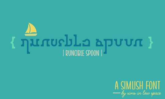
Happy New Year everyone! 🥂 I have a new Simlish font to share. Previews, details and download below.
Runcible Spoon is a serif font designed for display and copy. It comes in uppercase and lowercase, plus numbers, lots of symbols and three alternative ligatures (more about that below). I wanted to design something a little rustic and a little whimsical, but still clean.
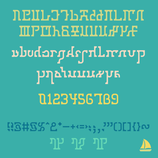
Alternative Glyphs --------------------------------------------------------------
Runcible Spoon has three alternative glyphs for these combinations (you can see the examples just above): rq, rg, rp
You can use these alternative glyphs with: | = rq, \ = rg, / = rp
I kerned this one until I could kern no more; it's not perfect, but it's pretty damn good. Manual kerning is always recommended if possible. :)
Attribution is appreciated, and I’d love to see your projects if you use it! Please do not use for commercial purposes or redistribute the font itself.
DOWNLOAD (SFS) OpenType format + preview images.
Lots of love, Spacey
I'll have more content (including actual CC) soon...I think I need to reinstall my game though and I'm just ._____. at the thought of that right this second. But I do want to get more active again next year, so here's a start. :)
284 notes
·
View notes
Text
✨PART OF FORTUNE IN SIGNS AND HOUSES SERIES: 6TH HOUSE✨
Credit goes to astrology blog @astroismypassion
ARIES PART OF FORTUNE IN THE 6TH HOUSE
You feel the most abundant when you have Aries and Virgo Sun people in your life. You could make money via fitness training, personal training, firefighting, law enforcement, emergency healthcare services, competitive sports, trading, stockbroking, automotive repair, mechanics, tech startups. You feel abundant when you come up with new, fresh ideas.
TAURUS PART OF FORTUNE IN THE 6TH HOUSE
You feel the most abundant when you have Taurus and Virgo Sun people in your life. You could make money via offering a service connected with pet sitting, tutoring or helping people to organise their kitchen, fridge, storage. You may also clean offices or make work environment more beautiful (for example putting on pictures, cleaning the computer). You feel the most abundant when you are stable on a daily basis and know what to expect from your daily schedule and when your work ethic, work relations are stable and grounded.
GEMINI PART OF FORTUNE IN THE 6TH HOUSE
You feel the most abundant when you have Gemini and Virgo Sun people in your life. You could make money via freelance journalism, you can write for newspapers, magazines, online publications. You can have abundance via starting a podcast or YouTube channel. You may offer translation, interpretation or language teaching services if you are multilingual. You feel abundant when you organise a networking event or a conference even. You could also blog about your profession or teach people about what is it that your job entails.
CANCER PART OF FORTUNE IN THE 6TH HOUSE
You feel the most abundant when you have Cancer and Virgo Sun people in your life. You could make money via blogging about topics related to home, family and well-being. You may start a blog or write for publications that focus on these areas. You would be an excellent planner! Planning and organising family-oriented events, such as weddings, birthday parties or even community gatherings in your local town. You could also offer pet sitting, dog walking or even start a pet grooming service.
LEO PART OF FORTUNE IN THE 6TH HOUSE
You feel the most abundant when you have Leo and Virgo Sun people in your life. You could make money via voice acting or doing voice-over work for commercials, animations or audiobooks. You will find fulfilment, joy, success and wealth in activities that promote mental and physical wellness. You might make organic make up or creams. You feel the most abundant when you incorporate hobbies, interests and passion into your daily life. You could also be a health advocate.
VIRGO PART OF FORTUNE IN THE 6TH HOUSE
You feel the most abundant when you have Virgo Sun people in your life. You could make money via starting your own online store selling products related to your interests connected to books, tech gadgets or dietetics/nutrition. You can set up a shop on Shopify or Etsy. You experience wealth by providing consulting services in your area of expertise. You may be a travel blogger or write travel articles, but more so on a local level, maybe also connected with short-distance travel.
LIBRA PART OF FORTUNE IN THE 6TH HOUSE
You feel the most abundant when you have Libra and Virgo Sun people in your life. You could make money via providing recipes for lunches for working people, like easy DIY ideas. You may also create meal plans for school children. You can create wealth by selling prints, stock photos or offering photography services.
SCORPIO PART OF FORTUNE IN THE 6TH HOUSE
You feel the most abundant when you have Scorpio and Virgo Sun people in your life. You could make money via working in alternative medicine or wellness, becoming a financial advisor or running your own cleaning business or provide services for neighbours or in your local town. You can offer cleaning or yard work services to neighbours or in your local community.
SAGITTARIUS PART OF FORTUNE IN THE 6TH HOUSE
You feel the most abundant when you have Sagittarius and Virgo Sun people in your life. You could make money via working in non-profits, via wellness coaching, physical therapy, working in educational institutions, hospitality industry, tour guiding, working for airlines, travel blogging, working in media, especially related to educational content, travel, running a small business that involves sharing knowledge or providing specialized services.
CAPRICORN PART OF FORTUNE IN THE 6TH HOUSE
You feel the most abundant when you have Capricorn and Virgo Sun people in your life. You could make money via farming, gardening, manual labor and agriculture, management, administration, working with your hands, project management, quality control and research. You definitely need to ask for a promotion.
AQUARIUS PART OF FORTUNE IN THE 6TH HOUSE
You feel the most abundant when you have Aquarius and Virgo Sun people in your life. You could make money via information technology, software development, working with cutting-edge technologies, via astronomy or astrology, via social enterprise, digital marketing, advocacy work, activism and community organizing, via renewable energy, sustainable development or green technologies.
PISCES PART OF FORTUNE IN THE 6TH HOUSE
You feel the most abundant when you have Pisces and Virgo Sun people in your life. You make money via tarot, healing, holistic medicine, work with elderly people or at a hotel. You could find success in making jewellery, specializing in anklets. You feel acquire wealth through counselling, psychotherapy, psychology, nursing, holistic therapies (like reiki or acupuncture), teaching meditation, drama/music therapy or dance/movement therapy, caregiving, hospice work, starting a creative arts studio, a holistic wellness center or socially conscious business.
Credit goes to astrology blog @astroismypassion
#astrology#astroismypassion#astro notes#astroblr#astro community#astro note#astro observations#natal chart#astrology blog#chart reading#part of fortune in the 6th house#astrology reading#pof in the 6th house#aries part of fortune in the 6th house#taurus part of fortune in the 6th house#cancer part of fortune in the 6th house#leo part of fortune in the 6th house#libra part of fortune in the 6th house#sagittarius part of fortune in the 6th house#virgo part of fortune in the 6th house#capricorn part of fortune#capricorn part of fortune in the 6th house#pisces part of fortune#aquarius part of fortune#aquarius pof#pisces pof#capricorn pof#astro observation#astrology observations#birth chart
116 notes
·
View notes
Text
Thinking about a new Shadowrun OC, Prince

-30 (a fitting age to start thinking “Did I achieve nothing because I’m moving at my own pace, or because I’m stupid?”)
- Got a few secondary roles in shitty sitcoms.
- Also got some roles in old ads. Like in a blister ointment commercial.
- Huge and hugely fragile ego.
- Is making a lot of astonishing discoveries, for example- that riding public transport costs money.
- Possess illusion magic, mind manipulation, and spying spells.
- When he's upset, he won't show it, but that night he'll be sitting on the bathroom floor eating ice cream and crying.
- “Checking privileges? What’s that?”
- Throws a tantrum and wants to drop everything every time someone else gets more attention/recognition than him. or when Prince THINKS someone has gotten more attention/recognition than him.
- Tells everybody that he’s 27. Like he still has time to join the 27 club.

Some background:
David Khlebnikov (street name: Prince)
Third and the youngest son of the owners of a large corporation (one of the daughter corps of EVO). He is 20 and 15 years younger than his siblings, grew up spoiled and was never denied anything, always considered the main cutie in the family. Got awakened at 14, when at the social gathering where Prince expected everyone to praise him for his first child role in some obscure sitcom, everyone turned their attention to someone else, which triggered a spectacular illusory explosion. Well, at least he’s got the attention he wanted.
In the following years he:
- Tried multiple times to get a higher education (musical, archeological, literature) but never managed to finish one.
- Tried to start a career as a singer in a dark-punk-weird-alt-wizard-blues-goth-metal-core band. Failed despite a significant boost by his parents’ money.
- Tried to start an acting career. Didn’t manage to go further than a few secondary roles and a few commercials. But you still can find his face on a foot deodorant commercial.
- Had some short but vibrant romance where it ended with him getting dumped and his ex running off with a lot of his money. Prince is trying to hang on, but after this he won't be ready for any romance for a long time to come.
Around his 30s his family situation changed drastically when one of his parents got assassinated in a car bombing, and another got terminally sick. And at this exact moment Prince started to suspect that he’s doing something wrong with his life. While talking to his siblings he shared that it would be so cool to become a shadowrunner, to be a legend in the underworld, oh how romantic would be!- and other such nonsense. And, to his surprise, his siblings (who used to roll their eyes on all his previous ideas) became very supportive of this venture. “Yes, brother, you can do it! That's a great idea! You'll be a legend!”. They bought him a fake SIN, a gun license, and sent a private jet on a one-way trip from Russia to Seattle. Prince is somewhat bewildered by this enthusiasm.
He spends some time in Seattle. There he improved his magical skills (primarily mind reading and mind control), and actually participated in one run. He managed to finish the run alive, but he realized that's very far from that romanticized dream of his. His dream is actually to lie on a private white sand beach and drink a cocktail from a coconut. All in all, Prince is severely disappointed.
While he was crying and eating ice cream about it, he got news about his second parent passing away and flew back to Russia for the funeral and the will reading. When his siblings met him they were strangely surprised to see him alive. Prince suspected something fishy was going on, and managed to read his sibs minds in secret. He learned that they wanted to get rid of him, and divide his part of inheritance between them. They planned an assassination, but decided that sending him towards a suicidal venture will keep their hands clean. And now he’s alive and back and in such an unfortunate moment just before the will is read. So maybe they'll get their hands dirty after all…
Prince got scared, panicked, packed up as fast as he could and ran away back to UCAS. That's how he actually had to become a shadowrunner.
#thanks to Nёxt for the translation!#and thanks to Wunjo for their Marcus broke Prince's heart#shadowrun oc#shadowrun#oc#character design#NecroComrade OC#OC:Prince
33 notes
·
View notes
Text
Excerpt from this story from EcoWatch:
In 1979, when President Jimmy Carter famously unveiled 32 solar panels on the White House roof, he remarked, “A generation from now, this solar heater can either be a curiosity, a museum piece, an example of a road not taken or it can be just a small part of one of the greatest and most exciting adventures ever undertaken by the American people.”
Despite his reputation as an often ineffective president, he had an enormous effect on the environment as an advocate for clean energy, protecting lands and regulating toxic chemicals.
Jimmy Carter was an early adopter of clean energy in an effort to reduce U.S. reliance on foreign oil following the oil crisis that preceded his presidency. Four years before Carter took office, the member nations of the Organization of Arab Petroleum Exporting Countries placed an oil embargo on the U.S. and several other western nations in response to their support of Israel during the Yom Kippur War. As a result, the price of oil rose by more than 300%, while American dependence on foreign oil was simultaneously rising.
After Carter took office, he responded by creating the U.S. Department of Energy. One of Carter’s major goals for the agency was to reduce the country’s dependence on fossil fuels by pushing for the domestic production of energy. While this push wasn’t perfect — part of his solution for the complex crisis included propping up domestic coal power — it was also a first-of-its-kind endorsement for clean energy, championing sustainable sources like solar and nuclear. “No one can embargo the sun,” Carter once said. “No cartel controls the sun. Its energy will not run out. It will not pollute our air or poison our waters. The sun’s power needs only to be collected, stored and used.”
In 1979, a second oil crisis hit, this time spurred by the decline in oil trade in the wake of the Iranian Revolution. Carter responded by laying out plans to expand renewable energy sources and made a pledge that 20% of American energy would be produced by renewable sources by 2000, but was voted out of office before many of these plans could come to fruition.
Carter also protected far more land than any U.S. president in history. In 1978, he advocated for the National Interest Lands Conservation Act (ANILCA,) which aimed to protect vast amounts of Alaskan wilderness from commercial use and destruction. After the bill failed due to a last-minute filibuster, Carter used executive authority to protect more than 56 million acres of Alaskan wilderness, designating those lands as National Monuments. This action alone would more than double the size of the National Park system.
In December of 1980, roughly six weeks before Carter left office, ANILCA was debated again in Congress, and passed. Upon Carter’s signature, the law became the most expansive federal protection of American lands in history, granting protection to more than 157 million acres of Alaskan wilderness, which included further protections for much of the land Carter had protected two years prior. Of those 157 million acres, it also designated nearly ten million acres to the National Wildlife Refuge System, more than nine million acres to the Wilderness Preservation System, and more than three million acres to the National Forest System.
20 notes
·
View notes
Note
Any tips on how to correctly credit clips used in YTP? I'm very lost when it comes to finding copyright info and stuff like that.
The stakes are pretty low for YouTube Poop and crediting clips in the video/description is not standard practice - but it's a good thing to do! That said I am not an authority on this and even my method has some blind spots. These are just some generally good ideas for being a slightly-more-courteous-than-average shitposter.
The acknowledgement is the most important part, stating outright what the names of the sources are. Pay attention to the official titles of what you use and try to trace them to their original form - for example in The Price is Rice COMPLETE I wanted to credit the gamer-themed Dust-Off commercial I used in The Price is Rice Jr. Usually ads are more difficult to track down than other kinds of televised media, so often "___ TV Spot" does the job, but a quick peek at the official YouTube channel reveals that the ad's actual name was How to properly clean your gaming computer.
Then there's an acknowledgement of the owner. I try to list composers for music, directors for film, and of course artists for art. You aren't required to give an exhaustive list of every single contributor to the art you've sampled, but make sure you credit the person/company it belongs to at the very least. Going back to the Dust-Off example, the YouTube video contained a link to dust-off . com which now redirects to falconsafety . com - I lucked out because the top of the page indicates clearly that Dust-Off is a product owned by Falcon Safety Products Inc. but this info is often in the About section of a website or at the bottom of the page.
I like to throw the year on each YTP credit as well. Academic citations usually require a more precise publication date if available. Among other benefits it helps distinguish between things with the same name/owner that were rebooted later - for example there are multiple games called Sonic the Hedgehog owned by SEGA from different years (In fact in this example there are two games from 1991 so it's also important to note what system the game is for!) Generally your source credits should communicate to a viewer where to start looking for a specific thing or who to ask.
You can use Wikipedia to orient yourself if you need a lead on where to start tracking down copyright information for popular media, but make sure you cross-reference what's there with other sources. For Movies/TV I usually just look at the very end of their credits which usually has the copyright info. For music I use Discogs. Sometimes for more obscure or less-documented things I have to do some search-engine sleuthing.
If you're stuck, ask a friend for help! It can be fun and rewarding to track down something that isn't answered by a quick google search, and like most things turning it into a collaborative effort makes it less of a slog.
Copyright acknowledgement is tricky to do correctly and not every Best Practice applies to each situation. There may come a day when MLA-style citations become normal or required even for shitposts and your due diligence will become greater. Do your best, give credit where it's due, and you'll be fine :)
79 notes
·
View notes
Text
Ostrichmonkey Hack: Layout Behind the Scenes
Been procrastinating on this enough! So here is a look at some of the process and decisions that went into doing the layout for the Ostrichmonkey Hack.
Let's start with the goals I had in mind:
Keep it simple.
Keep it easy to make.
With those goals set, next step is gathering materials and resources (not all of this was done as cleanly as I'm making it out to be, but this is the gist).
Materials used:
Classic Explorer Template
Affinity Publisher and Photo
Fonts
Art
The text itself
The Classic Explorer Template was critical in getting this layout done efficiently, since it does a lot of the work for you. It's not a replacement for having a rough idea on how to do layout, but it can serve as a nice tutorial/explainer on different elements of layout and typesetting, and honestly, is worth its (digital) weight in gold. There's a free version available if you want to check out what it offers.
I use the Affinity Suite for my layout work. It's a nice set of programs with a manageable learning curve, but there are plenty of other alternatives so go with whatever works for you (one of my favorite elements of using multiple Affinity programs is that within Publisher, you can access both Designer (vector illustration) and Photo (photo editing, illustration etc) functions, which is just a nice workflow).
Here's what my setup looks like, with all the guidelines/base grid stuff turned on;

Normally I start with some style tests and “sketches” to get a feel for what I want the layout to look like, but the Classic Explorer’s does a lot of that heavy lifting for me already so I get to skip this step for this project. Speed and efficiency is one of the main reasons I wanted to use the template - this was envisioned as a “I just need to get something done” kind of project.
So next up on getting it done, fonts!
There are lots of great places to get fonts from, just make sure you're getting them from legitimate sources. Do your homework and make sure that "free" font is actually free to use in commercial projects.
I pulled three fonts from the depths of my collection.
One for the title and main headers (Wallau Deutsch)
One for the second header (Rakkas)
One for the body text (PT Serif)
Technically a secret fourth font for some "bullet points" (1651 Alchemy)

I picked these fonts out because they work together well and are readable. The title/main header fonts are comparatively less readable, but you can get away with that since headers are Big and used less frequently. The second header (Rakkas) is a nice middle ground between a full on blackletter font like the main header, and the classic-y serif of the body text. It creates a transition between the two fonts.
I used PT Serif since it was already in the template, but it also had the bold/italics versions I knew I would need, is readable at a variety of sizes, and had all the special glyphs I would need (it actually did not, but whoops, we'll get to that later).
Normally when I start layout, I do a quick "sketch page" where I try out different fonts and style tests that can look something like this;

But that wasn't necessary for this project (another advantage of the using the template).
Now, let's get to some choices in formatting the text itself.

Each time a key term came up, it was highlighted by bolding and italicizing it. Any time after that, it was just normal text. I went back and forth on highlighting it every single time, but the current format just looked cleaner so it won out.
Additionally, in several places in the text, rather than introducing a third header (which just broke up the page too much, disrupting the flow and clean look), I instead put what would have been the new third header (HP or WOUNDS in the above example) in all caps and behind a colon. This ended up not disrupting the text too much, and was only necessary a handful of times. But when it was necessary, I made sure to stay consistent. Consistent and organized formatting is one of the key ways to make your layout look nice and clean.
Aside from changing some font choices, one of the other ways I tweaked the template was with some spacing (between "sections", like in the above text, introducing an extra line break between the Attributes and Staying Alive sections) and the "bullet points".
The large bullet points that accompany the second headers are actually a glyph pulled from a different font. I picked that one out specifically because its just a little irregular and handwritten looking (1651 Alchemy is a handwritten styled font), and it also helped pull you to the start of new sections, further enhancing the second header. It helps make each section discrete and more "modular".
Back to extra spacing for a second now. So each "chapter" of the text uses the main header to designate it as a full "chapter".

"Characters" up top there is one of those chapter headers. It's nice and big and special, and also takes up a good chunk of space. One a full spread, this also means that the second page of text begins higher up than the text on the first page (compare where Attributes starts vs where Dying starts).
I played around with the format of spreads that did not have a main chapter header on them, starting the first page text up toward the top to have it line up with the second page. Which, probably would have been totally fine, but I preferred the look when each spread had the same kind of spacing. But repeating the main header on each spread was too clunky. So the solution;

Bam! A line!
Blank empty space looked too empty, but slapping a quick line there took up just enough visual space for it to work. Then, I carried that line-design-language to other places (to separate footnotes from the body text, within the tables, and sort of on the cover). This then made the line choice feel even more cohesive and purposeful.
And speaking of footnotes, that was another extra tweak/flourish I added not present in the template (the sidebars are part of the template, but sidebars rule so they would have happened regardless). The footnotes served as a way to share specific references as an informal "works cited". A lot of NSR/OSR design is super iterative, so I thought it would be cool to shout out some of the more direct inspirations and references I used when making my game.
But the footnotes were also kind of not really my downfall. Turns out PT Serif didn't seem to have all the necessary footnote glyphs, nor did it want to make proper superscripts of integers past 3. So, rather than trying to find a new body font (or deal with the headache of using a font solely for superscript notation), I just fudged the formatting some and stuck to asterisks, and restarting "numbering" on each spread. Oh well.
Let's now briefly touch on laying out tables.
It sucks.
My advice is find an example of a really nice looking table and then try and figure out what makes it look nice, and then doing that forever. Luckily, the template saves me again by including multiple examples of tables, ripe for tweaking. Which ended up looking like this;

Nice and clean! Hooray!
Okay, there's a lot of small decisions that goes into making text properly formatted and look nice, but I skipped some of those decisions and didn't go ham on typesetting, but whatever. That all about covers the important parts regarding the text. Now let's talk about art.
Public domain art is your best friend.
I went and trawled through a bunch of art I've saved from the Met's Open Access collection (there's plenty of great open access collections out there, just happened to have some from the Met handy), and settled on this piece;
Which I then dropped into Affinity Photo and played around until I ended up with this;
Nothing too wild, but it Felt Right, so it's done.
I then immediately dropped that onto the cover page, slapped the title on, added a quick border (and also spent some time trying to fix some weird issues that ended up being solved by just rasterizing it, whoops) and bam;

And that's the only art piece used throughout the zine! But I made the most out of it. Between each chapter, I had a single splash page and dropped in different zoomed/cropped versions of the art. Like so (and even on the back cover!);


The original image was high resolution, so zooming in worked, plus the effects/distortions I created hid any imperfections.
So that's the art sorted and the zine finished!
Now, this is getting pretty long, so if there's anything anyone reading this is interested that I didn't touch on, shout in the notes!
38 notes
·
View notes
Text
$8 gacha sketch commissions open!

How does it work? For $8 through my ko-fi, I'll draw you a coloured sketch. If you want two or more characters, it will be an additional $8 per character.
After you've paid, the thanks message will have my discord for confirmation and for you to send your character refs and to communicate through. Please reach out to me after payment and refer to commissioning me via this gacha commission event.
Messages that are just "Hello" with no extra information will be ignored.
What style? I don't know and neither will you! What kind of colouring? No clue! Bust, waist or half body? Don't know! Definitely not full body, though. If you have a pose ref, feel free to send it! But I may not use it, depends on my comfort!
I will only send out art I am comfortable with charging for, so rest assured the quality will be good. If you want to see my prev art, check through my tumblr!
For now, I'll only have three slots open! So slip in quick, if you want to!
TERMS OF SERVICE:
By requesting a commission from me, you are automatically agreeing to everything listed below.
❤︎ Before reaching out to me for a commission, please have a clear understanding of what you would like to be drawn with references of your characters, poses and other relevant references ready. ❤︎ Full payment must be paid upfront before I start working on your commission. I will only start working on your commission after payment and references are sent. ❤︎ If you do not reply within 5 days of payment or of any queries I may have, the commission will be considered cancelled on your behalf and no refund will be given. ❤︎ Refunds are not allowed once I start working on the commission unless I am unable to start your commission or cancel the commission, in which case a full refund will be given.
I will cancel the commission if I am not treated politely and with respect, if I feel unable to complete the commission, or for any reason I feel is acceptable.
USAGE POLICY ❤︎ All commission pieces are for personal and non-commercial use by default unless stated otherwise ❤︎ For me, non-commercial use means you are not able to directly profit from your commission (for example, make merchandise to sell) but can use it for things like profile picture, banners, etc. ❤︎ I am able to post your commission on social media or use it as a sample of my work in my portfolio. If you would not like your commission to be posted before a certain date (for example, it is a surprise gift or you want to post it alongside a future announcement on social media), please let me know. ❤︎ You are prohibited to use your commission for generative AI training
PROCESS & DELIVERY ❤︎ All payment will be upfront through Ko-fi. ❤︎ Once payment is received and references are sent, I will start on your commission ❤︎ I will send progress updates whenever I feel like meaningful progress has been made or if it is at a stage where I would like feedback. However, feel free to reach out whenever you would like updates on where I am at with your commission ❤︎ Please allow up to a month for your commission to be completed ❤︎ Any extra aspects you wish to have included in the commission (such as pose refs or moodboards) will need to be sent to me with your character refs.
FAQs ❤︎ Do I get revisions? This is a gacha event, revisions are not available as you get what you get. ❤︎ Why $8? I'm still feeling festive from chinese new year and as this is my zodiac year, I'm needing as much auspiciousness as I can. Tips are appreciated, though! ❤︎ Will the sketch be messy? I've been told that my style is sketchy, yet clean. I will try to keep it as clean as I can but please keep in mind it's still a sketch only. ❤︎ What if I send a payment after your slots are full? I will complete your commission if your payment was sent within 12 hours of my commissions closing announcement, otherwise it will be considered as a tip or additional support for me. ❤︎ How long should I expect contact or replies? I may take up to 24 hours to reply to your messages.
Thank you for reading! If there are any questions you need answering, please feel free to dm me on tumblr.
WILL DRAW
❤︎ Humans/humanoid characters ❤︎ Original Characters ❤︎ Fanart ❤︎ Self Inserts ❤︎ Ships
WON'T DRAW
❤︎ Furrys (animal ears on humanoid character ok) ❤︎ Nudity (suggestive ok) ❤︎ Hateful content ❤︎ Gore ❤︎ Real people unless given consent ❤︎ Content that makes me uncomfortable
14 notes
·
View notes
Text
Revisiting Gakuen Handsome: Backstory + short review
I think every BL fan has seen something related to Gakuen Handsome at some point in their lives, it's a parody BL visual novel with quite the legacy. It was originally released in 2010 by Team YokkyuFuman and it also got its own OVA and anime adaptation in 2015 & 2016. The protagonist, who is an unnamed seventeen year old boy, moves back to the city after a seven year absence. He enrolls into Baramon High School, a prestigious all-boys school which takes pride in being the best of its prefecture. From now on, his life will be changed forever...

First of all, the developer team's backstory is probably one of the most unique ones. In 2008, eight film students from the Tohoku University of Art and Design formed Team YokkyuFuman (チーム欲求腐満). Their blog mentions that a year later, they attempted to submit the Gakuen Handsome opening movie to the 9th edition of the Niconico Film Festival (their submission was completely ignored). After that, the opening movie was uploaded on NicoNico Douga, where it was quite well received. The description of the video mentions “to be released in 20009”, as they originally probably had no intention to create a full game.
After it became a hot topic on NicoNico Douga, the team decided to continue production, and in 2010 they released the game "Gakuen Handsome". Their university even gave them permission to organize an official exhibition: Gakuen Handsome Matsuri (or just Gakuen Handsome Festival). Visitors could watch the opening movie, learn more about the characters and take pictures together with the life-sized cardboard cutouts. The exhibition also featured rare merch: A drama CD which would be released in "20009" and canned bread.
This exhibition was apparently not only held once, but many times according to their blog. The game was finally released in 2010 and many fans were happy to finally play it, supporting the team that created it. Togo Mito, who many of you know as the creator of (in)famous BL game Hadaka Shitsuji, also collaborated with them. These are some pictures I found on Togo Mito's old blog, Mizoguchi and Juro drawn by Togo Mito and the Hadaka Shitsuji cast drawn by Team YokkyuFuman.
Even after graduation, it seems like they would occasionally invite some of Gakuen Handsome's creators. In 2014, the university tweeted that they would not be able to host the exhibition that year due to renovations, but visitors could take pictures with the cardboard cutouts. There's also an interview from 2016 on the university's website, in which they talk about how things have been after graduation! I absolutely love how the university supported all of this.

Now about the game itself... Where to even start? You'll have to trust me, but the game is actually good. Many parody games can be quite a hit or miss, but this visual novel is something I still catch myself laughing at years later. The inconsistent art, pointy chins and strange jokes really create an experience unlike anything else. I don't think any commercial company would be able to create something like this, even if they tried. One detail that the anime adaptation doesn't really show is that many different artists worked on this, whose styles widely vary from each other, making absolutely no attempt to create one consistent artstyle. Most characters have at least 2 ~ 3 sprites that often look completely different from each other. For example, sometimes Saionji sensei looks like a clean-shaven teenager/young adult, but in the CGs he suddenly turn into an older looking man with a stubble.

Yes he's talking about eating paint in the screenshot above, why not. Anyway... the voice acting in this game is something else I wanted to talk about, because it adds so much to the game. Of course it's not professional, but I think that's what makes it amazing. You can sometimes hear the voice actors trying really hard not to laugh, and they will occasionally completely mess up their lines. Of course all of those lines are kept in the game and they didn't re-record them. I also loved it when they started swearing in English for seemingly no reason. Also, instead of just avoiding the name of the protagonist (who you can give any name you want) they pronounce it... by improvision. Just imagine how one would try to pronounce a "adfgdf" keysmash and you'll get an idea what it sounds like.
There are 6 characters in this game who you can romance. The protagonist's childhood friend Takuya, who is a bit obsessed with the protein bar Calorie Mate (which is censored in the new version of the game, so you just hear a BLEEP sound), outlaw teacher Saionji, school principal Juro who basically only functions as a save point, student council president Kagami, chuunibyou transfer student Shiga, and last but not least, the captain of the soccer team Mitsurugi, who also murders people with his chin sometimes. The protagonist's sister also has a (non-romantic) ending, which you need to play in order to unlock the extra scenario (which... is a ridiculous murder mystery story for some reason). I also could not find the guide I used a long time ago, so I just looked at some videos on NicoNico to see what others were doing and that worked pretty well...!
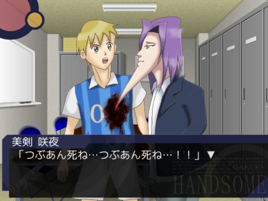
My favorite scene is probably still that one scene in Mitsurugi's route, in which he stabs people with his chin. It's also one of the scenes that gets referenced the most in fanart. The context makes it even more ridiculous, Mitsurugi gets really upset that some people like the chunky variant of red bean paste (tsubuan) and decides they should die. After stabbing his teammate and multiple other people he runs outside. The protagonist however, isn't safe either and also gets accused of being a "tsubuan supporter". If you survive though, you get a chance to marry Mitsurugi!
Honestly one of the reasons I wanted to write about this game is because many people only know the OVA and/or anime, but the game is so funny I think everyone should play it if they're interested. I also think the team behind it has such a funny backstory and I love seeing how supportive their university is. Right now the team is still active on their Twitter account and they sometimes create new content. Last year they released Gakuen Handsome Fighters, a short fighting game featuring the Gakuen Handsome characters.
If you are interested in purchasing it, I recommend getting the "Special" edition which can be purchased on DLsite! I couldn't find a working download link anymore of the older version, but I think the creators deserve the support, so I don't regret buying it (it was about 15 USD). It includes the original game and 5 shorter stories which were originally released as smartphone apps. While I think the original game is still the best one, it's fun to explore some of the extra scenarios as well. One of the shorter games takes place in an alternative universe in which the boys live in the Heian period, and for some reason some of the sprites are animated... yeah.

62 notes
·
View notes
Text
I was browsing Nicovideo trying to find this old Danganronpa animation someone made eons ago that I remembered when I stumbled across this. I clicked it right away because I could tell that it was a beta Monomi sprite in the thumbnail (one I hadn't seen before!)
It's a commercial for SDR2.


early beta Monomi sprites are easy to tell, because her cheeks are outlined.

Almost every sprite here is a beta version in some regard...granted, a lot of the differences are very small, and unless you're someone like me who is actively looking at this picture with the knowledge of beta sprites in mind, you probably wouldn't even realize it.

These are the ones i know for sure are off in one way or another just by looking...
When it comes to beta Danganronpa sprites...the work timeline of how the sprites are developed continues to elude me. But I have a working theory so far.
1: draft sprite. This is the sprite that first gets put into the game. Ranges from very poor quality to close to phase 2, but both version lack line weight.
2: clean-up sprite. These are the beta sprites that we sometimes see, because they are accidentally re-used. If you aren't paying attention, they can be often mixed-up with the final sprites.
3: final sprite. As the name would suggest, this is the sprite we see in the final game.
Here is an example of a sprite which we have all 3 phases of:


The first phase is the hardest to find images for, for obvious reasons. It's usually very obviously not finished, so it's never released into the wild. The fact we have that first image there is honestly a miracle.
Sometimes, though, phases 1 and 2 can look very similar - or phases 2 and 3 can look similar.


I've talked about the "smirking Komaeda" beta sprite in the past. But believe it or not, those first 2 images there are different (I'm 90% sure at least). It's just the changes made between phases 1 and 2 were so minor it's almost impossible to tell. That, and the image's bad quality makes it tough.
That being said, Komaeda's hair does have some line weight to it in the draft sprite, so it was either done from the get-go or that is actually phase 2, meaning there's an earlier sprite...but I kind of doubt it. But, I don't know for sure.
Anyways, I will elaborate on all of this at a later date because we do have at least one draft sprite for the majority of the characters thanks to a Japanese gaming site talking about when the game was first announced. Right now though, I wanted to share this with you all.
9 notes
·
View notes
Text
Every Real-World Brand Mascot in the Movie
Time for another interlude! Cool, huh? Okay, this admittedly isn't super interesting since it's just a game of "spot the cameo" with characters that are already in the movie, but I felt the need to trek my way through and point out just how many brand mascots (that is, ones based on actual grocery store products) we see throughout the movie. I'm aware there's already a list like this on Foodfight's Lost Media Wiki page, but it's slightly inaccurate and anyway, mine has pictures. So let's do this!
(Sidenote: This doesn't include products that appear in the movie but don't have a mascot. For example, we see Crest toothpaste on the shelves as the store closes, but there's no anthropomorphic tubes of toothpaste walking around so I'm not including it)
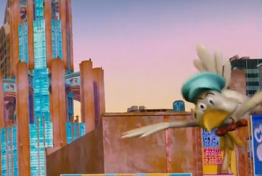


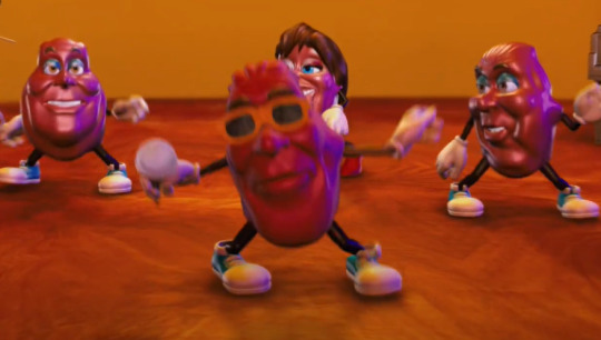


#1: The Vlasic Stork: Okay so this one is obvious since he's on the DVD cover and all, but he's also the first one we see in the whole movie, at around 1:50!
#2: Mr Clean. Again this one's super obvious and noticeable, I'm just listing all of these for completion's sake. I chose the screenshot of him with sewage on his clothes because I think it's funny.
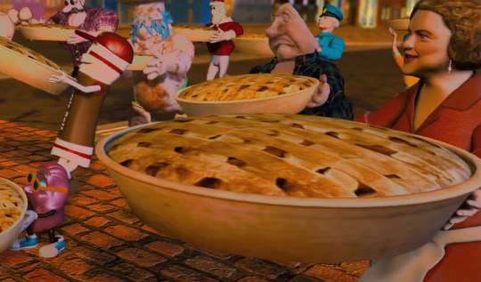
#3: Mama Celeste. I'm talking about the woman in the foreground in a red dress and a white apron- she just looks like a regular old woman but she's actually the mascot for a bunch of microwavable meals (like Celeste Pizza For One, which a friend of mine says is a very sad meal for very lonely men)
#4: Punchy. Not much to say about this one, but it's Punchy, the mascot for Hawaiian Punch. He has no lines but he DOES perform his signature move of offering someone a drink before punching them in the face, and we all know punching people in the face is tight.
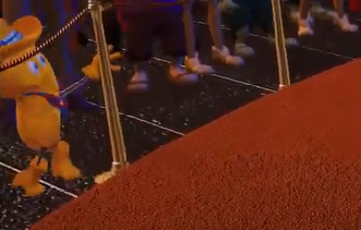
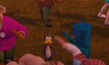
#5: Twinkie The Kid: The mascot for Twinkies, this character appears multiple times throughout the movie, but I'm just including the first time he shows up because it's easier (this is during a crowd scene early on where lots of cameos can be seen)
#6: Spammy. See, I wasn't even aware Spam had a mascot? But apparently they do, and he can be seen here staring right at you, the person reading this! He's basically just a can of Spam with a face and arms.
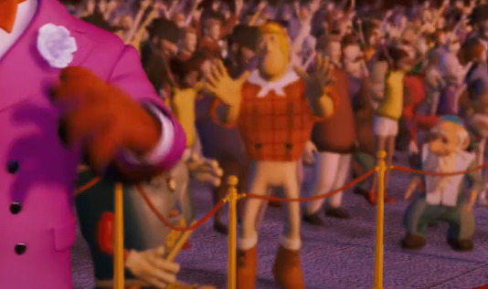
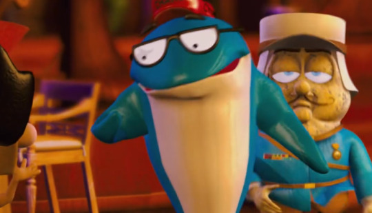
#7: The Dinty Moore Lumberjack. The mascot for Dinty Moore stew, he can be seen here waving his hands in the air and being stared at by a rabbi. (The rabbi in question is called Rabbi Kayman in case anyone's wondering, he's an original character created for the movie and is the mascot for a brand of granola bars and cookies. God, I know way too much about this movie)
#8 and #9: Tootsie Roll Owl and Tootsie Roll Man. In the background of the same scene, we can see these two characters. The owl, famous for the "How many licks does it take to get to the center of a Tootsie Pop?" commercials, and a walking Tootsie Roll (on the right) who Google tells me is just called the Tootsie Roll Man.
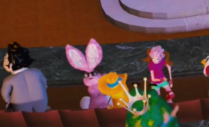
#10: The California Raisins. One of the more well-known mascots in the movie, in the scene pictured above they're in the Copabanana singing a cover of "I Heard it Through The Grapevine" which they often sang in commercials back in the 80s. They're also one of the only real-world brand mascots from the movie to actually get tie-in merchandise, as there was a plush released of one of them alongside all the original characters from the movie. (The only other real-world mascot to get a plush, or indeed any form of merchandise, was Charlie The Tuna. Speaking of...)
#11: Charlie The Tuna. The mascot for Starkist Tuna, he's notable for being one of the few brand mascots in the movie to actually get any dialogue. I like his Brooklyn accent, and as mentioned above he's one of only two real-world mascots to get any tie-in merchandise released. There were a whole line of plush toys released- Dex Dogtective, Daredevil Dan (I have this one!), Maximilius Moose, Cheasel the Weasel, Polar Penguin, a California Raisin, and Charlie the Tuna. He's also on the DVD cover! So Charlie the Tuna must be quite the star, getting his own plush and everything... either that or tuna companies typically don't get the chance to sell merchandise based around their canned fish mascot and jumped at the chance.
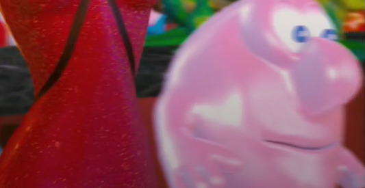
#12: Mrs Buttersworth. One of the only other brand mascots to get any dialogue, she throws pancakes at the Brand X army at one point and spills a glass of juice on Mr Clean. You have to wonder, with only three or four of these (relatively) popular characters getting speaking roles, if more of them had dialogue but it was cut before the movie was released. Mr Clean is credited as having a voice actor but never talks in the movie. Makes you think, right?
#13: Energizer Bunny. This one is a real "blink and you'll miss it" type cameo in the USDA meeting scene, but this is undoubtedly the Energizer Bunny. (Energizer Batteries also feature in a scene in the real-world grocery store)
#14: Mr Bubble. The mascot for a somewhat obscure brand of bubble bath, Mr Bubble appears multiple times throughout the movie but never does anything particularly noteworthy.
#15: Kid Cuisine Penguin. Another "blink and you'll miss it" cameo, the Kid Cuisine Penguin shows up in a few scenes, but he's really hard to spot- if you weren't actively looking, you'd have no idea he was in this at all. It's almost like they didn't want you to see him?
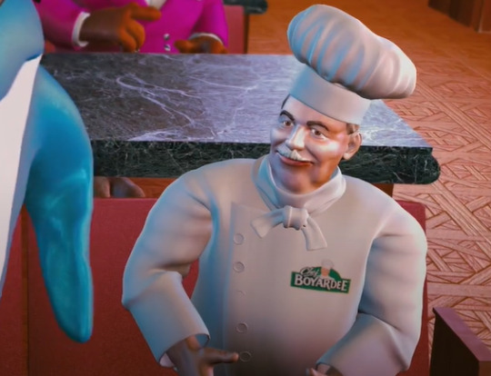
#16: Chef Boyardee. He shows up a few times at various points in the movie, and they've made sure to put the Chef Boyardee logo right on the front of his uniform, which is useful because otherwise he could easily just be mistaken for a regular nondescript chef.
#17: Hungry-Man. We're really getting into the pits of the cameos now. Hungry-Man is a brand of frozen dinners... but they don't have a mascot. I looked it up, they definitely don't and they never have. So for this movie they've created their own mascot for Hungry-Man by just taking a regular-looking guy and slapping a shirt that says "Hungry-Man" on him. The only interesting thing about this is it implies that in the world of Foodfight!, even products without mascots in the real world still have their own Ike in the Marketropolis.
#18: Duncan Hines. Okay, last one now. I watched this movie a BUNCH and I had idea who this was supposed to be, only to spot a logo on his apron right towards the end and realize this is supposed to be Duncan Hines. He doesn't look anything like the real-life Duncan Hines (a restaurant critic who definitely does not have a mustache) and as far as I know Duncan Hines cake mix doesn't HAVE a mascot. So for this movie I guess they just...created a mascot that looks nothing like the real-world man the company is named after? Okay, FINE.
So all in all that makes 18 cameos from 18 different brand mascots...in a previous post I said there were around 15 and that I'd have to pore through and catalogue them all at some point. And here I am! My guess was surprisingly accurate. A lot of these are so obscure and so easy to miss though, that I'd say they barely even count as cameos. The only notable ones are ones that get a shot specifically focused on them or a line of dialogue, like Charlie Tuna, Twinkie The Kid, Mrs Buttersworth and the Vlasic Stork. It makes sense they're the ones featured on the DVD cover and poster- they're the most recognizable of all these and some of the only real-world mascots with an actual role in the plot.
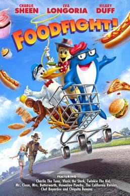
Sidenote: This particular variation of the DVD cover/poster (the same art is used for both) lists a bunch of cameos featured in the movie. Charlie Tuna, the Vlasic Stork, Twinkie the Kid, Mr Clean, Mrs Buttersworth, Hawaiian Punchy, California Raisins, Chef Boyardee and...Chiquita Banana? But the Chiquita Banana lady isn't in this movie at all! I should know, I just spent way too long going through every last second of it trying to pick out all the cameos. So either she was removed very late into production, or whoever wrote the text for this poster just got confused and made a mistake. I genuinely have no idea which though? The mystery of this movie really never ends...
#foodfight#dex dogtective#mr clean#charlie the tuna#twinkie the kid#spam#chef boyardee#tootsie roll#interlude
87 notes
·
View notes