#clipping path tutorial
Explore tagged Tumblr posts
Visit Tumblr Blog
Explore Tumblr blogs with no restrictions, modern design and the best experience.
Last Seen Tumblr Blogs


Fun Fact
In 2020, 44% of users from Denmark used Tumblr daily.
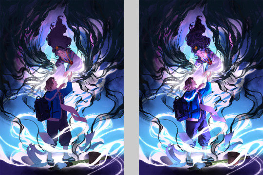
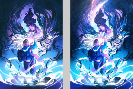
Text
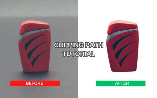
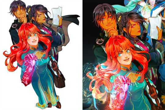
Creating a clipping path in Photoshop involves using the Pen Tool to outline an object, separating it from its background. Begin by selecting the Pen Tool, carefully trace the object's contours, and close the path. This precise technique is essential for isolating subjects in graphic design, enabling seamless integration into various compositions.
clippingpath #clippingpathtutorial #backgroundremove #removebackground #photoshoptutorial
Learn More: https://ukclippingpath.com/how-to-create-a-clipping-path-in-photoshop/
0 notes
Text
clipping path and background just pen tool
#clipping path#pen tool#clipping path tutorial#clipping path service#how to use pen tool#image clipping path#pen tool photoshop#clipping path tutorial in photoshop#background remove#clipping path photoshop#create clipping path#jewelry clipping path#clipping path tutorial in photoshop bangla#photoshop clipping path tutorial#remove background#use pen tool#background remove & clipping path pen tools use#clipping path bangla tutorial#product clipping path
0 notes
Video
youtube
How to Remove Background in Photoshop 2023
#youtube#clipping path service#clipping path service provider#best clipping path service#clipping path service company#photoshop clipping path#photoshop tutorial#adobe photoshop
1 note
·
View note
Text

COLORING + SHARPENING TUTORIAL
someone asked for a coloring tutorial and my sharpening settings, so here it is! there are also a few tips to achieve more HQ gifs. :)
tutorial under the cut!
FOR HIGH-QUALITY GIFS
FILE SIZES
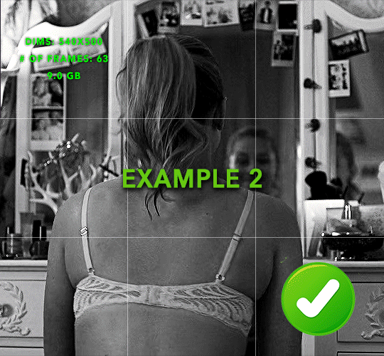
it doesn’t matter what your sharpening settings are if the file you’re using to gif is too low quality, so i tend to look for the best that i can get when downloading stuff.
usually, movies (+2h) look better if they’re 5GB or more, while an episode (40 min/1h) can look good with even 1GB. the minimum definition i try to find is 1080p, but i gif with 2160p (4k) when available. unfortunately, not every computer can handle 4k, but don’t worry, you can gif with 1080p files just fine if they are big enough. contrary to popular belief, size does matter! which means sometimes a bigger 1080p file is better than a smaller 2160p one, for example.
SCREENCAPPING METHOD
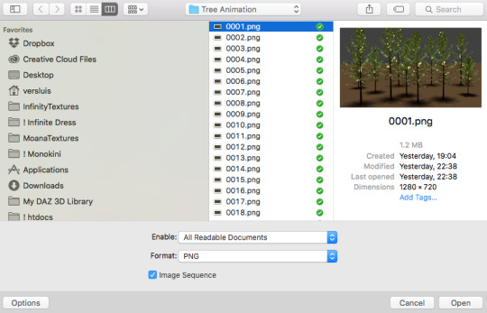
this can too influence the quality of your gifs. as a gifmaker, i’ve tried it all: video frames to layers, directly opening video clips, loading files into stack, and i’ve finally settled down with opening screencaps as an image sequence. with bigger files, it doesn’t matter much what technique you use, but i’ve noticed with smaller files you can do wonders if you screencap (either by loading files into stack or opening as an image sequence) instead of using video clips. for example, this gif’s original video file was only 4GB (so smaller than i’ve usually go for), if you can believe it!
here’s a tutorial for setting up and screencapping with MPV, the media player i use to screencap. again, you can keep using video clips for bigger files, but you’ll find this useful when dealing with dire causes. i don't file loads into stack, though, like the video does. i open as an image sequence (open > screencap folder > select any image > click the image sequence button). just select OK for the speed. this will open your screencaps as a video clip (blue bar) in timeline mode (i'm a timeline gifmaker, i don't know about you). you will need this action pack to convert the clip into frames if you're a frames gifmaker. i suggest you convert them into frames even if you're a timeline gifmaker, just convert them into a timeline again at the end. that way you can delete the screencaps right away, otherwise you will delete the screencaps and get a static image as a "gif".
ATTENTION if you’re a Mac Sonoma user, MPV won’t be an option for you unless you downgrade your system. that is, if you have an Intel chip. if you have M1 Max chip (or even a better one), here’s a fix for MPV you can try while keeping that MacOS, because nowadays MPV is skipping frames in its latest build. or you can use MPlayer instead for less hassle. here are two tutorials for setting and using MPlayer. Windows users are fine, you can use MPV without trouble.
FOR EVEN MORE QUALITY
ADD NOISE
here’s a tutorial for adding noise as a way to achieve more HQ gifs if your original material is too low quality.
REDUCE NOISE WITH CAMERA RAW
instead of adding noise, you can reduce it, especially if your gif is very noisy as it is.
the path is filter > camera raw > detail > nose reduction. i do this before sharpening, but only my video file isn't great to begin with. because it’s a smart filter, you can reduce or increase its opacity by clicking the bars next to its name in the layers panel.
TOPAZ AI
i use Topaz Photo AI to increase the quality of my screencaps when i need to. it’s paid software, but there are… ways to find it for free, usually on t0rrent websites. if someone’s interested, i can make a tutorial solely about it in the future.
SHARPENING SETTINGS
here are my sharpening settings (filter > sharpen > smart sharpen). i sharpen things twice: 500% 0.4px + 10% 10px. here's an action for it, for more convenience. here's a tutorial on how to use Photoshop actions. for animated stuff, i use this action pack.

COLORING
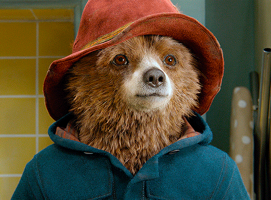
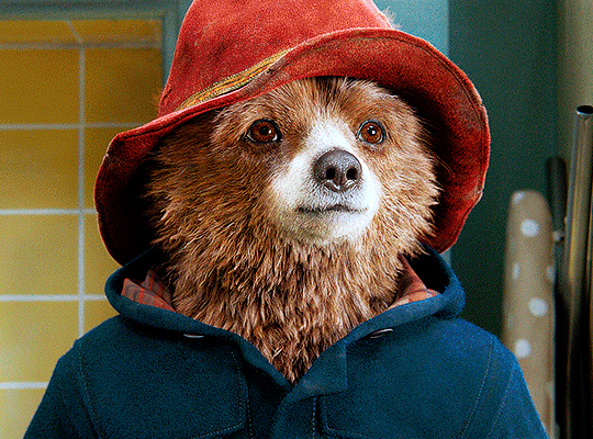
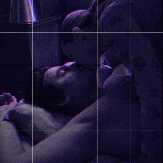
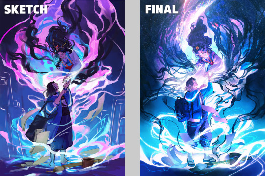
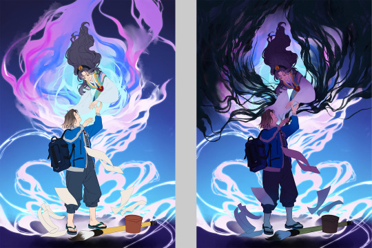
here’s the gif i'm gonna use as a base. it’s already sharpened like the way i always do it.

LIGHTNING THE SHOTS
half of the secret of a good coloring is good lightning. i always useCurves (layers > new adjustment layer > curves) and Brightness & Contrast (layers > new adjustment layer > brightness & contrast). the settings depend on the scene you’re giffing, but i always try make my gifs bright and with high contrast to make the colors pop.
CURVES
besides lighting your scene, the Curves adjustment layer has four automatic options that will color-correct it for you. it’s not always perfect and it doesn’t mean you won’t need to do further coloring, but it’s a great start. it’s a lifesaver for most ridiculously yellow scenes. look at the difference! this gif uses the 3rd automatic option (the screenshot below isn't mine btw so that's why the fourth option is the chosen one), from top to bottom. what automatic option you need to choose depends on the gif.

sometimes i like to tweak my Curves layer. not everybody does that, it’s not that necessary and if you’re not careful, it can screw your gif up. to modify your layer by hand, you will need to click and drag points of that straight line in the position you desire. this is the concept behind it:

basically, the lower part of the line handles the shadows, while the upper part handles the highlights of the image. if you pull a highlight point up, the image’s highlights will be brighter. if you pull it down, it will make them darker. same thing for the shadow points. you should play with it to get a grasp of it, that’s what i did when i first started giffing.
BRIGHTNESS & CONTRAST
then i added a bit of brightness and contrast.

CHANNEL MIXER
the scene looked a bit too yellow, so i used the Channel Mixer (layer > new adjustment layer > channel mixer) adjustment layer. here’s a tutorial of how it works. not every scene needs the Channel Mixer layer though, i mostly use it to remove heavy overall tints. in this particular case, the Curves layer got rid of most of the yellow, but i wanted the gif to be just a bit more blue so the Channel Mixer tweaks are very minimal.

SELECTIVE COLOR
now, this adjustment layer i always use: Selective Color (layer > new adjustment layer > selective color). this is THE adjustment layer to me, alongside the Curves one. this is how it works:

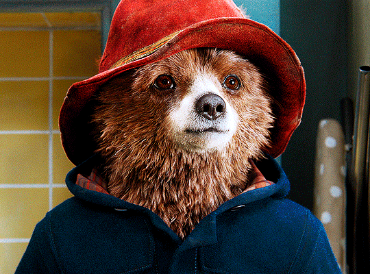
ie, you can separately edit a color this way, giving it tints. for this gif, i wanted to make the colors more vibrant. to achieve that, i edited the selected colors this way:
for the reds, i added even more red in them by moving the first slider to the right, making the color more vibrant. for his hat to have a more warm tint, i added yellow to the reds (third slider, moving it to the right). finally, to make the reds stronger, i moved the last slider to the right (more black).
for the yellows, i made them brighter by adding white to them, thus making the tile wall and Paddington more bright as well.
for the cyans and the blues, i just added the maximum (+100) of black that i could.
i wanted for Paddington's nose to be brighter, so i added more white to the whites.
lastly, i added depth to the blacks by increasing their own blackness.
you should always play with the Selective Colors sliders for a bit, before deciding what you want or need. with time, you will automatically know what to change to correct the color grading. it all takes practice!
HUE/SATURATION
i don’t know if you noticed, but there are some green spots on the blue wall behind Paddington. to correct that, i added a Hue/Saturation adjustment layer (layer > new adjustment layer > hue/saturation) and made the saturation of the greens 0%, making that unwanted green disappear from the background.

while the green spots on the wall are specific for this gif, i use hue/saturation a lot to tweak, well, hue and saturation. sometimes someone’s skin is too yellow, i made it redder by tweaking the reds and the yellows, or vice-versa. the hue bar follows the rainbow bar, so the maximum settings (+100 and -100) give the selected color to change its hue to something more red or pink (the rainbow extremities). changing hue can give pretty whacky results, like turning someone’s skin tone to green, so you will need to play with it to get the hang of it. you can also tweak the opacity of your hue/saturation layer to further improve your gif’s coloring. i didn’t do it in this case, the opacity is still 100%. the reds and the blues had their saturation increased to make them pop just a bit more, without affecting the other colors.
COLOR BALANCE
the highlights of the gif still had a green tint to it due to the automatic correction of the Curves layer, so i used Color Balance. this is how it works: instead of giving specific colors some tints, you can give them to the shadows, highlights, and mid-tones. if your shadows are too blue, you counterbalance them with the opposite color, yellow. same thing with the cyan-red and magenta-green pairings. in my case, i added a bit of magenta.


B&W GRADIENT MAP
now, if this gif was a dish, it’s time for the salt and pepper. i always add a Gradient Map (layer > new adjustment layer > gradient map) (black to white gradient) with the Soft Light blending mode, thus giving my shadows more depth without messing with the mid-tones and highlights. it also doesn’t “deep fry” (you know those memes?) the gif too much by adding even more contrast. usually, the opacity of the layer is between 30% to 70%, it all depends on the gif. it always does wonders, though!
COLOR FILTER
finally, i like to add Color Filters (layer > new adjustment layer > color filter) to my gifs. it’s very handy when giving different scenes for the same minimalistic set because it makes them kind of match despite having completely different colors. in this gif’s case, i added a “deep blue” filter, opacity 50% density 25. you can change the density and the opacity of the layer for further editing, again, it all depends on the gif.

VIBRANCE
if i feel like it, i add a vibrance layer (layer > new adjustment layer > vibrance) to make the colors pop. this can ruin your coloring sometimes, especially when regarding skin color, so be careful. i didn't do it in this gif because i felt i didn't need it.
TA-DA! 🥳
AN OTHER EXAMPLE
the color grading of the original scene it’s pretty good as it is, to be honest. let’s see a worse scenario, a VERY yellow one:
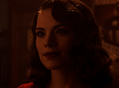
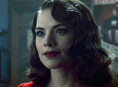
no channel mixer this time because the automatic curves option dealt with the yellowness, but you can see it made the gif too green. i needed to correct that with the following adjustment layers:
curves (automatic option) (gif 2) >> same curves layer (tweaks) (gif 3) >> brightness & contrast (gif 4) >> hue/saturation (tweaked cyan+blue+green) >> selective color >> color balance (gif 5) >> b&w gradient map >> (sepia) filter >> vibrance (gif 6)
i added a hue/saturation layer to remove the blues & greens before my selective color layer because i thought that was more urgent than tweaking the tint of all colors. color balance (gif 4) was the real hero here, though, by removing the green tint. the selective color layer was meant to make the red pop more than anything else, because the rest looked pretty good, especially her skin tone (despite the green tint). you can notice that tweaking the curves layer (small gif 3) also helped A LOT with the green problem.
tl;dr 😵💫😵💫😵💫
here's a list of my go-to's while coloring and lightning gifs. it's not a rule, just a guide. there are gifs in which i don't use all these adjustment layers, or use them in a different order. it all depends!
1. curves (automatic option + tweaks) 2. brightness & contrast 3. channel mixer 4. selective color 5. hue/saturation 6. color balance 7. b&w gradient map 8. color filter 9. vibrance
i'll suggest that you study each adjustment layer listed for more info, either with other Tumblr tutorials or YouTube ones. the YouTube ones focus on images, but you can translate what they teach to gif making very easily. you can ask me to further explain any adjustment layer, too! i was brief to keep this short (which i kinda failed lol).
feel free to ask me for clarification or something else about gifmaking wise, i always like to help. ❤️
#*#*tutorials#gifmaker tag#resources#resource: tutorials#ps help#uservivaldi#tuserjen#userrin#userelio#useralien#userzaynab#userchibi#userbuckleys#usertj#userbess#tuserlucie#useraljoscha#userdavid#usershreyu#usernolan#userhallie#userisaiah#tusergio#tusergeo#userjesslynn
673 notes
·
View notes
Text
Someone asked me how I created the fade transition in this gifset which I’ll try to explain in the most comprehensive way that I can. If you've never done something like this before, I suggest reading through the full tutorial before attempting it so you know what you'll need to plan for.
To follow, you should have:
basic knowledge of how to make gifs in photoshop
some familiarity with the concept of how keyframes work
patience
Difficulty level: Moderate/advanced
Prep + overview
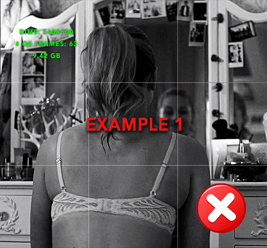
First and foremost, make the two gifs you'll be using. Both will need to have about the same amount of frames.
For ref the gif in my example is 540x540.
I recommend around 60-70 frames max total for a big gif, which can be pushing it if both are in color, then I would aim for 50-60. My gif has a total of 74 frames which I finessed using lossy and this will be explained in Part 4.
⚠️ IMPORTANT: when overlaying two or more gifs and when using key frames, you MUST set your frame delay to 0.03 fps for each gif, which can be changed to 0.05 fps or anything else that you want after converting the combined canvas back into frames. But both gifs have to be set to 0.03 before you convert them to timeline to avoid duplicated frames that don't match up, resulting in an unpleasantly choppy finish.
Part 1: Getting Started
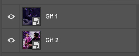
Drag one of your gifs onto the other so they're both on the same canvas.
The gif that your canvas is fading FROM (Gif 1) should be on top of the gif it is fading INTO (Gif 2).
And here's a visual of the order in which your layers should appear by the end of this tutorial, so you know what you're working toward achieving:

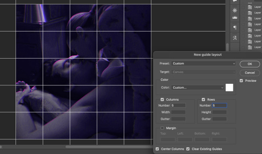
Part 2: Creating the grid
Go to: View > Guides > New guide layout
I chose 5 columns and 5 rows to get the result of 25 squares.
The more rows and columns you choose, the more work you'll have to do, and the faster your squares will have to fade out so keep that in mind. I wouldn't recommend any more than 25 squares for this type of transition.

To save time, duplicate the line you've created 3 more times, or as many times as needed (key shortcut: CMD +J) and move each one to align with the guides both horizontally and vertically. You won't need to recreate the lines on the edges of the canvas, only the ones that will show.
After you complete this step, you will no longer need the guides so you can go back in and clear them.

Follow the same duplicating process for the squares with the rectangle tool using the lines you've created.
Align the squares inside the grid lines. The squares should not overlap the lines but fit precisely inside them.
This might take a few tries for each because although to the eye, the squares look all exactly the same size, you'll notice that if you try to use the same duplicated square for every single one without alterations, many of them will be a few pixels off and you'll have to transform the paths to fit.
To do this go to edit > transform path and hold down the command key with the control key as you move one edge to fill the space.
Once you're done, put all the squares in their separate group, which needs to be sandwiched between Gif 1 and Gif 2.

Right click Gif 1 and choose "create clipping mask" from the drop down to mask it to the squares group. This step is super important.
After this point, I also took the opacity of the line groups down to about 40% so the lines wouldn't be so bold. Doing this revealed some squares that needed fixing so even if you aren't going dim the lines, I recommend clicking off the visibility of the lines for a moment to make sure everything is covered properly.

Part 3A: Prep For Key framing
I wanted my squares to fade out in a random-like fashion and if you want the same effect, you will have to decide which squares you want to fade out first, or reversely, which parts of Gif 2 you want to be revealed first.
In order to see what's going on underneath, I made Gif 1 invisible and turned down the opacity of the squares group.

If you want text underneath to be revealed when the squares fade away, I would add that now, and place the text group above Gif 2, but under the squares group.

Make a mental note that where your text is placed and the order in which it will be revealed is also something you will have to plan for.
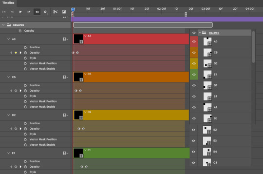
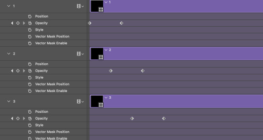
With the move tool, click on the first square you want to fade out. Every time you click on a square, it will reveal itself in your layers.
I chose A3 to be the first square to fade and I'm gonna move this one to the very top of all the other square layers.
So if I click on D2 next, that layer would need to be moved under the A3 layer and so on. You'll go back and forth between doing this and adding key frames to each one. As you go along, it's crucial that you put them in order from top to bottom and highly suggested that you rename the layers (numerically for example) which will make it easier to see where you've left off as your dragging the layers into place.

Part 3B: Adding the Keyframes
This is where we enter the gates of hell things become tedious.
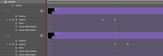
Open up the squares group in the timeline panel so you can see all the clips.
Here is my example of the general pattern that's followed and its corresponding layers of what you want to achieve when you're finished:
So let’s try it!
Expand the control time magnification all the way to the right so you can see every frame per second.

As shown in Part 3A, select your first chosen square.
Where you place the time-indicator on the panel will indicate the placement of the keyframe. Click on the clock next to opacity to place your first keyframe.

Move the time-indicator over 3 frames and place the next key frame.

Things to consider before moving forward:
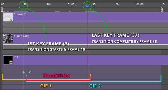
Where you place your very first keyframe will be detrimental. If you're using a lot of squares like I did, you may have to start the transition sooner than preferred.
If you're doing 25 squares, the key frames will have to be more condensed which means more overlapping because more frames are required to finish the transition, verses if you're only using a 9-squared grid. See Part 4 for more detailed examples of this.
The opacity will remain at 100% for every initial key frame, and the second one will be at 0%.
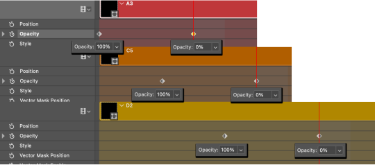
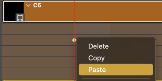
Instead of creating two keyframes like this and changing the opacities for every single clip, you can copy the keyframes and paste them onto the other clips by click-dragging your mouse over both of them and they'll both turn yellow. Then right click one of the keyframes and hit copy.
Now drop down to your next clip, move your time-indicator if necessary to the spot where the first keyframe will start and click the clock to create one. Then right click it and hit "paste".

Tip: When you have both keyframes selected, you can also move them side to side by click-dragging one of them while both are highlighted.
Your full repetitive process in steps will go as follows:
click on square of choice on the canvas
drag that square layer to the top under the last renamed
in timeline panel: drop down to next clip, move time-indicator tick to your chosen spot for the next keyframe
create new keyframe
right click new keyframe & paste copied keyframes
repeat until you've done this with every square in the group
Now you can change the opacity of your squares layer group back to 100% and turn on the visibility of Gif 1. Then hit play to see the magic happen.
PART 4: Finished examples
Example 1
the transition starts too soon Cause: initial keyframe was placed at frame 0
the squares fade away too quickly Cause: overlapping keyframes, seen below. (this may be the ideal way to go with more squares, but for only 9, it's too fast)
Example 2
more frame time for first gif
transition wraps up at a good point Cause: in this instance, the first keyframe was placed 9 frames in, and the keyframes are not overlapping. The sequential pair starts where the last pair ended, creating a slower fade of each square.
Part 5: Final Tips and Saving
You can dl my save action here which will convert everything back into frames, change the frame rate to 0.05 and open the export window so you can see the size of the gif immediately.
If it's over 10gb, one way to finesse this is by use of lossy. By definition, lossy “compresses by removing background data” and therefore quality can be lost when pushed too far. But for most gifs, I have not noticed a deterioration in quality at all when saving with lossy until you start getting into 15-20 or higher, then it will start eating away at your gif so keep it minimal.

If you've done this and your gif is losing a noticeable amount of quality and you still haven’t gotten it below 10mb, you will have no choice but to start deleting frames.
When it comes to transitions like this one, sometimes you can't spare a single frame and if this is the case, you will have to return to the timeline state in your history and condense the key frames to fade out quicker so you can shorten the gif. You should always save a history point before converting so you have a bookmark to go back to in case this happens.
That's pretty much it, free to shoot me an ask on here or on @jugheadjones with any questions.
#gif tutorial#photoshop tutorial#transition tutorial#grid tutorial#usergif#ps help#tutorials#tutorials*#resources*#requested
402 notes
·
View notes
Note
Hello Botanica I admire your art so much ❤️ do you mind giving tips on how you improved your art over the years? I would also be delighted if you could show us what your drawing process is like a little bit, if not thats cool too🤗 have a great day!!✨
Hey there! (*waves*) Thank you so much for the love <3 I'd be happy to share some insights on the topics you mentioned! (Sorry that it took a while.)
I think I’ve been drawing for almost 20 years now (Whoa!). Honestly, I don’t even know how I made it through, but ever since I was a kid, I knew art was a necessary part of my life. Looking back now, I’m just glad I stuck with it!
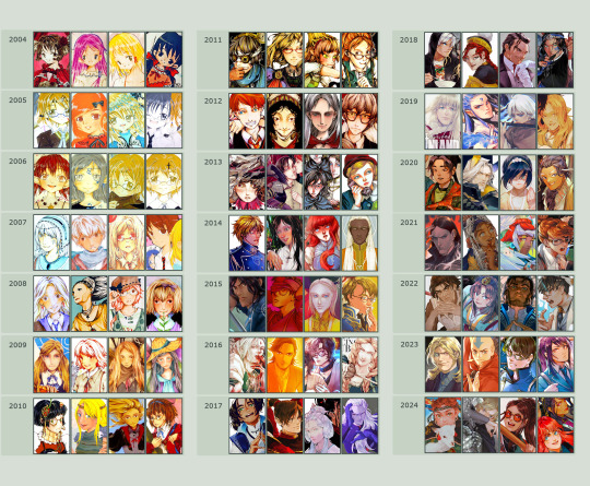
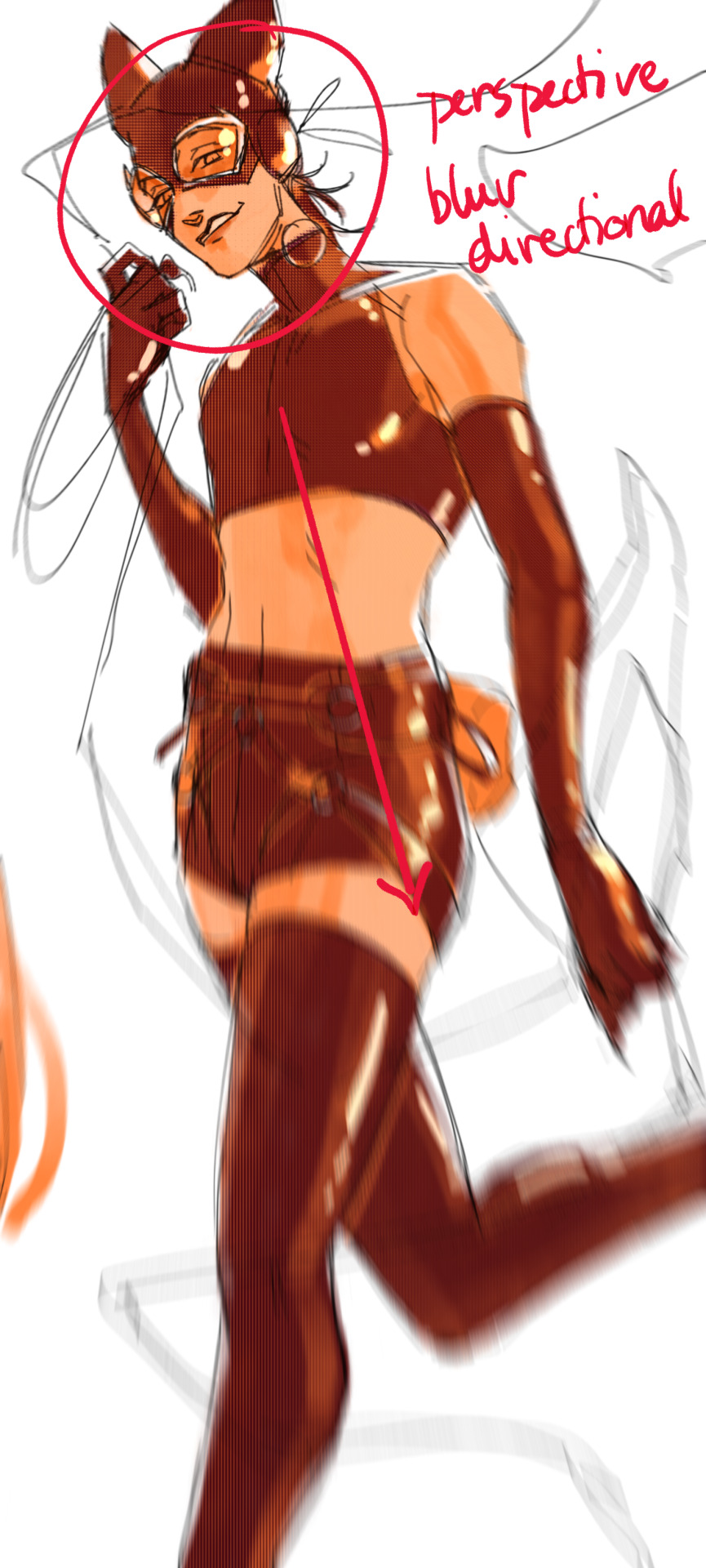
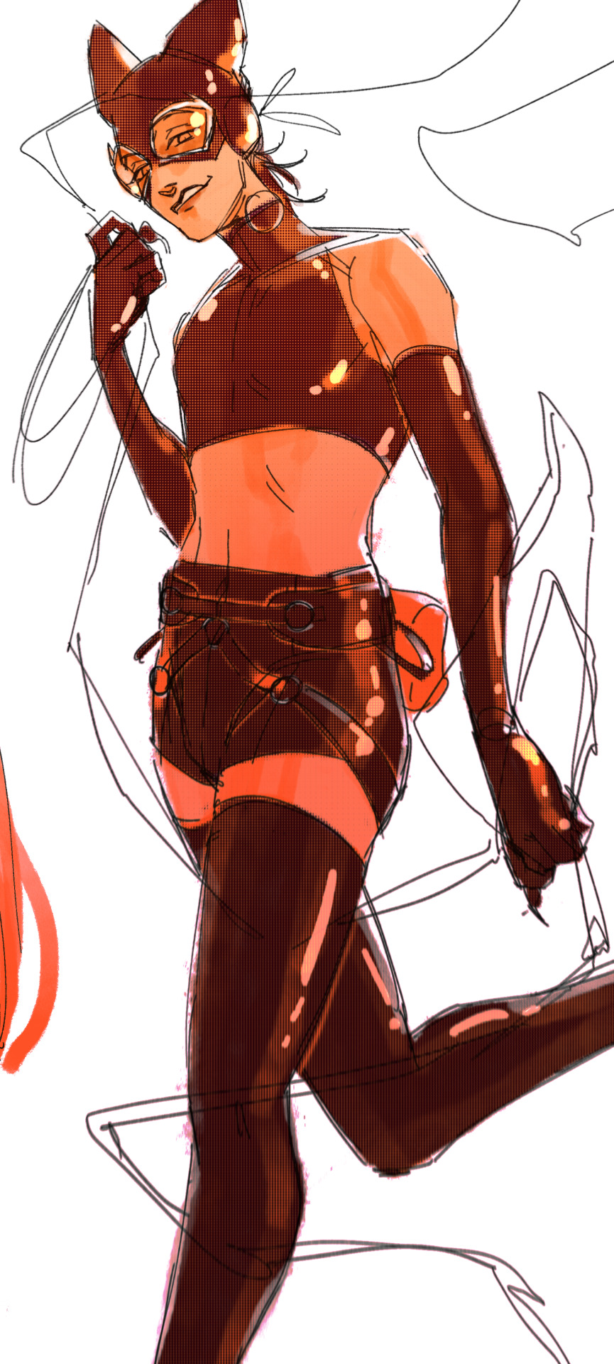
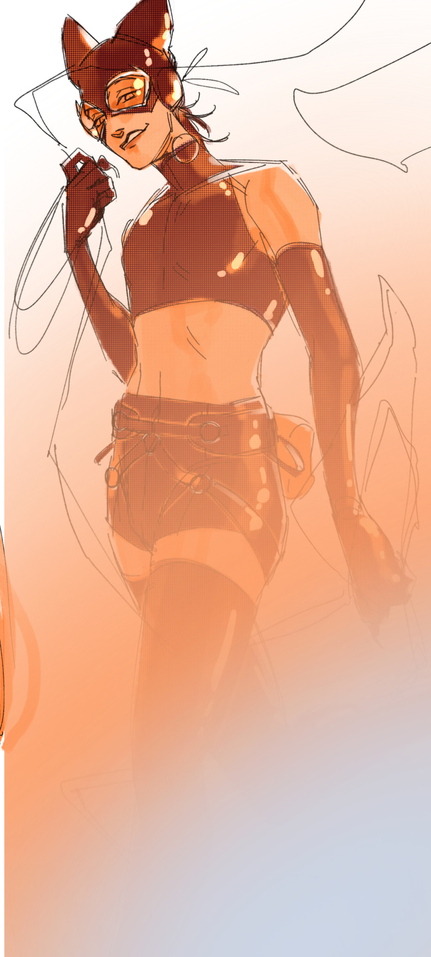
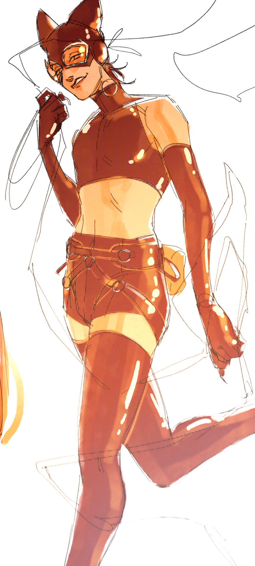
This piece is like a visual timeline of my art evolution. It’s wild to think I went from those super basic kid doodles to the style I have now. Growth is real, y’all!
So the tips! (They are mainly for those hobbyist artists, since I don’t have the luck to make it as my career.)
Keep your eyes and mind open to learn from different fields. It’ll spark fresh ideas and enrich your art, but always double-check when diving into unfamiliar territory.
Find tutorials that vibe with you, and collect references IRL.
Use primary sources to avoid distorted or AI-altered refs.
Take your own photos as ref.
Use 3D websites like Sketchfab, Blender for 3D assistance, and posing apps or manikins to help with your art.
Practice consistently. Balance your time between quick sketches and more polished pieces.
Accept where you are now and improve from there. Don't let others' opinions or other artists’ activities throw you off your path.
If art’s your hobby, the goal is to have fun! No pressure to push boundaries unless you’re feeling it.
Let’s move to drawing process. I’ve been doing hand-drawn art for more than a decade, but had to fully switch to digital media after 2016. Now I usually use Procreate for sketches and lines, then use Clip Studio Paint and Photoshop for colors and adjustments.
I’m gonna share two sets of process. One is for generic character art, and the other one is for pieces influenced by environment.
So character art is like:
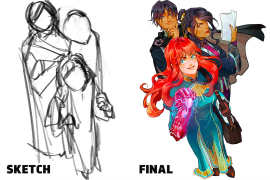
(More under the break.)
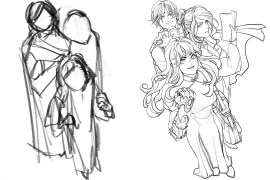
Do some (very) rough sketch to locate the characters → Line art
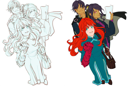
Define coloring section → Do flat basic colors, adjust the tone via gradient map, change line color
Add more details, use airbrush to shape the volume → Rendering (layer mode: multiply, linear burn)
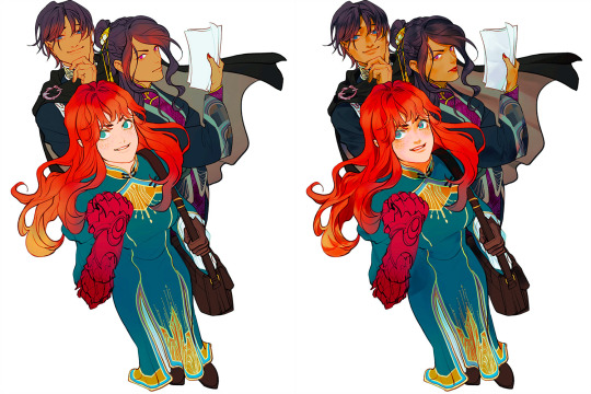
More rendering (layer mode: screen, overlay, soft light) → Post effects
Done!
The next is art influenced by environment:
Make a color sketch to set the general tone → Line art
Flat basic colors (background & characters) → Darken the art (layer mode: multiply), add more details
Add more details and begin rendering → More rendering, lighten some parts (layer mode: screen)
More rendering, use gradient map to adjust the tone → Post effects
Done!
Wow, this turned into a long post! Hope you found something useful here! Thanks for sticking around till the end! 🙌✨
38 notes
·
View notes
Text

I finally started playing the 2021 Guardians of the Galaxy game! It's so much fun! Rambling about Rocket below
Ok so he seems to use macabre humor to cover his pain. In the Quarantine Zone he remarks that if he hadn’t escaped we would probably be walking over bits of him right then. Like dude, that’s so morbid don’t say that 💀His past very clearly still bothers him, why wouldn’t it it was horrible, but he tries to brush it off or seem casual about it to hide his vulnerability. I did love when we first arrived and Rocket was geeking out about all the ships and weapons that were there, he’s such a little nerd ❤️❤️❤️
I liked when he told Quill to stop the fake techno babble “Don’t make up tech stuff, it’s annoying.” 🤣 He also chastised me when I went down the wrong path, but going off the beaten path is how you find collectibles, Rocket! It’s like he’s never played a videogame before smh my head. Btw as someone who grew up watching Pokemon I was simply delighted that our group was called Team Rocket lol My immediate response was TO PROTECT THE WORLD FROM DEVASTATION! And I kept making jokes to myself about how the monster we were gonna capture was Pikachu, I had way too much fun with that 😂
I love that Rocket’s the one who upgrades your weapons! It makes me so happy to go to him and get a tech upgrade, I’m always so giddy and afterwards I’m like ‘Thank you, Rocket’ ❤️🥰🥹✨💖 And when he does it he wears his goggles 🥺❤️
I’m most familiar with MCU Rocket who only gave bits of backstory when very drunk so I was surprised when Rocket in the game was more open to talking about it. I found the spinal control unit so I was able to get some further details from him, and all of them were sad :( RIP Lylla again she can never catch a break. His story about being controlled and doing things against his own will and all he could was watch like his own body was a prison was gutting. I wish there was a ‘hug Rocket’ button because man 😭
When they were debating about who would get sold to Lady Hellbender I wanted to step in to defend Rocket when he accepted being a monster the way he defended Groot but I wasn’t given that option >:(
(I got an interaction later on between Quill and Groot where he tells Groot he thinks he’s awesome and reassures him that doesn’t see him as a monster and I did really like that! It makes me wonder if there’s a similar interaction with Rocket if you choose to sell him.)
Also Rocket’s friendship with Groot is so cute! It’s so obvious how much he cares for him 🥺I love that he has a little Groot bead in his beard too.
Of course I stopped Drax from tossing Rocket across the ravine. I saw clips of it online and while admittedly it is kinda funny I could never do that to him 😞 It wasn’t even that hard to find an alternate way across. The worst part of the level was watching Rocket drown in jello over and over again because I kept failing the quicktime event 😭 That’s apparently a common issue though because I looked up a tutorial for it and everyone in the comments was complaining about how they ran into the same problem. I’m so sorry Rocket 😢 Once we got out of the stupid jello Groot cradled Rocket like a baby 🥺 Their friendship is the frickin’ cutest I love it so much. Speaking of Groot though his arms were free so he totally could’ve pulled us out of the jello but whatever
Okay one more thing when Rocket is assuring Groot he’ll break him out of Lady Hellbender’s fortress and he says, “I’ll do it Rocket-style if I have to.” And he gives him a little wink! Ugh I love him so much!!! ❤️ So yeah looking forward to continuing my adventure with him (and the other Guardians too lol) I’ll make another post once I progress further in the game 🙂
#rocket raccoon#guardians of the galaxy#gotg#gotg videogame#guardians of the galaxy videogame#gotg rocket#rocket gotg
52 notes
·
View notes
Text
I thought it might be fun to do a little behind the scenes for the last story post! You guys might be surprised how little actual editing was involved. I mainly just crop, add brightness and saturation, clean up any small bits of clipping or weirdness that bother me, and then add captions! Do you want to know what actually took me the longest?
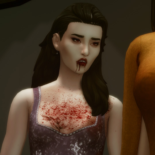
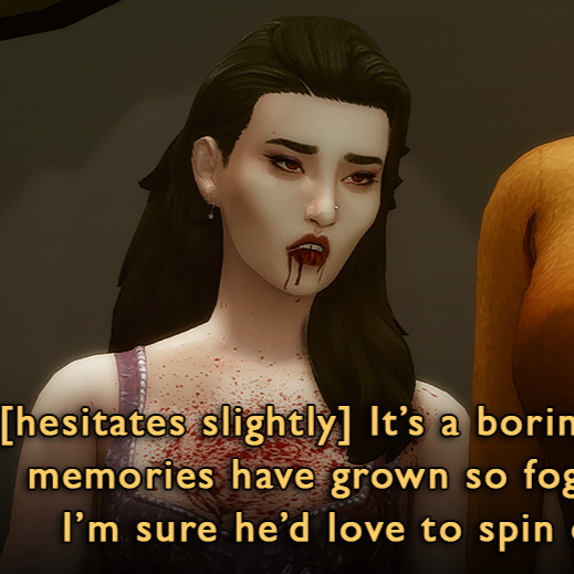
This hair had some problem areas that showed up in live mode but not CAS. It's such a tiny thing, but it annoyed me, so I had to touch it up in nearly every screenshot. Luckily, the darkness of her hair means I didn't have to do a perfect job.
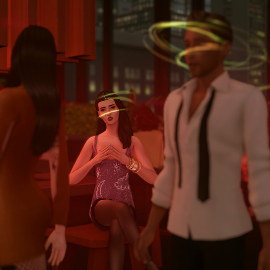
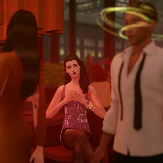
The effects were all done in-game. Lilith has the alluring visage vampire perk, which creates the red haze and mind control spiral. Unfortunately, Helena crossed her path too closely, and rather than set the shot up again I used the clone brush in Photoshop to edit out the effects around her head (vampires who can successfully do mind control on other vampires are exceedingly rare). By the way, I later figured out a quick and dirty method for dispelling unwanted visual effects on a Sim is to remove buffs in MCCC.
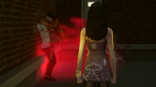
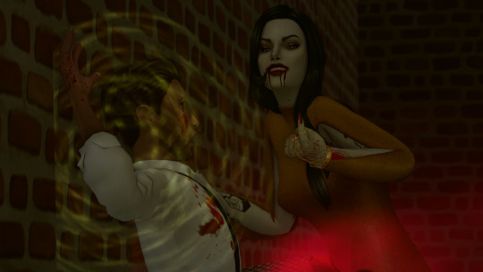
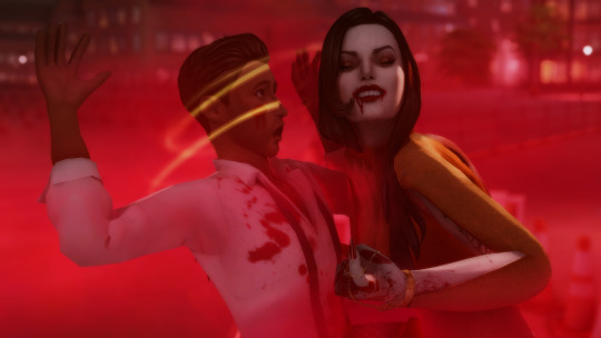
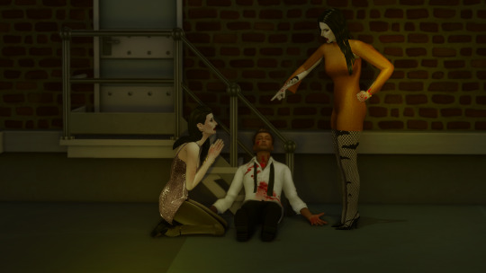
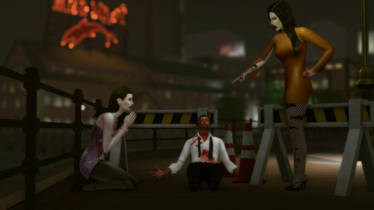
As I've mentioned, I had to shoot the attack scene twice. The first attempt was too dark, the location wasn't very visually interesting, I was in an area of San My where I had less camera control, and I used the Effects Player, which ended up being less eye-catching (hey, sometimes vanilla is the best option!). They would have worked to get the point across, but I think you can really see how I learned and improved upon my vision!
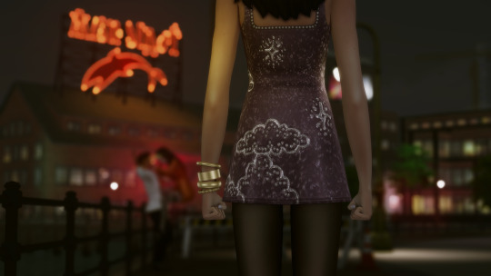
These comparison shots are all uncropped and unedited, by the way. Reshade/Relight truly does the heavy lifting. I've also gotten better at finding an angle I like and sticking with it, even if that's only because I don't want to adjust Relight all over again, lol! Speaking of angles, that last shot was done using the Dutch angle trick I learned in this tutorial by @surely-sims! First-person camera is actually super useful for storytelling. If you don't already know about this head-turning trick, it'll change your life. It comes in clutch for changing the eye line of a posed Sim since I'm not always great at getting that right in Blender.
Anyway, I don't know if anyone will find this super helpful or interesting, but I'm always open to questions about taking and editing screenshots, even though I feel like most of what I know has just been absorbed through osmosis and trial and error!
#ts4#sims 4#the zhaoverse#long post#i didn't even talk about the gifs but they were as simple as simple gets lol#i just saved the camera position in tab mode (ctrl + 5-9)#took two pictures from that angle#and then faded one shot into the other#all you need is the most basic gif making tutorial you can find#i use photoshop but i'm sure there are easier ways to do it#blood tw
64 notes
·
View notes
Text
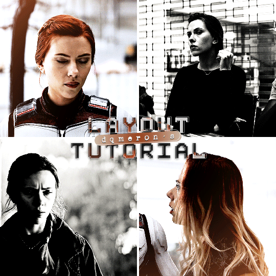
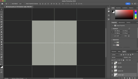
here's my quick tutorial for making layouts in photoshop! i'll be going over how to make this 4-panel square one! ↳ requires basic knowledge of photoshop
「 step 1: making your file 」 make a new file, 540 x whatever height you want (just make sure it fits within tumblr’s image size guidelines), and make sure the background is set to transparent. for this specific layout, i want the overall shape to be square, so my dimensions are 540x540!

「 step 2: mapping out 」 the best way to make sure your layouts are even and spaced equally is using guides! go to view > guides > new guide layout. the color of your guides doesn’t matter at all (i just like green so mine are green lol), and you can have as many columns and rows as you want. since this is going to be a 2x2 layout, i’ll have 2 columns and 2 rows. the general rule of thumb for gutter is 4px.

once your guides pop up, select the rectangle tool by pressing U on your keyboard. make sure shape is selected from the drop-down menu at the top (right by the home button in the top left), and make sure that you have snapping on (view > snap).
using the rectangle tool, trace out your layout panels! as long as you have snapping on, your path should naturally snap to the guidelines, making it a LOT easier to do this! when you’re done making your rectangles, you can turn off guides by going to view > guides > clear guides (i usually keep them on until i’m done adding in my gifs but this is up to you). i always name each shape layer after where it is in the grid to not get confused.

「 step 3: adding gifs 」 some quick things before i go over actually adding in your gifs: 1. make each of your gifs in their own individual files. you’ll be adding them into the main one later. 2. your gifs have to be the same length — you can cut them down to length in their own individual files or later in the main one. either way is fine, totally up to you!
now you have your layout set up, you can make and add your gifs! in order to make sure that they fit into the panels, check the dimensions of each shape you’ve created by selecting the layer and looking in the properties tab. my panels are each 268x268.

i’ll actually be making each of my gifs 270x270, just to make sure that i don’t have any weird gaps or anything (i’ll talk about how i’ll be getting rid of the 2 extra pixels on each side later).
once you have your gifs done, you can duplicate them into the main one. convert your gif and anything else (coloring etc) into a smart object (right click > convert to smart object), and then right click it and select “duplicate layer”. make sure the document you’re duplicating to is the one with your layout in it.
layers automatically duplicate aligned into the top left corner. since this is where my first panel is, i can just leave my gif there, but for the other ones, drag your gifs into place using transform and your mouse (once again making sure that snapping is on).
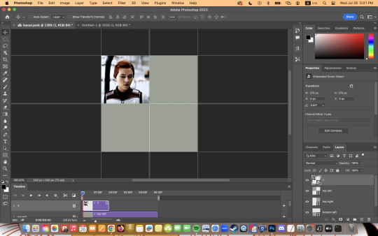
now to get rid of those extra pixels. this step also makes sure your gif is perfectly in line with the shape you’ve outlined the layout with. make sure your gif is right above the shape layer in the layers tab, and then right click and select “create clipping mask”. this makes sure your gif doesn’t go outside the limits of your guidelines. this is what it should look like in the layers tab:
「 step 4: exporting 」 exporting a layout gif is pretty much like exporting any other gif, but you do need to check your matte settings before saving. the wrong ones can make what should be the transparent dividers solid, which can throw off the look of your gifs. make sure matte is set to “none”, and then save as normal!

here's my finished gif:
happy giffing! feel free to send me an ask/message me w any questions!
#gif tutorial#gif tutorials#allresources#completeresources#userchibi#userpjo#uservivaldi#userraffa#userbess#usermorgan#tuserheidi#userrobin#userkosmos#usershreyu#userzaynab#userisaiah#thingschanged#rogerhealey#*mine
269 notes
·
View notes
Note
do you have any tips for drawing dynamic poses? i always love the way you draw bodies!!
i know this has been said a million times but the way i draw bodies significantly improved after i started drawing more frequently from reference. if i cant find a reference for a pose on the internet, i'll just use myself or a friend. i spend an unfortunate amount of time just standing in front of my mirror looking at my own joints. pay attention to where your body curves!!
other than that though—honestly my anatomy/pose knowledge is a whack amalgamation of art tips i've accumulated over the years (i miss old school deviantart/tumblr style art tutorials). i also like to look at how artists i admire draw bodies—what details to they include, what anatomical short-hands etc
i think i'm still figuring out how to draw dynamic poses, but here are some cheats i've picked up (under the cut coz this got long again):
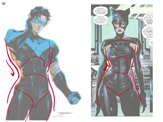
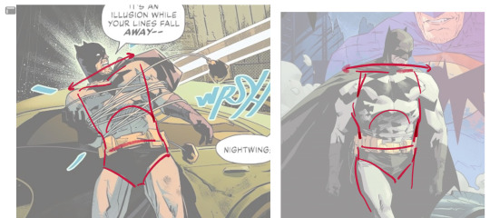
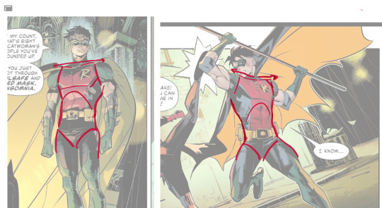
gonna use this stray!tim as a base
the easiest way for make up a pose is to start roughly with the head, collarbones, ribcage, and pelvis — you can build everything from there
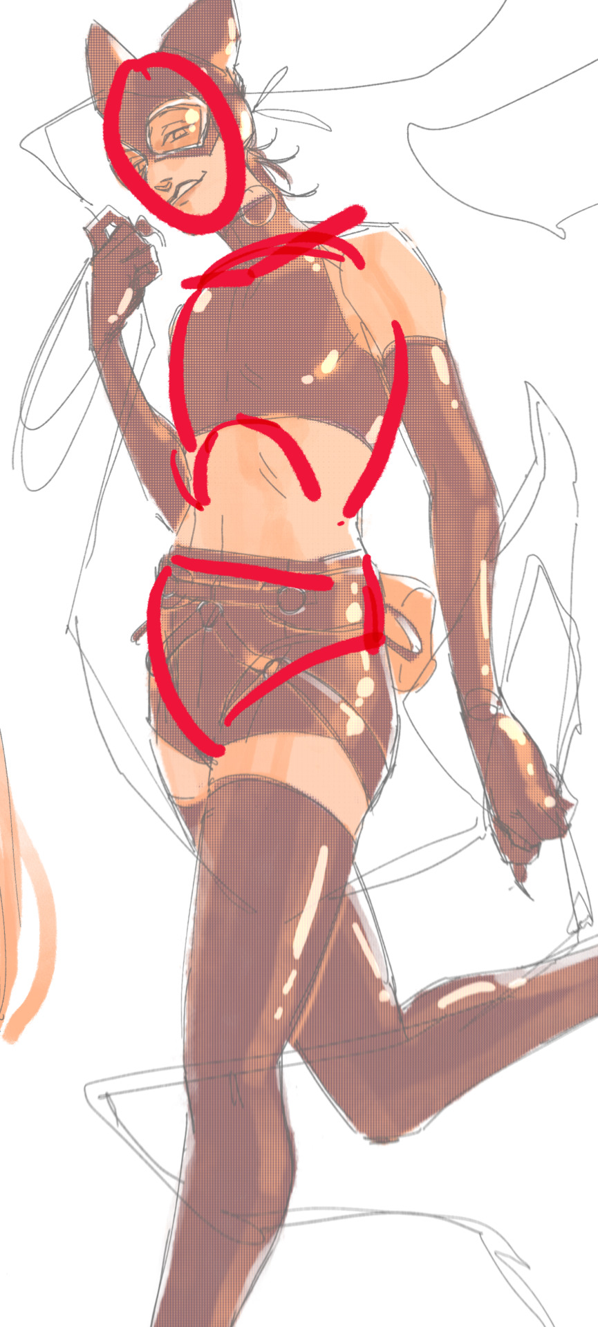
here's a couple more of what i mean by the ribcage-pelvis deconstruction:
2. push your perspective a little!! imo things look more dynamic if you move your sight-line up or down—the horizontal orange line here. if you look at the panels above, the sight lines tend to be a little low, at around the character's torso or waist. i did the same below with stray!tim
to do this i usually try to get a sense of the space im working in by putting in some sloppy perspective grids
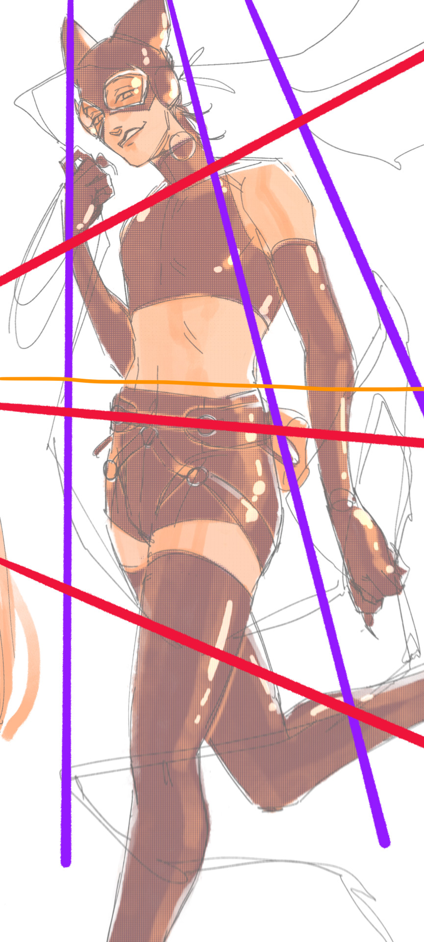
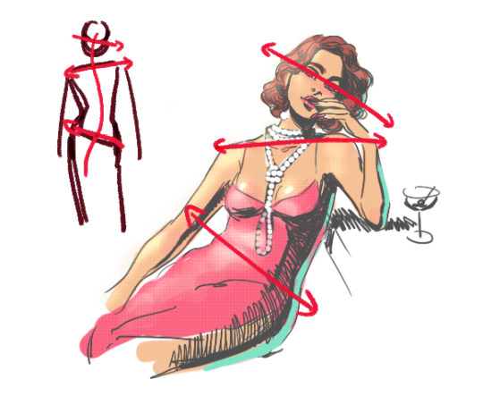
3. S curves!!! exaggerate the lines of the body. the body naturally has parallel horizontal lines—an easy way to get a body to look less rigid is to tilt those horizontal lines which in turn curves the vertical line of the body
this is what a mean by horizontal lines—usually i use the eyes, shoulders, and hips:
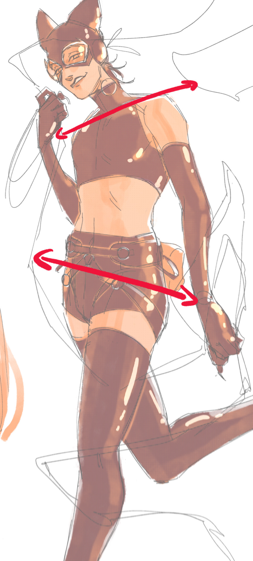
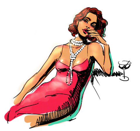
i'm gonna use caterina as a better example—usually you want the horizontal lines to sort of zigzag:
i've also picked up a couple visual tricks that don't exactly add dynamism to a pose? but they do give a static pose a little more oomph. a lot of this is done by visually highlighting one specific point of the body
for our purposes, i'm gonna make the focal point tim's face
motion blur! there are a couple ways to do this. i actually dont like working with traditional motion blur because you have to mess around with selections, so i usually fake motion blur using postional perspective blur:


2. gradient lighting—you can add a lot of depth this way. usually i like setting the gradient in the direction of the focal point, e.g. tim's face
below, i added a layer above the base drawing, used an airbrush to get this gradient, and then set the layer to color burn and lowered the opacity. you can also clip the lighting layer to the base drawing and set it to multiply

below, i did the opposite—instead of adding a gradient shadow, i added gradient light. i set the layer to add this time (instead of color burn) and then lowered the opacity again.
this kinda serves to desaturate the parts of the piece that are less important (ish i was kinda sloppy here), driving the eye to face—the most saturated. the motion blur does a similar thing, where the only thing "in focus" is tim's face
the gradient also sort of adds a directionality to the piece—it starts at the bottom right corner and goes up towards the upper left, causing your eye to follow that same path, which drags your gaze up tim's body
here's what it looks like when i combine 1 and 2:

3. chromatic aberration's been pretty popular recently. it does a similar thing as perspective blur but with more eyestrain (although i went with a really exaggerated version below just to show you what it does) but it looks cool!
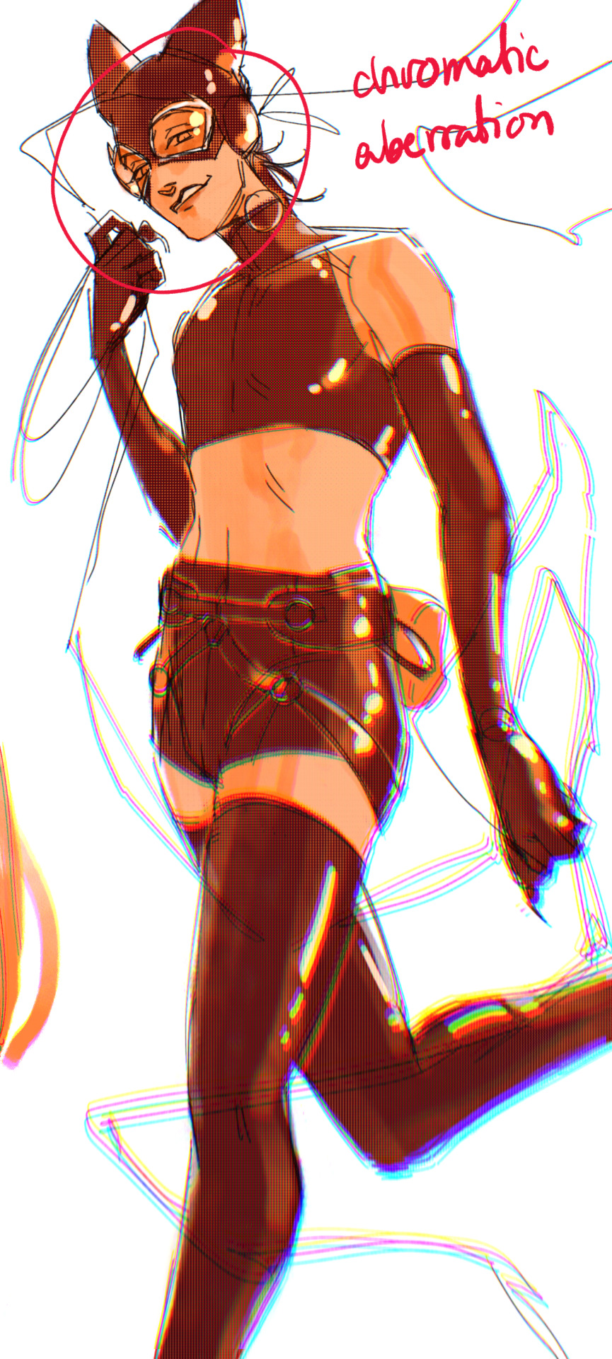
bonus cryptid tim as a reward for getting to the end :-)
#red talks#sart#art tutorial#YeAH UH this got long lmaooo i was on the bus for a Sec plotting this out so#also i am neck deep in a reincarnation/regression manhwa stress hyperfixation so i havent had the brain space to draw#so you get this instead!#if anyone wants recs lemme know lol#thank you anon :)))
68 notes
·
View notes
Text
A teacher at an Islamic Sunday school wanted Muslims to carry out arson attacks in the West, a court heard.
Dzhamilya Timaeva, 19, is accused of spreading “pro-Isis propaganda” by distributing a cartoon-style book calling on Muslims to wage jihad against non-believers.
The Old Bailey previously heard copies of the book, called “Little Muwahideen”, were found in a search of her home by police and that she had already distributed more copies.
On Thursday, it was alleged that Ms Timaeva had a video on her phone called “Incite The Believers” when she was arrested by police at Heathrow Airport’s Terminal Two as she was about to board a flight to Turkey in October 2022.
The clip encourages viewers to carry out arson attacks against buildings, forests and agricultural land in the West if they do not have a gun or a knife, it was heard.
While being questioned by police, Ms Timaeva was shown the film and said: “It’s the first time I watched the video”. But when she was rearrested in March 2023, police found she had made a voice note on her phone bragging about how she had lied to officers.
The court heard she said: “They were going through this sheet of why I was arrested and I was thinking this is nothing this is light work, like you guys have nothing on me.
“I’m sitting there like I’m chilling like I’m not even worried I’m not even scared – nothing! Like I’m so calm.
“And then after the video started on a tutorial on how to make explosives etc etc… and I had saved it on my phone and I forgot because I didn’t even watch the whole video.
“I like the start because it was a nicely edited video… I’m trying not to laugh because cos guys this one is not like me.”
Gareth Weetman, prosecuting, said Timaeva “wasn’t being truthful about not having watched the video”.
“She was not simply a devout Muslim but someone who believed that it was her duty to wage war against non-believers and instil that sense of duty in others”, he said.
‘On the path of Jihad’
Ms Timaeva was due to begin teaching classes at the Tawheed Islamic Education Centre, a Sunday school in Maidenhead, the Old Bailey has heard.
On the day after her home in Windsor was searched in 2023, a teacher at her school found her alone in an office trying to hide shredded paper in a cupboard, jurors heard.
The strips were reconstructed and found to relate to jihad with topics such as “Constants on the path of Jihad” and “Democracy: the modern idol.”
Ms Timaeva, who is on bail, denies disseminating terrorist documents and possessing a document for terrorist purposes between Oct 2022 and Feb 2023.
The trial continues.
13 notes
·
View notes
Note
Hi, your crafts are so incredibly cool! How did you get into wirecrafting? Do you have any favorite resources for learning about it?
Thank you! Unfortunately no specific tutorials or anything because I never really decided to get into this as a hobby. Rather I started playing with paper clips and staples when I was bored in lower school, and then over the years things... escalated. Better materials, better tools, more ambitious projects. Some day I will learn to weld these thin pieces of metal together instead of just tying them in place or twisting them together, and then I will be unstoppable.
If it helps, the two ways I think of wire is (a) lesser blacksmithing/machining and (b) that game where you try to draw a shape without your pencil leaving the paper. I pick a shape I want, figure out the path (or paths) to "draw" it in 3D space and how to anchor those strands to each other, and then immortalize that idea in metal. No heat, just pliers sturdy enough to bend the wire and reduce the number of times I stab myself on the loose ends.
I can definitely recommend some specific wire suppliers and materials and their tradeoffs, but really anything will work as long as you are physically able to bend it and as long as it holds its shape when bent. The "picture hanger" section of many hardware stores is a great place to look. Find something between about gauge 18 and 24 to start, and try it!
14 notes
·
View notes
Video
youtube
How to Remove Background in Photoshop
It all depends on the photo you’re working with. Only by practicing you’ll find out which tool will be best for the job because no photo is the same. Also, everybody has their own preferences and there is no right or wrong when the result is good. Here are a few examples of how to remove a background in Photoshop.
1 note
·
View note
Text
Rigging....

[Another crosspost from cohost. The original was posted on Feb. 17, 2024. I forget to post about them here, but I do make vtubers as my main source of income. I figured more people might like to see this.]
Complex mouth rigging + Added in some animation smears.

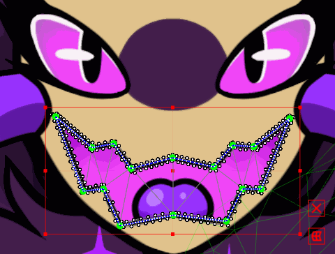
Since @Isa-ah asked how I did it, I'll just do a quick breakdown here. The mouth is made of three layers: the line for the top lip, the line for the bottom lip, and the mask for inside the mouth (which the tongue is clipped to). If you use the deform path tool to draw a path while multiple meshes are selected, it groups those meshes together so that they all move together. It's pretty difficult to get everything to behave the first go round, and your mesh needs to be set up in a particular way, which is why the mask for the mouth has very limited geometry in a sort of zigzag pattern so that any vertices in the middle wouldn't get left behind. This geometry can be further subdivided later, but it works best fairly low poly to start with.
I basically just drag the corners of the mouth in so that the geometry collapses in on itself to be really small. I use both the deform path and also the temporary deform tool to collapse the faces pretty tightly. So the widest mouth has the full geometry, the mid-sized one has the outer two lines collapsed in to the corners of the mouth, and the smallest one has the next two lines collapsed in.
Usually this can create a "tearing" effect on the exported model (where the smaller faces are collapsed, the more white bleeds into low opacity or anti-aliased faces), so sometimes I cover the collapsed geometry with another mask, but it can probably also be minimized using vtube studio's "get rid of white outlines" feature.
There's also still a bit of cleanup required since the deform path usually forgets about some vertices, but it really does feel like magic when you learn to do it properly. (Also sorry if some of this explanation was confusing... I did my best without just making a whole tutorial video. Haha)
11 notes
·
View notes
Text

Alternative title: how to use SVGs as paths in GIMP ▬ by Joy from @creativexspirit
Though I recently created a template for text messages, I didn't like how versatile it wasn't so, here's a little tutorial on how to create your own text messages for Gimp. This tutorial is meant to explore the Path tool a little.
This tutorial is made with Gimp 2.10.38. It uses a SVG I created just for that tutorial: [LINK]
Like or reblog if you download. Please don’t request as your own, respect my work. Don’t hesitate to tag me if you follow the tutorial! I would love to see your edits. If you have any question, my askbox is open.
Quick disclaimer: the following images are for a French Gimp version.
STEP 01.
Create or open the XCF project you want the text message in. You will now import the SVG as a path.
If you don't already, have the path window open. You can find it in Windows > Dockable Dialogs > Paths. On my Gimp, as I am in single-window mode, the Paths dialog window is automatically docked to the Layers-Undo dock as a tab.

On the Paths dialog tab, open the Paths menu and import the SVG by selection "Import a path".


If you've done everything correctly, you should see a new path named "Text Message" in your Paths tab!

STEP 02.
Now, you can modify the path with different tools according to your needs: transform, scale, rotate, flip... Just make sure you always choose the Path to be transformed!
You can select whether to transform a layer, a selection or a path on the tool options.


STEP 03.
After transform, it's now time to actually have a text message. You'll start by creating a new layer that will have the background color on it. I called mine "Text Message BG".

You will now go back to the Paths tab and create a selection from the path, by selecting the Text Message path and then choose in the Path options "Path to Selection". There is also a shortcut button at the bottom of the Paths tab.


Now, you will see the selection is only a border. You will need to add the inside rectangle to the selection.
You can do so by selecting the Rectangle option and putting it in "Add to Selection" mode. (You can also be in "Add to Selection" mode by pressing Shift while doing the rectangle.)


Now, you can fill your selection with a color! (Don't forget to change your foreground color with the one you want to fill prior to doing the fill!)

You know have a background for your text message!
STEP 04.
We will now add text. You might be wondering why in this SVG file there is an inner rectangle. It is actually meant to serve as a guide for your textbox and still have some padding.
To use the inner rectangle of the path as a guide, you have to toggle Paths as a guide. To do so, check the box in Display > Align on active path.

Now you can select the Text tool and create your textbox while following the inner rectangle. You should be able to feel that the textbox will naturally clip to the edges of the path.

Now customize your text as you want and you're finished!
11 notes
·
View notes