#chromations art
Explore tagged Tumblr posts
Text

Merry Christmas and Happy Chanukah!
zoom under the cut 🩷
AWHWUEJDJEJEKWOALSKS I NEED TO LICK HIM

#chromations art#led zeppelin#robert plant#art#robert plant fanart#led zeppelin fanart#artists on tumblr#my art#art tag#this is my art.
33 notes
·
View notes
Text

does this just keep going forever?
3K notes
·
View notes
Text

from 2022
2K notes
·
View notes
Text


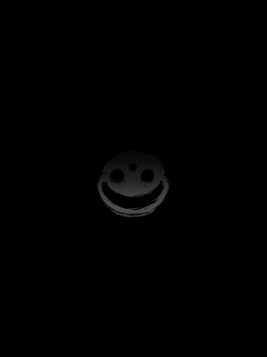

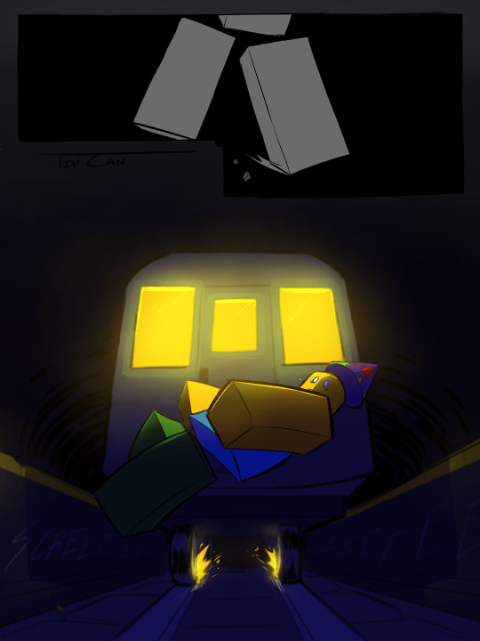
Trip
#regretevator#fanart#art#regretevator fanart#comic#poob#mr#poob regretevator#mr regretevator#cw chromatic aberration
2K notes
·
View notes
Text

mutual understanding
2K notes
·
View notes
Text


#im so fucking sorry#these are so cursed#dandadan#dan da dan#okarun#ken takakura#momo ayase#cannot believe this is how i spent my evening#plus side is i finally found out how y'all make proper chromatic aberration in krita 😂#i want you to know i outsourced the decision on what i was going to do for this#and instead of doing a genuine drawing of the characters in the meme pose#i was encouraged to make these monstrosities#my art
2K notes
·
View notes
Text
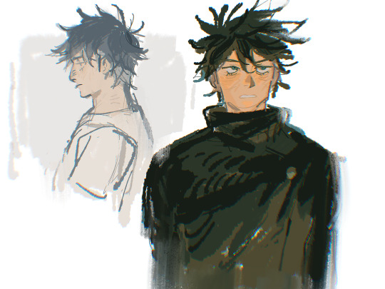
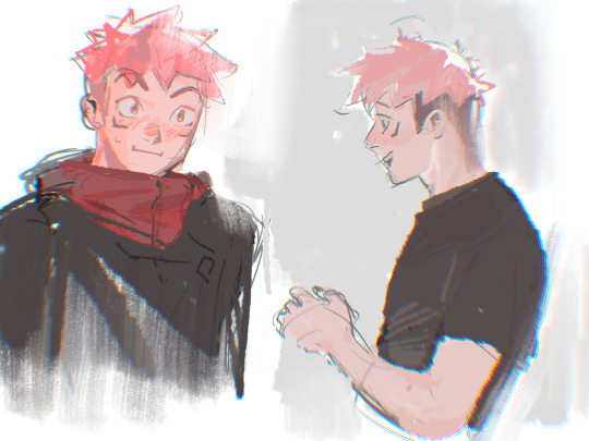

#I can draw other characters besides Gojo 👀#cw eye strain#in case…cause chromatic aberration#baegl's art#jjk#jujutsu kaisen#jjk art#geto suguru#itadori yuji#fushiguro megumi
1K notes
·
View notes
Text
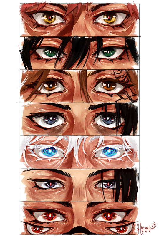
some quick jjk eye paintings
#my art#jujutsu kaisen#jjk#megumi fushiguro#yuji itadori#nobara kugisaki#yuta okkotsu#gojo satoru#geto suguru#ryoumen sukuna#fanart#jjk fanart#tagging everyone feels like it took longer than the actual painting my god#i believe ive gone on record waxing poetic about how i love lower eyelids and how i could paint them fr hours#so i put my money where my mouth is and thats what i did today . self care :)#i had a cool idea fr gojo where i wanted to do like an abberated effect to show 2 extra sets of eyes#but god it looked cluttered and awful no matter what layer mode i put it on sdgdgjsdg#settled fr chromatic abberation on th irises :')#quickish painting but i am ! happy !#very proud also of the different eye shapes i ws able to achieve while keeping them consistently sized#was worried abt geto there fr a sec#but tbh he turned out to be one of my favs ????? surprised myself#anyway this is my love letter to eye skin <3 i love u lower eyelid folds mwah <3
6K notes
·
View notes
Text
ENA DAY!!!

I love this series SM!!! Despite this, I rarely draw fan art, but today is a great opportunity!!
I CANT WAIT FOR DREAM BBQ NEXT MONTH!!!!
#art#illustration#fan art#ena#ena joel g#ena dream bbq#ena day#drawing#digital art#artwork#fanart#bright colors#eye strain#chromatic abberation#derealization#webcore#artist#my art#illustration art#pixel art#pixel illustration#pixel graphics#pixel artwork#pixel drawing#character illustration#my drawing#digital drawing#digital illustration#digital artist#id in alt
911 notes
·
View notes
Text

dog motif
#mouthwashing#mouthwashing game#mouthwashing fanart#daisuke mouthwashing#swansea mouthwashing#mouthwashing daisuke#mouthwashing swansea#tw eyestrain#eyestrain#astro art#save me chromatic aberration tool
607 notes
·
View notes
Text


im actually kinda proud on these. now take them and run /j
Color belongs to superyoumna
Killer belongs to rahafwabas
Cross belongs to jakei95
Epic belongs to yugogeer012
Delta belongs to AnimatedZorox
#undertale au#utmv#sans au#my art stuff#utmv fanart#something new#killer sans#othertale#color sans#ultratale#delta sans#epictale#epic sans#xtale#cross sans#crepic#colorkiller#color spectrum duo#epic sanses#chromatic crew#is that all of the tags? good? good
736 notes
·
View notes
Text

Oh, to sail away
To sandy lands and other days
Oh, to touch the dream
Hides inside and never seen, yeah
#led zeppelin#chromations art#robert plant#jimmy page#led zeppelin fanart#art#my art#art tag#this is my art.#artists on tumblr#robert plant fanart#jimmy page fanart#THIS TOOK A MONTH AND FIR WHAT REASO N
65 notes
·
View notes
Text

my own take on a giant siphonophore in dredge!!! :D

…and the aberration ;3
#this is one of my best drawings of 2024#spent SO long on this but it was worth it!!!#my art#dredge#giant siphonophore#dredge game#also the chromatic abberation was (ironically) a pain in the ass to get working haha but that paid the fuck off
1K notes
·
View notes
Text
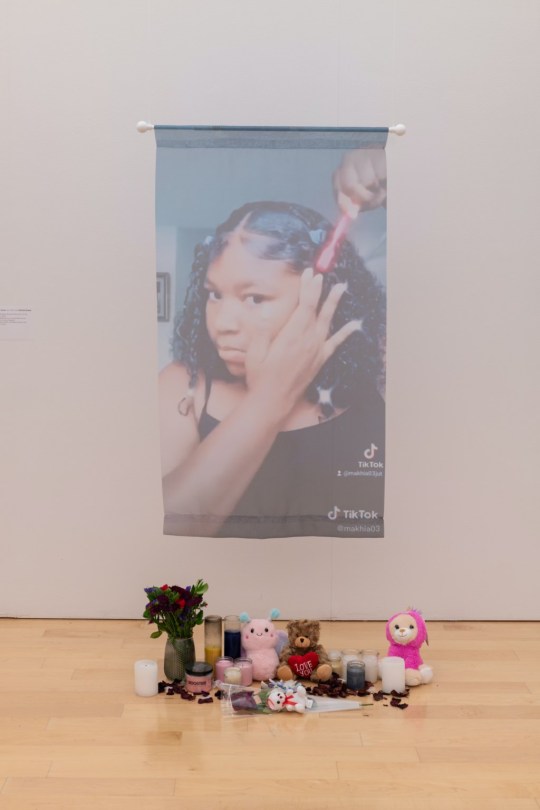
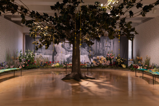
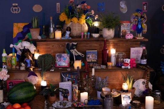
Installation view of Freedom Square: The Black Girlhood Altar at the Chicago Cultural Center
The exhibition at the Chicago Cultural Center opens with the installation “Homegoing.” The work is a suspended image depicting a screenshot from Ma’Khia Bryant’s personal TikTok. In the photo she’s laying her edges, her jet-black hair shining, her baby face clean and free of makeup. Below the printed photo is a collection of candles, stuffed animals, and a bouquet. On April 20, 2021, Ma’Khia was killed by an Ohio police officer in what was later determined a justifiable homicide. She was 16 years old.
In the gallery titled Rest and Recess: The Courtyard, the exhibition transports the viewer to the Caribbean where Black girls play together unburdened and hopeful. A tree, sculpted by Robert Narciso and made from branches from Rekia Boyd’s family home, sits in the center of the room casting a protective shadow over everything. From its branches hang yellow paper hearts scribed with the hopes and dreams of little Black girls. The sound of their joyful cacophony activates the space.
[ x ]
#chromatic voice#ma'khia bryant#rekia boyd#a long walk home#scheherazade tillet#robert narciso#we all make art#usermarmalade#police brutality#missing and murdered black women#say her name#black lives matter
3K notes
·
View notes
Note
May we have some more Cross nuggets if you have any to spare at the moment?
No nuggets in this house, only full couse meals (18 page comic)
Anyway, I’m begging you guys to see the potential of Killer being like a protective asshole older brother to Cross 🙏🙏🙏
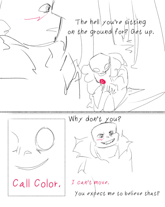

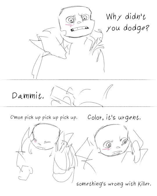
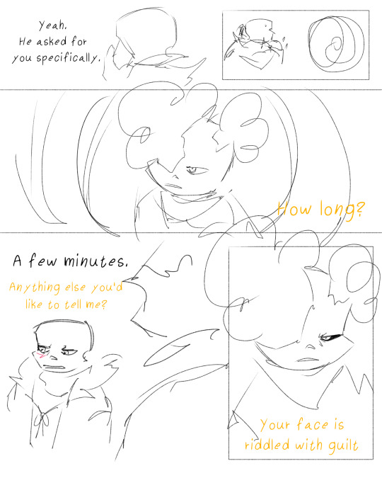
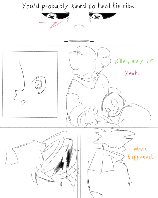
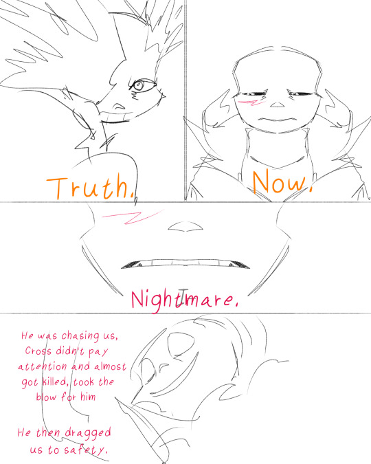

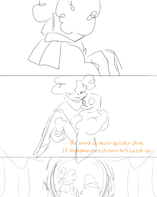
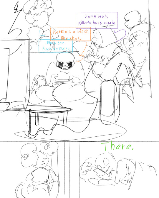
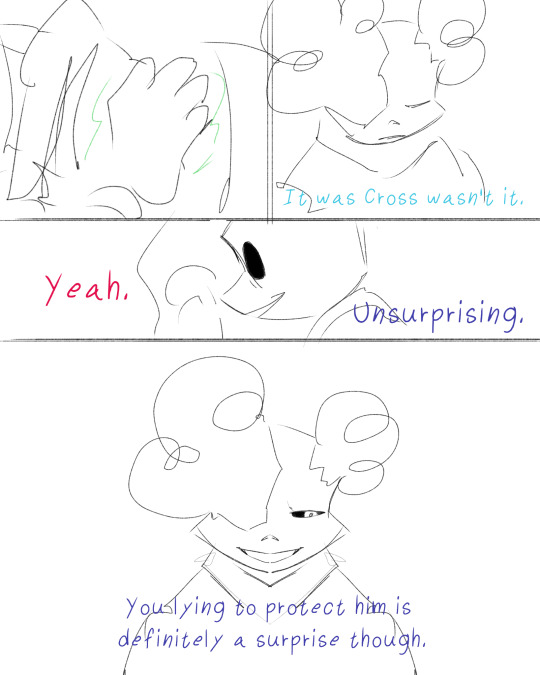

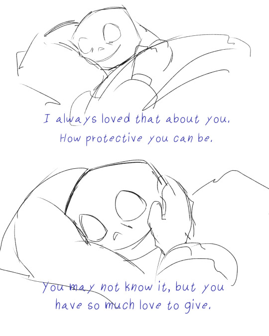
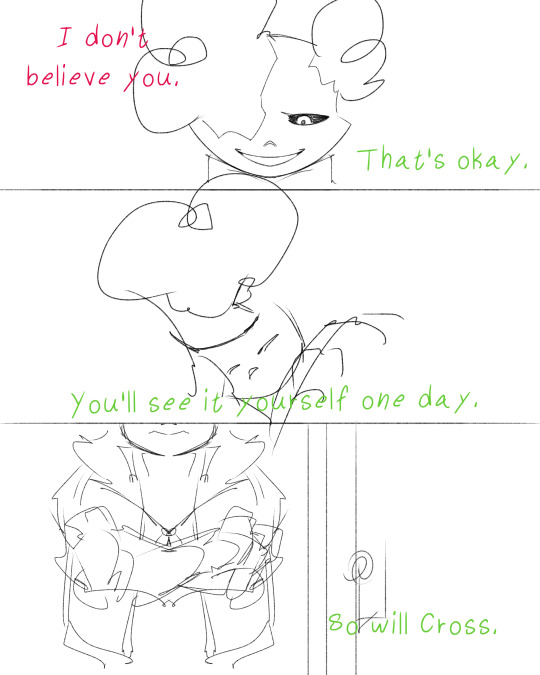

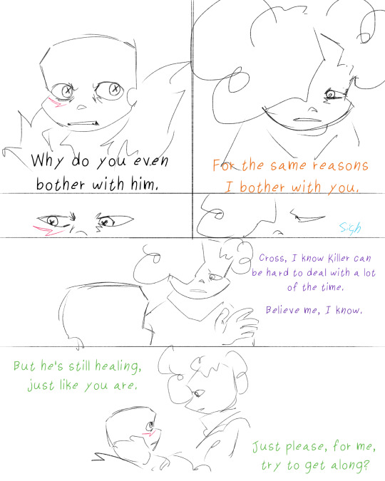
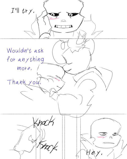
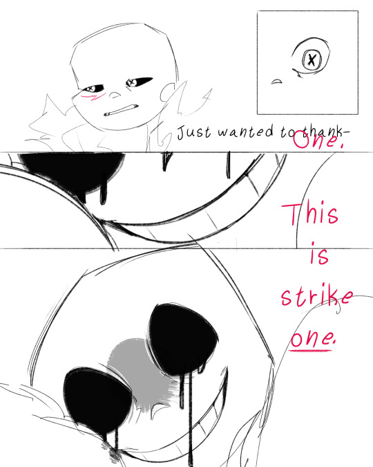

#‘for the same reasons I bother with you’ said Color in a very frustrated tone#said reasons are deep rooted care and love <33333#anothers ask#anothers art#cross sans#killer sans#color sans#epic sans#delta sans#chromatic crew#injury#injury cw#injury tw
1K notes
·
View notes
Text

lighting practice :0)
Color belongs to superyoumna
Delta belongs to AnimatedZorox
Epic belongs to yugogeer012
#sans au#color sans#delta sans#epic sans#epic sanses#epic trio#chromatic crew#undertale au#utmv#oz art#I still have 3 more shows to do
408 notes
·
View notes