#save me chromatic aberration tool
Explore tagged Tumblr posts
Visit Tumblr Blog
Explore Tumblr blogs with no restrictions, modern design and the best experience.
Last Seen Tumblr Blogs


Fun Fact
Tumblr Inc. has $15.1M in annual revenue.
Text

dog motif
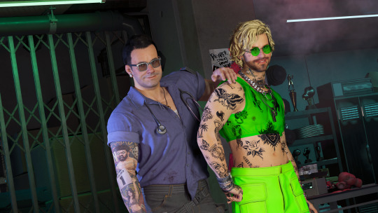
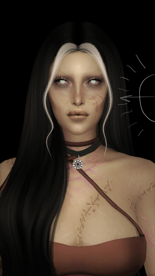
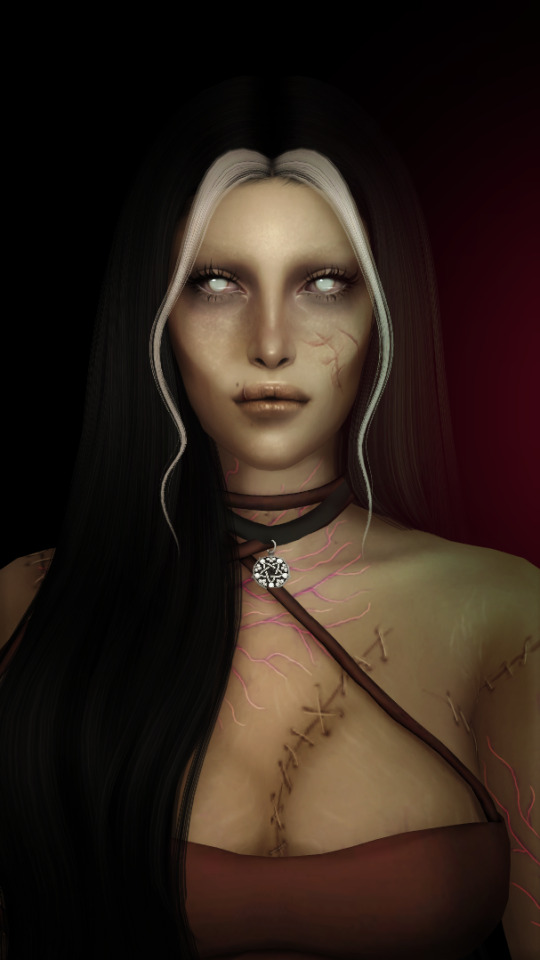
#mouthwashing#mouthwashing game#mouthwashing fanart#daisuke mouthwashing#swansea mouthwashing#mouthwashing daisuke#mouthwashing swansea#tw eyestrain#eyestrain#astro art#save me chromatic aberration tool
151 notes
·
View notes
Note
Do you still use Flash/Animate as your main drawing software? Flash was the program I learned to draw in, and I remember some of your process videos really helped me figure out how to make use of some of its tools. I remember there was a shark mermaid illustration you did, and I really loved how the underwater lighting effects looked in that one.

To this day, I still use this version of Flash from 2008. Newer versions have a quirk where it takes longer to save a document the larger it gets, so CS4 is where I've been for the past 16 years.
There's also this funny bug in it that will sometimes make Graphic symbols draw with the Add blend mode, which is normally exclusive to Movie Clips. This is great for exporting and it's what I did in my kyu-kurarin cover for the chromatic aberration effect.

103 notes
·
View notes
Text
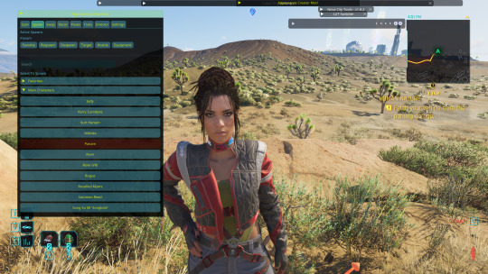
I was asked by @x-littlemoth how I do my VGP and I explained the basics here! This is a continuation of that tutorial with my own personal methods! For this tutorial you'll need this mod (in addition to the ones mentioned in the last post):
CharLi This is an excellent lighting mod that allows you to spawn individual lights and adjust their color, brightness, rotation, etc.
And here are some other mods I recommend, though they aren't necessary!:
Additional Portrait Presets I can explain more about why adjusting FOV or rotating the camera 90 degrees is useful below, but these presets save you the effort of tweaking yourself! Photomode Expression Megapack No tutorial needed, this just adds extra facial expressions you can select in photomode! Works exactly the same as the vanilla one and doesn't replace anything.
Appearance Creator Mod (ACM) I won't cover this one here because there is already a wonderful tutorial by PinkyDude who explained it way better than I ever could which you can check out right here! Briefly, this allows you to swap/toggle clothes, accessories, etc. on NPCs.
If you'd like any additional suggestions for pose mods, clothing mods, etc. or wants to know any mods I'm using I am very WCIF (where can I find) friendly so anyone can free to ask me any time! Additionally, if anyone would like a tutorial on my editing process, I pretty much just use my phone and a free app (and sometimes a paid app but that's not necessary) feel free to ask, I'd be happy to share :)
Let's get into the tutorial under the cut! ^^
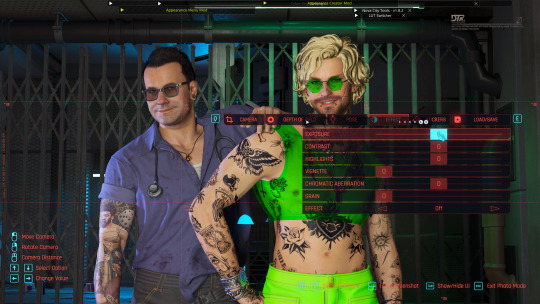
Okay, let's continue editing our photo of Viktor and V using CharLi! So, open your CET menu and look for the CharLi menu and open it up. First thing I tend to do is go over to the settings tab (the gear) and shut off chromatic aberration and volumetric fog. This is all up to personal taste though, so do what looks best to you! Now, return to the main tab (click the light bulb) and let's spawn a light! Personally I always prefer to start with 1x as the others tend to be way too bright for most scenes. Play around with choosing whichever type of light you like.
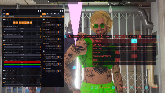
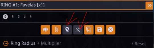
In the end, I went with the type called Favelas as my main light source. Go ahead and play around a bit with the rotation, intensity, and other sliders.
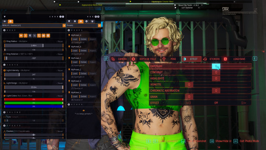
Here's what I ended up settling on! I try to make sure that the character's aren't washed out or too dark and I try to make my first light light the characters fairly evenly. Now, for depth and flavor, let's add a second light! This time I chose spotlight and I adjusted the colors until I achieved a relatively blue color.
One last thing, for each of your lights go ahead and toggle these two badboys off. That will hide both the physical light object and the pink tracker so they don't clutter up your photo.
Adjusting the angles a bit more to my own tastes, here's what I'm left with without any external editing!
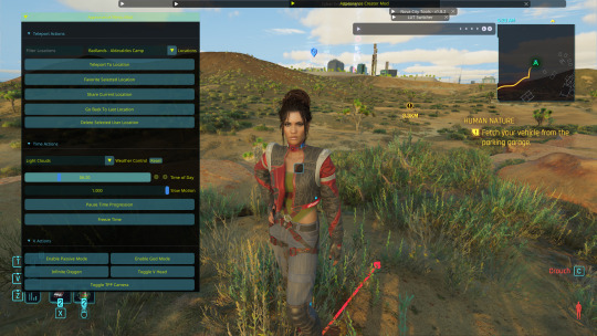
Now, let's try and outdoor photo! Following the steps in the last tutorial, I am going to teleport to my location of choice (I am using a teleportation preset found in PinkyDude's Roadtrip Through The Badlands AMM location addon). While here, I switch my Nibbles replacer to Fem because I'm gonna take some pics with Panam! Now that I'm here, I notice that the lighting out here could be better! I tend to adjust my weather and lighting outside of photomode because it doesn't always shift correctly in it. To make sure everyone is lit correctly, I tend to pick the character with the darkest skin or clothing that will be in my scene and spawn them from the spawn tab. I'll choose Panam, of course!
Note: Going to the tools section and selecting freeze target can help keep your spawned companion from walking away but I forgot to do that here lol For weather conditions, I like to choose light clouds. This makes the sky look nice and it also softs harsh shadows. This is up to personal taste and the mood of your scene though! Additionally, if you want more weather states and deeper control, you can use the Nova City mod. For now, let's just play with the vanilla weather settings.
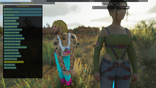
I tend to prefer the look of early morning the best, but again this up to taste! I would definitely recommend avoiding middle of the day though as the harsh lighting can greatly overexpose your image while also muting colors. Now that we've got all that set up, let's banish her just like we did Viktor in the first tutorial. Unlike Viktor, this Panam clone won't respawn (the real Panam is safe and sound, this won't affect her). Now let's return to photomode (and ignore my boy's goofy Us Cracks pose). Follow the steps to set up your replacer just like in the first tutorial. Now that I have my replacer swapped out to Panam, I am going to remove her jacket using one of the built-in presets (for swapping outfits with ones not listed in AMM see the AMC tutorial linked above). To do this I am going to go to tools > target replacer > scan and then scroll to the drop-down and list and pick the one I want to use. Let's keep the harness but remove her jacket!
From here, choose whatever poses you like, set up CharLi however you wish, and now let's try taking a portrait shot! This is where those presets come in handy. If you downloaded them, go ahead and flip through to the portrait ones at the end and select the one you like best. Otherwise, let's set this up ourselves! To do this, I will go to Camera tab in photomode and set my rotation to either 90 or -90 degrees. This allows you to fit more into the shot while also allowing your portrait to be higher quality because it fills up the whole screen instead of being a tinier image with a lot of empty space on the sides. Next, I'm going to adjust the field of view. The lower the field of view, the less your image is distorted. While distortion can be nice for some styles and atmospheres, I tend to prefer a lower FOV for my portraits. I tend to prefer to set my FOV lower then 20 but higher than 10. Here I've chosen 15!
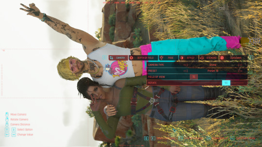
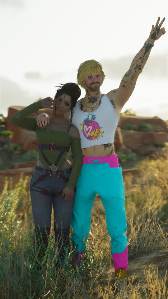
Now you can play around with the angles and take your photo! Here's the unedited one I got in the end:
If you have any questions definitely feel free to ask! This is certainly not the only or even the "best" way to do it, this is just my personal way :) Have fun!
20 notes
·
View notes
Text
I ramble for too long about my art (The post)
(Drawings here)
Thanks again to Nunki and Nov so much for pulling me out of art block 😭💕 I had so much fun drawing all of this and experimenting with poses and colors, etc. that I wouldn't have tried before this!! i'm so sorry this took like 2 months to finish there was lots of stuff going on but I finally finished it and i'm very happy how it all turned out. I made this post just to go through my thought process LMAO
DAY 1: Early SMP Days
This one was inspired by the "he asked for no pickles" meme and how in an early dsmp stream c!dream (in full enchanted netherite armor) asks c!george (half iron/diamond armor) to protect him with a crossbow while they go to l'manburg
At first this one was gonna be a quick drawing but then i got too invested into drawing the armor that it got out of hand and suddenly i had spent 2 days on that 💀
Also all the other drawings were gonna be like this one, a bit simple than what i usually do, but i got too invested x2 and ended up rendering(?) more the rest of drawings
C!dream is c!george's baby, like the cc's dynamic 👍
DAY 2: Objects of Affection
THE SHIELD DEMONS GOT ME 👹👹👹👹 also c!gnf keeps the mask even though it's a bit broken :3
C!gnf is a bit dirty because he doesn't shower, also he sleeps on the grass sometimes, he doesn't get sunburnt because XD protects him from that, also c!sapnap is the one that finds him like that and brings him back to kinoko
I think this is the drawing with most layers only because it was for setting the lighting
This one set the bar of how many details can i put on the next drawings haha got too silly and flew too close to the sun
DAY 3: Worship/Devotion
Inspired by religious imagery in renaissance paintings, they're very pretty and detailed and ohgggg i thought that aesthetic fit XDNF's dynamic ^_^
When I finished the drawing i added a canvas texture so it looked like the mentioned paintings' texture
The pose was so complicated but thankfully i hid all the weird anatomy under capes and hair(?) 🤭 and I have a mirror right next to my computer so i used myself as reference for the hands
The halo around c!gnf's head could be a reference to the headcanon of georgeeeHD existing and being another dsmp deity or also hinting at george's "destroying the smp" stream and how powerful and crazy insane he is!!! also the reflection of XD's halos on his eyes, they worship each other i think, xdnf makes my tummy hurt /pos
DAY 4: Visions/Dreams
Inspired by my weirdcore demons :3 i love that aesthetic so much
I did the error pop up on this custom generator!!
Saved a lot of time by making c!dream faceless since it would be covered by the pop up anyway, but it can also be symbolism for c!gnf not remembering his face or something crazy
I again used myself as reference for the hands i'm so cool and epic
Also I used a tutorial on how to make the vhs effect/chromatic aberration on paint tool sai and added grainy texture on the background for more spice :3
DAY 5: Reunion/Post-Nuke
I reused an old sketch of c!dnf side profile for this one, hashtag work smart not hard 😎 except i polished it and changed some stuff and now it looks way better than the old version
The concept was happy reunion, they're happy to see each other!! c!dnf good ending, i say in tears.
c!gnf touching the c!dritties :3 jk he's feeling his heartbeat, he can't believe he's real!!!
I had so much fun drawing the blood on the bandages and c!dream's scars, please zoom and admire them, it took so long,,,,
DAY 6: Roleswap
My demons..... my beloved rs au..... the posts i made some while ago were based on this drawing, i have a tag on my blog now for that au
RS!dnf wear matching chains!! also the concept for this drawing was that someone interrupted their make out session :3
Symbolism moment!! I like to draw characters with nail polish of the color it represents them, in this case green for dream and blue for george, but for this au, their colors are swapped: green for george and blue for dream, it symbolizes how their roles (king/knight) on that story are different and don't match with the canon. storywise, they're so in love they wanted to keep each other on themselves somehow so they exchanged nail polish colors
DAY 7: CC Roleplay/Cosplay
Sisyphus would be proud of me (<- almost gave up before drawing this), unironically i got demotivated when i finished day 6 so i took a break and then i went insane with this one
The concept was c!dnfies wearing cc!dnf outfits, dream specifically has so many outfit options but I ended up choosing the famous "dteam in madrid" outfit plus a cat beanie, and I couldn't find a fortnite jesus poster for george's shirt so i just found a silly cat pic and yeah ^_^
Thank you random twt user for the idea 👍
And that's it! I probably forgot to say some stuff more but i started to get anxious this post would be too long. Again thank you so much guys for being supportive over the wips i showed you and also being insane about c!dnf too 😭 <3
7 notes
·
View notes
Text
shading and lighting tutorial!
this was requested by an anon. a little before we start! i use procreate on my ipad pro with an apple pencil. unfortunately procreate is the only program i know but i imagine similar features exist in other programs as well. i feel like i need to say that i am in no way an expert on shading and i know it's not always accurate. also if you end up using this tutorial in some of your edits please feel free to tag me, i would love to see it! if i've missed something or if i explained something badly don't be afraid to ask me about it. okay long post ahead!
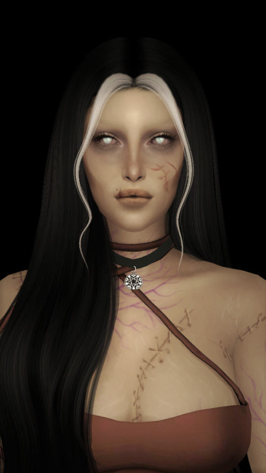
so i'm going to just make a little simple edit of my girl. this is a screenshot taken from cas that has the sunscreen filter on it from the built in windows photo editor on 20% intensity.
now i've added my normal little touch ups that i usually do, eyelashes, catch lights and highlights as well as touching up her scars. everything is painted with the soft airbrush except for some highlights that are painted with the 2B compressed charcoal brush. before adding highlights however you should figure out where you want the light to come from. i've drawn a little ugly sun for you to see where i've placed my light.
now i use the soft airbrush and paint with black where the shadows would be. if i would have fixed up the hair (which i didn't for this one because it's my least favorite part and i didn't have the energy) i would have made sure to make the shadow layer behind the hair ones since i think it looks better if the hair isn't shaded the way the face is. then i blend all of the black out with the smudge tool with the soft airbrush so it looks a little softer.
then change the layer to soft light and change the opacity to 60% and voilà! you have soft shadows! if some shadows still look to harsh for your liking just go back in with the smudge tool a little more.


now do a layer on top of everything and kind of circle the part you want lit up the most with black again, smudge it and set the layer to soft light at 60% opacity.


this step is not a must, i don't do it very often anymore but if you want some extra color or light you can do this. choose a color you want your light source to be. i tend to feel like intense colors look the best. paint it where you want the light to come from, then use the gaussian blur tool until your satisfied.
now you can leave it in the normal layer setting or play around a bit with different ones until you find something that you feel fits. for this one i decided on using the difference layer setting on 70% opacity.


a step i always almost forget is shading the eyes! to do that you just repeat the normal shadow process. paint it black, smudge and put the layer to soft light on 60% opacity. it adds so much, i highly recommend this step! now you're done with the first part. now save it as an image and start a new canvas with that image.


if you want to use gaussian, motion or perspective blur now would be the time. i didn't for this one but i almost always do. this next step is also totally optional. we are going to use chromatic aberration in the displace setting on 90% opacity and slightly pull it to the side. then use the normal chromatic aberration between 5-10%. it just adds a lot of fun and weird color that i just love and makes the edit look so much more alive. then use sharpen, i usually do 10-15%. and after that use bloom. my edits are almost always dark so i use a lot of it. i think i did 35% for this one to give it a little glow. then use noise. my go to is 3% on max octaves. then go into hue, saturation, brightness and change the saturation to 55% (you can do however much you want but these are my go to's) and brightness to 49%.

now go into curves and play around. i always make the gamma brighter but the colors i play around with so much.

completely optional again but i've recently started to add a gradient map, especially instant or noir. for this one i used noir on 20%. and that's it, we are done!
before/after.
hopefully this is understandable and helpful. have fun!!
137 notes
·
View notes
Video
tumblr
“In your darkest hour, in the blackest night... think of me... and I will be with you.” You’ve gotten an SSR drop! Lucky you!
I’m going to show the steps I took to make this below!
Tools used: Clip Studio Paint, Live2D, Adobe After Effects
I started out with a general idea of my WoL, Ariksar, holding Eleos behind his back. This is a glam I put him in often for DRK. I was generally happy with this sketch and ended up painting over it for his main body.
Below is a colour rough for how the lighting should be rendered. I needed to work with a lot of layers to be able to rig this in Live2D, so colouring each part to match the overall look was going to be difficult without a colour guide for me to follow.
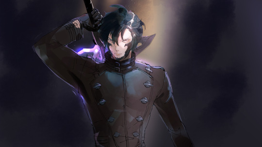
I redid the line art in their separated layers and painted them in according to my colour guide. Below is the finished rendered piece! It is separated into 33 individual parts (excluding the bg and front light beam and effects)

Moving onto Live2D, I slowly rig each part to give me room and flexibility during the animation stage. I only rig what is necessary for the gesture I intend to make him do to save time and effort. There is a total of 29 parameters set up.
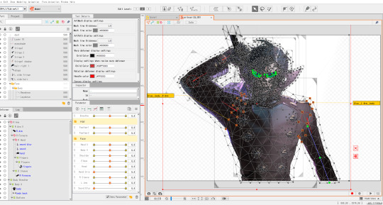
Below is the screenshot of the animation mode in Live2D, where I move the parameters around and keyframe them (as you would in other programs like After Effects) to complete the movement. I don’t use the parameters to the extremes that I rigged them in as it looks unnatural in movement if I do, sometimes the rig has to count for anticipation, squish/stretch, and exaggeration. This animation didn't require as much so it was fairly simple.
I rendered the animation out in MOV (transparent alpha), so that I could import it into After Effects where I added volumetric dust, particle effects, text, noise, chromatic aberration, etc. to complete the whole look. I exported the original background, light beam and glow from my rendered illustration earlier + gave them some tweaks so that it is more cohesive.

And we’re done! Hope this gives some insight to my workflow ^^ I originally made this just so that I have a moving wallpaper for my phone haha
#FFXIV#ffxiv oc#ffxiv aura#ff14 art#ff14 aura#ffxiv wol#ff14#workflow#live2D#live2d animation#my art
15 notes
·
View notes
Note
heres how i do it:
sketch. make it look at clean as humanly possible
skip lineart that bitch is dead 2 me
immediately block out the skin color. figure out the color palette and what hues you wanna use etc
multiply layer - base shading. saves you a shit ton of color mixing
start laying down the darkest shadows while layering yojr highlights. the face is the center of your portrait so spend as much time on it as you want, but dont spend more time on other areas as it will draw away from the importance of the face
use neon or vibrant colors for a pop of color
move on to the hair and clothes. spend an hour minimum on these, really just lay down the base color and then use a contrasting highlight color to really make it stand out
background. i do random shit and it works 👍
sign it and call it a night
here's my art process:
agonize over sketching because the image in my head isn't clear enough and nothing is looking right and the anatomy and everything constantly looks wrong until you successfully produce a few lines and circles
make a more detailed sketch on top
and another refined sketch
suffer over lineart for the next month as you create 5 billion lineart layers and nearly crash your program from how many times you have to use the liquify tool to make anything look right, and then eventually give up and try to pass a sketch off as lineart (while doing this make sure to also agonize over references because you don't use Pinterest and google images sucks and then spend at least half an hour trying to cobble together your own references out of pictures of yourself)
base colors (also take up 5 billion layers)
use a hard(ish) airbrush to render in some soft shadows everywhere
create a multiply layer on top of the entire drawing and fill it with a cool shadow
create several add/color dodge layers and go ham with the lighting
add a background (optional)
save the image as a png and then import it back into your drawing file to add fun blur effects and chromatic aberration (chromatic aberration is crucial to a finished drawing)
add lazy watermark
post
watch your post flop
#if you want screenshots of my art process just look through the 'my art' or 'wip' tags and witness my suffering in real time#ask
7 notes
·
View notes
Text
tlou2 photomode tips
disclaimer: these are just my go-to tricks that i like to use, but that doesn’t necessarily mean they’ll work for everyone! each person has their own taste and style that they have to develop and these are just what i’ve found work best for me
just going through section by section which settings I use. but i just want to note that a lot of the things i keep in mind when taking photos are what i’ve learned through real life photography and through my film major, where i was taught things like composition, lighting, etc. i have general tips i can give about that as well but for now i just thought i’d keep it to the actual settings i use, partly bc this post is already long as fuck
camera
for portraits, set camera roll to 90 (or -90, it’s the exact same just in different directions)
for all my portraits i’ll usually have field of view set all the way to zero and camera zoomed in as far as it’ll go, tho obviously this changes depending on what you want
depth of field
depth of field is one of the most important tools for drawing the eye and keeping your photos less muddled. you can keep your subject in focus while blurring everything else, so your viewer knows exactly what they’re supposed to be looking at
for nearly all my photos i keep DOF intensity at about 70
DOF is also good for creating a mood. for example, if i want really soft, cosy type photos i’ll have really intense DOF (about 80). if i want crisp action photos i’ll have less intense DOF (50-60)
lately i've been doing some experimenting and setting DOF at 100 to try and get some cool effects but again, this all comes down to personal taste. do your own experimenting and find what you like!
display
brightness changes from photo to photo. i started a system where i’ll find a 10-point range where the brightness looks good (ie. 35-45) and then take a photo at every 5 points (so three photos at 35, 40, 45)
again, these numbers aren’t set, i find whatever range looks best for the photo and then choose the best looking one after uploading to my computer
sharpness i usually don’t tamper with
i only use saturation alongside a 50% noir filter, which i’ve explained more below
screen effects
chromatic aberration is usually always the original settings. every now and then i'll amp it up if i think it looks cool but i've very rarely done this. again, all comes down to personal taste
film grain is pretty much always set to zero unless i want to use it for stylistic effect, which is rare
filters
what i do fairly often to get the dark backgrounds i like is to set filter to noir but change intensity to 50. then i’ll go to the display tab and change saturation to 30, sometimes 35 (the numbers aren’t always these tho, you have to eyeball it to find where the skin tones look normal)
this keeps the edges dark but still makes characters look as colorful as normal
noir is probably the filter i use most often, but every now and then i’ll use vintage, blorange, or none.
this is really where you can take my advice with a grain of salt because filters are very much a personal taste option, so find what you like!
vignette
for most of my photos, i have vignette ON but size and intensity are both set to 0. i find it helps even out the photo, so that background isn’t too bright while characters are too dark
if i want a particularly dark background, i’ll sometimes set both to 50. very rarely, if i want a darker background but all 0 is too light and all 50 is too dark, i’ll set size to 75 and intensity to 25.
but again, for nearly all of my photos they’re both set to 0
misc.
to summarize, my most common settings: camera roll 90, DOF intensity 70, multiple shots at different brightness settings, film grain 0, noir 50% with saturation bumped slightly, vignette ON but both settings at 0
your flashlight is your best source of lighting! it’s the only source you can actually control, so it’s especially helpful when photographing NPCs. shine your flashlight in their face and harass them!! i use the very edge of the light bc the center is often too bright and leaves a weird ring of light on their face
sometimes using the NPC’s flashlight as a source of light for your main character is also helpful, but it’s definitely harder, since obviously you can’t control them. just something to keep in mind
besides the flashlight, other in game objects can help to make cool effects as well. in this set i posted recently i used smoke bombs to make a more solid backdrop. they also help to emphasize light rays so i want to experiment with it more lol
most important thing to note is that i take a SHIT TON of photos. i’m guessing for every one i post there’s ten i don’t. the reason for this is, the graphics on your tv are gonna be set to different formats than your computer or phone, so your photos won’t look the same on each device. i always choose photos based on how good they look on my phone, because i figure that’s what most people will see them on. so if you’re like me and you don’t have / can’t afford good photo editing software, the best way to account for what looks best is to take a bunch of the same photo but on different settings and then compare on a separate device
i pretty much don’t make any edits outside of photomode save for cropping photos, but even then i've been trying to do that less. very rarely i'll make some brightness adjustments if they turn out too dark on my computer, but i try to avoid that as much as possible
i seriously can’t stress this enough, but just have patience and keep trying! the worst thing i always do is get all in my head about which posts were successful and whether or not people like my photos, but honestly? just ignore it and photograph what YOU like. art is an inherently selfish hobby. don’t let anything discourage you, just post what you like and keep trying to improve!
i tried to keep this limited to my general settings, but again, it changes with every shot. if y’all want to ask more specific questions about specific shots or whatever please feel free! or if you just want to ask general questions that's cool too! i'm always happy to help :)
#seriously tho don’t hesitate to ask more i promise i’m nice#all of my photomode improvement came from other photographers who were nice enough to share their own tips so i just want to pay it forward#tlou2 photomode#also i am SO sorry about the length it really got away from me#told y’all i overexplain :/#my posts
37 notes
·
View notes
Text
Illusion - post production
21 February 2021
I optimised images few days ago in Adobe Bridge and chose two the best shots of my objects. I made general adjustments and then opened them in Photoshop.
Object 1 - noose/knot
Before & after, maybe is not much difference visible on small size but I was working on 100% zoom to see all details and that was so much chromatic aberration to correct And I done this by thick remove chromatic aberration in the profile correction at optics in edit panel and also I adjusted manually using pipet.


Object 2 - USB cable

I decided to open USB cable image first in Photoshop. I used magnetic lasso tool to select object then clicked on select and mask and used refine edge tool and I got grid visible so I could see better the object along the lines when masking. When I was happy with selection, in output settings I chose New Layer with Layer Mask and I saved file as psd document, just in case of Photoshop freeze, as I experienced before and I had to make all the selection over again.


I made the same steps to select other object, but it was more difficult because of texture of the cord with a lot tiny outstanding bits. When I was using refine hair tool Photoshop got freeze. It happened to me every time I use this tool! I couldn’t even save it on that stage and I had to select and mask again several times. Finally, I managed to mask the object using refine edge tool.


I opened new document A4 in landscape format in Photoshop and chose black colour as background then I dragged layer of USB cable and layer of knot into this background. Using move tool I adjusted position and size of both layers. I used selected type of brush and black colour to conceal unwanted areas of each layer. When I was happy with them I started to use clone tool to merge the cord with USB cable and I worked alternately on the layers. Then I put them in group as I wanted to add shadow to both of them at the same time. I wanted to drop some shadow to give a depth and more dimensional look to my Illusion image, but I couldn’t see much on black background, so I change colour to grey. I paint layers with black so there was nothing left apart of my objects as they appeared as tiny shadows on the image. I changed shadow adjustments and then change the background colour back to black and I applied gradient tool because I wanted to create a darker mood.


Final image

Update
I opened psd file of my Illusion image and I added new adjustment layer to the ready layer group. I adjusted hue of green +100 more on magenta tone to take the green tones off from the reflection on the USB cable. I added another layer, blank one, to the layer group and I used clone stamp to get better blending between cord and USB cable and I used eraser tool to restore that part of a layer that I added to much of clone stamp. I reduced opacity of clone stamp respectively to get smoother transition.


Final result option 1

Final result option 2

5 notes
·
View notes
Text
What's Next For ON1 Photo RAW?
I have been meaning to write this post ever since Dan Harlacher over at ON1 posted a roadmap update for ON1 Photo RAW. I know Dan. He truly cares about ON1 customers and photographers in general. In fact that's true of everyone I've ever met at ON1 - past and present. End of statement. No questions. No qualifiers.
If you haven't read Dan's post yet, go check it out. I'll wait until you get back. :-) If you have, let's dig in.
There are several features I'm crazy-excited for coming in Photo RAW. And I'll get to those. Before I do, I want to highlight something else - Dan's candor. I really appreciate Dan being up front that the initial roadmap for Photo RAW was aggressive. The planned features took longer to release than anticipated. He doesn't dance around the topic. Dan owns it. That's integrity right there, folks. Photo RAW was a massive undertaking, no doubt. ON1 has learned from the experience. The software is only a few months old and has been updated several times. The 2017.1 release is nothing but stable for me and I'm eager for more.
So let's talk upcoming features! There are three at the center of my radar screen - and they are all planned for the end of May/early June 2017.
1. Lens Correction
Finally! I lived for a RAW editor that did not have lens corrections for years (Aperture, I loved you, but this was sorely lacking). The next update to Photo RAW will "automatically detect your lens and reduce distortion, chromatic aberration and peripheral fall-off". Huge. Huge Huge. I know this feature took top billing on the Photo RAW Project. Thanks for listening, ON1.
2. Improved Preset Management
This might not be one of the sexier features, however it's high on my list. I'm kind of an organizational freak, so this is right in my wheelhouse. Soon "you will be able to delete and rename preset categories as well as export categories for sharing and back-up". I really need this. Since I create ON1 preset packs often, I have a bunch of crufty temporary categories lying around. I'm in need of some serious cleanup. And a category export will be welcomed, too. This will make it easier to setup secondary systems and quickly get presets from one machine to another.
3. Clone Stamp in Develop & Effects
Yes!!!! ON1's clone stamp is my go-to cloning tool. The next update will bring "the powerful clone stamp retouching tool from Layers inside of Develop and Effects as part of the non-destructive workflow". Clone stamp part of the non-destructive workflow... awesome. Saving me a round trip through layers just for clone stamp work... double awesome. This will cross off one of the reasons I use Layers vs. Develop & Effects.
There are many other features coming, too. Compare Mode will be an excellent add, especially for wedding and portrait shooters. Improved searching in Browse is welcomed, too. I'll be exploring that in more depth.
Toward the end of the roadmap update, Dan shares this: "Looking even further ahead, we will be focusing on Layers and our plans are to bring it into the non-destructive editing workflow." Pause. Think about this for a moment. RAW, non-destructive layered workflow. Smart photos are useful, but have limits. True, non-destructive edits with layers... this is massive. I don't expect this type of feature to be in a dot release. Yet it tells me ON1 is clearly on the right path.
0 notes
Text
Canon Eos 6D Most effective Camera

The EOS 6D DSLR camera could be the ideal tool for unlocking your inventive vision. It capabilities a 20.2 Megapixel Full-Frame CMOS sensor, a wide ISO variety of 100-25600, expandable to L: 50, H1: 51200, and H2: 102400, for incredible image top quality even in low light, and a DIGIC 5+ Image Processor delivers enhanced noise reduction and exceptional processing speed. A brand new 11-point AF like a high-precision center cross-type AF point with EV -3 sensitivity makes it possible for focusing in intense low-light conditions, and with continuous shooting as much as 4.five fps, you are ready to capture rapid action. Full HD video with manual exposure handle, various frame rates, and the rewards of a Full-Frame sensor delivers amazing efficiency and inventive flexibility. The built-in Wi-Fi® transmitter permits you to wirelessly transfer your photos to social networking web sites by way of CANON iMAGE GATEWAY#, or upload practically anyplace out of your iOS or Android smartphone* using the no cost download of your Camera Connect app**. It is possible to use your smartphone for remote camera handle and operation (using the Camera Connect app), and even print your images on a Wi-Fi® compatible printer^. Fantastic for travel and nature photography, the built-in GPS## makes it possible for location data to become recorded even though shooting. Compact, lightweight, brilliant low-light performance, and loaded with uncomplicated to use capabilities, the EOS 6D is definitely the Full-Frame DSLR camera for everyone.
Canon eos 6d feature
DIGIC 5+ Image Processor for enhanced noise reduction and exceptional processing speed
For any complete new degree of performance, the EOS 6D makes use of a DIGIC 5+ Image Processor. Operating with two 4-channel A/D converter front-end processing circuits, and delivering speeds of up to 4.5 fps (RAW + JPEG), the DIGIC 5+ Image Processor improves information processing efficiency and attributes new algorithms that market higher noise reduction at higher ISOs. Along with conventional image processing functions, the DIGIC 5+ Image Processor provides real-time compensation for chromatic aberration in both still and motion photos. With the energy of this processor, speed improvements are noticeable in the immediate the camera is turned on plus the amazing final results speak for themselves.
DIGIC 5+ Image Processor for enhanced noise reduction and exceptional processing speed
For any whole new level of efficiency, the EOS 6D utilizes a DIGIC 5+ Image Processor. Working with two 4-channel A/D converter front-end processing circuits, and delivering speeds of as much as 4.5 fps (RAW + JPEG), the DIGIC 5+ Image Processor improves data processing performance and options new algorithms that market greater noise reduction at greater ISOs. As well as conventional image processing functions, the DIGIC 5+ Image Processor offers real-time compensation for chromatic aberration in both still and motion photos. Using the energy of this processor, speed improvements are noticeable from the immediate the camera is turned on plus the gorgeous final results speak for themselves.
Newly designed 20.two Megapixel Full-Frame CMOS sensor
The EOS 6D characteristics a newly created Canon Full-Frame 20.two Megapixel CMOS sensor for higher resolution, perfectly detailed images delivered with outstanding speed and performance. A 35.8mm x 23.9mm sensor captures photos of 5472 x 3648 pixels having a pixel size of 6.55 µm square for superb detail and a superior signal-to-noise ratio, resulting in terrific images from the start off. With no conversion issue, the EOS 6D's sensor guarantees that lenses mounted around the camera will provide exactly the same angle of view they would on a classic 35mm camera. Functioning in tandem with all the EOS 6D's DIGIC 5+ Image Processor, the sensor containing a new photodiode structure delivers ISO sensitivities of 100-25600 (with expanded sensitivities of L: 50, H1: 51200, H2: 102400) and may shoot at as much as 4.5 frames per second. Wrapped up within the EOS 6D's compact and lightweight physique, photography with a full-frame sensor has in no way been so uncomplicated and so portable.
Canon Eos 6D assessment
Review by cave dweller- Great camera just lacking several important attributes
I've been shooting canon my entire life. Shot having a 1dsmkii for many years. Purchased the canon 6D following I had a Sony junk on me. In my opinion it really is one of the very best cameras funds can obtain. But it lacks a number of key attributes. A more sophisticated AF technique. I imply 9 points genuinely? I really feel like I'm shooting with a t5. Also continuous AF in video. I would've gladly paid 200-400 extra to get no less than 12-15 af points and continuous AF in video. Now for the very good stuff. Low light; great functionality. All round image excellent and color rendering, completely mind numbingly superior. But be warned, this really is not a speedy camera. Don't purchase with all the intentions of shooting sports or rapid paced objects. That is no speed demon. But if your subjects are largely static or that you are into performing portraits/weddings by all implies it is fantastic. I also are likely to lean more towards it since I shot film for many years and also though it's quite primitive in options, it really brings you back property for anyone who is utilized to shooting film.
read canon 6d review below
Evaluation by lukesbeach- Most effective I've ever owned
I wanted a complete frame camera for a host of reasons. As an expert photographer I do beach photography of families, pets and young children. BUT, my accurate adore is wildlife and BIFs. Panning birds is tough operate, but I obtain I get much more usable shots then ever before with this lightweight camera (paired with Canon's 400mm Prime lens). Buy it. Save some cash. Your shots will likely be of expert level.
to get detail information visit: http://www.canon6dreview.com/
0 notes
Text
Basic Portrait Post-Processing Workflow Tips to Help You Save Time and Stay Organized
This article will walk you through some tips for how to set up a basic portrait post-processing workflow that can help you save time and stay organized.
The problem
When you’re new to photography, everything is exciting. Every time you come home with a full memory card, it’s a mad rush to the computer to see what you have captured. You’re eager to see every image and each one is treated as a separate entity with every technique you’ve come across. This is great. That excitement is what will keep you moving forward with photography and it is how you rapidly learn and grow as a photographer. That’s how it was with me, at any rate.
What happens, however, as you start taking more and more images? For example, regular portrait sessions a couple times a week can lead to an overwhelming amount of photographs. Approaching every frame as an individual becomes time-consuming and inefficient. If you’re not careful, you’ll have a backlog of images going back months and months. Often, many of your photos will be forgotten at the wayside.
The solution to this problem is to develop a portrait post-processing workflow.
Defining workflow
Straight out of the camera before any adjustments in Lightroom or Photoshop.
After portrait post-processing workflow steps in this article were applied.
In the simplest terms possible, a workflow is a checklist of repeatable actions that you work through as you go through a task. If it helps, in business the equivalent be would systems and in manufacturing, it could be compared to an assembly line.
You can have a workflow for any part of the photographic process, from planning and coordinating sessions to setting up and tearing down equipment and finally the post-processing stage.
This article will outline the steps of the post-processing workflow that I’ve been using on my portraits for a few years.
Starting point
Because every photographer has their own way of importing, organizing and editing their images in Lightroom (and other software), this article starts at the beginning of the post-processing stage for individual images. It assumes you will have already imported your photos into Lightroom and you have already edited (culled) down to the keepers.
Lightroom
This workflow uses both Adobe Lightroom and Photoshop. Each program offers its own strengths. To take advantage of them, consider using both with the Adobe Photographer membership – get 20% off (only $7.99/month) by using this link only for dPS readers.
Color corrections
The first step is to conduct any color corrections to your image. I do this in one of two ways. The first involves a ColorChecker Passport. If you don’t have one, just skip past it (or purchase one here on Amazon.com and follow along).
Xrite ColorChecker Passport
googletag.cmd.push(function() { ruleset_slots.push( googletag.defineSlot( “/1005424/_dPSv5topic-rhs(300×250)”, [300, 250], “pb-ad-0” ).addService( googletag.pubads() ) ); } );
In your Lightroom catalog, find the photo you took with the ColorChecker Passport in it. Go to File>Export and export the image as a DNG to a folder where you can find it.
To work in the ColorChecker Passports proprietary software, you need to export your image as a DNG.
Now open the software that came with your Xrite ColorChecker Passport, and import the DNG you just exported into it.
The software does a pretty good job of aligning the photo to the ColorChecker, but if it fails, just follow the instructions on the screen.
The Xrite ColorChecker Passport’s software allows you to create custom color profile unique to each lighting setup.
Press the Create Profile button and give it a name that has something to do with the images you are going to be working on. For example, if you’re working on portraits of Jane Doe in a wedding dress which you took on April 15th of 2017, you could name the profile: JaneDoeWeddingDress041517. That’s optional, of course, but it will help you should you decide to revisit these photos in six months time.
Now, reopen Lightroom, find the image of the ColorChecker Passport, and open it in the Develop Module. Scroll down the panels on the right until you find the Calibration tab.
At the top, there will be the word Profile followed by Adobe Standard. Click there and choose the profile name that you just made in the external software (in the example below I called it “PortraitWorkflow”.
Once created and imported into Lightroom, color profiles can be returned to at any point in the future.
This process has built a custom color profile, individual to the lighting present in the scene. This is a vital step if you want to get the most accurate colors in your photographs.
White balance with the ColorChecker Passport
In the right-hand panel, scroll back up to the top basic panel. Select the eyedropper. To correct the white balance in your image, click in any of the white or gray boxes on the ColorChecker in your image. That will correct your white balance automatically. Each box will have a different effect on your images, so feel free to go through them all to see which works best, or which you prefer.
Any of the white and gray squares can be used to set your white balance. They all have different effects, so experiment until you’re happy.
Press CTRL/CMD+Shift+C and in the dialog box click the Check None box. Tick off only the boxes for Calibration and White Balance, and then click Copy.
Setting the color profile and white balance to an entire set of images at once can save you heaps of time.
With your settings copied, you can go back to the Library Module and select all of the photos that you want these settings applied to. Select them and press CTRL/CMD+Shift+V to do this.
Make sure you deselect the group of images afterwards by pressing CTRL/CMD+D.
White balance in Lightroom
If you don’t have a ColorChecker Passport, you can set your white balance manually by using the eyedropper (click on something neutral in the image) and sliders at the top of the Basic tab. Once you’re done, you can copy and paste the settings to the other images in your set as described above.
To adjust white balance manually, use the eyedropper and sliders at the top of the Basic panel.
Lens Corrections
The next step is to find the Lens Corrections tab and click both the Enable Profile Corrections box and the Remove Chromatic Aberration box.
Enabling lens corrections will correct any distortion, vignetting and chromatic aberrations in your images.
Doing this will correct any distortion caused by your lenses and it will usually deal with any chromatic aberrations. It’s a simple step, but it can make a world of difference to your final images.
Before you move on, however, always zoom in and move around your image looking for any chromatic aberrations (look at the edges of the image) the software failed to correct. It’s usually very good, but sometimes it will fail in tricky lighting situations where there’s a lot of backlighting. For portraits, pay close attention to catch lights in the eyes. If you find any chromatic aberrations there, simply go to the Manual section of the Lens Correction tab, choose the eyedropper and click into any color halos that you find.
Basic Adjustments
For portraits, I try to keep my basic adjustments at this stage to a minimum. I will use the exposure slider as needed, the White and Black sliders minimally, keep the Clarity slider between +15 and -15, and often reduce the Vibrance to -10.
googletag.cmd.push(function() { ruleset_slots.push( googletag.defineSlot( “/1005424/_dPSv5topic-rhs(300×250)”, [300, 250], “pb-ad-1” ).addService( googletag.pubads() ) ); } );
For more natural portraits, keep your adjustments subtle.
The reason for keeping these adjustments minimal is that they are global adjustments (apply to the entire image). I prefer to work with local adjustments in Photoshop, which give you much more control over the image. But, it is also possible to do local adjustments in Lightroom using the Adjustment Brush, Radial Filter and Graduated Filter if you would prefer.
Client proofs
NOTE: When working on proofs to send to clients so they can make their final image selections, this is where I usually stop. There is little need to spend up to an hour retouching a photo that will never see the light of day. Colour corrections and maybe a few small contrast adjustments are almost always enough at this point.
Black and White (optional)
If you intend to work in black and white and you like doing your conversions in Lightroom, this is the stage where I do the conversion process using the black and white sliders.
If you intend or prefer to do your conversion in Photoshop, then skip this part and make it the first step once your image is opened inside Photoshop.
Export
With the Raw processing complete, it’s time to export (or open) your image into Photoshop. Press CTRL/CMC+Shift+E to bring up the Export dialogue box. Choose a location and name appropriate to your own organizational system and export the image as a TIF or PSD (either of those formats will retain all your layers when you save your work). Close Lightroom and open your image in Photoshop.
NOTE: Alternatively you can open your RAW file directly from Lightroom into Photoshop by right-clicking the image and selecting: Edit In > Edit in Adobe Photoshop – OR – Edit In > Open as Smart Object in Photoshop.
Photoshop
Blemishes
The first step of this workflow in Photoshop is to remove temporary blemishes from your subject’s skin. Create a new empty layer by pressing CTRL/CMD+Shift+N and pressing OK.
You can use either the Spot Healing Brush Tool or the Healing Brush Tool, or a combination of both. Once you’ve selected your tool, ensure that the All Layers option is selected in the drop-down menu labeled Sample. Also, ensure that you are working on the new empty layer (you just created above) in order to keep things non-destructive.
While using the healing brushes, zoom in to at least 200% on your image and use a brush that is only slightly larger than the blemish you are trying to remove. If you are using the Healing Brush tool, take a new sample after every click by pressing Alt/Option+Click to ensure the best results.
How far you go is going to be a matter of personal preference. I like to limit this step to only temporary blemishes and leave scars and beauty marks unless I’m asked to remove them by the subject.
Before blemish removal.
After blemish removal.
Note: It is possible to remove blemishes in Lightroom, but it is a time consuming and awkward process compared to Photoshop in my opinion. If Lightroom works better for you, go ahead and use it.
Color casts
Although we already covered color corrections in the first step, I like to revisit it at this stage. For example, in this image, the background is still too warm for my taste. Create a new Hue/Saturation adjustment layer.
In the Properties tab, find the icon that looks like a pointing hand. Click it and then find a place in the image you want to adjust the colors. In this image, it’s in the background.
With the pointer selected, click into any area of a colour cast you want to change.
Now adjust the sliders in the Hue/Saturation Layer until it has the desired effect on the color you are trying to change.
In this image, the background and the subject shared a lot of the same warmth. To keep them separate, use a layer mask. Click into the layer mask on your Hue/Saturation layer and press CTRL/CMD+I to invert it (hide all).
googletag.cmd.push(function() { ruleset_slots.push( googletag.defineSlot( “/1005424/_dPSv5topic-rhs(300×250)”, [300, 250], “pb-ad-2” ).addService( googletag.pubads() ) ); } );
Now select the Brush tool (B) and set your foreground color to white and your opacity and flow to 100%. Paint into the areas (on the mask not the layer) you want to be affected by your Hue/Saturation layer. If you mess up, just switch your foreground color to black and paint over the mistake.
Before Hue/Saturation Adjustments
After Hue/Saturation Adjustments
Dodging and burning
The next step is to deal with contrast. Instead of using the contrast sliders at the raw processing stage, it is best to use a technique like dodging and burning for small, local adjustments to get the most control over your images. There are a lot of different methods for dodging and burning, but I prefer the gray layer method.
By using multiple layers, you can obtain really fine control over the contrast and the tones in specific parts of your image with little effort. For example, you can have a set of layers for skin tones, another set for the clothes, a set for hair, and another set for eyes all independently adjusted. You can learn how to dodge and burn here.
Before dodging and burning.
After dodging and burning.
High Pass Filter
The last step of my workflow before saving is to use a High Pass filter to sharpen things up a bit. To use the High Pass filter, merge all of your existing layers into a new one by pressing CTRL/CMD+alt+Shift+E. Zoom into 100%, select the layer that was just created, and go to Filter>Other> High Pass.
As long as you are working with a high-resolution file, set the radius between two and five. If you’re working with a smaller file, move the slider to the left until the preview image looks like a faint outline of your original image (as seen below). Press OK.
It’s pretty easy to go overboard with the High Pass filter. Try to keep it as subtle as possible.
On the Layer Palette, change the blending mode to Soft Light or Overlay. This is more personal preference than anything, but Overlay will give a far more pronounced effect than Soft Light. I prefer Soft Light for portraits and Overlay for other subjects. The last step is to reduce the opacity of the High Pass layer. Zoom into 100% and move the opacity slider to the left until you can barely see the effect.
Use either the Soft Light or Overlay blending modes for your High Pass layer. Soft Light will be more subtle, while Overlay will be more pronounced.
Saving your image
When the image is finished it’s time to save it. This will different for everyone depending on your own organizational system, but I prefer to save files as 16-bit TIFFs with layers intact. Doing this means that you can go back and adjust any part post-processing at any time. It also means you can go back to your full resolution file at any time to create smaller images for web use and the like without potentially losing them. The downside to this is that 16-bit TIFF files can get very large and they do take up a fair amount of hard drive space, but to me, the peace of mind is worth it.
In the end
Straight out of the camera and before any adjustments in Lightroom and Photoshop.
After adjustments and retouching in Lightroom and Photoshop.
The amount of time it takes to get through this workflow varies from image to image. Some photos take five minutes, others take closer to an hour. Overall, having a workflow like this will save you countless hours of work. Knowing exactly what steps you’re going to take before you sit down removes a lot of guesswork and saves time. This is invaluable when you start doing sessions a couple times a week.
Obviously, this exact workflow may not be for you. However, I encourage giving it a try and then developing your own workflow that fits in with your style and existing skills.
googletag.cmd.push(function() { ruleset_slots.push( googletag.defineSlot( “/1005424/_dPSv5topic-rhs(300×250)”, [300, 250], “pb-ad-3” ).addService( googletag.pubads() ) ); } );
The post Basic Portrait Post-Processing Workflow Tips to Help You Save Time and Stay Organized by John McIntire appeared first on Digital Photography School.
from Digital Photography School https://digital-photography-school.com/portrait-post-processing-workflow-tips/
0 notes
Text
Lost & found - post production
8 March 2021
I opened images in Camera Raw for basic edition. I used auto correct button and adjusted sliders to my own taste. I clicked auto correction on geometry to straighten the image of building and I removed chromatic aberration. I adjusted white balance and then I opened the mage in Photoshop as background. I did the same adjustments on image of gargoyle and I opened in Photoshop couple of images as a stack, because I wanted to combine few layers on gargoyle to create one and then I selected subject using pen tool, saved path and dragged image with mask layers into background layer of building image. It was not easy to use pen tool for me without mouse. I don’t remember how long it has taken me, something about 40 minutes up to 1 hour just for selection and the post production in total approximately 3 hours.


I added two adjusting layers to correct colour balance and hue to get similar tone of red on gargoyle figure as was on the building. I added a layer with gradient tool and I chose blue gradient colour so I could match colours between roof illumination and gargoyle figure. I used eraser tool to remove blue gradient from areas I wanted to remain red. I also added new layer filled with 50% grey and used burn tool to darken outline of gargoyle and make it look dimensional.


I added another layer, filled with 50% grey and changed opacity into overlay. I dragged it down and put it above the background layer, then I used dodge tool on the sky around gargoyle to cut him out of background a little bit. I saved image as photoshop file psd. I got back to the image at some point to refine the details. I clicked on vector mask thumbnail and set the feather at 1.5 px so the outline of gargoyle figure got softer edges.


Image done - Gargoyle on Kelvingrove

4 notes
·
View notes