#but sketching is actually really fun c:
Explore tagged Tumblr posts
Text
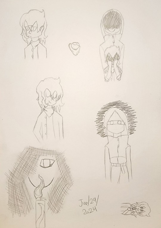
Did you guys know??? That you can just???? Draw????
Anyways, Smacks Riley and Smacks Boss :D
Also, did you know??? Riley hair is so fun to draw???? And Smacks Boss's coat is also very fun to draw????
And one last thing:
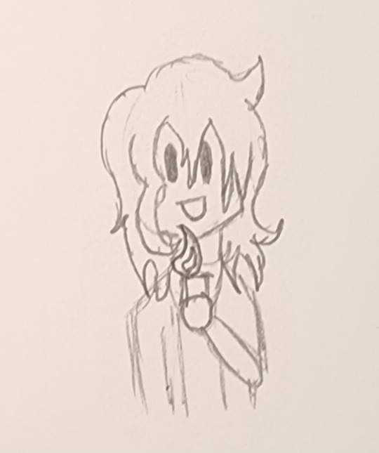
:D
#hi :3#I am still very tired and lack motivation to do stuff#but hey!!!#i remembered that you can just draw!!!#I love sketching tbh#lining is annoying and by the time I get to coloring I feel like I HAVE TO finish it#but sketching is actually really fun c:#I should do this more often#anyways... Riley :D#not exactly a hero#not exactly a hero au#neah riley#neah
2 notes
·
View notes
Text
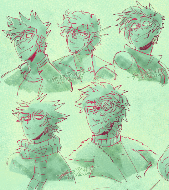

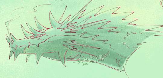
Whole gang's here :]
#first thing im able to actually sit down and draw in two months barring some color tests i did for talas and hades#if my kids are the thing that pulls me out of artblock again im gonna laugh sooo fucking hard dudes lmao#anyway god i love these guys so much. i really do#windyart#extinction#alex#riptide#c#danger#ethan#orion#its been SOOOO LONGGG since i drew danger too god damn but i love them so muhc too i missed em#tbh i missed all these guys a LOT you cant even imagine. the shame of the comic was just weighing so harshly on my shoulders#i think now if i accept im not gonna go back to it for my own wellbeing i actually can have fun with these guys again#also im trying to do diff things with the colors and textures on sketches!! i be experimanting 👍#not quite what i had in mind but its enough for now!#i may be emotional a little bit ough ough ough
281 notes
·
View notes
Text
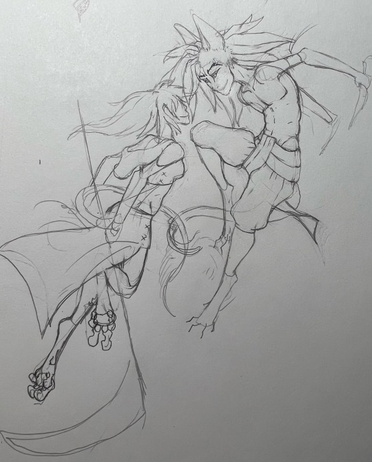
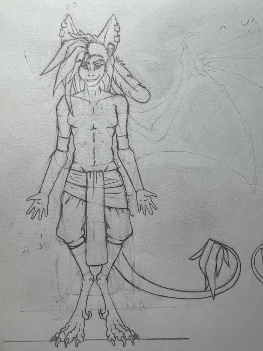
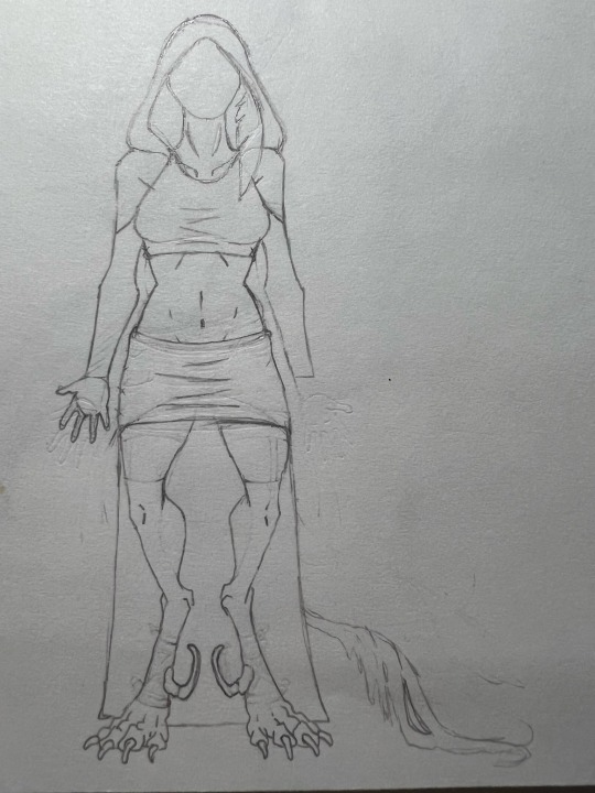
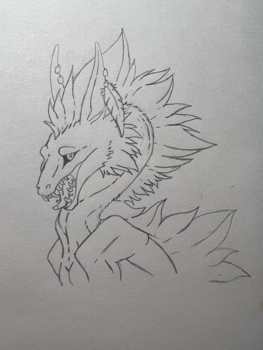
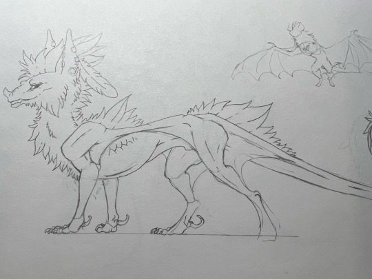
Sketchy dump!
Trying to get better at drawing humans/humanoid creatures by sketching shippy art of my two ocs. Bonus- updated ref sheet wips :P
This is Sky-Shifter (left, bottom) and Night-Stalker (right, top) two of the main characters from the webcomic I want to eventually do. They’re both half-demons, hence the human and feral forms.
Humanoid forms above, feral below.
I’m a messy sketcher, I’m sorry guys Dx
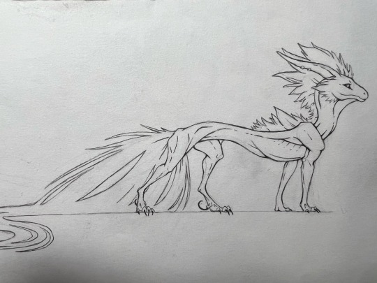
#sky-shifter is my sona c:#these are the two I ramble about occasionally- though I don’t think I’ve talked about them in a while#half-demons are pretty common in my head world but these two are the only ones belonging to the element of air#Aerythiia is like primarily an air elemental world#and mortals tend to distrust half-demons and stronger beings see them as weak#so air half-demons tend to be ruthlessly hunted#also!!! half-demons have this bond where they’re drawn to other half-demons- but especially those of their same element#it doesn’t necessary mean if you put two half-demons of the same element together that they’re gonna end up together#but it happens more often than not#hence me drawing shippy art of them 😏#idk why I didn’t think of using them like this to practice sooner#humans arent exactly my comfort zone but I’m a sucker for these two so uh I guess there’s gonna be more shippy sketches#I’m having too much fun#ironically enough these two actually kind of don’t really get along when they first meet#but they wind up together by the end of the story#anyways prepare for more low quality sketches XD#I ain’t gonna get better unless I practice but I’m struggling right now#but I cracked the fucking code to get me to draw humans finally#gIRL HELP I HATE DRAWING CLOTHING BUT I WANNA DRAW SHIPPY SHIT#I really need to get my art tumblr up and going cause this is my nonsense tumblr#I’m so good at procrastinating#haters to lovers slow burn- both in terms of their relationship and me getting better at drawing humans :P
4 notes
·
View notes
Text


Scout & Scout & Scout & Scout & Scout-
Some chaotic sketch pages. They're very different for being a ctrl+c ctrl+v of the same guy. Uhh brief related headcanon stuff below.
BLU:
- Goes by Jerm instead of Jeremy. He's actually not the clone, so he has a childhood nickname (and, well, a childhood).
- Has a cat named Minnie that he shares a tiny apartment with when off base. She was a street cat that he rescued. "A street cat, kinda like me..."
- Self harmed as a teen, even with a huge support system life was hard. Was struggling with undiagnosed ADHD and depression.
- He's furious about his father leaving, and he has a lot of angry panic attacks about his fear of abandonment.
- Briefly was in the military, like two of his older brothers. But the offer from Mann Co. was much better. Now he just has a special interest in military history, and he gets to kill anyone he wants.
- Dorky 70s workout gear makes him feel confident when he's running. Exercises a lot and doesn't eat a lot outside of bland protein meals.
- Smokes, I mean it's the 60s/70s, everyone's smoking like chimneys. It makes him cough when running, but he doesn't care.
- Gets a lot of piercings for fun, despite the taboo of it at the time. A safer way to feel some pain if he's upset.
RED:
- Thinks the name Jeremy is dorky, so he introduced himself as only 'Scout' until his thirties.
- A little in the drug scene, likes stimulants. Doesn't understand why they make him tired. Really big on cocaine, it calms him down and he feels like it helps his performance in battle. Spaces out on the floor of his room in base, sometimes for hours.
- Huge on NYC pizza (thanks to Ma's influence) and insists it's the only good pizza. Gets in fights with other team members about this regularly.
- Covers himself in bandages even if he's not wounded. It makes him feel like a kid, in a way. He has vague memories of frequent injuries as a kid, but they fade before he can process them.
- Taught himself a tiny bit of kickboxing "to be like a cool action movie character."
#tf2#team fortress 2#scout tf2#tf2 scout#blu scout#red scout#tf2 fanart#tf2 blu scout#tf2 red scout#scout#fanart#digital art#eyestrain tw#eyestrain#bright colours#drugs tw
65 notes
·
View notes
Text
so naturally i was up at 1am the other night watching tdp related youtube videos and i figured i'd watch the 2020 comic con panel since it'd been a while and oh my god some of this shit
(also just me talking about how much i love this cast)
"IT IS I, DARK_MAGE_DAD420" i cannot believe that is real
aaravos: "if i want to do a screen call, i must perform a cosmic blood ritual. with a mortar and pestle. AND FLOATING KNIVES" you are fucking kidding me (edit: i realize that pertains to what he did in s2 but still like "cosmic" "ritual" "knives"? cmon)
jason simpson playing the ukulele. that's all.
jack: *talking about how he had a baby in quarantine* eric: i've been doing a lot of gardening... uh i haven't had a baby, but you never know! i mean if it's possible through social distancing aaron: if anybody can make that happen through social distancing it's aaravos you are F U C K I N G KIDDING ME
racquel: some fun things i did- i uhh died my own hair and burned my scalp and i would like to inform you all it's finally healed and we're good to go, i'm ready to do it again! i'm obsessed with the fact that racquel is quite literally claudia irl
the ttm read is awesome. jack came with the Rayla Voice fucking PREPARED oh my god
i don't think i've ever actually talked about the dnd sketch but it is one of my favorite things in the entire world
rayllum in this sketch is amazing particularly callum he is SO down bad like "my character is a mysterious elf assassin with two beautiful blades to match my two beautiful eyes~~ ✨" like hello that's canon idc if it's a sketch that is canon
"my character cannot help but look at her. he locks eyes with rayla's mage" "....there will be time for roleplaying later" HELLO THATS GOLD
viren in this skit is genuinely one of the funniest things i've ever seen. i cannot emphasize enough this is comedy
necromancer ezran. i think about him daily.
s: "i start swinging my sword at, uhh, idk, rayla's mage" r: "WAIT WHAT" c: "uh wait wait i take it back MY SWORDS GLEAM INTO THE LIGHT AS I LEAP TO THE DEFENCE OF THE BEAUTIFUL MAGE!" s: "hey no takebacks!" sibling ass fight i love them
"LIKE WHAT DO YOU ACTUALLY DO?"
i rolled a 1 😐
i loot their corpses for blood >:D
"do elves have four toes?" "i always assumed that they would have 6 so they could learn how to count to 20" paula my love
someone get sasha some hamantaschen
i don't need arc 3 actually i just need the beta script including as many guns n roses references as possible
racquel: ok call me crazy, call me crazy... jesse: you're crazy, racquel racquel: THANK YOU FINALLY they are literally just them
"I WILL NOT BE POSTING A SINGLE THING ABOUT ICE, FOR I AM JULIA" (okay but.... venous frigoris anyone?)
paula: ugh, no one likes soren jesse: well no one likes rayla racquel: you two should fight 😈
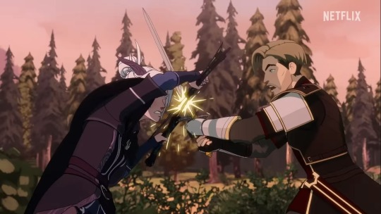
long hard sigh
bonus: jason: literally no one likes viren so let's move on
"how old is bait?" "sasha, how old do you think bait is?" "3."
"is-is a glow toad kinda like a toad?" "................kind of"
i fucking love sasha have i ever mentioned that i fucking love sasha
"i think that he's 56." "either 3 or 56 only, apparently"
the saga announcement is great i love how everyone's is so excited they don't even know all of their characters are about to be destroyed physically and emotionally
the way aaron says it so fucking funny "is there gonna be a season 4?" "uh so i think it's really important to emphasize: yes-"
"i too want to cry" "just cry, just-" "IT'S A PANDEMIC. NO TEARS. THERE'S NO CRYING IN A PANDEMIC." "...where is this rule coming from?"
and finally there were a handful of moments that i could not do justice by transcribing in a post so here is a masterfully edited compilation i made
#i think no matter how similar a va's speaking voice is to their character that there's always at the very least *some* differentiation#even when it's just the tone/cadence that makes things distinct#but jesse just talks EXACTLY like soren in every way and it's so trippy#tdpo#tdp#the dragon prince#continuethesaga#giveusthesaga
79 notes
·
View notes
Note
hello !!! i just wanted to say i love love love your art it is so delicious .... i am obsessed with your au it occupies my brain a normal amount . your art is a big inspiration to me you are so very skilled and i love your use of color and how you communicate your ideas so effectively . i only recently (a few months ago) found your au and i actually came to ask how long youve been working on it ? it is so fleshed out and i admire how you tell your stories , i hope i can get to that level someday . have a lovely day and thank you for creating !! sorry for the ramblings .
Thank you so much for the sweet words!! 🤍Always so happy to hear people enjoy the stuff I do!!
Just went back to check when I started and it's a little hazy. I made some first sketches in 2019-


but really deciding this is gonna be an AU with writing headcanons down so I don't forget (cause they were piling up in my head haha) started in 2023! So two years would be my answer :)
It's really fun to see the comparison between my 2019 art and recent art cause I see how much the characters and I changed and how much the lore thickend >:)c


Recently cleaned and sorted my Notion again and holy shit there's is so much stuff in there.......
48 notes
·
View notes
Text
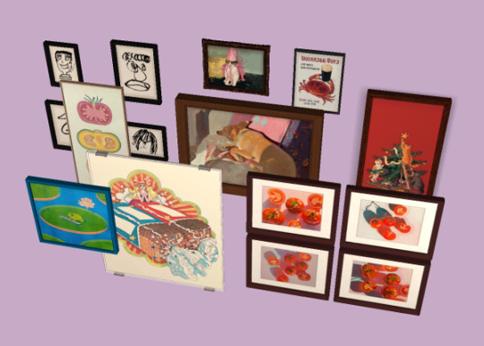
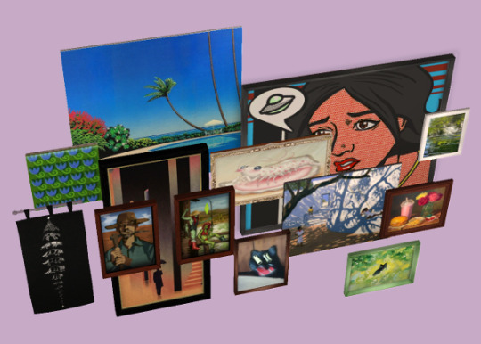
Stocking Stuffer 1/5: A Bajillion Random Painting Recolours
Happy Holidays to all! While I'm proud that last year I finally managed to achieve a longtime goal of sharing a full TS2 Advent Calendar, I'm simply not gonna be able to pull it off this year. Nonetheless, the holidlay spirit has encouraged me to finish up and share a couple of things before the end of the year! I'll be sharing five little gifts over the next few arbitrary days. First up: A BUNCH of Maxis painting recolours.
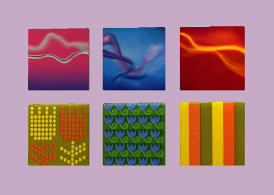
One recolour each of A/B/C Stroke (yes, I still enjoy playing with these as three separate paintings) using vintage matchbook covers designed by Saul Bass for The Ohio Match Company.
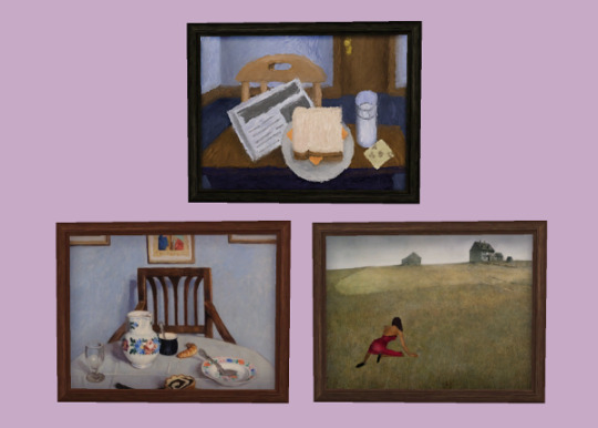
Two recolours +frames for Abstrutionism; "Poppy Cake" by Adolf Fényes (1910), and then this edit of Christina's World by Andrew Wyeth (1948) to include Bella Goth (the original Tumblr poster has deactivated).
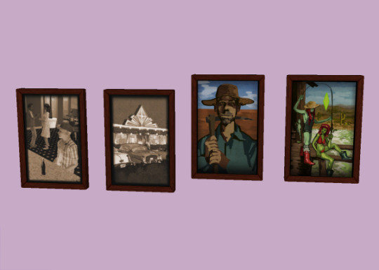
A recolour of Anonymous Masterpiece with these two digital paintings by user chestnutroan featuring their farmer Sim and his two alien daughters.
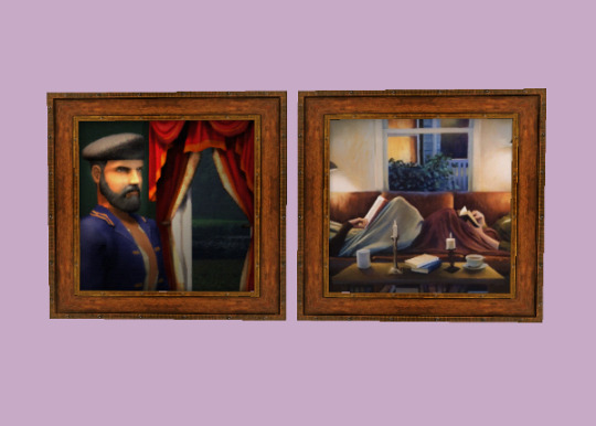
One recolour of the Arghist Soldier with "Friday Nights" by Deborah DeWit (2006), perfect for your novel-enthusiast Sims' reading nook.
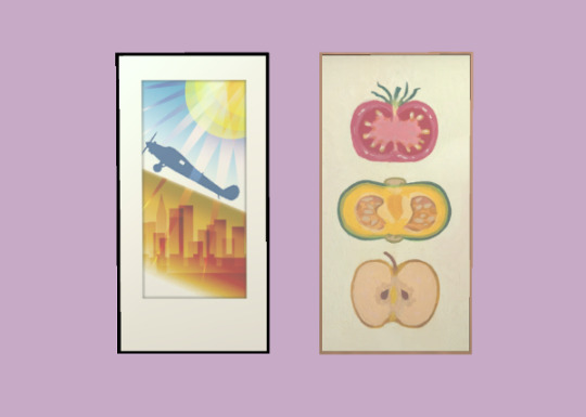
One recolour of City Skyline with a fruit & veg painting by Twitter user snail_soup (you can buy a real print of this too if you like it!)

One recolour of the Fourth Element wall scroll with "From Stardust to Stardust - Raccoon" by user ArtOfMienda.
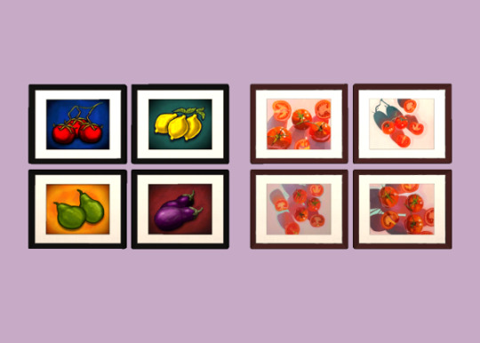
Four Vegetables recoloured with four deliciously juicy tomato paintings by artist Leah Gardner.
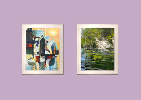
Geometry 101 recoloured with a beautiful palette knife painting by Lynn Boggess.
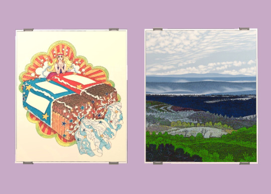
Two recolours of Grilled Cheese (you all know what Grilled Cheese looks like, c'mon); one vintage ad for Hollywood Diet bread which I cleaned/redrew to remove text/graphics, and then "Cloud Rows" by Ivan Eyre (2004).
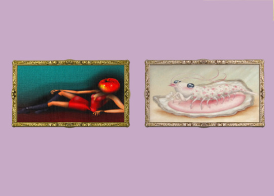
In The Beginning (+frame) recoloured with "Little Thief" by Courtney / Trash Kitty Art (also available as an affordable IRL print).
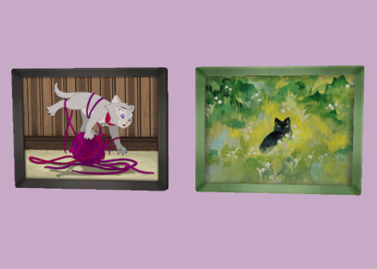
Kitten vs. Yarn (+frame) recoloured with this goache painting by user ieafy.
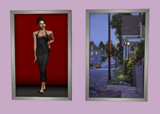
"Until Tonight" by Mark Grantham (2019) slapped on Lady On Red.
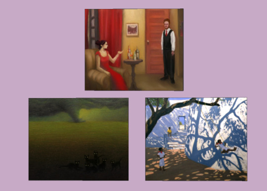
Two recolours of Living Room; "Midwestern Summer Fun" by user ink-the-artist (you may wanna zoom in for a surprise), then "Girl On A Swing" (2000) by Andrew Macara.
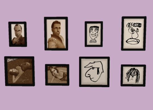
One recolour of Marketing Print with the Beatles as drawn by other Beatles. I don't remember who drew who because I'm actually not much of a Beatles fan but I thought these sketches were really darling.
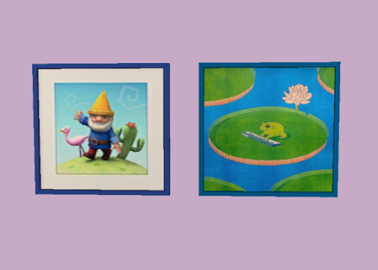
In Memory of Johnny Gnome (+frame) recoloured with a piece by Emma Roulette.

A recolour of My First Holiday with art from Twitter user heikala_art.
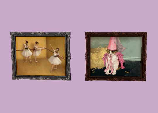
On Pointed Toes (+frame) recoloured with this digital painting by Twitter user catwheezie.
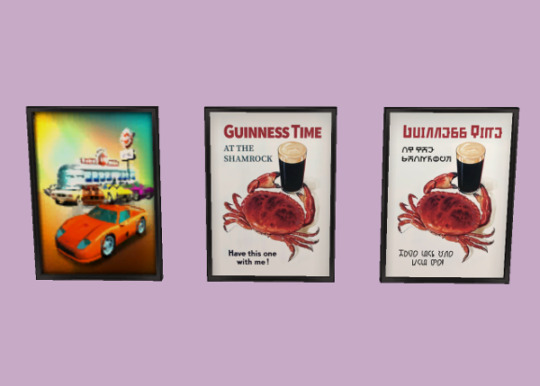
I fell in love with this Guinness ad so I tweaked it from the photo to fit on the Route 66 poster, then made an accompanying Simlish option.
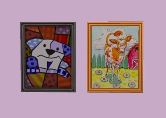
A single Scruffles recolour (+frame) with this adorable cow illustration by Twitter user poodlewool.
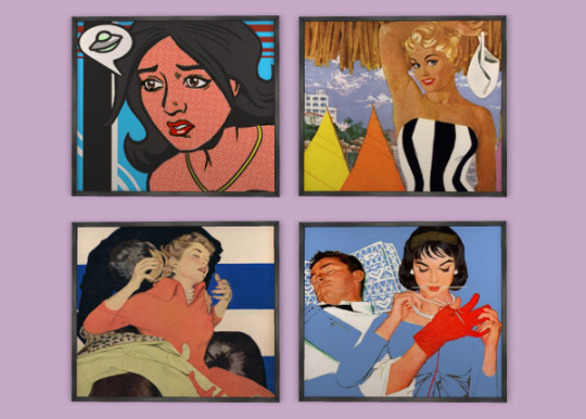
Four recolours of the Sim Noir pop art print; three pieces by Al Parker I found through this Tweet (with some English removed) and then an edit of the original painting to look passingly familiar...
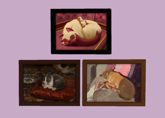
Two recolours (+frames) of Snoozing Enemies; "The Cat on the Pillow" by Adolf von Becker, and "Sleeping Sasha" by Lena Rivo.
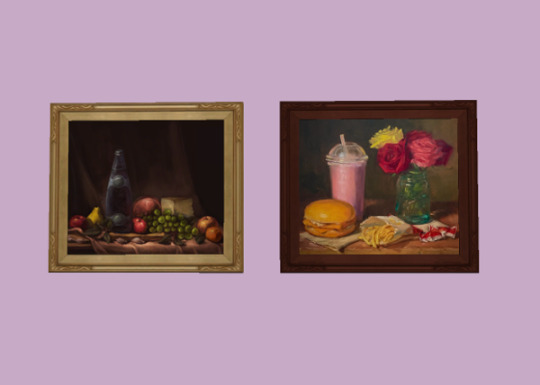
Stiller Life (+frame) recoloured with this oil painting of McDonalds by artist Noah Verrier.
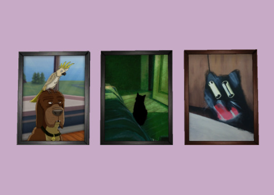
Two recolours (+frames) of Stumped Hound; "Shadow" by Tianyi Zhou and "cat falling off table" by user anasauruss.
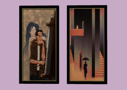
The Muse recoloured with this Juxtapoz magazine cover by artist Josh Courlas.
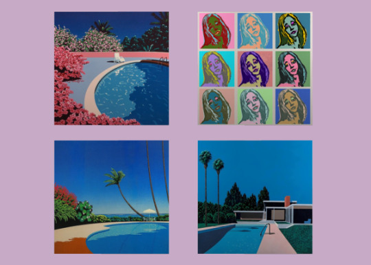
And lastly, three recolours of Untitled (the Bella Goth pop art painting) with works by Hiroshi Nagai.
Download All Paintings @ SFS
376 notes
·
View notes
Text
Making the ✨Lioncourt Gown✨ (Part 1/4)
Shoot, it's been like two years since I last posted, apologies! I’ve been incredibly busy with uni and life in general, taking care of my mental health, it’s just been a very stressful time lately. I haven't really worked on anything worthy of posting in the meantime, only minor things and one dress I rushed and it didn't turn out well anyway. But, since Halloween is coming up and I don’t feel like wearing the same thing for the third time in a row, I thought it was the perfect excuse to try and make something new and the other day at 2am I fell down a rabbit hole and came up with an idea I’m completely obsessed with.
So recently, (in case you couldn't tell by the title haha) I’ve been really into Interview with the Vampire (the TV show), and there’s this one costume that’s so iconic it immediately caught my attention: This Lestat outfit.
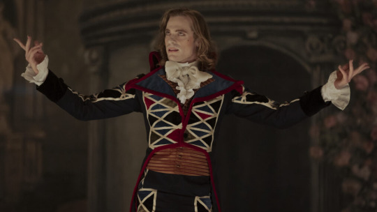
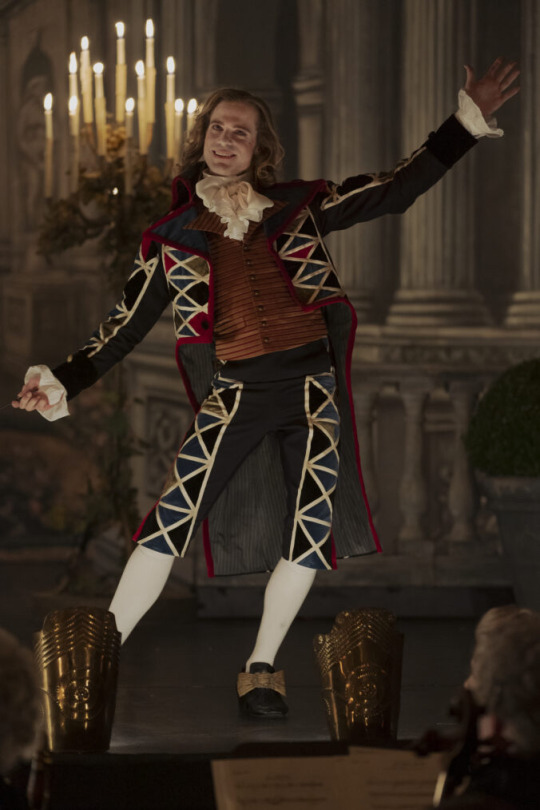
I feel like since this blog isn't fandom related I need to explain myself to those of you who are just semi-familiar with IWTV. Maybe you know Lestat as essentially the villain of the story and are wondering why on earth I'd want to make an outfit inspired by him. The answer is quite simple and not actually deep at all: I just thought it'd be a fun project. I'm very well aware of his personality and would not want to be in the same room as him in real life haha. But he's such an interesting character to watch on screen (they all are, in my opinion). Anyways-
This outfit is from a scene that takes place in the 1790s and now, I’m unfortunately not too versed in men’s fashion so I can’t quite comment on its historical accuracy (and also it’s worn in the context of a theater performance so it’s bound to be more flashy than what people would have worn on the streets), but the way the lapel is shaped just screams redingote to me, and since I've always wanted to make a redingote I'm going to make a redingote version of the costume!
For reference, here's what a c. 1790 redingote looks like:
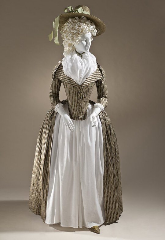
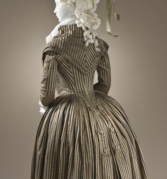
This one has a normal button closure but redingotes were also often double-breasted (which is what I'm going for), taking inspiration from men's fashion. These were often worn to ride in - hence the name, redingote - riding coat.
Maybe this is the point where I should mention that I'm not going for perfect historical accuracy for this project. It really is just a fun project to try to approximate something as seen on a show to an actual historical piece of clothing.
Here’s a super quick sketch I drew to check if the colors looked good together, and I have to say, I’m sold 1000%.
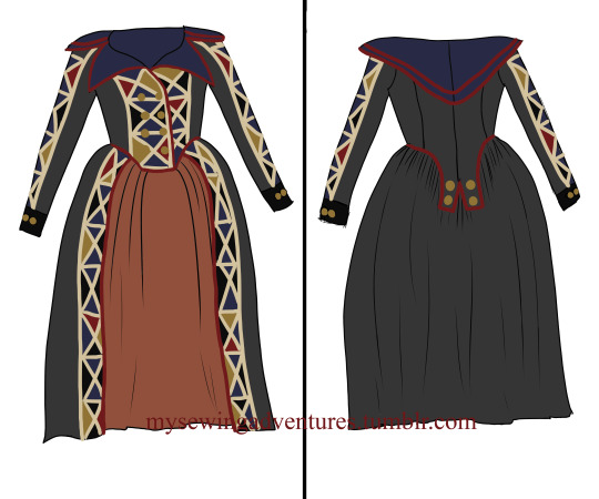
I am so excited to wear this when it’s done, but also a bit anxious because for starters, I’ve never made a redingote before, and the dresses that I have made all have issues with the sleeves because apparently, I can’t sew sleeves correctly. So this time, I really want to make sure it all fits properly before I sew it and take my time with it to make sure it ends up being something that I love as much as I love the idea of it.
This time, I tried something a little different with my mockup - usually, I’ll draft a pattern on paper, then cut out my mockup and sew it, but this time I decided to make the mockup by draping the fabric directly on the mannequin that I dressed in my stays and a bumroll, making sure I had the correct measurments, and it was a complete gamechanger. It fit right away with minimal adjustments, and I was also immediately able to check how the fabric falls, if it needed to be on the bias or not, etc. I ended up doing everything on straight grain which is technically not 100% correct as the front piece needs to be on a slight bias but it seems to work for this piece so let’s hope the fabric doesn’t wrinkle! I’ll also be adding boning so I’m hoping that’ll additionally keep it all straight and even in the front.
Once the mockup was completed, I went on the search for the right fabrics and got these (the skirt fabric, the buttons and the tape I ordered online and they've yet to arrive!):
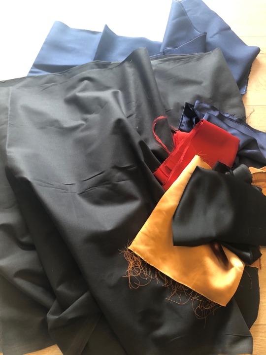
The black base fabric and the blue one are cotton, as will be the skirt. The details are satin! I spent a long time at the fabric store trying to think of the best way to do this and it does look like the details on Lestat's outfit are maybe velvet, but I was afraid it would look a little too costume-y and cheap, so I ended up going with satin in the end.
I pinned the fabric mock-up onto the lining fabric (just a white Ikea bedsheet), added 1,5cm seam allowances where needed cut out the lining first, then placed the lining onto the black base fabric and cut that out as well.
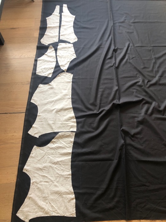
I needed to lay the pieces down this way because I bought 2,5 meters, and I'll need 2m for the outer skirt alone so there's not a lot of space left, as I'll also have to cut out the sleeves from that fabric. I then sewed everything together.
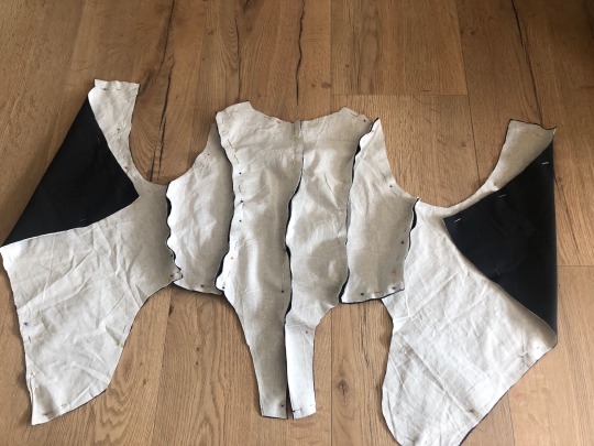
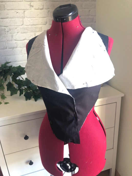
And then I noticed I'd made a mistake - the lining for the front panel was supposed to be blue. Welp, now it's white, and I also realized I didn't have enough blue fabric to do the collar AND the lining, so I went for a fake lining for which I cut out two blue triangles to be slightly bigger than the lapel
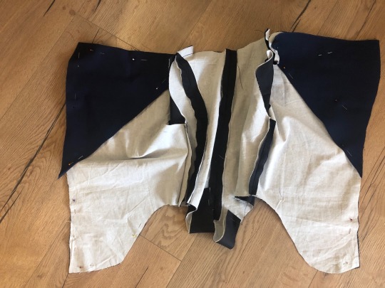
and stitched them to the lining layer so the seams wouldn't be visible on the black outer layer. This was the result:
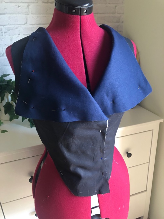
Pretty happy with it! Next up, even though I don't have the beige tape yet, I decided to cut out the color panels in the front and already pin them down. After some trial and error, I decided to go for 15x4,5cm triangles and calculated the size needed for the shorter ones (9x7,5cm), cut them out of the satin (which, let me tell you, was so finicky it ended up being the most difficult part of it all) laid them down and fastened with pins.
This is what I have so far:
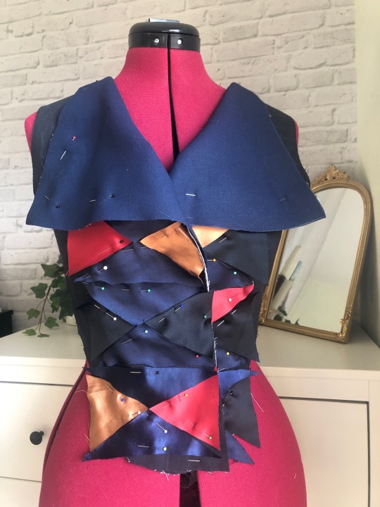
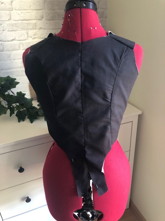
Looking at it in the picture, I'm worried that the color panels take up too much space in the front. It looks like that in the original picture, but in my sketch I made everything a little narrower. But I was also scared of pulling on it too much because the panels are just pinned to the fabric. Some parts are sticking out over the black base layer which maybe also makes it look wider than it really is, I'll cut it to shape once I have the tape and have a better visual understanding of what it's going to look like.
Next up will be the collar/yoke and the dreaded sleeves and possibly the boning. I should do the boning before I attach the beige tape. I am realizing as I’m writing this that I should’ve done the boning before pinning down the colored panels as they’re supposed to cover it. Oh well. It’s fine. Either way, I think it already looks super cool and I can't wait to see the finished product!
Part 2 | Part 3 | Part 4|
#fashion history#historical fashion#iwtv#interview with the vampire#lestat de lioncourt#amc iwtv#sewing#redingote#georgian fashion#18th century#18th century fashion#18th century dress#1790s#1790s fashion#georgian#fashion
60 notes
·
View notes
Text
in response to this ask from the very lovely @moonslantern, i have created art

why modern? why pajamas? why the jason momoa pose? because sometimes you have a vision and you cannot escape it.
i had a blast doing this, so you know, send me the stupid shit you want drawn with way too much effort considering the result!
bits and bobs under the cut
first off, this picture is hilariously small, because i initially didn't mean for it to be more than a sketch, and forgot to change the resolution before it was too late.
next, this would have been posted a lot sooner if i hadn't A. decided to make it so much more complicated than it needed to be, B. basically relearned how to use clip studio paint, and C. changed my entire work flow in the process.
BUT the outcome of all that was that i not only finished this whole piece--a rarity for me--i did it in a reasonable amount of time, and i had actual fun doing it. i may really start drawing again, and that's so exciting 🥹
here's a close up of rolan's face, because god damn am i proud of the freckle brush i made

and here's how i originally intended to render, but the style just didn't suit the uuuuuhhhhh subject matter

#don't blame me this wasn't my idea#bg3#rolan#holy rolan empire#bg3 rolan#rolan nation#fanart#baldurs gate fanart#my art#brid
39 notes
·
View notes
Text
Sketch dump time! A whole bunch of requests from the crazy ex-bird app
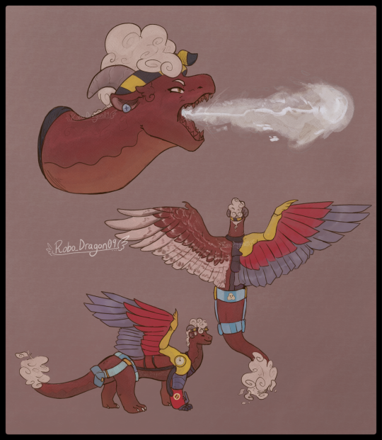

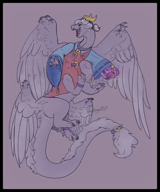
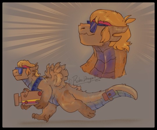
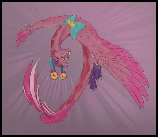
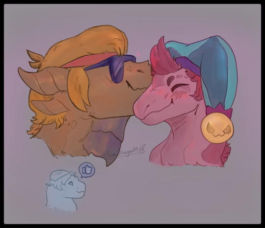
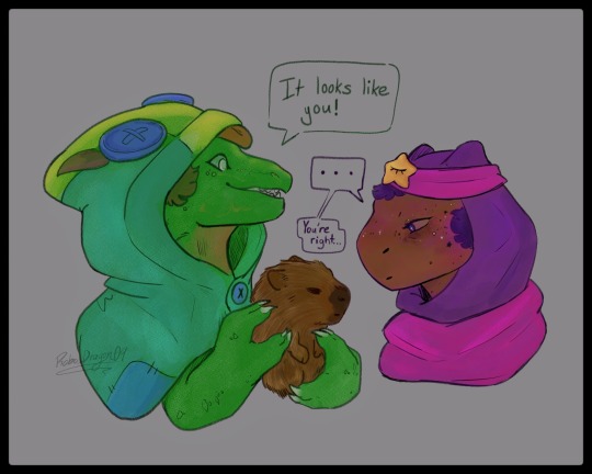

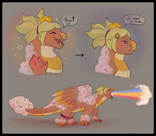
In Order: Maisie, Pam, Colette, Buster, Chester, Chuster ❤️🧡 (and a teeny Gus), Leon and Sandy (Leondy 💚💜), Bull, El Primo, and Mandy!
Extra notes about each sketch:
Maisie:
Her breath attack is a condensed foam material, similar to that of a fire extinguisher. Using a gas similar to a pressurized CO² (based on gas-based fire extinguishers!), she shoots it out at high speeds. These hits can potentially cause frostbite and even severe damage to the body if left unattended. She's quite powerful in this AU due to this ability 👀👀 being able to put out the fires and overpower another dragon's breath? Now THAT'S some queen moves right there! She can also simply spray out the foam substance at short range without that pressurized gas. This helps with more close range fire fighting work.
Her right wing and front leg were undeveloped, a disability she'd had since she hatched. However! With the help of mechanics, she uses these prosthetics to help her fly. Still gotta test out how to draw it to make sense, as well as sort out how it stays in place. I've been using inspiration from Toothless (HTTYD) and his tail that Hiccup made.
Pam:
Pam is a bulkier dragon, very much on the larger side of all of them. I'm at odds with myself to figure out whether ot not she'll have wings 🤔 so I had two copies there! Perhaps her wings may be a bit smaller if I do give her them.
Pam spits out molten magma that's stored up inside her as an attack. However, it can also be chunks of scrap metal that she stores up. Otherwise, it's just magma.
Though I didn't draw this, I want Pam to be very resilient to fire in general, as her species/family of dragon use their ability to spew this magma (technically Lava after ut leaves her body? I'll do more research on this...) in order to craft and shape metal. While other dragons need to spend some time to build up a fire hot enough, the Junker family line is able to do this much more easily. (Amber is a close second, though)
Her skin has the ability to crack and seep up lava out of it, potentially coating her body in this to give herself a temporary lava shield, something extremely hard to break through. (In the future, little Jessie may also be able to do this... however, Pam doesn't think she's ready at the moment and avoids the topic or any ideas of teaching her how.)
Colette:
Colette flies in a sort of funny way, twirling around and flapping her wings to maintain somewhat of a chaotic flight pattern. Think of a snake slithering through the sky, but with large wings and the grace of... a teenage dragon (not much, but it does work).
When she gets better at flying...pray and hope she isn't able to catch up to her favourite brawlers cause she isn't ever gonna let go of them 💀 It makes for a great attack, actually! Charging at enemies and coiling around them like a snake to prevent movement, like a big hug ❤️ she just loves everyone SO much 😍
Buster:
Finally kinda set on a design for this funky guy! He's a larger dragon (smaller than El Primo or Frank, but still definitely up there in size)
His wings never quite grew fully, so he wouldn't be able to fly 😔 however, that'll never stop him and his dreams of being a cool movie star 🧡🧡
Buster, at the heart of it, is an unstoppable force when he sets his mind to something. He'll charge in with the same ferocity as his favouite protagonists, rivalling the audacity and hard-headed nature of even Bull! All while doing so for his friends 💪 we love Buster in this AU frfr
Chester:
Chester always has theatrics when he flies. Flips, spins, and fun aerodynamic movements up in the sky! He's gotta compensate for his lack of speed compared to other wyverns after all, but he thinks he's pretty great 😎
Loved drawing this kinda unique pose tbh! That's what I loved with these drawings, I got to experiment without really thinking too much for em with how polished and clean that look. It was very fun! 🔥
Chuster ft. Gus❤️🧡:
We love some goofy gays here 🥹❤️🧡 I just wanted to let em have a little nuzzle + smooch! Dragons don't necessarily kiss, but little side boops like this are the equivalent of a cheek kiss.
Also, a little Gus on the side 🥹🥹 I love this sort of found family dynamic that have! Buster being the cool dad vibe/big bro to Gus, and then Buster being in a relationship with Chester so that he's also a cool dad too 😎 Gus loved these two guys from the very start, they're funny 🤭 never a boring day for these silly lads.
Leondy 💚💜:
My beloveds 🤲 I really do cherish the ship, as well as strong friendship Sandy and Leon have. (Btw in my HCs, Leon and Sandy are 13 & 14 respectively, just to clear that up!)
Sandy, I've mentioned a few times, is very inspired by Capybaras, so Leon finding one is just perfect 🤭 silly little deadpan face lads.
Bull:
BULLDOZERRRR- What a lad! Bull is inspired by- uh, Bulls! Great creatures, large bodies and thick necks to support those headstrong charges 🐂 I love making his posture all confident, strong steps to say, "Yeah. You TRY and stand up to me. I DARE you." Don't wanna mess with him on most days 🏃♀️💨💨
El Primo:
Still figuring out a full-body for El Primo, bit he's roughly the same size as Bull! (Maybe a bit bigger)
El Primo has got really small wings, similar to his El Dragón skin. Even his scales and horns are inspired by that mostly! Love when characters have preexisting dragon themed skins 🤭 makes it a lot easier to make ideas!
His "mask" is actually just body paint. He has similar paint on his body, really showing off the vibrant colours and persona he puts on for the crowds.
He WILL beat up his enemies into a pulp in matches. Thank goodness there's the gem powered regeneration and the respawn system in place 😭 I plan to give him a very strong body and tail, enough to support him when he needs to go on his hind legs and overpower his opponents. Buster is designed in a similar way as well!
Mandy:
Last but not least, the Queen of Candy herself. Not even the Dragon AU let's her escape fast food work 😔😔
Her super attack is purely a magical sugar-based rainbow blast, as shown in the sketch. Also, I'm now realizing that I forgot her red spots oml- No wonder she looks so empty 💀 uhh sorry about that, lads 😭 I'll redraw her one day to show off that glowing effect of her spots 🥹🥹
And that's all! Thank you for reading if you made it this far! Hopefully I can make more of these sketch dumps 🤭✨️ maybe take reqs from here too! We shall see. Take care y'all!
#bs dragon au#brawl stars#brawlstars#brawl stars dragon au#robos art tag#dragon#Maisie#Pam#Buster#Chester#Chuster#Leon#Sandy#Leondy#Bull#Primo#Mandy#oh god ao many tags ararrra#brawl stars Maisie#brawl stars Pam#brawl stars Buster#brawl stars chester#brawl stars leon#brawl stars sandy#brawl stars bull#El Primo#brawl stars el primo#brawl stars mandy#sketch dump#art
180 notes
·
View notes
Note
i rlly like ur composition, i wanna know about your process :D
thank uuu !! yeah so like. composing a scene for me generally begins with a vague idea that i want to get down as quickly as possible- and for me that usually starts with finding a setting. I knew that i wanted to draw a) a group of roomates gossiping in a crowded kitchen and i wanted there to be b) one figure in the extreme foreground and c) lots of plants. i do use some tools to figure out perspective, mainly the csp perspective ruler. Usually i start by finding a picture i like similar to the vibe im going for- but instead of referencing anything else- im purely interested in perspective. sorry to anyone who is shocked i dont generate all of my perspective purely by myself- i can draw in perspective fairly well but i struggle to make straight lines and this is easier to make grids with than the line tool lol ^_^ i try to use it kinda more like spellcheck on typos than like something to fully rely on. this is the video i learned this trick from:
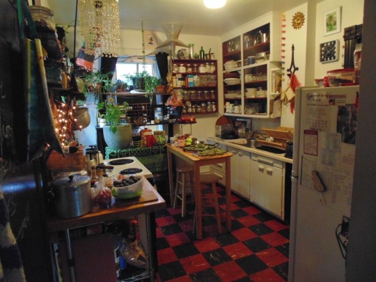
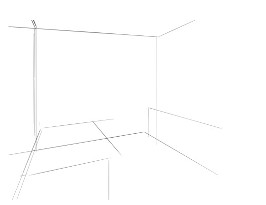
i saw the left photo and realllly loved how the cabinets alligned with the wall- so i used my ruler tool to draw out my inital plotted points from the image- basically the linear movements i was most interested in and then i turned off the image layer and worked with those lines and the ruler tool to move on. eventually i had this:

which was enough for me to put my characters in for the inital round. if you notice- i made a looot of further adjustments as i go on. this sketch is not a final layout, its so my characters have somewhere to be! i cannot draw someone standing on a floor if theres no floor, nor leaning on a table that doesnt exist. i can’t draw my characters without a background, but i also cant finish my background without accounting for how my characters can comfortably exist in it!!

this was the like.. very basic start. i knew the positions of two characters- but i needed to change a lot not only to fit them better but to allow for the other two figures i had planned.
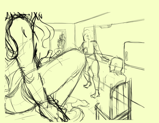
okay.. a little better. i widened the kitchen, closed the fridge door.. added a chair and fit in all the figures.. but this is waaay too dramatic. only two figures are actually interacting- and they are at wildly different energy levels!

this is where things started to make a little more sense characterwiss, so i was ready to refine backgrounds and figures and unite the two.
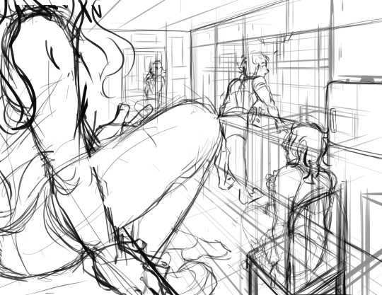
inital base sketch. much better layout.
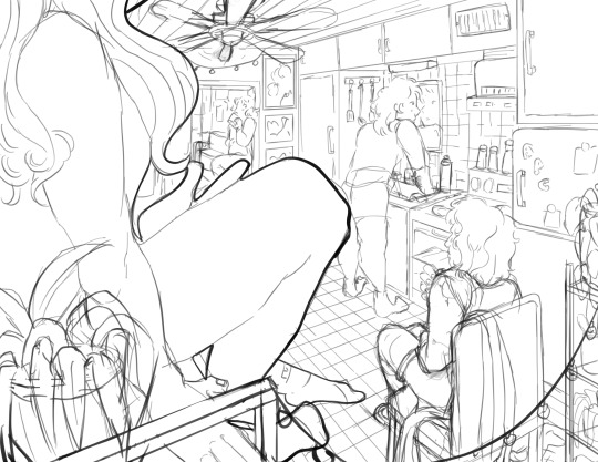
okay- this is where im getting my footing but things seem.. really really off. You can see me working on my framing here- theres some good linear movement from left to right here- but not vertically. It’s hard to notice the figure in the far back, so i need to redirect the viewers eye to move upwards as well!
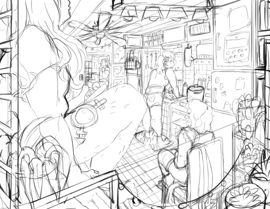
this is where i decided to zoom out, add an interesting vertical element to the left of the image and make it clearer whats happening in the foreground. i had to account for some stuff by adjusting the cropping, but i paid attention to that as well.
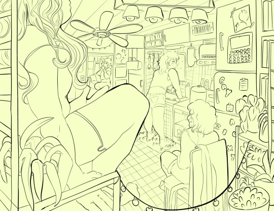
annnd- thats what a clean sketch looks for me! i have all the elements of my scene accounted for, and things are clean enough to read.
the next step for me would be transfer! essentially- I print the image of my sketch out, resizing and taping pages together so my sketch matches the size of the paper i want to paint on, and then i use a lightboard to transfer my sketch with pencil onto my paper. Then i refine the sketch a few times on paper before stretching my watercolor paper (essentially just prepping for painting) and inking with a brush and colored ink before going in with watercolor, gouache and ink, then usually finishing with marker, colored pencil, pastel and ink. it’s a lengthy process but a lot of fun lol. but sketches for me can be like.. 15 layers of different roughs until im happy with just the sketch. there were more images but im on mobile and theres a 10 image limit 😭😭 im a bit masochistic but i believe that if i dont have a good sketch i dont have a good painting!!
117 notes
·
View notes
Text


come get your levitous sidekick / vicious bastard / funny little guys
#don't tell the sheriff. that a couple of outlaws are having uh a halfhearted tussle or really cozy talk if you like#there's like a dozen of us here & i'm standing in another room saying this but a rando crops up like how & why have you just been around??#let's kick off '25 with Not That....meanwhile so totally unrelatedly i'm looking for a sexy singer & you're doing finger stuff; buddy#putting the g in g spot by way of: stands for gator. clench & death roll....but no. he's a crocodile. lotta options for c spots#corned beef#bsol#coconana#messed up like bloodsong is so Fun Sketches to me but even those take me eons. why couldn't i have done twice these in one sitting plus#a winston quant billions going :] plus i dunno whatever else floated my boat. unfortunately b/c then it wouldn't be me doing my things....#only 2/5 of these from canon but as gone on about idk where the Fake Blood was involved in turkey leg. just that it was. so#also didn't think about [sidebar with myself you forgot like angel & backlighting type imagery for Introducing Santa Violetta] like ah#so i did. well whaddaya gonna do...find & reblog the post that's like speaking of likeaprayer striking me like head first prayer second#smthing along the lines of ''muffled by dick in my mouth: lmao faggot'' there's some plausible coconana antics lol. steps; intervals....#can't have it be like ''be tender w/me bro im begging / bro im trying to find your g spot'' wouldn't beg for tenderness (cocodrilo)#or call anyone bro or much similar (either of them) like maybe i've waive the latter to try applying that to the musician/banana but yknow#in the meantime. funny little guys i cannot overemphasize this. bloodsong of love i also cannot overemphasize this#bilesong of hate....don't get me wrong Not a case where i only enjoy certain elements plucked out of canon / not as a whole#did i ever listen to that show straight through w/Ease....but if it Had been nothing but a vessel for lo cocodrilo times. god Damn#lo cocodrilo#bsol banana#also didn't think about how lo cocodrilo doesn't let go of the kazoo even to play it. mostly inadvertent Choice for top pic there#an issue that quickly arises w/like a prayer specifically: these characters don't have names. what's that mean peak literal lens?#i.e. seeing bsol itself as the less than totally literal method of storytelling that it is....idk & it wouldn't super matter#but i sure do think it'd be fun if they're treated as / perhaps actually [no name] on any possible layer of interpretation#[rando who firstnamed themself but besides that it's like eh & Where My Outlaws the less known the okayer]
6 notes
·
View notes
Note
1, 13, 16, 20 any and/or all for Eloise 😇
Hi!!!🫶🫶🫶
(sorry I’m so late to this bahahahahahahhahaah…December is a CRAZY month😆) I’ll put the answers under the cut bc I am a yapper🤭 AND THERE IS *A LOT* OF ART & WIPS & TALKING🤭🫶
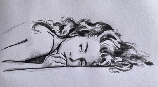
1) What was the original thought that led to the creation of this character?
This is a good question😭 I think of Eloise as separate from the girl I played in the game, AND separate from the MC in general bc I completely changed ancient magic & the whole storyline to something more interesting to me. As I was playing the game, though, I was SO INTENSELY CURIOUS about what their backstory could be - why were they starting 5th year? Were they a squib? What about their family?
I honestly LOVE that the game is so open-ended about this, because it allowed me to find a way to place Eloise in with canon lore (her mom is actually mentioned by Sirius in the books🤭) AND (this hasn’t been revealed yet) give a conceivable reason as to why the Babbits are not in the Sacred 28 when the list is created.
I’m also FASCINATED by thinking of pureblood society & the Black family in general (Sirius/Bellatrix are my favorite characters & BOTH heavily influence how I think of Eloise) & I have so much fun MAKING ALL OF THIS UP !!!!!!!!!! I LOVE thinking of different traditions/ways that old pagan traditions can be corrupted by the purebloods trying to hold onto their legacy…how the purebloods navigate society and the world in VERY subtle interactions etc etc ETC !!!!! I could literally make a whole post on all of these headcanons I’ve made up about the universe my fic takes place in😆😆😆

13) Do you have a voice claim for the character? What do you imagine the character sounds like?
Honestly NO😭 I think of her voice as very sweet but honestly it just kind of sounds like mine since I go into her mind so much as I write🤔 if anyone has any voice claims or ideas LMK !!!!
16) Is there any memes or running jokes associated with the character, both in- and out of universe?
ELOISE HATES WEARING PANTS AND SHE HATES QUIDDITCH😤😤😤😤😤😤😤😤 she HATE WATCHES every single quidditch match just to make sure Sebastian doesn’t get hurt…BUT she drags Ominis with her and tells him to let her know if anything happens bc she can’t bear to watch🤔 Sebastian is always getting himself hurt on purpose in Crossed Wands & even quidditch in the hopes that Eloise will come over🤭 bc she always insists on the muggle way…(everyone thinks they’re weird)


Another thing that I think is HILARIOUS is that as a design choice I just gave her a braid bc a) I think it’s cute & b) it’s a way to tame her crazy crazy crazy hair & c) so I don’t have to draw her hair down. BUT every time we talk about mc interactions everyone wants Eloise to show them how to braid their hair…SHE has to demonstrate though bc there is no way anyone that isn’t her could tame her own hair😫
20) Bonus question: share any additional thoughts, art, favorite scenes, anything you’ve been waiting for a chance to ramble about.
DAMN DANI YOU WANTED TO UNLEASH MY INNER YAPPER…🤭🤭🤭
I REALLY want to talk about everything I’m working towards in my fic but🤐 I can’t spoil things for my 2 readers…SO…
Here’s a wip of my 70s au…the strangest crossover ever bc Sebastian and Sirius are getting high AF🤭😶🌫️ I haven’t decided if eloise is going to hate Sebastian, or if they’re going to be making out within 30 min of meeting🤔😇 now you can all see my terrible sketches…that turn into messy art😆
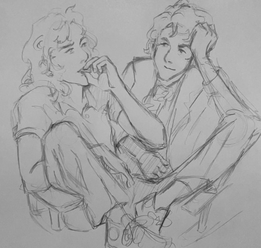
#it’s been so long thst I guess now I will repeat some questions😆 and I don’t realize…#bc I KNOW I’ve answered some of these before🤔 I got so many asks this time around & I still have one more🫶🫶#THANK YOU SO MUCH FOR THE ASK!!!!!!#even if nobody reads these (I can’t blame them😆😆) I always have a LOT OF FUN answering!!!!#& it’s fun to add some pictures too🫶🫶🫶#hogwarts legacy#hogwarts legacy fanart#hphl#hogwarts legacy mc#hogwarts legacy oc#eloise babbit#sebastian sallow#sebastian sallow fanart#sebastian sallow x mc#ask
32 notes
·
View notes
Text
What About Me? Ch. 2
Pairing: Jax x Reader (Romantic)
Sub-pairing: Gangle x Reader (Platonic) / Ragatha x Reader (Platonic)
TW: Bullying / Implied depression
Content: You get settled into your room and make a new friend.
Your bedroom was rather plain. A desk, a bed with white sheets, and a tacky poster of a kitten hanging from a tree. “Is this… supposed to mock me?” you ask with a raised brow. “Erm… not sure, exactly? Everyone’s room starts like this. You could always ask Caine to personalize it, or get the paint and do it yourself. Gangle is wonderful at drawing- she could make a poster or two if you asked,” Ragatha explained.
You step into your room, running your fingers over the smooth wood of the desk, thinking, “I have a few ideas… for one, the blankets should be (F/C), not this boring white. I’ll need some desk ornaments, and a few posters too.” You envisioned the perfect room as you listed it. Ragatha smiled, “Well, I can run and tell Caine, if you’d like, you just get settled in,” she waved as she headed back up the hall, “if you need me, holler!”
You turn, settling onto the bed and taking a deep breath. This was crazy, impossible, even, but you were going to get through it. You could take it. You’ve been through worse. At least it’s better than a trip to the emergency room for a broken bone, right? No pain. And it isn’t as if your life before was something spectacular, in fact, it was the opposite. Weren't you now living about a million people’s dream right now? A new, fantastical place with new, interesting people?
“How’s it feelin’, whiney?” your head shot up. Jax was leaning against the doorway, his already typical smug grin plastered across his face. You roll your eyes, “Pretty good, actually, this is gonna be better than my life back home.” Your statement seemed to surprise him, his smile faltering a moment, before he retook the jerk persona, “Oh, yeah? If you’re sooo sure about that,” he shrugged and invited himself into your room, glazing around with disinterest, “I’m betting you won’t last a month. The tough ones crack first.”
Your lips twitch as you resist snapping at him, “Mm, well if you say so,” and lay back against your bed. You were determined to ignore his rather desperate cries for attention. You ran your fingers over the soft white quilt and sighed, relaxing yourself.
Jax, on the other hand, was staring at you, eyebrow raised and a rather irked expression painted on his face. He narrowed his eyes, huffed, and left the room. This made you snort, he was acting like a toddler who was told “no.” Once he was out of earshot, you began to giggle out loud. His reaction was priceless. You were definitely going to ignore him like that permanently.
“Um… Ragatha told me you wanted a few p-posters?” a shy voice peeped. You glanced up, surprised that someone else appeared so quickly. You glanced up, seeing the ribbon-and-mask girl, then smiled a bit, “Oh, yeah. Gangle, right?” She nods and steps closer hesitantly, sniffing. Her ribbons were wrapped around a small stack of papers and ink liners.
“Oh, do you draw manga?” you ask without thinking. The ink liners were the kind you saw anime artists using all over the internet. Gangle nods, setting the stack of papers on your desk, “I don’t anymore, not really… Jax just makes fun of me for it. You frown, that familiar annoyance tingling in your gut, “Hey, just ignore him okay? He’s just a @#$%*,” your rather unpleasant name being censored by a cartoony boink.
She nodded a bit, then lifted a sketching pencil, “Um… what did you want me to draw?” You think a moment, then smile, feeling a twinge of sibling-like love for the sorrowful girl, “How about you just draw? I’d like your art on my walls either way.” Gangle perked up a bit, “Anything?” “Anything.” She nodded and shyly began to sketch. You watched her doodle for a moment, then realized something.
“Weren’t you a comedy mask when I got here?” you inquire, wondering if it changed depending on her mood. “Oh… yeah, I was but… Jax took in in the hall…” she blinked and her tears fell, but new ones immediately formed, “I don’t know where he went with it…” So her mood depended on her mask, not the other way around.
You made a small growl, “I’ll go get it back,” you gently pat where her shoulder would have been, “just stay here, enjoy yourself, okay? Don’t worry.” She nods, and you walk out the door, “And Gangle?” you add on your way out, “if he tries to mess with you, just tell him you don’t care, okay? He wants a rise out of you.” And off you went, in search of the annoying purple rabbit. Oh boy, was he about to get an earful.
TAGGING TIME: @lostsoullover (my bestieeee) @dai-tsukki-desu
#the amazing digital circus#jax x reader#tadc#jax#tadc jax#tadc x reader#tadc jax x reader#the amazing digital circus jax
321 notes
·
View notes
Text
Reflection Ruesday
So there's two versions of this post game going around today, and while I did get tagged by @thedissonantverses for the one version, I figured I might as well be an overachiever and do BOTH! I will warn in advance that only one of these examples is Bioware related because I really didn't do much in the way of fanworks for Bioware games until like, last year? But hopefully someone out there appreciates it anyway! And thank you to @becausedragonage for creating this fun little idea!
Also preemptively tagging some folks b/c the bit under the cut might not be everyone's cup of tea: @hyperions-light @biowaredisasterbisexual @mageofquandrix @sandcastlekings @seaglassmelody and anyone else who has anything they want to share!
First, @woundedsoul12 wanted people to share a published work that they personally liked that they felt didn't get much love. So, I'm gonna bring around a sketch I did back in November of Darvia and Varric getting a little quiet moment during the mission to Halamshiral. I hadn't really poked my head into the fandom much at that point, so it got a bit lost in the shuffle.
And secondly, we have the usual version:
What to do: Go through your writing, art, gifs, etc. that you started but never finished and find something you love. Brush it up a bit if you want and share it. Tag me and use the tag Reflection Ruesday (it'll grow on you, I promise) and I'll comment and reblog. Then tag some other folks you think might enjoy it.
As previously stated I don't have any Bioware-related works to dredge up, but I got hit by an old special interest this week and realized I still really love the snippets from a magical-boy-inspired Ghostbusters AU from like, 2013. So, uh, if anyone feels like reading some 11-year-old writing from me, here's a little taste. Who knows, maybe I'll actually finish it someday!
Excerpt 1: Ray
The floor under my feet lurches. I look around nervously to see my friends responding the same way. Egon shoves his glasses back up his nose with a slightly unsteady finger. "It would appear that the defeat of the node guardian is having an unexpected seismic effect on this structure," he says matter-of-factly. "In English, Egon?" Peter asks. "This whole building's coming down!" I say, hoping my voice doesn't sound as nervous as I feel. The ground is growing more unsteady by the minute. "By my estimation we have less than five minutes to get out," Egon says. Winston swears. "We're on the top floor! We'll never make it down in time." "Unless..." All three sets of eyes shift to me. My hands go all clammy, and it feels like my heart's going to beat right through my chest. "Me?" I ask, my voice squeaking through my tight throat. "It's the only chance we have, Ray!" Egon's voice is urgent. "But--" I swallow and try to talk again. "I've-- I've never transported anyone but myself! And the battle took so much of my strength... I don't even know if it will work! Or even if I can get us outside of the building!" By now, the floor is buckling so much it feels like the deck of a ship during a storm. Debris from the ceiling is raining down around us. "Ray, for heaven's sake, JUST DO IT!" Peter shouts, nearly falling over. Winston grabs him and hauls him upright. I tighten my grip on the staff. It just has to work! "Hold on tight!" I yell. When I can feel three hands holding onto my coat, I raise the staff and visualize our intended destination. "Mass Shadow Transport!" The dark purple shadows swarm up around us and for a moment the bottom falls out of the world and the dark building fades into spinning purple nothingness. Then, I can hear wind. Birds. We made it outside. Winston and Peter stagger back, Peter collapsing onto the grass with a thud. Egon doesn't seem to have been bothered by the disorienting transportation, though it's always hard to tell with him. I turn to face the dark structure that we left. With a massive groan, it collapses in on itself in a shower of obsidian black rubble. My stomach lurches as I realize we would have been trapped if I'd waited any longer. With the adrenaline gone from my muscles, it's all I can do not to collapse on the grass in a quivering lump. "Admirable job," Egon says from behind me. "Yeah, thanks Ray." Winston's voice is shaky, but relieved. "Does anyone else's mouth taste like socks?" Peter asks dryly. I know he's trying to diffuse the tension, but it's not helping. I can still hear the structure collapse in my head. Peter must have noticed, since all of a sudden he's poking his head around my shoulder. "Are you all right, Ray?" Winston asks. "He looks kinda green," Peter says. "Not pretty. Your hair's the wrong color for it." "Ray?" Egon says. Just as I open my mouth to speak, my stomach heaves. I only just make it to some nearby bushes before my lunch comes up.
Excerpt 2: Peter
Dana is at her locker with her back turned. I take a deep breath and wander over, trying to be as nonchalant as possible. She looks up as I lean on the locker next to her. "Yes?" she asks. "Can I help you?" Sometime between kindergarten and now her voice has gotten deep. I'm not complaining or anything; it's kinda sexy. "Dana Barrett, right?" I ask. Not that I needed confirmation or anything, but it's a great conversation starter. "Yes." Whoops. I guess Ray was right; she almost immediately gets defensive on me. Not what I was planning on, but she hasn't shut me out completely. I decide to play my trump card now and hope that does it. "Pete Venkman. I just moved back into the area. We were in the same kindergarten class, remember?" She softens just a bit, and actually smiles. "Of course I remember you." Score! "You were the one that got sent down to the principal's office for eating glue on the second day of school." Crap! I mentally slap myself in the face. I was hoping she'd forgotten that. "They called you 'Peter the paste-eater' for about four months, right?" Mayday! This is not going well. I need something for damage control, and I need it fast. Otherwise, I'm going to end up as "Peter the paste-eater" for the rest of my LIFE! I slide in and decide to throw on the charm. "Yeah, well we all do dumb things as kids. It's a miracle we even live to see Middle School, much less High School." She chuckles. "Some more than others." Ouch. "So, you have first lunch period or second?" I ask, trying to change the subject without sounding desperate. "Second, and I need to get to class," "But the Minute Music hasn't started yet--" Right on cue, the music comes on. You know, I get that all the teachers in this school are nostalgic for the sixties, but this is the third straight day that we've had nothing but Beatles hits. You'd think they'd shake things up once in a while. Dana grabs her books and straightens up. For a moment, I catch her eyes, and I can just feel a connection-- "PETER!" --and the connection shatters like a shot-put through the neighbor's good china as Ray nearly bowls me over in his enthusiasm. "C'mon Peter! We need to get to the cafeteria so we can claim our table! Egon's got some great ideas he wants to discuss." Dana smiles. "Goodbye, Peter." She closes her locker and melts into the crowd. I'm so frustrated, it's all I can do not to throw my ridiculously heavy history textbook at that stupid speaker in the hallway that won't shut up about how it wants to "hold my haaaannd." Instead, I just push my way through the crowd and down the hall to the cafeteria, Ray right behind me and still talking. Like the overachiever he is, Egon's already gotten a table. Thanks so much for ruining my moment for nothing, Ray. I dump my books on the table and line up for food. With tray in hand, I return to my seat, sandwiched in between Winston and Ray. "How'd your meeting with Dana go?" Winston asks almost immediately. I shoot Ray a glare, then turn back to Winston. "Well, she didn't slam the locker door in my face." "She's probably saving it for the second date." Egon doesn't even look up from his notebook, and his expression never changes. Until that stone-faced mask cracks a bit with a tiny smile. As nice as it is that Spengs is showing a bit of humanity, I wish it wasn't at my expense.
#my writing#dragon age#dragon age fanart#dragon age art#varric tethras#varric x inquisitor#dwarf inquisitor#ghostbusters#peter venkman#ray stantz#egon spengler#winston zeddemore#dana barrett#the ghostbusters story there was greatly inspired by an old (like 2003-2006 era) webcomic that nobody remembers now#it was called Angel Moxie and it was fantastic and funny and heartbreaking#and who knows someday i might finish this story#it made my brain itch when i was re-reading what i wrote last night
15 notes
·
View notes
Note
what's the planet like? I'm curious about how harsh the territory is, the different kind of threats they might run into, that sort of thing!
I am actually soooo glad you asked and I hope that answering this will help return my fervor in working on this fanclan. I'll try to keep this FAIRLY brief.
Keep in mind that I am a layman who is by no means an expert so there will be mistakes and things wrong- this is a warrior cats blog and I am NOT an expert in any way.
Now! To start things off! As you may have noticed on the character pages, our casts' residence is listed as Gliese 667Cc. This is a real planet! However, we really only know it exists because of its interactions with the other bodies in its stellar system soooo A LOT of what you'll see below is stuff that either scientists believe to be true about it or that I have made up.
The Gliese 667 is actually super interesting, it is a TRIPLE star system located in the Scorpius constellation [the stars are named A, B, and C... you see where this is going]. Planet "Vegas" aka Gliese 667Cc is a planet orbiting the star Gliese 667C and in our fictional setting it was renamed "Scorpio" by the colonists. Scorpio is a red dwarf and therefore a lot dimmer and cooler than our Sun and, because of this, the habitable zone is a lot closer to the star itself.
One of the consequences of this closeness is that Vegas is tidally locked, or in other words, the same face of the planet always faces the sun. Vegas does not rotate on it's axis the way earth does. This means ONE side of the planet is scorching hot and the other is freezing cold. The only part of the planet that is livable for human colonists is a band of twilight that lies between these extremes.
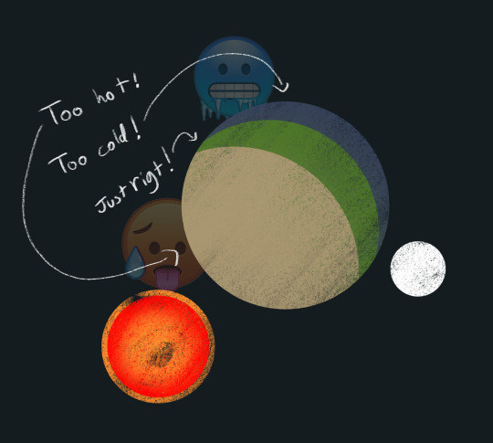
This tidal locking also means that Vegas doesn't have a day and night cycle the way one would expect. It's named after Vegas, the city that never sleeps, for a reason. While it is never fully dark, there are periods of dimmer light and brighter light. "Night" is an eternal, wine red sunset that casts the landscape in a ruddy glow. "Day" is determined by the presence of the moon as it reflects the light of the sun back down, casting everything in silver. Vegas's moon was named "Chronos" for this reason.

I have a lot of other notes and fun facts typed out in but they aren't quite as interesting to me. I've also got some fun alien critter planned for future pieces! I'll leave you with this early sketch page of cast concepts [and a suprise] as a preview of things to come.

20 notes
·
View notes