#but more so because i think it tends to give line art a sort of generic and lifeless feel?
Explore tagged Tumblr posts
Text
#digital art#line stabilization#i've been doing digital art for so long that i didn't even know it was a thing in some programs until a couple of years ago XD;#i don't personally use it because i think it's important to practice making neat marks#but more so because i think it tends to give line art a sort of generic and lifeless feel?#i think most people like that because it feels 'clean' but i'm not a big fan - i want to see some character in the mark making! <3#however i totally get using it if you have shaky hands etc or just need something in particular to look less hand drawn#anyway i'm just curious if a lot of people use it or not#poll#polls
288 notes
·
View notes
Text
pick an image to find out how your future spouse is with you
reminder that not all of the messages in this reading may apply to everyone. so with that i urge you to take what resonates and leave the rest. don't force anything if it does not fit. this reading is mainly just for fun. don't forget to follow or reblog if you want to see me do more readings like this.
pile one
this person is obsessed w you, like they are in LOVE love. & i dont mean in like a creepy "they are never going to leave you alone" type of obsessed, more like you are their favorite person ever and they love hanging out w you all the time. some drake lyrics were coming thru while doing this reading: "everybody has an addiction, mine happens to be you." i feel like very rarely will this person ever not get excited to just be in your presence during your whole marriage. like i can still picture them looking at you the same way they did on your wedding day even when you're both old n grey. they also happen to be a huge romantic so it makes a lot of sense. whenever they have good news they rush to tell you bc they want you to be the first person to share their happiness with. they're overall very sweet, i don't see them being the jealous type - i think they trust you enough to be scared of you going off with some other person. and you'll never even think about anyone else when you're with them because they treat you so well.
pile two
this person's love language is deff physical touch and it'll show when you're around them. they love hugging you and being intimate and doing all that sort of stuff. they honestly do not care where you both are because nothing is going to stop them from giving you forehead kisses or hugs. they love the way that you smell, it reminds them of walks in nature and pieces from their childhood. they love teasing you as well, they're very affectionate w you. they're incredibly supportive and also humble. i see you both being on a ton of trips, particularly road trips, but normal traveling is also coming through. i feel this person may not be as outspoken ab how much they love you, like they won't outright say "i think you're the most beautiful person i know" to you but don't worry bc they definitely think that you are. they have a very unique way of showing their love and i feel that you are someone who tends to pay more attention to details than others which makes you perfect for this person because while others may overlook or misinterpret them, you see them for who they are.
pile three
this person is super fun to be around, like they have the best energy ever. & i dont mean in a "they're always the life of the party" way, more like they make even the smallest moments feel special. i feel like whenever you're having a bad day, this person knows exactly how to cheer you up without even trying. they're the kind of person who surprises you with little thingamabobs and trinkets all the time just to see you smile. like they'll randomly bring you food that you like without you even asking them. they also happen to have a great sense of humor (that's kind of subtle but you like it) so you'll always be laughing a lot together. they’re overall very supportive of you, i don’t see them being the type to criticize your dreams. you'll always feel appreciated bc they will never take you for granted. though his laid-back and relaxed personality are behaviors you see often, you know your future spouse better than anyone. they're very inspiring and honestly i feel like you both will work on a project together bc you share similar dreams (i'm seeing some sort of art form, probably like writing or smth along those lines)
thanks for reading! if you enjoyed or resonated please heart and reblog so i can do more of these readings.
#tarotblr#pick a card#pick a card reading#pick a pile#pick an image#pick a picture#tarot blog#tarotcommunity#divination#divine feminine#free tarot reading
981 notes
·
View notes
Note
Do you know have any tips on how to draw a comic? As in simple style and easy to draw and consistent in redraw? I love your style and I can't help but wonder how you got here and if you could help. Thank you
okay sorry i left this in the inbox for a bit because. where to start lol! there's a lot of thought that can go into making comics i think. but i believe you're specifically asking about having a consistent art style and being able to draw the same character a lot over and over again, so i'll try to focus on that
i think a lot of consistency is just playing around with character designs and getting something you feel comfortable with. ill use grian as a good example because it took me a while to come up with a grian design that i liked. once i liked it, i was able to draw my grian a lot & very consistently. every time you draw a character, even if it's a little doodle, you gain that muscle memory for ur lines a little better, so you should doodle always as much as you can and never be afraid to try something new and experiment with your style
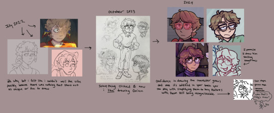
the pipeline
i think a good way to establish a character design that you really like to draw & can familiarize yourself with is by defining some key features about them. like in this image for example, my older grian designs don't really have anything about them that stands out to me. he wasn't rlly that fun to draw. but nowadays i think i have a distinct hairstyle & expression & glasses shape i give him, which are fun to draw. even if it's a tiny doodle with like, 15 strokes, you can still identify it as my grian design i think
something that i noticed (i didn't consciously do this but it just sort of happened as i was trying to make them all look different from one another) is that i assign different shapes to grian, cub and scar. these guys are good examples because 1. they're the three characters in my hotguy comics part and 2. they're the three guys i draw the most often
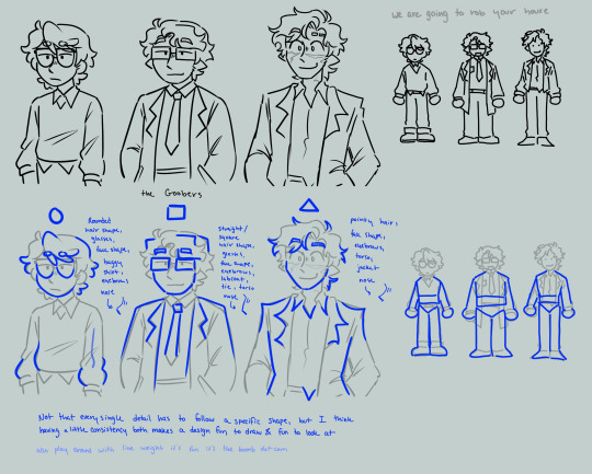
grian i tend to go for more rounded shapes, cub more squares/rectangles, and scar is more pointy and triangular. little things like this can help them stand out from one another and makes them fun to draw in my opinion. when i draw grian's hair i always have the hair come to a rounded point and is more neat/tidy. when i draw scar the hair is more spiky and wild. cub is sort of in the middle where his hair is more pointy, but is kept neat, which gives it those straight lines and right angles
TL;DR how i draw characters easily and consistently is make key features & shapes that make them fun to both draw & look at. and then draw them a lot
i hope that makes any sense, i like yapping about character design so hope you don't mind the long response lol ^_^
213 notes
·
View notes
Note
I just wanted to say I think your art style is awesome! I was wondering if you had any tutorials on how you draw anatomy in your style (hips and legs especially)? Sorry if there's already one posted and I just didn't see it 🥲. Happy New Year :>
thanks for the kind words. i tend to draw people pretty stylized and then some so a good bit of artistic licence gets used. these tips are just what i use so feel free to take them with a grain of salt. with anatomy in particular you can kind of talk in circles because human/animal bodies are that complex so ill just zone in on the points you specified. here's a little image with a bunch of pointers:

the above image condenses a lot of the points I'd make, but basically the key parts are to start with the bare essentials and build up that complexity. using a line of action is a good way to get a quick, rough start. you draw a line out in the general direction of the pose and do your best to adhere to it to give the pose a sense of flow.
you can also draw smaller, thumbnail versions that throw a lot of caution to the wind but capture the basic energy of what you're going for. even having a tiny little stick figure version of your idea can make for a good guideline of where to take it forward.
when it comes to actual limbs, you wanna consider how they integrate and work together, kind of like how chains do. you can see on some of the parts of pear i've drawn out these wireframes to kind of portray how the mass of her legs works in a three dimensional space. for aspects like the waist/hips, i use that X technique i highlight above a lot, particularly for the lower torso. a lot of the times, even when drawing a character totally naked, imagining them wearing things like skintight underwear can help a lot to guide you in the right direction.
its also a good idea to consider things like gravity and weight to a degree. humans are essentially big meat sacks and gravity is always pulling down on that, but theres all kinds of aspects that effect that, such as character build or clothing. pear technically isn't naked in this, but i've tried to imagine her as such and take that into account.
if you are drawing digitally, don't be afraid to take advantage of the convenience you get with that workflow. you can retry and iterate on things a lot faster that pen and paper, and do things that aren't really feasible at all when it comes to editing and modifying your existing work. things like resizing certain bodyparts, instantly flipping the canvas, or using selection tools to completely adjust the positions of parts of your drawing. to give you an example heres a timelapse with all the little edits i made just to this demo drawing:

you don't have to use these techniques linearly, either. sometimes ill have a really solid idea for a piece in my head, and go back to basics with certain elements if they’re not coming out right or i just want to brush them up a bit more. some of the tutorial-y parts i added in i didn't actually use during the drawing but often do use so they're there just for demonstration. not every drawing i do starts as building blocks or a really basic version, often ill just start with a face and build it out from there.
i always encourage liberally using references (this can include yourself) and trying out stuff like life drawing or looking at things like existing photographs of real people/places/things if you can, the more you use learning material the better you'll draw up a mental inventory in your head that you can rely on more and more. some of these tips are things i've learned from other artists over the years (the chin one especially i remember seeing a tutorial about lol), so this is a lot of knowledge i've amassed from other sources over time myself. there are plenty of times ill use all sorts of reference material and its all in service of arriving at the final destination as smoothly as possible. learn by doing, as they say. hope this helps!
957 notes
·
View notes
Note
Hey how exactly do these requests work exactly? there's no info at all on your patreon
I guess it's been a while since it's been brought up, and I figured it was relatively intuitive, but it's probably best to clarify.
Basically, people send requests of things they want drawn to the ask box (https://discount-supervillain.tumblr.com/ask). When I can, I dip into that box, pick out requests that seem fun and manageable, and I draw them. By manageable, I mean things I think I can actually draw in a reasonable amount of time, so there's a sort of equation of fun and simplicity that means a request will get chosen, and all of those are picked at my discretion.
Sending in a request is far from a guarantee that you'll have something drawn though. Even if your request is in line my somewhat arbitrary tastes, I get a lot of them, and I've only got the time to do one a day. I also tend to pick from relatively new requests, those sent within the last week or so--I'm also commonly dissuaded from choosing requests that are being spammed. But that doesn't mean you can't send a request again if I didn't get to it. If You've sent in a request that was passed up, but you think it's something worth drawing, you can give it another try after a few weeks.
As far as how the Patreon comes into play, the polls there are choosing from requests sent into this tumblr, then picked by me. Typically, these are more complex requests, or those that are outside what I would typically choose to draw for myself, so I figured it would be fun to let people pick out the drawings I try to put more effort into.
Oh, also worth noting that if you have a question you want to ask, you should send it non-anonymously so that I can respond privately. I'm sure I miss plenty, but I do try to answer questions sent in that fashion. I prefer not to answer anonymously sent questions mostly because I prefer my blog to be a solely art-based thing, mostly for aesthetic reasons. Actually, there's a decent chance I wind up deleting this later because it's a big block of text.
223 notes
·
View notes
Note
I know this definitely wasn’t the point of your post but this line “I think he gets shipped with Stanley by people who want to see Stanley get that kind of overbearing love that Fidds showed to Ford. I do understand wanting to give him that kind of partner but Ford deserves love too,” in your Fiddleauthor comic post made me think… what about aro/ace Stan. It seems like a lot of Fiddlestan shippers only ship it because they want Stan to have that overwhelming love or whatever, but do these people ever consider that maybe the only overwhelming love Stan wants/needs is familial? The most important relationships in his life are all family, and considering his repeated mentions of failing at romance/the implication he engaged in sex work, I can totally see him just straight up having no interest in romance or sex at all. In my opinion, the most realistic scenario (and probably the best for everyone involved) is Stan being aro/ace and happy for his brother and his brother’s partner, being supported and loved non-romantically and being perfectly content with that. It certainly makes a lot more sense then breaking up Fiddauthor which has so much canon basis and taking away Ford’s support system.
Ok so I've got a lot of thoughts here, but it's a great point to bring up. I'll start by offering up some art of Stan and the beans then dig into my thoughts.
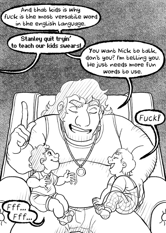
Nikola is speech delayed while Newton is an early yapper.
So I think the point about Stanley being happiest with familial love is a fantastic one. He's clearly someone who values family a lot and they seem to be his most consistent source of happiness. I think lot of people undervalue platonic love next to romantic love and I think that's a waste.
That said I don't see Stan being aro/ace, like it's a fun headcannon and I can understand the logic behind it. It's just I think something else is going on. I think Stan's issue is that he's terrified of emotional intimacy. Something backed up in the show by repeated examples of him avoiding being vulnerable in front of people. I think what happens with Stan is he tends to self-sabotage his relationships anytime they get too close out of fear. The sort of thing that likely stems from the trauma of being abused and rejected by his own family. He doesn't want to get close enough to someone new for them to hurt him. Avoidant attachment style
Family is different though. I think he has an easier time being close to family because there's this built-in connection and he isn't pressured to be vulnerable in the same way a romantic partner might pressure him. Instead, he has more of the space to open up at his own pace.
Speaking of, by that same metric. I actually think if he and Fidds ever happened, he'd probably sabotage the relationship pretty fast. Fiddleford loves rather aggressively and with an open hand and I actually think Stan would find it overwhelming. I feel like he would panic having someone shower him with gifts and bail.
Personally, I might ship Stan with someone else in this AU later on down the line though I'm still not sure yet if I want to fully commit to the idea. For now either way I see him spending at least the first few years of his nephew's lives completely single so he can focus solely on being a good uncle. He loves these boys like his own and he's just as involved in their upbringing as Ford and Fidds.
If I do ship Stan with someone at some point it's not because he needs a romantic partner. It's just because I found a ship I think could be fun to explore. Stanley doesn't need a girlfriend or boyfriend. He is perfectly content being the bachelor uncle and helping raise his brother's kids.
#gravity falls#stanley pines#young stanley#nikola pines mcgucket#newton pines mcgucket#au#papa ford au#why do you think Stanley's relationships always fail?
58 notes
·
View notes
Text


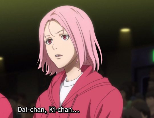
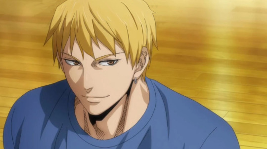


Last Game hair style fixes, in order of who needed it most.
I've never liked the canon hair styles in Last Game. They're either hideous, or just simply don't fit the characters/style of the main series. I get its a (mostly different) art department and meant to age the characters up, but most of the time, they simply just look off-model to me. I know I'm not the only one who's got issues with the hairstyles in this movie too, so I did my best to fix them up and give them styles that I personally think suite them. Originals below cut as well as my explanations! Important to note, these are my preferences/headcanons for them so take everything I'm about to say with a grain of salt.
**Akashi isn't here, because believe it or not, I actually think his hair looks the best out of everyone in LG.
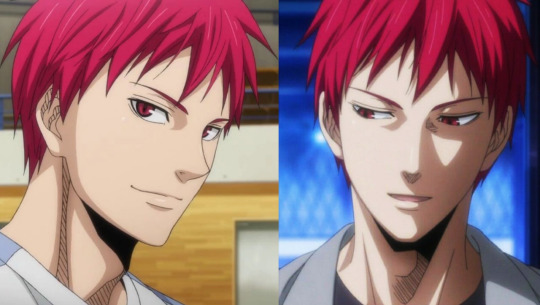
I wouldn't change it. I like to draw him with neater hair/his bangs pushed out of his face when I age him up, but for the summer after the Winter Cup - when LG takes place - the canon hair is exactly the sort of style I think he would/should have. I like the allegory that the rough chop is something he did when his mental health wasn't good, so now as his mental scars heal, it's growing back out. ❤️
Midorima
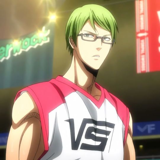

A neater/shorter hairstyle does fit Mido's character/personality, but the LG hair simply just doesn't look like the same hair type we see in the main series. Mido's hair has got the slightest wave to it (which I tend to over-exaggerate whenever I draw him).
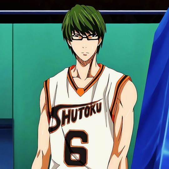
With this in mind, I went and gave his hair some more body/volume by extending the sides. (You'll see a lack of volume/body is the key issue with the other LG hairs as well).
Murasakibara
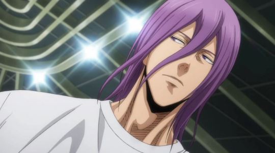

Mura's hair in this movie looks so so flat and greasy. Now I didn't do the best job fixing it up, but this is basically how you'd go about doing it; just add more flowy strands. His hair is pretty pin-strait in canon, but there's lots of flowing strands, even when he's not moving much, which give it a clean-look.

When it's all just one limp form, like the movie does, it appears unclean as opposed to just long and sleek.
Momoi
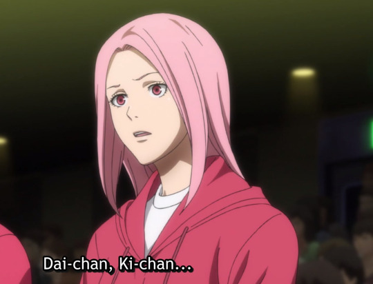

Another victim of the lack of body/volume. The style they gave her is also simply bad, like she just took a pair of scissors and cut in a straight line. There isn't even really any style to it. Its kinda just laying there on her head, which is not what her hair usually looks like in the main series. There's always strands/some lift to it. Also Momoi has always had some sort of bangs/framing pieces in her face, so for her whole forehead to be out was just a tiny bit jarring.

I think the style I came up with is a little more mature while still having personality and life to it. Plus, LG takes place in the summer, so a shorter hair style would be more comfortable in the heat.
Kise
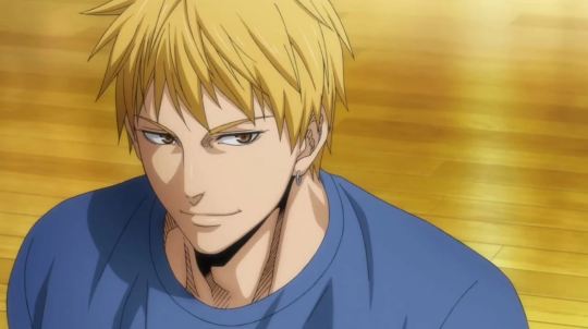

Kise I don't think I did a good job of fixing to my liking either. It was hard to edit it without making it look bad in general, because I really don't think this choppy sort of style suites him like at all, so it was too much to change. Now his hair is one of the better drawn ones in this movie for sure, but it feels more like a Kagami hairstyle than a Kise one to me. I just don't think his modeling agency would let him have such a choppy, hard-to-style haircut. I also think a more polished look fits his handsome, princely sort of appeal that makes him popular with girls.
Aomine
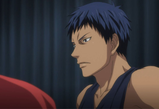

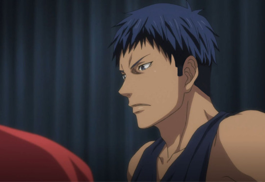
Alright, now its time for me to be playful and silly with some out-there hair styles. Aomine (and Kagami's hair) in Last Game I don't mind. After Akashi, I would say Aomine looks the best. BUT. We have NEVER seen Aomine with long hair, even in flashbacks when he's a child.

So for him to finally decide to grow out his hair - in the SUMMER HEAT - just feels like a weird move to me. Feels out of character. He strikes me as someone who likes his hair out of his face when he plays ball and just wants to roll out of bed and not worry about brushing/styling it or anything. The animators also aren't consistent in this movie and sometimes his hair looks particularly long in the front and back, which again, I don't think he'd like. This picture below and the ones above are from the same movie/take place within like a week of each other, yet look so different.
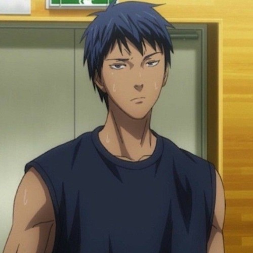
He looks cute and it definitely gives him a more youthful look; which is a weird choice, because they want to age up everyone else but Aomine in this movie. So, I think a fade would really suite him (I don't think I drew it that well tho). Keeps his hair short and out of his face but also ages him up a little more with a mature style.
Kagami


Alright, Kagami's look here is pure indulgence. @knbposting said "Kagami with a mullet" and I haven't stopped thinking about it. Sue me. His LG hair isn't bad and makes sense for his character and the time of year. But its just sorta plain. Honestly, Kise's hair style in this movie would probably suite Kagami more. I always liked how in the main series, Kagami's hair is a little scruffy in the back so I really wanted to lean into that.

Is a mullet suitable for the summer heat/something he'd like? Well, maybe not but I think it ages him up while also seeming like something he'd get at some point in his life. So here we are. I will end this with saying this is probably the longest he'd ever let his hair get.
Kuroko
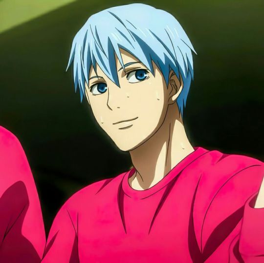

Finally, we have Kuroko, whose hair I've barely changed. Now, the animators/artists do a really bad job of keeping his face on-model (eyes too beady, features too sharp) but that's a whole 'nother issue, and I managed to find a scene where they kept him on-model lol. I think a shorter, neat style is good for the summer and suites him, but a main feature of all the hair throughout the main series is the spikes/strands of hair on nearly every character - Kuroko especially - so I just added a tiny bit more here.


And that's the end! If you read all the way to here, thanks for coming to my insane-person rant.
#kuroko no basket#kuroko's basketball#knb last game#kagami taiga#kuroko tetsuya#aomine daiki#kise ryōta#akashi seijuro#akashi seijurou#midorima shintaro#midorima shintarou#murasakibara atsushi#momoi satsuki#kise ryouta#generation of miracles#kiseki no sedai#wannabespeaks#knb meta
168 notes
·
View notes
Note
GT!!
Your writing inspires me every time I read it! I have long admired how you so skillfully drop deep insights into your writing in seemingly throw-away lines. You masterfully weave impactful themes into your narrative without disrupting flow for even a beat.
Personally, this is something I struggle with in my writing, and I'm really trying to improve. How did you learn to do this so well? Any tips for a new-ish writer?
Thanks for sharing your beautiful art with the world :) I wish I could scream at you in person about how much your writing has impacted me, but I hope you feel my respect and admiration across our screens! 🫶🏼🫶🏼
Thank you so much for the kind words! I offer you an answering scream into the void, out of mutual appreciation for the inspiration and kindness.
I think "writing themes" is tricky, because it depends on the kind of fiction you're trying to write. Some authors are deeply invested in telling a story that communicates a particular idea about how to live. (Contemporary critics tend to be dismissive of this mode because they see it as unrealistic; real experiences don't happen in order to communicate ideas or parables, etc.; and to that I would say who died and made you king of fiction, nobody said realism had to be the goal of all books ever, and the fact that the current literary climate happens to favor realism is an accident of taste and culture, not an objective standard of quality.) Those authors — I'm thinking of people like C.S. Lewis, G.K. Chesterton, Nathaniel Hawthorne, Harper Lee, George Orwell, Oscar Wilde, Paul Coelho, Anthony Burgess, most big-ticket science fiction novelists since Isaac Asimov and many fantasy novelists as well — have characters who act as representations of particular ideas. If you want to write that way, you might consider what you want one idea to "say" to one another in the moral thesis of your story: how do you think these concepts engage with each other? If you were going to visualize that by treating these concepts as people, what would they do to each other? What flaws would they have? How would they survive in different environments? What would be the "conclusion," i.e., which of them end up better-off? Is that a good thing? Why?
Alternatively, maybe you want a story that's more naturalistic and character-centric, and you don't want to necessarily give your reader a moral at the end of it. That's fine! In general, I've found that when most people talk about "themes," they use it as a sort of a catch-all term for "the author is thinking Deeply about Some Stuff," which doesn't necessarily mean that the text takes a position on any particular moral problem. It just means that the problems your characters have are rooted in choices they make, which allows the reader to see how certain ways of living may result in certain costs and benefits. The Great Gatsby isn't about capitalism and inequality per se, but watching Nick run around with these rich people, it's hard not to think about what capitalism and inequality are doing to each character in the story. Which kind of inevitably makes inequality and capitalism one of the themes of the book. It's not that the author put it there on purpose as an easter egg for you to find; it's just that if you want to discuss the book on a level deeper than a straight-up plot summary (asking the big why and how and what-if questions of analysis), you'll probably need to think about the ways that money and class are playing out in the story. It's woven into the structure of the story, right? These are concepts with force and energy in the novel, and they're moving pieces on the board. Conversely, some concepts don't play a role in the novel. For instance, nobody in the book is particularly religious. (Except, of course, the murderous idiot Wilson — and whoa, what does that seem to say about religion in the book?) So the redeeming power of Christ is clearly not a "theme" of Gatsby in the same way it very much is a theme of, say, Brideshead Revisited.
In that case, you might try dedicating a freewrite or two to what your concepts are. What's moving your pieces? Why you think your characters have the problems they do: what do you think causes them to fail? What in their pasts made them that way? In what situations would their faults become virtues? When they hurt other people, why does that happen? What institutions, systems, and social rules might have shaped their thought process? What do they believe, and does it help them or hurt them?
#then you get into literary theory and some people are like 'but what if every book actually could be understood with the same paradigms?'#'what if everything was freudian? what if everything was marxist?' it would be real boring. next#sometimes... books are about... different things.#anyway good luck with your writing!! if stuck the answer is always to write more and write different. hope this helps!#greenteacup asks
20 notes
·
View notes
Text


I have never posted Lily-Rose Depp before despite the fact that obviously she is attractive and obviously I have heard of her. The problem is the children of celebrities come with baggage. I am not mad about the Nepo baby thing, neither do I hold it against them nor do I agree with the people who think it is unfair to point out. Like all things, I think people can go too far one direction or another. There are so many invisible advantages that come with being the daughter of a famous actor when trying to be an actor and not all of them are as simple as access, there is just a baseline of knowledge. I am the rare sort who can trace a line of college graduates back 4 generations into the 1800's and while the vast majority of those ancestors were either men of the cloth or teachers so it didn't come with the benefit of fabulous wealth or access to halls of power that most people would assume and point to as the advantages it does come with a tradition of learning and knowledge that gave me a foundation many people don't get. Children of college educated people tend to be given many, many early childhood educational advantages because their parents are educated and that compounds as you go back further. My grandmother was not churning butter or working a loom when she watched me but she was teaching me about germ theory. Anyway, all that said, there are so many invisible advantages, including just the knowledge that being an actor is a real career and there are ways to make it work, a thing that might feel obvious but probably feels less real and more like a pipe dream to someone who grew up the son of a pipe fitter in Wisconsin.
So what I am saying is her dad comes with her when I post her and I have no interest in that and it probably kept me from ever seriously pursuing a post with her but now she is very appropriate because I watched Nosferatu, a movie that comes with a great deal of baggage. The Dracula story is so often filmed that the character of Dracula is actually the single most played character in the history of film. This iteration of course comes from a legendary silent film that is an exemplar of both the silent era and the German Expressionism that changed film making forever. But also there is already a legendary remake of that legendary movie, Nosferatu the Vampyre by Warner Herzog that does the same thing this movie does by taking the silent movie and then adding back all the bits from the Dracula novel to flesh things out giving us a synthisized version that is the Dracula story but with all the changes Nosferatu made. So I could not watch this movie without thinking about those movies, they were in conversation with each other whether this movie wanted to be or not. And that brings me to Lily-Rose Depp. I had a professor once who used to rage against "extra textuals". And he was right in one sense, any reading of the text has to be supported by the text itself. I have no time for your bullshit head cannon that is never in the text just because you like it, it's psuedo-intellectual nonsense. But also art grows and changes with you because of your experiences and that idea that people will view every movie in a vacuum is bullshit, that's not how life works and we can't cordon off parts of our brains like that. True greats knew that. Hitchcock cast people specifically because of their past roles and public image because he wanted that baggage, he knew people would bring it with him and this allowed him to manipulate them. So what I am saying is that Lily-Rose Depp is very pretty and on some level it might be unfair to not allow her to be a separate person from her parents but that's how the world works sometimes and this is all very low steaks. Maybe that will change now as this is actually the first thing I have ever seen her in and she was pretty good. That surprised me, which is likely unfair but I haven't liked her dad in anything in decades. Oh, well, no, apparently she can't escape the comparisons still. Oh well. Today I want to fuck Lily-Rose Depp.
22 notes
·
View notes
Note
do you have any tips for drawing dynamic poses? i always love the way you draw bodies!!
i know this has been said a million times but the way i draw bodies significantly improved after i started drawing more frequently from reference. if i cant find a reference for a pose on the internet, i'll just use myself or a friend. i spend an unfortunate amount of time just standing in front of my mirror looking at my own joints. pay attention to where your body curves!!
other than that though—honestly my anatomy/pose knowledge is a whack amalgamation of art tips i've accumulated over the years (i miss old school deviantart/tumblr style art tutorials). i also like to look at how artists i admire draw bodies—what details to they include, what anatomical short-hands etc
i think i'm still figuring out how to draw dynamic poses, but here are some cheats i've picked up (under the cut coz this got long again):
gonna use this stray!tim as a base
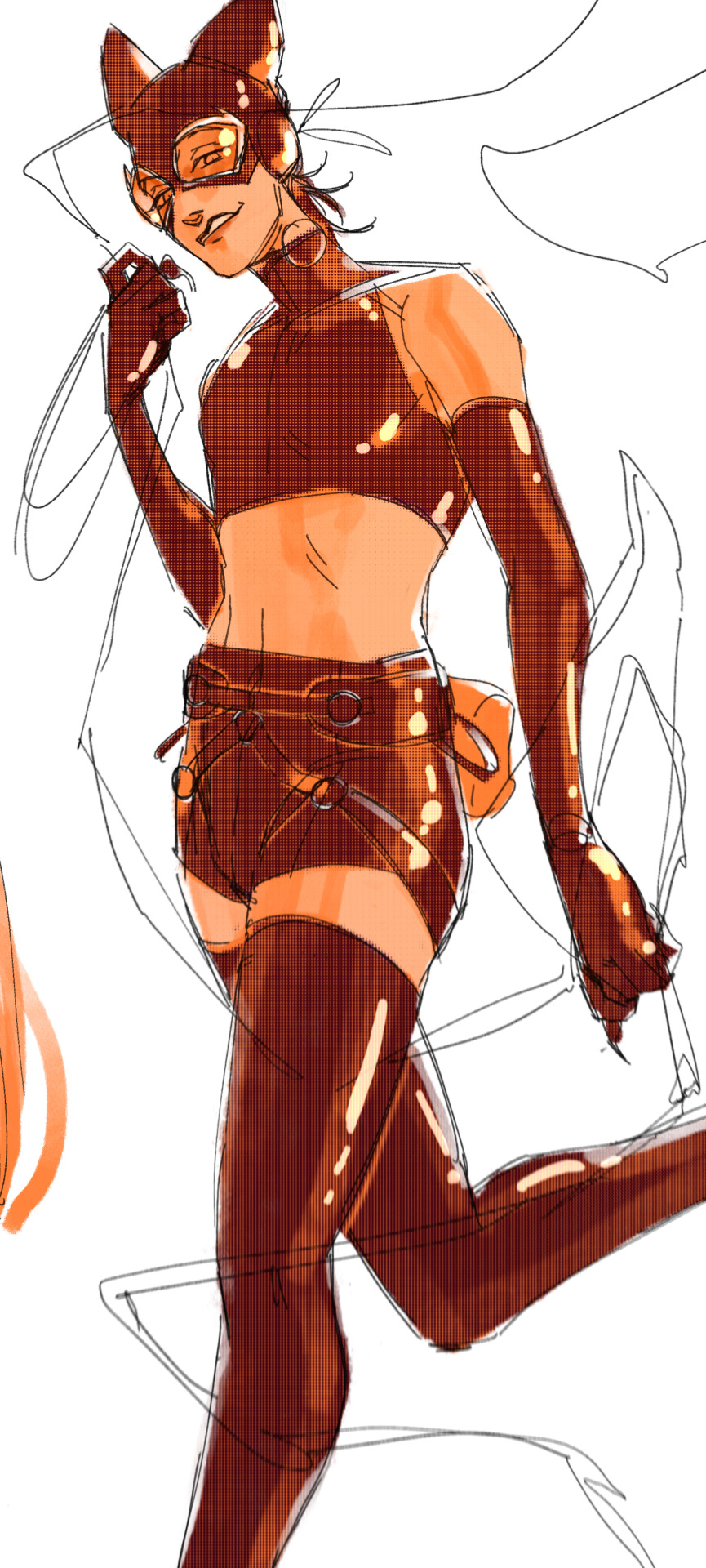
the easiest way for make up a pose is to start roughly with the head, collarbones, ribcage, and pelvis — you can build everything from there
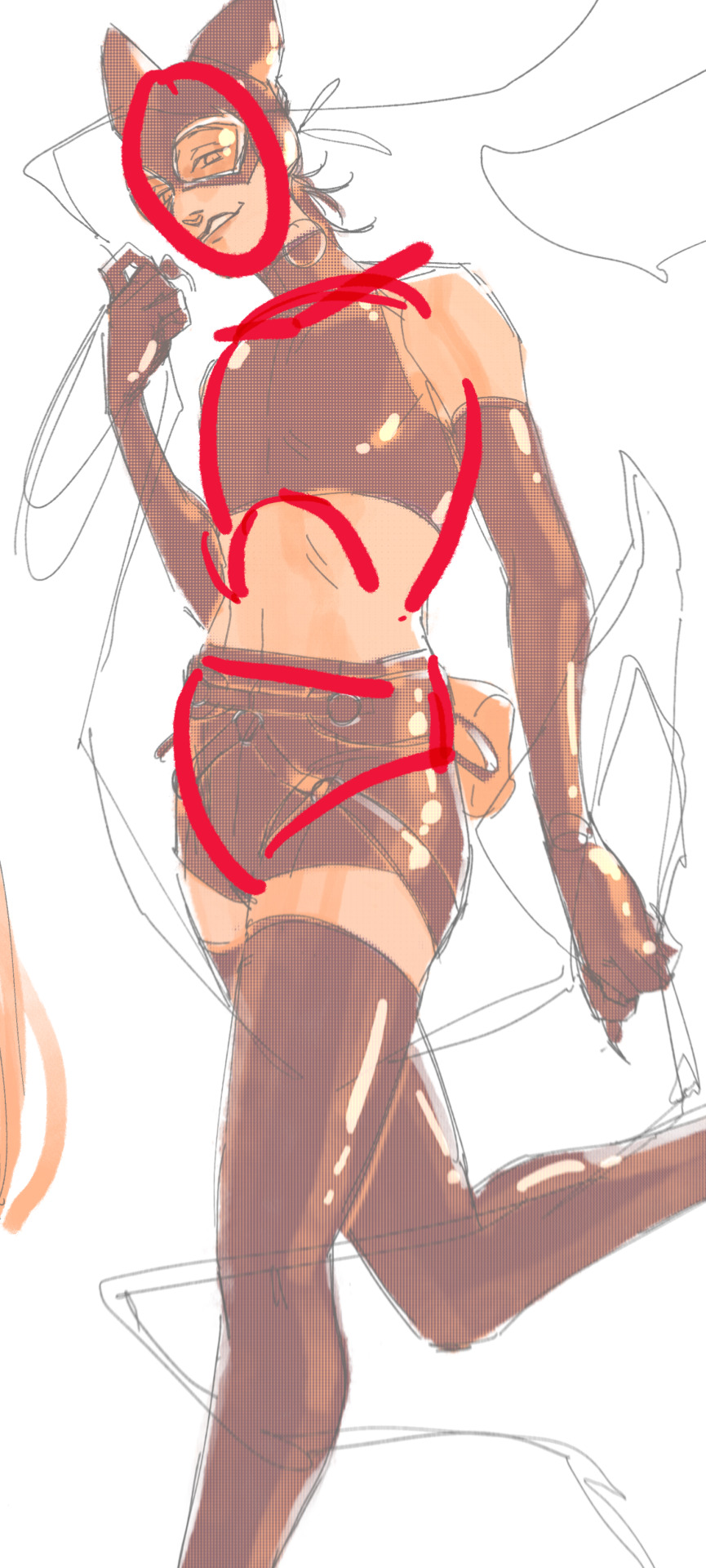
here's a couple more of what i mean by the ribcage-pelvis deconstruction:
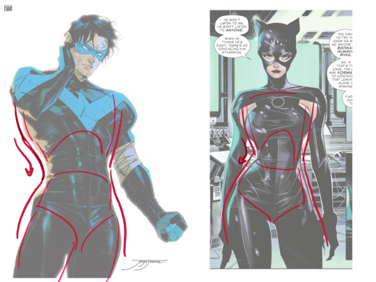
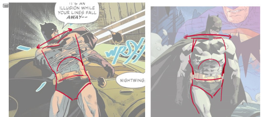
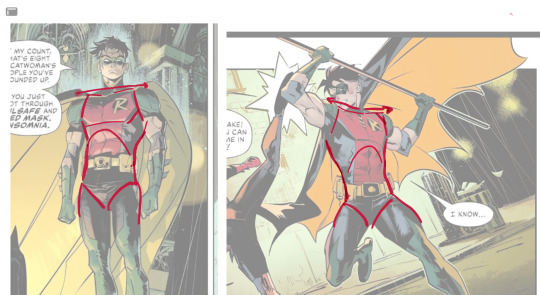
2. push your perspective a little!! imo things look more dynamic if you move your sight-line up or down—the horizontal orange line here. if you look at the panels above, the sight lines tend to be a little low, at around the character's torso or waist. i did the same below with stray!tim
to do this i usually try to get a sense of the space im working in by putting in some sloppy perspective grids
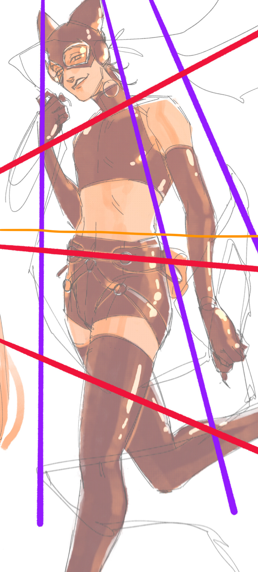
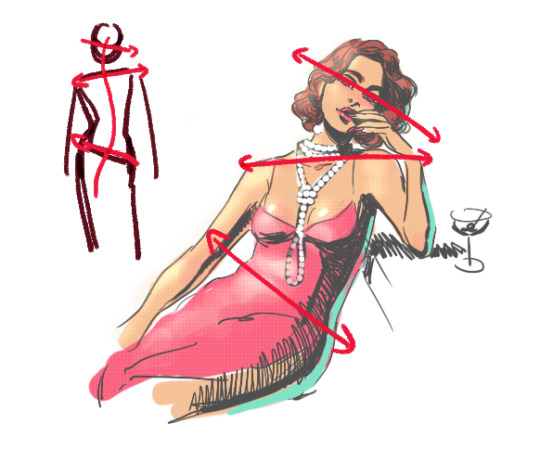
3. S curves!!! exaggerate the lines of the body. the body naturally has parallel horizontal lines—an easy way to get a body to look less rigid is to tilt those horizontal lines which in turn curves the vertical line of the body
this is what a mean by horizontal lines—usually i use the eyes, shoulders, and hips:
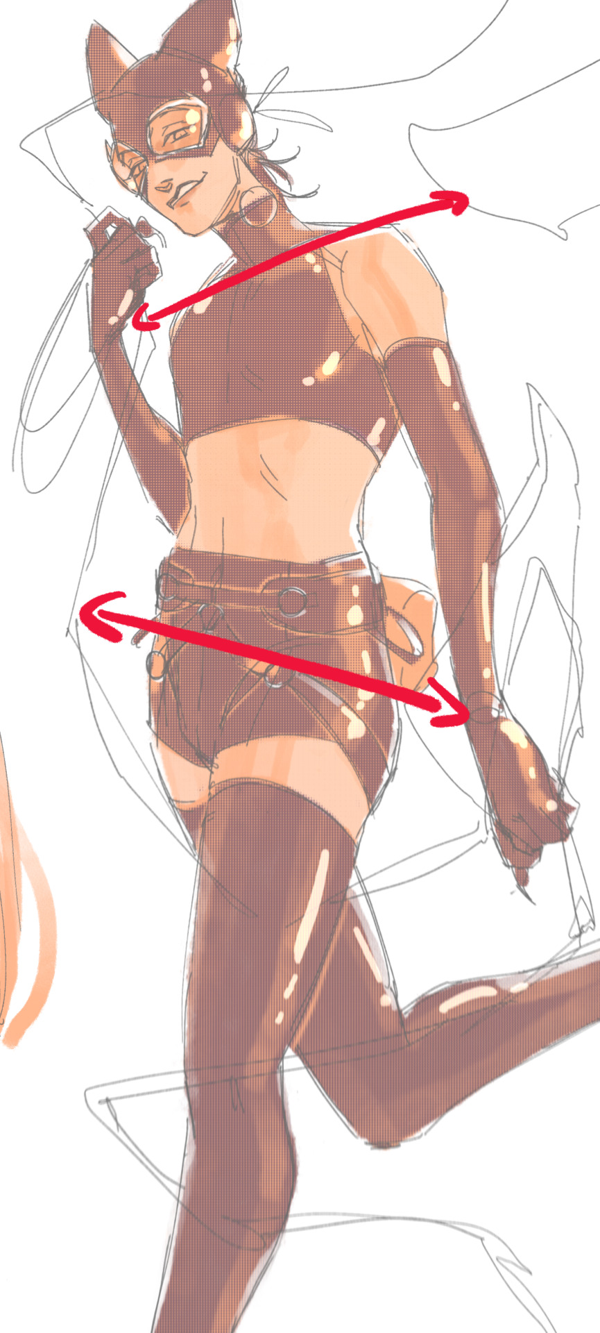
i'm gonna use caterina as a better example—usually you want the horizontal lines to sort of zigzag:
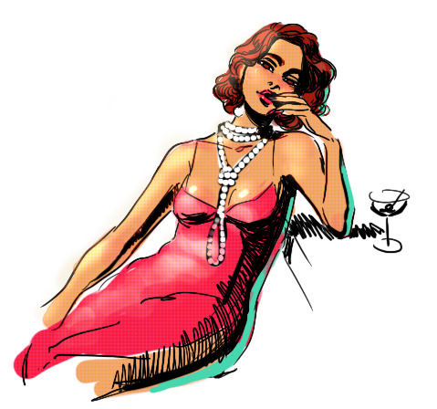
i've also picked up a couple visual tricks that don't exactly add dynamism to a pose? but they do give a static pose a little more oomph. a lot of this is done by visually highlighting one specific point of the body
for our purposes, i'm gonna make the focal point tim's face
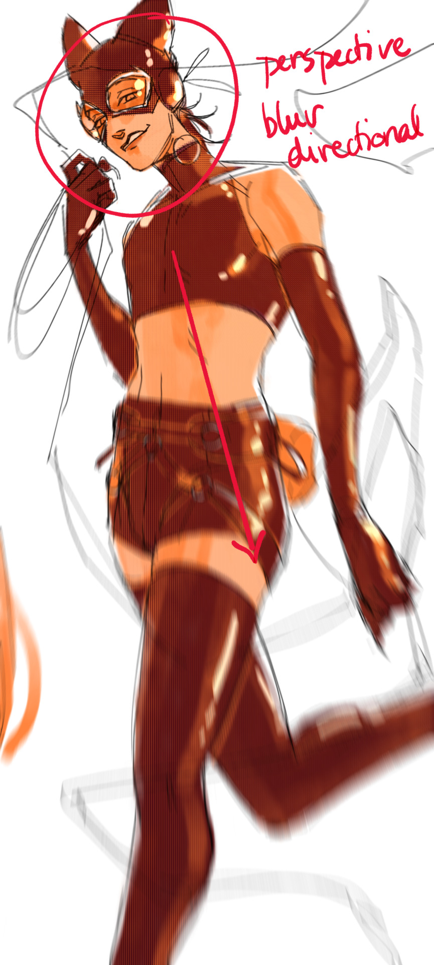
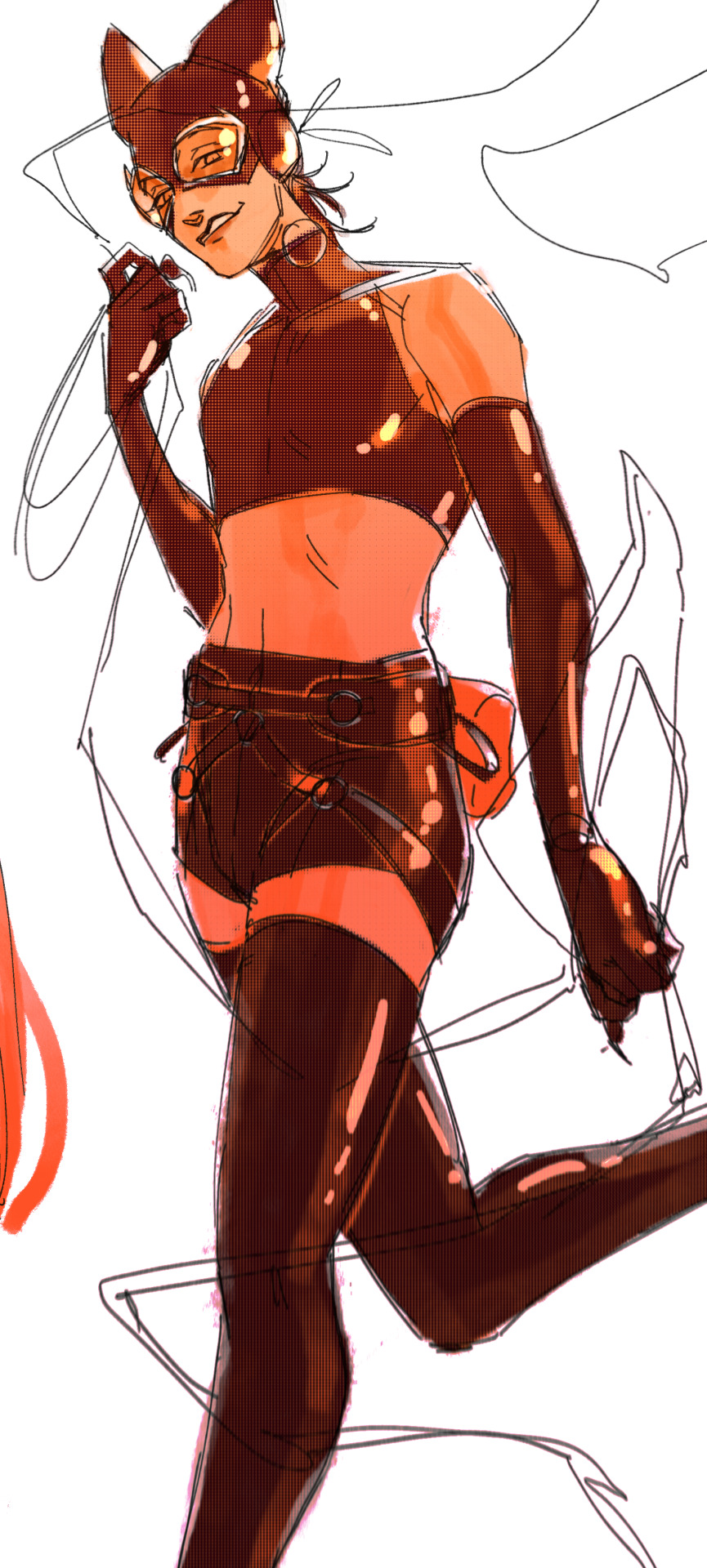
motion blur! there are a couple ways to do this. i actually dont like working with traditional motion blur because you have to mess around with selections, so i usually fake motion blur using postional perspective blur:


2. gradient lighting—you can add a lot of depth this way. usually i like setting the gradient in the direction of the focal point, e.g. tim's face
below, i added a layer above the base drawing, used an airbrush to get this gradient, and then set the layer to color burn and lowered the opacity. you can also clip the lighting layer to the base drawing and set it to multiply

below, i did the opposite—instead of adding a gradient shadow, i added gradient light. i set the layer to add this time (instead of color burn) and then lowered the opacity again.
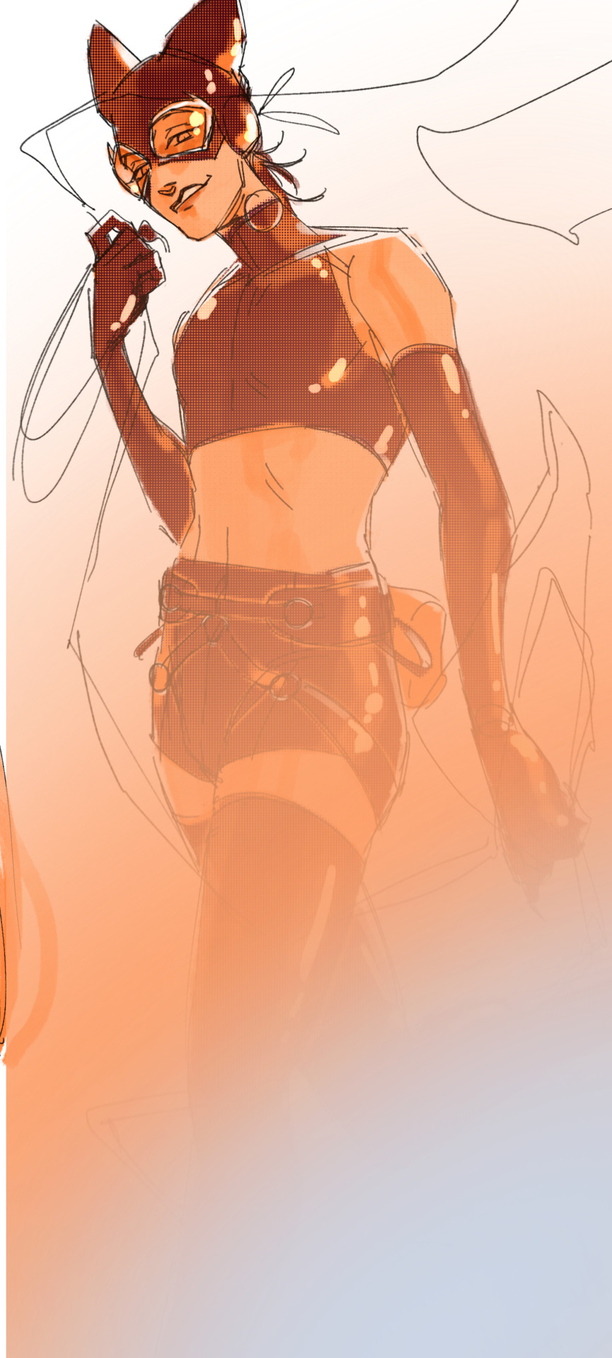
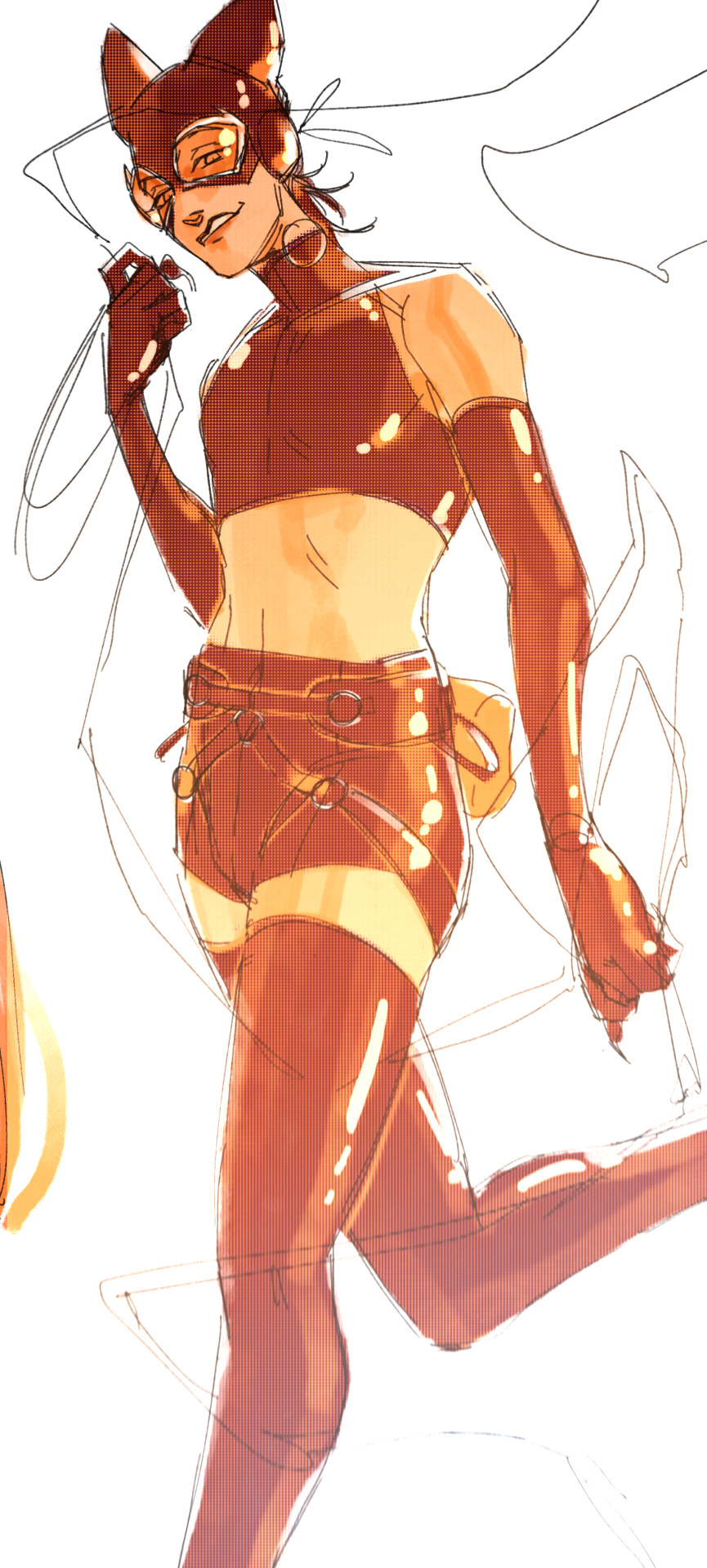
this kinda serves to desaturate the parts of the piece that are less important (ish i was kinda sloppy here), driving the eye to face—the most saturated. the motion blur does a similar thing, where the only thing "in focus" is tim's face
the gradient also sort of adds a directionality to the piece—it starts at the bottom right corner and goes up towards the upper left, causing your eye to follow that same path, which drags your gaze up tim's body
here's what it looks like when i combine 1 and 2:

3. chromatic aberration's been pretty popular recently. it does a similar thing as perspective blur but with more eyestrain (although i went with a really exaggerated version below just to show you what it does) but it looks cool!
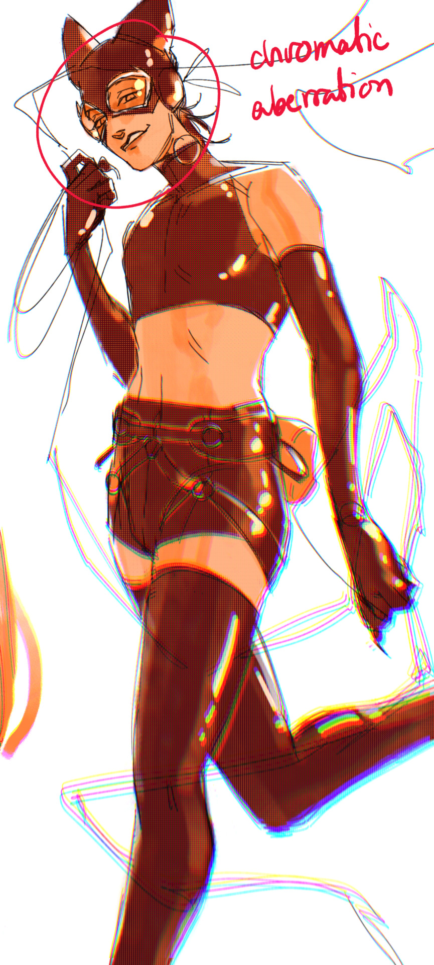
bonus cryptid tim as a reward for getting to the end :-)
#red talks#sart#art tutorial#YeAH UH this got long lmaooo i was on the bus for a Sec plotting this out so#also i am neck deep in a reincarnation/regression manhwa stress hyperfixation so i havent had the brain space to draw#so you get this instead!#if anyone wants recs lemme know lol#thank you anon :)))
67 notes
·
View notes
Text
Because I have a tendency to get stuck in art blocks and s t r u g g l e badly with composition, and because I think The Bad Batch is a beautifully shot show, I’ve started doing rough grayscale studies of bad batch to unpack how line and value can be used to direct a viewer’s eye to where people want the audience to look. (I’m doing it with other movies and shows, but I do really like TBB, so….) That way, if I’m sitting in a period where I can’t draw, then maybe I can at least learn something. It’s not fan art, it’s just trying to break the composition down and make it make sense to me, but I think it’s interesting so I figured I’d throw them all here.
So! Potentially very boring things under the cut:
The thing that started this off was getting sent a gifset of the scene in “The Return” where Wrecker gives Crosshair his armor back. It’s a great scene, and one of the things that allows for the show to pull that moment off is the way that most everything in many of the shots is designed to draw the viewer’s attention to Crosshair’s face so that we’re paying attention to his reaction. For example:
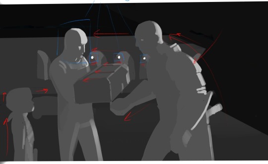
It’s not a very high contrast shot, but if we block out the basics, most of the lines in the scene are directing us towards Crosshair. Both Wrecker and Omega make movements towards him in this shot, and then this movement is sort of carried over to Crosshair via the various lines in the background/Wrecker’s arm/even the crate. Additionally, our eyes tend to be drawn towards points of highest contract, which, in this shot, include the lamps in the far background against the pillars (forming a line from Wrecker to Crosshair) and the light hitting Crosshair’s face against the much darker background. Between all of this most people in the audience are going to end up automatically looking right at Crosshair who is, of course, the main person we’re supposed to paying attention to here.
This isn’t actually a full frame. I sort of grabbed a screenshot over the interwebs for this one, but The Bad Batch actually has a very wide aspect ratio. From what I understand it’s shot and aired in a CinemaScope ratio (2:39:1 or 2:35:1, though TBB is 2:39:1). It’s basically super ultra widescreen, an aspect ratio used when a filmmaker wants to make something feel more epic or cinematic, and as far as I know it’s the same aspect ratio used for the original trilogy before any cropping happened. (For reference, The Clone Wars was also shot in a CinemaScope ratio, 2:35:1, but was cropped to 16:9 for airing on Cartoon Network, and Rebels was shot and aired in 1:78/more or less 16:9.) So an uncropped screenshot of TBB would look more like this:

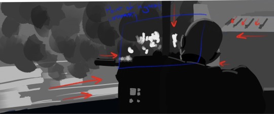
This is from “The Outpost.” It’s actually a fairly dark shot with Crosshair faced away from the camera and the value of his figure blending right into the rest of the foreground, which actually comes communicate a sense of someone who isn’t trying to draw attention to themselves (to me, anyway), but our eyes are drawn to Crosshair anyway by every major line in the shot as well as the highest point of contrast converging right over Crosshair’s shoulder. That, and the line of his rifle/shoulder and the support pole forming a big, well, cross-hair right in that same spot. Otherwise, he would blend right into the foreground and be easier to miss.
Unlike Hunter in this shot from “Plan 99”
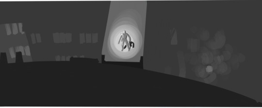
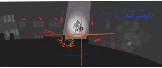
Where basically you’ve got the exact same thing happening, every line in the shot converges on Hunter’s location, but instead of using just high contrast to draw our attention, we’ve got a fairly middle-gray scene with our eyes being drawn to the focal point by having one bright spotlight.
The orange cross mark I’ve drawn here is just to mark the center of the frame, which I wanted to point out since, at least as far as I’ve noticed, TBB has a tendency to save center and slightly off-center shots for really specific moments. I’d have to check on that and what the pattern is, though, since a few of the remaining shots in this post are center shot. (Filmmakers area generally taught shoot in thirds or, alternatively, on a phi grid or other away from center set of focal points, though you do get some center shot movies and shows. I think Raiders of the Lost Arc has a lot of center shots.)
In fact, a pretty good example of shooting in thirds (or on a phi grid—I laid it out and I think it fits the phi grid slightly better) is this shot from “Faster”
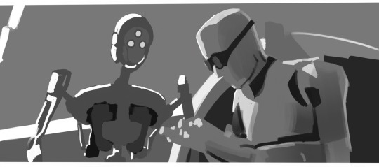
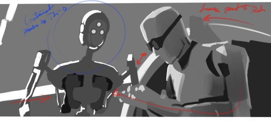
Where you’ve got Tech and Tay-0 placed on slightly close thirds on either side of the frame. If we’re just looking at line and value, with this shot we actually get this sort of interesting back and forth between where our eye is being drawn. A lot of the lines in the shot are directing us to look at Tech, but then you’ve got one of the lines going through, and the sweep of Tech’s arm and datapad pointing towards, Tay-0, whose face and body are outlined with a much higher contrast in value. And then we have that one very bold arc connecting the two. The result of this is that our eyes sort of bounce back and forth between these two characters as they get into their conversation.
Most of these shots have had just one or two (at most three) characters, and there are many scenes of TBB with everyone where our gaze is sort of directed to the group collectively, but sometimes you’ll have group scene where our attention is directed more towards one individual than others, like with this shot from “Battle Scars”
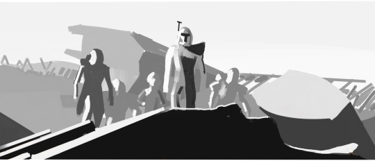
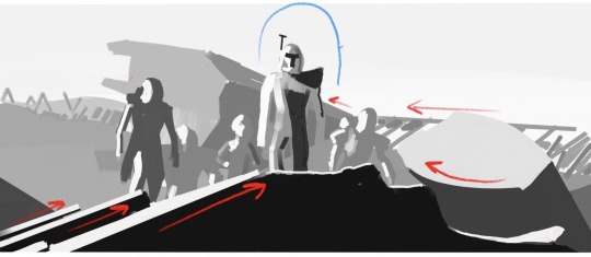
Once again, you’ve got most of the lines in the shot converging towards Rex as well as Rex’s person serving as the point of highest contrast while everyone else sort of melds into the background in terms of value. He’s also the first (and maybe only) figure who breaks fully above objects in the background to be shot directly against the sky. Line and value aren’t the only things directing the audience’s gaze towards Rex in this shot—there’s actually a lot of desaturation happening as we move from Rex, to the other characters, to the far background that helps as well, buuuuut this is a grayscale breakdown so that unfortunately doesn’t show up...here. (This is a center shot scene if we’re going horizontally, but Rex’s head, which is really the focal point, is right around the top third of the frame; it’s not exactly a low angle shot, but we are still looking up at him.)
Anyway, the reason any of this is important is because when you’re shooting with an incredibly wide aspect ratio like this, there’s a LOT of information being conveyed with every frame. You can fit a lot of stuff on screen at once. And while people generally going to rewatch and pay attention to background details (if nothing else, TBB is a goldmine for those background details), you do want to draw your audience’s attention to the most important parts of the frame—especially when an individual shot typically lasts only a few seconds. Or less. Like with this:
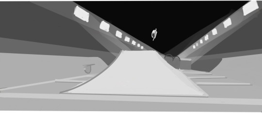
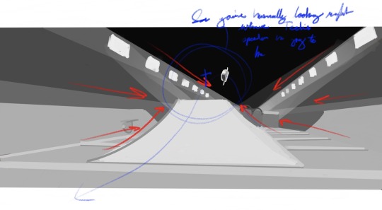
So this shot from "Faster" is up for less than a second before the camera turns to follow the speeders and then changes to another shot, and I had a devil of a time even getting screengrab of it. (Mostly because I was trying to grab it on my phone, but that's not really the point.) In less than a second the people making this have to communicate where Tech's speeder is, what's happening, what we're even looking at, while the objects in the scene are all moving incredibly fast. .
So, to communicate that, you've got multiple speeders moving in the shot, but only one (Tech's) standing out in terms of value against a fairly dark ceiling, as well as a combination of some real direct one-point linear perspective and the more or less arrow shape of the ramp pointing directly at the point Tech's speeder is going to be when it reaches the peak of its crest over the ramp. That way we're already looking at where Tech is going to be before he gets there and end up following his speeder as he zooms by.
#the bad batch#so anyway it's a very pretty show#and a very visually deliberate one too#(I think it's deliberate in other ways too but that's the kind of stuff I save for my endless old lady yells we're not done at clouds box)#there's no real conclusion to this#I just have a hard time getting my head around composition so I thought the way TBB does it is neat#also I know in animation it’s scene and sequence instead of shot and scene#but it’s easier to communicate it with shot and scene
23 notes
·
View notes
Text
AI Manipulations of Rings of Power. (Longish)
Saw the AI edits of Haladriel scenes being altered by GenAI to make the characters* kiss. I have seen chatter about it and the negative implications of creating or interacting with AI generated content.
At the risk of being nuanced, (feel free to block or scroll past this) it interests me what exactly is the concern with it and why. To be clear, I do work in an industry that is both working to incorporate and profit off AIs while simultaneously my own job is increasingly at risk by the same products or we are forced to use them for productivity reasons.
Some reasons that make sense to me that you would not want AI content would be
1. Legal and copyright infringement of the ownership of the art or source material used to train the AI models. Stolen work, no credit or payment to artists
2. It’s generally shitty, sloppy, uncanny valley. Which aesthetically I think most people would be against
3. It directly competes against manual labor of a human, devalues work, replaces jobs, or floods the market so creators never can be separated, investment in a skill or art form isnt worth it.
4. It extremely energy intensive, the environmental implications can he huge with the climate crisis.
5. Its being shoveled in our faces by overhyped tech bros because they think its cool and can find gullible investors for, like NFTs and crypto curriencies
6. Deep fake abuse with AI, making up fake news, abusing a real person image in a degrading way without consent.
I think all of these are serious issues with AI.
The stuff that was shared about Sauron and Galadriel kissing does it materialize those concerns? I’m going to assume that it may for the first one, legal and copyright ownership of training data. Im not a lawyer, and there are also some AI models trained on legally owner content or public domain / open source content. I have no way of knowing what models were used by the GenAI that made those haladriel kisses, so we probably have to assume they may have questionable provenance, and I think by that alone we should boycott those.
Now what if someone used a more solidly vetted model or genAI service without those legal issues? What if the artists do get paid or some form of royalties?
The kiss videos themselves were ok, maybe halfway believable, there were obviously the weird uncanny ai artifacts and stuff. It’s objectively worse than if ROP had actually filmed a kiss with live actors in the show proper. But who am I to judge whether that slop is aesthetically pleasing to someone else or not? Sometimes I have found AI art that is truly bizarre in that this is too weird surrealness quality like looking into a dream while being awake. I’m not sure that this feeling is necessarily wrong to enjoy on its own.
Regarding the AI replacing jobs argument. I suppose it depends what we mean. They were never going to remake ROP Season 1 or 2. Morfydd and Charlie won’t be offered the same role if another company were to buy the rights and make Rings of Power reboot. We will never get those kisses on screen. Maybe you can say that if people were fed content for Haladriel you could give them that almost infinitely by GenAI and then those people would be less likely to consume or pay for some other newer media that might otherwise give a satisfactory ETL with backstory and build up equivalent to what ROP has done with Haladriel? I’m not sure how to weigh that, it might be true? I tend to think these AI kisses arent replacing any creative workers in the film/tv industry. I don’t think we say that fanfic reusing known characters competes with original written stories (or do people argue this?) although i suppose it does on some level. Do people boycott fanfiction?
Along these lines, what about the actors consent and deep fake aspects? Personally, I don’t see how the AI images are more offensive or harmful than fanart which uses the actors depictions to do all sorts of things, stabbing, killing, kissing, screwing and everything and everyone in between. Or fan edits which use clever editing and overlay soundtracks with pointed lyrics which completely change the artistic intent of the actors /creatives who made the original in a particular way, say make two characters have a romantic chemistry that wasn’t there in the original? Or even the old photoshop manipulation stuff? I thought we’re ok with this in the fandom world, is this that different?
I’m not saying I like AI or you need to. I probably wont interact with it and try to avoid it personally wherever I can. But I do wonder if the arguments people are making against ROP AI edits are actually in good faith? Because then i question why other kinds of fan creations are acceptable?
23 notes
·
View notes
Note
this is gonna be rambly, btw
anon who was talking about Brandon's sexism - I think you've got a point but something about Brandon's writing idk, bothers me less than Viv's?
it's hard to explain but something about projects where he did most of the writing like Class Acts feel less mean spirited towards the female characters than HB is? like Brandon's specialty seems to be writing over the top people or broad stereotypes (for everyone, not just the women) and then making them feel tragic and human. and everyone gets this treatment, not just the male characters.
it's been pointed out Viv's female characters tend to fall into a couple of repeating categories: bitch (Loona, GlitznGlam), shrew (Stella), or perfect wholesome angel (Charlie, Millie, kinda Vaggie). but from what I've seen of Brandon's stuff there's a bit more variety - Class Acts has a grandma who is bitter and grouchy all the time but she's attending drama classes for her grandson's sake and cares a lot about him, while Morgana's character is a more realized version of what Loona was probably intended to be - a goth who's abrasive and mean because she's disappointed with how life is turning out.
on top of that the female characters often give as good as they get - there's this sequence in a recent Class Acts that's basically the Apology Tour party but done better where all the female characters are having an actual support group (meetup where they talk in a circle sort of thing) from their experiences with the main character that Brandon plays, who is kind of like if you combined Blitzo's jerk tendencies with an acting teacher with failed dreams.
And the show lets them have this moment. It doesn't do what Viv does and use the female characters' pain as a vehicle for another, suckier male character to look better in a ship that's increasingly DOA.
I guess what I'm getting at here is the overuse of 'bitch' and etc feels a lot less pointed in a show where the male characters get insulted constantly too, but more importantly the show doesn't prioritize its male characters over its female ones, screentime wise. Unlike Viv's writing Brandon's female characters actually feel like people - I haven't seen it but I know he devoted an entire series to the Bryce Tankthurst character, who looks kind of like what Stella could have been if she was fun and well-realized (I think Bryce canonically doesn't have a heart or something?)
Also as you mentioned also Brandon never pretended his writing was high art, unlike Viv who acts like her swearing is sophisticated comedy and keeps jamming in embarassingly handled abuse storylines to make her writing look more mature than it is.
Speaking of Stella, I have a hard time imagining Brandon writing a storyline where a woman is forced to get marry young, get pregnant and then is villainized for being trapped in a life she never wanted in order to make a flawed male character look better.
And if just Brandon had been writing Stolas and Stol1tz, I think it would have turned out less victim blamey than it is now, because from what I can tell he doesn't have a problem with holding his male characters to account and calling them losers.
If it had happened in an episode that wasn't written the way Apology Tour is, Blitzo's 'I don't wanna be this way, not forever' probably would have landed and been impactful. I kinda sensed where things were going with the Stol1tz storyline from the trailer but that line made me sad because I could so easily imagine a scenario where it would have worked. But since Viv's writing of men hamstrings the story's ability to hold them to account - combined with the horror movie levels of gaslighting going on with Stolas - that line is completely wasted in the episode and context it's in.
I don't mean to sound like I love Brandon's work or it means a lot to me - I don't and it doesn't. But I can see a level of craft there not present with Viv's and his female characters are just better handled across the board.
(The Octavia thing was messed up though, idk if he was just playing to the crowd there - and it's not even true since canonically Blitzo has no problem with Via! He calls her sweetie for crying out loud!)
Thank you for putting it into better words than I ever could.
Brandon's an asshole, but he does have a solid understanding of craft. He knows what kind of story he wants to convey and how to do it, and in spite of said assholeism, he has a better understanding of empathy, of how to write human characters. I think that actually really bugs Viv, to be honest.
52 notes
·
View notes
Note
Hihi! Love your art! I'm quite curious though. If there a specific reason why you draw sniper the way you do? For instance you have more darker skin, is that perhaps to make him look Maori? Either way I freaking love the way you draw him! (sorry if this offends you any way)
I'm not Maori or even remotely dark skin (I hate the sun), I have nothing to be offended about lmao
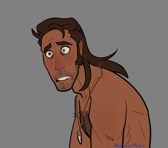
About his skin color: I just imagine that he... Spends time in the sun, but I'm too lazy to draw the tan lines or I just think that they don't fit the drawing, so I leave them out unless I'm going for a more realistic style
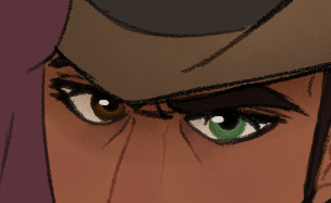
His eyes: the most striking feature of his design, I think. Besides from me thinking that heterochromia is really cool, I find it would make quite a bit of sense, like why always hide your eyes (even indoors, god) from other people? it's my headcanon that he kind of got bullied for it on his childhood, and when he was gifted a pair of shades he not only found himself looking very cool, but he also found that people didn't really notice his condition, so he just decided that he'd wear them pretty much all the time. He uses his shades to hide that he's high as well but, yknow
Facial hair: not much to see here, really. giving him a couple longer hairs on his upper lip and chin just kinda makes him look more rugged and feral
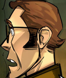

Hair: Come on, how could I not give him a mullet? in the game and the comics he already has a sort of.... mullet-y thing going on, so I just like to make it way longer, it makes him appear even more rugged and feral in my opinion. I will usually vary the length depending on what I feel like drawing, no particular reason for that specifically


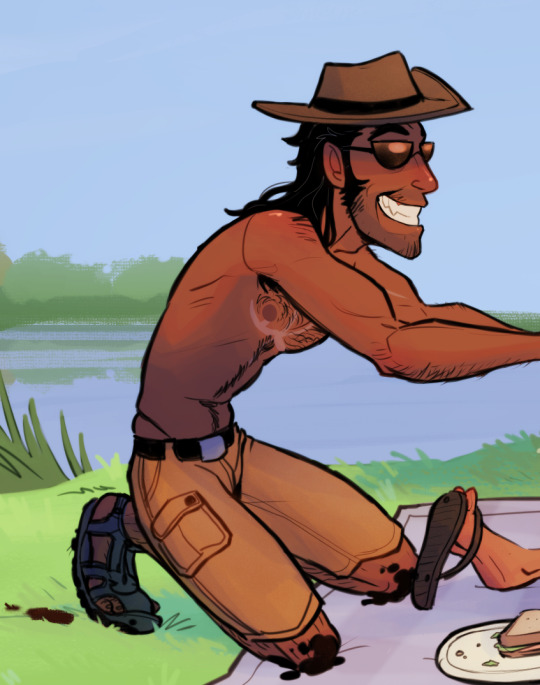
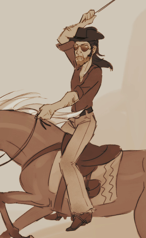
Clothing: I want to make him look like a cowboy most of the time, but his comfortable and very casual attire is more dad-esque, I think? I want all the outdoor vibes, honestly. The hat and the shades are always a must, but you may notice that I tend to depict him with a fang pendant, I just headcanon that it's a trophy he kept from a particularly arduous hunt
As for his body, I like to make him sort of... Sharp-looking? To make him stand out from the other mercs a little more. He's tall, and a little gangly, but not skinny, he has muscle and a little fat on him. I also like to make him the hairiest out of all the mercs, because he deserves it
Color palette: I really like giving him a very warm and cozy sort of color palette, it just kinda fits with his vibe, I guess? certainly fits with the "cowboy" theme that he has going on
I want to note that my style for him specifically is inconsistent at times because I just cannot make up my mind on how to draw his facial features, but the one thing that I do keep is his nose and his ears, long and sort of triangular
Overall I think I just kinda took the canon Sniper and exaggerated him even more? Cowboy-ified him, maybe? Anyway, yeah, that's it that's why I draw him the way I do
I have changed how I draw some of the mercs since I made this but these are my pseudo references for them, if you're curious.
138 notes
·
View notes
Note
Hi!! Your art is so fucking cool! Can I ask what the process looks like for form line? Ex. What do your sketches look like when they are really rough? How do you go from idea -> final product. 💕
Hadih, thanks so much for your question!
Honestly, it's sort of hard to explain? I do have some sketches to sort of give an idea though.
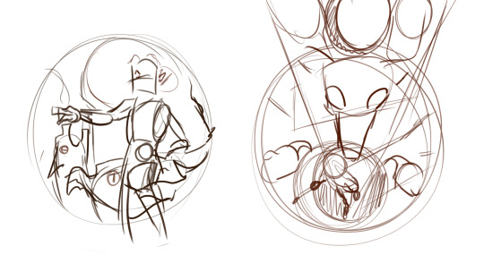
This sketch I posted a couple days ago is a pretty good example of what my initial concept sketches sometimes look like.. As you can see, they're pretty chaotic and very rough, and usually these sketches are more about getting the idea down then actually making the formline itself. There aren't formline shapes just yet, although I do sometimes sketch out elements or shapes like eyes or bodies or paws/hands that will usually have an ovoid in it, because those elements tend to be a focus or centerpiece. The sketch is obviously not final, and things can change along the way to account for space and balance as well as what I'm trying to convey. (These sketches aren't entirely accurate of course because they're for pieces that are meant to be fusions of character illustrations and formline art, but they're the best thing I can find on my pc at the moment)
The rough sketch helps me figure out the flow of the piece, and once I'm satisfied with it I try and get to putting down the shapes and silhouette, and it's here where I try to find the balance with my rough sketch and how the shapes can fit and behave in the piece to the best of their limits while also still conveying the message I want to send. The most common shape I start with is the focus shapes, which are usually ovoids.
This rough of my harbor seal formline which I sent to my aunt for review sort of gives a better Idea of what I mean when I say I try and focus on where the centerpoints will be. Ovoids are usually a focus, so you can see them pop up a lot; in the body, the head, the eyes, the tail, etc. Ovoids are so important and probably the most common shape in formline art, and one of the most common feedback I get from my aunt is to adjust how the ovoid looks in any one of my pieces; she often compared them to a loaf of bread! You don't want your ovoids to look like a loaf of bread! (Her words, not mine). I feel like I've gotten better at drawing ovoids though, because she gives it as feedback less and less nowadays. Ovoids usually also have to have a bit of weight/perspective to them; it's hard to describe but essentially the top of the ovoid should usually be bigger/thicker/have more weight then the bottom.
From ovoids, the next shapes are usually circles, u-shapes and crescents, then usually y-shapes/trigons. It can be difficult, because the key is to make sure the shapes flow together and feel cohesive, as well as to make sure the negative/positive space balance feels right. Also a fun tidbit, trigons are most typically used to essentially fill space; it's always important to make sure that they are binding bigger shapes like u-shapes and ovoids and not stealing all the space and attention.
The lines in this stage tend to be very rough and messy, and I always try to go over the next rough draft with a smoother and cleaner pen.
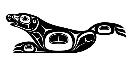
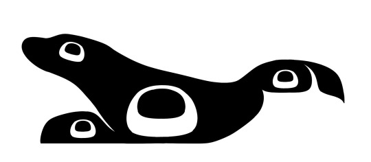
Once the initial shapes are done, I'll usually send the piece to my aunt (sometimes I send them earlier on, when I'm in the middle of working out the shapes) for feedback! I am still a student in formline work after all; basically all of my teachings come from my aunt, who has a lot more years of work in formline art then me. She'll give me feedback and tips of what she thinks I should fix or experiment with. I adjust and fix and sometimes even completely delete and redo parts of the piece with her guidance. The list of things she tells me to change decreases with each piece, so I like to take that as a sign that I'm improving!
Once the black and white version of the design is done, I move onto coloring. Usually I already have a color scheme in mind when I go into a piece, so I'll mess around and put down colors and see how well they contrast before I color it. Typically, a piece will have about 3 colors; one for the background, one primary color, and one secondary color. I use a clipping layer to color the entire formline piece with the primary color, and then go in with the pen tool and bucket tool to use the secondary color. Adding in the secondary color is tricky but important because it once again falls into balancing positive and negative space/colors and the transitions between the two.
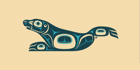
Once coloring is done, the project is basically finished! Unless there are some other plans I have for it, ie using it for an overlay in a bigger piece, colouring is usually the final stage.
And that's about it! I hope this helps you understand a bit; this isn't a perfect explanation as this is just from my own artistic POV and other nations and artists have their own process, but I hope it helps nonetheless!!
Edit: I forgot I posted other WIP formlines here before 😭 here and here!! You can sort of see me figure out the flow and balance of the designs in between the WIP and the finished piece!
#indigenous art#formline art#indigenous culture#the process of balancing shapes is a lot harder and more complex then I can describe in a tumblr post#it really is a balancing act that can take a long time to learn and i think i still have a way's to go to perfect my abilities#In that way it's sort of hard to describe and put down how exactly I do formline art I think? Bc of how close and thoughtful the process is#there's something very personal and honestly almost spiritual about finding that balance and figuring out how to convey the message you're-#trying to convey even if the piece doesn't seem that way (the amogus one lol). that's the most clear way I can describe it.#i am rambling a lot oops.
81 notes
·
View notes
Text
Lettering Tips for Comics Artists!
Lettering is an easy to overlook aspect of comics creation, partially because good lettering is designed to be invisible, but bad lettering can ruin an otherwise well crafted project.
Now, I'm not a letterer by trade, I'm a colorist who thinks too much about comics craft, but I've picked up on a few common mistakes I've seen new webcomic artists making, and I thought I'd share my tricks.
#1: Get a Dialog font
Sorry, despite Comic Sans having the word comic in the name, it's not actually good for lettering comics. Comic book letterers usually use specially designed fonts when they're lettering comics, and they often have websites where you can get these typefaces for a reasonable fee (or sometimes even free!)
What makes dialog typefaces special?
The barred-I! (and other contextual options)
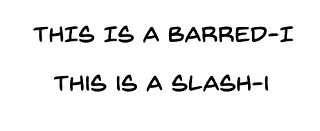
This one is subtle, but generally, you want to only use the barred-I for the personal pronoun "I" or for roman numerals. It helps clarify that what you're looking at is an I and not an L, but it takes up more space in the word, and we're trying to reserve as much space as possible for the art on the page.
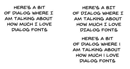
Specially made comic book fonts will also be custom designed to be legible at a distance, have multiple bold/italics options, and might even include special versions of individual letters for when you type multiple of the same character in a row! It'll give your lettering a personal touch that you won't get from typefaces designed for other things.

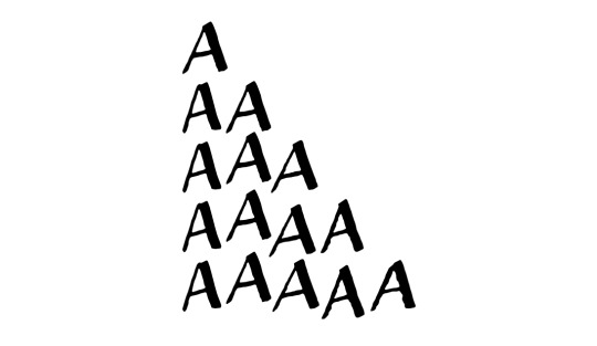
Blambot is a great resource for all your lettering needs. Here I'm using Backissues and Nightmark
#2: Dialog Stacking
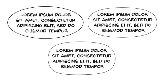
Dialog should always be stacked such that your longest line of text is in the middle. The block of text itself should have a sort of diamond shape <>. Sometimes this is difficult to do, especially if you have any long words at the beginning or end of a sentence. You can't always get it to work (and if you're unwilling to rewrite your dialog so it fits), so sometimes it might not be perfect, but if your text block is more hourglass shaped >< that's a good indication that you should try putting your line breaks somewhere else. Basically try to make your text as round as possible if it's in a balloon.
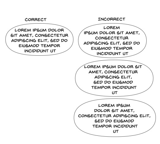
#3: Balloon Shape
One of the more common mistakes I see webcomic artists making is using perfectly elliptical balloons. It's actually kind of difficult to fit text into balloons that are perfectly elliptical; there ends up being a lot of uneven space around the text, and it looks kind of cheap. Making your balloons slightly more rectangular is going to give you more bang for you buck, they'll fit the text block a little better. I like a hand drawn balloon, I tend to think they add variety.
One thing you definitely shouldn't do is this:
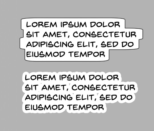
This might be a personal preference thing more than any kind of hard and fast rule, but these lettering styles give me the impression that the text is pasted on top of the art, and that no real thought was put into arranging it thoughtfully with the art. These are probably more appropriate for captions, not so much for dialog
Lettering is a part of the medium we're working with, the dialog should be approached as a part of the artwork, and treated as such.
#4: Balloon Placement
The number one, most important rule of lettering, is that the placement of your balloons should never confuse your reader. The goal of balloon placement is to guide your reader around the page, each one should naturally lead your reader towards the next thing they should read. Here's an example of something I see a lot:
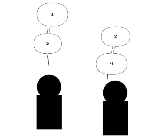
While yes, it is true that on a comics page, people read left-to-right top-to-bottom, if two balloons are connected with a line, I am going to read them one after another. Readers are not going to intuitively assume they should jump to the other side of the page just because the #2 balloon is slightly above #3. In this situation the balloons should be interwoven.

It should not be possible to look from one balloon to another and skip over intermediate dialog. If your reader misses a part of the conversation and has to double back to figure out what they missed, you've broken the flow and immersion of the page.
Like I said, lettering is all about guiding your reader around the page, it should be a part of your composition from the beginning, don't forget to incorporate lettering into your work when you're first laying out your page. Put yourself in the place of your reader and see how your eyes track across the page.

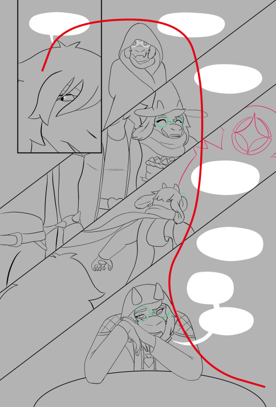
Hope these help! Like I said, I'm no expert; it took me a while to learn a lot of this. I would have found these tips super useful when I was first starting out. If you're interested in the technical side of lettering, I highly recommend The Essential Guide to Comic Book Lettering by Nate Piekos. It's one of the most useful reference books I own, and I learned most of this from that book.
#undertale and deltarune webcomics get a free pass on using comic sans#webcomics#tutorial#comics#ferrouscomicscraft#when I say I think too much about comics craft this is what I'm talking about#I could go on and on about how cool auto-ligatures are#lettering
130 notes
·
View notes