#brief 1
Explore tagged Tumblr posts
Text

AI BAD - Starten på GK2
2 notes
·
View notes
Text
Brief 1 - AI Fanzine
As we started the new semester with a fresh theme and a new teacher, Hans G, I couldn't help but feel excited about the prospect of studying Interaction Design (IxD), one of my passions as a design student.
Our teacher's recent interest in Artificial Intelligence (AI) led him to make it the focus of our first week, prompting us to experiment with different forms of AI. He also assigned us a task for the week, splitting our class of 60 into two groups - one in favor of AI, and the other against it - to debate the pros and cons of AI for designers and architects. Despite my lack of preference, I found myself taking the position against AI, even though I find it both fascinating and unsettling.
First out is me fooling around with the AI DALLE:


Whereas I ended up using an AI to argue why it is bad for designers and architects:

I focused more on the lack of originality...
2 notes
·
View notes
Text
Brief 1: Red Vs Blue (UV Unwrapping)
This as by far the easiest part I would say of the entire assignment; UV unwrapping. Not that I love UVs, I think they are weird and when stared at enough, they start eating my braincells but it is one of the core elements of getting a finished 3D artifact and a very vital one at that that cannot be missed or neglected at all.
Since I was using Maya, I was thinking of using the default UV toolset that comes with it. But hold up, I was made aware of this beautiful plugin by a genius guy whose name is Malcolm341 during my time in undergraduate study. He has created a bunch of plugins surrounding the UV toolset that is a bit more convenient than the traditional process. I installed the plugin onto my Maya client and loaded it onto the shelf for quick use and my god is it one of the greatest blessings to have graced us 3D artists. I would highly encourage anyone using Maya as their primary 3D software to install this plugin and try it out for themselves.

Figure 1 (Malcolm341 demonstrating the use of his plugin, 2021)
Using this plugin saved me a ton of time cutting seams and unwrapping the shells and arranging them together in a UV planar.

Figure 2 (Cutting seams and unwrapping the UV shells, 2024)
I did encounter a problem during the unpacking of the entire UV shells. I grouped the airplane, the stand and the coin box as different groups under a singular group. I unwrapped their UV shells as a group so that I would get more real estate to work with when texturing them in Substance Painter. However, because I might have not topologized them properly, the UV maps were overlapping each other in Painter. So unfortunately, due to lack of time, I had to combine all the models together and sacrifice the scales of the three UV shells.

Figure 3 (Exporting the UV maps as OBJ, 2024)
I clicked the entire combined mesh and exported the UV maps of the selection in an OBJ file format. I saved it in an appropriate location and moved on to porting it to Substance Painter so that I could texture those maps.
REFERENCES:
malcolm341, 2021. YouTube. [Online] Available at: https://www.youtube.com/watch?v=HyFFmwf3b7E&t=1s [Accessed 09 October 2024].
0 notes
Text
Xaden: “Okay everyone, safety briefing for this weekend.”
Xaden *to Ridoc and Bodhi*: “Do not add to the population.”
Xaden *to Imogen*: “Do not subtract from the population.”
Xaden *to Rhiannon, Sawyer, and Garrick in order*: “Do not end up in the newspaper, the hospital, or in jail.”
Xaden *to Violet*: “If you do end up in jail, establish dominance quickly.”
#incorrect quotes#incorrect fourth wing quotes#xaden riorson#bodhi durran#ridoc gamlyn#imogen cardulo#rhiannon matthias#sawyer fourth wing#garrick tavis#violet sorrengail#violet x xaden#violet and xaden#he’s doing his best#the standard used to be higher but we all know shit has devolved by now#that they put him in a leadership position is never going to be un-funny#took the charismatic son of a ‘traitor’ known to be a charismatic speaker and thought it’d be fine#Basgiath put him in charge of 1/4 their incoming force and no one thought that was going to be a problem#they told him he had to safety brief and this was the best he could do
1K notes
·
View notes
Text
Brief 1; AI and i
This is my wonderful contribution to a booklet of ai generated art.

0 notes
Text
AI is great/bad for designers
Good:
Ai kan lage millioner av forskjellige ideer basert på samme oppgave

0 notes
Text
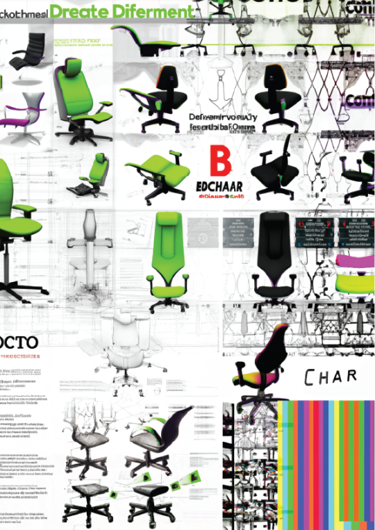
Brief 1: AI Fanzine
"AI is BAD for designers"
0 notes
Text
Brief 1: Red Vs Blue (Modeling)
At this point, I was ready to start blocking out my model. It kinda took me a while to figure out how I was actually going to approach the modeling process and to be completely frank, I am really intimidated by modeling. However, I took my shot at attempting to create it.
Before I started the actual modeling process, I added a basic human mesh to the scene and changed the units to meters to scale the model accurately to real life.

Figure 1 (Adding a basic human mesh to Maya, 2024)

Figure 2 (Changing the units to meters in Settings, 2024)
I first used basic primitive shapes, mostly cubes and cylinders to try and block out the shape for the airplane. I tried to line and arrange them together, just trying to get a basic shape I desired. Its basically a trial and error session until I got what I wanted and I started working on it.

Figure 3 (Blocking around with primitive shapes, 2024)

Figure 4 (Creating an opening for the seat, 2024)
I was using different Maya tools at my disposal and as per the necessity. To create an opening for the seats, I used the edge loop tool to add 2 edge loops at an equal distance with each other and deleted the upper faces that were marked out with a multi-cut tool.

Figure 5 (Creating the rocket exhaust, 2024)
To create the exhaust plates for the airplane, I used a basic cylinder shape, beveled its edges to make it smoother and added edge loops. A clever way of adding details to a model that I have always used is extruding faces off the edge loops and beveling its edges to give it more finer detailing.
From here on out, it's basically a nested process of adding a primitive shape, adding loops, extruding or deleting the faces, beveling its edges and so on.

Figure 6 (Previewing in Smooth view, 2024)
A useful tip I received from my former undergraduate lecturer back in Nepal was to switch from the raw to the smooth view from time to time to ensure that you are getting the correct shape you desire when you introduce more faces and poly counts to the model when smoothing it.

Figure 7 (Adding pipes and greeble pieces to the model, 2024)

Figure 8 (Creating the interior for the airplane, 2024)
It took me a while to figure out a way to tackle the interior of the plane but the easiest method I implemented was to add a cube, scale it elongated and pulling the outermost edges upwards and reversing the face normals. I then previewed it in smooth view and it worked like a charm so I used this taxing method. I do believe there is a better way to create the interior but this works for now.

Figure 9 (Creating the base stand for the toy, 2024)
I used primitive shapes to create the base stand for the toy, adding loops and extruding faces and shaping it as desired until I was satisfied with the stand. I also added a smooth operation to the models that were modeled with the help of smooth view to introduce more poly counts that would aid us later when unwrapping the UVs for the models.

Figure 10 (Creating a visor and adding loops, 2024)

Figure 11 (Modelling the Coin Box)
I had concluded with the modelling process for the airplane. One of the major prop that I created was a coin box for the airplane toy. The image above clearly demonstrates similar techniques that were employed in the creation of this coin pole box model.

Figure 12 (Modelling the loose cable, 2024)
After all of the models that I had envisioned were created, I started smoothing them out and was looking for any irregularities in the topologies. Since, I was on a very tight schedule, I couldn't spend much time debugging the model and I do suspect I have missed a few problems here and there, but for the most part, the models were completed.
0 notes
Text

Agatha & Rio | Agatha All Along 1x05
#for anyone who just wants to see a gif of that brief hand touch#agatha all along#agathaallalongedit#aaaedit#aubrey plaza#rio vidal#agatha harkness#agatha and rio#agatha x rio#agathario#aflawedfashiongif#affaaa#agatha all along: season 1#agatha all along: 1x05
979 notes
·
View notes
Text
there are a lot of evil people in the world and a lot of darkness in the world and so it’s very important for me to stress that now more than ever is the time to spread kindness and compassion. combat the evil by not only not partaking in it, but actively refuting it. destroy the notion that being compassionate or generous or kind to someone is uncool or embarrassing or even scary. be the change you want to see. start a chain reaction. positivity only breeds more positivity. do an act of kindness for someone so that that person who is too afraid to do it themselves can see you, realize that they’re not alone, and perhaps sheepishly follow your example. and then the next person who is too afraid but sees that person can do the same. when bad news comes out about bad people or horrible atrocities in the world it’s such an easy impulse to despair, and obviously it’s important to feel what you need to feel. grieve. be angry. be sorrowful. be empathetic. but dust off your pants and get up and be a part of a chain reaction that, no matter how small the scale, and spread compassion and love and care. all the reasons why you might not—“it’s hard! it’s scary! people will make fun of me! it’s useless because there’s too much evil!” are all grade A arguments as to why you should. you have no idea how many people you could inspire to do the same. even if it doesn’t get you anyway far, you can at least say you have the nobility of trying. please choose love and please choose life. you are worth loving and you are worth inspiring others to love
1K notes
·
View notes
Text
Brief 01 : Ai Fanzine
“AI is GREAT/BAD for DESIGNERS & ARCHITECTS…”
We started the semester this year with our whole class making a fanzine together. All of the content was Ai generated, and the class was split into two groups, Ai is great or Ai is bad.
I personally was put into the “Ai is great for designers and architects” group. In reality, i am pretty neutral to Ai, as the many possibilites and challenges that may come with it, is still far too unknown.
And yet, i had to try to showlight how Ai could be great for designers and architects, thus i started my journey of making my one page.
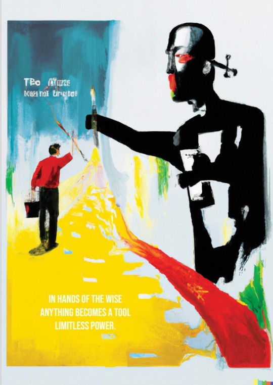
My process started with Dall E. i wrote in multiple different statements, until i got a picture i found fitting. I then used the content aware scaling feature in photoshop to make it fit the format of the fanzine. This was the picture:
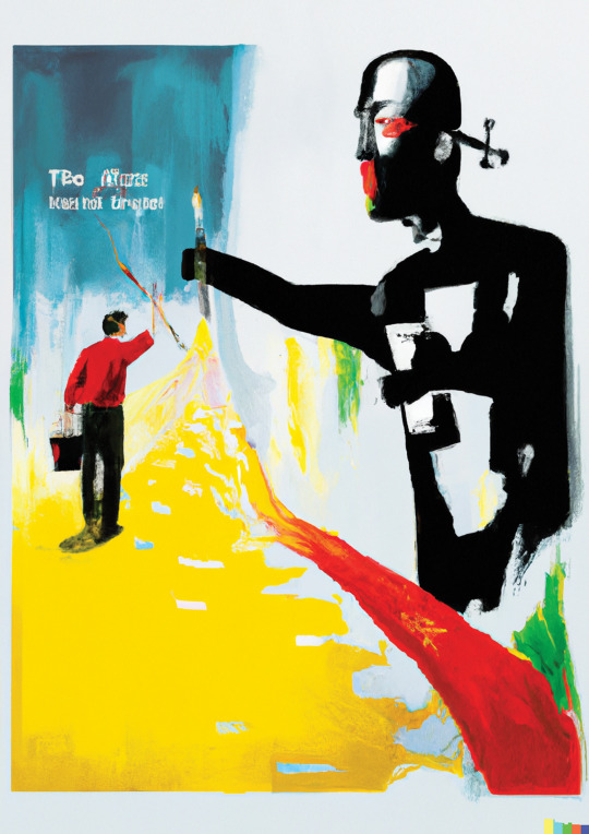
After that, i used chat gpt to write some statements regarding why Ai was great. I first picked out this statement:
“Anything can be a tool when used correctly
Understanding and object or ideas potential
And applying it to the task at hand can make it
A powerful tool for success.”
However, i changed my mind, and realized i didnt like how direct the statement was. I realized i preferred having fewer words, and chose to use ChatGpt again, but this time i asked it to write a haiku poem. I used some time finding the right poem, trying to direct ChatGpt as well as i could. After finding the perfect poem, i was unsure about what font and font size i should use, so i got some suggestions on that from ChatGpt as well:
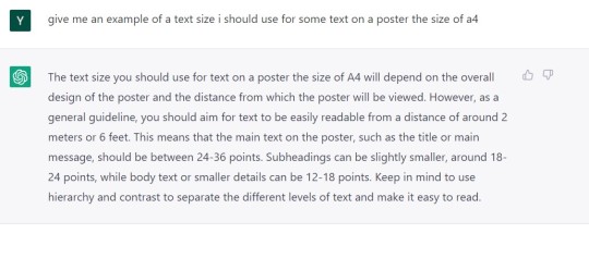
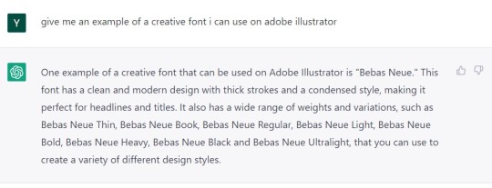
Being satisfied with the font and text sizes i was recommended, i used Adobe Illustrator to place the text on the picture, and i was very satisfied with the end result:
0 notes
Text
AI fanzine Brief 01
Vi startet semesteret med å lage en fanzine, som skulle ha AI generert innhold. Vi hoppet inn i ChatGPT, DALL-E og andre AI'er. Sykt uforventa start på året - rått.
Jeg kom på gruppa som skulle argumentere for at AI is bad for designers and architects. Jeg ba da DALL-E om å gi meg et bilde av en hjerne som går langt over egen kapasitet for å få bilde en ser under.

Videre skrev jeg på argumenter for hvorfor AI kan være dårlig for designere og arkitekter. Her spurte jeg ChatGPT om å gi meg en liste med ulemper AI medfører for designere og arkitekter.
0 notes
Text
when they ask fred vasseur how he signed lewis hamilton

1K notes
·
View notes


