
Don't wanna be here? Send us removal request.
Statistics
We looked inside some of the posts by mjstruckdesign124-blog and here's what we found interesting.
Average Info
Notes Per Post
0
Likes Per Post
0
Reblog Per Post
0
Reply Per Post
0
Time Between Posts
6 days ago
Number of Posts By Type
Text
16
Last Seen Tumblr Blogs


Fun Fact
BuzzFeed published a report claiming that Tumblr was utilized as a distribution channel for Russian agents to influence American voting habits during the 2016 presidential election in Feb 2018.
Text
Week 15- Final Thoughts
The future of design to me is almost going backward in history to the Modern Architecture period of the 1920s. I say this because when you look at a lot of theoretical conceptions of architects, new Apple products, and cars; you see the same idea repeated over and over again. Most of the designs all share the same word concepts; sleek, minimal, and stylish. Modern houses are going back to the white boxes of Le Corbusier's time, with open floor plans, rooftop gardens, and Mies's idea of the Curtain wall. I get these ideas from when I got to Super Jury in SARUP, which is a fantastic learning experience to have open to undergraduates. And I also follow quite a few Architectural based pages on Instagram, where they post conceptions, urban plans, and actual builds from architects today. I also see the idea of modern architecture coming back through our designs in technology today, primarily through Apple products, like the iPhone, Apple Watch, and the infamous Airpods. Their iPhones have changed throughout the years, but they all have a sleek and minimal curved rectangle shape. Apple's marketing strategies also contain some of the similar ideas, like the plain white or black background, with basic typeface, then they give an up-close look of their new sleek product. As one of the largest companies in the U.S, Apple will continue to grow and influence the future of design throughout the next decade. Cars have also become very influenced by the idea's of Le Corbusier, especially Elon Musk's company Tesla. Although his cars come in more colors than white, I see them as almost the Apple company of the car industry. The Tesla company follows its own points of design, as Le Corbusier did when he created the 5 Points of Architecture. Many of their cars have a similar shape and front end design. I chose to talk about these different projects and companies because they are the epitome of our future.
0 notes
Text
Week 14- Your Choice
One thing that I've always wanted to complain about in design is the shape of the Apple headphones; the realistically don't fit in a normal humans ear. And whenever I've used them the hurt my ears so much that I don't want to wear them ever. I understand the hype that they're an Apple product and most people like brand name items, but they are not designed for most people. Other headphones that have a more flexible insert like Skullcandy are adjustable for each user. Mainly because, each set comes with different sized rubber covers, and if you're like me you need the smallest ones possible. Also, something that I've noticed is that Apple headphones are not very noise canceling, probably because they don't physically fit in the human ear. Something that I've always wondered about designers is how do they create a style for themselves when they should be designing for their clients? When I say designers I'm talking about people like Frank Llyod Wright, he had a clear Prarie style that he incorporated into each of his houses, but what if that's not what his client wanted? This is an idea that I think about a lot, and it's something that I also struggle with myself when creating. Is there a balance that a designer should have between the two, or is the customer always right? One thing that this class has especially helped me with is to delineate between different styles and typographies. I do a lot of designing for Panther Fest and CAB, and before I didn't care about the fonts or the different parts to them. And I learned about the design process, which helps me with my Architecture classes because I can break down what my professor is looking for in this project, and accurately execute it.
0 notes
Text
Week 13- New Media Pt.2
The Digital Aesthetic is a design concept that was created in the early 2000s; it usually used in movies and TV show intros. Graphic Design: A New History, defines the Digital Aesthetic as " the lettering is decisively geometric in structure, with flattened curves and orthogonal forms." Which means the words jump off the screen towards the viewer with being 3D, "it's almost as if they're jumping into a deeper space." Many of the designs are in the form of animation that follows along to the theme song of a show or movie. The book talks about ESPN's Sportscenter opening theme; it's set to one central keynote, and the design of the intro seemingly compliments the sound. One thing that also attracts viewers is the use of machines in the design of intros, Sportscenters intro has a very metal and factory theme to it, which can be related to when many architects were obsessed with mass production in the late 1900s. I've noticed this in several movies as well, especially the new Spiderman: Into the Spider-verse movie, which is a comic as well. The movie's ending credits follow along with an ending song, The Black Panther follows along with the song "All the Stars are Closer" by Kendrick Lamar and SZA. In a different genre like music videos, Graphic Design: A New History claims that graphic elements play something of a supportive role, as well as the performer in the video." It's widespread for a music video to have a mix of animation and live action graphics mixed throughout the video. A good example today would be Ariana Grande's video for her new song "God is a Woman," to which she is seen in different forms. One video that has always stuck out to me for graphics is Billie Eilish's music video for "When the Party's Over," where took two shots of her and laid them over each other to show her crying blue tears. The digital Aesthetic has shifted its meaning today, but it's very prevalent in today's design.
Eskilson, Stephen J. “Download Graphic Design: A New History, Second Edition.” Books Library, 26 Nov. 2015, ifarus.com/graphic-design-new-his-stephen-eskilson.
0 notes
Text
Week 12-New Media
Although web design has many of the same concepts as graphic design, web design is more focused on the complex software that goes behind the design of the front page — programs like Adobe Flash player, a system that allows people to store graphics, not as pixels. An issue with web design though it that some viewers like web sites to have a certain balance of interactive experience, and not a lot of commercial advertising. But you still cannot have web design without graphic design; most corporate websites are based on their logos or marketing. Motion graphics is another field of interactive design, where a combination of graphic design and animation is used to generate an image or text that can move. Due to the growth of easy access software systems, motion graphics has proliferated. Again Adobe has been the significant leader of these types of systems, such as premier and after effects. Other companies such as Apple have produced similar yet unsuccessful programs to Adobe like Apple motion. These sites allow anyone to create different types of motion graphics; today many people know them as GIFs. GIF's are sometimes composed of scenes from shows or movies, or new material is generated by at home users. A final field of interactive design is viral advertising, where companies use a different and interactive platform to advertise their static piece. Movie posters are mainly static designs, but when placed on a web site or on tv, users experience a more personal connection with the movie. The book "Graphic Design a New History," by Eskilson uses the example of the 2006 movies "Snakes on a Plane," as a way to show their reader how marketers use different platforms to develop a static one. The creators for "Snakes on a Plane," used banner generators to help viewers feel more involved with the movie before seeing it. Interactive design has many different genres and platforms, each one has a different ability, but they all connect the viewer to the topic.
Eskilson, Stephen J. “Download Graphic Design: A New History, Second Edition.” Books Library, 26 Nov. 2015, ifarus.com/graphic-design-new-his-stephen-eskilson.
0 notes
Text
Week 11- Graphic Design
The definition of "Citizen Designer" is, "a professional who attempts to address societal issues either through or in addition to his or her commercial work." Citizen designers avoid going through clients because this closes of their opportunity to express their opinions on different topics. Civic designers believe, "they must confront the most pressing problems of contemporary society." So when applying this idea to today's graphic design era, a citizen designer would be the people using their abilities to rebel against the President of the United States. "Graphic Design a New History," talks about a few different kinds of citizen designers; some focus on different political stances, sustainability, or anything that seem unjust to them. Also, some designers take time specifically away from their professional side, to focus on their civic designing. One set of civic designers are those who focus on sustainability, and "design for the continued health of the planet and future generations." These type of designers use recyclable materials, join sustainability organizations, or advocate for it. Some simple things sustainability designers do to help protect the Earth is moving from paper design to strict technological designs, which in turn helps readers become more sustainable by not buying more paper. Another set of designers are those who focus more on the idea of social change and globalization in the world more than protecting the world as a whole. Civic designers in this boat are more worried about preserving their design, rather than letting it fall into the hand of the top corporations who control our economy. One particular designer, Jonathan Barnbrook, is someone who stands up against the corporation of America, he even created a Manifesto called, "First Things First 2000." Where he explicitly talked about how designers felt and still feel about "their professions contribution to global consumerism." Although many artists praised the manifesto, many also rejected the idea of it. Civic designers stand for many different beliefs, today there are some many topics to discuss, it's like hay day for designers.
Eskilson, Stephen J. “Download Graphic Design: A New History, Second Edition.” Books Library, 26 Nov. 2015, ifarus.com/graphic-design-new-his-stephen-eskilson.
0 notes
Text
Week 10- Graphic Design
Based off of the lectures we've been having in class about the Bauhaus, I think the typography style that came out of the school was very inventive and creative. The most exciting thing about Herbert Beyer is that he wasn't a trained typographer even though he taught at the Bauhaus's printing and advertising workshop. Also, Beyer was influenced by the Nazism of the 1930s; you can see it within his leaflets and posters for the government. After Germany Beyer moved onto American where he was incredibly successful with the container industry.
Another exciting part of typography that I found is that black lettering was only famous because of the work done by Johannes Gutenberg. Another book the helped bring up black lettering was Guthenburg bible, which is also known as the first book ever printed in Europe. Black letter type is still produced today but mainly as an Old English Calligraphy because in the early 19th century it was succeeded by the Roman type. Over time four sets of black letter started to appear around the world; Textura, Rotunda, Schwabacher, and Fraktur. The significant difference between most of these letterings is the difference between the thick and thin strokes of the letters and diagonal serifs in the lowercase letters.
And finally, the international style came about in the 1920s after being produced in Russia; it was widely seen as a modernist movement in the early 1900s. The idea of the international style was that is focused mainly on cleanliness, readability, and objectivity. Many artists used the International style typeface as a design element in paintings and photography throughout the 20th century. The International style is also in relation to the Bauhaus movement, the idea of "Form Follows Function," By Sullivan relate to the plain and simple design qualities of the International style typeface.
0 notes
Text
Week 8-Industrial Design

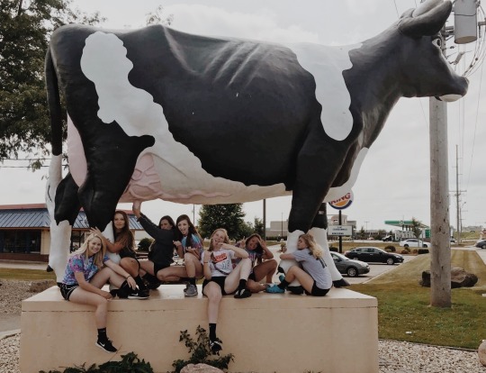
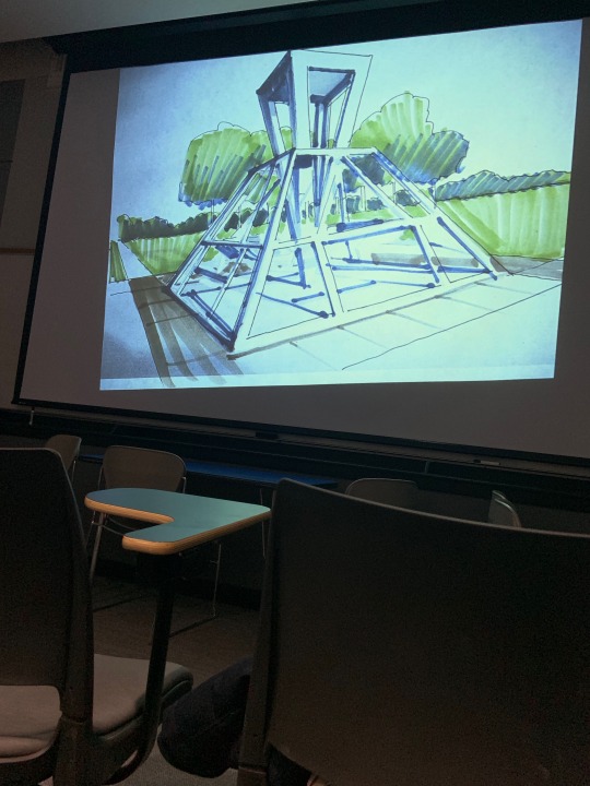
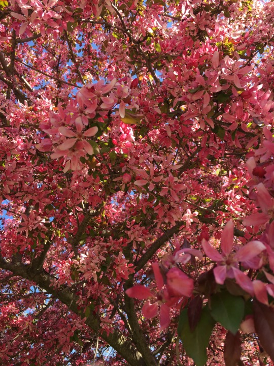
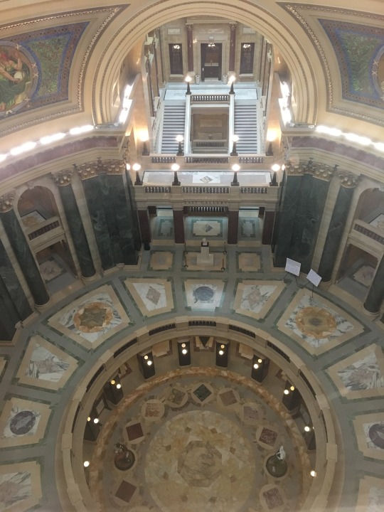
One thing that I've noticed about design within a culture, is that after a long period of time people start to look back at the past to create new ideas. That's why I put my Polaroid picture on here because, a lot of what teens look at for design and inspiration today, is mainly coming from the '80s and '90s whether it be for fashion or graphic design. My second image is a playful idea because especially in Wisconsin there are a ton of wacky sculptures around the cities. Which I definitely think is a fun way to attract different kinds of travelers, like the 85 different Bucky states that were placed around Madison last summer. Each one had a different design on them that represented Madison in its own unique way. My third image is of my mid-term drawing for Arch-103, it would have been better but long story short, I wasn't supposed to open the email. Anyways, each of my drawings has their own purpose, and this one was meant to test my abilities in under 3 hours. It was stressful, but it helped me realize where I am compared to my peers, and it told me to keep drawing and working on designs. My fourth picture is an image of the Milwaukee skyline, it's dusk so it's still light out but the buildings are starting to light up. The next image is one of my designs of a Kiosk, that my professor liked and decided to render in class. This was a very exciting thing for me because I struggle with my designs, especially this one. The big take away from my design though is that I wanted it to stick out, in my original design it's right at the corner of a park, and so people would be more attracted to the kiosk and the park in general. The flowers are a picture from a tree at my house, it blooms pink flower every year for maybe two weeks, and it's a truly beautiful sight. Nature has always been a key factor in design, especially when it comes to Frank Lloyd Wright. FLW always integrated his building in with the surrounding nature, never the opposite, and he always intended that if he made a mistake that nature would cover it up. My last few images are pictures of the Capitol, a painting I did and some funny notes from my lecture.
0 notes
Text
Week 7- Industrial Design
When thinking of flexibility of use I think of the different desk chairs I have between home and at school. The meaning of flexibility in universal design is; the design accommodates a wide range of individual preferences and abilities. At home I have one in my room, which is an average office swivel chair, that’s lime green and black. This chair is only used for me to sit in while I put my make up on in the morning, I rarely ever do homework in my bedroom. So, the use of this chair isn’t mainly just used to be in an office, it can be used for everyday routines or even gaming. At school the chair in my room is used for everything, I sit and do homework there, I do my makeup, and I eat my food in it. The chair may look different than the one at home, but they both have the same basic and flexible function; sitting. Now my mom’s swivel chair in her shop is strictly for office work, she only ever works out in her shop, and so that chair has one strict use. Flexibility in design is important because everyone has different lifestyles, some objects are used more than others, and some are used differently. The other universal principle of design I want to talk about is the idea of “low physical effort,” which means, the design can be used efficiently with a minimum amount of effort. For this principle, I think of my Vans slides, they’re extremely comfortable and easy to use when you need to leave quickly. I often use them when going down the cafeteria, or to the restore in Sandburg. Other types of slides on shoes are helpful, for people who struggle with tying shoes or haven't learned yet because it allows them to put on shoes with no issues. A low physical effort in industrial design is important for certain object especially for people with disabilities and other restrictions because they need to be able to use objects without feeling the extent of their restrictions.
0 notes
Text
Week 6-Architecture
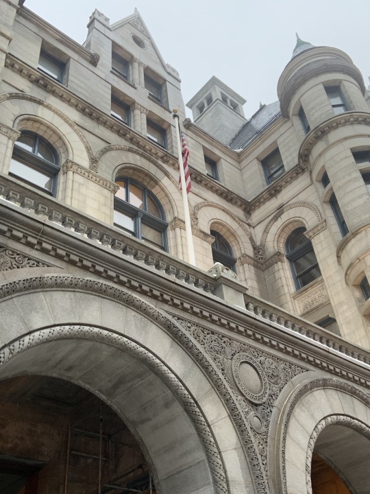
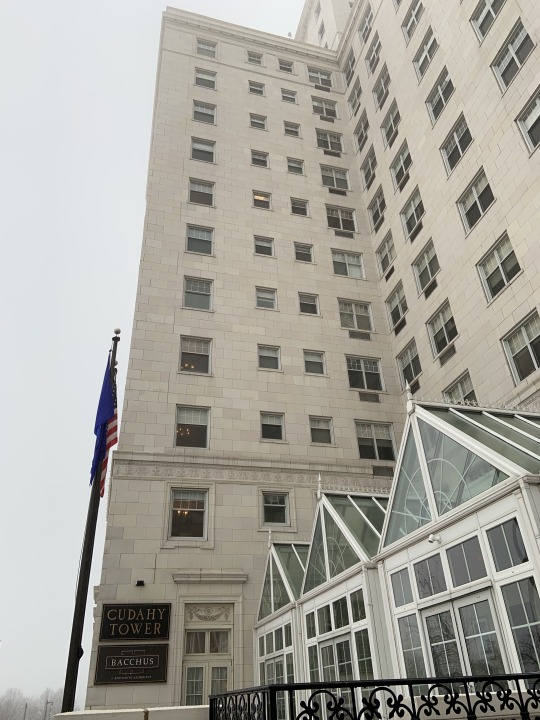

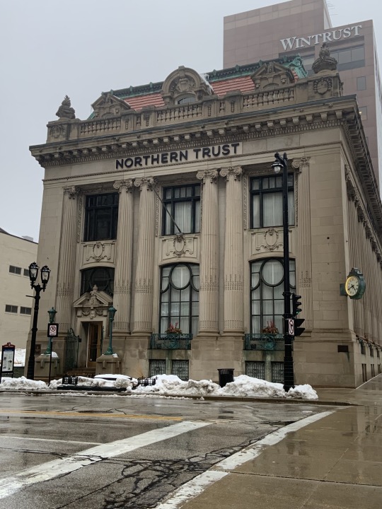
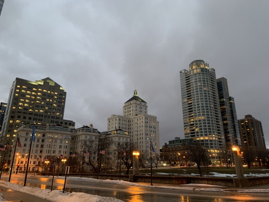
One of the most fascinating things about Milwaukee’s architecture is the endless amounts of buildings that are built with the cream brick. Hence the name “The Cream City,” which Milwaukee has had since the 19th century. Buildings like Cudahy tower are built tall and wide with the washed cream brick all around that city, when walking upon them, it almost feels like I'm in a different, more neo-classical city in Europe. When I was walking around the streets near campus, I happened to notice that a lot of the beautiful houses are all different kinds of styles, there’s the colonial, German, and Art Nouveau. The German and colonial houses naturally come from the substantial amounts of German immigrants that moved to Wisconsin in 1853. The Art Nouveau came from the designs of Frank Llyod Wright himself, buildings like the Bogk House and the Annunciation Greek Orthodox Church in Wauwatosa. Last weekend I went down to Wisconsin Ave. and studied/drew multiple buildings that lined the street. Some obvious ones were the Milwaukee Gas building, the Northern Trust Building, and the Federal Courthouse.
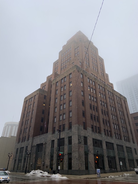
All these buildings have such monumental qualities, but different styles. The Milwaukee Gas buildings is best defined as a building of the Art deco era, it has a simple façade while still being split into different modules. The Federal Court building is Romanesque revival architecture, with its arches, colonnades, and simple face. The Northern trust build is most definitely a Beaux Art building because it emphasizes Greek and Roman architectural pieces. I’ve only really noticed a few, but I do believe that the ornamental pieces on the tops of tall buildings are very fancy. My main example would the Milwaukee Gas building with the ever-lit drop on the very top. When I went down, it was the very first thing I noticed when we rounded the corner of Wisconsin Ave. it glows so brightly. My other example is from the Third Ward, which is the Coakley Brothers Stained glass Water tower. I stayed overnight at the Iron Horse, and from our window, that's all I could see the piece was so mesmerizing.
0 notes
Text
Week 5-History of Design

#Metoo Movement and Rosie the Riveter
An example of design today that has greatly impacted so many people's lives is the #MeToo Movement which was founded in 2006, to help survivors of sexual violence. These designs for the #Metoo Movement and the idea of protecting women's rights started during the first wave feminism. During that time the Rosie the Riveter poster was designed by J. Howard Miller in 1943, convincing women to join in the workforce. Since then the “We can do it,” poster has been an icon for women's movements, suggesting that women can also do what men can do.
UWM’s School of Architecture and The Bauhaus
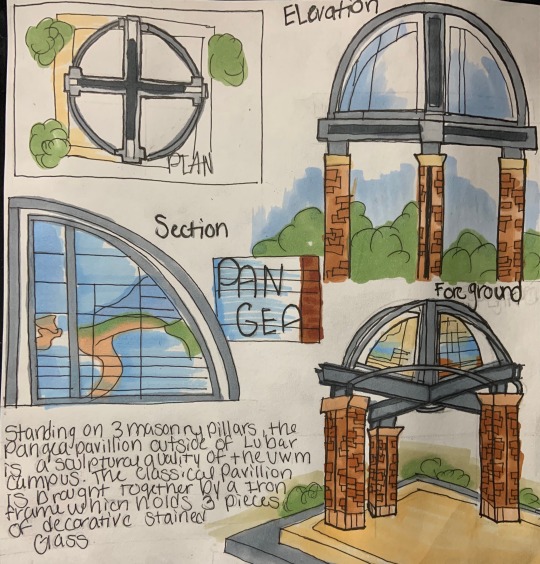
The Bauhaus school of art was a new type of building in the early 20th century, many architects look to the Bauhaus for its revolutionary design during the 20th century. Today many industrial buildings have the same conventional design to them just as the Bauhaus did. An example on campus here would be the UWM school of architecture and Urban Planning, the building was designed with reinforced concrete, plate glass, and masonry unit. All which we used in the Bauhaus and the outside of SARUP is set up in a way that the first floor is open to the public and the second floor is where most architecture classes are. And just like the Bauhaus, SARUP also distributed classrooms and studios for maximum occupancy and spatial logic. Another large impact the Bauhaus had on SARUP was the steel frame construction, is if you study the inside of the building you can see that all the structure is exposed for architecture students to study.
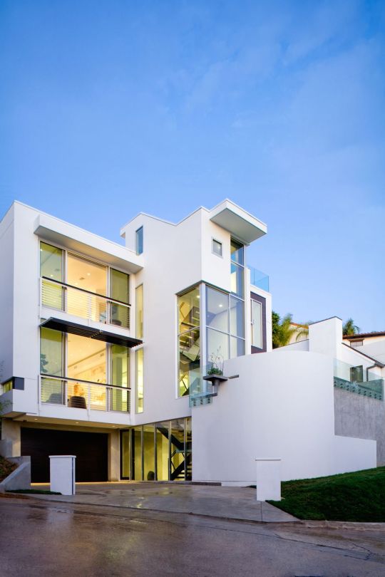
Today’s “Modern Architecture” and Le Corbusier's Style
Le Corbusier first coined the term “modern architecture after his design for the Domino House which was an open plan house, supported by six steel columns. This design paved the way for future architects as they were able to create copious amounts of plans just from one simple idea. Looking at today’s “Modern Architecture,” architects design unimaginable buildings, ones that are just stacked boxes and ones that show movement. The example I found would be a design from a home in Los Angles, California that was designed by the Harrison Company, the house looking like Le Corbusier’s, The Villa Savoye in Poissy, took the idea of stacking different rectangles on top of each other to create a new language. Once again, Le Corbusier’s ideas helped paved the for the future of architects, and many still recall upon him today for ideas
Citations:
Eskilson, Stephen J. Graphic Design: a New History. Yale University Press, 2012.
Quirk, Kathy. “UWM Rolls out New Peacebuilding, Architecture Degrees.” Helen Bader School of Social Welfare, 12 Nov. 2015, uwm.edu/news/uwm-rolls-out-new-peacebuilding-architecture-degrees/.
Stock, Charles. “#MeToo Movement More Relevant Than Ever.” The Bottom Line, 28 Nov. 2018, thebottomline.as.ucsb.edu/2018/10/metoo-movement-more-relevant-than-ever.
Valeris, Monique. “Must-See Photos of Stunning Modern Exteriors in the U.S.” ELLE Decor, ELLE Decor, 3 Oct. 2018, www.elledecor.com/design-decorate/g8674077/modern-houses/?slide=12.
“About.” You Are Not Alone, metoomvmt.org/about/#history.
“Harrison Design - Architect in Los Angeles, CA, 90067.” Dering Hall deringhall.com/architects/harrison-design.
“Le Corbusier.” Wikipedia, Wikimedia Foundation, 18 Feb. 2019, en.wikipedia.org/wiki/Le_Corbusier.
0 notes
Text
Week 4-Found Object

The object that I am going to write about today is all the bus stops in Milwaukee, being a student at UWM and without a car, our school provides us with free bus passes. I am very grateful for having a free bus pass, I use it almost every day, but I feel as though there need to be a few tweaks to the bus stops themselves. Most of the bus stops around the city are probably close to 7ft-8ft tall, and about 5ft-6ft wide. They all have glass windows that are bordered by black metal, the bus stops all sit about 6 inches off the ground. And almost all bus stops have a black metal bench that is nailed into the ground. Some of the larger bus stops like the one that is out the UW-M Union, are completely closed in and have more setting for users. The larger bus stops though do not sit up off the ground they are completely closed in with two entrances. I do believe that the bus stops do their job, but only in the short run, if a person must stand there for more than ten minutes, especially in the Wisconsin winters, they’re not satisfying the needs of users. After experiences of standing at some bus stops for over 45 minutes I defiantly would like to change the scheme of the shelter, my main issue is that most of the bus stops sit up off the ground, and if in the middle of the winter you’re trying to escape the wind, a bus stop isn’t really helpful. They should set back a little farther, to allow more people into a small space, like if it is raining you can’t have more than five people under one, so who’s willing to stand out in the rain? The biggest thing that I noticed is that some bus stops aren’t even covered, there is probably a specific reason, but if possible, all stops should have some form of shelter. Some other observations that I have noticed are that bus stops don’t times showing when a bus is coming, I think that this would be a very helpful feature especially for those without access to the internet. One of the biggest features that should never change in a bus stop is the see-through glass, after reading a few articles I noticed that all of them say the see-through glass is for our protection, and that it makes some users feel safe. A few other objects that you could compare the bus stop too is a school bus stop for kids, I know for a fact that more school bus stops don’t even have shelter for children, which is a shame because children are more vulnerable than adults. So, bus stops defiantly look better than a school bus stop, but when you look at something like a UK phone booth a simple bus stop cannot compare, the UK phone booth is a symbol in our eye, while a bus stop is just a bus stop. The UK phone booth is very well designed, its bright red color helps it be more noticeable by users, and the phone booth is completely closed in to help protect against the weather. If the U.S took the time a studied these phones booths, they could take some ideas from the UK, and create a safer and more iconic bus stop for the entire country.
0 notes


Text
Week 3-History of Design Part 1
Being an Architecture student, I must learn the basis on design, and how I can develop my thoughts from one piece to another. I picked a scan of my first few desktop organizer designs form the first day of school, a lot of my designs are basic, I just took geometric shapes and replaced them in different ways to create a type of language. Each of my organizers had some sort of drawers, paper filers, and cubbies. I didn’t try very hard with my first design, it just popped into my head and that’s what I stuck with. And my final still has these basic components but “more is less.” One day I went to Union Concourse and sketched out the stairwell that’s in there, ever since I toured Milwaukee the Union has been one of my favorite buildings. The layout of the stairs is so creative and modern, that even though the Union has a sort of bland coloring to it, the stairs create a kind of distraction from the colors. The stairs are a sort of optical allusion, it’s as if the left stairs reach all the way across from the right and vice versa, without touching. But in fact, they meet in the middle giving users the option of a different path each time. One of my modules in my drawing book is called “Other,” and the basis of the idea of showing movement and value with just lines. We often practice showing three-dimensional quality with shading and highlight within our drawings, these drawings are not only helping us improve our drawings skills, but they’re also helping us think about different forms and colors for our future designs. Another module I picked out was called “Media,” once again we were practicing shading and highlight, but this time we played with different media to improve our spectrum. Although the drawing may just be a simple farmhouse the idea is much broader. This last drawing is my final colored charrette desktop organizer, it’s small and simplistic but like I said earlier “more is less.” For my materials, I went with a mixture of wood and plastic, I like to mix different types of woods form dark to light with just one plain color. I think it gives it a very sleek look, along with that I had some basic organizer in my design, but I chose to extend my design horizontally with the side cup holders. Something to help give it a little more pop.
After my drawings I looked at my notes from Architectual thinking 104, this is beyond my favorite class I have ever taken, go through all the different stylistic movements, and discussing how they influenced architecture is so amazing to me. On Monday, we talked about the significance of the Art Noveau movement and who was large influencer during the time. Of course, as “Graphic Design: A New History,” talked about Le Duc we had to as well, are professor taught us about he was greatly inspired by the Gothic style of the 12th century. She also taught us about the difference between ornament and ornamentation, being that one was simply for decoration or something that was “attached,” while the other was a revealing style that showed the functional identity of the design. On that day as well, we talked about the Arts and Crafts movement, a time where people were so disgusted by mass production that they started building firms where people would hand craft objects like furniture. By having items be handcrafted, builders were able to promise buyer their attention to detail and a simple respect for nature in one item. A building that I chose was the Milwaukee Art museum, this building design is amazing. The shape of the wings and the fact that they do flap, is my favorite part and was a big highlight of my first trip to Milwaukee. The Art museum is very sleek looking, and the inside has a lot of ornamentation. One thing though that has always bothered me about the building shape if that one side is longer than the other, I think they should’ve tried to either even them out, or to cut the right side off. Other than that, I love the building, the slanted glass windows give the building itself a winged look to it. Another building that’s on campus and is obviously my favorite would be the School of Architecture and Urban Planning building. The mixture of textures from brick, concrete, and glass helps it stick out from the other rustic red brick buildings. Every day I sit inside and while I do my homework, I admire the openness all the way up to the ceiling. I think it’s important for the buildings inner working to be exposed for students, so that they can understand how the building they’ve grown in for over four years stands tall. My final building would have to be the North West Quad, whenever I walk into the building, I swear I find new areas that I’ve never seen before. I really like the NWQ because even though it’s creepy that the building was and old hospital, the outside has so much going for it. Just like the other old buildings on campus, the NWQ also is covered in the red brick but the build creates texture and pattern with some light colored and offset bricks. The addition of the children center brings some life and color to the building through the colorful playground on Hartford. One thing I take for granted though is the buildings size, when walking at the base the NWQ is small, but when looking at from Sanburg, you can see all the Quadrants stacked on top of each other like Jenga.
Citations:
Eskilson, Stephen J. Graphic Design: a New History. Yale University Press, 2012.
0 notes
Text
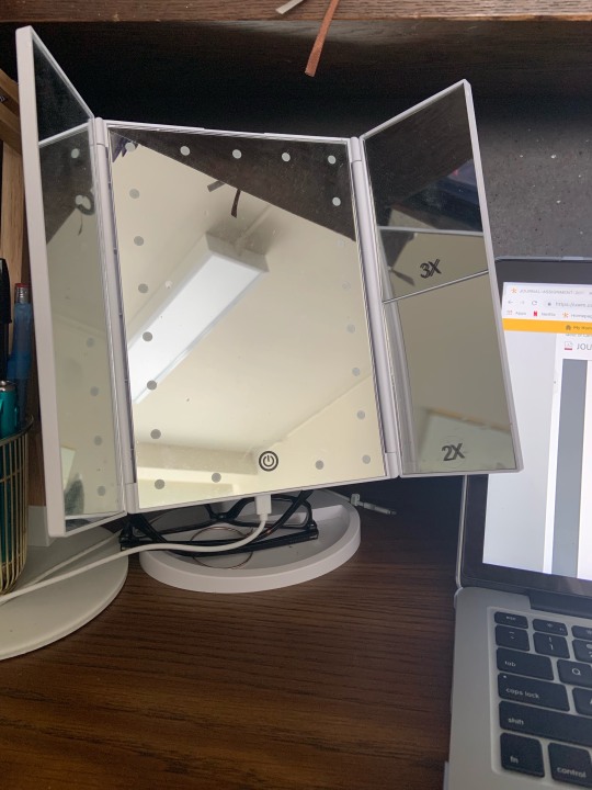
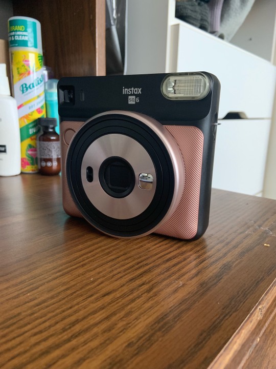
In one word I would describe the word design as a "process," to expand on that; the word design is the multi-step process of taking a problem and creating a solution for it by analyzing different perspectives of users and forming different ideas from others. They describe step one as examining the issue at hand, creating a solution for it, they do this by looking at different users perspectives, and explain how with these new ideas they can generate an answer. After that designers go to the drawing board, they bounce idea's off each other, to develop their first model, although this might not be the best answer, designers go back to the board regularly to re-draw until they've come up with a solid plan. After, some time at the drawing board most designers, create a model of their complete solution to present. Then if all goes well, they build a full-scale version of their answer. The design process is long and frustrating, but after all the hard work the outcome can be surprising. The article does an excellent job of breaking down the process, it was also very informational, and I hope I can take what I learned and apply it to my design classes. A great example of design would have to be in the DeWEISN Foldable Mirror the I use every morning to do my makeup, most mirrors only have one side or have a second enhanced side that you rotate vertically to. The DeWEISN Mirror has five separate mirrors within a small foldable desktop mirror. Along with the mirrors, it also has a holding tray for jewelry, thinking about the design process of the mirror, the creator would've had to look at essential makeup mirrors, and compact mirrors to think about how they can add more mirrors to one but still keep it small. After creating a small foldable mirror with different magnifiers, they would have to look at lighting. A lot of essential mirrors have the light source lining the very outside of the mirror, but I'm assuming that to keep the mirror small and foldable, they had to change that. The designers took the lighting to the inside of the mirror and but twenty-one small LED lights on the primary mirror inside. Another product I use a lot is the FujiFilm Instax SQ 6 polaroid camera, the design of the product is very sleek, and it gives a modern twist to the old Polaroid cameras. The camera also has a lot more feature than older cameras, such as double exposure and light/dark mode. The developers even included colored flash covers to add new colors to users pictures, from my perspective they took a good look at their buyers today and developed a new camera with fun new features to help explore the user's artistic side. Relating these articles to my new journey as an architecture major, I'm currently learning about the basics of design in my drawing classes as well. The most significant concept that I learned and am currently struggling with is going back to the board and redesign more than once. I always feel pressure to produce a fantastic design, but the more I go back to my sketchbook and re-draw the more I'll be able to meld my ideas from other models into one.
0 notes
Text
Week 1 - About me
So currently I am a first-year student at UWM, and I am majoring in Architecture. A few random facts about are that I am an only child, and I have three dogs, and they are all bulldogs. I have always wanted to be an architect since I was a little kid, so I am very excited to see my dream becoming a reality. I chose to take this class because after looking at other art classes, I decided that understanding the concept of design, and viewing it through different mediums would be necessary for my major. I often struggle with making new and fun content and relying on what I've created before, so hopefully, this class can help me with new design strategies, and help me step out of my comfort zone. I have a decent amount of experience with design, I created a few posters in high school for various events and drew up different t-shirt designs for school and my mother's business. She owns a t-shirt printing business and also builds websites for people, so I usually help her out with different themes and designs. I too am currently apart of the Pantherfest Planning Committee, and I hope I will be working on the marketing side of the event In design, I prefer a modern look to anything, simplistic, minimalist, basic colors, etc. I love to look at architecture/interior design pages on Instagram because homes and buildings are so beautiful and straightforward. Coming from a small town and moving to a city like Milwaukee has been so inspiring for not only design but for my lifestyle as well, I love living here and everytime I come back I fall in love with it again. Recently I bought a candle from Bath and Body works, and they had two different labels on the same kind of candle, I picked the candle that had a simple black cover and a purple design, with a basic font on it because like I said before I like a modern look to things.
0 notes