#bound by someone else
Explore tagged Tumblr posts
Text
They look absolutely fabulous! Good job.
It was designed for letter, yeah, and also to be printed a size smaller... they were intended for 32-mo, or L9 as I've been calling them (roughly the same size as A9, just with half-letter proportions rather than A series)
The margins were probably also affected by the fact I made them larger to accommodate trimming xD
but honestly, wide margins on a small book absolutely don't hurt. You get extra space to touch while turning the page!
... this reminds me, I meant to make some posts about the books I received in the mini book bang, and forgot to do so. I should do that...
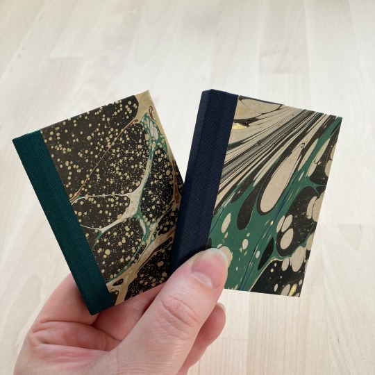
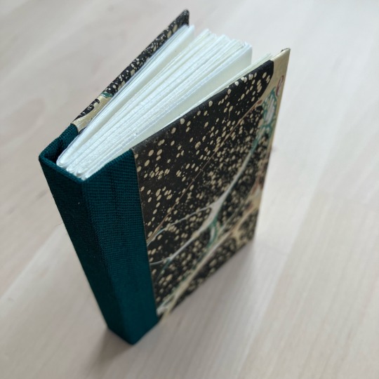
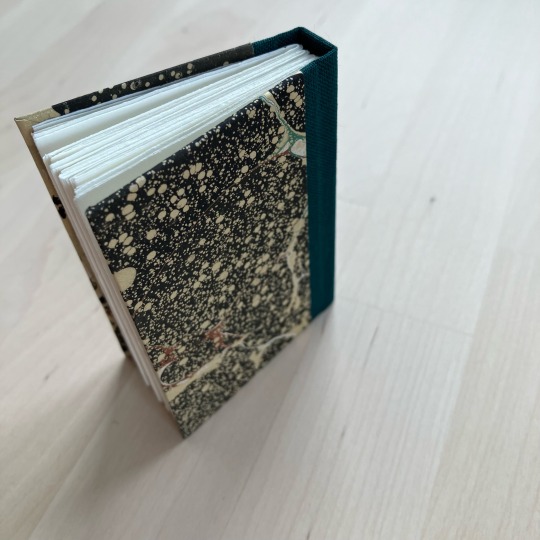
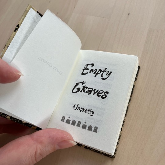


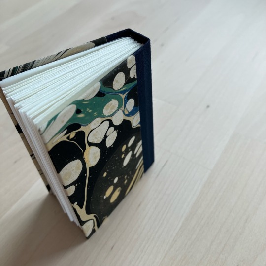
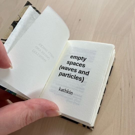
Empty Graves by @unpretty and Empty Spaces (waves and particles) by kathkin
I participated in @renegadepublishing’s tiny book bang last year, and as participant I got access to all the typesets from the event. I saved the ones I thought I’d want to do, and yesterday I looked through that folder, spotted two fics with the word ‘empty’ in the title and thought “oh neat, i know and like these fics, and I can make matching-but-not-same binds for them”. I was delighted to re-discover that they were typeset by the same person, @little-cat-press, so I went ahead with the matchy idea.
Empty Graves is a Superman fic from the POV of Martha Kent, and just so happens to be one of my faves in unpretty’s sprawling series. I chose the marbled cover paper because it evokes stars and galaxies and space for me. The fic is very contained, localised - the Kent farm - but high stakes; Martha will protect her son from the universe if she has to (and she does), because her family is her universe. I liked the idea of wrapping this small-but-big fic in something that resembles the vastness of space. The spine is green to match the hints of green colour on the otherwise dark marble.
Empty Spaces is a Back to the Future fic from Doc Brown’s POV, and featuring transmasc Marty McFly. The Back to the Future movies are foundational to me, and this fic is simply wonderful, highlighting the unique friendship between Marty and Doc. For this I knew I wanted something that evokes time travel, and wound up with this section of a larger marbled pattern that resembles the sci-fi woosh of time (and space) travel. This spine is blue to match the hint of blue visible alongside the green.
Both marbled papers are from Jemma Lewis Marbling & Design. The insides are printed on 90gsm Munken Pure Smooth Cream. These are self-ended, so no endpapers. The bookcloth is sourced from Ratchford but I don’t know which brand it is.
These are A8 sized (printed on A4) - I believe the typesets are intended for letter sized paper, but as I’m not in the US A-series it is. This prints fine on A4. The margins to the sides are slightly wider than originally intended, but that doesn’t seem to be an issue here.
#ashmouthbooks#typeset by me#bound by someone else#bound by ashmouthbooks#size: A8#author: penny anna#author: unpretty#penny anna#unpretty#renegade exchange#mini book bang 2023
279 notes
·
View notes
Note
cons of using bluesky: you don't exist
don’t worry, you won’t need an account on tumblr to view this blog (at least, i hope so)
#not a miku#ask#anonymous#for the record: there are no plans to run this blog anywhere else other than tumblr#and i personally; as someone who barely even used twitter in the first place; don’t plan on making a bluesky account#i mean twitter was going downhill so fast this was bound to happen lmao
95 notes
·
View notes
Text
can someone do a 'nene need people to gain strenght and a solo arc can either break her or make her' analysis pls
#is the one thing about the chapter that intrigued me#I am far from nene's biggest fan tho (my fixation really is only on my trio) so i feel like i'll miss details pls someone else do it#tbhk#toilet bound hanako kun#yashiro nene
67 notes
·
View notes
Text
I really want to do one of these. my first mockup when the concept was originally going around didn’t work very well lol
Lectern Book Case!
After this tiktok video with a suprise find of a lectern bookcase made it's round and @spockandawe made two very cool and helpful posts about their process, I wanted to try my hand at it:
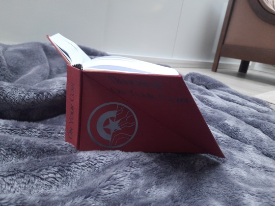
This is Dishonor On Your Cow by mandarou for which I did two versions. One is sewn and one is assembled with the Lumbecker glue technique. I used that one for my experiment, which I regret in hindsight, but alas.
About my process:
I tried following the measurements spock did, but to be honest my brain didn't want to do the math so I found a slightly rougher solution.
First I did a mockup to see how the single parts should be assembled and what would be possible obstacles. (I recommend doing that! It was very helpful)
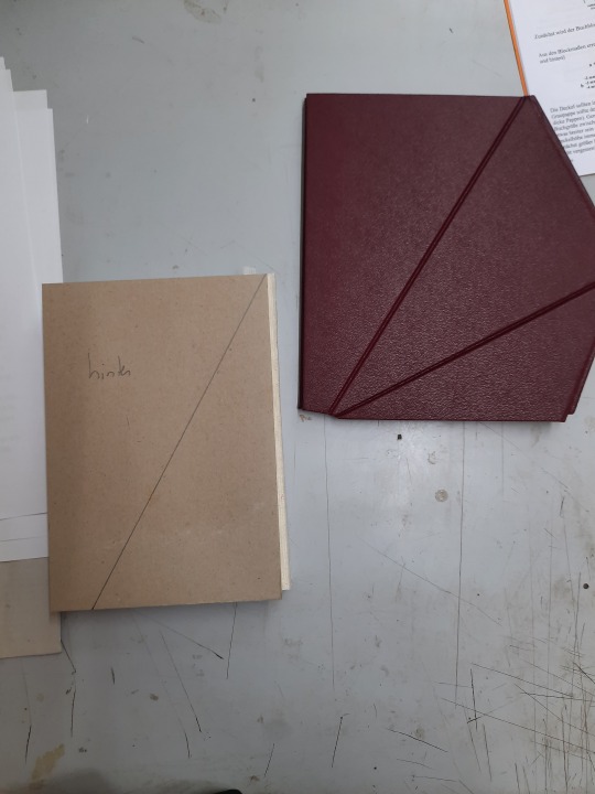
on the right is the mock-up on the left is part of the real one. You can see that the edges of the three pieces don't line up very well.
To get the pieces for the case:
this was my sketch:
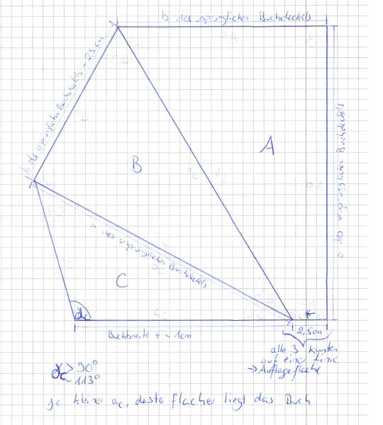
Pieces A and B I got by cutting the piece I would for a normal case:
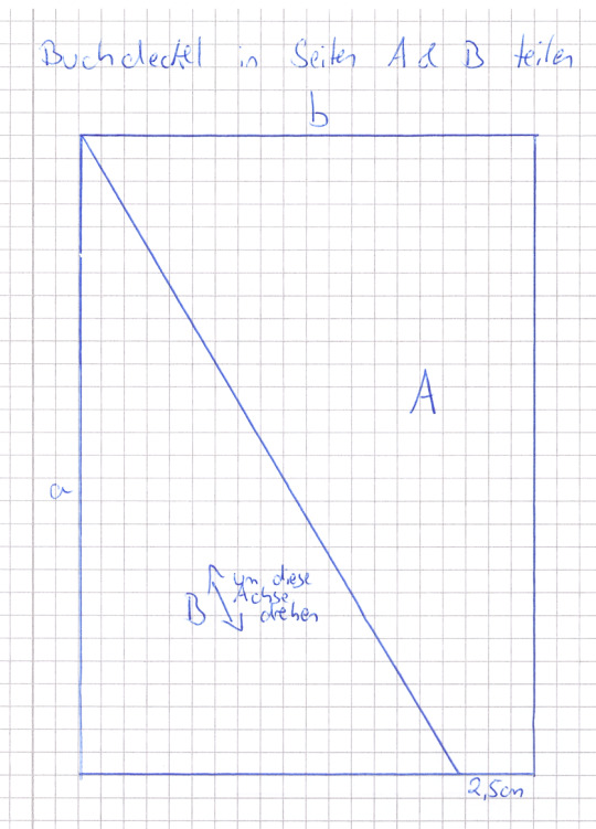
Side a is the length of your book block plus 2x3mm and side b is the width of your book block minus 2mm (because of the hinges).
(I guess whatever measurements you're normally working with will work here as well.)
Then I measured 2,5cm from side b and drew the diagonal, as you can see in the picture. Piece A is already oriented right. Piece B has to be flipped (marked with the arrow).
And piece C you get by making one side as long as the corresponding side from piece B and decide on your angle gamma. (That's the only real math I used here). I took 113° but it doesn't have to be precise. It just influences how steep the book will stand, later on. (I would use one above 90° though).
Then I arranged them and cut the two spine pieces:
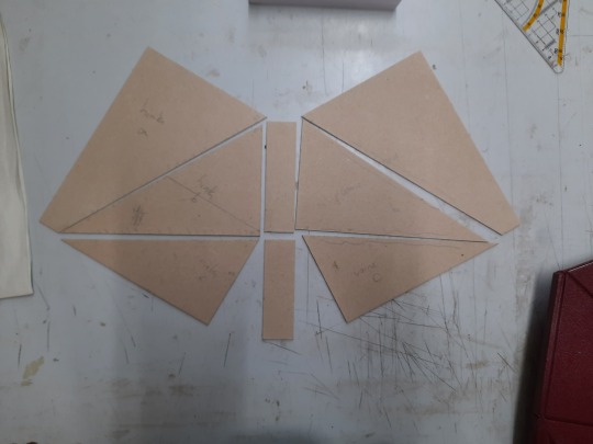
You can see that on spine piece needs to be as long as piece B and one as long as piece C. The width depends on how thick your book block is. I also wrote on the pieces which side is for the front and which for the back. This also helped with putting it together with the right side up, because I confused this one time and it's really easy to assemble it wrong. Then I marked down, which sides would touch later on (one side for piece A and C respectively, piece B gets cut on two sides. Don't worry it will look, like it's too short) and cut away 1mm to allow space for the hinges.
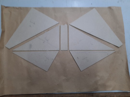
Then I glued everything except for spine C on package paper. You can see that I left space for the hinges. Normally I do 7mm. I did this for the spacing between Pieces B and Spine B . Pieces A and C I aligned so that the meeting point between them would be a straight line, as to avoiding the problem that arose in the mock-up. See here:
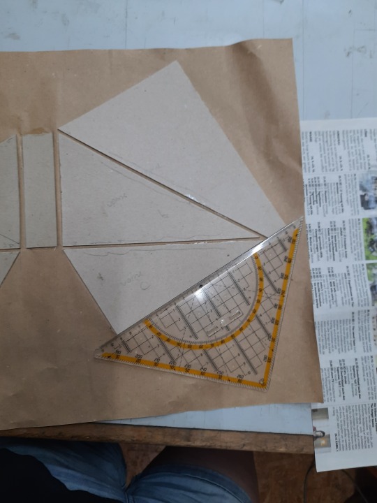
I also made sure that the pieces would align on the left side as well. The spacing was a little secondary. It's not that important.
Then I trimmed the packagin paper, glued the bookcloth on and added spine C:
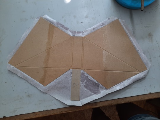
I made sure to use the bone folder to really impress the hinges from both sides.
(Additional tip. Before you do that, test if you assembled it right)
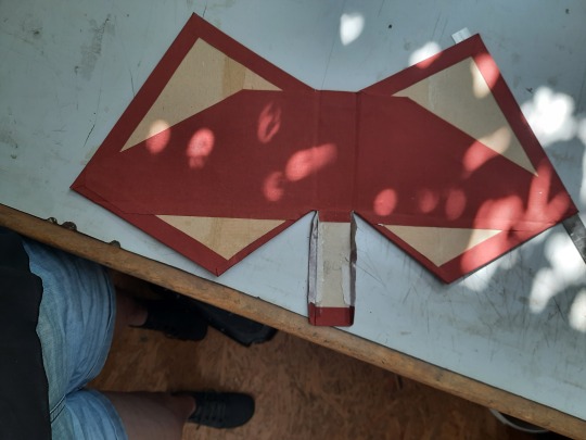
I added a piece of cloth in the middle (you will be able to see parts of the inside of the case when you open the book), I cut away the excess fabric to the sides of spine C and folded them outwards and glued them down. I left them up along spine C.
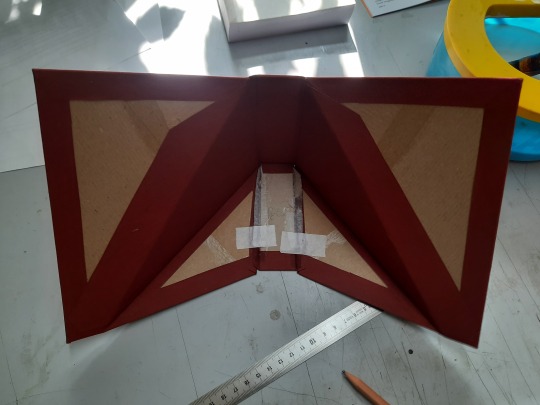
Then I brought the case in position and used those fabric flaps to glue it into this position. Afterwards it won't lay down anymore, so do your decorating and everything else beforehand.
Lastly, I cut a piece of cloth for the bottom because you will be able to see it as well, when you open the book:
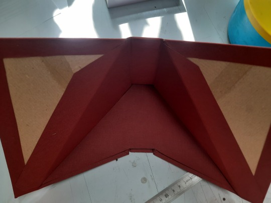
(Just do an approximation and then cut it down piece by piece. Unless you're really good with measuring and angles. :D)
Then I assembled the book. I put the book block inside and marked where side A would be on the endpapers. I only glued that part because the rest will have to disengage from the case (That's also the only part that doesn't need and inner lining):
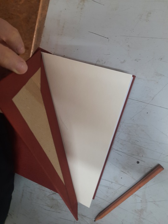
And this is the finished book
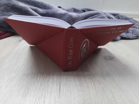
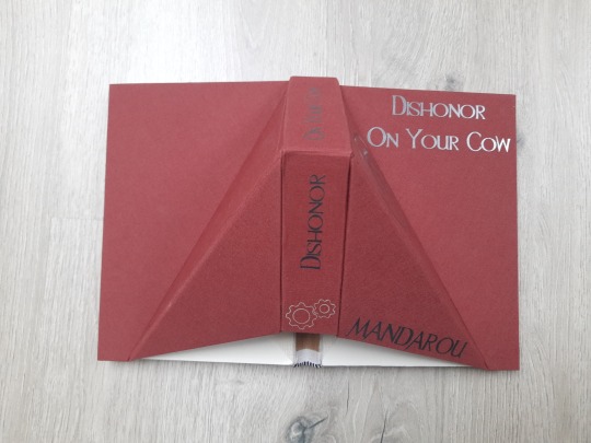
You can see part of the spine. Next time I would conceal that as well.
I also highly advise against using a Lumbecker binding. This kind of case puts a lot of stress on the book. Mine is falling apart already. I think a sewn book block would hold up better.
Anyway, it is very late and I tried my best describing the process. If anyone wants more details or a better version of the sketch, hit me up :)
#aley nag#process#bound by aley nag#lectern book case#bookbinding#bound by someone else#method by aley nag
83 notes
·
View notes
Text
being on marauders tumblr has made me realize that a lot of people would actually share anne rice's (terrible) opinion about fanfiction if they didn't write fanfic themselves.
#what do you mean people aren't allowed to make transformative works of YOUR transformative work?#people will literally come on this terrible website and say “no one can write fanfic of another person's fanfic”#the call is coming from inside the house#“ask before you make fanart”#sorry but maybe just take your fanfic down#how are you going to create fan works and then turn around and act like a dickhead when someone else does the same thing#btw this is not about selling bound fanfic#that is an outlier cause that's just copying someone's story and using it to make money for yourself#marauders#fanfic#ao3#wolfstar#jegulus#jily#drarry#dramione
242 notes
·
View notes
Text


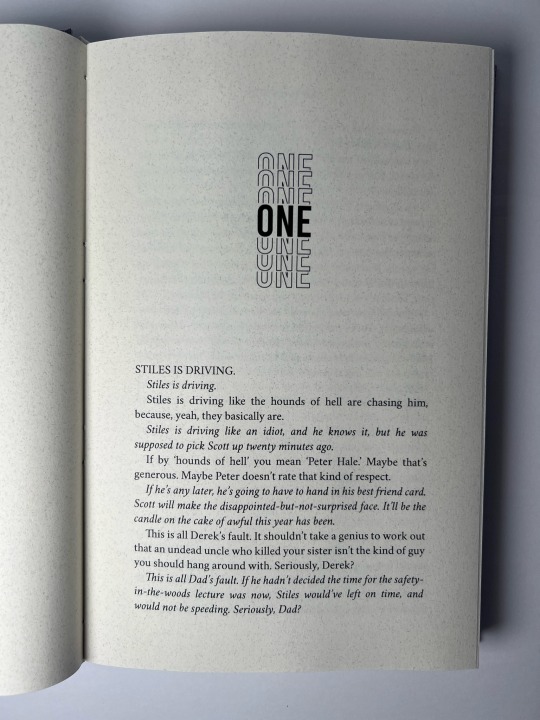
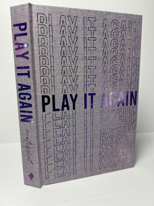
For the 2023 Renegade Bound Fic Exchange (cc: @renegadepublishing).
Fic: Play It Again by metisket Words: 63,206
fonts title: Bebas author name: Amiline body: Cochineal
bookcloth: duo flieder • endpapers • htv: siser infinite galaxy
#ficbinding#fanbinding#mine#teen wolf#sterek#2023 renegade exchange#2023 renegade bound fic exchange#my giftee received this yesterday so i can finally share#ALSO - i picked this up as a pinch hit#so if you're the author and would like a copy#just let me know#(since approval was already gotten by someone else - i didn't actually have any interaction with the author)#but i'm assuming the author already has a copy tbh lol#since i know i've seen a bunch of different versions of this#my offer still stands tho!
353 notes
·
View notes
Text
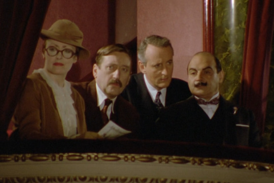
Watching the Poirot series for the first time and I’m entirely convinced this is just some eccentric queer friend group’s ‘Monster of the Week’ party.
#uhh methinks Expert Poirot/Mundane Hastings/Professional Japp/Spooky Lemon#all I��m saying is that the group dynamic is so ttrpg it’s insane#like this is me and my friends on Wednesday nights solving a new mystery with our different yet equally important abilities#I know this is so niche but come on there’s bound to be someone else who understands#and whoever you are lmk if you think they have different playbooks than the ones I gave them xoxo#agatha christie’s poirot#poirot series#hercule poirot#felicity lemon#miss lemon#inspector japp#james japp#arthur hastings#captain hastings#monster of the week#motw
69 notes
·
View notes
Text
it is absolutely gorgeous. So so so beautiful. And yes, the coffins are an excellent motif.
I also really love the cutout. cutouts. And how they line up in the case. Just gorgeous. It looks so cool.

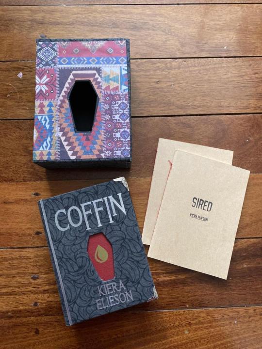


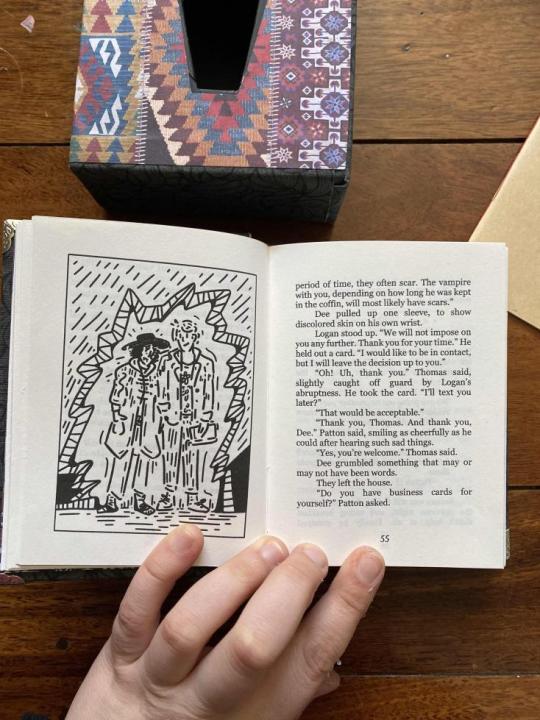
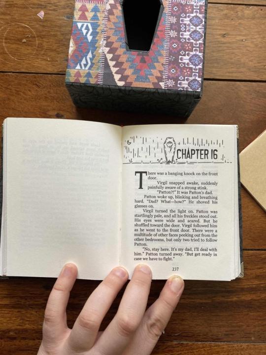

Coffin by @kieraelieson. Sanders Sides, 70k, casebound at quarter size (with slipcase!), plus two bonus oneshots done up in paperback booklet style that fit in the back of the case.
Typeset in Georgia, with Vampires used for the titles/headings, and Last Rites used for the drop caps and cover. All illustrations done by me - there's six full-page pieces in total, all throughout the book, plus the title plate and chapter headers! I'll probably put all of those in another post, eventually.
The cover titling is silver HTV, which makes for a striking look against the swirly flowery grey, and I may have gone overboard with the coffin imagery in the cutouts. But in my defense, it's the title of the fic and it's a hell of an eyecatching motif.
The sole copy of this binding is now in Kiera's possession! It is a very very heartfelt gift to her for all of the wonderful things she's created and the absolutely killer podfic she did for one of my longfics. It's my dearest hope that this chunky little volume makes her day as much as the podfic made mine. 💜
#bookbinding#perfectlynormalbooks#size: quarter letter#author: kieraelieson#bound by someone else#bound by perfectlynormalbooks#a gift#author copy#gifted to kieraelieson#kieraelieson#artist: perfectlynormalbooks#gifted by perfectlynormalbooks
208 notes
·
View notes
Text
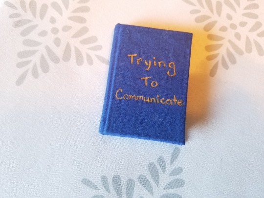
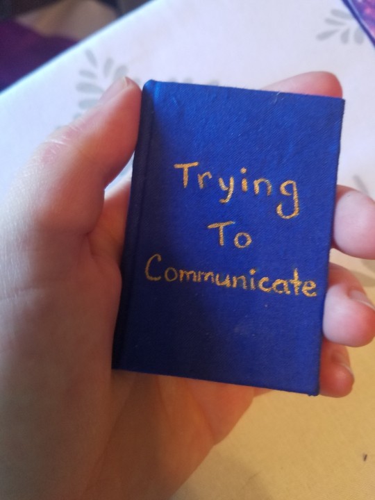
Trying To Communicate by @copperbadge for @saltyteethbooks for the @renegadepublishing mini book bang!
@saltyteethbooks did the typeset, and I bound it, and sent it over to them.
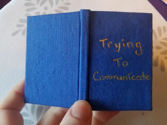
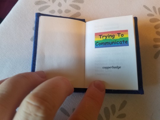


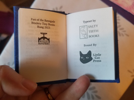
I'm supposed to make myself a copy too, but stuff happened and I wasn't able to bookbind for like half a month, after procrastinating the first half of the month, and I finished this copy on the last day before we were supposed to get them in the mail.
So.
I'll make my copy later.
It was fun making a sextodecimal book! It's a cute little size, and I'll probably make some more after this. This one might be a little bit of an odd size, because it's typeset for A4 paper, but I shrank it a little to print on Letter instead, and then the printer shrank it a little more because it likes to add margins.
So it's got A proportions, but is a little bit smaller.
The title is done with a new gold paint I got recently! Nice and shiny, and I only had to use one coat plus a few small touchups in spots.
#little cat press#bookbinding#typesetting by saltyteethbooks#bound by me#author: copperbadge#saltyteethbooks#copperbadge#a gift#gifted to saltyteethbooks#renegade exchange#size: A8#mini book bang 2023#typeset by someone else
256 notes
·
View notes
Text
Bound To You ( Prisoner x Guard Au I gave it a name!!)
Sera sees Adam on the couch with Lucifer on his lap while drinking a smoothie.
Sera: Whatcha got there Ad?
Adam: A smoothie?
Sera: I meant the murderer in your lap.
Adam: Mom, he’s just a baby.
Sera: He’s literally killed someone
Adam: My baby 💕
Lucifer has a sip of the smoothie: 💕
#adamsapple#hazbin hotel adam#hazbin hotel lucifer#bound to you au#alternative prison au#Adam is a little cock whipped#it’s okay Luci is pussy whipped#sera wishes he’d find someone else#literally anyone else
22 notes
·
View notes
Text
Does anyone else suffer from the disbelief that they are their age?
#I either feel 40 or 17. no in between#I can’t believe I’m in my twenties and some do my friends are getting masters#but more power to them!#or perhaps it is the relative freedom from not feeling bound to an arbitrary timeline and having the space to mentally breathe and explore#that I miss#but once you leave the structure of education (either after graduating from whatever is secondary school at your country/dropping out or#post grad education. things get weird#I’m realizing that some people (attempt to) follow these arbitrary timelines because they want to get married and (maybe) have kids#but….i don’t want that. which is quite freeing#I used to be of the ‘dating for marriage’ mindset but not now#idk it seems like a lot to look for someone who ticks all your romantic checkboxes and also ltr checkboxes#and kids are expensive so not having them is very financially freeing#and just…time freeing I guess#I think generally I’m not a very social person. and I don’t really start itching for socializing unless I’m literally isolated (like I was#literally yesterday)#and a lot of things I like to do I tend to do solo#like lifting. for me to get to my physique goals I’ll practically be in the gym almost everyday for ~2 hrs. and yeah I don’t *need* to be#that extra but I have that choice to decide whether to overtrain my body or crank out overtime or be in my routine executive dysfunction#spirals (ok that’s not really a choice but still)#and I need time to decide on which hobby to ditch and bounce from each time haha#basically I don’t think I’m ltr material. and that’s ok. im just out here enjoying my life#once you’re out of an educational structure (idk abt yall in academia) you can choose whether to follow a set path. and maybe that’s what#you want idk. but you should also examine whyyy you want the thing. do you want to get married to a man and have kids because YOU want that#or because everyone else is doing it? and you don’t want to stand out or feel like your failing in life. meanwhile you might not even like#men or hate prenthood.#imma end it here I have things scheduled (yay) and I need to shower#uchiha-gaeshi ramblings#uchiha-gaeshi overshares#life#txt
10 notes
·
View notes
Text
it really is a gorgeous little book, and I love the netting. It ties in especially well with the fact that much of the story revolves around merman Virgil being tangled in a fishing net!
I'll add some typeset pictures in a bit
This is the first of two books I bound for @renegadeguild's Tiny Books Bang.
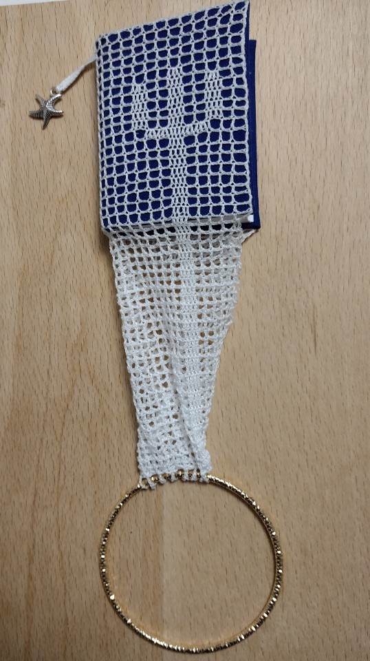
The story is (don't) take this the wrong way by @delimeful and was typeset by @little-cat-press for the Tiny Books Bang. It's a mermaid AU of Sanders Sides (Web Series), which I had never actually heard of before. But when I saw that it was a merperson AU, this idea popped into my head and I knew I had to try it, especially after I read the story and really enjoyed it.
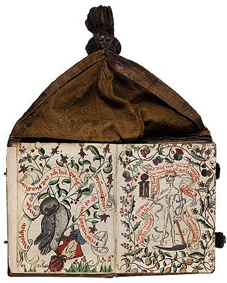
The inspiration is medieval girdle books, which are books whose covering material (typically leather) extended past the book to a knot that was both used as a handle when reading the book and could be tucked into the girdle when the book was not in use, thus the name.
Where my book is much smaller (it's a sextodecimo, about 2.25" by 2.75") it isn't designed to tuck into a belt/girdle, but rather is attached to a bracelet and dangles from the wrist when not in use.
When I think of mermaids, some things that come to mind are fish, treasure, and tridents, and I wanted to incorporate all three in the design. The book is covered in blue bookcloth, and then covered again in crocheted netting that was meant to bring to mind fishnets. I crocheted the netting from cotton-poly sewing thread doubled up. I incorporated a trident into the filet crochet, which is repeated on both the front and back covers. I blocked it on a piece of blotting...board? paper? It's soft and thick and meant to absorb moisture and came with my book press that started life as a flower press.
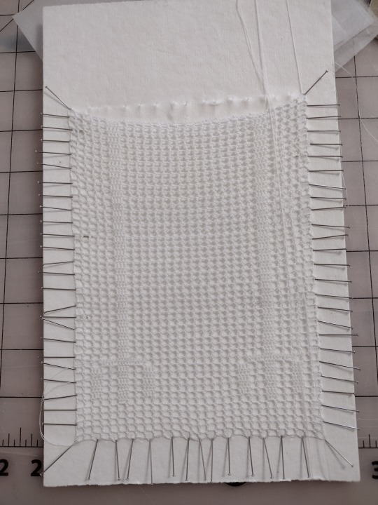
I then sewed the netting to the bookcloth covering the boards with teeny tiny stitches. It probably took twice as long to crochet the netting as it did to the rest of the binding combined, but I really like how it turned out.
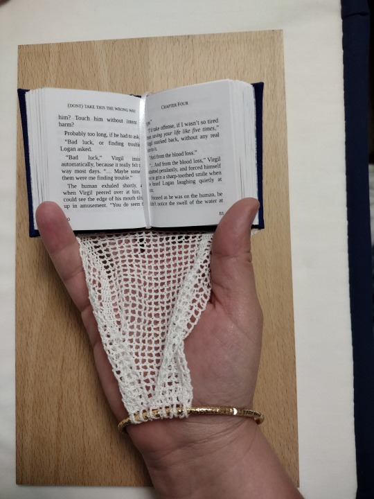
The bracelet I picked to attach the netting to is gold-colored to invoke the idea of sunken treasure. Rather than attaching the netting from one end to the other, I folded both ends to the middle and attached it like that so when you have the book open it lays more nicely.

The design of the endpapers looks like looped thread, and also reminds me of netting. I secured the bookmark to the bottom of the text block and let it hang from the top, which works better when the book is hanging from the wrist and doesn't get caught in the netting. I also sewed a little starfish charm to the end of the bookmark.
Technical details:
Sewn-on endpapers
Rounded but not backed
No headbands (I think I intended to, but forgot and then decided it didn't matter enough to try to pull the cover back off)
Things I liked about this bind:
I really like the girdle-book-on-a-bracelet design, it came out almost exactly how I had envisioned it.
Things I'd like to change/improve for next time:
I wasn't 100% pleased with how trimming went on these. It wasn't terrible, but I probably need to come up with a different solution than just a utility knife and a straight edge.
Crocheting the netting really did take so long. I'm not even done with the netting that's going on my copy yet, which is why all the pics are from the typesetter's copy. Probably would not want to do netting for anything larger than this one was.
Overall feels: Loved it! I enjoyed the story, the design came out pretty much exactly how I envisioned it, overall I'm well pleased.
#hooksbooks#bound by someone else#bound by hooksbooks#a gift#gifted to me#renegade exchange#mini book bang 2024#delimeful#author: delimeful#typeset by me
264 notes
·
View notes
Text
I made a Sakunene blog!!
Everyone follow me on dailysakunene or else you’re lame🫵🏻
#toilet bound hanako kun#tbhk#jibaku shounen hanako kun#jshk#sakunene#i would’ve done aoi nene but there’s already a daily blog for them#and ik i said i was gonna do mei nene but i don’t think i like them enough to be able to keep that up sorry :(#if someone else wants to make a blog for them tho pls do so#nene yashiro#sakura nanamine
13 notes
·
View notes
Text

The things you done to me
All the pain you put me through..
Everything you justified, because you wanted to!
Do you have any idea how long i thought lambert was dead! All because you corrupted MY MEMORIES!!!
YOU made me suffer and feel lonely !
I relied on you FOR EVERTHING!
And yet you took advantage of that!
Oh and don't forget that little stunt you did 100 years ago.....
Enjoy being dead for a while.....
Narinder
#cotl#cult of the lamb#bound by blood torn by time#cotl lamb#my artwork#bound by blood torn by time cotl au#cotl au#cotl the one who waits#cotl narinder#cotl nari#Lilith need help hurting your abuser aint it girl#lilith you blinded him already what else you wanna do to him??#What other thing your inner child want to do to narinder?#Why hurt him like he did to you that wont break the cycle#lilith look at reason and not anger because you doing things you swear you never do to someone#Abuse wont justify what he did to you.#You becoming just like him if you keep it up#Spotify
9 notes
·
View notes
Text
i think if there was an ES centered around lark it would be like. so incredibly looney toons. one day your character arrives in their lodgings to discover their most treasured item, (insert a vast number of tie-ins here), has been stolen from their very own home and under their very own nose and the entire story is just chasing the culprit around london scooby doo style. the culprit being lark himself of course. how does this all end? i don't know. but it's definitely goofy and light-hearted and dare i say a little bit silly
#despite (admittedly mostly against his will) being a LF protagonist#i think lark really lends himself well to like. a fun hijinks low stakes story. less angst and horrors more goofy and a little heartwarming#especially compared to. well. vaguely pointedly gestures at the scoundrel and scientist without elaboration#yin-thoughts#fallen london#by vast number of tie-ins im specifically thinking like.#something along the lines of the bunch of items you can get ''taxed on'' in the death and tax evasion ES#the tatterskin shawl. the complete set of internal organs. the mostly stuffed bound shark. etc etc#get fucking silly with it. your kitten sized diamond goes missing from its vault#you swore you put your discordance stone right here on the shelf yesterday but now it's Gone#your robe of mr cards has been snatched and it's going to be a really really really Really awkward conversation with your coworkers#so you need to find it Now#alternatively; someone stole the lease to london and nobody else is becoming this entire city's landlord on your watch
15 notes
·
View notes
Text
hey guys u like my unnecessarily specifc aus right. u like long hurt/comfort fics about something that's kind of silly and incredibly specific right
#im going to keep posting no matter what. bc someone is bound to enjoy my silly fics and my silly au ideas#purgatory creates#the mechanisms#the mechs#fanfiction#fanfic#ao3 fanfic#gunpowder tim#hurt/comfort#angst#fluff#jonny d'ville#ivy alexandria#raphaella la cognizi#drumbot brian#marius von raum#baron marius von raum#the toy soldier#nastya rasputina#the aurora#bertie the mechanisms#gunpowder tim vs the moon kaiser#fae#fae folk#names#nicknames#name magic#welcome to my twisted mind /j#idk what else to tag
10 notes
·
View notes