#ashmouthbooks
Explore tagged Tumblr posts
Text
They look absolutely fabulous! Good job.
It was designed for letter, yeah, and also to be printed a size smaller... they were intended for 32-mo, or L9 as I've been calling them (roughly the same size as A9, just with half-letter proportions rather than A series)
The margins were probably also affected by the fact I made them larger to accommodate trimming xD
but honestly, wide margins on a small book absolutely don't hurt. You get extra space to touch while turning the page!
... this reminds me, I meant to make some posts about the books I received in the mini book bang, and forgot to do so. I should do that...
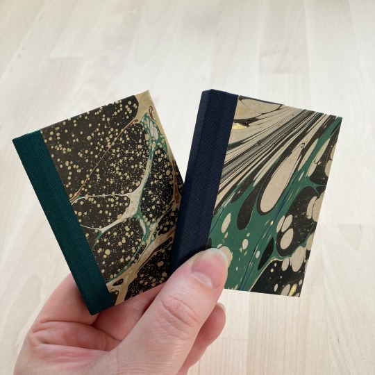
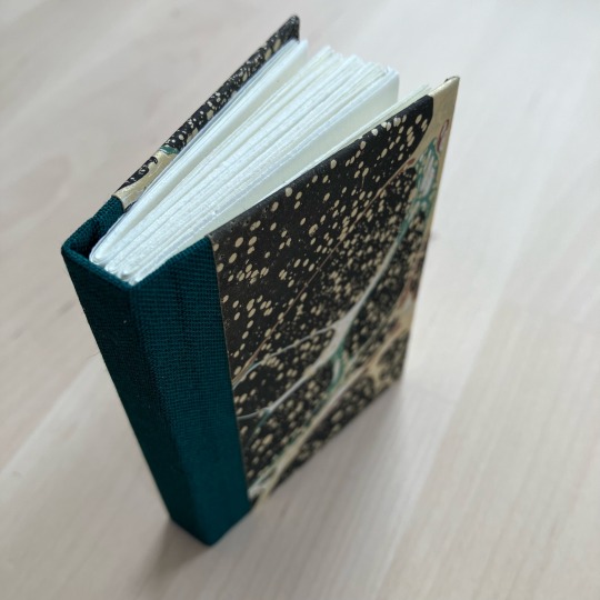
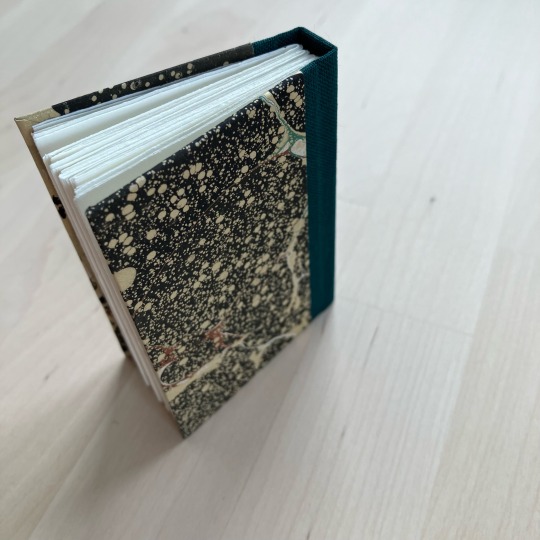
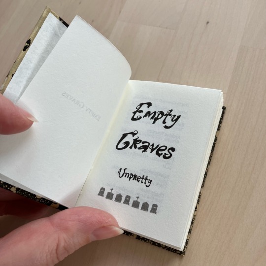


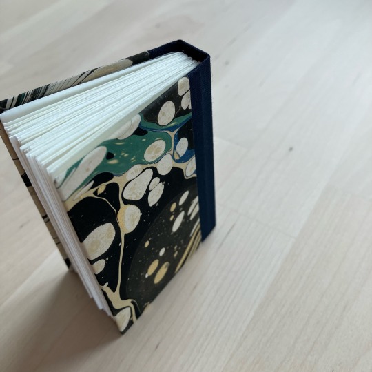
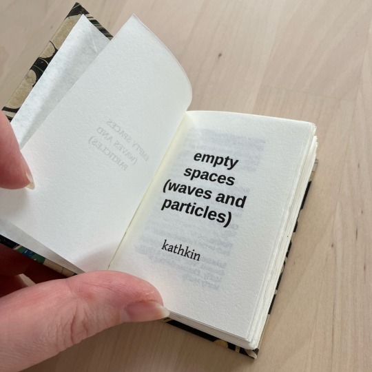
Empty Graves by @unpretty and Empty Spaces (waves and particles) by kathkin
I participated in @renegadepublishing’s tiny book bang last year, and as participant I got access to all the typesets from the event. I saved the ones I thought I’d want to do, and yesterday I looked through that folder, spotted two fics with the word ‘empty’ in the title and thought “oh neat, i know and like these fics, and I can make matching-but-not-same binds for them”. I was delighted to re-discover that they were typeset by the same person, @little-cat-press, so I went ahead with the matchy idea.
Empty Graves is a Superman fic from the POV of Martha Kent, and just so happens to be one of my faves in unpretty’s sprawling series. I chose the marbled cover paper because it evokes stars and galaxies and space for me. The fic is very contained, localised - the Kent farm - but high stakes; Martha will protect her son from the universe if she has to (and she does), because her family is her universe. I liked the idea of wrapping this small-but-big fic in something that resembles the vastness of space. The spine is green to match the hints of green colour on the otherwise dark marble.
Empty Spaces is a Back to the Future fic from Doc Brown’s POV, and featuring transmasc Marty McFly. The Back to the Future movies are foundational to me, and this fic is simply wonderful, highlighting the unique friendship between Marty and Doc. For this I knew I wanted something that evokes time travel, and wound up with this section of a larger marbled pattern that resembles the sci-fi woosh of time (and space) travel. This spine is blue to match the hint of blue visible alongside the green.
Both marbled papers are from Jemma Lewis Marbling & Design. The insides are printed on 90gsm Munken Pure Smooth Cream. These are self-ended, so no endpapers. The bookcloth is sourced from Ratchford but I don’t know which brand it is.
These are A8 sized (printed on A4) - I believe the typesets are intended for letter sized paper, but as I’m not in the US A-series it is. This prints fine on A4. The margins to the sides are slightly wider than originally intended, but that doesn’t seem to be an issue here.
#ashmouthbooks#typeset by me#bound by someone else#bound by ashmouthbooks#size: A8#author: penny anna#author: unpretty#penny anna#unpretty#renegade exchange#mini book bang 2023
278 notes
·
View notes
Text
I have my first bind of Binderary!
It's one of my own fics, Chains of Love, my darkish OFMD fic. I put it on the list of my requested fics for the typeset exchange and @ashmouthbooks typeset it for me as my exchange gift.


The paper on the front is Japanese paper from Hollanders, with Arrestox on the spine. I hand foiled the title in silver and totally messed it up, I will probably cover it with htv later.
The end pages are simple black linen textured cardstock that I kinda love.
This may be a good time to mention I do have an insta for just my books. It's at threeringspress.
71 notes
·
View notes
Text
Tiny Books Bang 2023
Wheeeee so the Renegade Bindery server had a Tiny Books Bang challenge where there's a typesetter and binder exchange thing of books sized quarto and below, and I got a Miss Fisher's Murder Mysteries epistolary fic typseset by @ashmouthbooks so OF COURSE I HAD TO MAKE IT LOOK LIKE A LETTER. AN OCTAVO SIZED LETTER (I attempted to fashion the covers into an envelope closure but that took too much time and effort to pull off, so no)

Definitely did a 2-day deep dive into period accurate stamps, had to print out the stamp onto sketch paper, carefully sanded down the back side edges sit it sits nice and flush. Spine is just homemade black bookcloth. For the cover, I printed onto brown sugar paper, then gave it a layer of acrylic sealer before attempting to align it, poorly on one copy so I kept that one lol.
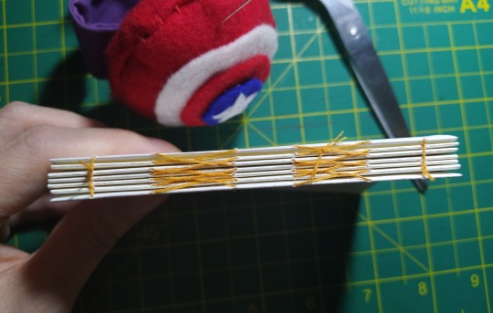
Inside, endpapers are these lovely chiyogami I bought a pack of a while back, and 78gsm cream paper. Made endbands by using the leftover chiyogami trimmings and gluing them around a core of leather.
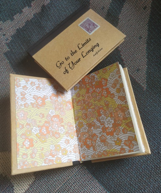

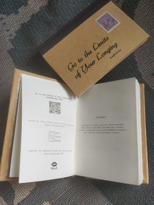
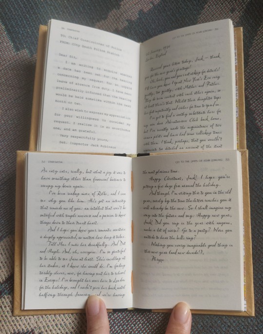
Some in-progress shots:


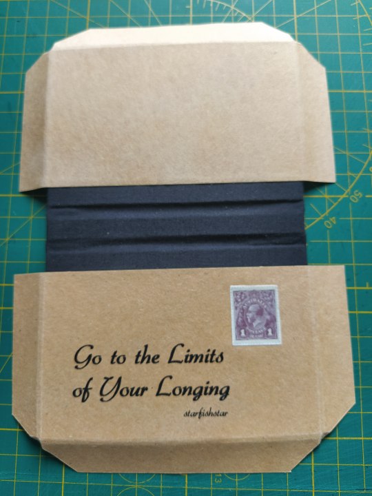

Then I bubble wrapped it and sent it off nearly halfway across the world! Where it arrived safely! (was I mother henning the tracking link, maybe)
165 notes
·
View notes
Note
Hello!! I'm a baby bookbinder, and I really loved the format in which you bound the three shorts fics in your 23th february post. I'd love to try and replicate this perfect format. Could you tell me the type of biding you used please? Thank you!!!
Hello hello! Thanks so much for stopping by and for the kind words! <3
For those books, I used a modified version of @ashmouthbooks's super cool paperback format! They use self-ended endpapers, where you paste the first and last sheet of the textblock directly to the covers. I do basically the same thing, except I glue an extra sheet of Kraft paper to the cover paper to make it sturdier + add a hinge to help the book open a little easier. I talk a bit about this process in this post too, where you can see how I layer the scrapbook paper + Kraft paper, then mark the spine and hinge areas for creasing. (As you can see in the post, I actually sew the textblock with French link stitches, but you could definitely use perfect binding instead!)
I also do this with my digitally designed covers, printed on matte photo paper--here are the two layers pre-gluing and trimming:
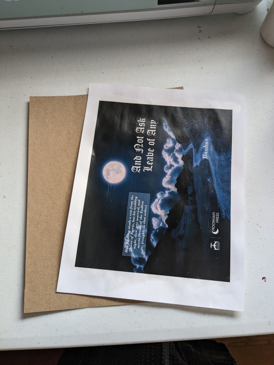
You can also just nix the kraft paper entirely! Cardstock and scrapbook paper work really well on their own in my experience, since they're already a bit sturdier. One thing I've found really helpful also, if you have it, is to use a scoring tool to crease where you want the hinge/spine. This is especially helpful if you do end up adding an extra layer to the cover paper, because it can kind of difficult to get a clean crease without it.
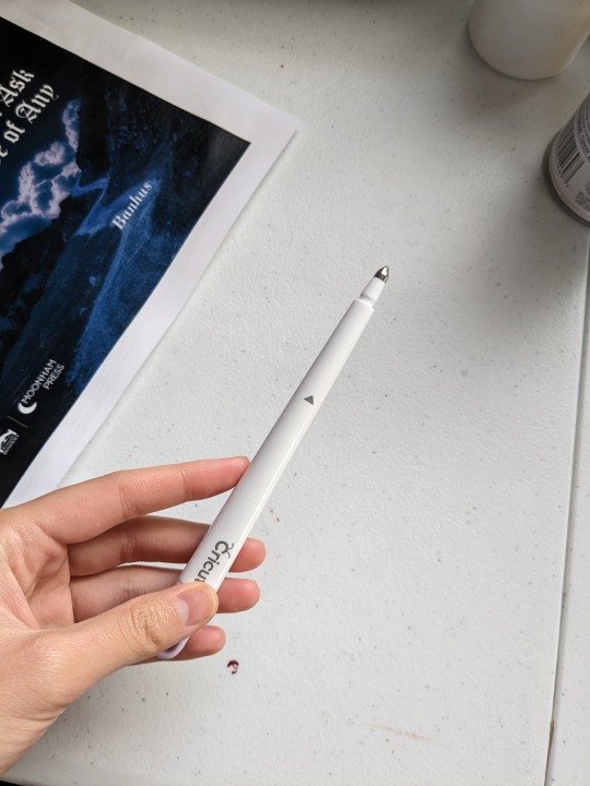
Then after everything is trimmed and creased, I glue the cover directly to the endpapers, leaving the spine and hinge areas free so that the book can open easily.

And that's about it! I hope this was helpful, and thanks again for stopping by! :D
301 notes
·
View notes
Text
This is so cool!!! I love how your edition came out, that cover is so inspired and it looks so flowy and landscape-y, like a topographic map it’s just so beautiful. Did you trim your textblock or does your printer print to the edge? Mine can’t so I have the blank border on my title page spread but this is what I intended it to look like and I’m so pleased somebody else made it work!!
Fanbinding: Inside the River by yeaka

Starfleet sends Jim a spouse and an oddly vacant honeymoon.


When I saw the lovely typeset and bind @ashmouthbooks did of "Inside the River" for the @renegadepublishing annual exchange, I was struck by inspiration. They had done this gorgeous two page spread for the title, and between that, it being a TOS/AOS fic I hadn't read yet but looked amazing, and the idea for the case, I *immediately* set to work on my first book of 2023.

I have this very pretty marbled paper that I wanted to try contouring a green fabric against, and that is what I ended up doing!


I am VERY happy with the end result, but it was a complete pain in the ass to make this happen. Each of the green pieces was separately cut out and worked together with cloth and then layered over the base with the blue marbled paper.
I also decided to test hubris and see how thin of a book I could round and back. I was mostly successful!

Thank you @ashmouthbooks for the lovely typeset and thank you Yeaka for the beautiful story!

#I think this is the first time somebody has bound my typeset and my heart is aflutter#thank you for tagging me I would’ve missed this otherwise#also t’is I ashmouthbooks I’m reblogging from my main#bookbinding#fanbinding#can’t get over how beautiful this is
467 notes
·
View notes
Text
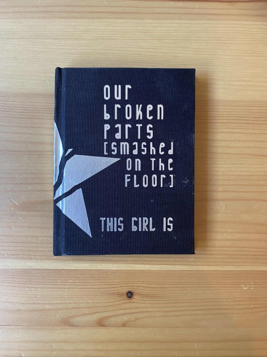
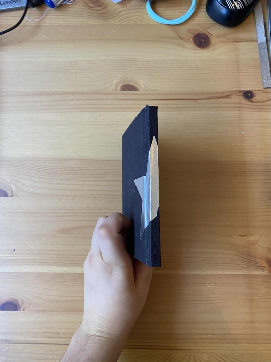

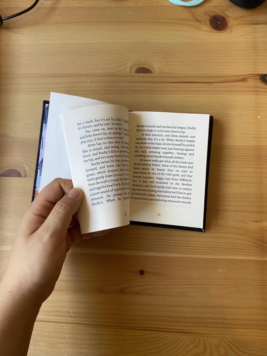
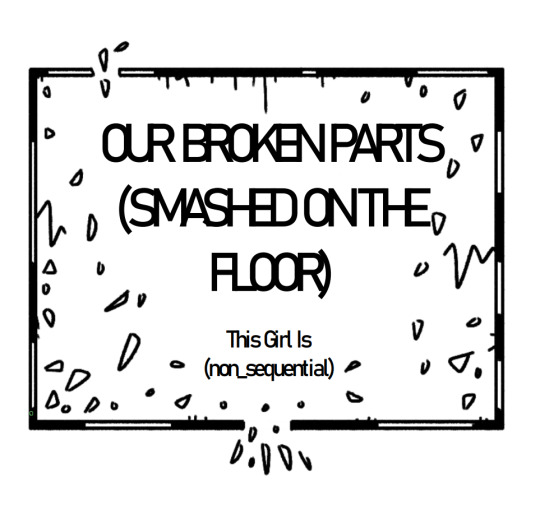
The first of two MCU fics bound for @ashmouthbooks in this year's Renegade binding exchange! This one's Our Broken Parts (smashed on the floor) by This Girl Is (non_sequential), a MCU Steve/Bucky fic - bound in simple quarto.
Typeset in Alegreya. This and the other fic I bound aren't very similar beyond the pairing and fandom, but I wanted to make them feel like somewhat of a matched set, so they have pretty similar visual appearances!
bonus (very small sketchy) illustrations, under the cut:

49 notes
·
View notes
Note
Hi! I just wanted to say that your works are so pretty, and they look so professional and polished and I always feel inspired whenever I glance at your page! I’m starting to get into bookbinding myself (I’ve done one or two A4 books) and I was wondering if you had any guides or tips on how to bind in the A6 size? Thank, and keep being amazing!!
Ahh thank you so much! My photos are carefully taken to hide as many flaws as possible, so half of it is an illusion. ;) I’ve only been binding for about a year, and only on weekends when I have the time, so I’m still learning and am in no way an experienced professional.
For A6 (or A7, which is even smaller), I use an imposition tool hosted on GitHub named bookbinder JS iirc, in my bookmarks bar it’s labelled cocoa’s imposer because that’s the name of the person who made it. This tool can impose PDFs for you into pretty much anything, and it’s worked really well for me!
I typeset in indesign (I have an adobe creative cloud subscription through work and I abuse it to typeset fanfic outside of work) but you can typeset in anything, what you want to do is make sure you typeset at the right page size. If you’re making an A6 book the page size has to be A6 son that when you imposition it to print (on A4 sized paper) it will look like this:
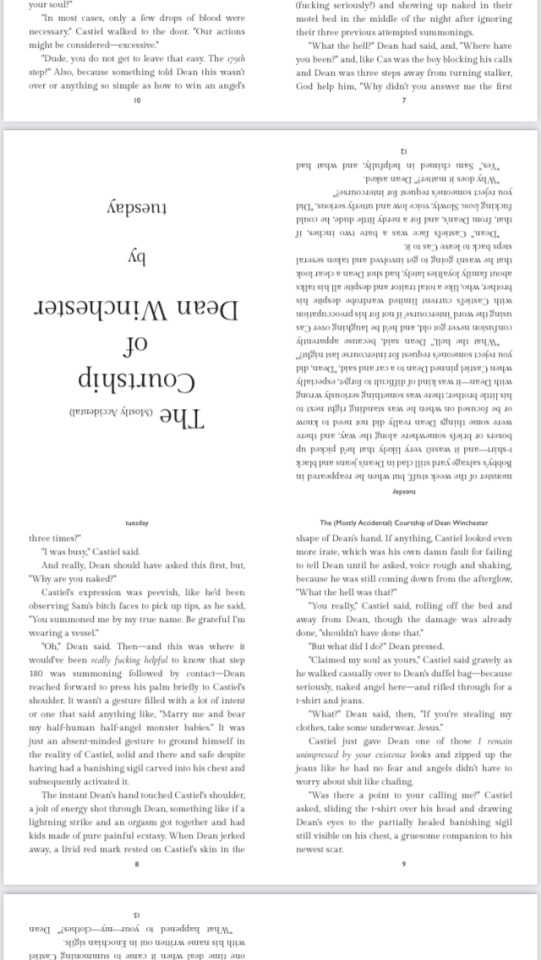
(Screenshot from my phone of an A4 sized PDF with four A6 pages imposed on it)
You print this out and then fold and cut. I have a TikTok account where I’ve put up a few videos where you can see me fold and cut pages for A6 - I can’t link on mobile sorry but here’s a screenshot of which videos show it:
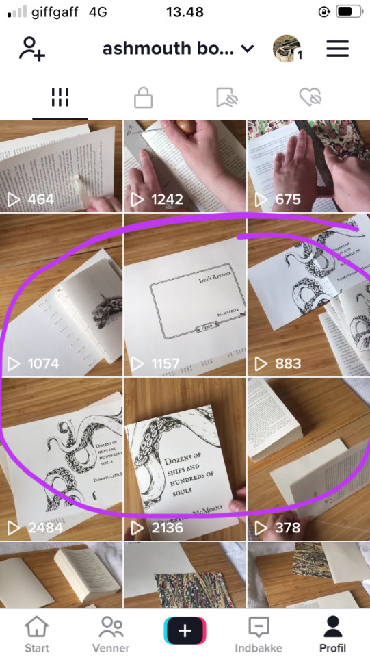
I’m @ashmouthbooks on tiktok as well.
A7 looks like this:
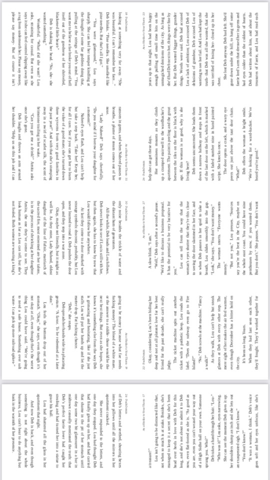
(Screenshot from my phone of an A4 page with eight A7 pages imposed on it)
So a bit more folding and cutting than for A6. Follow the folding instructions on cocoa’s imposer if you use that, for folding, I don’t know if other imposers do things differently. I think there are more resources linked on @renegadepublishing and if you want to join our discord server instructions for how to join are there too. It’s a really useful and supportive community and I wouldn’t have tried out A6/A7 sized books of not for them! Seeing what others are working on is such a huge inspiration.
I hope you have fun trying out making smol books! I feel a little like I could never go back to A5, I like the little books so much.
19 notes
·
View notes
Text
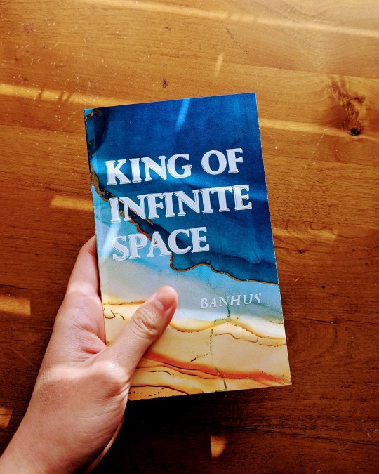
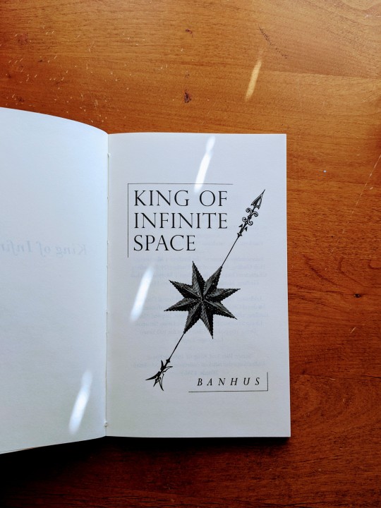
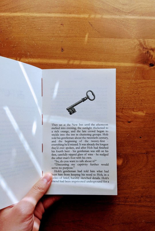
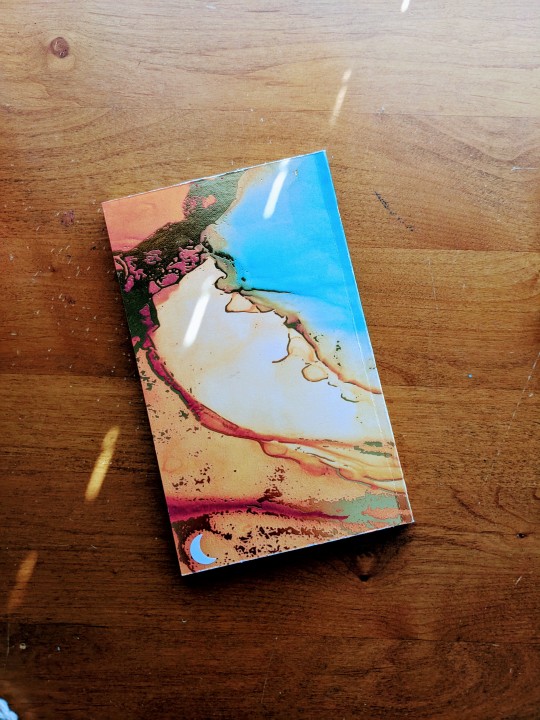

Finished binding @that-banhus's fantastic King of Infinite Space today! You ever get into a pairing fresh out of binging a series and read a fic that just solidifies the characters in your head? Like, they go from "funny lil guy I enjoyed watching on TV" to someone who could be real, someone you could know. That was this fic for me--banhus's Hob is such a delight to read, so vibrant and funny and optimistic. And of course Dream's voice in this is just *chef's kiss* pitch perfect.
Some process chatter, under the cut! <3
SIZE
So this was my first go at a quarto size on legal paper (8.5" x 14"), and I LOVE it. This size is perfect for that 10k-15k range, and with the community imposer designed by the lovely folks at @renegadepublishing (thank you, @simply-sithel and Cocoa!), it was such a breeze to figure out the formatting. (Printing, on the other hand, was a bit of a mess since my printer doesn't do duplex for legal sizes, but I figured it out in the end. And hey, I got a bunch of waste sheets out of it! XD)
BINDING
I did a variation of the paperback format I've seen floating around in the Renegade discord (@ashmouthbooks kindly explained it a few months ago, thank you so much!). French link stitching glued with PVA as per usual, although no tapes or mull.
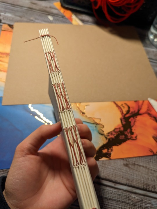
The cover is made of scrapbook paper and is glued directly to the flyleaf (flyleafs? flyleaves?), although as you can see below I added an extra layer of kraft paper to give it more of a "board" feel:
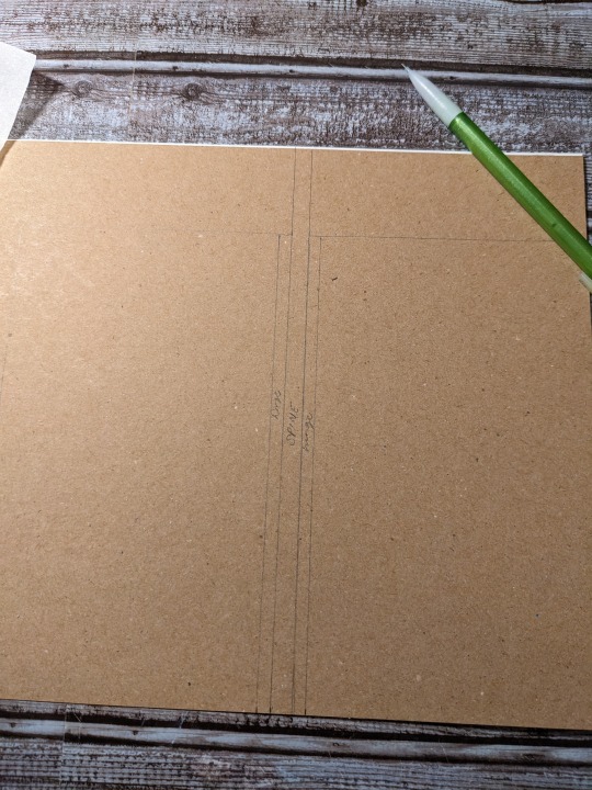
The pictures in this post are of my second/author copy, with an added a half-centimeter hinge so the spine can open more easily. My first copy did not have a hinge so it's a little stiff when you open it, but it gets the job done baha. Now I know for future binds in this size: hinges are the way to go!
DESIGN (or, as I call it, VibesTM)
The first line of this fic has lived rent-free in my brain for months now: They sat at the New Inn until the afternoon melted into evening, the sunlight thickened to a rich orange, and the late crowd began to trickle into the inn in chattering groups. I remember reading it late at night and immediately sitting up and going "oh hell yeah." This fic gives me that "walking to class in the fall semester and feeling the whole world passing you by and you have books to read and papers to write but you see your friend from across the quad and they wave at you and you wave back and everything is okay, maybe, because the leaves are turning and you're going to make it, dammit, you are going to make it" vibes. So the cover paper is from one of Michael's paper packs, called "Autumn Blaze."
HOWEVER, Banhus also mentioned that the paper looks like a sandy beach, and I'm smacking myself over the head for not doing that intentionally because yes! There's a lovely lovely scene at the end where Dream and Hob are lounging on the shore of the Dreaming and are finally, finally figuring it out, and it's wonderful and so atmospheric and I am 100% going to pretend that my paper choice here was tailored for that scene specifically XD
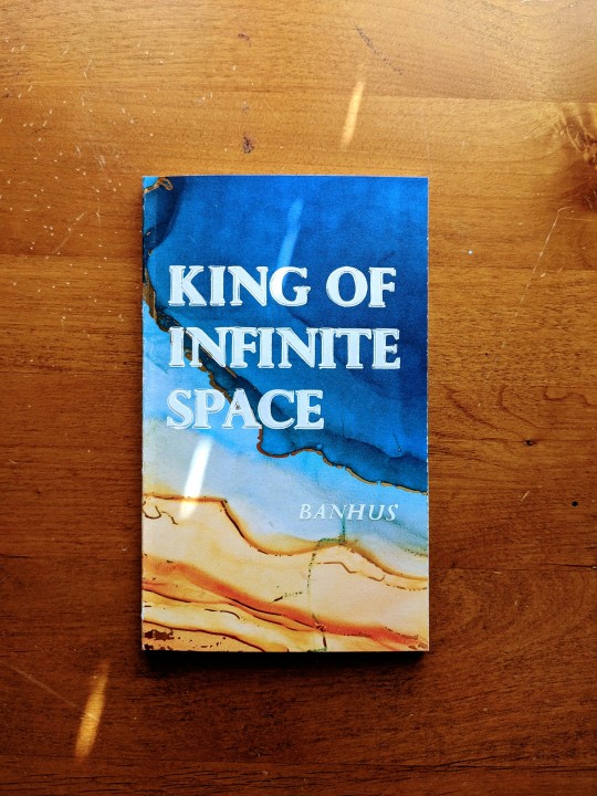
Titling is permanent adhesive vinyl cut by my Cricut, Charlotte, with hand-drawn "bolding" around each letter done with my uniball Signo white gel pen. And since I've been trying to get better at documenting my fonts, the titling for this one was Perpetua Titling MT, and the body was my go-to Garamond my beloved.
As a bonus, here is my first go at binding this fic, but in quarto letter size instead of legal! Smol :3
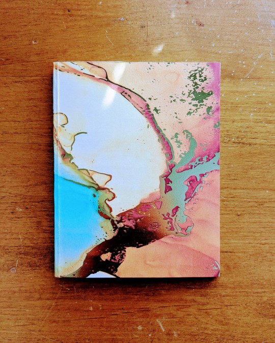
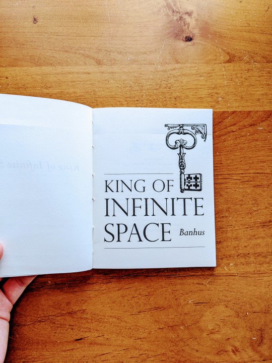
And that's all for today! Thank you so much, Banhus, for letting me bind your work! It was a pleasure, and I can't wait for you to receive your copy <3
All my love!
#the sandman#dreamling#dream of the endless#hob gadling#bookbinding#fanbinding#ficbinding#not my fic#King of Infinite Space#Banhus
304 notes
·
View notes
Note
It’s been almost a year since this last crossed my dash and I’ve since been tinkering with my front matter in different ways to include info I think might be relevant and am now doing, more or less, this*:

I’m not sure this is even perfect or exhaustive enough (I don’t include links to the original work on ao3 when the binding is meant for my own personal library, though maybe I should - whether as an url or a QR code or both). Let’s open it up to the floor? What do other binders include that I don’t? What do archivists want that I’ve omitted?
* I feel like I should explain that this screenshot is of a first in a special project I’ve just started which is what the urchin number and logo refers to, and that my usual @ashmouthbooks logo is on the title page instead.
Hi! So I'm a fanbinder who's been going wild making books, and sending them out as gifts when I can. The post about letters of provenance, etc made an impact, especially since lots of my books do leave my direct control. So, I'm very curious, from the perspective of an archivist, what added information would stand out to you as something helpful? Is it any different for books I gift vs. keep? I've tried to leave me out of my work before, but now I'm considering how to correct that going forward
Hi, thanks for the ask! Hope you don't mind that I made this public since I'd like this to reach a wide audience. Also fair warning you HAVE tapped into my feral archivist hindbrain so I am not responsible for any shouting about hyper specific archive problems that happens. Also fam what you do is SUPER COOL and you should definitely keep doing it.
Number one. First, most PRIMARY AND BASIC thing you can do, on everything you create, that will make any and every (and yes I mean all of us) archivist or future person literally PUNCH THE AIR IN VICTORY is date your work.
If you do NOTHING ELSE, please, please date your creations. If you can, and if the dates are significantly different, include the date of the binding and the date of the work. A date will help add context to the work; that should have obvious implications when it comes to the written material (historical context, zeitgeist, cultural influence, etc), but it also has implications for the binding.
For example, does this item need care? Can we get an indication of what materials are used, which is useful for cultural anthropologists? (For a real-life application of this see The Great Paper Shift in the mid 1850s when literacy rates were skyrocketing because of moveable type/printing presses and newspapers made the switch from cotton rag paper to acidic wood pulp which we can track down to the decade because GUESS WHAT THE NEWSPAPERS HAD.)
Second. I'm sure you do already, but include a maker's mark or signature or something else somehow identifying it as your work. This is where provenance comes in, it's helpful to know whose work you're looking at. Again, from a practical purpose as someone might be familiar with your binding style and what materials you use and that can come in handy for physical maintenance.
But also again, from a social standpoint. If we know, for sure because of the maker's mark, who is responsible for this binding, we have a solid way to track the impact of your work. How far did this binder actually have contacts? How wide is this network? How interconnected is this fandom? Etc. (Do please also include the author of the work you're binding as well, obviously.)
Third. I wouldn't necessarily go so far as to write a separate letter of provenance; those can be time consuming and perhaps difficult to attach to the work, especially if you're trying to make the binding more about the work and less about you. But. What I will encourage you to include, especially in gifts, is something like "X gifted to X on X date".
This will ensure YOU, the binder, are explicitly attached to the work (see above for importance of that), it establishes WHO the work went to after it left your direct control (in case it then leaves the sphere of that person and ends up with someone else), and it sheds light on the fandom network. ALSO YES HEY LOOK DATES MADE ANOTHER APPEARANCE.
(Also if you could add a vague “home” location somewhere in there that would be great too.)
Fourth. And yes, this is entirely wishful thinking on my part. If you can find a way to include the materials you used in the binding process? It will help long term storage efforts ASTRONOMICALLY.
Different types of inks, paints, glues, papers, textiles, etc all have different care needs and different shelf lives. If the person keeping the work knows what it's made of, preservation will be so very much easier.
ESPECIALLY if you are using organics like leather for covers or animal glue in the binding or cotton-based thread or embossing with metals or using metal corners/clasps because a) you do NOT want to see what happens to leather when it's poorly kept and b) you remember when we all thought lead and asbestos were cool and then suddenly they super weren't? When (not if) that happens again with another Thing we're super chill with now it would be GREAT if the person keeping the object knew they had That Thing to protect against.
tl;dr
Thee Most important things you can do as a fanbinder is date your work, sign your work, leave a brief note about who it is going to if it is being gifted, and leave a list of materials used in your process.
BUT MOSTLY DATE YOUR WORK
#also looking at this now I’m realising I forgot to change what paper this printed on#it was GOING TO BE recycled paper#but it actually wound up being copy paper#because it was the right grain direction#ugh well im not going to reprint the textblock to correct this#I’ll just make a note with a pencil in the back of the book or something#also the goddamn backwards quotes#bookbinding#fanbinding#archives#preservation
1K notes
·
View notes
Text
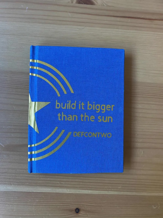


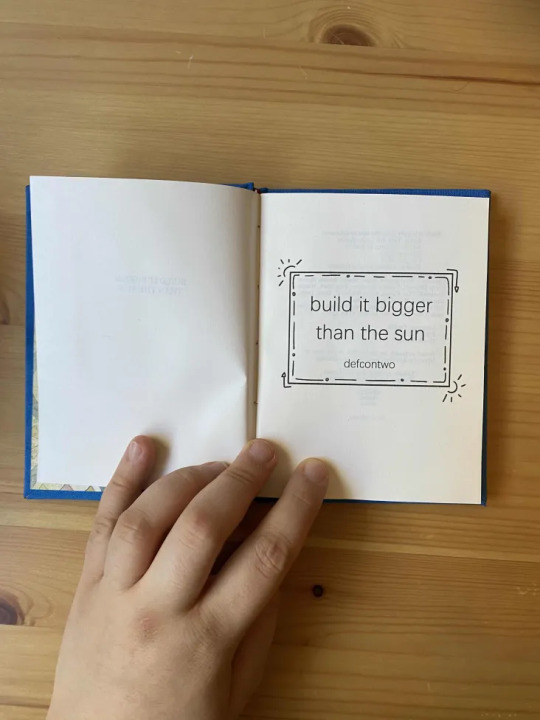

And here's the other MCU Steve/Bucky fic I did for @ashmouthbooks - build it bigger than the sun by defcontwo, also in quarto!
Forms a matching set with my other bind from this year's exchange. I like the contrast of blue-and-gold vs black-and-silver; it shows a nice contrast between the (very different) moods of the two fics.
Illustrations under the cut:


37 notes
·
View notes
Text


Finally finished binding the third Bunny & Raffles book! A lot of things went wrong but a lot of other things went really well.
I still haven't got any supplies to make sewn headbands (and I don't like the prefabricated ones) so I knit a pair again. Same colour scheme and endpapers as the first volume, only I didn't have enough paper left to endpaper a second book, so my genius (dubious) solution was to rejig the front matter a little to put the illustration on the front, and then cut a window in the front board. (I also changed which illustration to use because I felt this one was a lot saucier, ha.)
All in all I am pretty pleased!
Process videos (well, those that didn't glitch and fail) are on tiktok under #bunnyandraffles and #ashmouthbooks
102 notes
·
View notes
Text
Fanbinding: Inside the River by yeaka

Starfleet sends Jim a spouse and an oddly vacant honeymoon.


When I saw the lovely typeset and bind @ashmouthbooks did of "Inside the River" for the @renegadepublishing annual exchange, I was struck by inspiration. They had done this gorgeous two page spread for the title, and between that, it being a TOS/AOS fic I hadn't read yet but looked amazing, and the idea for the case, I *immediately* set to work on my first book of 2023.

I have this very pretty marbled paper that I wanted to try contouring a green fabric against, and that is what I ended up doing!


I am VERY happy with the end result, but it was a complete pain in the ass to make this happen. Each of the green pieces was separately cut out and worked together with cloth and then layered over the base with the blue marbled paper.
I also decided to test hubris and see how thin of a book I could round and back. I was mostly successful!

Thank you @ashmouthbooks for the lovely typeset and thank you Yeaka for the beautiful story!

#fanbinding#bookbinding#celestial sphere press#not my typeset#star trek#kirk#spock#spirk#disclaimer: i did NOT bind this during Binderary this was done in January
467 notes
·
View notes
Text
Eeeeeeeee
Tiny Books Bang 2023
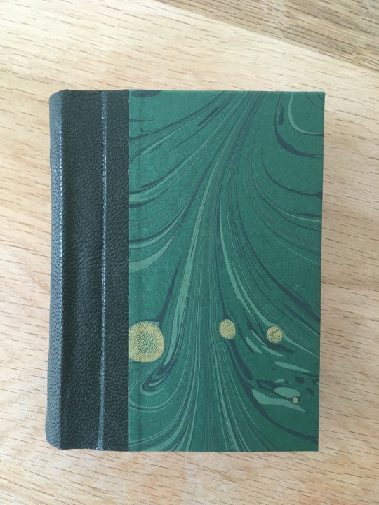


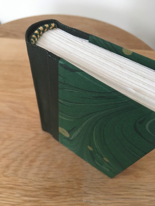

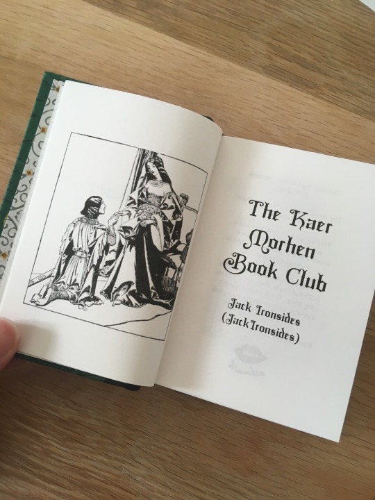
The Kaer Morhen Book Club by @jackironsides, typeset by @catspawbindery . Amyda has received her copy, and so has the author! so here we goooo
I JUMPED at the chance to bind this - agonised for a while about whether or not I got my first choice in claims - as this was a fic I already know and love and I had IDEAS for what to do with it. Amyda's typeset was so inspiring, including a frontispiece and medieval-esque fonts, and since the fic features medieval romance novels (chivalric, really) I thought it would be fun to try to emulate the binding of the novel Starcrossed Love as described in the fic:
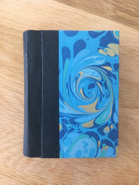
He waves an octavo at them. The cover has beautifully marbled paper, and black leather enclosing the spine with gilt decorations pressed in.
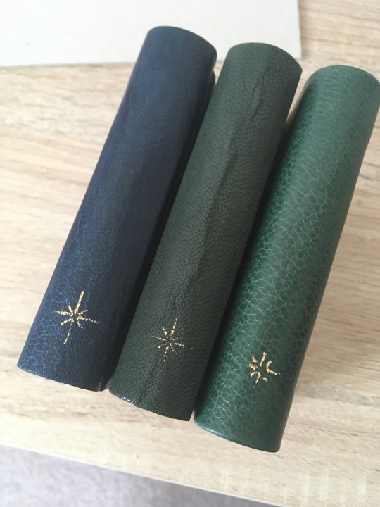
And there it is, with its dark calfskin binding, a single star stamped in gold on the spine.
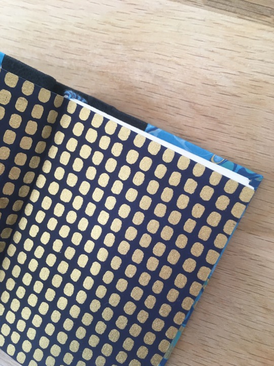
This is an octavo binding (though printed on A4 paper, so a very small octavo - an A7-sized book), it has a leather spine (animal: unknown), marbled cove papers, and a star foiled onto the spine with a hot foil pen. for endpapers I chose Japanese Chiyogami paper as I'd stumbled over this particular pattern by accident and thought both the colour scheme and pattern matched the medieval vibe. the headbands are green and gold embroidery floss.
I struggled a little with the leather - which I've never worked with before - so my own copy (the first trial copy) didn't come out as well, but lessons learned and the typesetter's and the author copies came out beautifully.
my copy, using a different, thicker leather for the spine, resulting in no visible hinge at all:
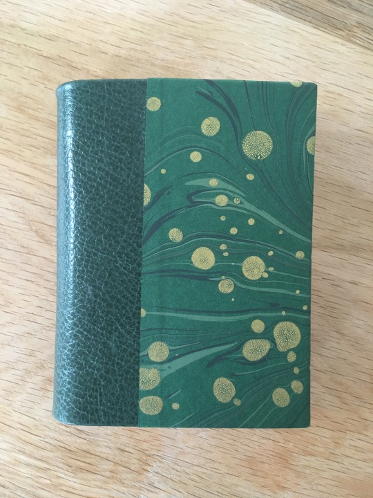
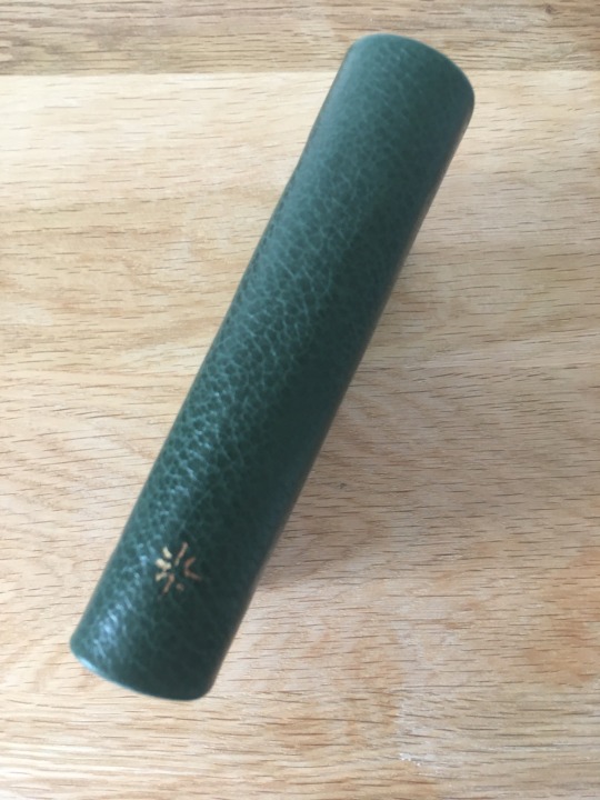
it doesn't look bad, but it's not the vibe I wanted and I had to do a lot of infilling to account for the thickness of the leather since I didn't have any leather paring tools.
the author's copy is a different colour scheme for two reasons: I sourced the leather from the leather scraps bin in Shepherd's, London, and the pieces were very small. I was only able to find two pieces large enough to cover the spine of an A7 (I'd brought along a dummy to test the scraps against) and the two pieces were different colours. I also didn't have enough of the medieval-esque Chiyogamy for a 3rd set of endpapers so I chose a wildly different but striking Chiyogamy paper to match the colours of the leather and marbled paper. the headbands are dark blue and pale blue embroidery floss.


bonus: all three copies together:

#ashmouthbooks#jackironsides#the kaer morhen book club#the witcher#complete#fanbinding#ficbinding#bookbinding#tiny book#tiny books bang 2023
185 notes
·
View notes
Text
hello I love your fic :D very pleased to be the vehicle of flattery!


a handful of more recycled paper books with breakaway spines. I had printer problems, back problems, and couldn’t remember how exactly I did this last time, so I had issues with every single one of these but they are functional and that’s all that matters.
all of these are Ocean’s 11 fics, Danny/Rusty, because I am depressingly predictable and I have loved these films since they came out, not to mention whatever the hell it is Danny and Rusty have going on. give me queer con men or give me death
confidence men by dorinda
danny and rusty, by everyone else in the world by sunshowerst (3 fic series)
grab your coat and start walking and other stories by berlincorpography (includes also The Art of Delegation and Love and Taxes)
breaking even by simplecoffee
The Night Before the Day Of by Dira Sudis
#it me ashmouthbooks on my main account#my fave thing about these little paperbacks is they fit in pockets and small purses so I can take them with me to read on the go
142 notes
·
View notes
Text
I'm so lucky to have this book from the exchange! Thanks to ashmouthbooks for binding it and to mouseonamoose (Nnm) for writing it!
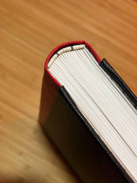
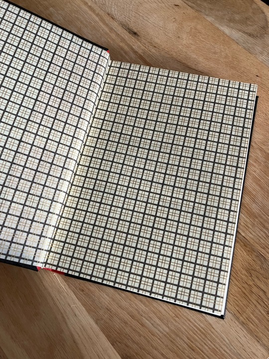
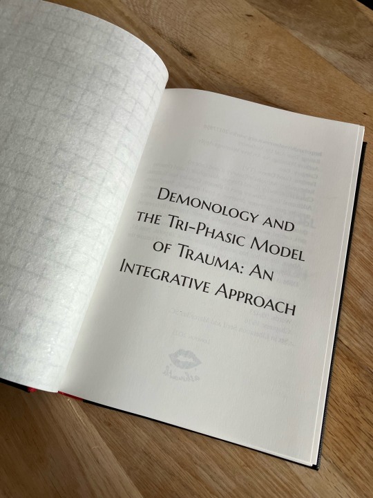
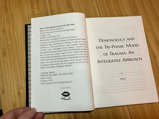
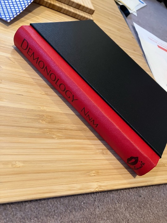

I participated in the @renegadepublishing bound book exchange again and this is the book I made for Mick at Silent Sun Press (who I don’t believe has a tumblr).
The fic is a Crowley-centric gen fic so I chose Crowley colours (his black jacket with the red collar) and on the inside I used Japanese chiyogami paper with a tartan pattern that reminded me strongly of Aziraphale - because Aziraphale is always at Crowley’s core. I used the same paper for the headbands. The case is a modified Bradel constructed like a hardcover case and I cased in like a hardback, i.e. the spine of the case is not fixed to the spine of the textblock.
The fic is Demonology and the Tri-Phasic Model of Trauma: An Integrative Approach by Nnm.
143 notes
·
View notes
Text
belatedly, the process video of making this book from folding & cutting to casing in. I only post videos to TikTok and my username there is the same as here: @ashmouthbooks
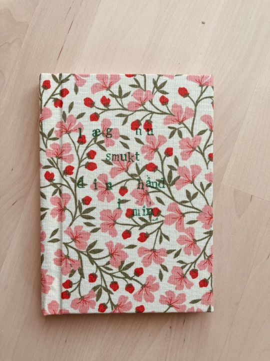
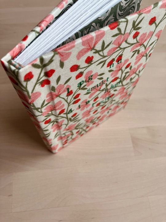
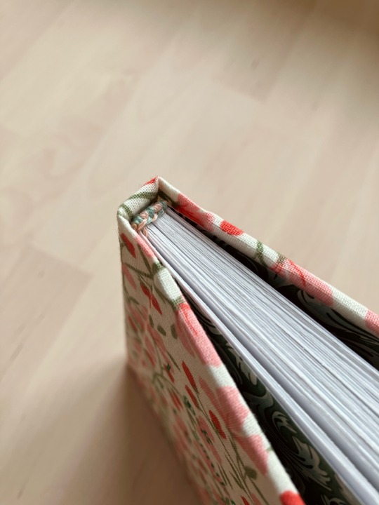
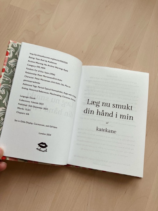
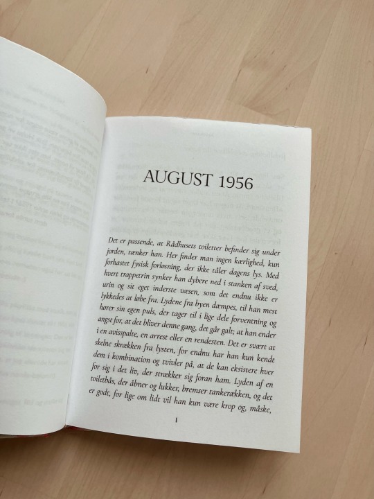
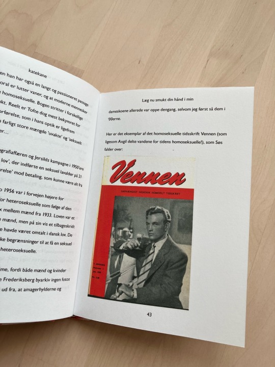
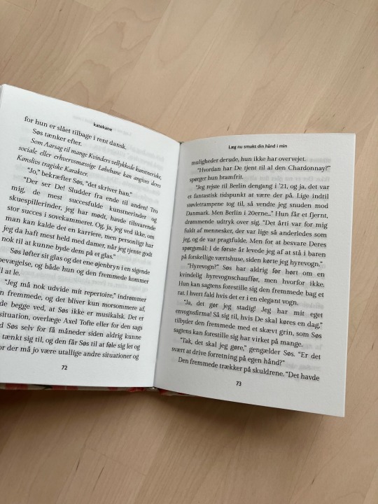
Læg nu smukt din hånd i min by katekane
A6 quarto hardback with homemade bookcloth - first time making it myself! and the title stamped on the front cover with fabric paint. I have never watched a single Far til fire film (not even the modern remakes) but when I stumbled across this on ao3 I couldn’t pass it by. this fic touches on Danish queer history with such heart and warmth and wonderful characters (I should probably watch the films) that it became an instant favourite.
for ikke at tale om at når man har tilbragt tyve plus år i fandom på engelsk og med engelske canons så er det at læse fic på dansk, der har udgangspunkt i dansk kultur og historie, som regn for sjælens ødemarker.
craft talk under the cut.
this is my first time making bookcloth so I want about it the cheapest possible way - fabric square from Søstrene Grene’s craft section backed with tissue paper which was a) the only paper I had that was big enough for the fabric square and b) salvaged from a past gifty delivery. it went ok but after drying some of the tissue separated from the fabric. hashtag yolo etc. I decided to use it anyway, and I think the moisture in the PVA was just enough to reactivate the paste on the paper backing, because the finished case came out beautifully smooth - and soft. I opted not to infill the cloth so it’s open weave cotton and feels as soft as a pillow to the touch.
the endpapers are also from Søstrene Grene, decorative paper 120gsm. The textblock is printed on 90gsm Munken Lynx Smooth Natural White, I wanted a whiter paper than usual as the chapter end notes have colour photos that I wanted to preserve. headbands are sewn on, the core is leather cord and the thread is embroidery thread.
the title is stamped on using rubber stamps from, you guessed it - Søstrene Grene. (they actually have letter stamps with the Scandinavian alphabet characters but the London store only has that particular set in all caps and the lower case set only had the English alphabet. luckily an æ is easily improvised and I have both a steady hand and a fine tip paintbrush for the circle over the å.) the paint is shimmery metallic fabric paint from Lumiere.
#I could post to tumblr but tumblr doesn’t let you post videos in reblog unless they’re from external sites??#very inconvenient#anyway here you go: this process video
109 notes
·
View notes