
Desmothene/Des | Amateur bookbinder and ficbinder since 2021, Member of Renegade Bookbinding Guild. Follows from @desmothene.
Don't wanna be here? Send us removal request.
Statistics
We looked inside some of the posts by celestial-sphere-press and here's what we found interesting.
Average Info
Notes Per Post
20K
Likes Per Post
12K
Reblog Per Post
8K
Reply Per Post
57
Time Between Posts
7 days
Number of Posts By Type
Text
16
Note
1
Last Seen Tumblr Blogs


Fun Fact
The “We are the 99%” Tumblr blog became the slogan for the Occupy Wall Street movement.
Text

Now that all three copies have made their way to the recipients, it's time to post pictures of my first end-to-end book bind!
These are copies of @robotmango's delightful Word of Honor novella, 'The wild geese.' Featuring arranged-ish marriage, Feral Gremlin Accidentally Falls For Husband, and really more self-mutilation than you might think for what's essentially a love story about finding freedom. I've loved this fic for a long time, and when I saw @rainsfalling's gorgeous typeset (mountain chapter headers! and scene breaks!) for @renegadeguild's Tiny Books Bang I was overcome with covetous glee >:D

...of course, then I had to actually print the thing, which took four separate goes around the Brother tech support phone line and a whole replacement printer, BUT! printer nemesis defeated, the bookmaking itself was a delight! This was my first time working with textblocks all the way up from a flat page to a book, and I was right, the sewing is the best bit. Naked unglued textblocks are extremely wobbly, though, and this is also very cute.


Another piece of technology conquered: my Silhouette Cameo vinyl printer (cutter?), scavenged from the ruins of Joann's demise and put hard to work cutting out so many tiny geese and mountain ranges. (Weeding is also very fun. Slightly less than sewing! But only because sometimes you lose pieces and have to swear about it.) Cover design remains a mystery, so I mostly copied @rainsfalling's interior design work ^.^;


One thing I knew I wanted was to make these three - one each for Rainsfalling and Orange and one for me to keep - to be sisters, not triplets. I got to try out faux double-core endbands at the Renegade Bindery retreat, and so swapping out a single colour in the endbands (and using different ribbons) seemed like a good way to change things up without making a ton more work for myself! (Pro tip, though: do not flirt with Thread Chicken while making end bands. It is very hard to keep an even tension with only two inches of tail!!!)


All in all, I'm extremely happy with these as my first full project, & I feel like I learned a ton. (Much thanks to all the Renegade folks, particularly @runawaymarbles for letting me come over & slicing chunks off of these with her guillotine, without which the edges would be a far more jagged affair.) They're real! They open! You can read them like real books! I... have already typeset & am partway through making three more octavo projects ^.^;
Soon my shelves will be overwhelmed with tiny fic binds and you know what? I'm okay with that.

108 notes
·
View notes
Text


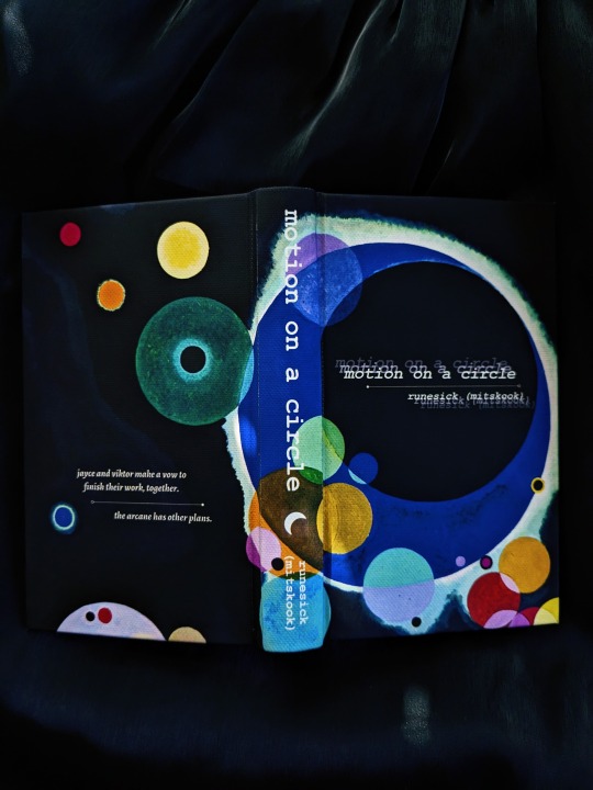


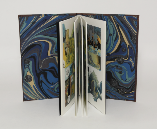
Another jayvik book, completed! This is the incredible motion on a circle, by @runesick. Stunning artwork by @marika-misc, who kindly granted me permission to include her art <3
As always, crafty chatting + more pics under the cut!
Whereeee do I even begin with this fic oh my gosh. The worldbuilding is PEAK. There are so many fun things that rune does with the structure that convey the strange, otherworldly, in-between space of the arcane. And the jayvik? AHHHHH. THE YEARNING! THE GRIEF!!!! It's both cosmic horror and sweeping romance at its finest. It's so, so good. I left a comment that was literally *checks notes* 2,000 words??? LMAO. Thank you rune for reading my yapping! I just had to bind your fic; it's been living rent-free in my mind for months now.
Some fun design things! There are a few sections in the second chapter that are written in the style of a screenplay, so I mirrored that in the typeset :3 For font, I went with Courier New, which is (I believe!) the standard for screenplays, and also changed up the justification for the paragraphs to be left-justified.
I really love the resulting effect--the chapter this happens in is about (spoilers aha) Jayce getting tossed into the metaphorical basement of the arcane, and because he's not technically supposed to be there, he's kind of only...partially rendered. But he's also literally aware that he's a construct, which is BONKERS and so delicious, narratively speaking. All that to say, I really wanted to convey that feeling of unreality, and I feel like the stark contrast between the two fonts really helps with that!


The title page was also super fun to design! After Viktor gets spat back out of the arcane, his face kinda splits into a thousand different after-images. I thought it would be really neat to convey that somehow, along with the general idea of motion as named in the title:

I liked the effect so much I did it for the cover text as well! This was my first time using printable canvas and gosh is it a game changer. For the cover artwork, I used Vasily Kandinsky's Several Circles and flipped it around so that that the title would fall in the black part of the big circle:


My bindery logo falling right in the middle of the orange circle was a happy accident heh, but it's one I'm quite pleased with :3 This was one of those designs that sort of fell into place the moment I found the artwork--it just felt right.

This was also my first time making paper endbands! I used the same paper for both the endbands and the endpapers and love how it brings it all together.


A million thanks again to rune for letting me bind their work, and to marie for letting me include her artwork! I had so much fun with this bind, and this is legit one of my favorite fics not just in arcane fandom, but also just in general. I'm so so happy to have it on my shelf! Here it is once more, for the road <3

231 notes
·
View notes
Note
@cissatheladybug you're welcome to dm me for the typeset if you want! I'm happy to share it, I just don't post it publicly for folks to grab.
Hii, ive followed your fanfiction "the desert storm" (and the sequel) for many many years, i dont normally comment as i have fics downloaded on my e-reader but im planning on typesetting your work. Just for personal use and i would like to ask as well if you had thoughts on dividing them into larger books where would you seperate them and what would you call each larger arc? Its totally ok if you dont answer! or dont have an opinion! i just wanted to ask before i just start cutting it on my own, it felt wierd to do that before asking your permission and opinion
I thought I had answered this one already, sorry! There is actually a printing set done up by celestial sphere press where they have made that sort of break-up for fanbinding, if that helps.
I do grant permission for fanbinding and the like, with the typical caveats- no using my work to make money, etc, etc, and anything else that can get us sued.
23 notes
·
View notes
Text


long time no book!
last fall I was preparing for an international move, then moved, started a new job, tried to find a new printer to replace the one I left behind in London (no luck) and a new place to live. I will be moving again soon but I borrowed the shitty printer at the office to print this because I was getting itchy not being able to make books.
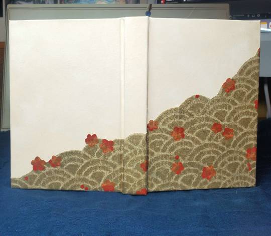
Hemlock & Wine by skazka is a Hamlet and Dr Faustus crossover fic that I read at some point last year or the year before (and then immediately read The Death I Gave Him by Em X. Liu, which is a sci-fi Hamlet retelling, and boy was it an experience reading the two back to back. 10/10 do recommend.)
the text is printed on 150gsm recycled cotton paper and sewn with dark green linen thread. the illustration on the title page is a German botanical illustration of hemlock, which I cannibalised to create section dividers and to dot little illustrations throughout the text. hemlock isn’t actually mentioned within the fic, but it is in the title, so.
the cover is a fake leather (or possibly bonded leather, idk) in a lovely dark wine red. the title is foiled on with a quill, in silver, gold, and red. could’ve gone with plain gold, but hemlock flowers are white and wine is red and well, here we are.
no endpapers - this is selfended. the recycled cotton paper was already Like That so finding an endpaper to match proved a challenge I wasn’t in the mood for.
115 notes
·
View notes
Text


Peeta’s Games by igsygrace, for my recipient in the AUS/NZ Autumn binding exchange (who does not have Tumblr, to my knowledge). (In the time since I sent this book off, the fic in question has been removed from AO3, so... no links this time!)
The inset cutout was a fun experiment, inspired by one of @celestial-sphere-press's alternate cover design suggestions from this post. Absolute pain to piece together, but has a really nice overall effect.
#great job!#you chose such fun colors#and yeah this style will never not be a pain lol#but like you said#the effect is great#bookbinding#fanbinding#not my binding
40 notes
·
View notes
Text
Pillar of Salt by @epitomereally

Late last year, my dear friend epitomereally did two amazing things: she became Dr. Epitomereally, and she wrote this fic.
As a graduation present, I decided to bind three of her fanfic for her, starting with this fic that I had begged her for permission to bind while I was getting a sneak peek as a beta reader as she was writing for @hderised . I kept the fact that she was going to be getting all three books a secret, and this weekend I got to give them to her at the Renegade retreat! (Pics of the other two will come soon).
Pillar of Salt is a dark, Draco-focused fic, with the central plot involving a morphed form of the mirror of Erised, and so mirrors are the main imagery in this bind.


This book was bound in black goatskin (a particularly stiff but easily skived instance), with foil quill decorations. The endpapers are perhaps my most subtle paste papers with gunmetal paste over plack paper. The edges are painted black and then splattered with the same gunmetal grey. The endbands are trebizond silk.
The title page was toner foil on black paper.


Epitomereally is a brilliant writer, and it was my enormous pleasure to bind this fic for her!
106 notes
·
View notes
Text
"simple" she says, and it turned out gorgeous! the use of 212th color in the sun + the typeset is delightful. *also* I see what you did there with the name of one of those fonts hehehe
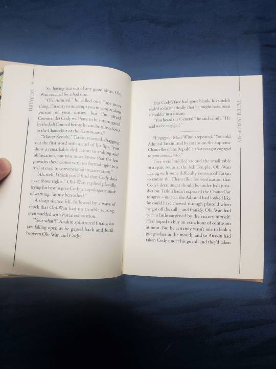
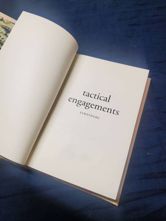
elwenyere double feature: recollection / tactical engagements
by @elwenyere
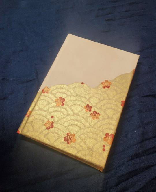
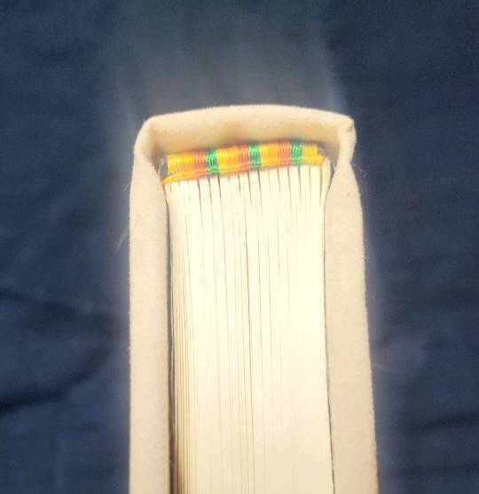

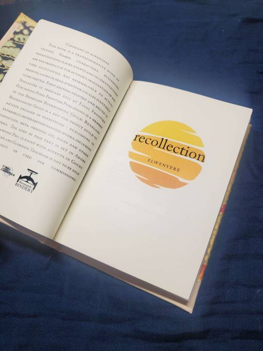
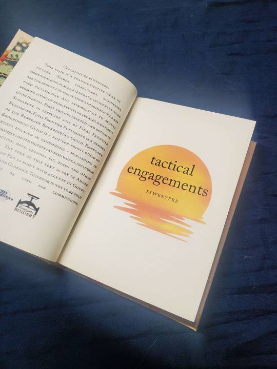

Techy bechy bitches!!! this was the second of two books i made for @celestial-sphere-press, styled as a tête-bêche, my favourite way of binding two shorter fics together.
a relatively simpler bind, also because i had like 4-5 days to finish this before i left for japan, so i speed moded this lil chunk.
some stats as usual:
37,106 words // 237 pages
Body text: Adobe Garamond Pro 10 point
Accents: Goudy Initialen and Glorious
i really liked doing the typesetting for these two fics??? i recently acquired a colour lazer printer, and decided YES I MUST ABUSE WITH SOME 212th GOLD ORANGE. cody deserved fancy ass drop caps, and yes i love that the other accent font is called glorious (no puns intended)
can't draw for shit? it's fine, if there's one thing that affinity publisher lets you do, it jazzhands lines with aplomb.

i was inspired by @zhalfirin-binds' intricate fussy cut designs (which i learnt at the retreat that she did them with a goddamn scapel), no wonder i was crying when i cut my patterns terribly with a bloody scissors). for the cover paper and the endpapers, i used chiyogami. the cover paper was interesting because i wanted something visually interesting with a different perspective when the book was viewed one way and then when it was flipped for the other. i liked the wave pattern with flowers as it looked a bit like waves from one perspective and tree leaves from another.
lesson to the wise though, chiyogami doesn't really like being pressed hard together for endpapers. the gold bits are mildly sticky. guess who had a mini panic attack when it stuck together and bits of the blotting paper stuck to it? it came off with a little bit of rubbing but whooo. terrifying.
i used a faux suede beige bookcloth i had bought from germany with zhal, which lent some interesting texture and colour variation to the bind. endbands were done with japanese size 9 silk, my beloved.
Des, my wonderful silly friend Des, stroked the text block paper among other things and went, "I love your paper!!!! It feels so nice."
Des. Buddy. My good friend Des. I used the nice paper that you recommended that you yourself use. Can you tell how much I laughed at her? (A lot.)
photos are exemplary and much better than what i would throw together because Des did the photos as I had none.
@elwenyere - thank you so much for writing some great fic! I'd love to bind you a copy if you're keen!!! (Just that it might take a while but YES can i make you a book?)
#fanbinding#not my binding#gorgeous books for MEEEEEE#yes yes i will take my ribbing about the paper#always laughing about 'tetchy betchy bitches'#star wars#codywan
123 notes
·
View notes
Text


Fanbinding(ish): Good Omens by Terry Pratchett & Neil Gaiman
(More photos below the cut, and I'll add the rest in another reblog.)
I had the idea for this four years ago. I actively started on the typeset about two years ago. I finished the typeset in about two weeks before the NG news broke--in fact I'd sent him an ask on tumblr just before he left, asking him if there's an explanation for Good Omens's inconsistent dropcaps. Maybe I'll ask the publisher.
Anyway! I almost didn't keep going, but I'd already put an insane amount of hours into the typeset, and also, fuck it. So I did it mostly for me, but also for Terry Pratchett, and also for the vine.
For those who aren't familiar, a red-letter Bible is one where everything Jesus says is in red. I thought it would be funny to do one where everything the antichrist says is in red--and then I also thought it would be funny to do pull-out quotes like my Catholic Youth Bible had, and then I thought, why stop there, and that's when things started to get weird. Trying to get the text to line up coherently around the trees and the mountains especially was delicate--and of course if I changed something on the page before it would throw everything out of whack.
The cover was inspired by those giant Bibles with covers that are an inch thick with a cross or something like that debossed in the middle. The text wasn't long enough to make it that thick, but it's two layers of thin board glued together. Leather on top, and then I used a foil quill to do most of the design--anything that's a circle is a brass stamp.
I make the design on Illustrator, and then had the cricut trace it onto the foil with a sharpie. I found that a lot more effective than printing it out and trying to do the foil quill through the paper stencil. I'll let you try and guess what shape I used instead of a cross, and will put the answer under the cut.
Doing gold page edges was a bitch and a half; I sanded off attempts about a dozen times. Fake gold was a bust; so was heat activated foil. I ended up doing one layer of acrylic paint and about five layers of gold acrylic.
And because I got this a lot about My Immortal: no, I'm not going to share the typeset. Even before Everything, I feel fine justifying this because I own the paperback, the deluxe edition hardback, the DVD, the script book, and the coffee table book. But I'm not actually into book piracy. (Unless you are the Terry Pratchett estate, in which case, sharing is caring.)


I'll do another reblog with the rest of the interior images.
(And for those who were looking for it: the cover is, of course, the dread symbol Odegra/the M25 motorway.)
#an absolutely stunning book & typeset#especially having gotten to hold it#gnu terry pratchett#bookbinding#Good omens
4K notes
·
View notes
Text
damn here I am a bookbinder, supposedly familiar with font choices & it did not consciously click for me that the font was making parallelograms too, thank you for pointing that out!!
I adore both obi-wan and Cody going through their respective Very Difficult Times while the other is the cause of said difficult time but also here to help out!! they make such a fun set to have as a tete-beche binding.


parallelogram. / 1861 c.100 s.60 double feature
by deniiqig / qigiined (@deniigi)
Huzzah!!! i am freshly back from the Renegade Retreat and boy am i hyped after a relatively long hiatus from binding. it was amazing to be able to meet internet friends in person, as well as be able to engage with people i've never really talked to but known of from the server. it was a great experience and i was so nervous going in because social anxiety can really do a number on me but it was really hella fun, 10/10, no notes, would 100% recommend to everyone.
i've been so busy since my trip to Japan in may, so i haven't had time to update, but this would be one of the books i made for @celestial-sphere-press.
THIS BIND HAS A STORY because Des has been pspspspsing me into things. we have a book exchange and i have owed her a book for a while. she had said she'd like anything obi-wan focused by deniigiq, BUT. BUT. what she really wanted was the mpreg fic. guys, i usually avoid pregnancy like the plague. it just squicks me out. but Des sold it as the tapeworm pregnancy fic so i said FINE I'LL READ IT.
this is the exact same "But hey, Nic, it's written so well, and this is the context that's very different from the traditional interpretation" that got me into reading ABO, y'all.
Guys, it did not disappoint. I had so much fun that I decided that hey, it's mpreg SO LETS COMMIT TO THE BIT.
Some stats as usual:
55023 words // 228 pages
Body text: EB Garamond
Accents: Voga, Gill Sans MT
I had to remake the textblock once cause i forgot the powder step in painting the edges the first time and the pages stuck together and tore. i guess it ain't too bad cause i decided to do suminagashi edges for the second try. Though there were minor fuck ups, probably because i didn't clamp it enough or i dipped it in for too long- the pages warped but by then i was like jkl;sdkl;sdfkl;'dfskl;sdf ugh it will become a book i don't care. the edges thankfully did turn out very nice with the orange and black.
For the cover, I've been in my cut-out phase for a while and ok i really wanted a fucking foetus on the cover, i just had to. the fic deserved it.

i got some helpful advice from @pleasantboatpress who suggested i layer more boards because i was initially worried about the boards being too thin as the top layer provided barely any support and these 1mm boards tended to warp a lot from the strength of the cloth when glued to it. See the pen marks on the curve above the belly? i read through the fic at least 10 times when i realized it never mentions breastfeeding or tits in it. the boobs on the cutout had to go.
i'd say the biggest pain was covering the baby and the parallelogram in cloth. i think the baby alone took me 5 hours to cover and by the end of it i was like UGH I WILL PROBABLY NEVER MAKE THIS DESIGN AGAIN.
i had initially wanted to do a hinge design on the parallelogram because i had pasted some momi paper underneath it but i found that red cloth covered parallelogram also looked pretty outstanding on its own and since i didn't have any hinges and was on A Deadline, the hinge idea had to go.
endbands were done with japanese 9 silk, my beloved. i don't quite know where my endpapers are from, i found them in my stash and went huh, that'd work. same for the black bookcloth.
all in all, i think it's got a pretty cohesive look and it turned out great! i also had a great time giving it to Des at like a queue in Star Wars Celebrations while some chatty dude behind us was like, "is that a foetus?"
Why yes, yes it is.

Many thanks to @deniigi for writing such a great fic!
#a lovely lovely book for meeeeee#i have already reread both fics inside and was delighted at their shenanigans all over again#codywan
148 notes
·
View notes
Text
No regrets, no apologies, glad to get you into yet another thing and THANK YOU FOR MY WONDERFUL BOOK!!!
parallelogram. / 1861 c.100 s.60 double feature
by deniiqig / qigiined (@deniigi)
Huzzah!!! i am freshly back from the Renegade Retreat and boy am i hyped after a relatively long hiatus from binding. it was amazing to be able to meet internet friends in person, as well as be able to engage with people i've never really talked to but known of from the server. it was a great experience and i was so nervous going in because social anxiety can really do a number on me but it was really hella fun, 10/10, no notes, would 100% recommend to everyone.
i've been so busy since my trip to Japan in may, so i haven't had time to update, but this would be one of the books i made for @celestial-sphere-press.
THIS BIND HAS A STORY because Des has been pspspspsing me into things. we have a book exchange and i have owed her a book for a while. she had said she'd like anything obi-wan focused by deniigiq, BUT. BUT. what she really wanted was the mpreg fic. guys, i usually avoid pregnancy like the plague. it just squicks me out. but Des sold it as the tapeworm pregnancy fic so i said FINE I'LL READ IT.
this is the exact same "But hey, Nic, it's written so well, and this is the context that's very different from the traditional interpretation" that got me into reading ABO, y'all.
Guys, it did not disappoint. I had so much fun that I decided that hey, it's mpreg SO LETS COMMIT TO THE BIT.
Some stats as usual:
55023 words // 228 pages
Body text: EB Garamond
Accents: Voga, Gill Sans MT
I had to remake the textblock once cause i forgot the powder step in painting the edges the first time and the pages stuck together and tore. i guess it ain't too bad cause i decided to do suminagashi edges for the second try. Though there were minor fuck ups, probably because i didn't clamp it enough or i dipped it in for too long- the pages warped but by then i was like jkl;sdkl;sdfkl;'dfskl;sdf ugh it will become a book i don't care. the edges thankfully did turn out very nice with the orange and black.
For the cover, I've been in my cut-out phase for a while and ok i really wanted a fucking foetus on the cover, i just had to. the fic deserved it.
i got some helpful advice from @pleasantboatpress who suggested i layer more boards because i was initially worried about the boards being too thin as the top layer provided barely any support and these 1mm boards tended to warp a lot from the strength of the cloth when glued to it. See the pen marks on the curve above the belly? i read through the fic at least 10 times when i realized it never mentions breastfeeding or tits in it. the boobs on the cutout had to go.
i'd say the biggest pain was covering the baby and the parallelogram in cloth. i think the baby alone took me 5 hours to cover and by the end of it i was like UGH I WILL PROBABLY NEVER MAKE THIS DESIGN AGAIN.
i had initially wanted to do a hinge design on the parallelogram because i had pasted some momi paper underneath it but i found that red cloth covered parallelogram also looked pretty outstanding on its own and since i didn't have any hinges and was on A Deadline, the hinge idea had to go.
endbands were done with japanese 9 silk, my beloved. i don't quite know where my endpapers are from, i found them in my stash and went huh, that'd work. same for the black bookcloth.
all in all, i think it's got a pretty cohesive look and it turned out great! i also had a great time giving it to Des at like a queue in Star Wars Celebrations while some chatty dude behind us was like, "is that a foetus?"
Why yes, yes it is.
Many thanks to @deniigi for writing such a great fic!
#book for MEEEEEEEEE#thank you nic for enabling my desire to have many deniigiq fics on my shelf#fanbinding#star wars#codywan#obi-wan kenobi#commander cody#nic you made so many clever choices and committed so hard#the foetus omg#and suminigashi edges!!
148 notes
·
View notes
Text


My personal goal is to try and make fanfic binding as accessible to everyone as possible, so here are some resources on how to make a fanfic hardcover for under $25.
This is a barebones bind for the broke college students and such. Happy to field questions, too!
Here's a proposed budget breakdown:


Loosely organized thoughts:
Fanfic bookbinders often share typesets amongst each other. Never pay for a typeset for a fanfic.
You'll hear a lot about grain direction for your printer paper, but as a newbie on a budget without your own printer, settle for some nice 92 bright paper. If you like the hobby, splurge after but expect to pay at least 2-3x more for short grain paper.
Printing is a pain because some copy shops won't let you print intellectual property smut, and it's very expensive. You are better off bartering instead or looking for a free printer on Buy Nothing.
You know the thick paper wrapping that comes with online orders? It's a good weight for endpapers if you need to scrounge. Paper grocery bags or gift bags (birthday presents) might work, too.
Ask your local library to give you covers from books they are throwing out. Ask for outdated textbooks (those covers are built like tanks) or three-ring binders that are too busted to be binders anymore.
Obtain a used book that was mass produced (so your destruction of it does not impede anyone's access) and maybe even become a little vindictive with it.
If you can afford it, I recommend the Olfa SVR knife (~$10)
If you can afford it, upgrade your ruler to a t-square.


I really hope this resource is helpful! I want to stress how possible this is and encourage people to cherish what they love through art.
If you are interested in fanfic binding and have a little more disposable income, I have an affordable Fan Fiction Bookbinding Starter Pack that I carry on my site. I pack them myself and drop them 1x/month on the 15th.
13K notes
·
View notes
Text
Fanbinding: Sanguine, by @glimmerglanger

MAY THE FOURTH BE WITH YOU!! (#2!)
My second post for Star Wars day is the canon vampire-au fic Sanguine, typeset by @aetherseer (& it is one of the last any of us received explicit permission for). This fic is one of my most dearly beloved of glimmer's works (so hard to choose a favorite). It languished for months printed but unfinished, on my shelf, because I was constantly torn over what to do for the cover design. The final design uses handmade bookcloth from white linen, with red paint seeped into the fabric in different tones & stages to give the effect of blood leaching into cloth (we are going after both meanings of "sanguine" here).
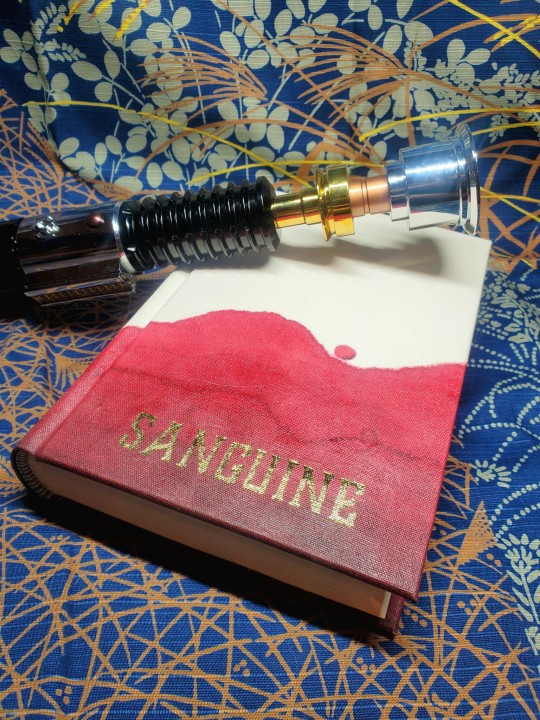


Aether's typeset, with art by @frostbitebakery, is gorgeous & has color on every page. I had this crepaldi tiger eye paper that I thought would go great, and did true double core endbands to match.

Bonus photo: aftermath of Nimitz deciding she needed to participate in this act of creation.

bonus bonus photo from my first photoshoot of this book where the book was acting like it was a Twilight vampire instead of a normal one 🤣:

#fanbinding#celestial sphere press#ficbinding#star wars#star wars prequels#obi-wan kenobi#commander cody#codywan#may the force be with you glimmer#may the fourth
312 notes
·
View notes
Text
months to go: LESS THAN 1, WE ARE AT 2 WEEKS TIL PACKUP
textblocks in progress: 1!! (but!! I may do something silly and add 6 more on top!!)
the impending international move means I need to get my shit together and work through the textblock backlog
months to go till move: 2.5
textblocks in-progress: 8 (might trash one of those though)
annnnd 1 maybe project I haven't actually started yet
22 notes
·
View notes
Text
Fanbinding: The Desert Storm (series) by @blue-sunshine-mauve-morning

MAY THE FOURTH BE WITH YOU!
This is 1 of 2 posts for today, a massive project that I have hit a significant milestone for: completion of both my & the author's 15-volume set of the 1.1 million word The Desert Storm. This is the fic series that got me into Star Wars as an actual fan.
Four years after Order 66 and the fall of the Jedi Order, a grieving, struggling Ben Kenobi finds himself inexplicably taken back in time, crashing headlong into the foundations of fate. Grasping hope and vengeance with both hands, Ben rebuilds his identity and seeks to change the course of history: by saving Anakin Skywalker, the Jedi Order, the galaxy - and just maybe saving Obi-Wan Kenobi along the way.
My design for this typeset was significantly influenced by mem, who had begun a typeset before me and selected black & white images for the title pages, a trend I continued.

As this fic series has meteliculous attention to both canon & EU lore, I stuck with aurebesh characters for titles wherever appropriate, which occasionally gave me some fun opportunities for chapters & tables of contents like this:


For scene dividers, I used a image you can interpret either as twin suns, or as an eclipse.

While I committed to a more classic and less elaborate design for this series, I still rounded & backed every volume in the set. "Editioning" high numbers of similar books like this is often considered in bookbinding circles as necessary to practice skills (I am at 37/45 volumes), and I can certainly say that I have gotten much better at a number of things along the way. The largest book in this series is 616 pages; the smallest, 160 - and I needed to round & back both.


Further thoughts...
Blue_Sunshine (the author) has a fantastic skill for foreshadowing; reread of this series are a must. On top of that, character relationships are consistently and realistically fleshed out and developed. And critically for a "go back in time" story, Blue has a wonderful grasp of the dominoes - what changes trickle down and ripple out; and how that could come back to bite some people. Finally - if you live a badass Obi-Wan Kenobi, this is definitely a fic series for you. Also Blue is a lovely person & our little bits of correspondence has been such a bright spot for me.
Material notes: Duo oatmeal bookcloth, orange marbled jute from Sustain and Heal, hammermill cream paper, gold foil + paint for titles.

#fanbinding#bookbinding#celestial sphere press#Star Wars#Obi-Wan Kenobi#The Desert Storm#star wars prequels#may the fourth#may the force be with you
454 notes
·
View notes
Text


This is the fan translation of Copper Coins by Musuli, which you can read here (or the official version will be coming out from Seven Seas later this year). I did the binding but not the typesetting/interior design. I was trying out new backing boards and accidentally backed this too deep, and would have needed a thicker cover board than what I usually use. So instead of just layering pieces together and making a thicker board, I made a sort of wraparound overlay out of a thin piece of chipboard, using bookcloth to cover the outer layer and the same paper as my endpapers as an accent underlayer.
In keeping with the wraparound design, I made a dragon stencil that could wrap around the book too (modified a stock image to make it a little longer in the middle). It's gold paint layered on black to give it a weathered metal look to match the coins (even though if we were going by canon appearances, the dragon should be black). The stenciling ran into some issues (the particular vinyl I used did NOT want to adhere to my bookcloth) but I kinda like the rough-looking result (on the dragon at least. The title could've come out better but it is what it is).
Rather than being attached at the top like a standard ribbon bookmark, this bookmark is attached to the bottom of the book so that the coin tassel at the end can hang over the top when it's in use.
#shut UP THATS GORGEOUS#I love the tarnished copper effect on the print!!#the layered cover that creates a millimeter binding appearance?? genius#damn its pretty#the coin tassel!#all around excellent
220 notes
·
View notes
Text


Sacred Bodies - VER
Thank you @sticksandsharks for the kind permission to bind your work. I love it very much and am happy to be able to hold a copy of it in my hands.
Full clothbinding with paper onlays
Materials used
Case covers - 1mm grey board spine stiffener - cardstock cover material - Colibri book cloth (forest floor) paper onlay - marbled paper (80gsm) by Renato Crepaldi title - gold foil, hot stamped
Inner book textblock - Schleipen Fly 05 (115gsm) endpapers - marbled paper (80gsm) by Renato Crepaldi endbands - linnen core (10/3) wrapped with marbled paper
Format: 9,5cm x 13,8cm
781 notes
·
View notes
Text
The Desert Storm by Blue_Sunshine


I live!!!! *cue mushu voice*
For reals though, I know it's been a while. it's hard to pick up bookbinding when your IRL state has been rotating from crisis to crisis (yeah).
the calm has settled a little and i've been talking about getting back into the thick of things, though procrastination and streaming on demand has been getting the better of me.
context is my little brother, who lives an ocean away and who i have seen a grand total of once in the last 5 years since the pandemic hit, has shown some interest in reading star wars fanfiction while admiring my handmade books. i love doing some TCW and obi-wan kenobi evangelism, i really do. it's my favourite thing. serendipitously said spouse was doing some educational training in the same country as my little brother for two months, and me (overly-ambitious, unrealistic silly me), mid-waffle, went, "hey yeah, maybe i could make him a book and you could bring it to him?"
my well-meaning spouse who knows me far too well gave me some healthy side-eye and said, "I don't think you'll finish it in time." (they were leaving in about 10 days)
GUESS WHAT GENTLE READER? GUESS WHO USED THE POWER OF SPITE FOR GOOD?
i made it by the skin of my teeth, crying inside the entire time. it's probably not wise to do a multiple intricate cutouts smaller than a size of my finger on like... 4 hours of sleep.
photos are like this because the book was out of the press in the morning, shoddily placed on the floor for a 5 minute photoshoot and then boom into wrapping they went. off onto the plane in a couple of hours.
It is not perfect, but it is unabashedly A Book.
I am proud to do some star wars fic evangelism with one of my most favourite fics of all time, @blue-sunshine-mauve-morning will never stop being aMAZING and this fic will always be better than sliced bread to me.
some stats:
96215 words || 380 pages
I'm still using the lovely @celestial-sphere-press's typeset, who has typeset the entire series, and for the author too!
There's this quote from the fic about the sunrise on Tatooine -
The pale dawn of first sunrise is just coming up, turning the world violet and blue and pale yellow, and Ben judges that he is precisely in the middle of nowhere, but probably still closer to Mos Eisley than to his hovel, and so he would be better served by walking back south.
I had to use this paper, I had to. Endpapers are beautiful marbled papers from Papiers Prina, while i used Colibri copper (my beloved) for cover material. I've been doing more cutouts and I was inspired by the recent Renegade Binderary to do More Complicated Cutouts. Gentlebeings, cutouts smaller than the size of your finger are a pain, I do not recommend. Endbands done in japanese size 9 silk, i made a couple of mistakes in terms of colour and i experimented with a new more rigid core but was defeated by it being square cord. have since bought new rigid round cord and my life has been changed.
PLANS!
i owe many exchange books and have managed to secure a place for the Renegade Retreat as a last minute attendee. this is not my first international meetup, though it will be the largest one i've attended with the most Renegade people. before that, i am heading off to one of my favourite places in the world where i will hopefully come home with more bookbinding supplies and am also doing a friend visit!!!
#it looks so good!!#nic damn you are crazy for attempting that cutout with a 10 day timeline#way to go#bookbinding#fanbinding#renegade bookbinding guild#not my binding#but its fun to see my typeset being used
141 notes
·
View notes