#be ready for all the redesigns
Explore tagged Tumblr posts
Text
I'm a little stuck in a constant loop of finding an artstyle and not liking it enaugh to work with it for redesigns. I will devinetely keep trying but i don't have a lot of free time.
#i will get there eventually#be ready for all the redesigns#i have too many ideas for everyone#exited to get there tho
6 notes
·
View notes
Text
Okay, here's a list of Dialtown character requests/refs that I have done/need to do! I'll make this like a lil series since it's fun =3. Also, feel free to leave requests on this post, too, and I'll add em to the list!
Please read the tags of this post for more info!!
[★ done]
[☆ not done]
Harry Fitzgerald★, Oliver Swift★, Abel Brannigan★, Jerry Gould★, Jake Wilson☆, Karen Dunn☆, Mr. Dickens☆, Theoroar Rustlebelt☆, Stabby (+ Shooty)★, Narrator☆, Fusco☆, Bigfoot☆, Bunny☆, Type/Phonegingi☆,


#dusty yaps#dialtown#not gonna tag all of them because thats.#too many and im not gonna put in that effort#btw yall dont worry about how many requests i already have#im not gonna stress myself out over this#this is just for fun and ill get to these when im ready so#dont worry about stressin me out or overworkin me!!#its all good 👍#also if you sent a request and its not featured here#it probably got buried in my notifs!!#feel free to reenter the request and ill add it!#ill also do dialtown ocs if you have a ref for me!#keep in mind these are redesigns so#if you send in an oc#that means ill more than likely change or add things to your character#if youre not okay with that then please do not request your oc!!!#thank yall kindly!
116 notes
·
View notes
Text

#ive got art brainworms rn#i cherish them so.....#sonic!!!! sonic hedgehog!!!! yay yay yippie!!!!!#i love sonic hedgehog guys!!!#UGHHHHH#THEYRE SO COOL I COULD LITTERALY GO ON FOR HOUURRSS#gave him pants because i slightly redesigned blaze and he looked naked <\3 heartbreaking#i drew silver so like. cool looking he is NOT that guy he's mimicking blaze#if you think that one scene in idw where they make a garden together doesnt live in my mind like a brain eating amoeba ur wrong#the besties ever. the siblings ever even but some of yous arent ready for that one#i love you girlboss and boyfailure you will never die#i have a system for tagging so i can find stuff easy but also it means im not putting all the tags i prob should be on my arty postys so#blaze the cat#silver the hedgehog#sth#eloscoredraws
98 notes
·
View notes
Text

savor-edesign thoughts
#zeno's art#ocs#reassassination#dr savory#the reason i have to redesign him is because reassass' style has become more refined and diverse in face shape/size#that the adult characters look distinct next to the teens#but savory still looks like a teen in the style#and he js supposed to be 32 years old so i guess thats not good#really i just gotta stretch out his face a bit#also i have some oc sheets done and ready tp post but i want to finish them all first....#or fuck it ill post it now actually
78 notes
·
View notes
Text
Rhoe Nightbloom for the Redesign Challenge

You don't know how excited I'm to finally post my redesign. It was a challenging process, and frustrating at some points, but despite that, I enjoyed the process a lot, and I'm really happy with the result. So here is my Rhoe for the Challenge.
I had some ideas very clear since the beginning. Rhoe needed a new haircut, a sleeveless outfit, and some pants.
For Rhoe's hair, I wanted to keep it simple, even though she is an elf and they go with all those fancy hairstyle, she grew up in a small village where that isn't the style. So I went for something simple.
Rhoe is more a long-distance fighter. Therefore, bows are just perfect for her. She's been a great archer since a young age, and her keen elven senses make nothing more to accentuate this. As the book went, even though she is could use sword, and even her own hand to defend herself, it's not her style, so when she found that chain in the Shadow Realm she just knew is was the think she needed, it allows her to get closer in a fight, but still keeping some distance.
After a whole journey saving the world, Rhoe realized how inconvenient her hairstyle was, always getting on the way. At first, she just tried to tie it, but that was not her thing, so she decided to cut it instead. Besides, she felt doing so, she let her young careless years behind.
Obviously, she needed to switch to pants. Fighting in a dress WAS NOT longer acceptable. As she returned to the Light realm in summer, she also needed a cooler outfit, so goodbye sleeves.
Even though she is involved in fighting A LOT, she won't use any armor parts, mainly because she is not use to them, and thinks they're always getting in the way
She has some scars, but they are mainly covered by her clothes. She has some ugly one in her left wrist, but they cover by her arm protector.
For this Challenge, I wanted not only to show Rhoe's new outfit, but to show some of her internal change. Because she is not the same happy and worries free elf she was at the beginning.
Tag: @bladesrc @choicesbookclub
#youll think id be ready for this long ago bc i was the one who picked the date but nooooooo#i thought i was not going to have it ready for the week but who needs to sleep after all#BladesRC#Blades Redesign Challenge#Rhoe Nightbloom#blades of light and shadow#playchoices#choices stories you play#blades mc#choices fanart
45 notes
·
View notes
Text
Not Xalon dragging me back into the dsmp pit in our lord’s year of 2024
#I CANT DO THIS AGAIN#IM NOT REASY#*ready#we’re stealing all the characters and turning them into OCs :3c#Xal is doing feral designs while I’m doing simple redesigns#I’ve only got gh0stb3r because he was the one I was the most attached to#also because his creator doesn’t deserve him I mean haha what#but still#we’ve gotten all of them renamed and everything I’m giggling#expect art of that maybe idk idkkkk#berryboxed#proxy rambles
4 notes
·
View notes
Text
I've connected the dots, yesterday. The true solution to fight burnout from making a webcomic about Interdimensional Superheroes is... To make a webcomic about Bandicoots? (Okay, who wrote this?!)
YES, IT'S OFFICIAL, IM PLANNING TO MAKE A CRASH BANDICOOT COMIC SERIES!
Introducing... CRASH BANDICOOT N. CORE!
"How'd this happen?" You may ask... Well, ever since Crash Team Rumble ended, we might not get new content for a while. So since i saw some fans, mutuals and friends (myself included) who wish this franchise would have more content than just games... I said "You guys are in a crisis, im on my way" and decided that i'll make this idea of mine to make a Crash related thing a reality! However, i will only focus on it when my motivation on D.D wears off. Once it's back, then i won't get back onto the comic until it happens again.
I may not have a script for it yet. But i promise you, I got plans for this... I just got to make some character designs first! For both new and old characters that'll appear, obviously.
Anyway, have a sneak peak!

And a Crash!

And a Coco!

and the logo!

and the info!

#crash bandicoot#comet's blasted bandicoot buffoonery#art#fan comic#character designs#coco bandicoot#fanart#yes btw to make it more my take i decided that ALL characters will be redesigned.#but yeah stay tuned for more of this because if i ever take a break from d.d... this is gonna be my side project.#im not fully developing it yet btw. I'm just getting things started.#BUT YEAH GET READY. MORE D.D AND CRASH!!! WOOO!!
12 notes
·
View notes
Text
Please list your most significant accomplishments in addition to development areas regarding your performance in 2023.
I dunno? Surviving? Not blowing up the servers in a fit of rage? Still haven't quit yet???
Please define 3-5 goals and dates for achievement during the 2024 performance year.
I dunno. The same as last year???
#seriously at the point of going#“what? are you going to fire me for not having goals?”#is it not enough that i execute on all your dumb redesigns?#stop asking me to self-reflect#makes me ready to fucking kms
9 notes
·
View notes
Text
ready player one[BOOK NOT THE MOVIE] has got me in a choke hold god damn
#ready player one#ready player one book#ernest cline#parzival#parzival rpo#wade watts#wade watts rpo#art#artwork#my art#digital art#clip studio paint#love that these are all scenes in the book#redesign#THE MOVIE DESIGN FOR HIM SUCKS ASS. JEAN DENIM VEST R U KIDDING ME#i hate drawing armor#S☆K♡
52 notes
·
View notes
Text
i should watch sleeping beauty again soon, i think i could dykify it in my mind real good
#it wasnt like my favorite one but i do like it plenty#prince phillip is just begging for a butch redesign. smack some glasses on that boy and soup him up with some fresher gender#and we have a nice little dweeb butch ready to go#she speaks#i think the worst part about this breakup business is feeling like i have so much love im so used to having an outlet for#and now not having a place to put it#so used to goin kissy and whining about how bad i want to cuddle and all that kind of fluttery nonsense and now i just have to swallow it#and it sucks
9 notes
·
View notes
Text
I'm like "oh I love character design character design is my passion!!!" until I have to choose colors
#fuck colors all my homies hate colors#im so bad at it 😭#cause its like ok i have the values#i know what i want to highlight#i have color meanings#but putting them togethrr is so 😵💫😵💫😵💫😵💫😵💫😵💫😵💫#and the best part is i cant even decide on what color fits riku best 🧍#do i got blue purple red something eles idfk 😭#yeah this is me redesigning his thief outfit AGAIN lmao#but i actually think its ready this time#the only thing is i took heavy inspiration from dm€#<dont want it to show up in tags#and its really annoying me 😿 the vibes fit riku so well but i dont want people to go “oh so hes cosplaying dante or nero lol”#ots like no the swag just fits him and it ties in with pimpernels shape language so well#i would love a second opinion but im way too cowardly to ask anyone 😿 because i dont want to bother or annoy em 😿#sorry to be all woe is me ill get it through it lmao
5 notes
·
View notes
Text

Article Link
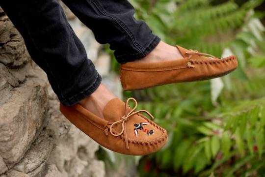
"Minnetonka first started selling its “Thunderbird” moccasins in 1965. Now, for the first time, they’ve been redesigned by a Native American designer.
It’s one step in the company’s larger work to deal with its history of cultural appropriation. The Minneapolis-based company launched in the 1940s as a small business making souvenirs for roadside gift shops in the region—including Native American-inspired moccasins, though the business wasn’t started or run by Native Americans. The moccasins soon became its biggest seller.
[Photo: Minnetonka]
Adrienne Benjamin, an Anishanaabe artist and community activist who became the company’s “reconciliation advisor,” was initially reluctant when a tribal elder approached her about meeting with the company. Other activists had dismissed the idea that the company would do the work to truly transform. But Benjamin agreed to the meeting, and the conversation convinced her to move forward.
“I sensed a genuine commitment to positive change,” she says. “They had really done their homework as far as understanding and acknowledging the wrong and the appropriation. I think they knew for a long time that things needed to get better, and they just weren’t sure what a first step was.”
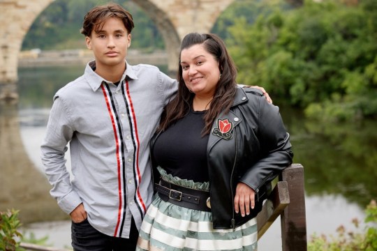
Pictured: Lucie Skjefte and son Animikii [Photo: Minnetonka]
In 2020, Minnetonka publicly apologized “for having benefited from selling Native-inspired designs without directly honoring Native culture or communities.” It also said that it was actively recruiting Native Americans to work at the company, reexamining its branding, looking for Native-owned businesses to partner with, continuing to support Native American nonprofits, and that it planned to collaborate with Native American artists and designers.
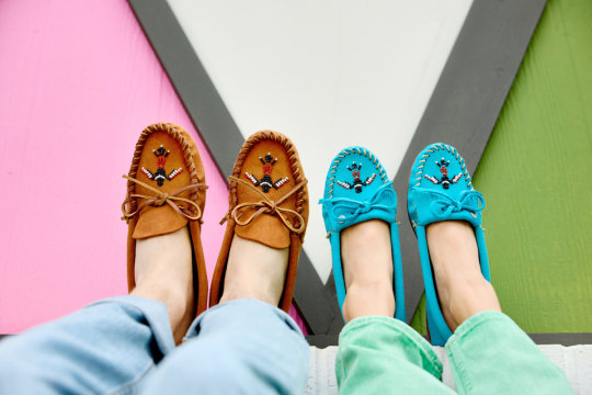
Benjamin partnered with the company on the first collaboration, a collection of hand-beaded hats, and then recruited the Minneapolis-based designer Lucie Skjefte, a citizen of the Red Lake Nation, who designed the beadwork for another moccasin style and a pair of slippers for the brand. Skjefte says that she felt comfortable working with the company knowing that it had already done work with Benjamin on reconciliation. And she wasn’t a stranger to the brand. “Our grandmothers and our mothers would always look for moccasins in a clutch kind of situation where they didn’t have a pair ready and available to make on their own—then they would buy Minnetonka mocs and walk into a traditional pow wow and wear them,” she says. Her mother, she says, who passed away in 2019, would have been “immensely proud” that Skjefte’s design work was part of the moccasins—and on the new version of the Thunderbird moccasin, one of the company’s top-selling styles.
[Photo: Minnetonka]
“I started thinking about all of those stories, and what resonated with me visually,” Skjefte says. The redesign, she says, is much more detailed and authentic than the previous version. “Through the redesign and beading process, we are actively reclaiming and reconnecting our Animikii or Thunderbird motif with its Indigenous roots,” she says. Skjefte will earn royalties for the design, and Minnetonka will also separately donate a portion of the sale of each shoe to Mni Sota Fund, a nonprofit that helps Native Americans in Minnesota get training and capital for home ownership and entrepreneurship.
Some companies go a step farther—Manitobah Mukluks, based in Canada, has an Indigenous founder and more than half Indigenous staff. (While Minnetonka is actively recruiting more Native American workers, the company says that employees self-report race and it can’t share any data about its current number of Indigenous employees.) Beyond its own line of products, Manitobah also has an online Indigenous Market that features artists who earn 100% of the profit for their work.
White Bear Moccasins, a Native-owned-and-made brand in Montana, makes moccasins from bison hide. Each custom pair can take six to eight hours to make; the shoes cost hundreds of dollars, though they can also be repaired and last as long as a lifetime, says owner Shauna White Bear. In interviews, White Bear has said that she wants “to take our craft back,” from companies like Minnetonka. But she also told Fast Company that she doesn’t think that Minnetonka, as a family-owned business, should have to lose its livelihood now and stop making moccasins.
The situation is arguably different for other fashion brands that might use a Native American symbol—or rip off a Native American design completely—on a single product that could easily be taken off the market. Benjamin says that she has also worked with other companies that have discontinued products.
She sees five steps in the process of reconciliation. First, the person or company who did wrong has to acknowledge the wrong. Then they need to publicly apologize, begin to change behavior, start to rebuild trust, and then, eventually, the wronged party might take the step of forgiveness. Right now, she says, Minnetonka is in the third phase of behavior change. The brand plans to continue to collaborate with Native American designers.
The company can be an example to others on how to listen and build true relationships, Benjamin says. “I think that’s the only way that these relationships are going to get any better—people have to sit down and talk about it,” she says. “People have to be real. People have to apologize. They have to want to reconcile with people.”
The leadership at Minnetonka can also be allies in pushing other companies to do better. “My voice is important at the table as an Indigenous woman,” Benjamin says. “Lucie’s voice is important. But at tables where there’s a majority of people that aren’t Indigenous, sometimes those allies’ voices are more powerful in those spaces, because that means that they’ve signed on to what we’re saying. The power has signed on to moving forward and we agree with ‘Yes, this was wrong.’ That’s the stuff that’s going to change [things] right there.”"
-via FastCompany, February 7, 2024
#indigenous#indigenous artists#indigenous art#moccasins#thunderbird#native american#native american art#cultural appropriation#indigenous peoples#cultural representation#minnesota#minnetonka#minneapolis#red lake nation#ojibwe#anishinaabe#reconciliation#fashion#fashion news#good news#hope#indigenous designers#native artist#indigenous artist
2K notes
·
View notes
Text
And at last !! the baddies

Finaly they are all here !!!!!! The full recap/height chart will be ready soon :3c


ALSO ! I modified Padme's one a little (redid the portrait a bit and some other minor details), and added Sabé :)))) dw about it <3

[COMMISIONS]
[PART 1] - [PART 2] - [PART 3]
Yapping below vvv
Had a lot of fun with Palpatine's outfit !! She gets to dress dramaticaly like the rich influencial nabooian (?) woman she is (the gown is heavily inspired by a 1998 Dior dress) ! Of course after the creation of the empire she doesn't do that anymore :( evil old lady in a bathrobe didn't bother to brush her air for 20 years... Good for her ig
I must admit.... Dooku's design is the most indulgent one here, it's targeted to *me* specifically fjfkdk like this outfit (minus the cape...for now) would be something I would wear, the dracula vibes because it's christopher lee and I have no problem what so ever with the hammer draculas, the feminine tall older woman- so yeah maybe I pushed the sith vibes a bit, and gave her the shadow the hedgehog color palette... But this is one of my faves design here sue me
For Boba I redesigned the og trilogy look a little bit, by taking some elements from disney's design and adding a bit of my own flaire to it :) and giving her a *big gun*
And for the first time..... You can trully appreciate how tiny Boba is jdndk big gun for tiny butch
Vader is just Vader- what do you want from me this is one of the best designs ever created djdk I'm not changing anything here (but this *is* one of the best Vader I ever drew jfkdkd don't know what I did different but he looks great !)
And Sabé is here now !! nothing to do with the fact I stumbled upon the Sabédala ship and it has occupied my mind ever since jfkfj Anyway ! Had a lot of fun with the flame dress (I know it doesn't contrast well with Padmé's, but I really wanted to do this one :(( the over handmaiden's outfits weren't as iconic imo)
PS : link to a post explaining why Vader uses he/him and Anakin she/her
#oh I had so so so much fun with these !!!!#soon the full recap will be finiiiiiished !!!!! (not looking forward to tagging the post omfg)#star wars sapphic au#darth vader#count dooku#darth tyranus#sheev palpatine#darth sidious#boba fett#padmé amidala#handmaiden sabé#butch lesbian#lesbian#star wars#star wars fanart#star wars original trilogy#star wars prequels#art#my art#digital art#fanart#sith lord#darthfett
1K notes
·
View notes
Text
This is what Viv should have done with the official redesigns. From what I heard the possible reason why Viv kept the redesigns almost identical to the originals was because fans were going to riot at any major changes, but what we got was a massive downgrade that even the fandom was mixed about and noticed. All you changed were some shapes, removed pointless details, and added some new colors and these designs are now much more interesting and character personalized than the official redesigns.

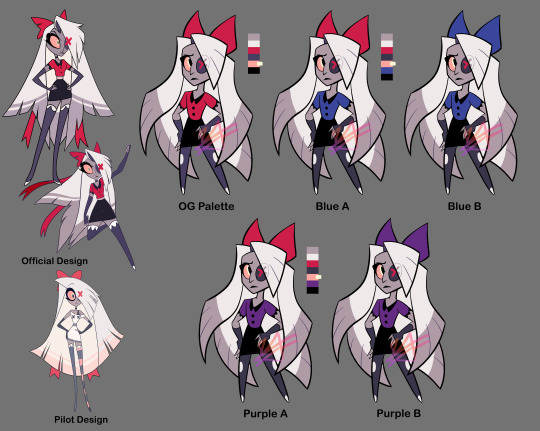
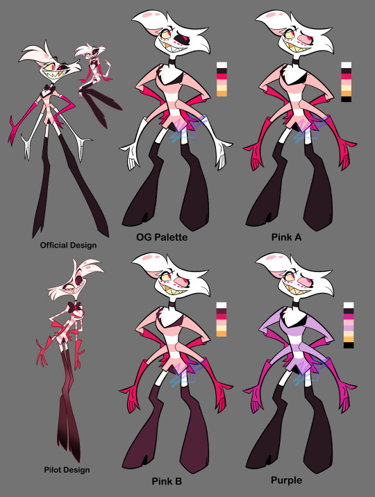

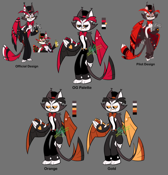
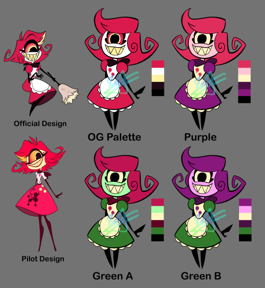
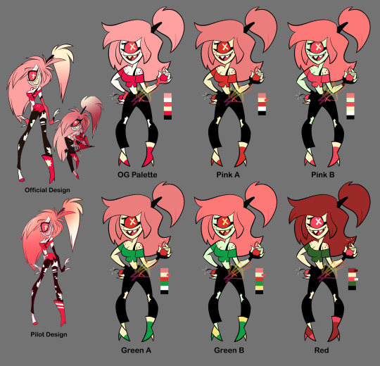
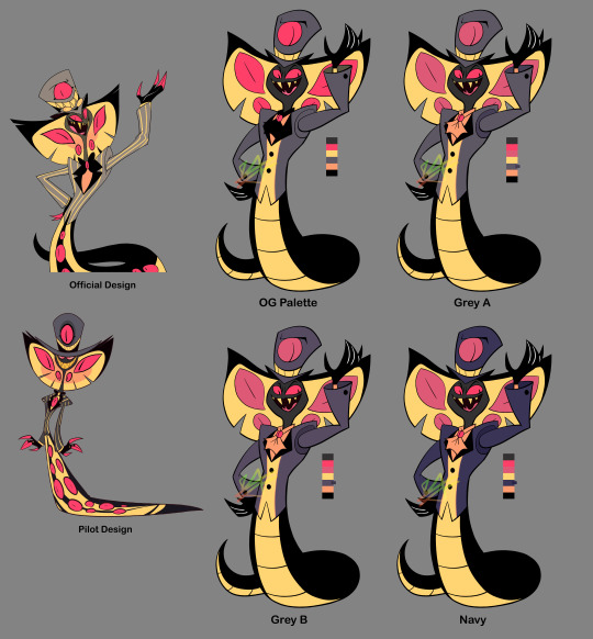


As a "fun" design exercise I decided to mess with the Hazbin characters' designs... Not really "redesigns," but more so "refined-designs"-- Keeping their overall look or "essence" while trying to simplify them and clean up their colour palettes, as well as making sure they all look distinct from one another.
I tried to stick close to the original's style but I couldn't help using thick lines, lol. Along with the simplified shapes, it gives them an early 2000s cartoon vibe I think.
For the colours I tried giving them more unique palettes, as well as making sure that they had enough contrast (the colour value of this show tends to be... not great). Also the lineup at the bottom isn't my final selection, it's just a selection to get a better idea of how they all might look together side-by-side.
Eh, tell me what you think. I could keep editing these but like, I'm tired of looking at them lol. More info on each design (plus a speedpaint) under the cut. It gets wordy, sorry.
Charlie: Not much to say besides she needs more contrast in her colours. I changed her shirt to the same colour as her corneas (yellow) so it doesn't blend in with her skin. I wish her eyes were still black (not only does it bring better attention to her face, but it works better with the idea that she's a doll-- yknow, painted on eyes? Does that make sense lol). In retrospect, maybe it would've been good to try some browns with her colours? Idk. I kept her red since she's the princess of Hell, and Hell's main colour seems to be red. Oh also, I gave her some lines on her face and hands just to make her look more like a puppet/doll. The rest of her body would have the same kind of joints/segments.
Vaggie: Ok I know her hair technically looks more moth-like in her og redesign but... it just seems like too much? Yknow? It's kind of outrageous. Idk how well my solution works but I tried simplifying it. I simplified her bow as well and made her stockings more like leggings. Her X-eye now hides behind her hair. Her gloves are shorter. Also I took away that thing around her waist that.... seems to be a different colour than everything else??? Idk what's up with that. Sorry I took away her feet. I tried out some blue and purple with her, I think it looks nice. Only thought about keeping the red bow because I thought maybe it'll match her with Charlie. Also sorry I took away her boobs 💀💀💀
Angel Dust: So unsure about how I drew him... Specifically, his 2nd set of arms looks so floppy and tacked on, and his legs... Idk I'm not great at digitigrade legs but I'm pretty sure that's officially what kind of legs he has. His head is weird. I think I got the idea of giving him big feet from Meppity's redesign video (her redesigns are some of my faves). I took away his bowtie because... too many of these guys have bowties, and he already has a choker too. Also I had the funny idea of all the Hotel employees wearing bowties/bows of some sort, and Angel is a patron but not an employee... Anyway. Kept his gold tooth to link him to Val (who also has a gold tooth), and kept the dots under his eyes since I THINK they're supposed to be representative of his spider eyes? They can be taken away if need be, though. His gloves don't go all the way up and kind of look like dish-washing gloves again but, the way his gloves go all the way up and his sleeves go into them... it just looks so weird to me. Idk, maybe I should've just given him shorter sleeves, or even no sleeves at all 🤔 And honestly I still have no idea what's going on with his pants. Are they short-shorts? Underwear? Didn't change them anyway. For the colours, I made sure all his gloves were the same colour (still don't know WHY they decided to make his 2nd set not only a different colour, but the SAME colour as his skin/fur????). Turned down the saturation on his hot-pink, and gave his right eye the light pink instead of that almost-black colour (still kept his eyes different colours because I remember seeing a really old sketch page of Angel that insinuated that there was a reason for his eye being black). Made some of the darker parts straight-black just because I've been using that in all the other character's palettes, but this can be changed to his almost-black colour. Also tried a more purple palette to get away from all the pink, kinda really like it.
Alastor: I originally tried his coat with coattails, but wasn't sure about it and made it the original shape. Took away his monocle because fuck that it's unnecessary and clutters his face. Made his antlers bigger. Swapped out his shirt collar to be like the one Charlie's og redesign has, because the way it goes all the way up like that gets on my nerves? Idk maybe I just don't know anything about fashion design but it doesn't scream 30's-suit to me. You could probably take away the collar, though. I wanted to try a lot of darker colours for his palette since he's like... kinda the bad guy. Dark colours would work well for him. I'm worried about his arms getting lost in the black of his coat, but that's why his cuffs and hands are a different colour. Really wanted to give him more than just red so I spread out the yellow of his teeth; I like how it looks for his shirt, it also works well with his eyes to draw you towards his face. I also tried to (again) lessen the saturation of his reds and pushed them more towards orange to better match the yellow. Kept all the brighter colours to his upper body to keep your eyes there, too.
Husk: I think Husk was one of my least favorite designs when the pilot came out because he's a real mess of detail. His wings are the worst. His redesign isn't much better (like dawg why's he got these random-ass hearts everywhere). Simplified his wings to just have some circles and rounded shapes. Kept some heart shapes (like his nose, bowtie, and paws) but added a couple diamond shapes, too (mainly his suspender buttons and the shape of his white chest-fur). Really wanted to have more blatant club and spade shapes too (to add to the poker theme), but didn't want it to get crowed and decided the rest of the rounded and heart shapes worked well enough. Made his eyebrows shorter and more square-shaped. Didn't have many ideas for colours but knew that I wanted to try some oranges and yellows. Made his eyebrows a darker colour, and changed his eyes to yellow corneas with black pupils. Stands out more that way, I think.
Niffty: Did you know her name is spelled with two Fs? I didn't. I don't like it... Anywayyyy. Swirled her hair a little more, and took the yellow streak out. Added some fluff under her dress just to match her apron. Kept the dots on her shirt (though there are only two now instead of three) because I'm assuming it'll make sense later (like idk maybe she was shot to death and that's what they represent), but I wonder if you can take those away for a cleaner design? Gave her more rounded shapes. I said before that all the Hotel employees would have bows/bowties of some sort for these designs: Niffty's would be her handkerchief (yknow, it's tied into a bow in the back? That works right...? Eh.) I took away her cheekmarks 1) to clear up her face and 2) to make Charlie's cheek marks seem more unique and doll-like. For Niffty's colours, I (again) turned down the saturation on her pink. I wanted to try using some green and purple on her, since her inspirations include B-movie aliens and the song One-Eyed, One-Horned, Flying Purple People Eater. Tried using different colours for her skin, since a lot of characters in Hazbin have white skin, and for Niffty specifically I think the white skin along with her white apron dries-out her look (if that makes sense?) Though I do agree her having yellow skin is NOT good if she really does end up being Japanese. I think pink skin works well for her, though. Oh! And again, it helps make Charlie's design more unique with her white skin, making her seem more porcelain. I made Niffty's eyes yellow like her teeth, and then used the same colour for her apron to unify the palette.
Cherri: Ok Cherri's design was my ABSOLUTE least favorite from the pilot, too many senseless details I HATE her ripped pants. So hard to look at. Idk if you noticed in the time lapse but I had to re-sketch Cherri because 1) her pose was too similar to Niffty's (I was making their poses similar to their official art) and 2) her hair was giving me trouble... I kinda hate how her hair hovers to the side like that? Tried re-shaping her hair and now it looks like she uses a TON of hairspray or something, lol. Took away her tattoo but kept her freckles. Took away the skirt thing(?) she's got on her pants. Took the symbol off her shirt, but added an X to her pants (can be taken away, though). Simplified the rips on her pants to just be ripped knees. put a heel on her left shoe so she doesn't look unbalanced/uncomfortable. Made her gloves shorter. For colours, I again took away her white skin for the same reason I took away Niffty's white skin (less "dried out" palette and makes Charlie look more unique/porcelain). Afaik Cherri's not Asian so yellow skin could work for her, though I also tried green skin. Since one of her themes is cherries I wanted to use reds, pinks, greens, and blacks. I tried some green for her clothes (and again her skin), and also turned some of her pinks more red. Made her hair darker for more contrast, and tried using some red for her hair instead of pink (I like the pink hair, but again... red like cherries). In general her colour palette was the hardest to figure out but I think I found some interesting things.
Sir Pentious: Sir Pent was my 2nd least-favorite pilot design by only a little 🤏. It's all his eyes. He's very hard to look at. I took away all the eyes on his tail, and turned down the saturation on the rest of the eyes EXCEPT the ones on his face (maybe I should have just made those reds much different colours, but it still looks a lot better with just the saturation down). Took away his stupid-ass goggles and made the face on his hat a lot simpler (combined the mouth with the hat band; it can still emote btw). Replaced his bowtie with... *quick google search* A jabot? It's supposed to be a jabot I think. I think that's what it's called. More 1700s than 1800s, but eh. Maybe I should've given him *quick google search* a cravat maybe??? Eh, eh, not a fashion expert but anyway. I thickened his mid-section so it eases into his tail better because, the way it is in the official design it always made him look like a slug to me? I looks too... squishy. Banana-slug-lookin' ass Also took away his red-tipped claws and made them straight black. For his colours, I think the grey and yellow works for him already, though I do wanna see how he'd look with more green or blue. Most of what I did colour-wise was the eyes, but also his suit; still grey, but trying both darker colours and pushing it more towards blue and purple. I wonder if I made his skin a little too dark? Is it kinda hard to see his features? Idk. Idk how I feel about these colours. Bleh.
#Making Vaggie have purple as her main color makes so much sense than red. Her personality doesn’t even match up with color language-#to justify giving her red as a main color#Making Alastor’s eyes yellow is now break from the red and draws our attention to his face because of the pop in color and contrast#Husk’s dark orange suit him better. Niffty’s being made of pinks and purples is ready nice to see since now in the redesign she’s just all#red and whites which gets really hard to look at a long period because there is no other secondary color on her body to relief the eyes-#those colors#I can go for hours explaining how this designs work better than the official. You did a good job OP!#hazbin hotel criticism#hazbin hotel critical#hazbin critical#꧁rambles꧂#reblog#★hazbin redesigns★
81 notes
·
View notes
Text

*Updated* (info)
Trillyke Moonlight Sneakers (Sims 3)
*my English is very bad*
All credits belong to Trillyke, I just added a complete repaint and redesigned them for other ages and reduced polygons.
Original Moonlight Sneakers.
3 recolourable channels
834 poly 609 vertices
1024X texures
Teens to Adults (males / females)
Disable for random / all lods
Available for maternity
Everyday, Athletic, Career, Outerwear
Custom thumbnails
♡ download / alt ♡
Let me know of any problems and have a great day ♡
By the way, I'm going to convert a lot of old shoes by reducing the polygons in them, hope you're ready for that (I'm not)
#s3cc#4to3#the sims 3#ts3cc#ts3 cc#ts3 shoes#4t3 shoes#s3 shoes#simblr#ts3 download#the sims 3 cc#4t3 conversion#s3cc download#ts3 cc finds
281 notes
·
View notes
Text
print design suggestions
okay folks we're wiling down on the very last week before my annual "THIS IS THE HOLIDAY SALE PLEASE GET YOUR ORDER IN ON TIME SINCE SHIPPING-TIME FROM CANADA IS HELL ON EARTH" sale, which lasts from around 4-6 days into November to 4-6 days into December
I usually release at LEAST 4 new print designs around this time of year. I've got "pissing all by yourself handsome" and "you cannot kill me in a way that matters" ready to go, the scans just gotta be cleaned. (might be redesigning the you cannot kill me one tho)
Still need to design the cephalopod's prayer and the fancy oh/oh fanfiction moment prints
but does anyone have any further suggestions for a fifth print design?
I'm all ears rn I got a lot of work to do in the next week and a half, and knowing what I got ahead of me makes things easier
#i woke up at a reasonable hour!#turns out all i need to sleep at a semi reasonable hour (3am) is a cannabis soda#it was cherry cola :3
194 notes
·
View notes