#aside from the other meanings of the color red which are also very fitting
Explore tagged Tumblr posts
Text
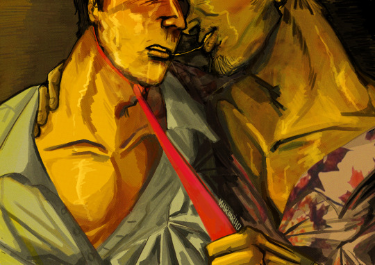
"How long are you gonna pretend I'm the one tugging on your tie?"
#been thinking abt rator hallucinating getting choked by tyler like this for a while ufufhfhgfh#love me some delusional narrator from time to time#hey guys 😝😝😝😝#sorry for disappearing 😝😝😝😝😝#I wasn't expecting the random bullshit of these past semesters 😝😝😝😝😝#didn't draw much cause I had so much shit to do and I also procrastinated a lot on everything#like#this is a rare sight#they shoved caravaggio down my ass so hard I started drawing in baroque#uhmuhm yeah#isn't perfect but this is my artblock rehab#I'm getting back on the grind I promise#also tie is red cause I read somewhere it was a gay secret code back in the day so I thought it would be cool to make it red#aside from the other meanings of the color red which are also very fitting#sowwy for disappearing#again#🥺#fight club#soapshipping#the narrator fight club#tyler durden#artists on tumblr#digital art#illustration#martyryo
570 notes
·
View notes
Note
honestly looking at the designs for Vil's hometown event, the colors are giving Gucci. They're pretty close to gucci's brand colors.
[Referencing the new upcoming JP hometown event!]
Oooh, that’s so true!!
Vil aside, the outfits of the other boys do have very similar colors to Gucci’s signature ones, which are a terracotta red, a deep green, and a faded gold. Black and/or beige are also common in Gucci designs:

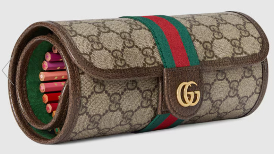

And well, what do ya know?? 😂 Jamil, Azul, AND Ace have beige suits with deep green undershirts, reddish-brown ties, and golden clasps/accessories. (I think Jamil wears a red-brown undershirt and has green lapels; it’s hard to tell from his pose.) They all also seem to have very dark liner, which, realistically, is probably meant to help their faces stand out in photos if they’re on a red carpet, but also fits into the Gucci color scheme.
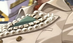
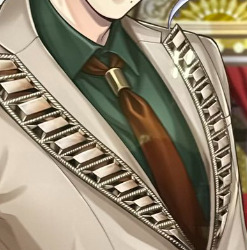
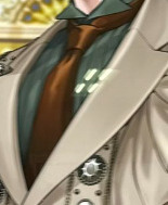
I believe Yana references luxury fashion sometimes for her designs, so maybe that was the intention here?? The color scheme also calls back to the Evil Queen's huntsman, so it creates a cool double meaning that fits the theme of a red carpet event starring Vil!
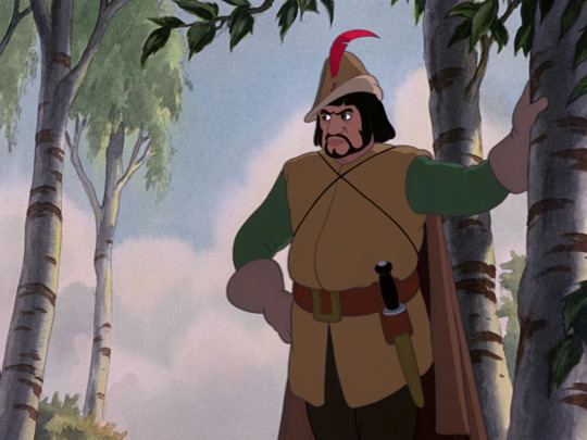
A friend recently proposed the theory to me that while Vil is the Evil Queen (and therefore is dressed most differently from the other event boys), Azul, Jamil, and Ace are dressed like the Huntsman to represent different aspects of him. For example, Ace is a card solider of hearts—so he’s the box that the Huntsman is meant to bring Snow White’s heart in. Azul could represent the deal the Huntsman made to spare Snow White’s life, or, alternatively, his kindness/mercy in letting her go. Finally, Jamil represents the profession itself and the Huntsman’s servile role to the queen.
I love seeing multifaceted fashion like this 🫶
UPDATE: Yes, it’s formally confirmed in the event that Vil’s guests are dressed up like the Huntsmen while his own outfit is inspired by the Beautiful Queen. The former are going to be his entourage and bodyguards as he walks down the red carpet!
#twst#twisted wonderland#Vil Schoenheit#Evil Queen#Huntsman#Azul Ashengrotto#Jamil Viper#Ace Trappola#disney twisted wonderland#disney twst#notes from the writing raven#jp spoilers#Snow White#twst theory#twst theories#twisted wonderland theories#twisted wonderland theory#tapis rouge in the shaftlands spoilers
259 notes
·
View notes
Text
I'm bored and with more Hundred Line news slowly dripping out I figured that I'd give my impressions on all the characters we've seen so far.
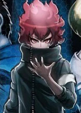
TAKUMI SUMINO
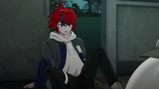
The protagonist himself, and probably the one guy we know the most about, even if most of that is just standard protagonist stuff. Kodaka's protagonists pretty must just follow the same archetype - relatively normal character among a cast of far more talented and impressive psychopaths, which usually leads to him developing a complex about it. And from what we've seen so far... Takumi seems to pretty much fit the bill to a T. Will he probably subvert expectations? Most likely - we've seen it with Hajime and Yuma from Rain Code before. There's definitely more to him than meets the eye, but I highly doubt that he's gonna be anything more than an average guy at the beginning, the straight man for the more unhinged characters around him.
He *does* seem to have an edgier look than every other protag we've seen so far. The rest of his look is pretty background character coded, which fits, but his hair makes him a dead ringer for Yomi from Rain Code. Which if you still remember that game, is a pretty far cry from "just an average guy". 50 percent chance that this is some sort of stylistic choice or if it actually means something about his personality - maybe he's a lot more rebellious than he seems from a first glance? Hard to say.
From the earlier promo art from before we knew what this game was supposed to be, the two "protagonist" characters had the same red hair and black color scheme, plus the katana that Takumi uses in battle. It looks like these traits were carried over to the final design at least - an interesting tidbit, even if it meant that we lost another potential female protagonist. This time with glasses, even!
DARUMI AMEMIYA
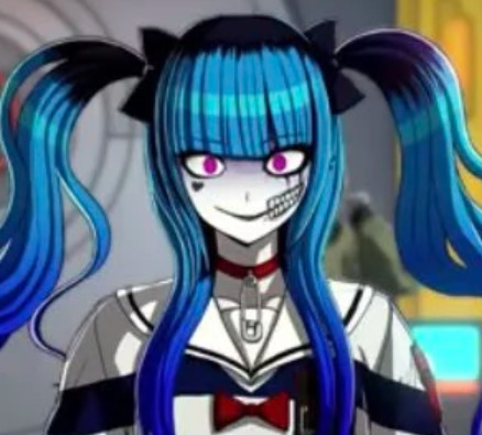
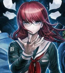
The second character we know the most about so far, and she's gotta be one that sticks out the most. When the trailer first dropped in June I swear like half of all discussion was just talking about her - more specifically, her design.
On first appearances, she very much reminds me of like a Kokichi-esque character, you know the one character in every game that just exists to make trouble and make the game more interesting when Monokuma's not around. She's a murder game fanatic, she has a bunch of crazy sprites, and also fights with floating knives. She's like if you asked an AI image generator to create THE danganronpa character.
She's not the first female character to be like *this* in Kodaka's works - Junko, Genocider Syo, Shinigami, etc, etc. - but exactly WHAT her role is is hard to pin down. She's been a lot more prominently advertised than other characters, so part of me believes that she has to have a significant participant in the game. Whether or not she's THE designated problems clown that every Danganronpa game, 90 percent chance she's going to be like top five most popular characters to come out of this game. hundred percent guarantee.
As a bonus note, I wonder if she was based on this character from the old promo art before the game was retooled entirely? I have nothing else to go off besides similar vibes - but it was a thought I had nonetheless. Probably the only other character from these early images that I can see carrying over to the final game besides Takumi, so this is the last time I'll bring it up, promise.
EITO AOTSUKI
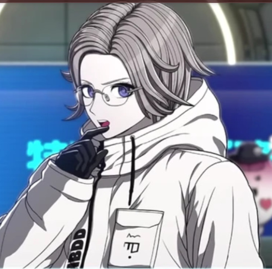
TV Tropes says that he's supposed to be an apprentice astronaut - I have no idea where they got this from, but it would make him design make more sense. Plus his last name also means "blue moon", for what it's worth.
On the surface this guy seems like a coolheaded nerd. That was my first impression anyway. Someone said early on that he had Nagito vibes, and well... yeah I can definitely see that. Pretty boys in Danganronpa are hardly ever sane, and aside from his massive forehead he is definitively a pretty boy. Of course, this was before Tokyo Game Show came and went and...
Well, you've all seen that screenshot by now lmao
So yeah he's definitely gay. And gay for Takumi, no less. And if we know anything about characters that gay homoerotic tension for each other in Kodaka games (and Uchikoshi games to some extent), is that they're NEVER unproblematic. Just look at his face in that CG - he's definitely a freak.
As a side note, when the trailer first dropped I was under the impression that his weapon was a huge ass wizard staff, which fit with his whole nerdy vibe. I then realized it's actually supposed to be a big ass scythe - so make of that what you will.
HIRUKO SHIZUHARA
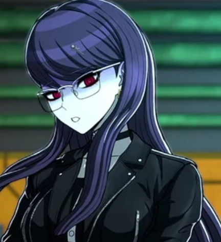
I fucking love tall women with long hair and glasses. Anyway, she's the cold, serious type with a penchant for bloodlust. She has a giant axe and admits to getting excited cutting down monsters. She's a freak yeah, but at least she does that while looking hot.
A lot of people have compared her to Peko for obvious reasons, but honestly, she's like a pretty direct copy of Martina Electro from Rain Code to a T. A statuesque woman with glasses with a lust for blood? Yeah that sounds familiar. For how much of a clone she is, the one thing that differentiates the two is that, for all her presence, Martina was ultimately submissive towards the far more problematic Yomi (the guy I said is identical to Takumi, ironically) - while Hiruko hasn't really given off those vibes so far. Wouldn't be surprised if Kodaka doesn't somehow work that in though. Disappointed, but not surprised.
TAKEMARU YAKUSHIJI
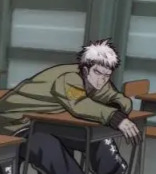
I don't have good quality shots of him on hand so enjoy this crusty cropped screenshot of grumpy Takemaru.
Not much to say about this guy so far. From what I've gathered from his intro, he's a rough and tumble type of guy, a delinquent who still believes in justice. And he used a motorcycle in battle. Sound familiar?
I can see him being a standard "jerk with a heart of gold" - he doesn't seem to be quite as violent as a certain other motorcycle riding delinquent, but who knows. He's one of your starting party members, so I'm guessing he has some early prominence in the game.
KAKO TSUKUMO AND HER BROTHER
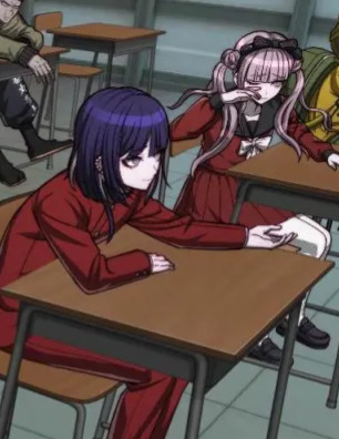
Putting these two together since they seem to be a package deal - and to be honest we're reaching the point where I don't have a lot to say about most of them.
Kodaka has NOT had a great track record with brother sister relationships - yes, not every brother sister relationship he's written has devolved into incest, but when Kako is saying "dearest brother" and seems to practically joined at the hip... can you really blame me for being a bit hesitant? There are of course ways that this doesn't end up being gross, and I sure as hope this doesn't turn out to be another Junko/Mukuro in DR3/Kiyo Chapter 3 situation.
OKAY, my fear from first impressions aside, Kako seems to be the meeker, quieter of the two, while her brother acts as her assertive protector. I don't think there's a scene where they've been apart so far... take that as you will.
Kako mentions that the two of them havent graduated junior high yet (im assuming that means theyre ninth graders, around 15 years old) - so they're presumably in the same grade. Maybe they're twins? It's hard to tell with same-face syndrome and all, but hair style aside they do have similar faces. Which does lead me to wonder... what if they're identical twins, but Kako's brother is transmasculine. This is just my pipe dream honestly - Kodaka hasn't been great with LGBT rep before, buuuuut he's improved... somewhat? Uchikoshi, on the other, is pretty good on LGBT issues - famously good even, especially in Somnium Files. It's hard to tell what influence Uchikoshi has had on the game aside from the branching paths approach to storytelling, but I have a little bit more confidence in the LGBT rep in this game if Uchikoshi is on the team.
Don't have much else to say about them, other than I'm CROSSING my fingers that they don't turn out to be weird. On my knees even.
ANGIE YONAGA TALENT SWAP
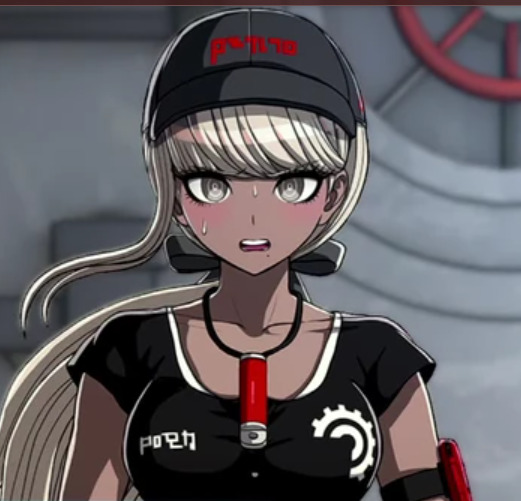
I know it's kinda cheap to do the whole "this character looks like this character" shtick because Komatsuzaki's style has had sameface syndrome since the very beginning, but coome ooooon, if you're going to give her the same skin tone-hair color combo then it's going to be impossible not to notice.
Anyway that aside, I can't really say much else about her. We hit the point where these character's dont have names yet so I'm going in blinder than blind. Out of all the characters, she seems like she could be a Danganronpa character the most - her outfit very clearly communicates a "talent", I'm guessing mechanics.
She gives me tomboy vibes. Like, she's also one of the only girls in the entirety of Kodaka's games to wear full-length pants as far as I'm aware.
THE TOKEN THING
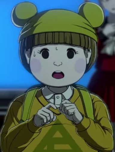
Im still not sure whether or not this is a boy or girl. I'm leaning towards boy, but I'm only like 80 percent sure that's right.
He's the token character with the cartoony design that's inevitably going to rank at the bottom of every popularity poll regardless of whether they're actually a good character or not. Character-wise, they come off as a shy fifth grader - Chihiro level shy, not whatever Mikan had going on.
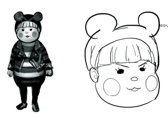
not much else to contribute to my opinion other than that their design is definitely just a retooled beta ryoma
THIS GUY
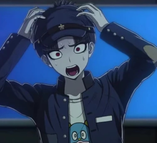
Exaggerated screaming sprite? Cartoon character on shirt? Fuckass hair cut? Yeah this guy's a fucking nerd. He's going to be Takumi's annoying "best male friend" character who you either love despite his eccentricities or want to shove off a building. Or both depending on which day you're on.
Flip of a coin that he's also the token pervert character.
-
Aaaaand those are the first ten characters. There are still five more characters to go through (plus the mascots), but I wanted to ask why the characters were split up this way. Why don't the other five guys show up at the beginning? My current working theory is that they're part of a separate class, perhaps one that gets the rest of their students massacred, leaving these five as their sole survivors. There is ONE character that could be an exception to this, but we'll get to her when we get to her.
GUY WHO LOOKS LIKE HE SELLS KNIVES
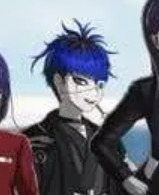
Yeah you can probably find better higher quality images somewhere else.
This dude... he's edgy. He's like someone's Tokyo Ghoul OC. He gives me Korekiyo vibes, but like, in the first impressions kind of way. He seems like a laidback kinda guy that would still stab you in the throat when you look away. And it looks like he's threatening the bowl cut nerd with a knife in at least one route, so that's not far off the mark.
His design also feels kinda traditional japanese mixed with modern gothic elements - the blue hair and eyepatch. The eyepatch also has an eye symbol on it, so symbolism yay.
SAMURAI GIRL
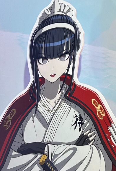
A real prim and proper girl. Highly traditional. Nothing much else to say, she has a cool design. That's not always an indicator of a "good" character in these types of games, but one can hope.
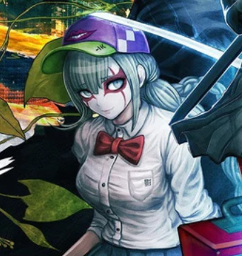
GREEN TOMATO GIRL
Hard to imagine this character isn't going to be a chuunibyou. Or at least, very difficult to take seriously. The creepy smile reminds me of a jack-o-lantern... wait is that the intent?
Not a lot to go off on rn, but she's definitely one of the characters I'm more interested in finding out about, if only to learn why she wears a mask with a smile for hours at a time. What's the mask for? What is the point of the mask?
ABSOLUTE UNIT
When I first saw this character from behind on the cover art, I thought she was chubby. Turns out she's actually just jacked. She's cute! She looks like a jolly character, just a ray of sunshine. It's nice to get female characters that don't just fall into the same body type.
As a side note - this isn't as blatant as Ryoma's design, but she does remind me a bit of one Sakura's beta designs, which gave her a more traditionally cute face to contrast with the rest of her body.
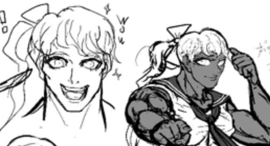
Her more cartoony face also reminds me of Ibuki's beta design too, although hers doesn't look *quite* as stylized based on the few brief glimpses we've gotten of her.
KARUA KASHIWA
One of the more mysterious characters so far - Takumi's childhood friends that Takumi tried to protect from the monster invasion. We don't actually know what happened to her after that - she;s not with Takumi when he wakes up, but she appears alongside the rest of the cast with a different outfit.
I know danganronpa same face syndrome is insane, but its hard to imagine that we're not at least meant to assume that these two are the same character
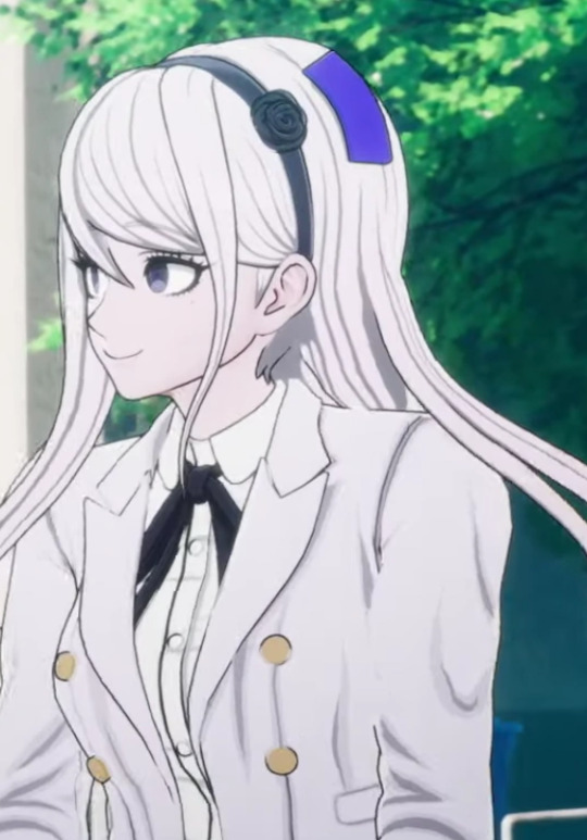
Theres zero chance that there isnt a huge twist regarding her, but what exactly she is or what role she plays is anyones guess because there hasnt even been an english trailer since what? June? Oh, speaking of June-
Both Kodaka and Uchikoshi have a habit of introducing female characters to be pseudo-love interests/close confidants. Think Kyoko, Chiaki, Kaede in Kodaka's case, and June, Phi, Iris, Mizuki in Uchikoshi's case. As far as characters we've seen so far, she fits the bill the most so far. She's the childhood best friend with a ton of mysterious circumstances surrounding her! She has white hair and purple eyes!
However because she's so obviously suspicious and close to the main protagonist, that also means that the likelihood of her actually being the "mastermind" is close to zero. So congrats Karua fans!
SIREI
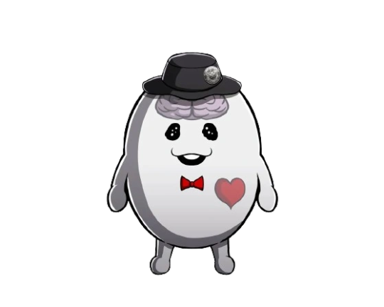
Serves the same basic role as Monokuma but instead of Monokuma's gimmick of having the voice of a children's mascot, he instead has a deep sexy voice. I don't know whether or not he's supposed to be the antagonist or moreso a morally unhinged mascot character ala Shinigami, but idk both seem just as likely.
I would have a plushie of him.
NIGOU
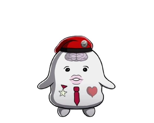
ninety percent chance this thing is literally just comic relief who cares
IN CONCLUSION
I spent an hour typing this out and embarassed myself in front of my mutuals by revealing that im invested in how danganronpa 4 turns out.
32 notes
·
View notes
Text
MTG x Final Fantasy Card Discussion (Pt. 2.5 - Tifa, Martial Artist)
Hello! It is 3rd of May, which means it is Tifa Lockhart's birthday! For this occasion, we also got her card revealed. Specifically, we got her card in the FF7 Limit Break commander deck precon revealed as the alternative commander. This will be a short post, but let's talk about her.

So there is Tifa Lockhart, the most popular female Final Fantasy character. Let's quickly discuss the colors: yeah, they fit. I'd say she is more Green/White with a splash of Red, but that still makes Red/Green/White, so that's kind of a moot point. There is an argument Blue should be somewhere in there, with how she is more reflective and standoff-ish about her own feelings, but the chosen colors feel appropriate enough. Anyway, a 4 mana 4/4 is right on rate, so that's good. Aside from that, her abilities are:
Melee, which gives her a +1/+1 for every opponent you attack if you attack with her, so to +3/+3 in your average commander game if you have 2 other creatures attacking and attack all your opponents. At minimum, she's a 5/5 whenever she attacks. At most, she's a 7/7 whenever she attacks. This is quite good, makes her quite aggressive.
Whenever one or more creatures you control with 7 power or greater deal combat damage to a player, you untap all creatures you control and if it is the first combat phase of your turn, there is an additional combat phase after this phase. This... gets complicated. So, if you get Tifa to 7+ power alone via whatever means and she is able to deal combat damage to a player, she untaps all your creatures and you get an additional combat phase. However, if you get Tifa to 7+ power and have 2 other creatures of 7+ power attacking to all other players and they all deal combat damage to a player, you get the untap 3 times and the additional combat phase 3 times. This is because of how this ability is worded. In terms of programming terms (since I did study Software Development), this is like an if statement inside of an if statement. The ability will always trigger if you deal damage to a player with a creature of 7 power or greater, so if you do that 3 times, you trigger the ability 3 times. Then, as part of the same trigger, it checks if it is your first combat phase of the turn and if so, gives you an extra combat phase. Because that trigger is on the stack 3 times, supposedly during your first combat phase, it gives you 3 extra combat phases. EVEN MORE SO, because this is tied to you dealing combat damage to a player, giving all the creatures of 7+ power double strike does in fact also double the triggers, meaning you'd get a potential 6 extra combat phases. Also 6 extra untaps, but that's relatively minor unless you have tap abilities to tap your creatures you can use between triggers.
So uh... what the f**k is the trend with these alternative commanders? Celes goes infinite with Persist and Tifa can potentially give you 6 extra combat steps, 3 if you are being more reasonable? All the main commanders looked relatively chill, why do the alternative commanders have 0 chill?
Anyway, my review of the card is that it is currently the clear winner of the commanders revealed for this deck. It's insane and the fact that it is Red/Green/White makes it so much scarier, since you can just slap this into a big dinosaur deck and go crazy with extra turns. This card will be expensive to get most likely. This is definitely a "remove it or die" type commander when the player controlling her can put any type of evasion on their creatures, like Trample, Menace or Flying, all not too uncommon in the colors chosen for her. At least Celes breaks 1 very specific mechanic, Tifa just breaks having any big creatures on the field.
As for the art. Credit to Yumi Yaoshida. Link to their Twitter. Hmm... I don't love this. She herself looks great, the background is phenomenal, but all the cinders/sparks? They make this art quite cluttered. This is definitely a decision I wholeheartedly disagree with, the sparks just make the art lesser. I'm also confused, if the sparks are something you want to show, why not show what they came from? We're now just looking at Tifa... Also also, I do notice how muted that red on her glove is. Not a fan, should be higher contrast in my opinion. Still good art, just not a slam dunk.
Like every other main commander cart, as for the alternative art:

Credit to Robert Cornelius. Link to his Instagram (though it's not been used in a few years). Now this art is amazing. I'm still not over the blank backgrounds, even though I do think this is the second best use of it, but the art itself is great. All the details are on point, she is looking sharp, a good in-character pose, even if it is a bit duller than I'd hope for. This is great, easily now battling against Tidus, Yuna's Guardian normal art and Celes, Rune Knight alternative art.
---
And that's it! That's the singular card review I have to do for another week (oh god, the debut is next week). Overall, absolutely insane card that will be priced way too highly for a piece of cardboard. Tifa Lockhart everyone! This was a quick post, now it is just the waiting game until next week! Thanks for reading and have a nice day o/
Oh, as a small bonus, here is the alt art of Cloud's main set card:

#mtg#final fantasy#mtg x final fantasy#card discussion#art discussion#woo tifa lockhart#tifa lockhart
11 notes
·
View notes
Text
Character Profile: Spectre
Summary
Spectre is a seemingly immortal being who was created as the result of an experiment to create a new element. While that goal failed, with the addition of a human soul, it resulted in a new life-form, the only of its kind. After a span of time near immeasurable, and thanks to the help of her fiancees Tera Elliot-Doorman and Kiara Von Roth, she's began to live among others as a mortal once more, picking back up the humanity she had discarded for so long.
Basic Details
Name: Spectre Morgenstern
Race/Species: Umbra artificialis
Age: N/A
Location of Origin: Ferro-252
Gender: Female
Pronouns: She/Her
Romantic Orientation: Panromantic
Sexual Orientation: Pansexual (Sex-repulsed)
Job/Role: Citizen of Sanctuary and Mother
Height: 5'2"
Astrological sign: Pisces
Appearance

(This picrew serves as a basis for interpretation. It does not reflect Ai's appearance 1:1.)
Due to her nature, what can be considered Spectre's true form is a mass of pitch black smoke. As a result, any form she takes is limited to purely black.
Her most common appearance takes the form of a 16 year old human girl with short hair that becomes more wavy at the bottom. In this form, her eyes and teeth are bright white, with her eyes glowing at a level similar to drone visors. She also has a halo above her head the appears to be melting, her fingers are tipped with medium length almond light blue nails, and she has bite marks on her neck and shoulder. In addition, in this form, Spectre has the ability to blush, which is a very dark grey in color.
Her first outfit in this form has her wearing a long open trench coat over a basic shirt and textured vest, along with a basic pair of pants and boots that go up to her mid calf.
Her second outfit when on Titanium-28, and one that she uses more often in the present, has her sporting a semi-fitted T-shirt, a circle miniskirt, stockings, and 2 inch heels with a thin strap around the ankle.
Her second outfit when on Copper-9, and one that she uses more often in the present, has her sporting a semi-fitted sweater, a circle miniskirt, leggings, and 2 inch heels with a thin strap around the ankle.
In all of her casual outfits, she wears a light blue scarf, given to her by Bishop. It is one of the only clothing items that has color due to it not being created by Spectre herself.
Her formal outfit is a shoulderless minidress, 2 inch kitten pumps, and a cloth choker.
In addition, she also owns a red overcoat similar in appearance to the one worn by Dante in DMC3, as well as a set of Tera's flannel and tank top.
In the past, while with Cyn at the Elliott manor, Spectre's hair was longer, and she wore an above knee dress with lace trim around the bottom of the skirt and lace sleeves. She also had a small choker and heels.
Her second most common appearance is a disassembly drone with similarly wavy hair, as well as eyelights, head eyes, a core, and nanite acid that all glow white. Her outfits are usually very similar to her human form, with the change that she shows off a bit of her core's top.
Personality
Spectre comes off as a very caring individual. She usually seeks the best for others, even if it means she is left harmed as a result. As a result of her millennia spent in this form, Spectre lacks pretty much any survival instinct, and will openly go into dangerous situations if she has reason to.
Aside from the caring nature, Spectre also frequently teases and jokes with those around her, finding humor in many places. She sometimes lacks a filter with these, and can easily make crude and suggestive jokes. Despite this, she can get embarrassed and flustered easily, particularly when caught off guard.
Spectre has mixed feelings in regards to her abilities. While she is not against using them for things like flight, she often does not utilize her shifting abilities to the fullest, feeling like she would lose some of who she is if she did. She has also recently started to deter travel via shadows as a result of being gifted and carrying items that are not part of her.
Spectre is horrified of her past, and some of the things she had done and forgotten about. She can feel very guilty at times because of this, and is terrified at somebody learning of certain events. The biggest example is the time with and relating to ███████ ████████ ██████.
Abilities
Shapeshifting
Because of her nature, Spectre is able to take on practically any form she desires, as long as she can visualize and perceive it. This also extends to things she creates, such as blades, which take on properties of what she perceives them as.
Her most common use of shapeshifting is in the form of 4 reptilian wings and a reptilian tail coming from her back, which is used for flight and affection.
There is a limit to what she can do, primarily with distance. Any detached creations that are not close enough to Spectre's main unit for too long will dissipate into the air at a molecular level to rejoin Spectre's main body.
Molecular Regeneration
Spectre can come back from any injury thanks to her regeneration. No matter what damage she takes, so long as a single molecule of her remains, she will recreate her material until she is fully reformed.
The process of regeneration can vary in length based on the severity of the damage.
Shadow Traversal
Spectre is able to merge herself with areas of darkness and travel between them. When doing so, she senses various different exits and locations.
The main downside to this ability is how difficult it is to transport other items and people. Transporting non-living items, which includes regular drones, requires immense focus, or the item will simply phase through her and fall to the ground. Drones in particular feel an immense sense of nausea when exiting the shadows. Spectre is unaware if she can transport organic material safely.
Weapon Proficiency
Spectre is proficient in using a variety of weapons, including katanas, bo-shuriken, longswords, and revolvers.
She is also proficient in hand-to-hand combat, primarily with quick punches and strong kicks.
Immortality
Possibly Spectre's biggest blessing and curse is her seemingly immortal nature. Due to the nature of the material making up her body, she is unable to die from something like age, as even when a bit of her decays into nothing, she will immediately create more material to take its place.
The seemingly only way for Spectre to die is by having every molecule of her deleted completely. The only known ways of achieving this are the NULL spheres created by the Absolute Solver.
Small Facts
Chatroom Nickname: [cursed-spectre]
Writing Font: Davys Crappy Writ
13 notes
·
View notes
Text
Ming and Joe's Colors in My Stand-In, Part 1: Overview
Part 2: Black and Blue
Part 3: Red and Green
Part 4: Yellow/Gold
Part 5: Brown
Part 6: Random Color Moments
I received an ask a couple of days ago asking me about Joe and Ming's colors (which is something I've been thinking about for a while) and decided to answer that question in a separate post. So, here I am.
I have a feeling I'll have a lot to say about this (because looking at the colors in QLs I love (and I love My Stand-In) is such a nerdy thing for me), so I'm sure I'll break this up into parts. I'll start by looking into what color/colors Joe and Ming are (which I'll do in this post) and then, when I've come to my conclusion about that, I'll dive deeper into their symbolism and meanings in separate posts.
Let's dive in!
My first impression, without having looked very deeply into this, is that Joe is mostly green while Ming is surrounded by/wearing a lot of black.
However, I also feel like they are both bi-colored because I believe Joe is also yellow/gold or blue (or both?) while Ming is also red. And, if this turns out to be possible, then I have them in contrasting colors and I will be screaming about that when I get to it in another post.
Since this is such a nerdy thing for me that I love to explore, I will rewatch every episode we have available now (at double speed because I'm only focusing on the colors and Joe and Ming). So, I'll be back with images and thoughts in a couple of hours.
*speeding through 7 episodes of My Stand-In*
I'm back! That was an interesting experience. (It might've been a second for you, it's two days later for me, lol.) Anyway...
I feel like I got a better sense of Ming and Joe, and I was a bit surprised that my ideas were mainly pretty good.
Before I figure out my thoughts in this post (because writing them down is how I come to conclusions about things I'm unsure about), I want to mention the colors first.
Based on my rewatch:
Ming is black and red.
Joe is blue and green.
Yellow/gold is significant to both.
Brown also has some significance (and this is where I get into nerdy territory with color theory).
(Btw, artists can discuss pink into eternity, but for the sake of simplicity in my posts, I will treat pink as the lightened value of red. So, when I mention red-ish in my posts, this is what I'm referring to. Also, since secondary colors (like orange) sometimes are hard to separate from the primary colors they're created from, because they can include a lot more of one of them, I will sometimes use yellow-ish to refer to yellow hues that might verge towards orange.)
Also, I think it's important to note my approach to Joe before I dive in. I will treat Joe 1.0 and Joe 2.0 as the same person when it comes to the colors unless stated otherwise. I might get into a tangent if I notice that the colors are different depending on the different Joes. But, unless I do, Joe is just Joe (whether 1.0 or 2.0).
Now, let's start with Ming because I feel like he's the most straightforward out of the two.
Ming is definitely associated with black.


He's often surrounded by/wearing black and it fits his moody brooder very well (I'll get into this more in another post in this series).
But Ming is also red.


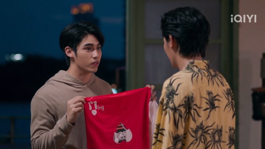


Red flag jokes aside, the red goes very well with his fiery, passionate, dominant personality.
When it comes to Joe, I feel like green is the most obvious one of his colors.


Green is a color found in nature and it suits the more "grounded" parts of his personality (again, I will develop the symbolism and meanings of the colors in regards to Joe and Ming in other posts in this series).
(That Joe and Ming are green and red means that they use contrasting colors, which is also something I will yell about in another post in this series.)
Then we have blue, which I was a bit unsure about going into my rewatch. However, I feel like it has solidified a bit more since my rewatch, and I'll explain why.


The blue is usually quite subtle around Joe even though it is there. The thing that solidified Joe being blue for me was that Ming is seen surrounded by it a lot the deeper he falls/has fallen for Joe (and let's not forget the blue watch Joe gave Ming).


The blue fits Joe well as he's both caring, loyal, and sad.
I feel like this is pretty accurate and straightforward, so far. So, let's get into more complex territory.
Let's start with yellow/gold, which is a very prominent color in this series together with green and black.
I previously stated in this post that I feel like yellow/gold is significant to both Ming and Joe, and that's because they share this color.
Joe 1.0's home bathes in warm yellow/gold/yellow-ish light, which means he's constantly surrounded by it. It's part of his home, his color palette, his life.

The same goes for Ming, as his family home includes golden details. Also, I feel like the light aspect of things (which I will write more about in a separate post) also has to do with this moment where he has his queer awakening seeing Joe's back on that billboard.

Let's forget that Ming thought it was Tong and just look at those colors. Joe is surrounded by that warm yellow/gold/yellow-ish light, which latches onto Ming out of his devotion and desire for that back.
Ming and Joe both had some aspects of the yellow/gold color before they met, but it deepened the more time they spent together (especially for Ming).
In Ming's case, it started as that little light in the background when he met Tong, became more evident the moment he met Joe, until he's bathing in it every single day in his condo.


That's how affected he was by Joe.
I will probably dive deeper into how Joe is the light in Ming's life and how Ming was the light in Joe's life in another post in this series, but I wanted to mention it here as well. And it's very evident in Ming's case considering how his new place looks so much like Joe's with all that yellow/gold light.
This is the color they share. The color Ming used to mend the broken mugs that represented their life together, their connection, and their relationship.

Honestly, so far, these are the colors I'm most sure about because they show up all the time. And call me crazy if you want (I'm giving you permission to in this particular case), but I'm pretty sure this image sums it all up:

Look at the blue-ish ferris wheel, the green plant, the black sky, the two dots of red light (right underneath the right lamp), and the yellow/gold lamp. That's Ming and Joe's individual colors plus the yellow/gold they both have. Both of their colors are summed up in this one image, which leads into a scene where Joe tells Ming that Ming has made his dream come true while Ming agrees to move in with Joe.
Go on, call me crazy.
And my crazy doesn't stop there. Because then we have brown, which can become a bit complex.
Since I've already used up the image limit (why tumblr, why do you only let me have 30 images per post? This visual artist needs visual aids in her posts, damn it!) I will have to do this part without visual aids. However, I will develop the use of brown in a separate post in this series, which will include images as well.
Anyway...
Let me first get into some brief color theory, because it matters to my view of how they use brown in My Stand-In.
There are two ways that I usually mix brown when painting. The first one (and the simplest) is to mix orange and black. This is pretty interesting considering some of the yellow/gold light that often surrounds both Joe and Ming sometimes verge into the orange (which is why I call it yellow-ish). Mixing that with Ming's black gives us brown.
The other way I usually mix brown hues is by mixing the primary colors: yellow, red, and blue. Does that sound familiar? Yellow is the color they share, red is Ming, and blue is Joe.
So, in my color-deranged mind, brown happens when Ming and Joe's colors are mixed together. And, in Joe and Ming's case, I've noticed that brown has two opposite effects. It either shows up when they feel the most grounded and relaxed or when things become "too much" between them. (I will develop this in a separate post.)
Some of their more explosive scenes actually include brown, but since my image limit is reached, I can't show examples of any of those right now, so I'll leave that for the post where I'll focus on the use of brown in My Stand-In.
Now that I've established all this (which will be the focus of my other posts in this series), it's time to move on to the next part.
Part 2: Black and Blue
Part 3: Red and Green
Part 4: Yellow/Gold
Part 5: Brown
Part 6: Random Color Moments
#iq color post#color theory#big color moments#my stand in#my stand in the series#thai ql#thai bl#thai series#my shit#black#blue#red#green#yellow#gold#brown#complementary colors#contrasting colors#the colors mean things
24 notes
·
View notes
Text
"TouNemu and Royalty"
So. Spoilers ahead obviously if anyone is unaware of the TouNemu plot for the Arc 2 finale. Because I’m going to go through the reasons why I think they made the choices they made. I promise there are reasons besides “gay” (though I feel gay is definitely a factor).
Presumably, Touka and Nemu chose the details of their Rumor. Thus, they chose to be Uwasa Queens. I tend to be good at deducing their thought processes and figuring out hypotheticals with them, so, this is how I think they came to that decision.
It likely began with teasing, because their whole dynamic tends to include a decent amount of that and Touka is commonly very princess. Touka might be the one to get the idea for once, because I can’t really see Nemu having the initiative in this case, so Touka tells her that if anything, it's Nemu who had the role of a queen of sorts. The one who presided over Fendt Hope (literally able to edit the place on the fly, like a god), their “castle” (Nemu refers to it as such in her MGS before she creates it!). The one with authority, and always the one to take on weight.
Then Nemu, being the way she is (introspective, philosophical, poetic), would go quiet for a little bit to think about The Weight Of The Crown/Heavy Is The Crown. How fitting to act like a despot and sacrifice the pawns without much thought for their individual lives (Magius era). To carry the burdens of a crown, to protect a people (shielding Magical Girls from their fate). Nemu seems to enjoy history a decent amount, so I can see her thinking back to what the monarchies of old were like, the ruler “chosen by divine right” to watch over the realm. Since Iroha and Ui were a part of the plan already without knowing, and we’ve covered how Touka and Nemu view those two as an unachievable ideal (I was particularly specific about this in the Buddhism essay), Nemu might make the connection to divinity. Credit for a monarch’s good work was attributed to God. On top of that, monarchs are viewed as “unreachable” in a way, much like they will soon be. They are in a way alien to the common folk, who cannot conceive the way they might think or what they might do, which reflects TouNemu’s unpredictable mega genius situation. Their actions will also impact countless lives, much like those of a monarch. Going down that route until it feels fitting for that to be the backdrop of their Rumor seems feasible.
This is where it gets gay because I genuinely think it’s the most natural way it would happen, so here’s what I propose. With that concluded, Touka may pout and ask, if Nemu is a queen, what is she supposed to be? As she usually does, she’s left herself wide open to attack, which in this case means Nemu can do that little head bunt thing they do in the anime, cup her face/hold her hand and softly go all “every queen needs a consort” on her. Cue Touka dying a little and inventing a new shade of red probably. It is, by all definitions, a marriage proposal (harder than usual too, because imagine a reality warper asking “will you spend eternity at my side?”) and that’s really the interpretation that makes the most sense. Because—picture me pulling out my extensive firsthand and secondhand knowledge of royal and nobiliary systems—the only way a country can have two monarchs, be it king-queen, king-king or queen-queen, is marriage. A monarch’s sibling is a prince/princess or duke/duchess of some variety; they do not share the monarch’s title. And this leads me into my outfit analysis! Because that’s also part of where I got my “Touka is the consort” interpretation, so let’s get started. Here’s a full view of both for your convenience:

Onto the analysis! First, the eyes. A thing I have been losing my mind over since the new designs dropped. I’m sure every person who has ever talked to me in DMs has seen me talk about this but it sure it a very specific and very deliberate choice that Touka and Nemu’s Soul Gems are now the color of each other’s eyes:

That aside, their eyes also tell us a little about the nature of what they are. The eyes of other Uwasa girls differ. For comparison, here are Uwasa Tsuruno, Uwasa Sana and Sakurako, next to Touka and Nemu:
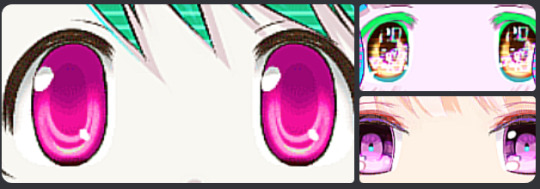

Now, of course, these are different cases. For example, Uwasa Tsuruno was a fusion of a Magical Girl and a pre-existing Rumor, and Uwasa Sana was a (more willing) fusion of a Magical Girl and a pre-existing Rumor as well (though I assume her eyes look like that because of Ai-chan being an AI). But Sakurako is straight up a Rumor herself. So, where does that leave Touka and Nemu? What are they really? Did they fuse themselves with a Rumor they wrote for themselves to wear, like Alina with the Fur God, or did they change themselves into a Rumor, become the Rumor themselves? Somehow, the latter seems likelier to me. More their style. More final. With that, we could also consider that their eyes being half “normal” and half “Uwasa-like” (though in a way we haven’t quite seen before that suggests an intertwinement not reliant on a pre-existing Rumor) represents how they are each one half of a shared Rumor. It makes sense, given that they are referred to as one entity in two parts, each hooked up to a different part of their power generator (Infinite Iroha, because of the Kimochi) as a failsafe. Connection.
Next up, a couple of small details:

Some neat ways their designs are made to match, the “texture”/pattern of their crowns being one of them. The exact same one is used. The same applies to the golden chain in Touka’s crown, with Nemu’s hair ties being changed to match it. And lastly:

The first thing many people noticed when we saw the Uwasa designs was Touka’s crown (by the way, the Soul Vessel thing they made for PH has both their crowns in it, Touka’s above and Nemu’s below, holding the weight—Touka’s is the one people notice first, which follows the pattern established from the start about her always getting more attention). It makes a lot of sense that a consort would gain a crown upon ascension, doesn’t it? Nemu’s just got an “upgrade” of sorts now that we see her as an Uwasa Queen, and similar to how crowns work in real life, the consort’s is more subdued in terms of gemstone presence, while in this case Nemu’s has so many gems. And as for the specific part pictured in the image I chose, they added a dangle for Touka’s headwear that also moves when she does, like Nemu’s, and mirrors Nemu’s (they're specifically placed so that when they do the motion that tilts their heads towards each other, the dangles move with them).
A couple more details. The Uwasa effect/texture affects black fabric, their hair, and specifically the gold around their Soul Gems. The gold of Touka’s corset(?) is untouched, the gold on Nemu’s cape is untouched, but the gold around their Soul Gems specifically is affected. Honestly, if I’d had it my way, they would’ve used the same sort of fluff they put at the base of Touka’s crown to add to Nemu’s cape (royal mantle). And removed the prison theme, because frankly it's the least relevant it’s ever been and would in fact be fitting to shed here—I feel like removing the prison theme would have been the right call for this form considering this is them having come to terms with everything and having made a pretty selfless decision that basically sets them free of both their guilt and earthly constraints. The rest of my design nitpicks are more personal taste, so I won’t bore you with them. But I will add that it’s very typical for the Queen Consort to be the more outwardly “cheerful”/smiley one of the two, while the Queen Regnant is more stoic. The way they settle into their roles is both interesting and satisfying, and as a conclusion to their characters, this whole Uwasa Queens development is actually incredibly fitting. Full circle.
So, yes, this has been my not-so-mini essay of sorts on why I think royalty fits them so well. I always thought the Wings of the Magius would have done better with a royalty theme, actually. It likely would have been easier to paint them as the good guys too. Unsettling, yet seemingly “good” at a glance. I hope everyone can enjoy the Uwasa Queens even more now and that I provided a little insight/pointed out something you hadn’t noticed!
8 notes
·
View notes
Text
People Will Say We're in Love
TW- none
Summary- The first news story about Valerie and Terry is released, and Valerie must cope with heightened scrutiny from her family, friends, and strangers. She also learns that Terry will be hosting a cocktail party to welcome the investment group and that she needs to be there.
This part introduces one of the details in this story that I was most excited to write about 👀 (see picture below for reference)

Sunday morning. Valerie rolled out of bed, donned a quick, casual dress and sunglasses, and ventured out for a newspaper.
Before she could even make the short walk back to her apartment, she couldn’t resist flipping through and skimming the pages. She didn’t have to look too closely- as expected, the day’s Society and Entertainment section of First Look’s newspaper was a splashy collage of color photographs from the café and blocks of accompanying copy. A shot of Valerie and Terry’s kiss took the main spot but were supplemented by photos of him pressing his lips to her hand and her swiping him across the nose with tea foam.
The headline: “Silver gets steamy over coffee with mystery woman.” The article: filled with questions and theories as to Silver’s unusual display of softness and the mystery woman’s identity.
In any other circumstances, it would be amusing to see herself in the newspaper. Valerie was pleased that, at the very least, she and Terry did photograph as a lovely couple, but she couldn’t help the prickle of dread that overshadowed this satisfaction, wondering what it might mean for her if Amanda Shotwell were to turn her keen journalistic attentions toward investigating her.
But this concern quickly became remote when Valerie arrived to work on Monday. She felt eyes boring into her everywhere she turned, accompanied by whispers.
“She’s not the type he usually goes for.”
“So that’s how she made it to the top floor so fast...”
Many coworkers, some she barely even knew, took it upon themselves to come up to her desk and pepper her with questions about the length and depth of her and Mr. Silver’s relationship and their unsolicited opinions about dipping one's pen into the company ink. A number of women that Valerie had hardly or never spoken to before gave her dirty looks and/or made snide comments to her in passing down the hallways. Blonde and model-built ex-paramours of Terry Silver who found it unbearable that they proved insignificant in comparison to the plain, comparatively classless creature before them.
Her friends tried their best to be supportive, but even those who thought the news was great were slightly confused due to how clear Valerie had made it in the past that she wasn’t fond of him. A couple of them just wanted to know how he was in bed, which was arguably worse than the insults of his exes. A deep red swept across Valerie’s cheeks and she recoiled at the mental image, as well as the idea that the people around her were picturing it.
“No- oh God, no!” she exclaimed instinctually, before realizing that her reaction didn’t fit the narrative. “I mean…” She tried to roll it back. “You know I don’t kiss and tell. I like to keep it classy. You’ll just have to use your imagination.” Her friend smirked. “Or don’t!”
Valerie nearly ran away, clutching the pile of binders and folders she was carrying to her chest and adjusting her glasses sliding down the sweaty bridge of her nose.
Proceedings at Dynatox had taken on a frenetic pace, as the top members of Kimura Investment Group were less than two weeks away from arrival. Final touches needed to be put on the business plan and the proposal, and hundreds of other pages of miscellaneous paperwork had to be put in order. Plus, Valerie and her fellow PR members had been working overtime trying to manage and tamp down negative news stories about the company.
And aside from the workload aspect of the upcoming arrival, the activity of the bustling employees nearly quivered with the anxious anticipation of it all, knowing how beneficial for the company it would be if they were successful- as well as how serious the consequences would be if it all fell through. Not only would Mr. Silver likely become frightful to be around for the foreseeable future, but he would certainly take out his anger on any and every one of the people he perceived as contributing to the failure. Any small mistake wouldn’t do. Basically, Valerie had much higher priorities that needed to be dealt with and she wished she could focus on, rather than having to spend time worrying about people questioning her judgment and imagining her sex life.
Then, the next morning, before Valerie could even get used to the atmosphere at work, these worries were compounded when she was awoken by a barrage of messages and phone calls that beat her alarm to the punch in terms of how early they came. Calls from various family members and friends back home that ran the gamut of emotions but could ultimately be boiled down to “what the hell is going on?”
Her sister was thrilled and unashamedly jealous; praising what she believed to be Valerie’s dedication to getting ahead: “Well, look at you living my dream. We all wish we could snag a sugar daddy like that- good for you!” Valerie’s jaw dropped. Her cousin was just morbidly curious, wanting every little detail so that he could brag to and joke with his friends. Her mother, as Valerie feared, was nearly turning herself inside out with concern- “Just how long have you been going out with him, dear? Why didn’t you tell any of us about it? What are his intentions? Your father wants to know.”
Valerie bit back a harsh laugh at her parents speaking about Silver as if he were one of the local high school athletes who was known for getting all the girls in the back of his car; like he wasn’t the CEO of a Fortune 500 company and she hadn’t also proven herself highly capable over her time in California and they were both children.
And of course, his true intentions were far more complex and rather concerning than anyone knew or needed to know.
“How did you even hear about this so fast?” Valerie inquired, ignoring her mother’s million questions for her own, realizing how suspiciously quickly the news had traveled from one end of the country to the other.
“This reporter called us asking about you and what we knew about the relationship,” her mother replied before quickly devolving into hysteria once more. “Which, of course, was nothing. Were you ever planning on telling us?”
“A reporter called you? Mom, what reporter?” Valerie’s heart began to pound, pumping blood that had gone cold with dread as she white-knuckled the phone.
“She was a very nice lady. She works for one of the big publications over there…”
“What was her name? Do you remember?”
“I think it was Miranda, maybe, or Amanda.”
Valerie dropped into the living area armchair, feeling dizzy. “Mom, what did you tell her?”
“She just wanted some basic information about us and how we felt about you two going out- oh, and to send some old pictures of you. Of course, since we had no idea any of this was going on, there wasn’t much to say. We probably sounded like idiots not knowing anything that’s going on with our own daughter…”
Valerie sought a way to end the call after that, slamming the receiver down after her mother hanged up and collapsing fully into the armchair with her head in her hands, letting out a piercing groan. Amanda already seemed disconcertingly close to uncovering some sort of unaccounted-for detail that would reveal her and Terry’s ruse, nullifying their deal and wasting all the time and energy Valerie had put into it, as well as publicly embarrassing her. Let alone what the unpredictable Silver might do to her.
Well, at her mother’s own insistence, her family didn’t really know anything of importance to give Amanda as ammunition. Valerie worked to slow her breathing once she realized she’d started to hyper-ventilate. Everything was probably fine. Sighing into her hands, she had to cut her doomed thought spiral short if she was to be on time for another gloriously invasive day of work.
~
Within a couple of hours at Dynatox, when Valerie was knee-deep in media release drafts and phone calls trying to tame the continuing, tense situation with the Midwest protesters, she received a call from Terry summoning her to his office.
“Ter- Mr. Silver,” she corrected herself in the interest of maintaining some façade of professionalism, glancing nervously at her coworkers, who thankfully seemed to either not notice or not care. “Can’t it wait? Now’s not a good time…”
Managing the predicament and keeping it from escalating was all the more important with Kimura’s impending arrival. And it served as a decent distraction from her host of other rapidly developing problems.
“I wasn’t asking,” he replied flatly. “I know you have a lot on your plate; I wouldn’t interrupt you if it wasn’t important.” His tone softened as he tried to pacify her.
Valerie glared in the direction of his door and rolled her eyes before sighing “I’ll be right there.”
“Thank you,” he replied, in a manner that implied she was the one being difficult.
After taking a few moments to note where she was at in each of her tasks for when she returned, Valerie made her way to his office, feeling eyes on her every step of the way. The second she shut the door behind her, she began her mentally rehearsed statement:
“Terry, if we don’t want those environmentalists in the Midwest to become a PR disaster, I really need to get back to-”
“Don’t worry about that. I just-” Terry attempted to interject and was swiftly steamrolled. Suddenly, everything that was going wrong began flooding out and Valerie couldn’t stop it.
“-Oh, and apparently over the weekend Amanda has been calling all of my relatives trying to get dirt on me! My family has been asking me a million questions and they told the press God knows what and tomorrow First Look is probably going to have a section about my high school photos from when I had braces-”
“-Valerie!” Terry strode around his desk to grab her by the shoulders. “Get ahold of yourself. It’s all being taken care of. I gave that assignment and almost everything else to Peter and his team; now all you have to worry about is Kimura and us.”
Of course, while Terry wanted to ensure that Valerie had enough time and energy to give a good girlfriend performance and focus on what had become the organization’s most important task- wooing the investors- this scheduling adjustment would also play perfectly into his larger covert op. If Valerie’s schedule was freed up to allow her more time with him, he would be able to draw her all the closer and get her more attached, more quickly.
Valerie’s face turned faintly pink, and she was obviously about to protest before the feeling of that weight being lifted off of her fully registered.
“Um... T-thank you,” she stammered, eyebrows furrowed as she was caught off-guard by his seeming generosity. “But won’t people think you’re playing favorites if you push a bunch of my work onto other people?”
“Who gives a fuck? They work for me. And after all, as far as they’re concerned, you are my favorite.” He shrugged, and Valerie wished for even an atom of his unruffled confidence. “And I wouldn’t worry about your family because they can’t tell what they don’t know, right?”
When Valerie didn’t immediately respond, his eyes narrowed. “Right?”
“I haven’t said anything to them. I wouldn’t even know what to say or where to begin,” she shook her head, pinching the bridge of her nose.
Terry was content with her answer, reminding himself that he also was keeping tabs of his own on her family and everything they were saying to the press in case he needed to step in. His entire plan wasn’t going to fall apart just because some senile or fame-seeking relative couldn’t keep their big mouth shut. He had the situation covered from all angles.
“As for Ms. Shotwell, try to take it as the sick sort of compliment it is. She knows you’ll get people reading. People are buying what we’re selling. Just keep playing it cool and remember that, at the end of the day, her livelihood relies on us. We’re the ones in control here. Now, will you please sit down?”
Valerie descended gingerly into the chair across from him at his desk, temporarily placated.
“I did say that I had something important to discuss with you. As you know, Kimura’s people arrive in less than two weeks, and we want to show ‘em that we’re the people to be in business with, but also nothing too crazy. Upscale, but minimalist. Remind them of home; really schmooze them. Show them a good time but that we’ll use their money wisely."
Valerie nodded and he continued. “I imagine you’ve heard that we’re planning a little cocktail party and dinner for the weekend they get here?”
“Yes,” she replied, thinking to herself that the gathering would be anything but ‘little,’ or ‘nothing too crazy,’ as it was to be about 40 people plus service aboard a yacht with a grand view of the coast.
“You’ll be there to help charm them as the CEO’s gorgeous and refined beloved.”
Gorgeous. Valerie shifted her jaw thoughtfully.
“Of course, we’ll need to downplay the fact that you’re with the company, let alone on the top floor- gotta appeal to their values. And we don’t want to show too much affection, but I don’t imagine you’ll mind that,” he joked. “Devoted but stable; practical. And don’t wear anything too sexy or over-the-top.” This last rule was as much for Terry as it was for the sake of appealing to Kimura. The idea of anyone but him looking at or thinking of Valerie in a desirous way made his blood pressure spike.
“Should I be writing this down?” Valerie asked sarcastically, crossing her arms and legs.
“I can write a checklist if you don’t think you can handle it…” She scowled at him. “You just make it so easy to tease you,” he explained, feigning innocence. “But that’s all for now. I’d like us to meet for lunch next Wednesday to nail down any final details.”
“Works for me.”
“See you around the office,” he said playfully as she got up to leave, and she bade him farewell with a wince and a faux-enthusiastic wave of her fingers. He responded with a wave and a smile in full force that she would have loved to smack off.
~
The rest of the week quickly came and went, and before Valerie knew it, she was standing in front of her mirror again, pondering another high-end outfit while she waited for Milos to buzz the apartment door.
The tea-length, strappy black dress, accompanied by a matching headband and the confidence she’d started to build after the successful café outing, helped Valerie to feel sophisticated and assured for what otherwise was the “couple’s” first truly high-stakes event.
A lot hinged on the Kimura businessmen’s impressions of Dynatox, particularly their impressions of its CEO. And even though she didn’t love feeling like a mere accessory to Terry and his carefully crafted image, as police sirens blared nearby, her eventual reward and the possibility of being able to move out of her tiny, slightly sketchy apartment helped. Plus, a free drink or two was never a turn-off.
The now-familiar sound of the door buzzer brought Valerie back to attention. “I’ll be right down,” she called over the speaker, surprised when Terry’s voice sounded on the line instead of Milos’.
“Hold on, I’m coming up.”
Valerie glanced at the wall clock, wondering what possibly couldn’t be discussed in the car, but shrugged it off, unchaining the door. It was his party, if he wanted to be fashionably late to meet a clientele that typically valued being on time. Nothing in she and Terry’s agreement said the deal with Kimura had to be successful.
The echo of Terry’s heavy footsteps could be heard coming down the hall and she turned to face the doorway. He had already begun speaking as soon as he crossed the threshold, before even looking to see if she was there.
“This won’t take long…” Once his gaze locked in on her outfit, he froze, seeming momentarily lost for words, which was a first in Valerie’s experience. Of course, it didn’t last longer than about a second. All the same, her confidence faltered under his ever-critical eye.
“Well, don’t you look…”
“-Save it, Terry! I don’t need this right now…” Valerie snapped, bracing for another thinly veiled insult or backhanded compliment. He shot her a wilting look.
“…I was going to say that you look nice.”
“Oh.” Valerie glanced down at the floor and shuffled her feet, guilt twinging in her stomach. The range of emotions that this man could exhibit himself and elicit in her within a matter of minutes could make her head spin.
“I’m going to have to send Joan a very extravagant Christmas gift.”
“You look nice too,” she chirped, taking note of his double-breasted blazer, loafers, and crisp dress shirt. Although she immediately regretted her awkward response, not quite sure how to respond to a sincere compliment from him, he visibly preened at her praise, smoothing a hand over his slicked-back hair.
“So, what do you need before we go?” She clasped her hands together expectantly.
“Ah, yes. Well, every outfit needs a finishing touch, right?” Terry rummaged inside his blazer pockets, removing a pair of small, flat red boxes.
Valerie gasped upon reading the word “Cartier” that was embossed on the center of each lid in elegantly rounded gold lettering. He opened one of the boxes and held it up at her eye level.
“Matching Cartier love bracelets. People will eat it up,” he grinned, studying her reaction. “Well, go on, take it. This one’s yours.” She wordlessly, slowly reached into the box to handle the bracelet with delicate fingers, observing the way the gold band glinted in the setting sun that sliced into the room.
“How does it go on?” she spoke finally, puzzled when she could find no clasp or latch. Terry removed a small velvet pouch from the box, revealing a tiny gold screwdriver within. “It screws on and off. It’s meant to be worn all the time.”
Valerie wrinkled her nose, her wonder quickly turning to disgust. “Why don’t you just handcuff us together?” she said dryly.
“Tempting. I like the way you think.”
“I just don’t like feeling like an object; like you’re marking your territory or something.”
“I was thinking more ‘touching gesture of commitment and devotion,’ but I can work with that, too,” he shrugged, biting back a laugh when she was clearly unamused by him returning the sarcasm.
They sat next to each other at the kitchen counter, starting the putting-on process with Valerie’s already unboxed bracelet.
“Alright, give me your hand,” Terry requested gently, pulling Valerie’s arm toward him and to the counter’s surface. He noted that her wrist was so thin his grip could more than reach around it, and once he got her bracelet unscrewed and slipped it on, how accurately he’d guessed the size.
“It’s a perfect fit,” he breathed, chuckling faintly as she watched him. He swore he almost saw a flicker of recognition in her eyes, like she’d discovered his obsessive game and true, cruel intentions, but it swiftly vanished as she tried to get used to the feeling of the cool metal bobbing against her skin.
“My turn,” he sighed, shifting in his chair as he extended his wrist and the tool to Valerie. Always wary of other people touching him, his attention was completely honed in on her work. Her hands shook as she attempted to twist the tiny screws in the band around his thick, surprisingly soft and warm wrist.
Valerie interrupted her handiwork with a glare up at him, snapping “Stop staring at me! You’re making me nervous!” But it only made him laugh. And to her annoyance, she was unable to stop herself from laughing too. Eventually, though not without some impatient remarks from Terry, she was able to secure the bracelet around his wrist.
“Now we’re ready to go,” he said, toying with her hand in his, allowing the both of them to studying the sight of their matching accessories before he abruptly rose from his chair, pocketing the screwdriver and heading for the door, leaving Valerie scrambling for her purse.
#thomas ian griffith#terry silver#cobra kai#the karate kid#creative writing#enemies to lovers#fake dating#karate kid fanfiction
21 notes
·
View notes
Note
I saw (and reblogged) your lotus pose series on Gihun! Art is meant to make you feel things and I’m so fascinated by how much that piece made me feel.
I saw in your tags that you vested a lot of symbolism in it, so I did some quick and dirty homework before wandering into your asks. My superficial but satisfying to my brain search has so far bought me: light emerging from dark, enlightenment, and rebirth. That is so fitting for this character!
Can I ask you to talk a bit more about the symbolism? What about the poem inscribed in the images (which are all gorgeous too btw)?
Thank you for creating this gorgeous series!
omg you have no idea how happy this ask makes me 😭 i had been struggling with a 3-ish year art block before watching squid game S2, and it makes me happy to see my art received so warmly
anyway! to start, the poem in the images are actually lyrics to a song by rokuro, called "spiritual phenomenon". if you click the title below the last slide, you'll be directed to my favorite version of it. i think this song really suits gi-hun in particular because it is, like you already correctly guessed, about enlightenment after suffering — but the lyrics also suggest that the singer is challenging the "you" mentioned in the lyrics to do the same, which i interpreted as gi-hun speaking to in-ho. the english text underneath each slide is the translation for the text in the images!
the song's cover art features a person sitting cross-legged in a meditative pose with a lotus drawn in the background, so in that sense i didn't create this symbolism. however, i felt like adding the gun at the end creates a striking contrast between a symbol of purity and a symbol of violence, which in turn creates a new symbolism: using violence for a just reason, like gi-hun does in S2
i also made red a recurring color. the original artwork has no color aside from the beige of the lotus, but i felt like the red needed to be here as red is a constant color in gi-hun's life: it is the color of blood (and therefor also the color of the lives he wants to protect), it's the color of the rage he feels towards the system (which he expresses with his hair), it's the color of refusing to kowtow to the oppressor (which is represented by the X-patch)
i wanted red hair gi-hun to represent the original artwork the most because the pose, the mudra, is one that means enlightenment and knowledge. we witness gi-hun, with his red hair and silly backpack at the airport, realise that his tragedy wasn't a one-off, but a systematic cycle of violence and abuse. that's the moment he wakes up to a new purpose after he spent a year aimless and adrift. i felt like that particular iteration of him was the best candidate for that pose
i'm glad my art managed to make you feel something! i'm very happy with how it turned out (especially gun gi-hun) and overjoyed to see others appreciating it
5 notes
·
View notes
Text
Since there won't be any more expansions (and i'm a chronic procrastinator), i updated my personal top 10 Gwent card arts into a top 20, including the few sets that came since then and shuffling things around a bit.
It's a long one, hence the cut.
Personal top 20 Gwent card arts:
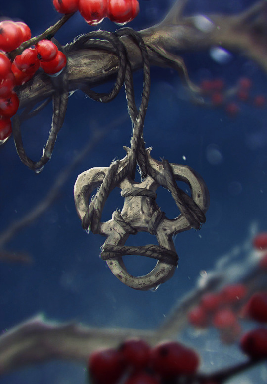
20: Bone Talisman by Bogna Gawrońska It's still the most festive looking thing i like. My beloved blue-and-bright red fidget spinner. I really can't explain my weird attachment to it any other way; i generally tend to like the item arts, maybe it's the collector brain, maybe it's because after Homecoming and most of the expansion sets since later 2019 onwards, these base set trinket adjacent arts became more prominent to me among a lot of new, more dramatic and bleak character and scenery art.
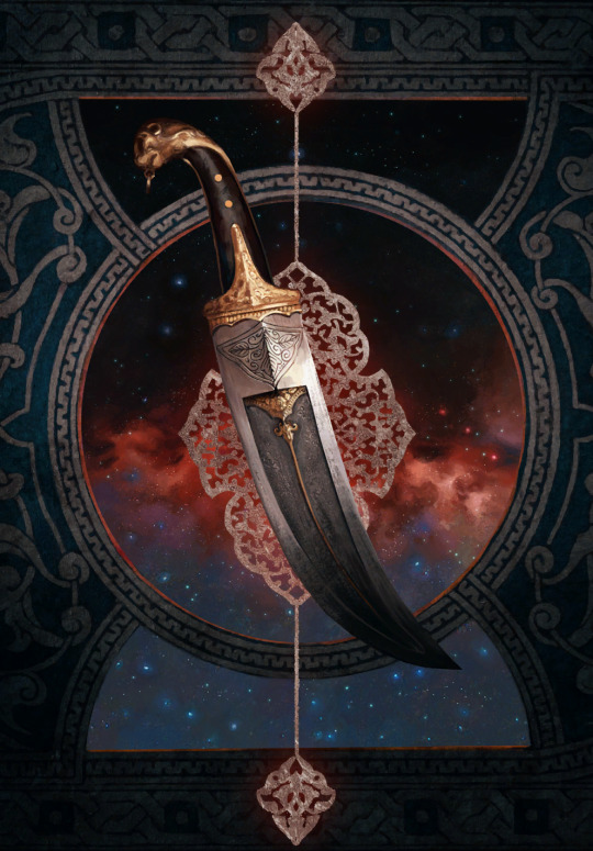
19: Ceremonial Dagger by Katarzyna Bekus The entire set of strategem arts from Merchants of Ofir is honestly packed, but the dagger is the one i found myself putting in my in-game profile the most. Maybe it's the item hoarder brain again, maybe it's the color scheme i find relatable if that makes sense, most likely it's the premium helping a bunch to make that choice too. The background weirdly fascinates me. Does it have anything to do with The Spiral? I have never attempted to really assign any logical meaning to the strategem arts, they're clearly more symbolic than anything, but it still makes you wonder.
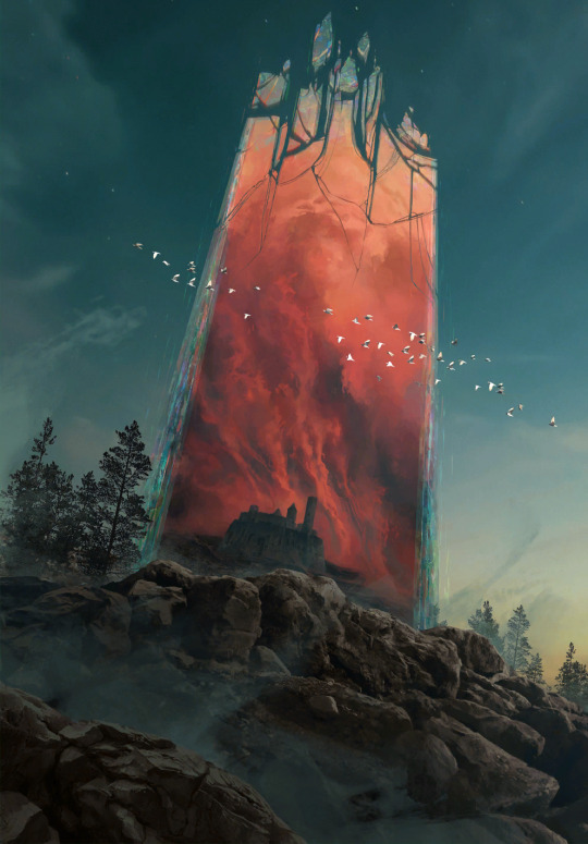
18: Ard Gaeth by Katarzyna Bekus Somewhat related, here's another piece of wonky multiverse lore. And once again, it's the color that first grabs attention; the contrast of teal and this dusty red. Then one starts realizing the implied size and scope, the birds help with that, apart from being a cute composition detail. The shattery effect makes it look volatile, unstable, dangerous. Ominous. Which ultimately makes it fit with the rest of the Wild Hunt archetype in more than just lore.
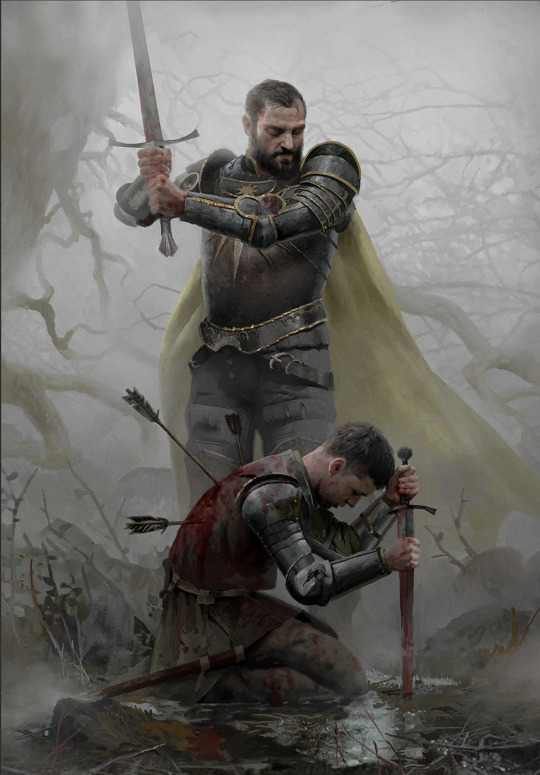
17: Coup de Grâce by Lorenzo Mastroianni There are two wolves in me, one loves bright colors, the other actually enjoys a lot of the bleaker scenes. Although to be fair, Lorenzo Mastroianni is a big contributor to that. And it's no wonder, when he casually drops stuff like this. It's almost symbolic, lot less than strategems but certainly more than other, straightforward "war sucks" Gwent art. How do you visually represent something sad in a way that makes it hard to look away not just because of the tragedy but because of the beauty put into making that image? You ask Lorenzo Mastroianni, the modern classical artist, to do it.
16: Viper Witcher by Valeriy Vegera I once described Valeriy's art as "where Lorenzo uses a tight color palette, he uses every pencil in the case". This one is perhaps not as obvious an example, the whole piece has a very unified atmosphere especially from afar, but still, there are so many colors especially in textiles and skin. They're harder to register sometimes but it's how Valeriy does texture and shading. And somehow, he bridges the bleak and the colorful world too. Admittedly, this card also had to be here because mr. Viper is my son, and the voicelines are done by an actor with the nicest, smoothest bass i've heard since Peter Steele.
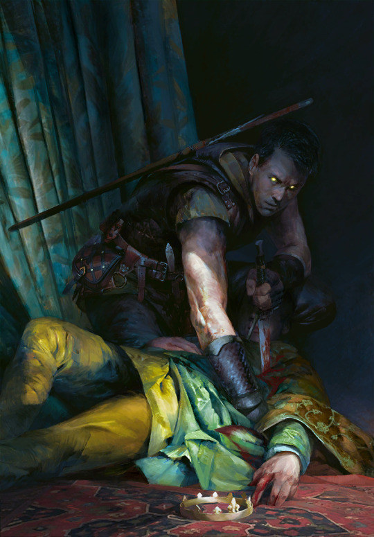
15: Naglfar's Crew by Anton Nazarenko I was surprised by how much i ended up liking this one. It's the implications, i think; enchanted to laboriously upkeep this monster of a ship, this 'and if you see it emerge from a breach in the sky, you know you're fucked' symbol of death and decay. It's dark in a way i find compelling, i guess.
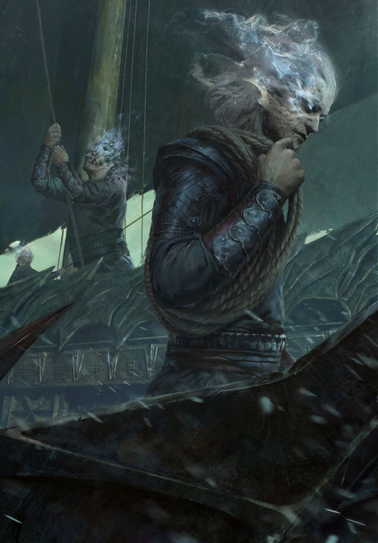
14: Serpent Trap by Marta Dettlaff Back to the bright ones, i liked this art ever since i discovered it as Nature's Gift in post-Midwinter beta. The card saw play in Scoia'tael spell decks, and to me it became linked to Francesca Findabair for their shared spectral snake thing. But that all aside, the art is just so pretty. Vibrant, yet not oversaturated. And like the item arts, needed to balance out the cool and badass and the dramatic and tragic. Looking at it now, another point comes to mind; it's still grounded? The way Gwent art at large is grounded compared to other card games. Like it's not trying so hard (both this piece and the game's art in general). That's refreshing.
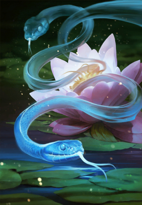
13: Chort by Bartłomiej Gaweł It reminds me of the first game's main menu. The Witcher 1 main menu is, to me, one of the most accurate representations of this universe, its atmosphere. Even if the "you kill cows, you get ambushed by the fucking baphomet" is a meme game mechanic, something about it is...witchery. Superstition, folk legends, and ultimately, monsters. Or that's my takeaway, anyway. But the Chort art, beside being on the more rare side in-game, has always weirdly drawn me in.
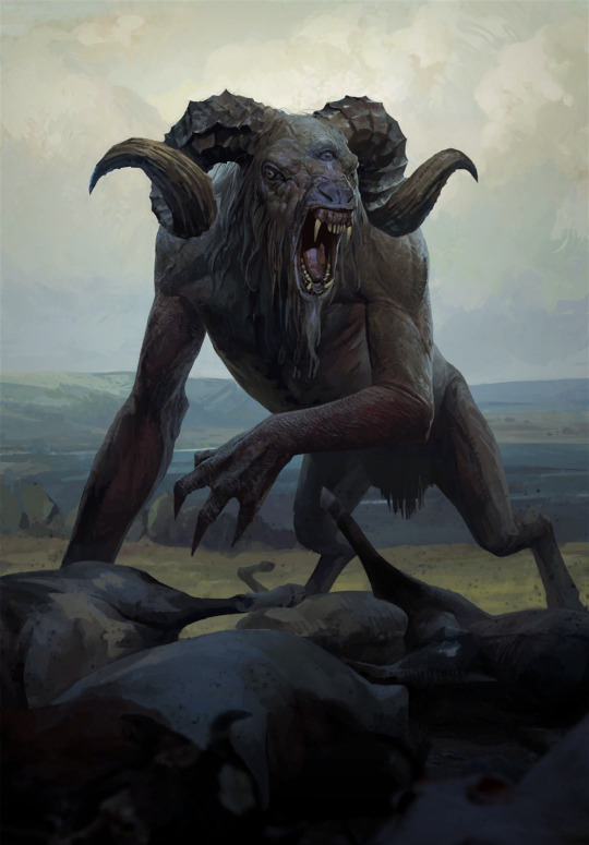
12. Oneiromancy by Lorenzo Mastroianni This was the Novigrad expansion key art before they turned it into a card, and i sure am glad they did. Lorenzo can get a bit weird, as a treat, someone said. Are they Condwiramurs and Corinne? Possibly! But i'll abstain from the schizo theories now. It's a gorgeous, well composed and executed surrealist piece. Inception if it had strong palpable atmosphere.
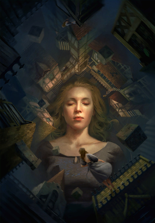
Denis Villeneuve > Christopher Nolan. but Lorenzo beats both
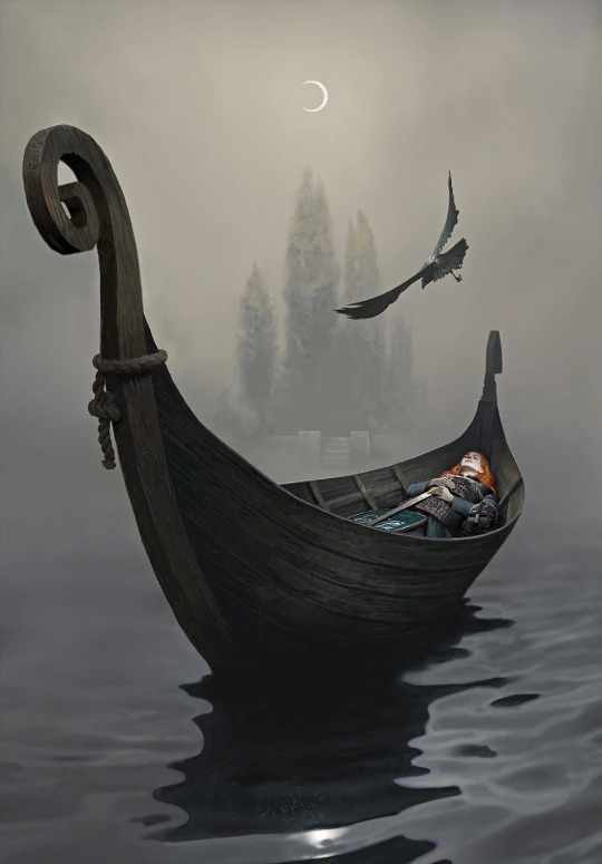
11: Funeral Boat by, you guessed it, Lorenzo Mastroianni One final yippee for the last card set. And my god it's beautiful. Tight composition can get surprisingly hard to coordinate and make decisions for, but this is so well-balanced. The left end of the boat is closer to the frame, but right side has the most noticeable color, the character's face, and of course the bird to even it out. As if to defend the title i gave him earlier, Lorenzo references Isle of the Dead in a way that, even if symbolic, fits into the universe perfectly. Someone stop me before i start rambling about similar concepts in different mythologies.
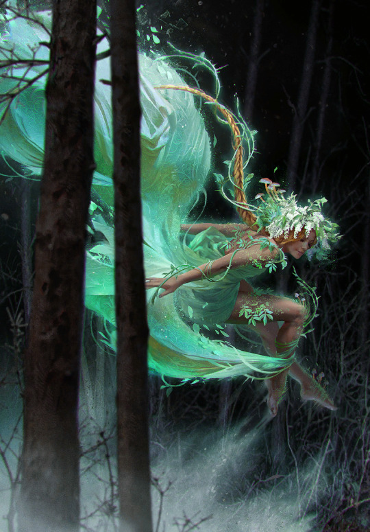
10: Dana Méadbh (now the token spawned by Call of Harmony) by Anna Podedworna The most famous Gwent artist enters the list. With a piece made around two, when you think about it very bold choices. The goddess of nature and life, glowing with inhuman light in a black and barren forest. Obscured by thin, bare tree trunks. But to make her emerge and stand out, that was necessary. And it's working wonders. A lot of the Scoia'tael faction is obviously green, all kinds of green, but even a simple choice like making it pop out of black makes the card art stand out among others.
9: Circle of Life by Oleksandr Kozachenko It has everything i usually look for in Gwent art; nature, color, atmosphere. A certain tranquility, perhaps. A little bit of story - the orange badge is the Kerack coat of arms. It's that environmental storytelling thing gamers keep talking about, complementing the character and faction drama of the rest of its card set.
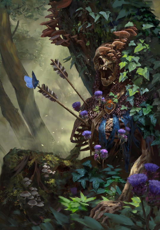
There's a slightly changed, extended version, too, and somehow it's even better.
8: Gezras of Leyda by Bogdan Rezunenko As much as i tend to dunk on Bogdan for having played Blasphemous once and making it his entire personality, Gezras is easily the best school founder card art of the set. Once again, the choice to have these prominent arts on the more symbolic side paid off, and the result is a stalking nocturnal animal out for revenge, backed by a giant image of what simultaneously did him irrepairable harm and gave him the means to defend himself. The premium doesn't disappoint either.
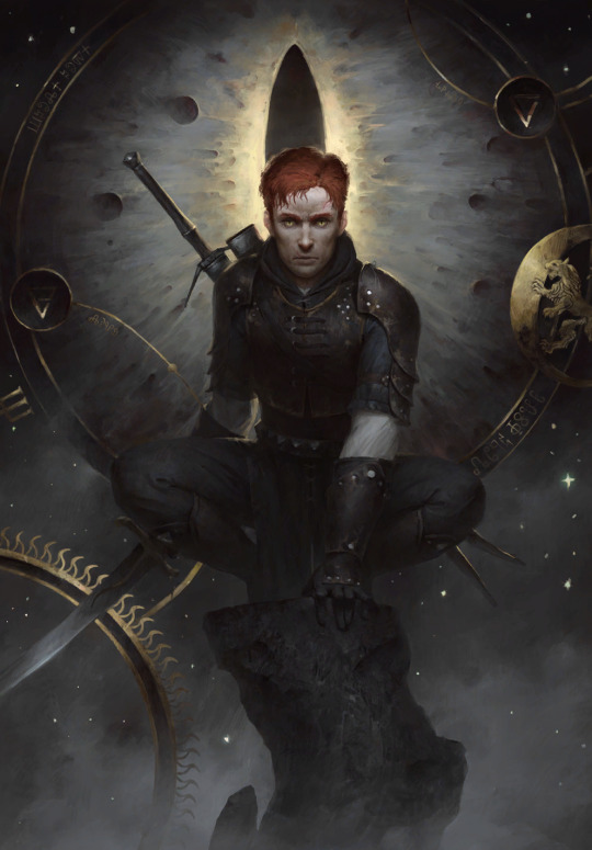
7: Rioghan the Undying by Daniel Valaisis To nobody's surprise, the atmosphere, once again, got me hooked. I love the cold color, the dramatic flow, the big imposing silhouette of a ship in the background. Poor boy is the picture of misery. It's pure melancholy (something not that common in the Skellige faction by the way, which is a point in favor of Funeral Boat too), that i, of course, am inevitably drawn to.
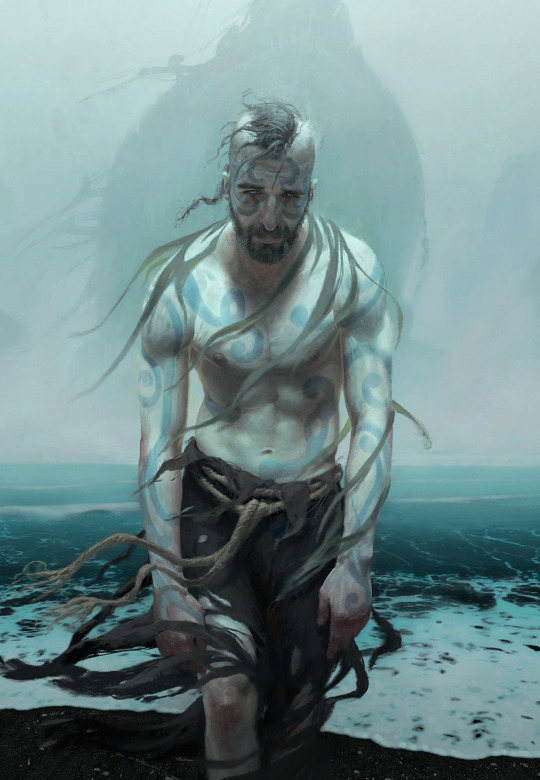
he's just like me fr...
6: Witches' Sabbath by Michal Lisowski Did i craft this card already or not? The realist's complaint towards near-greyscale card art. I share this sentiment, if only for the comedy of it, but with a few notable exceptions, and this piece is the main one. The Robert Eggers comparisons were made already i'm sure, but it really is a take on the last good Witcher 3 quest with a dramatic, more dreamy, or you could say cinematic quality ramped up to 11. Gone is the fanservice present in the game and the unnecessarily grotesque depictions of fatness of other parts of this card set, and what remains is a beautiful, ominous callback to folklore and classical art.
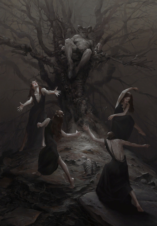
5: Tinboy by Valeriy Vegera This is a baroque painting. The drama. Tinboy doesn't take that scarf off, ever. And here this poor soul is, their last will to live dragging it off him. On purpose? On accident? Probably both. The pattern marking Tinboy as a gang member staining with blood of a victim, something something symbolism. All in Valeriy's signature 'which pencil should i pick up next' style. Underrated piece.
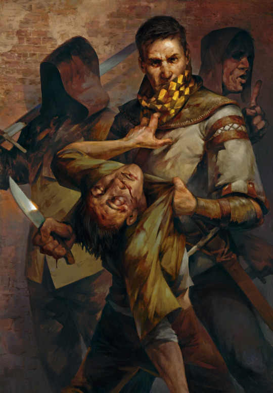
4: Lara Dorren by Toni Muntean They finally got our girl. And once again, despite heartbreak, it's gorgeous. Soft, sweet colors with a necessary hint of melancholy (the lighting suggests it's sunset?), and a pure, painted quality without the need for texture assets. A scene like this is better left a comparatively simple and laid back tribute. Beyond the technicalities, i also really, really applaud Toni for the outfit design. This is the Aen Elle princess, dressed well but for the weather. And the fact her mostly blue clothes with yellow sleeves mirror Cregennan's yellow jerkin with blue details, and her red brooch above the heart might, beside contrasting with the blue, very well reflect his fatal wounds... well. As much as death on card art isn't always done the best, Lara is represented together with that which mattered to her the most. Despite being categorized among the Wild Hunt, she remains herself.
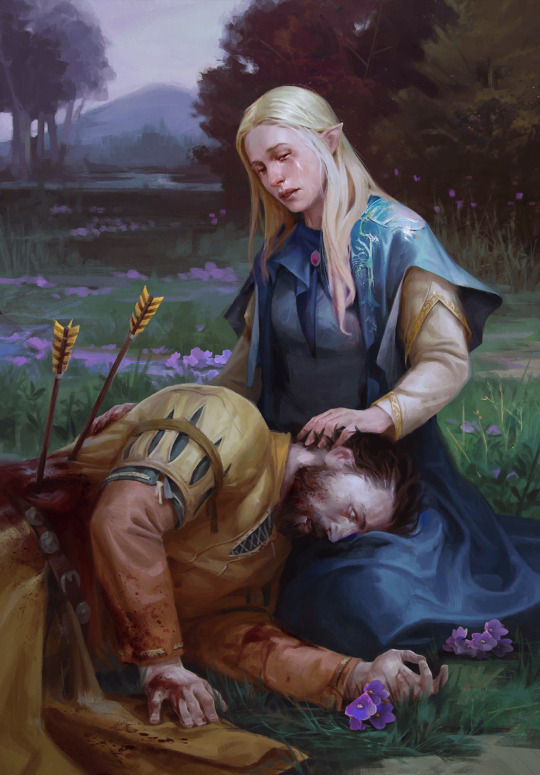
3: Lydia van Bredervoort by Igor Klymenko The joy i felt when this was the art of Lydia they managed to get into the game. It's easily one of the best contest pieces and on par with the best Gwent has to offer - it has mood, and that ever present air of groundedness, realism, and in that, unfortunate tragedy. But similarly to Lara, it shows Lydia being her own person; doing what she loved and was good at without sight of Vilgefortz despite her being known as his ever loyal assistant. Likewise, it doesn't sensantionalize her condition, but references it in a subtle, tasteful, and even clever way. I also love her dress and the overall color palette. Igor understood.
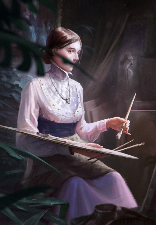
2: Eldain by Anna Podedworna Couldn't help it, this asshole has me in chokehold and he's enjoying it. In my defense, this piece highlights everything Anna is known for, because she's damn good at it. Incredibly sharp main subject of the piece contrasted against a blurry background, which allows for insane details like the strings extending from the top of the lute. To add more fun to it, Eldain isn't even in the absolute foreground, but the piece is still composed smart, so he remains the main focus. His silly red collar on mostly green helps. On top of all that, the art tells a little story, something Anna often does too, and in this case it delightfully sums Eldain up. It's also the best premium in the game.
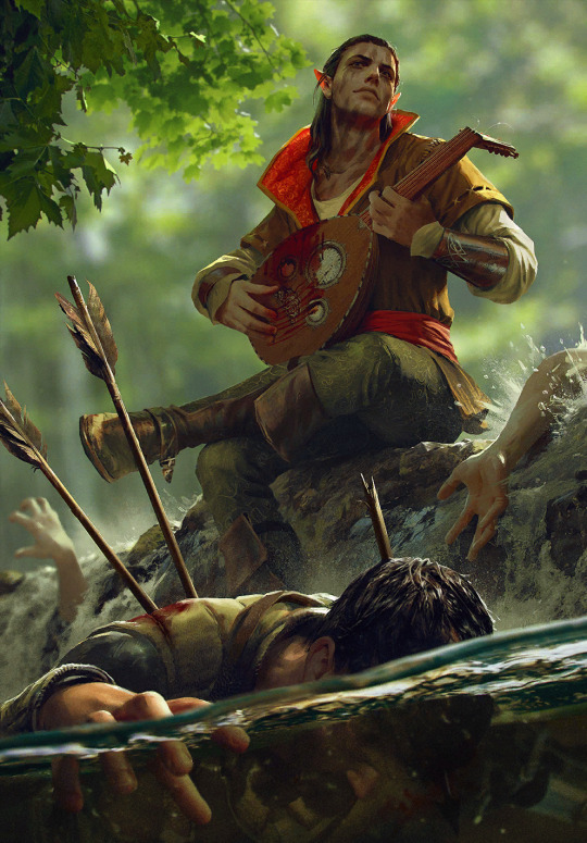
look at his little red ears from sitting against the sun aww
Honorable mention: Lake Guardian by Anton Nazarenko Like the following #1, this card has sentimental value to me as my second card reveal and artwork i made my best emote of. It was a perfect match, bird gals and all. It's a Sirin, bringing in a more obscure but not unwelcome mythology reference to the universe. And I love her vibrant, marble-like eyes.
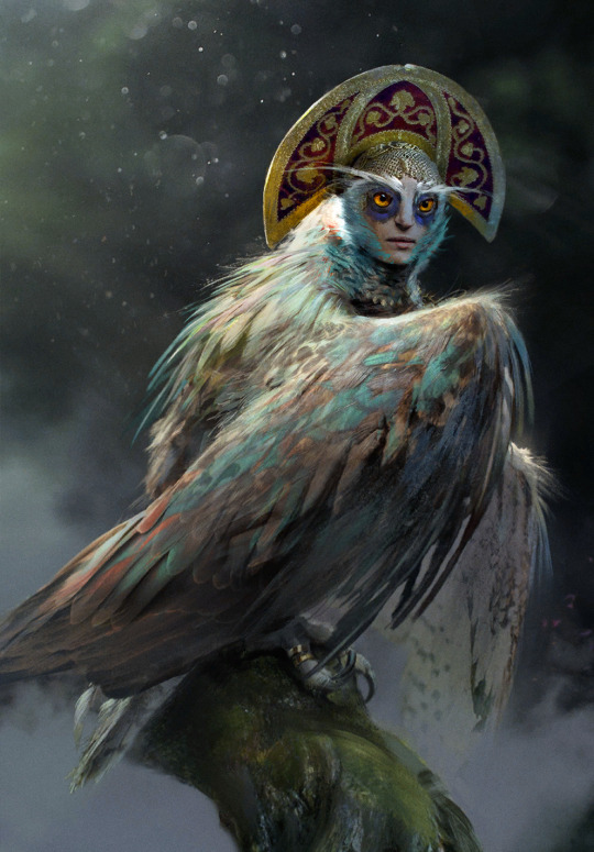
1: Dol Blathanna Sentry by Lorenzo Mastroianni ...remains my favourite card art since that fateful day sometime in January 2018. I was just discovering what there was to know about Witcher, downloading Gwent in the first place out of need for more content as i was slowly reading through the first book. Gwent has done a lot to explore and build on this universe, and it has helped me contextualize a lot of things early on. I remember scrolling through the deckbuilder, seeing this art, and being struck by its mood, this aura of secret and wonder. "Oh, so this is what Dol Blathanna looks like..." It's quintessential older Lorenzo. Very much admitted brush work, fog, tight color palette. The little specks of blue in flowers and face paint work just right. Maybe it's a reference to Arthurian myth and Avalon, maybe to Greek myth and Hades, or maybe, as is often the case and was the case later (or earlier in this list), both. It spoke to me and my sense of wonder back then. It speaks to me when i search for comfort now.
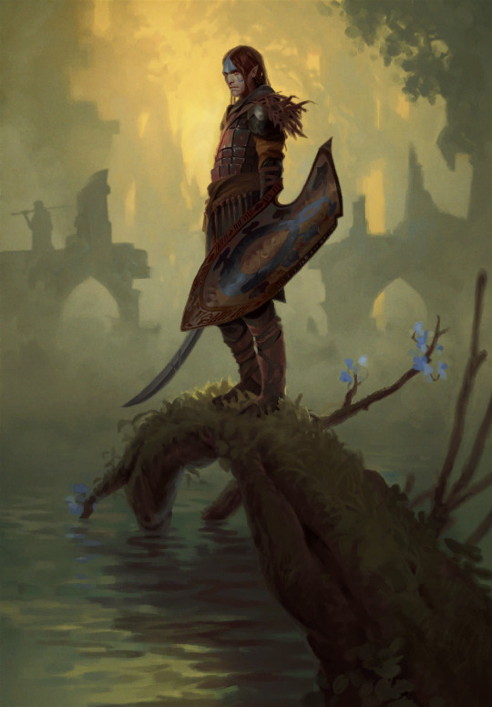
now, time to tear Karol Bem to shreds in the top 20 least favourites xd
#shut up elis#the witcher#gwent: the witcher card game#fingers crossed tungle doesn't obliterate the links
24 notes
·
View notes
Note
CG!DEREK BEDROOM PROMPT LIST?! SUPER LAST MINUTE SORRY
- @bebbie-bilinski
🐺Caregiver Derek Hale Bedroom Headcanons🐺 ➢ event masterlist
this kinda just turned into his whole loft hcs but shhh
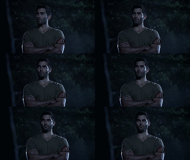
1. What kind of bed do they sleep in? What size is it?
- it’s a king bed and it’s super comfortable, the right mix of squishy and hard for Derek to actually enjoy sleeping on it. it was a gift from Peter a couple months into them being more comfortable around one another after everything that happened, Peter had noticed that Derek wasn’t sleeping and while getting a new mattress didn’t fix the issue completely, it definitely helped
2. How many pillows do they sleep with? What’s the color of their pillows?
- there’s four pillows on his bed but he really only uses the two on the right side as that’s the side of the bed he sleeps on
3. How many blankets do they sleep with? What colors are they?
- his comforter is gray and he has one maroon red throw blanket that stays on his bed at all times. although he does have another throw blanket that’s crocheted and was saved from after the fire that Laura made that he keeps in his closet, he’s scared to ruin it so it only gets used if he really wants it

4. Where do they keep their clothes? How are their clothes organized?
- he has a dark wood dresser that’s from his time living in New York, he keeps it very organized but also makes sure to keep one of his drawers stocked with clothes for littles from the pack incase of emergency
5. What kind of light sources do they have? How many do they have? Why?
- since the loft has that huge window he doesn’t feel the need to have a lot of light sources. he obviously has main lights for each room, but other than that he just has a small bin of different light projectors & fairy lights that he may use while looking over someone in the pack
6. What colors are their bedroom walls?
- his bedroom has a darker gray color brick while his living room/rest of the loft have light gray brick, you can barely tell the difference but it’s there okay. he needs people to be aware of it.
7. What does their bedroom look like? What kind of furniture do they have in there? How big is it?
- the loft is extremely open so it’s not necessarily a bedroom but more of a section he’s deemed to be his bedroom. he can see into most of the loft from his bed which he likes, it’s easier to see danger coming, but also to see if any littles are causing chaos if he can’t be at their side
8. What kind of floor does their bedroom have? What color?
- they’re concrete but have built in heaters that he can change the temp of, yes they were expensive but so worth it (especially when he comes home to theo & malia curled up on the floor together)
9. Do they have any toys? Do they sleep with any of them?
- he has a toy bin he keeps at the end of his bed for the littles, it’s filled with plushies, action figures, dolls, toy cars, anything that can fit really. he had started it when Scott mentioned that the loft might be a nice place for the littles of the pack to come and relax, it’s grown immensely. some of the toys Derek hasn’t bought himself and they’ve just appeared but he never questions it. he takes time after the littles leave after a visit to clean them all with disinfectant wipes and spray, just so nobody has to worry about them potentially getting sick from a shared toy
10. Do they have any rugs? If so, what color are they?
- there’s a rug under his bed but it isn’t big, his floors being heated means he doesn’t need them aside for decoration
11. Are there any decorative elements to their bedroom? What are they? Why?
- not really, he’s a minimalist through and through, but there’s a couple things he keeps. he has picture frames saved from the fire he keeps on his dresser next to a few of the pack that Melissa got him, and he has a board hung up by his bed that has all of the postcards Cora’s sent him hung up, he likes to reread them at night when he misses her. and occasionally a little will draw him a picture that he happily hangs up on the fridge with magnets (he has a folder of all of them in his closet)
12. What are some of the things they do in their bedroom?
- technically all he does in his bedroom part of the loft is sleep, or read, but as for the rest he does just about anything. when he’s watching over littles he lets them have free range on the house aside from the kitchen since that can get dangerous, so there’s lots of games of hide & seek, they can set up huge race car tracks across his floor since it’s so open, Kira & Lydia like to have talent shows for their stuffed animals, Theo & Malia sometimes shift into their wolf form at the loft so they play fight if Derek allows it— he doesn’t have strict rules. If nobody’s getting hurt, offended, or being left out, than it’s most likely okay
13. Do they share their bedroom with anyone. If so, who?
- nobody sleeps there every night but sometimes littles will stay the night in the loft, they always have the choice of the couch, Derek’s bed, or the floor which is mainly just for Malia & Theo staying over
27 notes
·
View notes
Text
Alright lets rate some SPD megazords B)
My fiance and I watched this season together (his first time, my second time) so it's still pretty fresh in my head for the most part.
First up,
Delta Squad 8/10
I admit that this one is not my favorite (I tend to prefer the more square/angular designs) but I will admit that from a design standpoint it is an overall good design. All the zords include the flashing lights, the white color base, the rounded cockpits. The stripes of color on each zord also makes it so you can still distinguish which zord is which but it doesn't make them feel separate from the megazord as a whole. Also the silhouette is very much giving an old cop with the round bowl hats which I think is fun since the season is all about the future.

Delta Command 8/10
This guy fucks, the fact that they made a megazord thats like twice the size of a normal megazord is pretty rad ngl. I like that this one has the huge reflector/flood lights that carry through the design along with the flashing lights. It feels like if all the lights were on you would definitely think police raid which I think is a cool touch. This also might not be the case but it does kinda feel like they put different splotches of color on the zord to make it feel like it WAS constructed with 5 zords which I think is kinda neat considering the solo transformation zords typically have a pretty uniform color scheme.
Omegamax 3/10
I'm gonna be so real with yall this one feels pretty messy imo. I get that it's a bike cop, that does read with the helmet. The chest? He looks like he got impaled by a car tire... The shoulders being silver means they kinda fade into the background since they're on the outer edge of the megazord. Also ik you can't see em in this pic but the legs are SO square compared to the rest of the design, this whole upper torso has the corners shaved off of nearly everything. I also think this is a good example of the color palette getting too busy, theres gold, silver, red, blue, white, black, like it's too much happening. If you asked which color ranger piloted this white would probably be like my 3rd or 4th guess.
Deltamax 4/10
I feel like I'm kinda dunking on the omega ranger (I swear I'm not trying to) and tbf this zord does fix a lot of the silhouette issues I had with the Omegamax. The design feels more cohesive overall, the helmet works with the rest of the body and you can very clearly see the white ranger inclusion on this zord. I think the problem I'm having is this feels more like what the Omegamax could've looked like because I'm not seeing a lot of the delta squad megazord in here. Like yes I see the red rangers car and the various colors but like, yellow and pink are just...parked? On the shoulders? ok? Also blue and green are kinda hard to spot with all the colors going on in the design. Idk, I feel like they could've workshopped it some more

S.W.A.T. 3/10
It's strange. I don't dislike it, I'm just disappointed I think. Out of all of them this one definitely feels the furthest from police, which I get incorporating the space theme makes that kinda hard since we don't have space cops. Everything is just like so square though, and not in the good way. The shoulders/wings feel so flimsy and honestly I was looking through pictures and could not tell if they were in fact shoulders or wings which isn't great in terms of readability of the design. (ik they're shoulders now) I think its the way the red and blue zords overlap which kinda makes them feel like they're just floating next to each other rather than connected. I'm also not a fan of the pinstripe on the legs, it kinda draws my eye in a bit too much to that area and takes away from the actual zords.
----
Overall, SPD does have some good designs but some of em definitely leave something to be desired. Aside from SWAT I do think that they all fit the theme quite well I just think that "Cops" is a bit of a strange theme to translate to a megazord design.
But again these are just my opinions, I'm just picky I guess xD
2 notes
·
View notes
Text
Okay, so Power Rangers is done with adaptations, but what if there was a season where every Ranger came from one of the 11 different teams whose suits went entirely unused?
Power Rangers All-Stars
It could very easily go the RPM/Dino Charge route of being its own universe, especially given that Cosmic Fury was the definitive end of that continuity. Maybe all of them could be the sole survivors from PR teams that had all fallen in battle.
The Baron/All-Star Red (Engine Fire)

ToQ 1 was my first choice for a protagonist solely because I loved the idea of the Rangers traveling via a magic train their Red owned. There’s also a bit of irony in the team being led by a Ranger from a Sentai without a leader, and it’s especially fitting since his season has a color swap gimmick. Even the All-Stars’ colors match the ToQgers. Aside from Blue, his suit is the least armored, giving the impression he’s tough enough without it.
He’s the one who’s lost the most, but Baron acts as a mostly eccentric figure, a eternally optimistic goofball who insists the team does the usual Sentai theatrics. He’s probably insane, but he gets results easily and is far smarter than people give him credit for.
Cory/All-Star Yellow

The rookie, fittingly wearing the newest suit courtesy of the 50th team. He’s the last of seven core members to join, doing so in the first episode while everyone else has already been at it for a while now, and he’s from Season 49, 7 squared. He’s also dinosaur themed, matching Mighty Morphin and fitting the protagonist well. On a more serious note, since the GoZyugers seem to be fighting each other in addition to everything else going on, he’ll be the only one who wasn’t already on a team.
He’s somewhere between Casey Rhodes and Tyler Navarro; young, looking for answers, ludicrously strong but not entirely confident in his skills as a Ranger, but he doesn’t have to lead so that’s at least one less thing on his plate.
His name is a play on Kyoryuger (“kyoryu” means “dinosaur”).
Jade/All-Star Green (FACET)

There’s no particular reason why I chose Kiramei Green, her suit’s just my favorite from her team.
Jade is Baron’s second in command. She’s the team’s heart and soul, being the most sensible person in All-Stars for numerous reasons. She’s soft spoken, yet firm. That’s why Baron trusts her.
Virgil/All-Star Blue (Phantom Force)

I wanted both of the VS Sentai to be on the core team, which of course meant I more or less had to use them for Blue and Pink.
Virgil’s a notorious showoff and charmer in the vein of Chase or Xander. He’s naturally talented enough that he doesn’t feel the need to take anything seriously, which can rub some of his teammates the wrong way.
Siren/All-Star (Hyper Guard)

Siren is a direct and stark contrast with Virgil, being fierce, dedicated, sometimes even harsh. Think Jen or Sky but with Vida’s temperament. The two argue constantly but work together perfectly.
As a duo, their first initials spell out “VS”, and their individual names are a pun on “vigilante” and literally “siren”.
Rod/All-Star Orange (Cyber Corps)

The smart guy, he creates most of technology the team uses that didn’t come from their original teams. Bun Orange fit the role pretty well; he himself had the uncanny ability to get anything the team needed, and PR’s precursors to Fern (Boom and Kat Manx) were the science types.
Rod also happens to be a robot, or at least some sort of mechanical life form; all the Orange Sentai starting from ToQger, that is to say all of them outside of Battle Fever J, are nonhuman. He’s got a very similar personality to Alpha, being quick to panic and slightly unlucky.
Asher/All-Star Violet (Hexagon)

Finally is Asher, whose counterpart is the only violet Sentai to be part of the core, starting group. Personality wise, they’re practically identical to their Sentai self with a bit of Gokaiger’s Joe and RPM’s Dillon for flavor. They’re the most serious and aloof of the seven, as serious as you can be in a lavender moth suit.
Oh, and there’s four “sixth” rangers on the team I guess.
#dullsville#super sentai#power rangers#ressha sentai toqger#no. 1 sentai gozyuger#mashin sentai kiramager#kaitou sentai lupinranger vs keisatsu sentai patranger#bakuage sentai boonboomger#ohsama sentai king ohger#red#yellow#green#blue#pink#orange#violet
2 notes
·
View notes
Text
Telling Wanderer’s Story through Color
My color symbolism brain strikes again! Let’s talk about Kabukimono/Scaramouche/Wanderer and how the colors of his various designs reflect his story. Now, there are other aspects of his designs that I could talk about, but for the sake of brevity, I’m going to be focusing specifically on the colors.
We’ll start, naturally, with…
Kabukimono

The dominant color in Kabukimono’s design is white, symbolizing his innocence. However, there’s also a good amount of purple, which is typically symbolic of royalty. Fitting for the son of the nation’s god. Aside from his veil, though, most of the purple is a very light lilac color, still very close to white.
The only black we see in his design are the wrist braces that were likely used to cover up some ball joints that hadn’t fully faded yet, a source of insecurity for him, and the black string tied to his golden feather. That feather was a gift from Ei, so that would also be a source of internal conflict for him since she abandoned him.
There’s also a red string as well. Red will take on a very different meaning in the next section, but here, it means vitality. Even though he lacks a physical heart, Kabukimono is undoubtedly alive. It could also be a nod the red string of fate, a concept that’s popular in Japanese media (and yes, I know Genshin is a Chinese game, but Inazuma is based on Japan). The looping knots of the red string could possibly symbolize the drastic shift his fate will eventually take at his own hands.
Scaramouche/The Balladeer

After joining the Fatui and becoming Scaramouche, his design takes on a lot more red and black. These colors are commonly associated with danger and evil, but it goes deeper than that. As Scaramouche, the red represents his anger, and this is also indisputably the time in his life when he’s the most active. His hatred is his driving factor.
The black represents the darkness that engulfed him after having his happiness ripped away from him time and time again.
However, despite his casting away of the innocent Kabukimono, his design still has a tiny bit of purple in it. The remnants of Kabukimono are still there deep down inside.
The Wanderer

As the Wanderer, he’s forgone all red in his design, signaling that he’s no longer letting his anger drive him. Instead, he now wears varying shades of blue, which symbolizes stability, calm, and peace. He’s found a new home with stability in Sumeru and achieved some semblance of peace with Nahida’s guidance, and he’s on the path to healing. He’s still a bit of a brat, but he’s no longer actively looking to stir up trouble, instead hiding among the regular folk of Sumeru.
The white to black ratio has also evened out, symbolizing a more neutral morality. He’s no longer outright evil working with the Fatui, but he’s not entirely good, either. He learned the hard way that he can’t erase the terrible things he’s done, but he can try to atone for them, even if the world has forgotten that any of it was his fault.
And even as the Wanderer, he still has a little bit of purple in his design. Despite everything, Kabukimono is still there, a part of his past that he’ll never fully discard.
28 notes
·
View notes
Text
Through having an autism moment for one of my favorite movies and its related medias (the current Beetlejuice fixation) I came to the following conclusions:
*Beetlejuice’s favorite color is probably red, which is probably a reference to the color of the star he’s named after
*Beetlejuice enjoys fashion and could even possibly be considered a designer (yes rly) Despite being a grungy character who’s known for being smelly and gross… he is a designer/seamstress with a vested interest in fashion???
Yes I’m going to explain in horrifically unnecessary detail. (It’s the autism) and yes this draws from all the juices but tbh any one of them would work as a stand-alone example (except maybe musicaljuice but he’s critical to the sewing part and also he’s the cute one)
————————-
The argument for Beetlejuice being an amateur designer:
There’s an interview somewhere with the costume designer for the musical that says they wanted the pinstripe black and white suit to look like it had been repaired and modified over the years, because since Beetlejuice was a loner, he’d been solely responsible for making and maintaining his wardrobe. So like, he sewed his own suit by his lonesome out of fabric of some sort. Because if it was magic why the hell would it need repairs? Which suggests at least to me that he *enjoys* making clothes because why go through all that work if you can materialize anything at will? And I mean it fits so, I’m sure it wasn’t his first ever pattern making and sewing experience.
There’s also the way toonjuice refers to his suit as having “never been washed” on numerous occasions so I don’t reckon it’s something he just makes from magic and poofs into nothingness on the fly? Though toonjuice could be argued to buy his clothing since they never stated he made it and he lives in some kinda monster city idk. I’m saying that suggests physical matter somehow not like, idk a temporary illusion? If you can wash it, it has some sort of mass to it right?
Listen, why the fuck a guy who can make his own patterns and sew an entire suit would not wash it is beyond me but okay. Anyways the point is there’s a suggestion being made here by the franchise that Beetlejuice makes his own clothing in the traditional way by sewing together some sort of permanent matter. I can’t say I get the same impression from moviejuice though. There’s not much to suggest his clothing isn’t just temporary magic bullshit, save for the visible decay… ok wait maybe it is made of permanent material. 🤷♀️ either that or the dust, tattering and moss is a fashion choice? 🤨🤨
Ok so for this next part let’s just like, put aside the weirdness going down with the wedding thing in the movie (btw I’ve seen it numerous times and I feel like it’s def “a green card thing” in the original as well, pay attention to the characters’ behaviors/interactions throughout the film with one another and u can see what I mean.)
Beetlejuice probably designed that red wedding dress right? Because he materialized it or pulled it out of thin air or whatever? And the matching red tux, same thing. I kinda think that was the fashionista in him taking the excuse to make dramatic evening wear lol. Using Lydia as a Bratz doll dressing her up in his designs smh
There’s also how jazzed up and amused he was by turning Otho into a walking fashion faux pas, or at least I have to assume that’s what he was doing when he ripped the guys outfit apart and replaced it with something that caused Otho to scream in terror. How tf does a smelly guy in a crypt know what’s considered a style no-no unless he’s into this shit lol

Oh and uh if you’ve ever seen the cartoon he dresses himself up in all sorts of little outfits on the fly, like very frequently. If nothing else he’s coming up with the concepts for these clothes, maybe not constructing them himself in every version of the franchise but he’s at least designing the outfits in all of them or so I assume. He also gives other characters makeovers or new outfits on various occasions. It seems for Beetlejuice, the living are like breathing Barbie dolls he sees no issue with dressing up in his latest creations.
I’ll now explain the “favorite color is red” thing:
*Beetlejuice doesn’t wear many outfits in the movie, but three out of the four I can remember had red in them. The aforementioned wedding outfits were primarily red. His shirt under the coat in the guide outfit is red. 🤷♀️ (Adams undershirt that he copies is red but I don’t rly think it counts) Whenever he’s seen wearing a saturated, non-neutral color, it’s red.
*didn’t he crash a little red car in the model at one point?… I just watched this movie again like last month and I forget already. That car in the photo, he crashed it into a fire hydrant earlier in the movie, didn’t he? Idk maybe not
*his tombstone has his name written on it in red
*toonjuice always has red nail polish 🤷♀️
*idk if this counts for anything but the nightclub Juno created to lure him away from the Maitlands was entirely red idk
*and the star Betelgeuse is a red supergiant, so yeah
Bonus entry is this guy a reference to Viy or am I overthinking it???
Yeah ok I’m def overthinking it. 🤦♀️
That’s all i have to say. All that crap above. Bye.
#long post#like rly long#I think tumblr auto (read more) these days but if not#plz tell me how to do that!!!#sorry#beetlejuice#betelgeuse#beetlejuice musical#toonjuice#bettyjuice
29 notes
·
View notes
Text
Making a colorza Fic that will probably be posted here and on Quotev. I’m thinking about the different colors and how they affect Phil’s personality
----
Redza: volatile and firery. Whatever emotion he feels, he expresses it tenfold.
Orange: I often see Orangeza depicted as a steampunk engineer. That seems to fit him well, using the urge to create that every Phil has. However, he can act just as volatile as Red, which ends up with him getting into trouble.
Yellow: Yellowza is portrayed as kind and helping by everyone who knows him. However, he does also have a dark side he tells no one about.
Green: this is the first color to interact with characters from SMP cc!Phil has been on (aside from Technoblade, who interacts with every colorza with the exception of one), as Greenza is basically DSMP Phil combined with 5 yr hardcore world Phil. He is a healer mentally, physically, and spiritually. He also would be considered neutral good. He fights for things he believes is best for everybody, even if getting there means it causes (a little) harm to others.
Blue: like Green, Blueza is also related to an SMP, earth smp to be precise. He is the cold hearted ruler of the Antarctic empire, but is secretly very sad and depressed due to things I will not spoil yet
Purple: the definition of a corrupt and manipulative politician. He seems friendly and calm, but is actually a psychopath. He is the breaking point of the entire series
Pink: a child at heart, Pink is the blissful void after Purple’s insanity. He is kind and gentle to all no matter what. This unfortunately makes him easy to manipulate. He is also the only colorza to have no interaction with Technoblade.
Black: every single bad trait of all the other colors combined. He is a killing Machine that cannot be stopped, not even by those who love him most.
White: the opposite of black and the combination of every hood trait the colors have. Nicknamed cumza buy Wilbur
33 notes
·
View notes