#anyway comics practice <3< /div>
Explore tagged Tumblr posts
Text
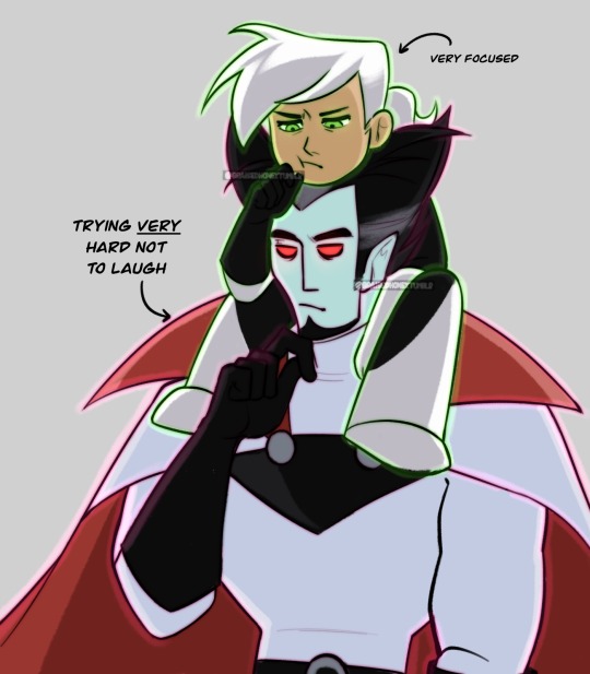
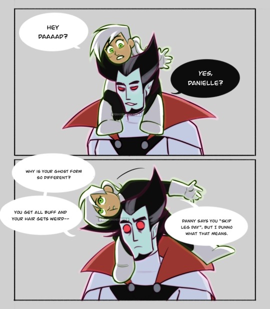
answer her questions vlad. why do you skip leg day vlad.
(more of this bc honestly, dani deserved so much better. also learning how to draw dani.)
still inspo from @lilianade-comics au where vlad sucks less! kind of! but also just generally a decent parent vlad au lmao.
(do not tag as ship. pls.)
#danny phantom#danny phantom fanart#dp#dp fanart#vlad plasmius#vlad masters#dani phantom#really really trying to like. relax a little when it comes to art#like with the shapes and style and w/e#cartoony comics like this help#insert spiderverse miles copying peter meme#anyway comics practice <3#ney’s art#ney’s comics#ALSO i drew dani like. way too tall in the last one#she is baby#this is why you use references folks bc otherwise your proportions turn out WEIRD#… just imagine she was older in the other one ig. highschool teenage daughter suffering vlad’s homicidal tendencies#DO NOT TAG AS SHIP#seriously. please.
1K notes
·
View notes
Text


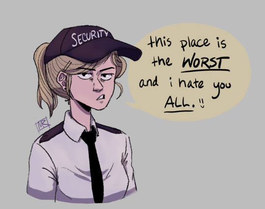
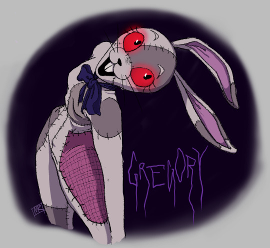
psycho furry Vanny dump 🐰
#art#fnaf#five nights at freddy's#fnaf security breach#fnaf gregory#fnaf vanny#fnaf vanessa#michael afton#Dad!Mike AU#fnaf sb#comic#this started out as a practice sketch months ago#just trying to get Vanny and Vanessa under my belt y’know#and then… whoopsies 🫣🫣#anyway more dad Mike :3 we love to see it
10K notes
·
View notes
Text


(ID in alt) you guys even fuck w/ the flash on here???
#dc comics#dc#wally west#irey west#the flash#the flash comics#gonna be so real. i am more a fan of irey than i am of wally. technically speaking#BUT I'M GOING TO TRY TO READ MORE WALLY THIS YEAR TRUST so long as it's fun#i bought the born to run tpb but it's currently held hostage at my uni accomodation (postage mixup)#anyway yeah. daddy-daughter duo of all time. what if your dad was your hero and the best man alive and also a massive dork and loser-#-who frankly sometimes really pisses you off but you love him so so much and you know you don't ever have to worry about him but you do#and also you were pretty much his carbon copy <3#this actually just started as me practicing running poses and then. spiraled#i don't normally fuck w soft shading and tbh I'm still not sure i like it here much but hey!#can't say i didn't try
711 notes
·
View notes
Text


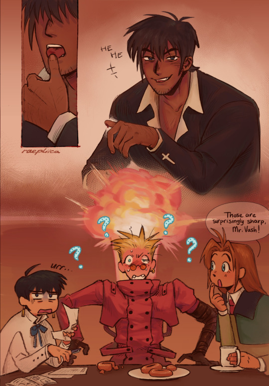
priest guy sending mixed signals, what is he up to?🤨🕶🤏
~~~
[Image Description: A warm-toned comic featuring Trigun98 characters. It opens with Vash shouting "YOWCH!!" as a half-eaten donut flies through the air, a bruise on Vash's tongue. Meryl, editing papers, is annoyed as he complains: "Ow! Ow! I bi'e my 'ongue..." "What's the rush?" Meryl asks, "They're all yours." Vash, still hurt, tries to explain: "They're jus' sooo good!" Meryl argues back, "Well, savour it then!" Wolfwood has been watching the scene unfold as Meryl continues, "Satisfying your sweet tooth doesn't come cheap, unfortunately." Wolfwood clicks his lighter open and closed, again and again. Without a word, he leans closer, his thumb on Vash's lips. "Wolfwood...?" Vash trails off. Then, Wolfwood opens Vash's mouth and knicks his thumb on one of Vash's canines in one fell swoop. "Wah? Huh??" Vash says as Wolfwood pulls his bleeding thumb away. He licks the blood off the wound then snickers at Vash. Meryl looks disgusted, Vash has lit up in an embarrassed explosion, and Milly remarks, curious: "Those are surprisingly sharp, Mr. Vash!" Question marks float around Vash, and his donuts lay discarded on the table. Each panel is signed by raepliica. End ID]
#trigun#trigun 1998#trigun 98#vash the stampede#nicholas d. wolfwood#meryl stryfe#milly thompson#vashwood#raepliica_art#ww has a thing for vash's fangs (because i said so)#i just know ww has had some interesting thoughts about those fangs the moment he noticed them‼️🦅🦅💥🦅💥#tbh i saw a wolf skull and went haha vash fangies (proceeded to black out for a week to draw this)#98ww is the most normal ww?🤔 WRONG‼️ he's a freak like the other ones! but kinda in a different way#ww flustering vash by being the weirder one>>>>>>#meryl's dwindling sanity as collateral damage<3#if u squint real hard this is a polygun art#okay maybe it doesn't look like it at all... but it is to me#polycule casually hanging out and one of them HAS to be a freak in public ugh🙄🙄#anyway im rambling ajsksh🏃🏃#enjoy this full colour comic i did to practice while thinking i had lost the ability to colour:] (this is what only doing b&w will do to u)#described#thank you starberry-skies for the id!!♥︎
2K notes
·
View notes
Text

chair + helmet for funsies
#xmen#xmen comics#xmen tas#xmen 92#krakoa#charles xavier#professor x#snap sketches#need to practice drawing this helmets 3/4ths angle hi#gotta make this post quick cause i told my bro we'd carve pumpkins before i left for the week#BUUUUTTTT ANYWAY yeah while i was browsing my comic shop the first time i ran across this story and thought it was cute#it was the tas/92 adaption of krakoa but i only skimmed it#i thought of picking it up at some point but as for now it lives as a memory in my brain. i do wanna look at it closer tho#tbh at some point i think i wanna try to do a design for charles that features his actual krakoa design but with a chair/hover chair#i think itd be fun cause ngl i always like drawing his chair and not getting to with krakoa stuff makes me sad#if i get to that i dont think it'll be like. a staple with my krakoa art but just somethin to do for fun#ok i think thats all for now. i think im gonna do a movie charles doodle page later cause I Am Once Again Working Out His Face#so fingers crossed ith that plan !!!! for now its pumpkin time BYE
473 notes
·
View notes
Text

astarion doodle
#astarion#bg3#i was making a comic but its stupid so heres this only#it was only like 3 pages anyway of nothing really. just practice#my art
404 notes
·
View notes
Text
why Aurora's art is genius
It's break for me, and I've been meaning to sit down and read the Aurora webcomic (https://comicaurora.com/, @comicaurora on Tumblr) for quite a bit. So I did that over the last few days.
And… y'know. I can't actually say "I should've read this earlier," because otherwise I would've been up at 2:30-3am when I had responsibilities in the morning and I couldn't have properly enjoyed it, but. Holy shit guys THIS COMIC.
I intended to just do a generalized "hello this is all the things I love about this story," and I wrote a paragraph or two about art style. …and then another. And another. And I realized I needed to actually reference things so I would stop being too vague. I was reading the comic on my tablet or phone, because I wanted to stay curled up in my chair, but I type at a big monitor and so I saw more details… aaaaaand it turned into its own giant-ass post.
SO. Enjoy a few thousand words of me nerding out about this insanely cool art style and how fucking gorgeous this comic is? (There are screenshots, I promise it isn't just a wall of text.) In my defense, I just spent two semesters in graphic design classes focusing on the Adobe Suite, so… I get to be a nerd about pretty things…???
All positive feedback btw! No downers here. <3
---
I cannot emphasize enough how much I love the beautiful, simple stylistic method of drawing characters and figures. It is absolutely stunning and effortless and utterly graceful—it is so hard to capture the sheer beauty and fluidity of the human form in such a fashion. Even a simple outline of a character feels dynamic! It's gorgeous!
Though I do have a love-hate relationship with this, because my artistic side looks at that lovely simplicity, goes "I CAN DO THAT!" and then I sit down and go to the paper and realize that no, in fact, I cannot do that yet, because that simplicity is born of a hell of a lot of practice and understanding of bodies and actually is really hard to do. It's a very developed style that only looks simple because the artist knows what they're doing. The human body is hard to pull off, and this comic does so beautifully and makes it look effortless.
Also: line weight line weight line weight. It's especially important in simplified shapes and figures like this, and hoo boy is it used excellently. It's especially apparent the newer the pages get—I love watching that improvement over time—but with simpler figures and lines, you get nice light lines to emphasize both smaller details, like in the draping of clothing and the curls of hair—which, hello, yes—and thicker lines to emphasize bigger and more important details and silhouettes. It's the sort of thing that's essential to most illustrations, but I wanted to make a note of it because it's so vital to this art style.
THE USE OF LAYER BLENDING MODES OH MY GODS. (...uhhh, apologies to the people who don't know what that means, it's a digital art program thing? This article explains it for beginners.)
Bear with me, I just finished my second Photoshop course, I spent months and months working on projects with this shit so I see the genius use of Screen and/or its siblings (of which there are many—if I say "Screen" here, assume I mean the entire umbrella of Screen blending modes and possibly Overlay) and go nuts, but seriously it's so clever and also fucking gorgeous:
Firstly: the use of screened-on sound effect words over an action? A "CRACK" written over a branch and then put on Screen in glowy green so that it's subtle enough that it doesn't disrupt the visual flow, but still sticks out enough to make itself heard? Little "scritches" that are transparent where they're laid on without outlines to emphasize the sound without disrupting the underlying image? FUCK YES. I haven't seen this done literally anywhere else—granted, I haven't read a massive amount of comics, but I've read enough—and it is so clever and I adore it. Examples:


Secondly: The beautiful lighting effects. The curling leaves, all the magic, the various glowing eyes, the fog, the way it's all so vividly colored but doesn't burn your eyeballs out—a balance that's way harder to achieve than you'd think—and the soft glows around them, eeeee it's so pretty so pretty SO PRETTY. Not sure if some of these are Outer/Inner Glow/Shadow layer effects or if it's entirely hand-drawn, but major kudos either way; I can see the beautiful use of blending modes and I SALUTE YOUR GENIUS.
I keep looking at some of this stuff and go "is that a layer effect or is it done by hand?" Because you can make some similar things with the Satin layer effect in Photoshop (I don't know if other programs have this? I'm gonna have to find out since I won't have access to PS for much longer ;-;) that resembles some of the swirly inner bits on some of the lit effects, but I'm not sure if it is that or not. Or you could mask over textures? There's... many ways to do it.
If done by hand: oh my gods the patience, how. If done with layer effects: really clever work that knows how to stop said effects from looking wonky, because ugh those things get temperamental. If done with a layer of texture that's been masked over: very, very good masking work. No matter the method, pretty shimmers and swirly bits inside the bigger pretty swirls!
Next: The way color contrast is used! I will never be over the glowy green-on-black Primordial Life vibes when Alinua gets dropped into that… unconscious space?? with Life, for example, and the sharp contrast of vines and crack and branches and leaves against pitch black is just visually stunning. The way the roots sink into the ground and the three-dimensional sensation of it is particularly badass here:

Friggin. How does this imply depth like that. HOW. IT'S SO FREAKING COOL.
A huge point here is also color language and use! Everybody has their own particular shade, generally matching their eyes, magic, and personality, and I adore how this is used to make it clear who's talking or who's doing an action. That was especially apparent to me with Dainix and Falst in the caves—their colors are both fairly warm, but quite distinct, and I love how this clarifies who's doing what in panels with a lot of action from both of them. There is a particular bit that stuck out to me, so I dug up the panels (see this page and the following one https://comicaurora.com/aurora/1-20-30/):

(Gods it looks even prettier now that I put it against a plain background. Also, appreciation to Falst for managing a bridal-carry midair, damn.)
The way that their colors MERGE here! And the immense attention to detail in doing so—Dainix is higher up than Falst is in the first panel, so Dainix's orange fades into Falst's orange at the base. The next panel has gold up top and orange on bottom; we can't really tell in that panel where each of them are, but that's carried over to the next panel—
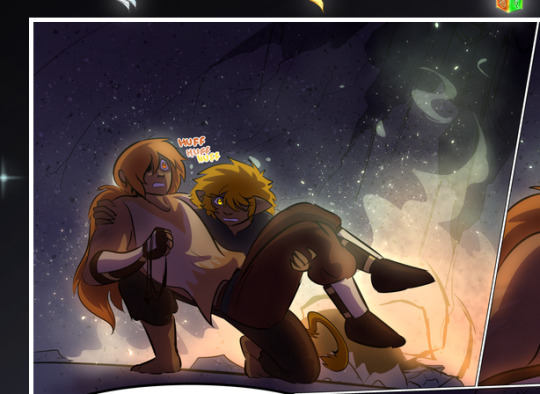
—where we now see that Falst's position is raised above Dainix's due to the way he's carrying him. (Points for continuity!) And, of course, we see the little "huffs" flowing from orange to yellow over their heads (where Dainix's head is higher than Falst's) to merge the sound of their breathing, which is absurdly clever because it emphasizes to the viewer how we hear two sets of huffing overlaying each other, not one. Absolutely brilliant.
(A few other notes of appreciation to that panel: beautiful glows around them, the sparks, the jagged silhouette of the spider legs, the lovely colors that have no right to make the area around a spider corpse that pretty, the excellent texturing on the cave walls plus perspective, the way Falst's movements imply Dainix's hefty weight, the natural posing of the characters, their on-point expressions that convey exactly how fuckin terrifying everything is right now, the slight glows to their eyes, and also they're just handsome boys <3)
Next up: Rain!!!! So well done! It's subtle enough that it never ever disrupts the impact of the focal point, but evident enough you can tell! And more importantly: THE MIST OFF THE CHARACTERS. Rain does this irl, it has that little vapor that comes off you and makes that little misty effect that plays with lighting, it's so cool-looking and here it's used to such pretty effect!
One of the panel captions says something about it blurring out all the injuries on the characters but like THAT AIN'T TOO BIG OF A PROBLEM when it gets across the environmental vibes, and also that'd be how it would look in real life too so like… outside viewer's angle is the same as the characters', mostly? my point is: that's the environment!!! that's the vibes, that's the feel! It gets it across and it does so in the most pretty way possible!
And another thing re: rain, the use of it to establish perspective, particularly in panels like this—

—where we can tell we're looking down at Tynan due to the perspective on the rain and where it's pointing. Excellent. (Also, kudos for looking down and emphasizing how Tynan's losing his advantage—lovely use of visual storytelling.)
Additionally, the misting here:
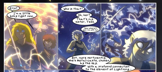
We see it most heavily in the leftmost panel, where it's quite foggy as you would expect in a rainstorm, especially in an environment with a lot of heat, but it's also lightly powdered on in the following two panels and tends to follow light sources, which makes complete sense given how light bounces off particles in the air.
A major point of strength in these too is a thorough understanding of lighting, like rim lighting, the various hues and shades, and an intricate understanding of how light bounces off surfaces even when they're in shadow (we'll see a faint glow in spots where characters are half in shadow, but that's how it would work in real life, because of how light bounces around).
Bringing some of these points together: the fluidity of the lines in magic, and the way simple glowing lines are used to emphasize motion and the magic itself, is deeply clever. I'm basically pulling at random from panels and there's definitely even better examples, but here's one (see this page https://comicaurora.com/aurora/1-16-33/):

First panel, listed in numbers because these build on each other:
The tension of the lines in Tess's magic here. This works on a couple levels: first, the way she's holding her fists, as if she's pulling a rope taut.
The way there's one primary line, emphasizing the rope feeling, accompanied by smaller ones.
The additional lines starbursting around her hands, to indicate the energy crackling in her hands and how she's doing a good bit more than just holding it. (That combined with the fists suggests some tension to the magic, too.) Also the variations in brightness, a feature you'll find in actual lightning. :D Additional kudos for how the lightning sparks and breaks off the metal of the sword.
A handful of miscellaneous notes on the second panel:
The reflection of the flames in Erin's typically dark blue eyes (which bears a remarkable resemblance to Dainix, incidentally—almost a thematic sort of parallel given Erin's using the same magic Dainix specializes in?)
The flowing of fabric in the wind and associated variation in the lineart
The way Erin's tattoos interact with the fire he's pulling to his hand
The way the rain overlays some of the fainter areas of fire (attention! to! detail! hell yeah!)
I could go on. I won't because this is a lot of writing already.
Third panel gets paragraphs, not bullets:
Erin's giant-ass "FWOOM" of fire there, and the way the outline of the word is puffy-edged and gradated to feel almost three-dimensional, plus once again using Screen or a variation on it so that the stars show up in the background. All this against that stunning plume of fire, which ripples and sparks so gorgeously, and the ending "om" of the onomatopoeia is emphasized incredibly brightly against that, adding to the punch of it and making the plume feel even brighter.
Also, once again, rain helping establish perspective, especially in how it's very angular in the left side of the panel and then slowly becomes more like a point to the right to indicate it's falling directly down on the viewer. Add in the bright, beautiful glow effects, fainter but no less important black lines beneath them to emphasize the sky and smoke and the like, and the stunningly beautiful lighting and gradated glows surrounding Erin plus the lightning jagging up at him from below, and you get one hell of an impactful panel right there. (And there is definitely more in there I could break down, this is just a lot already.)
And in general: The colors in this? Incredible. The blues and purples and oranges and golds compliment so well, and it's all so rich.
Like, seriously, just throughout the whole comic, the use of gradients, blending modes, color balance and hues, all the things, all the things, it makes for the most beautiful effects and glows and such a rich environment. There's a very distinct style to this comic in its simplified backgrounds (which I recognize are done partly because it's way easier and also backgrounds are so time-consuming dear gods but lemme say this) and vivid, smoothly drawn characters; the simplicity lets them come to the front and gives room for those beautiful, richly saturated focal points, letting the stylized designs of the magic and characters shine. The use of distinct silhouettes is insanely good. Honestly, complex backgrounds might run the risk of making everything too visually busy in this case. It's just, augh, so GORGEOUS.
Another bit, take a look at this page (https://comicaurora.com/aurora/1-15-28/):
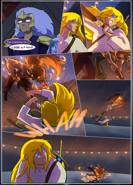
It's not quite as evident here as it is in the next page, but this one does some other fun things so I'm grabbing it. Points:
Once again, using different colors to represent different character actions. The "WHAM" of Kendal hitting the ground is caused by Dainix's force, so it's orange (and kudos for doubling the word over to add a shake effect). But we see blue layered underneath, which could be an environmental choice, but might also be because it's Kendal, whose color is blue.
And speaking off, take a look at the right-most panel on top, where Kendal grabs the spear: his motion is, again, illustrated in bright blue, versus the atmospheric screened-on orange lines that point toward him around the whole panel (I'm sure these have a name, I think they might be more of a manga thing though and the only experience I have in manga is reading a bit of Fullmetal Alchemist). Those lines emphasize the weight of the spear being shoved at him, and their color tells us Dainix is responsible for it.
One of my all-time favorite effects in this comic is the way cracks manifest across Dainix's body to represent when he starts to lose control; it is utterly gorgeous and wonderfully thematic. These are more evident in the page before and after this one, but you get a decent idea here. I love the way they glow softly, the way the fire juuuust flickers through at the start and then becomes more evident over time, and the cracks feel so realistic, like his skin is made of pottery. Additional points for how fire begins to creep into his hair.
A small detail that's generally consistent across the comic, but which I want to make note of here because you can see it pretty well: Kendal's eyes glow about the same as the jewel in his sword, mirroring his connection to said sword and calling back to how the jewel became Vash's eye temporarily and thus was once Kendal's eye. You can always see this connection (though there might be some spots where this also changes in a symbolic manner; I went through it quickly on the first time around, so I'll pay more attention when I inevitably reread this), where Kendal's always got that little shine of blue in his eyes the same as the jewel. It's a beautiful visual parallel that encourages the reader to subconsciously link them together, especially since the lines used to illustrate character movements typically mirror their eye color. It's an extension of Kendal.
Did I mention how ABSOLUTELY BEAUTIFUL the colors in this are?
Also, the mythological/legend-type scenes are illustrated in familiar style often used for that type of story, a simple and heavily symbolic two-dimensional cave-painting-like look. They are absolutely beautiful on many levels, employing simple, lovely gradients, slightly rougher and thicker lineart that is nonetheless smoothly beautiful, and working with clear silhouettes (a major strength of this art style, but also a strength in the comic overall). But in particular, I wanted to call attention to a particular thing (see this page https://comicaurora.com/aurora/1-12-4/):
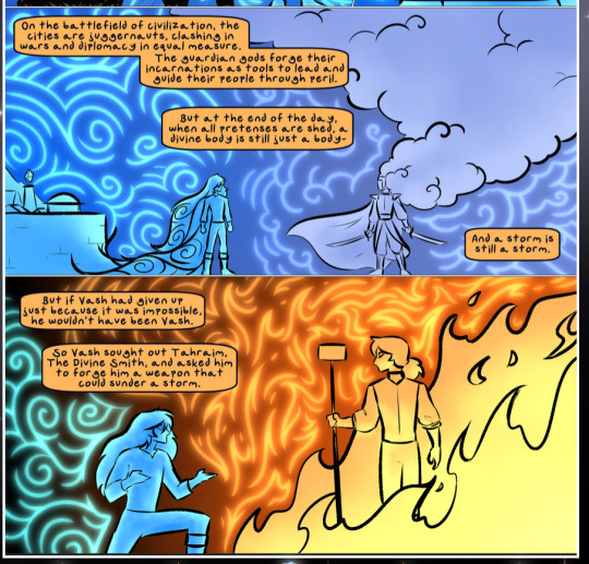
The flowing symbolic lineart surrounding each character. This is actually quite consistent across characters—see also Life's typical lines and how they curl:
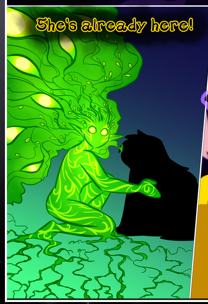
What's particularly interesting here is how these symbols are often similar, but not the same. Vash's lines are always smooth, clean curls, often playing off each other and echoing one another like ripples in a pond. You'd think they'd look too similar to Life's—but they don't. Life's curl like vines, and they remain connected; where one curve might echo another but exist entirely detached from each other in Vash's, Life's lines still remain wound together, because vines are continuous and don't float around. :P
Tahraim's are less continuous, often breaking up with significantly smaller bits and pieces floating around like—of course—sparks, and come to sharper points. These are also constants: we see the vines repeated over and over in Alinua's dreams of Life, and the echoing ripples of Vash are consistent wherever we encounter him. Kendal's dream of the ghost citizens of the city of Vash in the last few chapters is filled with these rippling, echoing patterns, to beautiful effect (https://comicaurora.com/aurora/1-20-14/):
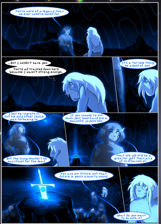
They ripple and spiral, often in long, sinuous curves, with smooth elegance. It reminds me a great deal of images of space and sine waves and the like. This establishes a definite feel to these different characters and their magic. And the thing is, that's not something that had to be done—the colors are good at emphasizing who's who. But it was done, and it adds a whole other dimension to the story. Whenever you're in a deity's domain, you know whose it is no matter the color.
Regarding that shape language, I wanted to make another note, too—Vash is sometimes described as chaotic and doing what he likes, which is interesting to me, because smooth, elegant curves and the color blue aren't generally associated with chaos. So while Vash might behave like that on the surface, I'm guessing he's got a lot more going on underneath; he's probably much more intentional in his actions than you'd think at a glance, and he is certainly quite caring with his city. The other thing is that this suits Kendal perfectly. He's a paragon character; he is kind, virtuous, and self-sacrificing, and often we see him aiming to calm others and keep them safe. Blue is such a good color for him. There is… probably more to this, but I'm not deep enough in yet to say.
And here's the thing: I'm only scratching the surface. There is so much more here I'm not covering (color palettes! outfits! character design! environment! the deities! so much more!) and a lot more I can't cover, because I don't have the experience; this is me as a hobbyist artist who happened to take a couple design classes because I wanted to. The art style to this comic is so clever and creative and beautiful, though, I just had to go off about it. <3
...brownie points for getting all the way down here? Have a cookie.
#aurora comic#aurora webcomic#comicaurora#art analysis#...I hope those are the right tags???#new fandom new tagging practices to learn ig#much thanks for something to read while I try to rest my wrists. carpal tunnel BAD. (ignore that I wrote this I've got braces ok it's fine)#anyway! I HAVE. MANY MORE THOUGHTS. ON THE STORY ITSELF. THIS LOVELY STORY#also a collection of reactions to a chunk of the comic before I hit the point where I was too busy reading to write anything down#idk how to format those tho#...yeet them into one post...???#eh I usually don't go off this much these days but this seems like a smaller tight-knit fandom so... might as well help build it?#and I have a little more time thanks to break so#oh yes also shoutout to my insanely awesome professor for teaching me all the technical stuff from this he is LOVELY#made an incredibly complex program into something comprehensible <3#synapse talks
786 notes
·
View notes
Text
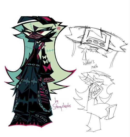
winter assassin outfit
#zeno's art#ocs#reassassination#octavia krankenstein#oh i got a LOT to say about this one#in the comic octavia starts wearing this outfit after a certain event i think n its very symbolic#it represents mainly how her personality has changed as well as her relationship with kranken and humanity as a whole#lets do it top to bottom. FIRSTLY the mask that replaces her goggles that she wore in the “summer” outfit#the mask represents several things. firstly that octavia's relationship with kranken improved#i think the mask itself is probably kranken's and octavia uses it. showing that they've become closer#and ALSO even using a mask to hide her identity while working is in line with kranken's ideas of clothing being practical rather than flashy#(see her first outfit was originally really frumpy and practical before she DIY'd it into the minidress type thing)#anyway. the hoodie is supposed to harken more to an executioner showing octavia is more used to her job#the hoodie has eyelets which are circles. the fact that there are way more circles in the design shows that she becomes less cold#and more assimilated into human society#the gloves however are a sign of her persistent rebellion as they're fingerless and impractical lol#the pants are based off of tripp nyc's design. which was popular with mallgoths in the 90s/00s#it shows octavia's own personality and interests and of course has two hidden sets of 6's through the eyelets#lastly her shoes resemble skulls. that one's just for fun#while her first outfit completely represented rebellion i like to think this one bridges the gap between rebellion and octavia settling down#and becoming more familiar with those around her#this is only the first pass so i'll prob incorporate more red into the outfit before it's finalised#octavia isn't the only one who changes either! i want like ~3 changes for almost everyone
278 notes
·
View notes
Text
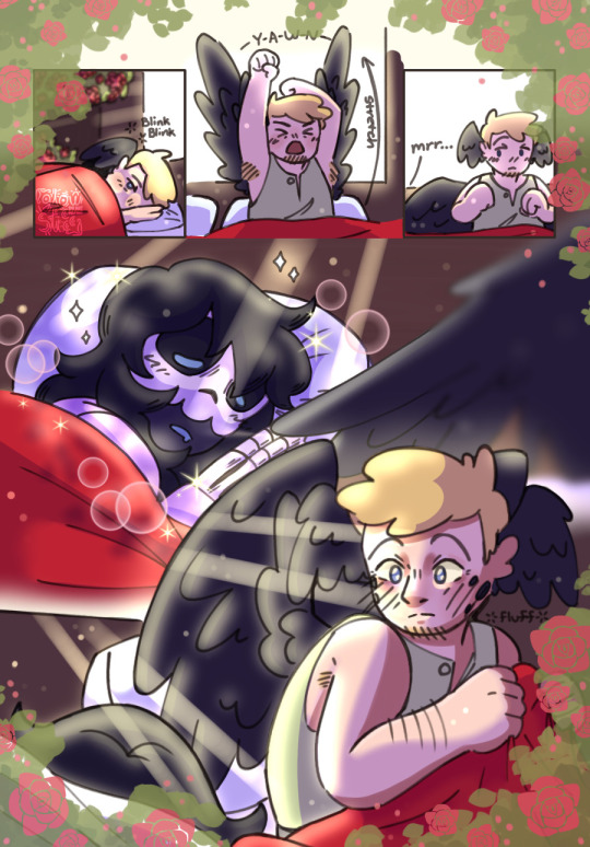
ik he didn’t immediately notice missas bed when he first woke up but a fella can dream
#qsmp#art#digital art#pissa#qsmp pissa#qsmp philza#qsmp missa#qsmp death duo#deathduo#philza minecraft#missasinfonia#i meant to draw this last week but yall know the drill#stuff happened#whatever we ball#anyways i like to imagine phil gets studio ghibli excited#like big emotion he just gets fluffier :3#also love how the only way i’ve been getting mini-comic practice in is through drawing block men#love that for me
468 notes
·
View notes
Text

Because it could never get out.
I think about Candy Cadets story a normal amount....
Cassie and Gregory having a sleepover when Cassie catches Gregory having a tier five Boy Moment™ with zero context
#my art#Chipillustrates#this is also practice for a short comic series I wanted to do with these guys#not pictured: Vanessa and Gregorys panic when they saw Cassie as they try to hide Freddy under a pillow because Cassie Does Not Know that-#-they just live with the decapitated head of the mascot of one of the most popular franchises in the world#fnaf#five nights at freddys#fnaf Gregory#fnaf Vanessa#fnaf Cassie#fnaf Candy Cadet#Fnaf Candy Cadet story#?#fnaf Security Breach#fnaf Security Breach Ruin#fnaf SB Ruin#Fnaf Ruin#Fnaf SB#hope I drew Cassies bonnet right- first time drawing one so I'll try n improve it next time!!#Cassie does NOT know what's going on with this family but she's doing her best to be supportive anyway<3#fnaf comic#fnaf fanart#3 star family#does this count as 3 star family?
466 notes
·
View notes
Text
Hey guys, do we fuck with the side profile slash facial features sketch practice?
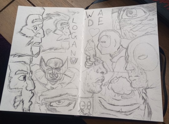
#obviously not the greatest cus its practice#but now i have the power to draw them kissing#next up is body pose practice so i can draw way more#anyways see bottom left for practicing logans kiss face with no one there to kiss so it looks real stupid < 3#deadpool 3#deadpool and wolverine#deadpool#wolverine#poolverine#logan#logan howlett#wade#wade wilson#deadclaws#wolverine x deadpool#deadpool x wolverine#logan howlett x wade wilson#wade wilson x logan howlett#i got all these references from comic pannels ofc#i gave up on the outlining#okay now back to fic writing#and text posts later ofc
59 notes
·
View notes
Text


heard there was a serirei drought
#serirei#reigen arakata#serizawa katsuya#mob psycho 100#my art#SOOOOOOOOOOO ITS BEEN EXACTLY A YEAR SINCE I STARTED THIS.#AND THE FINAL LINEART IS DONE!!!!!!!!!!!!!!#i started coloring but my wires broke#DISTRAUGHT#anyways i suck at coloring so if someone wants to color it nice dm me teehee <3#I WILL!!! BREAK DOWN THE DETAILS OF THIS COMIC SOMETIME THIS WEEK NO PROMISES#reigen arataka forces me to practice hands#and serizawa is hispanic he told me himself#SERIZAWA IS ME!!!!
113 notes
·
View notes
Text
i used to freehand comics all the time as a child and since the part i liked was the drawing part i would just draw panel after panel because i didn't want to stop drawing to think about icky icky words, plus the story TOTALLY still made perfect sense! to me! and noone else, but 'whoooo caaaaares omgggg its not like comics and sequantial art are a communicative meeediummmm lmaoooooo'. i spent my entire childhood telling myself stuff like "oh pfft I know this story by heart- ill SIMPLY remember the dialogue and write it later" ...and. I can't help but admire baby maiora's (call that a minora ba tm tsk) fucking audacity? hubris? confident wrongness? kid couldn't even remember to finish the comics in the first place? INCREDIBLE levels of unearned self assurance, wish that were me, genuinely- what an icon!!! anyway i think i have forever cursed myself
#maiora garrulates#the maiora overthinks the process of writing dialogue saga continues!!!!!!!#im so tired. i have been overthinking this shit in circles i have not been making any progress in any which way lmao!#im bitching and moaning for funsies this is not that serious in the Grand Scheme Of Things i just wanna improve at my fav thing#and ❤️ Unfortunately ❤️ my favorite thing in the world involves learning MY MOST HATED *NEMESIS*!!!!!!!!!!!!!!!!!! verbal communication. ew#words are fun! i LOVE words! toys!!!!! im using words right now and i didn't combust!!!!! wow look at that!!!!!!!!!!!!!#putting words in SEQUENCE? multiple times?? filtering THOUGHTS into SENTENCES???? sentences that a character would or wouldn't SAY???#AND THEN THERE'S ANOTHER CHARACTER SOMETIMES???? AND THAT BITCH ALSO HAS THOUGHTS AND FEELINGS????? AND THEY ALL HAVE PERSONAL IDIOLECTS#AND TONES THAT S U P P O S E D L Y ARE IMPLICATED BY MANNERISMS AND VERBAL HABITS AND CIRCUMSTANCES (AND THERE'S WRONG ANSWERS! ALSO!!)#AND THEY'RE IN A CONTEXT!! AND THEY'RE INTERACTING WITH EACH OTHER AND INFLUENCING EACH OTHER!!!!!!!!!!!!!!!!!!!!!!!#THE CONVERSATION COULD VARY GIVEN ENERGY LEVELS WHETER OR NOT SOMEONE'S FOOT IS FALLING ASLEEP THE F U C K I N G WEATHER#“oh dialogue is easy just say it out loud to yourself until it 'sounds normal' ^^”#screaming crying throwing up NONE OF THIS IS INTUITIVE TO MEEEEEEEEEEEeeeeeeeeeeeeeeeeee....!#ok dramatics over its out of my system! for now!!!#this is all easily explained bc i just. draw a lot more than i talk to people. so like. OBVIOUSLY i have more practice drawing#so drawing comes natural! talking does not! subsequently dialogue is Hard! No FUCKING Shit Sherlock!!!!! (affectionate)#so yeah. im using y'all (the tumblr void) as practice! hi!!! words at you!!!!!!!!!!#so yeah thanks for baring with me while passing by my corner of the internet#i do love self indulgence this is fun check out my navel gazing actually no do not look at my belly button#anyway i just think this is mildly interesting. some of my writer buds have the same “not good enough” allergy towards visuals#but they use it to be mean2me >:( same bitch that “omg i cant i suck at drawing i can't do this-” does the “uhm. just write? lol.” 2 meeee#we could have peace and love on planet earth and a common experience and yet you KICK miette for being bad at words!!!1!!! </3 heartbreak!!#what the fuck was i talking about even#oh yeah. perfectionism within creatives i guess. LMAO JK i am talking about NOTHIN!!!!G i am just putting Words Out Here ehehehehehe#its practice >;)c#all this bc ive been doodling comics for myself again and im V!! PROUD OF THE ART!!!! wanna share- but DIALOGUE!*⚡sfx!!*....... so! options#a) leaving it blank. no there are NO microphones in the budget. b) leaving blank *balloons* so that the Rythm is there. implied convo!!!#c) ...doing it badly. (tragic)(heartwrenching)(teeny tiny bruise 2 the ego) *dramatic single tear cleches fists * its the only way.........#...we shall see! literally none of this is all that serious i am procrastinating!! <3 playing with my tuoys!!!!!!!! silly time!!!#/all lh! am reaching 30 tags so that is all for THIS episode of the maiora bitches about dialogue saga thank you for joining me!!okilyBuhBY
21 notes
·
View notes
Text

hello sunset girl!
#art#my art#artists on tumblr#digital art#oc#pink space#WUAGH [holding her in my hands like a tiny duck]#/i gotta keep practicing side profiles with her. i say that like it's not the 6th most common thing i do kfsbvhg#/anywho designed that dress for her a couple months ago i think and i forgot abt it until today Loll#i was thinking a reversed suit with the button half on the bottom but i ended up getting looser w/ it anyway#and no heels for her! she just doesn't like them hfsh#/oh yea also wanted to try some other hair styles on her cuz i made her hair all crazy and then just skirted around it Lmao#i like her Shapes and i do not like changing them. but there may be exceptions so i would like to have some ideas for those later hfh :)#//yea had a lot of fun with these anyway !!!#got very in my brain abt her... i have a traditional comic and a poem so yea it's uhh. lotta brain juice hgkfsjfj#might digitize those later !! who knows !! :33#i've gotta peep pop poof to get this on my other spots tho so imma go do that :3#so toooodles o/ ~+~+~+~
12 notes
·
View notes
Text

january 15 is the best day for me as a vocaloid leon fan because i'm guaranteed to see at least 2 leon fanarts posted that day
#also hi long time no tumblr other than posting and leaving#leon fanarts spotted today: that's right. 2. not including mine#before today i used to say more than two but for some reason there were not a lot of fanarts posted this year#vocaloid fandom is so funny bc we have a handful of vocaloids who would get 1000 fanarts minimum on their anniversary/bday#and then there's the other 70% who get 3 to none#if you drew leon and lola today and i haven't shared it yet please tag me 🥺#anyways off to a different topic#i will be creating less of finished vocaloid illustrations and do more of comics/doodles since fandom seems to enjoy it more#(and i don't mind since it takes WAY less time for me to create)#for illustration i want to practice and create more originals so that it could help with my understanding of certain techniques#starting with shadows maybe#i'll probably be posting my originals to my bsky which i won't be sharing for now (but if you find it good for you)#gonna go sleep gn#waffula talks
9 notes
·
View notes
Text
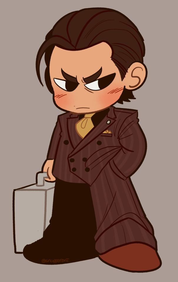
pocket-square sized
#rgg#ryu ga gotoku#ryu ga gotoku 3#yakuza series#yakuza#yoshitaka mine#snap sketches#HIIIIIIIII my wrist still hurts#i WAS just gon watch nakai movies while i rested but i fear ive watched all the available ones with eng subs.. //screams//#my bro picked me up onea them neat wrist support gloves tho so the pain is significantly gone and i can move my fingers better now#ill still let it rest for another couple days but recovery times lookin optimistic :]#as for this doodle.... i tolds you i MUST draw despite the injury... its my duty...#also i finished a comm today and since i had some practice drawing one handed working on that i figured id try drawin somethin small#and since it been a while since drawn mine... teehee..#def wont be doin any comics any time soon or even more detailed stuff but this is cute nuff for now#lol this is the timeline if i worked on my rgg stickers long enough to get to y3#since ive drawn mine tho ive been reminded.. i wont be able to go to animenyc this november :( too expensive for me this year#mabes ill go to animenext in like june or wait until next year to go to animenyc but </3 public dont get to see me mine cosplay </3#mabes when my wrist gets better ill wear it for fun but anyway typing like this still sucks so byee !!!!!!!
137 notes
·
View notes