#and then im doing some gradient color background ones
Explore tagged Tumblr posts
Text
My Favorite Cheap Art Trick: Gradient Maps and Blending Modes
i get questions on occasion regarding my coloring process, so i thought i would do a bit of a write up on my "secret technique." i don't think it really is that much of a secret, but i hope it can be helpful to someone. to that end:

this is one of my favorite tags ive ever gotten on my art. i think of it often. the pieces in question are all monochrome - sort of.
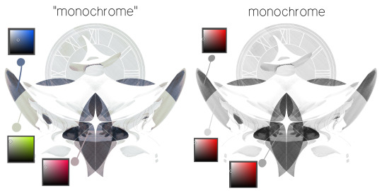
the left version is the final version, the right version is technically the original. in the final version, to me, the blues are pretty stark, while the greens and magentas are less so. there is some color theory thing going on here that i dont have a good cerebral understanding of and i wont pretend otherwise. i think i watched a youtube video on it once but it went in one ear and out the other. i just pick whatever colors look nicest based on whatever vibe im going for.

this one is more subtle, i think. can you tell the difference? there's nothing wrong with 100% greyscale art, but i like the depth that adding just a hint of color can bring.
i'll note that the examples i'll be using in this post all began as purely greyscale, but this is a process i use for just about every piece of art i make, including the full color ones. i'll use the recent mithrun art i made to demonstrate. additionally, i use clip studio paint, but the general concept should be transferable to other art programs.

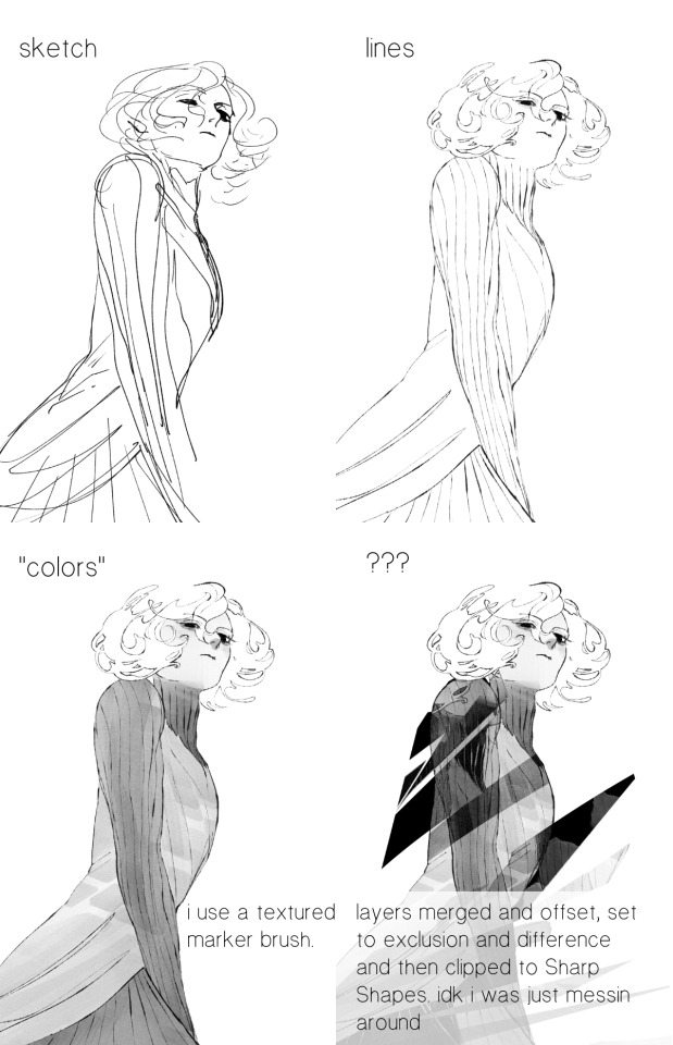
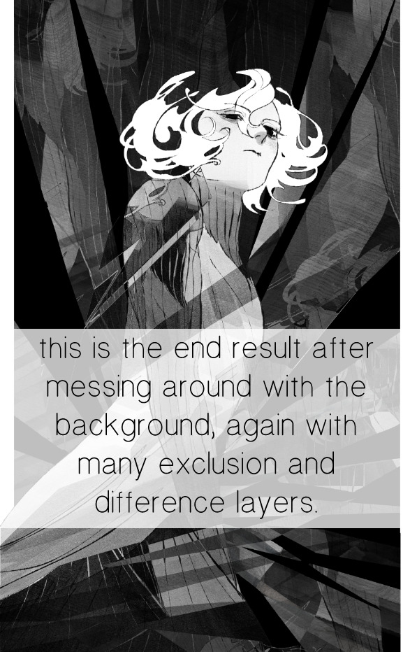
for fun let's just start with Making The Picture. i've been thinking of making this writeup for a while and had it in mind while drawing this piece. beyond that, i didn't really have much of a plan for this outside of "mithrun looks down and hair goes woosh." i also really like all of the vertical lines in the canary uniform so i wanted to include those too but like. gone a little hog wild. that is the extent of my "concept." i do not remember why i had the thought of integrating a shattered mirror type of theme. i think i wanted to distract a bit from the awkward pose and cover it up some LOL but anyway. this lack of planning or thought will come into play later.
note 1: the textured marker brush i specifically use is the "bordered light marker" from daub. it is one of my favorite brushes in the history of forever and the daub mega brush pack is one of the best purchases ive ever made. highly recommend!!!
note 2: "what do you mean by exclusion and difference?" they are layer blending modes and not important to the overall lesson of this post but for transparency i wanted to say how i got these "effects." anyway!
with the background figured out, this is the point at which i generally merge all of my layers, duplicate said merged layer, and Then i begin experimenting with gradient maps. what are gradient maps?
the basic gist is that gradient maps replace the colors of an image based on their value.

so, with this particular gradient map, black will be replaced with that orangey red tone, white will be replaced with the seafoamy green tone, etc. this particular gradient map i'm using as an example is very bright and saturated, but the colors can be literally anything.
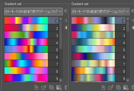
these two sets are the ones i use most. they can be downloaded for free here and here if you have csp. there are many gradient map sets out there. and you can make your own!
you can apply a gradient map directly onto a specific layer in csp by going to edit>tonal correction>gradient map. to apply one indirectly, you can use a correction layer through layer>new correction layer>gradient map. honestly, correction layers are probably the better way to go, because you can adjust your gradient map whenever you want after creating the layer, whereas if you directly apply a gradient map to a layer thats like. it. it's done. if you want to make changes to the applied gradient map, you have to undo it and then reapply it. i don't use correction layers because i am old and stuck in my ways, but it's good to know what your options are.

this is what a correction layer looks like. it sits on top and applies the gradient map to the layers underneath it, so you can also change the layers beneath however and whenever you want. you can adjust the gradient map by double clicking the layer. there are also correction layers for tone curves, brightness/contrast, etc. many such useful things in this program.
let's see how mithrun looks when we apply that first gradient map we looked at.

gadzooks. apologies for eyestrain. we have turned mithrun into a neon hellscape, which might work for some pieces, but not this one. we can fix that by changing the layer blending mode, aka this laundry list of words:

some of them are self explanatory, like darken and lighten, while some of them i genuinely don't understand how they are meant to work and couldn't explain them to you, even if i do use them. i'm sure someone out there has written out an explanation for each and every one of them, but i've learned primarily by clicking on them to see what they do.
for the topic of this post, the blending mode of interest is soft light. so let's take hotline miamithrun and change the layer blending mode to soft light.

here it is at 100% opacity. this is the point at which i'd like to explain why i like using textured brushes so much - it makes it very easy to get subtle color variation when i use this Secret Technique. look at the striation in the upper right background! so tasty. however, to me, these colors are still a bit "much." so let's lower the opacity.
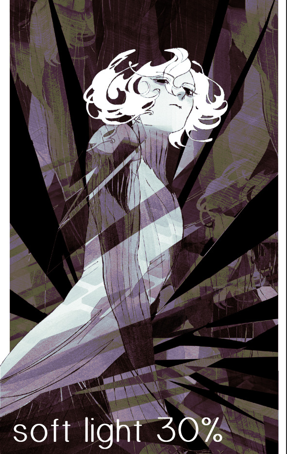
i think thats a lot nicer to look at, personally, but i dont really like these colors together. how about we try some other ones?
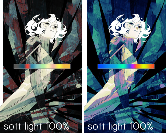
i like both of these a lot more. the palettes give the piece different vibes, at which point i have to ask myself: What Are The Vibes, Actually? well, to be honest i didn't really have a great answer because again, i didn't plan this out very much at all. however. i knew in my heart that there was too much color contrast going on and it was detracting from the two other contrasts in here: the light and dark values and the sharp and soft shapes. i wanted mithrun's head to be the main focal point. for a different illustration, colors like this might work great, but this is not that hypothetical illustration, so let's bring the opacity down again.
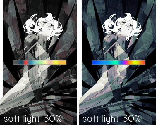
yippee!! that's getting closer to what my heart wants. for fun, let's see what this looks like if we change the blending mode to color.
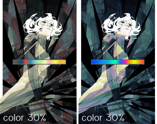
i do like how these look but in the end they do not align with my heart. oh well. fun to experiment with though! good to keep in mind for a different piece, maybe! i often change blending modes just to see what happens, and sometimes it works, sometimes it doesn't. i very much cannot stress enough that much of my artistic process is clicking buttons i only sort of understand. for fun.
i ended up choosing the gradient map on the right because i liked that it was close to the actual canary uniform colors (sorta). it's at an even lower opacity though because there was Still too much color for my dear heart.
the actual process for this looks like me setting my merged layer to soft light at around 20% opacity and then clicking every single gradient map in my collection and seeing which one Works. sometimes i will do this multiple times and have multiple soft light and/or color layers combined.
typically at this point i merge everything again and do minor contrast adjustments using tone curves, which is another tool i find very fun to play around with. then for this piece in particular i did some finishing touches and decided that the white border was distracting so i cropped it. and then it's done!!! yay!!!!!
this process is a very simple and "fast" way to add more depth and visual interest to a piece without being overbearing. well, it's fast if you aren't indecisive like me, or if you are better at planning.

let's do another comparison. personally i feel that the hint of color on the left version makes mithrun look just a bit more unwell (this is a positive thing) and it makes the contrast on his arm a lot more pleasing to look at. someone who understands color theory better than i do might have more to say on the specifics, but that's honestly all i got.
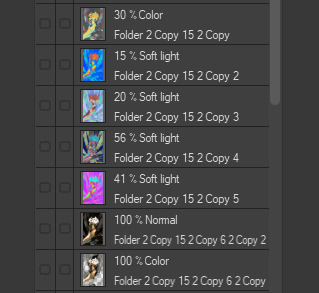
just dont look at my layers too hard. ok?
2K notes
·
View notes
Note
i love ur expressions so much!!!!! Is it alr if I ask for u to share ur drawing process, if u don’t mind!! If you’d rather not that’s fine too :333
I can try!
now this does assume I have a consistent drawing process which I don’t, but ill share what I do most often?
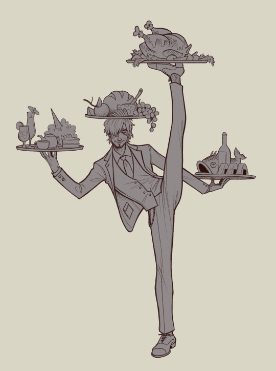
So first of course I have an idea
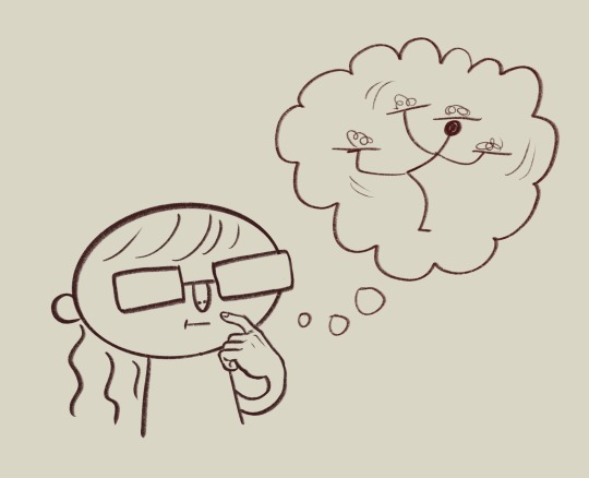
Then I do some sketchies to figure out what exactly I want the pose to be. I dont always do this except when the pose is tricky and/or im just not being lazy that day
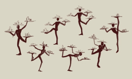
Then I go through my sketching and refining process:
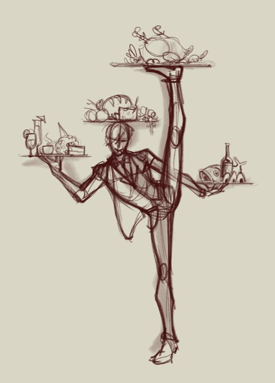
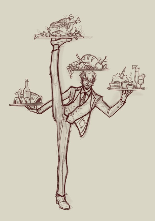
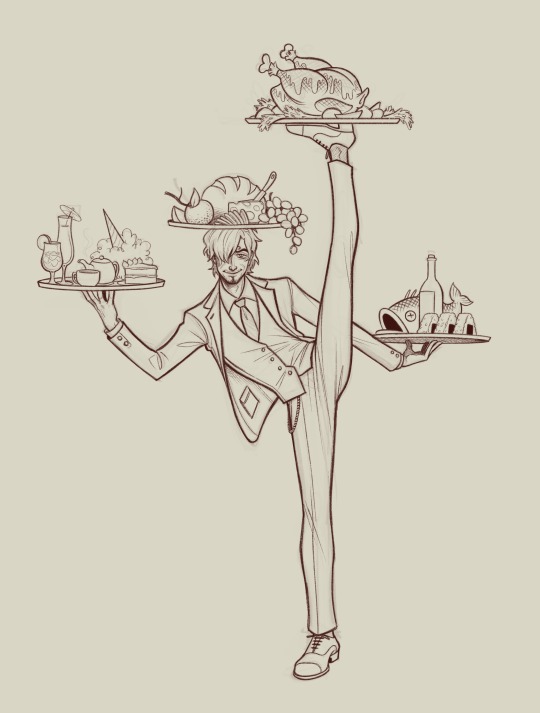
I usually do two or three passes and I try and flip it at least once throughout, to help make sure everything’s balancing. For the final lines I’ll usually make them a medium red that I then set to multiply, but if I plan on coloring the lines later i dont do that and just make them black. This is also the stage when I’m scrabbling about for reference images, here are some of the ones I used here:
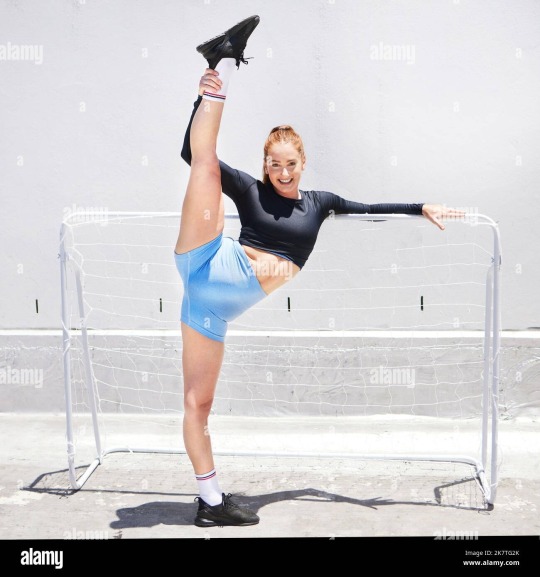
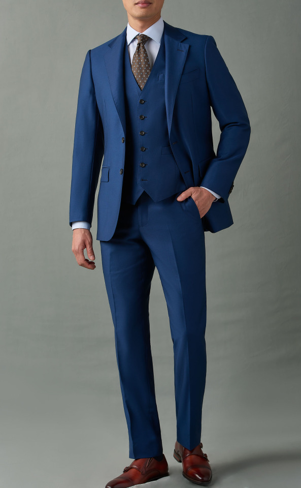
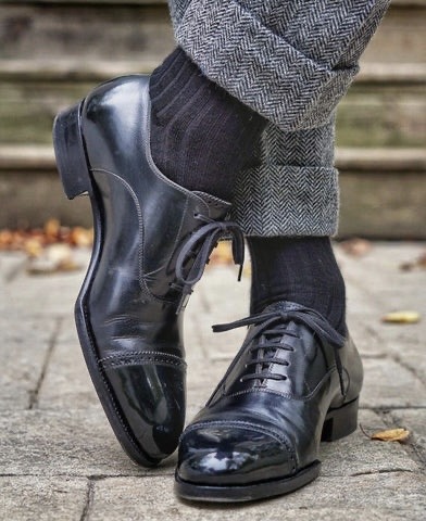

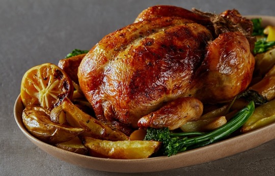
I usually hunt down references after I do my initial rough sketch, so I already know what im looking for angle and shape-wise in the references. Now for coloring ill fill in the whole area I’m gonna color with a gray then start putting down flats on clipping mask layers (so they dont go outside the lines)
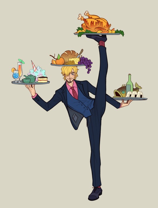
then for quick and dirty shading and highlights I’ll duplicate the flats, flatten them into one layer, then make them darker and bluer and generally futz with it untill ive got a good shadowed color profile down. I’ll repeat the process but making it all lighter for the highlights. Then ill take both those layers, make them masks, and start painting on the shadows and highlights over the original flats.
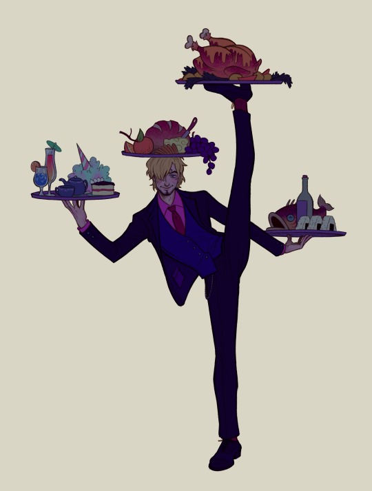
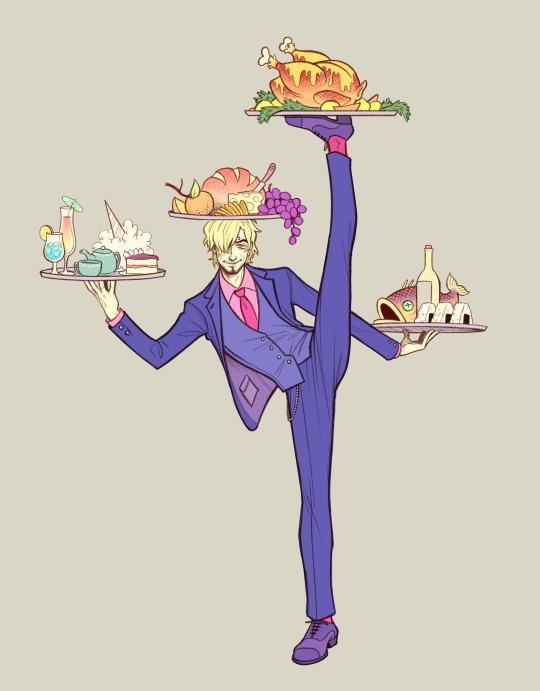
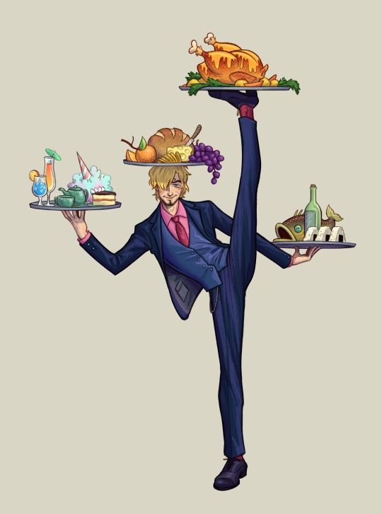
then the very final step is the Fussing Stage where I make a new layer or two over everything and start fixing mistakes, adding new colors, adding rim lights, messing with levels, color correcting, adding details like flowers, etc. etc.
this can take a very long time or no time at all, depending on how much effort I wanna put in.
Then I slap a background on it which is usually a solid color or a gradient because im a hack and have no idea what i’m doing and ta-daaaaaa, something kinda okay!
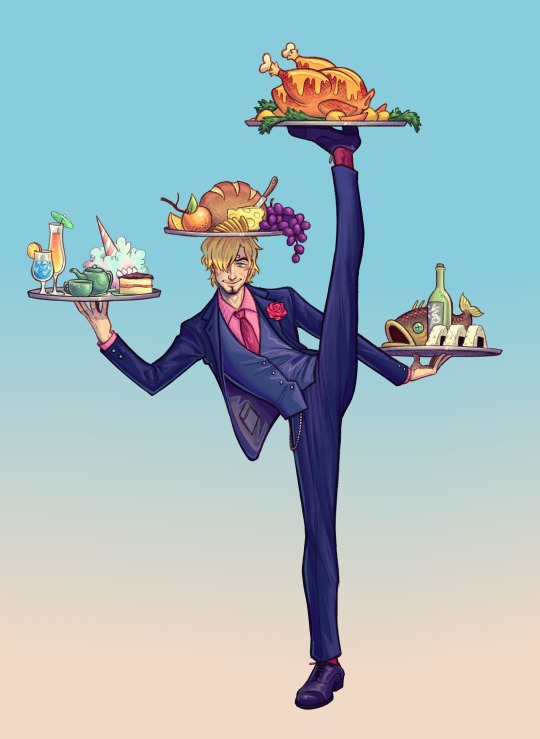
And that is one of the many ways I “fake it ‘till you make it” my way through art!
624 notes
·
View notes
Note
Hi uh,, kumzorg. I watched your 'you're too much' video on youtube, and I think it is really cool. I am really interested on how you did the filters for the backgrounds, as in; what program you used and what filters you applied.
Thanks for your time reading this, bye :D!
ok, first thing i have to admit is im really bad with colors so i rely on effects very often, be it level correction or posterisation or whatever, but i hope my explanation will still be of value to you ^^;
long post ahead
for that video every bg except the first one was taken from google maps, so their quality was always high and crisp, which i DONT like

for example first one I took from Shinsei Kamattechan MV "Michinaru hou e": (神聖かまってちゃん - 美ちなる方へ (youtube.com), and the compressed quality looked very nice when applied with tons of effects on it (My apologies to Noko for erasing them (m > <)m
So I'll go with example of another picture I already used, and scale it down

First I correct the levels and contrast so that details that I need pop out more

Then I use krita feature called "Gradient Map", which has a really nice feature that lets you do dithering with transparency

I copy the original picture and now for the second one I simply posterise it

I join the two new ones together, I usually use whatever effect I feel like but I personally really like the one called "Combine Normal Map"

now i copy the original picture AGAIN, and blur it with different constrast levels this time

I use Gradient Map on it again, this time with different dithering settings and color

I combine it with the previous one whily applying effects like Overlay or Burn

Now i'm mostly done, i scale up this new image slightly so that pixels are blurred, for a more washed out effect (plus some additional effects if your heart feels like it)

I posterise it once more so that colors bleed together nicely and now im done!

Just put whatever 2d freak you want over it and what the hell is this now (ಠ_ಠ)
(My first inspiration was from Shizuku VN, it had really cool backgrounds which had dark uneasy atmosphere, so i can kinda understand the comments that said they got a mysterious and liminal feeling from the video lol)
134 notes
·
View notes
Note
Heyyy. . :3
Idk if you are fine with questions but I'd like to ask where you get these gifs from.. And how u color them..

Your post with these banners
haiii!!!!!!!! these r the overlays below :3 i get most of these from pinterest,, i recommend searching up keywords like "gif overlays for editing" but im pretty sure u can find these also on tenor
and the coloring tutorial is under the cut !!!!!!!! (it is again, long)
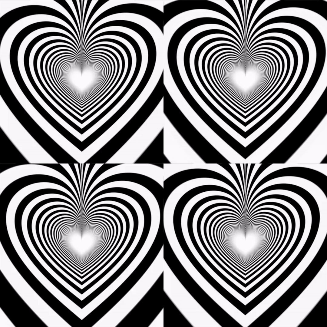
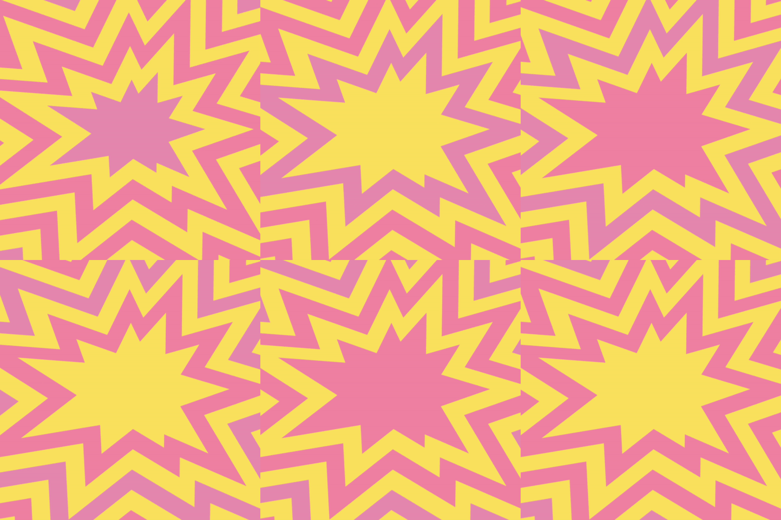
how do i color my overlays?
... is what ill be teaching u today! follow my steps
step zero : make the color first !!!
this will be used to color the overlays, your free to make it look like anything, throw in some gradients or some dots!!!


first, ill show you how to color the heart tunnel! ill be doing this on capcut, but this can probably work on most programs! follow my steps!
step one : add the images
make sure to first add the background and then add the overlay!!!


step two : color it
to do this first click on the overlay, scroll till you find "blend" and then click "dodge"

then save! this will be the end result, tada!

wasnt that hard, was it? now lets do the other overlay! ill be doing this again on capcut but this can work on most programs!
lets keep going!
step one : add the images
this time, add the overlay first and then the color! scroll til you find "overlay" -> "add overlay"
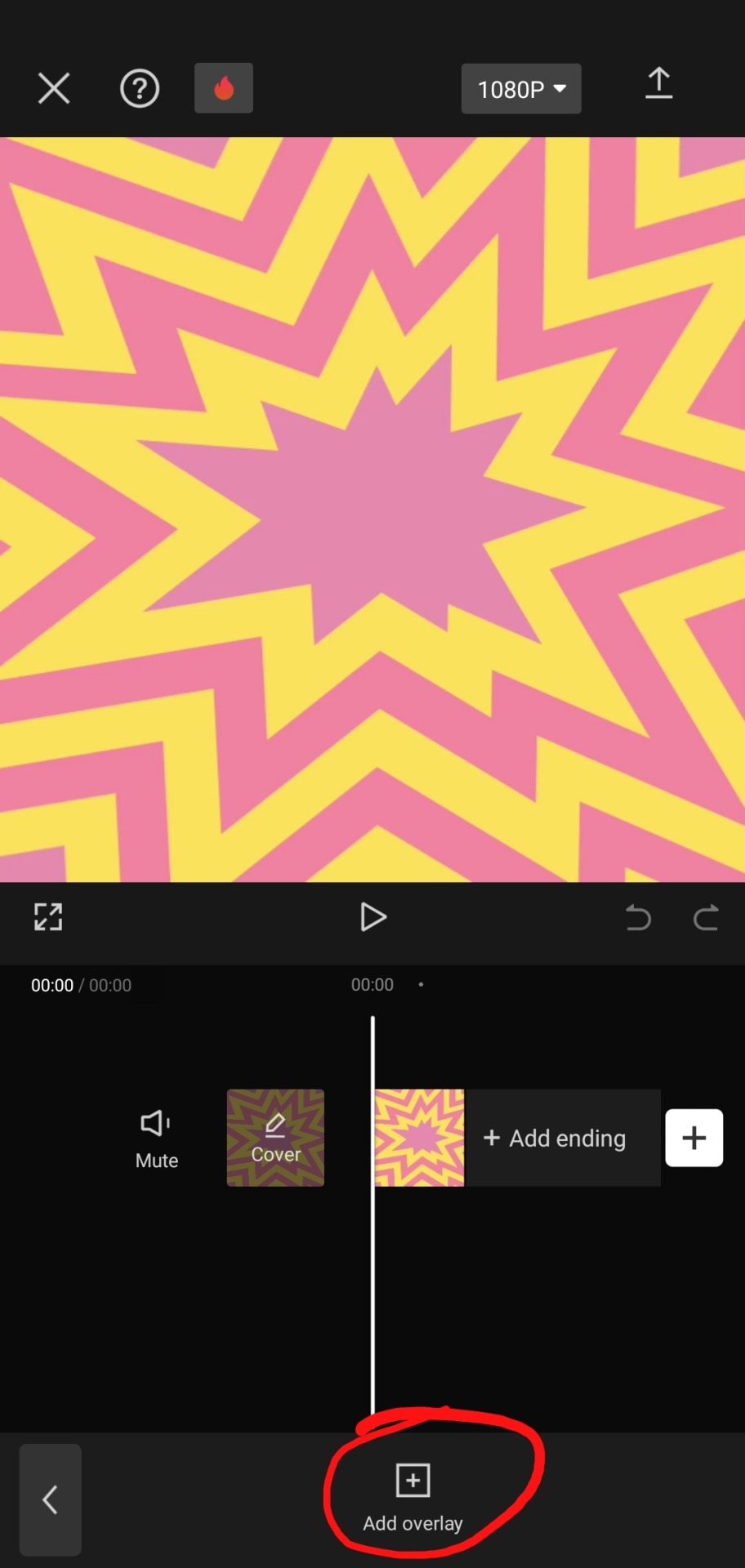
step two : color it
scroll til you find "blend" -> "filter"


and now save! and you are finished!
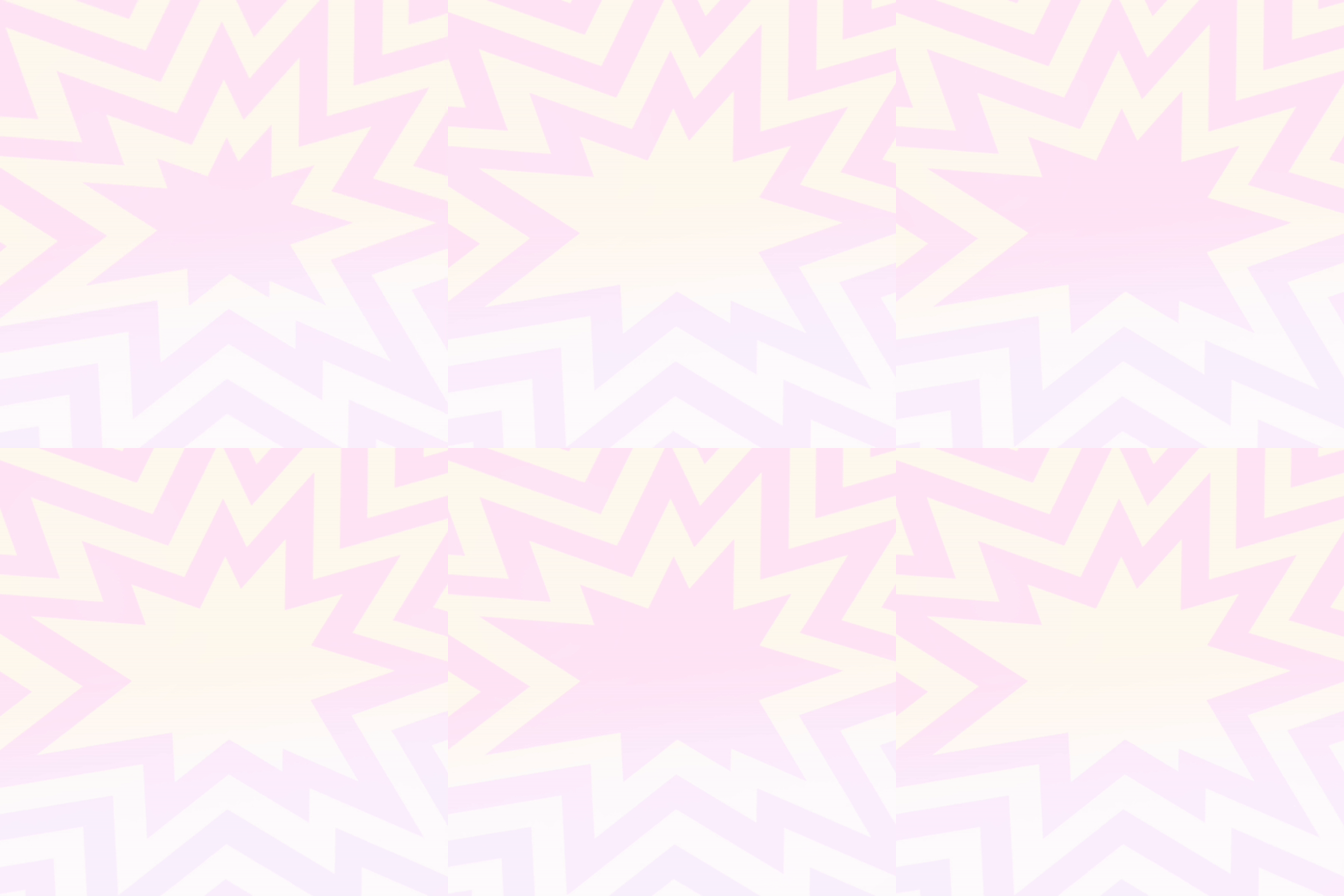
tada! now this is the end result!
additional steps: if u need to make it a gif, convert it on ezgif
hope this tutorial is easy to understand and helpful!
173 notes
·
View notes
Note
Im so so so so sorry for the dm but I gotta do, how did you do the lighting for these two??
https://twitter.com/Licollis_a/status/1657703869068234754 https://twitter.com/Licollis_a/status/1657631596198125569
(dm wouldnt send on twitter so I'll send it here!)
Be not afraid, for I will reveal my secrets in rendering step by step.
1. After I'm finished with lineart, I added the base color. It's faint, but putting in gradient will make it pop.
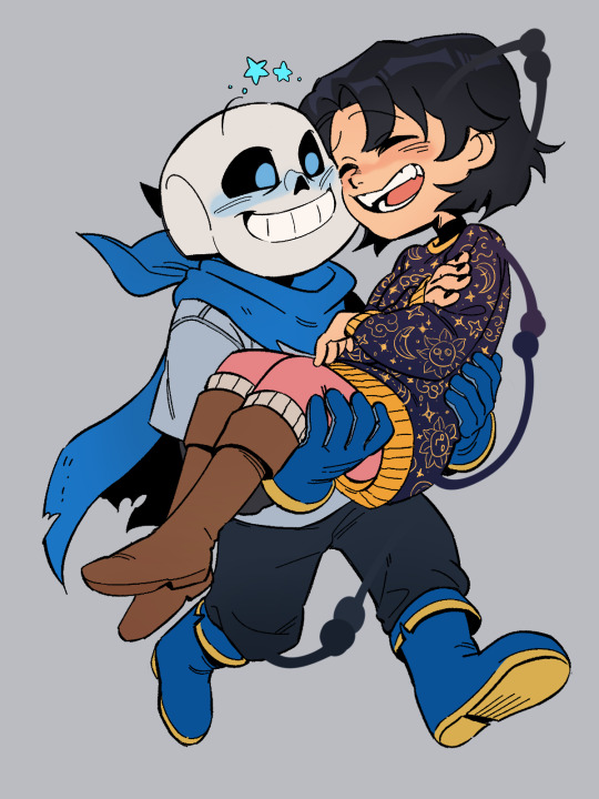
2. In order for the whole thing to look harmonious with each other, on top of the base color I added a multiply and overlay layer. The color I use for multiply is usually desaturated, kinda pastel-y. The overlay one is more saturated (see alternative colors below).

3. The result should be kind of dark. Which is what I'm after, because what you're seeing is already shadowed. So instead of adding the shadow to the base color, I'm adding the light.
On top of the multiply layer, I added an overlay layer. I keep in mind where the light source is coming from (see the blue arrows). The color of the overlay can be whatever -- it depends on the vibe you're trying to make (e.g if they're in waterfall, I'd use light cyan).
Also, see that normal layer clipped onto my overlay? It's how I added my "fringe" (aka subsurface scattering). I often use pink. Just line it on the edges of the light.

4. Now I added a multiply layer again, just to give the piece more depth and details (like the skin)

5. Now I'm adding what's called reflective light (google to see examples irl). Basically, I covered the darkest parts of the drawing with something lighter. For this one I just added pastel purple in the normal layer, but there are other layer types to lighten it up!
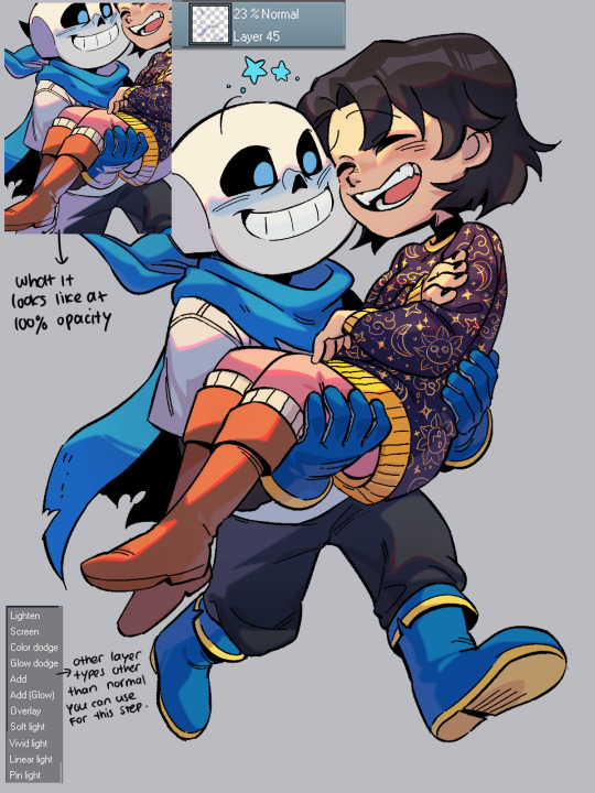
6. Now, I colored the lineart through clipping. I usually just matched the surrounding colors by adding a darker one (e.g dark red for skin).
Optional: I like to make 2 copies of the lineart, make one red and another cyan, and respectively slide it to left and to right. Sometimes it doesn't even look good tho....

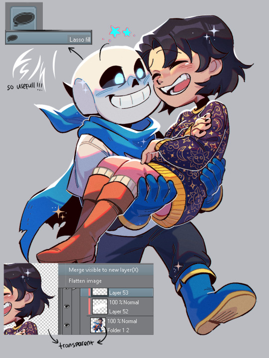
7. Highlights time! To do this I disable the background so it's transparent, click right and choose 'merge visible to new layer'. Which flattens the visible image onto a new layer. Now I can add in these white lights by clipping on top of it!
(It's a lil tricky to do this right with a brush, so I used the lasso fill tool.)
To top it off, I add some sparkes. My simp art is done <33
Edit: I forgot!! By the end of it all you can add a texture by setting said texture into overlay with low opacity (on top of the finished art). In CSP you can add a perlin noise, one of these:
You can use other kinds of textures for ur artwork, like watercolor etc.
#by the way the other art you linked also use similar steps. just simpler.#(multiply over base color. overlay for the light and fringe. low opacity for scattered light. done.)#i hope this helps you and other artists too!!!#happy rendering!!!#art tutorial#lico arting
722 notes
·
View notes
Note
Thanks for answering! Could you go into how you paint? It's always the trickiest part for me
Hehe sure thing! I even recorded some of it, bc for me personally, i learn a lot easier when it's visualized like that, aha.
So first off, we'll start off with our base!

Personally, I like a lot of gradients and color variations to start off with, but these can be solid base colors of you prefer :3. From this, ALL layers are gonna be merged down into one, no separate layers here yet :D
Going forward, I have a video done here kinda showing what I do :DD. I'll explain below the video in more detail what I do
First the base shadiws and highlights — for the shadows I'll usually pick from the color wheel (a darker, more saturated tone, plus I'll also shift the hue some) and draw right on the canvas. For the base highlights, i'll almost always use a bright orange on whatever adjustment layer makes your color nice and bright and glowy (for PTS it's Luminosity, and for CSP and Procreate I usually use an Add layer).
THEN I DO SOME MESSY BLENDING OUT, nothing pretty yet, just getting some of the colors blended out hehe
Afterwards, the drawing usually looks like this :0 very messy lol
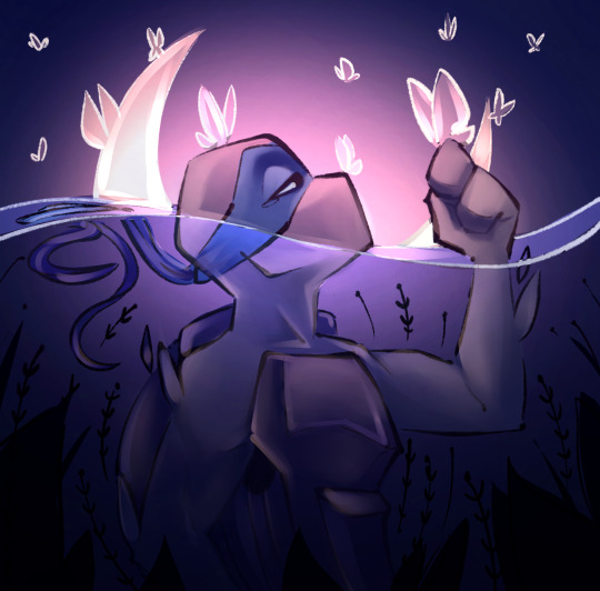
NEXT !!! PAINTING TIME !!! As show in the video, it's allllll about color picking and going over what you've already done. For a lot of it I use a softer brush, letting the colors blend together more softly, and then for other portions I'll use a harder pen for where I want more of the color that I picked to show through. Sometimes I'll draw over the line art all together if I don't think it's needed, or i"ll draw the line art back in after painting over it if I want those lines still :0
And there's just a looooot of drawing over and painting over. The 20 seconds you saw of painting and blending usually goes on for like 3-6 hours, depending on the drawing XD.
After ALLLL of that, I get smth like this

AND this was pretty much just working on leo. Now to work on the background elements >:3c same progress, just for the atmosphere and not the character!

YAY NOW THAT'S DONE !! Now all the paintings done soooooo
Color correction and final touches >:3c no more painting, now there's just a bunch of fun glowy layers we add on top of this heheheeh
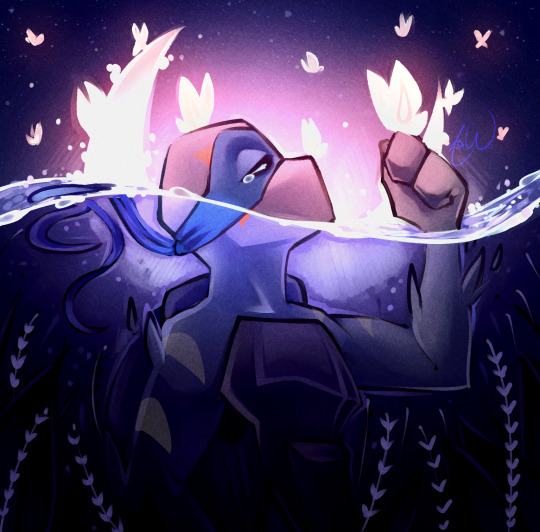
AND WE DONE >:DDD
I hope that helped some djejwjww. Tbh, the way I learn the most is if an artist im trying to learn from straight up just streams what they’re doing, but I don't rlly know anywhere i could stream or who would be interested ;w; but I hope this helps enough anyway!
If there are any other questions, I'll be happy to answer! Ive said before I rlly like playing art teacher heheheheh <33
226 notes
·
View notes
Text
(Cracks knuckles) Alright folks I remember how to draw
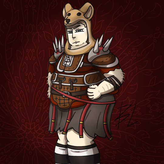
Fat fuck Vulpes by yours truly, Blaze Lander. Inspired by the lovely drawing by @yourmateyoya ,egged on by @legions-top-dog , and because i force you to deal with all my shitty drawings, @noomycatz
Yes, once again, i have put too much effort into a shitpost. Roughly 2 hours as I reused a canvas on ibis paint for a 5th drawing lmao
Yall can burn me at the stake later lol
Process below hehe i like to ramble
And just because i like to talk about my drawing process for characters with complex outfits, this is how my lobotomy brain does it:

First i do silly fun colored sketch. I use different colors to differentiate the "skeleton" from the, euh, fleshy bits, and the clothing. You can see lots of lines that would not be shown in the final product so it makes it confusing to look at.
Next i do a clean sketch.

This is where i clean up everything before doing the final lines. I use one color and a thin brush to make it easier to line over. Here i add any extra bits (like the top football armour) and "render the physics" as i call it, so properly drape cloth and the uhhh squish of stupid fat fuck vulpes' boobs and stomach. I also will balance the drawing here by flipping it and redrawing or using the drag tool.
Next is lining.

For this drawing, i used a 9.0 digital pen with a taper. Its my standard :þ. I kept my pen at the same size for this piece. Sometimes i line the outside darker to make the drawing stand out more. I decided not to as i wanted to give the drawing a more "serious" tone. (How serious can this be though lol-)You may notice on the arms little bits of the lines are missing, thats because i gave him some arm hair. I like make little details like that show over the lines. But since the one shading technique i used works with clipping masks, i had to but the arm hairs on a layer lower than the line art. Next is colour:

I colour in the drawing with midtones. Simple as. I tried to stick with warm colours besides his eyes, which are grey blue. Idc if they arent, im too lazy to google it. I mostly use flat colors but i did make his shirt a gradient. Next is do simple cell shading:

Depending on how i feel i shade with or without the colours in the back. I went with a sorta "non decrepit" light source here. Didnt want too much intensity. I used a deep marronish orange on a multiply layer on 45% opacity. Soft shading/lighting next:

I get intense with the soft shading. I use the airbrush with a deep maroon to add dark gradient and airbrush with a light pink to add a bit more depth. I usually use less light and more dark because im evil i like the intensity. I keep the layer the same amount of opacity and multiply it with the darks and soft light for the lights. Next are the shine highlights:

I use the dip pen hard with a taper to add light highlights of white on shiny bits like metal and eyes. I uses pure white, set the layer to 25% opacity, and use normal blending.
I also shade the lines because it makes the lines softer. I use a clipping layer on the line art, set the whole thing to a dark grey, and airbrush in darker and lighter parts. (I felt like a picture wasnt needed cuz its hard to notice.
For the background, i used a dark red i stole from the cell shaded layer, drew a vine pattern with the kaleidoscope ruler, and added a vignette. Vignettes are my cheat code for background hehe~ it makes the subject stand out while keeping suave, seriousness and formality. To make a subject pop out more, put the vignette behind the character but in front of the background. For more intensity but it on top of both.
Also- I usually draw with a level 10 stabilizer (i got shaky hands) but i drew with a 2 stabilizer so im surprised it came out so smoothly-
Also i gave him goggle tan lines because if i have to have them from playing tennis with sunnies, so does he.
#fallout#fnv#new vegas#drawing#digital art#fallout new vegas#vulpes inculta#shitpost#i put way too much effort into this#dont ask why i draw this type of shit good i swear i will blow up in a million pieces and cry if you do
21 notes
·
View notes
Text

ngl im not like, lineless art specialist, honestly i went lineless fairly recently (like lets say may 2023 when i started drawing art for homestuck), before that i was making art with lineart only, so take my process with a grain of salt lmfao but i hope it clears out some things!
lets dissect the recent dirkkri art ive made:
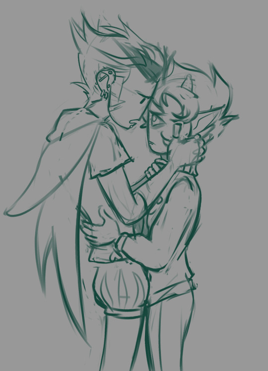
i start out with sketch, as you usually do. depending on how im feeling or how complex the pose/background is, i make it more or less detailed. for more basic poses i might even stick to a simple gesture drawing and go straight into laying out the colors, it really varies a lot. it might even change in the further process, like how i moved dirks shades from his head to be sticking out slightly from behind his arm, clipped to his shirt, because i didnt like how busy the area around the faces looked
one advice i can give is to not spend too much time on the sketch. its job is to guide the laying out of flat colors and thats it! dont make it too fancy, dont get lost in the details - you can add those later on when youre doing the flats. its fine if the sketch is messy, youll fix it in later stages of the process!
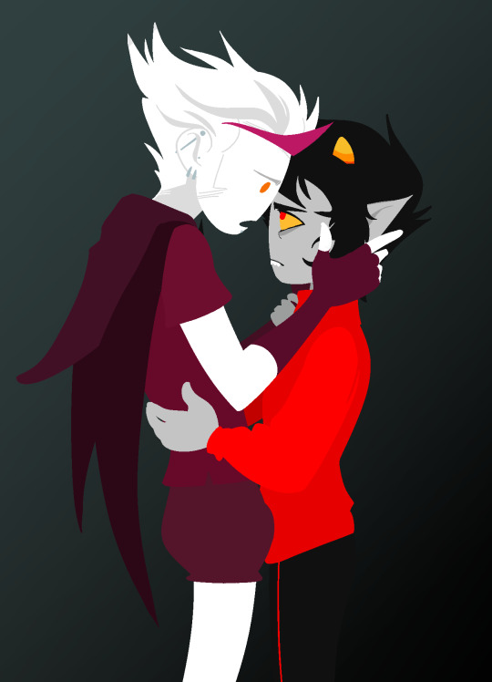
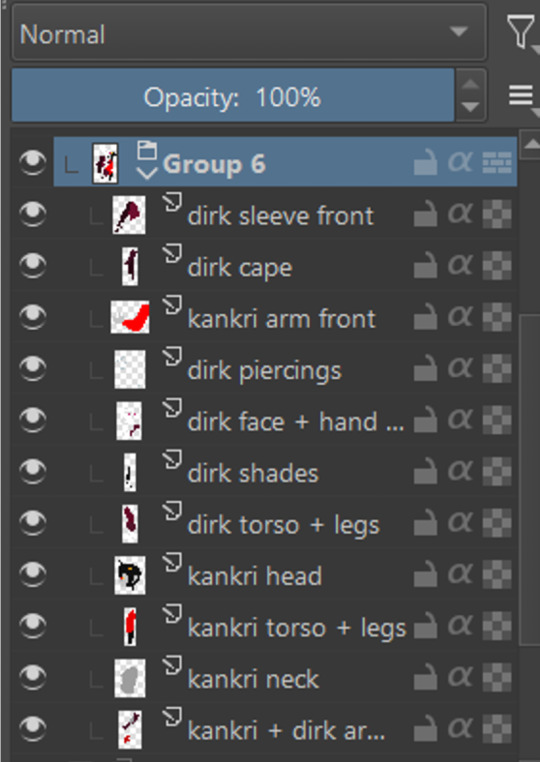
next i do the flat colors! i tackle it one thing at a time - for example with dirks head i started on separate layers with the general shape of his face, then added his facial features, then i drew the hair, then added his neck, the crown, and lastly his piercings. i then merged them all together - you dont need to leave it all separate, best way is to group things together and merge so you dont get lost with all the layers (like how kankris arm on the front is one layer including his sweater sleeve and his hand).
i highly recommend naming your layers - im a little on and off with it myself, but seriously it makes your life easier later on when you spot a mistake and have to shuffle through bazilion layers to find it lmfao, especially when your drawing includes multiple things that overlay on top of each other like in this example. dont be like me and take a second to name them asksks
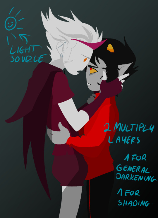
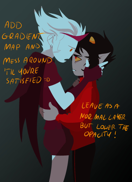
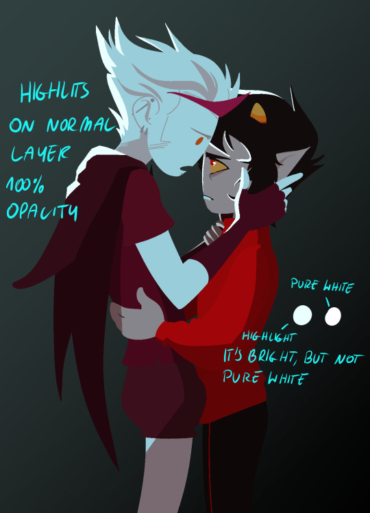
next to the rendering! i sometimes completely ditch this one, just leaving the flats as they are, but when i want a drawing to have more oomph i have some more steps to the process. its pretty simple - shadow, gradient map and highlight layer on clipping masks connected to the flats. in this one i used light gray for shadows (first layer to generally darken the drawing, second for defining shadows). same with highlights - one color.
the real star of the show is the gradient map, seriously, its a goddamn miracle worker. in krita you can add one by clicking on the plus sign to add a new layer and choose "add filter layer", then in the menu open the "map" category and here should be the option of adding gradient map. you can do it on your flats, but its destructive, and on a separate layer you can always change it if you dont like it later on. mess with the colors and tadah! it now looks fancy as shit and makes people think you know color theory!
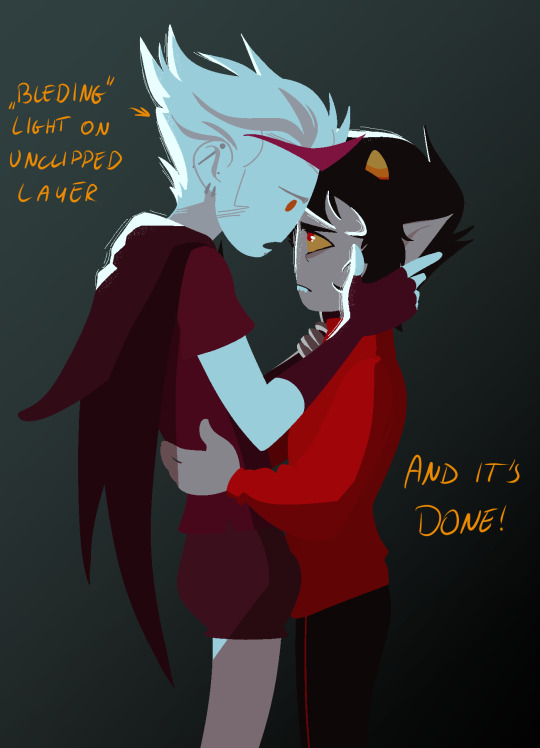

last but not least you can add some bleeding light on a separate layer that isnt clipped to the flats to give it more dreamy appearence! i also added an example of how my layers looked in a group at the end of the drawing process.
and thats it! hope it helps, and have fun drawing!
#ask#drawing process#lineless art#art tips#art process#digital art#hope its at least somehow understandable im really sleepy rn#god i hope i didnt make any spelling mistakes LMFAO#artists on tumblr
65 notes
·
View notes
Text
okay don't mind me just gonna ramble for a second haha-
(this was originally going to be under the drawing, but it got too long, and i can't add it in a reblog because both things are on queue, so separate post it is)
i just love how every time i start a drawing im like "well alright, just a quick sketch yea? no color, maybe some gray to white gradient and that's it, okay?". and then i start drawing (and obviously it takes longer than i thought because duh) and i go "okay but- i gotta at least do the flat colors, right? just the flats- maybe even some random colors to not spend too much time on it--". and then. of course. i do the flats, and im pretty happy with the result yeah? looks simple but not too simple, like it has some color some personality to it, but its not over the top so. so, i leave the drawing i go to get some water and start on an actual piece, and when i come back and take a look at what i drew its like, "well. listen. listen-- yeah im still pretty happy with how it looks but, but. it could be a little better, yea?" and then i sit down, put my water down, put my other drawing to the side, and i sit there making this quick sketch look better. "oh i don't like the colors anymore! but its all on one layer now so i can't exactly change them, plus i still like the idea, so maybe some filters? yeaj some filters on top will do!" (and of course its a yellow shade filter, because im original like that and 90% of my drawings don't also have it on). and then i add them filters and i think" well maybe some bounce light now? surely it already looks better with the filter but its kinda flat, and i want to bring *a little bit* of the original color in" so i add the bounce light, but now it looks out of place! shocker! so i decide that surely i can maybe add some grass at the bottom to hide the edge of the drawing a little. and well, alright, grass looks good, but its too dark, brings a lot of attention to it! and i can't exactly make it lighter, so, the logical choice would be to make the characters darker too, bring some contrast into the thing! and lets just do all the values while we're at it, why not! patterns to the horse, make the pants and skin darker, yes yes. and, oh- but now the eyes are lost because there's more dark hues! gotta make a new layer on top and make them eyes a little bit darker, maybe also color the bandana red and not brown so it looks special, hm? oh and! while we're on this top layer, lets also fix up the hair a little, maybe add some blush... oh and the straps of the saddle look weird, gotta fix those too! oh man and not that i look at it-- the head is too big! lets merge all the layers together and start that same thing over again! yes yes make the head a little smaller, yeah looks much better now! oh, better add some fading as well, to make it fit in the background a little, oh and some glow, suuure sure, and some lights in the eyes, and-
(and now that im looking at it, i realize that i somehow didn't save the final version????? like, i did a lot more to the thing, fixed up the saddle and that awkward shade oh his knee, and the grass-- i wont fix it now because NOW im too lazy to do it for some reason, but yeah, a bit unfortunate u_u)
anyways, point being, love art, art is pog, wish i cared a little less about it sometimes, but it also turnes this into this (imagine me pointing at the drawings as i say that, overly dramatic and sounding a little annoyed with myself)
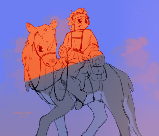
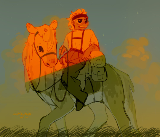
274 notes
·
View notes
Text
yesterday was webcomics day. i am bea and i make "A Ghost Story" - part 4: the art
this part i feel like gets done semi-easy once the rest of the shit is dealt with. yesterday, my knuckles continued to swell and feel like rotten wood so i had to cut it short. this shit happens more frequently than i would prefer. today i need to run to the store and also pick myself up a lil treat (an eighth). for right now tho i have some cbd rich stuff that should help. maybe. while the index finger still hurts, only the middle knuckle is swollen anymore. let's see.
i started with panels 2 and 3 bc they seemed the least immediately labor intensive. ill be copy/pasting the line/flats for panel 3 to edit from there. t...there's going to be a lot of copy/paste this page. its not usually like that. but i usually only copy/paste the lines and flats. i will re-shade things so that they look different
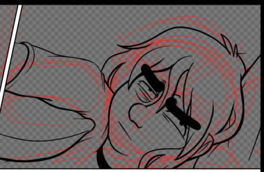
unlike the sketch, the lineart has more "weight" to it. wait thats not how the pillow would deform. hold on.
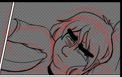
ok that's better. did people even notice that before i changed it. probably not. but it matters to me!!!!! these little things add up and add weight to your world!!!! ive been trying new things with line as as of [looks at watch] last week. so it looks bad right now. like someones vague idea of what good lineart is supposed to look like. practice makes perfect tho....or breeds familiarity or something.
some parts of this look weird. dont worry. we will cover up that shit with speech bubbles. thank you comics for your ways of obfuscating bad art.
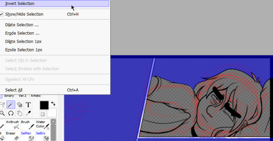
flats are easy. select everything that isnt your line art, invert the selection, and dump a base layer. then color that base layer with a mask
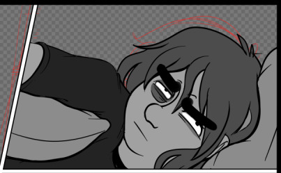
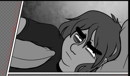
this page will, blessedly, not have any complex backgrounds. i already established the scene previously and can skate on doing my textured backgrounds. the background gradients in the direction the light in the room is being cast, usually.
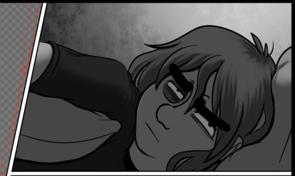
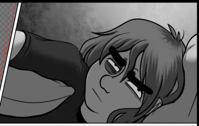
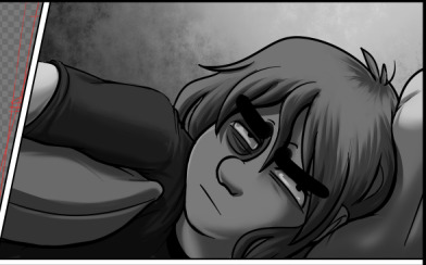
first, a multiply layer at 50%. since she's facing away from the light source, she'll be mostly in shadow. then a white overlay layer at 50%; this is to make the first shadow layer pop and keep from getting too muddy. then a second multiply layer at 50% for the next layer of shadows.
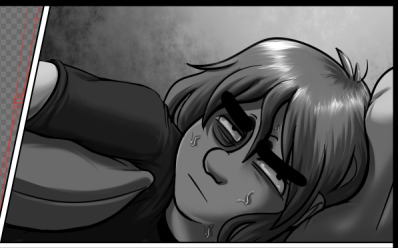
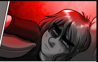
added some sweat beads to make her look more haggard and some shine to her hair, since she's so close to the light. i've started bothering doing this bc it unfortunately looks good. finally i add one more multiply layer at 40% over her eyes to make her look more over this entire thing. and then added the red glow in another overlay layer (100%) where it would land if being cast from above.
completely servicable and theres room for like. a speech bubble later. usually i do text first, but in this case its so secondary to the actions being performed, i want to prioritize one over the other.
looking at it, im not going to be able to copy/paste this after all. she's going to settle in more and her body will rotate too much in the process. i can use this as a base to trace over, though, which will get me started.
but pain is occurring so im going to eat breakfast. what a bitch!
24 notes
·
View notes
Note
what's your process for coloring like? the look of that elendira is so textured and interesting, i can't figure out how you do it
AA THANK YOUU ^__^ !! textures & brushwork are my favorite things abt my art, so im happy you find it interesting hehe . its SOO cool to look at & so much fun to draw imo
i prefer to color by building in layers , if that makes sense 🤔!! hundreds of them !! such that i'm always drawing on Top of previous layers, working from big & messy blocks of color to, eventually, small and refined blocks of color until it feels processed enough. as a result, i rarely ever erase (!!) and i rarely ever draw lineart aside from the initial sketch
a rough, patchy textured brush is key here, as it'll give you dimension and variability w/ your colors. i recommend "Brush and various sets of fountain pen style (万年筆風ブラシと色々��ット)" on Clip Studio (ID: 1679706) !! :3

im terrible with explanations though, so i'm going to show a step by step of that elendira drawing if you dont mind :3
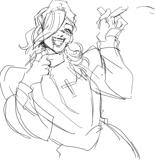
sketch layer !! because i mostly render through color alone, i try to make this as close to the finished thing as possible . ^__^ i hateee drawing the same thing over and over and like the expressivity and movement of my sketches anyways , so the more i can preserve at this step, the better. if u were to look at a side by side of my sketches and finished pieces, youd notice a lot of those og lines are present in the final drawing :3

2. flats !! pretty self explanatory, but the solid background gives me an idea of where the figure begins & ends while the colors themselves help distinguish whats what . i stick to ambient lighting @ this point because im usually not sure what i want to do with the overall palette or lighting yet . having two tones (ex, dark and light in her hair or dark and light on her skin) can also help in identifying key features early on that u wanna preserve. as you build layer by layer, sometimes these areas will remain untouched and i think it makes for a rly lovely feel at the end

3. start blocking !!! to be totally honest with you, i dont really know what i do here HAHAHA. like i just scribble the shit out of it, usually focusing on what i might want to do with lighting (ex: grey areas to accentuate folds in her costume). i think i like to start "erasing" the sketch where possible by coloring on top of it .. like if you look at her hat or her arm , you can tell i'm starting to get a sense of the shapes i like vs the ones i dont. it's at this point that the final image starts to emerge in my mind , like im gradually pulling her from a tarpit of scribbles until shes recognizable lol. chipping away at the marble until i can free her. tbh.

4. keep blockingg...when u think u are done , block some more . as you can probably see, the brushwork becomes more intentional as i add more shape, with specific focus on line weight. this is also where the patchiness of that textured brush comes in - notice how none of the colors seem totally uniform (ex: the red cross or the original sketchlines for her waist). you can see bits and pieces of the layers underneath pushing through and i really like that !! ^__^ its very fun and sketchy to me, so i try to keep them around. those areas are also great to colorpick from, because it'll give you "new" colors to work w/ that are already part of your palette.

5. GRADIENTS & GRADIENT MAPS !! TONE CURVE !! COLOR PICKER !! this is the best stage tbh. flatten your image so its all on one layer and just go crazy with all the color settings in ur program. add gradient layers and set them to darken, or overlay, or subtract, orrr. lighten or dodge glow or divide or soft/hard light.! OR!! edit the hue, saturation, luminosity and contrast.and then color pick from these edits, block even more on top of ur image, flatten, color edit again, etc. etc. until u feel satisfied.
ANYWAYSS . i hope that makes sense @__@ sry i wrote this out and deleted it like 23 times trying to make it make More sense but thats what ive got HAHA i hope its useful though :3 !
#SRY I STRUGGLED 2 EXPLAIN THIS#dude its like my brain bcomes stuffed w/ cotton anytime i try 2 write#i hope it makes sense tho..#it also probably sounds so redundant to make new layer one after the other for just a few brushstrokes#but those brushes i linked have a multiply property so if you draw on top of prev lines they'll create dark patches#and so if im working over a large area ill generally need like . 5 layers each with one brushstroke :sob: if that makes sense#this one had . 84 i think. total. layers i mean. the merylvash one had 300+ HAHAH so it rly depends#like YEAAH i could just use a normal brush but i really like the way this looks#andd sometimes the multiply function works really well or will give me the proper shadow tone im looking for#anywas.wanywaysn anyways#asktag#anonymous#long post
60 notes
·
View notes
Note
What's your process for rendering? It always looks so pretty!
maybe i should do a speedpaint video some day!
not really sure how to explain this without showing but my basic steps are
>make sure the base colors are done
>do base shadows using a really blend-able paint brush like clothes' creases and etc. I also add extra strands of hair around in this step
>merge all the color layers together
>clip and apply a multiply layer with a color from the background for that realism i guess
>erase parts of the multiply layer where you want light to shine with a hard eraser and then again in some areas with a soft one
>apply and clip another layer but its add glow with the color you want the lighting to be (if sunset, like an orange color for example) I usually never lower the opacity, just color over the light places lightly and make sure im not overdoing it on the add (my eyes) oh and i use a soft airbrush most of the time
>insert trial and error of a ton of blur and effect filters until it seems good. I sometimes like to add a gradient correction layer so that everything blends nicely and matches. Think of it like I don't want my character to be neon when the background is a dull monochrome lol
noise layer!
yeah idk sometimes this varies from work to work depending on what type of feel i want or brushes i use. Especially in a big work, i try hard a little more on the base shading and hair but usually this is my process lol
#yumii yap#rendering is different for everyone!#my art style: trial and error#ur art is pretty too!#yumii ask#art process
6 notes
·
View notes
Note
your one of my favorite artists and i wanted to know if you have any tips for anyone who wants to makes drawings with colors like yours. the backgrounds are beautiful and i wish i could play with colors like that
AAAA Thank you so much Ruby 😭🫶🏻 it really means a lot.
Lots of typing below so I'll add a keep reading tab!
I did go in depth in a previous ask, where I also linked back to yet ANOTHER ask, lol. I definitely encourage you to give them a read if you'd like! :)
But of course I can definitely add some more tidbits!
Besides playing around with clip studio's built in features (tone curve, approximate color, gradient map, etc.) Taking inspiration from real life is one of my favorite things to do. ^^
In fact it's possibly one of the best places you can get color reference from, because how you interpret it is entirely up to you!
For example with the celestial crystalfly piece, I saw these flowers near a supermarket, and a really lovely color scheme near the end of a sunset. (Besides the fact that I was daydreaming about painting Lumine if she collected all of the elements FHAHDGSHA) I didn't actually color drop for this piece, because I wanted to treat it like a study, and I was painting the flowers from memory because I didn't have a picture of it them the time. I stylized it in the end but was very pleased w the result. ^^

And with this character design, I got color inspiration from a butterfly in a photography book that was on sale in Indigo.
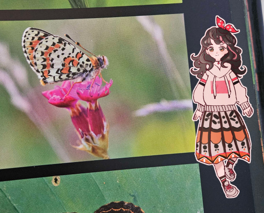
So generally my colors don't always come from nowhere!
Besides that for all pieces, I personally also like to plan colors during the sketch phase!
If you're like me and you used to follow the traditional sketch > lineart > color workflow, but once you got to the coloring part you'd get stuck, try it! Once you have a pose and character in mind, add some lighter base colors. As you work on rendering the piece, build up your base colors with darker colors (or lighter colors for things like accents and highlights)
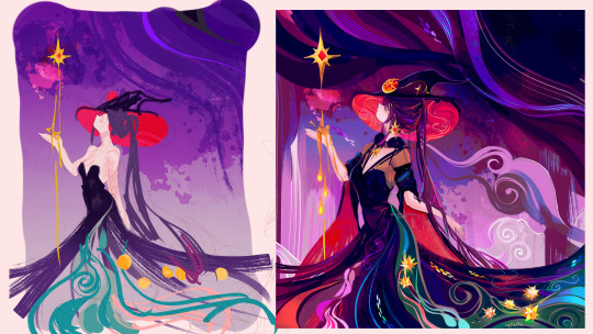
It's probably more suited to painterly styles, but I think you could definitely find a way to make it work if you prefer clean lineart.
I hope this helps give you some jumping off points to think about!
Color is a bit of a hard area to give concrete guidance on because it almost goes hand in hand with style. You get more comfortable with it and find what works the more you practice.
And that's coming from someone who used to color/draw like this 8 years ago,,,,,
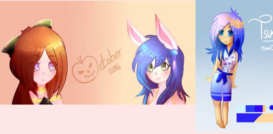
so trust me. 😭
#asks#Actually I feel like I should compile all these tumblr asks into one at some point for people to refer back to#so I might do that when I'm free.#or maybe record one of those speedpaint videos where you explain as you go 🤔
20 notes
·
View notes
Note
how do you nail the enstars style so well... what are your ways... (only if you want to ofc im just curious if you have any tips)
hi!!
i dont know if i have anything that could be helpful, but heres my process!
first, i get the pose down
i either use a picture of myself as reference or a persons pose from pinterest ( i used multiple references for this one)
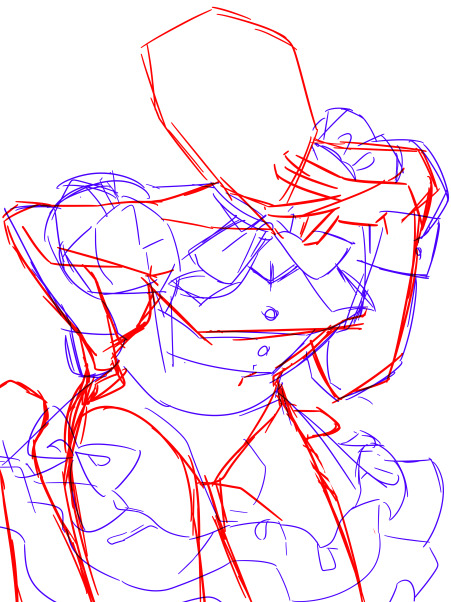
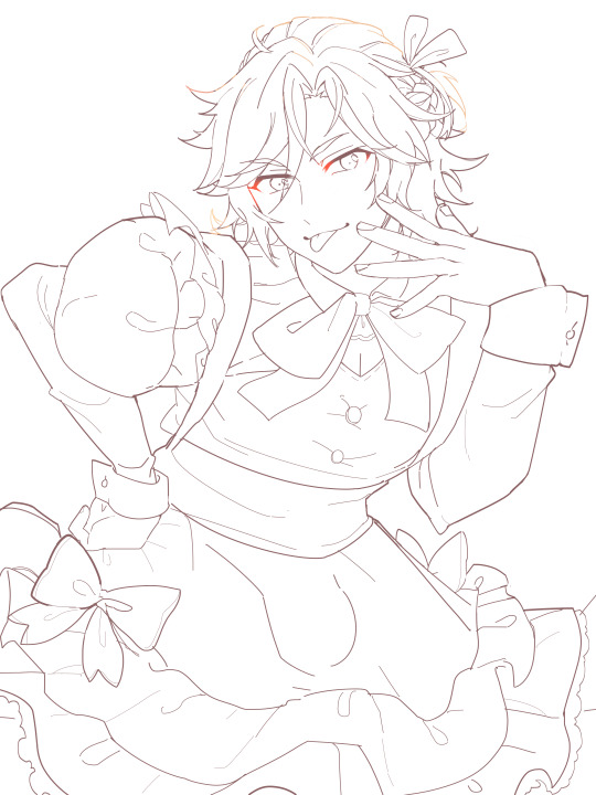
lineart:
i make the canvas huge, so i dont stress too much abt the lineart being clean enough
i heavily reference official cards, especially 3* because they have less angles and dynamic posing than 5*
i try to make it thinner and cleaner than my usual style but not too thin
outer lines are thicker than inner ones if that makes sense
i make it a dark brown instead of pure black and set it on multiply instead of normal
edges of the eyelashes are redder and softer, blush lines are always a subtle pink/peach shade
sometimes i make a second cleaner sketch before jumping to lineart, depends on how confident im feeling though
then the flats, pretty straightforward step

rendering:
i try to replicate the rendering on official cards as much as possible by keeping the references in front of me and color picking
i always make the contrast between shaded and non-shaded areas higher than im comfortable with usually because its what often makes the pieces pop (to me) and i make sure to add reflected light
i use gradients a lot, especially for hair
i make the lineart lighter in areas where the light is hitting like this
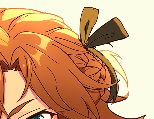
what i generally do for the eyes:
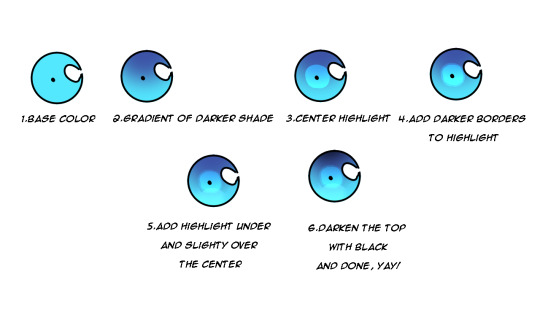
another tip is that i duplicate the lineart layer, make that duplicate into the "add" layer mode and glaussian blur it to give that lineart glow effect you find in cards:
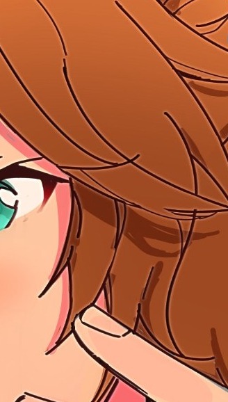
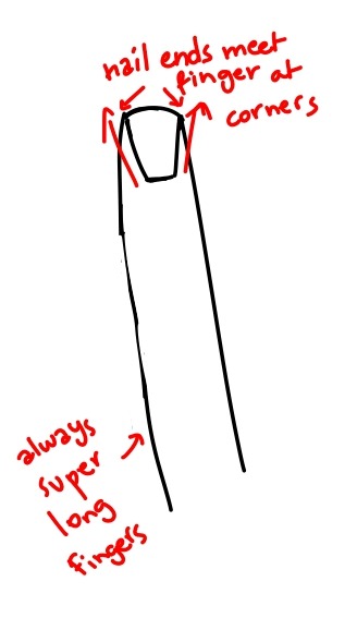
i also noticed this is how nails tend to be drawn and i kind of adopted that into my own artstyle because i love how it looks:
-lastly for the background, i used the ingame dressing room as a reference, did some blocks of color to express it and blurred it so i dont have to bother with any details because im lazy <33

-i lastly added some sparkles and stipples and a white blur around the edges to make it look more finished.
thats pretty much it! ofc take all of this with a grain of salt because im no expert HAHA this is just what i learned works from trying my hand at fake cards over and over again, so its practice too <3 i hope this was somehow helpful!!
46 notes
·
View notes
Note
Chapter 6
HOSEOK BITCH STOP GRANDMA???? THATS A STRETCH AND KNOWING U ARE AN ANCIENT BEING, DAMN I-
Hoseok stumbles, colliding with Seokjin’s chest. ofc he laughs with his entire body FUCK I MISS HIM WTF NAH NOPE WE WONT CRY WE MUST STAY FOCUSED BROTHER
JIN U BETRAYED ME??? HOW COULD YOU
Seokjin pleads, giving you the biggest puppy eyes that man hates aegyo on command, but watch his ass do aegyo on command if its on run bts tasks 😭 ik he will be the most supportive one if you told bts you are selling feet pics
who calls their fraternity Alpha? What kind of superiority complex do they have?” 💯fr
What are you? Secret vampires or something?” um
So mysterious”, Hoseok says, ok ig
“that man can be an asshole.” WHAT DO U MEAN MY KITTY IS AN ASSHOLE????
dig his metaphorical fangs into your neck and drain you of your metaphorical blood WHAT DOES THAT MEAN??? (ik what it means, but 👀👀)
at least she got her sleep and is stress free now, i guess thats a win
JAMAL CHILL?? OOH JIN TELL EM SIS, WHATS HIS PROBLEM?
they are quaking with the desire to punch each other’s faces in. BE LESBIAN, PROBLEM SOLVED YEEHAW
Without me? homie really said that with his whole chest
It’s one of those activities you like to call terribly boring." ??? sir ??
also u know what, i will make it unboring for you real quick, lets go on a pirate ship, that will make u scream

dont judge my man yall, he was giving birth to lie on the pirate ship
WHAT DID TAE TELL HIM???? JAMAL SMILED AT ME??? his moodswings be like ➡️⬅️⬆️⬇️↗️↘️↙️↖️↕️↔️🔄️↪️↩️⤴️⤵️🔃
joon asks me out to study AAAAAAH 😩
holding his arm before you giggle into it. *twitching eyes WHY SHE GOTTA LIVE MY DREAM AAH BUTTER TAE THOSE ARMSS 🤤😋
“Oh you’re still here?” Taehyung asks STOP HE IS SOO SASSY, GIVE THAT MAN LONG NAILS
making Taehyung chuckle.......... one of his weirdly dishonest ones. tae when jin forces him to laugh at puns (that still makes me cackle)
He is a self-centred peacock PEACOCK DAMN GURL
“Violence is never the answer IT IS THE SOLUTION
ok sorry tae, back to serious mode, IS THAT FORESHADOW TO HIS PAST(mentioned in drabbles)
we are going swing dancing today UWUW
I can’t dance. What if I make a fool of myself?” I CANT DANCE EITHER, LETS GET MARRIED we can swing dance together for shits and giggles and get drunk in each other's laughter and smile, kissing passionately as if we are still in high school.
(omg that was so romantic, lemme just copy that)
did i tell you i still love the way he talks, its so coquette, in a manly way
I am a terrible student. i got exams in a month i have barely studied 😃😭
time does really fly fr it does, you wish it went fast, but when you think back, you wish you could live in that moment one more time
“cake is quite the delicacy oof the fanciness
ah yes old stuff *sighs in delight and coziness
There is fog in the air. It got stuck on the rooftops of the houses. Like a perfect gradient it makes them disappear into a grey nothingness. if this scene was on tv, what color light would it have?? (background lights you know) i was thinking of yellow, since we are talking about antiques
“I guess…” you look out the window for quite some time to think of an answer. You look at the perfectly polished stones of the sidewalk. You watch how the rain builds little rivers in the nooks and crannies. And that is when you get your answer. and the lights slowly becomes cool and blue (blue for calm, unity and stability)
thats a nice perspective of history but for the love of god, i cant stay awake or mentally present during it 😭
With your cheeks burning up like crazy and a big smile on your face you look out of the window again. A swing song comes on the radio, Taehyung turns it louder the tiniest bit. AND THE LIGHTS TURN PINK
“N-no? I-I’m alright”, you stutter. we can see that
Taehyung gets a few (probably painful) steps on his toes, but he doesn’t say anything. MASOCHIST ALERT 😭
stop flattering me im shyyyyy *shakes booty like jimin
this is so cute bye im soo single
“this was like in the movies! Do it again!” SHE IS SOO CUTE UWUW MOVE TAE SHE IS MINE *hits the gym so i can yeet tae out of the way and carry her
HE DID IT AGAIN HEEEHEEEEHEHHE
“Okay but that throwing thing you did? You can’t just do that without training first. Also why are you so strong? It’s inhuman really.” SAY IT SIS
I just think you are beyond precious”BYE IM GONE
Why do an elderly lady and Taehyung know each to such extent that they are hugging as if they were two old friends reuniting? dont overthink, they are just besties, um they met on a idk metro yeah
“it’s been so many years and yet you still look the same. While look at me”, OBVIOUSLY ITS SUS
Perhaps I should have taken the offer back then.” 👀👀
“What offer?” um the plastic surgery offer, anti aging laser. HERBS YEAH IT WAS THE HERBS, SHE MISSED OUT ON AN HERBAL MASSAGE
No way! That’s splendid! Just what you dreamt of!” they are such cute besties pls
It is hard not to choke on your olive, not when your body is burning up like that. i choked on air
How is it?” WHY IS THIS SOO HOT STOP DONT FOLD THAT FAST BITCH NA UH *also folds like a lawn chair in a sec
Taehyung gets off the barstool and closes the distance between you and him. SIR MY MENTAL HEALTH???
you stutter, knees buckling slightly as he helps you stand up. SLIGHTLY???? u mean buckling like a trying on heels
You haven’t told anyone ever but in your dreams you always pictured your prince charming to be good with elderly people and kids. Not that you would tell anyone your stupid fantasies, but you really did picture him like that. we all do, tae is a prince charming *sighs in high standards
“I think you gave that lady proper heart palpitations fr, i got so giddy just reading
And so full of life”, 👀👀👀as opposed to what sir???
Taehyung seems properly flustered for a moment, eyes flitting downwards and blinking rapidly. YES WE GOT THE CUTIE PIE FLUSTERED YEEHAW THIS IS A WIN FOR THE GAYS AND UNGAYS (i love to use this in sentences unrelated to sexuality)
quite sad to think that we are looking at something which has died thousands of years ago ... Well if you say it like that mood sis
it is nice to know that we can look at the past when we look at the stars?” waaaah im in love with her
I always thought of them as a reminder of death”, “or rather hell.” AYO??👀👀
they are still burning bright. Mustn’t it be such a burden to never get to rest?” ooh
*starts playing love maze
“Then you mess up, you mustn’t worry about mistakes you haven’t even made yet” i will try to remember this all the time
because right now I am thinking that this lamp is also alone, surrounded by darkness and thick fog and it should feel so terribly lonely and yet here it is, outshining both of them."
HOW DO U WRITE THIS WELL?? LEAVE US SOME TALENT CRUMBS
People normally aren’t happy when they are around you and finally experiencing it feels so good. WHO HURT YOU POOKIE??? IM COMING WITH MY FRYING PAN
this is soo cute i cant, the writing, them, the lamp and the stars gosh, i feel so giddy i wanna spin around the lamppost like a simp does in music videos
Yes darling” Taehyung whispers and there is obvious seduction in his voice. OHO HO HO I SEE U NAUGHTY BOI
this was a cute chapter im gonna sleep soo good with idk grass and unicorns in my dreams
HOSEOK BITCH STOP GRANDMA???? THATS A STRETCH AND KNOWING U ARE AN ANCIENT BEING, DAMN I-
lmoaoao he is so mean for no reason fajsdfja I love him JFAJDFJ
Hoseok stumbles, colliding with Seokjin’s chest. ofc he laughs with his entire body FUCK I MISS HIM WTF NAH NOPE WE WONT CRY WE MUST STAY FOCUSED BROTHER
LISTEN I MISS HIM TOO OMFG I'M IN PAIN
Seokjin pleads, giving you the biggest puppy eyes that man hates aegyo on command, but watch his ass do aegyo on command if its on run bts tasks 😭 ik he will be the most supportive one if you told bts you are selling feet pics
I miss him so much 😭 BUT ALSO LESS THAN A MONTH TILL HE IS BACK OMGMGMG (the most supportive for feet pics would be Tae though change my mind. you can't.)
who calls their fraternity Alpha? What kind of superiority complex do they have?” 💯fr
no but it will ALL MAKE SENSE LIKE LIKE LIEK LIEKEKE LIKEKE
“that man can be an asshole.” WHAT DO U MEAN MY KITTY IS AN ASSHOLE????
the foreshADOWINGNNG (i said too much)
dig his metaphorical fangs into your neck and drain you of your metaphorical blood WHAT DOES THAT MEAN??? (ik what it means, but 👀👀)
HELLOOOOOOOOOO
Without me? homie really said that with his whole chest
THE JEALOUSY of this man LIKE
It’s one of those activities you like to call terribly boring." ??? sir ??
i love their sass fr fjadsjf
WHAT DID TAE TELL HIM???? JAMAL SMILED AT ME??? his moodswings be like ➡️⬅️⬆️⬇️↗️↘️↙️↖️↕️↔️🔄️↪️↩️⤴️⤵️🔃
perhaps something with her metaphorical blood HELLOO
joon asks me out to study AAAAAAH 😩
AAAH (scared)
holding his arm before you giggle into it. *twitching eyes WHY SHE GOTTA LIVE MY DREAM AAH BUTTER TAE THOSE ARMSS 🤤😋
when this video dropped I lost IT
ok sorry tae, back to serious mode, IS THAT FORESHADOW TO HIS PAST(mentioned in drabbles)
mhmhmmhmh
time does really fly fr it does, you wish it went fast, but when you think back, you wish you could live in that moment one more time
YES THIS OMFG the most painful thing ever 😭
ALSO I love how you thought of different colours during the scene <3 I love this energy heheh <3
Taehyung gets a few (probably painful) steps on his toes, but he doesn’t say anything. MASOCHIST ALERT 😭
there are no lies to be found here tbfh
“this was like in the movies! Do it again!” SHE IS SOO CUTE UWUW MOVE TAE SHE IS MINE *hits the gym so i can yeet tae out of the way and carry her
NO BUT THANK YOU i LOVE HER SO MUCH she is so cute frrr
“it’s been so many years and yet you still look the same. While look at me”, OBVIOUSLY ITS SUS
it IS
lmaooao you losing it over Tae existing is so me fr
it is nice to know that we can look at the past when we look at the stars?” waaaah im in love with her
me fr
I always thought of them as a reminder of death”, “or rather hell.” AYO??👀👀
THE FORESHADOWING GOES CRAZY FR ps: i forgot the stars and photography part during this chapter and now im <3 holy moly they were so cute together in the beginning im so soft
People normally aren’t happy when they are around you and finally experiencing it feels so good. WHO HURT YOU POOKIE??? IM COMING WITH MY FRYING PAN
NO BUT FR
this is soo cute i cant, the writing, them, the lamp and the stars gosh, i feel so giddy i wanna spin around the lamppost like a simp does in music videos
I'M HAPPY YOU LOVED IT SO MUCH HEHEHE 💜💜
10 notes
·
View notes
Text


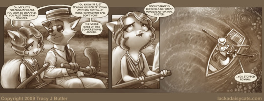


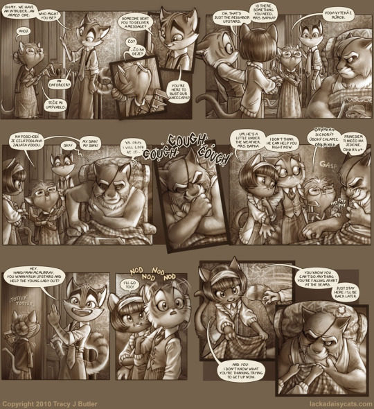
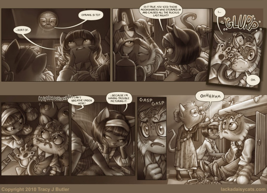
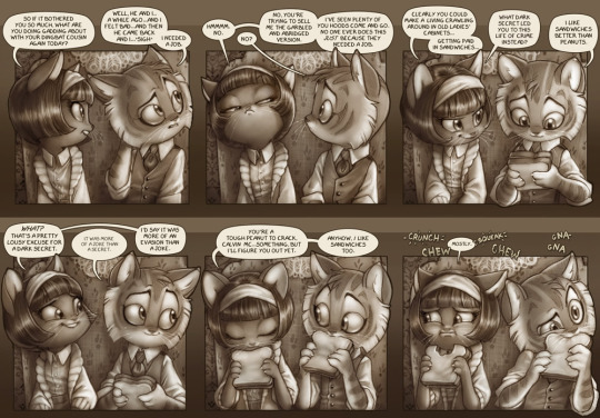
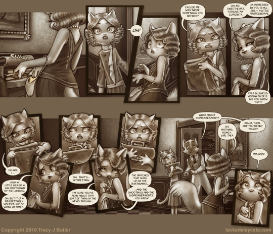

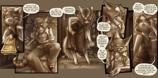
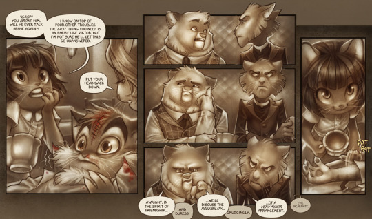
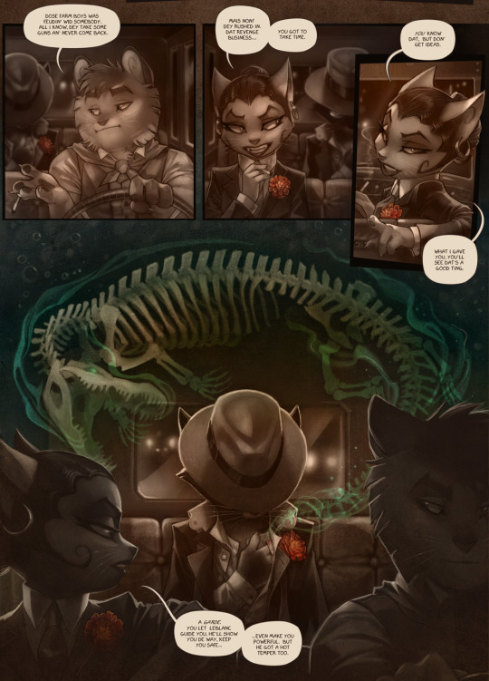
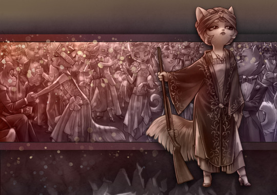
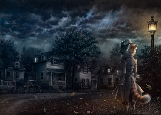
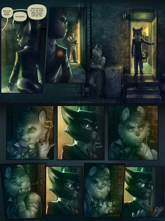

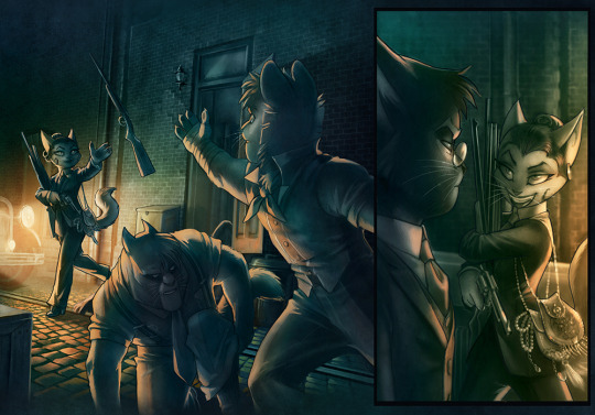
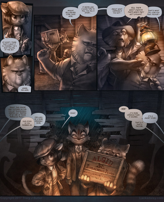
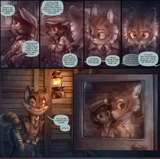
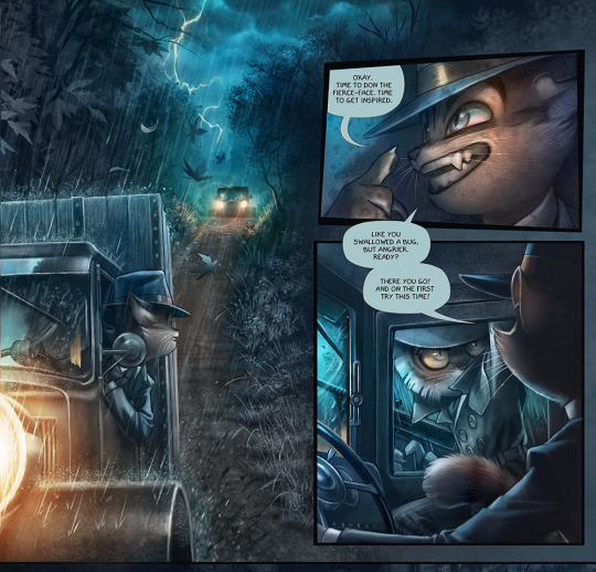


reread the rest thus far of lackadaisy and there's the both v easy & difficult task of gathering a shit ton but only a shit ton of excerpts (like every single page is a highlight i'm not exaggerating)
and every single element is superlative and the way it all only becomes More So....already mentioned the way the like smooth gradient shading made the successful evocation of 3D Shapes more noticeable, along w/the consistent geometries of character design & details in fabric folds; the way Lighting & Coloring only goes on to become more prominent elements only enhances that further. the compositions, backgrounds, pacing, angles....everything is so dynamic & expressive, such as including the expressions which you know i also Love / absorbed
going "hell yes for people to discover this superlative comic" then having to occasionally refresh past site traffic overloaded server errors like "nooo" but actually yes
whilest clapping & cheering for the fun of everyone who's been here a minute. My God the invigorating reward when again i started reading in '07 & the concept of rocky & freckle on a "proper" run had only manifested via fun official bonus art, then a literal decade later as it was actually happening in the comic like screeeeaammm i can feel it coming in the air tonight oh lord etc....i've loved following it, again, if i see another new comic page. i am going to be Enriched
i also really was right on the ball myself this time around like okay okay yep i have picked up on Everything, at least to the degree i can lmao. i love the mysteries. i love how Character Focused it is too ofc and there's no characters i'm uniterested in / dislike. you gotta point to one of them, truly, and i have been a [pointing at freckle] enjoyer these fifteen years but fr i am a connoisseur of everyone, i love that so many characters are a weird mysterious chaos element story driver in their own right. i considered mordecai more intently than ever, love his like ultra mystery (and that we leave off on him doing some detectiving even) and truly fun that like, the source of the more Immediate problems he keeps having in every damn interaction isn't the like [wow mordecai with the just diving into the hatchet murdering] factor so much as it's that he's generally like "i am just standing here" and is not nt in any way that matters and people insist on fucking with him on that front. the peak tragedy of him in a bonus comic getting bullied into having to dance with someone to Be Polite like i'm so sorry i wish you could be that ficus too. anyways intrigued with the marigold &/or mordecai mysteries including that it's like, how coincidental is it that he talks about marigold having a thorn in its side & the savoys' nickname for him is peekon = thorn. there is so much to consider, love that for us truly. and i'm rooting for mordecai & nicodeme's dynamic out here, is another conclusion....very enriched by comparing & contrasting that serafine nicodeme mordecai triumvirate with the rocky ivy freckle one, to be sure. im enriched
i'm also enriched by every footnote that's got like historical facts / research notes / [this is inaccurate for xyz prioritization but here's the disclaimer] explanations. i Love information. and everything else like i loooove this comic it's Soooo Fucking putting my hands to my temples and inhaling at length through my teeth
#first time i've really taken tumblr up on that new thirty image limit expansion; bit of a surprise maybe lol#put your back into autism acceptance month &/or press j; scroll fast; read through it actually; filter the following:#long post //#learning abt the overwhelming popularity of baby ruth candy bars from lackadaisy footnotes? relevant to gtm:pota aficionadoship at one pt#remember discussing what i learned from another footnote abt some christian denominations / other religions being very Anti Prohibition#every time i use the word cagey i think of lackadaisy. cagey thing... we've all been there#fantastic time revisiting and i love to be considering all these characters all the further / with reckless juxtaposition#especially the two triumvirates as mentioned. rooting for them all#rooting for mordecai to be relieved of that v realistic [ppl sensing a Mess With His he is not nt in any way that mattersness Free For All]#either let him be or start shooting at him lmfao. but i Love that the gang had that pleasant nonbrunch together & no shots exchanged yet#more brunches! and i think nicodeme could be mordecai's bestie or w/e he wants. turn out to be Supportive in any way that matters#they are more so the ivy and freckle of their group after all lol. slightly would-be Unlikely coupling there as well anyways; and yet!#i am as enriched and intrigued and appreciative and etc as ever#and reminded that in my rereading i haven't yet gone over all the bonus material lol....#also stumbled across that sungwon cho had fandubs of lackadaisy comics posted like 9 yrs back??#which means i probably saw one or two; think i remember one being shared and checking that out#like hey didn't know i'd encountered you before like; vines & oh the lamps are fucking & etc. and now there he goes voicing mordecai yaay#lackadaisy
64 notes
·
View notes