#and the dreams were in the 2d style
Explore tagged Tumblr posts
Text
Uhhh why aren’t the furious 5 in the king fu panda 4 trailer
#what’s going on#trailer looks awful but I’m not too scared bc dreamworks always makes their trailers super juvenile#and they’ve done this franchise especially dirty#I go into them more assessing if the concepts are interesting and I think they are#and I like the design of the new wolf/fox character idk what kind of canid she is#the shapeshifting villain seems really cool and I like the layer of having to take over the characters she is able to transform into#it does seem a bit too similar to the jade zombies from the last movie so I hope they make an effort to thematically differentiate them#if that makes any sense#overall the animation is obviously great but it’s not that much of a step up from the last one#like the quality of the CGI is about the same#I can see a lot of potential for visual spectacle with the villain#and really playing with the animation style#bc one of my favorite thing about the kfp movies is how they do that#like with the 2nd one how they used different art styles to represent different levels of reality?? (ig that’s they best way I could put it)#like the present reality would be in the typical 3d textured animation style#and the dreams were in the 2d style#and the stories were in shadowpuppetry#so yeah overall I’m not to thrilled about them making a 4th bc the og trilogy works so well thematically as a trilogy#with the whole body mind spirit thing#but overall it looks like there’s some promising concepts#but like please don’t push tigress to the background she deserves so much better
1 note
·
View note
Note
Machete and Vasco made an appearance in my dreams last night and I'd like to formally apologize to them bc my dreams are always horror slanted lol they didn't have a good time poor guys.
.
#what did you do? what did you do to them??#answered#anonymous#that reminds me#I also had a rare Vaschete appearance in a dream a few days ago#I don't remember much but they were living in Frasier's apartment#from the tv show Frasier#they were animated in 2d but existed in realistic environment Roger Rabbit style#and I was thrilled to see/meet them#but Machete was not happy at all to have strangers/film crew? in his home
213 notes
·
View notes
Text
have had at least a second in my series of dreams in which diagetically I(?) was playing zelda phantom hourglass. Reader, I was not
#this time link wasnt even there. it was roughly first person exploration#of a fancy starely home with 4 areas one of which was vampires? id had THAT part of the dream before but not the zelda#it had collectible style progression instead of zelda puzzles. actually there was a previous section#with boomerang puzzles but they were much more 3d than 2d link gets (i was climbing an ice cliff?)#j.txt
3 notes
·
View notes
Text
Had a dream where..(dream under tha cut)
A girl named Rapunzel (no relation whatsoever to the princess or movie or fairytale, just a vague resemblance) was kidnapped and held in the attic of her or an elderly-lady-on-vacation's house, and scu/movie sonic saw the kidnapping happen. The captors were about to hurt her and sonic, who had been trying to lie low in the hopes that the cops would show up before anything worse would happen so he wouldn't expose himself to humans against longclaw's warnings, jumped in to fight them. However, he either hadn't had speed/chaos powers for very long, or was inexperienced in using them, because he missed his shots/kicks/punches occasionally, and he got clotheslined by one of the kidnappers, and just when it looked like both kids were in trouble, Perry the platypus showed up! He kicked through the wall and took down the captors with no trouble. It turned out he'd gotten a tip somewhere, then alerted the police while he made his way to the kids' location. He congratulated the kids for being brave, hugs were passed around, therapy recommended, etc. After rapunzel went home, perry congratulated sonic for stepping in, asked how old he was, and after learning now old he was told him to please try not to interfere next time bc he could have gotten really hurt. Then he gave him a business card and said when he was older, he'd make a good fit for OWCA, if he wanted. Explained, to sonic's starry eyes, that he was an agent of sorts, sent in ahead by police or the higher ups for missions the police might not make it to in time or special secret missions.
Rapunzel looked like this, sandy blond, red 50s crisscross pattern on some parts of her dress, probably taupe eyes.

Sonic was younger than he was in the main events of his first movie, but older than he was in the longclaw flashback, maybe about 10 or 12? Rapunzel was a head taller than Sonic, and Perry was just slightly shorter than him.
#my dreams#scu#pnf#btw they were all in their own separate artstyles like perry was still 2d just..kinda roger rabbit style?#he looked at sonic so fondly and yet so concerned i wanted perry to adopt him when i woke up
0 notes
Text
I don't remember anything else about the dream I had last night except that there was a glitch in some video game that made one NPC horse look like this:

It was in 2D and had a laying down -animation that looked like this:


And the glitch was only on one specific horse - all the other horses in the game were totally fine. And the rest of the game was in this super realistic, RDR2-like style, so it looked like this:

1K notes
·
View notes
Text
it's been much too long since you posted this for me to only be reblogging it now but I have thought about it every single day since I first saw it!!!!!!!! LOOK AT THIS it's my girlllll!!!!!! you captured her big chubby face and stout little body so PERFECTLY... like that's it that's HER! 🦜🏴☠️🍷🦜🏴☠️🍷🦜🏴☠️🍷🦜🏴☠️🍷 Babs my friend Babs...... :'-)
thank you so much again for drawing my gal, Sugs!! 🥺🥺🥺🥺
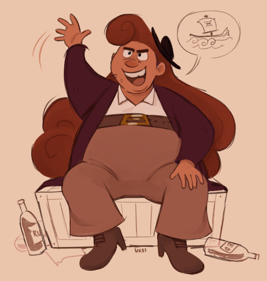
Character Fullbody drawn for @fleurmarigold !
#it has been a dream to see one of my characters in your style which has always been a big point of inspiration for me#and I'm defo commissioning you for that when I get the chance!#if Rum Red were a traditional 2D animated movie I'd want her to look JUST like this!!! it's currently sitting in my ref doc for her haha#the little Rum Red bottles and her infodump speechbubble make me so happy hehe....#this brought me so much joy and such a big smile during a very low time and I'm very grateful for that!!!! 🙏🙏💗💗💗#rum red#fave#alcohol -#maybe
57 notes
·
View notes
Text
Here’s a personal take!
The Sonic Prime 3D models have the best facial expressions seen from the modern cast. Why? Well, I’ll explain with my 0 experience in 3D animation. I’m only explaining as an observer. Not a professional. Anyways, onto the fun.
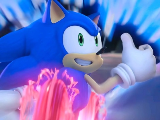
First of all, let’s talk about the current models in the games. The animators became better at animating them in Sonic Frontiers.

You can tell effort was being put in, but Frontiers still has limits due to the structure of Sonic’s face and eyes. I’ve seen fan animations with this model which animates him wonderfully. But no matter what, he’s still going to have limitations because his hands are too big, eyes are too far apart, mouth looks like it was made to only stay on the side, and more issues. The design frankly looks dead. Even in motion.

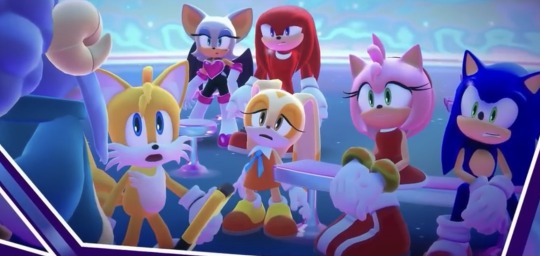
In all fairness, this character was built for a 2D design due to it being inspired by Mickey Mouse. But Sonic Unleashed (because they used different models like Dream Team) proves this character CAN be expressive in 3D with a good workable model. It’s not the animation that’s the problem in Frontiers. Here are similar expressions from Sonic Prime and Frontiers.
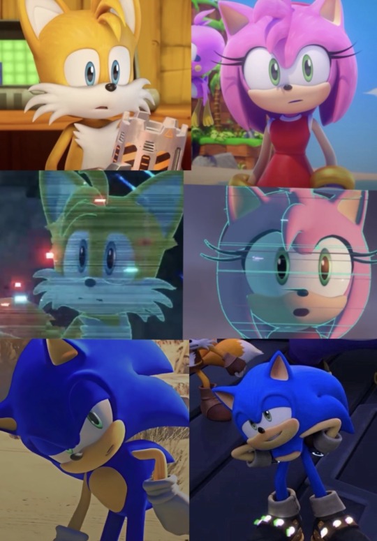
See how wider the expressions are in Prime? It allows their faces to be more flexible and warped. Prime!Sonic has rounder eyes making his head look easier for his facial structure to have an array of expressions. It’s kind of close to Sonic Dream Team with the minor tweaks of the OG models. Which is why the expressions in that game looked so good. ESPECIALLY when animated.
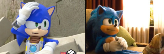
It’s even why other designs are able to have great facial expressions. The eyes being close together just works. While the OG looks like he’s pushing expressions that’s near impossible to push. Yes, it’s still expressive, but you can see how limiting it is because the eyes aren’t supporting the face. And his mouth is always stuck to one side.
Onto more compliments to the Sonic Prime models. They emphasize the hight differences too. I personally think Sonic and Shadow look like mixtures between their 06, modern, Boom, and movie designs. They have long quills like 06. Their entire look is inspired by the modern designs. Their eyes are shaped similar to Sonic Boom and they have cool textures like in the movies. Other characters count but it most notably is for the two hedgehogs.
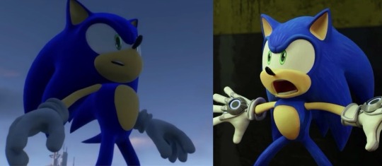
The hands are smaller like in the movies and Boom. The pupils being bigger gives volume to the faces. I also adore their fur and quill patterns to give the designs flare. Their gloves have little details too. I especially love how they can change the quills for Sonic and Shadow and make them look similar to a 2D style. Usually they’d make the quills smaller in the games to get that 2D look but Prime Shadow and Sonic are able to have long quills while the animators adjust them however and whenever they need to.
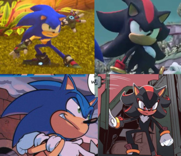
Their mouths are also well animated and smooth when transitioning to different sides of the face. The characters body shapes are also 100% better. While the Game model looks too straight the Prime model has a pear shape torso that are also given to Boom and Movie Sonic respectively. The Prime models look like they were made for action scenes.
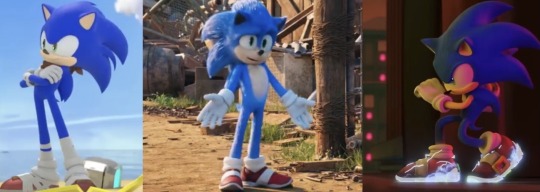
I know some people complain about the eyes not going down, but honestly it’s what makes the expressions weaker when used in 3D. I’m glad they have a balance of it sometimes to allow the expressions to get their points across. I really appreciate the colors on everyone also. They look lovely and bright with help of the lighting.
The few critiques I have are due to multiple watches but they’re not a HUGE deal.
1. I can easily see their necks at points.
2. The mouth animation looks weird when characters makes an O shape and the tongues/teeth are jarring.
3. I wish their hands weren’t so flat and skinny. Other models had their hands shaped like Disney characters, but Prime’s hands can look flat sometimes.
These are just nitpicks though.
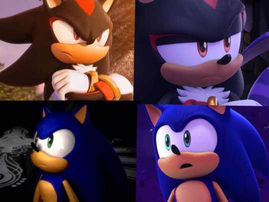
Even compared to the CGI cutscenes while still good I think Prime conveys a subtly previous models didn’t do too often. Of course the CGI looks amazing and it still holds up, but the nuance in Sonic Prime cannot be ignored. Hope my take makes the slightest of sense.
Stay Creative! 💜
#sonic prime#sonic the hedgehog#sth#amy rose#amy rose hedgehog#shadow the hedgehog#shadow the ultimate lifeform#miles tails prower#tails the fox#sonic wachowski#movie sonic#sonic movie#Sonic boom#boom!sonic#sonic idw#sonic frontiers#prime!shadow#knuckles the echidna#cream the rabbit#rouge the bat#chip sonic unleashed#Sonic unleashed#shadow games#sonic 06#sonic games#sonic animation#animation#character animation#character design#sonic art
310 notes
·
View notes
Text
Exactly 3 years of self-study! 😃🙌


This WildBrain-like style I've been developing since 2022, but thought I'd better compare it to the earliest artwork. I keep forgetting that I actually drew the very first costume concept for Future of the Past back in 2021 💀


I didn't take up humanization for a very long time, and the reasons are clear 🙂 It was only because I learned how to sketch in 2024 (because I finally bought a stylus) that I decided to venture out again and try it. I had a hard time visualizing the characters in people form, but after a bunch of trial and mistakes, it worked!!!

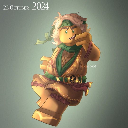
Also repainted favorite old work in a new technique I've started developing recently lol :) I have some drawings from 2018-2019 and I'd like to do the same thing again! ✨🐉
There have been a lot of issues this year, from family issues to trauma to depression, leading to burnout. Now I'm feeling better and also trying to put all my efforts into content to fulfill my dream of turning drawing into a profession! I even managed to open commissions last November, which helps a lot to live up to this day. But because of all the routine, I felt too withdrawn, and didn't even notice the successes in my work, which turned out to be not few (holy cow when I saw and thought about all progress, it was like I got a year-end gift) khvjtcjthjvutcjvh
The most important achievements for this year are not only in the improvement of skills. Now I have a professional device, can compose digital music (I was able to do it before, but didn't have a chance to show you), I started humanization, advanced in FotP, learned how to sketch, opened commissions, started a YouTube channel, animation, and even learned how to draw in 2D! That's a big deal to me, as well as the rest of the accomplishments. Hopefully 2025 will bring something to help me get even closer to my goal (and lastly I noticed a lot of mistakes both in the works and in myself that I'm already working on) 🫠
There were moments when I was about to give up my favorite thing - creativity, and thanks to all your support I am still here, for which I am weightlessly grateful! No one said that this path would be easy, and you taught me that after a fall, you need to get up :’3 💚
#ninjagood4#ninjago#fanart#ninjago fanart#art#redraw#art progress#2021 vs 2024#ninjago lloyd#lloyd garmadon#green ninja#ninjago art#thank you!#long post#I'm so happy to have joined the Ninjago community 🥹#These silly Lego man are the meaning of my life#help lol
80 notes
·
View notes
Text
inspired by a dream i had (which i hope to draw soon cuz i forgot I wanted until MUCH LATER WTF)
Reader getting isekai(ed?) to LMK but they keep their normal anatomy except ur just now drawn in into the art style
Ur body's now 2d
YAY FINGER PRIVELEDGES STAY!!! :D
u look bit odd compared the citizens anatomically but also like.....i don't think it would attract much the attention.....me thinks
feel like even if you were under average height (well depends on ur actual height) you would still be bit taller compared to the lego people, I always saw them being like smaller than regular humans if they were sized up irl....
like 4'5 for them is 5'5 and 5'0 would be 6'0 for them??? yall get what I'm trynna say ok lol
portable monke bf LES GOOOOOOOOOOOOOOOOOOOOOOOOOOOOOOOOOOOOOOOOOOOOOOOOOOOOOOOOOOOOOOOOOO
carry him like a sack of potatoes!
put him in ur lap and cuddle him!
JESSICA RABBIT AND ROGER RABBIT GOOFY AHH DYNAMIC WE LOVE
yes I'm including ALL MONKE BOIS (mac, wukong, mk)
but also none monkes but im just too lazy to tagg em all LOL
#fic?#lmk x reader#lego monkey kid x reader#reader insert#sun wukong x reader#six eared macaque x reader#macaque x reader#monkey king x reader#mk x reader
107 notes
·
View notes
Text
War of the Rohirrim: My Thoughts
So, I just got back from seeing this movie and I thought I'd write up a little review, I'll give a brief overview first and put spoilers under the cut.
First off, let me get this out of the way: I really, really enjoyed it! Which isn't to say that the movie didn't have problems, just that I was thoroughly entertained throughout and also got way more invested in it than I thought I would! It was a nice, self-contained little story that did service to Tolkien's Legendarium while still allowing for creative changes and I thought it all worked really well the way it was told. The animation was absolutely stunning in a lot of scenes (notably the fight scenes!), though I did have some issues with it in others. Notably with the compositing of the 2D and 3D art together, some of those just did not look right, but they were few and far enough between that they didn't detract overmuch for me.
The cast of characters were vibrant and well-crafted, especially the supporting cast for me, and the voice acting for everyone was on point. I also really liked the general design and portrayal of the whole cast, I thought they all looked very good. Notable standout character for me would be: the princes, Háma and Haleth, the King's nephew, Fréaláf, and the shieldmaiden, Olwyn. And honorable mention to the Dunlanding general, Turgg, too. I can't tell if it was just the nostalgic Howard Shore score returning in some parts or if I just generally liked the whole soundtrack (notably not composed by Shore this time), but I felt like the music was very good as well. Very suitable to the world and Rohan specifically.
And, last but certainly not least, I thought the vibe of the film was just incredible. Even moreso than with the Hobbit movies, The War of the Rohirrim felt like Middle-Earth. The vibes of the movie were impeccable and it actually seemed like a genuine story set in the original trilogy's Rohan. The styles and dialogue and whole atmosphere of the film seemed very in line with Peter Jackson's original trilogy and I think that's what elevated the whole thing for me, enough to overlook its flaws, which I will get into more detail in below the cut.
Overall, I personally would rank this a solid 6.5/10. It certainly didn't match the original trilogy and likely wasn't even as good as my favorite of the Hobbit movies, either. (Which is the first one, of course. 😌) A very solid addition to the Middle-Earth series and enjoyable enough that I'll definitely be watching it again, but nothing particularly groundbreaking. If you are a LotR fan, I feel like you'll like it. If you're an anime fan, you might get a good story and some pretty characters out of it. If you're a more casual movie watcher, it might be a tad hit or miss. But overall, I consider it a very solid movie.
Now, on to spoilers.
So, first off, let's talk about Héra. I've seen a lot of entertainment outlets and reviewers criticizing her character (or lack thereof) and calling her a "Mary Sue" which is, in my opinion, just a very lazy critique of her. The movie sets her up as this free spirit, a warrior king's daughter who grew up learning to fight and ride and adventure alongside her brothers. She is a beloved princess of the realm who the people greet by name, who is kind and compassionate, clever and competent, who dreams of one day being free of her royal duties and be able to travel where she pleases. Oh, and she has an overprotective father who wants to marry her off to try and keep her safe. A textbook Mary Sue, right?
Well, no, I'd very much beg to differ.
Héra is a flawed character. Time and again, her youth and inexperience lead her into situations she can't handle and she is a liability just as often as she's shown to be a hero. And time and again her compassion is taken advantage of, to the detriment of herself and others. The fact that she is clever and headstrong and grows into a deadly warrior by the end does not make her a Mary Sue. But that's also not to say that I found her to be the most compelling, either.
Don't get me wrong, she definitely had some amazing moments (her conversation with Wulf in Orthanc, her wisdom in evacuating Edoras and her traps laid out before its siege, her amazing "I'm no man's bride." "Who are you promised to?" "Death!" line read?) but she was rather generic to me all things told. However, she's shored up by an excellent supporting cast and a great plot, so I didn't feel I really needed a super interesting protagonist to follow. She is excellent in her role as the POV character for the events happening around her and she becomes anchored enough in the main plot by the role her family plays and the obsession the main antagonist has with her.
Which, speaking of...
Another character I really want to call out is Wulf. Because he... was a missed opportunity imo. I get what they were going for with him I guess? Hm, a sort of Maeglin approach to him almost, for those familiar with the Silmarillion, where becomes obsessed with the object of his desire to the point of madness and villainy. However, I personally feel as if his character could've been so much better if they'd taken him in a different direction? These are all my own thought and you don't have to agree, but hear me out: I think they should've tried to humanize Wulf more. We are told early on that he and Héra are childhood friends, but we're only ever given the barest glimpse of a flashback between them to set that up? We have one short conversation between them at the very beginning after his proposal to her and after that he takes a sheer dive into villainy that he double and triples down on as the story goes. But if the movie truly wanted us to feel as if there was a connection between them at all, I feel like they should've emphasized that relationship a lot more. Show more of their time together as children. Give more scenes to Wulf of him experiencing discrimination because of his Dunlanding blood. Give him moments of hesitation and remorse when he's forced into conflict with Héra. Like, I genuinely believed that's where the movie was going at the end? I really thought that, after their big fight where Héra has him on the ground and shows him mercy, I thought he was leaping up at her to die. I thought he intentionally missed her with his blade because he wanted her to kill him after everything he's done and that was the only way he could accept it happening. I thought the movie might come full circle again to showing that, despite everything, there was something genuine to his affections? That he wasn't wholly evil or deranged and that his declaration of love had been true once upon a time, even if he'd since forswore it after his father was killed. I really thought they would give him some glimpse of humanity. But no, he was genuinely just trying to kill her again and she beat his ass and that's that. Honestly much less impactful to me. Like, don't get me wrong, I absolutely did not want him to be redeemed. (Especially not after the absolutely abhorrent way he killed Háma right in front of Héra and Helm, oof.) But just any show of him not just being some black and white villain would've been welcome. Just the tiniest bit of complexity to a truly vile villain makes them stand out all the more for me and I think Wulf would've been truly memorable if he'd had that.
Now, my issues with the two leads out of the way, I just wanna bring it back around to the positives again and say how delightful I found the rest of the supporting cast? For all that they were barely in it, I was just instantly captivated by Haleth and Háma, not even joking. As soon as Héra rode in to Háma singing his little song for her, I knew I had a favorite. Oh, what's this? He's a poet and a bard and a handsome warrior prince?! Well, I'll be. It seems he was specially crafted to be my new blorbo, lol! And then Haleth showed up and my mind just instantly associated the two of them with my two absolute favorite Tolkien character and I knew I was a goner. (Please tell me I'm not the only one to instantly get Maedhros and Maglor vibes from them, eh? Which, in retrospect, Haleth is much more how I picture Celegorm, lol, but still. That initial projection really stuck in my mind. XD)
Héra's servant, Olwyn, was also such a pleasant surprise? I didn't expect much of her at the start, but she really grew on me as the film went on. I love that you just have to piece together her backstory as a shieldmaiden of Rohan and then you can start using that to theorize about Héra and how she idolizes them and it all just clicks together so well? And it's always nice to see an awesome older woman kicking ass!
And then Fréaláf showed up and he was just like the coolest guy ever?! Yooooooo, I loved him so much, even though he got so sidelined in the movie. 😭 But his appearance at the end wearing Helm's armor and blowing that horn was just awesome. I don't even care if his whole arc was a bit derivative of Éomer's from the films, I still just dug his whole vibe and personality. And it's terrible how Haleth and Háma had to die (like oof, both their deaths were just... so brutal 😭😭😭), but it's obvious that Fréaláf will make a fantastic king for Rohan.
Helm Hammerhand was, of course, amazingly badass, they really kept that part intact. And though I wouldn't say he was particularly likeable as a character, he certainly was compelling to watch. And his death scene, of course, just went so hard.
And yes, shoutout again to Turgg, the Dunlander, for being cool and levelheaded throughout the whole movie. Honestly, if that guy became the Dunlanding leader instead of Wulf, things would've gone like 2000x better for everyone. And I do love that he finally just outright refuses to do Wulf's bidding at the end. It is certainly an instance of too little, too late by that point, but still. I appreciate that he at least had some sort of line he wouldn't cross, even if it was purely because he finally saw how mad Wulf had become. Cool character, I liked him a lot.
I already spoke a bit about the music and the animation up top, so I won't rehash all that, but I just want to highlight a few outlying thoughts I had.
What the heck was up with that Watcher in the Water just chilling in the woods there? That seemed so random. And also, it ate that entire mumik like it was nothing, wot?
In general, the scale of things was kind a crazy? It seemed to vary a lot scene by scene and it was hard sometimes to really tell the perspective of anything.
I absolutely loved Miranda Otto coming back to act as the narrator for this film? Not only was it wonderful to hear Éowyn again in a new project, but I loved how they used it as a sort of framing device, like it was Éowyn telling us a story of her people. (And I love the thought of her being inspired by this legend of Héra as a little girl and dreaming of being a shieldmaiden, too.)
I love that Olwyn didn't die?! I was just waiting for it to happen the whole movie, she had so many death flags it was unreal. But then it just... didn't happen! Yes!
What on Middle-Earth was that dang siege tower Wulf built? Omg, that thing was ridiculous. When they were raising it up and it just kept going higher and higher and higher?! It was like a skyscraper there for a minute, what? And then it just crashed down and didn't break? XD I'm pretty sure I audibly said "Yo, wtf?" in the theater when I saw that part, lol. (It's okay, I was literally the only person there. >_>)
I didn't realize Dominic Monaghan and Billy Boyd were the voices of those two orcs until I saw the credits? That was a neat cameo!
Why oh why is there no WotR AO3 tag up yet? 😭 How am I supposed to find fix-it fics about mah boi Háma now? 😭😭😭
That one eagle sure was helpful in this movie, omg. And lol, I like that they established that the eagles and wizards can talk to each other? Lol, Maia to Maia communication. XD
But yeah, those are my initial thoughts. Overall, a very enjoyable experience! I was really glad to be back in Middle-Earth again, especially since my interest in all things Tolkien has been massively reinvigorated lately by my newfound fascination with The Silmarillion. This movie hit at a perfect time for me and I enjoyed it greatly. Thanks for coming to my TED Talk movie review. XD
#war of the rohirrim#lotr#silmarillion#tolkien#movie review#spoilers#war of the rohirrim spoilers#long post#if you don't want to read all that just know that I really enjoyed this movie lol XD#not as good to me as the original three or my favorite of the Hobbit films#but still really good#definitely flawed but still a very enjoyable experience ^_^
33 notes
·
View notes
Text
I had the longest most vivid dream about binging an animated series, it was SO GOOD, and when I woke up I had to genuinely sit for a moment to figure out wether or not it was real
It was about a small ‘paranormal investigation’ task force in rural Appalachia, one of many stationed across the wider rural Americas. They were mostly tasked with investigating missing 411 cases, but in their investigation (trekking the forest and interrogating the residents of the sleepy town nearby), they’d usually uncover a regular ol murder plot. The guilty party would be arrested, they’d be celebrated by the town, but the task force always left unhappy. This wasn’t what they were looking for. They knew there was something out there, and they wanted to finally know that unknowable truth.
They knew it existed, because it took one of their members. That is, thus far, the only time they’ve witnessed and documented anything legitimately supernatural firsthand.
The main character is a “replacement” for that missing member. She’s very autism coded, knows her shit about the forest, and is very blunt in a way that lends to her investigative work. The other characters include their overly sentimental/ optimistic leader, another lady who is an incredible actor, and their designated driver and tech guy.
Throughout the series, in the background of shots and *specifically* standing behind the missing member in various photos… is an old, too-tall, too-pale, thin haired man with no eyelids. He is suspect number one.
It was a 2D animated series, but the backgrounds almost looked… real? Like actual photos, edited but still high detail in a very uncanny way. The towns all looked withered and borderline apocalyptic. The characters, contrastingly, were quite simplified in style. Sometimes photographs of the characters would show them with “real photo” bodies and a cartoon head. The entire vibe balanced humour and genuine unease, the contrast made the moments of dread more palpable. It reminded me a bit of gravity falls.
Like I can remember specific shots, specific dialogue exchanges, settings and plot lines and. I woke up baffled that this wasn’t real. wtf
34 notes
·
View notes
Text
I'm so mad, I had a dream about a transformers fan film that was 2d cel animated and g1 styled but it was inspired by TFA bumblebee and wasp, and they like got arrested on Cybertron as tossed in underground jail with like robot bugs and stuff and they HATE each other because they got each other arrested, but they have to work together to get out now. And also we had like a jan-style raf there with bumblebee who's doing The Tech Stuff and they learned to be FRIENDS but they were being PURSUED by the fuzz for... Reasons... That are all fading... I'm so mad it was so fucking cool I'm so mad I had the fucking thing on VHS why isn't it REAL
20 notes
·
View notes
Text
The Missed Potential of WISH
It’s funny.
Last year, I really wanted to watch the new Wish animated film from Disney.

While everyone else were hating on the art and animation style, I actually kind of liked it and was genuinely looking forward to possibly viewing it on the big screen.
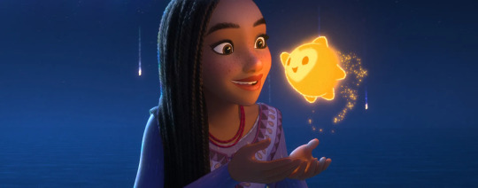
Then the reviews came in. Needless to say, I didn’t watch Wish.
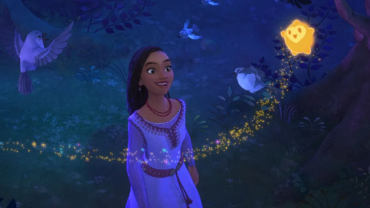
I remember a time when people used to complain about Disney making “too many love stories”. Then Disney stopped making love stories leading to films like Moana, Coco, Encanto and even Turning Red, which weren't bad.
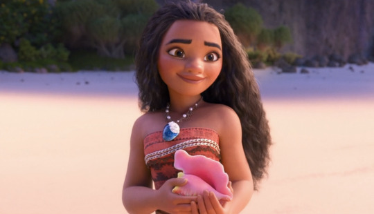
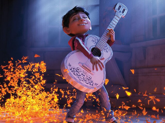

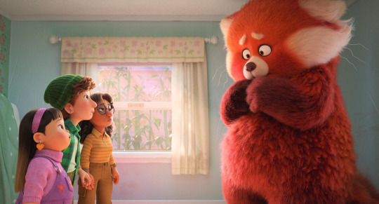
Following the failure of Wish, the biggest complaint I’ve heard for that film is that “it probably would’ve been more successful if it were a love story”.
The last romance Disney had we’re the protagonist was a “black girl” was Tiana from The Princess and the Frog which was technically their last 2D animated feature film.

And don’t get me wrong, til this day, The Princess and the Frog still tracks. Second to Tangled, I still very much love TPATF and it's one of Disney's classics that definitely have the rewatchability.
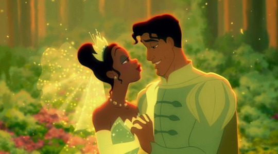
That being said, Wish is the first Disney film I've seen where the missed potential of what its story was originally supposed to be (herego a love story between a human girl and shape-shifting star boy) versus what we actually got is more popular.

Aww Disney, what were you thinking?! How could you think a film where the main character, who is a PoC, the first "black girl" (well technically I think Asha is meant to be mixed) female lead/love interest that you've had since Tiana in The Princess and the Frog in 14 YEARS where she is actually human for all of the movie and gets to share a love story with a handsome "star boy" who can literally make all of her dreams come and think that that's NOT gonna make you money!
I haven't even watched Wish yet I've seen more artwork and fan-made animatics of Asha and Star Boy than anything from the actual film.
At this point, Disney should just take all of the original ideas they left on the chopping block for Wish and revise them into a future title which is an actual love story they could market from.
Or…as an audience, we can just wait for one of their competitors, like Dreamworks to smell the blood in the water like the sharks they are and capitalize on Disney’s latest flop by taking the ideas they didn’t use and coming up with something that could potentially usurp the popularity of Wish’s failure.
In the case of Dreamworks, they don’t even need to make a new star boy since, technically, they already have potential “star boy” they can use.
Remember Rise of the Guardians?

Hahaaaaa OF COURSE you do, since it gave us the original immortal boy internet heart throb (also ironically voiced by Chris Pine who played King Magnifico in Wish) ---Jack Frost.

I find it hilarious that another reason why folks are hating on Wish so much is because Disney could've given us another potential immortal boy heart throb "Star Boy" to finally usurp the chokehold that Jack Frost has had on our generation of weebs and artists for the past 12 years since RoTG first dropped.
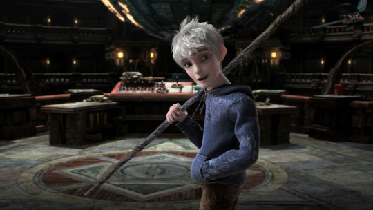
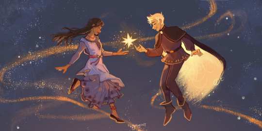
We could've had it all.
But as I mentioned Rise of the Guardians, did you know that there is character in the original series it was based off of called Nightlight?

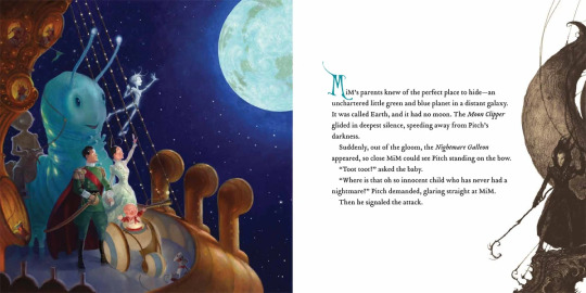


While technically not a “star boy”, Nightlight is the closest thing to one in an already established universe from a Dreamworks property and since this squiggle meister never misses a beat to push for continuation of Rise of Guardians, hear me out:
Imagine a Rise of the Guardian prequel-sequel about the character Nightlight and make it a love story.

(Because apparently there's a girl that Nightlight grows close to in his story called Katherine. It's just a friendship but needless to say, there is potential there).
I know it’s been 12 years since Rise of Guardians first dropped and I know I've be hollering for a sequel since 2012.
But c'mon, if there was ever a time for Dreamworks to capitalize on an RoTG sequel, it's now.
As Wish has proven, the internet is hungry for another handsome immortal boy with magical powers.
Dreamworks set the ball rolling with Jack Frost.
If Dreamworks were to revisit RoTG again, take Nightlight's story. Take his design and give him the "Jack Frost" treatment and make it a love story on top of that.
I'm not saying it will happen. Not even saying it could happen.
But if somehow thought becomes reality and something like this does actually happen, whoever does it will be rolling in dough.
This is just a longwinded way of me to say that somebody needs to bank on the concept of a star falling in love with a human and do it now since as the internet has shown, it's what the people want and what Wish failed to give.
~LMS (2024)
76 notes
·
View notes
Text
I dreamed that I was playing a fangame about the Minecraft creaking. It had a lineless style 2D style. It was set in the woods of course, but the color scheme was yellow and green instead of grey
The gameplay was simple and not very accurate to how the creaking is supposed to work. You were somewhere in the woods, and there was a creaking also somewhere. If it had line of sight on you you had to double tap the screen to go somewhere else in the woods. It usually followed you for a few scenes until you managed to escape. It was a 'how far can you make it' kinda game
I was playing it because it had a gacha life-esque character creator, even if you never saw your character in the gameplay, and it had some cool looking body horror options I wanted for a gacha design so. yeah
And then. The 'something watching you' aspect of the game became 'this is real life and you're being stalked'. I was part of the audience in a football stadium and someone in front of me was recording me, pretending that they were recording the game. The implication was that they've been stalking me for a while and this was the first time I noticed
As for the game itself... There were people arranged in a grid. They were standing still. For half of the grid, in front of each person was a writhing pile of flesh. The other half was holding white buckets full of meat and throwing it around. I was scared and I felt sick but I couldn't stop watching
#ice speaks#brain cinema#a flesh ritual? at this time of the year? localized entirely within my brain?#ask to tag
15 notes
·
View notes
Text
I always thought if a SQUIP user asks for a nonhuman character (e.g. Kermit or a sexy anime catgirl with a tail), you just sort of perceive them in the way you can perceive characters in dreams??
As in, you're not literally seeing Hatsune Miku standing there, a 2D object meshing with reality. Instead you just have the "delusion" (not sure how else to phrase it) that the concept of Hatsune Miku is talking to you. For me at least, I can almost never recall visual information from my dreams... Because I don't think there WERE visuals. It was just my brain constructing a narrative of what happened that I perceived the same way as the OUTPUT of my brain's sensory processing. It said "you're talking to Miku" and I went "okay" because that's the same amount of information I receive when I actually see and recognize a person; my brain takes all that light information and translates it into an abstract concept like "you're talking to your friend Tom," and that's all my inner brain is really used to seeing of the world.
I know this kind of contradicts canon, but if I were to write the squip, I'd have most of its powers operate by changing what you THINK you see/hear/know, and not actually altering your senses that much. Like if I were to rewrite optic nerve blocking, I'd have it not actually block Jeremy's optic nerves, but instead just make Jeremy incapable of recognizing/noticing the sensory stimuli that make up Michael Mell.
Both more efficient and way creepier in my opinion --- Jeremy SEES Michael, he just… doesn't know what he's looking at. His brain literally can't process Michael's face as a human person. That's just a wall or a backpack or something.
(Initially wrote this as a reply to @stormytbh's post about squips appearing with an art style --- I didn't mean this as a rebuttal or anything, it just got me thinking about my rich goranski lore and then I realized that leaving it as a comment would totally derail the post lol)
104 notes
·
View notes
Text
Plotting out "Yaksha" (Disney movie)

If you haven't checked out my post on my original Disney era, please check it out here. (And disclaimer: this post is a quick creation that is not the result of years like an actual film would be, and thus may not match the storytelling/music that properly reflects the culture.)


Background: Disney revives the idea for a "Jack and the Beanstalk" story, though they've no interest of making it take place in Spain like originally planned, citing the recent "Wish" film still burned in people's recent memory. Fawn Veerasuthorn (Co-director and co-screenwriter of "Wish," head of story for "Raya and the Last Dragon," and a story artist/storyboard artist/visual development artist for other recent Disney films) suggests a Thai setting, since there are many stories that revolve around Yakshas there. Though Disney is nervous about the idea due to RATLD's middling box office performance and polarized reviews on their SEA representation, Fawn points out that the former issue was COVID-related, and the latter issue can be solved by specifically focusing on Thailand. Eventually, they come around to the idea, citing how "The Princess and the Frog" was based a European tale with a fresh twist from another culture. Early on that they would gamble further by not only making the film a musical AND keeping a male lead, something they hadn't done since "Hercules" (AKA 1997). They aren't totally being risky, though; they bring over the Anderson-Lopez team, who was originally going to be used to be used for "Gigantic" (the original title for the adaptation) to write songs for it, as well as bringing in James Newton Howard in after his experience orchestrating the score for Raya. Opting to lean into potential "Avatar: The Last Airebender" parallels, Disney hires Michael Dante DiMartino and Bryan Konietzko as directors (and I'll be using some ATLA and TLOK pics for reference), with Matt Braly and Jared Bush creating the script. It was never established if they were going for a specific time period's influence, but the Sukhothai and Ayutthaya kingdoms were the most spoken about. Scott Watanabe does the concept art, and after a severe internal argument, they take another risk: to make it a 2D film. This is only done due to points being brought up how desires for 2D have increased (and TBATH winning "Best Animated Film" in 2024) as well as it working best in the film's favor being based on Thai art. Needless to say, Studio Ghibli plays a big influence on the art style, and the change to 2D makes production take longer to reacquaint the animation team with it, as well as getting the style they want.
Plot:

(Used this picture for visual aid; courtesy of Scott Watanabe's concept art for "Raya and the Last Dragon")
A poor family made up of a man, his wife, her father, and their two children, is blessed with another child. Unable to support him, the family falls into anguish, but his grandfather has dreams of buying and planting sugarcane seeds outside the kingdom and placing the baby there overnight, and is told that the child will be cared for. He tells the family, and the boy disappears the next day, being raised by the Yaksha in a sky kingdom above. For many years, the boy--named "Cloud"--believes he belongs there, until his adoptive mother informs him of his true heritage and guides him to the stalk from which she descended to retrieve him. As he grows, Cloud descends the beanstalk to learn more about the place he would've called home, but when a jealous giant follows him and accidentally kills the crown prince of the kingdom, the King vows revenge on the Yaksha, wanting to destroy them and conquer their plentiful kingdom in the process. Cloud, as a human, must know act as a bridge between both worlds in order to prevent an all-out war from occuring.
Characters:

"Cloud"--His main color is definitely blue, which references the world above that he lives in close to the sky. His nickname is a pun on his head sometimes being stuck in the clouds, as well as his easygoing and often gentle nature and the fact that he now lives in the kingdom above the clouds. He draws influences from several people (fictional or real, Thai or not) to craft a young man with a passion for peace and keeping the order between giants and humans. While he's spent most of his life in the world above, he will sometimes sneak down the sugarcane to a little village outside the human Kingdom of Khruth where he only goes by his nickname. For many years, he has befriended an elderly man, unaware that this is his grandfather. On Earth, he's known only by his nickname, with only a handful of people who know his real name, something he hardly uses (but still answers to).
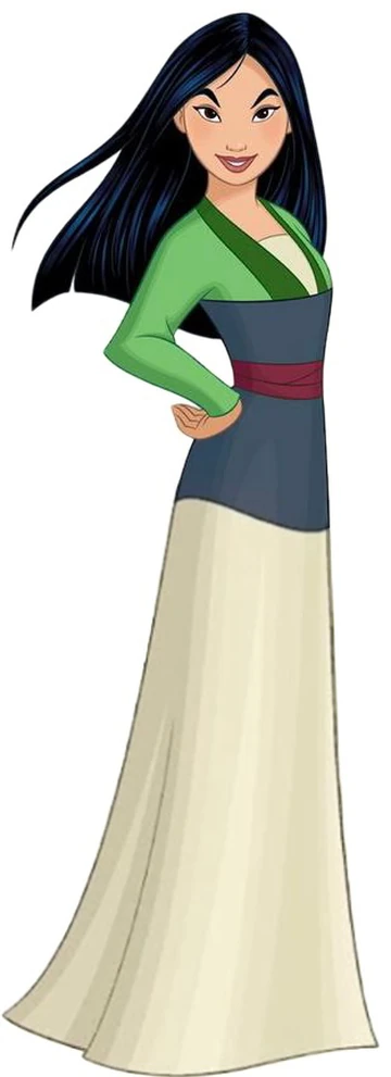

Suvana--One of the princesses of Khruth, who catches Cloud napping under the mango tree outside the palace. When she discovers he is the ambassador of the Yaksha, she's surprised, having expected him to be a brutish and reckless warrior, and she is pleased to find that he is respectful, pious, and compassionate. Somewhat of a black sheep in the royal family, she often tries to find time to herself, when she can be more playful and goofy without embarrassing her family or disrupting the royal status quo. However, despite her unique personality, she's also quite clever and mysterious, being underestimated often due to being seen as incompetent.
Note: her name is taken from Suvannamaccha, a mermaid princess from the Thai version of the Ramayana.
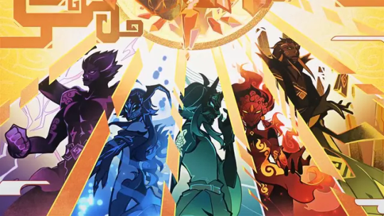
Ngein--A mother figure to Cloud and a leader of the Yakshas who reside in the sky, she's weary of the impending war with humans, who, in their hubris, desire to conquer the sky upon hearing of even more majestic lands and priceless gems and minerals there. On top of this, one of the Yaksha's kills the crown prince in a rage, fueling the friction between both parties.
(IDK if I'd use their "Genshin Impact" designs, but it is a nice visual aid.)

Sirichai--The King of Khruth who grew up with stories of giants who housed outstanding treasure and magic in the world above. When one of his sons is killed by a Yaksha, he follows it to the sugar cane and investigates the world above, and comes to the conclusion that while above him, it is still part of his kingdom, and his craving for revenge drives him to want to dominate the giants--or slaughter them for their wealth. Either or.
Songs:
Sent to Heaven--The opening song about the dreams and hopes of commoners, it focuses on Cloud's family leaving him below a sugarcane stalk after dreaming that he will live better if they do so rather than living with them. They ponder the drawbacks of this, however, as they may never see him again.
What Else is There?--After being told that he's the child of humans when he's young, Cloud begs Ngein to show him the sugarcane that peeks above the clouds, and as the years pass, he makes his way down to the human world, learning about the life he missed, with Ngein always satisfied because he always returns and because she watches him from Yaksha statues outside of temples
Underneath--Cloud rests beneath the mango tree, contemplating how large the world beneath the clouds is, and how he isn't ready to go back home. Meanwhile, Suvana talks about who she is underneath her decorum, and is simultaneously embarrassed by how she fails to live up to royal standards and sad that it alienates herself from her siblings.
Worth the Price--Sirichai makes an impassioned speech to his army to climb the sugar cane to the land above and make the giants above subservient to them. Suvana notes that despite her father's ill intentions, he does not recognize what he's doing as wrong, truly believing that his the skies above are part of his kingdom and thus his dominion.
What Else is There? (Reprise)--When Cloud is imprisoned and Suvana must go alone to persuade the giants not to kill the incoming warriors, they ponder if their desire to live and explore was always meant to end poorly, if they were better off living the lives played out for them. But then, they realize they wouldn't have met each other, and they'd always wonder "what if?"
Only Me--Having managed to avoid war and catastrophe, Cloud and Suvana marry, and they reflect on their journeys. Despite their kind hearts, they made hasty decisions that could have hurt so many people, and as they marry, they vow to each other and both kingdoms that the ceremony was not only a marriage of people, but a marriage of worlds. (Note: if I made the lyrics, it'd be "It's NOT only me")
Lemme know what you think and if you have any questions! Obviously I don't know the inns and outs of Thai culture, but lemme know if it sounds like it could work with these ideas. I may make minor changes to this. Perhaps I'll make more posts related to the rest of my fanmade Reinvention era.
#disney#disney animation#thailand#avatar#avatar the last airbender#the legend of korra#jack and the beanstalk#genshin impact#disney princess#mulan#raya and the last dragon#namaari#ozai#bolin#asta#black clover#anime#chan#ikem#overwatch#lifeweaver#bambam#studio ghibli
19 notes
·
View notes