#also the art style looks so appealing
Explore tagged Tumblr posts
Visit Tumblr Blog
Explore Tumblr blogs with no restrictions, modern design and the best experience.
Last Seen Tumblr Blogs


Fun Fact
BuzzFeed published a report claiming that Tumblr was utilized as a distribution channel for Russian agents to influence American voting habits during the 2016 presidential election in Feb 2018.
Text
Enlisting the help of Jojos Bizzare Adventure fans.
I want to start watching/reading Jojo but idk where to start, are some parts better than others? Are there specific ones I should start with?
I'm a big fan of shonen if you couldn't tell by the fact my current layout is Dragonball related, I've always wanted to start watching/reading Jojo but I don't know where to start or how to approach it.
2 notes
·
View notes
Note
I’d invite machete and vasco to my animal crossing village
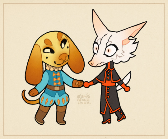
They're a package deal, you have to take them both.
#own art#own characters#CanisAlbus#Vasco#Machete#answered#wowwforever#this is as good a time as any to admit that I've never played any of the Animal Crossing games#consoles are just so expensive and I have a bizarre personal vendetta against buying electronics unless I'm 110% sure I *need* them#so these days unless a game gets a pc release I'm unlikely to ever get my hands on it#but the art style is very appealing and the character designs are vibrant and clever so I've been admiring them from a distance for a while#I love it when I have a chance to draw Vasco with these specific bean eyes#they make him look benevolently mischievous#also just now noticing that I made Machete's tail machete shaped
2K notes
·
View notes
Text
would you guys call me crazy if i said archetype wise that marinette's status as a Plucky Girl-Next-Door takes priority over her status as an Aspirational Everywoman. cause i have thoughts about this
#i think the reason a lot of marinette depictions (especially aged-up ones) tend to fall flat for me is that they polish away her quirkiness#which partially makes sense as she would naturally become more confident and composed as she ages#but also in my mind as she comes into herself more she would only get *more* eccentric and quirky and silly#this falls into the same nitpick i have with giving marinette too many white and conventionally attractive features#like i can't and won't *stop* you but i don't understand why you wouldn't want to make your blorbitos look more distinct#(same goes with adrien. at least explain why of all face claims you seemingly chose ALEX PETTYFER.WHAT)#but depictions of adrien are its own thing I apologize for derailing#they just both get the brunt of this sort of phenomenon but marinette especially#is it because we're so used to seeing our fiction taken over by absurdly hot people? is it part of the enjoyment? art style limitations?#overwhelmingly white/european reference photos?#do some people not find marinette's awkward adhd charm as part of her appeal?#is it just a misunderstanding of the archetypes and tropes mlb plays off of?#or is the appeal seeing this clumsy 14 year old mature into a Strong Independent Badass Strong Awesome Woman#anyway I'd like more mlb semirealism artists to depict a marinette who looks so disheveled she's painful to look at#if it's not too much to ask.
43 notes
·
View notes
Text

i tried tweaking the design of proto soul's helmet ... hmm 🤔
#something about the in game design just looks a smidge weird to me but idk what it is .. i think its bc of the silhouette#like part of protomans appeal is how aerodynamic he is LOL like he just has the one shark fin but then protosoul has Three#so i toned them down a bit and made them more like the teal swoops on regular megaman#and also his hair idk!! i made it swoopier instead of straight out like some budget axl LMAO#also accepting estimates for how old he looks here lolll because i did some studying and every time i study my art style does This for a bi#mmbn#megaman battle network#double soul#(hehe thats me)#megaman.exe#my art#edit: the visor was a bit out of perspective and it was annoying me. fixed
14 notes
·
View notes
Text
im excited that rov is getting a new anime movie but everything is so severely backlit with the modern anime Background Void Glow that the charm of ikeda's artstyle is like. drowning in it almost
#everything is Bright White and Shiny and Undersaturated its just like sighhhhh#wish it was also not done by m*ppa too i do not like their work. sorry#the colouring and animation is so 2020s new anime but then there'll be shots that are so rov in art style and im like oh right its that.#does that make any sense at all like clearly its very manga art accurate but the everything else on top is like oh yeah thats modern anime#modern anime slash neg#which like uh yeah obviously its going to but idk it looks modern anime in a way i dont find appealing
8 notes
·
View notes
Text
Tragic how ive forgotten how to draw him already
#whats wrong lol why are you afraid of drawing your fave#impostor syndrome? you cant maintain a style so you feel guilty that he looks different every time ?#also like zero appeal#scribblings#my art currently has zero appeal#i dont have a cool thing yknow#augh i just keep looking at all my sketches since my last finished art#like disgusting all of these are absolute garbage lol#but ill document them online even if i hate them#sigh sorry Ace i want to draw you as beautiful as i can#but today isnt that day#i mean my sketches lately have been atrocious#bad form bad anatomy bad lotta things#no idea what to do except just push thru it ????#or just not draw for the month idk
43 notes
·
View notes
Text
whenever i get through a vn i feel so out of it
#like what do you mean im not dating some unhinged guy#or a supernatural being...??#ig i could go finish up some art#but i could also keep running through these vns....#its a hard choice#btw...that klein one is really good#i love its art style so much#its perfect#it fits the vibe of the story so well#also its just visually appealing to me#theres a couple of scenes in there that are actually pretty spooky#it was just what i was looking for this whole weekend
3 notes
·
View notes
Text
unrelated to anything but I can't stand the art style of One Piece and I don't understand how anyone can look at it without being vaguely grossed out. everything and everyone looks so ugly and it weirdly messes with my synesthesia in a way where I feel like the whole cast just smells of dirty old feet gdsfj;oigdhsfj;oigrsfdj;io
#legitimately everytime I look at that big disgusting grin he slaps onto all his characters#all I can smell is dirty feet#I don't know why but it's basically written off the whole show for me#I ain't reading the bad hygiene manga and for w/e reason that's all I think about when I see the style#just that all these characters must stink because they look so gross and unsettling#also generally with art you want it to look appealing on some level#and idk why he chooses to draw everything Like That#it looks horrendous and there are panels that make me think#''wow this is so badly drawn I guess that's why he draws like that because he can hide the fact he can't fucking draw''#like the whole thing aims to overwhelm your senses while also just being proportionally bad and often visually nonsensical#so yeah I hate it and always have welp#you will never make me like it because it looks like how feet smell
2 notes
·
View notes
Text
Entranced by a new man once again
#<- girl who is aromantic and asexual but clearly has a thing for me she doesn't really have for women#i want to do baldur's gate related stuff but crucially i cannot play it on my laptop#so i'm left like. listening to people talk about it trying not to spoil myself#this is however granting me the strength i need to push through my deep seated fear of being cringe and wrong#which usually causes me not to draw fanart#i'm not at a point in my art journey where i easily capture likenesses#so i'm just like. trying to doodle astarion a lot lol. trying to get all his feature right#trying to bend my style in ways i think would look appealing#maybe the absolute and utter fascination i have for him will get my art to look better#in other news i hadn't actively paid attention but now that i've been actively drawing him#he has that little like. artistic curl of hair in front of his forehead right#well it falls kind of like cécilia's lol#i keep drawing it and having to catch myself and not draw cécilia's instead#conclusion: the coolest guys have that curly strand of hair#other examples include hunter toh and. i don't know probably more cool people#i am also Sick. sore throat for now. sucks ass but hey it's not worse#wow i have a ramble tag now
4 notes
·
View notes
Text
i woke up early today and am way too energised my brain is like spilling in circles but I still have not the right energy to be coherent or focus on actually doing anything with it
#thoughts#horrible feeling!#like tired but also way way way not.#the direct was fun. mario fans must have had a blast wow#not a bad thing I look forward to learning more of the peach game and the art style they went with for wonder is neat#uuuuh. oh I love the design of the glow pikmin they appeal to me very much. i haven’t played a pikmin game properly before but#I’m excited for 4 I’ve been wanting to get into it for a while now. uuuuhhhhhhh! silent hope seems neat ? dragon quest monsters too I like h#how it looks visually .wario ware is silly I don’t know if it’ll actually work but I like that it’s silly ?? I’m rambling to try to get#my energy to a manageable level I think it’s working talking takes So much energy#oh the the . i looked it up pennys big breakaway that seems cool I also like the visuals of that a lot#yeah this worked back to spacing out for me#wait the splatoon segment was weird that’s the last thing like. why’d they do that#maybe not back to spacing out exactly but definitely an improvement to when I started I’ll think of something else#oh I’ve been trying to learn to program in godot! it’s going slow since it’s a lot of reading and takes me energy pretty quick but#i think I’m doing well even if I can only do a little a day like I’m understanding it easy so far. don’t think I’ll be able to make anythin#anything for a while but making it feel less impossible to make something one day is nice#i made the tutorial turtle do a little dance : ) ! and I’ve been working on some crochet on and off. doing a bit more digital art though#just like sketching. i need to clean a bit so I can get my sewing machine set up I want to make little bags so I can carry more things#when I’m out. love having tiny bags for specific things in a big bag#oh and I’ve been reading about gardening a bit I need to map out the garden if I want to plant anything which I don’t know if I’ll be able t#to do any time soon but it’s still fun to think about and I hope I’ll be able to do it some time#ok words over I promise <3 back to art maybe goodnight
3 notes
·
View notes
Text
jimmy and the pulsating mass NEVER appears in those fucking rpgmaker motheresque game circlejerk posts and i’m SICK OF IT.
#you can argue it has rather large issues BUT LISA AND OMORI ARE ALWAYS RIGHT THERE#ISSUES IN A SOCIAL JUSTICE SENSE I MEAN#WITH JIMMY ITS THE LOGICAL RESULT OF AN EXTREMELY SHELTERED KID BEING EXPOSED TO JAPANESE CULTURE ENTIRELY THROUGH HIS ‘weeaboo’ UNCLE.#ITS SHIT BUT ITS NOTHING COMPARED TO…. *EVERYTHING* LISA PULLS OR THE FUCKING CLOSET FULL OF SUS’D ANIME BOYS THAT OMOCAT HAS#ITS! NOT ABOUT THE ~moral issues~ ZANNY YOU NEED TO STOP TELLING YOURSELF THAT PEOPLE DON’T CAAAAAAARE THEYRE HEATHENS WITH SHIT TASTE#THEY GOBBLE THAT BIGOT SLOP RIGHT ON UP#THEY JUST WOULDN’T KNOW ONE OF THE BEST TURN-BASED BATTLE SYSTEMS I’VE PERSONALLY *PLAYED* IF IT WALKED UP AND SMACKED THEM ON THE ASS#WITH CHARMING VISUALS LEGITIMATELY GUT-WRENCHING YET DELIBERATELY DIVERSE AS HELL HORROR STYLINGS AND THE BEST MUSIC.#ADMITTEDLY. IT HAS SOME TROPES. TBH A LOT OF THE APPEAL OF IT IS THAT IT DELIBERATELY PUTS THE BIG ONE OUTTIN THE OPEN#(i.e. ‘its the dream of a kid with emotional problems!!’#)#BUT ALSO SOME OTHER GENRE CLICHES. SURE#INCLUDING SOME MASSIVE SPOILERS jfc rhe games great play it don’t look up summaries and shit#BUT ITS…. NEVER ACKNOWLEDGED???#IS THE CREATOR A FUNDIE WHOSE GAME EXISTS ENTIRELY IN EVANGELICAL CIRCLES OR SOMETHING??? HAVE I BEEN ACCIDENTALLY OBSESSING OVER A NICHE SU#SUBCULTURE *EXCLUSIVE* MEDIA THING THIS WHOLE TIME????!?!#the answer is no on the fundie thing btw theres ways the game could go those places but it shows the restraint and agnostic compassion those#shmucks struggle with lmao#ALSO THE MUSIC IS SO FUCKING GOOD#the art is deliberately a bit chumbled and childish fights wise but ITS LITERALLY A KIDS DREAM BRO THIS IS THE FUCKING RPGMAKER#EARTHBOUND SUCK-N-FUCK ARTSYBOY GENRE IF IT DOESN’T PLAY WITH ‘unusual’ ART STYLES THEN WHATS EVEN THE POINT OF IT#DO FUCKS JUST WANT ANIME? OMORI??? FUCKING OMORI????#ngl i do want to actually play that game sometime. as much as i bear ill will towards its development/existence the fact its soooo beloved#has gotta mean it has SOMETHING good
5 notes
·
View notes
Text
im gonna reread crime & punishment except this time with the oliver ready translation
#ive heard great things abt it so am looking forward to it#& also the book cover is so appealing to me like yea i think that really is a good art style for what this story is
0 notes
Text
i js finished mob psycho s1......shigeo is soooo me.......and the art is soo pretty oml
#i love love love the use of mixed media and art styles#and how do they make airbrush shading look so good???????#also i am now seeing the appeal for reigen lmao#hes actually a sweetheart#who was gonna tell me????#[thoughts]#i have acquired two new blorbos
0 notes
Note
How the hell do you manage to superimpose the hilariously exagerated proportions of the tf2 mercs into a cohesive 2d style? I always struggle SO much with like, the way the mercs' models have huge hands, the way they have relatively low-poly definition on things like arms, shoulders, and legs... and Especially the way like, the models are kinda janky when you pose them for art purposes- when using movement tools, things like armpits and seams between body parts get all deformed... Which makes the study of form and silhouette rather difficult.
I assume that a lot of your ability to translate the concept of the mercs from their original mediums into your own works of art comes to you quite naturally- through experience you have with drawing and art style stuff, as well as through intuition. I was simply wondering if I could poke at your mind and get some insight into your process, any thoughts you have about the proportions and silhouettes of the mercs, any quirks you've found while drawing the mercs, or simply what you enjoy drawing about them. Like, don't be afraid to infodump about something just because you think people wouldn't find it interesting- I am here, I am sitting, and I am listening- if you so choose to speak.
I am utterly fascinated and enraptured by the more behind-the-scenes aspect of art. The mundane things that come second nature to great artists yet seem so revolutionary to less experienced artists.
I love your work, I look forward to seeing more of it, and I hope you have a nice day :]
Sorry for the late reply! I've been a little…stuck on how to answer this but that's mainly because to me, drawing is composed of SO many different little skills - you have form, anatomy, shape language, silhouette, appeal, rhythm, acting and posing…not to mention everything AFTER your raw draughtmanship like line style, rendering and colour theory. Trying to distill a multiude of small skills into some pithy advice is overwhelming to my brain. So I'll take the invitation to ramble instead :))
I don't think I have any new or revolutionary insight into the tf2 guys specifically - more I'm using them as work horses to excercise general silhouette/posing/shape-language and further my skills when it comes to drawing characters!
I do agree though the proportions are rather silly when you stop and think about them realistically…they can be kinda tricky if you follow their 'actual' proportions. what looks great individually was maybe never meant to be directly compared (ie: Heavy's hand size against Spy's lol). It would've been funny if the TV show exsisted and we had more content to review…would the animators have had rules like Spy and Heavy can never shake hands? Would they cheated the proportions for shots? Or would they have said WHATVER it's gonna look weird and embraced it? (Like Kingpin in Spiderverse lol)
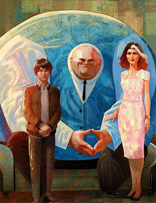
Paul Lasaine for 'Into the Spiderverse' This is AWESOME. But it's also one of the silliest designs I've ever seen comitted to screen. The varied scales of the characters work because of the unifying treatment (lighting, rendering, consistant hand anatomy, consistant clothing fold treatment etc) and because they are sort of proportional within themselves. A common mantra is that hands should be about as large as a characters face....which they all are here!
Human brains are very flexible and forgiving though. It's totally fine for you to put a character with huge hands and head next to a teeny tiny character! Vanellope and Ralph from Wreck-It Ralph look grand next to each other! And in that film you even have varying levels of stylisation sitting against each other (unified by the look dev treatment of the shaders and lighting). I think as long as the chracter is proportional within themselves it sort of works out. IE: a general rule is that a hand should be as large as the face so…you can have some large arse hands as long as their placed on a body with a big arse head. Unifying characters with the same treatment (ie: lineart brush, colouring style will also help them look cohesive next to each other :) )
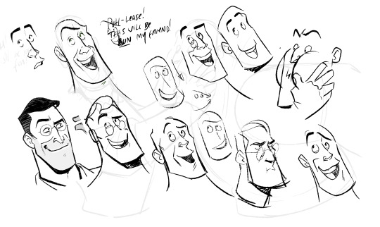
I don't actually reference the 3D models/animations very much at all and instead draw their proportions based on my tastes for stylisation following their general vibes/silhouette profiles. I don't stick THAT close to their in-game looks and there are artists who do that are so so so much better than me (Creedei and Flapjack come to mind). I'm not amazing at body-type differentation and TBH they're all wearing chunky clothes all the time so I usually draw the guys as one-of-three body shapes: Heavy is the uniquely wide guy; Sniper/Scout/Spy are all tall and slim and Demo/Soldier/Medic/Engie have a little more of the generic 'hero' bodytype with varying tallness and broadness of the shoulders
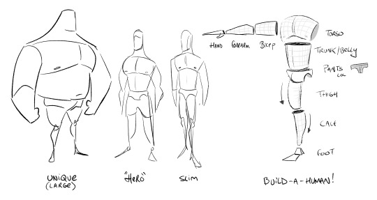
Something like this! You can vary all these individual elements in terms of size, thickness, taper amount etc to create different characters. If you ARE going to reference the 3d works though you'll need to apply some anatomy knowledge to overcome the weird shoulders, armpits and knees which desperately need blendshapes to correct the 3D volumes and approach it a little more like an animation supervisor. There's a reason why you see in making-ofs and art-ofs character designers, character leads or animation supes doing drawovers of the models. These are character models that have had great effort put into their 'base' silhouette but it still needs to be reinforced in every frame for maximum appeal.
Shiyoon Kim for 'Raya' This sort of thing will occur at multiple stages during the animation process. Shiyoon Kim's notes are post final model but pre-animation. Most likely for internal rig tests, exploring what blend shapes and alt shapes are needed for the rigs etc. If your production has time, this will continue all the way to final anim. IF! But it's interesting to see how he emphasises the shapes and enhances the character acting of the 3d model.
As for 'mundane things' - I wouldn't say they're second nature! (If that makes you feel better!) I have to actively really persue certain advice and try to figure out how to best apply it. This can sometimes involve redrawing and redrawing an element of the drawing until I've grasped the nettle of whatever I'm after or…..until I get frustrated and either delete the drawing or just call it done lol
Here, I'm looking for a really specific flow of the head that sells both the acting and a subtle head tilt. I'm also trying to apply the general mantra regarding faces that converging lines (set by the eyebrows and mouth) are more appealing than parallel. It's tough! I also tend to use a drawing I've already done as a template/reference on the page too. Oh! This page is an amazing example of why I'm not an animator or storyboarder…consistancy? Who is she? 💅
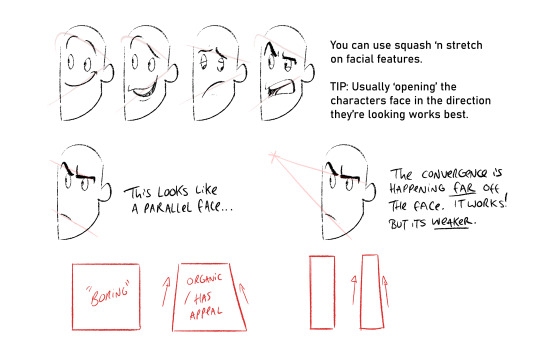
Converging lines (that form tapered shapes) are always more appealing than parallel. Using this logic you can loft the facial features across converging lines to create dynamic appealing espressions. Combining this with anatomy, perspective and rotation is the tough part though. I'm still learning o7
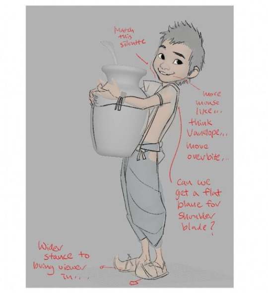
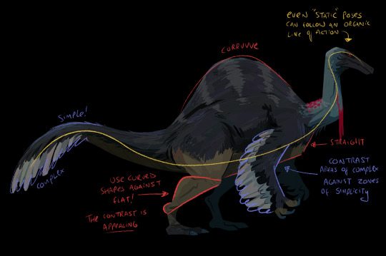
The things I probably think about MOST are always flats vs curves, simple vs complex and general line of action/flow...and then eliminting tangents. Each of these can be a dedicated visual-essay on their own - hence my stumbling as to answer your question. Anyhow, not sure if it's ever come up on this blog but I looove dinosaurs :)) so i'm using a wee piece to demostrate these ideas! (but also to demostrate these concepts apply to everything from humans characters to animals, props and background design)
Okay, I'm getting self-aware that this is getting really long :') I have a wee tutorial tag for my blog if anyone wants to comb through my garbled art-thoughts. Learning, studying, repetition and practice will always be the greatest teachers! I'm glad you like my art- thank you so much for the lovely comments - I feel like such a noob still and not qualified to give people advice but we're in it together learning! High-five! 🙌
#tutorial#asks#sorry for any spelling mistakes whoops!#hopefully...this is VAGUELY useful or interesting to people ;;#TBH I'd much rather do youtube drawovers/videos of my own or others work as that is...my job...rather than doing writeups lol#its much easier to talk and vibe about a piece of art vocally than to try and make everything uber succint in writing
410 notes
·
View notes
Note
The art style for the pokemon anime and manga has shifted and changed quite a lot over the years. Is there a specific series or era style that you particularly prefer or that you think your art style is inspired/affected by when drawing the characters?
Ugh amazing question I have 3 answers (for the anime since im an anipoke girlie)
I'm a big fan of the OS anime style. The colors, the sharper style and the grainy look. I also really love the proportions from that era. Everything just felt so solid and blocky in a nice way. I also really love the expressions. There was a lot more subtlety at that time and it was really effective.
Next one and maybe the bigger influence on my own style is the SM anime. I LOVED the design change. Incredibly simple, bouncy, round fun to draw, less tied down, etc. It's just so fun! I feel like my default style has always been a bit of a mix of anime and modern western cartoons and this is the pokemon series is the closest to that vibe. Also those EXPRESSIONS. I have so many random screenshots saved from this series just because of how bonkers the expressions would get.
My #1 influence without doubt is not a specific series style or era but rather a specific artist! His name is Akihiro Tamagawa and he was one of the animation directors on pokemon from OS to I beliiiiive XY? He also did a lot of the movies! Everything about his style is just so appealing to me. The proportions, the posing, the composition, the expressions, EVERYTHING. I've definitely taken inspiration from how he draws eyes and mouths. I draw a lot of low mouths and big smiles because of this guy. I feel like once you see it you won't be able to unsee it in my work hahaha. I made a post about it before!
And here's a guide of all the episodes he directed on!
478 notes
·
View notes
Text
Law's artist side isn't talked about enough, so here's a smooth brain ramble.
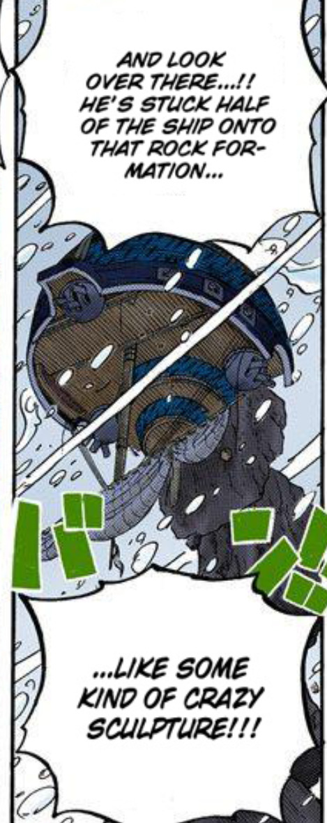
He prefers abstract arts over realism. Unlike Kid who forms animal or skull figures with metals, Law creates strange 'sculptures' with his victim's bodies/belongings:

And, of course, the tattoos.
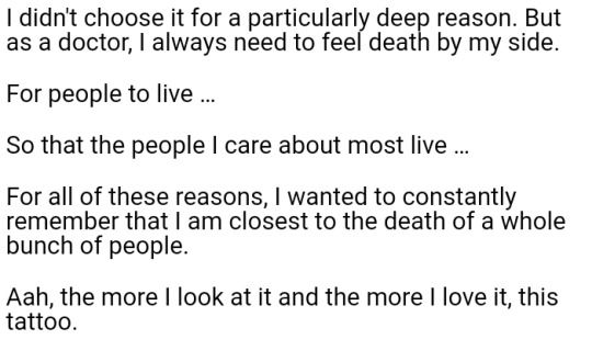
I like how all of his tattoos accentuate the shapes of his torso and arms, especially the joints and muscles. Combined they look like a single stylized drawing of human upper torso.
Seen theories that the tribal style could be a lost trend from Flevance (as seen on the arm of a miner in his flashback), but it could just be his personal style. That said, his upper arm's heart tattoos look similar.
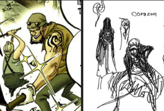
(Something that artists probably noticed long ago but I'm only noticing recently: Law's upper arm's tattoos have been simplified over time. There used to be two spiral-like protrusions, but Oda has been omitting them in later arts)
The "DEATH" tattoos have a straightforward message. According to the Law novel, these were his first tattoos.
Speaking of death, ghosts and spirituality have been implicitly a theme for Law, especially during Dressrosa. Doflamingo referred to Law as Cora's 'vengeful ghost'. Law's (cursed) sword Kikoku's name means 'wailings of a restless ghost". Ironically, Law having a hidden name was also a tradition that related to dead people.
The orange jolly roger (red in the sail) could be many things, I think it's a stylized way of drawing the sun.
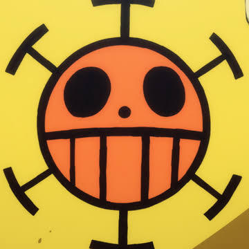
Sun symbols are everywhere in the One Piece world. Law's lower arm tattoos are different types of 'suns'. Law might've subconsciously carried those symbols from his hometown for their aesthetic appeal.
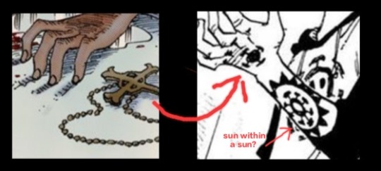
The tattoos on the back of his hands reminded me of the church lady's cross, which is slightly different from the cross seen at Kuma's church. It's possible that various faiths in One Piece world are interconnected, leading to a prophecy about the sun god and Dawn. Law, at the very least, believes in the will of D and his own fate being tied to a purpose.
The chest tattoo, clearly a tribute to Corazon, could have some elements of catholicism. Kikoku also has crosses all over its sheath. Originally this wasn't my observation, but Law seeing Cora as a sacred being makes a lot of sense.
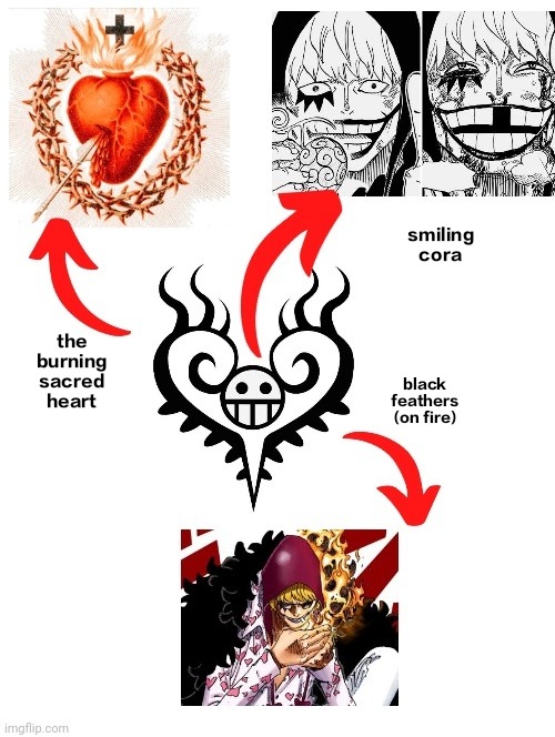
Carving a heart at the dead center of his chest by creating small wounds - the process itself reminds of Cora doesn't it
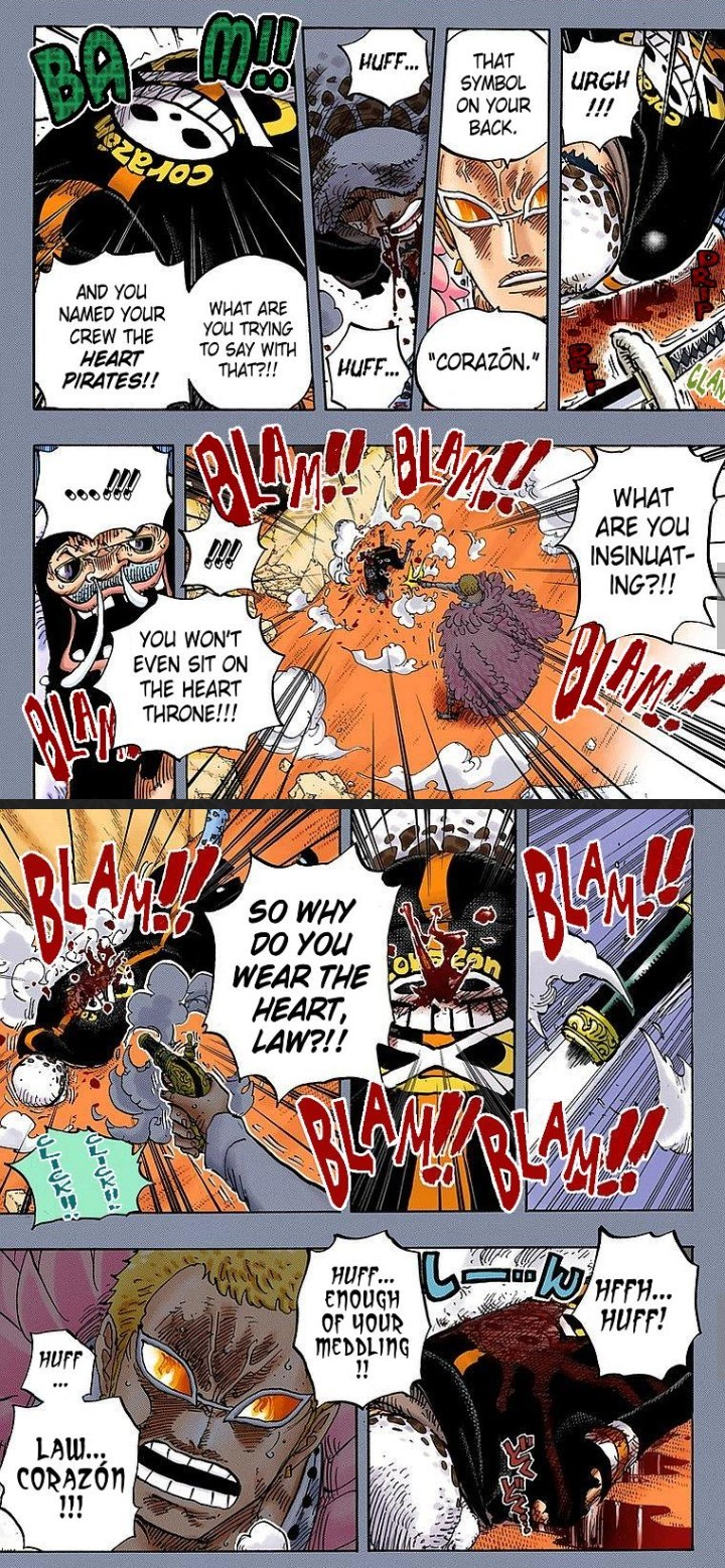
The custom-made Dressrosa coat is another tribute to Corazon, but IMHO he designed it specifically for Doflamingo, as a mockery.
A cross and circle like dangling a pistol target for Doflamingo's shooting practice, with a grinning face copied from Doflamingo's own jolly roger, but it's Corazon. Like his brother has returned to face his pistol again. A vengeful ghost indeed
And boy did it work...
Doflamingo shot it until the mark was completely drenched and unrecognizable.
Assuming he draws for all of his clothes himself, here's this masterpiece:
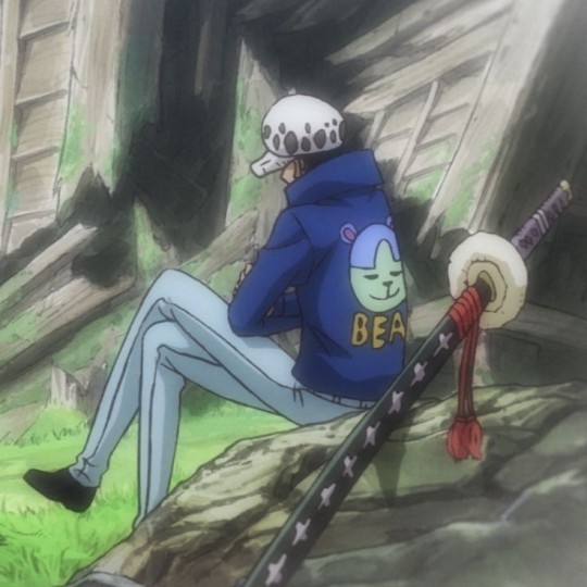
Or maybe it's gifted by his crew mates. Either way, it's adorable.
Since he's a surgeon (and a comic nerd), he should be skilled at drawing human anatomy. How does he draw realistic arts? Does he doodle while taking notes?
We've seen his handwriting in punk hazard arc and it wasn't particularly stylized. Regardless, it'd be nice to take a proper peek at his notebook.
#law's design appreciation#lmao this tag lives on#I miss Law man#if there's any different interpretation please feel free to share them!#one piece#one piece meta#one piece theory#trafalgar law#trafalgar d. water law#donquixote doflamingo#donquixote rosinante#mine#op meta
646 notes
·
View notes