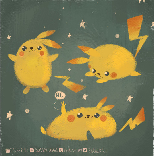
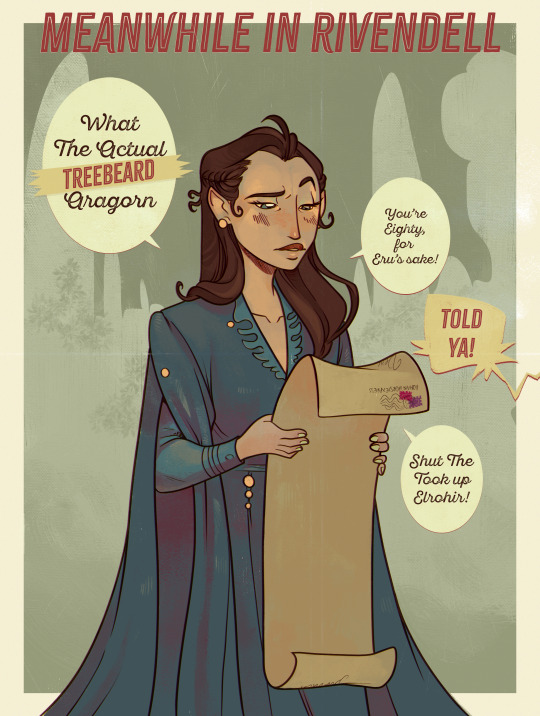
#also i learnt how to use photoshop for this
Explore tagged Tumblr posts
Visit Tumblr Blog
Explore Tumblr blogs with no restrictions, modern design and the best experience.
Last Seen Tumblr Blogs


Fun Fact
Forty percent of Tumblr users are between the ages of 18 to 25.
Text

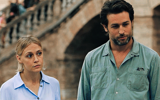


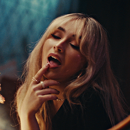
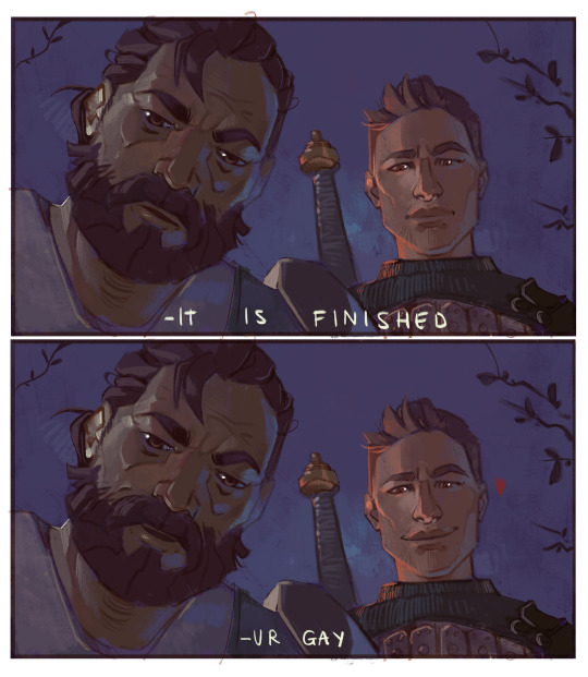
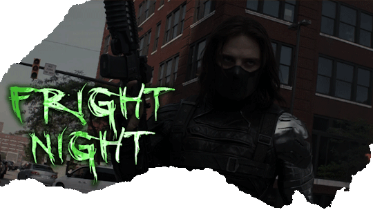
THE MALLORCA FILES S01 E08 — Death in the Morning
“The papers will enjoy this story. But at least the motive was personal, not political, so... a national outcry averted.”
#i learnt how to make gifs in photoshop!!#honestly it is considerably quicker than the insane back and forth between four different apps i did for my miranda & maría gifset#don’t get me wrong it still took me ages to make these but it was less tedious hndjfjshf#(also i already knew how to use photoshop for colour grading & whatnot so that made things a bit easier)#the mallorca files#gif#gifs#the mallorca files gifs#gifset#the mallorca files gifset#my gifs#miranda blake#max winter#ines villegas#s1 ep8#death in the morning
35 notes
·
View notes
Note
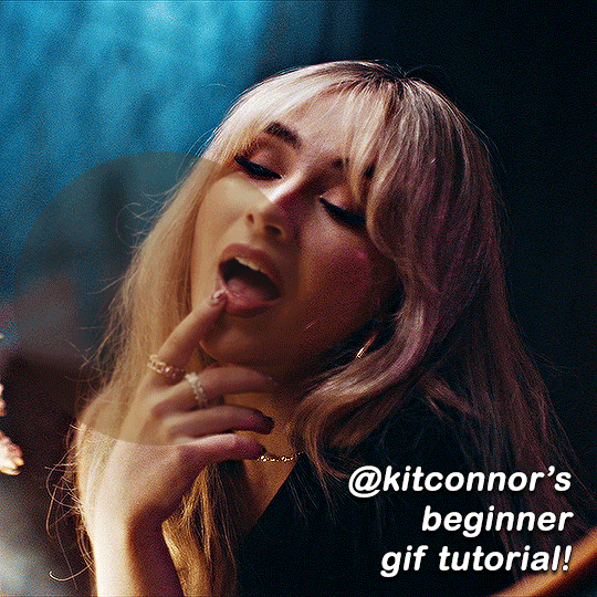
Hi! Happy 4k celebration 🥰 Can you share how you make your gifs or make a gif tutorial?
hi !! tysm <3 i'm more than happy to give you a little tutorial on how i make my gifs ! of course, my process is not the same to other gifmakers and may not always work for everyone but i hope it helps !
for this tutorial, i'm using the most recent edition of photoshop (2023) on my mac. full explanation under the cut.
full disclaimer: most of what i've learnt about photoshop and the giffing process is through pure trial and error. this won't work for everyone and others may think it's a little weird, but this is just how i make my gifs !!
1.find your scenes.
finding your scenes is sometimes very time consuming but you want to get it right the first time !! for this tutorial, i'm using a music video in mp4 format.
2. loading your scenes.
to load your scenes, you want to go: 'file' > 'import' > 'video frames to layers'. i know that this step varies on the user because some people like to go to timeline first, but i'd advise starting in frames first !
after that, a screen like i've depicted below will pop up. i've also annotated everything for you as well.
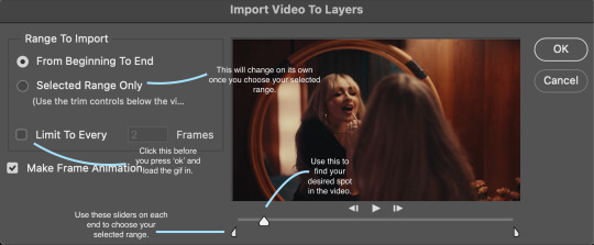
so, select your desired range, press 'ok' and then it will all load into ps !
3. setting up your gif.
i'm grouping this all into one step, but it's broken down into a few things.
the first part of this is: cropping. the recommended dimensions i follow are on this guideline here, but for the sake of this tutorial i'm just going to crop my gif 540x540 (as a w x h setting). the crop tool is on the left hand tool bar.
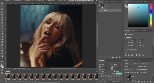
now, my gif looks like this. from here, i'm going to click on the timeline (the space along the bottom that has every frame). from there, click on the three lines to get this menu (i've circled where to go + what you'll click):

from there, go 'select all frames' and then click on any of the frames NUMBERS (where it says 0.04 with an arrow besides it, or whatever yours says) then change the frame rate. with most youtube videos i will use 0.08 as my desired frame rate, but when i'm gifing a show or something, it loads in as 0.02, so i change it to 0.05. 0.05-6 on any normal screen cap should be fine, but obviously you can change it depending on if it looks right or not.
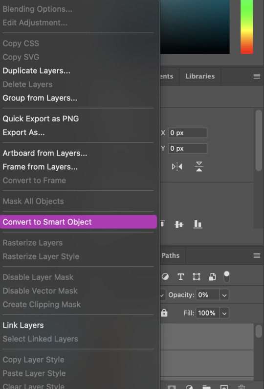
from there, you've basically done the first half of the basics. now, you'll want to click on this button:
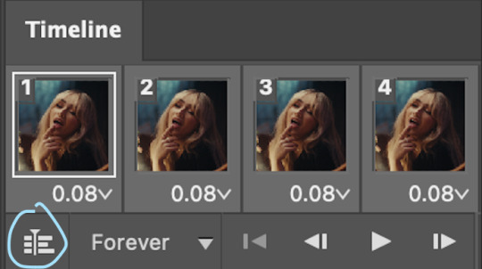
and now you'll be taken to the video timeline ! from here, select command + option + a (this is for mac, i think it would be control if you're on another device) then, right click on your layers and go 'convert to smart object'.
from here, i'll sharpen my gif before i colour. for this step i have two alternative sharpening settings first one by anyataylorjoy (rb to download !) and the other by maygrant (please ask !). the first one is tuser maygrant's and the second one is tuser anyataylorjoy's. i typically use morgan's for all my basic gifs but anyataylorjoy's for creative sets. every user has a different preference but just find what's good for you !

4. colouring your gif.
definitely the most tedious, this can be a little bit of a hassle depending on the scene. if the colouring isn't riddled with heavy yellows or cyans, colouring is usually a breeze but if it is, it can be hard.
CURVES

the circle with the arrow dropdown and that's half grey-white is the circle you want to click on to find curves. it'll open a menu and curves will be at the top.
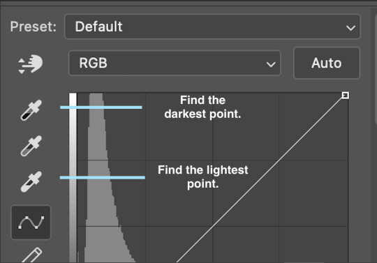
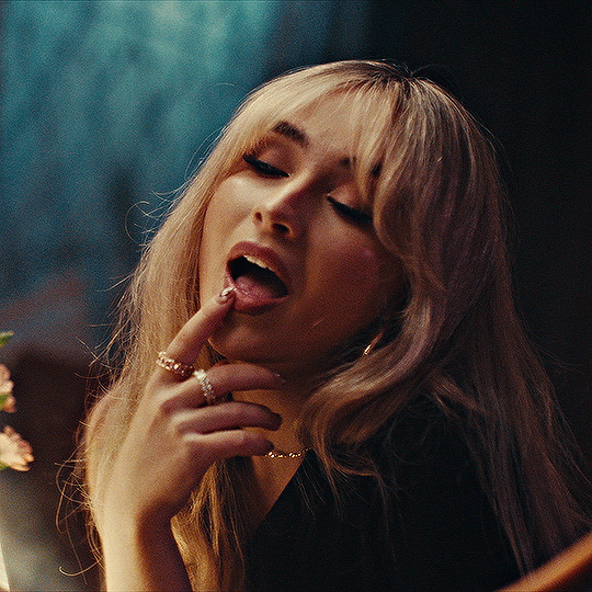
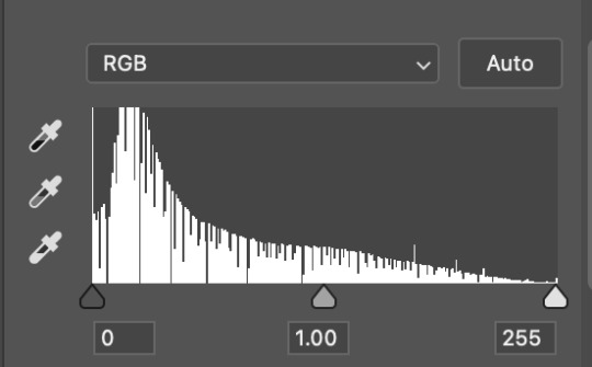
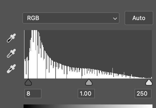
you'll see a little menu like above appear. now, select the dropper i've indicated as being the "light point" and then, using the zoom tool, we're going to zoom in and find the brightest point on the gif. this is typically where the light source is.
in this section here, i can see a couple of bright points. using the dropper, i'll click on the closest to white (note: i find that white rarely changes the colouring of the gif, so if there's like, a really really light yellow, for example, click on that) and then i'll do a similar process with the "dark point" dropper, finding the darkest spot, which is usually in shadows or in the corners. unlike with the light dropper, you want the closest to black, whether that's a dark dark brown or dark dark blue.
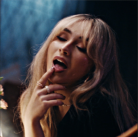
now, we can see how the colouring has changed:

optional: you can change the white line on the curves menu, which can make it lighter, or darker in different points of the gif.
LEVELS
levels is an optional step, but i recommend it on very light gifs, or if you want to add a little more depth. probably don't do it on an already very dark gif.
the levels menu looks like this:
the far left slider adds shadows and the far right slider makes it lighter. on this particular gif, i only need a little bit of depth to her face and i only need to contrast that a little bit. by just dragging the slider a little bit:
this is the result:
with levels, it can very quickly alter skin tone/make your gif look bad !! with levels, i don't think you need to go above 1-12 in adding depth.
OPTIONAL: BRIGHTNESS/CONTRAST
brightness/contrast is optional !! only add it if it's necessary :)
COLOUR BALANCE
a colour balance layer is great for fixing the tones for the gif !!
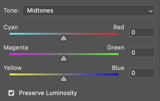
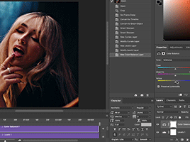
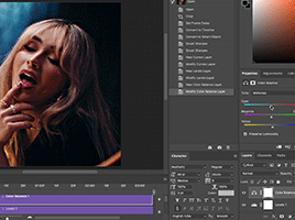
this one's pretty self explanatory. if you want it to be more yellow, slide it towards yellow. if you want it to be more red, slide it more towards red, etc etc. i've attached some gifs showing how i change tone:
but just play with it until it looks right. be very careful with skin tone !! colour balance can very easily whitewash/colour wash and that is not something encouraged, in the slightest.
SELECTIVE COLOUR
a selective colour layer is basically a "final touch" to colouring. where colour balance just kind of does an overall change of the gif, selective colour allows you to alter your specific tones, ie. reds, magentas, blues, etc. for me, i'll do the bulk of getting my desired colouring with colour balance, but if it overcorrects reds, for example, i'll add some cyan to red tones in selective colour, to diffuse that.
currently, in my gif, it's very red/yellow heavy. to balance that out, i want to add cyans. so, on the drop down list of the selective colour menu, i'll select 'red' and then i'll ADD cyans (so move the slider to the right, not the left to decrease) and then repeat that on other tones that i want to correct, with different colours.
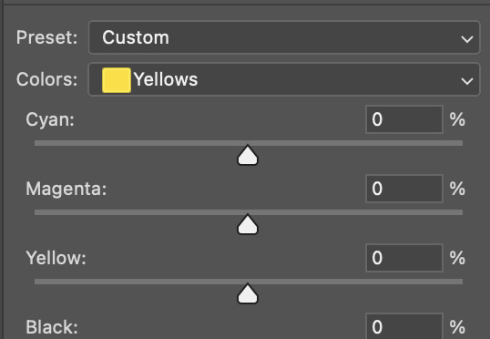
with each of the sliders, just add or decrease how much of that colour is in that tone. once again, be mindful of skin tone and whether it is appropriate or not.
with selective colour, if there are any standout colours (eg. in my gif, there's a big patch of cyan) that don't interrupt their face (eg. reds and yellows are always in faces) and change the way the subjects look, you can change those colours to make it more vibrant. so, in this gif, i'll enhance the cyans and blues and magentas to make the colours pop more.
5. saving your gif
once your happy with the colouring of your gif and done what you need to do with it, save it as a smart object with all your colouring layers, then go to 'file' > 'export' > 'save for web (legacy)...' . play back your gif, and it should be all good !! congrats on making your gifs !
i've included a playback of each layer, which is staggered to show each layer come into effect.
in order: nothing -> curves -> levels-> brightness/contrast -> colour balance -> selective colour.
hope this helped !!
#*tutorial#gif tutorial#ps help#ps tutorial#userriel#userautie#userraffa#usernorah#userrsun#usercats#thingschanged#**l.myeditss
112 notes
·
View notes
Note
How do you like make the screenshots of the game look good? I want to start my own legacy challenge and post it but idk how to make it look nice? :)
I use Reshade to take my in-game pictures. If you have a computer that can handle Reshade then you can follow some really neat tutorials that help you install and understand how to use it - @pictureamoebae has heaps. I only useReshade to take my pictures, I don’t play with it on as I use quite heavy settings.
I also edit my images in photoshop to add on extra coloring and sharpening/cropping. In my FAQ I’ve posted the exact presets I use for editing my pictures.
That all being said, there are heaps of Legacy Challenges that don't use heavy editting and are still beautiful! A lot of it comes down to how you use angles and cropping to create a great shot that speaks for itself. I look back at the images I was creating when I started - I was only using Photoshop and running on a Macbook Pro - and can tell my style and skill have changed heaps over time as I've played around with things and learnt more. So don't let it put you off starting!


1890 (taken in 2020) vs 1970 (taken in 2022)
20 notes
·
View notes
Text
✨ Self Rec Tag Game✨
I was tagged by the creator of the tag game herself, @shivunin and I'm terribly sorry if I came back to it super late ;; it was super fun looking at what others made with it tho <3 people are so talented!!
Rules: Share five of your own fanworks (fic, art, etc.). Then, tag five more people to share the things they've made.
Something you absolutely adore
Something that was challenging to create
Something that makes you laugh (or smile, if that fits more comfortably)
Something that surprised you (in how it turned out, how much other people liked it, etc.)
Something you want other people to see
For those I'll tag: categories aren't necessary, "they're more guidelines than rules" (cit. @shivunin)
I may have broken the rules because I'm chronically undecided << hopefully it's fine sorry in advance
Something you absolutely adore
I just... I'm into chill and comfy vibes <<' These three together bring me so much joy, like, I remember reading all their interactions on the wikia and smiling like an idiot because I wished that all of it was more blatant rather than "yea there's a 3% chance you'll get this interaction in game"
Something that was challenging to create
Probably the first batch from everything-else-but-Inktober 2020. I decided to drop the idea of messing with inks and straight up exercised on things I usually fail at / wanted to improve. The whole challenge was, well, a challenge. I remember struggling from day 1 to 30 because I'm terrible at studies, I tend to filter and filter and filter and... But I like the results!! Far from perfect, but I've learnt big deal through it ;; If you're interested, here's the links to the instagram posts: Weeks 1 - 2 - 3 - 4
Something that makes you laugh (or smile, if that fits more comfortably)
I can't decide! Aaaaaargh Here, have a multitude of things that make me crack a smile :'D

...I wanted to add more but I don't wanna make another monsterpost :'D
Something that surprised you (in how it turned out, how much other people liked it, etc.)
This fanart of Ophélie from Le Passe Miroir, which I'm very proud of ;; I know it doesn't seem like a huge accomplishment or an art megazord, but I was very in my head before opening Photoshop but during the process, when I realized I was doing exactly what I pictured beforehand, I just couldn't stop being proud of myself lol which is something I don't experience a lot :'''
Also this comm I did for @n7viper that made me say "oh, you can handle this" This was quite the experience ;; thanks again for letting me work on this dude <3 I started with a greyscale then added colors, which is a technique I used some times and like, I was sure it was challenging because it's super hard to balance everything out, but when things came out exactly how I wanted them to be?? Woah, alright Picasso, slay
Something you want other people to see
-My dwarven ladies 🧔✨
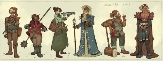
you can check it out here
-The things I'm doing for this artfight lol I think I leveled up in some cases 👌


These are previews, everything will be posted in this blog, my artblog, insta, twitter etc etc
-The collabs and trades I made with some of the most talented people I know and cherish ;;
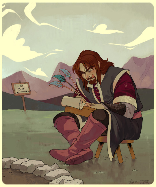
Like this one amongst the many I did with @greypetrel who dragged me back into Lord of the Rings after years and I'll be forever thankful for that ;; but also for the experience <3

Or these ones I did with @underneathestars Plus our joint effort for last year's N7 Day: her post - my post That was a challenge and your girls served 💅
Also This!!! Courtesy of @demandthedoodles This was like, one of the funniest - yet astounding - outcomes from a sketch I almost forgot I made lol I need to print this out when I can!
I would include all of them, because I traded art and collaborated with people I really appreciate but I can't possibly include other things ;; I'll mass reblog / share them in the next days!
Also, thanks again @shivunin for this tag game ;; I discovered things I've never seen from people I follow and found out awesome new things from people I didn't follow already. So super fun <3
I'm tagging (no pressure, no commitment): @n7viper @underneathestars @qwib @skeltrr @lethalhoopla @kassarts @aukanemin @ii-then @daggerbean @vaesivlasta @sparatus
#long post#tag game#self rec tag game#ndo sta l'art tag#of course I did a monsterpost siigh#listen I'm easily entertained when it comes to shitposting I had to spam :'#no I didn't have to but I did it anyway because I have no self control#I didn't include fics tho <<#I need to stop tweaking this post gdi
36 notes
·
View notes
Text
Personal Hygiene Matters

I don't know who needs to hear this but a person's personal hygiene is indeed an indicator of their character. Good personal hygiene shows that they care about their wellbeing and the wellbeing of others in close proximity to them. It shows that they are considerate.
Full offence but I am always perplexed by people who are surprised that people with bad personal hygiene are terrible in interpersonal relationships. Duh, they don't care about themselves, what makes you think that they will care about you?
Please note, I am speaking about desire not ability. That is people who have access to hygiene resources but refuse to use them. I also wanted to clarify that I am talking about hygiene not grooming because a lot people think the two are synonyms and they are not. Grooming is subjective, hygiene is not.
I know some people are going to say "my parents/guardians/teachers didn't teach me". I understand but that is just a lazy excuse. If you can use the Internet, you can learn new things. Many people seek out porn to learn how to have sex but you are telling me you cannot seek out actual self improvement resources. Come on, anybody over the age of 21 still using that excuse is just lazy.
Heck, my parents/teachers didn't teach me how to use Photoshop because they themselves didn't know how to use it but I learnt and now I use it in my career. Learning never stops and part of being a functional adult is being self motivated to seek out wisdom.
17 notes
·
View notes
Note
hello! i'm not sure if someone has asked this before but the blending here post/733052341549498368/kpopcreators-bingo-challenge-free is really good!! i was wondering if you could teach me how you did so perfectly because i don't understand much about blending and yours is so pretty
thank you so much! i've listed some of the basic steps here but i've also linked some really good tutorials i learnt from 💙
so if you want to get a gif with blending (like this! as a rough example below <3)

first make sure you have your two gifs ready! they should have the same amount of frames 🫡


the key to remember when selecting scenes for blending is that you're gonna be utilising blending modes on photoshop (most commonly screen or rarely multiply) so you want to choose scenes that have equal amounts of black in them.
because since you're choosing screen as a blending mode, the top gif will be more visible in darker parts of the bottom gif! so you can see there's plenty of dark available in the two gifs, think of them as merging/meeting spots for the two gifs to blend the most <3


once you've coloured your gifs as you like (a bit of contrast/increase in black selective colour is good!) you can put both gifs in folders with their respective colouring, and go to the top gif and change the blending mode to screen!

so this is the most basic blended gif <3

for a pop of colour, add a solid fill layer of any colour of your choosing 🫶

and you can play around with the blend mode settings for the colour but i most commonly use multiply for darker or bolder colours, and overlay for brighter ones!

and there you go <3
there's lots of experimentation to be done tbh with blending and i'd definitely recommend reading through the amazing below tutorials:
this double exposure tutorial by @eddiediaaz this blending tutorial by @aziraaphales this one that i first used ages ago to learn <3 by @yenvengerberg
hope that helps!
17 notes
·
View notes
Note
Duuuuude! You are so incredibly talented. May I ask, how do you make your graphics? Everytime I see one, they look fucking amazing. What program/s do you use? And how hard are they to learn?
nonnie! you are coming for my heart like this! 🥹😭
of course you can ask! I am always willing to help out anyone creatively where I can.
this is quite a spill so I have the explanation underneath the cut! 🥰
I use 2 programs, and it depends what for -
my gifs, headers, icons, and dividers I use adobe photoshop.
my collages for my writing social media and my wattpad, I use canva.
I want to give credit where it is due and say I learnt how to make gifs and graphics from my best friend, @sgt-seabass. she took me under her wing and from there she's taught me how to operate photoshop and make the gifs like I do, and since then, I branched out and fucked around with the program and that's how I got where I am.
as for how hard it is to learn, personally, it is not hard at all.
gif making can be challenging but I also don't have so much of an affiliation for them, and I like keeping them simple. header, banner, and divider making is my bread and butter. I fucking love making them and I just... I don't know. I love doing it so much, and I guess my passion shows.
the most important thing to making graphics look seamless and effortless is familiarity with the program you use, because if you don't know your tools, you don't know shit, basically. I would really recommend getting to know the software you choose to use - play around and make some dummy designs and make mistakes. making mistakes has helped immensely in my creative process.
learn the dimensions for posts and pixels, too. it can be different for all blogs!
I use the following for my blog: (all in pixel measurement)
line dividers - 600 x 5

thin dividers - 600 x 15

thick dividers - 600 x 25

headers - 3000 x 1000 the squares for these headers are 1000 x 1000

blog header - 640 x 360 even when transparent, like the two I use, they are still the above dimensions.

disclaimer banner - 2000 x 300 (the bigger the canvas, the better the transparent elements show)


if you have any other questions, my love, my inbox is always open! 💗
honestly, I would be open to doing tutorials when I have some spare time between these events - would that be something that's helpful? lemme know, chaos kittens! 😘
13 notes
·
View notes
Note
how did you get into gifmaking? sorry if this has been asked before but im. curious about how to get started and what made you interested in it🫣
so my first gif set was from shadowhunters (i went and found it this is it) it was about 8 years ago, i was 18 and i really wanted to be popular in a fandom and unfortunately in that fandom if you didn’t make gifs you were actually so irrelevant so i thought damn if i wanna be popular i gotta learn to make gifs and guess what? it didn’t work no one cared about me at all and yet i kept pumping out gifs
also i was actually so shocked when i switched this blog from shadowhunters to dan and phil that my gifs were getting notes
if you wanna get started there’s a lot of tutorials on tumblr that are really good! i learnt from tumblr and then refined my methods over time and now i have photoshop automated so i can make gifs quicker but like once you get the hang of it its so easy!
also if you have a windows computer it’s really easy to find cracked versions of photoshop so don’t feel like you have to pay for it (i only pay for it cos i have a mac and it’s so hard to crack adobe and keep it hidden from them on a mac) there’s also other ways to make gifs using websites and stuff but i don’t really know much about that you’d have to ask around about that
and then as for getting your gifs noticed look at how i and other gif makers here tag and use those tags and you can also tag #dpgdaily which is my daily blog cos we love reblogging everyone over there!! ( @dpgdaily )
3 notes
·
View notes
Note
hi i really love your style
this is not an "i want to know what it is bc ai" question i've just been wanting to learn to draw for a LONG time and am just wondering how yoh learnt to draw.
i hope you can answer if it's not much trouble thanks in advance
aw thanks!:)
well, I always liked to draw, then I went to a high school that had an art department, and I also studied art at university, then did a masters degree in animation, but there were also some things that I had to learn by myself. Based on my experience, these are some things that can help someone who is a beginner learn how to draw:
It’s good to start by drawing things that you enjoy, because it will keep you motivated. (I learned to draw digitally in photoshop because I did a lot of fanart that way)
Practicing by copying other people’s artworks. Of course don’t publish these, or says that they are yours, but it’s a very good way to learn.
Doing life drawings, still life, and croquis are really useful, & learning at least the basics of anatomy, perspective, color theory, and composition, even if realism is not your goal.
it’s important to differentiate between good and bad advice. I mean, when I was a teen I had a favorite anime that had an art style where the anatomy and colors weren’t the best (I didn’t notice this at the time) and my skills really stagnated when I tried to imitate this style, and I only drew this way. There are some popular youtube anatomy tutorials with like 800k views that are just, bad. So what I mean is, if you want to learn things like anatomy or color theory for example, choose to learn from somebody who is actually good at those things. There are also some good tutorials online. It becomes easier to differentiate them from the bad ones as your skills and way of seeing develops. It helps a lot if you learn from published books, from artists who are well known and respected in their fields. (For example Color and Light by James Gurney is a good book for learning about color theory) (this is also a reason why going to art school can be useful)
A lot can be learned from looking at and learning about different art styles, movements etc. Composition from renaissance and constructivism, anatomy from baroque art, color theory from impressionism, etc. I think learning about art history is really useful
experimenting with different mediums, themes, styles helps a lot and its also fun! I was a graphic design/animation major but I even had land art and abstract painting classes
so that kinda sums it up. I hope that answers it!
5 notes
·
View notes
Text
I’m bored and have a bunch of Raphael head cannons in my head that I want to get out:
• Raphael is an astrology girly. He has a collection of crystals and got master splinter to recount the day he was mutated to get his main three.
• Raph collects animal friends like they’re Pokémon. Cats, pigeons, frogs, rats, ect. Basically anything he can get his hands on.
• One time he rescued an egg he found in the sewers. To his surprise, it actually hatched. Gender? Baby alligator.
• He calls them his children and says he birthed them himself. Raphael even photoshopped them in ultra sound photos to ‘prove it’.
• The only reason he has a cat is because it was a start he used to feed. Master Splinter sighed and said he could keep it, because he couldn’t bare to see his son this sad after Spikes ‘death’-the pet turtle he’s had for around 10 years.
• Raphael also found one of those baby carriers you wear on your stomach at the dump one time. He puts the cat in it, who so happened to love it.
• He kept Spikes tank, bc he just couldn’t let it go. And had sewn a stuffed animal version of Spike, that sits on his shelf. Whenever he’s upset, he talks/rants to it because he hasn’t quite learnt to share his feelings yet.
• Mikey made him a comic called The Adventures of Raph and Spike to try and make him feel better.
•It consisted of real and fake adventures Raph and Spike have gone through from ages 5 until now.
• Raphael hugged him and straight up cried from it
• Raph knits/crochets. He’s made little hats and outfit for the cat.
• One time, for the fun of it, he made Mikey a dress. Mikey hugged him, because it’s a gift his grumpy brother made him. He wears it religiously.
• Leo asked him how long it took to make. He said a week or something. The brothers were simply impressed at the dedication to this joke gift that Mikey ended up loving.
#teenage mutant ninja turtles#tmnt 2012#raph tmnt#headcanons#raphael#raph 2012#Raphael and his animals#Raphael head canons#let Raph swear 2023#and Donnie#that man was STRESSED#Raph and animal friends
10 notes
·
View notes
Text
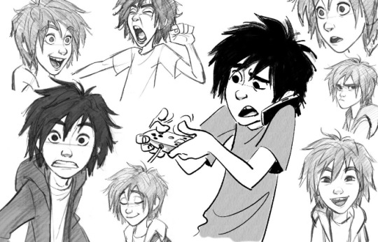
Artist research- Expressions
Jin Kim
Jin Kims art really caught my attention with how many expressions he draws for his character designs. Having learnt about phonemes this week, I noticed that from some of these sketches you can almost hear what sounds the sketches are making/saying.
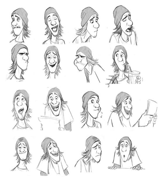
For example, in this sketch you can tell hes making an "ooo" sound

and maybe something like an "a" sound in this one

I like how he seems to be copying the voice actors mouth movements for these sketches to get the phoneme drawings right.

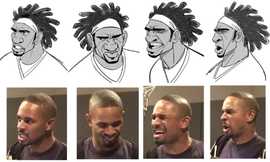
Here are a few other sketches I found interesting.


Lipsync class
Today Paul also showed us how to do a lipsync using animate and using groups for the mouth. We were also shown how to cut out mouths we made using Photoshop.

8 notes
·
View notes
Text
Workshop - Photoshop
Focusing on Asian Opression :

Linking it all back to my workshops,it all comes down to oppression and Asian oppression to be specific. I experimented with what I learnt on photoshop and implemented them to create this poster of fighting Anti-Asian Hate. Why the dark colours? It’s to show the viewer that this topic is not to be taken lightly. Using dark colours can make the viewer feel pessimistic,anger and sadness
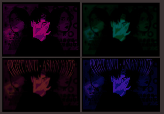
I played around with Saturation,Brightness and Hues to figure out what colours what colours i would like to go with.This gave me a good visual of what i want the mood to showcase. Colour is everything when it comes to mood so i don’t think i would have went with a bright coloured poster. Despite the New York campaigns being so colourful I personally did not take that approach. There are 4. Photos here that I experimented with
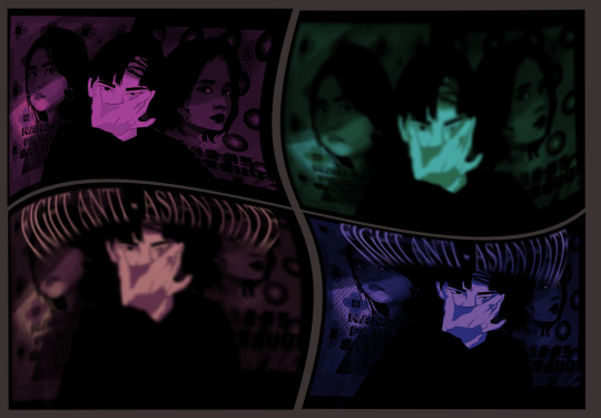
I deepened the saturation again and began to play around with the warping tool. I really really love how there a mixture of blur and focused photos, It hurts the eyes. Perfect for this since i have myself stretching my eyes out which i can tell you is not a pleasant feeling at all.
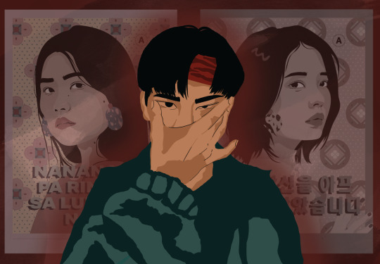

My process before choosing the final colours for my poster. as you can see at the very centre it is myself. I used the photo of myself from the you & me workshop and wanted to use that photo again. I had to think of a way to make myself into the same art style as my reference photos so i used a mixture of photoshop and procreate t bring this all together. Again i played with saturation and figured out that i did not want to make this piece as brightly coloured as the campaigns.
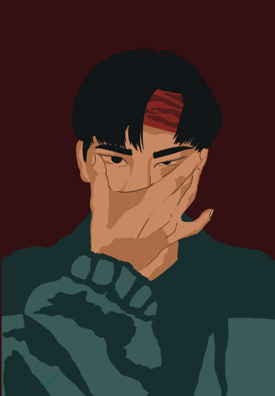

I worked on the photo of myself because using the original photo isn’t what I was looking for. So i used procreate to create this image of myself which is the same art style as those campaigns used for my reference.

For the workshop,Paul taught us how to take an image and turn into a stretched version of that specific image and create a palette. I found this part really helpful cause when wanting to use a specific colour you can use this technique and have the palette right in front of you,He also taught us how to use that background and use it behind texts
Here was an example of what it looked like which I thought was pretty cool

With this workshop we were taught how to use the shortcuts and how to utilise the tools on the app . We also taught how to animate using the tool,so so my class and I animated rockets just so can have a better understanding on how animating works.
3 notes
·
View notes
Text
Introduction to Photoshop
In this induction we went over the basics of photoshop. I learnt how to remove "imperfections" through use of the healing brush tool and the patch tool. We had to remove the footprints, the tape and the smudges. This skill will be useful in future project. I found this very satisfying and much easier that cutting out images. That is definitely something I am going to spend more time practicing.


I also learned how to use other tools such as quick selection tool, magic wand tool and object selection tool to create new images through use of layering. I just made a funny image as I was more interested in learning how to use the tools than create something that looked good. This made it easier for me to focus on learning the skills otherwise I would've spent more time thinking about what I want to make and stressing about it looking good.

2 notes
·
View notes
Text
How Photographs Can Tell Lies
youtube
The video demonstrated how photography can lie. demonstrating how the image and the photographer behind it can distort the reality or context in a variety of ways. highlighting as a photographer, you are framing a portion of the world with your photos, and altering or removing the context can change the meaning of what an observer sees and understands. In addition to controlling the context and manipulating the environment with a personal preference through images. The video also discussed the observer effect, subjective truth, and the power of photography and how it may be used against what is being captured. For example, the Lewis Heinz factory series as a photographic argument for the end of child labour. Using a series of photographs to establish a focused visual argument to convey misinformation or disinformation for personal gain. Another method was the stage image, which is one of the most prevalent and oldest methods for a photograph to lie. Creating hoaxes for profit or fame by using emotional and symbolic meaning and creating a story, such as the Cottingley fairies. The final way a photograph might deceive is by physical manipulation, such as using two different negatives to create spirit photography of a loved one who died during the war.
i found this video quite interesting. Although I've been using Photoshop for years to convert my photographs to black and white and create double exposures, I assumed it was the primary technique to manipulate a photograph. Looking back, photography has influenced what others see through the frame image and what individuals have done in the past to make the image work in their favour. Misleading information reminded me of Migrant Mother, Destitute pea pickers in California. Last semester I learnt about the true context of the pea picker mother and how people have taken the image and misinterpreted the context behind what really happened and now its used the image as a symbol for something thats not even true. Showing many important photographs contexts are lies.
Overall I agree with the examples shown in how photography can lie especially with previous knowledge of Migrant Mother and Afghan Girl' From the 1985 National Geographic Cover.


2 notes
·
View notes
Text
Rationale and Personal Reflection
Rationale:
Urbanist. This had been my chosen typeface of this type specimen booklet. Urbanist is a typeface created by Corey Hu in 2020 with 9 weights and accompanying italics. The font displayed as a type specimen on Google Fonts appears to be a rather thin type of font, the kind you see on magazine designs but shows a sense of attention and attraction towards the human eye. It is a style of font that is unique and very complex.
This font offers 18 styles from thick, thin, italics, and thinness. This font brings me connection in myself and the chosen font. the overall style of the font gives me nostalgia upon growing up in throughout my childhood, growing up I had seen similar typefaces of Urbanist on magazines, websites and childrens books, which brings a sense of connection towards me and my self identity and brings good memories, it also seems to be a typeface that relates to my pepeha and seems to be a font that also gives me a city vibe in both Tokyo and Taiwan which is a place I find myself being happy and gives me memories to look back upon.
Urbanist will be used to accomplish my overall design of my type specimen booklet. It is not too complicated, nor too thick or thin, rather in the middle. Which is why I believe it is a special font to me where it can attract the attention of the viewers, and is a font I believe will be able to get the job done. By using Urbanist, increases my insight and study towards the font, so I can develop a type specimen booklet in many ways which makes me understand its features, By bringing my culture and self identity into the booklet, I can focus on Urbanist as a font throughout my process which will be used upon all my type specimen pages, and I will be using a variety of different styles and thickness and italics to focus on different design values for each page.
Reflection:
During the first making of the booklet, i found it difficult to make the layout of it, i didn't have a actual plan and being focused on two assignments really made it hard for me to focus on one assignment at once. I usually procrastinate a lot and find i work better under pressure. In my first design, I didn't read the brief properly and just went for it. In my second version of the booklet i had created a much better layout and promised myself i would make a much better design and push myself to the limit for everything overall.
I had chosen the name Iizuka for both the type and the moving image. This is my families heritage and hometown in Japan. it is a city in Kyushu, Japan, and it is a city where my roots has come from my mother’s side. I felt it was important to include this word as my hero word as it primarily focuses on my start and where i am from. Growing up with only a mother beside me, i had felt more connected towards my Japanese roots than my Taiwanese roots.
In my moving image, I had created this on Adobe Photoshop using the timeline feature. I had went with a really basic illustration. Basically showing myself as a person, my roots and my connection with New Zealand, Japan and Taiwan. Growing up in New Zealand I have the most connection with New Zealand's environment and I feel like that’s an important factor to have. In my moving image, I talk about my pepeha, and the most important places on it that have had the most significance to me in my childhood. At the end of the video I explain how New Zealand is considered my home. But so is Japan and Taiwan.
My overall reflection, if I had more time I would improve upon creating a more detailed moving image and more detail upon my type specimen. I would also use a variety of different mediums for the future such as photography in my moving image or in my type specimen booklet. I also would have learnt to use Adobe After Effects as I wish to learn how to use the program for the future.
2 notes
·
View notes
Text

Throughout this cloning assignment I was able to successfully enhance and strengthen both my photographing skills as well as my photoshop skills. To start off, I began thinking of different angles, poses, and activities my clones could be in; at this time I was also thinking about different locations I could take these pictures at. I sketched out an idea and came up with various poses that helped me bring each one of the clones to life in a harmonious and unanimous manner. Continuing on with these thoughts, I chose to take my pictures at a hill since I thought it would demonstrate nature in a more modern way. The hill is in a relatively populated area but still has plentiful amounts of wildlife which I thought would be a good way to represent the modern beauty of nature. Furthermore, after I figured out the poses, location, and message I wanted to send to the viewer I went out and I began taking many different pictures with myself on many different areas of the hill. Later on I picked out my favorite poses which ended up being: posing at the bottom of the hill, posing at the top of the hill, picking flowers, holding out a bouquet of flowers, walking up the hill, as well as laying on the ground.
After I chose my favorite poses and positions of the clones, I went to photoshop and began adding new layers to the original picture of the hill. I cleaned the edges up around each one of the clones and made it appear like there were multiple versions of myself, to the best of my abilities. By doing this I was able to learn what the purposes of different photoshop tools were, as well as how to make an image seem more interesting in a short amount of time. I am able to use the skills I learnt throughout making this photo in many other projects as I have broadened my understanding of the topics at hand.
Overall, I found that this project was able to help me improve my skills in photoshop and photography while also giving way to the things I appreciate in life.
2 notes
·
View notes