#ad screencap set
Explore tagged Tumblr posts
Visit Tumblr Blog
Explore Tumblr blogs with no restrictions, modern design and the best experience.
Last Seen Tumblr Blogs


Fun Fact
69% of Tumblr users are millennials.
Text


since people were such big fans of dan tasting weird lemon candy powder icon set, I figured I'd do another one
the boys experience surströmming, a new icon set for u n ur pals: arin edition
dan edition
#you're welcome for not adding any pics with the fish in frame#i do this for you#game grumps#the grumps#arin hanson#10 minute power hour#icons#icon set#screencaps#surströmming
18 notes
·
View notes
Text

Beauty Bunny
Available digitally (included in ComiXology subscription)
#this appeared on comixology#i think theyve added some titles#the only real drawback is that its never a full series with them#anyways#this one has an older shojo feel#its funny and a bit out there#but i was enjoying it#i did fall asleep reading it#but that was on the melatonin#beauty bunny#manga#manga recommendation#screencaps#romance#manga panel#shoujo#shojo#fyres hyperfixations#kodansha#school setting#romance manga
4 notes
·
View notes
Text

insane lineup here
#they gave us 2 absolute monsters and then added 3 more#we don't get this lux a set up for fucking lostbelts lmao#my post#screencaps
6 notes
·
View notes
Text
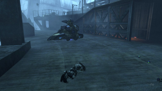
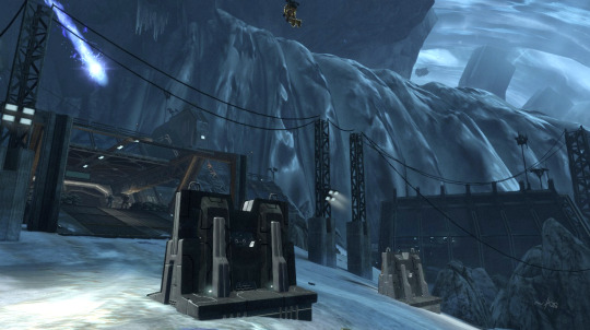
Now, yesterday, I told you the epic tale of Noble Six and her struggle to get the par score on "The Package" level of Halo: Reach. I still can't make GIFs or capture video but it dawned on me... I can make screencaps from the Theater!
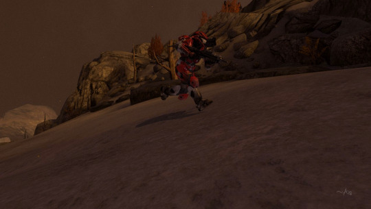
Noble Six, running through the gloom, to get that darn par score!

I always wanted to get those giant AA guns to blow up at the same time. I managed it on this run!

Awwww yeahhhh, Six making her epic parkour sprint-bounce-jump off the statue, aiming for that window to the right. Will she make it???

Six: *believing in herself SO HARD right now*

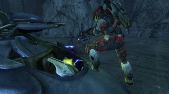
Score! And also was immediately shot by that blue bolt coming at me from a camouflaged Elite. 😑 But I lived to run on through, avoiding that darn General Elite with the concussion rifle who will be running down that ramp at the back annnnny minute now, only to realize I outsmarted him!

HOLY MOLY, HE DOUBLED BACK THROUGH THAT DOOR AFTER ME! 😱 Seriously, I knew he was shooting at me but I was running for that green button to trigger the cutscene and get me the heck out of there, so I didn't look back. I had no idea he was THAT CLOSE. I don't honestly know how he missed me with that concussion rifle. If he would've lobbed a plasma grenade at me, it would've been Bye Bye Noble Six. 👀 Whew.

And we're now flying the friendly skies with Noble Six and her jetpack, on the way to hijack that Banshee. 😇
Six: Hello, sir, would you like to have your Wraith hijacked today?"
Six: Of course you would! Heh.
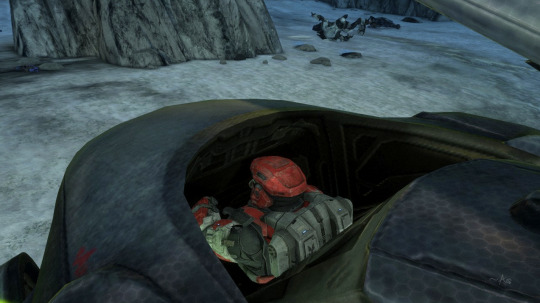
Wow, Six is even better than I thought she was, she's looking at a blank wall while she's driving AND shooting the mortar bombs!
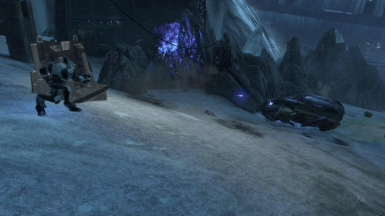
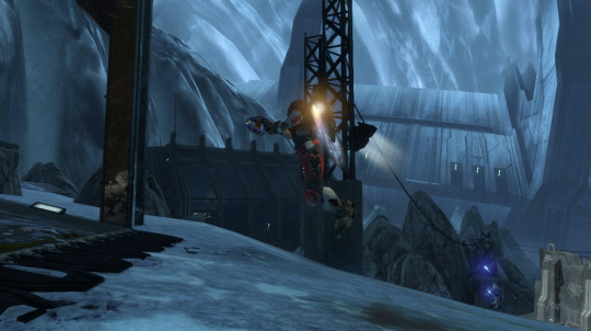
SIX IS TOTALLY NOT PANICKING RIGHT NOW, about to jump out of the Wraith and try to get past that Elite who's in between her and the sweet, sweet button of Ending This Level! It's a little hard to see but there's a line going diagonally from left to right across the Elite. I could hear somebody providing cover from the lab but didn't know who it was...

...until now when I could use the Theater camera to look. It was Carter, my beloved!

I'm contractually obligated to use this picture every time I say "Carter, my beloved." Sorry, I don't make the rules. 🤷♀️😇😉

In a dramatic ending, Six leaps from the Wraith as the counter is ticking down, failure is imminent if she can't get to the button by the door. So she activates her sprint and... wait, she's wearing the jetpack. Oops.
This is called "Panicked Jetpacking" and was done Entirely On Purpose™
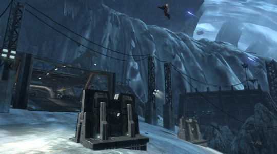
Six must go, her people need her...
Also, note the enemy Wraith mortar bomb coming at the lab. 😱
Six remembers she has to go UNDER that opening to get to the button. It's not on the frickin' roof. 😑 Also note the Elite continuing to shoot at me. 😑😑😑

It's hard to see but that's Carter waiting for me next to those sandbags! I'm doing the most awful, awkward jetpack spluttering hops up this ramp because I continued to forget I don't have sprint. IT WAS AN EMOTIONAL TIME, OKAY? 😭😂

YESSSS, the button that only I, Noble Six, can push! The level ends and I achieved the par score at last!

Achievement accomplished! Noble Six can put her jetpack down and get a good night's rest, now that she has Pushed The Button No One Else Can.
Annnnd yes, you might notice that I have over 1,200 hours on the MCC, now! 😎👍🤷♀️😉
And there you have it! 💖💖💖
#halo#halo reach#halo: reach#this is my game tag#noble six#noble team#carter a259#carter my beloved#now with added screencaps!#i love the theater mode it's so much fun to go back and look around at things you don't have time to look at while you're playing#i had a lot of fun#i'm sorry the pics are dark#these are actually brightened quite a bit#this is a dark level unfortunately#and this was also brightened for the play#usually i have to have my night vision on to see anything at all but then remembered i could adjust the settings 🤷♀️#ageless aislynn
2 notes
·
View notes
Text
firealpaca keeps fucking up my custom brush like its there but none of the adjustments i did when making it saved so its all fucked 😭

1 note
·
View note
Text
My brain just beamed me thoughts of my childhood anime and the realization that the moment I noticed how much I like Inuyasha's dynamic with Sango a lot more, they would've turned out to be my very first rarepair but alas... It instead became the catalyst of me finally losing my hyperfixation of 10 years on it.
#aria rants#it was like a wake up call of ''what are you even hyperfixating on it anymore?''#also like thats a fr thing cuz young me didnt know there were things called fandom back then#i didnt know there were things like fanart and fanfics so yaknow what she been consuming content of?#official content and amvs. i didnt even know inuyasha had a manga i was wholly convinced#it only had an anime. i milked that anime (dub vers too cuz it was the one i grew up on) soooo much#i practically memorized Every Dialogue on All its episodes and movies. i even memorized#What happens in What episode (there are like 100+ eps bro) and i could even identify#a screencap of an episode. i was that unhinged. it was my life goal to keep that up#i even memorized Which opening and ending song a set of episodes will have like gurl wtf#also my music taste back then was sooo wack. cuz id click on any amv as long#as it was about inuyasha. then id loop that video and wtv song it has is added to my playlist#now i dont even remember much bout it other than how crazy hyperfixated i was on inuyasha
0 notes
Text

COLORING + SHARPENING TUTORIAL
someone asked for a coloring tutorial and my sharpening settings, so here it is! there are also a few tips to achieve more HQ gifs. :)
tutorial under the cut!
FOR HIGH-QUALITY GIFS
FILE SIZES
it doesn’t matter what your sharpening settings are if the file you’re using to gif is too low quality, so i tend to look for the best that i can get when downloading stuff.
usually, movies (+2h) look better if they’re 5GB or more, while an episode (40 min/1h) can look good with even 1GB. the minimum definition i try to find is 1080p, but i gif with 2160p (4k) when available. unfortunately, not every computer can handle 4k, but don’t worry, you can gif with 1080p files just fine if they are big enough. contrary to popular belief, size does matter! which means sometimes a bigger 1080p file is better than a smaller 2160p one, for example.
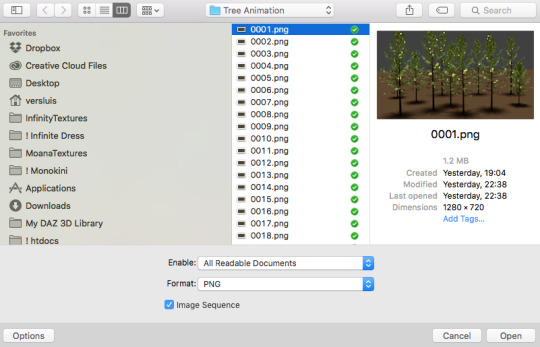
SCREENCAPPING METHOD
this can too influence the quality of your gifs. as a gifmaker, i’ve tried it all: video frames to layers, directly opening video clips, loading files into stack, and i’ve finally settled down with opening screencaps as an image sequence. with bigger files, it doesn’t matter much what technique you use, but i’ve noticed with smaller files you can do wonders if you screencap (either by loading files into stack or opening as an image sequence) instead of using video clips. for example, this gif’s original video file was only 4GB (so smaller than i’ve usually go for), if you can believe it!
here’s a tutorial for setting up and screencapping with MPV, the media player i use to screencap. again, you can keep using video clips for bigger files, but you’ll find this useful when dealing with dire causes. i don't file loads into stack, though, like the video does. i open as an image sequence (open > screencap folder > select any image > click the image sequence button). just select OK for the speed. this will open your screencaps as a video clip (blue bar) in timeline mode (i'm a timeline gifmaker, i don't know about you). you will need this action pack to convert the clip into frames if you're a frames gifmaker. i suggest you convert them into frames even if you're a timeline gifmaker, just convert them into a timeline again at the end. that way you can delete the screencaps right away, otherwise you will delete the screencaps and get a static image as a "gif".
ATTENTION if you’re a Mac Sonoma user, MPV won’t be an option for you unless you downgrade your system. that is, if you have an Intel chip. if you have M1 Max chip (or even a better one), here’s a fix for MPV you can try while keeping that MacOS, because nowadays MPV is skipping frames in its latest build. or you can use MPlayer instead for less hassle. here are two tutorials for setting and using MPlayer. Windows users are fine, you can use MPV without trouble.
FOR EVEN MORE QUALITY
ADD NOISE
here’s a tutorial for adding noise as a way to achieve more HQ gifs if your original material is too low quality.
REDUCE NOISE WITH CAMERA RAW
instead of adding noise, you can reduce it, especially if your gif is very noisy as it is.
the path is filter > camera raw > detail > nose reduction. i do this before sharpening, but only my video file isn't great to begin with. because it’s a smart filter, you can reduce or increase its opacity by clicking the bars next to its name in the layers panel.
TOPAZ AI
i use Topaz Photo AI to increase the quality of my screencaps when i need to. it’s paid software, but there are… ways to find it for free, usually on t0rrent websites. if someone’s interested, i can make a tutorial solely about it in the future.
SHARPENING SETTINGS
here are my sharpening settings (filter > sharpen > smart sharpen). i sharpen things twice: 500% 0.4px + 10% 10px. here's an action for it, for more convenience. here's a tutorial on how to use Photoshop actions. for animated stuff, i use this action pack.

COLORING
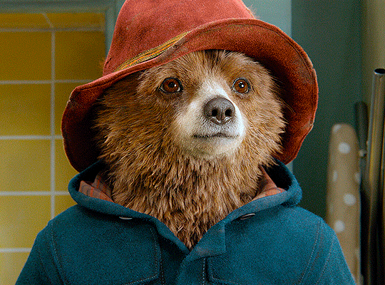
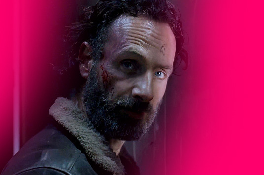
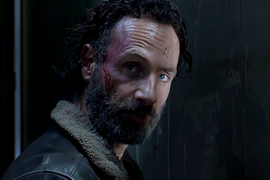
here’s the gif i'm gonna use as a base. it’s already sharpened like the way i always do it.

LIGHTNING THE SHOTS
half of the secret of a good coloring is good lightning. i always useCurves (layers > new adjustment layer > curves) and Brightness & Contrast (layers > new adjustment layer > brightness & contrast). the settings depend on the scene you’re giffing, but i always try make my gifs bright and with high contrast to make the colors pop.
CURVES
besides lighting your scene, the Curves adjustment layer has four automatic options that will color-correct it for you. it’s not always perfect and it doesn’t mean you won’t need to do further coloring, but it’s a great start. it’s a lifesaver for most ridiculously yellow scenes. look at the difference! this gif uses the 3rd automatic option (the screenshot below isn't mine btw so that's why the fourth option is the chosen one), from top to bottom. what automatic option you need to choose depends on the gif.

sometimes i like to tweak my Curves layer. not everybody does that, it’s not that necessary and if you’re not careful, it can screw your gif up. to modify your layer by hand, you will need to click and drag points of that straight line in the position you desire. this is the concept behind it:

basically, the lower part of the line handles the shadows, while the upper part handles the highlights of the image. if you pull a highlight point up, the image’s highlights will be brighter. if you pull it down, it will make them darker. same thing for the shadow points. you should play with it to get a grasp of it, that’s what i did when i first started giffing.
BRIGHTNESS & CONTRAST
then i added a bit of brightness and contrast.

CHANNEL MIXER
the scene looked a bit too yellow, so i used the Channel Mixer (layer > new adjustment layer > channel mixer) adjustment layer. here’s a tutorial of how it works. not every scene needs the Channel Mixer layer though, i mostly use it to remove heavy overall tints. in this particular case, the Curves layer got rid of most of the yellow, but i wanted the gif to be just a bit more blue so the Channel Mixer tweaks are very minimal.

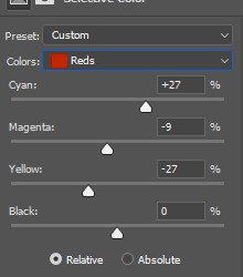
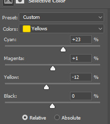
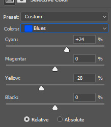
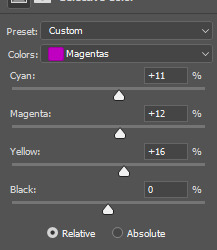
SELECTIVE COLOR
now, this adjustment layer i always use: Selective Color (layer > new adjustment layer > selective color). this is THE adjustment layer to me, alongside the Curves one. this is how it works:

ie, you can separately edit a color this way, giving it tints. for this gif, i wanted to make the colors more vibrant. to achieve that, i edited the selected colors this way:
for the reds, i added even more red in them by moving the first slider to the right, making the color more vibrant. for his hat to have a more warm tint, i added yellow to the reds (third slider, moving it to the right). finally, to make the reds stronger, i moved the last slider to the right (more black).
for the yellows, i made them brighter by adding white to them, thus making the tile wall and Paddington more bright as well.
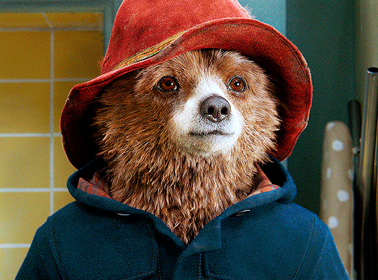
for the cyans and the blues, i just added the maximum (+100) of black that i could.
i wanted for Paddington's nose to be brighter, so i added more white to the whites.
lastly, i added depth to the blacks by increasing their own blackness.
you should always play with the Selective Colors sliders for a bit, before deciding what you want or need. with time, you will automatically know what to change to correct the color grading. it all takes practice!
HUE/SATURATION
i don’t know if you noticed, but there are some green spots on the blue wall behind Paddington. to correct that, i added a Hue/Saturation adjustment layer (layer > new adjustment layer > hue/saturation) and made the saturation of the greens 0%, making that unwanted green disappear from the background.

while the green spots on the wall are specific for this gif, i use hue/saturation a lot to tweak, well, hue and saturation. sometimes someone’s skin is too yellow, i made it redder by tweaking the reds and the yellows, or vice-versa. the hue bar follows the rainbow bar, so the maximum settings (+100 and -100) give the selected color to change its hue to something more red or pink (the rainbow extremities). changing hue can give pretty whacky results, like turning someone’s skin tone to green, so you will need to play with it to get the hang of it. you can also tweak the opacity of your hue/saturation layer to further improve your gif’s coloring. i didn’t do it in this case, the opacity is still 100%. the reds and the blues had their saturation increased to make them pop just a bit more, without affecting the other colors.
COLOR BALANCE
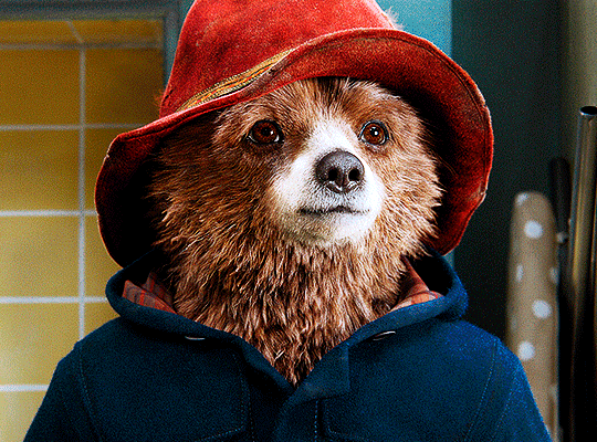
the highlights of the gif still had a green tint to it due to the automatic correction of the Curves layer, so i used Color Balance. this is how it works: instead of giving specific colors some tints, you can give them to the shadows, highlights, and mid-tones. if your shadows are too blue, you counterbalance them with the opposite color, yellow. same thing with the cyan-red and magenta-green pairings. in my case, i added a bit of magenta.


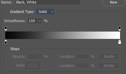
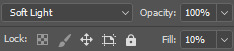
B&W GRADIENT MAP
now, if this gif was a dish, it’s time for the salt and pepper. i always add a Gradient Map (layer > new adjustment layer > gradient map) (black to white gradient) with the Soft Light blending mode, thus giving my shadows more depth without messing with the mid-tones and highlights. it also doesn’t “deep fry” (you know those memes?) the gif too much by adding even more contrast. usually, the opacity of the layer is between 30% to 70%, it all depends on the gif. it always does wonders, though!
COLOR FILTER
finally, i like to add Color Filters (layer > new adjustment layer > color filter) to my gifs. it’s very handy when giving different scenes for the same minimalistic set because it makes them kind of match despite having completely different colors. in this gif’s case, i added a “deep blue” filter, opacity 50% density 25. you can change the density and the opacity of the layer for further editing, again, it all depends on the gif.

VIBRANCE
if i feel like it, i add a vibrance layer (layer > new adjustment layer > vibrance) to make the colors pop. this can ruin your coloring sometimes, especially when regarding skin color, so be careful. i didn't do it in this gif because i felt i didn't need it.
TA-DA! 🥳
AN OTHER EXAMPLE
the color grading of the original scene it’s pretty good as it is, to be honest. let’s see a worse scenario, a VERY yellow one:
no channel mixer this time because the automatic curves option dealt with the yellowness, but you can see it made the gif too green. i needed to correct that with the following adjustment layers:
curves (automatic option) (gif 2) >> same curves layer (tweaks) (gif 3) >> brightness & contrast (gif 4) >> hue/saturation (tweaked cyan+blue+green) >> selective color >> color balance (gif 5) >> b&w gradient map >> (sepia) filter >> vibrance (gif 6)
i added a hue/saturation layer to remove the blues & greens before my selective color layer because i thought that was more urgent than tweaking the tint of all colors. color balance (gif 4) was the real hero here, though, by removing the green tint. the selective color layer was meant to make the red pop more than anything else, because the rest looked pretty good, especially her skin tone (despite the green tint). you can notice that tweaking the curves layer (small gif 3) also helped A LOT with the green problem.
tl;dr 😵��😵💫😵💫
here's a list of my go-to's while coloring and lightning gifs. it's not a rule, just a guide. there are gifs in which i don't use all these adjustment layers, or use them in a different order. it all depends!
1. curves (automatic option + tweaks) 2. brightness & contrast 3. channel mixer 4. selective color 5. hue/saturation 6. color balance 7. b&w gradient map 8. color filter 9. vibrance
i'll suggest that you study each adjustment layer listed for more info, either with other Tumblr tutorials or YouTube ones. the YouTube ones focus on images, but you can translate what they teach to gif making very easily. you can ask me to further explain any adjustment layer, too! i was brief to keep this short (which i kinda failed lol).
feel free to ask me for clarification or something else about gifmaking wise, i always like to help. ❤️
#*#*tutorials#gifmaker tag#resources#resource: tutorials#ps help#uservivaldi#tuserjen#userrin#userelio#useralien#userzaynab#userchibi#userbuckleys#usertj#userbess#tuserlucie#useraljoscha#userdavid#usershreyu#usernolan#userhallie#userisaiah#tusergio#tusergeo#userjesslynn
711 notes
·
View notes
Text
Eyes of the Hex, cuz I am bored and I really like looking at eyes. Feel free to use as reference.
I have all the Gemini skins so if you need a reference of anything, DM me, if I got a moment I'll get you sorted with a reference.
Max settings all, scene: Drifter's Camp. Default colors. One pic in sunlight, one pic off sunlight, one in the cave.
Arthur:


(this man has so much sad dog energy)
Aoi:


(so pretty and dual colored too!)
Amir:


(DE please fix his eyebrows, also the shifts in color between light and shadow are mesmerizing)
EDIT:

Added a 3-light setup to Amir and only Amir cuz he's my special boy but I also felt the light screencap didn't capture his eyes well enough. <3
Eleanor:


(spooky but pretty)
Lettie:


(her hairstyle casts a shadow lol)
Quincy:


(he got some nice eyes ngl)
#warframe 1999#warframe#warframe amir#amir beckett#warframe aoi#warframe arthur#warframe eleanor#warframe quincy#warframe lettie#leticia garcia#eleanor nightingale#arthur nightingale#quincy isaacs#aoi morohoshi#warframe reference#art reference
246 notes
·
View notes
Text
i'm a bit of a balatro nerd, so here's some notes on dan's screencap in his insta story
if you haven't played before, balatro is poker in its most core mechanics, with single-player roguelike (so you lose a lot and build from playing a lot) deck building (what it sounds like, you build your deck) mechanics to make poker Bigger. you can do some weird and wild things with it, but at its base, you're playing flushes and straights and pairs and trying to score chips.
if you want to see it in action, markiplier has a good video that seems like it'll be first in a series.
in balatro, you get a base level of hands per round depending on your deck/add-ons like vouchers or jokers. for checkered deck, which dan is playing, it's 4 hands/3 discards, so you have four hands to try to get enough chips to get to the next round. there are three rounds per ante, and the regular game ends at ante 8. you can also skip rounds to get stuff.
which is the long version of saying: dan has gotten to endless mode, which means he's beat the regular part of the game and is shooting for a ludicrously high score. he has to get 47 billion chips to win this round and get to the next one. for comparison, round 1 in ante 1 on white stake difficulty (which is the one dan's playing in) needs 300 chips to advance.
also for comparison: i have hundreds of hours on this game and i haven't cracked the 100 million chips achievement on steam
he's doing a flush build (which makes sense for checkered deck; it only has hearts and spades, unlike the normal four suits) and his flush is leveled to 24, which is really good/necessary to get this late in the game. he has a lot of money, he used all his discards for the round, and he has a bunch of face cards with modifications on them. it's good strategy just looking at this much, basically
and then all the jokers he has up top make this REALLY impressive. in order from left to right
gluttonous joker: played clubs get +3 multiplier. odd one for checkered deck (no clubs to start with) but a) maybe he added some and b) even if he didn't, it's a negative card, so it's not taking up room that any other joker could use. (for this set of circumstances, base slots for jokers would be five.)
sock and buskin: retrigger all played face cards, which means all the cards dan is playing in this hand will score a second time. two of his face cards have red seals, which means they'd play a third time, one of those red seals is a glass card that'll give him a higher multiplier...i could keep going, but doing a face-card flush build is a good way to score big.
photograph: first played face card gives x2 multiplier when scored. again, another great joker for a face-card build.
blueprint: copies the joker to the right. GREAT card if you have good jokers. it also has holographic, which means it add a +10 multiplier as well.
triboulet: highest tier of joker (legendary) where kings and queens give x2 multiplier when played. but imagine it twice, since he has blueprint as well.
the tribe: x2 multiplier if hand contains a flush. and he's obviously doing a flush build.
to add to all of this, his order is really good because the cards play left to right. times multipliers stack on each other, and since chips get exponential, you need that to really get anywhere.
tl;dr - while some of this is luck (the store doesn't always sell jokers this good at the right time), dan is good at balatro.
178 notes
·
View notes
Text

sure is convenient for the deetzes that code 699 - trespassing souls in the afterlife is on the same exact page as code 804 - soul suckers. who organized this book? also, the next page canonizes the grim reaper. okay.
i know this text is completely unreadable but i have painstakingly figured out what it says. my eyes hurt. check the alt text.
i’ve also got another screencap of the sandworm page but that’s over here.
implications under the cut:
contrary to several complains i’ve seen, astrid absolutely had time to find the relevant information in the book. it was never a mystery as to when she had time to read it; we SEE her reading the pages she references.
the reason the contract stopped working was not because it was made on illegal terms, but rather because a specific consequence for what betelgeuse did is voiding all marriages, apparently including engagements. *looks at delores* …this is probably good news for him in the long run.
betelgeuse is quite likely facing consequences for bringing lydia to the netherworld. this potentially includes community service clerical work. he’s gonna hate that.
the afterlife apparently functions on a system where each soul has a set amount of years before they’re allowed to take the train out of there, and more years can be added as punishment. we know thanks to delia and charles that this isn’t true for every ghost, and we know thanks to the maitlands that there’s a loophole (possibly completing unfinished business) that gets you out faster. i think it’s very likely that dying by suicide extends your sentence.
ghosts are usually allowed to haunt their prior residences.
delores can cross between worlds whenever she wants. this fills the “plot hole” of how she got to the church despite not having an official reason like wolf & co, a contract like betelgeuse, or a free ride like delia.
assuming her powers don’t diminish when she reforms, she could totally go to the living world to get revenge on lydia and astrid…
delores got stronger with every soul she consumed.
sandworms are soul suckers’ weakness? girl sandworms are EVERY ghost’s weakness.
soul suckers like causing havoc. this is probably why delores and betelgeuse got along so “well.”
delores. girl. you were not wronged. you murdered him so he murdered you back. you are not a righteous avenger here, i’m afraid.
adam was not joking about this book being poorly constructed. (kudos to the production team for keeping that detail!)
THE GRIM REAPER STROLLS AROUND THE NETHERWORLD AND OCCASIONALLY CUTS GHOSTS IN HALF.
#beetlejuice#beetlejuice beetlejuice#beetlejuice 2#astrid deetz#delores laferve#delores beetlejuice#beetlejuice movie#betelgeuse#beetlejuice 2024#the handbook for the recently deceased#beetlejuice film#beetlejuice delores#the netherworld#beetlejuice sequel
253 notes
·
View notes
Note
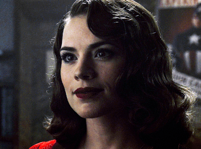
Hello! I just saw your last Caskett gifset for usergif and i loved it, can i aks how did you make the old film look/filter?
Hi, Anon! I used an overlay which I got from here :) I don't know if you're familiar with overlays but here's what I do:
SMALL OVERLAY TUTORIAL
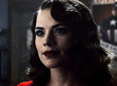
First I make my gif as I usually do and in that gifset this was the base I was working with (a gif with 37 frames):
So, next I take screencaps of the overlay I'm using and I make sure it's got the same number of frames, in this case 37. Now I put my overlay screencaps above my gif and this is what my photoshop looks like:
Notice how I placed my overlay between the text and the base gif. The text thing is optional but I liked the text to stand out.
Now, as you can see this overlay's background isn't completely black but gray, and I didn't want that. I added a Selective Color layer and increased the "Black" in the "Black" tab to +100. This is how it looks now:
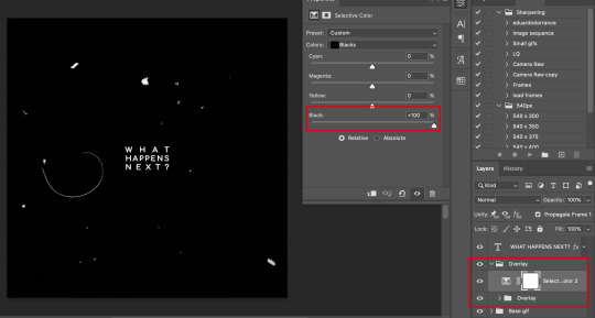
The difference is noticeable right? Well now onto the last step. I went to my overlay group layer and set the Blending mode to Lighter Color and the Opacity to 50%.
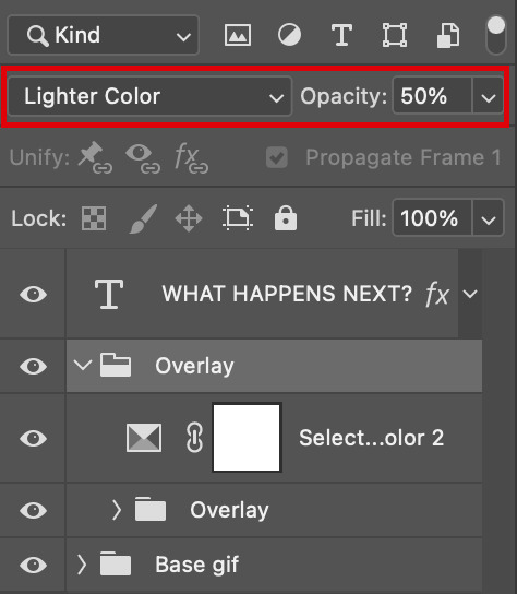
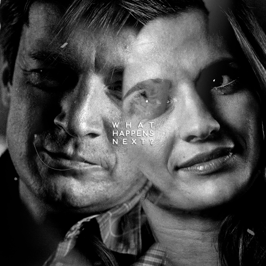
This step depends on your personal preference so feel free to play around with the Blending Modes and the Opacity and see which ones suit your gif best. With those settings I got my final gif:
And that's how I work with overlays! There are so many nice overlays in youtube you just have to use keywords like camera, vhs, old video, lightleaks, etc. Overlays can completely change your gifs and turn a simple gif into a beautiful and complex one!
#ask#Anon#ps tag#tutorial#userabs#alielook#uservivaldi#userelio#userbuckleys#userrobin#tuseruta#userahri#userbeani#userchibi#carolook#usermai#usertenacious#userwintersoldado#usercats#usermels#tuserheidi#tusermels#chaoticresources
116 notes
·
View notes
Text


Over 350 behind the scenes photos from the sets of Detroit Reawakening and Detroit Evolution are now available for public viewing over on our site, Octopunx. I didn't even lock these behind a free account - they're just public. But if you do join the site, you'll get to stay updated on the stuff I'm constantly adding to it, and I've got plenty more behind the scenes and archival stuff to go!
I can't enable downloadables on the gallery but screencapping is fine if you want to save any of them.
Enjoy the memories~
69 notes
·
View notes
Text
Signs you might be dealing with a bot or troll trying to interfere with the US presidential election
Default PFP. Not everyone who has a default PFP is a bot or troll, and a few bots/trolls actually do have custom PFPs, but enough bots/trolls have default PFPs that it's always worth looking for additional signs you're dealing with a bot/troll when you see one.
(If you're a real honest-go-goodness Tumblr blogger and you have a default PFP, then I strongly recommend you change it because many people will block you on sight.)
Default colors/layout. Again, bots and trolls don't usually put a lot of effort into customizing their blogs. Some of them fiddle around with the basic settings, but they're very unlikely to upload custom graphics and put too much effort into customizing the colors. Same as above, not everyone who has a default blog theme is a bot or troll, but enough of them do that it's worth looking for other signs of suspicious activity.
Soundbitey content. Bots/trolls don't really engage with the content of the posts they interact with. They post very generic soundbitey responses, like "You have Trump Derangement Syndrome. See a therapist," "Fuck you, I'm not voting for Genocide Joe/Kamala the Cop," "America is run by lobbies. Voting is a scam," or "Republicans and Democrats both hate us, that's why I'm voting third party." Basically, if it sounds like a regurgitated line, you may be dealing with a bot or a troll.
Lack of personal content. Bot/troll blogs may have only one post, or might just have a bunch of reblogs with nothing of substances added to them. I'm going to point out here that I've also been seeing blogs do this with pro-Biden/pro-Harris content, so I'm not sure that all of these blogs are necessarily trying to interfere with the election, or if they're trying to get attention so they can try and advertise something else down the line. Some of these blogs also post or like porn, so I suspect a lot of them are actually pornbots trying to capitalize on politics.
Here's some examples of replies from bot/troll accounts:
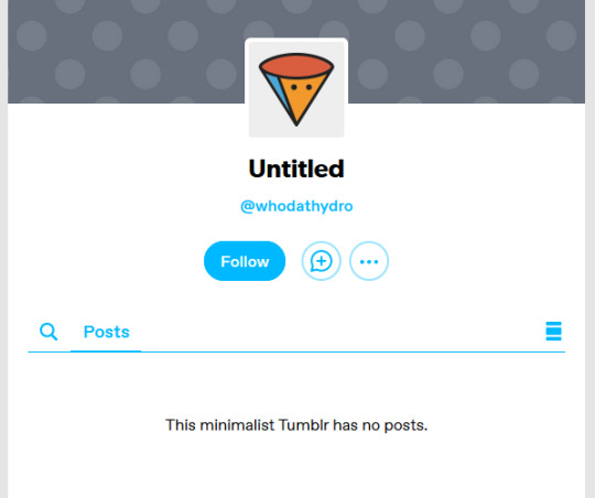
whodathydro is a great example of an extremely obvious bot/troll. When we go to their blog, we can see that it hasn't been customized in any way, and there's not even a single post on it.
I've also got screencaps of one-post blogs over here that you can check out. (The first one has actually gussied up their blog a little, but it clearly hasn't been used in any way an genuine blogger would use their blog - no personal content, no engagement, nothing.)
So yeah, there ya go; if you see blogs like this they are probably trolls or bots; happy reporting and blocking!
#politics#uspol#us politics#american politics#election 2024#2024 elections#election interference#voting interference#voter suppression#psyops
158 notes
·
View notes
Text
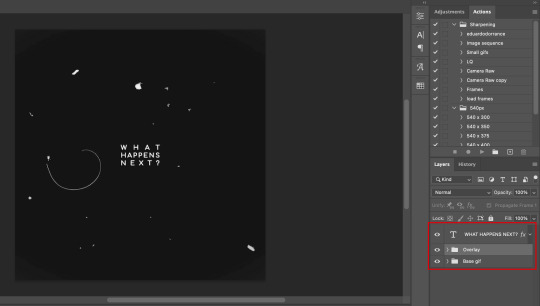
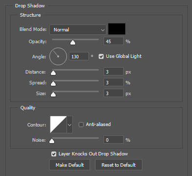
gif tutorial
i was asked to make a tutorial for this set i made, so let's get right into it!
first things first, i downloaded the music videos from youtube in 1080p using 4k video downloader. unfortunately, the quality of youtube videos always seems... not great, to put it simply. plus these music videos are from the 90s, so they've been upscaled to 1080p after the fact. all of this works against us, but i've definitely worked with videos of lesser quality than these, so at least there's that!
when i gif, i import video frames to layers rather than screencapping. this comes down to personal preference. after everything has loaded, i group all my layers together and set the frame delay to 0.05. i then cropped my gif to 540x500.
the next step in my process is sharpening. i did play around with my settings a bit given the quality of the footage and the dimensions of the gif. i compared both @hellboys low-quality video gif tutorial to my regular sharpening action and my vivid sharpening action and in this case, i preferred my normal vivid sharpening action. i used this tutorial to create the action for myself, and you can find other sharpening tutorials here. this action converts my frames to video timeline and applies sharpening.
once my gif is sharpened and i'm in timeline, i begin coloring. i wanted to simplify the amount of colors used in these gifs, again because of the video quality -- i knew it wasn't going to have the crispness i would normally like for my gifs. here are my coloring adjustment layers and their settings (not pictured: my first layer is a brightness/contrast layer set to screen) (explanation in alt text):

all of these layers and their settings will vary depending on your footage and its coloring (and obviously, feel free to make the gradient map whatever colors you like if you aren't going for this exact look).
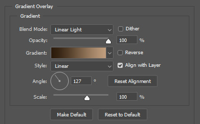
pretty basic coloring, especially with just slapping a gradient map on top (my beloved), but at this point, i still didn't like the quality of the gif, so i added a couple textures/overlays.
i put the left one down first and set the blending mode to soft light and the opacity to 8%. depending on what look you're going for, you could increase or decrease the opacity or play around with different blending modes. i like using this texture with lower quality footage because even when it's sized up a bit, it adds some crispness and makes things feel more defined. for the second texture, i set it to overlay and 75% opacity. we love and respect film grain in this house.
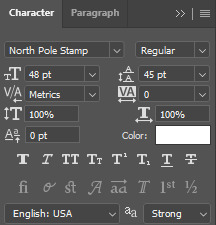
now for the typography! sometimes i really enjoy typography and other times it's the bane of my existence for the sole reason of just how many fonts i have installed. anyway, here are the settings i used for this set:
make sure the color of your font is white and then set the blending mode to either difference or exclusion. i can almost never see a difference between the two, but for this set, i used exclusion. below are the blending options (double click on your text layer to bring up this menu or right click and select blending options).
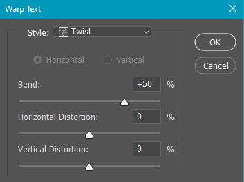
now we have to add the warp effect. with your text tool still selected, click this icon at the top of your screen:

from the dropdown menu, select twist. these were my settings, but feel free to play around with different warp options and their settings. the ones i use most often are flag, fish, and twist.
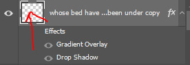
this last step is completely optional, but it's an effect i use in most of my sets with typography. duplicate your text layer (select the layer and ctrl+j), turn off the layer effects (click the eye icon next to effects), and set the blending mode to normal. right click on the layer and select rasterize type. right click on the layer icon itself and choose select pixels.
at this point, you should see the moving black and white dotted line showing that only your text is selected. then go to edit > stroke. here are the settings i almost exclusively use.
this is what your text should look like now:
using ctrl+T, move the layer off the canvas so you can't see any of the text anymore. you should be left with only your outline. click anywhere on your canvas to de-select the text we just moved. use ctrl+T again as well as your arrow keys to nudge the outline over to the left 2px and up 2px. this is personal preference as far as the positioning, but i almost never move it any other way. you can leave it like this, which i sometimes do, or you can set the blending mode to soft light like i did for a more subtle effect.
and that's it! rinse and repeat for each gif in your set or use a different warp effect on each gif to switch it up! if you have any questions about this tutorial or would like me to make one for anything else, please feel free to ask any time!
#gif tutorial#my tutorials#gifmakerresource#completeresources#dailyresources#chaoticresources#userdavid#coloring tutorial#typography tutorial#tutorial#photoshop tutorial
265 notes
·
View notes
Text
1-b social media pfps
monoma: photo he once managed to take of bakugo tripping over something. yes he gets threats over it, no he will not change it ever
setsuna: changes hers frequently, most of the time it's her newest cool selfie. sometimes the chosen pictures feature one or more of her geckos
tsuburaba: also changes his pfp all the time but in his case it's a dumb blurry selfie on monday, random cursed image on thursday and a dumb blurry picture of something else (sometimes also featuring his hand doing a thumbs up) on sunday
yui: just a solid color (im thinking peach or pastel pink) and it's been that way since forever
honenuki: somewhat poor quality picture of his cat that he finds endearing. it's also been that for a really long time. worth noting that his cat is incredibly ugly
shishida: it's not the exact same picture that's on his school ID but it could as well be
rin: originally he had no pfp and just went with the default. tsuburaba really hated that for some reason and kept pestering him to change it so eventually he added a hat to it bc he didn't know what picture to choose (tsub was pleased)
kinoko: fairly recent mirror selfie with a pink overlay and a bunch of cute effects added. her phone covers her face in the picture and the focus is on her frilly dress
reiko: pretty #aesthetic black and white portrait of herself taken by someone else
ibara: either a selfie taken from an awkward angle, boomer-uncle-on-facebook-style, or a bible quote image with a sunset background taken from the internet (too small to read)
tetsutetsu: cropped picture of himself with his friends taken in rather poor lighting. it is more on less centered on him but someone who doesn't know him could still have trouble telling which person is supposed to be him.
kendo: epic motorcycle pic (not her own </3)
kaibara: a nature photo he took once and liked a lot. he originally intended to change it every time he took a new favorite but ended up getting used to the first one he ever set his pfp as and hasnt changed it since
pony: cycles between selfies, picrews loosely based on herself, random pretty photos she takes (usually of the sky) and screencaps of her anime faves
awase: old photo of his dog, may he rest in peace
manga: goku
kuroiro: either a picture of himself wearing his favorite outfit with his face cropped off, or just solid black. can't decide
kamakiri: stick bug :)
shoda: slightly old pic of himself taken by someone else, zoomed out so it shows about half of his body. outfit and surroundings are nothing extraordinary but the picture has an inexplicably cool aura.
bondo: photo of a pretty flower. he's also never changed it
#bnha#class 1b#monoma neito#setsuna tokage#kosei tsuburaba#yui kodai#juzo honenuki#jurota shishida#hiryu rin#kinoko komori#reiko yanagi#ibara shiozaki#tetsutetsu tetsutetsu#itsuka kendo#sen kaibara#pony tsunotori#yosetsu awase#manga fukidashi#shihai kuroiro#togaru kamakiri#nirengeki shoda#kojiro bondo#PHEW#tikto's headcanons#the original idea for monomas was that the picture was taken by kaibara buuut yknow what#just because he likes taking pictures doesn't mean he took that one.#he's got better things to photograph than bakugo falling on his ass#still thanks to my friends for giving me this idea bc i was stumped lmao#by social media here i mostly mean like. whatever messaging app they use? line?#other social media i think arent something that everyone in the class would have
101 notes
·
View notes
Note
about the tutorial: just one about dark scenes in general would be great :)
sure :) here's a tutorial on how I work with dark scenes:
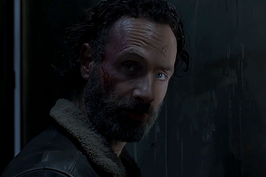
before we start, it's important to mention that working with dark scenes is so much easier when your video/ screencaps are high quality. I personally refuse to gif dark scenes unless I have 4k quality footage lol.
my general coloring tutorial is here in case you want check it out!
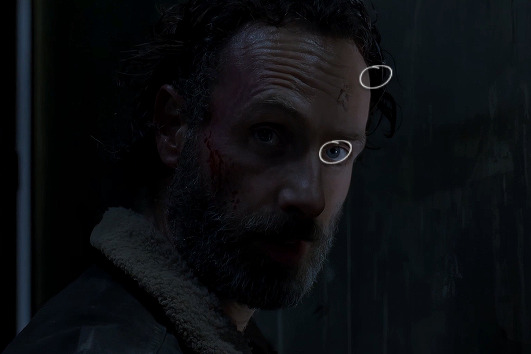
alright, let's start! after resizing and sharpening my gif, here's what we're working with:

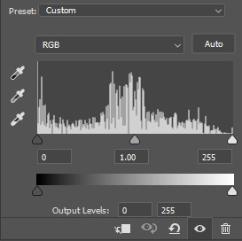
STEP 1: levels. I use the pipette tool to select the lightest and the darkest parts of my gif, it's a great guide that helps to neutralize the overpowering color:
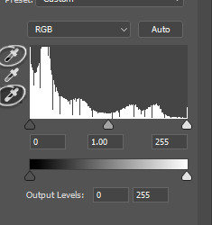
in this case, the lightest part is the little white dot in the corner of his eye and the darkest one is around his hair (if there are many dark shadows in my gif, I just click on a few darkest looking spots and see how it adjusts the coloring and lighting of the gif and just pick the one I think looks the best). basically, this layer is a good guide on how to make the overall look more natural if there is one obvious dominant color and we want to get rid of it (for example, my gif has quite a lot of blues, but it's not too crazy, so I won't need to adjust that much):
and this is what we've got just after using the levels adjustment:
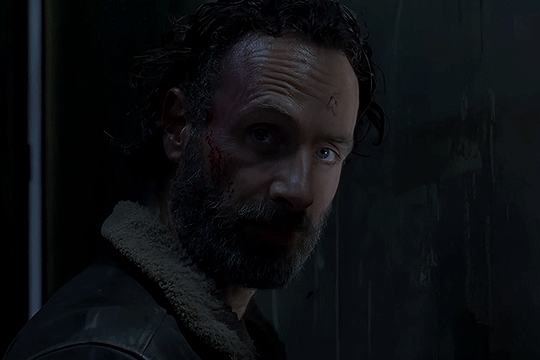
the gif is lighter and the blue was reduced a little bit, the scene now has more green and red undertones. sometimes I mess with the settings myself if I don't like the way it looks, but in this case I'm pretty happy with the automatic adjustments and I didn't even have to do that much!
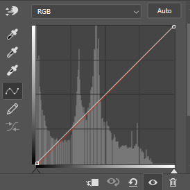
STEP 2: curves. I do the same thing that I did with the levels, using the pipette tool to select the lightest and the darkest parts and also pull the rgb curve to the middle to brighten my gif even more:
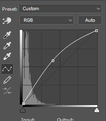
and here's the result after setting the curves layer opacity to 37%:
STEP 3: brightness and exposure layers. next up, I just want to brighten the character a little bit more, but not the background, so I'm adding a brightness/contrast layer and an exposure layer, here are my settings:
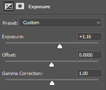
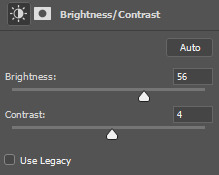
but since it adjusts the whole gif and I don't want that, I select the mask on my brightness layer and pick the eraser tool. I erase the part of my gif that I don't want to be affected by this adjustment, I colored that part bright pink so it's obvious:
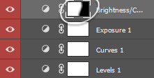
and then I do the same with the exposure layer.
in my gif the character is not moving that much, so it looks pretty natural when I brighten just him. here's where we're at:
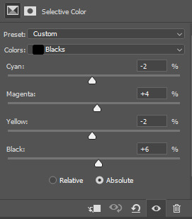
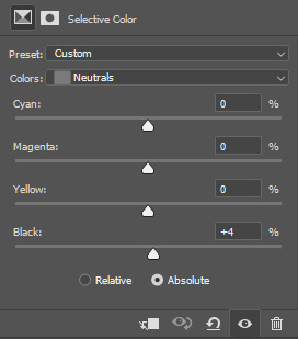
STEP 4: selective color and gradient map. I'm happy with how bright it is, but I do want to deepen the shadows here and just mess with the coloring itself, so next up I'm gonna use a couple more layers.
here are my settings for selective color layer, opacity set to around 40%:
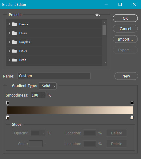
and here are my settings for a gradient map to deepen the shadows:
and here's the result:
ADDITIONAL STEP: I sometimes like to add another layer and just put some soft color gradient to one side of the gif.
in this case I used a soft blue color, set to lighten, 62%:
I'm not very good at tutorials and I put this together pretty quickly, but hopefully this was somewhat helpful, let me know if you have any questions! <3
165 notes
·
View notes