#actually no it’s 1 am
Explore tagged Tumblr posts
Text
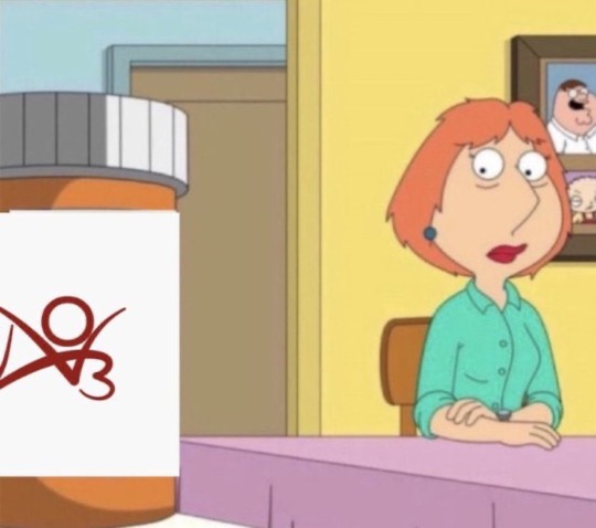
Ao3 is up and running. Going back to get my fix
#it’s 5 o’clock somewhere#actually no it’s 1 am#ao3#poolverine#icemav#chenford#tarlos#hangster#buddie#destiel#rejoice#yes op has issues we should not dwell on like for instance insomnia#get back to reading kudoing commenting folks
2K notes
·
View notes
Text
hey gamers I’ve started watching star trek does anyone else see the romantic tension between captain kirk and mr. spock
#I gotta get to the important questions first#I wouldn’t DARE ask this on reddit#no but actually I know SO little about Star Trek and I didn’t know that until I started watching#I’m intrigued I really am#star trek#star trek the original series#star trek tos#captain kirk#mr. spock#do I have to tag their full names idk#I’m only on season 1 still but I’m making headway#ack#text post#THEIR SHIP NAME IS SPIRK BAHAHAHA#THATS SO GOOD#spirk#BABAHAHAHHSHDURHDUUHEHUHEUHEUEHUE
81K notes
·
View notes
Text
best types of brennan NPC
autism haver
stoner
frat bro who has unlearned hypermasculinity so hard that he's gone 100% the opposite direction about it
anticapitalist proletarian
the most insane person you've ever met
#brennan lee mulligan#in order this post is about (1) ayda aguefort (2) max durden (3) ragh barkrock#(4) bud cubby and (5) bill seacaster#guess what SHOW i am WATCHING#dimension 20#d20#stuff#blmulligan#dnd#ok wait i wanna think about this for unsleeping city#who are the autism havers in tuc why am i blanking.......#im gonna say esther could be an autism haver. or nod#the johns are obviously the frat bros#seven (s3\/3n?) is the anticapitalist proletarian obviously#maddy is both the anticapitalist and the autism haver as a matter of fact#and her name might be spelled maddie idk#anyway alejandro is the stoner#and wally is absolutely the most insane person youve ever met......him and la gran gata perhaps.......#i just remembered about arthur aguefort the actual most insane person youve ever met#strong case for that#the point is these are always brennan's best NPCs#most sentimental? most touching scenes? usually not. but fucking funniest? almost without fail#fantasy high
9K notes
·
View notes
Text

I think my copy of the game is broken they've been doing this for 30 minutes
Crop of the Biolizard edit I did bc it makes me laugh:

#art#sonic the hedgehog#sonic#shadow the hedgehog#rouge the bat#their dynamic is so funny to me like hello what episode of Untucked is this#I am rotating them in a 2 bed 1 bath apartment in my mind#Also very proud of how this turned out I think I'm finally finding a comic rendering style that doesn't make me want to rip my hair out#Simplify baybee it's a comic not an illustration you can get a little crazy with it#Spoiler alert. Getting looser with lineart and better at colour schemes and simplifying shading. Is good actually.#It's so much easier to eyeball what a colour would look like in a setting instead of colourpicking the OG palette and struggling with...#...like 9 overlay and multiply and soft/hard light layers#Approximating colour genuinely looks better than forcing local colour into the piece. As long as the values are still there it works out#comic
10K notes
·
View notes
Text

not my usual lineup
#my art#hina.sketch#jujutsu kaisen#jjk#jjk fanart#gojo satoru#sukuna#ryomen sukuna#nanami kento#geto suguru#forcing myself to draw the jjk adults#namely geto sghhghsj i never draw that guy ever#among jjk fanartists i am squarely in the first years camp they r my true muses in this show#tempting as it sounds tho i guess i don't /actually/ want to only draw yuuji or itfskg on my sketch sheets#so i fought down th urge 2 draw more yuuji tht seems 2 have infected me as of late#sukuna counts kind of tho ig???? same shapes ish???#i do like playing with angles and concepts tht make sukuna look like yuuji or yuuji look like sukuna but ths reserved fr Not sketches#i did allow myself one (1) pockey yuuji per doctor's orders#sry i need my daily dose if i dont draw at least one yuuji i will die. perish even.#anyway rings dinner bell rare hina stsg-adjacent art come and get it
4K notes
·
View notes
Text


Have been reading Dratchrod fics, got disappointed, drew dratchrod
#Actually have been reading also Swerve/Whirl/Cyclonus/Tailgate or Swerve/Whirl and also got disappointed#only 1 perfect work and 1-2 good ones#somehow I feel like I forgot how to draw and what this process is pfffffht#wanna read something with drift|deadlock/roddy|hot rod maybe it's better over there ahah#dratchrod#cockroachdoodles#transformers#maccadam#drift#rodimus#ratchet#maybe I am too picky but I love when Roddy and Drift are literally such close friends that he goes in dratchet pairing without questioning#and the only one actually questioning it is Roddy because “They are conjunxes!! I am not allowed there!” *gets snatched*#but was coming across Drift almost ripping Roddy's kibbles off out of jealousy?#or Ratchet being like “noOOooooOO” to a threesome. In my head he was such a disaster during uni days that I just... what??#Anyway whoever reads this don't mind me ahsgjsha
3K notes
·
View notes
Text
"For most people, a rat is at best an unwelcome guest, and at worst, the target of immediate extermination. But in a field clinic in Tanzania, rats are colleagues—heroes even.
Far from a trash bin-dwelling NYC street rat, the African giant pouched rat is docile, intelligent, easier to train than some dogs, and for East Africans, the performer of lifesaving tuberculosis diagnoses every day.
400,000 new cases of tuberculosis (TB) were estimated to have been prevented by these rats, whose sense of smell would make a bloodhound take notice. As [TB is] the number-one killer among infectious diseases worldwide, many of those 400,000 can be translated into lives saved.
“Not only are we saving people’s lives, but we’re also changing these perspectives and raising awareness and appreciation for something as lowly as a rat,” said Cindy Fast, a behavioral neuroscientist who coaches the rodents for the nonprofit APOPO.
“Because our rats are our colleagues, and we really do see them as heroes.”
APOPO uses giant pouched rats to sniff out traces of TB in the saliva of patients. In parts of Tanzania, a saliva smear test under a microscope by a human may only be 20-40% effective at detecting TB.
By contrast, a giant pouched rat like Ms. Carolina, a now-retired service rat who worked for APOPO for 7 years, raised the rates of detection on TB samples by 40% in the clinic where she worked.

Pictured: An APOPO employee with one of their trained rats
It would take 4 days for scientists to analyze the number of samples that Carolina could screen in 20 minutes. For that reason, when Carolina retired last November, a party was thrown at the clinic in her honor, and she was given a cake.
TB is sometimes thought of as a thing of the past—a disease for which doctors used to prescribe “dry air,” leading a modern sense of humor to muse at the antiquated, pre-antibiotic medical advice.
But it remains the number-one cause of death globally from a single infectious pathogen, and Tefera Agizew, a physician and APOPO’s head of tuberculosis, told National Geographic that once people see what the nonprofit’s rodents can do to slow the spread, they “fall in love with them.”
3,000 times in her career did Carolina detect one of the six volatile compounds that can be used to identify Mycobacterium tuberculosis, and she got a hero’s send-off to a special compound to live out the rest of her days with her closet friend and sniffer colleague Gilbert, in a shaded enclosure dubbed “Rat Florida.”
“We’ve made special little rat-friendly carrot cakes with little peanuts and things on it that the rat would enjoy,” Fast said. “Then we all stand around and we clap, and we give three cheers, hip hip hooray for the hero, and celebrate together. It’s really a touching moment.”
APOPO has made headlines for its use of these rats in other lifesaving tasks as well: landmine clearance.
One of the world’s great underreported scourges (a lot like TB, coincidentally) is landmine contamination. There are 110 million landmines or unexploded bombs in the ground right now in about 67 countries, covering thousands of square miles in potential danger. Thousands of civilians are killed or injured by these weapons every year.
GNN reported on APOPO’s demining efforts using pouched rats back in 2020. One rat named Magawa alone identified 39 landmines and 28 items of unexploded ordnance across an area the size of 20 football fields.
If at the start of this story you didn’t like rats, maybe Magawa and Carolina will have changed your mind."
-via Good News Network, March 31, 2025
#rats#rodents#hero rats#african pouched rat#tanzania#africa#east africa#landmine#tuberculosis#tb#public health#infectious diseases#good news#hope#listen guys I love rats SO MUCH so this is my fav news story in a while#rats are beautiful and brilliant and deserve the world#idc what you think#also this particular species of rat lives like 7-10 years which is a HUGE improvement on the 1-3 typical pet rats live#so although I almost certainly would never actually have done it#I am very sad to learn that it is illegal to bring them into the US#killing my dreams#anyway rats make great pets thanks for listening to me ramble#lore drop: I love rats
3K notes
·
View notes
Text
#genuinely curious how people feel about this#I do it and I neither care if Im being annoying nor do I think I am#the ppl who followed me for my art are not going to get annoyed at me for showing them my art#though sometimes i get worried for like 1 millisecond if i come across as pushy then i remember this is the art website abd i stop caring#polls#art#can I tag this as that even if there's no actual art in the post#well. it IS about art#>1k
7K notes
·
View notes
Text
my issue is that just rewatching Supernatural isn’t enough. It takes too long. I want it all at once. I need a room covered in 327 monitors that feed me every single episode at the same time. I need the DVDs melted down and put into an IV drip. I want every single minute of the show tattooed on the inside of my eyelids. I need to live inside its flesh.
#I’m just a casual fan no biggie#take it or leave it I don’t really care for spn that much#no but seriously like you get me right???? or am I actually going insane#cause when I watch season 1 I miss cas and Jack and Crowley and everyone#but when I watch season 14 I miss the boys on the road looking for dad 🥹#so like I can’t win????#spn#supernatural#dean winchester#sam winchester#castiel#crowley#jack kline#rewatch#going insane#normal show for normal people#misha collins#jensen ackles#jared padalecki#destiel#sam and dean
4K notes
·
View notes
Text
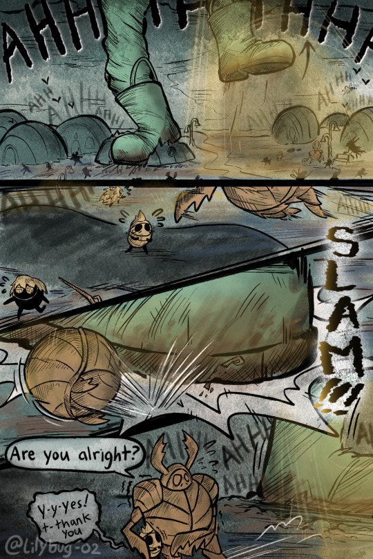
Sam-zilla! Civilization crumbles as her rampaging flattens a city of 6 million 100 from the face of the Earth!!!
Bug Fact: There are multiple Monster Bugs in the Godzilla Franchise. Those notably being a Gigantic gang of Praying Mantis and a Web-spiting Spider. EDIT: and Mothra the Moth!! More thoughts and Godzilla below 💖🦖
V2 First || Prev // Next
Volume 2 Masterpost
▴♥︎▴ Patreon ▴♥︎▴ Buy Me A Coffee ▴♥︎▴
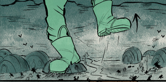
Okay, can I gush about how much I enjoyed drawing this one scene? idk why, but it itches a spot in my brain. Something about Sam being way too tall for the shot and having the entire middle ground be essentially half a city. Sense of scale is always fun to play around with.
This comic has been a very fun way to implement my different interests.
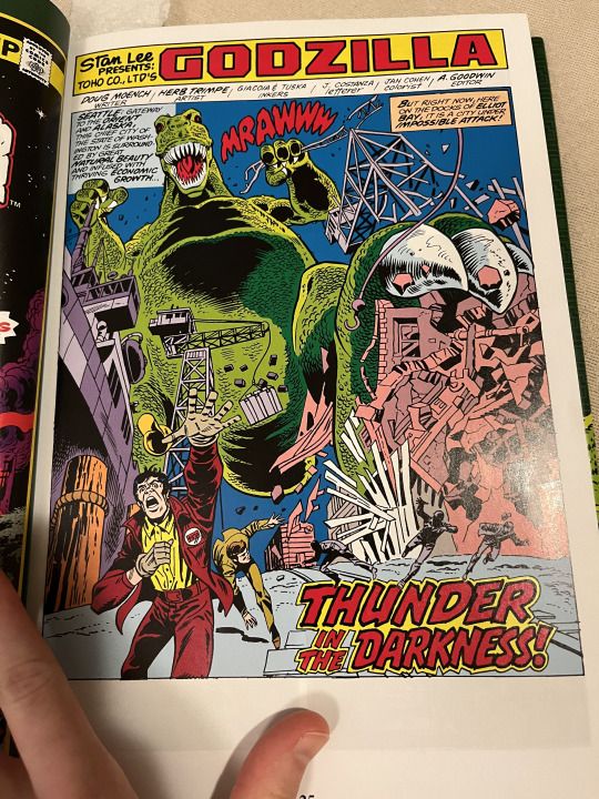
This part is very inspired by my silly Godzilla obsession. LITERALLY. This one scene was heavily inspired by the Godzilla comic I'm reading :)
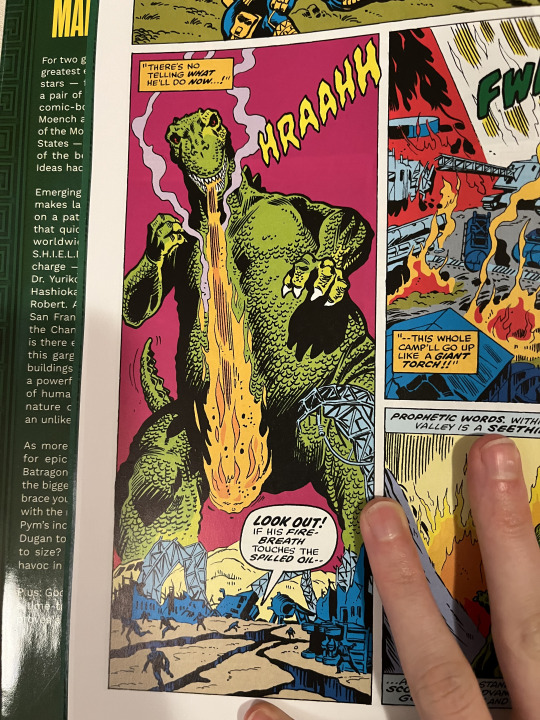
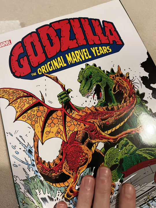
Also YES. Godzilla showed up in the OG Marvel Comic series and it's as cheesy and beautiful as you can imagine.
Omg almost forgot- These are the Godzilla bug foes.


the one above is actually a black hole bug! WOW
#The “Sam-zilla” sentence is a reference to a Godzilla poster I have in my room.#There's actually two references with the first panel. 1) Godzilla and 2) UFO#WOW I am living for this rn. This is going to be so fun. I love doing action shots#Rolling Ogrim up in a ball was literally so weird. Where does he put his spiky bits???#I hope the action scene is readable though. Lol. It's hard to fit them into one page sometimes!!#Dewi's Adventures in Hollow Knight#Dewi's Adventures in Hollow Knight V2#hollow knight humans#hornet hollow knight#ghost hollow knight#my art#dewi#comic#hollow knight au#Lilybug Comics#art#Hollow Knight#hollow knight fanart#hk fanart#hollow knight comic#hollow knight art#hk art#hk au#sam#I spent all day on this. Never again lmao
1K notes
·
View notes
Text
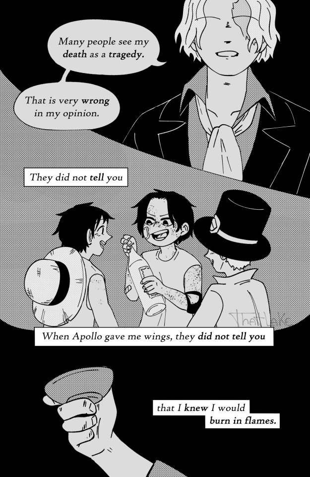


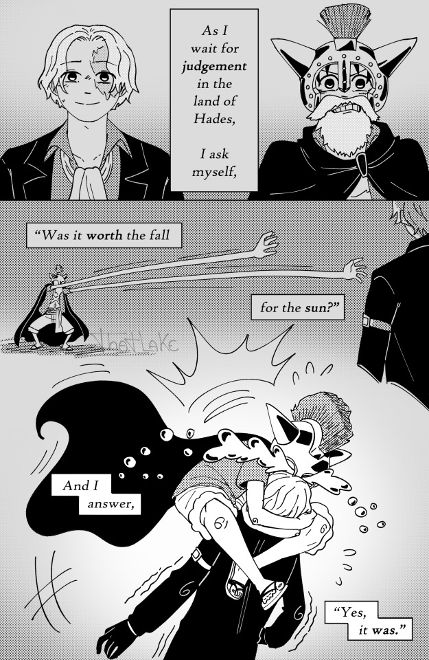
“Icarus.”
it's all about freedom really
Credit goes to An Sifakah for the poem. Enjoy!
Support me on Ko-fi maybe?
#lake's art#happy birthday sabo!#this time actually on time wow#revolutionary sabo#one piece sabo#asl brothers#asl trio#monkey d. luffy#portgas d ace#watch me tag ace even though he barely shows up#one piece comic#one piece#one piece fanart#oh i'll confess. i traced that ship from a screencap#there's no force on earth that can make me draw a whole ass ship sorry#as always I am stupidly proud of exactly 1 (one) page and this time it's the third#but i also just love that part of the poem so i was already biased towards it before i drew it lmao#i had a whole ass explanation for the reasoning behind this comic that i wrote at like. 3 am. but fuck knows what i did with it#i contemplated colors and immediately gave up. hell nah i'm not doing that again
4K notes
·
View notes
Text


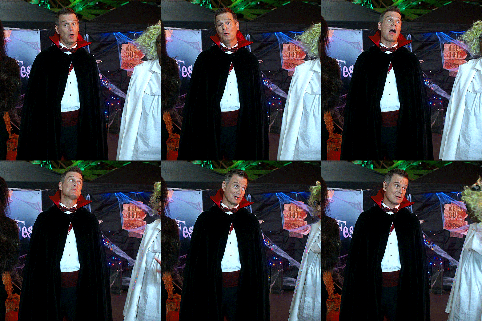
a true fashion icon
#911#bobby nash#me at 1 am can't be blamed for making this ridiculous thing#me at 11 am can probably be blamed for actually posting this though#bobby nash ily#my gifs
1K notes
·
View notes
Note
time for skeleman
with the lack of any other info yet, all I can focus on are those Charles Lloyd-looking sunglasses. they are absolutely sending me. I feel like we're gonna fall through a tree or whatever and this stitched-up boney gentleman is gonna pop out from behind a gravestone and start serenading us with some smooth jazz on the saxophone.
or should I say...the saxoBONE???????
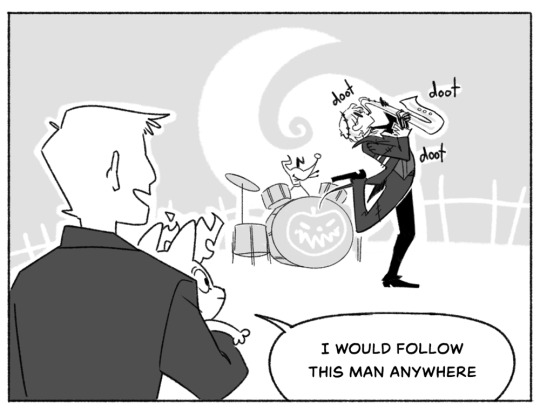
#art#twisted wonderland#twisted wonderland spoilers#doot#i drew this so fast i'm so sorry#god. we don't even have an event name yet what do i tag this with.#the only thing we know about him so far are 1) glasses#2) ~*wagahai*~#(is wagahai a jack thing because that's incredible)#(hold on i gotta look up the japanese dub)#i have zoomed in and i THINK he's got orange eyes but the pixels are defeating me#anyway excuse me for a moment while i vibrate so intensely that i start phasing through the floor#nightmare event is nigh!!!!#this is the number 1 event i have wanted most i can't believe it's real and it's actually happening#i've been dreaming of halloweentown boys for forever i am SO excited#slightly bummed it looks like there's not going to be a sally too but we can't have everything i guess#(unless...? 👀)#stream on the 29th let's GO#and for once it's not at like 4 AM my time thank you for small mercies twst#i wanna see my guys in fancy halloween suits!!!!
3K notes
·
View notes
Text
Gorgug Thistlespring, a Half-Orc Barbarian raised by gnome tinkerers. His parents don’t fully get him but they love him and support him as he is. He dated a 4’11” girl and He’s 6’4”. He offered someone a metal flower on the first day of school, punched them, still offered them the flower, and sang in class. He died on the first day of school and went to hell. He bonded with Kristen because they both died that day. He became a drummer because Fig saw him sing about rage and wanted to share her coping mechanism. They became a rock band. He protects his friends. He loves his friends more than anything. He helped Ragh accept himself by kissing him at Prom and getting him to help fight a dragon. He left Elmville without telling Zelda goodbye and spent an entire season trying to fix it. Fig was missing, Riz was dragged into a mirror? He had to get to them, but he should have called her. He’s the greatest wizard of the age. “Spring Break, I believe in you.” He is the crab king and the shrimp prince. He figured out how to use his parent’s satellite to talk to Zelda. “It’s Gorgug, keep going.” He hugged Fabian, who punched him on the first day of school when they got back to each other in the Nightmare King’s forest. He multiclassed without anyone doing it before him and without help. He mixed his parents together and made a new multiclass. He built the solar lasso that caught the night yorb, he helped Riz gain some of his arcano-tech! His van is holding the Night Yorb. He uses his rage to protect people, he took 4 years of school at once to make sure he got to multiclass because he was not gonna be told no. He stayed on the Owlbears for Fabian even though he didn’t want it anymore. He took the Last Standard Exam and he crit so. many. times. He didn’t fall and neither did his friends! He flew a boat and killed dragons and he protected his spellcasters from Porter because that bitch was not gonna kill his friends. He hugged Kristen and told her she looked better. He looked better too. “Remember when we died?” He posited “It might happen again,” she responded. He didn’t let it. He wouldn’t let that happen. Not to them, never again. His new girlfriend is 2’.
I genuinely can’t get over him I love him and I have so many more analyses of so many more characters coming and hopefully they will be more coherent but it’s 4 am in a warehouse
#it's actually 1 am but you get it#dox.jpeg#dimension 20#fantasy high#fantasy high junior year#fantasy high spoilers#fhjy spoilers#gorgug thistlespring#fantasy high junior year spoilers#fhjy
3K notes
·
View notes
Text

5 YEARS ?!?!?!!!!
#THIS IS TECHNICALLY LATE. BUT I am posting it on the day HLVRAI act1 part 1 came out on YOUTUBE#so it's basically the same . Okay.#this was actually pretty fun 2 draw... hehhee..#hlvrai#half life vr ai#id in alt text#my art#gordon freeman#benry#benrey#Dr Coomer#tommy coolatta#dr bubby#gordon feetman#half life vr but the ai is self aware
839 notes
·
View notes
Text
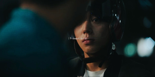
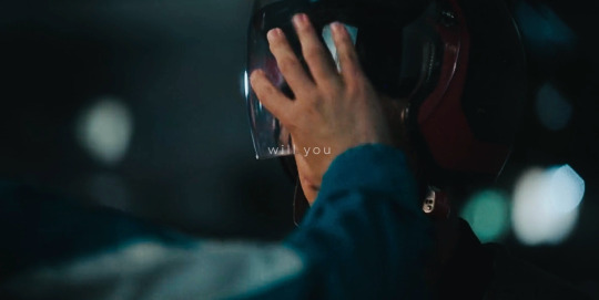
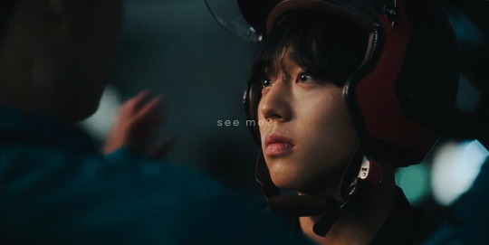
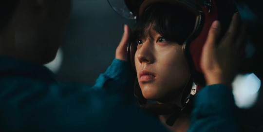
there will always be one who loves quietly
⋆.˚ Weak Hero Class 1 (2022)
(more weak hero edits)
#if not a romantic scene why is it shot and lit in such a romantic way#the framing is so romance drama coded too#listening to actual romance kdrama osts doesn’t help#ost in question: here I am again from crash landing#and yes I just completed whc1#*trashes myself*#weak hero class 1#kdrama#whc1#weak hero class one#yeon sieun#ahn suho#whcloveleys
808 notes
·
View notes