#Wednesday Tips
Explore tagged Tumblr posts
Photo


(via Wednesday Wisdom: Onboarding, Training, Leading)
#Wednesday Wisdom#Wednesday Morning#Wednesday Tips#Onboarding#Training#Leading#Leadership#Tracy Chamberlain Higginbotham#Tracy Higginbotham#women entrepreneurs#female business owners#volunteer training#staff training#small business tips#entrepreneurship#female entrepreneurs#women business owners#Syracuse ny#CNY
0 notes
Text
Lord Ganesh: শ্রাবণের বুধবারে মেনে চলুন এই নিয়ম, শিব-গণেশের আশীর্বাদে জীবনে আসবে অর্থসুখ
জি ২৪ ঘণ্টা ডিজিটাল ব্যুরো: ভগবান গণেশকে (Lord Ganesh) পৃথিবীর প্রথম পূজারী বলে মনে করা হয়। অর্থাৎ কোনও শুভ কাজ করার আগে নিয়ম মেনে গণেশের পুজো করার পর তাঁকে ভোগ দেওয়া হয়। এরপরেই শুরু হয় কোনও শুভ কাজ। বুধবার গণপতি বাপ্পার পুজো। বলা হয়, যদি কোনও ব্যক্তি সমস্যায় জর্জরিত হয়ে থাকেন, তাঁর সমস্ত কাজ নষ্ট হয়ে যাচ্ছে, তা হলে বুধবার তাঁর ভগবান গণেশ সম্পর্কিত ৫ টি বিষয়ে মনোযোগ দেওয়া প্রয়োজন। যা করলে অসমাপ্ত…
View On WordPress
#Budhwar Ke Tips#Budhwar Ke Totke#Budhwar Ke Upay#favorite work for Lord Ganesh#how to please Lord Ganesh#Lord Ganesh#Lord Ganesh favorite cloth color#Lord Ganesh favorite color#Lord Ganesh ke Tips#unpleasant work for Lord Ganesh#Wednesday tips#what not to do on Budhwar#what to do on Budhwar
0 notes
Text
Creating Fear in Your Characters: A Writers Guide

Creating authentic emotions is vital for immersive storytelling, which is why I decided to make this series on how to write different emotions. After exploring rage, and sadness it's now time to delve into fear!
Fear is a powerful emotion that can manifest in various ways, from subtle apprehension to paralyzing terror. Here's a guide on how to write fear effectively, covering different aspects of your characters' behavior and reactions.
Facial Expressions
Fear often manifests first in facial expressions, conveying the initial shock or unease. Describe these expressions to immerse readers in your character's emotional state:
Widened Eyes and Dilated Pupils: Show the eyes widening in response to a sudden threat, with dilated pupils indicating heightened alertness.
Tense Jaw and Clenched Teeth: Mention the clenching of jaw muscles or teeth, signaling internalized stress or anxiety.
Furrowed Brow and Raised Eyebrows: Describe the furrowing of the forehead and raised eyebrows, revealing worry or confusion.
Quivering Lips or Lip Biting: Note subtle lip movements like quivering or biting, reflecting nervousness or fear.
Frozen or Stiff Facial Muscles: Highlight moments of fear-induced immobility, where facial muscles become tense and rigid.
Body Language and Gestures
Fear can also be expressed through body language and gestures, showcasing your character's instinctual responses to danger or threat:
Backing Away or Recoiling: Describe your character instinctively moving backward or recoiling from the source of fear, signaling a desire to retreat.
Raised Shoulders and Tensed Posture: Show how fear causes the shoulders to rise and the body to tense up, indicating readiness for fight or flight.
Trembling Hands or Shaking Limbs: Mention the trembling of hands or shaking of limbs, reflecting nervousness or anxiety.
Covering Vulnerable Areas: Describe your character instinctively covering vulnerable areas like their neck or torso, symbolizing a protective gesture.
Fidgeting or Restlessness: Note any fidgeting or restlessness, such as tapping feet or wringing hands, as signs of inner turmoil and fear.
Vocal Cues and Dialogue
Fear can alter vocal cues and dialogue, affecting how your character speaks and communicates their emotions:
Quavering Voice or Shaky Speech: Describe the voice quivering or becoming shaky, indicating nervousness or fear.
Rapid Breathing and Gasping: Mention rapid breathing or gasping for air, showcasing the physical impact of fear on the respiratory system.
Stammering or Hesitant Speech: Note any stammering or hesitant speech patterns, reflecting the character's struggle to articulate their thoughts coherently.
Sudden Silence or Lack of Verbal Response: Show moments of sudden silence or the inability to respond verbally, highlighting the overwhelming nature of fear.
Repetitive Phrases or Vocalizations: Describe repetitive phrases or vocalizations, such as muttering prayers or chanting reassurances, as coping mechanisms in fearful situations.
Reactions and Physical Responses
Fear triggers various physical responses in your characters, showcasing the body's instinctual reactions to perceived threats:
Increased Heart Rate and Sweating: Mention the character's heart rate increasing and sweating profusely, reflecting heightened physiological arousal.
Dilated Pupils and Heightened Senses: Describe dilated pupils and heightened sensory perception, as the character's senses become more attuned to potential dangers.
Muscle Tension and Rigidity: Note muscle tension and rigidity, as the body prepares for action or defense in response to fear.
Nausea or Stomach Churning: Show how fear can lead to feelings of nausea or stomach churning, as the body's stress response impacts digestive functions.
Fight, Flight, or Freeze Response: Highlight the character's instinctual response to fear, whether it's a readiness to fight, a desire to flee, or a state of frozen immobility.
Types of Fear and Emotional Depth
Different types of fear can evoke varying emotional responses in your characters, adding depth to their portrayal and the narrative:
Startle Fear: Describe the sudden, reflexive fear triggered by unexpected events or loud noises, leading to a quick, intense reaction.
Apprehensive Fear: Show the lingering sense of unease or dread that accompanies anticipated threats or impending danger, heightening tension over time.
Terror: Depict the overwhelming, paralyzing fear that arises from extreme danger or horrifying experiences, impacting the character's ability to think or act rationally.
Phobias: Explore specific phobias that trigger irrational and intense fear responses, shaping how your character navigates their environment and interactions.
Trauma-Induced Fear: Address fear resulting from past traumas or experiences, influencing the character's behavior and emotional resilience in present situations.
Verbs and Adjectives for Writing Fear
Here's a list of verbs and adjectives to help you convey fear effectively in your writing:
Verbs: tremble, cower, gasp, quiver, shrink, freeze, recoil, sweat, pant, gulp, shudder
Adjectives: terrified, anxious, alarmed, horrified, shaken, jittery, panicked, petrified
#quillology with haya#hayatheauthor#haya's book blog#haya blogs#writers on tumblr#writer community#writing fear#writer tools#scary stories#writer blog#writer stuff#writer wednesday#writer tips#creative writing#writing emotion#writers of tumblr#writerscommunity#writeblr#writing community#writer spotlight#writer things#writing prompt#writing tools#writing stuff#writing#writing life#writing inspo#writing help#writing advice
2K notes
·
View notes
Text

Sporty Girls
#sporty#sporty girls#sporty chic#sporty and rich#sporty & rich#fitness#health and fitness#Health & Fitness#fitness and exercise#fitspiration#Fit girls#fitspo#fitness routine#fitblr#fitness journey#fitnessmotivation#fitspiritaion#wellness#health and wellness#wellbeing#wellness tips#healthandwellness#beauty and wellness#wellness journey#wellness wednesday#wellness routine#wellness girl#wellnessjourney#self care#self care tips
698 notes
·
View notes
Text

i love this drawing of kara from @moeblob sm, she reminds me of a red velvet cupcake lol

#edit: bruh the rendering looks so much softer on desktop.. . mobile you will start to cough in 3 days..#i rly rly like the idea of kara changing her hair colour frequently lol#blonde one day. brown the next. pink hair on wednesdays. green streaks at 6pm bc why not#holy shit kara with ebony dark'ness dementia raven way hair..... like black with red streaks and purple tips#my immortal au omfg#''some people tell me i look like valorie curry (an: if u dont know who she is get da hell out of here!!)''#dbh#detroit become human#dbh fanart#dbh kara#100% organic younger money
153 notes
·
View notes
Text
I feel like All Might tried to dress up as Santa for an event one year, complete with an 'I AM HERE! TO DELIVER PRESENTS!' and the bad news is he was very obviously not Santa but the good news is every single child present was so excited to see All Might they totally forgot about that other dude
#pro tip the next time you want to dress up as someone other than yourself don't yell your own catchphrase#in your incredibly distinctive voice when you do it#the blond v shaped fringe that simply cannot be tamed didn't help#anyway MERRY CHRISTMAS TO ALL WHO CELEBRATE#merry wednesday to those who do not!#whatever your plans for the day i hope you have a good one <3#welcome to the christmas queue#all might failing to convince a bunch of small children that he was santa claus was televised and resulted in a limited edition#'santa might' figure that inko allowed izuku to display in the living room with the actual christmas decorations#he gets rolled out every year like the nativity#yagi toshinori#mha#bnha#liza blather#q
162 notes
·
View notes
Text
What is... Alpha vs. Beta Reader?
Most writers do not publish a work without it going through the process of being critiqued by multiple people beforehand. People that do the critiquing are alpha and beta readers.
But where is the difference?
Alpha readers come in first. They can read your draft at any point, you can even just run your first ideas by them. The alpha reader should focus on the general story, the bigger picture. They tell you where plot holes are and if an idea or scene in underdeveloped. They will tell you if one of your ideas just don't translate on the page just yet. You should take their feedback and apply it.
After working on the draft with the feedback you got, it's time for the beta reader. This one comes in towards the end, when the overall draft is finished. A beta reader should represent your target audience and should tell you what they liked and didn't like as a reader, not a fellow writer. They can tell you about what they felt while reading your story and if they cared about the characters. Beta readers will examine the whole story like the alpha readers, but they will do it more in-depth, which is why it's important to have them come in at the end, when you've gone through multiple rounds of revisions of the overall story.
#what is... wednesday#writing help#writing tips#writeblr#writers on tumblr#writing community#writing advice#beta reader#alpha reader
1K notes
·
View notes
Text
Worldbuilding Tip
If you have a fantasy race with animal traits look at that animals social structure when desiging their culture.
A kingdom of lion people could have 2 types of towns, one with mostly women and one man as mayor and another made up of men banished from the first town when they hit puberity. With duals to decide the mayor of the first town.
Fauns and satyrs could banish all men from town except for during mating season with only women running socity or have seperate towns for each gender like actual deer herds.
Most cultures in fantasy are real world cultures with the serial numbers shaved off or a mish mash of real world cultures. So this is a great way to make more interesting cultures in your setting.
#world building#worldbuilding#fantasy worldbuilding#worldbuilding stuff#worldbuilding ideas#writers on tumblr#writing#writeblr#writing inspiration#writing tips#writing advice#fantasy world#world building prompts#fantasy writing#world building wednesday
170 notes
·
View notes
Text
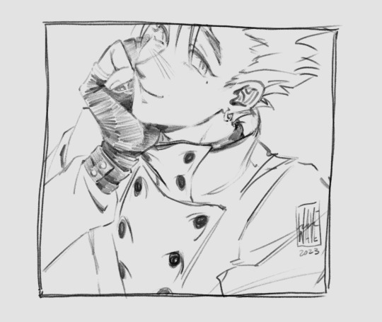
vash for wip wednesday!! (idk what i'm doing but this is part of a vw reincarnation au thing that i've had on my mind for the last few months kajcjdka)
#vash#vash the stampede#trigun#wip wednesday#wip#mine#i got spoiled pretty early on for that one scene (pro tip literally never google a character even for smth completely unrelated i stg)#(tho also even if i hadnt googled i doubt i woukdve escaped the spoilers on twt so i guess its okay 😂😂)#but yeah i finally summoned up the courage to read that volume#and i.#yeah#yeah.....#yeaaahhhhh.......
363 notes
·
View notes
Text
The Writer's Guide to Authentic Wounds and Fatalities
Writing fatal injuries in a story requires a delicate balance between realism and narrative impact. The portrayal of these life-altering events can evoke strong emotions in readers and shape the trajectory of your characters' journeys. In this blog, I will explore the intricacies of depicting fatal injuries in a manner that feels authentic, engaging, and respectful to the gravity of such circumstances. By understanding the nuances of fatal injuries, you will be equipped to craft compelling narratives that resonate with your readers.
Writing Fatal Injuries
When it comes to writing fatal injuries, it is crucial to approach the subject with care and accuracy. Fatal injuries carry immense consequences for your characters and can shape the trajectory of your story. By delving into the intricacies of portraying fatal injuries authentically, you can ensure that the gravity and impact of such events are effectively conveyed to your readers.
Choosing the right injuries for your story
Selecting the appropriate fatal injuries for your narrative involves considering various factors. Ask yourself: What purpose does this injury serve within the story? How does it affect the characters and the overall plot? Conduct thorough research to identify injuries that align with your story's context and resonate with the emotional journey of your characters.
For example, in a historical drama, you may research common fatal injuries during a particular era, such as battlefield injuries, diseases, or accidents prevalent at the time. In a crime thriller, you might explore the portrayal of fatal gunshot wounds or traumatic injuries resulting from violent encounters. By aligning the injuries with the context and themes of your story, you create a more immersive and believable experience for your readers.
Researching the mechanics of fatal injuries
To portray fatal injuries convincingly, it is essential to delve into the mechanics behind them. Understand the specific anatomical structures and systems involved, as well as the forces or mechanisms that can lead to fatal outcomes. Explore medical resources, consult experts if possible, and gather insights into the physiological and psychological implications of such injuries.
For instance, if your character suffers a fatal stab wound, research the anatomy involved, the potential organs affected, and the potential consequences such as internal bleeding or organ failure. By understanding the specific details and implications of the injury, you can describe the physical and emotional toll it takes on the character with greater accuracy and depth.
Depicting the immediate aftermath
When writing about fatal injuries, vividly describe the immediate aftermath to capture the intense emotions and physical realities. Consider the sensory details, the shock and disbelief experienced by characters, and the chaotic environment that often surrounds such events. Balancing realism with the needs of your story, create a scene that immerses readers and evokes empathy.
For example, if a character experiences a fatal car accident, you can depict the chaos at the scene, the character's disorientation, and the reactions of witnesses. Emphasize the sensory details such as the sound of screeching tires or the smell of burning rubber, creating a visceral experience for your readers.
Emotional and dramatic impact on the narrative
The impact of fatal injuries extends beyond the immediate moment. Explore the ripple effects on other characters, relationships, and the overall plot. Delve into the emotional responses, grief, guilt, anger, or determination that arises in the aftermath of loss. Utilize these emotional arcs to deepen character development and drive the narrative forward.
For instance, the loss of a loved one due to a fatal illness might lead to grief and strained relationships among the remaining family members. The emotional journey of a character grappling with guilt and seeking redemption after causing a fatal accident can become a central theme in your story. By delving into these emotional arcs and their consequences, you add depth and resonance to your narrative.
Writing Minor Injuries
While fatal injuries may capture our attention with their dramatic impact, it is equally important to pay attention to the portrayal of minor injuries in your writing. Minor injuries, though less severe, can still significantly affect your characters and contribute to the authenticity of your story. In this section, we will explore the art of depicting minor injuries, ensuring that they are not overlooked or trivialized. By delving into the nuances of minor injuries, you can add depth and realism to your characters' experiences.
Types of minor injuries to consider
When crafting your story, it is essential to consider a range of minor injuries that can occur. These injuries can include cuts, bruises, sprains, minor burns, or even minor fractures. Each type of injury carries its own unique characteristics, associated pain levels, and recovery processes. By understanding these distinctions, you can create accurate and believable depictions that resonate with your readers.
For example, a character who sustains a cut on their hand may experience sharp pain, the sight of blood, and the need for immediate first aid. On the other hand, a character with a sprained ankle may struggle with mobility, experience swelling, and require rest and care for a few days. By paying attention to these specific details, you can enhance the realism of your storytelling.
Conveying pain and discomfort
When writing about minor injuries, it is important to effectively convey the pain and discomfort experienced by your characters. Consider describing the sensation of pain, the throbbing or stinging feeling, and how it affects their daily activities or interactions. Showcasing the emotional impact of pain, such as frustration, irritation, or vulnerability, can deepen the readers' connection to the character's experience.
For instance, if a character suffers from a sprained wrist, you can describe the dull ache that persists, making simple tasks like typing or holding objects challenging. By capturing these small but significant moments, you immerse readers in the character's struggle and create a more realistic portrayal.
Balancing realism with narrative pace
While it is important to depict minor injuries realistically, it is also crucial to strike a balance with the overall pace and momentum of your story. Consider the significance of the injury within the larger context of your narrative. Some injuries may require more detailed attention and impact the plot, while others may serve as background elements. Adjust the level of detail and focus accordingly, ensuring that the portrayal of minor injuries aligns with the narrative's flow.
For example, a small cut on a character's finger may not require an extensive description unless it becomes infected or triggers an unexpected consequence. By aligning the portrayal of minor injuries with their narrative relevance, you maintain a consistent pace while still acknowledging their impact on your characters' lives.
Writing Bloodshed And Realistic Blood Loss
When writing about wounds and injuries, it is essential to consider the amount of blood loss your characters may experience. Realistic portrayal of bloodshed can enhance the authenticity of your scenes and immerse readers in the gravity of the situation. In this section, we will explore the factors influencing blood loss and techniques for accurately depicting it in your writing.
Understanding blood loss and its impact on the body
To authentically portray blood loss, it's crucial to have a basic understanding of how the human body responds to injury. Research the circulatory system and the role of blood in transporting oxygen and nutrients throughout the body. Consider the different types of blood vessels and their potential for bleeding when injured. This knowledge will help you create realistic scenarios and determine the appropriate level of blood loss for specific injuries.
Factors influencing blood loss in different injury scenarios
The amount of blood loss can vary depending on the severity and location of the injury. Factors such as the size of blood vessels, the rate of bleeding, and the body's ability to clot play a significant role. For example, a deep laceration in an artery will result in more substantial blood loss compared to a superficial cut on the skin. Consider these factors when describing injuries and their resulting bloodshed.
Techniques for accurately portraying blood loss in writing
There are several techniques you can use to convey the realistic impact of blood loss in your writing. Describing the color, consistency, and flow of blood can provide vivid imagery. You can also include physical symptoms such as dizziness, weakness, or fainting that may accompany significant blood loss. Additionally, consider the emotional response of your characters and how they react to the sight of blood or their own injuries.
By incorporating these techniques, you can create scenes that evoke a visceral response in readers and enhance the authenticity of your writing.
Bruises: Colors, Progression, and Pain
Bruises are a common result of injuries, and understanding how they form, change in color, and cause discomfort can greatly enhance the realism of your writing. By accurately describing bruises, you can bring depth to your characters' injuries and portray their healing process convincingly.
Understanding the stages and colors of bruises
Bruises go through distinct stages of color as they heal. Initially, they may appear red or purple due to the broken blood vessels beneath the skin. Over time, the color changes to blue, green, yellow, and eventually fades to a brown or yellowish hue. Understanding this color progression can help you accurately describe the age of a bruise and the healing process.
For example, a fresh bruise might be vivid purple, indicating recent trauma, while a fading bruise may have a yellowish tinge, suggesting that healing has begun. By incorporating these color details, you can add realism to your characters' injuries and track the passage of time within your narrative.
Depicting the progression of bruises over time
As bruises heal, they often change in appearance and size. Initially, a bruise may be small and localized, but it can gradually spread and become more extensive. Describing this progression can provide a sense of the healing process and the passage of time within your story.
For instance, a character who sustains a significant blow to the face may develop a bruise that starts as a small spot near the eye but expands to cover a larger area over the next few days. By accurately portraying the progression of bruises, you enhance the authenticity of your characters' injuries and their recovery.
Conveying the pain and sensitivity associated with bruises
Bruises can be painful, sensitive to touch, and affect a character's movement and daily activities. Describing the pain and discomfort experienced by your characters can create empathy and immerse readers in their physical ordeals.
Consider conveying the tenderness of a bruise when pressure is applied, the throbbing sensation, or the limitation of movement due to the pain.
Remember The Side Effects
Injuries, whether minor or severe, often come with a range of side effects that can significantly impact your characters' lives. These side effects can extend beyond the physical realm and encompass emotional, psychological, and social aspects.
Physical side effects
Injuries can have profound physical side effects that go beyond the immediate pain and discomfort. Consider the potential consequences such as limited mobility, impaired coordination, chronic pain, or the need for assistive devices like crutches or braces. Describing these physical side effects can add depth to your characters' struggles and provide a realistic portrayal of their healing journey.
For example, a character who sustains a leg injury may experience difficulty walking, require physical therapy, or have long-term complications that affect their day-to-day activities. By addressing these physical side effects, you create a more nuanced depiction of the aftermath of injuries.
Emotional and psychological side effects
Injuries can have a profound emotional and psychological impact on characters. They may experience fear, anxiety, trauma, or a loss of confidence. Consider how the injury affects their self-image, relationships, or mental well-being. Explore the emotional journey your characters undergo as they navigate the aftermath of their injuries.
For instance, a character who survives a near-fatal accident may develop post-traumatic stress disorder (PTSD) and struggle with recurring nightmares or panic attacks. By incorporating these emotional and psychological side effects, you can deepen the complexity of your characters and their responses to traumatic experiences.
Social implications and changes
Injuries can also lead to significant social changes for your characters. They may face challenges in their personal relationships, encounter stigma or discrimination, or experience changes in their roles or identities. Explore how the injury affects their interactions with others and their sense of belonging in the world.
For example, a character who sustains a facial injury may encounter judgment or stares from others, leading to self-consciousness or isolation. By addressing the social implications and changes resulting from injuries, you can create multi-dimensional characters and explore the impact of their injuries on their social dynamics.
By incorporating these various side effects into your writing, you bring depth and authenticity to your characters' experiences and showcase the wide-ranging impact of injuries.
Conclusion
Writing authentic wounds and fatalities requires attention to detail and a deep understanding of the physical, emotional, and psychological aspects involved. By following the guidelines and exploring the subheadings discussed in this guide, you can create compelling and realistic portrayals of injuries in your writing.
Remember to conduct thorough research on the specific injuries you want to depict, understanding their mechanics, symptoms, and potential outcomes. Consider the immediate and long-term effects on your characters, both physically and emotionally. Incorporate sensory details to immerse readers in the experience, describing the pain, bloodshed, colors of bruises, and the progression of healing.
Additionally, don't forget to address the side effects that injuries can have on your characters' lives. Explore the physical limitations, emotional struggles, and social implications that arise from their injuries. By delving into these aspects, you can create well-rounded characters and compelling narratives that resonate with readers.
I hope this blog on forging epic battles will help you in your writing journey. Be sure to comment any tips of your own to help your fellow authors prosper, and follow my blog for new blog updates every Monday and Thursday.
Looking For More Writing Tips And Tricks?
Are you an author looking for writing tips and tricks to better your manuscript? Or do you want to learn about how to get a literary agent, get published and properly market your book? Consider checking out the rest of Haya’s book blog where I post writing and publishing tips for authors every Monday and Thursday! And don’t forget to head over to my TikTok and Instagram profiles @hayatheauthor to learn more about my WIP and writing journey!
#hayatheauthor#haya's book blog#haya blogs#writers on tumblr#writer community#writer tools#writer blog#writer stuff#writer wednesday#writer tips#creative writing#writers of tumblr#writerscommunity#writeblr#writing community#writer spotlight#writer things#writing prompt#writing tools#writing stuff#writing#writing life#writing inspo#writing help#writing advice#writing inspiration#writing ideas#writing things#writing tip
4K notes
·
View notes
Text

Natural Beauty
#Vogue#vogue italia#Vogue Paris#Vogue Magazine#vogue korea#vogue beauty#sporty#sporty girls#fashion#style#chic#wellness#health and wellness#wellbeing#wellness tips#healthandwellness#beauty and wellness#wellness journey#wellness wednesday#wellness and health#wellness routine#wellness girl#wellness and beauty#wellnessjourney#nutrition and wellness#health#self care#self care is not selfish#self care tips#self care sunday
250 notes
·
View notes
Text
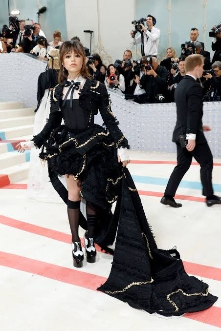
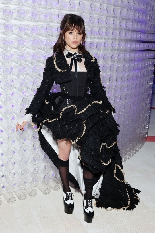
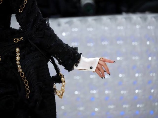

Jenna Ortega wearing custom Thom Browne at the 2023 Met Gala 🖤🖤🖤
It’s giving gothic 18th century Addams Family and I’m here for it
#*screams incoherently*#she’s gorgeous#perfect right down to the black french tip manicure#jenna ortega#wednesday#wednesday addams#wednesday netflix#wednesday 2022#ptbv
417 notes
·
View notes
Text
What is... a red herring?
A red herring symbolises a diversion tactic. It's a literary device that is used to distract the reader and lead them to a false conclusion.
Mostly used intentionally, especially in crime stories, it can also be used unintentionally. In crime and adventure stories this element is one of the most important ones to set the reader on the wrong track and keep up the suspense.
The name comes from the actual strong-smelling fish that was supposed to divert the hounds when hunting.
#what is wednesday#red herring#literary#writing advice#writing tips#writeblr#writing#writers on tumblr
850 notes
·
View notes
Text
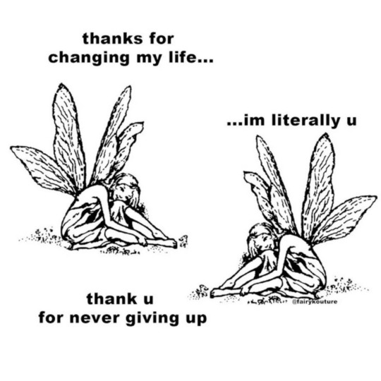
🧚♂️✨
#self growth#self discovery#self discipline#self love#self care#self help#self improvement#spirituality#spiritual awakening#spiritual journey#spritualjourney#spiritualgrowth#mental health#positive mental attitude#mental wellness#health and wellness#wellnessjourney#wellbeing#wellness girl#wellness tips#wellness wednesday#healing#healing process#healingpower#motivation#motivating quotes#get motivated#motivating myself#motivateyourself#motivator
16 notes
·
View notes
Text
happy walton wednesday!

frosted tips in the wild…
#so rare to see the frosted tips in the wild. a fine specimen#do y’all think he frosted every tip. or#walton wednesday#walton goggins#10/02/24#bona fide
22 notes
·
View notes
Text
wip wednesday 💕
hi friends, hope you're all doing well! I've been slowly writing the next chapter of Everywhere, Everything as well as picking away at under the weeping willow pt 2 bc im so deep in drama and I miss writing filth lol
here's a little snippet of chapter 7 of Everywhere, Everything for this week's edition of wip wednesday ☺️
Azriel watched as Elain cleared her throat and wrung her hands together in her lap, fingers tugging at the cuffs of the long sleeved black top she was wearing.
"Graysen proposed," she hiccupped, nervously tucking her hair behind her ears.
The two words were softly spoken and she said them with no break in between but Azriel heard them loud and clear.
His stomach dropped, the two glasses of wine he'd consumed turned sour in his stomach and did little to ease the pain of his heart slamming against his chest as Feyre and Nesta began firing off question after question - all of which were ignored by Elain and none of which he could hear over the incessant buzzing in his ears.
He prayed that he'd heard her wrong. Prayed that there was no way she'd actually said what he thought she said. It wasn't until he saw Feyre reach for Elain's left hand that Azriel forced himself to focus, his eyes zeroing in on her fingers.
#having a blast writing this chapter and so excited for the rest of this fic#I think I've got 10 chapters plotted but will adjust as necessary#elriel fic#my writing#WIP Wednesday#everywhere everything#also trying to pick a title for ch 7 is not going well tip
25 notes
·
View notes