#These will look better once lineart and colors have been set!
Explore tagged Tumblr posts
Text

Adopt sketch update, 16 WIPs made today, marking 28/1000 n3n/ Stopping for the night, to both lay down and let my hand rest >w<! Good progress thus far :D! Images that are done shown below, marking who is who!
Magikarp

2. Mimikyu

3. Pikachu

4. Butterfree

5. Girafarig

6. Musharna

7. Umbreon

8. Slurpuff

9. Fennekin

10. Victini

11. Oshawott

12. Lucario

13. Primarina

14. Meloetta ( Aria )

15. Vaporeon

16. Finneon

#nymphrasis#art#my art#pokemon#eevee#Magikarp#Mimikyu#Pikachu#Butterfree#Girafarig#Musharna#Umbreon#Slurpuff#Fennekin#Victini#Oshawott#Lucario#Primarina#Meloetta#Vaporeon#Finneon#MY HAND HURTS BUT THAT IS OK BECAUSE NOW I CAN HAVE A BREAK AND REST QWQ#I wanted to see how many I could do in a day#No worries I have been taking a few small breaks!#I just didnt do my little hand stretches inbetween leading to cramps ;w;#These will look better once lineart and colors have been set!
21 notes
·
View notes
Note
DUUUDDEEE your art is insane!! I ADORE the scales you draw and render, and how you make so much of your illustrations look like real work staff from WoF would make! Do you have any tips for scales? Rendering? Drawing them :0?
thank you so much!! for scales, i'd recommend avoiding circle shapes and instead go for a more angular hexagonal shape! it reduces weird gaps in between the scales and makes the texture look a lot more tight-knit and interconnected


as for rendering, i think my best tip would be to start with shadows first. make a shadow layer, fill it in entirely with the base color for the shadows, and carve out the light source by erasing parts of the shadow layer. I've been trying out a new method of rendering which takes a lot less time but gives the same if not better results (using a color layer on multiply above a greyscale render layer with a color overlay to add color to the shadows! i'll go more in depth with this once i have a finished example piece to break down)
and i usually render scales by filling in each individual scale above the lineart to create an alpha mask and i use a clipping group using the mask

scale mask (normal layer mode, 100% opacity)

set to "color dodge" at 40% opacity, additional "shadow" layer (black color layer set to "erase" above the layers in the clipping group) used to create depth!
112 notes
·
View notes
Text
-FAQ-
Hello! I've gained a whole bunch of followers lately and I've been getting a lot of questions about commissions, what my setup is, what brushes I use, etc, so I thought I'd make a post about it to answer everyone's questions at once !
Putting them under the cut <3
Commissions:
Commission prices are listed in my pinned post. You can send me a private message about your commission idea and we can get to talking :) It is helpful to have enough references handy (character, outfit, descriptions etc)
I am generally a fast drawer but I also have a job and a physical disability so there might be moments I can't work on your commission. But that is never longer than a few days at most.
Payment is upfront, the full amount and via paypal only. I know this might seem a bit scary but unfortunately there are a lot of people who end up not paying for commissions and I want to avoid that.
During the process I will send you frequent updates and will ask for input, to see if it is going in the direction you want. You can ask for changes during the sketching progress but once I've started on line-art and coloring, no big changes will happen. (You can for example ask for a different color for a shirt etc, but not for a different prop or pose or expression)
When it is completed, I will send the drawing to you via email. The drawing will remain mine and it is not to be sold or profited of by the person who commissioned me. If the commission is for something commercial/for selling, that needs to be discussed. I prefer to do drawings only for personal use!
For more questions, my dms/asks are open :)
How long have I been doing digital art:
I've been drawing digitally for about 5 years now i think? But before that I've been drawing and painting traditionally literally since the moment I could pick up a pencil.
Set-up:
It's just me and my ipad and apple pencil laying on my bed. I wouldn't even know where to begin for those whole multi-monitor/screen setups ;-; I draw only with Procreate
Brushes:
I tend to play with different brushes from time to time to get different textures, but generally i use the same few for most of my drawings/styles. My favorite one is the Peppermint Brush, for sketching. I use it in every drawing i make! I always sketch with it, and often do the line-art with it as well! And it makes for a nice textured brush for rendering as well! (i used it for a lot of rendering of the armor in this drawing)
The (procreate) brushes i use a lot are
for medieval style: inking - Ink Bleed (for line-art) artistic - Quoll (for coloring)
for general style: calligraphy - Chalk (coloring/rendering) sketching - Peppermint (line-art/sketching)
for realism: calligraphy - Shale Brush (full rendering) Also using the shale brush for smudging and erasing when drawing realistic
for lineart: smooth pencil from this pack by Heygiudi
How/why do you choose a base color:
I tend to look at a few different things when deciding on a base color/color palette.
the overall color of the reference pic
the color i associate with who or what i am drawing
the feeling/vibe i want to give off with that drawing
color has a BIG impact on the vibe of a drawing, so it is something i keep in mind when im drawing.
Using a color as a base to start, helps a lot with my drawing process. It helps me pick out other colors so they match better. It helps me get light/dark values right. And the chalk brush i use, has gaps between the strokes, so the base color will always come through a little. Having the same color come through in the entire drawing, helps pull all the colors together if that makes sense? I always start with a solid base color when i am painting traditionally as well!
Advice:
PRACTICE!!! just keep drawing and practice. I know this is such generic advice but truly practice is The Way. Learn from other artists but don't compare yourself to them. Everyone's artistic journey is different and there's no "good" or "bad". And most importantly make sure that you have fun when you're making stuff :3
I also learn a lot by studying art I admire and love. Figuring out what it is I like about it. (for example, the line thickness or the shapes or texture etc), and try to incorporate that in my own style in a way that is not directly copying or stealing.
#my art#FAQ#frequently asked questions#art process#art tips#drawing process#procreate#brushes#commission info
781 notes
·
View notes
Photo

IT’S POWER, EVERYONE!!!
Check out my etsy shop
If you want to see how I made this piece, check out the extended stuff below!
Okay, the story behind this piece is nuts, but. I’ve known I’ve needed to work on improving my art for a while, so as you can tell from all the newest pieces, I’ve been trying to push myself. It started like this:

This was actually the fourth sketch I made. I knew I wanted Power to be looking down at us (you know, what she does with everyone), and I wanted to have her swinging a blood scythe in one way or another. I set up composition lines, but the more I looked at the sketch, the more frustrated I got. I finally just had to accept my anatomy and my 3d understanding of the body is very much lacking, and If I wanted to improve I had to work on something.
I watched a bunch of tutorial videos, and decided to try out the 3D model in Clip Studio paint. It didn’t take too long to learn how to manipulate the model, and I came up with this:
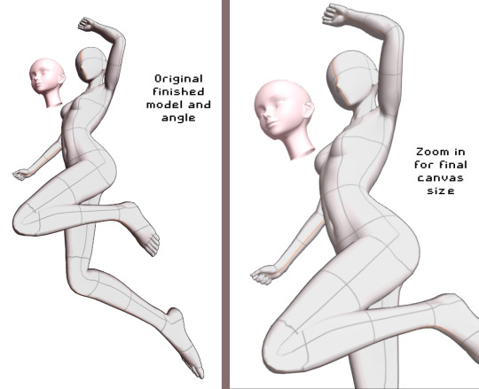
From here, I decided to do my quick sketch with Power

While I was experimenting with Clip studio’s art stuff, I decided to try playing around with their new “Shade Assist”. I figured it could give me some more ideas to make my shadows feel more ‘real’ or have me look at my art in a different way. Once I finished the lineart, got the color in there, and drew in Meowy, this is what I tried.
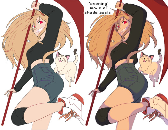
I really loved how the ‘evening’ mode of shade assist looked, even after playing around with my own colors, but I liked how it gave her a slightly more ‘yellow’ tone, and how the shadows were actually just lavender and light pink. So I took those colors, and worked on the shadows.

From there, I made the background layer. I used one of the Clip Studio gradient pre-sets, the ‘evening’ one, and painted a texture on top of it to have it match more with the textured painting style I went with. I added blood splatters, and ‘rectangles’ in the background, just to have more things visually going on.
On top of all of that, I added another layer on top of Power herself, with a very slight tone color of the gradient behind her, to make her and the background feel like they’re supposed to be together. And that’s it!!
I’m really happy with this so I wanted to explain my process. Looking around at tutorials on youtube, talking to artist friends who- tbh, are WAY more knowledgeable then me, helped a ton. And using the 3d model helped visualize the body, and different angles, WAY better then anything else I could find.
So uhhh thank you, and enjoy!
652 notes
·
View notes
Note
Hi!! I just wanted to say that the way you draw characters/use colors in your art is an absolute dream, I've never seen anything prettier. Do you have a specific way you pick/use colors, or any advice for coloring? You inspire my art so much, and I'd love to learn how to color like you someday :)

@braventheninth gonna reply to both of you here hope that's cool!
aaaah thank you so much I'm really honoured to hear you both like it and that it inspires you anon !! ;v; I don't actually know much about art theory-wise, aside from very basic colour theory that I always forget so most of my choices are pretty instinctual and based on my own preferences!
i can do my best to explain my thought process though! uuh it is. lots of text though just as a warning.
one thing I tend to do with almost everything is pick what kind of colour mood I'm going for! usually, since I love orange and also warm feelings, I'll aim for some kind of warm tone and when doing that I try to slide every colour I pick towards the warm end of the colour wheel. Blacks and whites are especially good for this! As a general thing I almost fully avoid picking any colours along those edges of the colour picker

instead I'll move all my colour choices a nudge into the square for the colours towards the tone I want (in this case warm) (the white is there be warm too I just forgor to type it).

and since I wanted warm colours for this drawing I desaturated the blue of Brain's pants so it would fit in better. I once heard someone say you should always pick one main colour and saturate fully and the further away from it on the colour wheel you got, the more desaturated your colours should be. I don't really do that bc I like my colours to stay bright but I do keep it in mind to mess around with sometimes.
I'm not always great at keeping this consistent, but I think it usually makes for pretty decent results... Other things I keep in mind are that when I pick the colour for my shadows I always make a little slide on the colour wheel towards the opposite tone of what I based my main colours on. oh and picking the right base colours ?? no clue tbh I always put every colour on it's own layer and then I spend a couple minutes adjusting them all seperately until I feel like they go well enough together. I usually avoid the bottom to right section of the square fully, bc I find they often get oversaturated and muddy, but that's just a personal preference I guess.
also since I enjoy the way coloured lineart works for my stuff I tend to mess around with layer settings for my lineart! usually the end results will look something like this:

where the clipped layer is clipped on to my colours folder. lineart is the only place where I just use plain black since I'm gonna change it with these layer settings later. it often still shows up as black for darker colours (and especially blues?) but it keeps a slightly coloured edge that I enjoy. if the blacks of the end result don't look good, messing around with the layer opacity usually changes stuff up. sometimes I'll also erase part of the lineart from one of the layers as a way to adjust.
I think what might be more relevant though, is the way I've been picking my colours for most of my recent posts though, which is. very differently. and also quite dependant on the fact I've been drawing on Tegaki! Tegaki has a limited colour palette that looks like this

only the 6 colour slots next to the bottom greyscale can be replaced by your own colours. As shown here I only bothered to add something to half of them; mainly the beige-ish colour I like to use for whites, a brown that I never use bc it's ugly with everything else here and a purple? that I only Think I added. both the brown and purple suffer from being too desaturated for the rest of the palette, which makes them stand out in a pretty bad way when used tbh.
I have. absolutely no idea what I'm doing with colours on this site though ngl. I think it just automatically pushes you to be a little more chaotic with the choices? a simple example is the green I picked for Link's tunic here doesn't really have any good, easy choice for shading imo. most of the "darker" green tones just feel more saturated, and it sticks out pretty bad as a shading colour for the more muted green I picked for the tunic. Removing those, the choice was either a mossy green or a blue.

and while the mossy green is still green, it feels far too dark a shading colour compared to what I picked as shading for the rest of the drawing. The blue has the added bonus of being closer to the purple I used for the black-ish parts.
I think my point is that it's really easy to push yourself to make some fun new choices when the tools you're using limit you a bit in a way? Looking at it now, I'm also seeing that the hands were lined with very different colours. I remember just thinking that I couldn't be bothered to find the exact same purple I used for the first hand so I just went with the first thing I landed on, that being a pink. But now I think it works pretty well since the one hand is lifted a bit more into the light and that goes well for a bright colour like pink. happy accidents and all that right ?
I am fully just yapping at this point 🧍 but the point still goes for most things drawn on this site.

like there was no reason to add the blues or reds or pinks to the heather here but I only had so many purple shades to work with. it might be less realistic but I don't think it would've come out as well if I had stuck to only the purple shades from my reference photo.
This ended up way way too long and I have no idea if any of it made sense or was helpful at all, but it was surprisingly fun to reflect on my own choices a bit more! especially since I often just do whatever I feel like I think it's helpful to sit back and consider what instinct actually tells me it's the right thing to do.
in an attempt to do something actually helpful uuh I recommend messing around with 2 specific things and switching around with them a bit; namely limited colour palettes (like 1 or 2 main tones imo) and then just going absolutely ham and just using whatever colour for everything (make them orange! put some blue and purple on the bark! leaves can be blue if they want to! (go more ham than I did tbh))

I think just messing around does so much for making some kind of sense of colours even without Knowing how they work. it's easy to say we should all study, but personally I'm pretty bad at it and it's more fun to just trial and error it... errors do happen a lot though omg do they happen, but that's helpful for figuring stuff out too!
#ask#when I called myself Yappinator 2000 on bsky this is exactly what I meant shfdiuhsdf#feeling a little sick and should've probably slept early instead of figuring this out but it was rly fun and relaxing actully!#considering how bad I've slept recently ending the day with lots of quiet pondering might be just what I need haha#I should probably get the triangle colour wheel so I can lessen all those colours I don't like to use but I'm too used to it being like thi#too tired to have imposter syndrome too tired to overthink whether I make sense. it's quite nice actually#I hope at least some of it will be helpful or fun :)#almost started overthinking anyway I am pulling myself back by the scruff and off to bed#sleep well everyone whenever you do <3#also. totally no secret tegaki agenda here totally 👀 it's totally not like I think everyone should at least try that site haha no waay#it's only full of cool and nice people just like here and you can draw silly comments to each other#and also runs better on chrome than firefox wink wink......... spleepy time..........
26 notes
·
View notes
Note
Hiiii i just saw your Outsiders/Christine art and HOLY SHIT. When i say my jaw was on the floor it was on the floor. I’m a huge Stephen King fan (I’ve only read his books bc to me his books are good enough. I’m not a huge horror movie watcher girlie but i can do thriller/horror books. I have like 8 of his books, including Christine, on my bookshelf) and once again: HOLY SHIT. I can lowkey see the Outsiders trio as the Christine trio. Now whenever i go to reread the book, i can’t view it the same anymore haha. Another Outsiders/Stepehen King art idea for Halloween: 11/22/63. It’s one of my absolute favorite Stephen King novels. And if you haven’t read it, highly recommend it. It’s so intense and entertaining and i do get lost in that book. Anyways, HOLY SHIT. But i was also wondering if you have any tips for beginner digital artists? Like on layers, line art especially, shading etc.? I really want to get into more digital art but my tradional sketches lowkey look better than my digital ones haha. Whenever i see your stevepop or Outsiders art it just gives me a boost of inspiration. And i love them your honor.
Woah, thanks!! I’ll have to check it out- so far I’ve only read Christine and The Body (because my dad’s obsessed w/ Stand By Me), but I really dug both so I’m looking forward to it!
And as for digital art tips, I guess I’d say to keep things loose! I like to use a modified version of the Shale Brush on procreate for my sketches and lineart because it resembles a pencil, and the rough messiness makes it a whole lot easier for me to just relax and draw the way I do on paper. I don’t shy away from messiness especially in digital art- it makes things flow better in a medium that can get really stiff sometimes.
I like to do my sketches in bright colors, and I tend to assign every subject a certain color so I can tell them apart easily (idk how helpful it is, but it works for me!) Then I lower the opacity and draw on a layer on top like this:
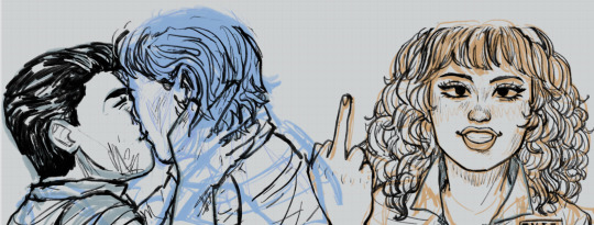
Then I turn off the sketch layer and either fill everything in with base colors, or color it in grayscale w/ this Copic marker brush and varying levels of opacity for my comics.
As for shading, I do a combination of cell shading and painterly shading (picture for the uninitiated lol). Both have their merits, and shadows in real life usually include a bit of both.
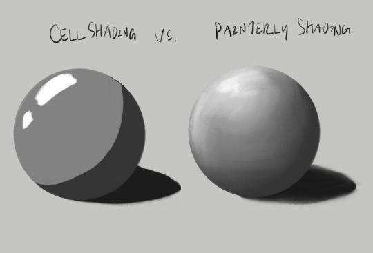
For more simple stuff, I take a shade of either purple or sometimes magenta and cell shade everything with this pencil brush on a multiply layer, usually set to 30-ish% opacity depending on the drawing. Then I’ll blend it out a bit to soften some edges, which is what makes it look painterly. Also if you don’t know, “clipping mask” layers are really helpful for shading! You just put the shading layer over the colors and it stops you from going outside of the colors, it can be super helpful. This method is the one I usually use, and the one I’ve been using since I first started about five years ago now.
For the Christine poster specifically though I mostly just kept everything to one layer and color dropped from the reference, altering the colors as I saw fit- and just sort of guessed for Evie because she’s way tanner than Leigh and needed her own colors. The only times I used different layers were for each individual character so that they didn’t mess each other up, and also for the sketches, which I put on top of the colors but lightened the opacity on. Idk that I’d recommend this for a beginner tho, it’s taken me years to get comfortable working like this!
Sketch is set to a multiply layer here too. You can’t see it super well here tbh, because of how dark everything is, but oh well. Here’s a study I did last year with the same method tho! (Also she’s got some similarities to Evie huh?? I guess I have a type lol oops)
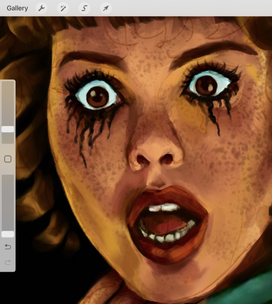
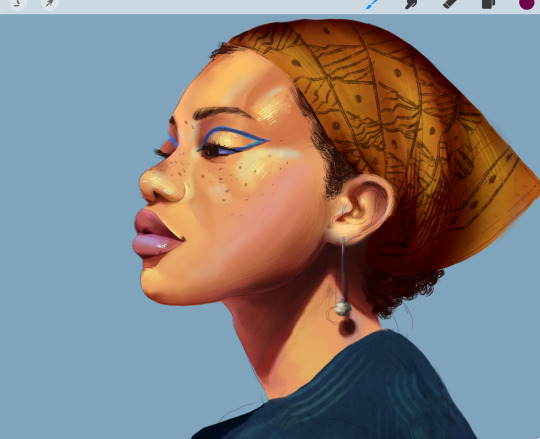
Anyhow, that’s probably enough for now lol- but lmk if there’s anything else you wanna know! And obviously this is just how I do things, there’s no hard and fast rules for any of this- I’m making it up as I go along, and you should too!!
14 notes
·
View notes
Text
Digital Art Progress
Went through my digital art to see how much I’ve improved through the years. You all don’t know how badly I cringed at the older ones. I mostly wanted to see just how much my coloring and line work improved.
I don’t really want to talk about 2014 since it was only one or two pieces, 2015 was when I really started doing digital art and yeah my coloring was AWFUL. My shading especially. And don’t get me started on my lazy ass refusing to draw backgrounds. 2016-2017 wasn’t any better with the backgrounds. 2017 was when I started making use of the effects for the shading. I also had art as an elective during those years so my teacher was a real help in improving it. Oh and I did have more artist friends to learn from too.


2018-2019, my coloring was getting better. At least the coloring for hair and eyes mostly, I noticed I went really soft with the shading. I also noticed a bit of a drawing regression through 2019-2020 but I was forcing myself to draw between those years. 2020 was the year I started coloring my linearts xD It was also when I started adding more effects and layers to make the shading better. And then 2021 is when I started doing a base layer for all the coloring so I didn’t have to worry about erasing any colors that went past the lines.

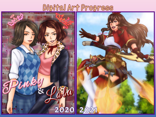
2022-2023 had a lot of my favorite art. My coloring and shading has improved greatly. I was experimenting more with different brushes for better lineart and coloring. I’m still in love with that drawing of Coby, it’s my favorite art for HPHM xD but yea, more effects more layers. I used to stick with about 15 layers but it moved up to 25 layers. 47 on a good day. As for colors, I kind of improved on that especially for shading xD At least characters with blond hair don’t look weird anymore when I shade and highlight them. I’m still working on coloring leather though.

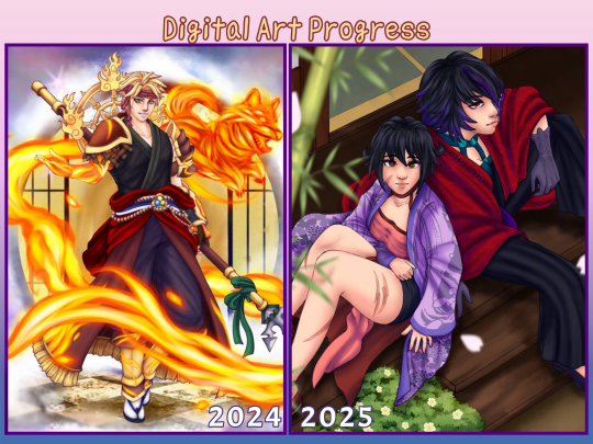
And then there’s 2024/2025. I learned another way to color lineart without having to directly color on it. Just set it to purple and set the layer to hardlight and it’s done. Though it really depends on the kind of drawing, I still had to color in some areas so it blends better. But that’s how I colored Thoma's mystic skin in the image here. And my fire effect is getting better ( ̄▽ ̄) I used to cheat and just use IbisPaint's fire materials. Also I no longer need to do three layers of shading to get the desired effect. I’ve also switched to a more simpler method to color hair, which is honestly fine. I think I prefer it this way now over the previous method. And once again I’m learning more on color theory because I still struggle. I’ve also been desaturating my art more now, especially with the latest ones. It honestly make them look so much more nicer to just stare at.
#just ari things#I’ve only ever shared art from 2014 on facebook never anywhere else#art improvement#art progress#digital art#digital art improvement
9 notes
·
View notes
Note
um um um I'm back and I decided to analyze your art cause I really admire it :')
Honestly, I've noticed you use the same line width, if not similar line widths throughout the entire piece, which makes the dresses easier to swallow compared to how some artists draw, and I also think it goes perfectly with the overall simplicity of your art! While it is rather simple, it is also rather easy to add details into it to make it much more fun to do and gorgeous to look at.
I also love how you color things, as it is also pretty simple and goes with the line art, but it's also really easy to add details that you can overlook but still add to the drawing! Not even to mention how well the background goes with the outfits, especially in cases like the black hole dress or the white and blue angel dress (which both look amazing and are easily some of my favorite pieces ever)
Anyways once more, your art looks gorgeous and has given me so much inspiration and insight into my own art and how I can better it, as well that keeping things simple can totally help my art a ton!!!
um anyways sorry for the paragraphs but tysm for making the blog, it has cheered me up multiple times before and it probably will do it again countless times <33
This is so freaking cool to read, you absolutely hit the nail on the head with some of these comments :D Hope you don't mind if I add some insight on my part since it's so lovely idk if I could post it without anything to say.
But yeah, my usual choice in brush is literally a default CSP brush with the pen pressure turned off, and it tends to be 6-12px wide? There's nothing particularly special about it other than drawing with a smaller brush size helps me keep my canvas roughly the size I like (since I alter it each drawing), and I'm not a big fan of line weight in general lol. I'm definitely not the kind of person who will swear by a special custom brush or specific settings, I've always been the kind of person who will just make art with whatever the fuck I'm given.
If I can be honest, a lot of the time I just wing it with colours and the background- so you don't see it but there's a lot of me trying to slap a bandaid on a leak I created by not planning ahead. Sometimes things go smoothly, other times it doesn't.. For the record, an artwork will turn out wayyy nicer when you have a complete idea of what it's meant to look like. Do not aim to emulate me 100% I am but a fool in the grand scheme of things.
ANYWAYS, you wanna know something fucked up that might make ppl look at my art differently? This is my process for the latest drawing I did. I took my sketch, I drew it over it digitally and inked it, THEN I overlayed the sketch because I liked how it messed with my colours-


I paint OVER the artwork, realised my sloppy colouring makes the bottom part stand out so I add a shadow trying to adjust for this, decided I needed the artwork to be 100x more vibrant so I upped the contrast a bajillion times..


Then the rest was just shit i painted over:

I didn't even have lineart for the angel dress.. Check out this freak shit:


Have fun guessing what part of my artwork is what now,,,
#asks#ppl dont even know whats happening inside my dark sick and twisted mind.....#and neither do i my process varies a lot#all my art files are FUCKED girlies u dont even kno
9 notes
·
View notes
Note
Shoppy talky, feel free to do all or none: where do you get your cute ideas, how long does it take to make something on average, what program and pens are you using when you go digital, do you color drop or eyeball it, what makes you happy and what's kinda flustering about the hobby in general, who do you love drawing most and from which angle~.
I could (and did) read this in Graham's voice haaaaaa~
1 - where do you get your cute ideas It depends? Comedy-wise, it almost always stems from either a- A conversation that was between me and someone else laugh or b- it made ME laugh. I ah... I have a weird rule where if it doesn't make me laugh, I don't make it. However, the cute ideas? It's usually inspired by seeing prompts or thinking of situations that has me kicking my feet, something that makes chest feel all warm like a big ol' hug and a comfort I desperately want to give the character. (Sorry if I'm vague... even I'm trying to think where I get it from.) 2 - how long does it take to make something on average Haaaaaa that one is tricky if only because it depends on the work? Like, okay... drabbles and quick prompts is no more than a few days (rarely, but sometimes, its on the spot), but a comic page, colored doodle or a longer fic takes easily a week at the shortest and a few at the longest. Sea of Adventurers and 3adv as a whole can easily take a few months if only because I'm a perfectionist and tend to revise. A lot... act 8 has been in the works since like, September? And as I write this have only finished chapter 2 of Sea of Adventurers. Out of three.
3 - what program and pens are you using when you go digital So for my basic drawings, I use Clip Studio Paint and honestly I use the generic g-pen or texture pen (depending on I guess the theme? Like the anniversary page was g-pen, but my recent KQ comic was texture pen). However! When I do a comic page, I use both CSP and Medibang.... I prefer the comic font/texture Medibang has but I looooooooove the cleanliness of CSP so I do all my roughs/lineart on CSP (sometimes even color on it) but I transfer it to Medibang for that grayscale coloring/texture.
4 - do you color drop or eyeball it Both! Like, for characters that pre-exist I've color in the past (e.g. Guybrush, Graham or Neese), then I'll pull up either their original source material and color drop. However, if it's one that never existed (e.g. 3adv!Zelda or Mako) then I eyeball the colors until it's appealing to me. However, once it's set and I'm repeating them several times.... color drop~
5 - what makes you happy and what's kinda flustering about the hobby in general What makes me happy is really having the ability TO create? I know it'll sound vain but honestly, there's nothing that delights me more than knowing if there's something I want to see, and I'm not seeing it, I can pull up a computer or sketchbook and get to making what I want (that was literally what stemmed 3adv haaa). I also love seeing how people react to my artwork as a whole... sometimes I'll get comments about it that makes me really sit and go "wow, people like my stuff" and it makes me happy. But on the other side of the coin, the flustering part about it... there is a few things, but it boils down ti having the time and energy and motivation to create. Like, sometimes I want somebody else to come up with the idea and the drawing and so on and so forth. Sometimes my bouts with depression gets the better of me and I can't bring myself to create. Sometimes I find myself with an idea that looks so cool in my head but when I try drawing/writing it, it's just... garbage. And it's frustrating. (And then I boot up Final Fantasy when I grumble how I should be working on making it work). And sometimes it clicks for me at 2 in the freaking morning and I forget to write it down and poof! Gone it goes. Like my sleep.
6 - who do you love drawing most and from which angle~ Hmm... while I do love drawing Link (especially in action shots) and Graham without his hat, I have to say it's my two favorite captains: Guybrush and Number One. Especially from like... the 3/4 angles because of how their hair is floop.
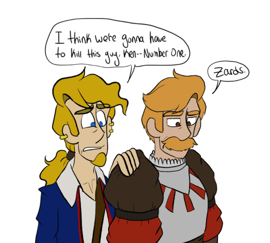
Also Guybrush lowkey became ten times more tolerable to draw once I fixed his hair for 3adv and I really really really really love drawing No1's stache.
7 notes
·
View notes
Photo
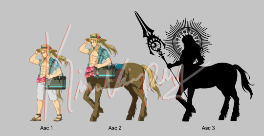
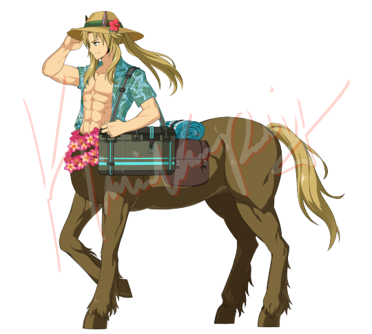
I decided that I better post the first and second ascensions before I went insane and did the third fully. Circe’s staff is a placeholder, but once I have all three I’ll post this again lol
Anyways, did you know that there’s almost zero muscular guys with their legs showing fully? I worked with Caligula but it was still a bit of a trial. There’s a lot more of guys who wear armor and leg coverings than you’d think!
I used and edited assets from Summer Robin Hood, Summer Blackbeard, and Waver (shirt), Rider Da Vinci (ponytail... hair not uh, horse tail), Summer Marie, Kiara, and Kiyohime (hat and flowers) , Caligula (as stated above), Summer Costume and Alter Emiya (Torso and cooler), and Lancer Arturia Alter (horse ears). Saddle bag and towel were hand done and everything else was taken and edited from Chiron’s own assets.
Not including the Draft Layers, Two Ascensions end up close to 400 Layers which seems like a lot but when you factor in the combination of color, lineart, shading and the shirt’s texturing, its a lot. Fate’s sprites are all cut up so you gotta make sure it all fits, yeah?
Anyways (again), I have a general plot line for the Summer Event with Caster Summer Chiron (tentatively called Eternal Summer Stage / Lost Summer Stage) and also the individual sets below the cut as well as the taglist
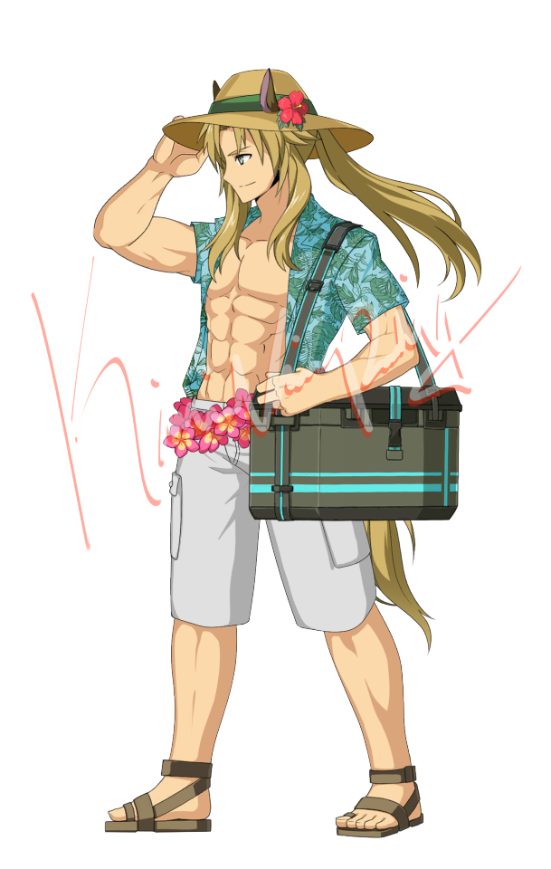
In general, I’m thinking that kinda like the Hawai’i event, this one takes place in Greece, but things are really different — either the nation’s been condensed or it’s impossible to tell where you are in Greece, even for the Greeks.
The premise is that something or someone is creating an influx of energy there, causing an unbalance or some shit but while the threat level is low, allowing for you to take your time (as all Summer events do), it still needs to be dealt with.
Chiron is your main companion Servant though he’s not the welfare one. He, alongside of a rather enthusiastic Li Shuwen and unmasked Berserker Lancelot— both of which are also Summer Servants for the first half wave (Li being either Saber or Berserker) and Lancelot being a Lancer but still Berserker’s more mellowed and gloomy character.
(Costume dress Servants are still up in the air but I’m weighing more on Hans Christian Biggerson and Geronimo, with the long overdue Hawai’i Cu, and Medusa)
Upon arrival, there’s all sorts of plays and performances going on up and down the coast and further inland where there’s a large village up against a Mountain. Both myth and man are mingling, to which Medusa and Chiron both note to be something much out of an ancient sort of tale (hence why Chiron can take his true form and no one cares).
The first half of the event is mostly solving the mystery of what this influx of energy even is— which is where you meet the second Summer Servants for the first half. Technically not Summer in terms of Class change, Ching Shih is the first you meet, dressed in that event’s other Costume Dress for her summer look. She’s happy to help, though there seems to be something a bit off about how easily things start to pop up after that. Plays pertaining to [ ] and other tales, along with even more heroic legends being spun and told. At night, you often run into an unknown woman who sits and chats with you about things as well.
All the while, Chiron seems to become more and more troubled as time goes on.
One night, however, you wander outside the inn because you can’t sleep only to get attacked by rouge Servants. This is when the second meeting happens— and it’s the “Dark fellow” that Ching Shih has been talking about. None other than Sir Agravain of Iron is here.
Though he recognizes you, he doesn’t say much on the matter, simply defeating the rouge Servants and sending them back to the Throne mercilessly. Post fight, Chiron arrives with Ching Shih and Li Shuwen and Agravain is formally introduced.
(There’s an entire thing about him wearing black armor and then you get his costume dress for free)
After that, the reveal that there’s all sorts of half-phantom-half-servants or rouge servants hiding about is finally confirmed though you’ve been fighting shadows and monsters before, the real task is at hand.
In general throughout the farming periods, the Servants will state that they are splitting up to investigate the area, kinda like the very first summer event where each location is a little bit of a sub story (Lancer-lot and Cu are at the shore investigating traces of magical energy with Geronimo, Li Shuwen and Medusa are investigating the plays and performances with Ching Shih, Biggerson and Agravain are in the town investigating there) so that’s there to get the rest of the costume dresses in the shop (Ching Shih, Cu, Medusa, Biggerson, Gero, etc)
The second half has much more to do with Chiron than the first, though he’s your companion for the first half.
Achilles joins the group, though like Ching Shih, he seems a bit odd, but he arrives and arrives with startling news which kicks off the second half of the event— the mountain against the town is Mount Pelion, the Birthplace of Greek Heroes.
This, of Course, has Chiron absolutely of kilter because suddenly he’s home. Ching Shih admits that she feels like a majority of the Singularity’s power is coming from the Mountain but didn’t want to risk going there because it’s crawling with phantom-servants— which only spurs Chiron to restate that he should still go to investigate there.
Everyone decides to go after that, because Chiron clearly isnt about to just up and let it go.
As you go through the mountain you learn a bit more about it from Chiron and Achilles, and Medusa inputs some that she knows. Agravain and Lancelot get into a minor fight, but it’s settled by Hans mostly, the usually in-between stuff.
Oh and did I mention that during this time there’s also cutscenes and non battle story from an unknown person’s POV within another space? Because there is.
In general, I’m still working out the middle chunks, but the ending is pretty much the arrival at Chiron’s Cave, only to be met by the mysterious woman who you’ve been talking to at night. It turns out that she’s Chariclo and she admits— or seems to admit— that she’s been summoning Servants from between the lines of history and Servants that normally have been gotten overlooked for some reason or another due to either being seen as not heroic enough, prejudiced factors, or they’ve simply been forgotten.
Some other stuff happens, and right when she’s about to say something pretty important you’re interrupted... by you.
Another version of you has arrived and it turns out that while Chariclo has been summoning and maintaining Servants, it wasn’t her choice. The other You has been having her do so in order to find [ ] and you know who that is— how could you not?
An argument breaks out, the other You is convinced that Chariclo has already summoned That Man, and while she doesn’t deny it, she states she can’t let the Other You into the Cave because it’ll ruin things. the Other You is determined, and perhaps a bit irrational with obsession to see That Man again and orders the Shadows to attack.
While almost every Servant is there for support, Achilles is not, and when the battles are done you realize why as Achilles stands by the Other You.
Chariclo is firm, continuing to refuse entry into the cave, and the Other You has had enough. Achilles is revealed to have not been Chaldea’s Achilles and apologizes before he’s ordered to kill Chariclo. Obviously, Chiron’s not about that, and takes the blow, severely wounding him.
Of course, this causes a chain reaction, as Li Shuwen and Agravain immoderately go for the kill on Achilles— the Other You makes a move for the Cave, you intercept Yourself because even though Chariclo might not have been a full alley, she had protected the Cave vehemently, Medusa and the others hold off the others are still fighting the shadows, before the mountain shakes.
While not dead, Chiron’s blood on Chariclo’s hands is enough to pull her from her passive state and forge a temporary contract with you. In combination, you and Chariclo stop the Other You and there’s a long conversation about grief and letting go before You and the shadows leave— either fading away or just leaving.
Once gone, Chariclo immediately has you bring Chiron into the cave so she can start healing him.
This is where you meet your welfare— none other than Romani Archaman himself. He’s weak, of course, but there and its a big reunion moment only to be interrupted by the Singularity destabilizing now that the Other You is gone.
There’s conflict, of course. Chariclo wasn’t lying when she said that Romani was too unstable to bring back. Similarly, the only reason she was able to appear, that she knows of, is because they are at Mount Pelion meaning she too is too unstable to follow a Rayshift. Unless a Holy Grail is used.
A choice is presented that you have to make, but all your choices are Romani, no matter how much you or Chiron want to bring Chariclo back as well. When you make your choice, Chariclo will present you a Grail and admit she didn’t use it on Romani at first because she was terrified what the Other You would do when Romani was stable.
With Romani Stabilized, everyone moves to head back down the Mountain for a rayshift back, but Chiron lingers. There’s grief, of course, but the two must say goodbye once more.
... Only, upon arriving in Chaldea, it turns out to not be the case.
Upon Chiron’s injury, Chariclo’s Noble Phantasm, “Lifeblood of Pelion”, quite literally used Chiron’s blood as fuel upon it being soaked into the ground. While they’re not the same as Ryoma and Oryou, as they’re separate Servants, Chiron and Chariclo’s origins linked and allowed for her to exist in Chaldea as another Caster. it’s a bittersweet ending, as Ching Shih and Agravain did not follow— but it’s no worry. Ching Shih stated that she’d see you again, and Agravain, while he didn’t say so, simply nodded in response.
( * Basically Ching Shih and Agravain are added to the permanent summon pool with Ching Shih being a 5* Rider and Agravain a 3* Assassin )
Chaldea Achilles remains extremely put out that he had been the one to harm Chariclo in the Singularity— and also annoyed he couldn’t go because he was busy making sure that Herc didn’t go off the rails.
Post event, the usual collection of the other 4 copies for the np5 welfare are unlocked along with a costume dress for Romani. Who is a Shielder class Servant.
So yeah. That’s basically the bare-bones of the idea. I don’t quite remember where the Shielder Romani idea came from but I saw a post on it and filed it away in my brain forever. The only reason Medusa, Cu, and Gero aren’t full servants is because I really couldn’t think of good classes for them. The only ones I can really think of for Gero is Avenger, and Medusa has alts for lancer and avenger, and Cu has alts for saber caster and berseker... also there’s the Servant pool of Ching Shih, Agravain, Chariclo, Chiron, and Li Shuwen, which is a hefty number even if the first two are perma summon.
If Third Asc Chiron doesn’t obliterate my soul then I’m probably going to work on Summer Li Shuwen next, or the Costume Dress trio of Gero, Medusa, and Cu. Then we’ll see about making those sprites where there’s no character base to use at all.. I might die (jk)
But when I do post the third ascension I’m going to include hatless Chiron because he’s got a lil bow hair tie and the horse ears are CUTE as hell
Anyways, Tag list below. Good god if you made it this far congratulations I know I ramble and make zero sense half the time
Taglist Form or feel free to ask me to get tagged (just DM!):
@jedifisto @spaceydragons @purgetrooperfox @spacerocksarethebestrocks @insanelytomato @babygirljoelmiller @certified-anakinfucker @d3epfriedanger @genifer-championofpaldea @thecodyagenda @babygirl-leon-kennedy @txtalnyx @jawajawas
Please tell me if you want to be taken off of the list as this is no longer just Star Wars art
Additional Tags for those who have been interested in Summer Chiron the past few days (i hope you dont mind):
@300iqprower @bitterrosebrokenspear @random-senpai
#Penguinkiwi Creates#fgo spoilers#maybe not but better safe than sorry#im going to die though my eyes are watering#fgo chiron#Chiron#fate chiron#fgo fan singularity#fgo fan event#fgo#fate go#fate grand order#fate#archer of black#FGO Male Swimsuit Event#FGO Male Servant Alt#Kiwi Creates#Eternal Summer Stage (Fan Event)
62 notes
·
View notes
Text
My Typical Art Process✨🌈
Was gonna reply to anon with this, but figured it was a bit too unrelated so I'll make a separate post! I do kinda wanna share my process anyway for anyone curious. I made something similar for twitter once but I no longer use twitter and my style has changed since then so here's a new one!
Tl;dr I draw for fun only and I have learned that textures and overlays and post-processing can do a LOT when it comes to making something look more "complete" while also not taking a lot of additional time. This is just my personal style spawned from my laziness and my love of harsh colors😆

I'll put it below the cut because it's long!
So to begin with, when I doodle (as opposed to a proper drawing that I take my time on) this is my typical "lineart":

I just draw the… what do you call it? The under parts… Like the circle and shapes, etc. to get the pose. Then lower the opacity and do another sketch on top of that. Then I lower the opacity of that and do ANOTHER sketch on top. 😆 I do that as many times as necessary until it looks like something. I don't worry a ton about anatomy or messiness or stray lines, it's just for fun to get an idea out of my head :)
Sometimes I also leave the under-sketches in or sometimes I turn the layer off. For this one I left them in.

Then I turn on all my textures, overlays, and H/S/L correction layer and crank the saturation up. The selected colorful layer was something I made once and saved it as an image material so I can just slap it on any time as an overlay. You will see it in almost all of my art, she's my beloved crutch and also I just like it lol. Other than that, I sometimes use paper textures that CPS came with and sometimes I make a perlin noise layer with the smallest grain size and set it to 'soft light'.
I also have recently been using a manga screentone overlay that comes with CSP.
Then I start coloring underneath!
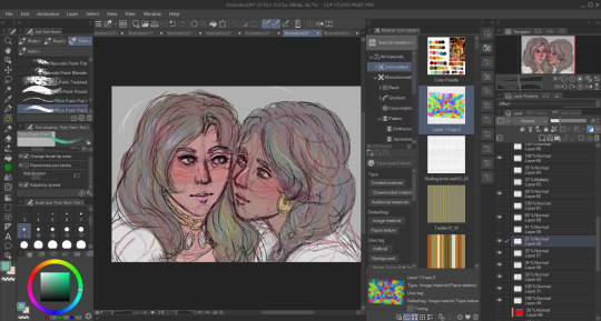
This is how it looks without all of the blinding colors and textures I put there to distract you from the mess lol
Even in ones where I DO put in effort and try to use better anatomy and clean up a lot of the scribbles I pretty much never use clean lineart simply because I cannot be bothered 🤷🏾♂️ I don't really do anything different here, I just spend more time one it:
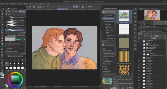
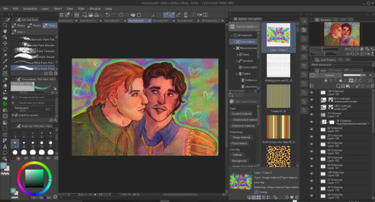
Also, even then the overlays and textures do a lot of the heavy lifting. Some of the overlays and effects I draw myself like the rainbow boarders around them and of course the doodle hearts. I don't draw backgrounds very often but I don't like an empty background so overlays or little doodles or text effects typically go there.

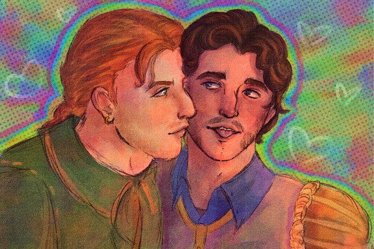
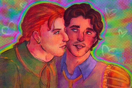
I should also mentions that I use the lightroom mobile app to further enhance all of my art, as shown above in the before and afters. I don't really have much to say on this point. I used to use lightroom mobile a lot when I did doll photography and I pretty much just wing it based on what I learned doing that. I like to mess with the texture settings and do masking edits to change the foreground and background independently to get better color balances. Like a bozo I pay for the subscription but I bet you could use any old editing app.
Oh, and I do pretty much everything with these brushes here. I got them a while back when they were free for 48 hours but unfortunately they are no longer free and cost 80 clippy now :( Should also warn you that they saturate any color and idk how to stop it from doing that so I just adjust the color accordingly before using or edit in post. Very nice though!!
Some other (free) things I like and use a lot:
Warm color set
Watercolor paper texture (free)
Cloud brushes
Watercolor auto action
Real paper textures
Prism brushes
Freckle brush
Aaaaand that's basically it!
#eye strain tw#we do not discuss my 100+ layers...#long post#artists on tumblr#digital art#jun rambles
11 notes
·
View notes
Note
I saw the Lupin recolors you did (they’re amazing btw) and I’m curious how do you keep lineart so clean on your recolors? I’ve been doing some recolors recently but my technique is usually either trace the lines on top of whatever color I’m changing to which results in slightly-sloppy and inaccurate lines or I spend a million years doing masking. But yours look so clean it’s awesome! How do you do it?
Hello, anon- thank you for the kind words and for sending an ask in!!
The screenshots anon is referring to are in this post!
Sorry it took me a while to get back to you-- I wanted to make some example images to go along with this since this is a question I've gotten quite a few times. I'll try my best to answer as concisely I can!
I personally use Clip Studio Paint (which is what I'll be using to explain this), but I've also done this with Photoshop. I'm hoping this method is simple enough so that its usable for whatever program you (or whoever else sees this guide) uses.
We'll see how it goes ¯\_(ツ)_/¯
Some bits to start:
I know this is kind of a no-brainer, but a big thing that always helps is image quality. The better the image quality, the less obvious your changes will be-- so make sure the screenshot you're recoloring has good resolution. This method (in theory) should work for lower res stuff too, but it'll be harder to avoid messy lines no matter how careful you are when selecting. Here's the images I'll be using for this example:
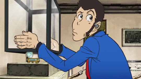
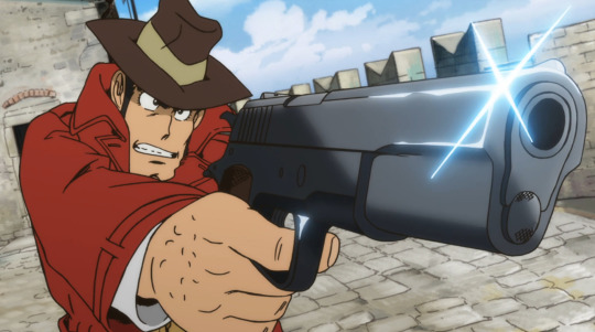
Make sure to have a backup of the original screenshot you're editing!! Even though I didn't include this in these upcoming examples, have the original below the image you're editing so you can check your progress and make sure you didn't miss any changes you wanted to make in your edit.
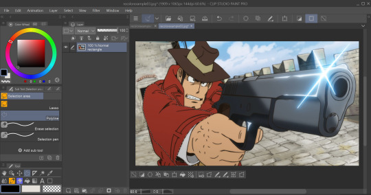
We'll use this pt. 4 screenshot of Lupin as our first example!
Let's say we want to make his jacket red-- it's as easy as it sounds, but it'll still take a bit of time.
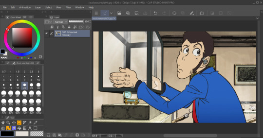
I use selection tools over masking-- primarily the polyline tool. Even after testing with masking and layer overlays, this is the best way I've found to keep line integrity and cleanliness.
When you select with the tool, you'll want to go along the edge of the actual color you want to change, not the linework.

It's going to be time-consuming (which is why I only outlined his sleeve lol) but from all the testing I've done, it's what gives the nicest results. Plus we don't even have to use any layers or masks-- we can just change the color of the screenshot directly!
To do that, we'll want to find the option to change hue, saturation, and luminosity.
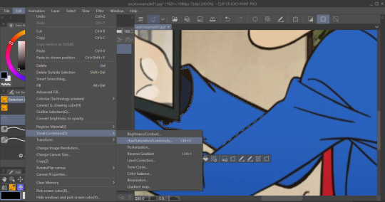
From here we can tweak the colors in whatever way we want without any of that ugly crunchy outline stuff or having to fiddle with a dozen different layer settings.
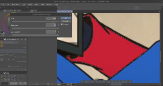
This way of doing it is really good for changing the hue, saturation, and darkness to whatever we want it to be without sacrificing line quality.
Here's the final:

Even though I eyeballed the color for example's sake, the final change doesn't look half bad!
The only catch I've come across is when you need to make something a lighter color. You can bring the luminosity of an image down, but once you bring it up you start having some unavoidable issues.
We'll use one of my favorite Zenigata screenshots for our second example.
Let's say we wanna change his red pt. 4 trench coat to his green one from pt. 3 (again, only changing the sleeve for time's sake).
This is a tough change since there are a lot of lines and extra details on his coat that get caught and lightened in the change.
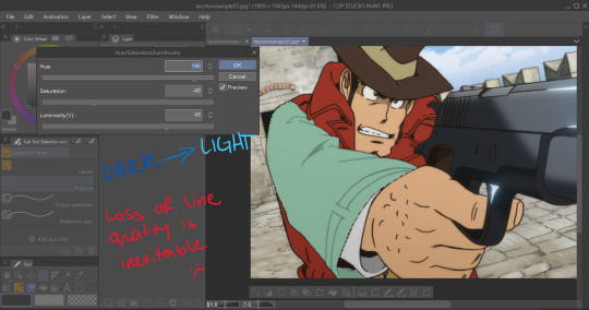
At this point we're going to have to do some line tracing.
Yeah, I'm not a fan of this part either, but unfortunately it's another time-consuming necessity if we want an edit to look as unedited as possible. Every other method I've tried to keep the lines dark ends up really corrupting the linework already in the image.

I'm sure you've noticed the edge of the selection we made in this; even though I skipped this part for time's sake you're going to want to go over those outer lines, too.
I recommend using a simple default brush set to a size that is as close to the actual linework as you can get. If the brush you're using doesn't have tapering or line size pressure just make sure it's slightly smaller than the actual lines. Stabilization isn't exactly a requirement; I'd only suggest turning on line stabilization if you aren't very confident with your linework (practice makes perfect and all that).
When we're done, it'll be pretty obvious that we went over the lines-- there's another really simple fix I found that helps to make this a little less obvious.
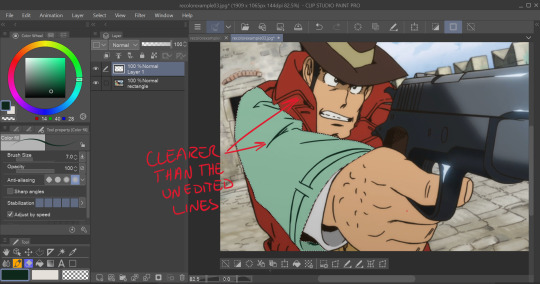
Messing with the layer opacity and the blur filter helps to bring out the linework beneath what you've gone over and makes the lines look less obviously drawn in.
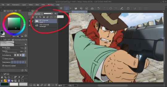
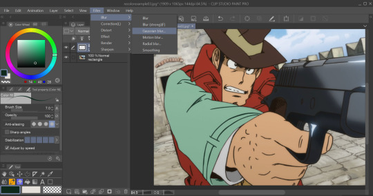
I'm sure you could also tweak the layer's settings until you find something that looks right, too-- it'll be the same sorta "experimenting until it looks right" deal as with changing the colors earlier.
I generally stick within the 2.5/3.5 range when blurring for decent res screenshots. In hindsight I probably went a little too low with the blur for this one, but you get the idea.
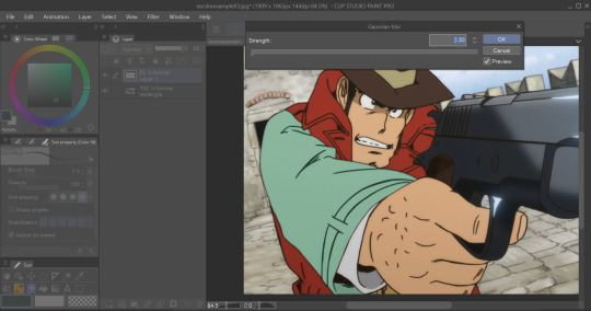
I think that it mimics the semi-blurry quality that lines tend to have in screenshots and helps to make it look less like it was drawn over.
Here's the final:
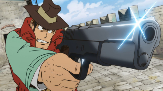
I'm sure if I bothered to do the entire trench coat it wouldn't look half bad, lol.
ANYWAYS that's a crash course on how I make lines not look like doodoo in my edits :3
Hopefully this is helpful!!
Thanks again for the ask, and if you have any more q's don't be afraid to send another ask in!🫡
#lupin iii#lupin iii recolor#lupin iii screenshot#screenshot edit guide#i have no idea what to tag this with lmao#im sure this'll be fine#tackyart#tackyanswers
9 notes
·
View notes
Text
Devlog 11: Aesthetics, playtesting & more

Happy new year & merry holidays every one :-) December has quite been a busy month regarding this project's development, especially with its aesthetics such as GUI and even CGs. As of right now, I've tackled on drafting up a bit of a placeholder GUI for the different menus. Moreover, I surprisingly got a lot done with the CGs. As always, more details are under the cut.
1st GUI drafts


Honestly, I forgot that I tackled this during December or so, the moment I started working on the previous devlog (because I've been busy with getting the CGs done...), but, yes, there has been work on the GUI side of things! A part of me feels unsatisfied with it, but what matters is that it definitely is better than whatever I was working with before December -- it also adds a bit of a unique flare to the game. I have also made a logo for this game to give it a try.

It's based on Red Velvet's Russian Roulette album cover, and as a first venture into GFX, it's definitely passable, but I definitely have much more to learn about.
CG placeholders


And so, we've reached the CG drafting stage. Albeit, I underestimated my ability to make so many sketches for them (yes, sketches and not composition drafts) for the whole of December, but either way, I got a lot done by the end of it. A majority of them are still stuck in the "still needs lineart" phase, but in the handful of days before the new year, I've managed to color in and add some needed polish to the CGs that did have lineart done. For me, I'm quite satisfied with the way they look right now :-). Though the process is a bit more painful now that I have other elements to take into account, such as pen pressure because for once, since I'm not doing pixel art for a game.

For January, I'm definitely prioritizing getting all those sketches lined, but with the limited time in that month for pouring my efforts (IRL matters again...), I'll still be satisfied even if I managed to do so halfway. EYHO! doesn't have a set release date quite yet, since I don't think about that until it's polishing time + the thing I'm only waiting for is the feedback from my playtesters. Speaking of which, the project's gotten to the point I managed to release a working build to my usual group of playtesters!
1/30/25 edit: I have successfully lined all 27 CGs (excluding variations I need to make) for this month! Good job on my end for managing to meet my set deadline! Yay!
Playtesting

As of right now, I have gotten back one editing log from one of my playtesters. To be honest, I'm quite surprised at the sheer lack of major bugs in the log itself (only minor bugs/visual errors, such as text going off the box and so on), which is quite a change of pace from what I've experienced in my past projects. As you know, this stage is where I spend most of my time on regarding polishing, but for once, that might not be the case with EYHO!, and I'll just have to prioritize dusting off the aesthetics along with CG works.
Coding a visual novel in Renpy, much like making a game in RPGmaker, requires a ton of patience. Though, a notable difference with Renpy games is that you need to have a good tolerance for inputting repetitive code for sprites and so on within Visual Studio; the rest of the hard work mostly relies on the script. As my second visual novel game that's lengthier than is&d, I'm quite a fan of the support for the large text copy-pasting, as RPGmaker still requires you to input all the dialogue manually.
Knowing that, it definitely levied a lot of difficulty from me, when I had to backtrack and add more to the script to give more depth to both the world and the characters after getting feedback. Said feedback was especially useful, as before it, I felt like there was something missing from the game, but never pinpointed the thing that irked me, already too blinded by the fact that this project, in a way, already irked me in general because how long it was taking me (whoops). Anyhow, I definitely feel like the writing has more impact to it after that brief intervention, so I'm very grateful about it.
What's next?
After knowing that I'm done with lining all the CGs for this month, the logical conclusion for the next month's goal is to, obviously, get all of them colored and shaded. This game's finally going somewhere after a brief (?) period of purgatory! As usual, there is no set release date yet, but to play it safe knowing that I still have to work with the main menu GUI along with the pubmats for this game, it would probably be released in the latter half of March or early April. As always, thank you for your time and see you in the next devlog.
1 note
·
View note
Text
something different: a history of my painting
A while ago I received a comment that was something like "I feel like you've improved your painting a lot in a short while". While this is for the most part true, I have been working on my painting skill for years. Over 10 at least. It does tend to improve in leaps and bounds because well, I have ADHD, and sometimes I hyperfocus on my painting skills because it gives me The Serotonin. But when I'm not doing that I'm still observing the world around me and developing my eye as well.
Just wanted to throw a few pictures up that show I did in fact start somewhere:
(buckle up this is a long one so continued under the cut-)
This piece is from about 10 years ago when I got more into painting as I was working on some board game art. It's super basic and you can tell I'm more used to doing lineart&color at this point.

Here's another one from that set that I don't like as much:

This next one is from a few months after when I was helping out some friends with video game concept art (yeah I know I wasn't that good but I wasn't paid for this iirc).

I do like this one, it was enjoyable to work on as I had a set of requirements to include (ooze, mushrooms, crystals). Still pretty uh, lackluster though.
Next up, when I was super into LoL and working on a portfolio for getting into art grad school, which I didn't end up pursuing as I went into the tech industry full-time.

I was soooo proud of this Lux piece. Looking back, yeah, it's definitely above my average for the time (I put a lot of time into it) but there's obviously a lot I'd change now.

Similarly I also loved this piece of Soraka that I did, around the same time, maybe 9 years ago. Super simple background, everything is very smooth, and I'm pretty sure I was working exclusively in Paint Tool SAI.
Hmm I actually don't have a lot in between that... Here's a little piece I did for a friend circa ... 2019?

It's definitely an improvement... my favorite bit is the amber-orange vase.
And THEN I got into ffxiv...

This piece of Erren from around a few years ago? 2022 maybe? was one of my first pieces going straight back into painting after a long dry spell of no real art. I remember being pleasantly surprised that I could paint better than I did previously.

This piece from the FFXIV OC Gala (the first one) was a similar level of skill, and it was the start of me almost exclusively painting going forward

Once I started doing some black/white studies and using environment/pose reference, I feel like my improvements started to pick up a lot. This piece I used in-game reference for, from the Ishgard aetheryte plaza.

This piece challenged me because I was using in-game reference for the background and character angles. I think I overdid it and it ended up looking a little weird, but I'm happy with the rendering at least.
Compare that to something like this where I used a real-life reference photo instead, mostly for the torso up. I think the pose looks a lot better. Although I think the face didn't land 100% the way I wanted.

This piece however, of Gaius, hits the sweet spot I think. The reference used was only for the background - the pose was from my eye only. It did take me a LONG time to finish though.

I hope this post accomplishes a few things:
makes you realize that I've been at this for a long time
shows you that you can really improve when you use references & train your artist's eye, even if you aren't drawing every day
0 notes
Note
do you have any tips on streamlining your comic/art making process? I colored in a doodled comic and the whole thing took me hours, I just feel like there's something I'm missing that would make the whole thing go faster? I know a part my own struggle is just learning the program i work with in the first place. apologies if this is somethin too specific to myself lmao
laziness, ultimately.
I think it's pretty universal for artists to assume they're doing something the "wrong" or "difficult" way, and that there MUST be some secret everyone else knows that you somehow missed. I know I definitely feel this way, especially about painting and layout design.
I think once I realized that the amount of time you spend on a comic =/= how much people like it, I stopped caring if I left things sketchy or uncolored or anything besides the bare minimum of what it takes to say what you need to say. I've been trying to practice skills I'd use in storyboarding, except I don't really think about it like "practicing storyboarding skills", I think about it like "what can I do to communicate this scenario as efficiently as possible". How clear are the poses? The order of dialogue? The pacing? The tone? Does the punchline land? Is the setting and placement of characters clear? What can I do to vary the perspective and angles to keep it interesting and aid the tone, without it being too confusing? Sometimes, I DO need to do a bit more with value or color or backgrounds, but I try to get away with conveying as much as I with as little as possible.
I skip a lot of steps. I don't do lineart, I just clean up my sketches. I rarely color things (but I'm trying to get better!) and when I do it's really sloppy and not at all in the lines, but it doesn't really matter. I don't think anyone cares much (not in a self-deprecating way, but a "most people are only going to look at this for a few seconds so fuck it" way)
Beyond that, keyboard shortcuts help a lot. I know screen tablets are the Hot Thing and seem like the industry standard for animation and illustration, but I can't imagine not having my hand on my keyboard the entire time I'm drawing. I use wayyy too many shortcuts to ever use the ones on my tablet, or one of those controller things.
Certain things like the polygonal lasso tool or CSP's nifty "close gap" feature on the bucket tool sure help a lot. There are somethings you'll always have to brute force, so you just have to practice getting faster at brute forcing it.
238 notes
·
View notes
Note
You may have answered this before and if you have forgive the re-ask. But what art program do you guys use for making the comic? Is it more than one? And on average how long does it take to make a page from script to lineart to ink & color? It's so vibrant!
Okay so
It starts as the script Lolly writes, which, beyond Chapter 1, is a list of dialogue and important actions (unless the scene were to change, at which point Lolly gives a detailed exposition of what exactly I'm supposed to be drawing) and, for the most part, it looks something like this:

From the script, I sketch out thumbnails for each page, traditionally, in a sketchbook specifically for thumbnails. Most of them look like this:

Once I have the thumbnails done, I go into Paint Tool Sai 2 and get all the panels and lines done. Those get saved as two separate images so they can be imported to TVPaint as two separate layers. In TVPaint, I import backgrounds and color, shade, and add speech bubbles (for chapter 1, everything was done on TVPaint, but I ended up liking the pen selection in Paint Tool Sai better).
... Yes, I do use an animation program to do my coloring in, but like c'mon I paid 700 bucks for this thing, I'm gonna use it as often as I possibly can. Plus, it's nice to have all the pages of the comic on the same file as individual animation frames with their own layers, it's a good organizational set-up I have going. (I did accidentally save over Chapter 2 Page 14 on the comic's TVPP file though :C )
Once the page is colored and the speech bubbles have been added, I export the frame containing the latest page to a single PNG, and open that in Photoshop to add all the text, any emojis I need to add, and any sound-effects that are hand-written (as opposed to typed) so that I can add an outline to them.
Once that's saved as a PNG, I open it in Paint Tool Sai, again, to add the paper texture (not actually sure how many people notice this detail) and that gets saved and uploaded to the internet for all of you to read :3
Ideally I just spend one day on each page so I can dedicate the rest of my time to work I actually get paid for lol, though sometimes it may just happen that I can't spend as much time at my computer on the day I'm supposed to update the comic, so I get delayed.
129 notes
·
View notes