#lupin iii recolor
Explore tagged Tumblr posts
Note
I saw the Lupin recolors you did (they’re amazing btw) and I’m curious how do you keep lineart so clean on your recolors? I’ve been doing some recolors recently but my technique is usually either trace the lines on top of whatever color I’m changing to which results in slightly-sloppy and inaccurate lines or I spend a million years doing masking. But yours look so clean it’s awesome! How do you do it?
Hello, anon- thank you for the kind words and for sending an ask in!!
The screenshots anon is referring to are in this post!
Sorry it took me a while to get back to you-- I wanted to make some example images to go along with this since this is a question I've gotten quite a few times. I'll try my best to answer as concisely I can!
I personally use Clip Studio Paint (which is what I'll be using to explain this), but I've also done this with Photoshop. I'm hoping this method is simple enough so that its usable for whatever program you (or whoever else sees this guide) uses.
We'll see how it goes ¯\_(ツ)_/¯
Some bits to start:
I know this is kind of a no-brainer, but a big thing that always helps is image quality. The better the image quality, the less obvious your changes will be-- so make sure the screenshot you're recoloring has good resolution. This method (in theory) should work for lower res stuff too, but it'll be harder to avoid messy lines no matter how careful you are when selecting. Here's the images I'll be using for this example:
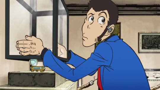
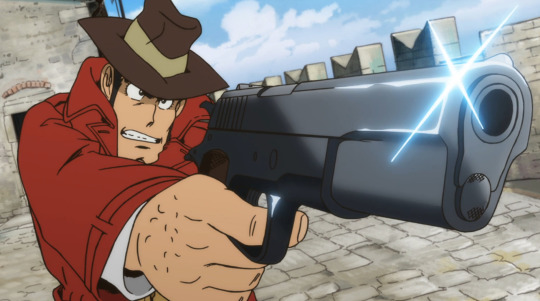
Make sure to have a backup of the original screenshot you're editing!! Even though I didn't include this in these upcoming examples, have the original below the image you're editing so you can check your progress and make sure you didn't miss any changes you wanted to make in your edit.
We'll use this pt. 4 screenshot of Lupin as our first example!
Let's say we want to make his jacket red-- it's as easy as it sounds, but it'll still take a bit of time.
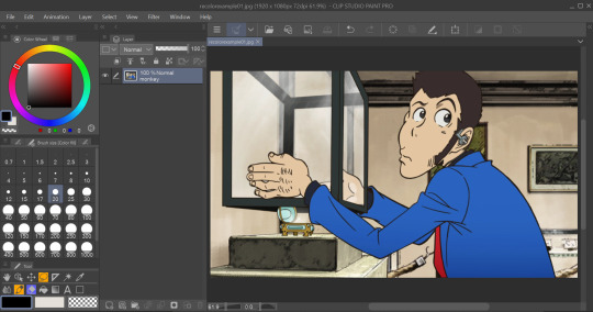
I use selection tools over masking-- primarily the polyline tool. Even after testing with masking and layer overlays, this is the best way I've found to keep line integrity and cleanliness.
When you select with the tool, you'll want to go along the edge of the actual color you want to change, not the linework.

It's going to be time-consuming (which is why I only outlined his sleeve lol) but from all the testing I've done, it's what gives the nicest results. Plus we don't even have to use any layers or masks-- we can just change the color of the screenshot directly!
To do that, we'll want to find the option to change hue, saturation, and luminosity.
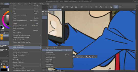
From here we can tweak the colors in whatever way we want without any of that ugly crunchy outline stuff or having to fiddle with a dozen different layer settings.
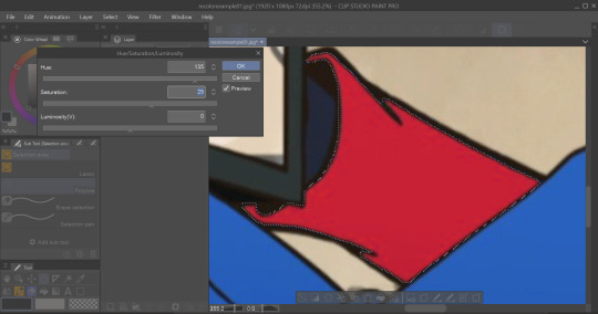
This way of doing it is really good for changing the hue, saturation, and darkness to whatever we want it to be without sacrificing line quality.
Here's the final:

Even though I eyeballed the color for example's sake, the final change doesn't look half bad!
The only catch I've come across is when you need to make something a lighter color. You can bring the luminosity of an image down, but once you bring it up you start having some unavoidable issues.
We'll use one of my favorite Zenigata screenshots for our second example.
Let's say we wanna change his red pt. 4 trench coat to his green one from pt. 3 (again, only changing the sleeve for time's sake).
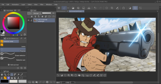
This is a tough change since there are a lot of lines and extra details on his coat that get caught and lightened in the change.
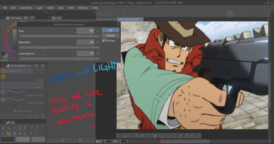
At this point we're going to have to do some line tracing.
Yeah, I'm not a fan of this part either, but unfortunately it's another time-consuming necessity if we want an edit to look as unedited as possible. Every other method I've tried to keep the lines dark ends up really corrupting the linework already in the image.

I'm sure you've noticed the edge of the selection we made in this; even though I skipped this part for time's sake you're going to want to go over those outer lines, too.
I recommend using a simple default brush set to a size that is as close to the actual linework as you can get. If the brush you're using doesn't have tapering or line size pressure just make sure it's slightly smaller than the actual lines. Stabilization isn't exactly a requirement; I'd only suggest turning on line stabilization if you aren't very confident with your linework (practice makes perfect and all that).
When we're done, it'll be pretty obvious that we went over the lines-- there's another really simple fix I found that helps to make this a little less obvious.
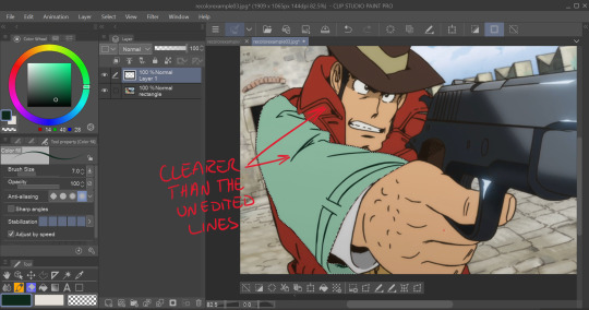
Messing with the layer opacity and the blur filter helps to bring out the linework beneath what you've gone over and makes the lines look less obviously drawn in.
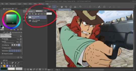
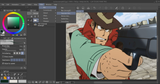
I'm sure you could also tweak the layer's settings until you find something that looks right, too-- it'll be the same sorta "experimenting until it looks right" deal as with changing the colors earlier.
I generally stick within the 2.5/3.5 range when blurring for decent res screenshots. In hindsight I probably went a little too low with the blur for this one, but you get the idea.
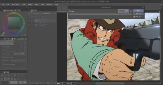
I think that it mimics the semi-blurry quality that lines tend to have in screenshots and helps to make it look less like it was drawn over.
Here's the final:
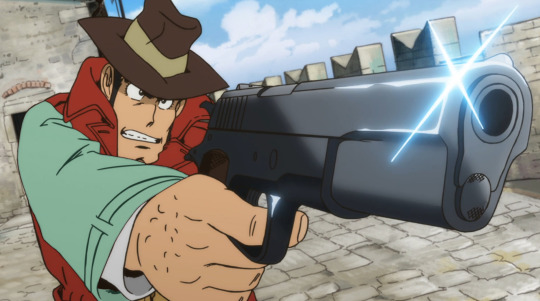
I'm sure if I bothered to do the entire trench coat it wouldn't look half bad, lol.
ANYWAYS that's a crash course on how I make lines not look like doodoo in my edits :3
Hopefully this is helpful!!
Thanks again for the ask, and if you have any more q's don't be afraid to send another ask in!🫡
#lupin iii#lupin iii recolor#lupin iii screenshot#screenshot edit guide#i have no idea what to tag this with lmao#im sure this'll be fine#tackyart#tackyanswers
9 notes
·
View notes
Note
If early Part 3 episodes and the animation version of Lupin VIII are any indication, it seemed that they tried to course-correct and converge into Manga Goemon's design, or at least the Shin Lupin III era, but decided to go back to Part 2 and Part 1 designs by the time that the specials and Part 4 aired? There's the Dead or Alive designs, but it pains me so to see that Goemon reflect the post-manga Goemon design. Design's great, but it's like seeing manga Goemon reprinted with black hair... :(
Yeahhhh
It really did seem like there was an effort to slowly push him towards the manga design, but with the changing directors and artstyle of Part 3 I guess the idea wasn't fully communicated and some only knew Goemon for how he was in the popular Part 2. I genuinely wonder that if the design had stuck for Part 3 and if Lupin VIII was published, if Part 4 would have shown an even more manga-like Goemon.
I remember seeing that Samba Temperado animation and the Mankatsu segments which were based on the manga and I did like them, but it still kinda hurt seeing Goemon's design being so obviously altered for the sake of the anime. The black hair doesn't sit with me well either.
I really do like the blonde-brown hair because it's meant to go alongside his cleft chin and eyes to show that he's mixed despite his upbringing with only Japanese culture, and for a character who is literally supposed to represent moving forward in bringing together culture, a major theme of Monkey Punch's works, it feels a little backward that the anime now instead wants to portray him as close-minded. The sideburns probably exist in his manga design for the same reason too.
He was meant to be naive and accepting, not resentful.
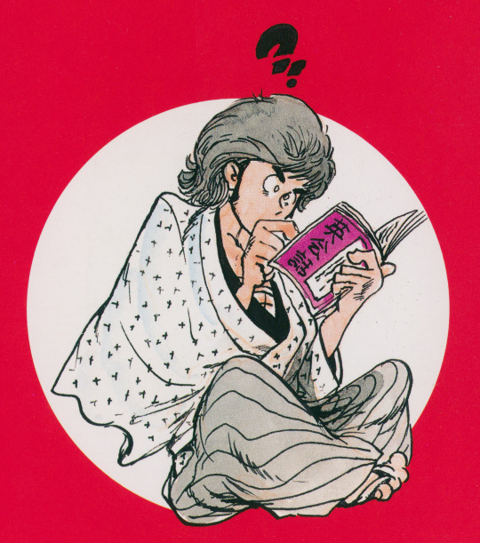
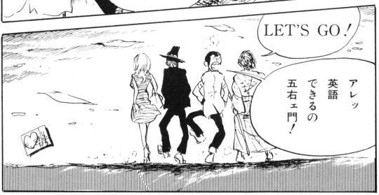
(English Conversation Maneuvers of Lupin III)
I really do wonder if they color his hair black and avoid making him mixed for the same reason as why they also changed the skin tones of the characters over time. It's a shame because I really do believe early Part 3 at least understood the idea of making everyone's race ambiguous like the manga did, even if Goemon's hair was made black.
I feel though that recoloring his hair, and/or using his anime personality makes his design feel incomplete and even contradictory, so if they're going to go as far as to appeal to the manga I would rather they go all the way. In my opinion, from what's been attempted already, if TMS does want to try pushing his general design to be more like the manga again, trying to mix both designs just won't stick for long.
I've said this a million times but I really want to see him properly animated!!!
#lupin iii#monkey punch#goemon ishikawa xiii#lupin the third#manga#原ゴエ#i would actually like explode if i ever saw him in the anime yall have no idea#i like anime goe too but i just want manga goe to have a chance cause he's my favorite#plus it's a big step towards the anime taking more influence from mp in general#also dead or alive designs were so good
26 notes
·
View notes
Note
what mods did you use for your lupin iii sims?
Umm, not a lot actually. Lupin and Zenigata's clothes are recolored Maxis items. Hair is straight up unedited Maxis hair. Both sideburns are edits of a beard I found online (literally any sideburns CC would work well.)
Aaaand that's it!

8 notes
·
View notes
Photo

A player set I designed based on The Thief, a character from one episode of Samurai Jack. I thought his design was cool (and I wanted to include a recolor that would make you just look exactly like Jigen from Lupin III)
76 notes
·
View notes
Text
Circa 2003

This is not my 100 followers gift (which is in progress), but I tracked down these files while my internet connection dicked around and got the download ready. Back in high school I used to watch Adult Swim whenever I had the opportunity to stay up until 2 o’clock in the morning. I’m a huge fan of The Big O and Lupin III even...wow...fifteen years later. ;o; I’m not getting old, nope.
So these are recolors of Linacherie’s 4t2 conversion of Simsza’s national park prints. I created them using some tweaked versions of my own artwork. Sorry, no in-game previews on these right now, but you can see one in my Prickles & Petals preview to get an idea of size.


I’m assuming if you’re looking to download these, you’re familiar with the characters, but just in case:
(from left to right, per the swatches) R. Dorothy Wayneright, Roger Smith The Big O, Inspector Koichi Zenigata Fujiko Mine, Arsene Lupin III Goemon Ishikawa, Daisuke Jigen ♥
Files are named for their characters and the above swatches are included. I’ve also included the mesh for the sake of convenience, but you really should check out Linacherie’s entire gift to beccabear over there at GoS. (Some of my favorite wood floors are there!)
Download Circa 2003 SFS It’s been a little while so if I cocked anything up, please let me know. XP
102 notes
·
View notes