#The blue and white contrast is very nice feels when sketching the drawing out
Explore tagged Tumblr posts
Text

Lady :) @nokmietarchive
#art assignment#i had to go ask my teacher what version of my ship designs should I focus on because I kept adding versions and more versions#he thought the spikes were cool#as one does#The blue and white contrast is very nice feels when sketching the drawing out#doodle skadoodle#blueprint sketches
10 notes
·
View notes
Note
your designs are so peak! dyou think youd be willing to share some of your process for how you develop the looks you make?
Sure thing ! I'll take you on a journey into my mind's eye
Long text post ahead in case anyone's interested in my designing process
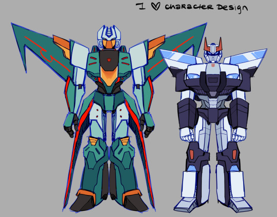
I start off with references-- lots of references. I pull inspiration from more than one iteration for a character ! For Brainstorm specifically I took the most inspiration from IDW Brainstorm with aspects from G1 like his darker/greener color.

Red Alert's darker color palette is also based on the TFA design with heavy IDW influence. First Aid's little doctor's coat was inspired by the Bayverse Crosshair's coat. Ratchet's design is based on his Prime, G1, IDW, and Cyberverse iterations but I took the most inspiration from his Prime design (I think Prime Ratchet is also my favorite Ratchet so I might be biased)
Before I begin designing anything, I map out the character's silhouette, it gives me a feel for the shapes I want and how they'd stand out in a lineup. Here's Wheeljack for an example.
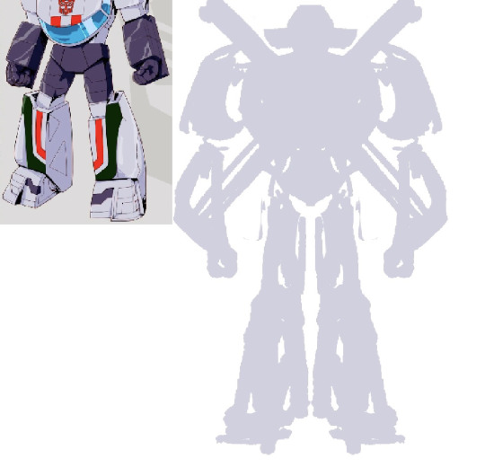
Then I start the first draft/sketch. I just draw on top of the silhouette and adjust as I go, I'm mostly going based on what feels right to me.
Since a lot of the bots I was working with had White and Red color palettes I had to use different accent colors to break it up and I wanted to emphasize their shape language. I try to keep things from blurring together too much. I also used various off-white colors (it's very subtle) and different shades of red.

I also pull inspiration from figurines/model kits from gundams specifically-- honestly I do this mostly for the legs, I struggle a lot with making the legs look right so I look at Gundam legs for references on knee articulations and the ankles.

a lot of it is trial and error and it usually takes me more than one attempt before finalizing a design. Let me show you the monster that is my first Brainstorm attempt.
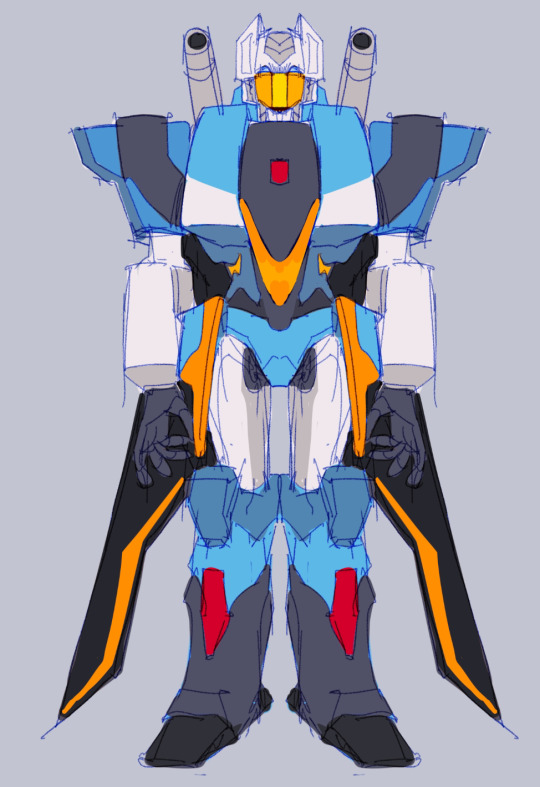
Good fucking god I have no idea what the hell I was thinking, literally the first thing I said to myself as I was finishing this was "Oh my god he is UGLY, I cannot keep him like that" he was not working out so I went back to the drawing board and worked small.
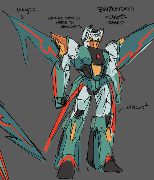
Here was my second draft of Brainstorm, I was thinking about his personality as I was working on him which I think helped a lot. Chaotically natured, I incorporated a lot of sharp shapes and I darkened his color palette to a sea green to let the red and yellow/orange accents stand out. It also emphasizes his more sinister personality while the broad yellow-accented shoulders paired with the extra red accents kind of give him this "show-off" and "full of himself" vibe.
My previous mistake was that the blue was far too bright and the orange and red were just clashing too much. Also his wings being flat against his back just did not fit him. I think I was too afraid to break to mold with Brainstorm-- Like there was this line between "This is not Brainstorm enough" or "This is too far from being Brainstorm" and then I remembered his very wise words
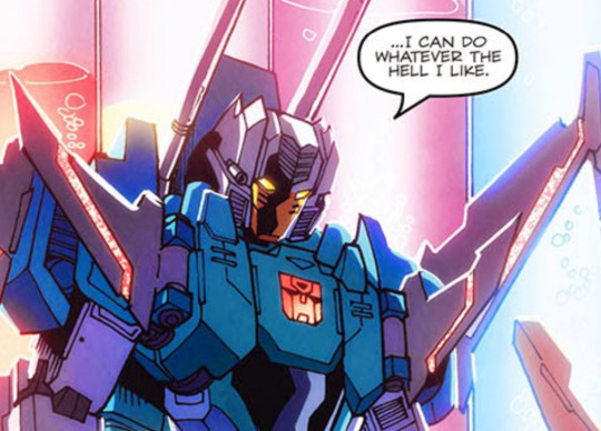
Then I just started to get adventurous and experimental and bam, we have Science AU Brainstorm. The major takeaway from this is don't be afraid to get wild with your designs.
In contrast, Since Prowl and Brainstorm will be seen around each other a lot, I kept Prowl's design less flashy and his palette limited, pulling heavily from IDW Prowl. It also fits his personality, he's much more serious and orderly. So when they're seen in the same drawing, there's this nice design compliment between Brainstorm and Prowl.
Another oopsies I did was initial First Aid attempt where I made his accent color orange for some reason. It looked really bad and I ended up changing it to blue which worked a lot better.
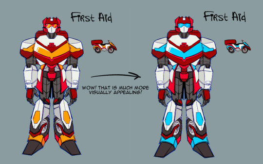
But yeah ! That's my general design process ! Play around, have fun and don't be afraid to get experimental and try some new things for designs !
104 notes
·
View notes
Text
【KagePro】 KuroEne/SaeEne 🖤💛💙


【KagePro】 KuroEne/SaeEne 🖤💛💙
【カゲプロ】 黒コノエネ/クロエネ/冴えエネ
My shadow wants to swallow up this dream of yours.
Intro Rambles
Happy 9/6! Happy HaruTaka/KonoEne/KuroEne Day!!! 🖤 💛 💙 🥳 🎉
I've loved 9/6 and all related ships for over 10 years now 🥰💞
KuroEne was baby Sen's 1st ship that I was OBSESSED with as a 12 year old, and after 10 years, the KuroEne obsession is here to stay.
Snake x Bunny 🐍🐇
Ene's twintails look like bunny ears 💙
I came back to KagePro in April and got obsessed with Kuroha and KuroEne again, exactly as I predicted. Turns out I'm not immune when my meow meow mf gets handsy with my wife.
B*tches when Snake of Clearing Eyes. I'm b*tches! /lh
I first got into KagePro when I was 12 when I watched the Outer Science MV. Sidu's MV aesthetics and Kuroha's design drew me in immediately. Great design and song~
I'm obsessed with Meow meow mf charas. Black and white colour scheme and design aesthetics. Causes problems on purpose. Sen-core bastard cat. Smug chaotic edgy evil asshole character. Violent, unhinged, bloodthirsty and murderous. Arrogant with a huge ego that distances them from humanity (or social interactions).
All of my top fave masc charas are like this. There's literally no one with more obvious and predictable tastes than me LMAO 😭
Kuroha/Saeru, the embodiment of "Knowledge/Wisdom" as a dark evil cunning and malicious entity in KagePro, and the main source of conflict and tension in the plot, is so interesting to me.
The truly evil monster who wears the face of a past love.
With Ene, I'm very enamoured with her chara and design. The way the way she acts so cheery and self-centered in the hopes of Shintaro to open up more, how she wants to be someone else's friend to subside their loneliness, the same kind of loneliness she'd always felt back then… It also feels like over-compensation for her past regrets, wahh, Ene… ;_;
Rough sketch WIPs. I love their expressions here sm~ I started playing around with Gradient Maps cuz I love picking colours. My works tend to lean more saturated with high contrast, so I ended up going with a more saturated palette.
This shows my process for picking colours. The final one I ended up picking is the 1st one. It has a blue hue shift on Ene, red hue shift on Kuroha, and generally more saturated colours and higher contrast. The last one shows the colours I started with.
The more red + purple toned Kuroha has really nice visual contrast against Ene's cool colours (blues) in her design tbh~
I started off with a more muted palette (different from what I'm used to), but ended up going with more saturated colours cuz I think it fit the mood of the piece more. Though I think it'd still be fun to do both a Muted Colours and Saturated Colours version!
These doodles aren't refined, and just me roughly filling in the base colours on my sketches to get an idea of colours. Since Idk when I'll get to refine these drawings and clean up the sketch and lines
Shadow gate to love by Guilty Kiss is sooo Sen ship-core. It basically works for every Light/Darkness, Angel/Devil, and Narrative Opposites ship of mine. Oh baby shadow gay~ 🌈
KuroEne has such a unique context as a ship cuz it uses HaruTaka and KonoEne (my no. 2 KagePro ships), as a basis. Ene has a "special" relationship with the person that Saeru uses as his vessel.
KuroEne is like the equivalent of the evil sleep paralysis demon (in this case, evil sadistic parasitic snake) possessing your past love (Haruka), or the person that you're conflicted about, but still have a certain kind of tenderness for (Konoha)
Sadistic parasitic evil snake bf and computer virus gf~
Ene already gets flustered around Konoha who is airheaded. So with Saeru, the teasing would just be merciless, cuz Ene is easy to rile up. ENE BELOVED…
KuroEne is SUCH an interesting ship to think about and analyze due to their characters' context and the potential of the complicated, complex, and messy relationship that they would have.
They give me immense brainrot.
I'll talk about the setting of my KuroEne AU. I'll put the rest of my rambles and art WIPs under the cut! I copy pasted these rambles from my side blog and previous post, since it's pretty long.
It feels fitting to include it again, cuz it's basically the big summary of my KuroEne AU.
Art Rambles
Version 8: Lineart (Multiply + Colour Burn) + Increased saturation on Ene's Eyes (50% Opacity)

Version 7: Lineart (Multiply + Colour Burn) + Increased saturation on Ene's Eyes (20% Opacity)

Version 6: Lineart (Multiply) + Increased saturation on Ene's Eyes (50% Opacity)
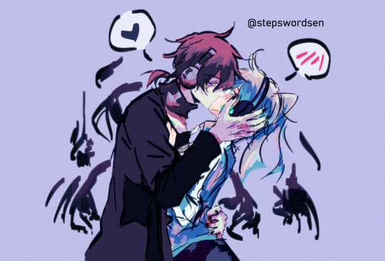
Version 5: Lineart (Multiply) + Increased saturation on Ene's Eyes (20% Opacity)

Version 4: Lineart (Multiply + Colour Burn) + Increased saturation on Ene's Eyes (20% Opacity)
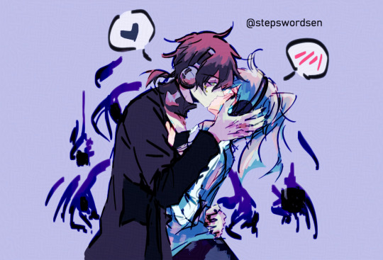
Version 3: Lineart (Multiply) + Increased saturation on Ene's Eyes (20% Opacity)
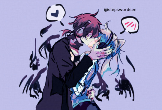
Version 2: Coloured Lineart
(Sketch is coloured a dark blue)
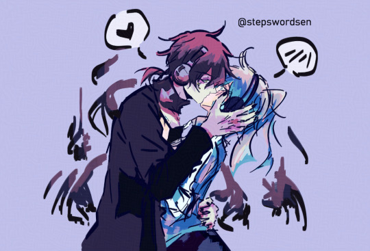
Version 1: Lineart (Multiply + Colour Burn)
(Sketch is coloured black)
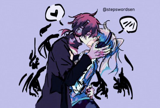
KuroEne Kiss 😚 🖤 💙
Progress WIP shots of the Lineart set on Multiply vs. Multiply + Colour Burn (Combined)
These are still super sketchy lines for me since it's the 1st sketch pass (that looked good right away ^^)
I drew Kuroha with black nails (since I have a tendency to add painted nails and/or eyeliner on my fave) but Kuroha having black nails just felt so natural I forgot it was even a HC
I'm planning to do more sketch passes to clean up the sketch later on
Also I'm gonna say. Their headphones are lowkey annoying to draw 😭
Kuroha's are at least easier to draw due to the shape, but Ene's has this rectangular part on it that I honestly dislike drawing. I'll fix the sketch up eventually.
Also I adjusted the white colour on Ene's sweater compared to last time, so it's a bright tinted blue~ish white instead of pure white
Usually I don't repost stuff unless I redraw stuff (or make new edits and significant changes), but I figured I could talk about my art process this time.
I initially had Ene's eyes as ice blue for visual contrast against her hair.
With the lines being set on Multiply, the lines are slightly translucent
With the lines being set on Multiply + Colour Burn (combined), the lines gain a subtle glow on the edges.
In response to the lines being lighter, I upped the saturation of Ene's eyes.
I think having it at 20% Opacity looks best cuz it still harmonizes with the colours well
And I think I lightened the value of Kuroha's inner clothes a bit compared to last time. I'll play around with the values later.
I have a tendency to shift hues in my arts for the colours used for lighting and shadows, to keep things looking visually interesting.
That's why I roughly splotched red on Kuroha's hair, and pinks on Ene's hair and sweater to get an idea of colours
I've been playing around with a Auto Action called Better Line Color that you can find on the CSP Assets Store that colours the lines according to the colours underneath, and makes a subtle glow on the lineart.
It does some steps like Gaussian Blur, other adjustments, then sets the Layer Mode to Colour Burn, Linear Burn, or Multiply.
The duplicated lineart, when set to Colour Burn, creates a nice subtle glowy effect that I've been using on my coloured doodles.
Having coloured lines makes such a huge difference with my art. I think it has a really nice effect on my art 🥰
When I first tried it with the KuroEne doodle though, I was so confused cuz all white colours would show OVER the lineart. I found it strange cuz it didn't happen on my other drawings.
So then, for the KuroEne doodle, I just set the lines to Multiply Layer Mode instead. I think both versions look nice ^^
Colour Burn darkens shadows, deepens colours but preserves whites, so the whites show over the coloured lineart. The solution is to change the pure white to a tinted colour white instead. I'll fix that and make edits and combine both versions later.
So far, the dark spirals around Kuroha are on the same layers as the sketch, so it has the glowy lineart effect on it. Though I'll eventually make the dark spirals apart of the colours instead, like in Version 2
The version with the saturated purple glow still looks nice. This time I combined both Multiply and Colour Burn lineart versions.
...
I've been having fun playing around with colours, seeing which layers to turn off and such.
I've been playing around with Gradient Maps and Hue shifts and slightly different colours.
The purple/red toned Kuroha one is also really nice cuz it has nice visual contrast against all the cool colours (blues) in Ene's design
Red vs. blue contrast <3
Plus, it fits Kuroha to be tinted with red...
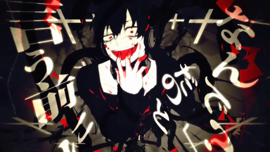
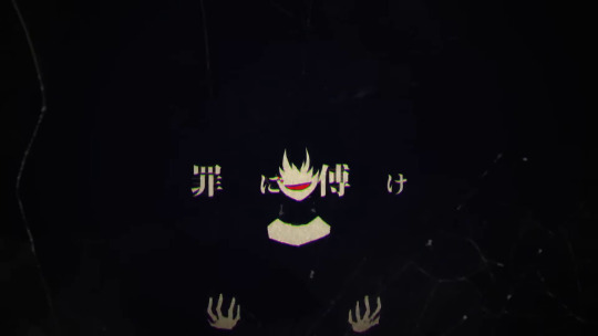
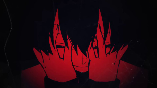
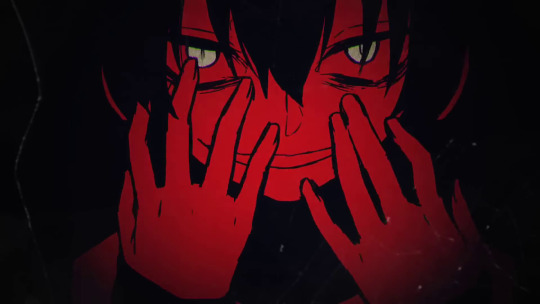
Considering the red tinted shots in the Outer Science MV where he smears the Mekakushi Dan members' blood over his face.
Love the chosen shots in this MV. Outer Science is my top fave KagePro MV due to its stunning visuals and visual storytelling. Additional Memory and Losstime Memory are also in my top faves.
The white, black and red shots here look so good. And the expressions as well~ I love Sidu's brilliant visual aesthetic sense.
KuroEne Rambles
Ok I also have something to add (once again I'm snatching these rambles from my side blog's rambles cuz I've yapped way too much about these two)
It's pretty unfortunate that my yapping and ramble posts outspeeds me creating art so I'm just waiting for the chance to draw so many of my KuroEne writing and art ideas so I can post them on main combined with drawings
Canon verse KuroEne is not “romance,” at least definitely not in the traditional sense. But there IS desire and passion, and a sense of yearning/longing, a need for warmth and fulfillment. It’s filled with desperation and tension and conflict, which makes it really interesting…
When I think about their relationship in this kind of canon-verse AU setting, it's infused with feelings of love, obsession, desire, passion, yearning, and attachment.
It's so fun to think about Kuroha's selfish twisted nature and dark urges, combined with Ene's bold tenacity and confidence. Since he's someone that's generally observant and good at reading people and their desires, it makes him pair well with Ene who has trouble facing more honest feelings and being open about the things she wants.
I think a lot of things are playing into their relationship dynamic. Like the circumstances of HaruTaka and KonoEne's context, Kuroha's omniscience and knowledge, desire, and a craving/yearning for warmth, touch, and affection and companionship on Ene's end, and the pull she feels for him because of the vessel he uses, and his intimate knowledge of her.
For 9/6 day, it's time to blast the anthem of my fave ship, Yuukei Yesterday~ The song dedicated to Takane's feelings and HaruTaka~ Tatatara!! 💗
Considering the theme of my art, though, I put a lyric from Shadow gate to love.
I also wanna say that I'm seriously obsessed with my genderfluid Kuroha HC ���
Kuroha can change his body into whatever he wants by using Konoha's Eye Ability, Awakening Eyes. In Novel Route, he knows how to use Awakening Eyes to rebuild the body molecule by molecule and make him immune to other Eye Abilities.
...
I think it's interesting that canon verse KuroEne is a ship that's so tinged with angst and tragedy. But I also love that aspect about them.
I think that in the context of a Kuroha ship AU, Kuroha believes that he and his S/O have a connection of karmic fate with each other, in the way that they'll continue to meet across all the different time loops, for all of eternity.
Kuroha’s love would inevitably be very dark and twisted, because he is that way at his core. At the end of a Route, he kills his S/O, and/or their friends, in order to meet with them forever. Ensuring the next coming of a new cycle is a priority to him.
The intimate knowledge that Kuroha/Saeru would have of his partner’s desires, wants, past, insecurities, relationships, etc., due to all the time loop resets, is so interesting to think about.
And, he gets to be with the other party forever by doing this. It’s a win win for him! He doesn’t want to give that up. Cuz in some fucked up way, in his fucked up form of love and obsession, he creates the concept of “eternity” with his S/O, by killing them, and/or, their friends, constantly, endlessly.
...
Kuroha is someone that wants to draw out "truth" to add to his "knowledge" (massive knowledge bank) and explore endless possibilities.
And Ene is someone who has trouble being honest, especially with her wants/desires, and Saeru was created for the purpose of granting wishes. So he finds it fun to tease her and rile her up, and fulfill her desires for warmth and pleasure, etc.
Ene asks Kuroha if he's learning how to pretend to be human throughout all the time loop resets. Kuroha says there’s no “pretending” about it. And it's true. He's been here since even before the beginning of the world. He asks her if you can really call it pretending at that point.
The end of Outer Science's MV shows Saeru in Azami's hair even before the creation of the world. He's existed before humans were born. He knows the nature of humans better than anyone else after observing them for a long time. He has so much knowledge, that the sheer extent of it is just unfathomable to the average person.
Each time the Route resets, he gets to “perfect” his knowledge, and in the context of intimacy, he gets to know his partner and their intimate desires even better and better, each time.
He constantly refines and adds to his “knowledge” every new Route. He likes learning new things about the other party. Kuroha likes how Ene, with her confrontational, brazen personality, and predictable unpredictability, always manages to find a way to catch him off guard and surprise him.
Kuroha/Saeru possessing Konoha's body means he has his face. His body. His voice. Ene can't shake off the feeling of how uncanny his resemblance is to them, physically, and gets reminded of Haruka and Konoha around him.
...
Now I'll copy paste my rambles from my old posts that summarizes my KuroEne AU. Here. I added some new stuff at the end
KuroEne AU: Set-up
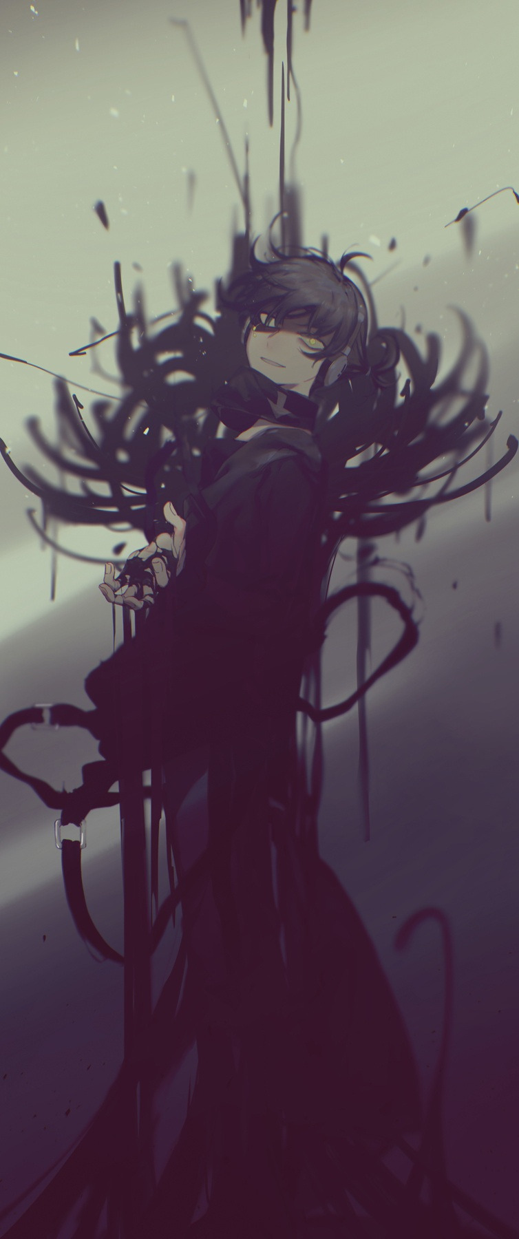
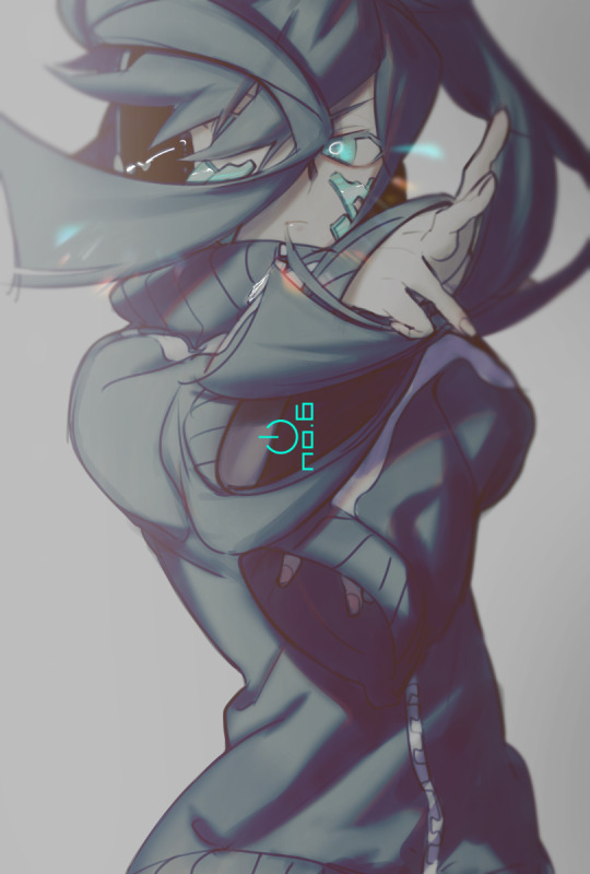
Source: KagePro LN: 7 - from the darkness - Colour Illustration Source: Sidu's Mekakushi Dan Members Colour Illustrations
Ok, I'm just gonna ramble about the setting of my KuroEne AU.
I also included a summary for context just in case my non-KagePro mutuals want to tune in to read these rambles.
I just wrote this quickly before I go to sleep. I have more to say but I think this is a good starter.
In official KagePro media, the present day plot starts after 2 years, on the fateful day of August 15th (Kagerou/Heat Haze) Day.
The Kagerou Daze, the never ending world, swallows up people who die on August 15th, and gives those with especially strong desires, who are compatible with an Eye Ability, a substitute life so that they can return to the real world.
In most Routes, Saeru ends up orchestrating Haruka and Takane's deaths. One thing you'll learn about KagePro is that this guy (Kuroha) is responsible for almost everything bad that happens
Because killing them so that they'd come out with an Eye Ability, is a part of his plan to get the rest of Azami's snakes out of the Kagerou Daze and into the real world.
Haruka's death leads to the creation of Konoha, and Takane's death causes her to lose her human body and become a cyber girl named Ene
There are multiple different ways that a KuroEne AU could go, depending on the Route. KuroEne AU Routes are so fun to write, because any time I get a new idea, I can just put into a different Route (timeline) to explore all the "What if" scenarios that don't fit into a single Route.
Kuroha's Plan and KonoEne
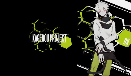
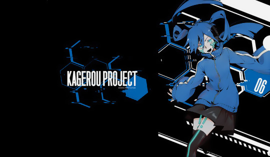
Source: @/x0401x
Mekakushi Dan Clear Files: (X)
Normally, the rest of the Mekakushi Dan members meet each other in the present day plot after 2 years, the fateful day of August 15th, the day Kuroha/Saeru plans to kill everyone.
Kuroha/Saeru's plan is to gather all the snakes with a new Medusa in the real world (bringing the rest of Azami's snakes out of the Kagerou Daze to the real world), and killing all Eye Ability users.
Then, he forces Marry, "the next Master," to rewind the world using the power of the Queen Snake, Combining Eyes.
In official media, Kuroha/Saeru usually possesses Konoha's body at the end of a Route on August 15th, the day he plans to proceed with the "Tragedy" and kill everyone.
I imagine that in my KuroEne AU, Kuroha/Saeru possesses Konoha's body MUCH earlier. Like, anywhere within the timespan after Takane and Haruka's deaths (1 - 2 years)
Because of this, Konoha and Ene usually end up meeting and befriending each other earlier. Ene recognizes Konoha as Haruka's game avatar from back then, and mistakes him for Haruka. Konoha asks if she has the wrong person, and Ene gets heartbroken at Konoha's seeming amnesia and inability to remember her.
Ene imposes a sense of distance around Konoha due to her conflicting feelings (he resembles the person she loved but isn't him).
In my AU, KonoEne establish a relationship dynamic of some kind (which varies depending on the Route), which either progresses to an acquaintance-ship, friendship, or intimate relationship.
Kuroha introduces himself to Ene for their first meeting in a Route
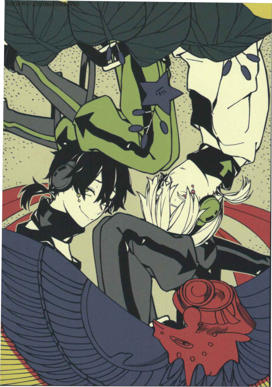
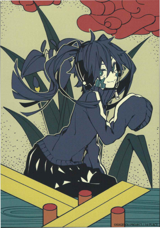
Source: Sidu's 2016 Calendar Hanafuda Set
And then, at some point, Kuroha/Saeru possesses Konoha's body. At this point, when he introduces himself and makes himself known to Ene for the first time, he can choose what information he wants to reveal, and how much.
For example, Kuroha can choose if he wants to introduce himself as Black Konoha, and/or "Saeru," or whether to reveal it for later. (And he also chooses whether he wants to reveal his true identity as the Snake of Clearing Eyes.)
Ene later nicknames him "Kuroha" and "Saeru" to shorten the name.
He knows that the 1st one would be more familiar to Ene. To introduce himself with the 2nd one would make Ene more distrusting/suspicious of him.
He most likely doesn't reveal his true intentions (to kill the Mekakushi Dan) so soon, because he knows that if he does, Ene is (obviously) not gonna want to "play the game" (of being intimate with him) anymore, cuz it means that he is literally putting her and her friends' lives in danger.
Though, across multiple Routes, he probably does play around and experiment with the timing of when he reveals certain information, and how much.
I think in most Routes, Ene is suspicious of him at first, and asks about his intentions and what he's really after, and Kuroha/Saeru just tells her that it's too early to say yet, and that she will find out soon.
(Though, Kuroha could probably quell her suspicions with enough convincing, due to the massive amount of knowledge he carries)
KuroEne AU: Context
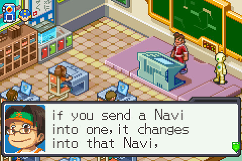
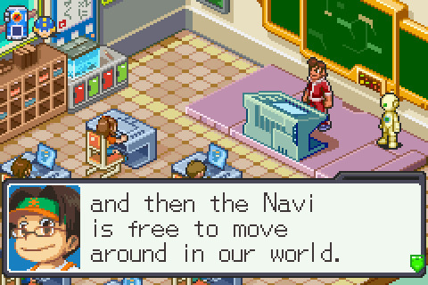
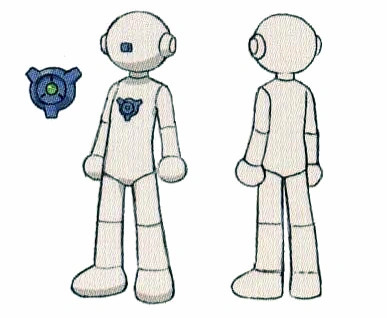
Source: Mega Man Battle Network 6 (Rockman.exe 6)
In my KuroEne AU, Kuroha/Saeru, who has messed around with human technology and innovation, has been able to develop a humanoid android/robot body with human flesh that Ene can transfer into.
This concept is inspired by Mega Man Battle Network (Rockman.exe), specifically, the NetNavis (humans' companion AIs in this universe) from MMBN/EXE.
NetNavis can transfer into CopyBots (android bodies) for limited amounts of time, to move around in the real world. These CopyBots take the appearance of the NetNavi that transfer into it.
In my KuroEne AU, I imagine it's battery powered, but with every Route, he gets better and faster at making it. Like he improves the battery life over time, so it goes from lasting an hour to lasting a whole day, etc.
According to the KagePro LNs, Kuroha/Saeru has knowledge from everything from the start of civilization...
Shintaro in the KagePro LNs compares Saeru to "a living encyclopedia with a full grasp of everything from the start of civilization up to modern science."
That LN bit confirms that Kuroha/Saeru carries knowledge of the history of mankind and its technologies over (probably) millions or thousands of years.
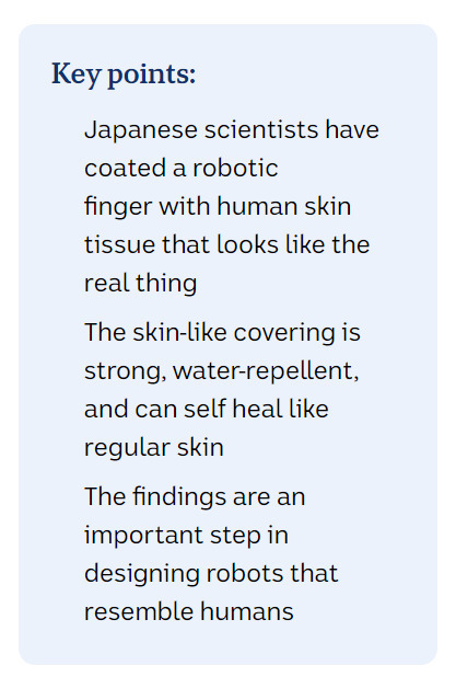
Especially when scientists have made developments regarding wrapping living human-like skin onto a robot that can heal when cut.
If he carries knowledge from the start of civilization, so much knowledge that it's unfathomable to the average person, then yeah I definitely think he could get it done (especially for the sake of my AU).

KuroEne's Intimacy
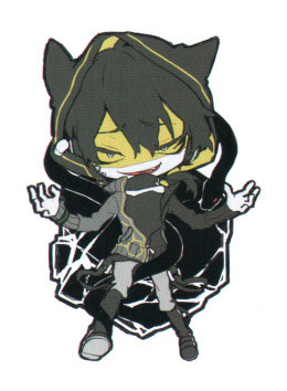
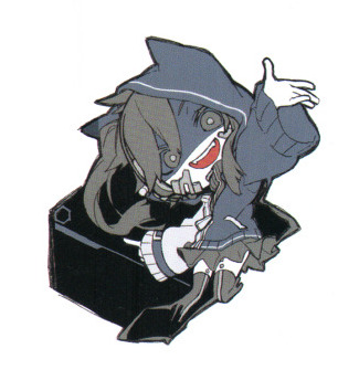
Source: (X)
Scan: @/ayara-resara
Kuroha proposes that he has a solution for Ene not being able to move around in the real world, and introduces the little invention that he made, for her to test out, which Ene eventually agrees to, out of curiosity.
Ene feels a sense of gratefulness to him for allowing her to move around in the real world since it gets lonely in the cyber world, not being able to feel or touch anyone on the outside…
Kuroha gets to know and bonds with Ene, anywhere within this 1 - 2 year timespan, and at some point, Kuroha and Ene get intimate with each other.
Ene gives into the sense of longing/yearning that she feels for Kuroha/Saeru, a yearning for warmth and touch after being stuck alone in the cyber world for so long (in spite of everything - if she knows about his true identity at this point), which is in part caused by his vessel (being Konoha, who's in Haruka's body).
Kuroha knows how to react to her and what to say to her and how to act around her due to his knowledge, and so, seduces his S/O and tempts her with carnal pleasures, and they indulge in "the game/dance" of being intimate with each other.
Because Kuroha/Saeru keeps memories of previous Routes, he remembers memories of being with the Enes of previous Routes, and thus, knows how to react to her when talking/chatting with her normally, knows how to appease Ene's behaviours and whims, goes along with what she wants, knows how to get the responses he wants when he wants something from his partner (so he knows how to seduce them), and knows how to satisfy his partner in the context of intimacy.
Because of the knowledge he carries, he knows the context, past, Eye Abilities, vulnerabilities, etc., of every Mekakushi Dan member, and that includes Ene. So he'd definitely know about Haruka and Takane, and Konoha and Ene's context and relationship together.
The person who's her greatest enemy (whether she knows it at this point or not), very literally knows everything about her.
And not only that, the greatest enemy of the Mekakushi Dan, knows her better than she knows herself.
Kuroha's Nature
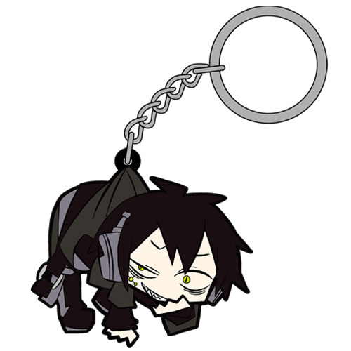

Source: COSPA - Tsumamare Series (Keychains and Rubber Strap Charms)
Not only does he weaponize Konoha's body by using Konoha's body as a murder weapon to kill everyone at the end of a Route, he weaponizes words, too. Kuroha/Saeru uses "knowledge" as an advantage over his partner, and weaponizes knowledge. Actually staggering advantage. Because he knows almost everything.
Kuroha ships are like the only time I have ships where one party in the ship has THIS much of an advantage over their partner.
Therefore, as I said before, Kuroha/Saeru ultimately has a power imbalance with his partner (any Mekakushi Dan member that he could be paired with).
He has an overwhelming advantage over his partner due to his role (set-up as an antagonist constantly killing the cast) and capabilities. It is ultimately in his favour.
That fact in itself, that the power imbalance exists, isn't inherently a bad thing, it just means that you NEED to tread carefully with portraying Kuroha's ships. I always make sure to depict my ships with as much care as possible, and as healthy as possible.
Ene is one of the characters who is a really good match with him. Because making Ene more assertive and dominant in the KuroEne ship, and making them take turns in leading intimacy, with having Kuroha letting Ene take control through their bedroom intimacy at times, helps alleviate this power imbalance slightly.
Kuroha is literally so fucked up dude cuz even his twisted form of affection that he holds for his S/O (the Mekakushi Dan member who he's paired with), is still in a twisted, selfish, self-serving way.
Due to his twisted nature, he embodies Koi (恋), "Selfish love," "loving someone for their own sake."
Even when he caters to his partner's pleasures, it still ultimately caters to his pleasures the most. That makes him interesting, though. Someone so inherently dark and twisted and sinister, with selfish desires like that… 🥰💖✨
Misc Rambles
So I imagine, in most KuroEne AU routes, he reveals his true intentions either approaching the fated day of August 15th, or right on the day of August 15th.
There's absolutely a sense of betrayal that Ene would feel following the reveal of his true intentions - he built up a relationship with her, on purpose, just to drop the worst possible scenario imaginable.
Like let's be real. The reveal of "I've been killing you and your friends throughout multiple Routes (timelines)" just sounds like a nightmarish scenario, especially if you've been fucking this guy, like come on. 😭
And something that would make Ene get especially pissed at him, is if he decides to reveal that he was responsible for orchestrating Haruka and Takane's deaths in the first place.
(In official media, Ene sees Konoha for the first time, on August 15th, 2 years after Haruka and Takane's deaths)
Though, there are probably KuroEne AU routes where Konoha and Ene don't get the chance to meet each other - Routes where Kuroha/Saeru possesses Konoha's body before the two can actually meet, so when Ene sees who she thinks is "Konoha" for the first time, it's actually Kuroha/Saeru. With this kind of setting, he could even pretend to be Konoha, if he wanted.
And then on August 15th, he proceeds with killing the Mekakushi Dan with sadistic glee (and even his S/O - though if he's feeling nice, then he can spare them, since he doesn't need to kill everyone), and forces Marry to rewind the world.
Thankfully, due to the nature of Ene's body and predicament, she won't feel physical pain when he kills her. And then, a new Route (timeline) begins.
Previous KuroEne Posts
In my new post (this one), I wrote more about the set-up of my KuroEne AU, and then copy pasted my old rambles. I copy pasted the summary of my KuroEne AU cuz it felt relevant since I'm posting the same art.
My old post has some more rambles regarding some general ideas of my KuroEne AU (since I didn't feel the need to copy paste the same stuff here too)
Shadow gate to love
Lyrics:
Song: (X)
These lyrics work so well for ships like LimGuda, XanLena, IdaTatsu, and KuroEne.
The song sung by the sub-unit, Guilty Kiss, in Love Live! Sunshine!! My favourite version of Shadow gate to love is this fan-edit that pitches down the song to match the original voice actors’ voices, compared to their characters’ voices (which are higher in pitch)
Shadow gate to love is sooo Sen ship-core. It basically works for every Light/Darkness, Angel/Devil, and Narrative Opposites ship of mine.
It’s my song to fall back on if I can’t think of any other songs for my ships. I think it fits these 4 the best, though.
Oh baby shadow gay~ 🌈
The lyrics are in the link above.
The lyrics of the song works for all of my meow meow mfs in general.
In KagePro, though, the mention of "Strong scented eyes" takes on another meaning cuz of the emphasis on EYES, particularly the Eye Abilities.
I also love the emphasis on the Light/Darkness aspect and seduction in the lyrics.
KuroEne: Kuroha seduces Ene by tempting her with carnal pleasures, and keeps the secrets of his plan to commit the Tragedy (killing the Mekakushi Dan on August 15th, Kagerou Day) hidden from her. He tells her "beautiful lies" in order to keep up his facade.
He decides to act tamer prior to the fated date of August 15th, catering to her desires and befriending and bonding her and spending time with her and actually getting to know her. They'd do soft and fluffy stuff like go to the amusement park together, play video games together, and eventually, get intimate with each other.
Due to his inherently dark and twisted nature, Kuroha/Saeru prioritizes his own desires and desire for immortality, and constantly keeps causing the Tragedy by killing the Mekakushi Dan, Marry's friends, forcing the time loop resets. He also believes that doing this allows him to be with his partner forever, because he can continue to come and meet them forever and ever.
Ai (愛) vs. Koi (恋)
Azami's genuine pure form of love for her family, willingly sacrificing herself for her family and mankind.
Vs.
(In the context of a Kuroha ship AU)
Kuroha/Saeru holding a twisted form of affection and obsession for his S/O and wanting to continue the time loop Tragedy in order to be with his S/O forever in a twisted, selfish, self-serving way.
He looks up to his Masters and serves them, but won't put anyone else above himself and his wants and needs.
In the end, he's doing this all for Azami, because he believes that this is what she truly wanted and needed, but ends up being the one causing her the most suffering.
"Selfless" vs. "Selfish" love.
Ai (愛) vs. Koi (恋)
Azami -> "Loving someone for the sake of someone else"
Kuroha -> "Loving someone for one's own sake"
Kuroha's twisted selfish love and how he ultimately loves someone for his own sake, to experience the "high" of being in love...
Reminded of that one chapter title from FGO: Tunguska Sanctuary event (Koyanskaya's main story chapter)
"Love is Karma, and Karma is..."
This fits so well with Kuroha/Saeru's character and KuroEne. Good god.
I can't put any more images due to Tumblr's image limit so you can read about the two loves (Ai vs. Koi) here
Source: (X)
...
If you wanna put it crudely or in funny terms, then Kuroha ships are like the most elaborate ships with the time loop tragedy causing serial killer, in the history of anything ever. But actually really interesting and fascinating.
"I'm gonna kill you" boogaloo (and nothing else) is not very compelling for ships (and even in general) lol
In canon-verse, Kuroha/Saeru lacks humanity and forms of care for others (when compared to my other faves).
That's why I wanted to explore the ideas of Kuroha messing around in the Routes and actually getting to know the Mekakushi Dan members before he kills them all.
#kagepro#kagerou project#kagerou daze#mekakucity actors#kuroha#enomoto takane#takane enomoto#ene#dark konoha#black konoha#snake of clearing eyes#clearing snake#me ga saeru hebi#saeru hebi#saeru#kuroene#saeene#kuroha x ene#saeru x ene#dark konoha x ene#black konoha x ene#stepswordsen kuroene au#stepswordsen art#stepswordsen#my art#wip#doodle#kuroene au#sen's kuroene au#I debated editing and adding more to my old rambles but I think this post is already long enough. I added some new rambles
10 notes
·
View notes
Text
Hand and Eye: Visual diary
Visual Diary entries of visit to Oceanario de Lisboa (Lisbon Aquarium):

For this page I tried to mix mdeiums a bit but also limit myself to the 3 colour limit we have in place in order to explore the possibilities. The top half I used a large crayon for the background, then pressed it harder to make it pop more in areas I wanted darkened on the shark. For a third sense of depth I used hatching to make the darkest parts of the shark, I quite liked the combination. I also tried somewhat some pattern making with the plants and the fish sillhouettes. I liked the overall effect but the posca and crayon combo was a bit of a hard combo as the crayon wold layer up on the pen’s tip and make the flow of ink scarce, so while I liked the effect visually it is not a combination I want to work with more.
The bottom two fish I used only posca and black liner pen but limited again the colours used. I liked how contrastring the blue and yellow are, they make the fish really pop and the pattern on one of them really effective. I also liked how the outline of them made them so stark against the paper and their shape very distinct.

In this page I worked on each creature as a separate sketch. My favourite was the top one which while it is in black and white, the hatching and movement makers the fish have an expression somewhat. The jellyfish also looks very flowy and whimsical, and while I limited myself to three colours they blended together into a third shade of light purple, which we are allowed to do.

Beyond the sketches before, I also made a page of more fish sketches but made digitally. I wanted to see if I could capture the flowy-ness of the handdrawn aesthetic I have been maanging to achieve and these sketches showed me that they really are possible when I am light on my hand, keep the size of the brush consistent and also when I choose the most appropriate, pencilk looking textured brush tool. This is an aesthetic I really am enjoying and might use in my final piece, especially if it involves fish as I think it adds to their movement underwater.
Visual Diary entries for visit to Quinta da Regaleira (Castle and gardens in Sintra, in Portugal):

These sketches I made of castles was very challenging as they have so many details that just a simple doorway takes a liong time to make. I focused on symmetry on the most complicated ones, and tried different levels of pressure on my pencil in order to add dimension to it. The top right symbol is a crest I found ona wall and it was interesting to draw due to its twisting shapes.

For this one I challenged myself with drawing something more in perspective as I might need different perspectives besides the front in order to storytell correctly.
Reworking Sketches:
While the sketches looked nice the style and medium were not very innovative, so I decided to redo them but with a glass pen, which I never used before this. Since the fopcus was stylization I scanned the original sketch, dimmed it down and printed on a paper that does not bleed the glass pen, and traced the original.

I really liked the slight variations in pen weight that happens as the glass pen runs out of ink, it adds dimension to it. Overall this medium makes the drAwings a lot better as it makes the details more prominent, but also it gives off a storybook, fairtyle vibe to it that reflects what is being drawn which is where kings and queens lived.

I then did the same thing with the digital sketches of the fish, to see if the glass pen ehances them the same way it did the castle drawings, and I did not even finish all the fish when I realised it did not. I feel like the glass pen inn contrast to a pencil does not fade away at the edges of the linewark, so the fish overall feel a lot more stationary in pen than it did with pencil, even if it is a digital pencil. So I took a pink brush pen out and tried it in one of the fish, and it made it a lot more cartoonish, and while not as flowy as the pencil fish, it flows more than the glass pen. Also the thickness being bigger than any of the other mediums makes me think of using line weight cleverly when it comes to the final piece.
Diary entry for my birthday:

I did this fast sketch of me on my birthday, and while it was a fun day with loved ones, the way I drew her alone made it seem like shes lonely. While artistically this page was not very impactful it gave me ideas of possible birthday plotlines for the book, such as why would she be alone? Thematically it gives one more path.
1 note
·
View note
Note
your colors are always sooo good :0 got any tips?
thank u v much !!
and ermmmm i think if ur someone like me who has a very difficult time committing to art things and is a bit insecure abt colors, drawing with anti-aliasing turned off is rly helpful, since u can change any of the colors very easily by using the bucket fill (tolerance set to 0 and anti-aliasing turned off, itll fill only that specific color area. plus if u want it to fill every area with that color u can turn off "apply to connected pixels only") if u wanna make adjustements whatnot
color theory wise i have a LOT of thoughts since im quite the unprofessional art-loving mess - but its 4am so i dont feel like making an entire essay (and also i dont rly think my thoughts or advice r very helpful anyway), so ill keep it short (my tips r not beginner friendly im sorry for that):
ill typically have flat colors be saturated, while shading colors desaturated
do not underestimate greys, its extremely flexible and can look like a variety of colors depending on the pallet around it
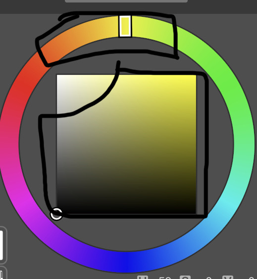
^^ these parts of the color wheel r my bff as someone who uses warm tones/red extremely often. often when i use a color i dont actually use the obvious "correct" tone, but rather smth slightly off (like making my reds be a bit on the orange side, my blues just gray, greens r a desaturated/dark yellow, etc etc)
i never use pure white, ill dabble in pure black sometimes (for sketching esp) cause it looks pretty nice as a contrast, but since i find it easier to use darker colors i dislike using pure white and u will like never see me purposefully use it unless its for a highlight or on mspaint lol
the way i usually start out deciding the pallet will be derivative of how light/colorful the darkest is or how dark/colorful the lightest color is. the main middleground color (usually for me thats a strong red) is probablymore important than both of those though, and what i tend to make the background
personally i absolutely suck at using filters/gradient maps and dont actually know how to use them to my full advantage, but do NOT be afraid to use them !!! use them all u want!! and honestly? its a talent of its own to know how to use the right filters/gradient maps/etc. ur not lesser of an artist or cheating when using these, they r viable tools at ur disposal !
ty for the question even if my response wasnt great !!
15 notes
·
View notes
Text
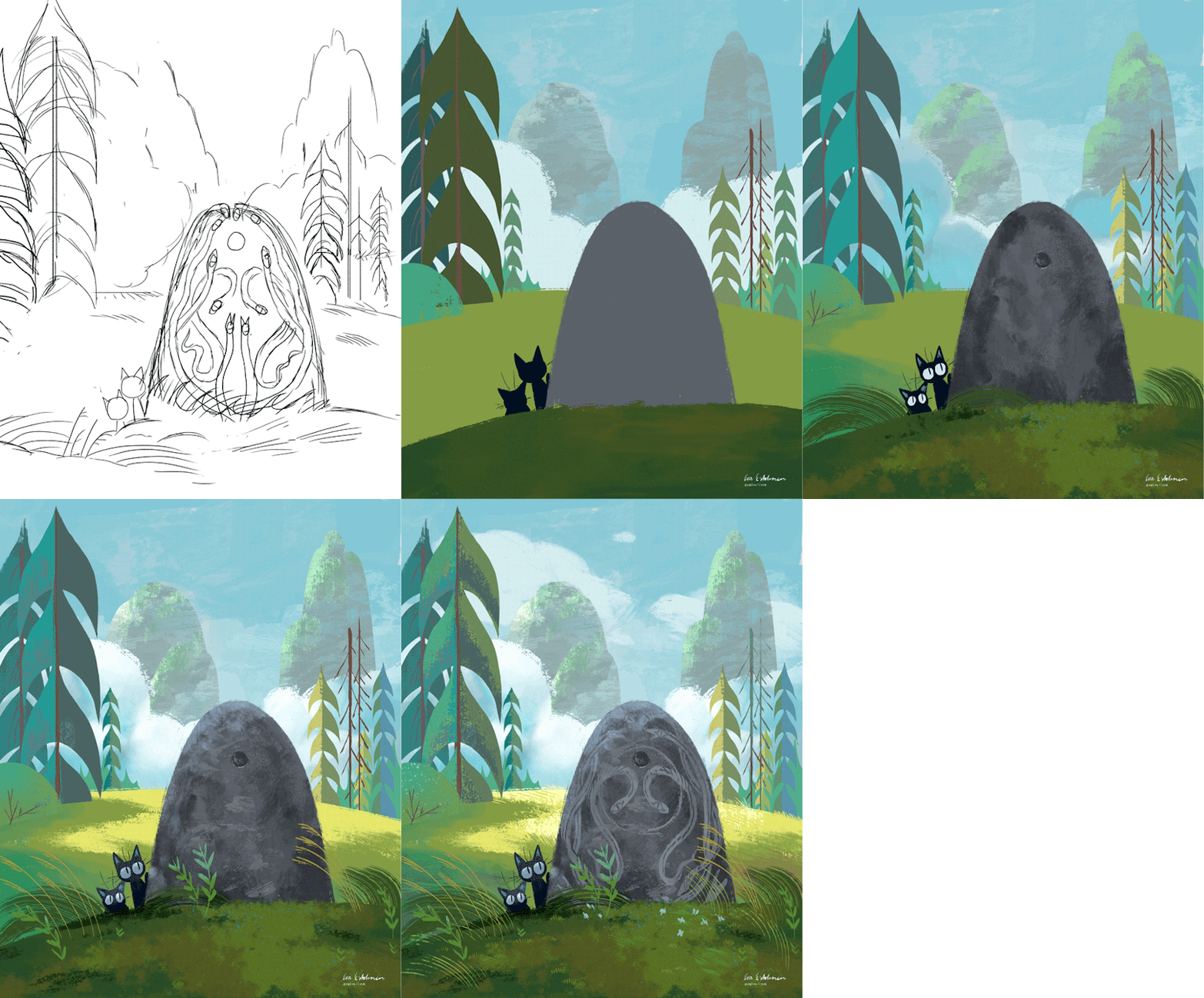
An older illustration, but I'm copying a post from 2019 I made to my very irregularly updating Patreon. This as part of an answer to previous Finnish askbox anon, to illustrate a little how I think about light and depth in picturemaking. Keep reading more for the break down of each step!
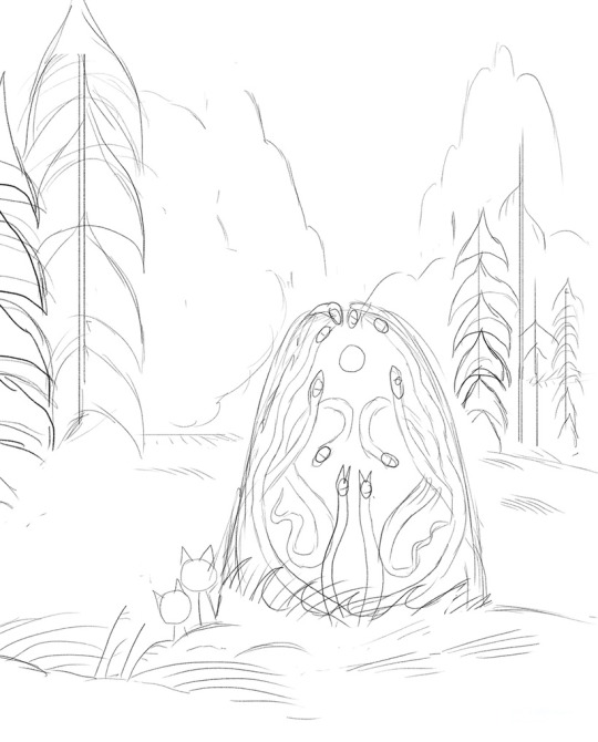
1. Sketch Generally speaking, my layouts and sketches are super rough. This is how I work when I just want to paint for myself. What I really want to get down is just the general composition and elements that there will be. When I make illustration or animation work for a client, I will make cleaner and clearer concepts. But, this will do for myself.
The story behind the idea... I have been drawing two black cats and one white chubby cat every now and then, thinking they are brothers who are taking care of each other while their feral mom is gone. In their adventures they end up confronting events and creatures both mysterious and mythical. In this image, two of the cats have been separated from their little brother and come across something strange. 2. Basic shapes and values
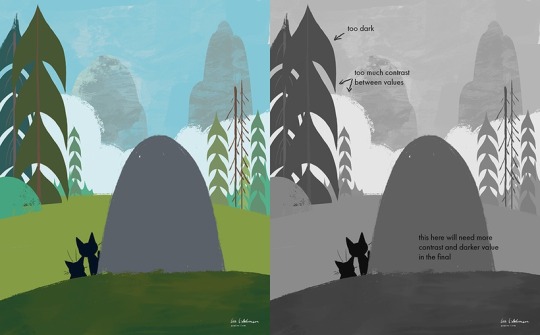
This is what we could call doing the flats or doing the basic shapes. I use lasso tool for almost everything and then clean the shapes up a bit with brush work. I'm more than happy to use Photoshop smoothing on brushes for the fastest and cleanest linework - previously I had a tool called Hej Stylus, which is a smoothing plugin for Photoshop with the similar effect. Very handy for quicker clean up work.
It might be just me being obvious, but values are very important for achieving the feeling of depth, even in more graphic styles of illustration. I often compare what I'm painting to the greyscale version of the image, which reveals immediately where the eye is drawn.
Here are my rules of thumb:
1. Furthest background is always lighter in value than the middleground and the foreground.
2. The further we go, the more colors blend into one another/values become closer to each other. Vice versa, more contrasted elements should be on the foreground or where you want to draw the immediate focus.
Regarding the values - a common trick that I use to achieve variety and richness in colour is that I choose two colors that are very close to each other in value. The turquoise bushes on the left and right sides of the illustration are nearly the same in value as the yellowish green grass. Same with the mountains grey and green (next image). That way you can get detail without being repetitive nor losing the focus of the eye.
3. Adding light and texture

I often work with light and texture simultaneously, as some textured painting directly imply where the light is touching. I think about where do we get the direct sunlight (yellow and warm) and where do we see the reflective light. That is the light that bounces from the sky, for example - which makes shadows appear bright blue-green on the large tree on the left.
A lot of the work at this point is just painting! I'm not always 100% on the values when I begin, I only a general idea of what I think is important and the viewer should be looking at. The stone, and the cats... after that, everything else.
In the final, you can see I figured out how to make the stone pop up even more and not lose all the focus in the trees on the left side.


A big bright batch of grass behind the stone, where the sunlight hits, outlines the stone very nicely while giving a feeling of grassy hill in the wind.
198 notes
·
View notes
Text
“The Azure Sky” - Chapter 3 - Lego Elves
Shadows to the Brightest Flame: Series
- The legacy of Lumia’s influence is scarred eternally into the lands of Elvendale. Burdened by a prophecy foretelling her demise and need for a successor, she watches for one capable of such power. Yet her enemies are working steadily to undo all she’s labored so long for, and it is millenia too late to make peace.
Emily Jones, heir to Eimileen, is a bold girl dedicated to protecting Elvendale, but the world she has grown so fond of is not so black and white as it seems, and the titles of Guardian of Portal and Guardian of Light may hold darker legacies some ancient elves have worked tirelessly to hide.
In conjunction with the extended version of the Guardian of Light prophecy I wrote previously
Basically a rewrite of all of the Lego Elves & Secrets of Elvendale storylines with an additional arc beyond the Season 4: Into the Shadows. There will be a varying degree of deviation from canon.
Technically a crossover with Lord of the Rings/Hobbit/Silmarillion in terms of worldbuidling, as I set Elvendale as being north of Middle-Earth, cause this is fanfic and I can. So there will be mentions of the Noldor, Sindar, Silvan, and some Tolkien characters, but they will be mostly background. Definitely not an issue if you aren’t familiar with the Middle-Earth fandom; everything will still be easy to understand.
Book 1: The Azure Sky
Grieving over the unexpected death of her grandmother, Emily Jones is accidentally trapped in another world. Befriending a few young elves in an attempt to find her way home, Emily discovers many secrets about her grandmother’s past, but for every truth she learns two more questions take its place, leaving her vulnerable to darker force inhabiting this realm.
A rewrite of Unite the Magic
_____________________________________________________________________
Chapter 1
Chapter 2
_____________________________________________________________________
Chapter 3
The walls of the spacious cove shimmer softly as the gentle waves reflect light back upon them. Into the rough surface are carved little alcoves and shelves, dotted with a great decree of bottles and boxes. It is cluttered in such a way that seems intentional, like how fantasy movie set might be arrayed.
An elf sits elegantly by the water. Even from her position, it is clear she is tall, willowy. Her skin is pale, almost glowing with silvery undertones. Her hair and eyes mimic the bright colors of the ocean water. She turns to greet them with a small smile, poised like a water spirit from some ancient mythology.
“Naida! This is Emily! She’s a human from the portal of the Sisters and she needs our help to get home!” Aira squeals.
Naida raises an eyebrow ever so slightly, but seems to ignore Aira’s outburst. She resumes her polite smile. “Blessing to meet you Emily,” she says softly, “I’m Naida Riverheart, though I’m sure my friends have already told you all about me.”
“It’s nice to meet you too,” Emily replies.
The water elf motions for them to sit, to which they oblidge. Naida takes a long look at Emily, her expression now neutral. “Now,” she begins, turning to watch Farran, “Perhaps you should all start from the beginning.”
“Well, I was walking along heading to Farran’s treehouse and then one of the trees started glowing blue, and like there was this magic forming this circle, and then this girl falls through the portal. So I introduce myself, cause that was awesome, and I realized she was human, wearing weird clothes and didn’t know anything about elves, so I figured she must be from that human world the Great Sisters built a portal to. Aira thinks so too.” Azari’s smile of excitement spreads even wider across her face, always having been one allured by adventure.
Naida listens. “Is it true? Did you really come through one of the gates of the Sisters?”
Emily shrugs shyly. “I don’t know, I don’t even know where I am, much less anything about elves or portals or whoever the Sisters are. All I know is that after my grandmother passed away last week she gave me her amulet, and then I wandered in her garden, this old tree I had never noticed before started glowing, and I ended up here.” She pauses, her curiosity getting the better of her, “Who are the Great Sisters?”
“The Great Sisters were five elves who made a considerable impact on the history of northern Elvendale. Their parents were some of the first elves to settle up here, back when the lands were far less explored and far more isolated from the rest of Elvendom. The eldest four were powerful mages, each devoted to a different element. The fifth had very little magic, but she had an open and kind heart, and was cherished dearly by her sisters. Together they accomplished many things, which are told among our people. However their last deed was to create two portals, one leading to the origin realm of humankind, and the other leading back here. The first sister was chosen to guard the doorway leading to Earth, and the fifth was sent to Earth to guard the door returning to Elvendale.
After that, the Sisters each went their own ways. The second returned to her husband, the third and fourth sought their own fortunes in the still unexplored wilds. They faded from the prominence they once held, divided among themselves and withering from some of the more controversial reactions to their creation of the portals.
Nuala, the second Sister and my grandmother, never explained much beyond that, though I have heard rumors that the fifth sister fell in love with a human and forsook her immortality, but Nuala would never confirm or deny it.” Naida tilts her head curiously. “I suppose it is possible you could be her descendant, though I worry what the implications would be should that knowledge spread extensively.”
“Perhaps we should bring this to Nuala,” Farran suggests quietly.
Naida catches Farran’s gaze, but shakes her head slightly. “She, along with Onas and my parents, are still up in Esandosa for the forseeable future. I do not think it would be wise to bring this to their attention until we can learn more.” She looks at Emily thoughtfully. The elf rises and retrieves a large wooden box from one of the many alcoves along the cavern wall. She unlocks and opens the lid, revealing a long, rolled up scroll. “Here, Emily,” she says softly, “Why don’t you open this?”
Emily takes it from her, frowns. It feels somehow like a test, though of what or how she has no idea. She unrolls the parchment, flinching as the old paper protests the handling. Upon the surface is sketched a simple map of what looks to be at least part of Elvendale. In contrast, a detailed and out of scale castle is drawn on the upper part of the page, which glows as though a candle were being held behind the paper.
“I see a castle,” she offers, feeling somehow in the moment that is the right response.
Naida gives an approving smile, coming to stand over her shoulder. “And I see a key,” she replies, and indeed, a drawing of a key does appear on the page, glowing as well with just a slight tinge of blue.
The other elves immediately crowd them, and three additional keys present themselves on the map. In a blank box on the right hand of the page, runes appear. Azari excitedly takes the parchment, clearing her voice to read.
“To the wanderer ensnared from another plane
Mortal lost among the ageless fae
Four elements must unite and concede
Or from this realm you’ll never be freed.”
Naida turns to Emily, “It seems you really did come through the Sisters’ portal. With that understanding, it would be best we return you there with some urgency.”
The human nods in agreement, though her mind wonders about the unspoken implications of that statement, and those concerning the tale of the Great Sisters.
How much danger is she really in, just by being here?
Maybe that is mere paranoia speaking, but maybe that shouldn’t be disregarded either. She walks in a land with immortals, magic, and likely other things beyond her imagining. Paranoia may be what she needs to stay alive.
#lego elves#unite the magic#emily jones#naida riverheart#farran leafshade#azari firedancer#aira windwhister#fanfiction#fanfic#elvendale
5 notes
·
View notes
Text
How to Pick and Use Colour in Your Art

rainbow
We all know the feeling of dread that kicks in when you finish your line art. You’ve spent hours meticulously sketching your art out, then cleaning the sketch up and getting it perfect, only to hit a blank when you have to add colour. There are hundreds of colours to choose from, each of them with varying saturations and intensities that could totally change the mood of your art. You add the wrong shade of red to your art and it totally changes the feel of the piece and you have to start over. Colours are difficult to pick, and difficult to make look good. I personally struggle with colour palettes, but I’ve found a few tricks that make it a lot easier. Those tips are what I’d like to share with you today in this blog, so keep reading to check them out!
Take from nature
Nature has some beautiful colours, so why not use them? Take some pictures of the fall trees, the flower fields, the setting sun, whatever looks nice! Make sure to be careful though, as sometimes even natural colour palettes can look cluttered. Avoid using things like rainbows as colour palettes, and try not to use pictures off the internet, as the colours might be altered and it might not look as good. Once you have your picture, take the colour that shows up most and make that your main colour. Then find commonly reoccurring colours and use those as your secondary and tertiary colours. Then, BOOM! You have a colour palette!
Lower the Saturation
Having bright and vibrant colour palettes can be great and super fun, but you can’t make them too bright. Make sure you don’t over-saturate your colours, or you’ll end up hurting your eyes. You can desaturate your colours by adding a little black or white to them. This will make the colour less intense, and spare your eyes from agony. If you want a vibrant colour palette, don’t use super bright colours. Use complementary colours like pink and light green. Put them near each other, and they’ll pop out and look more vibrant. If you’re confused, there’s more about colour theory in the next section.
Colour theory
Having good colours is important, but knowing how and where to use those colours is just as crucial. That’s where colour theory comes in. Remember back in fourth grade art class when the teachers would talk about warm and cool colours and complementary colours? Yeah, that’s colour theory. Well, kind of. To sum it up, warm colours are red yellow and orange, and cool colours are blue green and purple. Greys can be cool or warm too. If a grey has a red undertone it's a warm grey, and the opposite for blue. Warm colours are better if you want to have a warm environment, like a fireplace or a summer’s day. Cool colours are good for cold environments like snowy tundra. If you want to show a warm place near a cold spot, like a log cabin in winter, you can use warm colours for the inside of the cabin and cool colours for the outside. This will make the inside feel warm, and the outside feel cold and treacherous. The contrast between the two colours will further emphasise this, and make it feel more alive and interesting.

Colour wheel
In colour theory, there are also contrasting and complimentary colours. Take a look at a colour wheel. Draw a straight line from one colour to another. Those colours are complementary. For instance, blue and orange are complementary. Complimentary colours next to each other look very vibrant, and will pop out. If you use them too much though, it will hurt your eyes. Make sure to use them sparingly or turn down the saturation if you use them unless you want to hurt your eyes. You can use complimentary colours to bring focus to something. For instance, if you want the focus to be on a character’s eyes, you can use purple as a base colour and add yellow highlights to make it stand out. This will bring the focus to the eyes of the character.
This video does a really good job at explaining colour theory!
Just ditch the colour entirely!
If you’re having a lot of trouble with colour, and it's getting to the point where it isn’t fun anymore, just go monotone! Monotone colour palettes take a lot more skill to convey emotion, but they can be very pleasing to look at. The key is adding just the right amount of grey scale. Don’t totally go black and white, use some greys and browns too. Warm browns can add just the right amount of colour to your piece. You can also add some warmth to your blacks and whites by using a very dark, or almost black, red or an off white. This will save you the trouble of a colour palette without causing hindrance to your piece. In fact, it could make your piece feel old or graceful, like an ink written letter from the 1800’s! If colour isn’t your strong suit, then improvise and find something that works better and is easier for you! Here’s a monotone colour palette that looks really nice!
Colour is really fun, and can add a lot to an artwork, but it can be really tough to find a good palette. Hopefully my tips have helped out, even a little bit. If they haven’t, please tell me what you struggle with in the comments, I’d love to help! If I did help at all, please feel free to leave a like or tell me what you liked about my tips. I’d love to hear how it helped!
#colour pallette#How to pick a colour palette#colour#colours#how to pick colours#art#arts#artsy#creative#colour schemes#colourtheory#picking colours#how to#tips#tips and tricks
7 notes
·
View notes
Text
Feng Zhu :

This scene depicts a room with a mermaid-like creature in a tank being looked at by Two people, the room is being lit up by lights dotted around the room and there also appears to be some sort of light inside the tank. The main colors of this image are Blue and Yellow, the rest of the image is in Black and white. The Yellow and Blue contrast very well and frames the Blue color nicely. The focal point of this image is the tank as it is the most colorful and bright part of the image. This image could be telling the story of a captured mermaid which makes you wonder if it is really safe in this tank along with what will happen when it is transported to wherever it is being taken. Overall, I really like the way this image looks, it is extremely aesthetically appealing and the colors make it look very calming.

This scene features an old fashioned bedroom and similar to the last image, the room is being lit up by lights dotted around the room which creates a nice and calming atmosphere. Also similar to the last image, the image features few colors (Yellow for the lights, Red for various details around the room and Blue as the light shining through the window). The Red and Yellow do not contrast however they do go well together making the image very smooth looking. There isn’t an obvious focal point of this image however I was firstly drawn to the bed as it is where there is a more concentrated color. Overall, I really like the way this artist has designed this room as it is very magical-looking.

This image appears to be a series of anatomy studies / character designs with both skeletons and a detailed character (however the skeleton is not overly detailed). This image does not feature colors however it does feature some shading and shadows which adds more depth and detail to the designs. This image does not have a focal point as it is a series of sketches / designs however, I was more drawn to the skeleton (skulls) sketches as they stand out the most because they are larger than the other sketches and have more White tones. Overall, I really like the way these designs have been laid out and I also really like the texture the background has as I feel it makes the designs look more visually appealing and interesting (I plan on adding a background similar to this to my work in the future as I feel it will make my designs look more visually appealing and match more with the theme of my game and characters along with the time period it is set in).

This image features drawings / sketches of different buildings (Two larger versions and Two smaller ones in the corner from a different angle). They are all extremely intricate and detailed and they are also both very different from each other. Similar to the last image, this image also does not feature color however it does feature shading and shadows which makes the images much more interesting to look at. These designs look like they are a house / a couple of houses on a remote and small island which makes you wonder who lives here and why and if it was by choice. Overall, I really like how these designs are laid out and I really like the themes present within these sketches / drawings (this piece / pieces similar to this could be a big inspiration for the world my game will be set in).
1 note
·
View note
Note
Do you have certain materials you prefer? Like a certain type of paper, pens, etc.?
If you’re practicing, use the cheap crap! Use printer paper and ballpoint pens and RoseArt and Reeves! Always practice with the cheap stuff and save the good quality materials for when you know what you’re doing. For stuff I prefer for myself now... Paper. When working in sketchbooks I really like Canson Mix Media. It has some tooth to it and I really like that. I also work a lot with markers and it holds up to them really well. I have Strathmore Mixed Media books, too, but they’re really smooth and I’m not very fond of that. Seems like it would be better for blending, but I always feel like the pencil or ink is going to smear or feather. For comic book paper I really like Canson as well. Doesn’t bleed, doesn’t feather, I just wish it had some more layout markers. (Though I can just do that with a ruler.) Pencils! Been using Prismacolor Col-Erase for a long while now, usually in Light Blue and Carmine Red. Please note that Carmine Red doesn’t erase well and is kinda a pain in the butt. I used to draw in Non-Photo Blue, but it was too light when I was inking and I’d have a hard time seeing my sketch and scanners would still pick it up. If I’m doing warm-ups, thumbnails, or just sketches I’ll use anything. Normal pencils, ball-point pens. Anything. Pens. For inking I usually go for Sakura Micron. Comes in a bunch of sizes and I go through them like candy. They can handle a decent amount of work, have pretty durable nibs as long as you’re not stabbing the paper. I also like their brush pens for filling in. I used to use Copics as well for inking, but they were too expensive to upkeep and I didn’t really like how they felt. (I had the metal ones that you could refill. Heavy pens.) I also used to use Stabilo and I kinda hated them. Did my first comic with them and it looks like shit. Feels like holding a pencil, though. I might try them again now that I know how to use pens better, but for now I’ll stick with Sakura. Oh! I also use Sakura Gelly Roll for white ink, but I’m not super fond of it. I just need it for fixing mistakes. I’ll look for a better white ink pen later. Markers! If you wanna get into markers, use Ohuhu. They’re cheap, they dry out in a year, and they come in a ton of colors. Good to practice with. Right now I use Copic Sketch and I like them a lot. I have some that have dried out too soon, so I might try to revive them again, but overall I like them. They blend nicely, they don’t usually feather or bleed too bad, they come in a verity of colors. I like them. I’ve also used Faber-Castell, they’re okay. I’m not really fond of them. They never seem to dry out which is nice. Don’t blend very well, but that may just be me. Sharpie I hate. Never got the hang of them. Hate the smell, hate the colors, I don’t like Sharpie. I know other people that can make them work, though, so that’s definitely me. Other art stuff! I use Mod Podge to glue things, usually paper to whatever I messed up on so I can re-draw it. Bad idea. don’t use Mod Podge to glue things. Coloring over it will also make it look weird. Get a quark-back metal ruler. Keeps the ruler from slipping around. I have a cheap glove-thing I got for free when I bought a tablet to cover my hand and keep me from smearing stuff. I used to have a SmudgeGuard brand one, but the elastic gave out on it and for some reason the woman who ran the store didn’t believe I had small hands so she sent me the wrong size with a letter that an adult can’t have hands that size. I may try to sew my own one day. But it does keep the pencil and whatnot from getting messy. Computer stuff?? For taking photos and posting them to Insta, I use SnapSeed for fixing contrast and white-balance issues and LINE Camera for editing out stuff like eraser dust or little things like that. For digital art I use Photoshop CS6 and a really out-of-date version of GIMP. Like, so old. Super old. I don’t actually have a scanner and haven’t for a long time now, so I can’t really do any digital art. I’d like to get back into it, but I’m also VERY rusty. I never draw digitally and I should really try to get better at that. I want to try out Clip Studio Paint, but that’s a bit expensive for something I don’t know if I’ll like so maybe I’ll use their free trial. Drawing tablets I’ve used have been a Wacom Graphire3. From 2004. It was a good little tablet until it died. I have a little Wacom Intuos. It has a giant scratch on the surface, but it works fine. If I do any digital art, I usually do it with that. I also have a Huion Kamvas GT156HD. I hate it. It worked properly once and never again. The wires are a pain in the ass, setting it up is even MORE of a pain in the ass. It’s constantly running in the background for no reason, the pens can’t hold a charge, and it freaks out if you have drivers for other tablets installed. No matter how many times I uninstall and reinstall drivers it never works right. It’s a pain to change pen settings, I just hate it. Haven’t used it for two years or so, it was a huge waste of money.
3 notes
·
View notes
Text
Skull Oil Painting 💀 Still Life from Start to Finish
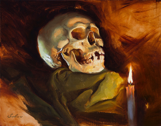
By Pavel Sokov
Setup and Preparation Stages
Before I start a painting, I like to come up with a couple of thumbnails to nail down the composition. I do these from imagination usually. So in these ones, I played with the placement of the skull, the direction of the lighting, and the orientation of the canvas. After coming up with these 4 thumbnail sketches, I got kind of a better idea of what I actually want from my painting.
Also, it sort of helps to have a thumbnail completed to use as reference when I start my painting because if I don’t have anything to look at it’s possible that when I start from scratch on my canvas, my subject will end up too big, or even worse, run off the page or something.
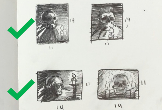
Composition is a bit of a feeling thing along with some guidelines. It’s not like stiff rules that you must follow. So having said that, I think I like sketch 1 and 3 the most.
You know, since the color temperature plays such a big role, I digitally painted this sketch with some invented color before actually making the setup, just to give an idea of what kind of mood this painting would be. And it also gave me an opportunity to plan some of the painting methods and steps that I’ll use in the actual painting process.
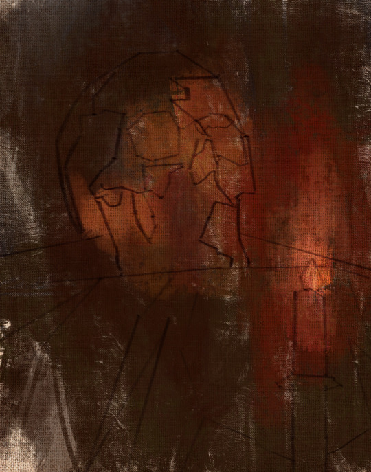
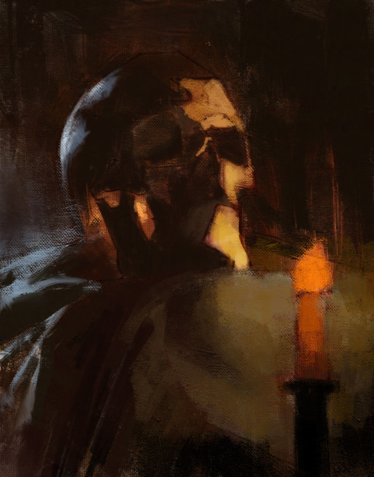
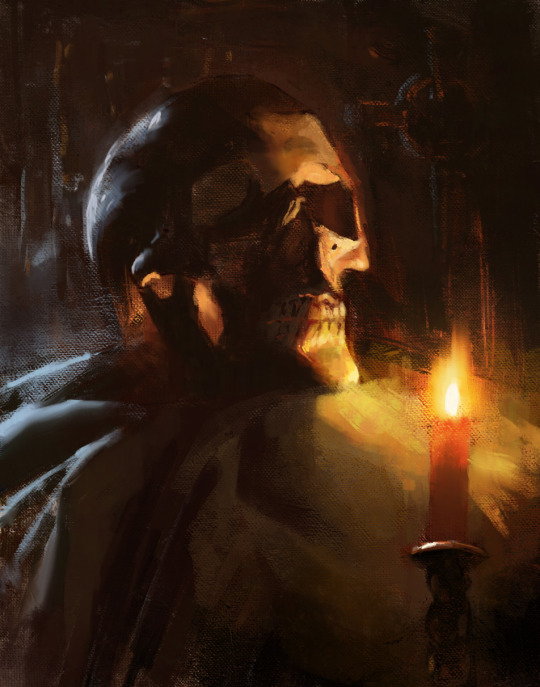
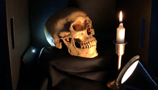
Okay, so with the sketches in mind, let’s put together the setup that I will paint from today.
Execution of the painting
So a big challenge to overcome here with this skull is that I want to paint it in the dark for a more dramatic and moody atmosphere since it’s Halloween and all, but at the same time, I want myself and my easel to be in the light so I can see and we can make this video.
Sadly, the candle doesn’t provide a strong enough light during the day, so we’re going to use a warm lamp instead.
Since we don’t want to burn the house down though by lighting that black box on fire, I think our candle shouldn’t be lit at the beginning stages of the painting.
I’m using a portable paintbox today that makes it convenient for me to paint anywhere I go.
For my brushes, I plan to use a lot of bristles because I want to load this painting up with a lot of thick paint, but I also packed a few softer brushes to get some soft edges in there too.
As my painting surface today, I am using an 11×14 linen panel. It’s actually one of my favorite sizes for life paintings.
I paint with a few different brands of oil paint, but there’s no need to name them or be concerned with what they are. What’s really important about that is that they’re professional grade and they’re not the student grade which are very difficult to paint with. It just doesn’t work, it’s like toothpaste, so just don’t even get it.
Okay, let’s squeeze out our paint. And don’t be afraid to use a lot. For the longest time, I’ve been so shy with squeezing out my paint. It’s been taking me years to paint thicket and thicker, and I gotta tell you, if you can skip all these years of being shy and just get straight into it and load up a lot of paint, it will save you a lot of trouble.
On my palette today we have:
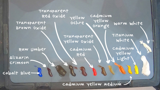
Titanium White, Warm White, Cadmium Yellow Light, Cadmium Yellow Medium, Cadmium Yellow Orange,Yellow Ochre,Transparent Yellow Oxide, Cadmium Red, Transparent Red Oxide, Transparent Brown Oxide, Raw Umber, Alizarin Crimson, and Cobalt Blue.
Underpainting and Drawing Stage
The very first thing I like to do when starting a painting is to tint the canvas. But you have to select your tinting color wisely, because it’s going to provide the underlying temperature to the whole piece. I often let this initial tint show through all the way to the end of the painting, particularly in the shadows.

In this case we have a very warm light on our subject so we can expect our painting to be pretty warm. I’m going to tint this canvas with that in mind by using something really warm like transparent red oxide, and I will mix it with a bit of Cadmium Yellow Medium in the area where the candle will go because later, all this warm underpainting should give this skull a nice inner glow. I am diluting my paint with gamsol here when I do my initial washes, because makes the paint behave like a watercolor, which is perfect for making a stain.
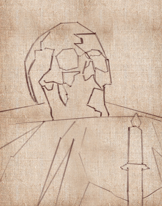
Drawing the Lay-in
Okay, so now that our canvas is tinted, we can start to draw our linear lay-in on top of our stain. My favorite tool to do that with is actually a hard bristle brush. The reason why is that those stiff hairs, they allow me to get nice straight lines which are the exact type of lines that I find helpful at this stage to simplify the contours of everything that I’m drawing and to find those big shapes.
Don’t worry, we’re going to complicate these lines later when we go to paint them!
As you draw your lay-in, don’t forget to focus on the big shapes and the proportions of what you’re drawing. Don’t get carried away on details and things like that because it’s way too early at this stage. Simplify everything to its most basic elements. Find the big shapes and don’t mind the secondary forms for now. It also kind of helps to keep your horizon line in mind when you draw your lay-in. For example, in my case, I’m sitting below the skull and looking up at it.
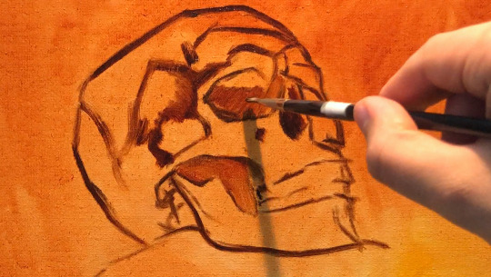
You have to ask yourself, are you looking up at the your set-up, or are you looking down at it? And, whatever the answer is, you have to design your lines with that in mind.
So if you’re noticing that your drawing is off at this stage, don’t be shy to move lines around until you get it right. Trust me, you’re gonna be saving yourself a lot of headaches if you fix things at this early stage than if you try to fix them later on when you have a lot of opaque paint down on your painting.
So right now I’m filling in the dark shapes on my underpainting because I find that it helps me see my mistakes better when I fill in the big dark shapes. With these dark shapes filled in, it’s much easier to judge the distances on your drawing.
Opaque Painting Stage
At this point I often like to take a kneadable eraser, or more often a napkin, and rub out the lightest areas. This helps me establish the light source a lot sooner before I even lay down the opaque paint. Just make sure to do this before your stain is dry, or else you won’t be able to do it anymore. You usually have about 10 minutes max depending on your surface before your wash dries, so be careful.
My goal here is to establish the big values, shapes and color temperatures as soon as I can, so to do that, I am going to cover the entire skull with some opaque paint, aiming primarily to tell the story of the lighting that’s hitting our skull. I am thinking a lot about color temperature. Our primary light is warm, so I’m mindful that my the parts that are in the light are going to stay warm. Often times, students want to lighten an area, so they grab a bunch of white. White is actually the coldest color, so the result of that is that the value of the area goes up and it does become lighter, but at the same time, the temperature goes a lot colder.
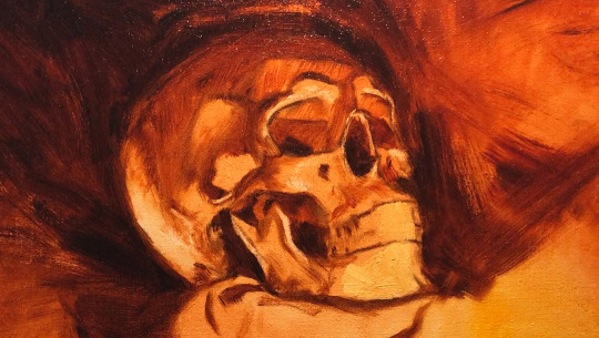
This is actually great if your subject is in a cold light, like maybe a North lighting window. But in our case, our subject is in a warm light, so that’s no good for us. When you want to lighten an area that’s in the light, consider using a color to lighten that area. In this case, to lighten my mixtures, I’m going to include some cadmium yellow medium, cadmium yellow, and transparent yellow oxide in my light mixtures to keep it warm. But conversely, if you want to darken an area, a lot of students reach for the black to darken things, and that creates a cold mixture as well. Try darkening a shadow with a warm dark. Something like transparent red oxide, transparent brown oxide, or alizarin crimson.
While you’re putting down that initial opaque paint, a good principle to work by is to paint the lights thicker and the shadows a little bit thinner. So that means you can’t be afraid to lay down some serious paint in the lights. If you keep the shadows more thin and flat, then the lights are going to feel more luminous in comparison. And I also love to let my warm underpainting show through in places in the shadows.
When you have dramatic lighting like this, you are bound to see a lot of contrast. Let’s make sense of all of it this way:
Since most of our subject is lit, make sure that the amount of values you use in lights is higher than in the shadows. In other terms, make the shadows more flat and have less values, like you could make the shadows just one value so that it looks a lot simpler than your halftones and your lights. As a result, the shadows will have less information in it than the parts that are lit.
I am thinking of the skull as an egg, with the closest part receiving the most light, and the parts farther away receiving the least amount of light. If the underlying “egg” of the skull reads well, then you are gonna be in good shape!
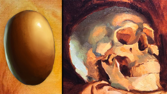
Our halftones are the most chromatic and the most information-dense parts. So in our case they are going to be the warmest parts of the skull. The lightest lights are pretty washed out, but they’re still warm.
Finishing Stage
To see the finishing touches make sure to watch the video below.
youtube
3K notes
·
View notes
Text
The Light Caressed the Curves
Written for @lire-casander for the @goodvibesinroswell Cosmic Love Exchange!
Summary: Painter!Alex and Cowboy!Michael out exploring New Mexico and each other.
Notes: Used Smut Prompt List #11 and a bit of hand waving on the terrain and landscape of the area.
Read on Ao3
Alex was on the porch of the cabin when Michael's truck rolled up the drive. He was waiting for Michael to pick him up as they were heading out on a painting expedition to paint the wilds of New Mexico - basically a hike and some camping. He was hoping this alone time, away from everyone and everything would give them some precious bonding time and continue their journey of reconnection. Plus, he needed someone to help carry all of his shit.
What he wasn't expecting was the horse trailer being pulled behind the truck.
Alex pointed at the trailer questioningly as Michael jumped out of the cab.
"What?" Michael just shrugged. "Thought we could cover more ground this way. And from the looks of all this stuff," he said, waving a hand at the gear on the porch, "I think I'll need help carrying all of this."
"Good idea, I guess." Alex sounded a little worried. He hadn't been on a horse in probably 20 years, let alone missing a foot.
"It'll be okay, Alex. I picked you out a good horse; she's calm, but responsive. You'll love her," Michael replied, as if reading his mind, trying to calm any fears.
"Can't wait." Alex plastered on a smile, in an attempt to be confident and sincere. "So where did you rustle up these ponies? Should I be worried?"
"A buddy I used to work with at the ranch still lives in the area. He owed me a favor, so I cashed it in to hook us up."
After packing everything in the truck, they headed south to the national parks near Carlsbad.
The windows were rolled down, and the wind whipped through the cab, catching Michael's curls and making them dance around his face. Alex was mesmerized by the sight, and with only an am radio station playing country music softly in the background, the 2 hour drive was over in the blink of an eye.
After parking the truck and trailer, Michael unloaded the horses and got them saddled. Alex's horse was named Lucy, a beautiful dark gray and silvery colored Appaloosa. He stood at her head, feeding her carrots and an apple while Michael packed up the third horse, Rusty, with most of their camp gear and Alex's painting supplies. Michael's horse was a dark bay with a huge white star on his face, appropriately called Polaris.
When Michael was done, he came over, his hands behind his back obviously hiding something.
"Whatcha got there, Cowboy?"
"Got you a present, something to make you feel like you belong up there in the saddle." Michael presented Alex with his very own cowboy hat. It was sort of buckskin brown in color, a few shades lighter than his eyes. He couldn't get over how beautiful it looked atop Alex's head.
Donning the hat, Alex asked, "So, how does it look?"
"Perfect." Apparently, Michael had a thing for men in cowboy hats too.
They hit the trail with no real destination in mind. Alex had packed a gps unit and a map in case they needed them, but he really wanted to explore and see where the landscape led them. And they were in no rush, so he had planned to stop and sketch whenever a scene or a moment caught his interest. He brought along watercolors and a sketchbook with thick paper to handle the wet medium. This was so he could do some quick studies, get a feel for the shapes of the landforms, the contrasts of the soft eroded hills against the sharp, jagged mountains rising behind them.
At one point, they stopped by a stream to give the horses a break. Michael found a shady spot and seemed to doze off for a bit. Alex couldn't help himself from sketching out his form, the curve of this neck peeking out of the collar of his shirt, the curls, the outline of his black cowboy hat, the soft folds of his faded blue jeans, and the scuffed up toes of his boots. He wondered if he'd ever seen Michael this relaxed before.
Later, after they'd made camp, ate some supper, and were sitting around the campfire, Alex asked, "Are you still glad you came along?"
"I could go anywhere with you, and I'd probably be happy."
"Did you just quote Bright Eyes at me?" Alex was surprised he even remembered the lyrics. That song felt like it was from ten lifetimes ago.
"Still true though. I would have followed you to the Air Force if my hand wasn't fucked." Michael could have gone on with all his declarations, but Alex leaned into his side, bringing a hand up to Michael's cheek.
"I'm glad you were here safe though. Gave me something to hope for, to keep me going during those long days and nights out on secret missions, not having to worry that you might not be here if I made it out alive."
Michael's lips met Alex's. It was soft and tender and perfect. Michael deepened the kiss, his hand finding the back of Alex's neck, pulling him in closer. Alex's lips parted and their tongues playfully touched and slid against the other.
They laid back on the blanket then, Alex half on top of Michael, comfortable enough to just enjoy making out under the stars. Alex worked one under Michael's shirt while the other had a firm hold of his curls. Michael soon worked a hand down the front of Alex's jeans. He didn't have much room, but he tried his best to make it feel good for Alex.
Alex pulled back from the kiss with a gasp. "Mmmm, Michael, fuck. That feels...fuck…" It was simultaneously too much and not enough.
He rolled off to the side and worked off his jeans, along with his boots. Michael just sat there watching, so when Alex was done, he had to do that for him too. When they were both undressed only from the waist down (it was getting cooler out the lower the sun sunk behind the hills in the distance), Alex came back to straddle Michael's thighs. He took Michael's cock in his hand and started working him to full hardness. He ran a thumb over the slit, gathering a bit of pre-come to help his hand slide a bit better.
Michael hissed at the sensation, loving every second, but wanting more. He always wanted more of Alex.
“You’re really going to make me beg for it?”
"Not at all." Alex leaned forward, his hot breath ghosting along Michael's neck. "I'm gonna fuck you so hard you might not be able to sit in a saddle all day tomorrow."
Michael let a moan. That's just what he wanted.
"You want me to save a horse, and all that?" Alex continued, his words teasing to match his hand stroking Michael's cock.
"Yes. That. Absolutely," he agreed. "Need you."
Alex was slow and gentle with Michael until he wasn't. He started off fucking into him with long tortuous thrusts as he wanted to draw it out, make Michael beg for more. That only lasted until he became consumed by the clenching heat around his cock and he couldn't hold back from pounding into Michael, the slap of skin and the muffled grunts of Michael the only sounds that made it to his ears.
The campfire was reduced to dying embers by the time they both came, Michael first with Alex riding out the waves of his orgasm before coming too. After he pulled out, he wiped Michael clean, his gentleness returning now that he was coming down from the highs of pleasure. Then he somehow managed to get them both into the tent before they passed out on the blanket with little protection against the cold.
When Michael crawled out of the tent in the morning, he found Alex in his element, in his new state of being. He'd set his easel up with a small, primed masonite canvas, and was painting away. The early morning light that peeked over the mountains cast the valley in such beautiful colors and accentuated the textures of the brush and the exposed rock about halfway up.
But Michael's favorite part, of course, was that Alex hadn't bothered to get dressed, even though the morning air was still a little chilly. The light caressed the curves of his arms, back, and ass - truly the most breathtaking part of the whole scene. What made it all even more stunning was his new cowboy hat atop his head.
He came up behind Alex and wrapped his arms around his waist, pressing in against Alex's back. "You looked cold, thought I should warm you up," Michael whispered, nipping at this ear.
"I'm still pretty hot from last night," he teased. "How're you feeling?"
"Cosmic," Michael replied with a proud smirk on his face.
Endnotes: Lire left me some really nice encouraging comments on my first 3 RNM (malex) fics during RNMweek19, so I thought I'd flesh out one of those stories a bit further as a present! Hope you like it! This isn't as finessed as I'd hoped, but I did try to keep it fluffy and angst free and good vibe-y so we could all have a break from the heartache! And then @eveningspirit posted an awesome illustration of painter!Alex for my Cosmic Love Exchange gift - truly helped me push through and finish this today!
37 notes
·
View notes
Text
Together in Santorini
This story is dedicated to @plueschpop and her amazing moodboard
read on AO3
Everyone is 18+
---
After a stressful few weeks of business deals and contracts, Tony felt high strung and in need of a breather. They had been flying around Europe for over two weeks now and Santorini was their last stop.
It was a beautiful island in Greece where the sky and sea merged together in calming blue, it made Tony feel like he was floating and drowning at the same time. The view from his hotel allowed him to see the smaller islands that surrounded the ageless city, yachts and ships littered the coast.
Pepper insisted that he should take in the sites while he was here to help him unwind.
“And who knows Tony, maybe you’ll actually enjoy yourself for a change?” she jokes as she shooed him away.
Which is how Tony found himself wondering the streets by himself, soaking up the beauty of the city. He admired the way the city shone in the sun, a startling white against the cerulean sky.
He had ditched his suite for a white short sleeved cotton shirt, light grey shorts and brown loafers, accompanied by a white panama hat and black sunglasses.
We choose a path at random and begins his trek down the island.
Eventually the cobble paved street leads him to a local museum, like most of the city, it was made of white stone, but this building gave of an antediluvian feel to it. He ran his hand over the columns at the entrance and hummed in appreciation at how, after hundreds of years, they have remained intact and strong.
He slowly paces inside with his arms held behind his back and takes in the artefacts that are on display. There’s an ancient pottery set with farmers painted on them, an old fire kiln with all its weathered cooking equipment, tiled mosaics on the wall displaying an ancient map of the city and much, much more. It was all very fascinating.
He entered the main exhibit and marvelled at the statues that filled the room. Some were polished and clean like they had been made just yesterday, while others had started to crumble due to corrosion, yet still held a powerful presence to them.
Backing up to gaze up at a particularly big statue of an old philosopher, Tony bumped into someone behind him, sending whatever the person was holding all over the floor.
“Shit I’m sorry, I’m-” Tony turns and is stunned by the image in front of him.
At first, he thought he had bumped into one of the beautiful statues on display but after rubbing his eyes he realises that it is in fact an attractive young man. A young man with stunning brown eyes that bore into Tony’s soul like he was standing there naked with all his secrets to bare.
“I’m, I’m Tony!” He grimaced at how he blurted that out but gave the boy a half smile. “Tony Stark.”
The stranger tucked one of his unruly soft curls back behind his ear as he graced Tony with the most charming smile he had ever seen.
“Oh, that’s ok,” he offers a hand covered in black smudges to Tony. “I’m Peter by the way, Peter Parker.”
Tony looks at the hand stunned, still not quite with it. Peter gasps seeing the mess on his hands. He rubs them furiously on his denim shorts before offering it again, still smiling from ear to ear.
“Sorry I was sketching with charcoal and my hands got messy.”
Tony takes the hand this time, not wanting to leave the boy hanging and unconsciously rubs his thumb over Peter’s, who’s smile only seemed to widen. He lets go of the hand and steps backwards and knocks his foot against something. Frowning he looks down to see, what he assumes, is Peter’s art supplies.
At once they both bend down to pick them up only for Tony to place his hand on top of Peter’s when reaching for the same pencil. They both stare at each other before Tony abruptly stands up, hugging his hand to his chest. Tony mumbles another apology as Peter scoops up the rest of his supplies.
As soon as everything was gathered, the boy looks up at him curiously with inquisitive eyes. Tony fidgets under the stare for what felt like an eternity. Eventually the boy smiles again and sticks out his hand as a peace offering. Tony takes it and gently pulls the boy off the ground.
“So,” Tony asks trying to break the awkwardness of the situation. “You draw, do you?”
Peter sees Tony eyeing off his sketch book, grins and offers it to the man with pride.
“Yes, I’m here for a bit of an artist retreat, so to speak.”
Tony flips through the pages of miscellaneous sketches, most of them were sketches of the building and temples in Santorini but as Tony explores the book, he finds himself smiling at the drawings of the locals. There were some lovely ones, all drawn in natural poses, like a moment in time captured on paper.
Peter beams when he points to a picture of a little girl holding hands with an older lady.
“This one is my favourite.” Tony glances up at the boy. “I found the girl crying, she had been separated from her family. I ended up keeping her company until her mother finally found her.”
Peter hugs his supplies tighter to his chest with a relaxed sigh.
“They were so happy to find each other again. With the risk of sounding cheesy, you could feel the love they had for each other. I just had to get it down on paper.”
Tony just watches Peter and how he lights up while retelling all the stories behind the sketches. He feels a warmth pooling in his stomach. It gives him a sense on serenity, like all his stress from the past few weeks have all but vanished, leaving him feeling a renewed energy.
He wanted more.
“Come sailing with me?” he says before his brain could catch up
Peter’s head snaps to look up at Tony
“Pardon?”
“Come sailing with me?” Tony repeats but with more confidence. “I’m only here for a short time and I would love to have you keep me company.”
The boy gifts Tony with his smile once more, he suspects that he is starting to become addicted to the mesmerising gesture.
“I would love to.”
---
The sun is high, the day is warm, and the smell of sea air is strong as Tony guides the little white yacht that he hired across crystal clear waters. the wind is faint so the vessel glides smoothly.
Peter is leaning against the railing on the bow, laughing as a sturdy breeze picks up and tussles his hair about. Every now and then he’d sketch something he sees in the distance.
Tony notices that he worries his bottom lip between his teeth when he concentrates on his work, a pink tongue darting out every so often. The minute Peter catches Tony observing him drawing, a faint red hue graces the boy’s cheeks before he turns back to his sketching, hiding a small smile behind his book.
Eventually Tony finds a nice private area and anchors the yacht is place.
As he does so, he hears a faint rustling, the pitter patter of feet on the deck and then a loud whoop followed by a splash. Peter emerges from the water gleefully and pushes his hair back out of his face.
He is completely naked.
Creamy white skin glows from the light reflecting off the water’s surface as he swims backwards, absorbing the sun. The sea provides no cover and Tony can see everything. He swallows a gulp as he stares down at the most beautiful individual he has ever encountered. His eyes trace the boy’s slender waist, up his flat stomach, past his pastel pink nipples and his mouth is left dry when he watches the boy’s adam's apple bob as he talks, what about Tony can’t remember as he is too busy devouring the boy in his mind.
After doing a small lap, Peter waves over at Tony, beckoning him to join him.
“Come on Tony,” he practically purrs. “The water is amazing.”
Without skipping a beat, Tony undresses and jumps in after the young man, the sea is brisk against his warm skin. Peter giggles as Tony emerges and splashes water at him lightheartedly.
“Oh? Is that how we’re playing?” Tony smirks at the boy and throws a handful of water into his face.
Peter lets out a surprised Oh face then his eyes sparkle mischievously. He brings both hands in and creates a big wave that splashes Tony back and takes off before the man could react. Realising Peter was swimming away Tony let out a playfully growl and chases after him.
Peter swam towards the yacht but was grabbed before he could reach the ladder, he lets out a loud squeal as Tony tickles the boy from behind.
“Stop…ha-ha…please!” Peter cries turning around to face Tony, laughing at the onslaught. “Please I yield! Ha-ha, I yield!”
As they both start to calm down, both grinning stupidly at each other, Tony is made painfully aware that he is holding a very naked Peter against his own very naked body. All laughter dies as the mood shifts to something more intimate. Peter’s hair falls over his hooded eyes and Tony can’t help but brush the strands aside so he can drown in their murky depths.
He runs a splayed hand over the smoothness of Peter’s back, dragging it up to join his other hand in the wet mess of curls. Gently, he angles the boys head, eyes shifting from Peter’s to his slightly pouty lips. A soft exhale of a content sigh is all the permission the man needs.
Tony’s lips meet Peter’s, they’re wet and taste of the sea. At first the kiss is slow, the tender movement of simply sweeping their lips together. The boy delicately mouths at Tony’s bottom lips, nose brushing against each other, inhaling as the kiss deepens.
They pull apart for air and stare searchingly at each other before joining again, this time more desperately. Peter holds them up with one arm clinging to the rails behind him as Tony grinds their bodies closer. Water stirs in their frantic display of affection, creating small waves that ripple against the yacht.
A bite on the boy’s lips causes him to gasp, granting access for Tony’s tongue. His mouth tasted sweet and warm, a stark contrast to his lips. The feeling drags a moan out of him as his cock twitches to life against the boy’s stomach.
Without breaking the kiss, Tony reaches for Peter’s own erect penis, it fits perfectly in his hand. He gives it a gentle squeeze, his thumb flicking over the slit a few times. The boy whines urgently at his ministration, pulling away from the kiss to pant breathlessly while leaning his head on the back of the yacht.
The cries of pleasure remind Tony of an old sea tale about sirens, luring men to their deaths with their enchanted voices while out at sea. Tony muses, while he slowly pumps the cock in his grip, that he would follow Peter willingly, even if it meant his own demise.
Soon Tony hooks his leg on the bottom rung of the ladder that’s submerged in the water and positions Peter, so that the boy is straddling his thigh, cocks pressed firmly against one another. With one hand placed safely on the Peter’s hip, keeping them as stable as possible, he uses the other to grip them both together. The pleasure of the hold jolting down their spines.
Starting with a soft, slow pump, getting used to the feel of both cocks in his hand, his head falls forward, face tucking into the boys exposed neck. He mouths absently at the skin as he struggles to stop his hips from twitching and rutting forward. His lust and desire are nearly overwhelming, but for Peter he would go slow. For Peter he would be gentle.
After a few beats of winded pleas and steady grunts, Tony picks up the pace. He can feel Peter gripping the rails for dear life as his own hand tightens on the boy’s milky hips, fingers bruising the delicate skin. Peter twists and turns at the carnality of it all.
“Please Tony?” a broken sob escapes his parted lips. The boy’s eyes bore into him once again, tears beginning to form from the intensity of their building climax. He can slowly feel his control slipping through his fingers.
With a feverish moan, Tony strokes faster, encouraging Peter to move with the thrusts. The water is now churning with their rapid movements, drops of water splashing their faces, but they’re too far gone to care.
He can feel the telltale signs, the knot forming in his stomach as the heat grows like a fire coursing through his body. His foot almost slips off the ladder as the desire begins to engulf him. The sharp sting of Peter’s nails bite into his shoulder, dragging out a deep groan from within, the pain only heightens the pleasure.
Tony comes hard with the boy’s name spilling from his lips, his hips bucking upwards chasing his own orgasm, his eye clamped shut as the euphoria filled him up leaving him senseless. Peter’s whimpers are cut short as the boy follows through with his own seed mixing with Tony’s, only to be washed away into the sea, the only evidence left of their act was the tears that feel freely down Peter’s cheek.
Peter finally loses his grip on the ladder and collapses against Tony with a sated sigh, he weakly manages to give a lopsided smile. He looked stunning holding onto Tony as they float in the sea, with his flushed face and wet cheeks. With a calloused thumb, Tony can’t help but brush the drying tears away and look at the boy is stunned awe.
A slight wind brings them back down to earth, causing them to shiver slightly from the cool air.
Tony leans in and places his forehead against Peter’s and gives him a slow kiss, then another and one more for the hell of it.
“Maybe we should get back on the yacht and dry ourselves off?” He breathes softly against the boy’s lips, wanting to kiss them again, to never stop, he’s been cast under a spell and these lips were the cure.
Peter nods silently and turns to begin his climb, leaving Tony with a close-up view of the boy’s ample backside, water drips down his torso, the sun making it glisten seductively, a bruise already forming on the pale skin. Tony wonders how many times this kid could leave he speechless today.
---
Tony lay stretched out on the dock, naked and spent from the third round of sex, his arousal finally quenched. He had his back to the setting sun and his head in his arms, drifting on and off from sleep. The sound of scratching stirs him awake and he sleepily turns his face sideways to inspect the noise.
Peter is sat against the railings with a white sheet draped around him, his knees pulled up to his chest and he is scribbling happily in his art book, his tongue doing that thing Tony loves. He gives Tony a warm smile when he sees he is awake.
He crawls over and kisses him tenderly before Tony sits himself up and pulls the kid in for a hug. He rests his head in the crook of Peter’s neck and sneaks a peek at the sketch book still in his lap.
They’re all sketches of Tony, mostly of him sleeping. A warm feeling pulls at his heart strings as he traces the pictures with his fingers.
“Come back with me.” Tony pleads against the boy’s curls, now soft and dry again. “I don’t want this to be our only time together.”
Peter pulls away slightly so he can look Tony in the eye, he looks…sad
“I can’t Tony.” he caresses his face warmly, threading his fingers through his beard, his thumb delicately strokes his lower lip. Tony plants a forlorn kiss to his palm, holding it against him with his own hand.
“I came here for a break before I start college. It’s important for me to go back.”
Tony nods his head empathetically, he knew they’d have to return to reality soon enough, he couldn’t just abandon his company either.
“Are you studying art?” he questions while he makes a notion towards Peter’s book.
Peter just chuckles, shaking his head a little.
“No, this is just for fun,” he massages the pages of the book like an old lover. “I’m actually studying biochemistry at MIT.”
Tony freezes.
“No way…” he manages to say after a while of staring at the boy with his mouth gaping like a fish. He couldn’t believe his luck. “my main office is in New York, I’m like four hours away from you!”
Or shorter if Tony takes one of his private planes.
It takes a few seconds but Tony watches as realisation dawns on the boy.
He gasps as he is knocked back onto the deck when Peter launches himself at him with a flurry of emotions, showering him with kisses all over his face. Hot wet tears begin to fall from his eyes which Tony happily kisses away.
“Does that mean we can keep seeing each other?” Peter asks imploringly, searching Tony’s face for an answer.
“Only if you want to Sweet.”
“Yes!” Peter yells out to the sky with a gleeful laugh. “A thousand times yes!”
The laugh is contagious and soon Tony is laughing too.
Who would've thought that taking a stroll would lead him to this?
As he leans in to kiss Peter, Tony reminds himself to give Pepper a raise.
68 notes
·
View notes
Text
【KagePro】 KuroEne/SaeEne 🖤💛💙


【KagePro】 KuroEne/SaeEne 🖤💛💙
【カゲプロ】 黒コノエネ/クロエネ/冴えエネ
My shadow wants to swallow up this dream of yours.
KuroEne was baby Sen's 1st ship that I was OBSESSED with as a 12 year old, and after 10 years, the KuroEne obsession is here to stay.
Snake x Bunny 🐍🐇
Ene's twintails look like bunny ears 💙
I came back to KagePro in April and got obsessed with Kuroha and KuroEne again, exactly as I predicted. Turns out I'm not immune when my meow meow mf gets handsy with my wife.
B*tches when Snake of Clearing Eyes. I'm b*tches! /lh
I first got into KagePro when I was 12 when I watched the Outer Science MV. Sidu's MV aesthetics and Kuroha's design drew me in immediately. Great design and song~
I'm obsessed with Meow meow mf charas. Black and white colour scheme and design aesthetics. Causes problems on purpose. Sen-core bastard cat. Smug chaotic edgy evil asshole character. Violent, unhinged, bloodthirsty and murderous. Arrogant with a huge ego that distances them from humanity (or social interactions).
All of my top fave masc charas are like this. There's literally no one with more obvious and predictable tastes than me LMAO 😭
Kuroha/Saeru, the embodiment of "Knowledge/Wisdom" as a dark evil cunning and malicious entity in KagePro, and the main source of conflict and tension in the plot, is so interesting to me.
With Ene, I'm very enamoured with her chara and design. The way the way she acts so cheery and self-centered in the hopes of Shintaro to open up more, how she wants to be someone else's friend to subside their loneliness, the same kind of loneliness she'd always felt back then… It also feels like over-compensation for her past regrets, wahh, Ene… ;_;
Rough sketch WIPs. I love their expressions here sm~ I started playing around with Gradient Maps cuz I love picking colours. My works tend to lean more saturated with high contrast, so I ended up going with a more saturated palette.
This shows my process for picking colours. The final one I ended up picking is the 1st one. It has a blue hue shift on Ene, red hue shift on Kuroha, and generally more saturated colours and higher contrast. The last one shows the colours I started with.
The more red + purple toned Kuroha has really nice visual contrast against Ene's cool colours (blues) in her design tbh~
I started off with a more muted palette (different from what I'm used to), but ended up going with more saturated colours cuz I think it fit the mood of the piece more. Though I think it'd still be fun to do both a Muted Colours and Saturated Colours version!
These doodles aren't refined, and just me roughly filling in the base colours on my sketches to get an idea of colours. Since Idk when I'll get to refine these drawings and clean up the sketch and lines
Shadow gate to love by Guilty Kiss is sooo Sen ship-core. It basically works for every Light/Darkness, Angel/Devil, and Narrative Opposites ship of mine. Oh baby shadow gay~ 🌈
KuroEne has such a unique context as a ship cuz it uses HaruTaka and KonoEne (my no. 2 KagePro ships), as a basis. Ene has a "special" relationship with the person that Saeru uses as his vessel.
KuroEne is like the equivalent of the evil sleep paralysis demon (in this case, evil sadistic parasitic snake) possessing past love (Haruka), or the person that you're conflicted about, but still have a certain kind of tenderness for (Konoha). Sadistic parasitic evil snake bf and computer virus gf
Ene already gets flustered around Konoha who is airheaded. So with Saeru, the teasing would just be merciless, cuz Ene is easy to rile up. ENE BELOVED…
I'll talk about the setting of my KuroEne AU. I'll put the rest of my rambles under the cut! I copy pasted these rambles from my side blog since it's pretty long.
KuroEne AU: Set-up


Source: KagePro LN: 7 - from the darkness - Colour Illustration Source: Sidu's Mekakushi Dan Members Colour Illustrations
Ok, I'm just gonna ramble about the setting of my KuroEne AU.
I also included a summary for context just in case my non-KagePro mutuals want to tune in to read these rambles.
I just wrote this quickly before I go to sleep. I have more to say but I think this is a good starter.
In official KagePro media, the present day plot starts after 2 years, on the fateful day of August 15th (Kagerou/Heat Haze) Day.
The Kagerou Daze, the never ending world, swallows up people who die on August 15th, and gives those with especially strong desires, who are compatible with an Eye Ability, a substitute life so that they can return to the real world.
In most Routes, Saeru ends up orchestrating Haruka and Takane's deaths. One thing you'll learn about KagePro is that this guy (Kuroha) is responsible for almost everything bad that happens
Because killing them so that they'd come out with an Eye Ability, is a part of his plan to get the rest of Azami's snakes out of the Kagerou Daze and into the real world.
Haruka's death leads to the creation of Konoha, and Takane's death causes her to lose her human body and become a cyber girl named Ene
There are multiple different ways that a KuroEne AU could go, depending on the Route. KuroEne AU Routes are so fun to write, because any time I get a new idea, I can just put into a different Route (timeline) to explore all the "What if" scenarios that don't fit into a single Route.
Kuroha's Plan and KonoEne


Source: @/x0401x
Mekakushi Dan Clear Files: (X)
Normally, the rest of the Mekakushi Dan members meet each other in the present day plot after 2 years, the fateful day of August 15th, the day Kuroha/Saeru plans to kill everyone.
Kuroha/Saeru's plan is to gather all the snakes with a new Medusa in the real world (bringing the rest of Azami's snakes out of the Kagerou Daze to the real world), and killing all Eye Ability users.
Then, he forces Marry, "the next Master," to rewind the world using the power of the Queen Snake, Combining Eyes.
In official media, Kuroha/Saeru usually possesses Konoha's body at the end of a Route on August 15th, the day he plans to proceed with the "Tragedy" and kill everyone.
I imagine that in my KuroEne AU, Kuroha/Saeru possesses Konoha's body MUCH earlier. Like, anywhere within the timespan after Takane and Haruka's deaths (1 - 2 years)
Because of this, Konoha and Ene usually end up meeting and befriending each other earlier. Ene recognizes Konoha as Haruka's game avatar from back then, and mistakes him for Haruka. Konoha asks if she has the wrong person, and Ene gets heartbroken at Konoha's seeming amnesia and inability to remember her.
Ene imposes a sense of distance around Konoha due to her conflicting feelings (he resembles the person she loved but isn't him).
In my AU, KonoEne establish a relationship dynamic of some kind (which varies depending on the Route), which either progresses to an acquaintance-ship, friendship, or intimate relationship.
Kuroha introduces himself to Ene for their first meeting in a Route


Source: Sidu's 2016 Calendar Hanafuda Set
And then, at some point, Kuroha/Saeru possesses Konoha's body. At this point, when he introduces himself and makes himself known to Ene for the first time, he can choose what information he wants to reveal, and how much.
For example, Kuroha can choose if he wants to introduce himself as Black Konoha, and/or "Saeru," or whether to reveal it for later. (And he also chooses whether he wants to reveal his true identity as the Snake of Clearing Eyes.)
Ene later nicknames him "Kuroha" and "Saeru" to shorten the name.
He knows that the 1st one would be more familiar to Ene. To introduce himself with the 2nd one would make Ene more distrusting/suspicious of him.
He most likely doesn't reveal his true intentions (to kill the Mekakushi Dan) so soon, because he knows that if he does, Ene is (obviously) not gonna want to "play the game" (of being intimate with him) anymore, cuz it means that he is literally putting her and her friends' lives in danger.
Though, across multiple Routes, he probably does play around and experiment with the timing of when he reveals certain information, and how much.
I think in most Routes, Ene is suspicious of him at first, and asks about his intentions and what he's really after, and Kuroha/Saeru just tells her that it's too early to say yet, and that she will find out soon.
(Though, Kuroha could probably quell her suspicions with enough convincing, due to the massive amount of knowledge he carries)
KuroEne AU: Context


Source: Mega Man Battle Network 6 (Rockman.exe 6)
In my KuroEne AU, Kuroha/Saeru, who has messed around with human technology and innovation, has been able to develop a humanoid android/robot body with human flesh that Ene can transfer into.
This concept is inspired by Mega Man Battle Network (Rockman.exe), specifically, the NetNavis (humans' companion AIs in this universe) from MMBN/EXE.
NetNavis can transfer into CopyBots (android bodies) for limited amounts of time, to move around in the real world. These CopyBots take the appearance of the NetNavi that transfer into it.
In my KuroEne AU, I imagine it's battery powered, but with every Route, he gets better and faster at making it. Like he improves the battery life over time, so it goes from lasting an hour to lasting a whole day, etc.
According to the KagePro LNs, Kuroha/Saeru has knowledge from everything from the start of civilization...
Shintaro in the KagePro LNs compares Saeru to "a living encyclopedia with a full grasp of everything from the start of civilization up to modern science."
That LN bit confirms that Kuroha/Saeru carries knowledge of the history of mankind and its technologies over (probably) millions or thousands of years.
Especially when scientists have made developments regarding wrapping living human-like skin onto a robot that can heal when cut.
If he carries knowledge from the start of civilization, so much knowledge that it's unfathomable to the average person, then yeah I definitely think he could get it done (especially for the sake of my AU).


KuroEne's Intimacy


Source: (X)
Scan: @/ayara-resara
Kuroha proposes that he has a solution for Ene not being able to move around in the real world, and introduces the little invention that he made, for her to test out, which Ene eventually agrees to, out of curiosity.
Ene feels a sense of gratefulness to him for allowing her to move around in the real world since it gets lonely in the cyber world, not being able to feel or touch anyone on the outside…
Kuroha gets to know and bonds with Ene, anywhere within this 1 - 2 year timespan, and at some point, Kuroha and Ene get intimate with each other.
Ene gives into the sense of longing/yearning that she feels for Kuroha/Saeru, a yearning for warmth and touch after being stuck alone in the cyber world for so long (in spite of everything - if she knows about his true identity at this point), which is in part caused by his vessel (being Konoha, who's in Haruka's body).
Kuroha knows how to react to her and what to say to her and how to act around her due to his knowledge, and so, seduces his S/O and tempts her with carnal pleasures, and they indulge in "the game/dance" of being intimate with each other.
Because Kuroha/Saeru keeps memories of previous Routes, he remembers memories of being with the Enes of previous Routes, and thus, knows how to react to her when talking/chatting with her normally, knows how to appease Ene's behaviours and whims, goes along with what she wants, knows how to get the responses he wants when he wants something from his partner (so he knows how to seduce them), and knows how to satisfy his partner in the context of intimacy.
Because of the knowledge he carries, he knows the context, past, Eye Abilities, vulnerabilities, etc., of every Mekakushi Dan member, and that includes Ene. So he'd definitely know about Haruka and Takane, and Konoha and Ene's context and relationship together.
The person who's her greatest enemy (whether she knows it at this point or not), very literally knows everything about her.
Kuroha's Nature

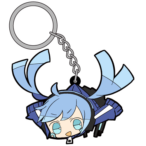
Source: COSPA - Tsumamare Series (Keychains and Rubber Strap Charms)
Not only does he weaponize Konoha's body by using Konoha's body as a murder weapon to kill everyone at the end of a Route, he weaponizes words, too. Kuroha/Saeru uses "knowledge" as an advantage over his partner, and weaponizes knowledge. Actually staggering advantage. Because he knows almost everything.
Kuroha ships are like the only time I have ships where one party in the ship has THIS much of an advantage over their partner.
Therefore, as I said before, Kuroha/Saeru ultimately has a power imbalance with his partner (any Mekakushi Dan member that he could be paired with).
He has an overwhelming advantage over his partner due to his role (set-up as an antagonist constantly killing the cast) and capabilities. It is ultimately in his favour.
That fact in itself, that the power imbalance exists, isn't inherently a bad thing, it just means that you NEED to tread carefully with portraying Kuroha's ships. I always make sure to depict my ships with as much care as possible, and as healthy as possible.
Ene is one of the characters who is a really good match with him. Because making Ene more assertive and dominant in the KuroEne ship, and making them take turns in leading intimacy, with having Kuroha letting Ene take control through their bedroom intimacy at times, helps alleviate this power imbalance slightly.
Kuroha is literally so fucked up dude cuz even his twisted form of affection that he holds for his S/O (the Mekakushi Dan member who he's paired with), is still in a twisted, selfish, self-serving way.
Due to his twisted nature, he embodies Koi (恋), "Selfish love," "loving someone for their own sake."
Even when he caters to his partner's pleasures, it still ultimately caters to his pleasures the most. That makes him interesting, though. Someone so inherently dark and twisted and sinister, with selfish desires like that… 🥰💖✨
Misc Rambles
So I imagine, in most KuroEne AU routes, he reveals his true intentions either approaching the fated day of August 15th, or right on the day of August 15th.
There's absolutely a sense of betrayal that Ene would feel following the reveal of his true intentions - he built up a relationship with her, on purpose, just to drop the worst possible scenario imaginable.
Like let's be real. The reveal of "I've been killing you and your friends throughout multiple Routes (timelines)" just sounds like a nightmarish scenario, especially if you've been fucking this guy, like come on. 😭
And something that would make Ene get especially pissed at him, is if he decides to reveal that he was responsible for orchestrating Haruka and Takane's deaths in the first place.
(In official media, Ene sees Konoha for the first time, on August 15th, 2 years after Haruka and Takane's deaths)
Though, there are probably KuroEne AU routes where Konoha and Ene don't get the chance to meet each other - Routes where Kuroha/Saeru possesses Konoha's body before the two can actually meet, so when Ene sees who she thinks is "Konoha" for the first time, it's actually Kuroha/Saeru. With this kind of setting, he could even pretend to be Konoha, if he wanted.
And then on August 15th, he proceeds with killing the Mekakushi Dan with sadistic glee (and even his S/O - though if he's feeling nice, then he can spare them, since he doesn't need to kill everyone), and forces Marry to rewind the world.
Thankfully, due to the nature of Ene's body and predicament, she won't feel physical pain when he kills her. And then, a new Route (timeline) begins.
Previous KuroEne Posts
In my new post (this one), I wrote more about the set-up of my KuroEne AU.
My old post has some more rambles regarding some general ideas of my KuroEne AU (since I didn't feel the need to copy paste the same stuff here too)
Shadow gate to love by Guilty Kiss
Source: (X)
These lyrics work so well for ships like LimGuda, XanLena, IdaTatsu, and KuroEne.
The song sung by the sub-unit, Guilty Kiss, in Love Live! Sunshine!! My favourite version of Shadow gate to love is this fan-edit that pitches down the song to match the original voice actors’ voices, compared to their characters’ voices (which are higher in pitch)
Shadow gate to love is sooo Sen ship-core. It basically works for every Light/Darkness, Angel/Devil, and Narrative Opposites ship of mine.
It’s my song to fall back on if I can’t think of any other songs for my ships. I think it fits these 4 the best, though.
Oh baby shadow gay~ 🌈


The lyrics of the song works for all of my meow meow mfs in general.
In KagePro, though, the mention of "Strong scented eyes" takes on another meaning cuz of the emphasis on EYES, particularly the Eye Abilities.
I also love the emphasis on the Light/Darkness aspect and seduction in the lyrics.
KuroEne: Kuroha seduces Ene by tempting her with carnal pleasures, and keeps the secrets of his plan to commit the Tragedy (killing the Mekakushi Dan on August 15th, Kagerou Day) hidden from her. He tells her "beautiful lies" in order to keep up his facade.
He decides to act tamer prior to the fated date of August 15th, catering to her desires and befriending and bonding her and spending time with her and actually getting to know her. They'd do soft and fluffy stuff like go to the amusement park together, play video games together, and eventually, get intimate with each other.
Due to his inherently dark and twisted nature, Kuroha/Saeru prioritizes his own desires and desire for immortality, and constantly keeps causing the Tragedy by killing the Mekakushi Dan, Marry's friends, forcing the time loop resets. He also believes that doing this allows him to be with his partner forever, because he can continue to come and meet them forever and ever.
#kagerou project#kagepro#kuroha#ene#enomoto takane#takane enomoto#snake of clearing eyes#clearing snake#dark konoha#black konoha#me ga saeru hebi#saeru hebi#saeru#kagerou daze#mekakucity actors#kuroene#saeene#kuroha x ene#saeru x ene#dark konoha x ene#black konoha x ene#stepswordsen kuroene au#stepswordsen art#stepswordsen#my art#wip#doodle#kuroene au#sen's kuroene au#I've been forgetting to post my art on main so I'll catch up with posting
8 notes
·
View notes
Photo
Sparkle By the Sea
Pardon me as I just barely squeeze a MerMay piece of art in. I'll be honest with you guys, I've been pretty lacking in artistic motivation since NaPoWriMo ended. Although if you've noticed my lack of uploads, you probably could've already guessed that. This isn't abnormal for the aftermath of a month-long challenge for me, especially with a brand-new video game calling my name at every moment of the day, but even so I feel like this particular motivation drought was a bit different. Part of it definitely had to do with the changes to DeviantArt that I'm sure I don't need to remind everyone of, but that's been more of me dreading seeing what the state of the community is than anything else. (However, I have noticed I'm not a fan of the new tag system over the old category one, as confusing as the category system could be sometimes.) Rather, I think this lake of motivation has more to do with the fact that being largely absent from all social media during NaPo reminded me...well, that I hate social media. This is really a bigger discussion for a journal or something, but suffice to say it did not feel good to realize just how many literal hours I had previously been spending trying to desperately to scrape up just a little bit of support on other social media platforms (namely Twitter), versus the more natural growth I see here on dA that also feels a lot more genuine and less forced/obligatory. I can't really explain it, but that reminder/realization really helped my brain slip back into a place where I felt like creating again. And with that, I'll transition into talking about the art and save the social media talk for, as I said, a journal or something later on. Naturally, I've been seeing a lot of mermaid art this month and every year I feel the urge to get in on the fun, though I know better than to try actually doing the MerMay Challenge (especially not this year after having just done NaPo), so I usually either do a one-off drawing or if I'm too busy with other projects I just skip it. But I was starting to feel that need to make art in my brain again and I've had a specific set of stickers from the dollar store sitting in my stash for quite a while now that more or less sealed the deal for me. How do these stickers fit into the mix? Well, I originally fell in love with/picked them up because they are mermaid-themed and absolutely adorable--See for yourself! And I thought they would make for nice decals in a book project since they're wall stickers and therefore repositionable with minimal adhesive-yuck. And at first, I thought maybe I'd end up making them into said hypothetical book project in time for MerMay...except that felt a little cheap in combination with my lack of uploads. Did I really want to come back with a book project featuring mermaids I didn't even draw? And for MerMay of all things? So I sat on the idea and left the stickers out where I could see them, and eventually I sat down and took a closer look at them. The art style, upon further inspection, actually didn't look like it would be too far outside my usual art-making realms...Most of the coloring looks a lot like watercolor, except for the skin which I thought was flat and smooth like alcohol marker and the glitter accents which from my perspective pretty much had to be digital, but could potentially be replicated with glittery/metallic supplies... And that was the moment the idea hatched. I decided I'd try drawing a mermaid myself in the same style. This would work for MerMay, have something to do with the stickers, and based on my plans would work well for me as a mixed-media project, which as I'm sure I've said before is where I think my artistic talent shines best. I thought the scariest part was going to be replicating the looser and less strict line style, and to a point it was, but it wasn't nearly as bad as I thought it was going to be. I find it's usually kind of tricky to explain this, but really what this part of the process boils down to for me (if I'm replicating an existing style and not using my own), is really just studying the original artwork(s) and looking for patterns, then trying to stick to those patterns. For example, the style here features fairly large & rounded faces, and the hands are more like hand-shaped mittens (which was great news by the way because hands are always a pain in the butt for me), so I did my best to emulate those features. As per usual, I did start with a sketch, but I tried to keep it looser than usual, and then when I did the inking I started with my 0.2 Micron, again trying to keep things loose and no be too fussy if I could help it. Then I went back with a brush tip liner from Prismacolor to get more natural variation in the lines and to force myself to not have quite so much control over the line weight. I was also very careful with my choice of liners because I knew pretty much everything except the skin was going to see a lot of watercolors, which meant the lines had to be waterproof. And of course, I went with watercolor paper (my nice 100% cotton stuff this time) to make sure I didn't have any issues with blending or layering. Now, at this stage, I didn't know what I was going to do for the background, though I was leaning towards the idea of making one separately and placing the mermaid on top afterward, as sort of a nod to the original mermaids being stickers. But I wasn't totally sure yet. What I was sure of was how scared I was to just dive into coloring. The sketching and inking and gone so well I was thinking I was in for a rude awakening at any moment. So, just in case, I scanned my uncolored lines as a fall-back if I royally screwed up. With my paranoid mind set at ease (for the most part), I could begin with color application. I started with the skin since it was the easiest; Just one good layer of alcohol marker, leaving a little white space here and there like the artwork I was emulating. Although 1. The marker color turned out a bit darker than I was expecting and later blended too well with her tail, so I had to lighten it in Photoshop, and 2. because watercolor paper really soaks up the ink, I ended up with less white space than I thought I would. But beyond that, this step went off without a hitch. So then came the second-scariest part: The watercolor. I used a mixture of my Master's Touch watercolors and Mermaid Markers (yes, that was a very conscious supply choice ) and tried to take my time and be mindful of the color balance I was looking for. I'd decided ahead of time that I wanted to try and stick with a soft-ish palette like the original art, but I still wanted my choices to be different. Since yellow/gold is featured in the original but not used for a tail color, that's what I went with, and I opted for the blue-y-purple hair since a soft blue and purple are also prominent in the original and based on color-theory would be a nice contrast to the gold-orange tail. Though I did also try to get some pink in both the tail and the hair for a bit of unity and calling back to the pink in the original art. The trickiest part with the coloring was actually the tiny lips and blush spots. I ended up using a fluorescent pink for that turned out as more of a red originally and had to be touched-up via Photoshop because of that and also because of the lightening I did to the skin. It's more that it was a bit of a challenge to get the shapes of these much smaller areas right and in the correct place, since I had to use very minimal pencil markings, lest I end up with nasty graphite marks mixed into the paint. Getting the hair to be dark enough without being extreme compared to the rest of the drawing was also a great test of patience, but it ultimately worked out, I think. I also had a hard time deciding what color the piece of coral in her hair should be, which is why it ended up as this vague dusky-orange color. And I got more pink on the sand dollar next to it than I intended, but neither of those things is a huge deal. While I waited for all that to dry though, I had to decide how I was going to go about tackling all that extreme sparkle the original art had. I could have just added it in digitally and not even attempted it traditionally, but everything else had gone so smoothly that I decided to push my luck this time. Originally, I started with just glittery gel pens, but I found pretty quickly that they were sinking back into the colors underneath them too much and thus just weren't doing what I wanted. I wanted high-impact sparkle. After some brief consideration, I turned to the metallic watercolor sets I have made by Art Philosophy, which are very high-impact metallic and pretty opaque, which would work well over my failed gel pen and would work wonders for the areas where I wanted that high-impact over an opposing color. (I.E. Where I wanted the blue sparkle over a very orange-yellow area, which would normally make brown mud if the color on top wasn't opaque.) The funny part about that is that I originally used a different shade of purple and gold for those areas of sparkle that I ended up completely covering with different shades (the purple needed to be lighter and the gold needed to be darker/more gold and less yellow). And her eye shadow cover saw all three colors before I settled; The purple just seemed wrong, and the gold blended too well with her skin. I thought the blue wouldn't work so close to her blue hair, but it actually ended up looking the best out of the three. Although, I do have to make a full disclosure that the high-impact sparkle you see here is in fact where I went in and re-did it digitally once I scanned the artwork in. Unfortunately, glitter and metallic supplies just don't scan very well and usually end up looking too dark, dull, or flat by comparison. The metallic paints work just fine in person since you can move the art and see how they reflect the light, but it just doesn't work in a still image that's been captured by having a bright light uniformly shined over it. Still, re-tooling the sparkle digitally ended up being an interesting challenge, especially since it's been a fairly long time since I was messing with digital textures like this. Also worth noting is that I had to re-paint some of the metallic areas because they weirdly lifted off onto the plastic cover I used to protect the art when I pressed it onto the background to make the glue stick. I'm not sure if it's because those were the extra-layered areas and they hadn't fully dried all the way down to the paper, or if that particularly plastic just picks up this metallic paint really easily or what. And speaking of that background... Like I said earlier, I wasn't really sure what I wanted to do for a background for a while, but after reviewing my mermaid-centric Pinterest board I decided a simple rock seat and something to vaguely suggest the ocean/water without getting too detailed would suffice just fine. Based on that, I felt like using gouache would work nicely (and I just really felt like using the gouache since I don't find a lot of opportunities to use it) and that a color scheme that flipped her hair and tail colors would be best for the effect I wanted. I've found I really like the Strathmore 400 series mixed media paper for gouache because of how smooth it is, so I cut a piece down to size and got busy. For the most part, I just kind of went in with the colors doing whatever felt right, and trying to use some gouache I'd already mixed from past projects (since gouache can be reactivated and I've found this kind, in particular, seems to reactivate really nicely) either on their own or to mix the colors I felt like I needed. And I also tried to do a lot of blending straight on the paper to get more variations in color and make things a bit more lively. Oddly enough, this ended up being a good example of gouache's covering power because I accidentally started applying the colors upside down--using more greens and blues on top and more pinky-purple on the bottom--and not only had to flip the paper around but also had to do a fair amount of covering the colors I'd already put down with colors you don't really want to mix with them because they don't make very pretty results. But it worked out just fine, so yay! I also added some clouds for a little extra ambiance, which I think looks quite nice. Believe it or not, the most difficult thing about the background was the rocks. I spent far longer than I care to admit (or bothered to document, for that matter) trying and in many ways failing to mix the proper shades of gray I wanted, and the end result didn't turn out quite as clean and graphic as I had hoped, but by the time I put the mermaid on top, you really can't tell because you can only see a fraction of what's actually there. And I mean, the end result isn't terrible, it's just not quite what I was picturing in my mind's eye is all. Personally, I know it's kind of an odd choice, but I really like how there's no defining line between the water and the sky, and yet you still get a clear idea that they're separate and the rocks aren't just floating in space. I'm not sure how, but I think I'd like to work with this kind of ambiguity more often. It's like a step between abstract and more structured art. Anyway. With the background done, the next step was to attach the mermaid, which I felt like doing in a more 3D and less flat manner, so I chopped up a cardboard box that previously held a chocolate bunny I had on hand and glued some pieces together to boost the mermaid up a bit. This where those deep shadows between her and the background are coming from. Here I feel the need to insert a comment about how difficult it was to get my tacky glue to dispense the glue for me, though there's a chance this is because I need to poke the opening in the tip to be a bit wider. (You have to poke it open yourself and I always felt like I never did get it open quite enough...unless you like strenuous hand exercises...) Of course, once all the above was done then I had to scan the art in, which I was admittedly a bit nervous about after the incident with the plastic cover peeling off the metallic paint (though fortunately, the scanner glass didn't have the same effect), and then all that was left wad the digital retouches. Overall, I'm really happy with how this turned out. It doesn't blend in as well as I originally wanted it to with the original art, but in the end, that doesn't really bother me. It's just a nice piece of art on its own that is also unique from what I normally do...except it's still got a lot of similar elements to how I normally make art. It feels a lot like the days when all I made was fanart. The key difference here is that I know myself better as an artist now and thus can use that knowledge to my advantage. I can't promise this a return to regular posting for me, though I do hope it's a gateway to me posting more frequently at least, but I can say I do intend on getting back to working on art more often and therefore being more present online again. At the very least, I can happily tell you guys that I have a couple of new art supplies en route to me that I've been wanting for a while and am excited to share with you once they arrive. If nothing else, we at least have that to look forward to! ____ Artwork © me, MysticSparkleWings ____ Where to find me & my artwork: My Website | Commission Info + Prices | Ko-Fi | dA Print Shop | RedBubble | Twitter | Tumblr | Instagram
1 note
·
View note
Text
Painting a Picture of Perfection (Brian May x Reader)
PART ONE | PART TWO
Summary: you, an up and coming artist, were in the park looking for some inspiration. you suddenly saw a curly haired guitarist and you were very much enlightened.
Words: 2,762
Notes: swearing, veru fluff, freddie x mary, probably wrong timelines
A/N: thinking of making this into a series cause i can imagine (Y/N) and Bri’s first date and etc! please tell me what you guys think <3
🖌 tagging: @obsessedwithrogertaylor @malekdarling @i-padfootblack-things
~~~~~~~~~
You were an art student at the Ealing Art College in 1970 and Your next assignment was to take inspiration from daily life, but nothing was really that interesting. You were sat on the grass in the park with your close friend and roommate, Mary, and the most ‘inspiring’ thing you had seen was a leaf falling off a tree. You sighed, not having clue what to do. Mary noticed your distress and put a hand on your shoulder.
“It’s fine (Y/N), maybe you’re just having some sort of artist’s block. I’m sure you’ll get over it”
You tried to fake a smile, but it was too obvious that you weren’t happy. You just did not see anything in particular that sparked a flame in you creativity. Everything just seemed monotonous and black and white. Mary stood up, giving you an empathetic look.
“I’ve gotta head to work, but you get home soon, okay?” She was sort of like your mother at some points. Reminding you that you’re a human and humans eat, sleep, socialize and so on. You just nodded, even though you know you’d probably lose track of time or wander about aimlessly.
She gives a knowing look, before heading off to the shop that she has worked in. You were alone now, and didn’t bother you that much. It gave you more room to think, but you couldn’t help but still feel empty.
It was that moment when a dark brown curly-haired man entered your vision. He was extremely tall and held a acoustic guitar in his hand. It seemed that he had just entered the park and was looking for a place to lounge about.
The sight of him intrigued you, so you decided to watch on.
He sat under the shade of a tree and started playing his guitar, experimenting with different notes. You could barely make out what he was playing since he wasn’t within close proximity of you, but from what you could hear, it sounded amazing. The chords he played came to life and told their own story. That spoke to you in more ways than you could count. It seemed that seeing someone divulge in their own artistic endeavors inspired you.
It was either that or you had caught feelings for the random stranger or quite possibly both.
The music was quickly drowned out by all the thoughts and ideas that came to your head. You sketched them down, trying your best to capture the essence of them before the moment passed. You had drawn him playing the guitar sitting under a tree, different stories and colours escaping from his guitar and into the sky. It was quite a sight to behold, you just needed to colour and shade it in.
You wanted to go up to the man and ask who he was, but when you looked up from your sketchbook he was gone. Your giant grin had faded into a small frown as you realized you missed your opportunity to talk to a cute, talented guy. You let out a deep exhale you didn’t even realise you were holding until this moment. You decided to go back to the flat and finish up the sketch.
“I’m home!”
You slammed the door shut and saw Freddie, Mary’s boyfriend, laying down on the couch with no Mary in sight. He was actually a classmate of yours in one of you classes, he thought you were great and vise-versa. He looked up at you, startled by your entrance. You just raised an eyebrow, wondering what he was up to now. He was fully clothed thought so that was nice.
“and what is Mr. Mercury doing here? Mary isn’t due till 5 o’clock.” You asked as he sat up straight giving you some room on the couch. You sat down beside him and placed your backpack on the floor next to the couch.
“Thought I could get here early so we could leave together for my show, but I actually also wanted to talk to you.”
He said it proudly, feeling responsible for being early. You’ve never actually seen him perform so you thought about tagging along tonight. You’ve definitely have heard him sing but now with the band. Anyways, The plot has thickened. You wondered what he could possibly talk to you about, then again he usually just asked about class notes so it was probably no big deal. You let him continue.
“Could I see how your newest assignment going?”
His eyes lit up curiously, wondering what you had accomplished so far . Your face quickly turned beet red as your mind tried to rack up an excuse to why he most definitely could not. You couldn’t just saw you were inspired by a really cute stranger and drew him and didn’t even tell him. He quickly noticed this and it was his turn to raise an eyebrow.
“Something interesting happen?” He asked eyeing the backpack you had left on the floor. You were quick to shake your head
“Uh no-It’s just-uh-no”
It was as if your mind had just shut down and you couldn’t say or do anything. You were frozen. Fred took this an opportunity to snatch the sketchbook in your bag and make a beeline to the bathroom. You were quickly snapped out of your trance and ran after him, but it was too late he had locked the door You knocked on the door furiously demanding him to let you in. You grabbed the closest thing to you and used it as a threat.
“FARROKH BULSARA I WILL STICK A CANDLE UP YOUR ASS.”
However Freddie knew you were far too nice to do so. He opened up your sketchbook to see a drawing of his bandmate, Brian May, under a tree playing the guitar. How curious he thought. Did you know that was Brian? Did you talk to him? Most importantly, did you develop a crush for the guitarist? He needed more details and gave into letting you in. He unlocked the door to see heat radiating off of you due to the anger and embarrassment.
“Give me that.”
You said taking it out of Freddie’s hand. You marched back to the living room and grunted as you sat back down, arms crossed. Freddie followed quietly and cautiously, thinking of how he could bring it up without pissing you off any further. He sat down on a recliner next to the couch, giving you some space.
“It’s really good.” He broke the silence with a compliment, hoping you’d forgive him. You took a deep breathe and decided to stop overreacting. You looked up and gave him a soft smile. “Thanks.” You said shyly, in contrast to the emotions you were displaying just earlier. He smiled back, happy that you had calmed down.
“So where’d you get the inspiration.”
You decided to just come clean. It wasn’t as if it were strange to talk about someone you had thought was cute. Mary talked about Freddie all the time, so you could surely talk about someone you developed the slightest crush on.
“I saw this guy in the park.” You started as Freddie leaned in closer, listening intently.
“He sat under a tree in the park and started playing some music which I thought was really nice. I got inspired and drew well.” You held up the sketch, feeling a little more confident. “Anyways, by the time I was done, I didn’t notice that he had left.” Your expression looking miserable as you remember you hadn’t even gotten his name. Fred then thought of plan to get two of his friends a date and watch you unravel at the sight of your mystery crush. He smirked at the thought, while you were still too flustered to notice.
“Don’t worry, (Y/N). You’ll probably see him again.”
Fast forward to an hour later, you were with Mary and Fred on your way to bar he was performing at tonight. It was about a five minute walk away so it wasn’t too bad. You slightly felt like the third wheel, but they did their best not to let you feel that way. You were coming up to the bar and you saw all the light from the bar practically gleaming off the windows. You thought they must have one hell of a set to get to perform here.
Fred stepped in first and held door open for you and Mary. You gave him a small curtsy and you both giggled at how formal you two were being. He led you two backstage to see a blonde, blue eyed drummer, a brunet bassist and-
“Oh no.”
You had let the words slip right out your mouth and everyone had heard. You went back your flustered state and wanted to hide in a bush. Freddie tried to keep in his laughter as he saw you go turn as red a tomato. You saw him out of the corner of your eye and you started regretting that you didn’t shove the candle up his ass.
“(Y/N), this is Roger Taylor, John Deacon, and last but not least, the charming Brian May.” Freddie smirked while pointing to the respectively. You had accidentally made direct eye contact with Brian and quickly looked away. He was so much more pretty up close. You couldn’t even look at Brian and just desperately tried to escape the situation. Mary sensed your discomfort; at times like this she knew just what to do.
“So-”
“(Y/N) and I are gonna head to the bathroom for a second, we’ll be right back.” Mary smiled apologetically. She linked arms with you and hurried down the hall into the bathroom. You just went along with it, seeing as you had no real other choice. She closed the door and looked straight at you.
“Okay I know Roger’s hot and all, but-”
“No, no it’s not Roger.” You said awkwardly scratching the back of your head, not really knowing how to say this again. You explained the situation to her and she responded with an ‘Ohhhh.’ She felt bad, but she was trying to hold in laughter because of what Fred did, however it she could not hold it in any longer. She started laughing and all you could do was grunt like a child.
“It’s not funny.” You said crossing your arms for what felt like the hundredth time. She apologized in between laughs, but you were still mad. After the laughter had died down, she spoke up again.
“So you have a crush on Bri?”
“You could say so.” You finally admitted, smiling like a schoolgirl with a middle school crush. Mary let out a squeal as quietly as possible and you just rolled your eyes. “What am I gonna do?” You asked, feeling nervous to even step back outside.
“Just be you.” She said as she opened the door for you, gesturing you to leave.
“Hey, sorry for that, we’re back.” Mary said letting go of your arm. You looked around to see the once again, all with their instruments. You waved at them, no really feeling like talking as of the moment. Brian was the first to come up to you and hold out a hand.
“Hey (Y/N), I hope you’ll enjoy the set later.”
You nodded and took his hand shaking it gently. Him being there, already improved the set by a 100% so you didn’t see how it could go wrong. Roger and John had also introduced themselves to you before they head out onto the stage to perform. You all talked together, about your interest and such, but you were really hitting it off with Brian and you could not be any happier. Before you left, Bri told you that he’d see you in the crowd. You basically had a mental breakdown because you didn’t know if he meant you as a plural or a singular noun.
The show was great and you really felt their energy blowing the roof off the place. You felt like you were in an arena with thousands of people and Queen was at the center of it all. The way Freddie entranced the crowd was amazing, he could get them all to scream the lyrics at the top of their lungs. John was clearly great at the bass and he would also move around the stage, slightly. You could tell he was a tad shy, but desperately trying to break out of his shell. Roger was essentially a perfect drummer; You couldn’t tell how he had control over all of the rhythms, and how he had done the solo during ‘keep yourself alive’.
Last but not least, there was Brian. He was perfect. You could tell that music was truly his passion and that enchanted you beyond words. You tried not to stare for most of the time, but you couldn’t help it. He’d occasionally flash a wink or smile and you’d giggle. You just wanted him to kiss you softly under the light of a thousand suns; something so sweet yet so intense.
As the set came to an end, you met the four of them backstage to see they were already packing things up. You and Mary tried your best to bring them out into the van and you all finished up quicker. After that was all over, you all decided to go back inside for a round of drinks or two, all except Brian, because he was driving later on.
Sooner or later, you were left alone with Brian sitting on the stools, watching everyone else dance to some other music. You decided it was your time to be confident while you still had alcohol in you so you spoke up.
“I actually saw you earlier.” You said as he looked up at you, curious to hear what you had to say. “At the park, I think you were playing some songs.” You continued, waiting to hear what he’d say.
“Oh, why didn’t you come over?” He did remember seeing a pretty girl off in the distance at the park, but she seemed concentrated on something so he didn't bother. He wondered if that was you.
“Well, actually the tunes you played were so good that it inspired me to draw. I’m actually an art student like fred.” You confessed, feeling like a weight had been lifted off your shoulders that would last only until his next question.
“What’d you draw?”
You contemplated whether exposing yourself or running away once again, then again running away was all you ever seemed to do. You decided you needed to step up and show him. Freddie said it was good after all. You hesitated for a moment, but then started rummaging through your bag to find it. You pulled it out and opened to the page you had been looking for. You handed it to him, awaiting his response.
Brian thought it was absolutely wonderful; he didn’t even imagine anyone could portray him a such. Although it looked unfinished, he was impressed by all the small details you had caught and how creative it was. You left him breathless.
“It’s not finished, bu-”
“No, yeah don’t worry it’s really wonderful. It’s brilliant.”
He couldn’t take his eyes off of it. You couldn’t help but smile at the ground, flattered by his compliments. Once he was done, he looked back up at you and handed you the book.
“It doesn’t come off as creepy, does it?”
“No, no. It’s magnificent. I wish I could draw half as good as you. You really are talented, (Y/N).”
And as if you thought you couldn’t blush any harder than all the previous times, Brian May had proved you wrong. You were much more than relieved to see that he loved it. It warmed your heart.
“Well, I wish I could play the guitar just as good as you, you inspired me after all.” You laughed, feeling confidence run through your veins. Bri now blushed, thinking about how he inspired you like that. He couldn’t believe he sparked that kind of passion in you.
“Forgive me for being a tad forward but maybe, I could inspire you a bit more next friday night?” He responded, leaving you starstruck. You didn’t actually think you’d get this far so you had no idea what to do other than to say yes, so you did.
“I’d love to Bri.” You smiled sweetly as you took his hands intertwining his with yours.
That was where it all started.
~~~~~~~~~
#brian may#brian may imagine#brian may imagines#brian may fluff#brian may x reader#brian may x you#dr brian may#queen imagines#queen x reader#queen x you#queen imagine#queen#classic rock#gwilym lee#gwilym lee!brian may#gwilym lee x reader#gwilym lee imagines#gwilym lee imagine#gwilym lee x you#bohemian rhapsody#borhap#bohemian rhapsody movie#artist#artist!reader#x reader#imagine#imagines#x you#freddie mercury#mary austin
164 notes
·
View notes