#colour schemes
Explore tagged Tumblr posts
Text

alien lars and vamp kirk ‼️ go crazy go stupid
#metallica#kirk hammett#lars ulrich#metallica family#metallica art#art#fanart#digital art#metallica fanart#bowl art#fisheye#i love wacky perspectives and blinding colours#colour schemes#hues#hues >>>>
75 notes
·
View notes
Text

#horoscope#colour#colour palette#Aries#Taurus#Gemini#cancer#Leo#Virgo#Libra#sagittarius#capricorn#Aquarius#Pisces#colour schemes#colour story#mumble_bee_
12 notes
·
View notes
Text
There Is a Hell Believe Me I've Seen It. There Is a Heaven Let's Keep It a Secret
#ThursdayThrowback is a weekly colour scheme inspired by an iconic album cover of yesteryear. This week’s throwback is the 2010 album “There Is a Hell Believe Me I've Seen It. There Is a Heaven Let's Keep It a Secret.” by Bring Me the Horizon.
#2010s#colours#10s#colour#Bring Me The Horizon#color#BMTH#Thursday#colors#albums#album covers#album cover#colour scheme#color scheme#throwback#thursday throwback#color schemes#colour schemes#metal
2 notes
·
View notes
Text
Review: Bishoujo Transformers
Transformers can transform into most anything right? That’s what makes them Transformers. Over the years we’ve seen them turn into everything from toasters into entire cities. There is also a history of Transformers turning into humans. Whether that’s having their consciousness put into a human clone like way back in the Generation 1 cartoon, to Pretenders – human on the outside but robots on…

View On WordPress
#acessories#Big Angry Trev#Bishōjo#Bishoujo#Bishoujo Transformers#colour schemes#Cute Girl#faceplate#fusion cannon#human forms#Megatron#Optimus Prime#Pretenders#Review#robots#Shunya Yamashita#trailer briefcase#Transformers
4 notes
·
View notes
Text

hc that danny just sees wanda and cosmo's true forms
#he doesnt realize that he is the only one who can#we werent given colour schemes for their angel designs#so i made them up a bit#also had such a hard time drawing cosmo#the struggle#nicktoons unite#danny phantom#fairly odd parents#my art
23K notes
·
View notes
Text

endless night
#animal art#animal comic#penguin art#comic art#artists on tumblr#just a comic about emperor penguins#(they are emperor penguins but yellow didn’t go with the colour scheme loool)#(i tried to make it work just trust me lol)#i keep forgetting to upload here woops#sometimes i don’t wanna draw anthros#i’ve been wanting to experiment again#i have a couple pieces planned#but i also wanna do more horror#rlyyyyy hard to decide lmaoooo
57K notes
·
View notes
Text
decided to get started on the fanfiction oh/OH. print design. This one is getting released November 6. Selected chrysanthemums because of their meaning and cus they're pretty
there are
SO MANY FUCKING PETALS

i am going to BED
#the colour scheme is going to be warm tones#golds reds oranges etc#calligraphy#in any case yes the joke is mums are a symbol of longevity and the oh/OH is often in slowburns
11K notes
·
View notes
Text

I think my copy of the game is broken they've been doing this for 30 minutes
Crop of the Biolizard edit I did bc it makes me laugh:

#art#sonic the hedgehog#sonic#shadow the hedgehog#rouge the bat#their dynamic is so funny to me like hello what episode of Untucked is this#I am rotating them in a 2 bed 1 bath apartment in my mind#Also very proud of how this turned out I think I'm finally finding a comic rendering style that doesn't make me want to rip my hair out#Simplify baybee it's a comic not an illustration you can get a little crazy with it#Spoiler alert. Getting looser with lineart and better at colour schemes and simplifying shading. Is good actually.#It's so much easier to eyeball what a colour would look like in a setting instead of colourpicking the OG palette and struggling with...#...like 9 overlay and multiply and soft/hard light layers#Approximating colour genuinely looks better than forcing local colour into the piece. As long as the values are still there it works out#comic
10K notes
·
View notes
Text

man i love the idw characters
#surge the tenrec#sonic idw#idw sonic#sth#sth fanart#sonic fanart#sonic the hedgehog#weaselkart#surge sonic#when in doubt black/white and red colour scheme#(i got lazy)
5K notes
·
View notes
Text


father lyney + alts
#genshin impact#my art#tbh i dont rly think hed take on arlecchinos colour scheme but the concept itself is nice#also i cant for the love of me put him in longer pants it jst doesnt feel right. he needs those short shorts nothing else
13K notes
·
View notes
Text


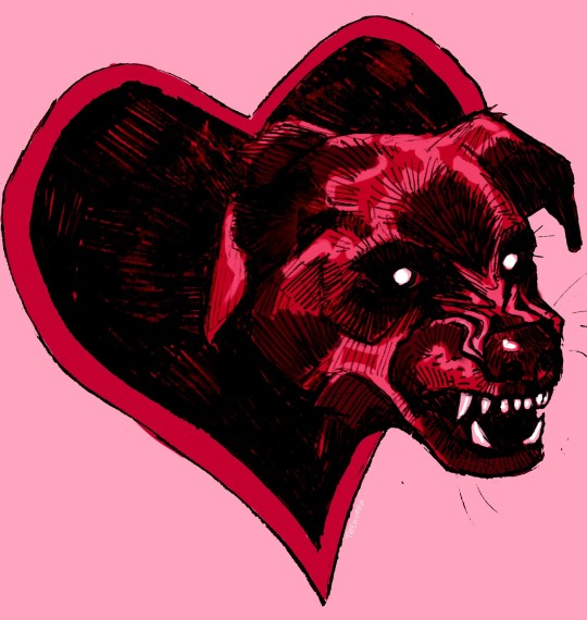
Intimacy issues 💔🦷
Something for Valentines Day
#Hmmm I hate the colour scheme but was determined to make valentines day colours#My oc once again#Valentines day#Valentines#valentines art#art#sketch#character art#Dog motif#Gay#Queer#Oc#Original art#OC art#Angel
13K notes
·
View notes
Text


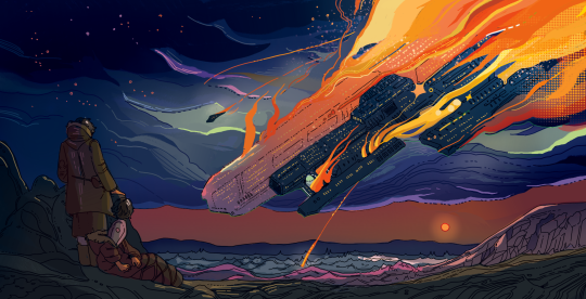
thousands of years apart, ships are burning
find me on instagram!
#i didn't even mean to give these the same colour scheme#i just seem to secretly love indigo#illustration#drawing#artists on tumblr#my art#bump#digital art#art#digital illustration#sketch#bethfuller#artwork#digital painting#original art
18K notes
·
View notes
Text


Bucciarati gang but I play with their outfits a little..
#bruno bucciarati#leone abbacchio#giorno giovanna#trish una#guido mista#narancia ghirga#fugo pannacotta#jjba#golden wind#jjba part 5#jojo's bizarre adventure#tried making their colour schemes more harmonious w each other#that was so fun hehe. bruabba and fugonara crumbs
2K notes
·
View notes
Text
Fear of the Dark
Thursday Throwback is a weekly colour scheme inspired by an iconic album cover of yesteryear. This week’s throwback is the 1992 album “Fear of the Dark” by Iron Maiden.
#colour schemes#colours#metal#colour#Iron Maiden#color#Thursday#colors#albums#album covers#album cover#colour scheme#color scheme#90s#1990s#throwback#thursday throwback#color schemes#fear of the dark
2 notes
·
View notes
Text

Mandatory C.A. Cupid fanart CAUSE I THINK SHE'S SO CUTE
#I know her colour scheme is a little but wild but I can look past it#she's so cute#Just imagine she's in glorious technicolour idk#art#artists on tumblr#digital art#illustration#digital drawing#digital illustration#digital artist#artist#drawing#sketch#fanart#monster high#monster high fanart#monster high g3#c.a. cupid#ca cupid#cupid#cupid asteria
2K notes
·
View notes
Text

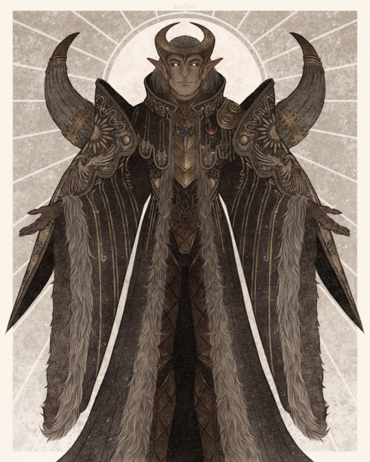
"I am Elgar'nan — First of the Firstborn, Last of the Evanuris."
#come to reign over you with fiiiine and gentle hand#my art#dragon age#dragon age the veilguard#elgar'nan#datv spoilers#(for the caption quote mostly)#so i was supposed to post this along with the ghil one but this took me WAY too much time#because the coat gives me headaches and because i've just been taking psychic damage from various other things for the past week#anyway i was going to post the two evanuris together again so i matched their colour schemes (that's why his coat is black)#but after the time this took me i'm just gonna post them seperate#i don't have the energy to do another big piece atm i'm tired
2K notes
·
View notes