#Noto Sans
Explore tagged Tumblr posts
Text
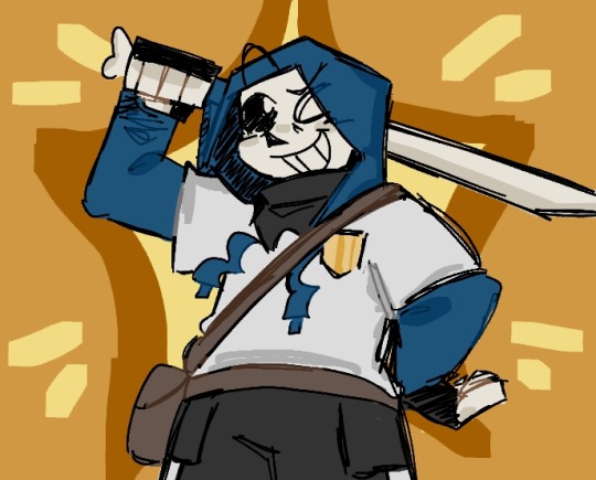
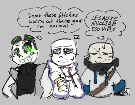
Made aus with my friends.. cups him in my hands like a bug
SurfaceSwap is basically if the monsters won the war instead, also lacking magic.. and stuff, I've honestly barely touched on worldbuilding. Noto sans (or Noto) is basically the exact same in his universe, but I imagine he bugged out by accident, fucking his code up so hard his personality and goals change completely. Now he's a pathetic cheap assassin lmao.
Clear!sans belongs to @coffeeapplegull !
Mobile!sans belongs to @bloody-juicebox !
#sans undertale#undertale#sans#sans au#undertale au#making my own tags ig??#surfaceswap#noto sans#noto sans au#surfaceswap sans#sans oc#utmv au#utmv sans#utmv oc#utmv art#utmv#my art#chariixdoesart
55 notes
·
View notes
Text
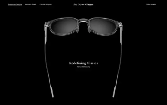
The Other Glasses
#The Other Glasses#glasses#sunglasses#artisan#touch#retailer#black#typography#type#typeface#font#Libre Baskerville#Noto Sans#2024#Week 24#website#web design#inspire#inspiration#happywebdesign
5 notes
·
View notes
Text
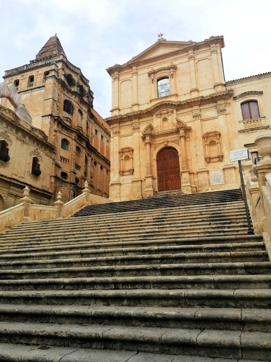
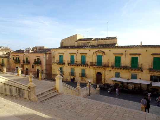
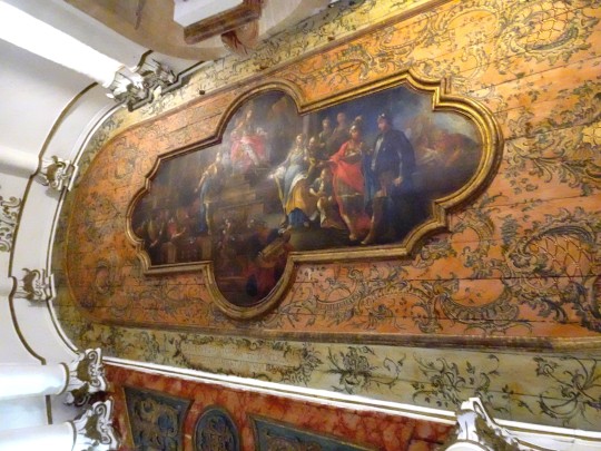
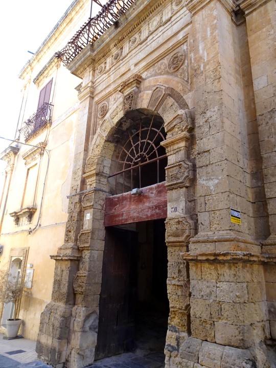
Avec Christine, on a fêté nos 40 ans d'amitié en faisant un voyage de 15 jours en Sicile. Cette fois, on est basés à Modica.
On est allés à Noto, une des villes baroques du Sud-Est de l'île (2 fois car j'avais raté mes photos la première fois !)
Ici, alternées, la Chiesa di San Francisco d'Assisi al'Immacolata, en haut de son escalier (et en face d'elle, sur l'avant-dernière) et la Chiesa di Santa Clara, toute blanche et au plafond richement peint.
8 notes
·
View notes
Text
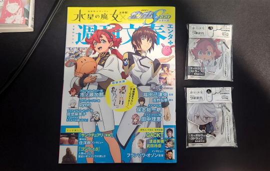
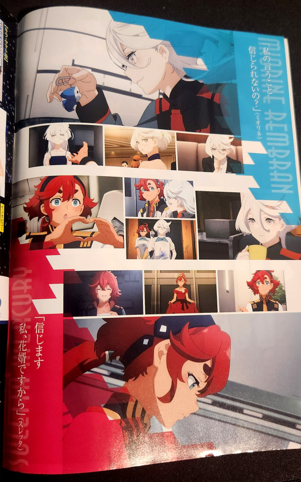
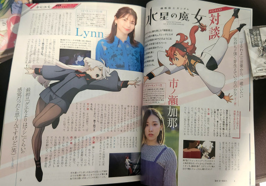
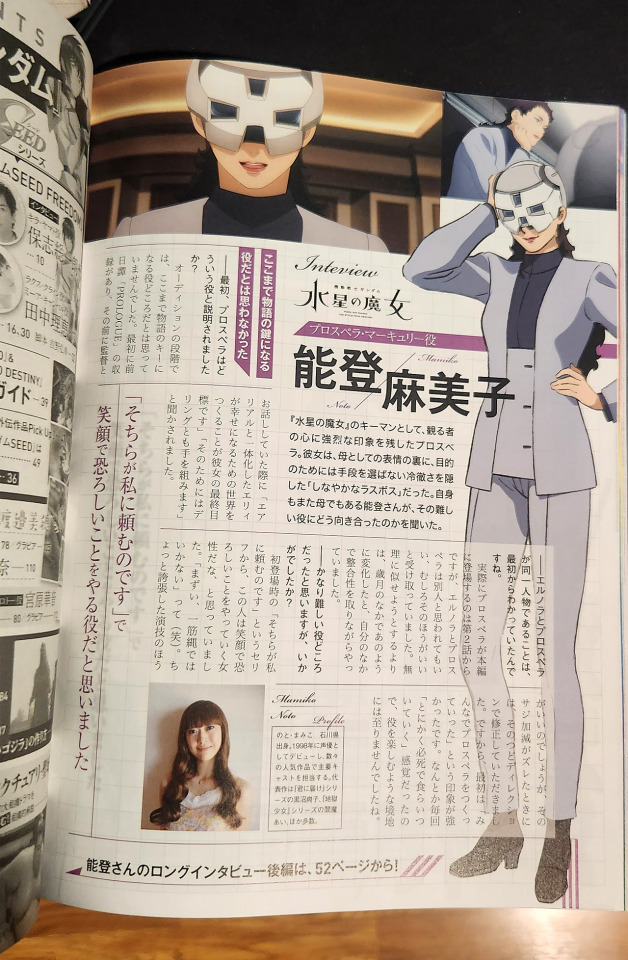
My issue of Shuukan Bunshun Enta+ featuring G Witch and Seed arrived!
Quite a lot of G Witch content in there… literally the first 2 pages are SuleMio character bios and screenshots/quotes.
Then there's…
Interviews
Ichinose Kana and Lynn
Noto Mamiko
Ogata Naohiro (executive producer on G Witch and SEED Freedom)
And a bunch of mook stuff including a (very confusing) attempt at diagramming the entire series' plot and character interactions, mobile suit info, and an English lesson using on-screen text from the show.
#g witch#mobile suit gundam the witch from mercury#not sure when i'll get the chance to read/tl but i'm looking forward to noto-san's interview in particular#i let the experience of watching destiny filter out from my memory a long time ago lol#so i'm sorry but i'm not gonna post about the seed-related content at all because my interest level in freedom is zero
27 notes
·
View notes
Text
ew ew ewwww one of my profs requires probably the worst fucking styling on papers i've ever seen >:(
like seriously, 1-inch margins, 11pt Arial, and single spacing? seriously? it looks like shit.
And Arial isn't a native font in libreoffice, i had to download it. I was reduced to downloading. Arial. Come on.
3 notes
·
View notes
Text
Abusi sessuali su ragazzino in cambio di ricariche, abiti e videogiochi: chi è Padre Andrea Melis, il noto prete arrestato
Il presunto “orco” indossava la tonaca. E le accuse sono pesanti come macigni. Ricariche sulla Postapay, abiti griffati, videogiochi. Regali che arrivavano dopo gli abusi sessuali. Con questa accusa un prete è stato arrestato dai carabinieri di Genova. Dalle indagini, coordinate dal pm Federico Panichi, sarebbe emerso che la vittima era un ragazzino che faceva il chierichetto. Il sacerdote…
#abusi sessuali#Andrea Melis#Cagliari#comunità#Finale Ligure#Genova#gip#indagini#Liguria#Noto#Padova#San Bartolomeo#Savona#Scolopi
0 notes
Text
SDCC 2024: The final series of Star Wars: The High Republic Phase III revealed…. Fear of the Jedi!
SDCC 2024: The final series of Star Wars: The High Republic Phase III revealed…. Fear of the Jedi! #comics #sdcc #sdcc2024 #sdcc24 #comiccon #starwars #highrepublic
This February, the galaxy-spanning finale of Phase III of The High Republic begins in Star Wars: The High Republic – Fear of the Jedi, a new ongoing series written by New York Times bestselling author Cavan Scott and drawn by acclaimed artist Marika Cresta. Announced at the Star Wars: Stories From a Galaxy Far, Far Away panel at San Diego Comic Con, Star Wars: The High Republic – Fear of the Jedi…
#cavan scott#comic books#Comics#marika cresta#marvel#phil noto#san diego comic-con#sdcc#star wars#star wars: the high republic#star wars: the high republic fear of the jedi
0 notes
Text
ARCHEOLOGIA / Ritrovate due antiche ancore nei fondali di San Lorenzo, nel Siracusano
#ARCHEOLOGIA / Ritrovate due antiche ancore nei fondali di San Lorenzo, nel Siracusano
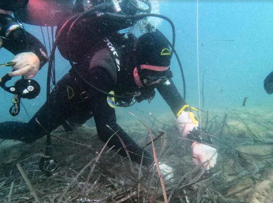
Due antiche ancore in pietra sono state ritrovate nei fondali di San Lorenzo, in provincia di Siracusa. I reperti archeologici, di età arcaica, si trovano a poco distanza l’uno dall’altro, a circa 15 metri di profondità, in prossimità di una secca. A far scattare l’operazione di verifica e rilievo, eseguita dalla Soprintendenza del mare della Regione Siciliana e dal Nucleo sommozzatori della…
View On WordPress
#ancore#archeologia#archeologia subacquea#notizie#Noto#Regione Siciliana#San Lorenzo#scavi#scavi archeologici#scoperte#Sicilia#Siracusa#Soprintendenza del Mare
0 notes
Text
Noto-san! (≧▽≦)
606 notes
·
View notes
Text
SEARCH ME — character psd template
a character profile template that looks like a fictional celebrity profile database inspired by kpopping.com! this template is perfect for a celebrity-inspired character with plenty of space to list out notable or recent "career" items and up to five photos.
all photos and text are fully customizable. this template is recommended for those with intermediate experience with photoshop.
DETAILS:
fonts used: Poppins, Noto Sans Korean, and Font Awesome 6 Solid (Free)
sample images are credited to their rightful owners
do not copy, steal credit, or monetize this graphic template (see full guidelines)
customization, including removing elements of this template to add to another, is permitted so long as the other template owner(s) allow it as well
this is a premium template; please do not share with others
please like/reblog and credit me by linking back to my blog if you use this template
optionally, please tag me or send me a link so I can see how you've used this!
* download from payhip
#roleplay resources#template#resources#rp resources#psd character#character psd#psd#roleplay psd#rp#template psd#dailyresources#completeresources#* mine#* chara
460 notes
·
View notes
Text
… to @bcacstuff and her Anon who said
Looks like Cait is on an interesting path in HW not just as member of The Academy of Motion Pictures and actress but also making things work in this industry from BTS.
ACADEMY REVEALS 2024 NICHOLL SCREENWRITING FELLOWS
Posted: Monday, September 30, 2024
LOS ANGELES, CA – Four individuals and one writing team have been selected as recipients of the 2024 Academy Nicholl Fellowships in Screenwriting. Each individual and writing team will receive a $35,000 prize and mentorship from an Academy member throughout their fellowship year. They also will participate in a week of virtual seminars, a virtual meet and greet with the Nicholl Fellowships committee, and in-person networking events, including a celebration in Beverly Hills on October 29. The Nicholl Fellowships were established in 1985 through the support of Gee Nicholl in memory of her husband, Don Nicholl.
The 2024 Nicholl Fellows are (listed alphabetically by author):
Alysha Chan and David Zarif (Los Angeles, CA), “Miss Chinatown”
Jackie Yee follows in her mother’s footsteps on her quest to win the Los Angeles Miss Chinatown pageant.
Colton Childs (Waco, TX), “Fake-A-Wish”
Despite their forty-year age gap, and the cancer treatment confining them to their small Texas town, two gay men embark on a road trip to San Francisco to grant themselves the Make-A-Wish they’re too old to receive.
Charmaine Colina (Los Angeles, CA), “Gunslinger Bride”
With a bounty on her head, a young Chinese-American gunslinger poses as a mail order bride to hide from the law and seek revenge for her murdered family.
Ward Kamel (Brooklyn, NY), “If I Die in America”
After the sudden death of his immigrant husband, an American man’s tenuous relationship with his Muslim in-laws reaches a breaking point as he tries to fit into the funeral they’ve arranged in the Middle East. Adapted from the SXSW® Grand Jury-nominated short film of the same name.
H (West Chester, PA), “The Superb Lyrebird & Other Creatures”
A neurodivergent teen who envisions people as animated creatures, battles an entitled rival for a life-changing art scholarship, while her sister unwisely crosses the line to help.
A total of 5,500 scripts, from 80 countries, were submitted for the 2024 competition.
The 2024 finalists are (listed alphabetically by author):
Kelly Beck-Byrnes, “Where the Boxelders Grow”
Tate Hamilton, “Delivery Girl”
Jamie Murphy, “Lights over Idaho”
Adele Smaill, “No Ghosts Tonight”
Justine Suh, “Deep”
The five fellowships are awarded with the understanding that recipients will complete feature-length screenplays during their fellowship year. The Academy acquires no rights to the works of Nicholl fellows and does not involve itself commercially in any way with their completed scripts.
The Academy Nicholl Fellowships Committee is chaired by Julie Lynn (Producers Branch). The members of the committee are Aldis Hodge and Caitríona Balfe (Actors Branch); Julien Thuan (Artist Representatives); Susan Shopmaker and Academy governor Kim Taylor-Coleman (Casting Directors Branch); Andrzej Bartkowiak (Cinematographers Branch); Allison Anders (Directors Branch); Bruce Hendricks and Marcus Hu (Executives Branch); Blaise Noto (Marketing and Public Relations Branch); Jason Michael Berman, Susan Cartsonis, Julia Chasman and Linda Reisman (Producers Branch); Sue Chan (Production Design Branch); Bobbi Banks (Sound Branch); and Destin Daniel Cretton, Susannah Grant, Ehren Kruger, Adele Lim, Justin Marks, Zak Penn and Katie Silberman (Writers Branch).
The global competition, which aims to identify and encourage talented new screenwriters, has awarded 186 fellowships since 1986. In 2024, several past Nicholl fellows added to their feature film and television credits:
Aaron Chung is a staff writer on Apple+’s “WondLa.”
Elizabeth Chomko directed the docuseries “Martin Scorsese Presents: The Saints.”
Eric Nazarian wrote and directed “Die like a Man.”
“Holy Irresistible” is from Andrew Shearer and Nicholas Sherman’s 2007 Nicholl-winning script.
“Interstate” is from Anthony Jaswinski’s 1997 Nicholl-winning script.
Jason Micallef is an executive producer and writer on Disney+’s “The Acolyte.”
R.J. Daniel Hanna wrote and directed two features: “Succubus” and “Hard Miles,” which he co-wrote.
For more information about the Academy Nicholl Fellowships in Screenwriting, visit oscars.org/nicholl.
Oscars Press
Brian 29 June 2022
Remember Caitríona’s latest Academy role?
#Tait rhymes with hat#Good times#Academy of Motion Picture Arts and Sciences#2024#Nicholl Fellowships#Screenwriting#Thanks bcacstuff
31 notes
·
View notes
Text
Avec Christine, on a fêté nos 40 ans d'amitié en faisant un voyage de 15 jours en Sicile. Cette fois, on est basés à Modica.
On est allés à Noto, une des villes baroques du Sud-Est de l'île (2 fois car j'avais raté mes photos la première fois !)
Les 3 premières photos ont été prises devant la Chiesa di San Domenico; quant à l'avant-dernière, c'est le Théâtre Municipal. (on aura compris que donc, je ne sais plus trop à quoi correspond la dernière photo !)
4 notes
·
View notes
Text
youtube
English subtitled clip from the "Mobile Suit Gundam: Witch from Mercury" Post-Finale Special Livestream
Ichinose Kana (Suletta) reads a letter from Noto Mamiko (Prospera).
#g witch#mobile suit gundam the witch from mercury#prospera mercury#suletta mercury#maki translates stuff#subtitles#noto-san sent in a beautiful 5-page handwritten letter#it's so good#Youtube#kana ichinose#mamiko noto
18 notes
·
View notes
Text
Making Accessible Interaction Banners - a Guide by Binoo "ChildrensWard"
Interaction or "DNI" (do not interact) banners are a staple of the age regression community, but too often are they made without taking accessibility in mind, whether it's because they're unreadable, have excessive eye strain, or aren't marked with alt text.
Therefore, in the hopes that I can help people out with this, I decided to write a mini guide on how to make your banners accessible for as many people as possible!
Under the "read more" cut, this guide will cover the following:
Fonts, and how to choose the best ones
Text, and what your interaction banners should say
Colour contrast, and why it's important in making your graphics accessible
Eye strain, and why it generally should be avoided
Alt text and image descriptions, and how to write them
And an example of an interaction banner I made using the criteria I've written in this guide!
So, without further adieu, let's get into the real meat of this guide!
Fonts
Fonts are easily the most important thing about an interaction banner! It's how you're going to best convey the contents of your banner in a way that's readable to the viewer. Here's a quick and firty rundown of the different kinds of fonts, as well as which ones you should (and shouldn't!) use for your banner:
Body Copy fonts are your basic Sans and Sans Serif style fonts that you'll most often find on books and websites, because they're some of the easiest fonts to read in smaller text (10-14pt) due to their lack of details. Examples of Body Copy fonts include PT Serif, Arial, Comic Sans, Roboto, and Helvetica Now.
Display fonts are often used for headers and subheaders and include features such as being thick, having unconventional letters, and, on occasion, being in all caps. However, these fonts should not be used for body or small text, as they will be very hard to read. Examples of Display fonts include Futura PT, Elephant, Noto Serif Display, and Shoreditch.
Script and decorative fonts are subtypes of display fonts, with the former having a handwritten quality to them, while the latter are considered to be the fun display fonts. However, you should be very careful with using either of these fonts- not only can they be hard to read on their own, but neither should be used specifically for body or small text in any circumstance. For the sake of readability and accessibility, however, I'd be more inclined to avoid using these fonts.
Text
Aside from the fonts that your text will be written in, the text itself is also a mandatory aspect of your banners. After all, it's what banners are entirely based on, and it's the very thing that tells you who can and can't interact with your posts.
However, there's something important to keep in mind, and that is how much text you're trying to cram into your banner because you're trying so desperately to fit your entire DNI criteria onto it.
What I think is important when it comes to making your banners is to keep any text you have on there as short as possible. If you bombard your banner with all this specific criteria, then you're more likely to make your readers confused, whether or not they happen to be a screen reader user.
When making your banners, ask yourself the following questions when deciding on your criteria:
How likely is it for someone interacting with the age regression or similar communities to fit this criteria? Have I come across a good number of people who fit this criteria that makes it worth mentioning?
Is this criteria at all relevant to the content I'm presenting? Do I need things like inter-community discourse terms from other communities on my banner if I'm making content specifically for age regression?
Is there any "unspoken" criteria that everyone agrees upon that doesn't need to be included? These might include nazis, racists and white supremacists, homophobes and transphobes, ableists and eugenicists, misogynists, anti-choice, etc.
If your answers show that the specific criteria is not relevant, then it's best to leave it out to keep the information on your banner more clear and concise.
Colour Contrast
While colour contrast is something often talked about in web development circles, it's also an important skill to learn when making any sort of graphic design- which is what interaction banners essentially are. Without taking colour contrast into mind, you're left with a banner that may not be easy for most people to read; let alone those with low vision or blindness. We also need to think about things like people who may be using old or outdated monitors, people reading on smaller screens (like a smart phone), and bad lighting and glare. As Contrast Rebellion puts it: aesthetics are important, but aren't the ultimate goal of design.
Okay, so you've understood the reason why colour contrast is important, but how do you put it into action? How do you know your colours of choice are readable?
Well lucky for us, there's many resources out there that help us in choosing the right colours! Here are a few of my favourites:
CSUN: Color Contrast - An introduction article on colour contrast, why it's important, and some examples of good and bad colour contrast choices.
Random A11y - If you don't have any colour combinations in mind, Random A11y is here to help! With it's vast amount of randomly generated colour contrast combinations, you'll have plenty of options to work with. Don't like the combination you're given? Just click on the "new colours" tab to generate a new palette!
Colour Contrast Analyzer - This is a free program for Windows and Mac that helps you with colour checking with a variety of different features; including multiple ways to select colours (CSS color formats, RGB slider, colour picker tool), and a colour blindness simulator.
Accessible Colors - If you don't want to or can't download the program above, then this website works just as fine with checking colours, too! Just enter in the hex codes of your colours, the font size and weight, and which level of conformance you'd like your colours to pass.
Eye strain
A bit of a sore topic for some, but I feel I must put it bluntly for people to understand: making your colours easy on the eyes of the viewer should be your top priority over your aesthetic. Some people, like myself, have certain health conditions that are triggered by eye strain, and by continuing to slap extremely contrasted rainbows on your banners, you're continuing to put disabled people through worsening symptoms, all because you feel the need to retain your aesthetic.
Many of the same resources shared in the Colour Contrast section can also help you to rule out any eye-straining palettes. Also, a general rule of thumb to keep in mind is: if a colour palette is eye straining enough to cause you some mild problems, then it's enough to cause someone with a disability more severe symptoms.
Alt text and image descriptions
I think a lot of us find writing alt text to be daunting- I know I did for a long while, which is why I never wrote any for my posts until recently. But really, once you get the hang of it, it can be very simple and easy to write! Even so, people who don't know how exactly to write alt text often fumble with this- either writing too much or too little, not being clear enough, or just copying the image caption and calling it a day.
Here's some tips and tricks on writing better alt text:
Alt text generally follows the Object-action-context rule. In the words of Alex Chen at Medium: The object is the main focus. The action describes what's happening, usually what the object is doing. The context describes the surrounding environment.
Be specific and concise, and even consider the content of the post or webpage it's on as well. You'll also want to consider the function or purpose of the image, and what you want your viewers to gain from it.
Keep your alt text short, as long descriptions with too much flowery language and filler words can be distracting when using a screen-reader. Generally, most screen-readers will cut off alt text at around 125 characters.
Avoid using "image of..." or "picture of...," as HTML codes will already identify your images as such. However, in this case, mentioning what type of image it is can add context.
Always check for spelling mistakes, as this can affect the user experience, causing interruptions and confusion.
Not related to interaction banners specifically, but avoid including alt text for decorative images that are used to make your post prettier. In this case, insert the word "null" in your alt text fields.
Image descriptions are a little different in the fact that they're allowed to be more descriptive than alt text, considering screen readers won't be able to cut off any alt text at 125 characters. Even so, it's still best to keep your image descriptions as short as possible to save from redundancy and confusion.
Please remember that writing alt text and image descriptions can take a lot of practice and trial-and-error, so don't give up if you can't get it right the first time! Write and rewrite it as much as you need to, or even consider changing your interaction banner altogether if you think it can't be described in words concisely.
An example
Taking what we've learned above, let's take this banner I made just for this post as an example of these characteristics put into action.
In this example, I have chosen the hex colour #4D0000 for my text colour, and the colours #B5F3DC and #E3B158 for my background. According to CCA, the contrast ratios for my colours of choice are 12.8:1 and 7.9:1 respectfully, which both meet the minimum contrasts of 1.4.3 for AA and 1.4.6 for AAA.
I have chosen the font FS Lola Bold, which is a type of display font that's best for headers and subheaders, but not so much any body or small text. I don't have to worry about this though, because I don't have any small text in my banner.
I've also kept my criteria to a simple "No DDLG/CGL interaction," because I feel that this is the most relevant information regarding the content of my blog and the posts I make. Short and simple, yet specific to who I don't want interacting with me. I also like the idea of my favourite fictional characters protecting my blog, which is why I've included another short sentence for it!
Here's an example of what the image description or alt text for this banner could look like:
[Image description: Banner that reads "Toopy and Binoo protect this blog, no DDLG/CGL interaction!" On it are the titular characters from the show. /End ID]
And if I were to have both alt text alongside an image description, then the alt text could be as simple as what the banner reads, which would be:
"Toopy and Binoo protect this blog, no DDLG/CGL interaction!"
Remember, you don't have to go into every little detail with your image descriptions or alt text, because then it can become very confusing for certain people to decipher! Keep it simple and state the minimum.
Closing words
I think that's everything that I wanted to cover in this post. Of course, there's more to accessible design than just text and fonts alone, but when it comes to interaction banners, it's usually the focal point of the images, which is why it's so vital that people with disabilities can also read your banner- especially when they contain important information about your personal boundaries.
Age regressors often pride themselves for the image we've set up for our community, that it's safe for everyone to join and no one will be judged or excluded for who their are. But the reality is, we still have lots of work to do before we're ever at that place, and making our community more accessible is just one of these steps that we should all be encouraged to take. Besides, what kind of message are we sending if we don't take the steps to make our space as accessible as possible? How do you think it'd feel to realize that a community you wanted to join is actively hostile towards you because of the refusal to learn how to accommodate for them? Especially when we have such a huge demographic of disabled people in the community, we can and should be doing better to accommodate for everyone as much as we possibly can.
Learning accessibility is a skill that requires time and practice, and I don't expect anyone to be perfect at it the first time around. The aim of doing these things isn't to make sure that every single thing is 100% accessible in every single way imaginable and with no mistakes whatsoever; but to instead encourage, develop, and incorporate good accessibility practices into our every day lives.
Thank you for reading,
- Binoo
#age regression#agere#agere community#sfw age regression#sfw agere#age dreaming#agedre#sfw agedre#dni banner#interaction banner#accessibility#a11y#long post
209 notes
·
View notes
Note
WE NEED THE FIC U PROMISED, THE ONE I COMMENTED ON EARLIER 🗣🗣🗣🔥🔥🔥❗❗
Ah como chilla la niña... 😾 (apreciemos a Kaburamaru jajajaja)
Ler: Mitsuri Kanroji
Lee: Iguro Obanai
~Versión Español~
'Shinobu, ¿puedo preguntarte algo?', habló la pelirosada.
Cuando Kanroji se unió a la cofradía de cazadores, tardó un poco para acostumbrarse, era algo nuevo para ella.
Parecía que los pilares solo eran hombres y que ella era la única mujer, claro, hasta que conoció a Shinobu y supo que no estaría sola.
'Claro, Kanroji. ¿Qué pasa? Alguna nueva historia sobre interés romántico?'
'Oh vamos. No siempre te estaré hablando de mi vida romántica, es más, un tema de personalidad...'
'Kanroji, nena, te he dicho muchas veces que eres perfecta tal y como eres. Y que un hombre te diga lo contrario, bueno, significa que no tiene cerebro para apreciar la belleza que tiene frente a él. Así son algunos, por ejemplo, Tomioka, hehehe, de hecho bromeo, él si es un caballero'
Bueno, no era exactamente a donde Kanroji quería llegar. Pero, ese hecho la mataba, bueno, más bien diría que la avergonzaba, pero ya sabéis como es Mitsuri, un poco muy tímida.
'Es que, creo que Iguro-San, está molesto conmigo...'
'Iguro? Contigo? Porqué? Que motivos tendría para enojarse contigo?'
'Buenooo...'
Hace un tiempo, casi unas semanas después de haberse vuelto una pilar, aproximadamente, Mitsuri se había dado cuenta de algo, algo le llamó la atención, no de forma romántica pero si como una buena amiga
'Iguro-San, se ve tan despreocupado. Pero, no podría, noto algo más en él... No lo sé, quizás una ligera tensión, ¿porqué caminaba así? Con la cabeza algo agachada, se veía deprimido', pensó.
Y aunque su primera opción había sido un ataque furtivo, algo la detuvo. ¿Y que fue? La confianza, no sentía que tuviese la suficiente confianza (y valor) para hacerle algo a Iguro, considerando que no son del todo amigos.
Así que, decidió preguntarle que hacer a Sanemi, él era su amigo. Tenía planeado hablar con Kyojuro, pero, su relación era más de hermanos, necesitaba a alguien que fuera su amigo, entonces...
'Shinazugawa-San, tú e Iguro-San son amigos, ¿no?'
'Bueno, nos llevamos bien, así que, sí, podríamos considerarnos amigos. ¿A qué se debe la pregunta?'
'No sé si solo es impresión mía pero, lo noto algo decaído, como si necesitara algo, pero no sé que es. ¿Me ayudarías a descubrir que le pasa? ¡Por fis!'
Sanemi lo estaba dudando, pero, una idea le pasó por la mente y accedió.
'Entonces, debo hacerle cosquillas en la espalda o de lo contrario no reirá. ¿Y si no funciona?'
'Inténtalo. O en todo caso, haz lo que tenías planeado hacer desde un inicio, pero no digas que no te lo advertí'
Mitsuri infló las mejillas, pero accedió, tenía la excusa perfecta por si el plan fallaba.
Se acercó lentamente, hasta que gritó "ataque sorpresa", y comenzó, mejor dicho, intentó hacer que Iguro ría, sin éxito alguno.
'!Cosquillas cosquillas cosquillas!'
'Em, Kanroji... ¿Qué haces?'
Bien, no era la respuesta que esperaba, pero sí se dio cuenta de algo, Obanai tenía una cintura muy pequeña. Era algo lindo, nunca había visto a un hombre con una cintura así.
'Iguro-San, tú cintura... Es tan pequeña...'
'Lo sé... Y lo siento, pero no tengo cosquillas'
Sanemi evitó reírse, después de todo, tuvo razón y a Mitsuri no le quedó de otra más que seguir el consejo.
'Quizás no tengas cosquillas en los costados, pero las tienes en la espalda~'
'¿Qué? No, Mitsuri, no te atrevas a... M-Mit-Mitsuri... Bahahasta... ¡BASTA!'
'¿Lo dices en serio?'
'Sí.. ¡Cahaharajohoho! Sahanehemi... ¡Vohohoy a matahaharte!'
Cuando Mitsuri terminó, se dio cuenta que Shinobu estaba aguantando una risa, oh perfecto, ahora ella también se reiría de su vergüenza.
'Oh Kanroji, no creo que Iguro se moleste. Pero, mírale el lado positivo, al menos le lograste tocar la cintura hahaha'
'Bastaaaaa... Tan humillante...'
~English Version~
'Shinobu, can I ask you something?', the pink-haired girl spoke.
When Kanroji joined to the slayer guild, it took her a while to get used to it, it was something new for her.
It seemed like the pillars were only men and she was the only woman, that is, until she met Shinobu and knew she wouldn't be alone.
'Sure, Kanroji. What's up? Any new romantic interest stories?'
'Oh come on. I won't always be talking to you about my romantic life, it's more a matter of personality...'
'Kanroji, darling, I've told you so many times that you're perfect just the way you are. And for a man to tell you otherwise, well, it means he doesn't have the brains to really appreciate the beauty in front of him. That's how some people are, for example, Tomioka, hehehe, I'm actually joking, he is a gentleman.'
Well, that wasn't exactly what Kanroji was getting at. But, that fact killed her, well, I'd rather say it embarrassed her, but you know how Mitsuri is, a little too shy.
'It's just that, I think Iguro-san is upset with me...'
'Iguro? With you? Why? What reason would he have to be angry with you?'
A while ago, almost a few weeks after becoming a hashira, maybe, approximately, Mitsuri had realized something, something caught her attention, not in a romantic way but as a good friend
'Weeeeeell...'
'Iguro-San, he looks so discouraged. But, that couldn't be, I noticed something else in him... I don't know, maybe a slight tension, why was he walking like that? With his head slightly lowered, he looked depressed', she thought.
And even though her first choice had been a sneak attack, something stopped her. And what was it? Trust, she didn't feel she had enough confidence (and courage) to do something to Iguro, considering that they are not really friends.
So, she decided to ask Sanemi what to do, he was his friend. She had planned to talk to Kyojuro, but, their relationship was more like brothers, she needed someone who was his friend, so...
'Shinazugawa-San, you and Iguro-San are friends, right?'
'Well, we get along well, so, yes, we could be considered friends. Why do you ask?'
'I don't know if it's just my impression, but I notice that he's a bit down, as if he needs something, but I don't know what it is. Could you help me find out what's wrong with him? Please!'
Sanemi was hesitating, but an idea crossed his mind and he agreed.
'Then, I must tickle his back or else he won't laugh. What if it doesn't work?'
'Try it. Or in any case, do what you had planned to do from the beginning, but don't say I didn't warn you.'
Mitsuri puffed out her cheeks, but agreed, she had the perfect excuse if the plan failed.
She slowly approached, until she shouted "surprise attack", and began, or rather, tried to make Iguro laugh, without any success.
'Tickle tickle tickle!'
'Um, Kanroji... What are you doing?'
Well, it wasn't the answer she was expecting, but she did notice something, Obanai had a very small waist. It was kind of cute, she had never seen a man with a waist like that.
'Iguro-San, your waist... It's so small...'
'I know... And I'm sorry, but I'm not ticklish.'
Sanemi held back a laugh, he was right after all and Mitsuri had no choice but to follow his advice.
'You may not be ticklish on your sides, but you are ticklish on your back~'
'What? No, Mitsuri, don't you dare. M-Mit-Mitsuri... Stohohop... STOP!'
'Are you serious?'
'Yeah.. Fuhuhuck! Sahanehemi... I'm gohohoihing to kihihihill yohohou!'
When Mitsuri finished, she noticed Shinobu was holding back a laugh, oh perfect, now she would laugh at her embarrassment too.
'Oh Kanroji, I don't think Iguro will mind. But, look on the bright side, at least you managed to touch his waist hahaha'
'Enough... So humiliating...'
42 notes
·
View notes
Text
Taking Sparkling Eno As Strategy (Again) Another Eclectic Tribute to Brian Eno
On the occasion of his 76th birthday, Wub-Fur Internet Radio once again pays tribute to Mr. Brian Eno with another collection of sparkling cover versions of his songs, recorded by an eclectic selection of artists between 1982 and 2021. Featuring the obliquely strategic talents of Queens of the Stone Age, The Feelies, St. Vincent, Jason Falkner, Chrome, Nouvelle Vague, Birdsongs of the Mesozoic, Game Theory, Brand X, and a half dozen more artists who know but don’t let it show.
▶︎🎶 Listen on Mixcloud
Running Time: 1 hour, 5 seconds
Tracklist
Intro: The Interesting Thing (0:15)
Needles in the Camel's Eye (3:20) — Queens of the Stone Age | Palm Desert, CA | 2007
Burning Airlines Give You So Much More (3:41) — Jason Falkner | Los Angeles, CA | 1996
Baby's on Fire (4:01) — Shearwater | Austin, TX | 2006
Third Uncle (3:19) — The Feelies | Haledon, NJ | 1984
No One Is Receiving [ft. Nadéah] (3:17) — Nouvelle Vague | Paris, France | 2016
Cindy Tells Me (3:08) — The Mess | Los Angeles, CA | 1992
St. Elmo's Fire (2:40) — Sam Miell | ??? | 2017
Sombre Reptiles (4:02) — Birdsongs of the Mesozoic | Boston, MA | 1992
Some of Them Are Old (3:00) — St. Vincent | LA/Dallas/NYC | 2012
Sky Saw (4:57) — Brand X | London, UK | 1997
The Big Ship (9:14) — Vapour Theories | Philadelphia, PA | 2021
By This River (4:02) — Alva Noto + Ryuichi Sakamoto | Germany / Japan | 2011
Here Come The Warm Jets (3:00) — Chrome | San Francisco, CA | 1987
Taking Tiger Mountain (5:22) — Pascal Comelade | Montpellier, France | 1982
Needles in the Camel's Eye (2:47) — Game Theory | Sacramento, CA | 2020
Long time listeners (and perspicacious newer ones) have no doubt already noted that this mix is a sequel to our previous Eno covers tribute, originally aired in July of 2016 and then updated and revised for Brian's 69th birthday back in 2017, which can be heard here.
39 notes
·
View notes