#Libre Baskerville
Explore tagged Tumblr posts
Visit Tumblr Blog
Explore Tumblr blogs with no restrictions, modern design and the best experience.
Last Seen Tumblr Blogs


Fun Fact
Tumblr is used by 21% of adults online aged 18-29 years.
Text
FINAL


Propaganda under the cut.
Alice: "It’s so nice… so classy… it feels like a less aggressive/formal Times New Roman"
Libre Baskerville: "Libre Baskerville is a pleasing font to read. The uniform letters still maintain their style, with added curves when needed, with the serif as a finishing touch.", "close enough to times new roman to fool any nitpicky English teacher, but a few pixels bigger to pad out the length of your essays. and it rules", "my boner"
174 notes
·
View notes
Text

The Other Glasses
#The Other Glasses#glasses#sunglasses#artisan#touch#retailer#black#typography#type#typeface#font#Libre Baskerville#Noto Sans#2024#Week 24#website#web design#inspire#inspiration#happywebdesign
5 notes
·
View notes
Photo

The Kingdom of Kush
Kush was a kingdom in northern Africa in the region corresponding to modern-day Sudan. The larger region around Kush (later referred to as Nubia) was inhabited c. 8,000 BCE but the Kingdom of Kush rose much later. The Kerma Culture, so named after the city of Kerma in the region, is attested as early as 2500 BCE and archaeological evidence from Sudan and Egypt show that Egyptians and the people of Kush region were in contact from the Early Dynastic Period in Egypt (c. 3150 - c. 2613 BCE) onwards. The later civilization defined as 'Kushite' probably evolved from this earlier culture but was heavily influenced by the Egyptians.
While the history of the overall country is quite ancient, the Kingdom of Kush flourished between c. 1069 BCE and 350 CE. The New Kingdom of Egypt (c. 1570-1069 BCE) was in the final stages of decline c. 1069 BCE, which empowered the Kushite city-state of Napata. The Kushites no longer had to worry about incursions into their territory by Egypt because Egypt now had enough trouble managing itself. They founded the Kingdom of Kush with Napata as its capital, and Kush became the power in the region while Egypt floundered.
Kushite kings became the pharaohs of Egypt's 25th Dynasty and Kushite princesses dominated the political landscape of Thebes in the position of God's Wife of Amun. The Kushite king Kashta (c. 750 BCE) was the first to establish himself on the Egyptian throne and appointed his daughter, Amenirdis I, the first Kushite God's Wife of Amun. He was followed by other great Kushite kings who reigned until the Assyrian invasion of Egypt by Ashurbanipal in 666 BCE.
In c. 590 BCE Napata was sacked by the Egyptian pharaoh Psammeticus II (595-589 BCE) and the capital of Kush was moved to Meroe. The Kingdom of Kush continued on with Meroe as its capital until an invasion by the Aksumites c. 330 CE which destroyed the city and toppled the kingdom. Overuse of the land, however, had already depleted the resources of Kush and the cities would most likely have been abandoned even without the Aksumite invasion. Following this event, Meroe and the dwindling Kingdom of Kush survived another 20 years before its end c. 350 CE.
Sponsorship Message
This article was sponsored by Total War™
Total War: ROME II – Desert Kingdoms is a Culture Pack DLC released on March 8th, 2018. Pre-order now to get 10% off. Full faction details available on Steam. Learn More
.sponsor.ca h3 { text-transform: none; margin-top: 0px; margin-bottom: 15px; font-family: "Libre Baskerville", "Palatino Linotype", "Book Antiqua", Palatino, serif; } .sponsor.ca .ca_logo { width: 100px !important; height: 46px; float: right; box-shadow: none; margin: 0; } .sponsor_message { margin-left: 280px; font-family: Karla, Arial, Helvetica, sans-serif; line-height: 140%; } .sponsor.ca { padding: 10px 0px 25px 0px; margin: 25px 0px; border-top: 1px dotted #dadada; border-bottom: 1px dotted #dadada; } .sponsor_message .big_red_button { margin-top: 13px; } .sponsor.ca .key_art { margin-top: 0px; margin-bottom: 10px; width: 260px; height: auto; float: left; } .sponsor h4 { font-weight: normal; text-transform: uppercase; color: silver; margin-bottom: 10px; margin-top: 0px; font-family: Karla,Arial,Helvetica,sans-serif; font-size: 13px; padding: 0; } @media (max-width: 1199px) { .sponsor.ca .key_art { float: none; width: 100%; } .sponsor.ca .sponsor_message { margin-left: 0px; } .sponsor.ca h3 { margin-top: 20px; margin-bottom: 10px; } } @media (max-width: 767px) { }
Continue reading...
27 notes
·
View notes
Note
YES SHOW PLEASE
okay, here's the tutorial! sorry off the bat for the picture quality, i'm on a 5 year old chromebook 😟

✶ APPLICATION: Canva (pro was used)
✶ RESOURCES: coolors.co (color palette generator), @1cyl0's layouts (i prefer the minimal ones)
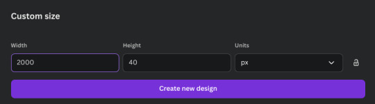
⤷ open your menu, select "create a design"

⤷ on the lefthand side, select "custom size." your base is going to be 2000 x 40px.
⤷ click on your blank canvas. at the top, select the white circle. this is your background.

⤷ once the menu opens, select the color wheel under "document colors." choose gradient, instead of solid color. once selected, click on "circular gradient."

⤷ choose your colors. i recommend using the darker color for the outer, and lighter color for the inner. i used #5F758E and #0B132B.

⤷ now for the text. on the left, select text. select "add a text box." set the size to 23 and center it. choose your font (i chose Libre Baskerville). once chosen, click "effects" at the top.

⤷ under the effects menu, select "neon".

⤷ at the top next to "effects," click "animate/animation." select "neon" under general, then for the drop down menu, select both, then set your desired intensity, then select "character" under writing style.

⤷ and you're done! you can mess around with it as you please. once done, go to the top and select "file," then select "download," then select GIF under file type. leave the size as is, don't tick the transparent background box.

18 notes
·
View notes
Note
7, 19, 24 for writer ask meme : )
7 - your preferred writing fonts
GASP, love this question because I love fonts oh my goodness o(≧▽≦)o. And curb stomping writing block by changing fonts on a whim, my love. Anyways, I completely adore Merriweather and Georgia! 99% of all my fics are written in these beautiful, incredible fonts. Mwah. Love ‘em. But occasionally I’ll go for Lucida Sans, or Libre Baskerville or Domine!!! Some rare fics are font specific in my brain, like I can’t write it anything but this specific font. Don’t know why.
19 - the most interesting topic you’ve researched for a fic
Aw, I wish I had a classic writer answer like stages of decomposition, or the components of obscure laws, but my snippets of research are few and far between, since if it feels too much like work, I’m not doing it. But to answer, probably older British-y words for “whore”! I went with slag, by the way.
24 - how do you recharge when you’re not feeling creative?
Read! :) one of the reasons I write so much is because I’m such a big reader! I always have been, honestly. I’m always trying to find the next book to read, through Meticulously combing through horror books recommendations (trying to determine whether or not I like the style to finally buy), or devouring fanfics at a concerning pace, or INHALING manwha’s. I read so many comics. Manga, manwha, mostly via shonen/action genre but I dip into romance on rare whim. Other than that, I’m slowly trying to play video games to expand my hobbies and allow a better cool off for my brain when I get writing fatigue. I draw as well, but reading and drawing are my mains!
thank you for the asks :))) I love these !
#also have comic refs if anyone wants any#But like immortal days is so good#Sickeningly good oh my god#And glass scientists#Devil’s candy#Demon street is pretty good#Dungeon meshi + gokurakugai + gachiakuta are so delightful to me!!! So pretty (manga)#Every week I check on my fav ongoing stuff it keeps me sane <3333#“The guy she was interested in wasn’t a guy at all” epic epic epic style is sonuummy#I’m just rambling about comics in tags but GEORGIA FONT REIGNS SUPREMEEEEEEEEEEEE#asks#ask ask ask
10 notes
·
View notes
Text
¡ESTAMOS DE VUELTA!
¡Estamos de vuelta, usuarios de Crónicas Vampíricas RPG! Antes de nada, y como siempre tras estos períodos de reforma, encontraréis en vuestras BANDEJAS DE ENTRADA un link directo al último ANUNCIO DE LA ADMINISTRACIÓN, donde encontraréis reunidas todas nuestras novedades. Os recomendamos que os toméis un tiempo para leer con calma, preguntar cualesquiera dudas que hayan podido surgir, y sobre todo explorar por este nuevo espacio. ¡Bienvenidos de nuevo a Crónicas Vampíricas RPG!
12 notes
·
View notes
Text

PSYCHO - BY MABEL
Do not repost or claim as your own.
Credits are not mandatory but would greatly help me.
If there are any issues, feel free to reach out to me via DM. .
Não republicar nem revindicar como seu.
Créditos não são obrigatórios, mas me ajudaria bastante.
Qualquer problema podem me chamar na dm.
Fonts: Kollektif Libre Baskerville Alike
Download - ko-fi
#mabel ; psd template#mabel ; resources#graphic free#free rp#rp resources#rph#rp help#character design#templates#character template#mabel ; free
35 notes
·
View notes
Text


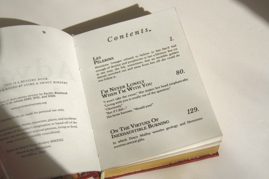

Advent Anthology by @pacific-rimbaud
A Compilation of PR's one-shot entries for DHr Advent, years 2020-2022.
Fandom: Harry Potter
Relationship: Draco Malfoy x Hermione Granger
Art by the wonderful @chestercompany
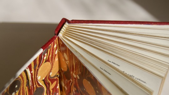
My binderary baby and second fanbinding project.
read below the cut for the process and other binding deets.
Quick Specs
20,015 words | 179 pages | Quarto (1/4 of Letter)
Technique: Flatback bradel Title & Body Font: Libre Baskerville (in various style emphasis)
Fics included:
Les Pelerins (10k; 2020 entry)
I'm Never Lonely When I'm With You (5k; 2021 entry)
On The Virtues of Inexhaustible Burning (5k; 2022 entry)
Pac is the type I could trust to write anything and I know I'll absolutely love. Her advent fics, in particular, I especially adore. The writing is very visceral and I will not admit how many times I've reread these.
On The Book
I had not intended to bind any book/s for @renegadepublishing's binderary because of my hectic schedule, however FOMO won over and this book was born. It was a relatively quick design and typeset (I really do better under pressure lol). I wish I could say the same for when I started the actual binding though. This is the 8th book I’ve bound and I had expected it to go relatively smoothly, but this book fought me every step of the way and I'll indulge in expressing my distress on this post.
First, the print place I go to messed up my typeset, thus me having to travel back home to use our old crappy inkjet (that took 3 hours to print). And because said printer is crappy, I had to use 100gsm short grain to minimize show-through, and well, you can imagine how stick straight the pages are. Second, I made the case too small (I worked on the book after a toxic 12 hour lab day and was not in the right state) and instead of redoing the covers, I re-trimmed and repainted the fore edge (at cost of my lovely margins ..wails). Third & last, the vinyl refused! to stick to the cover and I proper burnt the HTV as well as my finger on my iron. In the book's defense, it was my first time using leather paper and I forgot to test their chemistry.
On The Bind
Everything else went swimmingly, aforementioned shit aside. I tried not to make this book scream Christmas and leaned into a more subtle theme through color choices. I finally got to use this lovely red leather paper from Itoya, which my parents bought me during their trip in Japan. Many thanks to @celestial-sphere-press for helping me out with the shops to visit!
The design cover was made on Illustrator. The words are actually the fic prompts which I arranged in concentric circles, inspired by the arrangement of the advent candles in our local church from years back. I have no idea what paper my print place used, but it has some nice pulp to it.
As I said, I melted the HTV and certain parts refused to stick, so I peeled all of it off, except for the spine title (which miraculously stuck) and used my foil quill pen instead. I used an off-brand one and it's really good!
I also did this sort of strip across the edge which I learned is called a "river" as Nic @bindsbymunchkin called it. The side near the spine though, looked asymmetrically empty, so I added the foiling. And as this is an anthology, the punctuations was a design choice to convey the start and end and pauses in-between stories (and mostly because they just look fancy lol).
Like my last bind, the edges are gold which is comprised of an undercoat of diluted dark gray Sakura acrylic paint and many layers of Liquitex iridescent gold acrylic ink.
Endbands are made with alternating colors of cream, gray, and gold DMC cotton threads, however I'm learning I don't very much like how sewn endbands look on small flatbacks.
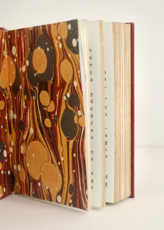
The endpapers are my fave. I had already tipped in plain cream cardstock but then I was like: this book needs MARBLED PAPER! so I ripped off the one I had stuck and replaced it. It's actually not real marbled paper HAHA. I sourced it from this site, printed it on some heavy paper, and oh my god I believe the universe really meant for me to find this pattern because it coincidentally matched the colors of the endbands!!
On The Typeset
I wanted to keep things cohesive but also give each story its own character. Libre Baskerville was a lovely typeface to do that on.


From left to right: Les Pelerins, I'm Never Lonely When I'm With You, On The Virtues of Inexhaustible Burning
For Les Pelerins, I wanted to mimic the silhouette of the establishments in Montmartre, hence the varying heights of the letters. If I wasn’t on a time crunch, I would’ve spent more time editing the headers but alas this is what we get. INLWIWY is more straightforward– a pinecone, which was a recurring theme in the story. And I think OTVOIB is my favorite. I drew tiny gold cracks onto the coal rock which is a significant element in the story. It still gives me that stomach flip whenever I reread it (iykyk).
#sting and snout bindery#buzzing books#z’s biblioteca#fanbinding#bookbinding#binderary2023#dramione#pacificrimbaud#dhr advent 2022#dhr fic#ficbinding#dhr advent
133 notes
·
View notes
Note
hi alby! i just played the lightning thief and i don't know if someone already told you or axel that but if you change the font to eb garamond or libre baskerville you can't change it back to anything else it gets stuck on that font
Hello! I did experience that before during testing, but after refreshing it a few times it usually changes to the new font. If you still experience this, I'll try to have it fixed before the next update!
15 notes
·
View notes
Text
ROUND 4

Propaganda under the cut.
Comic Sans MS: [default inclusion]
Libre Baskerville: "Libre Baskerville is a pleasing font to read. The uniform letters still maintain their style, with added curves when needed, with the serif as a finishing touch.", "close enough to times new roman to fool any nitpicky English teacher, but a few pixels bigger to pad out the length of your essays. and it rules", "my boner"
110 notes
·
View notes
Text
i cant decide between libre baskerville or garamond heaven help me
3 notes
·
View notes
Note
7. 3. 11. :)!!
1. what font do you write in?
sometimes i write in comic sans bc it makes me laugh, but usually when i write in google docs i use libre baskerville because it’s the taylor swift folklore font and when i type on word i usually use baskerville bc it makes me feel fancy lol
3. what is your writing ritual and why is it cursed?
when i can i light an absolutely ungodly amount of candles when i’m writing. not that cursed i guess but it does somewhat make me feel like i’m summoning a demon
(side note: i just bought a book about catholic exorcism rituals that does include a demon summoning ritual so… 👀)
7. what is your deepest joy about writing?
i love crafting a PERFECT sentence or series of sentences. it makes me so happy when i come up with a symbol only i will pick up on or word something so it flows exactly the way i imagined it in my head
11. do you believe in the advice “kill your darlings”?
it makes me so sad to kill off characters 😭 i have been known to cry over character deaths THAT I WROTE. i do however like putting my characters through the most pain imaginable and then seeing how they recover from/deal with that, and i love ghost characters too!
tysm for asking!!! you’re the best grim <3
4 notes
·
View notes
Note
i may actually be getting a hardon for fonts
My favorite font is Bauhaus 93, what's yours?
oh there's a big world of them i've yet to explore, but of the ones i know i'm a sucker for libre baskerville as a standalone, i can dig a calibri for professional context, and i've been using shanti a lot for dev stuff
for reference (listed in order):


ABCDEFGHIJKLMNOPQRSTUVWXYZ
26/26
101 notes
·
View notes
Photo
The Battle of Abritus
The Battle of Abritus was an engagement fought between the armies of Rome under the emperor Decius (249-251 CE) and a coalition of Goths under the leadership of Cniva (c. 250 - c. 270 CE) in 251 CE resulting in a victory for Cniva and the death of Decius and his son in a total defeat of the Roman army. The Romans had no choice afterwards but to allow Cniva to march out of Roman territory with all the booty and slaves he had captured on campaign.
The forces met in the valley of the Beli Lom River, near the town of Dryanovets, in modern-day Bulgaria. Cniva had already attacked the Roman cities of Novae and laid siege to Nicopolis ad Istrum, where he first met Decius, before the decisive battle at Abritus. Had Cniva capitalized on this victory and returned for another attack, he could have destroyed whatever forces Rome had left in the region to mount against him; he did not, however, and chose to take his substantial booty home to fight against Rome another day.
He has been identified with the Goth leader Cannabaudes who was defeated by Aurelian (270-275 CE) in 270 CE and was killed, along with 5,000 of his troops. Whether Cannabaudes was the same king as the victor of Abritus is disputed, but there is no doubt that Cniva's victory in 251 CE was a severe blow to Rome and the first time a sitting emperor – as well as his son and successor – was killed in battle.
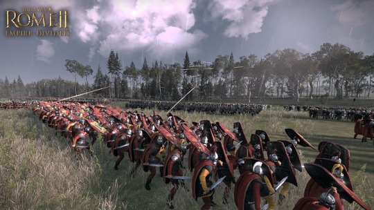
Sponsorship Message
This article was sponsored by Total War™
Empire Divided is a new campaign pack for Total War: ROME II, focused on the Crisis of the Third Century. Can you restore the Roman Empire to its former glory or will you tear it down? Play from the 30th of November 2017. Get the Game
.sponsor.ca h3 { text-transform: none; margin-top: 0px; margin-bottom: 15px; font-family: "Libre Baskerville", "Palatino Linotype", "Book Antiqua", Palatino, serif; } .sponsor.ca .ca_logo { width: 100px !important; height: 46px; float: right; box-shadow: none; margin: 0; } .sponsor_message { margin-left: 280px; font-family: Karla, Arial, Helvetica, sans-serif; line-height: 140%; } .sponsor.ca { padding: 10px 0px 25px 0px; margin: 25px 0px; border-top: 1px dotted #dadada; border-bottom: 1px dotted #dadada; } .sponsor_message .big_red_button { margin-top: 13px; } .sponsor.ca .key_art { margin-top: 0px; margin-bottom: 10px; width: 260px; height: auto; float: left; } .sponsor h4 { font-weight: normal; text-transform: uppercase; color: silver; margin-bottom: 10px; margin-top: 0px; font-family: Karla,Arial,Helvetica,sans-serif; font-size: 13px; padding: 0; } @media (max-width: 1199px) { .sponsor.ca .key_art { float: none; width: 100%; } .sponsor.ca .sponsor_message { margin-left: 0px; } .sponsor.ca h3 { margin-top: 20px; margin-bottom: 10px; } } @media (max-width: 767px) { }
Continue reading...
15 notes
·
View notes
Note
Asks for writers: 1 and 40, if you please!
Thanks for the ask <3333 #1: I bumped into the “use comic sans when writing” trick a couple years ago and it’s really, really worked for me when doing the raw something-from-nothing stage of writing. But, when it comes to the long process of editing and refining, I’m a moody, idiosyncratic bastard about typography. The first three parts of my most recent series needed to be in the simple and elegant but faintly warm Lato while the much longer fourth part was Libre Baskerville, all the way. The story before that, The Art of the Possible, was the cooler-toned, detached and minimalist geometric sans serif Muli. And the now-abandoned story before that worked with one of the lighter weights of the constructed and rationalist, almost monolinear, Poppins. Go figure.
Variable but strongly felt typographic feelings! #40: Here's the poem that's stayed open in my tabs lately and been messing me up:
October
Mary Oliver
1
There’s this shape, black as the entrance to a cave.
A longing wells up in its throat
like a blossom
as it breathes slowly.
What does the world
mean to you if you can’t trust it
to go on shining when you’re
not there? and there’s
a tree, long-fallen; once
the bees flew to it, like a procession
of messengers, and filled it
with honey.
2
I said to the chickadee, singing his heart out in the
green pine tree:
little dazzler
little song,
little mouthful.
3
The shape climbs up out of the curled grass. It
grunts into view. There is no measure
for the confidence at the bottom of its eyes—
there is no telling
the suppleness of its shoulders as it turns
and yawns.
Near the fallen tree
something—a leaf snapped loose
from the branch and fluttering down—tries to pull me
into its trap of attention.
4
It pulls me
into its trap of attention.
And when I turn again, the bear is gone.
5
Look, hasn’t my body already felt
like the body of a flower?
6
Look, I want to love this world
as though it’s the last chance I’m ever going to get
to be alive
and know it. —
Weird Questions for Writers - Ask me!
2 notes
·
View notes
Note
1, 4, 7:)
Send me a weird writing ask!
1. What font do you write in? Do you actually care or is that just the default setting?
Usually the default for gdocs or word (Arial or Calibri) but sometimes I've been known to use Garamond, Libre Baskerville, or Amiri when the mood strikes!
4. What’s a word that makes you go absolutely feral?
Top 3 is probably cavity, pierce, ephemeral
7. What is your deepest joy about writing?
Being able to articulate emotions that are difficult to explain otherwise; having people tell me that my writing struck on those feelings for them! That happened the first time I shared fic ages ago and has been fueling me since.
1 note
·
View note