#MTV design
Explore tagged Tumblr posts
Photo
Click here for my posts about MTV and here for Fred/Alan’s MTV work.
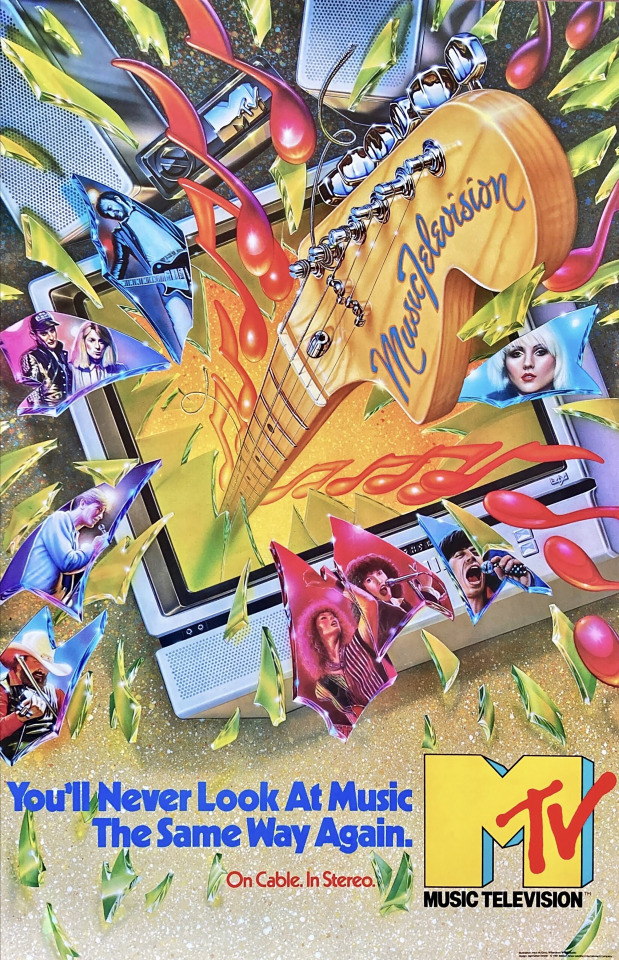
The first MTV poster. Summer 1981.
I’ve been searching for this poster (or at least a file of it) for almost 20 years. It was the first poster we did for MTV in the summer of 1981, and maybe because it was in a somewhat outdated style it sort of got sidelined and I didn’t save it.
We were so late in finalizing the MTV logo pretty much all of the promotional merchandise that we put together to promote ourselves to record companies, music managers, advertisers and cable operators (and of course, ourselves) were rushed. Consequently, even though our logo animations were leading the channel into what became our loose, illustrative design style for MTV’s first few years, the earliest stuff was a bit of a hodge podge that we thought might work.
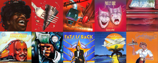
Artist David Willardson led the 70s California based music business through an innovative era by reviving the airbrush and using it to give a unique spin to 12″ vinyl album covers, which had generally been either photography of the musicians or abstract illustrations. By the end of the decade it was the cool way to showcase music. By 1980 he’d partnered with artist Charles White III in the Willardson+White studio in Los Angeles. Around the time we started thinking about MTV, Manhattan Design –Pat Gorman, Frank Olinsky and Patti Rogoff– had started their studio in the spare room behind a tai chi studio above Bigelow Chemists in New York’s Greenwich Village. I’d grown up with Frank and one thing led to another and we hired the team to design our logo. 500 tries later not only did we have the ‘M’ we had our main designers for the first several years of the network.
Because of the speed at which we needed to ramp up once we settled on the logo weeks before our August 1, 1981 launch led to a lot of creative decisions that would have little effect on the overall approach we’d eventually take to design on the channel.
This poster, which fit into the prevailing record business of the past decade, would really be in complete opposition to my thinking for our channel. Which was, simply put, that MTV: Music Television needed to be the leader of the music biz –hell! the entire culture!– MTV needed to be what was next. It’s a great poster, a wonderful illustration, to be sure (well, I probably would’ve left off the artists; within about a month after our debut, most of them would be yesterday’s news). But, if you take a look at some of our other work, you might agree that with this piece we definitely hadn't become “next.” Yet.
PS: This poster led to one really stupid design decision on my part which plagued the production groups for several years. In my attempt to be organized and professional with respect to design, I took a cue from this poster’s type design, a variation of the Kabel family of typefaces. I insisted that all our on-air typography use Kabel, taking the choice out of individual designers. The typeface wasn’t really suitable to early 1980s television technology, but I insisted. Dumb!
.....
Credits:
Art direction: Manhattan Design (Pat Gorman, Frank Olinsky, Patti Rogoff) Airbrush illustration: Mick McGinty for Willardson+White Creative Direction for MTV: Fred Seibert & Alan Goodman
Click here for my posts about MTV and here for Fred/Alan’s MTV work.
.....
…::: Addendum (July 7, 2023): I thought Manhattan Design had originally told me this poster illustration was done by Charles White III of Willardson+White. Through some research that I didin’t pay attention to –that is, I never looked carefully at the credits at the bottom right of the poster!– it turns out the artist was actually Mick McGinty.
So, I reached out to Mick’s website and got this note back from his son Jobey:
Hey Fred...we actually still have the original, and I have a print hanging in my home studio. It's one of my absolute favorites that Dad did, myself being a guitar player as well.
I would love more information on it if you have some, and I will gladly send you photos of the original. Dad had it hanging in his studio for about 20 years, but then it hung in my bedroom during high school, until I moved out and it went back to his studio. While I was in high school, Dad was offered a pretty large sum for it...he said I could use the money to go to college, haha, but I lacked some ambition and decided to keep it...and this was in 1996 or 1997.
Most of Dad's illustrations are going to go to Heritage Auction in August [2023].
So glad to hear from you and meet you...anytime I get to have contact with someone that my Dad worked with it's always a huge gift and blessing to me. Jobey
My response:
Oboy! What a nice note, thanks so much!
As it turns out, persistence is a quality that can work out once in a while. I found the poster on a rare rock poster site from Germany, of all things. It got sent to me right as I came down with a serious medical condition, and now that I'm OK, I'll be able to finally open the box!! Looking forward to getting it linen backed and framed.
I'll tell you what I know of the poster, given that I was the client rather than the commissioner, Hope it's helpful.
I was the original creative director at MTV. About a year before we launched on August 1, 1981, my creative partner (eventually, my business partner) Alan Goodman and I commissioned Manhattan Design to create a logo for the channel-to-be. (Actually, I went to my childhood friend, Frank Olinsky, who had been a fantastic artist since I met him at 5 years old, and not for nothing, a lifelong music fanatic. He'd just started a design collective with two others, Pat Gorman and Patti Rogoff, and the assignment broadened to their firm. Which, by the way, was housed in a storage room behind a tai chi studio above Bigelow Chemists, on Sixth Avenue in Manhattan.) It took at a year of over 500 comps before we were satisfied with the eventual, final logo.
The final corporate approval of the design went on way too long and by the time we asked Manhattan Design to come up with our launch poster (mostly for the cable operators we needed to put the channel on their systems, and advertisers we needed to give us their money to survive). Frank thought Willardson+White would be the right shop for the illustration (Frank himself was a fantastic illustrator, kind of out the Seymour Chwast style, but he had become sick of his own work and preferred designing) –after all, airbrush was the most exciting thing to happen to 70s album design, and pop design in general– and after they sketched out a comp, you dad did the fabulous work.
Honestly, until I stumbled upon the information that your father illustrated the poster, I was completely in the dark about it. I think Manhattan Design told me it was Charlie White who did it, but maybe I misremember, or possibly they told me a name they thought would impress me.
After the poster was printed (in a very small quantity) we went on to the main work of the channel. Personally, I was interested in moving past the styles of the 70s, not just in album design, but in animation design too. My boss wanted everything to look "modern," by which he meant the kind of Star Wars style of computer controlled animation and, of course, the airbrush kind of thing. I loved both of those things, but I felt like MTV needed to forge its own path, and not follow anything else. How would we be considered special if we were followers? When he said "Star Wars" I blurted out I wanted us to look like Gumby –claymation– and convinced him we couldn't afford the more expensive stuff (claymation was way out of the mainstream by the 80s, and I let him know that the studios needed the work and would do stuff for us at a budget more in line with what we could afford).
Bob Pittman –my MTV boss– left us alone, creatively and it gave us a chance to work on Frank to do our work in a more flat illustrative direction; he could execute that personally. Reluctantly, and given the startup budgets we were working with at the beginning –it took several years for the channel to be financially successful– Manhattan Design steered us right into the pocket I was looking for, and it helped make us famous during the first decade.
Anyhow, that's what I know. If there's anything else you're curious about lemme know, it'll probably ping my brain to things I've forgotten.
Take care, sincerely, Fred
#posters#MTV#1981#illustration#MTV design#Manhattan Design#graphic design#David Williardson#Willardson+White#Mick McGinty#MTVposts#Bob Pittman#Alan Goodman
6 notes
·
View notes
Text
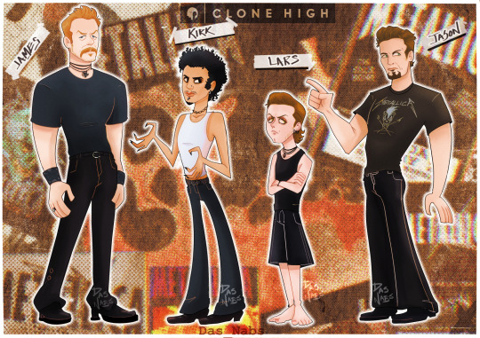

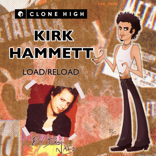


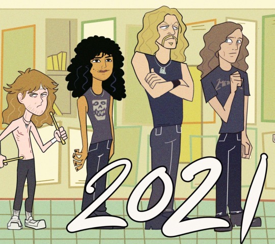
Clone high: metallica load era , 1996
Re design of an old fan art that I drew a long time ago 🤢
#metallica#my artwork#fanart#james hetfield#kirk hammett#lars ulrich#jason newsted#clone high#character design#art oc#fan character#clone high fan clone#clone high fanart#clone high 2023#digital art#metallica family#metallica fanart#load#reload#rock#load era#mtv#art#metal#heavy metal#cliff burton#clonesona
510 notes
·
View notes
Text
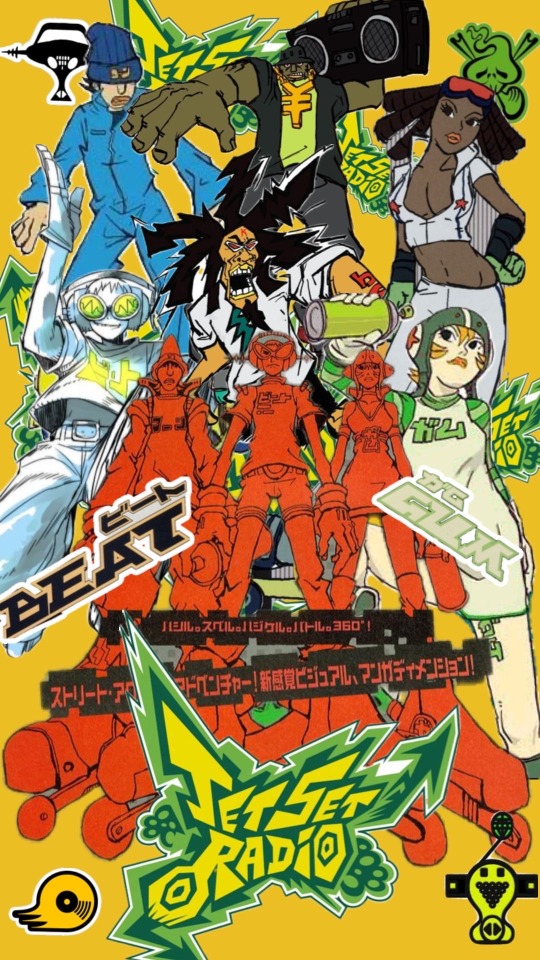
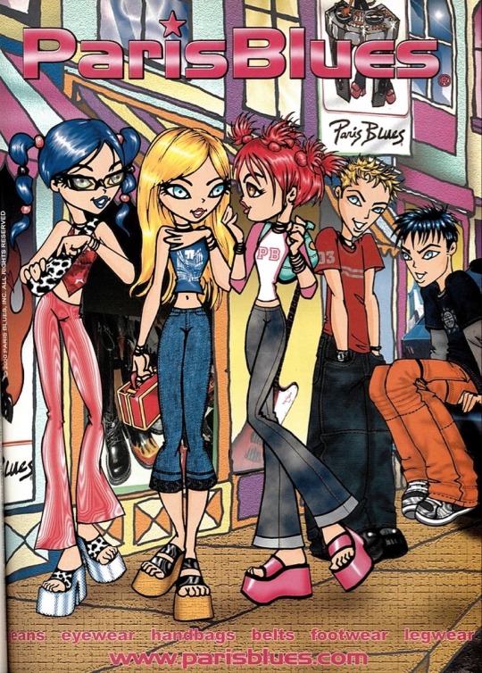
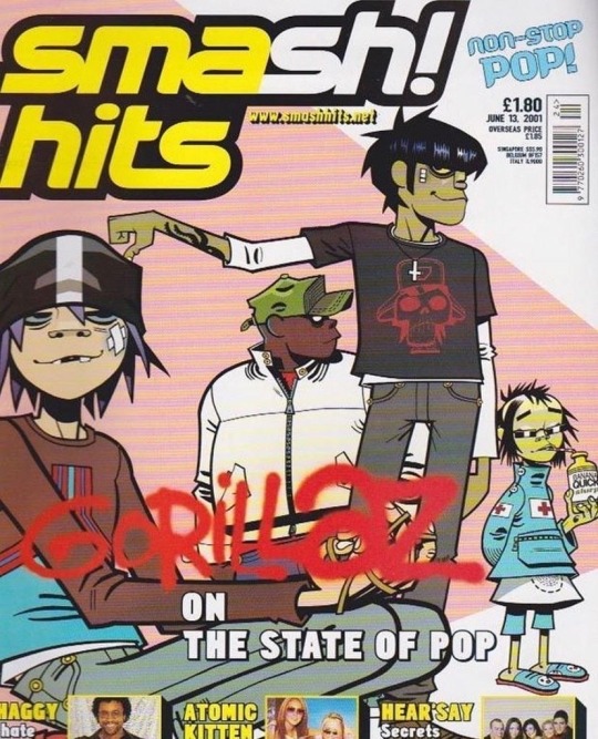


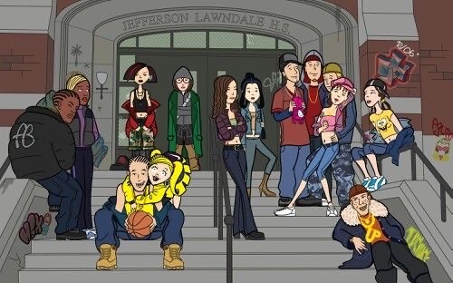
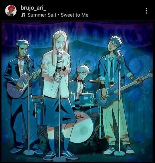
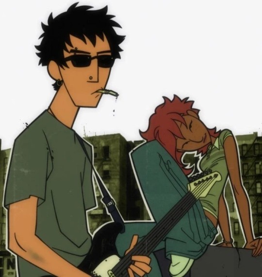
What would I not give to be a 90s/early 2000s-esque animated character apart of a nonchalantly cooler than yours friend group ?
N O T H I N G , there is literally
N O T H I N G I would not give or do, take it all and beam me up !!
1 - JSR 2 - PARIS BLUES ADV. 3 - GOTILLAZ 4 - DOWNTOWN 5 - SILVERTAB ADV. 6 - DELTA STATE 7 - DARIA 8/9 - @BRUJO_ARI_ ON INSTA. 10 - DELTA STATE
#90s#90sanimation#90s aesthetic#friends#cool stuff#cool#animation#character design#character art#jet set radio future#jet set radio#daria#daria mtv#mtv downtown#delta state#brujo art#gorillaz#SoundCloud
265 notes
·
View notes
Text

This is my favorite cartoon then and now :)
#daria#art#graphic art#cartoon#daria mtv#sketch#news#comics#graphic design#artists on tumblr#digital artist
54 notes
·
View notes
Text
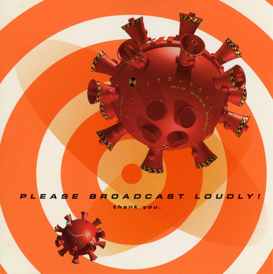
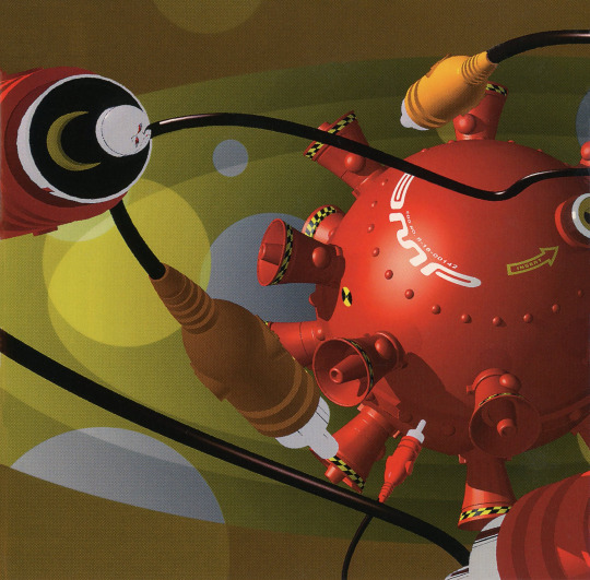
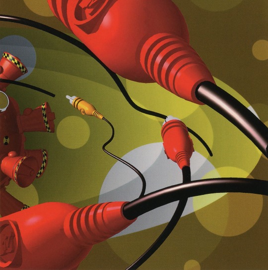

#my discogs scans#mtv's amp#mtv amp#y2k#y2k aesthetic#big beat#breakbeat#breaks#acid#electronica#idm#digital hardcore#3d design#90s#neon#discogs#my scans#crucial listening
274 notes
·
View notes
Text
youtube
MTV Dancefloor chart 1998 by János Piros
#98#90s#1998#1990s#animation#art#blue#cybercore#cyber y2k#design#graphics#kaybug#music#mtv#technology#television#tv#y2kcore#y2k aesthetic#y2k core#y2k cyber#y2k design#y2k graphics#y2k nostalgia#y2k#youtube#yqueuek#Youtube
21 notes
·
View notes
Text
My name is Eid, and this is my twin brother Khairi. Since we were young, we've always loved learning and studying, driven by ambition to become active members of society. We hoped to leave a beautiful mark that people would remember. From the first to the 11th grade, we faced many difficult days, weeks, and years on our educational journey, but they all culminated in success. We reached the final step, the high school stage, and with it, our dream of pursuing medicine drew nearer.
My brother and I agreed to choose medicine as our field of study because it carries immense human value and impacts society, alongside its responsibilities and challenges. We chose medicine because it benefits humanity, saves lives, and offers limitless opportunities. We entered our final year of high school with great determination, aiming to achieve this dream. We did not let fatigue get the best of us throughout the long months until the school year ended, closing a chapter of sleepless nights, hard work, and dedication. After awaiting the results, we received scores of 95.9 and 94. We were overjoyed. Then, we packed our bags and went to Egypt after waiting for months at the Rafah border crossing to crown years of hard work with medical studies. However, our applications to medical school were rejected because of our delayed arrival in Egypt due to the crossing.
We returned to Gaza with shattered dreams and great disappointments, only to find all the university seats in Gaza were filled. What should we do? With determination, we decided to retake our final year of high school with the same enthusiasm and fighting spirit! After months of hard study and family support, we achieved even higher scores than the first year: I got 98.9, and my brother 98.3. It was and always will be one of the happiest moments.
We returned to Egypt again to study medicine, but unfortunately, our applications were rejected for the second time due to reasons that are hard to explain. We returned to Gaza, carrying with us as much contentment as sorrow. The universities in Gaza were almost full, and since the cost of studying medicine in Gaza is high—around $5,000 per year for each student—we enrolled in the Faculty of Medicine at Al-Azhar University after applying for several scholarships to help us financially during the long years of study, especially since we were both students.
We didn’t let all the circumstances we faced over the past two years make us forget our dream or extinguish our passion for studying medicine and embarking on this long and beautiful journey. We were pleased because, after so many years, this dream was closer than ever. The first academic year began, and with it, our beautiful journey that was not meant to be completed. Our journey was cut short just 10 days after the school year started, due to a reason we all know—the genocide in Gaza.
Now, 10 months after the war, we don't know what to do. Life in Gaza has been at a standstill for 10 months. Children were killed, women died, a boy was left searching for his mother, and a mother was left weeping over her only son. In Gaza, homes, streets, hospitals, schools, and even universities have been destroyed without a trace. The war in Gaza began, and with it, everything ended. Our dreams vanished, and our lives were lost in long journeys of displacement that continue, with us unable to do anything!
But we are confident that some can help us regain our lives and continue pursuing our cherished dreams
,Please help us too continue our studying and Repairing the destroyed house.
( https://gofund.me/167f0900 )
#help_me#twins#cotl#artists on tumblr#nonbinary#interior design#cats#mtv video music awards#digital painting#my art#artwork#doodle#ibispaint art#digital sketch#midwest princess#chappell roan#chappel roan#gazaunderattack#gaza genocide#free gaza#gaza#help#gaza strip#donations#palestine#save rafah#save palestine#save gaza#gofundme
31 notes
·
View notes
Text

Taiyokami was a huge star in her home country of Japan, but she never saw success internationally. Her videos would air on MTV at 2AM back in the 80s; the only exposure the West got during her prime (as well as her marriage to Bodashi, who was touring the world with his band, Stratosphere)
Taiyokami retired in 1997, but she’s remains an icon of Japanese pop culture to this day. In the West, she gained a small, but dedicated fanbase thanks to the advent of the internet, and general interest in 80s aesthetics
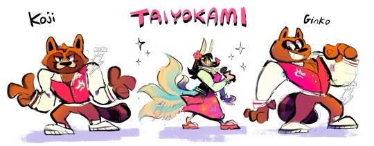
her backup dancers have names btw :p
#oc lore yayy#my ocs#oc tag#my art#nostalgiacore#cartoony art#furry#furry art#pastelcore#80s#90s#tw eyestrain#chromatic aberration#vhs aesthetic#fake screenshot#mtv#city pop#vaporwave#kitsune#tanuki#character design#liminal#liminal space#furry ocs
51 notes
·
View notes
Text
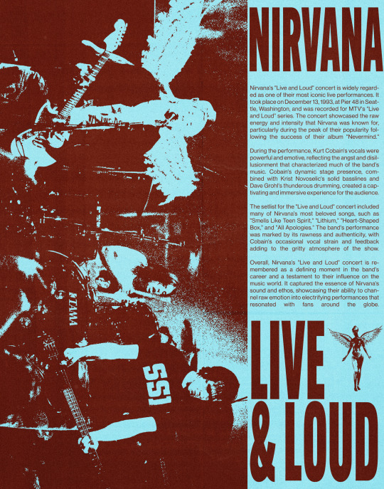
— nirvana • live & loud
#i’m posting on insta everyday for this month#go check it out#graphic design#music posters#art#fanart#nirvana#kurt cobain#dave grohl#krist novoselic#grunge#live and loud#mtv#artist support#poc artist#artists on tumblr#my projects
61 notes
·
View notes
Text

I loved @fontodue 's genderbent Beavis and Butthead.
Anyway, Darius lets them borrow his jacket because he's a gentleman.
bonus:

#artists on tumblr#digital illustration#character design#my art#funny#beavis and butthead#daria morgendorffer#daria mtv#genderbend#quinn morgendorffer
29 notes
·
View notes
Text

Liquid Television - MTV
20 notes
·
View notes
Text


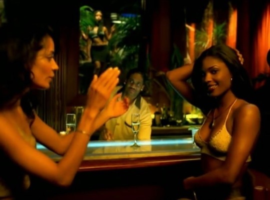

#2000s#like#viral#aesthetic#y2k#rnb#fyp#beyoncé#design#beauty#fashion#rap#travel#beach aesthetic#jay z#90s#photography#photoshoot#destinyschild#mtv#video vixen
345 notes
·
View notes
Text

The Norns from my story Verthandi in the Middle dressed as Daria characters, with Verthandi as Daria (in one of her Beavis & Butthead outfits), Skuld as Quinn, and Urth as Helen since Daria doesn’t have another sister.
Also, I think this is the first time I've drawn Urth hatless
#art#artists on tumblr#artwork#traditional art#character design#fanart#daria mtv#daria#cosplay#character cosplay#daria morgendorffer#quinn morgendorffer#helen morgendorffer#Verthandi in the middle#Verthandi#Skuld#urth#urd#verdandi#norse mythology#norn#nornposting#Arlequine lunaire#small artist#pen and pencil#colored pencil#messy hair#norse pagan witch#trans artist#queer artist
8 notes
·
View notes
Text


TAYLOR SWIFT - VMA 2024
follow me - @visaocenicart (instagram) | @viniciusribeiroator (instagram)
#taylor swift#swifties#my edit#taylor swift edit#music#pop#art#taylornation#design#photoshop#VMA#MTV
10 notes
·
View notes
Text
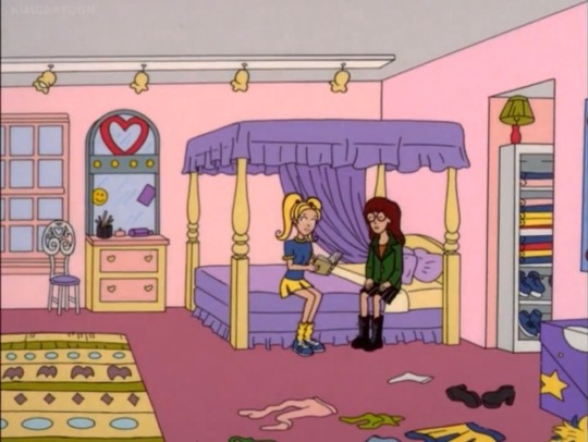
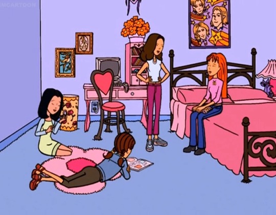
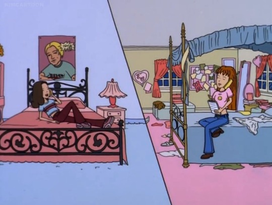

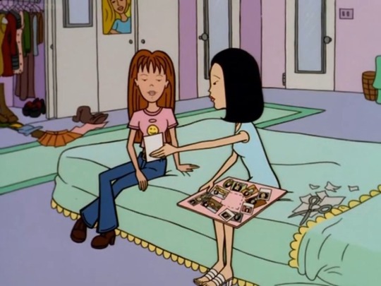


Bedrooms shown on “Daria”
37 notes
·
View notes