#Jane Morris
Explore tagged Tumblr posts
Text

'Portrait of Jane Morris Asleep on a Sofa' by Dante Gabriel Rossetti.
Photo by Birmingham Museums Trust, licensed under CC0.
513 notes
·
View notes
Text


Various versions of Proserpine by Dante Gabriel Rossetti, created between 1874 and 1882
#dante gabriel rossetti#pre raphaelite#19th century art#19th century painting#pre-raphaelite art#art#greek mythology#art comparison#beauty#persephone#proserpina#proserpine#jane morris#my posts#faves
401 notes
·
View notes
Text

"THE DAY DREAM" | c. 1855 DANTE GABRIEL ROSSETTI [coloured chalks on paper | 104.5 x 77 cm.]
#dante gabriel rossetti#pre-raphaelite#portrait#drawing#modern art#jane morris#19th century#british#art#u
957 notes
·
View notes
Photo



DOOM PATROL — DONE PATROL (S04E12) ››› Riley Shanahan and Brendan Fraser as Cliff Steele / Robotman ››› Diane Guerrero as Kay / The Kaleidoscope

#doom patrol#riley shanahan#brendan fraser#cliff steele#diane guerrero#kay challis#jane morris#dctv#dc#doompatroledit#dctvedit#tvedit#dcedit#doom patrol spoilers
1K notes
·
View notes
Text

"Astarte Syriaca" by Dante Gabriel Rossetti (1877)
#dante gabriel rossetti#Jane Morris#oil on canvas#Astarte#Rossetti#pre raphaelite#1877#oil painting#19th century artist#pre raphaelism#pre raphaelist#19th century painting#19th century art#19th century#art#painting#traditional art#classical art#paintings#inspiration#art inspiration#green#women in art#women in paintings#obsession of aesthetic
138 notes
·
View notes
Text

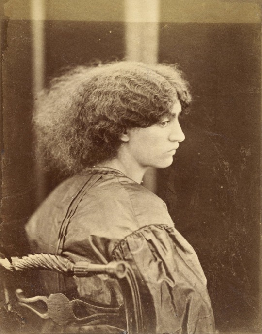
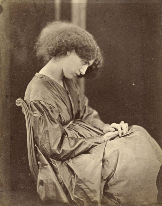
"Jane Morris, posed by [Dante Gabriel] Rossetti"
Photographed by John R. Parsons, 1865, London.
374 notes
·
View notes
Note
I want to know more about the guy who threw three tons of type into the Thames, please! Thank you!!
So first, thank you for this ask. I love talking about this guy, and you gave me an excuse to fact-check all of the absurd things I’ve learned about him over the past year or so and, as a result, learn even more absurd things about him. But oh man, where to start. So those tags were about a guy named Thomas James Cobden-Sanderson (often written about as T. J. Cobden-Sanderson, TJCS here for efficiency). He was an absolutely fascinating dude – quit like three or four different career paths before actually becoming a lawyer and just fucking hating it. He was hanging out with his buddy William Morris (yes, THAT William Morris*) lamenting his lack of satisfying work when Morris’s wife Jane (yes THAT Jane Morris**) suggested he try his hand at bookbinding. (Side note (there are going to be so many side notes): TJCS is the one who coined the name “Arts and Crafts” for the decorative arts movement that Morris basically founded, and TJCS was hugely influential in that circle as well.) He started a bookbinding apprenticeship and just kind of blew everyone away. He was crazy good at it much faster than he should have been, and he founded the Doves Bindery (named after the nearby pub, not the bird) with capital from his wife.
(The biggest side note: TJCS was a hard core Wife Guy, and Annie Cobden-Sanderson was insanely cool in her own right. She was a famous suffragette, was arrested and imprisoned for demonstrating in the lobby of parliament, and was an evangelist for vegetarianism. This whole post could be about her, actually. TJCS thought she was so cool that he took her name – he was T. J. Sanderson, she was Annie Cobden, and when they married, they both took the name Cobden-Sanderson. She went to the U.S. in the early 20th century to teach the suffragettes there what she had learned protesting in England, so I feel like she is in part responsible for my right to vote. Love her.)
Okay, but back to TJCS. Our very talented, very egotistical, very tempestuous little dude was Not Satisfied binding whatever books came in the door because he had big feelings about what the Ideal Book should be. To that end, he teamed up with printer and engraver Emery Walker, William Morris’s former partner at the Kelmscott Press (yes, THAT Kelmscott Press***) to found the Doves Press so that he could create the most beautiful books by printing only the most beautiful words. TJCS was the “visionary and fanatic” (his words) and Walker was the technician. TJCS commissioned a new typeface to be used exclusively by the Doves Press. It was based on some of the most beautiful typography ever created – the capitals based on Nicholas Jensen’s 15th century roman that’s still considered one of the standards of perfection in type design (if you’ve ever used Centaur or read a book set in it, that’s kind of the contemporary version of Jensen’s roman). The Doves Press was unexpectedly successful and it along with Kelmscott Press laid the foundation for what would be the fine press movement of the 20th century. The Doves Bindery now only bound Doves Press books, and if you have a local library or museum that has examples in their collection, it’s well worth the trip to go look at these books.

(The opening of Genesis from The Doves Bible, widely regarded as one of the most perfect books ever printed, image from Jonkers Rare Books.)
Of course, “tempestuous” and “egotistical” are not a great recipe for long and healthy partnerships, even when coupled with ��very talented,” and TJCS and Walker had a mega falling out. TJCS was a perfectionist the level of which it is hard to overstate. Walker was… not. He was a printer. You printed your pages, and that was that; sometimes there were going to be errors. Also, he liked to make money. The Doves Type was widely regarded as the most beautiful typeface in existence, and there were lots of folks willing to pay to use it in their own printing pursuits like advertising and other commercial work. I’m sure you can imagine how well this went over with TJCS. After what seemed like endless fighting, a mutual friend, Sydney Cockerell****, suggested a compromise: TJCS would get exclusive use of the Doves Type for the rest of his life, but Emery Walker would own it and could do whatever he wanted with it once TJCS died. Walker figured this was the best he was going to get and agreed. TJCS agreed at the time, but as he got older, he got even more tempestuous and obsessive, and this is where the river comes in. Dude grabbed all of the matrices and punches (the stuff you would need to make more of the Doves Type) and literally threw it into the Thames. Fine, now the only Doves Type that exists is what’s in active use by the Doves Press. That was not good enough for our good friend and Weird Little Guy TJCS. No, in addition to throwing the matrices and punches into the river, he ALSO threw every last piece of type in the workshop into the river. This is fucking hilarious because it’s not like a print shop just has a few copies of the alphabet laying around. A working press (even a small one) like the Doves Press had literally more than a ton of type in the workshop. TJCS was so petty and so determined that only HE would ever get to use this type that he made almost TWO HUNDRED trips to Hammersmith Bridge to dump type in the river.
And the story doesn’t even end there! And I’m typing this alone on my couch instead of trying to retell the abridged version over drinks with friends, so guess what? You get the rest of the story too! The Doves Type is still to this day considered one of the most beautiful typefaces ever created, and I get to introduce you to another single-minded, obsessive little guy who REALLY REALLY wanted to create the most accurate digital facsimile possible of the Doves Type. His name is Robert Green, and at first he was just looking at the texts printed by the Doves Press and trying to recreate it from the printed pages themselves. He did a pretty good job. In his quest, read everything he could about TJCS and the Doves Press, including TJCS’s diaries. I’m not sure anyone before Green really took literally TJCS’s declaration that the type had been “dedicated & consecrated” to the river but Green sure did. He even figured out that TJCS’s bridge of choice must have been Hammersmith. And then he started digging around. Almost a hundred years after TJCS donated it to the Thames, Green found a piece of the Doves Type in the mud under Hammersmith Bridge. With help from Port of London Authority divers, more than one hundred and fifty pieces of the Doves Type were recovered, and Green was able to revise his facsimile based on actual specimens.
The absolutely insane consequence of this is that YOU, dear friend, can buy your own license to the Doves Type and use it for whatever unhinged purpose you can dream up. Whether your interests align with TJCS and you also want to create the Ideal Book, or you feel like typesetting your favorite shitpost, one of the most beautiful typefaces ever cut is at your disposal.
Feels a little silly to put the footnotes under the cut given how long this got, but we're running solely on vibes now, so here we go.
*Founding member of the Arts and Crafts movement, iconic designer, you definitely know who William Morris is. Or at least you've seen his wallpaper.

**Similarly, textile artist, muse and model for the painters of the Pre-Raphaelite Brotherhood and Arts and Crafts movement, you know who Jane Morris is.

***If you know Kelmscott press, it's likely because you know The Kelmscott Chaucer. It is widely considered one of the most beautiful books ever printed, and it's likely that you've seen images of its pages if your interests run bookish at all (and I kind of assume they do if you've managed to read this far).

****Okay, so I footnoted Sydney Cockerell mostly to talk about his younger brother, Douglas. You probably don't know who Douglas Cockerell was, but I think you should! The fine binding tradition in England is an incredibly vibrant community of artists, and many of them can trace their education directly to TJCS through his apprentice Douglas Cockerell. Cockerell quickly became a giant in the craft and trained a generation of bookbinders himself, notably Bernard Middleton, another deeply talented binder and teacher who taught many, including Dominic Riley, from whom I have been lucky enough to take classes.
#so this definitely got away from me#but yeah everyone loves to hear the story of the Weird Little Guy who tossed a literal ton of printers type into the Thames for spite#t. j. cobden-sanderson#william morris#jane morris#the doves press#bookbinding#letterpress#fine press#long post
35 notes
·
View notes
Text


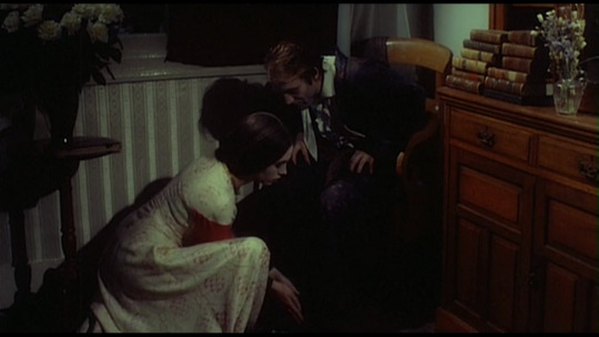
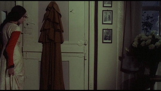
#la belle iseult#william morris#jane morris#1858#isabelle adjani#nosferatu#1979#gisela storch#costume design#nosferatu phantom der nacht#nosferatu the vampyre#werner herzog#film#my posts
47 notes
·
View notes
Text
Elizabeth Siddal & Jane Morris
Pre-Raphaelite models as artists in their own right


Photographs of Elizabeth Siddal (left) and Jane Morris (right)
Elizabeth Siddal and Jane Morris are mostly known as artists' models for the Pre-Raphaelite Brotherhood, representing the ideal of feminine beauty for the movement.

Elizabeth Siddal famously modelled for John Everett Millais's Ophelia (1852)


Jane Morris in paintings by Dante Gabriel Rossetti: Proserpine (1874) + The Daydream (1880)
But both women were also artists themselves.
Elizabeth Siddal
In the paintings and drawings she modelled for, Siddal is never depicted as looking directly at the viewer. Instead, she is languid and lovely, gazing off dreamily into the distance or closing her eyes, like in the examples below.


Elizabeth Siddal in paintings by Dante Gabriel Rossetti: Regina Cordium (1860) + Beata Beatrix (1870)
Her self-portrait, however, presents a fascinating contrast.

Elizabeth Siddal's self-portrait (1854)
Her expression is stony and her gaze is direct. She knows you're looking, and she's looking right back. It reminds me of the Agnès Varda quote,
“The first feminist gesture is to say: OK, they're looking at me. But I'm looking at them.”
Here are some more of Siddal's own paintings below.
Her style is distinct and striking.


Lady Clare (1857), The Quest of the Holy Grail (1855), Clerk Saunders (1857), Holy Family (1856)
Jane Morris
Jane Morris was not a painter herself, but an embroiderer, bookbinder, and calligrapher.
She came from a working-class background and only received an artistic education as an adult, after she married William Morris.
Unfortunately, not much of her work survives, or can be definitively attributed to her, but the two floral patterns below reveal her skill with the needle.


#pre-raphaelite art#pre-raphaelite#pre raphaelite#jane morris#elizabeth siddal#19th century art#victorian era#pre raphaelism#women's history#women artists#women's art#art history#embroidery#textiles#dante gabriel rossetti#john everett millais#preraphaelite#long post#depictions of women
34 notes
·
View notes
Text


Would you like to join me on a mission to save the world?
Diane Guerrero as Jane Morris DOOM PATROL - 4x02 “Butt Patrol”
#dcedit#dctvedit#dctvgifs#doompatroledit#dcmultiverse#dcladies#dcfilmblr#diane guerrero#dianeguerreroedit#dguerreroedit#femalegifsource#femalecharacters#jane morris#jane system#doom patrol#**#*diane
579 notes
·
View notes
Text

post these jane
28 notes
·
View notes
Text

Jane Morris
Pencil portrait
42 notes
·
View notes
Text
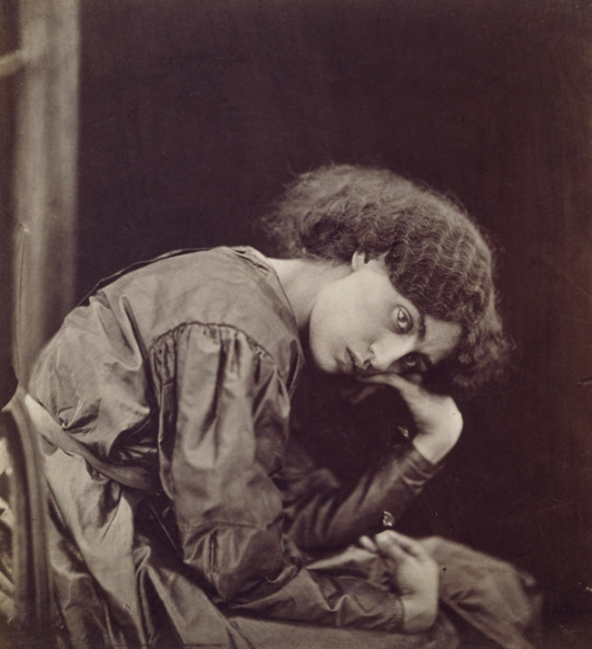
Portrait of Jane Morris by John Robert Parsons, 1865 commissioned and posed by Dante Gabriel Rossetti wet plate collodion photograph, Birmingham Museum
#Jane Morris#Rossetti’s Obsession: Images of Jane Morris#Dante Gabriel Rossetti's muse#Rossetti#muse#photographic portraiture#portraits of women#John R. Parsons
107 notes
·
View notes
Text

Paolo e Francesca da Rimini (1855), Dante Gabriel Rossetti
#dante gabriel rossetti#paolo e francesca#'800#19th century#acquerello#watercolor#watercolour art#watercolourpainting#tate britain#london#tate gallery#john ruskin#william morris#george rae#painting#pre raphaelism#pre raphaelite#romanticism#romantic#dante#dolce stil novo#symbolist art#symbolism#symbolist painting#jane morris#estetismo#arte#art
27 notes
·
View notes
Photo


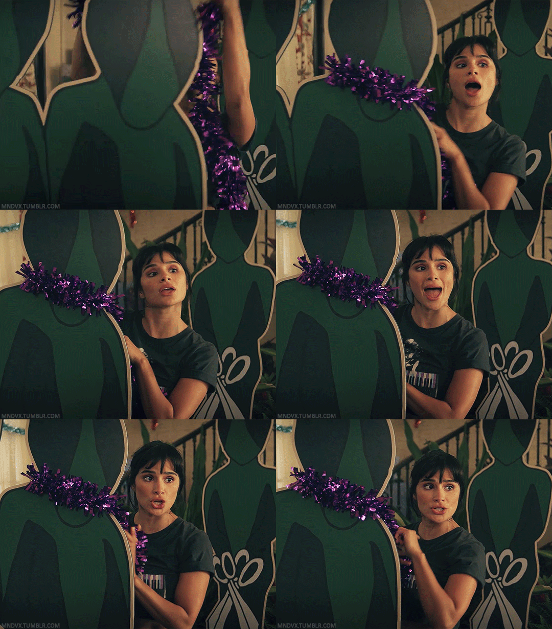
DOOM PATROL — IMMORTIMAS PATROL (S04E09) ››› Diane Guerrero as Jane Morris

#doom patrol#diane guerrero#jane morris#dctv#dc#doompatroledit#dcedit#tvedit#dctvedit#doom patrol spoilers#gay people and garlands..... it's universal
416 notes
·
View notes
Text
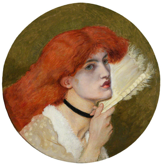
A portrait of Jane Morris with the red hair of Elizabeth Siddal, found unfinished in Dante Gabriel Rossetti's studio at the time of this death.
#pre raphaelite#pre-raphaelite#preraphaelite#art#art history#dante gabriel rossetti#rossetti#jane morris#elizabeth siddal
67 notes
·
View notes