#It's a calming read
Explore tagged Tumblr posts
Text
not to be controversial bc I know this is like…not in line with shifting opinions on fanfic comment culture but if there’s a glaring typo in my work I will NOT be offended by pointing it out. if ao3 fucks up the formatting…I will also not be offended by having this pointed out…
‘looking forward to the next update’ and ‘I hope you update soon!’ are different vibes than a demand, and should be read in good faith because a reader is finding their way to tell you how much they love it. I will not be mad at this.
‘I don’t usually like this ship but this fic made me feel something’ is also incredibly high praise. I’m not going to get mad at this.
even ‘I love this fic but I’m curious about why you made [x] choice’ is just another way a reader is engaging in and putting thought into your work.
I just feel like a lot of authors take any comment that’s not perfectly articulated glowing praise in the exact manner they’re hoping to receive it in bad faith.
fic engagement has been dropping across the board over the last several years, and yes it’s frustrating but it isn’t as though I can’t see how it happens. comment anxiety can be a real thing. the last thing anyone wants to do is offend an author they love, and that means sometimes people default to silence.
idk where I’m going with this I guess aside from saying unless a comment is outright attacking me I’m never going to get mad at it, and I think a lot of authors should feel the same way. ESPECIALLY TYPOS PLZ GOD POINT OUT MY TYPOS.
#ao3#archive of our own#fanfiction#tbh even if I got a comment that said ‘I hate you I’m going to kill your family’ on chapter 75 it still means they read 75 chapters first….#it just makes me sad to see so many writers shouting into the void#and also see ppl complain openly about the specific types of comments they receive#posting screenshots on Reddit like ‘should I be mad at this’ CALM DOWN#sigh
37K notes
·
View notes
Text

yellowfang, i wish you were here. my sister is dying.
ID in alt and under cut
ID: digital painting of Cinderpelt and Brightpaw from Warriors. They are two cats curled around each other. Brightpaw, a ginger-and-white cat, is badly injured with cobwebs as bandages around her face and other injuries. She is unconscious and lying on her side in a moss nest. Cinderpelt, a gray cat, is curled around her with her tail over Brightpaw's back, looking at her with concern. They are in a shaded den surrounded by autumnal ferns, with a pool of water in the corner, and a strip of bright sunlight illuminating their faces. end ID.
#i was thinking about how. brightpaws injury is like the first really difficult patient cinderpelt has on her own after yellowfang dies#and its her sister#but also i went back to read dangerous path and they seem to have. forgot. that they are sisters#like cinderpelt is pretty calm about the whole thing...#seems like a huge missed opportunity for drama#graphic novel adaptation please hear me.#warriors#warrior cats#cinderpelt#brightheart#art#2024#wc
5K notes
·
View notes
Text
I am currently reding Notes from an Island by Tove Jansson and Tuulikki Pietilä. It's such a beautiful book with copperplate etches from Tuulikki and dairy entries by Tove. The love for each other and the island which they lived on is there.
1 note
·
View note
Text
“How is 12 year old Annabeth head of the Athena cabin??”
1. Demi gods have the life expectancy of a lemming.
2. Gifted kids often burn out by age 16 & I doubt any of the Athena teens have the energy or desire to argue with their little sister who willingly takes care of all the family paperwork.
#ramblings#percy jackson#pjo#OMG PEOPLE THIS IS A JOKE I KNOW SHE WAS THERE THE LONGEST#ITS STILL P WILD TO HAVE A 12 YEAR OLD IN CHARGE OF ALL HER SIBLINGS CALM DOWN PLS#I READ THE BOOKS I DID MY TIME LET ME JOKE ABOUT THIS
13K notes
·
View notes
Text
So y'all have seen the Williams F1 Logo before, yeah?
well get ready, becaues I am about to ruin your day!
where does one even begin with this. i am sorry in advance. -just a poor learning graphic design student, who simply tried to enjoy their saturday evening
The Logo
For anyone that doesn't know, here's the Williams F1 Logo. Entirely unedited, copied straight from Wikipedia:

Now like many fans, I actually quite enjoy this logo. I like the modern, sharp edges of it and it's simple yet intriguiging design. It's memorable, while also easily recognizable as a W. I also really enjoy the colour choice (this, however, is entirely a personal preference.)
(entire rant under the cut. please keep reading this took years off my life span.)
How did we even get here?
Let's start at the beginning. How did we even get here? Well I, a poor poor learning graphic designer, was watching this lovely video from Mr. V's Garage about bad F1 Logo's over the past 35 or so seasons. Very interesting, I can only recommend it (but you don't need to watch the video to understand this post)!
Now, to cleanse the palette at the end of the video, Mr. V included a top 10 GOOD logos from this time span, it was very kind of him.
On P4 of this "Good List," Mr. V placed the current Williams F1 Logo, as pictured above. At first I vaguely agreed with this, believing that he probably simply hadn't noticed one of the things that's been bothering me about that Logo since the first time I saw it up close.
The first sign of Trouble
So, what is this mystery issue, you might ask?
It's simple really. You don't necessarily notice it at a first glance, but something about that logo seems off. Taking a second longer, you may notice it yourself.
No, I mean it, take a minute and go look at the logo. It looks wonky as hell, doesn't it?
Well I can tell you the first thing that I personally noticed. The arms of the W aren't in line with the bottom half, see:

(Graphic by @girlrussell who was so kind to let me use it, as it is way prettier than the one I made)
It's a crooked W. There is no good explanation for this. The rest of the font is perfectly fine, geometrical shapes.

Anyway, the good person that I am I went to point this out to my partner ( @leftneb ) who proceeded to inform me that he, infact, was not aware about this and was, quote, "never going to unsee that."
Now, the good FRIEND that I am, I, of course, proceeded to rush into our broader F1 friendgroup to make them suffer for eternity.
What's the logical next step to take? Of course, fix the logo in Adobe Photoshop, you know, as a joke.
(Disclaimer at this point, I am not necessarily the biggest fan of Williams Management Team. I enjoy ALL their drivers this season. I do NOT enjoy James Vowels. Be warned.)(Also I am aware that he probably did not have an influence on the logo)
Trying to fix it. Oh god, I was so innocent back then
Trying to fix the logo in Photoshop is the worst mistake I could've made. THE worst path to take. I could've just giggled about making my friends suffer (which I succeeded in, by the way) and moved on. Instead I ruined a perfectly good Saturday evening, and for what? I don't know anymore.
Anyway, how was I gonna go about fixing the logo in the simplest way possible? Simplest way I could come up with: slap the thing in Photoshop and put two, mirrored boxes at each side to make the sides line up. Small issue, how do I make the thing actually even? Fix: line them up at the intersecting point with the bottom tips of the W.
Here's the result:

Hey, anyone care to explain to me why in THE LORDS NAME the arms are different sized? I mean, surely they weren't before. Surely, certainly, I must've messed up.
I double, I tripple checked. I made sure everything was lined up and made sense. But no.
It just couldn't be. Something was uneven in this logo, something even deeper. Something I could not have predicted when first taking a closer look. It was at this point I realized I had messed up. What rabbit hole had I stumbled across? Certainly, it couldn't get much worse.
And that's when I noticed.

(pictured above; my genuine reaction)
There's MORE? (oh god, the top isn't lined up)

I couldn't believe my eyes. This is the PINNACLE of the sport, and THIS was the logo of one of the competing teams? I mean, yeah, we have a Visa Cash App RB or a Kick Sauber or even a MoneyGram Haas which are all terrible logos, but at least they're CLEAN. (this has not been checked. If anyone wishes to ruin a nice Saturday evening, feel free to check them and tell me how wrong I was in the previous statement!)
But you can see that there is no end in sight for this post. I'm sure you're as scared as I was at this point. By now we were sitting in VC, discussing the horribleness of this logo. I had long informed my irl's about this, who take said design classes with me. And it was one of them who pointed out the next thing that had been bothering me, but I had not been able to put a finger on up to this point.
thE DISTANCE, HOW DID THEY FUCK IT?

I'm afraid I have to confirm your fears.
Yes, those lines are the same length. According to Photoshop, they're on the same level as well, so no flunking with angles.
The gaps of the arms to the main W are not the same. They're differently sized gaps.
It was clear to us, this logo is inherintely flawed. They're subtle issues, but once you pay attention you start to notice things. It all looks slightly wonky and off centre. And eventually, you get paranoid, and start comparing other angles and sizes. And you will keep finding things. This has ruined my life.
HOOOOOW

Honestly, I don't even know what to say. Yes, yes sadly those lines, too, are the same length. Just copied over from one side to the other and layed over on the same height. I admit, they're not layed over perfectly. I was honestly holding back tears at this point. But the point still stands, you can clearly see a difference in width.
Honestly, the only way I can explain it is that at some point there was a mess up of distance or proportions and whoever was designing the logo couldn't pin it down and tried to restore the visual balance by making manual adjustments. And in all honesty? They kinda did a good job, if that's what's happened. I mean, you notice the crookedness of the arms, and then maybe the difference in height, but the rest you probably will not notice if you don't spend too much time staring at it. (like some of us) And even those issues clearly aren't noticeable to the vast majority, considering I had to go point it out to a group chat for my friends at least to notice.
what the fuck is THAT?
Now, the thing about doing this investigative work of prooving a team you dislike is worse in more aspects than you previously thought, is that you do a lot of zooming in. And zooming in means you might notice bits that yours eyes simply overlooked before, because they were too small.

Here you can witness the top of the middle point, that, for whatever reason, really wants to touch the top border of the Logo. I'm relatively certain that's the highest few pixel in the entire graphic, considering earlier chapter "There's MORE?" I have no idea why it looks like that or why they thought it was necessary for it to not end in a clean point.

I just actually have no idea how to even describe what is going on on the top of the left arm. That left hand side, again, touches the side and is therefore the most-left-pixel in the graphic. I, once again, have no idea the purpose of this. However the RIGHT hand side also makes no sense, as it is the most prominent corner in the whole logo. There's pointed corners, and rounded OF corners, but nothing that is trying to form it's own colony in a distant land that hopefully isn't this god awful logo. I hope that blob gets away. I really do. You go king.
i'm loosing my mind
Anyway, the only reason I could come UP with those weird "reachy-outy-bits" was to establish the dimensions of the logo? But if that was the case, I don't understand why they managed to keep all the other potentially border touching corners clean?


Like, look. Those are clean, sharp corners with some clearance off the borders. I have no clue why they managed it here but not with the others.
guys. please.
Backtrackig a little bit, going back to the positioning of the arms.

Do I need to mention that those lines are both the same length and the same (mirrored) angle? I really hope I don't, because I don't think I could be making this shit up. Like, once you roughly know what you need to look for it just kinda becomes easy to find.
As said before, I genuinely do think that most of these issues happened in a chain-reaction. For example, the distances between the main part and the W wouldn't be as noticeable (and they do get noticeable once you start looking at it) if the angle wasn't fucked. And guess what, there's more fucked angles here! Which ALSO influence this specific area of the logo!
this is just embarrasing for you.

something something same line copied over and mirrored etc etc
It's not as visible but the angles defintely don't line up here as well. As mentioned before, these issues for the most part all influence each other. It doesn't really excuse the issues, in my opinion as a designer, because a big company like this shouldn't have these sort of issues in their logo.
So let's review;
to sum it up,

i cannot even BEGIN to explain to you how big of a fucking JOKE this FUCKING logo is. because, i thought to myself, to round the post out, hey, why not show ALL the issues i pointed out in one picture? that would round it out quite nicely, wouldn't it?
Yeah well, this logo sent STRAIGHT FROM HELL just could NOT let me rest. I had only done the lines visualizing the crooked arms in PAINT up until this point, i.e. I had only pulled both up individually. To make a nice "rounding out" picture I still had to add them into PHOTOSHOP. so i did. i pulled up the line. i mirrored the line.
THE ANGLE IS FUCKING DIFFERENT
none. and i mean NONE of my friends had noticed this before. i need you to understand that we looked at this thing with FIVE pair of eyes, and NONE of us noticed that until i thought to myself "Oh I still need to add these specific lines to have ALL the issues I pointed out in my SILLY TUMBLR POST in ONE image" and i get THAT FUCKING SURPRISE
I was PLANNING to round the post out with a statement on how obviously this isn't a serious post. Here, I even had it all written out already because I accidentally started writing it in the last paragraph:
Of course, this is nitpicking, and it's not that serious. I'm aware of that. AS MENTIONED most of these would not be noticeable if we hadn't gone specifically looking for them.
yeah, well, fuck that. i just spent two hours seething about this logo. i'm ending the post on this instead.

#i am ENRAGED#i managed to actually calm down about it#yk. just typing away#and then i just try to ROUND OUT THE POST#for fucks sake#anyway i know i'm posting this at an hourrendous hour#if you read all the way. reblog? maybe#pretty please#williams f1#williams formula 1#williams racing#formula 1#f1#also apologies for any spelling mistakes i do NOT have the nerve to go back and proofread this
931 notes
·
View notes
Text
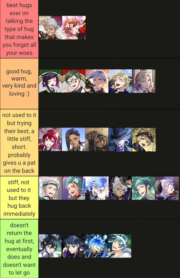
x
#reading this meme gives me comfort#twisted wonderland#twst#this is just what i think#who would u swap and where#honestly jack is probably the first and second tier once he gets comfortable with you#like it is so kind and warm it actually makes u forget ur woes#kalim and ace are just the tight huggers that's why they are on the top list#they squish u and that serotonin out#u're just little pouch of serotonin in their hands#trey is between giving u awkward back pat or hugging you#but i like to think even tho he's just pretending his hug is very comforting#deuce is just bewildered confused and flustered that's why he doesn't return the hug immediately#but he sure wouldn't want to let go afterwards#cater might seem like he would give a good hug but i imagine his true self be like o . o and then switch to ^ - ^ immediately after#vil is just a kind person in my eyes#he is mature and calm and nurturing if he wants to#i alter the meme wording by a bit to fit my perception more#if u put the birthday boy icons together it makes a heart omg#ruggie is honestly confusing me#he would probably only hug wholeheartedly if money is on the line#but i think he hugs his family and the kids at the slum very lovingly#idia is probably between the third and fourth tier but maybe he leans more towards hugging back than patting on the back#patting in the back is probably too cool for him#floyd'd examine u first and giving the how dare u touch me look menancingly but then be like ehe bcs it's little shrimpy i'll forgive u~
2K notes
·
View notes
Text
Everyday Poetry - "Every story I create, creates me. I write to create myself." Octavia E. Butler
1K notes
·
View notes
Note
Out of curiosity why do you bow before eating?
"It's a sign of respect."

"When I kill to eat, I know I am taking a life. I do it out of necessity. The creature's life moves to me so that I can survive and prosper. With this gesture, I pay tribute to its sacrifice."
"The bow is also to acknowledge the work of a person who brought the food, to feed me and the others. You're not pressured to do that, but even if the meal isn't to your liking, you would still recognize the effort. Our colony was small, with Hunter as the only adult, so any food brought back was celebrated."
"In my later cycles, the ability to craft explosive spears became incredibly useful for hunting and self-defense. I had a natural advantage, but it was to be exercised with caution."

"Truth is, I can do a lot of damage with my «powers». It's a big, alienating responsibility. And it was an issue in my younger cycles when I couldn't control it well - sometimes people around me would get hurt, but despite that, I was shown kindness and given guidance by my mentor. My adoptive family did not treat me like a freak, and it mattered a lot to me. It still does."
"I feel no need for bloodlust. I am content with my life… for the most part. Whatever grievances I may have, I know it's bad to take it out on others. For the temporary relief it gives, you realize it really is not worth it. To kill for sport, it makes my stomach turn - a sad waste of life. Just because I can, doesn't mean I should. Cruel thoughts are the domain of a scared animal. I don't want to live in suffering because of such fear, and most of all I don't want my family to think less of me. Does that make sense? I wouldn’t want to disappoint them, or lose their trust…"
"When I hunt for food, I often think of what my mentor would say. Those thoughts guide my spears, the memories remind me to be kind in the face of the vast, indifferent world. Most of the creatures out there have it considerably worse than me, trying to survive nature day by day. I've been blessed with a mark, I know things that a typical slugcat would never need in their life. I don't think I can ever go back - knowledge, like my «powers», are both a blessing and a curse. And, dare I say, I think it is better that I have those powers… for I know, at the very least, that I trust myself to use them wisely."
"The bow is a sign of respect, and a gentle reminder of the things that I stand for."
#rain world#rain world oc#rain world au#rw pioneer#rw hunter#slugcat#slugpup#artificer's pups#ask blog#au lore#tagging it as lore cuz this post is kinda important#it was meant to be three times shorter but i got carried away lol#the left half of the second image was meant to show “Marbles as a menace without the guidance of Hunter”#cuz yknow... she wouldn't have known right from wrong#but i think people will read it as lil shit blowing up stuff for fun#which may be true in some way#tbf she was a fairly calm child that needed friends so bad#that whevener she hurt other kids by accident she would bawl her eyes out out of shame#shout-out to opashoo for assistance 👍
422 notes
·
View notes
Text

#literature#words#life quotes#spilled thoughts#bookblr#book quotes#quoteoftheday#reads#bookish#bookislife#love yourself#self love#self care#dont give up#willbe fine#stay calm#staypowered#stay positive#get motivated#inspiring quotes#liveon#enjoy#be yourself#be kind#be your best self#believe in yourself#dream big
433 notes
·
View notes
Text
thinking about how kim dokja thinks he's alone in the world and there is no one in the world who understands him or can possibly understand him.
but. there yoo sangah is. yoo sangah who discusses literature with him. yoo sangah who understands kim dokja bc she is very perceptive about people and very empathetic and also bc they have the kind of friendship where words aren't needed. yoo sangah who read every book in the library about kim dokja bc she was genuinely interested in her friend's life and bc she wanted to understand him. yoo sangah who figured out it was 49 and not real kdj and figured out what he did but didn't say a word bc she understood and respected his decision even though she wanted her friend back more than anything.
yoo sangah who witnessed his mundanity and monstrosity both, and loved him either way. loves him despite every irredeemable quality he thinks he has. yoo sangah who wants to be his best friend in every lifetime and live together right next to each other. yoo sangah, his best friend who understands him without words.
#orv#orv spoilers#yoo sangah#kim dokja#idk i just feel like she gets him in a way that few people do and wordlessly#like ofc she's never been through the things he has and cant relate in that sense#but she doesnt need to bc she just gets him. bc shes really good at reading people and very empathetic#but also their conversations are like.. they have this silent understanding. tacit understanding we have a phrase for it in mandarin#LIKE SHE JUST GETS HIM#THEYRE PLATONIC SOULMATES#THEYRE BEST FRIENDS IN EVERY LIFETIME#PLATONIC DOKSANG ENDS ME. THEYRE MY EVERYTHING#PLATONIC SOULMATES ARE REAL AND THEYRE IT#IS2G!!!#i wrote the post in calm language but im actually screaming and clutching my head in agony#mp: orv
1K notes
·
View notes
Text
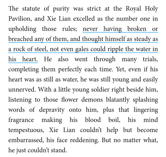
absolutely love it when they put details like this
#no cuz I read that part and went THATS WHY IT WAS IN THE DONGHUA#ofc hua hua's words will cause a ripple in his calm waters (heart)#oh don't i just love it connecting references like this#the creators read the book and took note of every small detail#love them for it#now give me that scene where xl falls on hc's lap i know y'all have it in your pc somewhere#tami rereads tgcf#tgcf#heaven official's blessing#hua cheng#mxtx#xie lian#tian guan ci fu#hualian invented love#san lang#hualian#heaven officials blessing#tgcf novel#tgcf donghua#donghua#danmei
1K notes
·
View notes
Note
I read a fic recently where mu qingfang was like "sometimes if we get VERY lucky, shang-shidi knows some miracle cure" and ive thinking about that in terms of 'god sqh'. Like you mention how x disciple is gonna die of the hyperdeath dying flower and your martial brother speaks in tongues to himself for a moment before stuttering and stammering his way into a 'this might work but good luck' possible cure. Reality takes a sharp turn for half a second and then when you try it, it works. He dismisses it and himself but it keeps happening. Not always, but sometimes. Often enough to be a pattern. Is he some kind of seer? Diviner? Or just divine? He's very protective of his personal rooms so you're not going to be able to get evidence either way. He keeps a garden of poisons and cures that he supplies you with personally, anyway. You're not gonna pry. Then later when everyone is screaming crying throwing up because he betrayed the sect you interrupt his demon king? Boss? Something. To be like hold up. Shang-shidi can I have an address for any emergency letters I might have to send you. Oh and also have you got a supplier for your meds in the demon realm? Hm? Oh yes very powerful demon Lord your flustered servant takes anti anxiety medicine. Yes it's a mix of herbs that forces him to be in less of a state- yes he gets worse than this. Shang-shidi don't whine I've seen you off your meds I KNOW you get stomach aches from anxiety so bad you can't work. Yes the 'category 5 tummy event' is not a secret. We know about them shang-shidi.
The category 5 tummy event he's so me 😭
The idea of Mu Qingfang just knowing that yeah Shang-Shidi most often then not probably has the cure to this Very deadly disease and doesn't bat an eye he's just like well as long as they live I GUESS.
Also the person with the balls to go staring up at this incredibly cold and dangerous demon with a straight face to tell Qinghua to take his meds
Mobei would definitely listen and take notes
#svsss#mobei jun#shang qinghua#ask#nib text#also drop the fic if you can i would love to read 👀#also hes a god and can make any cure known to man but he cant stop himself from having anxiety i feel him#at least he can make something to calm it
686 notes
·
View notes
Text

i made two falinses from memory as a warmup 2day
#ive read more than half of the manga and i feel kinda silly not doing anything sooner#falin touden#chimera falin#dungeon meshi#tessart#GOD i had missed traditional. my brain feels calm again
490 notes
·
View notes
Text
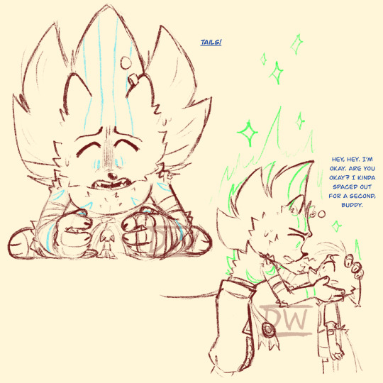
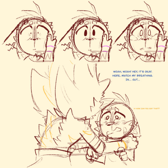
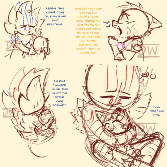
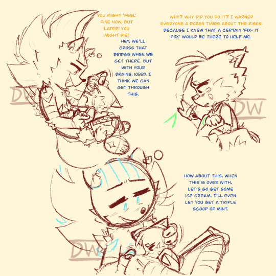

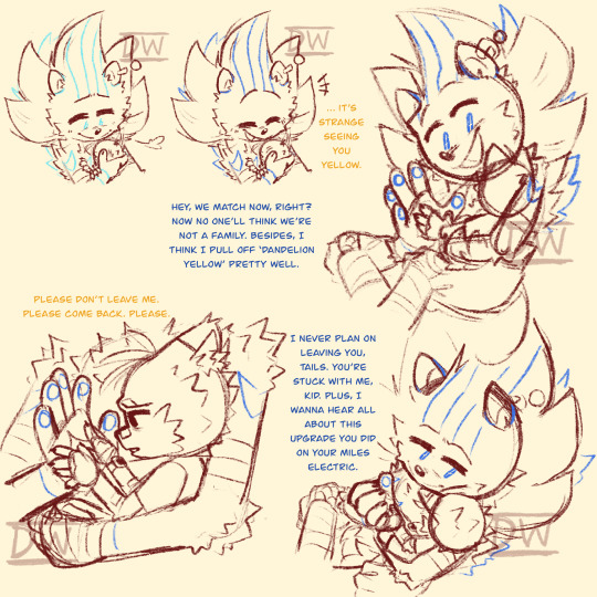
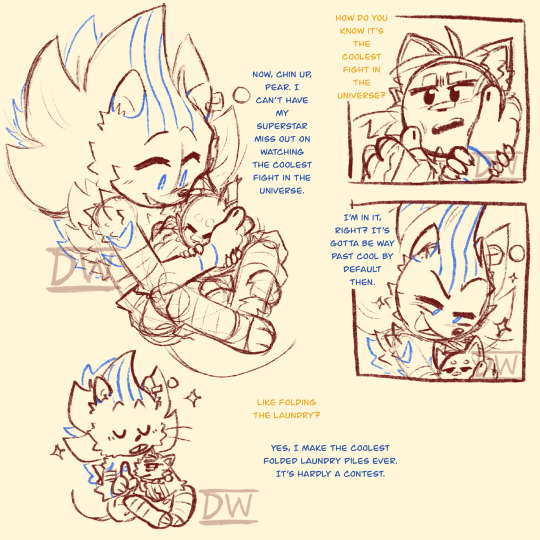
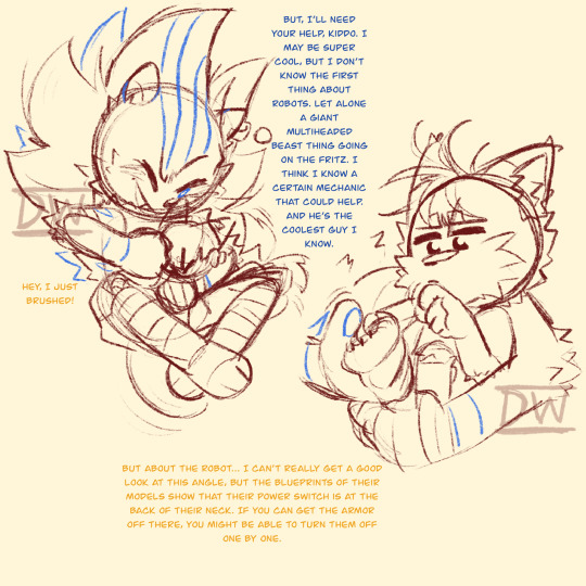
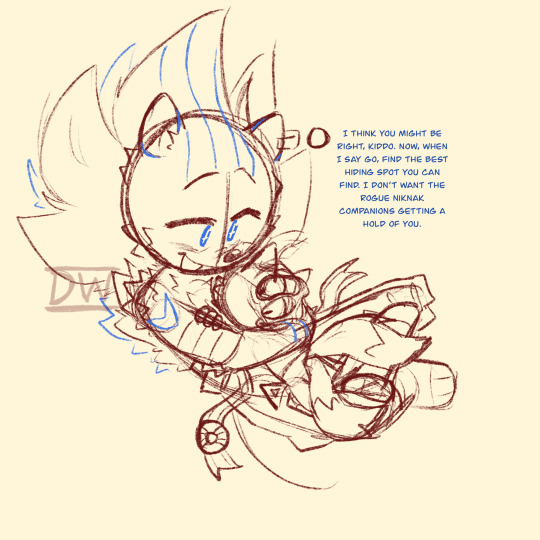
February 29- March 2 2024
The first time Sonic went Super in Road Trip wasn't exactly as stunning to Tails as other au's and stories.
Tails is like maybe 5 here (I'm not actually that organized on the timeline for this au yet, I'm getting there though, things are getting in order.) and he wasn't forced to grow up and be a hero in this au. So he's a bit more childish than canon Tails because he doesn't feel as pressured to mature and grow up fast. Plus, he genuinely thinks Sonic is going to die and this is the last time he see's him, so tears are bound to come down.
Part 1
#roadtrip!sonic au#sonic the hedgehog#super sonic#dadnic#miles tails prower#tails the fox#sonic fanart#wholesome sonic and tails wednesday#Okay- I'm gonna ramble a little bit about the dialogue and behaviors here you can skip the other tags if you're not interested#First- Sonic immediately tells Tails that he's fine first before asking if Tails is okay. This isn't Sonic putting himself first-#-but him trying to comfort Tails because even if it's cheesy- Tails will only feel okay if Sonic is okay.#Apparently it calms children down if they listen to their parents heartbeat (melts my heart when I remember that) so Sonic put-#-Tails close to him not only so he could hear that Sonic is alive- but also to try calming him down a little more.#Small thing I started incorporating way too late- Sonic will call Tails Big Guy if the kit is smaller than him and-#-Little Guy if the kit is larger than him.#Sonic changed his pattern color to be blue like Tails' eyes after he points out that they are both yellow (it's not colored here-#- but you probably remember that Super Sonic has golden fur.)#Sonic is constantly rubbing a thumb on Tails' hand as a comforting gesture.#That's my ramble- I know it's just pretty bare bone stuff that anyone reading might get but I freaking love explaining stuff (I gotta stop)
622 notes
·
View notes
Text
Austen said the sexiest thing a man can do is gently manage your insane family
#husband asleep. post mr knightley thoughts#the scene of knightley and emma guiding conversation so that their families don’t upset each other!!! teamliness!#the scene of knightley walking down the street in the snow and talking to the coachmen so he can calm everyone’s catastrophizing#Cate reads
229 notes
·
View notes
Text


a dyptich.......
(ft. a printout of a sebby doodle by @legowizard. bc he is lovely. vash #1 based off this image)
#my gf had me draw the “stop fucking around” one to help her finish her thesis....#then asked me to draw the 2nd one a month after she graduated and realized she didnt know how to calm down#and sebby's there bc. cmon. look at him. if u cant read it he says “Good luck out there!!”#also if anyone wants me to draw ur fave with an encouraging message and mail it to u for like. $10. hmu#trigun#vash the stampede#trigun 98
202 notes
·
View notes