#IVE DONE THE LINEART FOR MOST OF THEM
Explore tagged Tumblr posts
Text
guys motivate me to color because i wanna do requests at some point but im sooo fucking backlogged that the last request i got (a few months ago) is just on the verge of being finished ;w;
#text#scaledantennae#IVE DONE THE LINEART FOR MOST OF THEM#I JUST HATE COLORING AAGHHH#and yeah... finished. not posted. not even close to being posted. we still have like a hundred left to go before it gets posted.
7 notes
·
View notes
Text
i just put together my year in review art summary for the year and its interesting because compared to last year i think my technical skills improved but it feels a little bittersweet overall because as soon as i got my job all of that ambition just vanished LOL
#txt#tbd#not to say i dont still want to draw and create stuff--i still love drawing and ive been expanding into multimedia a lot this year#but more like..#last year every month just about had some big like full illustration that i felt very proud of#sometimes more than one alongside other art!#and this year started with some of those (tho i feel like ive been in and out of art block for kind of a while now)#but as soon as september hit i literally like. i was finishing ref sheets and then its like#lineart only headshot . lineart only drawing with pink laid under it . and those are the most finished things i have for a month#and i like those drawings! and for some people that IS a finished piece which im trying to work towards in my head#i just know I LIKE making full illustrations with nice colors and a background and character interactions#and i have ideas for them but im just so worn out from working. and im barely even part time#and im not working an art job thats draining my creativity or anything. i wonder if an art job would help or if id just#be doubly burned out#i hope maybe i can adapt to work again or maybe theyll give me health insurance and i can talk to a doctor#about my energy issues. idk. cuz if i cant even work part time and keep drawing then its fucking over for me mentally haha#i do draw sometimes but im much slower. and i have to give myself the grace of knowing like#my ass is chipping away at several larger projects during that time that arent visible on my review cuz theyre not done het#yet*#but that doesnt mean i was doing nothing. and even if i was i should know thats fine#like fuck i made my own nendos this year !! im sewing plushes! i just painted a flower pot! im making animations and studying code!#and even then again i like the art i made this year i just want More of it#realistically i have a lot of free time but its hard because i work best starting At the hour i have to be asleep for work#so my peak productive hours im sleeping. :(#except on days off ig but even then its complicated
1 note
·
View note
Text
I love drawing Aris as sif so much she's so cutsies. It almost makes up for the horrors of having to draw her as sif. Almost.
#rat rambles#eternal gales#stars posting#I will live in a state of not rly understanding everyone's hatred of lineart until I do sprite redraws#I get it now. this is hell#it doesnt help that I have to improv poses and expressions and stuff a thing that Im not good enough at style emulation to do well#I was going to try to do all of sifs battle portraits with aris but Im like 3 hours in and only done with 5 of them I am not strong enough#tbf in theory the rest after the first 7 shouldnt be as bad since I can just edit the first ones but I dont wannaaaaa#I Do have ideas tho. alas.#Ive just been thinking oh so hard abt her expressions throughout the acts#also abt her going through the horrors in general#for the first two acts she isnt smilely like sif is instead having a very determined look#but after that she becomes a lot more like. innitentive I guess?#basically imagine she's like completely stuck in her own head at that point and is barely processing the things around her#she also gets her only smile within this set being her buff/heal animation where she puts on a fake smile to try to meet her pretend#shes ok and paying attention quota#its not helping. its only making the others worry more.#I have the least ideas for act 5 but I think it'd be fun to maybe have her actually make eye contact with the camera for those?#shes looking off center for all her other ones so I think itd help set the tone of oh god fucked up shit is happening#also she tends to mask more when stressed so.#in general its just very fun thinking abt the ways aris would handle things differently than sif#for one she doesnt have as many side quests where she gets nosy and regrets it due to a mix of her being so fixated on solving the loops#and her just generally being bad at reading most ppl leading her to not rly noticing or caring abt stuff that sif would#mainly she doesnt get the confession side quest despite sier still trying every loop because she didn't rly realize how important it was to#sier and just sorta assumed it was not that important in the grand scheme of things#but she Does have a similar side quest with mase where she gets to have a self hatred spiral <3#in the house shed sometimes catch mase secretly pick some stuff up when shes not looking and if she asks at the end hed say that he was#going to make something but didnt get everything he needed. this leads aris to assume itd be some tool or weapon or smth like the bomb#so if she went around and found all the spots where he collects stuff in one loop shed be able to ask again and he'd reveal he wanted to#make matching bracelets for everyone. and aris would get frustrated and upset and then freak out because she got mad and spiral
1 note
·
View note
Text
ITS THEMMMM!!!!!!!!!!!!!!!
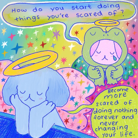
#i honestly dont know Y i started rambling BUT I DID SO IF ANY1 WANTS 2 READ IT ITS DOWN THERRREEEEE#well ok ik Y its bc im insane about kart just AAAAAAAAA let me try 2 mask my giddiness 4 a wee second#i just ihvae such a specific idea of them about this conversation in my head askjhfakfla#how they r so similar in their differences that things like “advice” or “perspective” hit harder 2 eachother?#so i just AAAAAAA i jsut AAAAAAAAAAAAAAAAAAAAAAA#bart in my head is much less scared 2 take a step even if there r a MILLION steps#if he wants 2 start solving an issue HE WILL START.#kon on the other hand 2 me would perhaps get a bit depressed about it#he will think about the issue but not WANT 2 take the “next step” ((sorta speak?)) until he has a vague understandign of how he wants 2 mov#bc of past experiences how that didnt exactly work out 4 him#like tldr; bart when scared tackles the problem head on in his own way while kon when scared bcomes a bit paralyzed#again i dont uhhhh im not super confident in my characterizations of these guys no matter how muhc i love them bc i havent read every comic#book in the world & just AAAAAAAAAA most of this is me thinking about them l8 @ night akjsHFljksagfajhfwe#which is rn#ANWYAYS IDK IF UR READING MY RAMBLE THERE MAY B NO POINT AKJSHFJKW#TY 4 THE TAGG!!!!!#I LOVE THIS ART ITS SO COLORFUL!!!!#& ITS ALSO THEM!!! BUT ALSO JUST SO GOOD & THE DIALOGUE MAKES ME HAVEA CRISIS ITS SO GOOD#TASTE LIKE TRIX THE CEREAL & IT REMINDS ME OF CHILDHOOD & THE THINGS IVE DONE WHILE SCARED OR SHOULDVE DONE#REFLECTING ON EVERYHTING#THE CRAYON TEXTURE IS SO NOMMY NOMYM I EAT ITT!!!!!#i love u bright blue lineart!!!!!!!!!!!!!!!!!!!!!!! <3333#the stars make me happy#reblog
5K notes
·
View notes
Note
any advice for someone starting comics who feel like the storytelling side is their weak point? i started a couple comics but always loose steam on them because i feel like the storytelling/plot/writing is my weak point, and ive found the plots and characters i come up with so uncompelling that it feels embarrassing to even use them, its never been something ive been interested in ive always just been passionate about the art side and never been awfully good at writing as a whole, but i could spend hours diving into stylizing artwork to look like various types of comics and ive had that itch to just make something. am i just built to work freelance being paid to draw someone else's story or do most comic makers feel like that and what ways do people improve?
Writing is also an art! It is something that takes years of practice and learning and it's absolutely fine to aim to improve with it. It is a skill to refine!
I would say, that if it is not something you are passionate about though, you could try looking at other options.
Collaborative stories with friends are an option! Rabbit on The Moon comes to mind, it's a collaborative comic that my friends did. Songdog wrote the script, and Nitteh illustrated and designed the characters. It's a lovely story, and beautifully drawn, I can't recommend it enough.
You could also consider public domain stories! Adaptations are done for a reason! You could make a comic of a an old folktale, or adapt a fable or greek myth, while having the flexibility to do whatever changed you want! There are quite a few webcomics I love that are based on public domain/myths, it can take some of the pressure off of you as a writer.
There is also the freelance option you mentioned. If you're not too passionate about the writing aspect, and are mostly invested in the art, getting paid to do it seems like a pretty winning option!
To be honest, the writing has always been the part I am passionate about. I am constantly writing and rewriting stories in my notes, I have dozens upon dozens of comic concepts written up and even scripted that I can only hope to get to. I like doing lineart and expression work, but the rest of the art process is only the means to an end for me. It's not my focus and would happily hire artists if i had any sort of budget lol
I do not think it is uncommon for creators to be into one aspect more than another, I think it's about just figuring out what works best for you.
#answers#i do not have the best advice on this and this might not be any help to you i apologize#i am very into what I do#problematically so!#I would just say to try things out and see what sticks for you
98 notes
·
View notes
Note
I wanna know about your art style. How you draw like that??
i tried putting down considerations as well as a (very) general step by step of what i do; if there's anything more specific you want me to explain lmk i guess?
first off, general (self imposed) constraints / purpose of project -- this informs what i draw & how i draw it
i.e. "kuradex" is pretty different from my normal art (my 5 latest rough illustrations):

or my monster hunter charms:
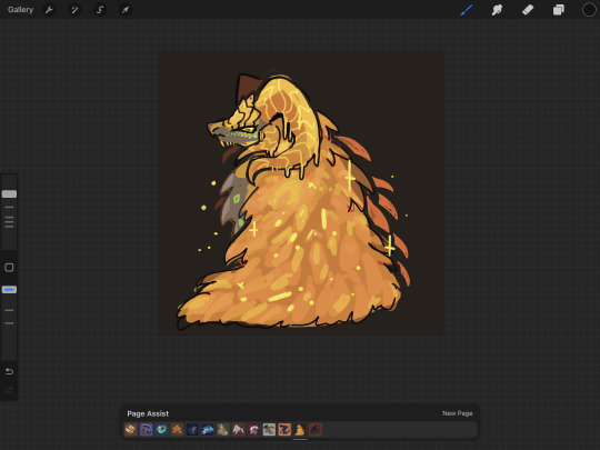
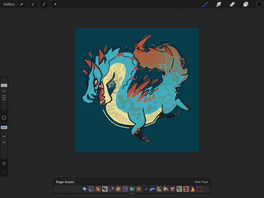
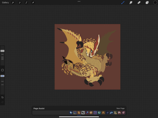
or my pokemon tcg contest illustrations that im not allowed to show until june (😉):
although i've said its for merch purposes, ive started drawing these because i wanted to practice conveying "liveliness" and noticing key features / nuances of a given design, but i didn't want to spend a large amount of time on each one.
so what i came up with is
i want to draw things on-model in terms of proportions ( + take note of weight / tapering of shapes / etc )
no backgrounds & minimal "props"
experiment with / practice line/texture/color/flow/rhythm/etc
spend <1 hr on each pokemon on average (this is a bit more difficult for me to track, but for example, the cyndaquil line took me less than 42min to color, combined, and means at some point in time instead of focusing on cleaning up the art as much as i can, i stop after cleaning up most of it)
that said, the pose & the rhythm/flow of lines are key in conveying liveliness, and if i have a concept in mind i usually end up going with it, but i may go thru a few if i dont.
i consider pokemon origin / lore or a key point in its design, and if i'm particularly stuck, i try looking up pokemon card illustrations for inspiration. (i noticed the research i do is essentially a truncated version of how Atsushi Furusawa does research before doing an illustration.
(& even despite all this i do get stuck sometimes and don't exactly understand a pokemon and just opt for "as cute or cool as i can make it i guess?", but i think it's part of the process...?) (theoretically things that are A Shape should be really easy to draw but with what i want to practice in perspective i find them difficult...)
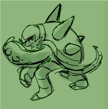
this is from my latest paid req but these are my first sketches of chesnaught -- i was thinking of how one of its inspirations is a warrior / tanker from RPGs, so i drew a pose where it's shielding its face.

i do another pass and take note of details.
in general i draw overlapping shapes and erase (it's a bit visible on one of the spikes)
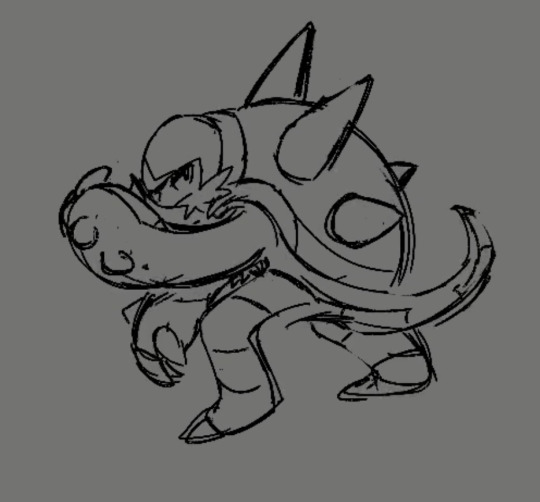
because i opt for quickness i start coloring at this point -- i just use a colored "color burn" sketch layer for the "lineart" & colorpick official art & lay down messy flats & set the color layer to 60%
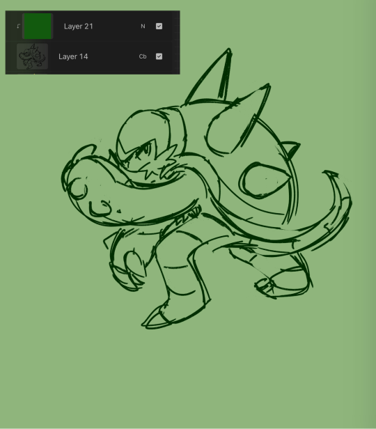
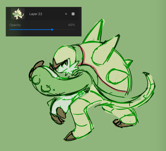
60% multiply layer for shadows. i tend to use both hard and soft brushes
for bigger projects i would use 2-3 shadow layers to create more "layered" shadows
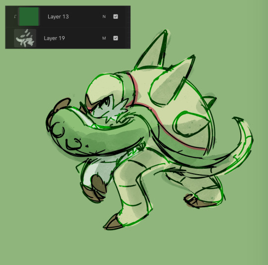
here i use overlay layer (60%). this is just throwing colors at it and seeing what works and doesn't work. i personally prefer to throw red under the eye and a yellow or blue near the top of the head. this is mostly done with a soft brush

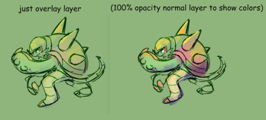
before this point, everything is under the rough lines, but now i start drawing/painting over it
i just color pick the colors that have been laid down from the previous steps and clean up / render textures (making the green on its arms look fuzzy) / fixing anything that i forgot or looks too off (i.e. the spike on its shoulder and the way the tail curves)

I could potentially keep cleaning this up, but this is where i usually stop 🫡
138 notes
·
View notes
Note
I NEEDA KNOW what do you use to make art?
OOHHH man anon you're about to learn just inconsistent i am as an artist because i switch back and forth between programs like a madman.
the main three programs i use are magma, procreate, and clip studio paint.
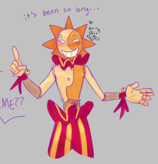
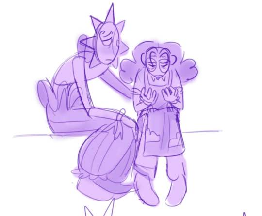
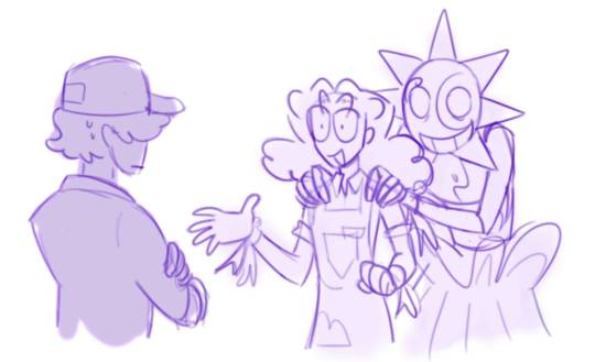
^^^ these were all drawn in magma. i really like using the default soft brush. tbh ive been using this program a looottt more recently like idk something about it just works for my brain. but yeah for whatever reason i always make my lineart purple when i use it??? so if my art is ever Extra Purple, that's how you know it was drawn in magma

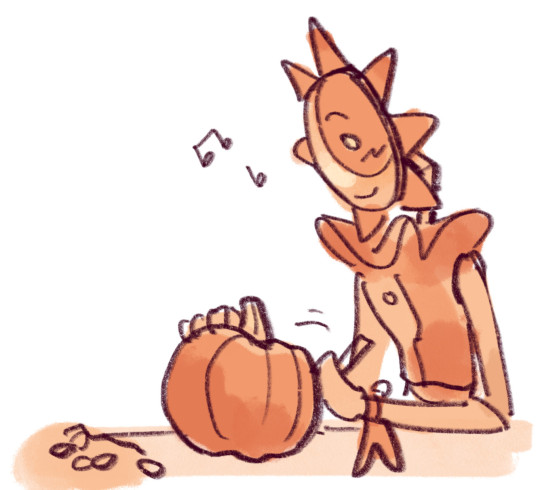
^^^ THESE were all drawn in procrate. tbh most of my dca comics were done in procreate (I have only recently started using clip studio paint again). i really really like the texture of the HB pencil brush... smth about it tickles the brain

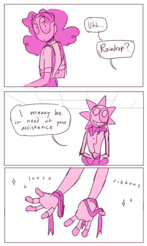

^^^and then THEEESE were all drawn in clip studio! as you can see a lot of my most recent posts have been in clip studio. i use it when im making a serious piece of art or a comic that's a bit longer than a couple panels
out of all of them, i'd say clip studio is my favorite program to use. but yeah!!! go experiment and have fun <333
117 notes
·
View notes
Note
sorry if youve talked about this before, but do you have any tips relating to your coloring process? i ADOREE the way you render things and it looks soso cool and once i saw a post where you said your art typically only took a couple hours and i was in SHOCK. cuz ive been working on a yuji piece that has a similarish (not really but idk how to describe it…) coloring style and ive been working at it for. about a month now…sorry this is rambly i hope u have a good day!!!
hi!!! first of all thank you so much I'm happy you like the way I render! honestly it Is still the aspect of drawing that takes the longest for me, I've only recently started to come up with ways to streamline my process (mainly through keeping my layers/brushes limited and overall being less anal about details) . these days my average drawing does take about 2.5-4 hours I'd say, with Big Illustrations obviously being the exception
i wouldn't beat yourself up too much about taking longer to finish a drawing tho ! it took me. a While to learn how to speed up and honestly my biggest piece of advice is loosen up and let certain things look imperfect or unfinished ! and if you're like i was and want to work at getting faster then i would recommend practicing churning out sketchy/rough pieces and see what tricks and habits you can implement or adjust to save time
all that being said I realize haven't done an updated overview of my colouring/rendering process so I guess this can be that ! I'll put it under the cut because i too like to ramble and this Will get long
lineart and base colour/underpainting


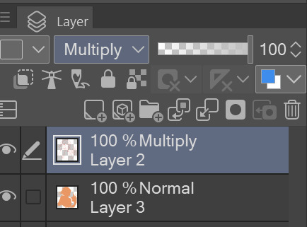
my lineart is nearly Always on multiply. it helps the lines stand out less starkly against the colours and makes it so that I don't have to change the colour of as many sections of lines later on
the base colour layer is honestly completely optional, tbh i sometimes skip it so you don't Have to have one but i like it for a few reasons: - I like to keep all my colours on the same layer so if i'm going for a painterly style this serves as an underpaint layer of sorts . having this means that when i paint, whatever colour i have here will blend with all the other colours i use and help them look cohesive - even if I'm not painting, i still like to work with all my colours on the same layer and it helps me make sure I'm not missing any spots, which helps when it comes time to section individual areas off in the next steps
2. flats
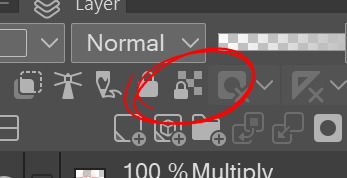

lock transparency button my beloved . this makes it so that you're only able to paint on areas where there is Already colour (which is where having an underpaint layer comes in handy)
not much else to say about this step, just choosing colours rly !
3. shading
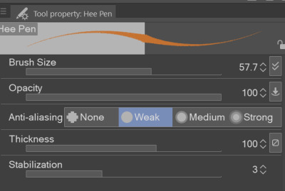
here's where the fun starts ! since i'm working all on one layer, i use the wand or lasso tool to section off whatever area I want to work on, then go in with (usually) one of the three brushes below: from left to right 1. my favourite dry brush that i use to cover large areas, it has an amazing dry paint stroke-y texture and i use it in everything. great for skin/clothes/hair/fur/organic material...she does it all 2. smaller, blendier/smoother brush that I use to soften out the rougher edges left by the first brush. I find it's really good for hair and small clothing creases 3. rough pen brush that I use to add little bits of flavour in the form of crosshatches or stray lines, usually to hint at individual hair strands! I also use it to line sometimes but I'm using it less for that recently
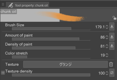
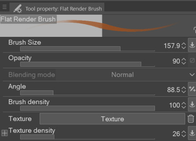
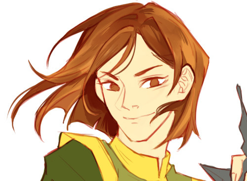
also, since the lineart layer is set to multiply, it's super easy to colour directly under the lines on my colour layer and use that as a way to make certain lines Darker . it's most obvious at the eyelashes and under the jaw but I do it everywhere

4. finishing touches and texture overlay
here I add another layer above the multiply/lineart layer and use it to add highlights and other details! this is also the layer i use to paint directly on top of any areas that got messy or need extra definition
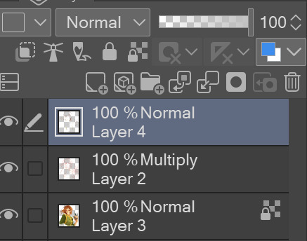
my texture overlay of choice is just a rough monochrome static file that I got on the csp assets page but use whatever you'd like tbh ! set the layer mode to overlay and adjust the opacity to your liking (I also like to rasterize the layer to make it easier to work with but it's not too consequential if you skip that step since you're basically done by this point anyway)
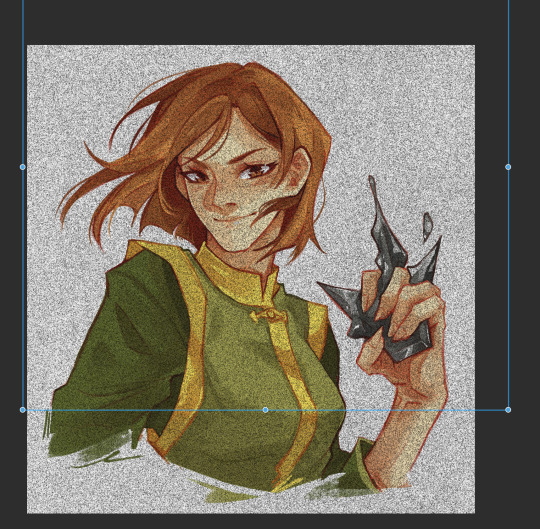
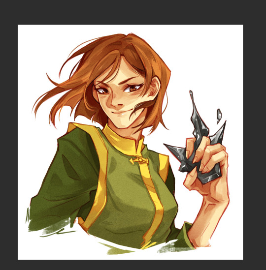
And done ! slap a signature on that bad boy and send it <3

#answered#flowingredscale#art advice#my art#i rly hope this was helpful!!!#best of luck with your yuuji piece <3
34 notes
·
View notes
Text
COMMISSIONS ARE:
OPEN / [CLOSED]
most important info in the photos here but if you do want to commission, more details under the cut!


hi opening some cheap commissions!! if theres any other redrawn shitposts let me know i can give a price for that too :))
no proship, incest, pedophilia, homophobia, transphobia, etc. if something makes me uncomfortable i will not be doing it.
i can rake paypal and zelle, not venmo bc it wont work for me. i can also get cashapp if you dont have paypal or zelle
my art style begins with color which is why theres not much for just a sketch unless its a photo redraw/trace. i am learning how do lineart but so far im not gonna sell it unless you want really shitty lineart drawings lmao
i will do nsfw but im still learning it so it wont be that great so you are aware, same goes with animals. i can draw animals well from references tho, especially birds and wings since those are one of my major interests :))
when i post photos publicly they will be poisoned with an overlay, you can see this on here. but when i send it to you i will send both the poisoned and unpoisoned versions. i do request any posted publicly be the poisoned version in order to combat AI, especially on twitter
DO NOT FEED MY ART TO AI.
most money will go toward my studio bad egg bill cipher merch fund but anything left over will be going to student loans 😔 looking to get atleast like 50$ by december 15th so i can atleast get the one bill cipher pin i really want 😭 i will also probably use some money towards other people's commissions to support them as well :)
ive never done commissions so let me know if you have any questions or noticed things missed!!
#small artist#art#commissions#gravity falls#gravity falls fanart#monkey wrench au#billford#commissions open#thatonend#thatonend commissions#please reblog#!!
16 notes
·
View notes
Note
any advice 4 when u want to keep drawing 2 improve but u cant get over perfectionism ? like when u just dont care how its gonna turn out, if its bad its bad yknow?
ahh yes lowkey ive struggled with this a lot. not as much now as in the past tho, and honestly its beecuz ive developed a more neutral view on myself/my art in general. its going to take time to get to this state of mind, so dont be too hard on yourself when you find yourself falling into bad habits.
advice under the cut (kind of long winded) ⬇️⬇️⬇️
the first thing ive done to overcome perfectionism is focus less on details and more about overall shape and form. when i sketch im trying to get roughly what i want, and i limit the strokes i do in certain parts of my sketch to like 1-3 depending on what im drawing (im ngl i also am very impatient and have created a workflow that makes it so i am able to start and finish pieces as fast as possible LOLOLOL. shrugs. i just like drawing fast).
a good example would be this thing i just drew:
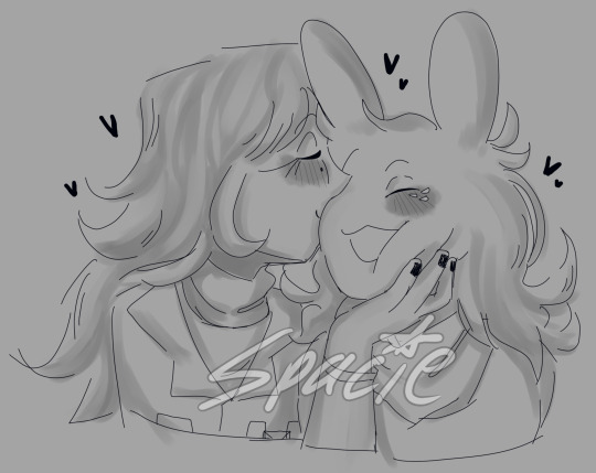
in all of my sketches i tend to use as few strokes as possible and just get the basic idea down. good for not overly focusing on teeny tiny details and worrying about them later (i also use the same technique for lineart, but just end up connecting the lines. thats another tip i have, if you like your sketches more than your fully lined pieces, just line the same way you sketch! or you could also use your sketch as your lineart :P)
another tip i have is to draw from references, and once again, focus mostly on shape/form/the big picture of your subject before going into details (do you know how many planes there are on the human face....i still dont know howta draw faces properly but im not mad at myself anymore about it, i just open up a reference and try to learn). i also recommend having a drawing session where the goal is to draw awfully. draw something you want to draw, but that you're not sure if you'll draw it right, and draw it. dont try to correct it, acknowledge that what you made isnt perfect, and then draw something else. you're learning! of course its not gonna be perfect. but inevitably, you're going to get frustrated. just remember if its something you really want to go back to, you will be able to revisit it in the future. feel your anger and frustration, but do your best to not direct it inward.
small side tangent about shading- I AM SO SHIT AT SHADING SKFHSAFDJHS. people dont tend to notice (surprising), since ig my shading style is considered "beautiful" or something, but if you looked at it on a technical level, there are mistakes everywhere. i havent really tried to improve it. i dont really care most of the time b/c i just like shading for fun. and especially when im shading my sketches, i already have it in my mind that its not supposed to be perfect. its a sketch. this is where im supposed to make all of my mistakes. once i start making my way to the final product is when i start worrying more about if i did the lighting correctly (even then ik im not good at it im not trying to be a god im just trying to draw things that make me happy).
additionally, i really rec u dont try and fudge a sketch until its better if you're deep in a Perfectionist moment. keep the old sketch and start over on a new sketch taking bits and pieces you liked from the original, and improving on those that you dont (shitty thumbnails are also good if you have a vague idea in mind but need ta figure out howta place subjects in your scene). honestly drawing the same thing/idea over and over gets me a better understanding of my subject each time, so naturally each iteration looks better. it doesnt take me that long to sketch tho, so if sketching takes you forever (sometimes if sketching takes you forever its b/c you're a perfectionist skjfskdjf) just think about how much time you're willing to spend on something. remember☝️ its okay to give up/take a break on something and try again later. sometimes you just needta stop looking at your art and like. look at a tree or something lmfao.
i will also say that im not looking to go into a career in art, im more of a hobbyist. ik school environments dont exactly.....help with perfectionism lol. there are certain expectations put on people who go into the art field that are inescapable. if this is the case for you, i still think what ive discussed before can help you, but i also think that you may need to lean more on the mental tips i have also provided below.
alright! mental health tips in regard to art:
so, i have c-ptsd, and with that comes a lot of self image issues that ive had to work on. my feelings about myself extended to the way i felt about my art. it was shit, it was awful, i cant draw like this other person can so why bother, if its not perfect i shouldnt draw at all, etc. and honestly, something thats helped is affirmations. my affirmations are c-ptsd related, but ive noticed a shift in the way i view myself, and by extent, my art since ive started repeating them to myself daily. and honestly, i think a requirement of overcoming perfectionism is telling yourself that your art doesnt hafta be perfect, A LOT. LOL. LIKE YOU ACTUALLY HAFTA ACTIVELY TELL YOURSELF YOU'RE NOT AWFUL LMAOOOO. its funny, we dont think much about how we naturally are self critical about ourselves, and we dont realize that we are basically repeating negative affirmations about ourselves over and over and thats why we're not improving (mentally).
even when you're not drawing, i think it would benefit some people to have some kind of notification on their phone to remind them to tell themselves that their art doesnt hafta be perfect daily/however often you feel you might need it. and then with that affirmation, practice Shitty Drawing. one of the best tips ive ever gotten for this was from one of my friends monnie. get out your sketchbook or some printer paper, take out a shitty pen, and DRAW. and then any mistakes you make are permanent and you cant just endlessly try and fix them. it forces you ta sit with this uncomfortable feeling that something you made isnt perfect. eventually your brain will realize that when your art isnt perfect, you can still draw and you're ALLOWED to continue to draw even if what you make isnt spectacular. if you dont want to repeat an affirmation daily, try to remember to at least repeat it before you sit down to draw. something along the lines of "my art doesnt hafta be perfect in order for me to want to draw. im allowed to draw even if its not perfect" or something else. it depends on what you most struggle with in regards to your perfectionism. im ngl its probably going to feel cringe at first, but i promise you, it really works if you put it into practice longterm.
shoot for neutrality instead of positivity first. let me tell you thats where i am now and its so much less exhausting drawing lmfaooo. i make something that looks like shit and im just like. i dont fucking careee i dont give a fuccckkkkk
those are my tips :] i hope this was helpful!
#spacie spoinks#art tips#kind of?#art advice#i would have added more art but i dont have my art saved on this device KSHFSKJDFH#i copy and pasted my art above from my tumblr post 💀💀💀💀💀💀#anyway#have a great day anon!!
10 notes
·
View notes
Text
rat brainrot going hard
sorry for not posting this week, i was cooking some stuff but this drawing took almost the entire week to do, worst part, it was a shitpost
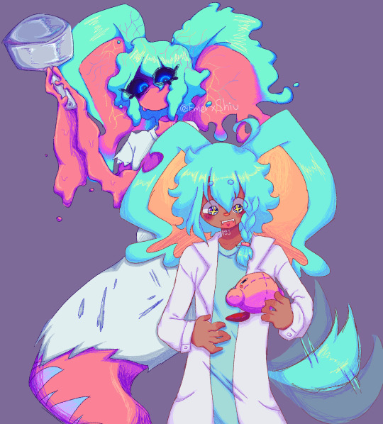
i still dont know why this took me so much
so uh, almost all my drawings this week have been related to this two(and lis) so much so that i struggled because i wanted to draw other things so i would just stare at a blank sheet of paper for over half an hour, god that was torture, tho i dont mind drawing the sillies, sometimes it gets a bit boring drawing the same over and over y'know? im also going to take this as an opportunity to ramble about my forgo gijinka, because surprisingly i hadnt done that yet.
og image

ok now to actually talk about the wet rat
ive tried doing a gijinka of em since i joined the fandom (my first gijinka was fecto elfilis (well not really they were fnaf, but i mean when i got into kirby and when i started using the term gijinka))
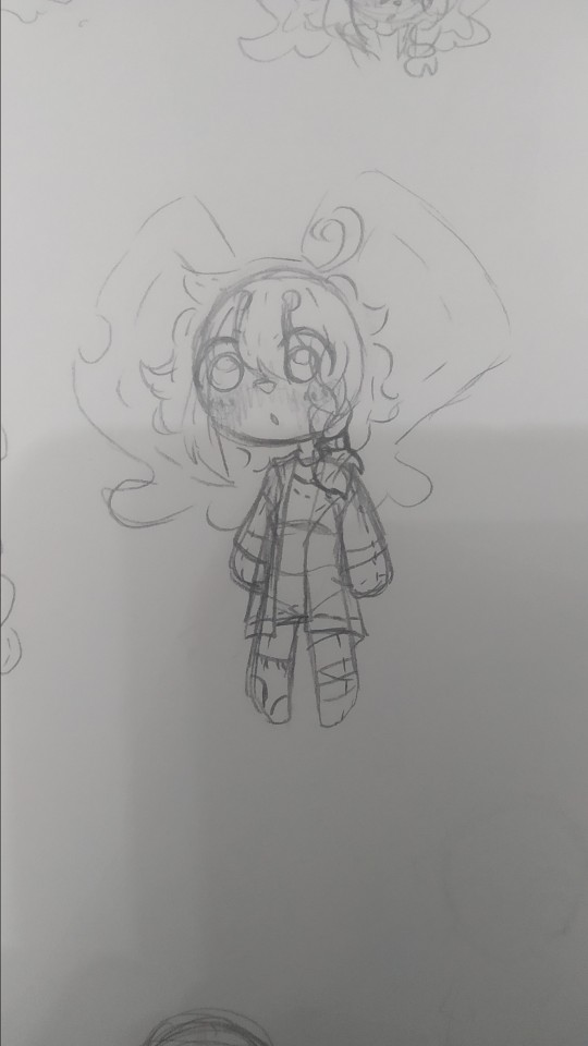
but most of the time it just looked like elfilin but like...evil, with a different ear and a hospital gown, thats it, so i barely drew them since i didnt like that, but on february, i actually sketched an idea that i liked, and thought it looked cute but a bit off (i mean off in a good way)
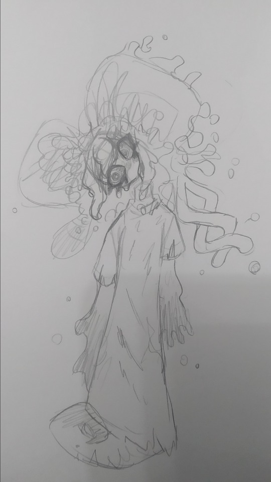
(yes im posting this image again because i think its the best drawing of my forgo (im very inconsistent with my style ok))
they have their eyes closed most of time, like in game, i considered giving them legs but i ended up with the tail, since i didnt want to end up with like a fourth evil elfilin, the arms are like that so i can have em be small and weird like in the actual game, but i also made it so they can like change it, that way i can make em have hands and stuff if necessary (like to hold that frying pan for example)
not sure if a lot of you notice it but um, bro has no neck, i took away his neck privileges, i did it just to see but i ended up falling in love with that and stuck around, and also that allows me to draw them bending their head like in the drawing above because their neck isnt necking and i like that, i like being able to draw characters doing stuff that shouldnt be anatomically possible or is abnormal (i did something a bit similar with void) thair clothes are rugged because well forgotten land you know what i mean, but in general theyre actually pretty simple
i also did the drawing in digital

i tried doing very sketchy lineart, i tried a new brush in this one and thats the one im using for my last drawings (not sure if anyone noticed the brush change) it was pain painting it because i did it all with the brush in the same size, not changing it, god did my hands hurt and it was a bad idea
i accidentaly downloaded the following 3 drawings twice lol
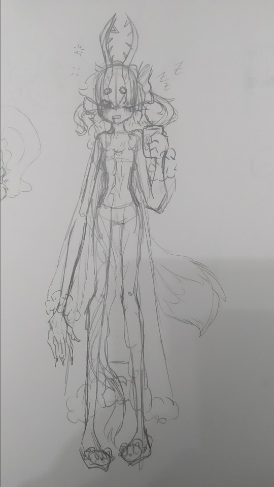
sleepy zzzz
i think they would wear something like this to sleep, i dunno i just wanted to draw em in something cute, and sleepy, with elfilin slippers (the mug also has elfilin btw) oh and also i like changing their hair, here one of their long bangs is tied into a bow, kinda like callie from splatoon, i have some drawing im probably wont post, one more of forgo wich looks very much like the upper one but like eyes closed, and one of fecto elfilis gyaru because my sister asked me to draw them like that, bad thing is i didnt look up references on gyaru since i couldnt use my phone at the moment, i did like the hair i did for them in that one tho, they have their bangs tied up in a bun, and then left the rest loose, making it look longer than it actually is. i might redraw it, but actually looking up gyaru so i can make something more accurate, i like the style, but im not too informed on it
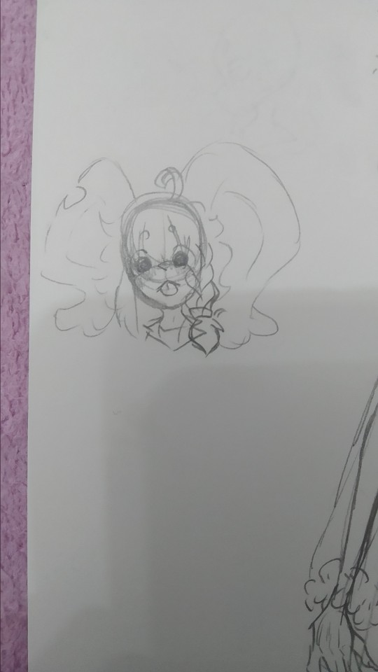
elfilin being silly like a kitty :p
not much more to say on this, just sillines :3
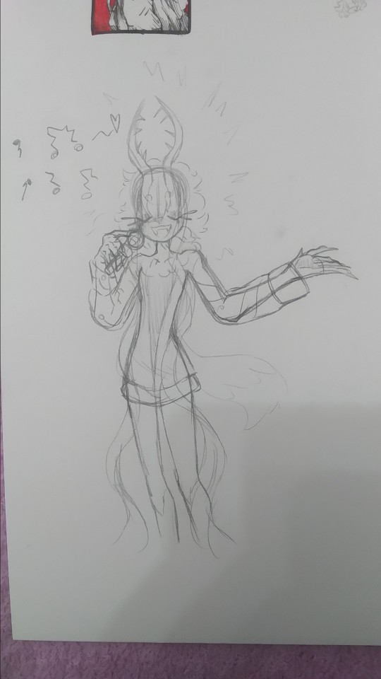
there is totally not a cropped drawing there
based on the kirby manga, where they make it so elfilis sings really bad, at first i didnt like it that much since i had imagined they'd sign great, but after i while i started to find it a bit cute so now its a headcanon, they like to sing but suck at it.
writing this just made me remember i wanted to do another drawing too for this with kirby and them singing, but i forgot to do it, im kinda tired (and its late) ill probably draw it, but for next post or another one
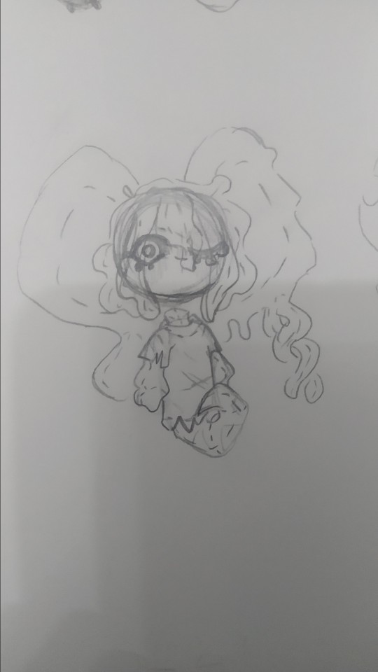
tried drawing fecto forgo as a plushie, silly.
i wanna learn how to sew so i can make plushies of characters (like prince fluf!) but im way too lazy, i will get around it some day! (hopefully)
elfilin too as a plush
i also wanna learn to sculpt, i tried doing a clay kirby once, but one his feet broke in half, and one day my mom put it in a box, and his eyes fell off and stuck to the box :(
i really wanna do figures for characters i like or dont have enough merch or my ocs (prince fluff, flamberge, fecto elfilis)
but as i said, im way too lazy and unmotivated, though its be nice, one day, maybe one day if i stop procrastinating
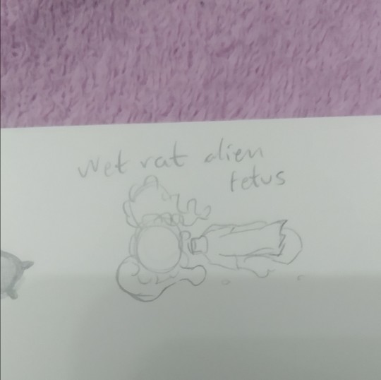
it doesnt have the same ring to it as "feto rata mojada alien" wich is how my sister and i call them (she doesnt know that much about kirby, but i sometimes show her my drawings (reluctantly sometimes, but im the older so like >:) she has too if she wants to show me her stuff too))
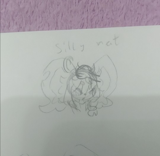
silly rat and wet rat, thats how i call em (because wet rat alien fetus is too long sometimes)
you can tell the brainrot was too strong (were near done(kinda))
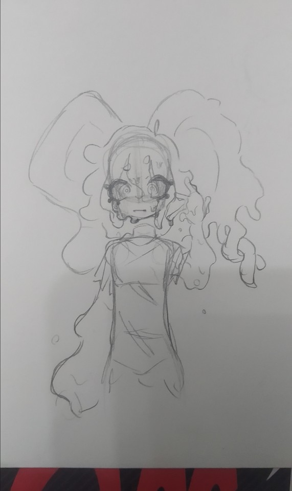
they gain a mouth whenever i fell like it very much
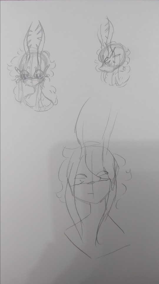
artblock hit, and all the rest of pages i stared at them for 30 minutes
it felt weird looking at my fecto elfilis with the eyes so big, it looked off (in a weird way)
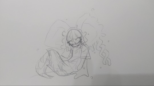
dunno, tried drawing them in a different pose i i dunno really
i think these are from tuesday. i did more but those were oc (mostly splatoon) or other kirby character related, and i want this to be a rat post (might post those tommorow or another day maybe)
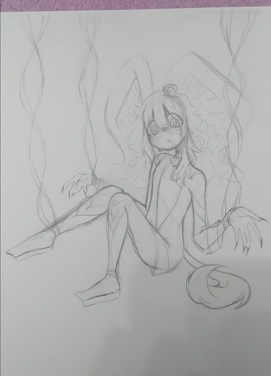
i dunno (x2), i tried drawing elfilin like elfilis, i really liked the hands here. i still struggle a bit with anatomy but i think this was quite good for my usual character just stading looking at the front or a quarter profile. im considering making this into a fully digital drawing, what do i say by considering im actually doing that fuck it, i just think it looks kinda cool

"This new creation, driven by pure chaos, was defeated by the bright light of Kirby's hope."
Chaos Elfilis reminds me of a moth. kirby's hope is a bright light.
you can see my thought process. i just thought itd be a bit cute and kinda silly and funny.
the kirby fandom wiki, said that chaos elfilis looked akin to a moth, and it just stuck with me, so i wanted my gijinka of them to be moth inspired, and thats when i saw just how cute moths are! i mean im still a bit scared of insects but at least now i kinda like em.
i feel like i need to say sorry to that one moth i desintegrated in a matter of seconds with a book because i thought it was an spider and didnt think (im so sorry little guy)
but ah yeah elfilis, moth, it made sense to me since chaos elfilis has the soul of morpho knight, who is a butterfly, and moths are kinda like butterflies too. and i thought itd be cute
so uh yeah i sometimes like making my chaos elfilis be a bit like a moth, that includes liking light, a lot, so uh kirby is like a lamp in here because i said so
now to talk about the desing since for some reason i hadnt earlier, as i said before, they are very moth inpired so uh im might say that word way too many times (im sorry i suck at explaining stuff)
their horns are thinner to resemble moth anntenae, and they curve just because i thought it look cool, and to differentiate it a bit from fecto elfilis. their bangs tie into a bun (i forgot to draw that but i dont wanna go and change it now, way too tiredv man and i still have to post this on other places) the bun looks a bit like an eye, because well, they are basically a soul boss, and moths have things in their wings that look like eyes, btw chaos elfilis doesnt have their wings here because i got lazy and i didnt want them to like cover most of the drawing. the things coming from their bun are like the trhee things theyve got in their head, theyre shaped like that to resemble insects legs a bit, fecto elfilis also had the 3 things (i dunno how to call em sorry) as their eyelashes, but chaos elfilis has just white eyelashes, because the bun already has the 3 things and because my morpho has white eyelashes so (i still havent done my morpho gijinka yet, i just know im gonna give the butterfly some white eyelashes cuz cute and pretty grimm reaper) the rest of the hair is shaped into like a ponytail but like, adn shaped, with whats left shaped like a lil moth
the waistband they have is a nod to morpho, they used to have a bow shaped just like the butterfly morpho appears as, but i took it out because i thought it crowded the design way too much, and also because it was too on the nose. the arms have those golden things because my fecto has it and because my og chaos elfilis gijinka had them so i wanted to bring it back, the hand fades into white because the red in the hand wasnt hard to distinguish so i came up with that to make it easier to see.
the red part of the pants are actually a bit fuzzy akin to a moth and the white part has those stripes to loke like insect stuff because y'know akin to a moth. the boots are like the red part in their legs their model in-game has, so i just made em tall boots, the high heels? originally it was platform just ike my fecto but then i wanted to draw them in high heels when i was slightly redoing chaos elfilis, and welp, i loved it and now theyve got high heels. those rings around the ankle are inspired by the ones leaongar has around their arm. also can you tell anatomy is not my strong suit? and that i dont draw high heels often?
i made a slight change in my kirby, making the sleeves be a different color, since the one he had before i felt was way too white, and i wanted to have more saturation in it
i also forgot but elfilin is supposed to wear that during forgotten land, and then i decided that after the anding of the main story he changes clothes, but i forgot about that while doing this so he has his pre-ending clothes (also because i still cant really decide on their second outfit for the post-game)
god im so tired i wanna talk and show more drawings but o shit im sweating why is it so hot in here
um thank you for reading all the unnecessary long rambles about why i do certain stuff in my gijinkas, i appreciate it a lot (im still sorry about writing walls upon walls of text but i just cant help it)
Jambuhbye! :D
#art#fanart#kirby#kirby fanart#kirby gijinka#silly#digital art#firealpaca#traditional art#fecto elfilis#elfilin#chaos elfilis#kirby elfilis#fecto elfilis gijinka#elfilin fanart#elfilin gijinka#chaos elfilis gijinka#gikabi#gijinka#fecto forgo gijinka#fecto forgo#shitpost#they have invaded my brain#fuck it the next drawing are probably gonna be them too btw#its 1:53 rn lord save me please#you know what#staright up kill me please#i love you tumblr mwah thank you for not having such a small character and image limit like x formerly know as twitter#i still dont know why the alastor elfilis blew up on twitter#im cooking some fanfics btw
34 notes
·
View notes
Note
Hihi! I'm the anon from the MN talk sprite ask I'd love to hear about your sprite genius science haha :-D
Ps to say that I'm a huge fan of your work just in general
first of all THANK U SO MUCH WAAH....... im so glad you like our stuff TvT !!
second !! ill hop to the sprite explanation right here! i'll put it under the cut bc it might get long eheh
and a note: im using csp but this should work with any program! i previously used ibis for my talksprites before remaking them ^^
for my example subject, i'll be using ace! they'll be my best example since theyve gotten more use so far!

quick notes about the background; i always export my canvas as transparent to give the image that they're just a Part of the post/environment. the nametags and gradients are optional, but i feel the gradients help fill dead space and add a bit more to it- the nametags help in emulating the feel of video game dialog too (i dont tend to have the patience to actually make pokemon textboxes because i have to do it manually, so putting this over post text is my next best option.. makes it easier for chattier people, and gives screen reader accessibility as well!)
ANYWAYS, now for the actual Building of the Sprite!

where i usually start is with a base sketch of their neutral expression. i have two for All of the modern/updated talksprites, because i had initially wanted to put them at an angle to add a bit more flavor to them.. ultimately though, i stuck with the symmetrical style for my personal quality of life. i find it easier to work with and add to- i just have to be very meticulous about getting the proportions right is the main thing ^^'
now, from the sketch is the natural next step of Lining shit! and heres where the method of madness starts, because a big part of this entire thing is...

this . im so sorry about this image.
if you look at the layers, you'll see the general order of operations! basically i try to look at it as different Pieces, or Assets. its like a paper doll that you're assembling- the pieces that go behind need to go all the way in the back, then you build up. the back of someone's hair goes behind everything, then their body. then their clothes, then head, face, face accessories, bangs, and finally cartoony emotes on the very top if that's your style.
generally, i try to set my layers up for maximum customization- mixing and matching it the key for making my talksprites as versatile as possible. so stuff like having a base body that you can add changes of clothes too, using clipping layers to add shadows that would go over everything, that kinda thing.
but overall, having layer stacks worked out like this is the MOST important part, imo, for doing these talksprites. when it all comes together, the result is a clean basis for mixing and matching however you might need for both expressions and appearance. i keep everything in folders of Lineart, Shading, and Color as well, just in case i need to revisit or add to something premade later.
speaking of adding- this also allows for you to easily make any future assets for changing appearance and expression! i personally do it case-by-case, as i can't ever anticipate every expression or article of clothing i'd Ever Need. when something new is needed, i'll just make the new thing, and then it's just another piece to have in the mix! it's pretty nice! :D
tip: god remember to name your layers/folders. i used to Not and it made finding the pieces i need so hard. doing this method will result in a LOT of layers. be nice to yourself and name things accordingly!

now focusing in on the most important part of an expressive talksprite, heres the face, and the best way ive found to stack the layers so far. within all of these layers are the pieces of expressions that can make countless matches if you add enough to them. fun!


now the Eyes. the eyes . the eyebrows and mouth are pretty straightforward you just Draw and Color them and boom theyre done. but i want to draw special attention to the Eyes because figuring out how to do these were probably the thing i struggled with the MOST. its a system thats a bit more in depth than just. Doing it. here's what we got though.

the optimal stack for maximum eye expression that ive found? do lines and the coloring for those lines. SEPARATELY.
the idea is to make irises fully round so you can move them around or have wide eyed expressions without any weird cutoff in parts you failed to draw (looking at my old sprites. sighs). but to avoid having to delete or erase anything, the iris folder needs to clip onto the eye whites folder so you dont get stuff like

this . yeah.
and another thing i had to learn the hard way is that if your character has stuff like eyebags or makeup, and this is the reason my "lineart layer" has folders, if that if you put that stuff on the white layer, the irises will sit over THAT as well as the whites, resulting in some annoying little things.

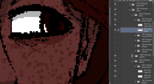
see: ace's eyebags in the whites layer, VS ace's eyebags in the lines layer.
ofc this is unnecessary if you dont add that kind of detail to your own characters- in that case, the lines layers can be as simple as just being lines!
with all that, the eyes more than anything are layers i recommend having properly named. you'll need to have the right whites with the right lines, so being able to find the two pieces with the same names is important! else you could get fun bits like this:

i dont think eyes are supposed to do that.
and generally, that's the most important parts of making these that i'd say! i have a few more tips, but theyre mostly little things that are moreso optional that i'll rattle off real quick-
for shading, i just use solid black shading with a lower opacity (i know, booooo). it's the quickest and easiest way to ensure they're both consistent, and covering everything in the same way. tbh i dont every see shading as necessary for these- but it adds just that bit more of depth and extra visual appeal to it imo
a general rule i use for characters with facial hair, which is Several in missing numbers; beards go with the head base, mustaches should be redrawn with every mouth. when someone with a mustache or stubble is talking, its usually gonna be moving and contorting with the shape of the mouth:


having it be static can range from a little off, to just Weird with more extreme expressions. but thats mostly because my style leans more realistic- if you've got a more toony style, i dont think having a mouth overlapping a mustache a little will be too bad!
this is just because i put a lot of detail into stuff and is SUPER optional, but one thing i do is have two different head bases for whether a mouth is open or closed. the jaw is opening is gonna result in the chin going a bit farther down, as opposed to it being closed! all i did to make it was take the original head base, grab the jaw area, and lower it a few pixels, then filled in the gaps. work smarter not harder
when moving the irises around, i prefer to duplicate the base layer. usually to get things to look right, you'll need to move the irises independently, so its good to just have the original stay as it is because getting it back EXACTLY how it was might be difficult. plus, you can keep the moved ones for reuse later! ^-^
if your art program allows for a universal symmetry ruler, awesome! make sure you know exactly where to put it later to add to your character! and if you use a program like clip studio (like me) where the ruler only applies to one layer; at least for csp, i can put it on a folder and it applies to everything inside that folder, so i just put all the assets in one Big folder and put the ruler there. i dont know every art program, but hopefully that still helps??
if your character has strands of hair that rests in front of their shoulders like ace's wisps or leafs big old strands, draw them as a part of the bangs or put them in the same folder so they properly sit atop everything else!
ace doesnt have any hands yet, but those would go at the very top of the layer stack. heres our lovely assistant for an example!

and for now, thats all i can really think of!
these talksprites aren't ideal for a lot of bodily motion, but for stuff like that, i figure thats where hand-drawn pieces come in. generally, i have these setup to make work on updates a bit easier, as it takes me a while to draw entire original pieces (and i struggle to focus. this is in fact why the blog suddenly went quiet again), but i still want my posts to have that visual flair to them! doing an entire visual of a character from the ground up is a fair bit more work than just. drawing a symmetrical mouth onto a guy, so i've found this whole mix-n-match type of talksprite thing a godsend ^^
anyways !! i hope i explained that well enough- good luck with ur endeavors, and i hope i get to see it!! :O
and please feel free to shoot any other questions my way if you need anything else!! im always happy to explain and help :D
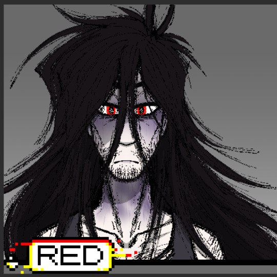
and as a blog teaser for whoever gets all the way down here, a little something for your time... ive hired these three trainers to stare at you


#mn diary#hoping this is comprehensible TuT thank u again anon ur so sweeet auhjndkfdklssnkksldjn#i hope this helps anyone who sees it n wants to try!#hell did something similar for green but exported his assets into some picrew-adjacent site for his own ease of use#so thats also a thing but idk how that works.. i like my methodical madness lol
8 notes
·
View notes
Note
ok im not sure how to ask this properly but how do you make your art look like "glowy" near the lines?? ive seen it in a few other artists' styles but yours is the most like this. it makes your lineart really pop and adds this like bubbly happy feeling to it i like it a lot!
okay so basically its mostly just two simple overlays and a border effect

this is how the piece looks fully done and how i post it, but this is how it looks without any overlays or border effects

i generally always put an overlay over skin and hair layered above the line-art so it gets like the first level of the bleed, and also because it just looks more vivid


i then go to the line-art layer folder


and select watercolour edge with these values. i then select the entire folder and make another overlay layer


and finally reduce the values to this so the lines are still nice and sharp while having some bleed to them

(you'll have to adjust these depending on how big or small of a canvas youre working with)
i hope this helps!
#violet talks#its super easy and simple and i use it for basically everything. there isnt a reason not to. that dark red is a god send for overlay colour
26 notes
·
View notes
Text
I'm not coloring my doodles anymore... I'm so done.... IM SO DONE!!! I SELF-PRESSURE MYSELF INTO DRAWING WITH COLOR AND HAVING "Perfect lineart!"
IVE DONE IT SINCE I WAS TWO MONTHS OUT THE WOMB HOW CAN I STOP!?!??!
I REFUSE TO DO ANYTHING BUT SKETCH!!! IM LAZYY. LAZY!!!!! IM GONNA USE MESSY COLORS!!!! IM GONNA STOP PERFECTING MY LINEART!!!! IM GONNA STOP MAKING MY SKETCHES INTO LINEART AND CLEANING THEM UP TO LOOK PRESENTABLE!!!!
But most of all... IM GONNA GIVE UP ON TRYING TO DRAW GOOD PERSPECTIVE!!! AHHAHAHAH ahHAHAHAHAH ahaHA HDUINHACDHOQNCAIa

Ignore my manic episode please and thank you… exams have been getting to me.
28 notes
·
View notes
Note
haiii i don't know if anyone's asked this already but i was wondering what your process is for making animatics?
im so sorry anon im not the best person to ask this question! ive only done one whole animatic, and it was as much of a learning process as any beginner, lol
i'll leave here my process:
i started out with very basic thumbnails of what my ideas looked like with the lyrics and all:


then i uhmm. i opened a canvas on csp and generated a folder for each scene and then an animation timeline (to play my progress as i go) and i started sketching
after sketching, i didnt really wanna edit, so i played my progress with the song in the bg to visualize a more developed Thing (this is the unlisted video i shared to a couple friends)
youtube
(cut to +30 hours of me doing the lineart for each of the frames)
well. i did the lineart for each of the frames, exported them all into a folder, and then opened davinci resolve. i then slapped all the frames on there and started trying to fit them into the rhythm of the song
i remember having trouble with the lyrics, because if i wanted them to flow separate from the images on the screen, id have to do them again but in a separate layer, and export all those layers again, which i didnt wanna bother doing, and my laptop didnt like it when i tried (it is a piece of junk)
so i edited the thing. and then i posted it and then i won
i realize this may not be the most in-depth explanation ever, and im sure theres ways to do this more effectively (and a LOT more cool things you can do w/ editing, i basically just slapped a bunch of images next to each other), but in my defense i dont have a lot of experience making animatics lmfao
still!! thank you for the ask anon!!!!
29 notes
·
View notes
Text
RIDDLEBIRD VN CGS 6/16

Edward has taken to letting off some steam by endlessly complaining about the other guests, tearing them apart by insulting every little thing about them that annoyed him.
Oswald's too tired to do much else but listen, amusedly watching him as he gesticulates wildly, only cutting in whenever Edward manages to miss something.
i am so so SO sorry for disappearing for a couple weeks,, between gaining a cherik hyperfixation, stressing about the election results, and losing power for several days, i havent exactly been in the creative mood lately 😭(lowkey i also kinda forgot about this blog whoops) i believe i said somewhere that i was planning on having the CGs done by the end of november, but its looking like the end of the year now (i sure fucking hope so at least, seeing as i have the month of december off from work for the holidays)
however, on the good news side of things: i think i have someone who will be doing the music for the visual novel !!! which, quite frankly was the thing that gave me the push to start working on the cgs again, because that is a HUGE weight taken off of my shoulders. dont get me wrong, ive enjoyed making music in the past, but i would have to learn a whole new program in order to do the things i want. and at this point i think it would be better both for me and everyone who plays this game if i just got the help of my friend who literally went to college for music instead of just stumbling through making amateur songs
(anyways, now its time to talk about the CGs lmao)
this is the last CG of the confession route !! which means that not only is this the first of the 4 routes that has all the lineart done for it, but this is also one of the last super romantic CGs thats in chapter 1... im gonna miss drawing them happy and in love 😭 but thats what i get for prioritizing the confession route
fun fact: this CG set is the 3rd largest one with a total of 23 pictures ! although thats going to change in the final product cause 8 of them are placeholders for the animation im planning on making. also the 1st and 2nd largest sets have 28 and 25(?) because for some reason i decided to make them the most complicated they could be LMAOO
and since im posting this the day after thanksgiving, i just wanted to say thank you to everyone that has taken an interest in this project so far <33 i never thought i would get this far along in this project and i hope people enjoy playing it when i release it for playtesting. ive wanted to make a visual novel for years now, so the fact that im actually doing it now (even if its going slower then i wanted) is just absolutely crazy to me :]]
#nygmobblepot#riddlebird#oswald cobblepot#the penguin#edward nygma#the riddler#gotham#gotham 2014#riddlebird vn
8 notes
·
View notes